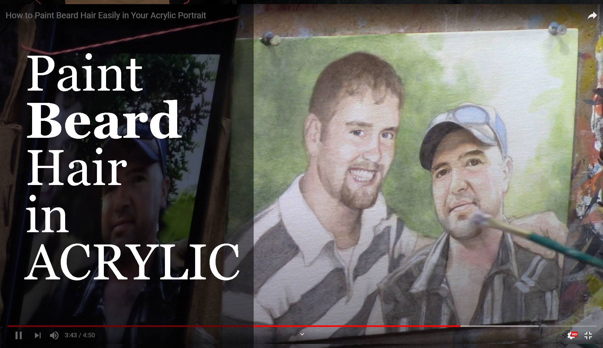
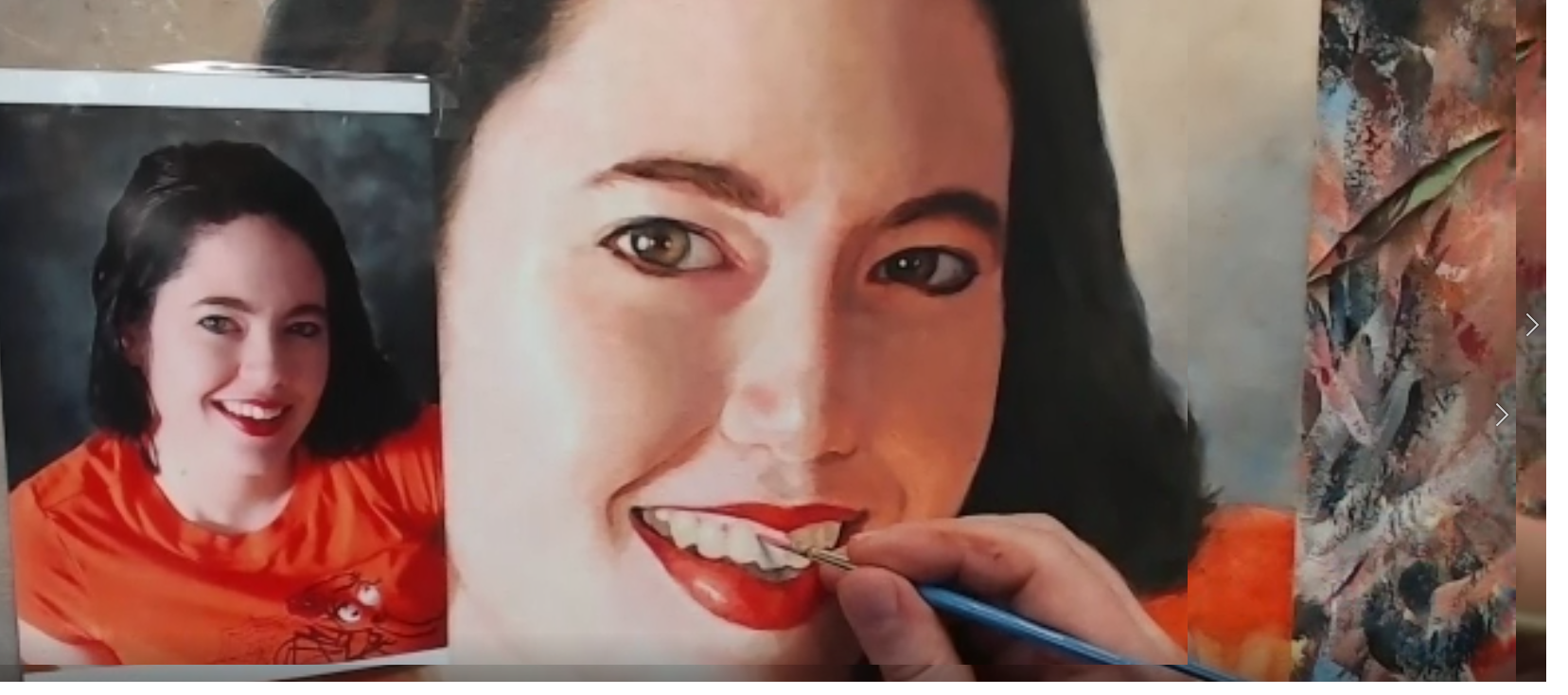
Learn the art of painting beard hair with this simple and effective technique
Painting facial hair, such as beards, can be one of the more challenging details in portrait art. It may seem daunting to capture every individual hair in a realistic way, but it doesn’t have to be. In this guide, we’ll break down an easy method for painting beard hair using acrylics that doesn’t involve painstakingly painting each hair strand. Instead, we’ll focus on blocking in colors and values, giving the appearance of detail while keeping the process simple and effective.
Whether you’re a beginner or an experienced artist, this approach will help you add convincing realism to your acrylic portraits without frustration.
Step-by-Step Guide to Painting Beard Hair
1. Start with a Base Color
The key to painting facial hair, like a beard, is to begin with a base color that matches the underlying skin tones and beard shade. Then don’t worry about painting individual strands right away. Instead, follow this process:
Mix raw umber as a base for the beard.
Add a touch of alizarine crimson to introduce a slight warmth, and include titanium white to ensure the paint covers the surface effectively.
For cooler tones in the beard, mix a bit of ultramarine blue into your base to add depth and shadow to your mix.
When you have your base color ready, load it onto a flat edge brush and block in the general area of the beard. This block of color will act as the foundation for the beard hair. Focus on the overall value instead of trying to capture individual strands. This method prevents the painting from looking too busy or artificial.
2. Block in the Values
Instead of painting each beard’s hair, think in terms of values. Then block in the light and shadow areas of the beard, which will provide the necessary contrast and depth.
Use your cool-toned mixture to paint the stubble or full beard, applying the color in sections.
Blend as you go to create a soft transition between the skin and the beard.
The key here is to focus on where the light hits the face and then how it interacts with the beard hair. The shadows and highlights will imply the presence of hair, of course, without needing to meticulously paint each one.
3. Create Realism with Minimal Detail
Once your base layers and value blocks are in place, you can add a few finishing touches to suggest individual hairs. Use a detail brush sparingly, picking out just a few strands of hair in key places. Because this technique gives the illusion of individual hairs without overwhelming the painting with too much detail.
In smaller portraits, like 8×10 canvases, it’s unnecessary to paint each hair meticulously. Because simplicity often works best in creating a realistic appearance. Focus on the main areas of light and shadow to convey the overall texture of the beard.
Techniques to Improve Beard Hair Painting
1. Use Color Blocks to Imply Detail
The most efficient way to paint beard hair in acrylic portraits is to rely on blocks of color rather than individual strokes. Because this method implies detail, which can trick the viewer’s eye into perceiving realism without overwhelming the painting with unnecessary detail.
2. Choose the Right Brush
For the base layer, use a flat edge brush to cover larger areas and then create smooth transitions between skin and hair. When adding a few fine hairs for detail, switch to a small, pointed detail brush for better control.
3. Blend Your Colors
Blending is crucial when painting facial hair. You don’t want the beard to look too stark or separated from the face. Softly blend the edges of the beard into the skin tone, paying attention to areas of transition where light hits the skin through the hair.
4. Focus on Contrast
Realism in facial hair is often achieved by strong contrasts between light and shadow. Beard hair, especially in portraits, reflects light differently than other parts of the face. Make sure to adjust your highlights and shadows accordingly.
Use more titanium white to brighten up areas where the light hits the beard.
Deepen the shadows with your ultramarine blue mix, especially near the edges of the jawline.
Tips for a Realistic Beard in Acrylics
Work in Layers: Build the beard gradually, adding more color and depth in layers as you progress.
Don’t Overwork It: Less is more when painting beard hair. Don’t feel the need to paint every strand. A few details go a long way.
Play with Texture: Facial hair, especially beards, has texture. Try lightly dry brushing to simulate this texture without going into too much fine detail.
Observe the Reference: Always refer back to your source image. Look at how the beard flows, where the shadows fall, and how the hair interacts with the face.
Common Mistakes to Avoid
Overdetailing: Beginners often make the mistake of trying to paint every individual hair, which can result in a cluttered and unnatural look. Instead, focus on the big picture: light, shadow, and overall shape.
Incorrect Brush Choice: Using a brush that’s too large or too small can cause issues. A flat edge brush is best for blocking in large areas, while a fine detail brush works for final touches.
Too Many Highlights: Over-highlighting the beard can make it appear unrealistic. Use highlights sparingly to ensure they mimic how light naturally interacts with facial hair.
Conclusion
Learning how to paint beard hair in an acrylic portrait can elevate the realism in your work without requiring an excessive amount of time or detail. By focusing on values, layering colors, and adding minimal detail, you can create the illusion of beard hair that looks natural and lifelike.
Remember, painting doesn’t have to be complicated. Sometimes, simplicity achieves the best results. Experiment with this technique in your next portrait, and you’ll be amazed at how easily you can paint realistic beard hair.
I’d love to hear your thoughts about this video. Please share it with your friends and family. Let me know if you have any further questions. I’ll greatly help you.
If you’d like to learn more, sign up for my free email tips and video class today.
Thank you so much for taking the time to read this tutorial and watch the video. That means a lot to me. I hope you find it very helpful in your portrait painting.
Yours for Better Portraits,
P.S. Did you find this post helpful or encouraging? If so, send it on ahead! Let others know with the share buttons below. I’d love to hear your comments. Thank you so much! Also, do you have a question on acrylic portrait painting you’d like answered? Let me know, and I’d be happy to help!
elpful or encouraging, would you send it on ahead? Let others know with the share buttons below. I’d love to hear your comments. Thank you so much!
It’s kind of sad to see the challenge drawing to a close. As I write this, it’s been an entire month since I started this challenge on April 6, 2020.
My goal was to create a way for artists to overcome the challenges of being in COVID-19 lockdown, create something beautiful with their time, and grow their skills as artists.
Many, many have risen to the challenge and done exactly that. If you’re reading this, and you’ve taken the challenge; you’ve gone through steps 1-7, I’m so proud of you! It’s not easy to paint a realistic portrait in acrylic, let alone during a quarantine. But you did it! And you’ve encouraged many others along the way.
Is it too late to join the challenge? No, not at all. This challenge is meant to be ongoing—something you can do at your own pace. The lessons are free and they aren’t going anywhere.
If not, register below for FREE and I’ll send you:
a downloadable/ printable”Welcome Kit” with a Supplies List and a Palette Color Layout Guide.
high-resolution images of the photo we’ll be painting from for this challenge.
each new lesson that comes out in this Masterclass series.
a link to my private Facebook group, where you can do this challenge with other artists, get feedback and help on your portrait, and not feel alone.
I am so happy that you have done this challenge with me and hundreds of other artists. I give you a virtual high-five for the effort and dedication you have put in.
First, I give God the glory and thanks for entrusting all of us a talent to use. Next, I thank you and the other artists for taking your time and investing it into yourself as an artist and into others’ lives to encourage them.
You’ve left great comments for each other and your building skills to be able to paint a portrait you can take pleasure in and others can too.
This is what art is about. It transcends a piece of cotton canvas stretched on a wood frame, with plastic polymer resin on it. In the hands of a skilled painter, it becomes something beautiful that can last forever.
When we touch lives, bring hope and encouragement both in the creation and in the giving or selling of the art, we are doing something that has the potential to last for eternity!
So what we all have done in this group, by God’s grace, is amazing. And I believe it is just the start! 🙂
If you would like to work with me more closely, so I can personally help you become the portrait artist you’d like to be, be sure to watch my invitation at the end of the video. Whatever you decide, thank you so much for taking part in this challenge and may God richly bless your talent, and multiply it many times over!
Yours for Better Portraits,
If you found this post helpful or encouraging, would you send it on ahead? Let others know with the share buttons below. I’d love to hear your comments. Thank you so much!
Let me know if you have any questions about the challenge that I didn’t answer. Leave your question in the comments below and I’ll get back to you!
Learn the classical glazing technique for depth and luminosity
Acrylic painting is an exciting medium known for its versatility, but achieving the depth and vibrancy often associated with oil paintings can seem challenging. However, by employing the classical glazing technique, a method favored by old masters like Rembrandt, Titian, and Vermeer then you can produce rich, luminous results with acrylics. This blog post will guide you through 5 essential steps to create a vibrant acrylic portrait using this time-tested method.
This tutorial shows the entire process of painting a portrait. Here are the steps I show in this tutorial:
Start with a Detailed Sketch.
Apply the Initial Glaze Layers
Layer and Build Gradation
Introduce Vibrant Colors
Focus on Nuances and Details
1. Start with a Detailed Sketch
Every masterpiece begins with a solid foundation, and in portrait painting, that foundation is the sketch. Before you start adding color to your canvas, take time to create a detailed and accurate sketch of your subject. For this project, an 11×14 portrait of three girls in a park serves as an example.
By using a sepia-tone prismacolor colored pencil, you can establish proportions and likeness. Accuracy in this stage helps set the stage for a calm and confident painting process. Once your sketch is ready, seal it with a clear matte medium. This acts as a protective layer, ensuring that the pencil lines remain intact as you begin adding paint.
Tip: Use a flat brush (¾ inch to 1 inch wide) to apply the matte medium. Make sure the application is smooth and even, allowing it to dry thoroughly before proceeding to the next step.
2. Apply the Initial Glaze Layers
The heart of this painting method lies in glazing, where thin, transparent layers of paint are applied over one another to build depth and richness. Unlike traditional opaque acrylic painting, the classical glazing technique requires a mixture of 95% matte medium to 5% paint. This creates a very light wash that enables you to gradually build colors without overwhelming the canvas.
Begin by mixing raw umber dark with ultramarine blue to create lifelike skin tones and shadow areas. These first layers will be almost imperceptible, but they provide a strong base for the layers that follow.
Tip: The first layers of glaze should be incredibly light. This allows for adjustments in color or value without the need to paint over mistakes. The glazing method helps avoid the common frustration of muddy colors often encountered in acrylic painting.
3. Layer and Build Gradation
Once the initial glaze is applied, it’s time to focus on layering. As you build up more layers, you’ll notice how the painting starts to take on a more vibrant and realistic appearance. The goal here is to create a seamless transition between light and dark values, blending tones smoothly to replicate the natural shading found in your reference photo.
In this step, more raw umber dark and ultramarine blue are used to deepen the shadows on the forehead and hair. This layering process helps achieve the subtle gradation required for realistic portraits.
Technique: As you layer, ensure that each glaze is thin and transparent. Too much paint in a single layer can cause the painting to look heavy and lose the delicate transparency that glazing provides.
4. Introduce Vibrant Colors
To make your portrait truly vibrant, it’s essential to introduce bold colors into the glazing process. In this example, a dash of Liquitex hot pink was added to the dress to intensify the color and give it a glowing effect. The key is to use these bright colors sparingly, applying them in thin layers so that they blend harmoniously with the existing hues.
When applying glazes to areas like the clothing, make sure to leave the white areas exposed. This technique, known as “preserving the luminosity,” ensures that highlights remain bright and eye-catching, adding to the overall vibrancy of the portrait.
Tip: When adding vibrant glazes, thin the paint with medium and apply it cautiously. This helps prevent overpowering the existing layers while enhancing the color saturation.
5. Focus on Nuances and Details
The final step in this process involves refining the smaller details and nuances that bring a portrait to life. For example, the highlights in the hair, shadows in the creases of clothing, and the subtle changes in skin tone around the eyes require careful attention.
In the final layers, you can also experiment with a semi-opaque mixture, using titanium white, raw umber dark, and organic red-orange to add warmth and depth to the skin tones. With each new layer, the portrait takes on more life, depth, and realism. At this stage, it’s important to use more opaque layers sparingly, as glazing is best suited for large areas, while more detailed parts, such as fingernails or eyes, may benefit from a slightly thicker application of paint.
Technique: If you notice that certain areas appear too flat or lack depth, consider adding a dark glaze to emphasize the shadows. Because mixing ultramarine blue with raw umber dark creates a rich, deep tone perfect for refining these darker areas without relying on black paint.
Conclusion: Patience Is Key
As you add each layer of glaze, then always remember that patience is vital. Because acrylic glazing requires multiple layers, sometimes ten or more to achieve the desired depth and luminosity. Each layer builds upon the last, contributing to the portrait’s final vibrancy. While it may take time, the results are well worth the effort.
By following these five steps, you can create a stunning acrylic portrait with vibrant colors and lifelike depth, all while employing the classical glazing technique favored by the old masters.
I’d love to hear your thoughts about this video. Please share it with your friends and family. Let me know if you have any further questions. I’ll greatly help you.
If you’d like to learn more, sign up for my free email tips and video class today.
Thank you so much for taking the time to read this tutorial and watch the video. That means a lot to me. I hope you find it very helpful in your portrait painting.
Yours for Better Portraits,
P.S. Did you find this post helpful or encouraging? If so, send it on ahead! Let others know with the share buttons below. I’d love to hear your comments. Thank you so much! Also, do you have a question on acrylic portrait painting you’d like answered? Let me know, and I’d be happy to help!
Create a stunning 30-minute acrylic portrait of a smiling girl in yellow with easy-to-follow techniques
Creating a captivating 30-Minute Acrylic Portrait of a smiling girl in yellow can be a fulfilling and enjoyable artistic endeavor. In just half an hour, you can capture the essence of joy and vibrancy, making this project perfect for artists of all skill levels. Whether you’re a seasoned painter looking for a quick challenge or a beginner eager to experiment with color and expression, this guide will provide you with step-by-step instructions to bring your vision to life on canvas. Let’s dive into the techniques and tips that will help you create a stunning portrait that radiates happiness!
For today’s portrait, I’ll be painting a picture of a young woman ( a still shot image from Ray Comfort’s video interviews ) with a beautiful dark complexion and attractive smile. I like the dark shadows and forms within her face and hair, and I thought it would make for a fantastic little portrait.
This will be an 8 x 10, acrylic on canvas board.
McKaela, still shot image from Ray Comfort/ Living Waters footage used for alla prima acrylic portrait by artist Matt Philleo, 2019, used with permission.
I’ll demonstrate how you can paint a quick portrait study with an aggressive opaque, alla prima technique. The idea is to see what you can accomplish within 30 minutes. It will force you to think quickly, and find out what the most important aspects are that will convey the subject’s likeness and just paint them without fuss.
At the same time, I encourage you to enjoy the process and don’t fret over whether the painting looks good or not. Of course it won’t look as good as a painting you’ve spent hours on! But it’s OK. Just enjoy the process.
Later on, you can always add more layers to the painting and give it a finished look.
Ready to dive in?
Season 1, Episode 3 of the 30-Minute Acrylic Portrait…
After watching it, leave me a comment here below. I really look forward to reading and answering your thoughts and questions. Let me know how I can help and have a blessed and productive day!
Yours for better portraits,
P.S. Did you find this post helpful or encouraging? If so, send it on ahead! Let others know with the share buttons below. I’d love to hear your comments. Thank you so much! Also, do you have a question on acrylic portrait painting you’d like answered? Let me know, and I’d be happy to help!
And so as portrait artists, we need to learn how to paint realistic wrinkles–whether we’re painting someone old or young. Painting wrinkles well can really help to capture a person’s likeness in a portrait. They can add so much to the personality.
But it’s not easy. There’s so much to it: the shape, the coloring of the shadows, the highlights, and the blending. How do you do it, without it looking fake?
Do You Struggle To…
paint wrinkles that look like they are actually wrinkles?
paint the creases from nose to mouth convincingly, to make it look the person is really smiling?
show the expression and personality of the person by painting the wrinkles in the forehead correctly?
paint the different nuances in light and shade, the shadows on the wrinkles and how to make them look natural?
choose, mix and blend the colors to create realistic shadows and skin tone?
accentuate the wrinkles without making them too prominent?
create smooth gradients on your wrinkles, with correct shadows and highlights blending together, cohesively?
see the correct shape of the wrinkles from your reference photo and accurately represent that on your canvas?
capture the likeness of the person you’re painting by painting wrinkles realistically?
If you’re an an acrylic portrait painter who struggles with painting wrinkles, then I’d love to help you get better at it.
Why did I decide to do a course on painting wrinkles?
I’ve been painting portraits in acrylic for nearly 25 years and teaching classes for the last two. During that time, I’ve taught over 100 students how to paint an acrylic portrait, step-by-step. That course covers a lot of material and it’s been wonderful to see students take it and get noticeably better at their portrait painting.
But one of my students was really struggling with how to paint wrinkles. So I thought, “Why not teach an online class on it?” After getting feedback from my other students, I realized there are other artists who struggle with this as well.
And so, now I’m excited to teach you, too, how to paint wrinkles realistically!
What will we cover in the course?
Why painting wrinkles well is important and how it can make your paintings better
The 5 different kinds of wrinkles in the face and how to see them accurately, so you can paint them accurately
How to sketch wrinkles accurately, and do the “heavy lifting” here so the painting part is way easier.
Choosing the right colors, mixing and blending so they don’t get muddy.
Achieving accurate values for both the colors and highlights so the wrinkles actually have depth to them
Finishing up with a gentle touch, painting smooth gradients, resulting in a portrait that just begs to be looked at
And more!
Here’s How We’ll Do it
> This is a brand new course, so I will teach a lesson every week, recorded in my studio on Tuesday and released Wednesday morning for the next four weeks. I will upload them to this site, and you will get instant access as soon as they are up. The lessons will start June 6th.
> Each lesson will be about an hour long, and broken up into smaller segments so you can easily watch them and come back to them when you like.
> I’ll respond to your feedback and questions, making sure I’m teaching exactly what you need to succeed.
> You will have lifetime access to these videos on this site (as long as technology holds out) and can watch them at your own pace 24/7.
Personal Critiques to Help You When You Feel Stuck
If you need extra help, I’d be happy to record a personal video just for you and critique your work. I’ll point out any areas that could be corrected or refined. I’ll show you exactly with my Crystal Clear Critique method of drawing on top of your reference photo and your portrait in progress, while explaining how to improve an area you’re struggling with. You’ll know exactly what to do to get your sketch or painting back on track.
Getting a Critique is Easy & Effective:
Step 1: In the critique, you email me ([email protected]) a photo of your work in progress, and the reference photo(s) you’re working with, along with your comments on what you’d like addressed or any frustrations you have.
Step 2: I’ll set your portrait up on my video screen and set up the recording.
Step 3: Then I compare and contrast your painting with the reference photo, literally showing you gently (but clearly) what’s working and what could use improvement. This is all on a private, personalized video, not in a group setting. So you never have to feel awkward as if anyone else is judging your work!
Step 4: I send the recorded video back to you (usually within 24 hours or less), where you can access it online via a personalized link, just for you. The critique will typically be about 15 minutes long.
Step 5: You take whatever suggestions you like from my critique, and incorporate them into the painting. Your painting looks great. You feel great about it. You finish the sign the painting and hang it up, send it to the client, or give it to that loved one!
There’s no need to be frustrated or confused! Just ask for a critique. (Critiques are available for the Academy and Master level only.)
Will it Work?
You might be thinking, “Matt, I know you can teach this stuff, but will this course work for me?” I want to ensure you that it will: if you watch the lessons, put them into practice, and ask me any questions if you aren’t sure about something.
I can’t promise you’ll paint a portrait like Rembrandt. That’s just not a realistic goal starting out. But I can guarantee that your portraits, and more specifically, your ability to paint wrinkles WILL improve as a result of taking this course.
Here’s just a small sampling of comments I receive from my students. It makes my day!
“Wow! This class is one of the most amazing classes I have ever attended. I really felt like I was present in the classroom. You have taught each and every important part of gridding so well. And your lively talks kept us all smiling all the time. Thanks a lot for the excellent advices.”
–Aastha Thakur
“Just a quick thank you for your help. I had written down the colors that you used for your glazing technique on portraits and I can’t believe how much easier it is for me now. I have been dreading this portrait that I volunteered for since last year… I was using too opaque of colors and it caused me to be nervous to lay down any paint in fear that I would make a mistake. The glazing technique is more forgiving and it was like it flowed off my paintbrush. I’ve had blending gel but never really used it so now I’m going to buy stock in it. LOL. I can say that this portrait I’ve done is my best and I have an emotional bond with it because of the circumstances.”
–Keri Sparenga
“I enjoy your videos & courses very much indeed. My paintings have improved like I never thought possible, thanks to your teaching .i am doing another commissioned painting now, I will send a pic when it’s completed. Thanks again for all your help…… ps I clicked YES!! Have a good weekend ttyl.”
–Keith Foss
Hi Matt,
Thank you so much for the prompt critique! I always appreciate your insights and those little changes do make a big difference. …I questioned my sanity when I started the chequered shirt so I’m glad it paid off… maybe that’s good encouragement for the other patterned shirt!…. today I have 1600+ and have had 7.6 thousand comments!!! The response is overwhelming and I feel so blessed. Many people have contacted me to commission me to do larger pieces for them! So your realism skills have been extremely handy so far, my ability to pick shapes accurately and distinguish the areas for sharing make these fun little paintings just charming!
I feel so blessed that I can paint and teach portrait painting for a living, and to hear back from my students is extra special to me. These are the kinds of results that most of my students are experiencing, not just a select few. Now, just in case you’re still wanting a little extra assurance, I get you. I want to take away all your risk by promising you a bold satisfaction guarantee…
My Win-Win 30-Day Satisfaction Guarantee
Try the course for 30 days. Get some quick wins by trying out a few of the techniques. And if for some reason, you don’t see either the value of what I’m teaching or don’t feel like you’re getting the results you wanted, just email me and let me know. I will gladly refund your entire enrollment fee back, no questions asked.
However…
I only ask one thing: that you watch the lessons. Why? Because I know if you do, and utilize the techniques I teach you, they will work. If you are patient with yourself and consistently practice what you learn, you will see improvement.
Here’s how it will be a win for both of us: If you go through the course, and put the techniques to use, you’ll be able to paint a realistic portrait you can be proud of. And it will be a win for me, because I’ll be happy to see the amazing paintings you create. I’ll let other potential students know they can do it too–which will most likely increase enrollments in the class.
I will do everything I can to help you learn how to paint realistic wrinkles in acrylic. That’s my promise to you.
Imagine what it would feel like to finally paint a portrait that looks real…
…and looks like the person.
A portrait you can be proud to hang on your wall or give as a high quality, unique gift.
Fine Art by Matt Philleo | 1404 Oxford Ave. Eau Claire, WI 54703 | Studio: 715-839-1126
P.S. Because of different time zones and schedules of potential students all over the world, we will not be doing live classes. But you will get immediate access to the lessons, after I upload them weekly on Wednesdays, starting June 6.
There’s nothing quite as difficult as painting wrinkles. There’s so many details and shapes to get right, and how do you shade them in? That’s what I want to answer in today’s post.
Learning how to paint wrinkles is a crucial skill for adding realism and depth to your acrylic portraits. Capturing the fine lines and textures of wrinkles can make a painting truly lifelike, conveying the story and character of your subject. With techniques like layering, shading, and glazing. This topic of wrinkles has come up a few times since I started teaching portrait painting two years ago, and most recently when a student asked me how to do it. I shared briefly the steps how in my previous article, “7 Questions About Portrait Painting, Answered.”
Now I want to dive a little deeper.
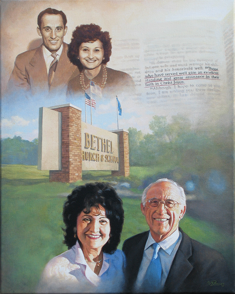
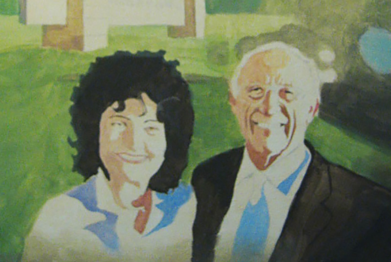
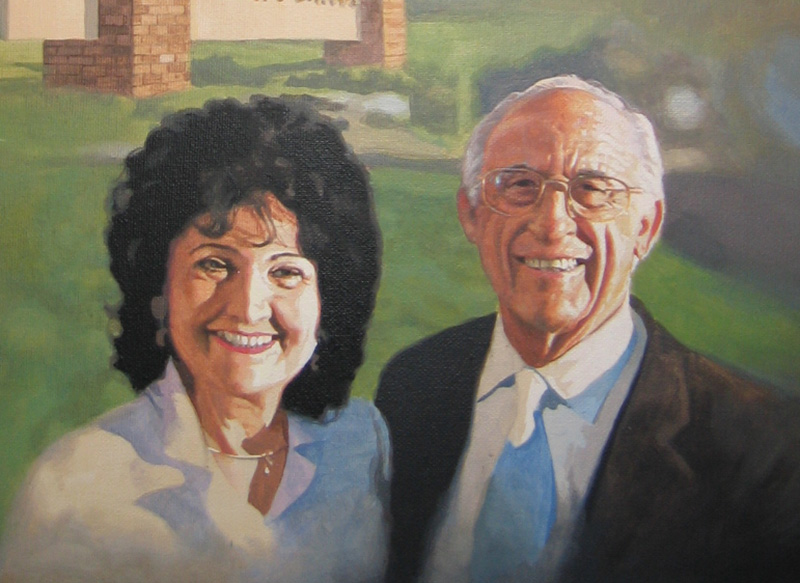
For an example, I’m going to use one of my favorite paintings–a portrait I did for my pastor, Philip Palser, of Bethel Church in Eau Claire, Wis., to commemorate his 80th birthday. As I write, he is turning 93 this month!
Portrait of Pastor & Mrs. Philip Palser of Bethel Church, Eau Claire, Wis., 16″ x 20″ acrylic on canvas, by artist Matt Philleo to commemorate Pastor’s 80th birthday.
He actually doesn’t have to many more wrinkles than what he had 13 years ago. But they may have deepened a bit with age, signifying his experience. 🙂 Both he and his wife are in amazing health for their age.
Now back to the topic of painting wrinkles…
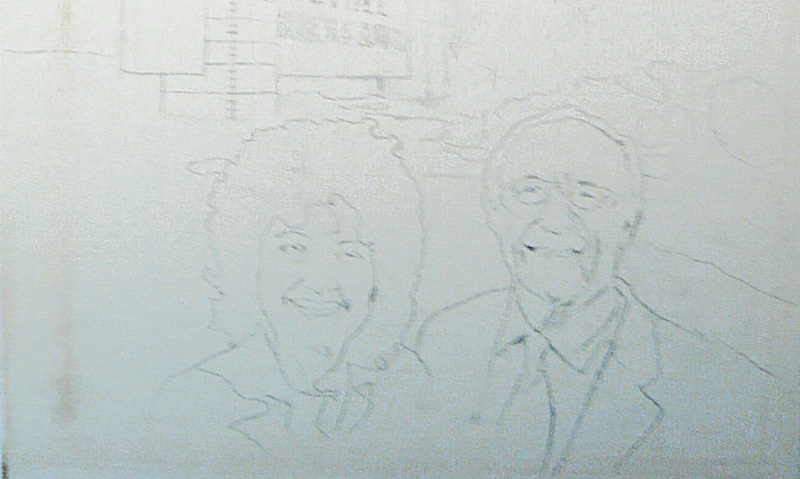
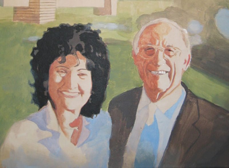
I’m going to show you just the portion of when they are older–mostly concentrating just on my pastor’s face, because his wrinkles are more apparent.
Step 1: the Sketch
I started with a sketch outlining the major details–such as the the creases around the mouth and the major wrinkles in the forehead.
Step 2: Blocking in the Values
Next, I filled in the major values, without a lot of fuss. It is important to accurately define the shapes of the predominant shadows, and put them in their place. They need to stay within their pre-defined boundaries, which ideally would be outlined in the sketch. Now, of course strong lighting–in this case, from the sun–makes this a lot easier.
You may not always have control over this in your portraits, especially if you’re doing a commissioned portrait painting from a photo. But if you can, choose a photo that has strong lighting with a lot of contrast. It really helps model the face, emphasizing its three dimensional form.
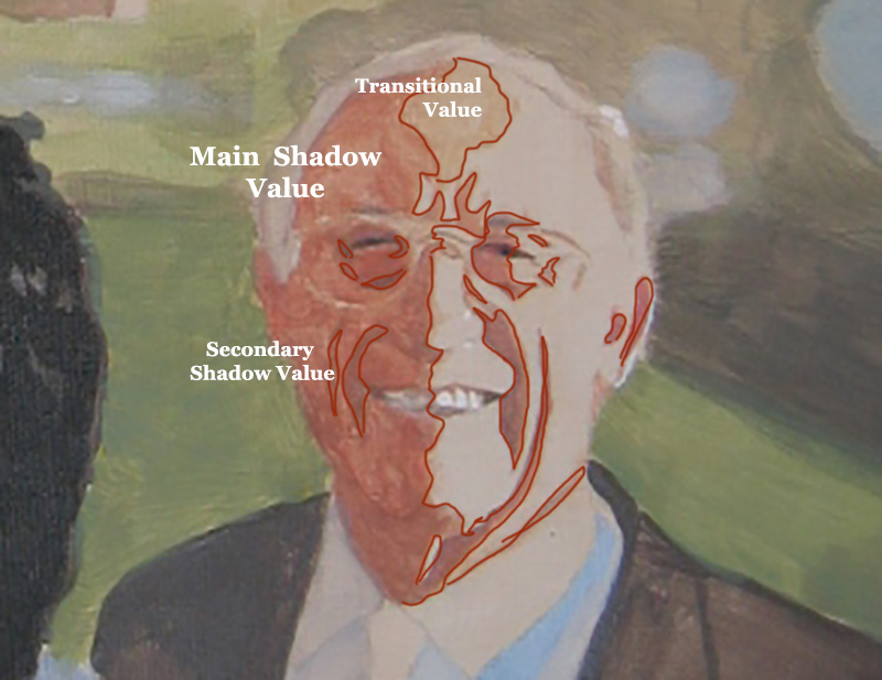
Step 3: Strengthening the Shadows
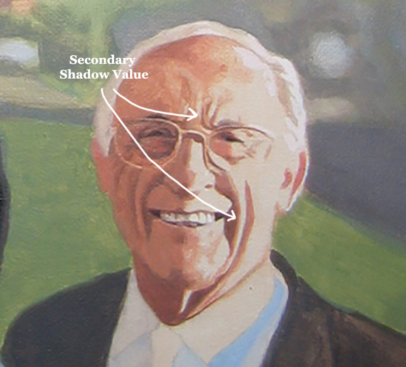
In this step, I am taking what I did in the previous step and darkening everything. I use burnt sienna and raw umber dark to strengthen the contrast. The vertical wrinkles especially in the man’s forehead and the horizontal crows-feet wrinkles by his eyes are more apparent now. But they are still pretty basic. I did paint in just a slight gradation on the wrinkles that run from the nose to the mouth. But it’s still pretty simple.
To explain, I broke down the shadows into three categories: the main shadow value, the secondary shadow value, and then the transitional value. These are terms I’ve made up just to differentiate between everything. If you keep things simple to begin with and build on a firm foundation, you will find it a lot easier to achieve the realism you’re shooting for.
It makes me think of a verse where Jesus says, “Anyone who listens to my teaching and follows it is wise, like a person who builds a house on solid rock.” (Matthew 7:24)
If you can teach yourself to see these abstract shapes within your reference photo, and then replicate them on your canvas, you will experience amazing growth in your skills as a portrait painter.
After getting these values locked in, the trick is to bridge them together with some shading and gradation. Notice the highlighted part of his face is flat.
That is OK.
Later, I’ll paint more depth in that area, but for now, it’s not necessary.
Would you like to learn more about how to paint wrinkles? If so, let me know by clicking the button below, and I’ll create a video tutorial/ course for you!
Although I try to give these stages precise beginnings and endings, I don’t want you to think that I am only “bridging the gaps”–transitioning between values only in this stage. But it is at this time, that I’m concentrating on that the most. You can see I added more detail to the transitional value on his forehead.
And then, in the image below, you can see how I added more of the secondary value (the same value that’s within the wrinkles on the shadow side) to the vertical wrinkles between his eyebrow ridge and the crease alongside his mouth. Now what that does is add another layer of depth to the wrinkles.
And now also, the underside of the wrinkles look like they’re catching some light from the highlighted part of the face. And that increases the realism.
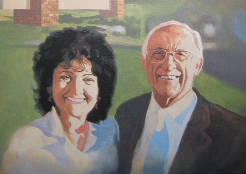
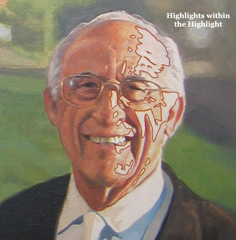
Step 5: Smoothing out and Finishing With Detail
In this step, I take what I built in the previous foundation, and embellish it. When you have a good foundation and you bring it far enough along, the structure of the wrinkles can just about stand up on their own. But by adding some more shading, we can really make it look nice–like putting on the trim. 🙂
What I did here was add highlights on top of the main highlighted area. This give us one more layer of depth to the face. I put the detail in for the horizontal wrinkles in the forehead as well as some highlights that heightened the creases running alongside the mouth. Some of the thin areas of the forehead wrinkles that you would think would be painted with small round brush were actually created by painting the lighter value and “closing them in.”
However, I would use a small brush to refine them if necessary.
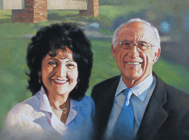
Here is a detail image of the final painting…
How to Paint Wrinkles in an Acrylic Portrait, with step-by-step tutorial, based off 16″ x 20″ acrylic on canvas portrait by Matt Philleo, final
That’s it for now. Hope you found this tutorial helpful. Let me know if you’re interested in learning more on how to paint realistic wrinkles in acrylic. As I write this, I’m considering doing an online course on the topic. But I need to hear from you first, to see if it’s something you would find interesting and benefit from. Let me know!
Have a blessed day, enjoy painting, enjoy life,
P.S. Did you find this post helpful or encouraging? If so, send it on ahead! Let others know with the share buttons below. I’d love to hear your comments. Thank you so much! Also, do you have a question on acrylic portrait painting you’d like answered? Let me know, and I’d be happy to help!
Do you struggle sometimes with getting your acrylic portraits to look lifelike? Many artists do. It may be possible that you are making one or more of the three common mistakes I’ll mention in this article.
I’ve been painting portraits for nearly 25 years, and teaching for the last two. While teaching and critiquing students’ work, I’ve noticed similar mistakes crop up again and again.
The purpose of this article is not to put anyone down.
My goal is to simply show you a few of these mistakes–identify and take the mystery out of them–so that you can be intentional as an artist and avoid making them in your portrait painting.
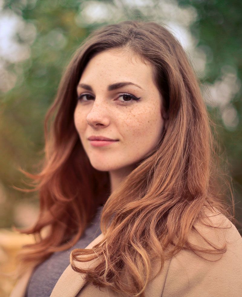
So, to demonstrate, we’ll use a photograph of an attractive young woman. I’ll post it here in it’s unedited form. Obviously, this is not a painting, but rather a photo. But since we strive for realism that would be on par with a photograph (or better if painting from life) this picture will be an example of a fantastic, realistic portrait.
Notice the pose: the woman is smiling gently, the lighting is smooth and even over her face. If I painted a portrait like this, I would be very happy with the results, and I think you would too. The form of her face is accurate, the values, shading, tints and colors, are all in the right place.
That is why it looks realistic.
Now, using Photoshop, I edited this image, and I’ll do a side-by-side comparison between the original photo (we’ll call it the reference) and then the versions with the mistakes. I’ll show you three of the most common. But not many artists are aware of them. Here they are…
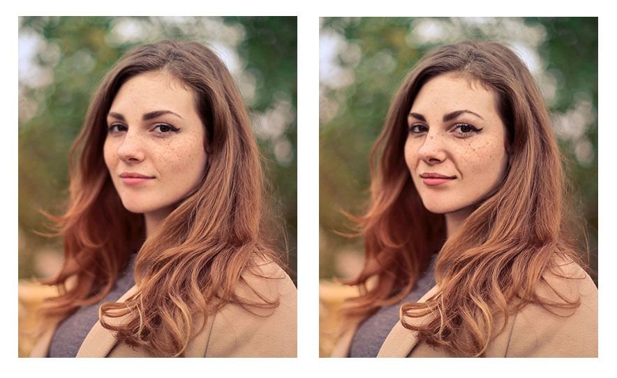
Mistake #1: Over-emphasizing certain details
An artist may see a wrinkle under the eye for example, or running from the nose to the mouth, but the tendency is to make it way darker than it really is–in real life–or as shown by the reference photo. It’s great to be able to see the detail, but too much detail can detract from realism, rather than create it.
You’ll notice angle of the eyebrows are exaggerated. Even the freckles are too large and too dark. That happens often. We observe a feature, a characteristic on someone’s face. But then we overdo it. Like a caricature, we unintentionally make it too prominent. And that detracts from realism.
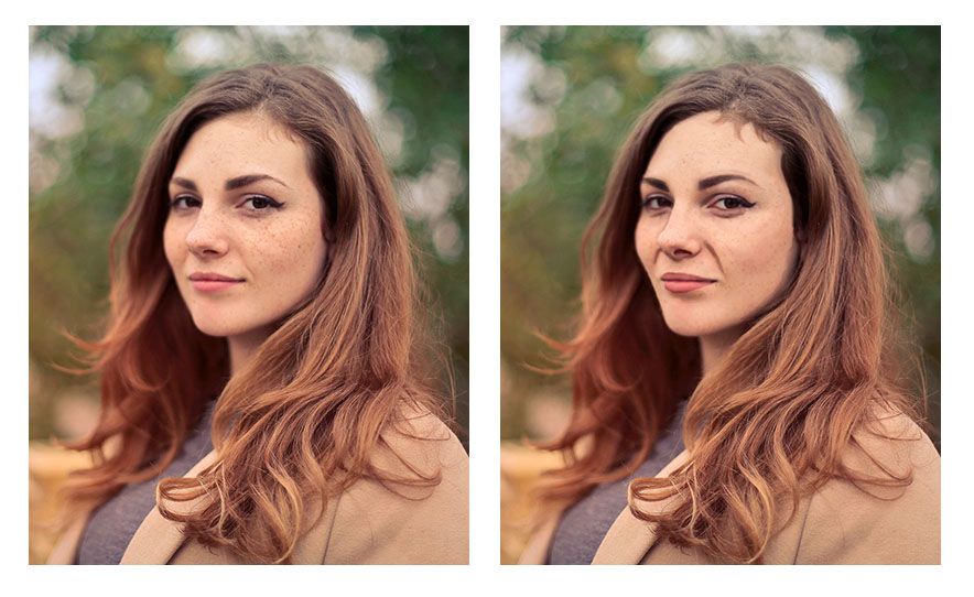
Mistake #2: Over-simplifying complex shapes or angles
Artists may see the wrinkle stretching from the nose to mouth that shows when the subject is smiling. But they paint the shape as one straight line when, in reality, there are a couple different angles merging together to create what looks like one straight line.
In other words, they take a jagged kind of line and smooth it out.
The angle of the woman’s cheek and jaw on the left side (her right) is another example of this. Notice how in the reference photo, it has three distinct curves (you could call them hills) running from the eye down to her chin. But when this over-simplification mistake is made, those curves are merged together into one line–dull, lifeless, and inaccurate.
One final example would be the woman’s eyebrows. Whereas in the original reference photo they have a slight peak to them, here they are completely smooth and curved.
The result looks as if they are painted on.
In realism though, even though everything is painted on, we are always trying to defeat that fact, and create the illusion of three dimensional reality on a two-dimensional surface. Nevertheless, the mistake of over-simplifying details often persists.
Why?
Because, as human beings we want to order our world–make things look more even, more refined. But in nature, there is randomness; that’s the way God created it.
There is beauty in that irregularity. So we need to learn to see what’s really there, and paint that, rather than what we think is there. That is always the challenge. Every artist, no matter how experienced, has to fight that tendency, myself included!
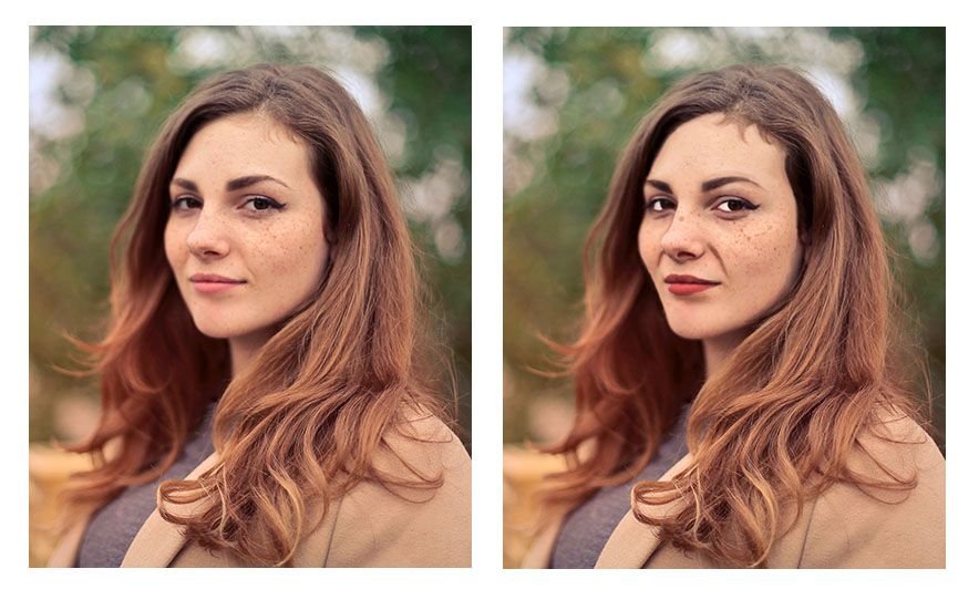
Mistake #3: Painting (and drawing) symbolically rather than representationally
We are taught from childhood that eyes are white, blond hair is colored yellow, lips are red, and so on.
That’s just how we learned to color our coloring books. And so we take that into creating realistic paintings. And we end up with eyes that are way too white, and all the other things.
In reality, eyes actually appear grey, and they can be darker than the skin around them.
Why?
Because the eyebrow ridge, eyelids, and eyelashes cast their shadows over the eye, but once you get below the eye into the cheek, the shadow dissipates. And the skin is actually lighter in value that the eye. That is just one example. But we make that mistake more often than we realize.
You can see from the image how odd it looks to have eyes that are that white. Especially when you compare it side-by-side with the reference photo. The reason is that the values are just completely incorrect with reality.
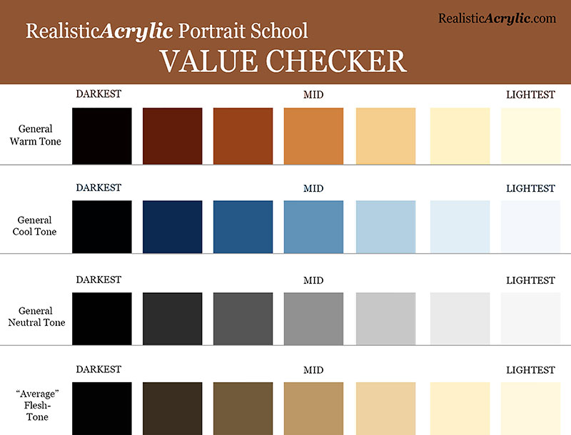
A tool to help you paint better values and realism
A great tool to overcome this is the Value Checker tool. You can print this out, and what you do is hold up the square that has the closest color and value next to the area in question on your painting. Then set that same square above the corresponding area on your reference photo–and see what the difference is.
Get the downloadable, printable Value Checker Tool from Realistic Acrylic Portrait School to double check the values in your portraits and make sure they are accurate.
Do you need to go darker or lighter?
Or, do they match? That’s obviously what we’re shooting for. If they don’t, now you know exactly how far off you are, and you can adjust as needed.
It’s not cheating.
It’s a tool to double-check yourself and help you do your best work possible.
You can download a full resolution version, below, for free and then print it out and keep it as a handy tool in your studio. Let me know how it helps.
I’ll sum up with this: it’s a never ending struggle to paint realism, because we have to fight inherent human tendencies. But it’s a worthy struggle. If you continue in the battle, you’ll amaze yourself at the beauty you can add to the world with your well-crafted fine art portraits.
Here’s my advice on how to improve…
Be aware of these three mistakes. That’s the first step. Then you can catch yourself making them.
When you do, make the necessary adjustments by carefully observing your reference photo. Print it out smaller and tape it with low-tack tape onto your canvas so it’s right next to what you’re painting. Study it and compare the difference.
If you can’t see what to do next, ask an artist friend to critique your work–or ask me. I’d love to help.
However, just the fact that you read this article to the end shows that you have what it takes to improve and create a realistic portrait that you can be proud to show. May God bless you in your portrait painting adventures!
All the best,
P.S. Did you find this post helpful or encouraging? If so, send it on ahead! Let others know with the share buttons below. I’d love to hear your comments. Thank you so much! Also, do you have a question on acrylic portrait painting you’d like answered? Let me know, and I’d be happy to help!
Lifelike Sketch + Accurate Acrylic Layers + Patience= Realistic Acrylic Portrait. The equation works every time.
Even when you make mistakes. 🙂
Don’t worry, this won’t be a math lesson. That was not one of my better subjects in school!
But there is something to be said laying down a good foundation for your acrylic portrait with a lifelike sketch. When I mean lifelike, I don’t mean that it looks photographic, but rather that you capture the likeness of the subject–the person (or pet) you’re going to paint.
When you do that, you exponentially increase your chances for success in painting a realistic acrylic portrait.
Notice I didn’t say perfect. You don’t have to have a perfect sketch, just one that is as accurate as you can make it.
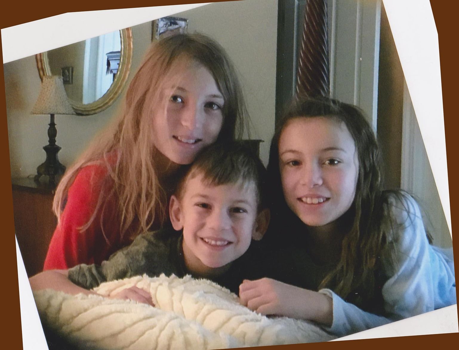
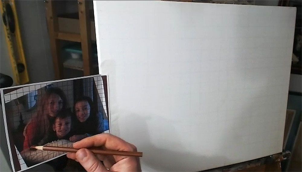
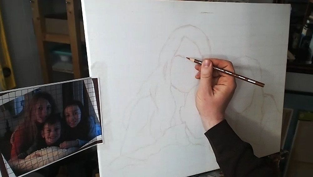
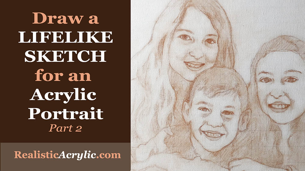
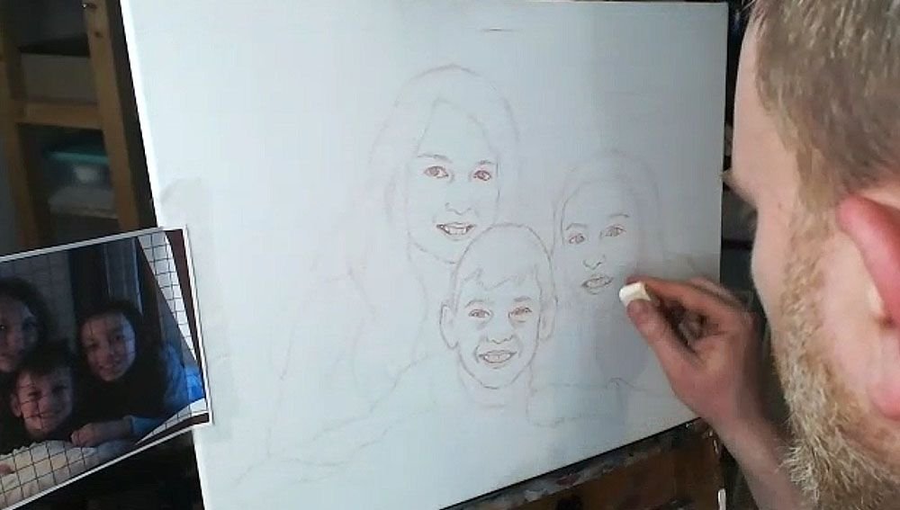
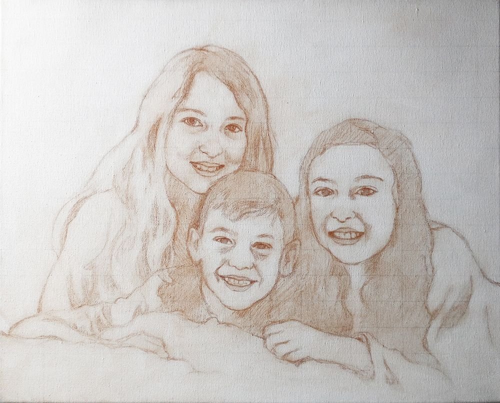
Today, I’m going to show you how I drew the sketch for a commissioned 16″ x 20″ acrylic portrait I’m working on of three children…
…based off a candid photo of them just hanging out on a bed. I tilted the image because I thought it was at an awkward angle. You can obviously see the original angle in shown in the edges.
Tools Needed:
You’ll want to use a sepia-toned colored pencil, like burnt ochre, dark brown, or terra cotta.
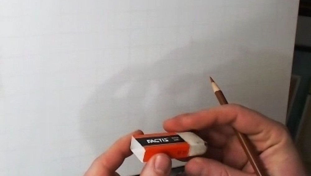
And then a white eraser.
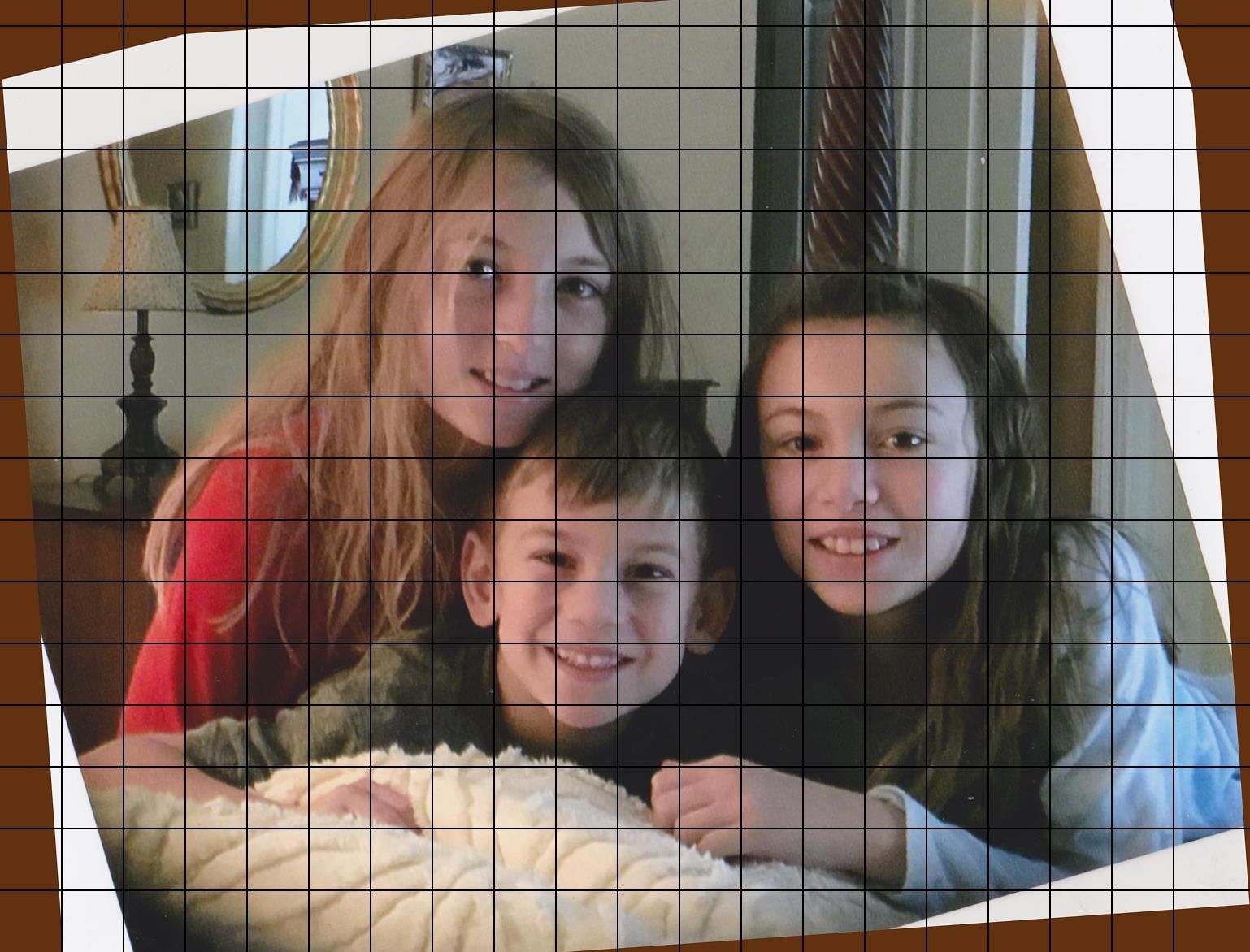
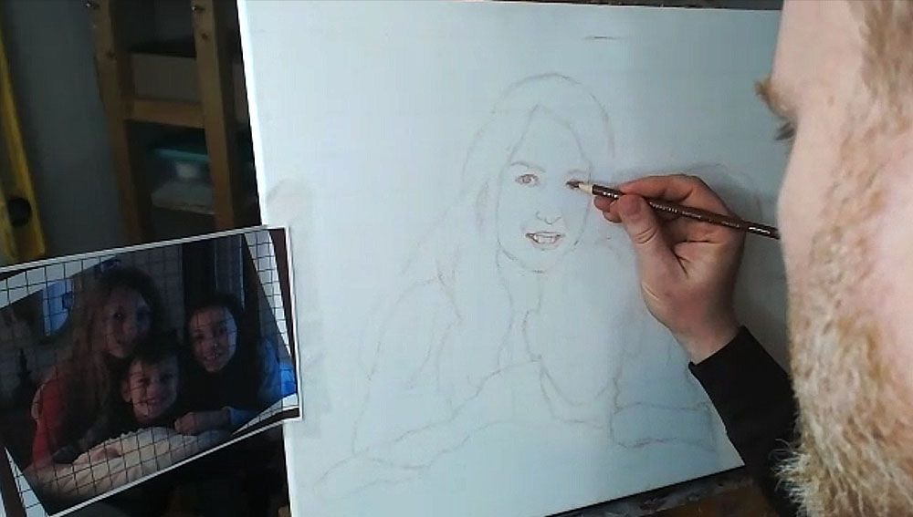
I started with a canvas that I drew a grid on–with 1″ squares, using a light colored pencil (light grey, tan or peach is fine). It is important to seal the grid in with a mixture of matte medium and gesso. This provides a barrier on the canvas so that when you need to erase anything on your sketch, you will not disturb the grid lines beneath. Also, it makes it amazingly easy to erase a sketch on your canvas–much easier than graphite pencil. This is a technique I discovered just by being frustrated with pencil and experimenting.
The photo reference is also gridded correspondingly to match the squares on the canvas. I used a grid drawing tool at ArtTutor.com and then printed out the image.
Alright, now let’s begin…
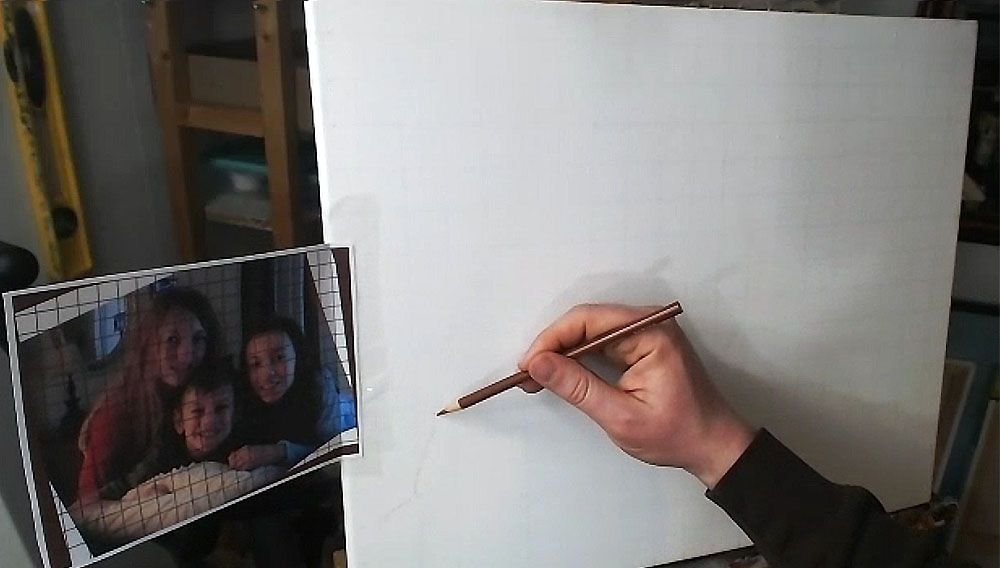
Step 1: Get Started in the Right Place
When using the grid technique, it’s so important to make sure you start sketching in the right place. Otherwise, you may end up sketching for a while, only to realize your composition will be off.
Yes, I made this mistake.
So, count off your squares, and double-check that you’re matching up on your canvas, what is on your reference photo.
Watch this video to see the beginning portion of the sketching process…
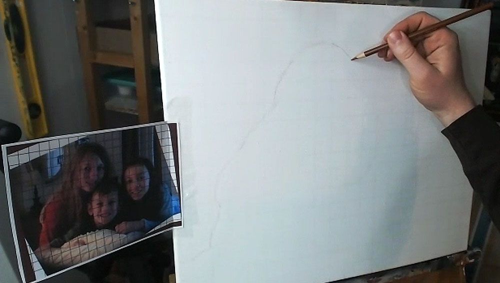
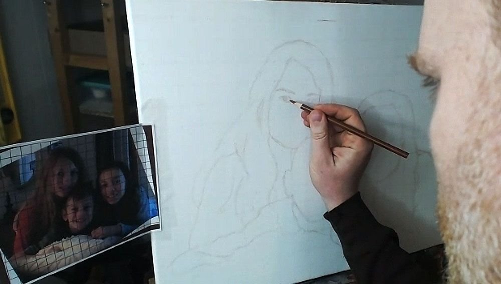
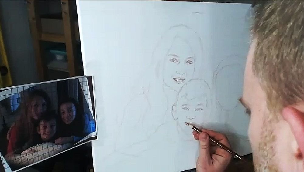
Step 2: Start Your Outlining the Forms of the Subjects
Here, we only want to get just the outside edges of the subjects and then fill them in. I start usually in the lower left corner and then work my way up and across. You don’t need to achieve perfection in this. But it is good to see where the major lines representing the shapes are intersecting the squares. Break it up into fractions.
(Uggh, math again. It’s OK. If I can do it, so can you, believe me!)
You note, “Okay, this line crosses through the vertical line of this square at about 1/2 of the way up.”
Or, “this line intersects the horizontal line of the other square about 2/3 of the way to the edge.”
You may see fractions like 1/4, 1/3, 1/2, 2/5, etc. You’ll begin to see them naturally and not even think about it with some practice. When you learn to do this, your gridded sketching will become very accurate.
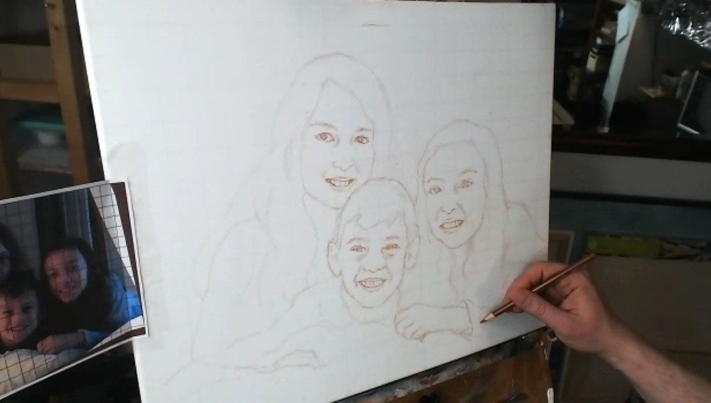
Here is the sketch, with all the outlines filled in.
You’ll notice that I made a pretty large mistake, but thank God for erasers! I considered editing it out of the video, but then I figured, “Why not keep it in there, to show an accurate recording of my process?” We all make mistakes, but it’s what we do after we notice them that counts.
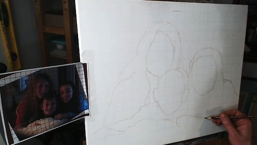
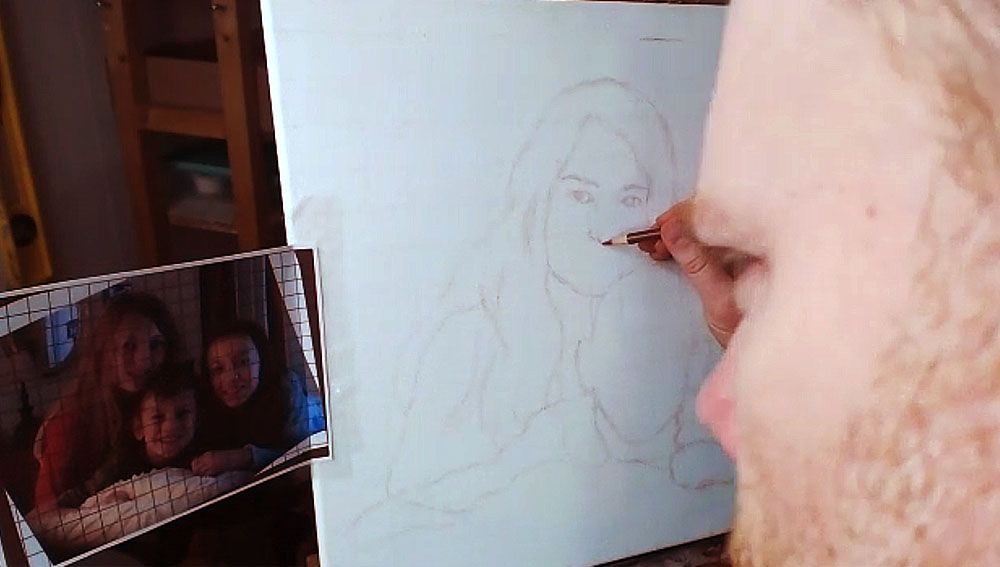
Step 3: Fill in the Features
After getting the proportions of the subjects in correctly–the outside edges of the hair, the shoulders, the faces, etc., then you’re ready to move on to drawing the features. The reason we get the main forms defined first, is because we want to make sure we have an accurate foundation to drop the features on. In addition, you’ll be able to tell if you like the overall composition.
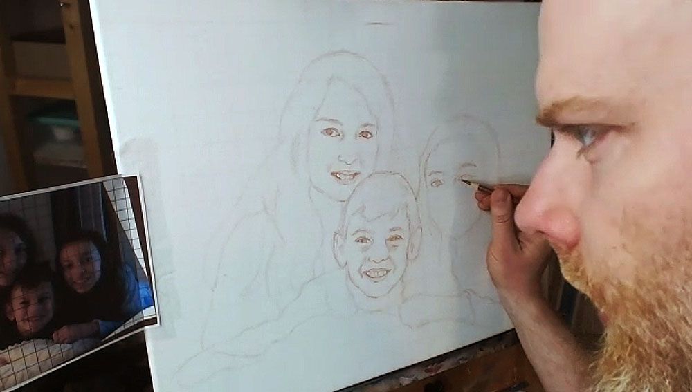
Now, when I start drawing in the facial features, I work from left to right, and then top, down. (Of course, if you’re left handed, you may naturally work in the other direction.)
I start by noting the angle of the eyebrows and sketch them first. Doing this will really establish the alignment of the face and your other features will need to be in conformity with it.
Then I draw the eyes loosely, and not too dark, so I can refine them later. The eyes are the most important feature on the face, so I really pay attention to them.
What is the overall shape? Are they skinny, angled, rounded? Are there prominent eyelids or are they barely perceptible? How far away are they from the eyebrows? How close are they together? Ask yourself these questions as you draw.
If you can get the eyes about 85% or more accurate, you’ll have a good portrait.
If you can get them 95% or more accurate, you’ll have an outstanding portrait, provided the other features are drawn fairly well.
Next, draw in the nose. Observe your reference photo to see how far down the bottom of the nose is from an imaginary line that intersects the eyes. What is the shape of the nose and nostrils? Is it wide, narrow, rounded, sharp? Observe carefully and draw what you see.
After you get the proportions and shape of the nose accurately defined, it’s time to move on to the mouth.
I start with the top of the mouth, drawing in the bottom edge of the top lip and then the top edge of the bottom lip. I sometimes will draw the top edge of the top lip, if it’s very prominent–like, for example, when a woman is wearing lipstick. Of course, that is not the case for this drawing of three children.
I finish with the bottom edge of the bottom lip. Of course, I also draw in the teeth, but only lightly suggesting their form by showing the gumline, and the shadows on the sides where the teeth are foreshortened in perspective, and the lips cast shadows on them. The space between the visible teeth and the edges of the mouth is very important, and you’ll want to indicate it as a dark value, because it is in shadow.
One of the main mistakes I see artists making in their sketch is when they over-define the teeth. It makes the person you’re drawing look like they have braces. Pencil lines are just too dark of a value for the teeth, and it’s hard to overcome in the painting. Draw them lightly, and you’ll get better results.
Watch Part 2 of my video lesson below to see exactly how to do it…
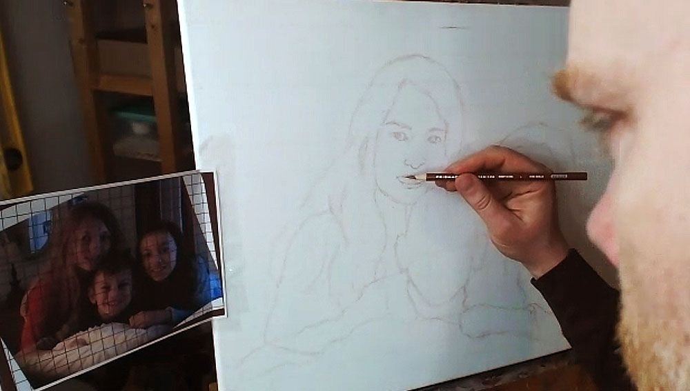
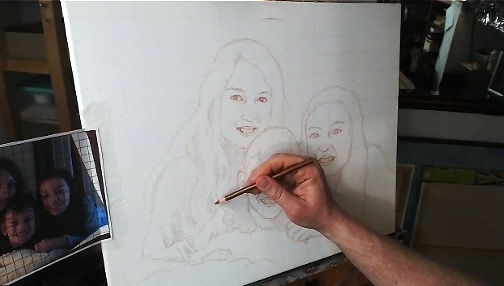
After I get the features sketched in loosely and lightly, then I go back over everything. I darken and refine.
I repeat the process on the other faces.
TIP: Look at your reference photo often as you draw–much more than you are currently. At least 30% is a good rule of thumb.
I can tell you from teaching portraiture in person, that students only rarely look at their reference photo. But you can only draw what you are observing, so observe more and draw better.
But if you make a mistake, you can always use an eraser!
Step 4: Finish Off the Forms
After filling in the facial features, I draw in the hair, hands, wrinkles for the clothing suggesting the shoulders and arms.
Step 5: Shade in the Major Values
Everything we see in the three-dimensional world is viewed in the context of differences in value and color. There really aren’t lines separating anything in nature, even though the concept of a line exists in geometry and we can obviously draw them.
So, with that , I feel it’s important to define the major values in your painting during the sketch stage. You’ll be much better prepared when you start painting. You won’t have to wonder subconsciously, “What do those bunch of lines represent?”
The values will let you know where to apply your first layers in the blocking-in stage of your painting. You can dive right in and do it.
So I fill them in, using the side of my pencil lead, rapidly. It doesn’t need to take much time. I just try to see the major areas of contrast, like the shadows under the faces, wrinkles in the clothing, locks of hair that aren’t illuminated, and represent it on the canvas.
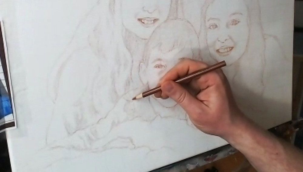
Lastly, you can double-check the facial features on everything, and make sure it’s accurate.
And here’s the final sketch. Not perfect. But close enough that I can rectify any mistakes in the painting and bring it closer to a very accurate likeness.
I’ll be showing more of the process of this painting, breaking it down step-by-step and teaching you as I go along. I look forward to sharing more with you !
Have a blessed day,
P.S. Did you find this post helpful or encouraging? If so, send it on ahead! Let others know with the share buttons below. I’d love to hear your comments. Thank you so much! Also, do you have a question on acrylic portrait painting you’d like answered? Let me know, and I’d be happy to help!
Painting the mouth, especially the teeth, in an acrylic portrait can be tricky.
It’s one of the hardest parts of the face to get right, but it is so important. Teeth are not easy to paint, because of the very subtle shapes, shades of color, and nuances you have to capture correctly to convey a convincing reality of a beautiful smile.
Today, I’m going to show you how to paint realistic teeth using my Old Master’s glazing technique.
1. Using a small round brush grab a little bit of napthol red off your palette…
2. Then a little bit of titanium white…
3. Mix into a warmer color like raw sienna, and dilute with a small amount of matte medium…
4. And then add the shadows just above the teeth, in the crevices between them, on top of the previously painted gums (that have just a light pink glaze on them)…
There’s a lot more! Watch it all here…
The 12-Minute Video Tutorial
(Instruction on painting teeth starts at 3:30 in the video)
And here is the completed portrait of my wife…
Hope you enjoyed this post, and have a blessed day,
P.S. Did you find this post helpful or encouraging? If so, send it on ahead! Let others know with the share buttons below. I’d love to hear your comments. Thank you so much! Also, do you have a question on acrylic portrait painting you’d like answered? Let me know, and I’d be happy to help!
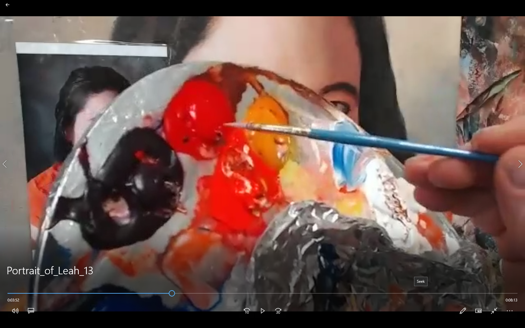
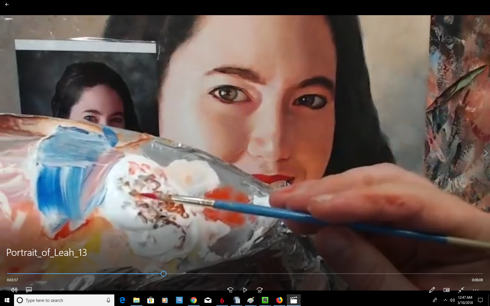
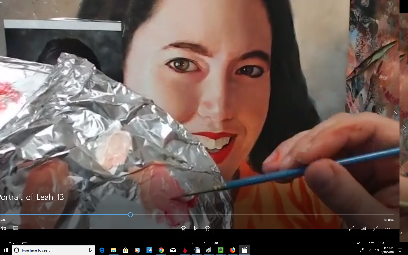
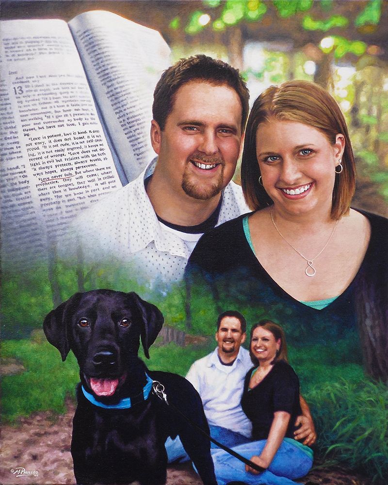
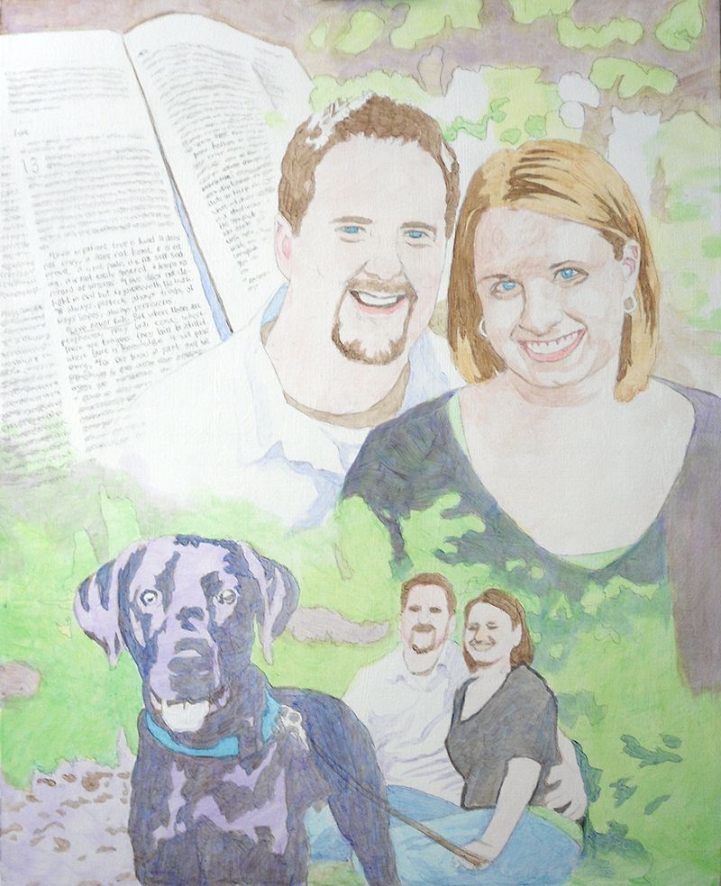
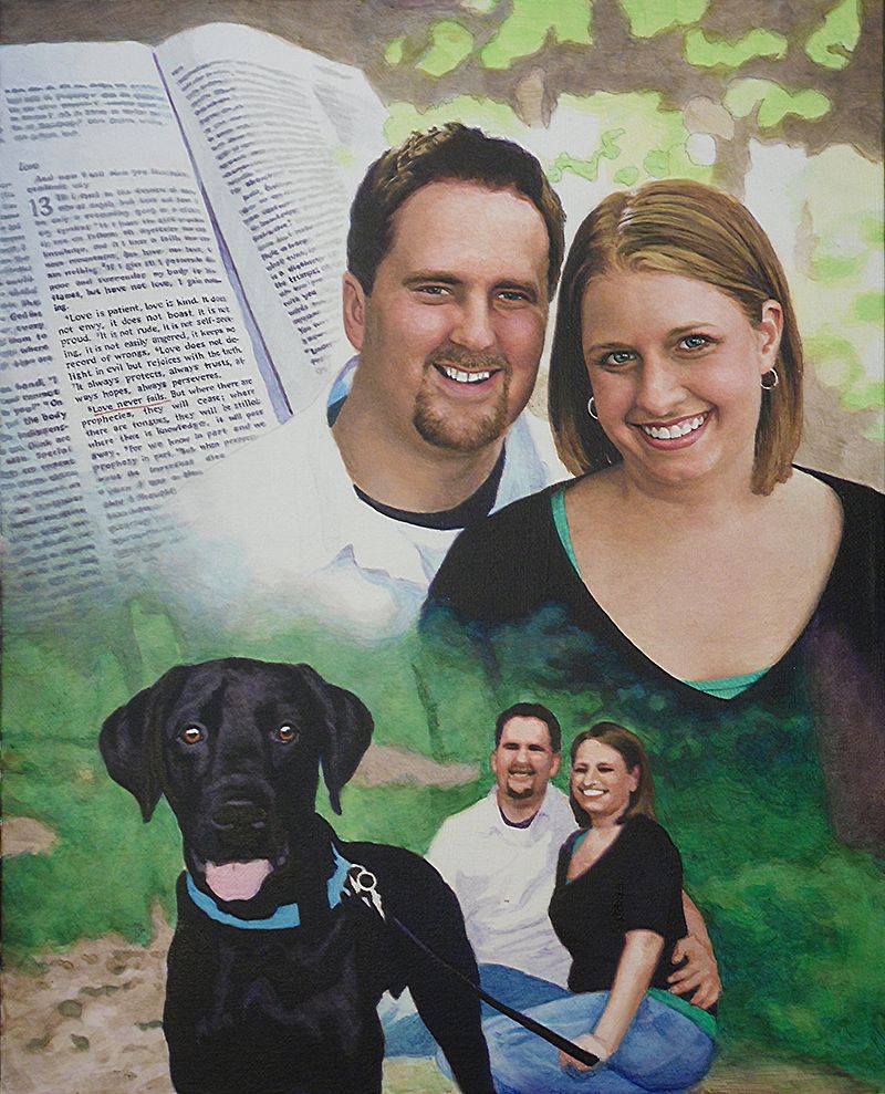
Today, I’d like to show you how I painted a montage portrait–several images put together into one design. This is one of my favorite portraits from several years ago, a 16″ x 20″ acrylic on canvas.
This was to be given as a gift from the mother to her son and his fiance as a unique wedding gift. The idea was to incorporate a large image of them, a picture of them with their dog, and then a scripture verse in the background, that would go with the marriage theme.
Here’s how I did it.
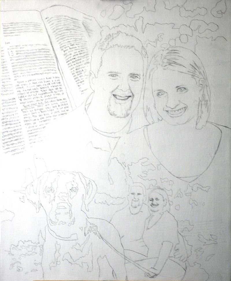
Step 1: The Sketch
After getting my photos together from the client, I did a layout.
This was before I started using the grid method, so I sketched it with a projector and pencil, following the outlines of the photographs closely. The projector sometimes gets things wrong, so you have to go back, double-check your lines and refine accordingly.
Step 2: The Foundation with Light Glazes
The purpose of this step is to quickly establish the tonality of the portrait by getting the colors in the right place. Secondarily, I want to set up my values, by creating immediate contrast between light and dark. I start attacking the darkest values first, using cooler colors like ultramarine blue, raw umber dark and dioxazine purple to create a rich, nuanced black.
This way, when it’s all done, and the viewer takes a close look at the painting, it won’t be flat. You will be able to sense the folds of fabric, and contours around the body of the person within.
My goal is always to create a painting that has immediate impact, but also rewards the viewer for taking a closer look.
For the subjects, I use raw umber dark for the darker values within the hair, raw sienna for the lighter values, and burnt sienna, raw sienna, raw umber dark, and alizarine crimson for the skin tones.
Of course, as with virtually all my painting, the pigment is mixed with a generous portion of matte medium to thin it out, and create the translucent depth that’s similar to the Old Master’s techniques.
Notice how for the trees and background I use a light green, made up of phthalo green, raw sienna, and a little indian yellow. It will give it a lot of luminosity as the light shines through the layers.
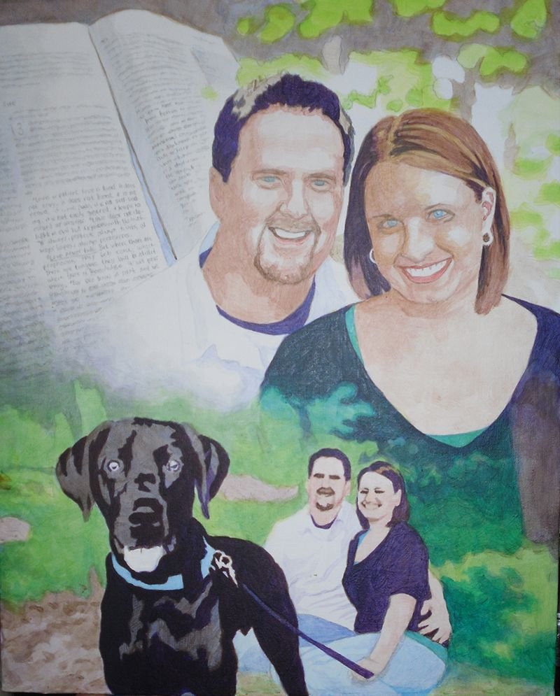
Step 3: Darkening the Deep and Mid-Tone Values
Now that I have the foundation, I go back and add several layers to all the areas within the painting. But mostly, I want to bring the darkest values to about 80% of their full strength. This will give me something to work with as I move the other values in the picture in accord.
I could just go and use full strength pigment, but it gives the painting a nicer finish to darken everything slowly. In addition to that, it gives me the ability to precisely blend even within the dark areas.
Is a black shirt just straight black?
No.
Not when there’s light shining on it. We don’t want to use straight black. Otherwise how can you paint the shadows in representing the beginning and end of arms, chest, waist, and all the appropriate wrinkles within the fabric? Instead we get it dark enough and leave room for the shadows.
And by the way, ivory black is not the darkest color you can get. You’ll get an even deeper black with dioxazine purple, aliazarine crimson, phthalo blue and raw umber dark mixed together.
Why not just settle for black? Well, it’s the same reason why HDTVs boast of having higher contrast. I used to sell LCD TVs years ago when they first came out on the market. They were terrible. The darkest values on the screen were just grey. Therefore the lightest values were not very impressive, and so the whole picture looked weak.
With a painting, you will get a way more dramatic effect if you can use really dark values to set of your lighter areas by contrast. It just reminds me of the way the darkness of sin makes the righteousness of God through Jesus Christ that much more glorious. You have to have some darkness to set off the light. Enough said.
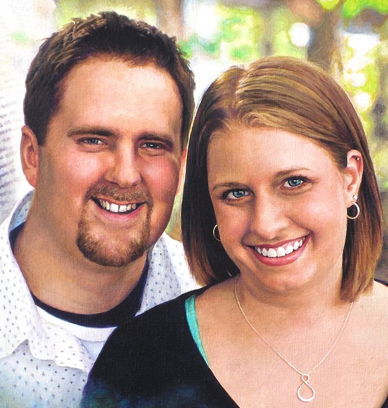
Step 4: Adding Nuances to the Faces
At this point here, it’s time to turn my attention to the most important part of the portrait: the people. And especially their faces. In the previous step, I blocked in the darkest shadows within their faces, but now, I want to add some tie-in values. Those are the tones that bridge the gap between the lightest and darkest values.
So I keep the ones I put down as a good foundation. But now, I’m adding more on top, glazing over translucently, so the bottom layers still remain. That’s how we do this with acrylic–with layers.
I feel like their features–the important ones–like the eyes, eyebrows, nose, and mouth need some work. So I begin to darken them, adding detail wherever it needs it.
It’s good to remember the old adage, “Rome wasn’t built in day.” You have see the big picture and slowly comform your painting to the reference photos. Patience is key. For example, I darken the eyebrows as one solid mass of color–just one shade, but I know after this layer dries, I’ll come back to it again–and again, if need be. Then I will go in and darken just a portion of the eyebrow, while leaving the other part with whatever I did in the previous layer.
By doing this, I can suggest that the eyebrow hairs are thicker in a certain area, or the eye sockets are creating a shadow over that portion. That’s all you have to do. You don’t have to get crazy with drawing each individual hair. That actually detracts from your realism. Just hint at it and let the viewer’s mind’s eye interpret the rest and create the reality for you.
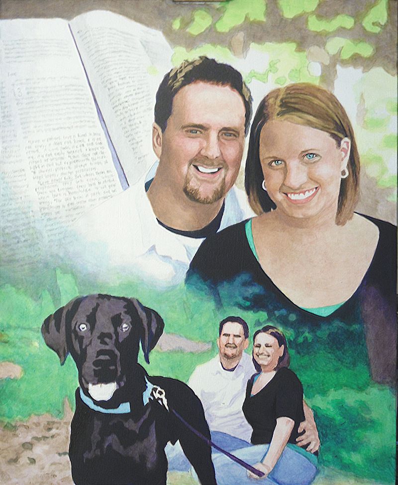
Step 5: Building Up More Nuances Everywhere
In this step, I keep on adding layers to the faces: more layers of alizarine crimson, raw sienna, and some titanium white. Using a average size flat brush (3/8 or smaller) I keep adding nuances to the faces. When I start a portrait I use my largest brushes: typically 1″ or even larger. But as I get toward the end of the project I switch to smaller.
Why?
The smaller brush is good not only for detail work, but also those precise areas of nuances–the subtle transition of shading from the cheek to the area below the eye socket. Or the fleshy area under the chin and neck where the light is reflecting from another illuminated surface.
In this portrait, that is happening: we have the woman’s illuminated chest area reflecting as a secondary light source onto her chin. And so with that, I have to make sure I don’t paint the shadow underneath too dark. Since both the man and woman are outside, it makes sense that the light will really illuminate them well and the shadows won’t get very dark, except on the darker clothing and hair.
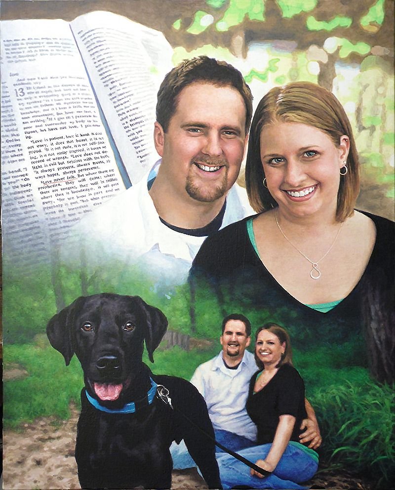
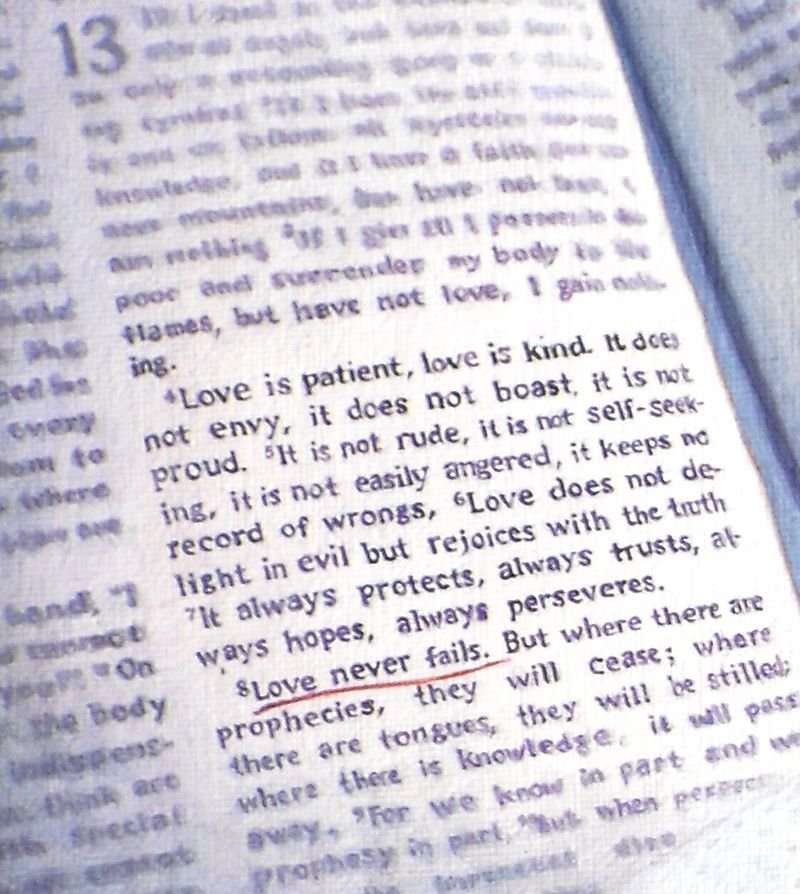
Another area I want to touch on is the Bible, which shows the scripture verse. That’s important part of the painting. I chose to just suggest the text by creating random out-of-focus lines. But the actual verse, “Love never fails” from the famous Corinthians 13 passage, is clearly in focus.
To paint something this detailed on canvas, you have to really make sure you have a nice detail brush, like 1/0 or smaller round, twisted to a point, with very fluid paint. Mist your palette and make sure the paint is about as thin as it can go before getting watery, and it will glide right over the canvas.
It makes painting text a whole lot easier.
Finally, I went over the greenery of the background trees and grass, just adding more nuances. I used phthalo blue, ultramarine blue, and raw sienna for the darker shades. Once you have your initial light green set up, it really sets it off beautifully.
In addition, I painted the dog’s eyes, using brown tones to give it some contrast. I still left the areas representing reflections quite light.
Step 6: Highlights and Advanced Blending
The portrait, at this stage, is starting to look done, but there’s still a lot of work to do. One of the things that can really enhance the realism is using highlights. Although I do like to leave a lot of areas of the canvas untouched for creating my lighter values, it is nice to go back in with some opaque highlights for certain areas.
I feel it gives me the best of both worlds: Glazing is fantastic for building depth and achieving fine gradations in shading, but it creates a roughness that must be overcome with some opaque layers. The trick is to use them just in a few areas.
The hair is one example. Here, I go back in and add just a little titanium white toned down with raw sienna to add the look of diffused light reflecting just at the top of the woman’s silky smooth, straight hair. I also go in and add some slightly darker highlights to the man’s textured short haircut. I already have the base color and value down. Now as I add these highlights, it will quickly change add depth to that area.
Also, I add detail to their teeth. We want to make sure that we don’t overdo it though. We want to use just enough of a light amber grey to suggest that there is separation between them. Raw umber dark mixed with titanium white and thinned by matte medium) is a fantastic way to create shadows for the teeth–in the right value and color.
Once I have the teeth darkened slightly, I can add even more depth by going over with a pin-point highlight of pure titanium white. With this, we just suggest reflections of light over the moist teeth. After it dries, add a tiny glaze of indian yellow, thinned with medium and it will give that white a bit more warmth and luminosity.
You can also do this on the gums. For some people, depending on the structure of their mouth, and the lighting, the gums will catch more of those highlights than the teeth. That was the case for this portrait.
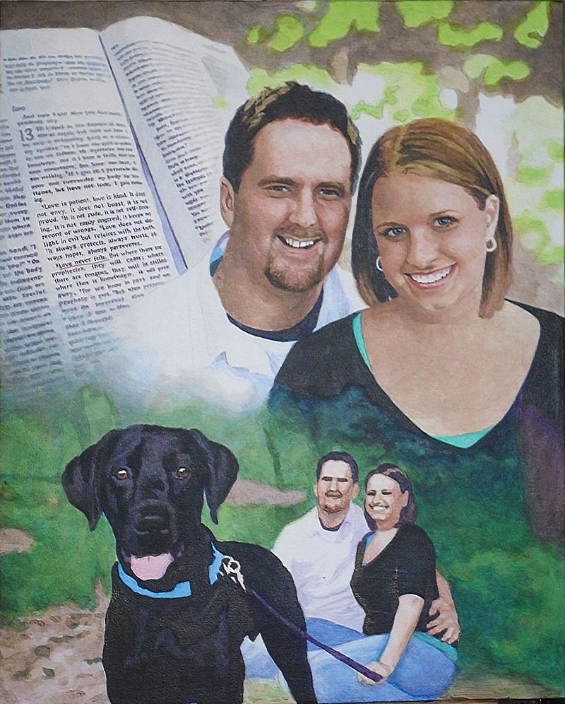
Step 7: Adding the Details
Because this is a collage–or montage–portrait, there’s a lot different elements that need attention. So just when you think you are done, there’s just a little more.
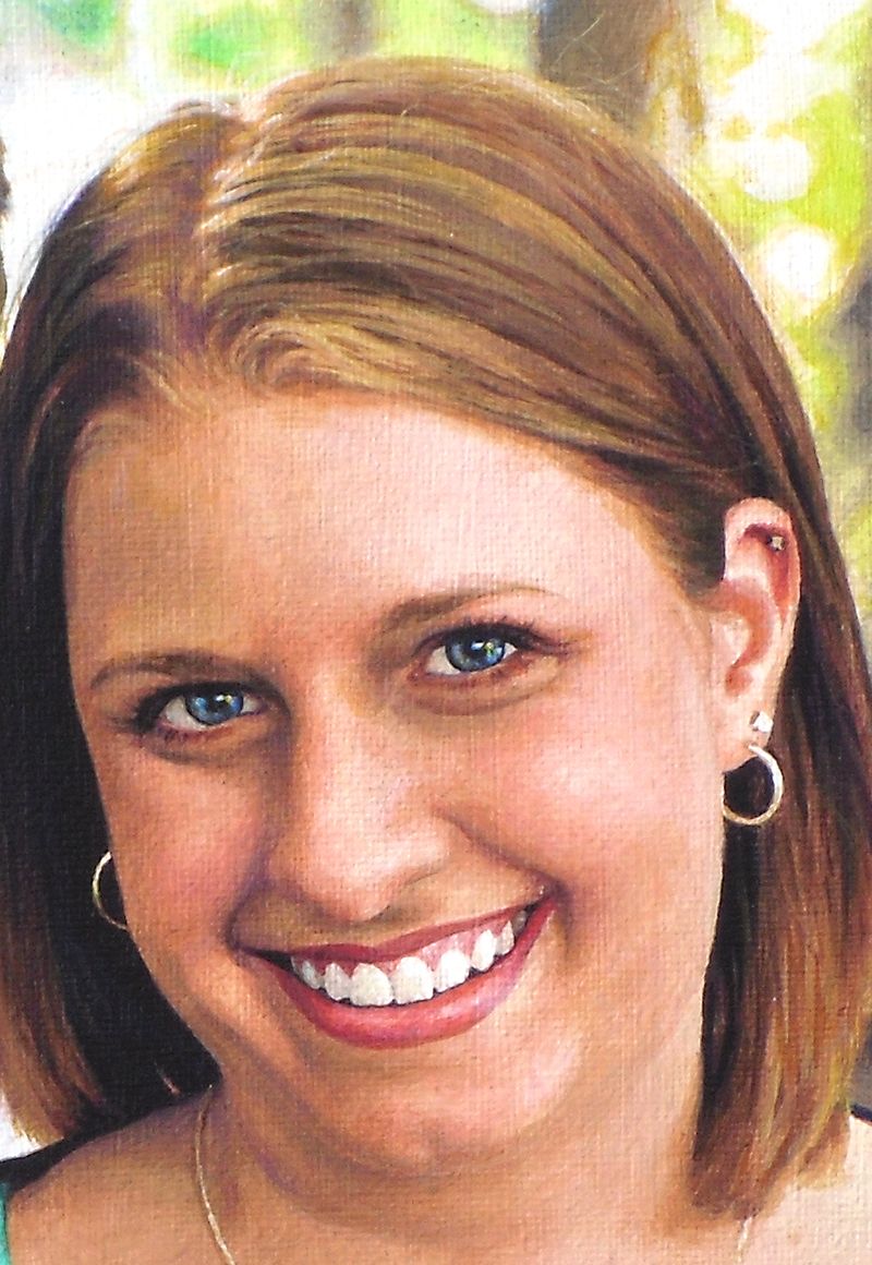
Now, it’s time to add in some more detail to this couple’s background portrait. I noticed that the woman appeared to be looking away from the camera, but by adding just a few darker spots within her eyes on the right side, we suggest that she is looking toward us. It’s just a small amount of work, but it pays dividends in creating that visual connection with the viewer.
It’s time to add the long blades of grass in. I already have the base tones in. It’s just a matter of putting in some darker shadows in angular shapes, and then going over with highlights. Phthalo blue, ultramarine blue, raw sienna, even some yellow ochre and titanium white is what’s used, from darkest to lightest in capturing the effect.
Moving to the left of that, I tackle the jeans for both the man and woman, using the same two blues on my palette. I tend to use ultramarine blue for the darker values and phthalo blue for the lighter. For the darkest shadows I add in some diox purple and raw umber dark so it doesn’t get too bluish.
The Final Painting
With some more nuances here and there, I can call the painting done!
I hope you enjoyed this post and found it valuable. If you have any questions on the techniques used to create this portrait, I would love to help.
Have a blessed day,
P.S. Did you find this post helpful or encouraging? If so, send it on ahead! Let others know with the share buttons below. I’d love to hear your comments. Thank you so much! Also, do you have a question on acrylic portrait painting you’d like answered? Let me know, and I’d be happy to help!