Archive Monthly Archives: April 2018

Top 7 Powerful Techniques for Starting Out in Acrylic Portraits
Begin your portrait painting journey with confidence using these essential acrylic techniques
Are you just starting your journey into acrylic portrait painting? With so many techniques to learn, it’s easy to feel overwhelmed. That’s why I am covering the essential techniques for starting out in acrylic portraits, from choosing the right colors and brushes to creating smooth blends and more. In this post, you’ll find answers to common beginner questions, giving you the tools to bring your portraits to life with ease and confidence! Let’s dive in and explore these foundational techniques together.
Today, I’m going to answer seven fantastic questions from a follower of mine named Andrea. The questions deal with everything from what colors and brushes to use, to blending, to some advanced techniques.
Read below to find out if one of your questions gets answered…
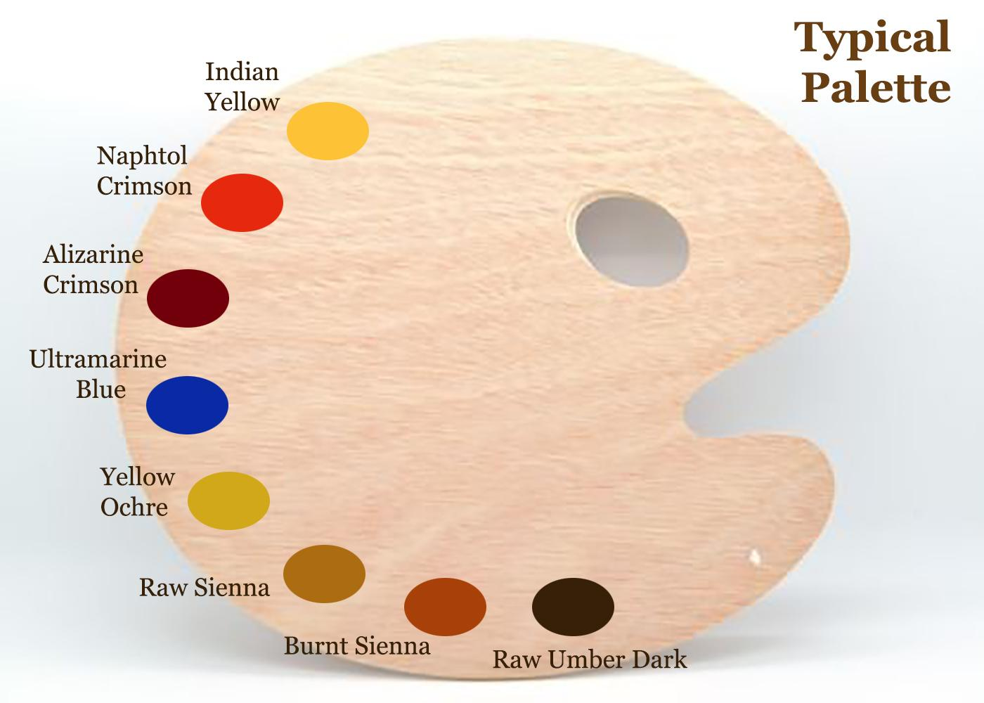
Q #1: What should be my basic color palette for portraits, and mixes for shading?
A: This is my basic palette for painting portraits. I would also have titanium white on it in the upper corner, by the indian yellow. Typically, I start out with raw umber dark and ultramarine blue thinned down with clear matte medium to block in the darker values. I make them into a very translucent glaze of 90% or more medium to 10% or less pigment. Eventually, I work my way into the warmer tones with burnt sienna, raw sienna, and alizarine crimson. The raw umber dark is used to counter-balance those glazes so they don’t get too warm/ orangish.
Q #2: What sort of brushes should I be using?
A: I don’t use anything fancy. Just brushes you can buy at your local art store in a multi-pack, ranging from 1″ flat/ 1/2″ flat, 3/8, flat, and a varied assortment of rounds from size 4 to 3/0. I go through a lot of brushes, so I don’t get anything expensive. But I do have a few nice ones for surface shading and the final varnish coat.
Q #3: How do I keep my paints from drying up, or drying immediately they are applied before I have chance to blend them? I do have retarder but should I be adding this to every color on my palette before I start?
A: No, I don’t recommend a retarder. Some artists like it, but for the classical glazing technique that I use, the faster the paint dries, the better (within reason). Basically, I love the quick drying glazes. It means I can be ready for another coat in about 10-15 minutes. I work various parts of the painting, cycling from the background to the foreground, from the hair to the face, from the clothing, the eyes–whatever. That way, when I move to another part of the portrait, it’s already dry and ready to work on.
Q #4: How do I shade?
A: I have five different ways to blend. Check out my latest blog post here for more info on these techniques…
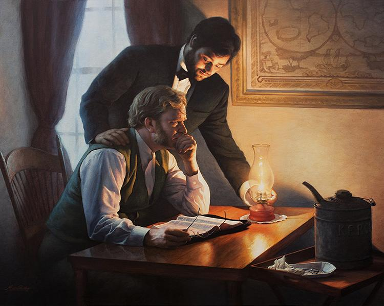
How I Painted the Portrait of My Pastor and His Wife
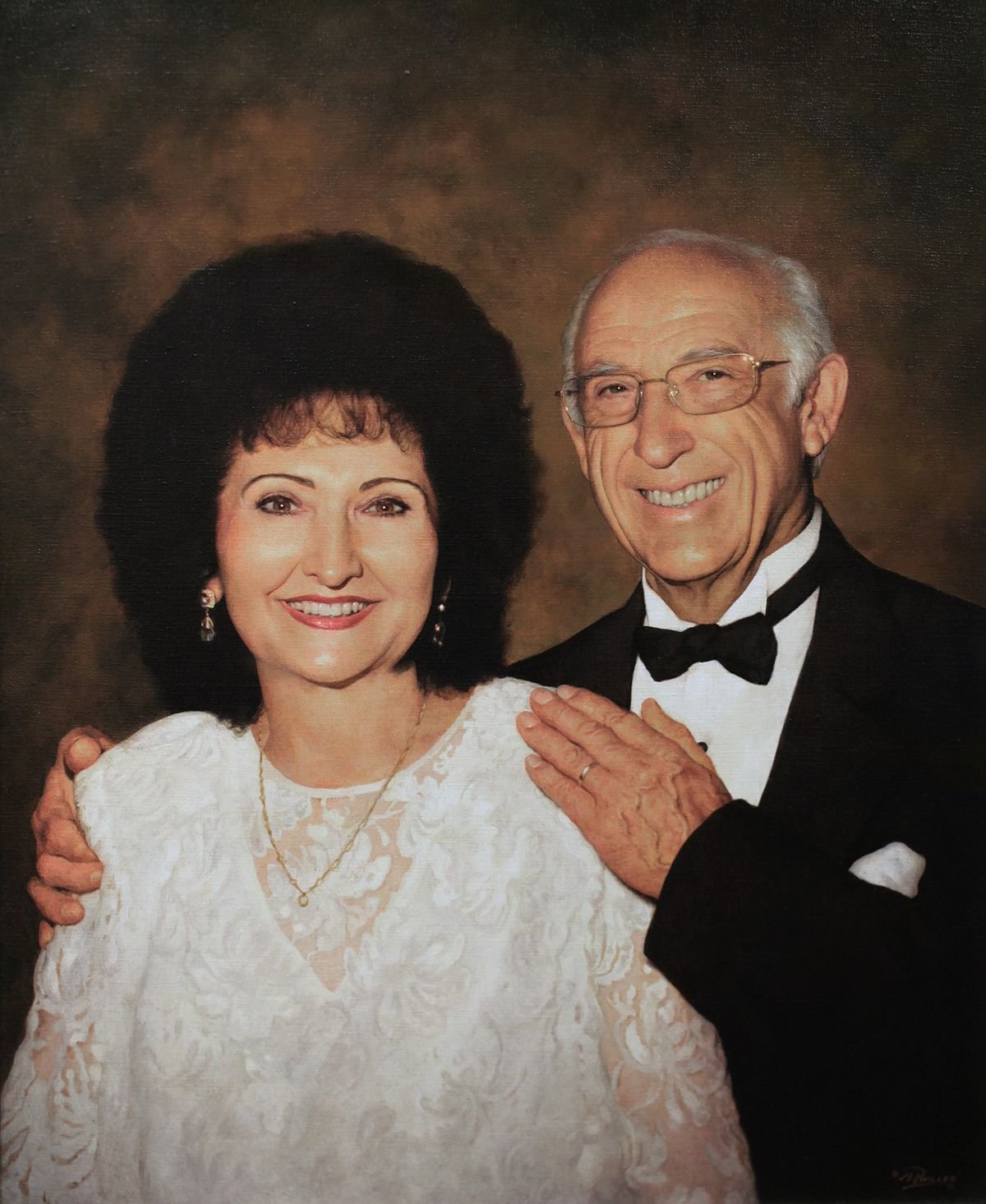
How I Painted the Portrait of My Pastor and His Wife
If you’d like to delve further into how to shade, I created a course on it: “Shade With Acrylic Like a Master.”
Q #5: In what order should I paint? I started with the background.
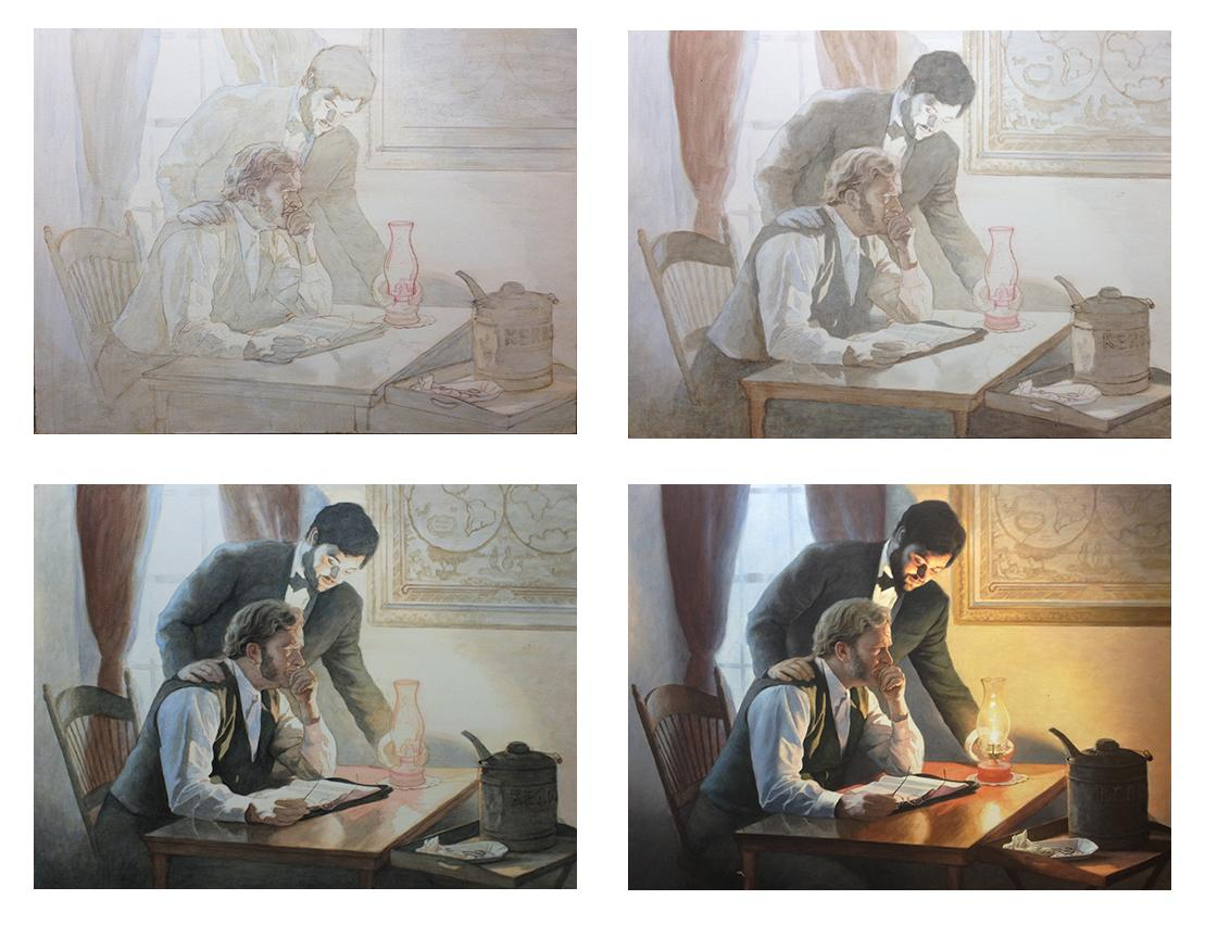
A: I sometimes start with the background, but not always. I want to establish contrast as soon as possible. So I try to fill in the darkest values first. It may be the background, but not necessarily. You can see the progression of how I work below on this example painting, “Smoldering Wick” (30″ x 40″ acrylic on canvas).
Notice, I filled in the darkest values first, and then moved to the lighter areas last…
Q #6: How do I tackle difficult aspects, such as deep creases from the nose to the mouth, the sides of the mouth and wrinkles?
A: I need to do a course on this. Others have chimed in as well, saying they really would like to see how it’s done. I’ll probably start out with a couple videos on the topic and then move into a longer course. But to answer your question, I’ll say this: look for the shadow first. Notice where the light source is at, and then the crease will be shaded on the opposite side. On the side facing the light, there will be a highlight.
Here’s how you do it:
- You paint the shadow of the crease in first, with a thin that’s fairly faint, and that’s one layer.
- Next, you go over that with another layer, that darkens just a few spots within that crease. In any crease or wrinkle, there will always be some areas that are deeper than others, and those need to be darker.
- You paint a thicker line on top of the first line. This line should be even more faint than the existing line, and the color should be slightly warmer.
- You paint a highlight on the opposite side. It should be about the same color as the flesh tone surrounding the crease, but a couple shades lighter and warmer too.
- You may need to add a couple more layers to both the shadow and the highlight to blend it in appropriately.
One quick tip: start out faint and go progressively darker. This is the number one mistake I see in portraits. Artists notice creases and wrinkles, but they paint way too prominently.
Would you like to learn more about how to paint wrinkles? If so, let me know by clicking the button below, and I’ll create a video tutorial/ course for you!
Q #7: What colors should I use for each area, especially the top eyelid, the mouth and the shadows under the eye?
A: This depends on the person. You need to really pay attention to the colors in the picture you’re working from. Generally under the eye, the colors are a bit cooler, because the skin is thinner there and you see the blood vessels on the surface. So, use some ultramarine blue, alizarine crimson, and raw umber dark mixed together and thinned out into a very light glaze. Then go over the area under the eyes with that.
For the mouth, you’ll need alizarine crimson, and napthol red, but it depends on the person. Obviously, a woman with lipstick will need more red on her lips. But even some men have lips that are more red than others.
Let me know how this post helps in your portrait painting. (If you’re not an artist, but you found this interesting, I’d love to hear about it. )
May God bless your painting,

P.S. Is there a question YOU have that wasn’t covered in this post? Just ask! I’d love to help.
If you found this post helpful or encouraging, would you send it on ahead? Let others know with the share buttons below. I’d love to hear your comments. Thank you so much!

3 Common Portrait Painting Mistakes & How to Avoid
Do you struggle sometimes with getting your acrylic portraits to look lifelike? Many artists do. It may be possible that you are making one or more of the three common mistakes I’ll mention in this article.
I’ve been painting portraits for nearly 25 years, and teaching for the last two. While teaching and critiquing students’ work, I’ve noticed similar mistakes crop up again and again.
The purpose of this article is not to put anyone down.
My goal is to simply show you a few of these mistakes–identify and take the mystery out of them–so that you can be intentional as an artist and avoid making them in your portrait painting.
So, to demonstrate, we’ll use a photograph of an attractive young woman. I’ll post it here in it’s unedited form. Obviously, this is not a painting, but rather a photo. But since we strive for realism that would be on par with a photograph (or better if painting from life) this picture will be an example of a fantastic, realistic portrait.
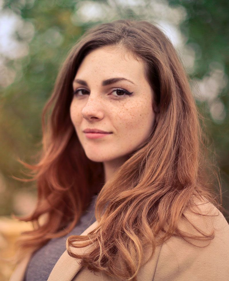
Notice the pose: the woman is smiling gently, the lighting is smooth and even over her face. If I painted a portrait like this, I would be very happy with the results, and I think you would too. The form of her face is accurate, the values, shading, tints and colors, are all in the right place.
That is why it looks realistic.
Now, using Photoshop, I edited this image, and I’ll do a side-by-side comparison between the original photo (we’ll call it the reference) and then the versions with the mistakes. I’ll show you three of the most common. But not many artists are aware of them. Here they are…
Mistake #1: Over-emphasizing certain details
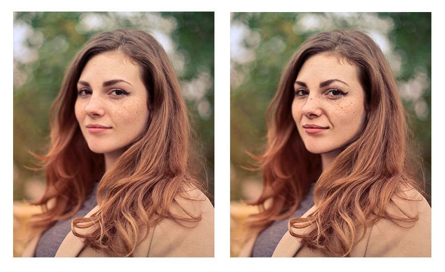
An artist may see a wrinkle under the eye for example, or running from the nose to the mouth, but the tendency is to make it way darker than it really is–in real life–or as shown by the reference photo. It’s great to be able to see the detail, but too much detail can detract from realism, rather than create it.
You’ll notice angle of the eyebrows are exaggerated. Even the freckles are too large and too dark. That happens often. We observe a feature, a characteristic on someone’s face. But then we overdo it. Like a caricature, we unintentionally make it too prominent. And that detracts from realism.
Mistake #2: Over-simplifying complex shapes or angles
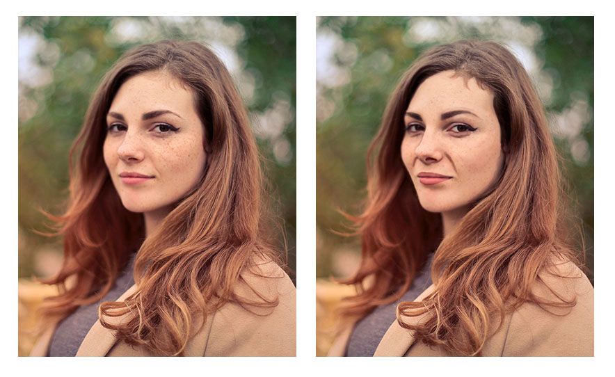
Artists may see the wrinkle stretching from the nose to mouth that shows when the subject is smiling. But they paint the shape as one straight line when, in reality, there are a couple different angles merging together to create what looks like one straight line.
In other words, they take a jagged kind of line and smooth it out.
The angle of the woman’s cheek and jaw on the left side (her right) is another example of this. Notice how in the reference photo, it has three distinct curves (you could call them hills) running from the eye down to her chin. But when this over-simplification mistake is made, those curves are merged together into one line–dull, lifeless, and inaccurate.
One final example would be the woman’s eyebrows. Whereas in the original reference photo they have a slight peak to them, here they are completely smooth and curved.
The result looks as if they are painted on.
In realism though, even though everything is painted on, we are always trying to defeat that fact, and create the illusion of three dimensional reality on a two-dimensional surface. Nevertheless, the mistake of over-simplifying details often persists.
Why?
Because, as human beings we want to order our world–make things look more even, more refined. But in nature, there is randomness; that’s the way God created it.
There is beauty in that irregularity. So we need to learn to see what’s really there, and paint that, rather than what we think is there. That is always the challenge. Every artist, no matter how experienced, has to fight that tendency, myself included!
Mistake #3: Painting (and drawing) symbolically rather than representationally
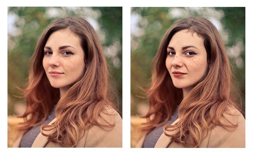
We are taught from childhood that eyes are white, blond hair is colored yellow, lips are red, and so on.
That’s just how we learned to color our coloring books. And so we take that into creating realistic paintings. And we end up with eyes that are way too white, and all the other things.
In reality, eyes actually appear grey, and they can be darker than the skin around them.
Why?
Because the eyebrow ridge, eyelids, and eyelashes cast their shadows over the eye, but once you get below the eye into the cheek, the shadow dissipates. And the skin is actually lighter in value that the eye. That is just one example. But we make that mistake more often than we realize.
You can see from the image how odd it looks to have eyes that are that white. Especially when you compare it side-by-side with the reference photo. The reason is that the values are just completely incorrect with reality.
A tool to help you paint better values and realism
A great tool to overcome this is the Value Checker tool. You can print this out, and what you do is hold up the square that has the closest color and value next to the area in question on your painting. Then set that same square above the corresponding area on your reference photo–and see what the difference is.
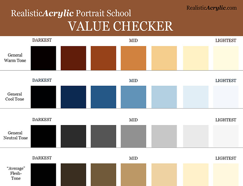
Get the downloadable, printable Value Checker Tool from Realistic Acrylic Portrait School to double check the values in your portraits and make sure they are accurate.
Do you need to go darker or lighter?
Or, do they match? That’s obviously what we’re shooting for. If they don’t, now you know exactly how far off you are, and you can adjust as needed.
It’s not cheating.
It’s a tool to double-check yourself and help you do your best work possible.
You can download a full resolution version, below, for free and then print it out and keep it as a handy tool in your studio. Let me know how it helps.
I’ll sum up with this: it’s a never ending struggle to paint realism, because we have to fight inherent human tendencies. But it’s a worthy struggle. If you continue in the battle, you’ll amaze yourself at the beauty you can add to the world with your well-crafted fine art portraits.
Here’s my advice on how to improve…
Be aware of these three mistakes. That’s the first step. Then you can catch yourself making them.
When you do, make the necessary adjustments by carefully observing your reference photo. Print it out smaller and tape it with low-tack tape onto your canvas so it’s right next to what you’re painting. Study it and compare the difference.
If you can’t see what to do next, ask an artist friend to critique your work–or ask me. I’d love to help.
However, just the fact that you read this article to the end shows that you have what it takes to improve and create a realistic portrait that you can be proud to show. May God bless you in your portrait painting adventures!
All the best,

P.S. Did you find this post helpful or encouraging? If so, send it on ahead! Let others know with the share buttons below. I’d love to hear your comments. Thank you so much! Also, do you have a question on acrylic portrait painting you’d like answered? Let me know, and I’d be happy to help!

How to Paint an Acrylic Portrait You Can Be Proud Of
What would it feel like for you to truly be able to paint a portrait in acrylic you could be proud of?
…to give as a high quality gift, display in a show, or to get a “thumbs up” and a good price for your artwork when you do a commission? How would it feel to not struggle with finding the right skin tone, or get the blending in the colors right? Or to be able to paint a person’s face and not have it look flat?
Imagine how it would feel to know how to mix the paint and control the brush..and get a realistic result…predictably.
I’ve been painting portraits in acrylic for over 20 years, and started teaching out of my studio two years ago.
The next year I started teaching online when one of my email subscribers, in her mid-80’s, urged me to put a course together. We chatted on the phone and she asked me how much I would charge for an online painting class.
“How about $97?” I replied.
“I’ll mail you a check right away.”
Just like that, I had a paying student…I had to teach the class now!
I asked some other folks on my email list if they wanted in, and about 10 more students instantly enrolled. Since then, I’ve taught almost 100 students literally all over the world, and it’s been so enjoyable to see the progress they’ve made.
If you want to learn how to paint a portrait in acrylic that you’ll be proud of, then learning directly in a step-by-step video course is best way to cut through the fog, and achieve results fast.
That’s why I created an online course called “Paint Your First Amazing Acrylic Portrait.”
![]()
It’s a complete step by step video course, showing you exactly how to paint a portrait in acrylic, from the sketch to the finished, signed painting. All the lessons are online, available for you to watch at your own pace, 24/7.
Click here to learn more/ enroll
Judy, one of my students in this course, just started acrylic portrait painting a couple months ago. She was having some difficulty and felt stuck in her painting progress, so she emailed me asking for a critique. (You can request a personal critique, too, as a student of my course!)
Here’s what she emailed me after I sent her the interactive video critique…
“Hi Matt,
Thank you so much, that is so helpful. You said it so well when you talked about “being intimidated by the painting” that was exactly how I felt – a kind of stage fright, haha maybe “easel anxiety” anyway as I listened to your critique I just felt it unlock.

I feel excited about making those changes. I laughed when I saw that despite staring at the photo for hours and hours I never noticed a piece of his ear was missing in my painting.
Then Judy finished that painting, utilizing the techniques in my course and some tips in my critique, and wrote me again:
“Hi Matt,
Here is my painting that I’ve been working on. I’m really thrilled with it and it will work with Maurice’s portrait.
I’ve been learning so much – how to fix a mistake, and how to wait patiently for paint to dry.


I made a mistake straight off by using a lead pencil instead of the one you recommended I use ( which was right there next to it). Bet I will never do that again! I’m really getting a feel for mixing glazes and I’m having so much fun.
Thank you so much you inspiring teacher!”
Cheers,
Judy
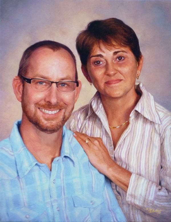
I love the beautiful husband/ wife portraits Judy did side by side. Not only has she enjoyed the painting process, but she has two paintings she’s proud to show. And she has only started painting.
You can do this too. You can save time, paint, and frustration. You can learn how to paint a lifelike portrait that you can confidently show others, by taking my course.
I’d love to have you as a student!
All the best,
P.S. It is the one-year anniversary since I created this course in April of ’17. If you are wanting to take the next step in painting, here’s your best opportunity. I truly believe if you take the course, your portraits will dramatically improve. Why? Because the techniques work, and that is what I have seen happen for several of my students. Hope you’ll be one of them!
Click here to learn more/ enroll

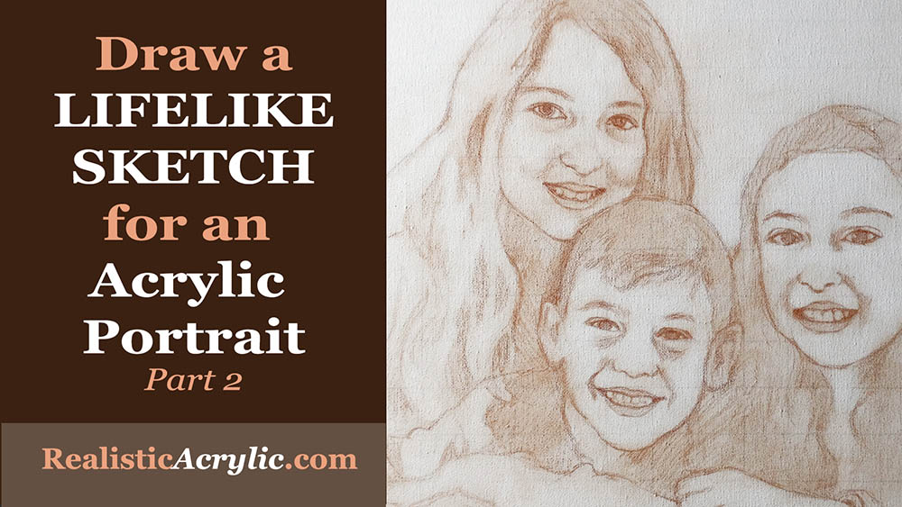
How to Draw a Lifelike Sketch for an Acrylic Portrait
Lifelike Sketch + Accurate Acrylic Layers + Patience= Realistic Acrylic Portrait. The equation works every time.
Even when you make mistakes. 🙂
Don’t worry, this won’t be a math lesson. That was not one of my better subjects in school!
But there is something to be said laying down a good foundation for your acrylic portrait with a lifelike sketch. When I mean lifelike, I don’t mean that it looks photographic, but rather that you capture the likeness of the subject–the person (or pet) you’re going to paint.
When you do that, you exponentially increase your chances for success in painting a realistic acrylic portrait.
Notice I didn’t say perfect. You don’t have to have a perfect sketch, just one that is as accurate as you can make it.
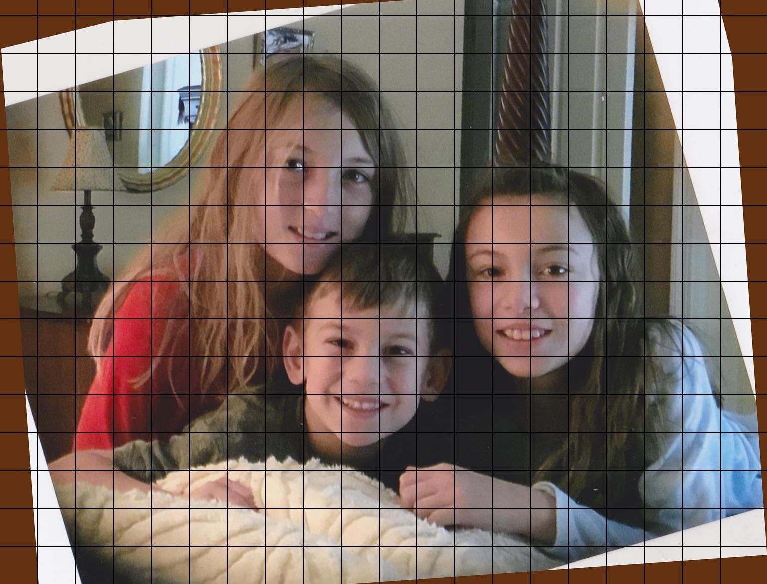
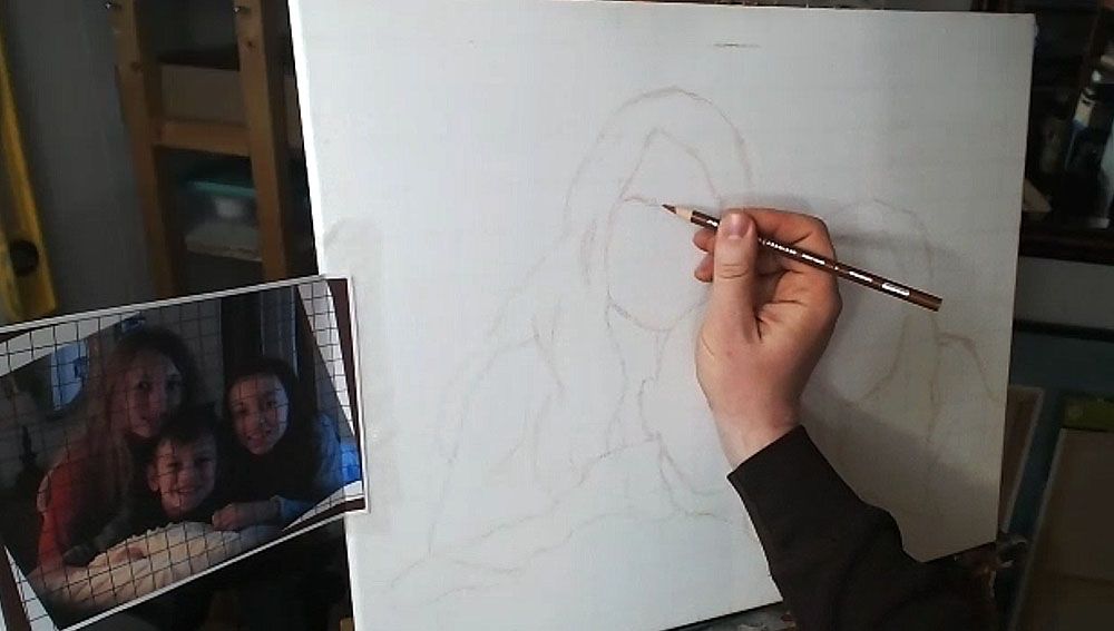
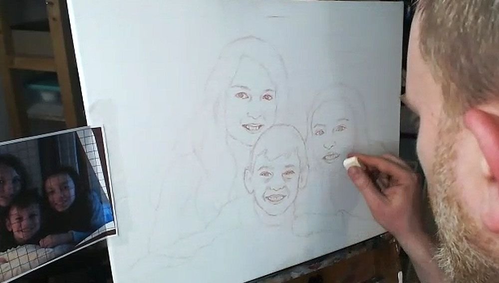
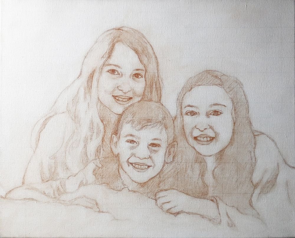
Today, I’m going to show you how I drew the sketch for a commissioned 16″ x 20″ acrylic portrait I’m working on of three children…
…based off a candid photo of them just hanging out on a bed. I tilted the image because I thought it was at an awkward angle. You can obviously see the original angle in shown in the edges.

Tools Needed:
You’ll want to use a sepia-toned colored pencil, like burnt ochre, dark brown, or terra cotta.
And then a white eraser.
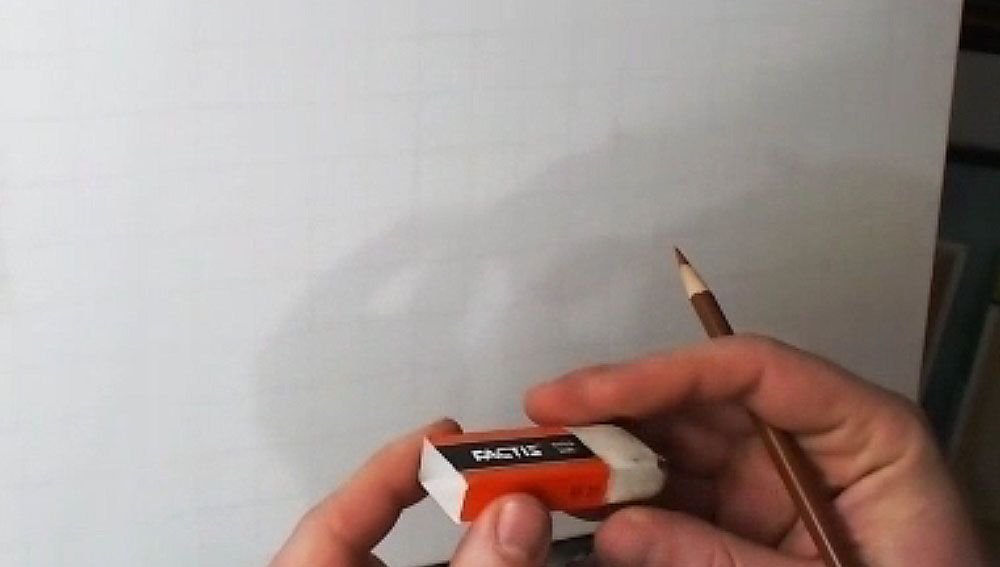
I started with a canvas that I drew a grid on–with 1″ squares, using a light colored pencil (light grey, tan or peach is fine). It is important to seal the grid in with a mixture of matte medium and gesso. This provides a barrier on the canvas so that when you need to erase anything on your sketch, you will not disturb the grid lines beneath. Also, it makes it amazingly easy to erase a sketch on your canvas–much easier than graphite pencil. This is a technique I discovered just by being frustrated with pencil and experimenting.
The photo reference is also gridded correspondingly to match the squares on the canvas. I used a grid drawing tool at ArtTutor.com and then printed out the image.
Alright, now let’s begin…
Step 1: Get Started in the Right Place
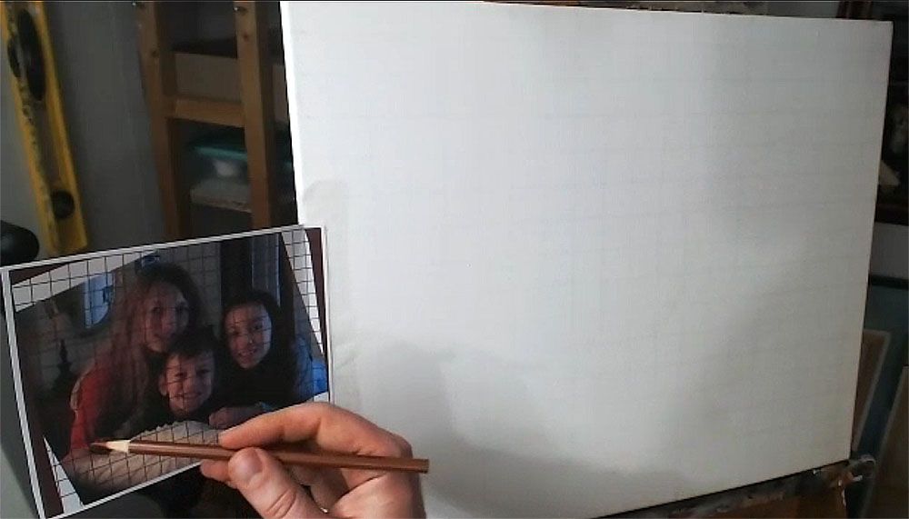
When using the grid technique, it’s so important to make sure you start sketching in the right place. Otherwise, you may end up sketching for a while, only to realize your composition will be off.
Yes, I made this mistake.
So, count off your squares, and double-check that you’re matching up on your canvas, what is on your reference photo.
Watch this video to see the beginning portion of the sketching process…
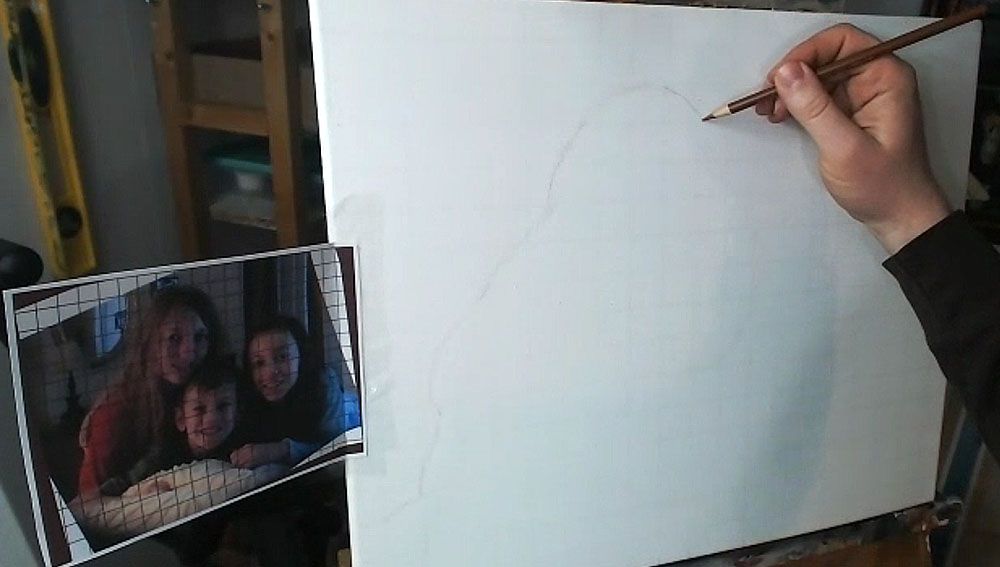
Step 2: Start Your Outlining the Forms of the Subjects
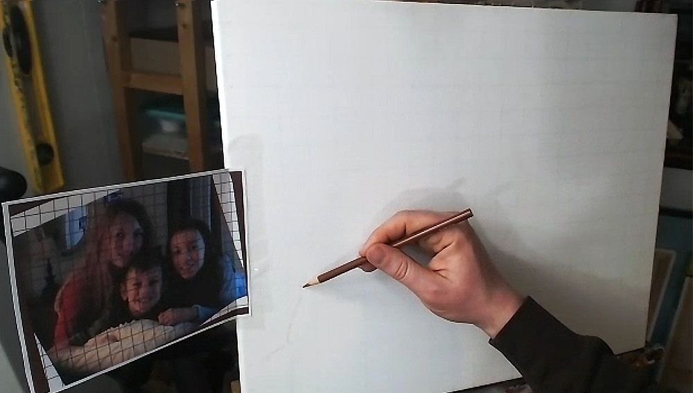
Here, we only want to get just the outside edges of the subjects and then fill them in. I start usually in the lower left corner and then work my way up and across. You don’t need to achieve perfection in this. But it is good to see where the major lines representing the shapes are intersecting the squares. Break it up into fractions.
(Uggh, math again. It’s OK. If I can do it, so can you, believe me!)
You note, “Okay, this line crosses through the vertical line of this square at about 1/2 of the way up.”
Or, “this line intersects the horizontal line of the other square about 2/3 of the way to the edge.”
You may see fractions like 1/4, 1/3, 1/2, 2/5, etc. You’ll begin to see them naturally and not even think about it with some practice. When you learn to do this, your gridded sketching will become very accurate.
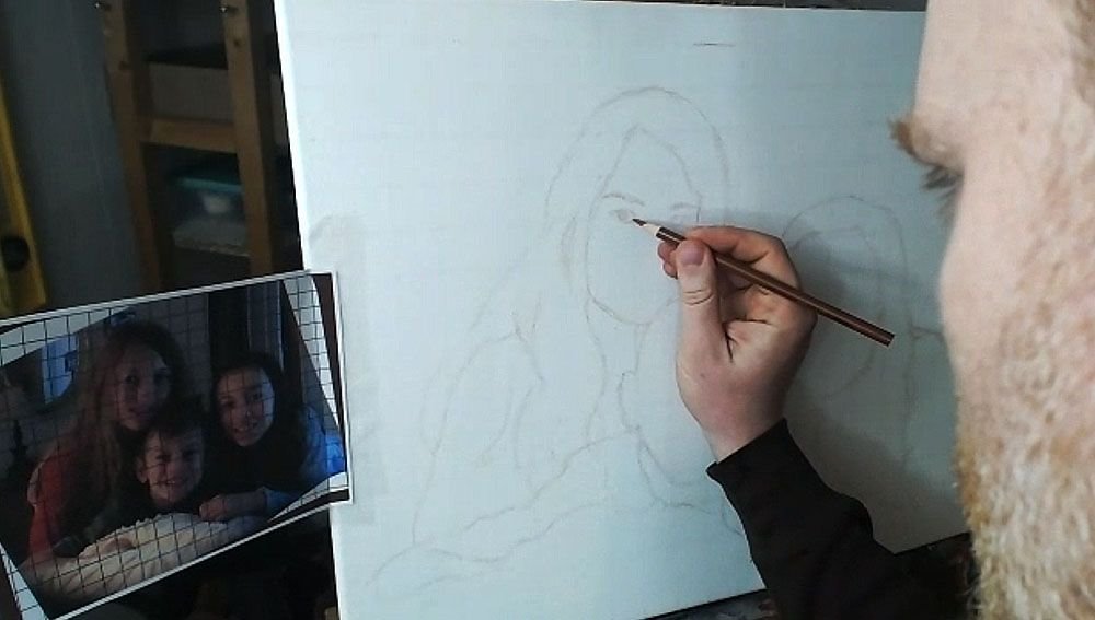
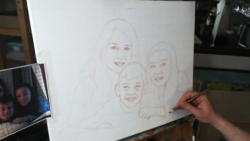
Here is the sketch, with all the outlines filled in.
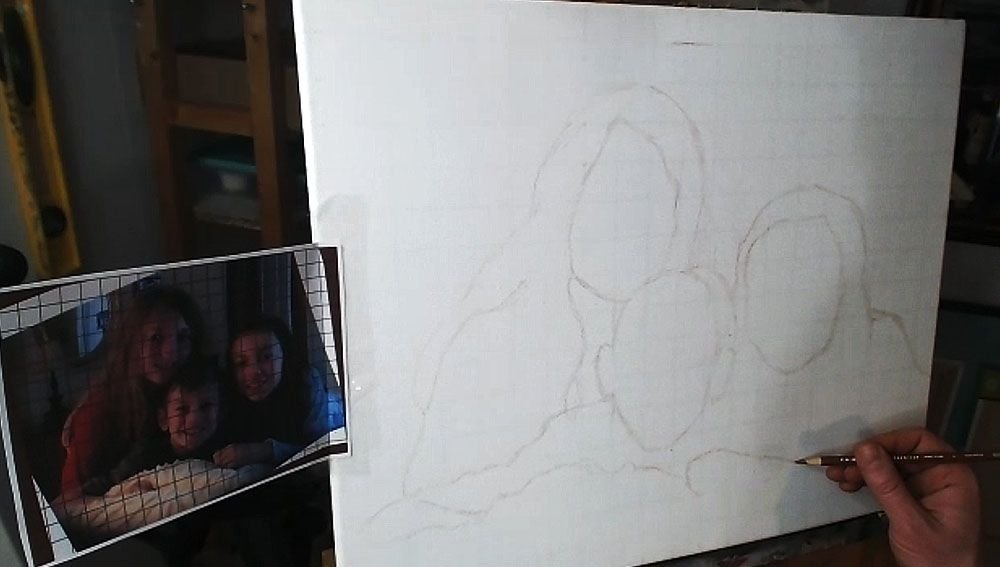
You’ll notice that I made a pretty large mistake, but thank God for erasers! I considered editing it out of the video, but then I figured, “Why not keep it in there, to show an accurate recording of my process?” We all make mistakes, but it’s what we do after we notice them that counts.
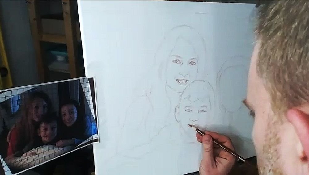
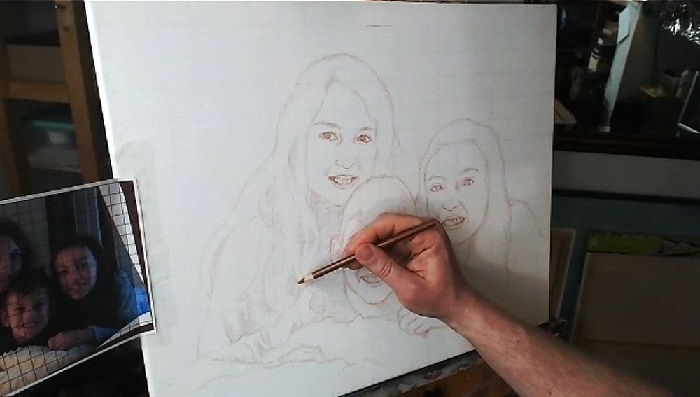
Step 3: Fill in the Features
After getting the proportions of the subjects in correctly–the outside edges of the hair, the shoulders, the faces, etc., then you’re ready to move on to drawing the features. The reason we get the main forms defined first, is because we want to make sure we have an accurate foundation to drop the features on. In addition, you’ll be able to tell if you like the overall composition.
Now, when I start drawing in the facial features, I work from left to right, and then top, down. (Of course, if you’re left handed, you may naturally work in the other direction.)
I start by noting the angle of the eyebrows and sketch them first. Doing this will really establish the alignment of the face and your other features will need to be in conformity with it.
Then I draw the eyes loosely, and not too dark, so I can refine them later. The eyes are the most important feature on the face, so I really pay attention to them.
What is the overall shape? Are they skinny, angled, rounded? Are there prominent eyelids or are they barely perceptible? How far away are they from the eyebrows? How close are they together? Ask yourself these questions as you draw.
If you can get the eyes about 85% or more accurate, you’ll have a good portrait.
If you can get them 95% or more accurate, you’ll have an outstanding portrait, provided the other features are drawn fairly well.
Next, draw in the nose. Observe your reference photo to see how far down the bottom of the nose is from an imaginary line that intersects the eyes. What is the shape of the nose and nostrils? Is it wide, narrow, rounded, sharp? Observe carefully and draw what you see.
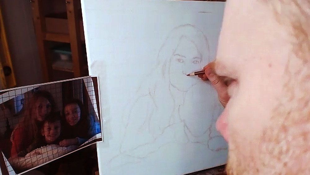
After you get the proportions and shape of the nose accurately defined, it’s time to move on to the mouth.
I start with the top of the mouth, drawing in the bottom edge of the top lip and then the top edge of the bottom lip. I sometimes will draw the top edge of the top lip, if it’s very prominent–like, for example, when a woman is wearing lipstick. Of course, that is not the case for this drawing of three children.
I finish with the bottom edge of the bottom lip. Of course, I also draw in the teeth, but only lightly suggesting their form by showing the gumline, and the shadows on the sides where the teeth are foreshortened in perspective, and the lips cast shadows on them. The space between the visible teeth and the edges of the mouth is very important, and you’ll want to indicate it as a dark value, because it is in shadow.
One of the main mistakes I see artists making in their sketch is when they over-define the teeth. It makes the person you’re drawing look like they have braces. Pencil lines are just too dark of a value for the teeth, and it’s hard to overcome in the painting. Draw them lightly, and you’ll get better results.
Watch Part 2 of my video lesson below to see exactly how to do it…
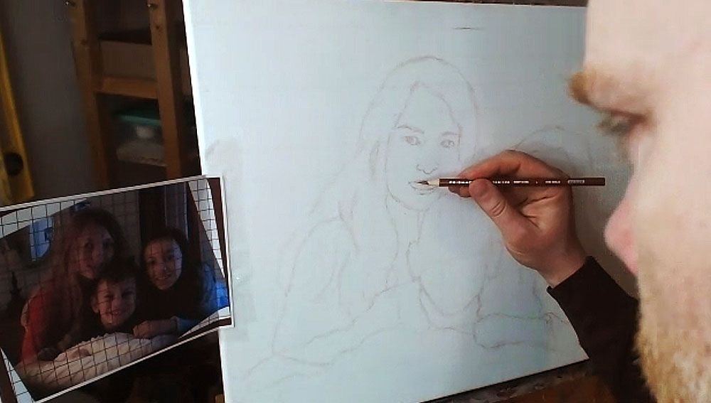
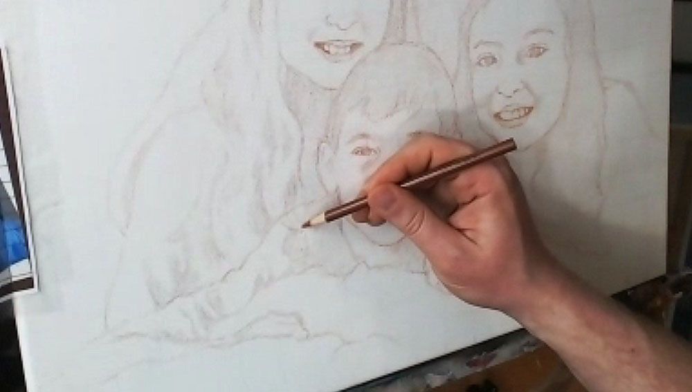
After I get the features sketched in loosely and lightly, then I go back over everything. I darken and refine.
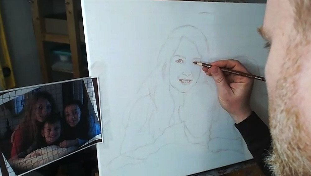
I repeat the process on the other faces.
TIP: Look at your reference photo often as you draw–much more than you are currently. At least 30% is a good rule of thumb.
I can tell you from teaching portraiture in person, that students only rarely look at their reference photo. But you can only draw what you are observing, so observe more and draw better.
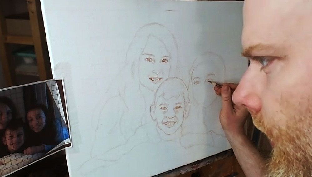
But if you make a mistake, you can always use an eraser!
Step 4: Finish Off the Forms
After filling in the facial features, I draw in the hair, hands, wrinkles for the clothing suggesting the shoulders and arms.
Step 5: Shade in the Major Values
Everything we see in the three-dimensional world is viewed in the context of differences in value and color. There really aren’t lines separating anything in nature, even though the concept of a line exists in geometry and we can obviously draw them.
So, with that , I feel it’s important to define the major values in your painting during the sketch stage. You’ll be much better prepared when you start painting. You won’t have to wonder subconsciously, “What do those bunch of lines represent?”
The values will let you know where to apply your first layers in the blocking-in stage of your painting. You can dive right in and do it.
So I fill them in, using the side of my pencil lead, rapidly. It doesn’t need to take much time. I just try to see the major areas of contrast, like the shadows under the faces, wrinkles in the clothing, locks of hair that aren’t illuminated, and represent it on the canvas.
Lastly, you can double-check the facial features on everything, and make sure it’s accurate.
And here’s the final sketch. Not perfect. But close enough that I can rectify any mistakes in the painting and bring it closer to a very accurate likeness.
I’ll be showing more of the process of this painting, breaking it down step-by-step and teaching you as I go along. I look forward to sharing more with you !
Have a blessed day,
P.S. Did you find this post helpful or encouraging? If so, send it on ahead! Let others know with the share buttons below. I’d love to hear your comments. Thank you so much! Also, do you have a question on acrylic portrait painting you’d like answered? Let me know, and I’d be happy to help!