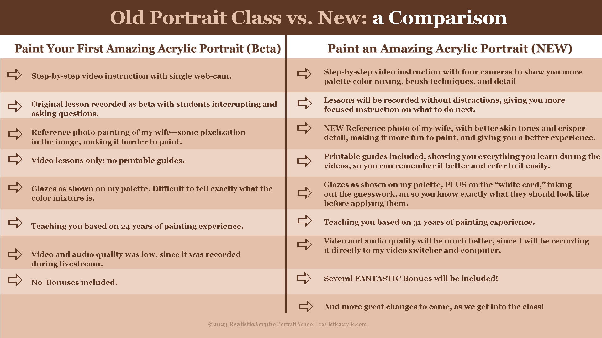
I’m SO excited for the new painting class that I will be opening up tomorrow!
So what’s the difference between that one and the old one?
Well, the first one, “Paint Your First Amazing Acrylic Portrait,” was launched waaaay back in 2017. Oneof my online followers, Dorothy, asked and asked and asked me when I was going to teach a class. I had taught in-person classes for a while, but I wasn’t sure if it was possible to teach online.
Despite my uncertainty, a very eagerDorothy, who was in her 80’s, bought a webcam and I walked her through on how to set it up. Then she asked me, “IFyou were to teach a class, how much would you charge?”
I researched online, and it seemed like $97 was a good price. So I told her, and she said, “I’ll mail you a check.”
So now,I HAD to do the class!
I let the people on my email list of 141 people know and 10 signed up! And that was my original class. I taught it all live. I bought an online class teaching me how to teach an online class. They said, “it’s better just to do it imperfectly than to be a perfectionist and not do it at all.”
I took that to heart and decided to take action.
From several conversations with artists, I learned what they wanted in a class, and what frustrations they were experiencing while trying to paint a portraitin acrylic. I created my lesson plan based on that.
Quickly,Isuspended my webcam with some sticks and wire on the ceiling and started meeting with the students once a week, and recording the lessons.
That first class was good—for a beta class—and hundreds of students got great results from it.But I know it could be better. I’ve gotten tons of feedback. Like hundreds of comments from students to know what to improve.
So what will be the difference between the classes?
Let me show you.
As you can see, God willing, the new class will be TONS better! I am excited to offer it to you.
Tomorrow, I’ll give you more details andopen it up for enrollment.
Students who are new to my glazing technique have a lot of questions. So many mediums to choose from. Which ones are best to use…and why?
That’s what I want to discuss today.
Here’s a portion of an email I got from one of my students:
As you know, I am currently working on your portrait course at the moment, however, I have a question that I hope you can clarify. All previous information I have looked up indicates that when applying glazes, acrylic matte medium dries cloudy and gloss medium dries clear and obviously glossy. Can you just explain it for me why we only use matte medium for glazing in your tutorial, as my initial thoughts would be that the cloudiness would just build up? Or am I just missing the l point in that this is how we build up the underpainting of the portrait? Many Thanks, R—
This is a good question.
So, what’s better for glazing? Matte medium or gloss medium?
Let me answer that with the reply I sent back to my student.
I use matte medium for three reasons:
1. It dries to a flat finish and so it doesn’t react with the lights in my studio, producing distracting glare.
2. Because it dries to a flat finish, it is closer to the sheen of paint, and so when you have areas that are more opaque and less opaque, they match up better. In other words, you can perceive the values more accurately. A glossy finish will make colors look more saturated and deepen values. When you put a varnish over the painting, it would present a problem, causing certain subtle nuances that seemed to look correct, suddenly become inaccurate. (Yes, this happened to me!)
3. Matte medium is usually less expensive than gloss medium. With the copious amounts of medium that I use, this adds up!
Now, I don’t find that matte medium builds up cloudiness, in the way that I teach. It will get cloudy, if you have areas of your painting that are quite dark or saturated, and you overlap those areas with a very transparent (high ratio of matte medium to paint) glaze.
But I don’t do it that way in my paintings. Rather, I start off very transparent, (95-5) then shift to more translucent (80-20), and finally end up with semi-opaque layers (50-50) over portions of the work.
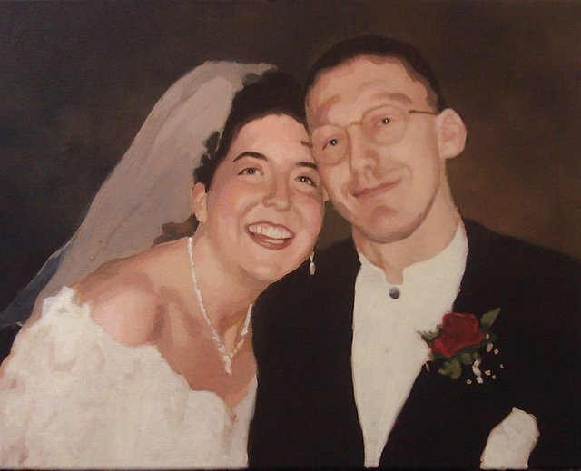
Acrylic portrait painting challenge example in progressm using the acrylic glazing technique, 16 x 20, acrylic on canvas by artist and instructor Matt Philleo
This prevents that cloudiness from occurring and gives a rich saturation of color too. But we still retain the benefits of the smooth shading, vibrancy, and depth that glazing produces.
I finish my painting with a satin or semi-gloss varnish and that’s where we can add some extra saturation of value and vibrancy.
What is YOUR experience with acrylic mediums? Which do you prefer…and why? Let me know in the comments below.
Look forward to sharing more tips and tutorials with you.
Yours for Better Portraits,
If you found this post helpful or encouraging, would you send it on ahead? Let others know with the share buttons below. I’d love to hear your comments. Thank you so much!
For those of you that know me, I have long championed the technique of glazing paint onto a white canvas, so that the light reflects through the layers of paint, giving it added luminosity and depth. I still think it’s a fantastic way to paint.
But occasionally, I like to try something new.
A client from Brooklyn, who I am doing portraits of rabbis for, asked me if I ever tried painting on a black canvas. The idea is that if your painting already has a lot of black areas and dark values (which rabbi portraits do with their dark suits and hats), why not start with a black canvas and work the other way out?
So that’s what I did.
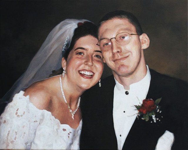
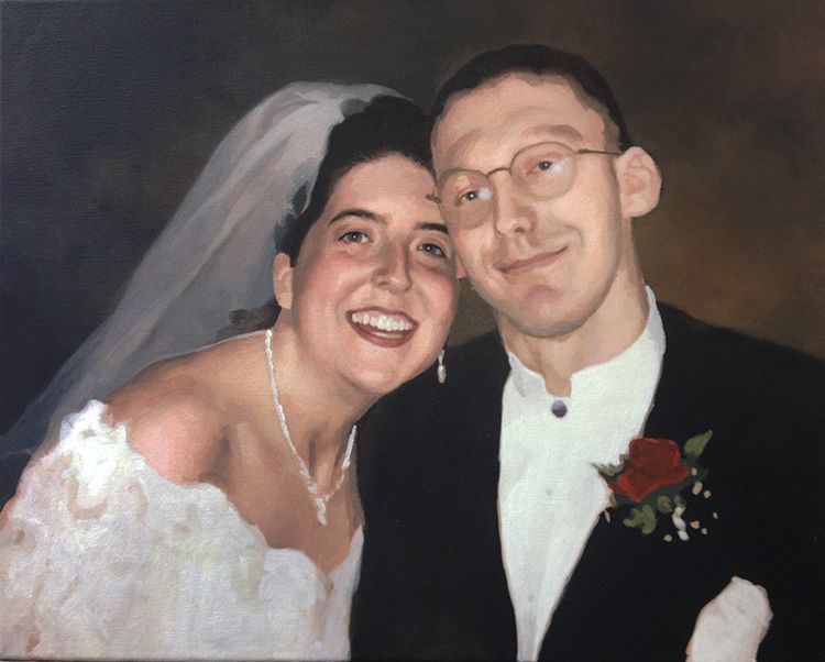
A couple of old high school friends asked me to paint a portrait of them from their wedding day–and I thought, this would be the perfect opportunity to utilize this technique.
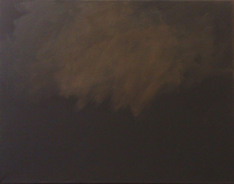
Step 1: Toning the Background
So with that, I bought a 16″ x 20″ canvas already primed with black acrylic gesso. The next step was to tone the background. I used my favorite portrait painting color, raw umber dark and a little bit of raw sienna and burnt sienna, thinned with acrylic medium, applied with a couple layers.
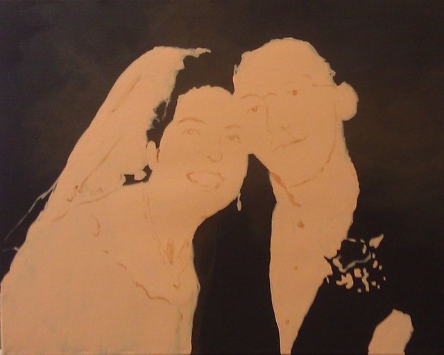
Step 2: Blocking the Forms
I want to be transparent with my process. Although I utilize many techniques for sketching onto a canvas–from tracing, to using a grid, to freehand sketching, to even painting without a sketch, in this particular painting I used a projector to quickly establish the shapes and forms. I mixed a portrait base tone with titanium white, raw sienna, and burnt sienna and applied it with a couple layers to the canvas, following what I saw in the projection. After the final layer dried, I defined some of the details of the faces and clothing using the portrait tone mixed with burnt sienna and raw umber dark.
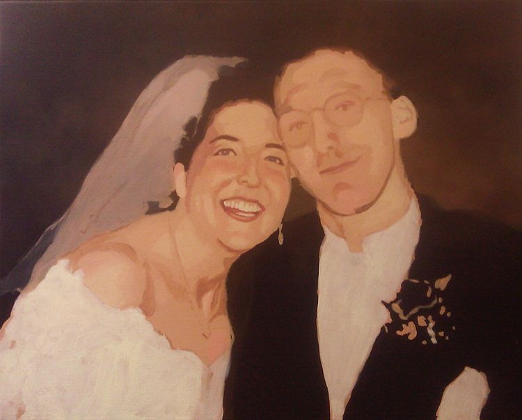
Step 3: Building the Foundational Colors and Values
In the next step, I started establishing some tonal values right away with glazes of raw umber dark, and burnt sienna. On the faces, I darkened the details of the eyes, under the chin, added some depth to the faces by establishing the shadows on the sides of the head, with various mixtures of raw umber dark, burnt sienna, and napthol crimson.
Additionally, I painted in the white of the dress with pure titanium white, thinned down with a small portion of medium to give it a translucency effect of white fabric with the skin behind it.
Then I painted in her veil with a mixture of raw umber dark, white, and a tiny bit of ultramarine blue. Most of the cool tones in that veil are achieved by the mixture of the white paint with raw umber dark. Any time you add white paint, you are cooling down the temperature of the color mix, so this can be used intentionally to create that effect.
Finally, I lightened up the background with a few more glazes of raw umber dark, raw sienna, and burnt sienna. This provides more contrast so that the black value of the suit is more clearly outlined.
Step 4: Heightening the Contrast
In this step, I continued to heighten the contrast in the painting all over. I added more glazes of raw umber dark, burnt sienna, and alizarine crimson for the shadow areas, and raw sienna, titanium white, and a tiny bit of indian yellow and organic orange for the highlights. It’s necessary to warm up these highlights with some colors that have more intensity when you mix white into the glaze. (Because I was starting with a medium-value flesh tone as the base, I glazed in reverse for the highlights, moving from that darker value to lighter.)
You can see I darkened in the eyes and added reflections to the eyeballs. That really brought the painting to a higher level, and made me feel good about how it was progressing.
Moving to the other side of the canvas, I introduced red to the boutonniere with napthol red and raw sienna which, mixed together, is very opaque.
Step 5: Adding More Nuances
Here the painting began to really get close to the finish line. I feel like this was the reward for all the tedious work in layering initial values and colors. I kept adding nuances and tones throughout, with various mixtures of raw umber dark, burnt sienna, napthol crimson, raw sienna, titanium white and couple other colors where necessary.
I darkened the veil with some layers of ultramarine blue mixed with ivory black and white, of course, thinned down with clear acrylic matte medium. I wanted to continue to suggest some of the lace in her dress by adding some flesh tone mixture in various patterns.
Sometimes capturing realism is not found in what you put in, but what you leave out.
I could have gone crazy with adding every little texture of the lace and netted tulle openings, but that would be unnecessary. I would likely have distracted from the realism, and certainly draw your attention away from the most important thing; the bride and groom’s faces, exhibiting the joy of the moment of their wonderful day.
Last Step: Adding Final Nuances and Details
When a painting nears completion, you have to balance a couple different factors.
How much more do I need to add to this so it looks fantastic, finished, without going overboard?
What is the deadline?
In this case, I had some wiggle room on the deadline, so that wasn’t a factor. But as a professional portrait painter, I don’t want to take my time adding details that contribute very little to the overall impact of a painting.
But I had a little more work to do. I needed to add in some important jewelry on the veil, her earrings, and define the necklace, as well as some of the buttons on the groom’s shirt. If those details were not there, we can safely say, the client would notice!
In addition to that, I worked all over the painting, adding a few final nuances–heightening the contrast of the teeth, some of those “shiny” highlights on the face that usually glisten due to sweat on the skin, and also some of the details within her dress.
Finally, I signed it and called it done!
I hope you enjoyed this little painting tutorial, and as always, have a blessed day,
Learn the tips and techniques to enhance your traced sketch using freehand refinements for a more dynamic and detailed artwork.
Now what? Begin painting? Not so fast! 🙂 In this video, I’ll show you how to refine a traced sketch freehand and to make it ready to paint upon.
This is for the book of Isaiah by Russell Stendal and it’s an illustration based off this image here of a man in intercessory prayer. And originally, I did a video showing the tracing process, asking whether it’s ok to trace. And I think I answered that question, that it is—as long as you do freehand sketching and work with grids. But especially as you work with freehand sketching, which will help you to improve as an artist.
Now, I’m going to work in this sketch to show you the process of tightening up a sketch done by tracing initally and the tracing process does leave you with a lot of work left to be done. So, I’m going to show you how I’m going to add additional shading in detail and then have a sketch that I can paint on top of.
The Power of Freehand Refinements
Traced sketches are often used by artists to quickly capture the proportions and major features of a subject. However, relying solely on tracing can result in a flat, lifeless image. In this guide we will explore how to refine a traced sketch freehand, enhancing the details, adding depth, and preparing the sketch for the painting stage. By the end of this tutorial, you’ll understand how to transform a traced sketch into a dynamic, polished artwork ready for the next step.
The Importance of Freehand Refinement
When an artist traces an image, they capture the basic outlines but often miss out on critical details like shadows, textures, and fine forms. This is where freehand refinement comes into play. It allows you to go beyond the rigid lines of a traced image and add life to the drawing.
In this tutorial, I’ll demonstrate how to refine a traced sketch freehand based on my work on a sketch of Isaiah or Hezekiah, which was originally traced. The traced lines were helpful to get the basic structure down quickly, but the freehand refinements were crucial for adding the depth, shading, and detail needed for an intercessory prayer-themed illustration.
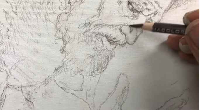
Step 1: Shading and Detailing the Hands
Hands are complex and full of intricate details like tendons, veins, and shadows, which are often missed in a simple traced sketch. To refine the hands in this illustration, start by adding shading to differentiate the forms. Pay attention to areas where light hits the fingers and where shadows fall.
Tip: Focus on the fingertips and the blood vessels to give a realistic, textured appearance to the hands.
Technique: Use a light pencil to gently shade in the forms and increase pressure in areas where darker shadows fall, especially around the tendons and between the fingers.
Step 2: Refining Facial Features
The face is another area that greatly benefits from freehand refinement. In this particular sketch, I had traced the basic lines of the face, but it still needed significant work to look convincing. I added texture to the beard and refined the nose’s shading to give it a more three-dimensional appearance.
Tip: When refining facial features, focus on adding shadow to areas like the nose, cheekbones, and chin. This helps to convey depth and structure.
Technique: Create subtle distinctions between the different parts of the nose (e.g., the wing and the ball) by gently shading around the contours. Don’t hesitate to erase and rework lines if they aren’t quite right. Precision is key in this step.
Step 3: Adjusting Proportions and Textures
One of the challenges with tracing is that it can sometimes lead to slightly distorted proportions. Freehand refinement allows you to adjust these proportions for greater accuracy. For instance, I changed the hairstyle in this sketch to make it look less like myself (since I modeled for it) and more like the character I intended to depict.
Tip: Use freehand sketching to add texture to the hair and adjust any features that seem off.
Technique: When drawing hair, follow the natural flow of the strands, adding texture by varying the direction of your pencil strokes. This adds realism to the hair, especially in areas where light and shadow interact.
Step 4: Refining Clothing and Drapery
Clothing, especially in historical or religious illustrations, requires careful attention to the way fabric drapes and folds. In the sketch of Isaiah/Hezekiah, I added shading to the clothing to give it volume and ensure it looked appropriate for the era being depicted.
Tip: Study the way fabric falls on the body and add shadow in the deeper folds to create a sense of weight and movement.
Technique: Use long, fluid strokes to indicate folds, and vary your shading to show where the light hits the fabric versus where it falls into shadow.
Step 5: Adding Final Touches to the Sketch
As you refine your traced sketch freehand, don’t be afraid to go back and rework certain areas that don’t feel quite right. For example, I added a scroll to the hands to illustrate a significant moment in the story of Hezekiah, when he spread a threatening letter before the Lord and prayed for deliverance.
Tip: Small details, such as props or background elements, can enhance the narrative of your illustration.
Technique: Incorporate these elements with care, ensuring that they integrate naturally into the composition without overshadowing the main subject.
Final Thoughts on Freehand Refinement
Refining a traced sketch freehand is an essential step for any artist who wants to create dynamic, realistic artwork. The tracing process can save time, but it’s the freehand refinement that brings the sketch to life. By focusing on shading, texture, and proportion, you can take a basic traced image and transform it into a detailed and accurate foundation for painting.
Just like building a house requires a solid foundation, a painting requires a well-executed sketch. The time and effort you put into refining your sketch freehand will set the stage for a more successful painting, allowing you to focus on color and brushwork rather than correcting mistakes.
Conclusion
Refining a traced sketch freehand involves improving proportions, adding textures, and sharpening details to ensure the sketch serves as a strong foundation for painting. This process is especially useful in achieving realistic, dynamic compositions. Remember that tracing is just the starting point; it’s the freehand refinement that makes the difference. Keep practicing your freehand sketching skills to improve your artistic abilities and bring more depth to your work.
I’d love to hear your thoughts about this video. Please share it with your friends and family. Let me know if you have any further questions. I’ll greatly help you.
If you’d like to learn more, sign up for my free email tips and video class today.
Thank you so much for taking the time to read this tutorial and watch the video. That means a lot to me. I hope you find it very helpful in your portrait painting.
Yours for Better Portraits,
P.S. Did you find this post helpful or encouraging? If so, send it on ahead! Let others know with the share buttons below. I’d love to hear your comments. Thank you so much! Also, do you have a question on acrylic portrait painting you’d like answered? Let me know, and I’d be happy to help!
Discover the key techniques for correcting and enhancing eye details in acrylic portraits
Creating Realism Through Eye Adjustments
When painting an acrylic portrait, one of the most challenging yet crucial aspects to master is capturing the eyes accurately. Because the eyes are the focal point of a portrait, and even small misalignments or incorrect proportions can alter the entire mood of the painting. And then in this post, we’ll guide you step-by-step on how to adjust the eyes in an acrylic portrait, focusing on enhancing the visual weight, perfecting the line thickness, and making necessary corrections to achieve a realistic look.
Understanding the Importance of Corrections in Portraiture
All artists, no matter their skill level, face challenges when working on detailed aspects like the eyes. The good news is that making corrections is a natural part of the painting process. Then learning how to modify and improve your work ensures your portrait becomes more lifelike.
In this video tutorial, I guide a fellow artist through adjusting the eyes in an acrylic portrait. Then the process includes thickening specific lines and matching the eye shape more closely to the reference photo. Because by understanding how to use these techniques, you’ll be able to refine your own portraits and create more accurate and convincing results.
Step-by-Step Guide to Adjusting the Eyes
1. Assess the Current Eye Shape
Then begin by evaluating the current state of the eyes in your portrait. Compare them carefully with your reference photo, paying close attention to the upper eyelids, irises, and overall proportions. Sometimes, even slight inaccuracies in these areas can make the eyes appear flat or misaligned. In the video below, we noticed the eye shape needed more refinement to match the model.
2. Thicken the Eyelid Line for Visual Weight
To reduce scalloping (uneven curves), start by thickening the line above the upper eyelid. This technique creates a more defined and realistic appearance. Using a small brush, gently add a second layer of paint to the eyelid, focusing on the area right above the iris. Thickening this line helps give the eyes more visual weight, making them stand out naturally against the surrounding facial features.
Tip: Avoid following the original line exactly. Instead, round off the edges slightly to create a smoother transition.
3. Round Off the Eye Shape
Sometimes the eyes can look too flat, especially if the lines are too straight or rigid. To fix this, gradually round off the shape of the eye. This can be done by adding subtle curves to the top and bottom eyelids. When rounding the eye, pay special attention to the middle area directly above the iris, as this part often needs extra thickness to mimic the natural curvature of the eye.
Technique: Use a fine brush to apply thin layers of paint. It’s essential to work in small increments to prevent over-adjustment. This ensures you maintain control over the changes you’re making.
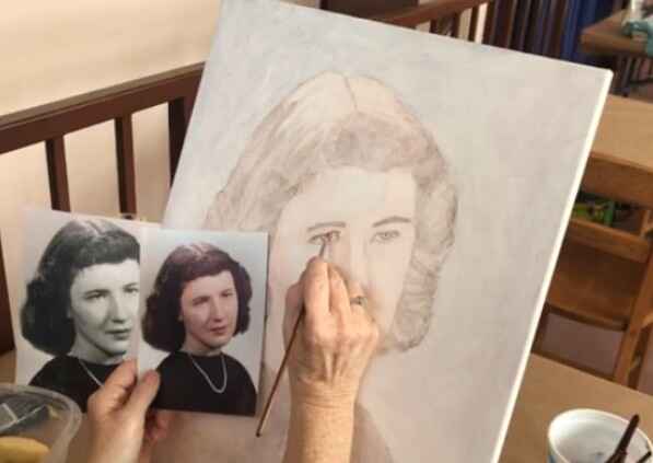
4. Matching the Painting to the Reference Photo
One of the best ways to achieve accuracy in portrait painting is by continuously comparing your work to the reference photo. For many artists, this process can involve placing the reference photo directly next to the canvas, or even taping it onto the canvas for easy comparison.
In the video below, I advised to keep checking how the thickened lines and rounded shapes brought the portrait closer to the reference. Each adjustment, no matter how small, contributed to a more accurate representation of the subject.
5. Adjusting the Opposite Eye
Once one eye has been corrected, it’s important to adjust the opposite eye to ensure symmetry. In this case, the same technique was applied to both eyes: adding more weight to the top of the eyelid and rounding off the edges.
Tip: Work on both eyes alternately rather than finishing one completely before starting the other. This method helps maintain balance and consistency between the two.
6. Darkening and Extending the Eyelid Shadow
To add depth to the eyes, focus on darkening the shadow underneath the eyelids. Shadows are crucial for conveying three-dimensionality and creating a sense of depth in your portrait. Use a darker tone than the skin color, and apply it lightly under the lower eyelid to enhance the eye’s form.
The artist also extended the shadow slightly to the outer edge of the eye, creating a more natural flow. This step helps to reinforce the illusion of light and shadow interacting with the contours of the face.
Technique: Use glazing to gradually build up darker tones, applying thin layers to ensure a smooth blend with the surrounding skin tones.
Common Mistakes to Avoid
While adjusting the eyes in your acrylic portrait, there are some common pitfalls to watch out for:
Overcorrecting: It’s easy to make too many changes, which can throw off the overall proportions. Work incrementally, making small adjustments, and step back frequently to evaluate your progress.
Inconsistent Line Thickness: When thickening the lines around the eyes, ensure consistency. If one eye has a significantly thicker line than the other, it will look disproportionate.
Neglecting Symmetry: Symmetry is key in portraiture. Although no face is perfectly symmetrical, large discrepancies in the eyes will be noticeable. Make sure both eyes align properly with one another.
Final Touches and Review
After making all necessary adjustments, take a final look at your work from a distance. This will give you a fresh perspective on how the eyes fit within the portrait as a whole. If needed, you can further tweak the thickness of the lines or refine the shadowing to enhance realism.
In the video, the artist took a step back and reviewed their work after the adjustments were made, noticing a significant improvement in the likeness of the subject. With a few final touches, such as subtle darkening of the outer corners of the eyes, the portrait came together beautifully.
Bringing Your Portrait to Life Through Eye Adjustments
Adjusting the eyes in an acrylic portrait requires patience, practice, and attention to detail. By thickening the lines, rounding off the shapes, and carefully comparing your work to a reference photo, you can significantly improve the realism of your portrait. These techniques allow you to correct minor errors and bring your artwork to life.
By following the steps outlined here, you will be able to refine your skills and produce more convincing and engaging acrylic portraits. Keep practicing, and soon you’ll master the art of adjusting the eyes in your paintings with ease.
I’d love to hear your thoughts about this video. Please share it with your friends and family. Let me know if you have any further questions. I’ll greatly help you.
If you’d like to learn more, sign up for my free email tips and video class today.
Thank you so much for taking the time to read this tutorial and watch the video. That means a lot to me. I hope you find it very helpful in your portrait painting.
Yours for Better Portraits,
P.S. Did you find this post helpful or encouraging? If so, send it on ahead! Let others know with the share buttons below. I’d love to hear your comments. Thank you so much! Also, do you have a question on acrylic portrait painting you’d like answered? Let me know, and I’d be happy to help!
Discover the easy technique for how to varnish an acrylic painting in one step to enhance and preserve your artwork’s vibrancy
There’s a lot of controversy surrounding this topic, or at least, many different opinions on how to do it right.
Some say you need an isolation coat. But others say you should spray apply the varnish. And then there are some who pour it on or use a sponge!
I’m not here to dismiss any of those methods. If they work for that particular artist, more power to them.
Rather, I’d like to share with you the method I’ve been using for over 20 years as a portrait painter. And then it’s easy, and you can do it one step.
Let me break down this one-step acrylic varnishing method into how to actually do it…
Lay your canvas flat on a table, oriented horizontally, but at an angle.
Raise your canvas up, on four scraps of wood placed under each corner (make sure it’s level. 1″ x 2″s work well )
Get your 4″ varnishing brush (Liquitex Freestyle works well)
Pour matte varnish (Novacolor or Liquitex) into a clean yogurt container or any plastic container large enough to accommodate the width of the brush. Be sure to stir the varnish if it’s been sitting for a while! Over time the polymer resin can separate from the water in the mixture. If you don’t mix it, you may have streaks.
“Sweep” any dust or debris off of the canvas surface with a large brush before you begin.
Dip your brush into the varnish container, so the bristles are coated with varnish 1/3-1/2 of the way up from the tip.
Begin brushing the varnish on the surface, starting with the end farthest from you. Brush in the longest direction of the canvas.
Let your brush hit 1/3″ of the way from the left edge of the canvas. Apply even pressure and bring the brush all the way to the left edge.
Bring the brush all the way to the right edge.
Wipe any excess varnish that remains on your brush inside the top lip of your container.
Flip the brush over and smooth out the entire first application, overlapping the edge slightly with 1-2 strokes. Do not overbrush!
Dip your brush into the varnish container and repeat the process. Let your stroke slightly overlap the first (about 1/4″)
You will be working your way toward your body. This will keep you from accidentally dripping onto the finished varnished surface.
If you have any extra varnish that drips onto the side of the canvas, use a 3/4 flat brush to wipe it off. If the canvas will be framed, the side-drips are usually not a problem and can be left alone.
Let your canvas dry flat on a table. It might look milky white in areas. Resist the temptation to brush it! If you followed my method, the varnish should dry crystal clear. It should dry completely within 3-5 hours, depending on humidity.
Disclaimer: I have used this method with great results in over 20 years of portrait painting. Because your results are up to you, how you apply this method, and the humidity levels of your studio space. I cannot be held responsible for any painting that gets damaged during the varnishing process. Then it would be a good idea to varnish a test piece first. You can add another layer (after 3-5 hours of dry time) if you feel the first one didn’t cover as well as you’d like, but most of the time, you won’t need to.
Watch this video below to see the process in action…
I’d love to hear your thoughts about this video. Please share it with your friends and family. Let me know if you have any further questions. I’ll greatly help you.
If you’d like to learn more, sign up for my free email tips and video class today.
Thank you so much for taking the time to read this tutorial and watch the video. That means a lot to me. I hope you find it very helpful in your portrait painting.
Yours for Better Portraits,
P.S. Did you find this post helpful or encouraging? If so, send it on ahead! Let others know with the share buttons below. I’d love to hear your comments. Thank you so much! Also, do you have a question on acrylic portrait painting you’d like answered? Let me know, and I’d be happy to help!
Unlock the secrets to realistic portraits with these essential pencil drawing techniques
Drawing realistic pencil portraits can be a rewarding yet challenging experience. If you’re looking to improve your pencil drawing skills, it’s essential to focus on technique, control, and mastering shading. Whether you’re a beginner or a seasoned artist, improving your pencil drawings can drastically boost your portrait painting skills, especially if you primarily work in acrylic. In this blog post, you’ll learn 3 valuable tips that will help you create lifelike pencil portraits.
1. Master Cross-Hatching for Realistic Shading
Cross-hatching is a time-tested technique that involves layering pencil strokes in a criss-cross pattern to build depth and texture in your drawings. In this method, parallel lines are drawn in one direction, and then a second set of lines is added at an angle across the first set. This overlapping of lines creates a rich texture and smooth tonal gradation.
To start, use a soft pencil like a 4B, which produces dark, rich tones. You’ll want to keep your pencil strokes close together, allowing minimal gaps between them. This technique is perfect for areas that require detailed shadowing, such as the contours of a face or fur on an animal. Then the secret lies in maintaining consistent pressure and evenly spacing your strokes.
To take it a step further, try cross-hatching at a 45-degree angle. Because this adds an extra layer of dimension and allows you to control the light and dark values more effectively. When shading, remember to follow the natural form of the subject to make the drawing appear more realistic.
By mastering cross-hatching, then you’ll find that your pencil drawings will have smoother textures and enhanced depth, making your portraits stand out with their intricate details.
2. Protect Your Drawing from Smudges
One of the biggest challenges when drawing with pencils is avoiding smudges. Then as you work, your hand can easily smudge the graphite, causing unwanted marks and ruining the clean lines of your portrait.
A simple yet effective way to prevent smudging is to place a piece of scrap paper under your drawing hand. Because this will act as a barrier between your hand and the drawing, keeping the graphite from smearing as you work. Not only does this keep the drawing neat, but it also prevents the natural oils from your skin from warping the paper.
It’s also important to work from left to right if you’re right-handed, or right to left if you’re left-handed, to reduce the risk of accidentally smudging what you’ve already drawn. Working in layers, starting with the lighter areas first, and finishing with the darkest parts will also minimize smudging.
By taking care to protect your drawing, you ensure that your portrait remains sharp and polished, free from unnecessary smears.
3. Blend with Tissue for a Smooth Finish
Blending is a powerful technique for smoothing out pencil strokes and achieving a soft, even tone. Many artists use blending stumps or their fingers, but using a piece of tissue paper offers a superior finish without over-smearing the details.
When you blend effectively, gently rub the tissue across the shaded areas of your drawing in small, circular motions. Then be careful not to press too hard, as this can overly blend the graphite and flatten the texture. And of course the goal is to lightly blend the surface to achieve smooth gradation between shadows and highlights.
One benefit of using tissue is that it preserves the texture of the paper underneath while softening the shading. This keeps the drawing realistic without losing detail. Additionally, after blending with tissue, you can go back and add more layers of pencil to intensify the values. This layering process creates richer depth in the drawing, allowing you to achieve darker areas without overworking the graphite.
By combining the precision of cross-hatching with the gentle blending of tissue, your portraits will exhibit a refined, professional quality, with smooth transitions between light and dark areas.
Technique Recap:
Cross-Hatching: Start with closely-spaced, diagonal strokes at a 45-degree angle, layering them in opposite directions to create smooth, realistic shading.
Prevent Smudging: Use a piece of scrap paper under your hand to keep the graphite from smearing, and work from top to bottom to avoid unintentional marks.
Tissue Blending: Gently blend shaded areas with tissue for a polished look, allowing for added layers to deepen your values.
Conclusion:
Drawing better pencil portraits comes down to mastering basic techniques that bring out the realism in your work. With cross-hatching, careful blending, and preventing smudges, you can elevate your portrait skills and create lifelike, professional-quality art. Whether you’re sketching as a hobby or enhancing your painting skills, these pencil drawing tips will give you a solid foundation.
To keep improving, don’t forget to practice these techniques regularly. With time, you’ll see remarkable improvements in the depth, detail, and overall quality of your portraits.
Did you find these tips helpful? Be sure to subscribe to my YouTube channel for more art tutorials and visit my website, RealisticAcrylic.com, where you’ll find in-depth resources to help you create stunning portraits. Let’s bring your artwork to the next level!
Questions? Suggestions? Thoughts? Let me know, below in the comments. Please share this post with your friends!
I’d love to hear your thoughts about this video. Please share it with your friends and family. Let me know if you have any further questions. I’ll greatly help you.
If you’d like to learn more, sign up for my free email tips and video class today.
Thank you so much for taking the time to read this tutorial and watch the video. That means a lot to me. I hope you find it very helpful in your portrait painting.
Yours for Better Portraits,
P.S. Did you find this post helpful or encouraging? If so, send it on ahead! Let others know with the share buttons below. I’d love to hear your comments. Thank you so much! Also, do you have a question on acrylic portrait painting you’d like answered? Let me know, and I’d be happy to help!
Unlock the secrets of applying initial highlights to your acrylic portraits for added depth and realism.
Adding highlights is a crucial step in bringing your acrylic portraits to life because it adds depth, dimension, and a sense of realism to the painting. In this tutorial, we’ll explore how to add initial highlights to your acrylic portrait after laying down a toning layer, using titanium white mixed with Indian yellow for a warm, vibrant touch. Then these highlights will help define the light source, making your portrait stand out.
Materials You Will Need
Before we dive into the process, gather these materials:
Titanium White Paint: For a bright, opaque base.
Indian Yellow Paint: To warm up the white highlights.
Matte Medium: Thins the paint for smoother application.
Flat Size 14 Brush: Ideal for blocking in larger areas.
Smaller Detail Brushes: Useful for adding precise highlights.
Palette Knife (Optional): For mixing paint and mediums.
Step-by-Step Guide to Adding Initial Highlights
1. Mixing the Paint The first step in adding highlights is preparing the right paint mixture. Because in this technique, we mix titanium white with a small amount of Indian yellow. Then the combination will create warm, natural highlights. So that the thin mixture with matte medium to around 50% opacity. This will also allow the highlights to blend seamlessly with the underlying layers without overpowering them.
Using matte medium ensures that the paint remains flexible and doesn’t dry too quickly, giving you ample time to work on the highlights.
2. Restoring Lost Highlights After Toning After applying a toning layer, some highlights may have been muted or lost. Now it’s time to restore them. Start by focusing on the areas of your portrait where the light hits directly, such as the sky, the subject’s face, or their clothing. Then these areas need to stand out against the mid-tones and shadows.
Using the size 14 flat brush, gently block in the highlights. When you apply light, controlled strokes to ensure the paint doesn’t cover too much of the surrounding areas. Then keep your strokes smooth to avoid hard edges.
3. Adding Highlights to the Sky and Clouds Begin with the sky and clouds, especially if you’re painting an outdoor portrait. Because when you apply the titanium white and Indian yellow mixture to the parts of the sky where the light source is strongest. This will create a glowing effect, giving the sky a more realistic appearance.
In this case, incorporating highlights into the clouds will help to define their shape and make them stand out from the background. Use soft brush strokes to add highlights along the edges, creating a gradual transition from light to shadow.
4. Highlighting Clothing Next, move on to your subject’s clothing. Clothing often reflects light differently than skin, so it’s important to be mindful of texture. For smoother fabrics, such as silk or satin, use long, even brush strokes. Then for rougher fabrics like wool or cotton, stipple the highlights to mimic the texture of the material.
Start with broader highlights and then use a smaller brush to add more precise details, such as folds and creases. So remember that, these highlights should enhance the form of the clothing and help convey the fabric’s texture.
Techniques for Effective Highlighting
1. Build Gradually When adding highlights, it’s essential to build up the light areas slowly. And then begin with lighter tones and gradually add more layers as needed. Because this ensures a more natural transition between highlights and shadows, enhancing the three-dimensional effect.
2. Focus on Light Source Always keep the direction of the light source in mind. Highlights should reflect where the light is hitting the subject the most directly. In this tutorial, the highlights were added primarily to the face, clothing, and parts of the background, such as the sky and clouds.
3. Use Warm Colors for Depth Instead of using pure white for highlights, adding a warm color like Indian yellow can create a more realistic effect. This warmth will help your highlights blend into the mid-tones and make the subject appear more vibrant.
Common Mistakes to Avoid
1. Overuse of Highlights Too many highlights can make your portrait look flat and overexposed. Then focus on applying highlights sparingly in key areas where the light hits most directly. And less is often more when it comes to achieving a natural look.
2. Hard Edges When applying highlights, avoid hard, defined edges unless you’re working on a very reflective surface like glass. Because most highlights, especially on skin and fabric, should have soft transitions to blend naturally with the rest of the painting.
Adding Final Details
As you finish applying the initial highlights, step back and observe your painting from a distance. This helps you see how the highlights interact with the rest of the painting and determine if they need any adjustments. If the highlights appear too bright or harsh, you can soften them by glazing over them with a thin layer of mid-tone color.
For areas like the face and hair, use a smaller brush to add subtle highlights that bring out the details. In the tutorial, highlights were applied to areas like the clothing, face, and even the sky to create depth and realism. For instance, on the subject’s face, highlights were applied to key areas such as the forehead and cheekbones, which receive the most light.
Conclusion
Adding initial highlights to your acrylic portrait is an essential step in creating depth and realism. By using a mixture of titanium white and Indian yellow, thinning it with matte medium, and applying it carefully to the key areas, you can restore lost highlights and breathe life into your portrait. As you continue to refine your highlights, remember to stay mindful of the light source, apply highlights gradually, and avoid overworking the painting.
Whether you’re painting a sky full of clouds or the fine details on a subject’s face, mastering the art of highlights will take your acrylic portraits to the next level.
I’d love to hear your thoughts about this video. Please share it with your friends and family. Let me know if you have any further questions. I’ll greatly help you.
If you’d like to learn more, sign up for my free email tips and video class today.
Thank you so much for taking the time to read this tutorial and watch the video. That means a lot to me. I hope you find it very helpful in your portrait painting.
Yours for Better Portraits,
P.S. Did you find this post helpful or encouraging? If so, send it on ahead! Let others know with the share buttons below. I’d love to hear your comments. Thank you so much! Also, do you have a question on acrylic portrait painting you’d like answered? Let me know, and I’d be happy to help!
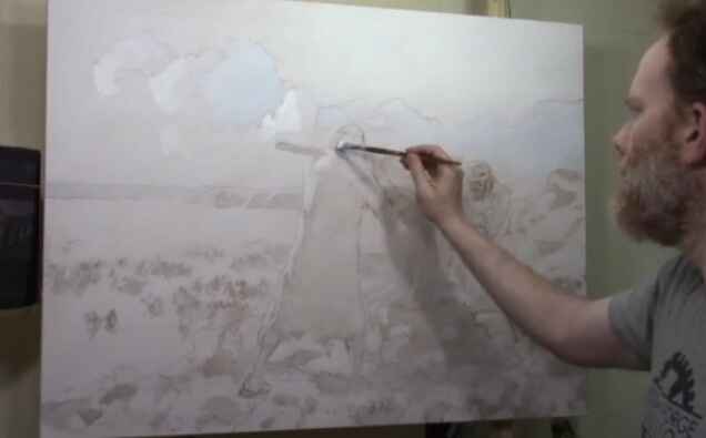
Learn the technique of blocking-in a large 30″ x 40″ acrylic battle scene to establish strong foundations for your painting with depth and detail.
When tackling a large-scale project like blocking-in a 30″ x 40″ acrylic battle scene painting, the initial steps are crucial to setting the stage for a dynamic and cohesive composition. Because by using these combination of broad strokes and carefully placed color, this foundational layer helps you define the major forms, balance your composition, and create a sense of depth right from the start. Whether you’re an experienced artist or just starting out with larger works, mastering the blocking-in process will ensure your painting flows smoothly.
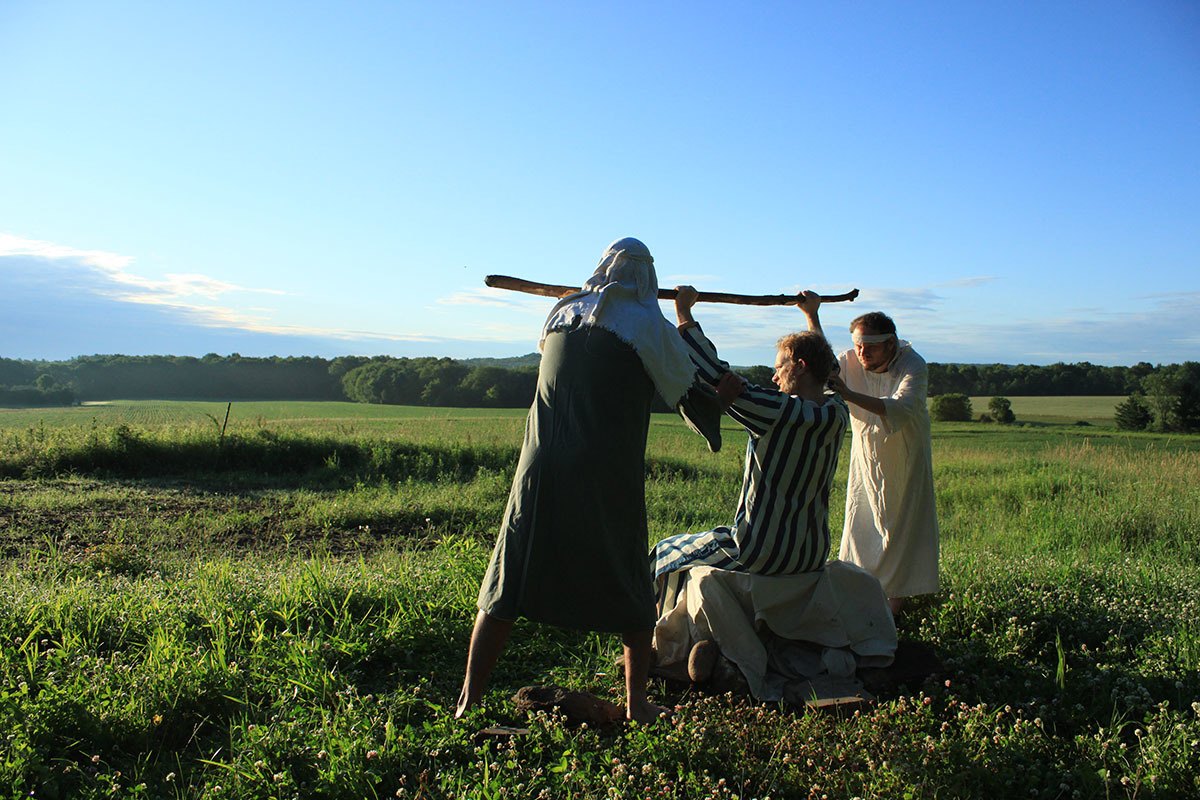
So in this demonstration, I am using a 30″ x 40″ acrylic painting I was commissioned to create, a battle scene between ancient Israel and the Amalekites. Then I asked my friends to come over to my home early in the morning, at sunrise, and model for the painting.
In this battle, when the Israelite leader Moses held up his staff, the power of God would flow. Then it caused the Israelite army to defeat their battlefield enemies. But, as the battle lasted for hours, Moses grew tired and couldn’t hold up his staff. Then the Amalekites got the advantage over the Israelites!
His assistants, Aaron and Hur came up with an idea. They had Moses sit on a rock. Then they held up his arms on either side, so once again, the Israelites could prevail.
This painting is meant to depict the struggle in praying, and how when others come alongside of us, they can ease the burden. And then their faith strengthens ours, and we can get the victory!
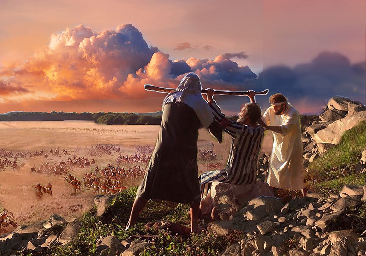
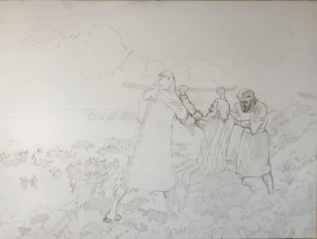
Here is my layout for the painting that I edited on Photoshop…
Then we apply a layer of raw umber dark, ultramarine blue and matte medium to the shadow areas designated on the sketch…
Tips and Techniques
Start with Prayer & Purpose: Before beginning your painting, consider focusing on the purpose behind it. In this case, the painting represents a moment of intercessory prayer, symbolizing perseverance and spiritual victory. This mindfulness sets the tone for intentionality in your artwork.
Use Matte Medium for Glazing: Apply matte medium to your palette before mixing in your colors. For blocking-in, ensure that your paint is heavily diluted with matte medium, aiming for a mixture that’s about 90-95% medium to 5-10% paint. This creates translucent layers, allowing for smooth blending and luminosity in the final work.
Choose Your Colors: Use a traditional palette with earthy tones like raw umber, burnt sienna, and ultramarine blue, mixed with other colors such as titanium white for highlights. These colors create a natural, muted foundation for blocking-in shadows and light.
Block-in Major Values: Start by blocking-in large value structures, such as the shadows on the figures and the surrounding landscape. Keep the application light to allow for adjustments later. Work across the whole canvas, focusing on dominant shapes and transitions between light and dark areas.
Work with Large Brushes: Use larger, flat brushes, such as a three-quarter inch, to block-in broad areas quickly and efficiently. This prevents getting stuck in details too early, allowing you to build up the entire scene cohesively.
Blend with Confidence: As you block-in, keep your brushstrokes fluid and in multiple directions to ensure smooth blending. Make sure to maintain a wet edge to avoid streaks and allow for easy adjustments.
Don’t Fear Corrections: Because the paint is thin, any mistakes in the blocking-in phase can be easily corrected. You can always layer additional glazes or shift values as the painting progresses.
By focusing on blocking-in the large value structures early in the process, you create a solid foundation for your 30″ x 40″ acrylic battle scene, allowing the details to emerge naturally as you build layers.
I’d love to hear your thoughts about this video. Please share it with your friends and family. Let me know if you have any further questions. I’ll greatly help you.
If you’d like to learn more, sign up for my free email tips and video class today.
Thank you so much for taking the time to read this tutorial and watch the video. That means a lot to me. I hope you find it very helpful in your portrait painting.
Yours for Better Portraits,
P.S. Did you find this post helpful or encouraging? If so, send it on ahead! Let others know with the share buttons below. I’d love to hear your comments. Thank you so much! Also, do you have a question on acrylic portrait painting you’d like answered? Let me know, and I’d be happy to help!
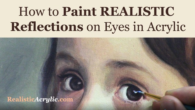
Eyes are the most important feature of an acrylic portrait. When you paint the eyes correctly, everything else seems to fall into place so much easier.
In this video, I’ll show you how to paint realistic reflections, using two complementary colors in addition to white, and getting the shape of the reflection just right. Then this originally was a BONUS video in the Acrylic Portrait Painting Challenge Master Class, now available in the All-Access Membership at Realistic Acrylic Portrait School.
Even though it is technically over, you can take the Acrylic Portrait Painting Challenge (it’s FREE!) and paint along with us! 8 master class lessons are posted to help you paint a portrait you can be proud of!
REGISTER TODAY. The challenge is ongoing, something you can do at your own pace. It’s not too late to enter! After you join, I’ll send you the supplies list and reference photos to paint from.
Paint realistic reflections on eyes in your acrylic portrait
Questions? Suggestions? Thoughts? Let me know, below in the comments. Please share your sketches in our Facebook group and share this post with your friends!
I’d love to hear your thoughts about this video. Please share it with your friends and family. Let me know if you have any further questions. I’ll greatly help you.
Thank you so much for taking the time to read this tutorial and watch the video. That means a lot to me. I hope you find it very helpful in your portrait painting.
P.S. Did you find this post helpful or encouraging? If so, send it on ahead! Let others know with the share buttons below. I’d love to hear your comments. Thank you so much! Also, do you have a question on acrylic portrait painting you’d like answered? Let me know, and I’d be happy to help!