Category Archives for Written Tutorial
")
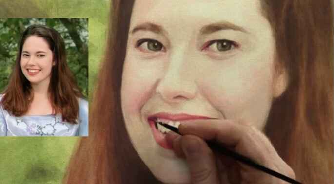
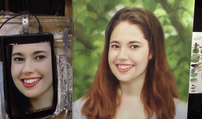
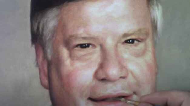
2025 Winter Acrylic Painting Challenge, Lesson 7 Creating Realism in Your Portrait
Bringing your portrait to life with realistic detail
Painting a portrait that looks lifelike requires careful attention to shading, contrast, and color blending. In this lesson of the 2025 Winter Acrylic Painting Challenge, we will focus creating realism in your portrait on refining details, adjusting highlights and shadows, and building realistic skin tones using the glazing technique. If you want to take your portrait to the next level, mastering these techniques will make all the difference.
Step-by-Step Process for Creating Realism in Your Portrait
1. Refining Facial Features with Subtle Adjustments
The face is the focal point of any portrait. In this step, we will:
- Deepen the shadows to define the contours of the face.
- Add warm highlights to create a sense of volume.
- Adjust color transitions for smoother blending.
To start, a detailed brush is used to apply a translucent glaze of raw umber dark and ultramarine blue over the shadowed areas. A touch of alizarine crimson is then added to neutralize any harshness.
2. Enhancing Skin Tones for Natural Depth
Acrylic glazing allows for gradual tone building. The following color mixes are applied in thin layers:
- Warm tones: A combination of burnt sienna, raw sienna, and napthol red is used for rich skin undertones.
- Cool tones: A glaze of ultramarine blue and titanium white is added for reflective highlights.
- Midtones: A mix of organic orange and Indian yellow is applied to balance the transitions.
Each layer is blended using a size 2 round brush to create smooth gradations, ensuring the portrait has a lifelike appearance.
3. Strengthening Contrast for Increased Realism
Realism depends on well-executed contrast. By reinforcing the darkest areas and refining highlights, the portrait gains a three-dimensional look.
- The shadows under the hat brim, on the sides of the face, and within the beard are darkened using raw umber dark mixed with matte medium.
- The reflected light from the snow is captured by adding a cooler highlight using titanium white and ultramarine blue.
Applying these techniques ensures that the light and shadows interact naturally, making the subject appear more lifelike.
Tips & Techniques for Creating Realism in Your Portrait
✅ Layer Thinly – Avoid thick applications. Multiple thin glazes create depth.
✅ Use Color Temperature Correctly – Warm tones advance, cool tones recede.
✅ Refine Gradients – Blend shadows and highlights smoothly to avoid harsh transitions.
✅ Observe Reference Photos – Study how light interacts with skin, clothing, and surrounding elements.
✅ Step Back & Assess – Viewing your painting from a distance helps spot necessary adjustments.
Bringing realism to your acrylic portrait requires patience and careful layering. By focusing on shading, contrast, and color nuances, your painting will come to life. Keep refining, keep glazing, and enjoy the process of creating a masterpiece.
👉 Join the challenge today and take your portrait painting skills to the next level!
Frequently Asked Questions (FAQ)
Q: How do I prevent my highlights from looking too harsh?
A: Use a soft brush and apply highlights in thin glazes, gradually building them up rather than adding a thick, opaque layer.
Q: What should I do if my shadows look too flat?
A: Introduce color variations within shadows by using warm and cool tones to create depth. Adding a touch of alizarine crimson or ultramarine blue can help.
Q: How can I make my portrait look less ‘painted’ and more realistic?
A: Focus on smooth transitions and subtle color shifts. Avoid sharp edges unless defining key features like the eyes or lips.
Q: Can I fix an area if I’ve applied too much color?
A: Yes! Acrylic glazing is forgiving. Apply a thin layer of titanium white mixed with matte medium to soften or correct areas.
2025 Winter Acrylic Portrait Painting Challenge Series
2025 Winter Acrylic Portrait Painting Challenge: Steps to Get Started
2025 Winter Acrylic Portrait Challenge Pre-Lesson: Gathering Your Supplies
2025 Winter Acrylic Portrait Challenge, Lesson 1: Prepping Your Canvas for the Portrait
2025 Winter Acrylic Painting Challenge, Lesson 2: Sketching Your Portrait Accurately
2025 Winter Acrylic Painting Challenge, Lesson 3: Sealing in Your Sketch
2025 Winter Acrylic Painting Challenge, Lesson 4: Beginning Your Portrait with Glazes
2025 Winter Acrylic Painting Challenge, Lesson 5: Building Up Color and Contrast
2025 Winter Acrylic Painting Challenge,Bonus Video: Increasing Contrast
2025 Winter Acrylic Painting Challenge, Lesson 6 Shading and Color Nuances

How to Paint Titanium White Highlights on Acrylic Grisaille
Unlocking depth and dimension with the power of highlights
Acrylic grisaille painting, where the initial layer focuses on monochromatic shades, builds a solid foundation for adding light and shadow. By incorporating titanium white, you’ll create highlights that bring vibrancy and realism to the piece. This tutorial focuses on how to add titanium white highlights on an acrylic grisaille painting, with an emphasis on using layering and glazing techniques.
1. Understanding Titanium White in Acrylic Grisaille
Titanium white is a high-opacity pigment ideal for creating highlights that stand out against darker backgrounds. It’s often used as the top layer in grisaille to add illumination. Mixed with a matte medium, titanium white becomes more translucent, making it perfect for glazing subtle highlights.
2. Setting Up Your Materials
Before you start painting, make sure to gather these essential materials:
- Titanium white acrylic paint
- Matte medium for glaze consistency
- Raw sienna for warm undertones
- Soft, synthetic brushes for precision
- Reference photo, if available for guidance
Setting up your materials in advance helps ensure a smooth painting process and allows for better color blending.
3. Mixing Titanium White with Matte Medium
To achieve a translucent effect, mix titanium white with a matte medium.
- Combine Equal Parts of titanium white and matte medium.
- Adjust Opacity by adding more medium if needed.
- Add a touch of raw sienna to warm the highlights.
Mixing with matte medium softens the intensity of titanium white, which avoids chalky finishes and integrates with existing shades.
4. Building Up Highlights with Layers
The key to lifelike highlights is building them in layers. Start with lighter layers and intensify as needed:
- Apply in Thin Layers: Use translucent white for softer highlights.
- Use a Dabbing Technique: Apply paint gently with your fingers or a soft brush to blend naturally.
- Focus on Key Areas: Areas like the forehead, cheeks, and hands usually capture light.
Building highlights gradually gives you control over how much brightness is added and helps blend with the underlying grisaille.
5. Creating Soft, Blended Edges
Blending is crucial to achieving a realistic finish. Soft edges allow highlights to transition smoothly:
- Feather the Edges by gently moving your brush outwards.
- Dab with a Clean Brush to soften transitions between highlighted and shaded areas.
- Layer Highlights: Adding subsequent layers after each has dried creates depth.
6. Incorporating Warm Undertones with Raw Sienna
Adding a touch of raw sienna to titanium white enhances the warmth, making highlights appear more natural.
- Mix with Titanium White: A small amount of raw sienna warms up highlights for a more lifelike effect.
- Apply Over Darker Areas: Use raw sienna highlights where the form turns, such as along the scroll in the painting.
- Layer Gradually: Continue layering with raw sienna-infused highlights to achieve depth.
Warm undertones help the highlights feel more integrated with the skin tones and surroundings.
7. Emphasizing Key Highlights for Depth
With grisaille, the highest highlights create the most contrast and depth:
- Focus on High Points: Areas like the cheekbones, forehead, and hands should be brighter.
- Use a Slightly Thicker Application: In these areas, reduce the amount of matte medium to make highlights more opaque.
- Add Fine Details: Tiny highlights on features such as eyes or the edge of a scroll add realism.
Tips and Techniques
- Practice Patience with Layers: Allow each layer to dry fully before adding more white to avoid muddying colors.
- Experiment with Blending Tools: Fingers can be a great blending tool, allowing for soft, natural transitions.
- Keep Highlights Soft: Avoid hard edges by lightly feathering the brush or dabbing with a clean brush.
Conclusion
Painting titanium white highlights on an acrylic grisaille foundation elevates your artwork by adding brilliance and realism. Through layering and blending techniques, each highlight contributes to the depth and life of the portrait. Start by mixing titanium white with matte medium and raw sienna, and then carefully apply highlights in key areas. The result will be a stunning, light-infused painting that truly stands out.
FAQs
What is the Purpose of Using Titanium White in Acrylic Grisaille?
Titanium white is highly opaque and ideal for creating crisp highlights that stand out against darker monochromatic underpainting. It helps to enhance light and depth.
How Do I Avoid Chalky Highlights?
Mixing titanium white with matte medium and a touch of raw sienna creates a warmer, less chalky effect, blending smoothly with darker tones.
Why Use Raw Sienna in White Highlights?
Adding raw sienna brings warmth and helps integrate the highlights with the rest of the painting. It adds a subtle vibrancy, avoiding the starkness that pure white can sometimes create.
How Should I Place Highlights on a Portrait?
Focus on areas where light naturally falls, such as the forehead, nose, cheeks, and hands. Adding highlights here enhances depth and realism.
How Do I Layer Highlights for Realism?
Start with thin, translucent layers, gradually adding more opacity to the final highlights. This layering builds a natural depth that closely resembles real light and shadow.
LEARN MORE
- Sketching Your Painting Accurately
- Beginning a Pet Portrait in Acrylic
- The Mystery of Realism in Painting
- Apply A Burnt Sienna Glaze to a Portrait
- Learn How to Sketch a Portrait Freehand in 45 Minutes
- Adding highlights to your acrylic painting
- 5 Excellent Reasons to Use Aluminum Foil
- Paint Realistic Wrinkles in Acrylic
- Painting Clothing in an Acrylic Portrait
- Paint a Cloudy Sky Acrylic
- How to add Semi-Opaque Highlights
- How to Enhance the Contrast in Your Acrylic
- How to Add Glaze to Your Acrylic Painting
- Paint Realistic Reflections on Eyeglasses in an Acrylic Portrait
- Build Up Depth on Your Acrylic Portrait Backgrounds
- How Do You Do Layers With the Glazing Technique?
- Learn How to Paint Wrinkles in Acrylic
Read more about how to paint a portrait that you can surely be proud of!
I’d love to hear your thoughts on this video. Please share it with your friends and family. Let me know if you have any further questions. I’ll greatly help you.
If you’d like to learn more, sign up for my free email tips and video class today.
Learn How to Paint Acrylic Portraits With My Free Mini-Video Course!
Thank you so much for taking the time to read this tutorial and watch the video. That means a lot to me. I hope you find it very helpful in your portrait painting.
Yours for Better Portraits,

P.S. Did you find this post helpful or encouraging? If so, send it in ahead! Let others know with the share buttons below. I’d love to hear your comments. Thank you so much! Also, do you have a question on acrylic portrait painting you’d like answered? Let me know, and I’d be happy to help!
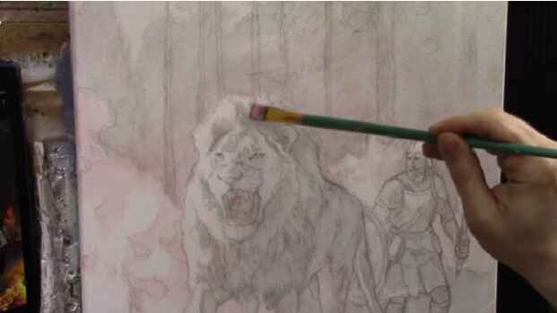
How to Add Realistic Flames to Forest Fire
I’ll show you how to add flames to the forest fire in my Lion and Soldier painting.
Creating realistic flames in acrylic painting can be both exciting and challenging. This guide walks you through the process, using a scene of a lion guiding a soldier through a forest fire, a painting that symbolizes strength, resilience, and guidance in times of trial. In this tutorial, we’ll discuss color selection, flame shapes, and the layering technique to add lifelike flames to your artwork.
Understanding Flames in Painting
Before beginning, it’s important to understand that flames are illuminated particles rising in a gaseous form, usually emitting a blend of vibrant colors like white, yellow, orange, and red. Capturing this dynamic movement requires both attention to color gradients and an understanding of how flames behave.
Materials Needed
- Acrylic Paint Colors: Titanium White, Indian Yellow, Organic Orange, Burnt Sienna, Ultramarine Blue, Phthalo Blue, Raw Umber Dark, and Naples Red.
- Mediums: Matte medium (for glazing effects).
- Brushes: Variety of sizes; smaller brushes for detail work.
- Palette and Reference Material: Always have reference photos for accurate flame depiction.
Step-by-Step Guide to Painting Realistic Flames
1. Setting Up Your Base
Start with a dark background to make the flames stand out. The surrounding trees and background should be painted with dark, muted tones such as raw umber dark or burnt sienna. These darker shades will allow the flame colors to appear vibrant and dimensional.
2. Mixing Flame Colors
Prepare a base color for your flames by mixing titanium white with a small amount of indian yellow and organic orange. This combination creates a warm, saturated hue that will serve as the foundation for the flames.
Tip: Experiment with different levels of each color to find the perfect balance for the glow you want to achieve.
3. Applying the Glazing Technique
While glazing is commonly thought of as a dark-over-light technique, it can also be used to apply lighter hues to darker areas, ideal for flames. Use a small brush to apply thin layers of the flame color over the background.
- Begin by painting the brightest parts of the flame with a mix of titanium white and indian yellow.
- Gradually blend in Organic Orange to create the effect of fading heat, especially around the edges.
- Leave some gaps to create the illusion of light dispersing through smoke.
4. Creating Flame Shapes
To achieve the realistic, fluid motion of flames, use curved, wave-like strokes. Flames are not static; they appear to curl, twist, and rise in unpredictable patterns.
- Begin at the Base: Paint a thicker portion of flames at the base of the tree. These flames should appear denser and more saturated.
- Move Upward: As you move upward, make the flames narrower and more dispersed.
- Avoid Repetition: Flames should not be uniform; vary their shapes and sizes to maintain a natural look.
5. Adding Depth and Layers
Flames often consist of multiple layers of light. To create this effect:
- Add a base layer of yellow-orange flames.
- Layer with small strokes of brighter colors like titanium white in the hottest areas.
- Use glazing techniques to add additional colors like burnt sienna or even touches of phthalo blue for shadows, enhancing the contrast and depth.
Tip: Building layers allows the flames to look fuller and more dimensional, mimicking the movement and light of real fire.
6. Refining Details and Enhancing Realism
To make the flames look more realistic, add finishing touches by focusing on the smaller details:
- Skip Patterns: Avoid creating a pattern in the flame strokes. Flames should feel spontaneous and unpredictable, with some parts skipping or fading out.
- Add Flickering Flames: Introduce small, disconnected flame shapes around the main body to capture the erratic nature of fire.
- Vary Intensity: Use more titanium white in certain areas for high heat spots, and blend these into darker hues to show where the flame tapers off.
7. Creating the Illusion of Movement
To create the impression that the flames are alive and moving, make sure some flames overlap with others and wrap around objects, like tree trunks. Paint the fire to follow the tree’s curvature, making it appear as if the flames are creeping up and wrapping around the branches.
8. Balancing Warm and Cool Colors
To prevent the painting from looking overly warm, add a touch of cooler hues to balance the warmth of the flames. Phthalo Blue or Ultramarine can be used subtly to suggest smoky, shadowed areas within the flames, adding contrast.
9. Finishing Touches
Once the flames are layered and dimensional, consider the final refinements:
- Blending: Soften some edges by lightly blending with a dry brush to create a glowing effect.
- Glaze for Glow: Apply a thin layer of matte medium mixed with organic orange over parts of the flames to give them a translucent, glowing effect.
- Smoke Details: Add hints of smoke by dry-brushing with a very light gray or white paint, especially above the flames.
Key Tips and Techniques Recap
- Use Reference Images: Study flame references to understand how flames move and interact with surroundings.
- Layer Wisely: Build up your flames in layers, starting with lighter colors and gradually adding depth with glazes.
- Avoid Patterns: Flames should look organic and spontaneous, with variations in size, direction, and shape.
- Add Shadows: Integrate darker shades like phthalo blue to create shadows, adding depth and contrast.
With these steps, you can add stunning, realistic flames to your forest fire scenes. Using glazing, color blending, and mindful brushstrokes, your painting will achieve a fiery brilliance that draws the viewer in and enhances the story your art tells.
FAQ: How to Add Realistic Flames to a Forest Fire Painting
1. What materials do I need to paint realistic flames?
To create realistic flames, use a combination of colors such as titanium white, Indian yellow, organic orange, burnt sienna, and a matte medium for blending and glazing. Ensure you have a fine-tipped brush for detailed flame work and a reference photo to guide your painting.
2. What colors work best for painting fire and flames?
For fire and flames, start with a base of titanium white, mix in indian yellow and organic orange to create a vibrant orange-yellow, and use burnt sienna for depth. Adjust the colors depending on the flame’s distance and intensity. This palette gives a realistic look to flames by blending warm and cool tones effectively.
3. How can I make flames look like they’re moving?
To capture the movement, create curving, wave-like shapes rather than straight lines. Flames should look fluid and natural. Think of how smoke and gas rise and twist, which helps create the visual illusion of flame movement.
4. How do I avoid making the flames look too repetitive?
To keep the flames from looking repetitive, vary the spacing and shapes. Avoid evenly spacing your flame strokes, and let some flames skip areas or curl around the tree trunks randomly. Think of each flame as a unique shape with small curves, bulges, and variations.
5. Can I use glazing for flames on a dark background?
Yes, glazing works well to create realistic flames on a dark background. Light-on-dark glazing isn’t as common, but it’s effective here to add subtle highlights and layered depth to the flames. Using thin, translucent layers helps create a gradual glow effect.
6. How can I make the flames blend naturally with the rest of the forest fire scene?
Mix in colors that complement the surrounding areas, like Burnt Sienna or Ultramarine Blue, to soften the flames’ edges. Incorporating these tones can give the flames a cohesive look within the forest fire setting, helping them blend with the scene’s overall atmosphere.
7. What brush techniques work best for painting flames?
Use a fine-tipped brush and light, upward strokes. Create flowing, curved lines for a gaseous effect. Varying brush pressure and direction will give flames a natural, random appearance. For added realism, layer strokes over time to build depth.
8. Should flames be brighter at the bottom or top?
Flames tend to be brighter at the base, where the combustion is most intense. Start with lighter colors like titanium white and indian yellow at the bottom, and let the flames gradually fade to darker, cooler tones as they rise.
9. How can I add depth and dimension to flames on trees?
Layer the flames using different tones and adjust the transparency by using matte medium. Start with a base layer of lighter tones, then add darker colors in specific areas to create shadowed regions that add depth. Incorporate background colors to integrate the flames with their surroundings.
10. Do I need to use reference photos for painting flames?
Using a reference photo is highly recommended. It helps you understand how flames behave, especially in terms of movement, color transitions, and positioning on objects. Reference images can be used as a guide without copying them exactly, allowing you to capture the look of fire naturally.
11. What’s the role of temperature in creating realistic flame colors?
Matching temperature in your color choices is essential. Warmer colors, like yellows and oranges, create intensity, while adding cooler tones like red or burnt sienna gives flames a more natural, multidimensional feel. Avoid overly saturated or stark colors for a balanced look.
12. How do I prevent flames from overpowering the main subject of the painting?
Keep the brightness and intensity of flames balanced relative to the scene. Use lighter and more subdued tones for flames in the background and save the more intense, bright colors for the foreground flames that complement your main subject.
LEARN MORE
- Sketching Your Painting Accurately
- Beginning a Pet Portrait in Acrylic
- The Mystery of Realism in Painting
- Apply A Burnt Sienna Glaze to a Portrait
- Learn How to Sketch a Portrait Freehand in 45 Minutes
- Adding highlights to your acrylic painting
- 5 Excellent Reasons to Use Aluminum Foil
- Paint Realistic Wrinkles in Acrylic
- Painting Clothing in an Acrylic Portrait
- Paint a Cloudy Sky Acrylic
- How to add Semi-Opaque Highlights
- How to Enhance the Contrast in Your Acrylic
- How to Add Glaze to Your Acrylic Painting
- Paint Realistic Reflections on Eyeglasses in an Acrylic Portrait
- Build Up Depth on Your Acrylic Portrait Backgrounds
- How Do You Do Layers With the Glazing Technique?
- Learn How to Paint Wrinkles in Acrylic
Read more about how to paint a portrait that you can surely be proud of!
I’d love to hear your thoughts on this video. Please share it with your friends and family. Let me know if you have any further questions. I’ll greatly help you.
If you’d like to learn more, sign up for my free email tips and video class today.
Learn How to Paint Acrylic Portraits With My Free Mini-Video Course!
Thank you so much for taking the time to read this tutorial and watch the video. That means a lot to me. I hope you find it very helpful in your portrait painting.
Yours for Better Portraits,
P.S. Did you find this post helpful or encouraging? If so, send it in ahead! Let others know with the share buttons below. I’d love to hear your comments. Thank you so much! Also, do you have a question on acrylic portrait painting you’d like answered? Let me know, and I’d be happy to help!

How to Use Negative Spaces to Build Realism in Your Acrylic
Master the art of adding depth and realism by utilizing negative spaces in your acrylic painting
When it comes to creating lifelike and detailed acrylic paintings, focusing on negative spaces is a powerful yet often overlooked technique. Negative space, or the “empty” area around and between subjects, can be used to convey details and enhance the realism of your art without explicitly painting each element. This technique is particularly effective for landscapes, like forests, where light filters through gaps in foliage, creating an atmospheric and immersive effect. Here’s how you can harness the potential of negative spaces to add subtle, realistic touches to your acrylic works.
Understanding Negative Spaces in Acrylic Art
Negative spaces are not just empty areas in a painting; they contribute to how viewers perceive the shape and volume of the painted subjects. When applied thoughtfully, these spaces allow the artist to imply depth and details, like clusters of leaves or tree needles in a forest scene. Instead of painting each leaf individually, you can use negative space to create the illusion of leaves by painting the gaps around them. This indirect approach helps viewers’ minds fill in the details, enhancing realism.
Setting the Scene with Base Colors
To start, apply a base layer in a semi-opaque manner, covering the canvas with foundational tones. For example, in a painting like “The Lion and the Soldier,” a semi-opaque smoothing layer can be used to flatten some of the background while preserving enough detail for the upcoming negative space work. With the foundational colors laid down, the next step is to add negative spaces, using a palette that reflects both warm and cool tones for a balanced composition.
Tips and Techniques for Using Negative Spaces
1. Choose the Right Colors
- Begin with a mix of titanium white, ultramarine blue, and a hint of organic orange. This color blend may seem unusual, but it adds the necessary vibrancy and balance of cool and warm tones. Adjust the color depending on the atmospheric elements in your painting for instance, using more blue for cool backgrounds or adding a touch of orange for warmth near light sources like flames.
2. Create Fluid Highlights
- Mix titanium white with a matte medium to create a lighter, more fluid paint application. This consistency allows you to create soft edges, perfect for the negative spaces that represent light filtering through trees. Starting with a slightly darker mix, layer on lighter tones for more depth.
3. Use Gradual Layering
- Apply negative spaces in layers. Begin with broader, darker spaces and gradually add lighter, smaller highlights on top. This layering technique mimics the natural effect of light penetrating through tree branches and leaves, giving a sense of depth and realism. For an organic effect, make sure your highlights vary in size and placement.
Balancing Colors for Realism
Achieving realism with negative spaces depends heavily on color balance. Here are a few strategies to perfect this technique:
- Cool and Warm Tones: For a natural glow effect, alternate between cool tones (like ultramarine or phthalo blue) and warm tones (like organic orange). Adjust these colors based on the background tones and the light source in your painting.
- Experiment with Variations: Start with a color that’s slightly warmer than desired and adjust it incrementally. A touch of phthalo blue, for example, can cool down a warm area and make it blend seamlessly into the surroundings.
Steps to Creating Negative Spaces in Your Painting
- Apply an Initial Layer: Begin by smoothing over the background with a semi-opaque layer. Once dry, mix titanium white with a hint of blue and medium to create a lighter tone.
- Block in Negative Spaces: Using your brush, apply small dabs to imply leaves or needles without painting each one. Aim for round shapes with uneven spacing nature isn’t uniform, so your negative spaces should vary in size and distance to look organic.
- Layer and Refine: Continue building up the layers by applying lighter shades in some of the gaps. Layering smaller, lighter spaces over darker ones mimics the dappled light effect seen in forests.
- Use a Reference Photo: Working from a reference photo ensures that your negative spaces are based on natural patterns rather than appearing overly structured or repetitive. This helps your painting look realistic and avoids the common tendency to make everything look orderly.
Advanced Techniques: Organic Patterns and Nuances
To achieve a truly lifelike quality, aim to avoid regular, repetitive patterns when applying negative spaces. Vary the shapes, sizes, and placements to give the impression of random, natural clustering.
Tips for an Organic Effect:
- Size and Shape Variations: Mix large and small clusters to create depth. Some gaps should be small and narrow, while others can be broader. Avoid regular patterns keep some areas denser and others sparser.
- Soft Blending: Blend edges by dabbing with your fingertip or a soft rag. Acrylics dry quickly, but you can still soften harsh edges by working with diluted paint or dabbing with a rag to lift excess pigment.
Using Reference Photos for Realistic Negative Spaces
Having a reference photo is invaluable when working with negative spaces. It provides insight into the natural gaps in foliage or branches, helping you to keep your painting realistic. Study the light and shadow in your reference image carefully. Look for areas where light naturally filters through and try to replicate these in your painting.
Additional Tips for Success
- Start Subtly: Begin with slightly darker tones and gradually lighten them. Avoid using pure white for highlights initially, as it can appear too stark. Work up to lighter shades in successive layers.
- Experiment with Dab Techniques: A soft dabbing motion is effective for blending colors and softening edges. If the paint application is too heavy, dab gently to reduce intensity and add a touch of realism.
- Create a Glow Effect: To mimic the way light filters and glows through leaves, layer light colors over dark tones with slightly smaller negative spaces. This approach creates a glow, as though light is shimmering through the canopy.
- Use of Golden Proportion: For balanced composition, offset the placement of your gaps and highlights. Avoid centering them directly between branches; instead, position them slightly off-center to achieve a natural look.
Conclusion
Mastering negative spaces can be transformative for your acrylic paintings, bringing depth and realism to scenes that require intricate details like wooded landscapes. By carefully placing highlights and using color adjustments, you can recreate the illusion of light filtering through leaves and branches. Remember to work from a reference photo, keep your patterns organic, and layer colors to create a luminous, glowing effect. With these techniques, you’ll bring a newfound depth to your acrylic paintings that will captivate viewers and enhance your skills as an artist.
LEARN MORE
- Sketching Your Painting Accurately
- Beginning a Pet Portrait in Acrylic
- The Mystery of Realism in Painting
- Apply A Burnt Sienna Glaze to a Portrait
- Learn How to Sketch a Portrait Freehand in 45 Minutes
- Adding highlights to your acrylic painting
- 5 Excellent Reasons to Use Aluminum Foil
- Paint Realistic Wrinkles in Acrylic
- Painting Clothing in an Acrylic Portrait
- Paint a Cloudy Sky Acrylic
- How to add Semi-Opaque Highlights
- How to Enhance the Contrast in Your Acrylic
- How to Add Glaze to Your Acrylic Painting
- Paint Realistic Reflections on Eyeglasses in an Acrylic Portrait
- Build Up Depth on Your Acrylic Portrait Backgrounds
- How Do You Do Layers With the Glazing Technique?
- Learn How to Paint Wrinkles in Acrylic
Read more about how to paint a portrait that you can surely be proud of!
I’d love to hear your thoughts on this video. Please share it with your friends and family. Let me know if you have any further questions. I’ll greatly help you.
If you’d like to learn more, sign up for my free email tips and video class today.
Learn How to Paint Acrylic Portraits With My Free Mini-Video Course!
Thank you so much for taking the time to read this tutorial and watch the video. That means a lot to me. I hope you find it very helpful in your portrait painting.
Yours for Better Portraits,
P.S. Did you find this post helpful or encouraging? If so, send it in ahead! Let others know with the share buttons below. I’d love to hear your comments. Thank you so much! Also, do you have a question on acrylic portrait painting you’d like answered? Let me know, and I’d be happy to help!

How to Transform Your Acrylic Paintings with Vibrant Colors
Learn to create stunning acrylic paintings using advanced glazing techniques
Transform Your Acrylic Paintings with the Glazing Technique: Step-by-Step Guide
Achieving depth and vibrancy in acrylic paintings can be challenging, but with the right techniques, it becomes an exciting and rewarding process. In my recent tutorial, we continued working on an allegorical painting titled “He Goes Ahead of Us,” depicting a lion and a soldier. This painting symbolizes Jesus fighting our battles, with the lion representing Jesus leading the way.
Understanding the Glazing Technique
The glazing technique involves applying thin layers of paint mixed with a large amount of matte medium. This method builds up depth and luminosity, allowing the underlying layers to show through and creating vibrant, rich colors.
Setting Up the Value Structure
We applied a monochromatic glaze to establish the value structure. A mix of matte medium, raw umber dark, and ultramarine blue was used to create a gray glaze, which was then applied to block in the tonal values throughout the painting.
Adding Organic Orange to My Lion and Soldier Painting
We focused on adding color to our painting using the glazing technique. The key color introduced was organic orange, which adds a warm, vibrant touch to the fiery areas of the painting. This color, mixed with matte medium, creates a translucent glaze that enhances the painting’s luminosity and depth.
Preparing the Glaze
- Select Your Brush:
- Use a flat 5/8 brush for even application.
- Mix the Glaze:
- Combine a small amount of organic orange pigment with a generous amount of matte medium to create a translucent, milky glaze that dries clear.
Applying the Glaze
- Begin with the Fiery Areas:
- Apply the organic orange glaze to the edges and openings of the flames to create dynamic, vibrant effects.
- Build up layers gradually to enhance the luminosity.
- Expand to Other Areas:
- Extend the glaze to other parts of the painting, such as the lion and the soldier, to ensure color harmony and depth.
Tips and Techniques for Effective Glazing
- Use a Reference Photo: Carefully observe your reference photo to accurately place tonal values and colors.
- Apply Thin Layers: Start with light applications of glaze and build up gradually to avoid overpowering the painting.
- Dry Brushing for Shading: Exhaust the paint on the brush to create subtle shading effects.
- Incorporate Color Harmony: Spread the glaze throughout the painting to maintain color unity.
Enhancing the Painting
To create realistic flames, the glaze was applied around the edges and in the openings of the flames. This method enhances luminosity and ensures the fire looks dynamic and vibrant. By layering different colors, such as yellow, on top of the orange glaze, the flames will become even more striking.
Expanding the Glaze to the Background
The warm colors from the fire were extended into the background to capture the effect of the flames lighting up the forest. This creates a cohesive and immersive scene. The glaze was also added to the soldier and the lion, ensuring color harmony throughout the painting.
Detailed Steps in Glazing
- Establish the Darks:
- Apply the glaze in the dark areas first to set the stage for luminosity.
- This step is crucial for achieving a balanced value structure.
- Build the Midtones:
- Gradually apply the glaze to midtone areas, ensuring smooth transitions.
- Use a light touch to avoid overpowering the initial layers.
- Highlight with Light Colors:
- After establishing the darks and midtones, add lighter colors to create highlights.
- Use yellow or other bright colors to enhance the vibrancy of the flames.
Tips for Successful Glazing
- Use Matte Medium Generously: Mix a large amount of matte medium with a small amount of pigment to create a smooth and translucent glaze.
- Build Up in Layers: Gradually build up the glaze in multiple layers to achieve the desired depth and vibrancy.
- Observe and Adjust: Continuously observe your reference photo and adjust the placement of the glaze accordingly.
- Practice Patience: Glazing requires patience and practice, but the results are well worth the effort.
How Do You Make Acrylic Paintings More Vibrant?
To make acrylic paintings more vibrant, mastering the glazing technique is essential. This involves applying thin, translucent layers of paint over a dry layer to create depth and luminosity. Start by mixing a small amount of pigment with a generous amount of matte medium to form a smooth glaze. Apply this in thin layers, building up the color gradually.
Additionally, using high-quality, artist-grade acrylic paints ensures richer, more vibrant colors. Incorporating contrast between light and dark areas, adding bright highlights, and using a limited palette for color harmony are also key strategies. These methods, combined with careful observation of a reference photo and meticulous layering, can transform your acrylic paintings, making them pop with vibrancy and life.
Final Thoughts
The glazing technique is a powerful tool for artists looking to enhance their acrylic paintings. By applying thin, translucent layers of color, you can create depth, vibrancy, and a sense of realism. This method allows for continuous adjustments and refinements, ensuring your painting evolves beautifully.
Watch the video below on how I use the glazing technique to create amazing luminosity in your paintings
By incorporating these techniques and tips into your painting process, you can achieve stunning results that capture the essence and vibrancy of your subject. Keep practicing and experimenting with the glazing technique to unlock your full artistic potential.
LEARN MORE
- Sketching Your Painting Accurately
- Beginning a Pet Portrait in Acrylic
- The Mystery of Realism in Painting
- Apply A Burnt Sienna Glaze to a Portrait
- Learn How to Sketch a Portrait Freehand in 45 Minutes
- Adding highlights to your acrylic painting
- 5 Excellent Reasons to Use Aluminum Foil
- Paint Realistic Wrinkles in Acrylic
- Painting Clothing in an Acrylic Portrait
- Paint a Cloudy Sky Acrylic
- How to add Semi-Opaque Highlights
- How to Enhance the Contrast in Your Acrylic
- How to Add Glaze to Your Acrylic Painting
- Paint Realistic Reflections on Eyeglasses in an Acrylic Portrait
- Build Up Depth on Your Acrylic Portrait Backgrounds
- How Do You Do Layers With the Glazing Technique?
- Learn How to Paint Wrinkles in Acrylic
Read more about how to paint a portrait that you can surely be proud of!
I’d love to hear your thoughts on this video. Please share it with your friends and family. Let me know if you have any further questions. I’ll greatly help you.
If you’d like to learn more, sign up for my free email tips and video class today.
Learn How to Paint Acrylic Portraits With My Free Mini-Video Course!
Thank you so much for taking the time to read this tutorial and watch the video. That means a lot to me. I hope you find it very helpful in your portrait painting.
Yours for Better Portraits,
P.S. Did you find this post helpful or encouraging? If so, send it in ahead! Let others know with the share buttons below. I’d love to hear your comments. Thank you so much! Also, do you have a question on acrylic portrait painting you’d like answered? Let me know, and I’d be happy to help!

How to Paint Lion and Soldier: Glazing Technique & Tips
Learn the acrylic glazing technique to create depth and luminosity in your portraits.
In the realm of acrylic painting, capturing depth and luminosity can elevate your artwork to a new level. Today, we delve into a symbolic and inspirational piece: a 16×20 acrylic on canvas depicting a lion and a soldier. This painting, inspired by the concept of divine guidance and protection, uses the glazing technique to achieve its captivating effect.
The acrylic glazing technique is a powerful technique that has revolutionized the way artists approach acrylic portrait painting. By layering translucent washes of color over a base layer, artists can achieve a depth and luminosity that bring their subjects to life. This method is particularly effective in creating inspiring works such as a Lion and a Soldier, where the interplay of light and shadow can evoke powerful emotions.
Understanding Acrylic Glazing
Acrylic glazing involves applying thin, transparent layers of paint to a dried layer of acrylic. Each layer modifies the color and tone of the underlying layers, allowing artists to build complex, rich hues without the muddiness that can result from mixing colors directly on the palette. The technique requires patience and precision, as each layer must dry completely before the next is applied.
The Concept Behind the Painting
The painting titled “He Goes Ahead of Us” is based on a verse from Deuteronomy, illustrating how divine guidance leads and protects through life’s battles. The lion symbolizes strength and leadership, while the soldier represents our active role in facing life’s challenges. This powerful imagery is brought to life using acrylic paints and the glazing technique.
Materials Needed
Before diving into the process, gather the following materials:
- Canvas (16×20)
- Acrylic paints (raw umber, burnt sienna, raw sienna, phthalo blue, ultramarine blue, alizarine crimson, naphthol red, organic orange, Indian yellow, titanium white)
- Matte medium
- Brushes (various sizes)
- Palette
- Reference photo
Steps to Achieve Acrylic Glazing
- Prepare Your Canvas: Start with a clean, primed canvas. Apply an underpainting if desired, using opaque colors to establish the basic composition and values.
- Mix the Glaze: Combine your chosen acrylic color with a glazing medium to achieve the desired transparency. The ratio of paint to medium can be adjusted based on the effect you want to achieve.
- Apply the Glaze: Using a soft brush, apply the glaze in thin, even layers. Allow each layer to dry completely before adding the next. The drying time will vary depending on the thickness of the glaze and environmental conditions.
- Build Up Layers: Continue adding layers of glaze, gradually building up the color intensity and depth. Pay attention to the interplay of light and shadow, which enhances the three-dimensionality of your subject.
- Final Touches: Once you have achieved the desired effect, add any final details or highlights. Use opaque paints sparingly to avoid disrupting the transparency of the glazes.
Mastering Acrylic Portrait Painting
Acrylic portrait painting benefits immensely from the glazing technique. Portraits require a nuanced approach to capture the subtleties of skin tones, facial features, and expressions. Glazing allows artists to create realistic and lifelike portraits with a sense of depth and dimension.
Key Techniques for Acrylic Portraits
- Underpainting: Start with a monochromatic underpainting to establish the basic values and shapes. This serves as a foundation for the subsequent layers.
- Layering: Use glazing to build up the skin tones gradually. Begin with lighter, more transparent layers, and gradually increase the opacity in the darker areas.
- Blending: Acrylics dry quickly, which can make blending challenging. Use glazing to create smooth transitions between colors and tones.
- Details: Add fine details such as hair, eyes, and textures using a combination of glazing and opaque painting techniques. Use a fine brush for precision.
- Highlights and Shadows: Emphasize the highlights and shadows to enhance the three-dimensionality of the portrait. Glazing allows for subtle adjustments and refinements.
Inspirational Acrylic Painting of a Lion and Soldier
Combining the majestic presence of a lion with the strength and bravery of a soldier creates a powerful and inspirational image. The acrylic glazing technique is particularly suited for capturing the contrasting textures and emotions of such a subject.
Composition and Planning
- Conceptualize: Begin by conceptualizing the composition. Decide on the pose, background, and overall mood of the painting. Sketch out your ideas on paper.
- Reference Materials: Gather reference photos of lions and soldiers. Pay attention to the details of their features, textures, and expressions.
- Composition: Plan the composition on your canvas. Consider the placement of the lion and the soldier, ensuring a balanced and harmonious arrangement.
Painting Process
- Underpainting: Start with a detailed underpainting. Use earthy tones for the lion and neutral tones for the soldier. Establish the basic shapes and values.
- Layering and Glazing: Begin applying glazes to build up the colors and textures. For the lion, use a combination of warm browns, oranges, and yellows to capture the fur. For the soldier, use cooler tones such as blues, greens, and grays.
- Textures: Pay attention to the textures of the lion’s mane and the soldier’s uniform. Use glazing to create a sense of depth and realism.
- Details: Add fine details such as the lion’s whiskers, the soldier’s facial features, and any other intricate elements. Use a combination of glazing and opaque painting for precision.
- Background: Create a background that complements the subjects. Use glazing to create a sense of depth and atmosphere.
- Final Touches: Add any final highlights and shadows to enhance the overall impact of the painting. Ensure that the glazes are smooth and evenly applied.
Watch the full video below
The acrylic glazing technique is a versatile and powerful method that can elevate acrylic portrait paintings to new levels of realism and depth. By mastering this technique, artists can create inspiring and impactful works, such as a painting of a lion and a soldier, that resonate with viewers on an emotional level. Whether you are a beginner or an experienced artist, incorporating glazing into your acrylic painting practice can open up new possibilities and enhance your artistic expression.
LEARN MORE
- Sketching Your Painting Accurately
- Beginning a Pet Portrait in Acrylic
- The Mystery of Realism in Painting
- Apply A Burnt Sienna Glaze to a Portrait
- Learn How to Sketch a Portrait Freehand in 45 Minutes
- Adding highlights to your acrylic painting
- 5 Excellent Reasons to Use Aluminum Foil
- Paint Realistic Wrinkles in Acrylic
- Painting Clothing in an Acrylic Portrait
- Paint a Cloudy Sky Acrylic
- How to add Semi-Opaque Highlights
- How to Enhance the Contrast in Your Acrylic
- How to Add Glaze to Your Acrylic Painting
- Paint Realistic Reflections on Eyeglasses in an Acrylic Portrait
- Build Up Depth on Your Acrylic Portrait Backgrounds
- How Do You Do Layers With the Glazing Technique?
- Learn How to Paint Wrinkles in Acrylic
Read more about how to paint a portrait that you can surely be proud of!
I’d love to hear your thoughts on this video. Please share it with your friends and family. Let me know if you have any further questions. I’ll greatly help you.
If you’d like to learn more, sign up for my free email tips and video class today.
Learn How to Paint Acrylic Portraits With My Free Mini-Video Course!
Thank you so much for taking the time to read this tutorial and watch the video. That means a lot to me. I hope you find it very helpful in your portrait painting.
Yours for Better Portraits,
P.S. Did you find this post helpful or encouraging? If so, send it in ahead! Let others know with the share buttons below. I’d love to hear your comments. Thank you so much! Also, do you have a question on acrylic portrait painting you’d like answered? Let me know, and I’d be happy to help!

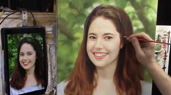
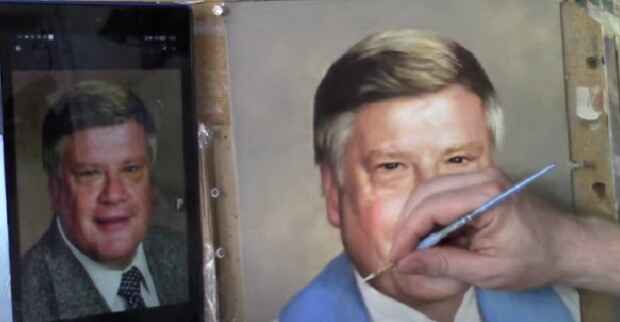
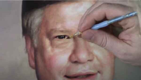
How To Adjust Eyes, Mouth, And More In Your Portrait
Enhance your portraits with detailed adjustments using the glazing technique
Portrait painting is a journey that involves continuous learning and refinement. One of the key skills to master is the ability to make adjustments to the eyes, mouth, and other facial features. These fine-tuning techniques can significantly enhance the likeness and realism of your portraits. In this blog post, we will explore the glazing technique, a method that allows for precise adjustments and seamless blending. By following this step-by-step guide, you will be able to elevate your acrylic painting skills and achieve a more lifelike finish.
Preparing Your Workspace and Materials
Before diving into the painting process, it is crucial to prepare your workspace and materials. A well-lit area is essential, and all necessary supplies should be within reach. For this session, you will need:
- Acrylic paints (including raw umber, ultramarine blue, and alizarine crimson)
- Matte medium
- A variety of brushes (including a Princeton Velvet Touch size 4)
- A reference photo (preferably a lighter version to see details clearly)
By ensuring that your materials are ready, you will be able to focus entirely on the painting process without interruptions.
Assessing and Adjusting the Reference Image
The first step involves assessing your reference image. If the original photo is too dark, it is recommended to create a lighter version to help identify finer details. This step is essential for making accurate adjustments to the eyes, mouth, and other facial features. In the example discussed, the artist used a 20×24 commission portrait and identified areas that needed slight adjustments for better likeness.
Mixing the Right Colors
Next, it is important to mix your paints to create a rich, almost black color. Combine raw umber, ultramarine blue, and alizarine crimson. Adjust the color temperature as needed to achieve the desired shade. This custom mix will help in fine-tuning the details and nuances of the portrait.
Applying the Glaze
The glazing technique involves applying a thin, translucent layer of paint over the existing layers. The brush should be dipped into clear matte medium and mixed with the custom color to create a translucent glaze. This diluted glaze allows for smoother blending and more precise adjustments. For instance, when adjusting the width of the subject’s mouth, the artist added a bit of darkness to the nasal labial fold and then blended it out using the diluted glaze.
Blending Techniques
Blending is a critical aspect of the glazing technique. To achieve seamless transitions, the following method should be used:
- Apply the glaze to the desired area.
- Dab the surface with a finger or a clean brush to soften the edges.
- Repeat the process as needed to build up the desired opacity and smoothness.
This technique ensures that the adjustments blend naturally with the existing layers, creating a lifelike finish.
Enhancing Facial Features
Pay close attention to key facial features, such as the eyes, nose, and mouth. Small adjustments can significantly impact the overall likeness of the portrait. For example, in the video tutorial below, the artist shifted the eyes slightly to the left and added shading to the tear ducts to enhance realism. Similarly, refining the angles and shading of the mouth can make the smile appear more natural and expressive.
Adjusting the Eyes
The eyes are often referred to as the windows to the soul, making their accuracy crucial in portrait painting. To adjust the eyes:
- Study the reference photo closely to determine the necessary adjustments.
- Apply a translucent glaze to the areas that need modification.
- Blend the glaze smoothly to ensure a natural transition.
- Pay attention to the placement of the iris and the overall shape of the eyes.
These steps will help create a more lifelike and expressive look in the eyes of your portrait.
Refining the Mouth
The mouth is another critical feature that can greatly affect the overall expression of the portrait. To refine the mouth:
- Adjust the shape and angles to match the reference photo.
- Use the glazing technique to add depth and definition to the lips.
- Blend the edges carefully to avoid harsh lines.
- Consider the relationship between the mouth and other facial features, such as the nasal labial fold.
These refinements will help in capturing the true character and emotion of the subject.
Final Touches and Refinements
After making the primary adjustments, it is important to take a step back and assess the portrait as a whole. Look for any areas that need additional refinement. The same glazing and blending techniques should be used to enhance these areas. For instance, adding warmth to the nasal labial fold with a bit of alizarin crimson can help the features blend more harmoniously.
Additional Tips for Realistic Portraits
While the glazing technique is powerful, several other tips can enhance your portraits further. Here are some additional suggestions:
- Use high-quality brushes: Investing in good quality brushes can make a significant difference in the application and blending of paint.
- Work in layers: Building up layers gradually can help achieve depth and realism in your portraits.
- Take breaks: Stepping back from your work periodically allows you to see it with fresh eyes and identify areas that need improvement.
- Study anatomy: A solid understanding of facial anatomy can aid in making more accurate adjustments and creating more lifelike portraits.
By incorporating these tips into your process, you can continue to improve your portrait painting skills and create works of art that truly capture the essence of your subjects.
Additional Resources
By following these steps, precise adjustments can be made to the eyes, mouth, and other facial features in your acrylic portrait. The glazing technique is a powerful tool that allows for subtle yet impactful refinements, enhancing the overall likeness and realism of your artwork.
For more tips and techniques, I recommend you download my free gift for you, a free guide, “Fix Muddy Skin Tones in Your Acrylic Portrait.” This comprehensive resource provides additional insights into correcting common issues and achieving a professional finish. Visit the Realistic Acrylic Portrait School for more tutorials, videos, and free downloadable guides to help you paint a portrait you can be proud of.
For a video tutorial, watch the full video below.
LEARN MORE
- Sketching Your Painting Accurately
- Beginning a Pet Portrait in Acrylic
- The Mystery of Realism in Painting
- Apply A Burnt Sienna Glaze to a Portrait
- Learn How to Sketch a Portrait Freehand in 45 Minutes
- Adding highlights to your acrylic painting
- 5 Excellent Reasons to Use Aluminum Foil
- Paint Realistic Wrinkles in Acrylic
- Painting Clothing in an Acrylic Portrait
- Paint a Cloudy Sky Acrylic
- How to add Semi-Opaque Highlights
- How to Enhance the Contrast in Your Acrylic
- How to Add Glaze to Your Acrylic Painting
- Paint Realistic Reflections on Eyeglasses in an Acrylic Portrait
- Build Up Depth on Your Acrylic Portrait Backgrounds
- How Do You Do Layers With the Glazing Technique?
- Learn How to Paint Wrinkles in Acrylic
Read more about how to paint a portrait that you can surely be proud of!
I’d love to hear your thoughts on this video. Please share it with your friends and family. Let me know if you have any further questions. I’ll greatly help you.
If you’d like to learn more, sign up for my free email tips and video class today.
Learn How to Paint Acrylic Portraits With My Free Mini-Video Course!
Thank you so much for taking the time to read this tutorial and watch the video. That means a lot to me. I hope you find it very helpful in your portrait painting.
Yours for Better Portraits,
P.S. Did you find this post helpful or encouraging? If so, send it in ahead! Let others know with the share buttons below. I’d love to hear your comments. Thank you so much! Also, do you have a question on acrylic portrait painting you’d like answered? Let me know, and I’d be happy to help

How to Paint a Smiling Man with Dark Hair
A step-by-step guide on painting a captivating portrait in just 30 minutes
Discover the secrets of creating a stunning 30-minute acrylic portrait of a smiling man with dark hair. Perfect for both beginners and experienced artists, this guide will walk you through each step of the process with expert tips and techniques.
Creating a portrait in just 30 minutes may seem like a daunting task, but with the right techniques and materials, it can be an exhilarating and rewarding experience. In this guide, we’ll explore the step-by-step process of painting a smiling man with dark hair using acrylics. Whether you’re a seasoned artist or a beginner looking to improve your skills, this tutorial will provide you with the tools and confidence needed to create a stunning piece of art in just half an hour.
Materials You’ll Need
Before diving into the painting process, ensure you have all the necessary materials at hand:
- Acrylic paints: A basic set including primary colors, white, and black.
- Brushes: A variety of sizes, including a flat brush, a round brush, and a detail brush.
- Canvas or painting surface: Preferably pre-primed for acrylics.
- Palette: For mixing your paints.
- Water and a container: For cleaning brushes.
- Paper towels or rags: For wiping brushes.
Step by- step on how to paint smiling man with dark hair in 30 minute acrylic portrait
Step 1: Prepare Your Workspace
Set up your workspace with all your materials within easy reach. Ensure you have good lighting to accurately see your colors and details. Place your reference photo in a visible spot for easy access.
Step 2: Sketch the Outline
Using a light pencil, sketch the basic outline of the man’s face on the canvas. Focus on the placement of key features such as the eyes, nose, mouth, and hairline. Keep the sketch light to avoid visible lines through the paint.
Step 3: Blocking in the Base Colors
Start by blocking in the base colors of the face. Mix a skin tone using a combination of white, red, yellow, and a touch of blue. Apply the skin tone using a flat brush, covering the entire face area. Don’t worry about details at this stage; focus on creating a smooth and even base layer.
For the hair, mix a dark brown or black shade and block in the hair area. Use broad, sweeping strokes to cover the entire hair section. This will serve as the foundation for adding texture and highlights later.
Step 4: Adding Shadows and Highlights
Once the base layer is dry, begin adding shadows and highlights to create depth and dimension. Mix a slightly darker shade of the skin tone for the shadows and a lighter shade for the highlights.
- Shadows: Apply the darker shade to areas such as under the cheekbones, around the eyes, and along the jawline. Use a soft, round brush to blend the edges, creating a smooth transition between the shadow and the base color.
- Highlights: Apply the lighter shade to areas where light naturally hits the face, such as the forehead, the bridge of the nose, and the tops of the cheeks. Blend the edges to create a seamless transition.
For the hair, add highlights by mixing a lighter shade of the base color and applying it to areas where light would naturally reflect, such as the top of the head and along the strands. Use a smaller brush for finer details.
Step 5: Detailing the Features
Now that the basic tones and shades are in place, focus on adding details to the facial features. This step brings the portrait to life and captures the subject’s expression.
- Eyes: Use a small detail brush to paint the whites of the eyes, leaving the pupils for later. Add shadows around the eye sockets and highlights to the upper eyelids to create depth. Paint the irises using a color that matches the reference photo, and add small highlights to give the eyes a lifelike sparkle.
- Nose: Refine the shape of the nose by adding subtle shadows along the sides and under the tip. Highlight the bridge and the tip to give the nose dimension.
- Mouth: Paint the lips using a mix of red and skin tone. Add shadows to the corners and under the lower lip to create volume. Highlight the center of the lower lip for a fuller appearance.
- Hair: Add fine strands and texture using a small brush and lighter shades of the base color. Pay attention to the direction of the hair growth and the natural flow of the strands.
Step 6: Final Touches
In this final step, refine any areas that need additional work and add the finishing touches. Check for consistency in lighting and shadows across the entire portrait. Add any necessary details, such as subtle wrinkles, moles, or other distinguishing features.
Step 7: Let It Dry
Allow the painting to dry completely before making any further adjustments or displaying it. Acrylic paints dry quickly, but it’s important to ensure all layers are thoroughly dry to prevent smudging or damage.
Tips for Success
- Work quickly: The 30-minute technique relies on swift application and blending. Keep your brush strokes fluid and confident.
- Practice blending: Smooth transitions between shadows, midtones, and highlights are key to creating a realistic portrait. Practice blending techniques on a separate sheet before applying them to your painting.
- Use a limited palette: Working with a limited color palette can help maintain color harmony and simplify the painting process.
By following these steps, you can create a stunning and expressive portrait of a smiling man with dark hair using the 30-minute acrylic portrait painting technique. This method allows you to achieve impressive results in a short amount of time, making it perfect for artists of all skill levels. With practice and patience, you’ll be able to capture the essence of your subjects and bring them to life on canvas.
Remember, the key to learn this technique is practice and experimentation. Don’t be afraid to try different approaches and make adjustments as needed. Happy painting!
Watch the video below for more details.
LEARN MORE
- Sketching Your Painting Accurately
- Beginning a Pet Portrait in Acrylic
- The Mystery of Realism in Painting
- Apply A Burnt Sienna Glaze to a Portrait
- Learn How to Sketch a Portrait Freehand in 45 Minutes
- Adding highlights to your acrylic painting
- 5 Excellent Reasons to Use Aluminum Foil
- Paint Realistic Wrinkles in Acrylic
- Painting Clothing in an Acrylic Portrait
- Paint a Cloudy Sky Acrylic
- How to add Semi-Opaque Highlights
- How to Enhance the Contrast in Your Acrylic
- How to Add Glaze to Your Acrylic Painting
- Paint Realistic Reflections on Eyeglasses in an Acrylic Portrait
- Build Up Depth on Your Acrylic Portrait Backgrounds
- How Do You Do Layers With the Glazing Technique?
- Learn How to Paint Wrinkles in Acrylic
Read more about how to paint a portrait that you can surely be proud of!
I’d love to hear your thoughts on this video. Please share it with your friends and family. Let me know if you have any further questions. I’ll greatly help you.
If you’d like to learn more, sign up for my free email tips and video class today.
Learn How to Paint Acrylic Portraits With My Free Mini-Video Course!
Thank you so much for taking the time to read this tutorial and watch the video. That means a lot to me. I hope you find it very helpful in your portrait painting.
Yours for Better Portraits,
P.S. Did you find this post helpful or encouraging? If so, send it in ahead! Let others know with the share buttons below. I’d love to hear your comments. Thank you so much! Also, do you have a question on acrylic portrait painting you’d like answered? Let me know, and I’d be happy to help!

How To Know That Your Portrait Is Done: 4 Ways To Determine
A free guide for you: Recognizing the signs of your acrylic portrait painting is complete.
Painting a portrait is a labor of love, blending meticulous detail with artistic intuition. One of the most common questions artists face is: “How do I know when my portrait is done?” Overworking or underworking a piece can both detract from its final impact. In this comprehensive free guide, we will explore four key indicators to help you determine when your acrylic portrait painting is finished.
Four Ways to Determine When Your Acrylic Portrait Painting is Done
1. You’re Not Adding Value Anymore.
- Avoid Over-Detailing: Adding every tiny detail, such as individual eyebrow hairs or skin pores, can lead to a less realistic overall effect. More detail does not always equate to more realism.
- The Law of Diminishing Returns: As you add more and more detail, the impact of each additional touch decreases. If your changes are no longer enhancing the painting, it’s a sign that it might be time to stop.
2. You’re Making It Worse
- Quality Over Quantity: Sometimes, pushing a painting too far can actually detract from its quality. Overworking areas can lead to unrealistic textures and tones.
- Correcting Mistakes: If adjustments are making the portrait look worse, it’s better to correct those mistakes and call it done rather than risk further deterioration.
3. Deadlines
- Meeting Deadlines: Whether for an art show, contest, or commission, deadlines can dictate when a painting must be completed. Utilize techniques like glazing to ensure the entire canvas is addressed, even if it’s not perfect.
- Practical Completion: Sometimes, a portrait must be finished because of time constraints. In such cases, ensure all sections of the canvas are covered and presentable.
4. Client Approval
- Satisfaction Guaranteed: When working on commissioned portraits, the client’s approval is a definitive indicator that the work is done. Avoid making additional changes after the client has approved the piece to prevent any dissatisfaction.
- Final Touches: Only make minor adjustments, such as fixing small errors or adding finishing touches, after client approval.
Practical Tips for Finishing Your Portrait Painting
- Take a Step Back: Regularly view your portrait painting from a distance to see the overall effect.
- Seek Critiques: Have your work critiqued by peers or mentors to gain fresh perspectives.
- Compare with References: Consistently compare your portrait painting to your reference photo to ensure accuracy and completeness.
- Push Through Challenges: Avoid abandoning a portrait painting due to frustration. Instead, push past difficulties and aim to complete it to the best of your ability.
- Sign and Varnish: Once you’ve decided your portrait painting is done, sign it, varnish it, and allow it to dry properly before presenting or shipping it.
For a detailed guide, watch the complete video tutorial below
Bonus Tip: Emotional Readiness
Sometimes, prolonged work on a single piece can lead to burnout. If you find yourself loathing the project or feeling emotionally drained, it may be time to wrap it up and move on to new projects. However, ensure you’re not giving up on frustration but rather recognizing a natural conclusion to your efforts.
Knowing when your acrylic portrait painting is done is both a skill and an art. By understanding the signs of overworking, meeting deadlines, and seeking client approval, you can confidently determine when your portrait is ready for the world. Remember, each portrait is a step in your artistic journey, and finishing a piece is an achievement worth celebrating.
Embrace the process, trust your instincts, and continue to refine your skills with each new project. Happy painting!
LEARN MORE
- Sketching Your Painting Accurately
- Beginning a Pet Portrait in Acrylic
- The Mystery of Realism in Painting
- Apply A Burnt Sienna Glaze to a Portrait
- Learn How to Sketch a Portrait Freehand in 45 Minutes
- Adding highlights to your acrylic painting
- 5 Excellent Reasons to Use Aluminum Foil
- Paint Realistic Wrinkles in Acrylic
- Painting Clothing in an Acrylic Portrait
- Paint a Cloudy Sky Acrylic
- How to add Semi-Opaque Highlights
- How to Enhance the Contrast in Your Acrylic
- How to Add Glaze to Your Acrylic Painting
- Paint Realistic Reflections on Eyeglasses in an Acrylic Portrait
- Build Up Depth on Your Acrylic Portrait Backgrounds
- How Do You Do Layers With the Glazing Technique?
- Learn How to Paint Wrinkles in Acrylic
Read more about how to paint a portrait that you can surely be proud of!
I’d love to hear your thoughts on this video. Please share it with your friends and family. Let me know if you have any further questions. I’ll greatly help you.
If you’d like to learn more, sign up for my free email tips and video class today.
Learn How to Paint Acrylic Portraits With My Free Mini-Video Course!
Thank you so much for taking the time to read this tutorial and watch the video. That means a lot to me. I hope you find it very helpful in your portrait painting.
Yours for Better Portraits,

P.S. Did you find this post helpful or encouraging? If so, send it in ahead! Let others know with the share buttons below. I’d love to hear your comments. Thank you so much! Also, do you have a question on acrylic portrait painting you’d like answered? Let me know, and I’d be happy to help!

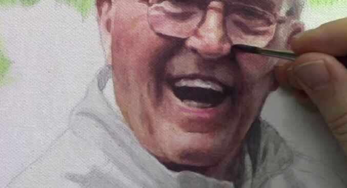
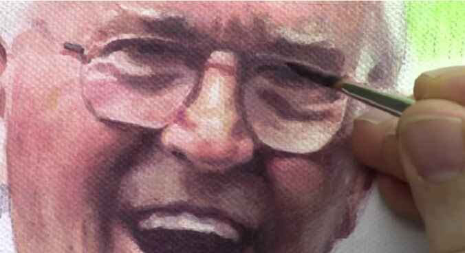
How to Make Your Acrylic Portrait Realistic With Vibrant
From initial sketch to final Glaze: A comprehensive guide to acrylic portrait painting techniques
The process of making a realistic acrylic portrait painting involves mastering various techniques, with shadows being one of the most crucial. In this comprehensive guide, I’ll show you through my process of painting an 11×14 acrylic portrait of a late pastor.
Highlighting the importance of shadows and finishing touches. At the end of this video tutorial, you’ll have a deeper understanding of how to bring your portraits to life with realistic depth and dimension.
The Importance of Shadows in Portrait Painting
Shadows add depth and dimension to a portrait, making it look realistic. They help define the line of the face and other elements, giving the painting a three-dimensional appearance. Here’s how you can make the shadow of your acrylic portrait painting realistic.
- Choosing the Right Colors: Start by selecting a shadow color that complements your base tones. For this portrait, I used a mix of raw umber dark, titanium white, and ultramarine blue. Adjust the mix to avoid overly harsh or light shadows.
- Applying Shadows to the Chin and Jawline: To create a shadow under the chin, I applied the shadow mix to darken the clerical collar, enhancing the depth and realism. Extend the shadows outward from the jawline to create a natural gradient.
- Detailing the Eyes: Adjust the reflections near the eyelids by darkening specific areas to highlight subtle details. This step is crucial for capturing the subject’s expression and character.
- Refining Teeth and Lips: Add fine details to the teeth and lips without overdoing them. Too much detail can make the painting look artificial. Aim for subtlety to maintain a natural look.
- Enhancing Cloths and Accessories: Softly outline the chains and zippers in the subject’s vestment. Use sketch lines as a guide, then soften them to create a realistic appearance.
Step-by-Step Process of Adding Shadows
Step 1: Mixing Shadow Colors
- Mix raw umber dark, titanium white, and ultramarine blue to create a balanced shadow color.
- Adjust the mix if it appears too blue by adding more raw umber.
Step 2: Applying Shadows Under the Chin
- Apply the shadow mix under the chin and along the jawline.
- Darken the clerical collar to emphasize the shadow cast by the chin.
Step 3: Extending Shadows from the Shoulder and Arm
- Gradually extend the shadows from the shoulder and arm area, creating a smooth gradient.
- Use a light touch to blend the shadows seamlessly into the surrounding areas.
Step 4: Adjusting Eye Reflections
- Darken the reflection near the eyelids by adding a small amount of brown at the top.
- Ensure the reflection is subtle to enhance the realism of the eyes.
Step 5: Detailing Teeth and Lips
- Add minimal details to the teeth to suggest their presence without making them too prominent.
- Enhance the highlights on the lips to give them a glossy appearance.
Step 6: Softening Sketch Lines on Cloth.
- Use a mix of white and blue to soften the sketch lines on chains and zippers.
- Break up the lines into small segments to mimic the appearance of chains.
Final Touches
As you near the completion of your portrait, it’s essential to review your work with fresh eyes. Here are some final touches to consider:
First, Emphasizing Highlights: Use titanium white mixed with a touch of red to enhance the highlights on the lips and other reflective areas.
Secondly, Cloth Details: Ensure the chains and zippers are well-defined but not overly harsh. Subtlety is key to achieving a realistic portrait.
Lastly, Balancing Shadows and Highlights: Revisit the shadowed areas and adjust as needed to ensure a balanced contrast with the highlights.
Final Review: Take a break and revisit your painting the next day. A fresh perspective can help identify areas that need improvement.
Watch the Process
For a detailed guide, watch the complete video tutorial here.
Creating a realistic acrylic portrait painting involves patience, practice, and attention to detail. Especially in learning shadow techniques and applying subtle touches. And you can bring your portraits to life with depth and realism. Remember, the key is to balance shadows and highlights, ensuring a natural and lifelike portrait.
Happy painting! Get your free acrylic portrait painting techniques and don’t forget to share your progress and finished works. If you found this tutorial helpful, please give it a thumbs up and subscribe to my YouTube channel for more painting tips and tutorials.
LEARN MORE
- Sketching Your Painting Accurately
- Beginning a Pet Portrait in Acrylic
- The Mystery of Realism in Painting
- Apply A Burnt Sienna Glaze to a Portrait
- Learn How to Sketch a Portrait Freehand in 45 Minutes
- Adding highlights to your acrylic painting
- 5 Excellent Reasons to Use Aluminum Foil
- Paint Realistic Wrinkles in Acrylic
- Painting Clothing in an Acrylic Portrait
- Paint a Cloudy Sky Acrylic
- How to add Semi-Opaque Highlights
- How to Enhance the Contrast in Your Acrylic
- How to Add Glaze to Your Acrylic Painting
- Paint Realistic Reflections on Eyeglasses in an Acrylic Portrait
- Build Up Depth on Your Acrylic Portrait Backgrounds
- How Do You Do Layers With the Glazing Technique?
- Learn How to Paint Wrinkles in Acrylic
Read more about how to paint a portrait that you can surely be proud of!
I’d love to hear your thoughts on this video. Please share it with your friends and family. Let me know if you have any further questions. I’ll greatly help you.
If you’d like to learn more, sign up for my free email tips and video class today.
Learn How to Paint Acrylic Portraits With My Free Mini-Video Course!
Thank you so much for taking the time to read this tutorial and watch the video. That means a lot to me. I hope you find it very helpful in your portrait painting.
Yours for Better Portraits,

P.S. Did you find this post helpful or encouraging? If so, send it in ahead! Let others know with the share buttons below. I’d love to hear your comments. Thank you so much! Also, do you have a question on acrylic portrait painting you’d like answered? Let me know, and I’d be happy to help!