Category Archives for How to Paint Children and Babies

How to Paint Realistic Trees & Grass in Your Acrylic
It’s important to know how to paint greenery in your acrylic portrait.
In this tutorial, we’ll explore how to paint realistic trees and grass using the acrylic glazing technique. This approach allows for gradual layering of colors, which adds depth and vibrancy to your landscape. Acrylic glazing helps build up the scene, much like how an oil painting develops, while maintaining the versatility and quick-drying benefits of acrylics.
Whether you’re working on a portrait background or a full landscape, these methods will enhance your painting’s realism. So, grab your brushes and let’s dive in!
Materials You’ll Need
Before starting, make sure you have these essential tools:
- Acrylic paints (Raw umber, ultramarine blue, indian yellow, phthalo blue)
- Matte medium
- Flat brushes
- Palette
- Reference photo (optional)
Step-by-Step Guide to Painting Trees and Grass
1. Prepare Your Palette and Materials
Begin by setting up your palette with the necessary colors. In this painting, raw umber and ultramarine blue will serve as the foundation for shadows, while indian yellow and phthalo blue will add vibrancy to the lighter areas. Make sure to have a matte medium to thin out your paints for glazing.
Transitioning between vibrant and muted colors is key. As you work in darker areas, shift away from highly saturated colors like Indian Yellow to cooler tones like ultramarine blue.
2. Start with a Sketch
Begin with a light sketch on your canvas, which will act as a guide for placing trees and grass. Use thin layers of paint to avoid covering up your sketch too early. In the initial stages, the painting may resemble a watercolor, but as you apply more glazes, it will begin to take on the characteristics of a full-bodied acrylic painting.
3. Apply the First Layer of Glazes for the Grass
When painting grass, start by applying a base layer using vibrant colors like Indian yellow and phthalo blue. This combination gives the grass a rich, glowing appearance. As you move further away into the background or shadows, use cooler and less intense tones like raw umber.
For glazing, thin out your paint with matte medium to make it translucent. This will allow previous layers to show through, creating depth. Layering slowly is crucial—don’t rush the process.
4. Develop Shadows Within the Shadows
Once the initial glaze dries, begin adding darker tones to create depth. In this case, mix raw umber dark with ultramarine blue. The deeper shades of color should be applied sparingly to the areas that are farthest from the light source. This technique, known as adding “shadows within the shadows,” adds dimension and makes your painting more realistic.
In places where light barely reaches, such as underneath trees or in between clumps of grass, carefully brush in darker glazes. Thin these glazes with matte medium to ensure the darkness isn’t overpowering.
5. Blending Techniques for a Smooth Transition
To achieve a seamless blend between light and dark areas, use a dry brush technique. As the paint on your brush begins to run out, use the remaining paint to blend areas softly. Gently sweep the brush back and forth in different directions, blending the layers into each other.
Switching between horizontal and vertical brush strokes can smooth the transitions between glazes, ensuring a more natural look for both trees and grass.
Tips & Techniques for Realistic Trees and Grass
- Use Cooler Colors for Depth: Darker areas should have cooler, less intense colors. Avoid overly vibrant shades in the shadows to maintain realism.
- Layer Gradually: Build your painting slowly, one thin layer at a time. This helps the colors blend well and creates a smooth transition from light to dark.
- Reference Photos: Keep a reference photo nearby to help guide your light and shadow placement. Analyze where the darkest areas should be in relation to the light source.
- Be Patient: The glazing technique takes time. Allow each layer to dry completely before moving on to the next. This prevents muddying your colors and ensures each layer adds value to the final piece.
Read more about my additional resources, tutorials, to learn more and check out my free courses here. . Whether you’re a beginner or an experienced artist, there’s always something new to learn and apply to your paintings. Happy painting!
- Adding highlights to your acrylic painting
- 5 Excellent Reasons to Use Aluminum Foil
- Paint Realistic Wrinkles in Acrylic
- Painting Clothing in an Acrylic Portrait
- Paint a Cloudy Sky Acrylic
- How to add Semi-Opaque Highlights
- How to Enhance the Contrast in Your Acrylic
- How to Add Glaze to Your Acrylic Painting
- Paint Realistic Reflections on Eyeglasses in an Acrylic Portrait
- Build Up Depth on Your Acrylic Portrait Backgrounds
- How Do You Do Layers With the Glazing Technique?
- Learn How to Paint Wrinkles in Acrylic
Read more about how to paint a portrait that you can surely be proud of!
I’d love to hear your thoughts on this video. Please share it with your friends and family. Let me know if you have any further questions. I’ll greatly help you.
If you’d like to learn more, sign up for my free email tips and video class today.
Learn How to Paint Acrylic Portraits With My Free Mini-Video Course!
Thank you so much for taking the time to read this tutorial and watch the video. That means a lot to me. I hope you find it very helpful in your portrait painting.
Yours for Better Portraits,

P.S. Did you find this post helpful or encouraging? If so, send it on ahead! Let others know with the share buttons below. I’d love to hear your comments. Thank you so much! Also, do you have a question on acrylic portrait painting you’d like answered? Let me know, and I’d be happy to help!

How to Block In Skin Tone Values Using Glazing Technique
A step-by-step guide to glazing technique in acrylic portraits
Achieving realistic skin tones in acrylic portraits requires a nuanced approach, combining color theory with technique. The glazing technique, a method involving the layering of transparent color, can be highly effective for this purpose. In this post, we will explore how to block in skin tone values using the glazing technique, drawing from a practical demonstration by artist Matt Philleo. Whether you’re aiming for lifelike detail or a more stylized finish, this guide will help you understand and implement the essential steps in your acrylic painting.
Understanding the Glazing Technique
The glazing technique in acrylic painting involves applying thin, transparent layers of paint over a dry underpainting. This method enhances depth and richness in colors without overwhelming the underlying details. When blocking in skin tones, glazing allows for subtle gradations and realistic shading, critical for achieving lifelike results.
Step-by-Step Guide to Blocking In Skin Tone Values
- Prepare Your Palette: Start by setting up your palette with essential colors. For skin tones, commonly used colors include raw umber dark, raw sienna, alizarine crimson, and occasionally ultramarine blue. But these colors will form the base of your glazes, which are mixed with a matte medium to achieve transparency.
- Block In Basic Shapes and Values: Begin by analyzing your reference photo to identify the key shapes and values on the subject’s face. Because, blocking in these shapes with a darker tone, such as raw umber dark mixed with matte medium, helps establish the foundational values. But, this step is crucial for building the structure of the portrait.
- Technique Tip: Use a round brush for precision. This allows you to carefully place glazes in specific areas, such as the darker regions of the face, while preserving the light areas.
- Layering Glazes: Apply your first glaze layer over the basic shapes. For example, mix raw umber dark with raw sienna and alizarine crimson to create a flesh tone, and apply it to the areas where shadows naturally occur. This layer should be thin and transparent, gradually building up the color intensity.
- Technique Tip: Patience is key. When glazing requires multiple layers to achieve depth. Because it allow each layer to dry before applying the next to avoid mixing colors unintentionally.
- Adjusting Skin Tones: As can be seen your progress, you may need to adjust skin tones to match different areas of your reference photo. For cooler skin tones, incorporate a touch of ultramarine blue into your glaze mix. For warmer tones, consider adding pyrrole orange or indian yellow. Adjusting these colors will help you match the diverse skin tones present in your portrait.
- Technique Tip: Monitor the transparency of your glazes. Adding more matte medium will help maintain the transparency necessary for effective glazing.
- Refining Details: Once the basic values are in place, focus on refining details. Use a smaller brush to add more precise glazes to areas such as shadows around the eyes or lips. This step helps in achieving a more nuanced and realistic appearance.
- Technique Tip: Apply glazes in thin, smooth layers to avoid creating harsh lines. Gradually build up the color to achieve the desired effect.
- Final Adjustments: After blocking in and refining your skin tones, assess the overall portrait. Make any necessary adjustments to ensure consistency and harmony in skin tones across the portrait. This may involve adding additional layers of glaze or adjusting existing ones.
- Technique Tip: Stepping back from your work periodically can help you see it from a different perspective and make more informed adjustments.
Blocking in skin tone values using the glazing technique is a powerful method for creating depth and realism in acrylic portraits. By layering transparent colors and carefully adjusting tones, you can achieve lifelike results that capture the essence of your subject. But remember, patience and practice are essential in mastering this technique. With time, you’ll find that glazing becomes an invaluable tool in your acrylic painting repertoire.
Tips and Techniques Recap:
- Use a round brush for precision in blocking in values.
- Mix colors with matte medium to create transparent glazes.
- Apply glazes in thin, smooth layers and allow each to dry before adding more.
- Adjust colors based on skin tone variations and monitor glaze transparency.
- Refine details with smaller brushes and assess the overall portrait for consistency.
By following these steps, you’ll be well on your way to mastering the art of blocking in skin tone values using the glazing technique.
Read more about my additional resources, tutorials, to learn more and check out my free courses here. . Whether you’re a beginner or an experienced artist, there’s always something new to learn and apply to your paintings. Happy painting!
- Adding highlights to your acrylic painting
- 5 Excellent Reasons to Use Aluminum Foil
- Paint Realistic Wrinkles in Acrylic
- Painting Clothing in an Acrylic Portrait
- Paint a Cloudy Sky Acrylic
- How to add Semi-Opaque Highlights
- How to Enhance the Contrast in Your Acrylic
- How to Add Glaze to Your Acrylic Painting
- Paint Realistic Reflections on Eyeglasses in an Acrylic Portrait
- Build Up Depth on Your Acrylic Portrait Backgrounds
- How Do You Do Layers With the Glazing Technique?
- Learn How to Paint Wrinkles in Acrylic
Read more about how to paint a portrait that you can surely be proud of!
I’d love to hear your thoughts on this video. Please share it with your friends and family. Let me know if you have any further questions. I’ll greatly help you.
If you’d like to learn more, sign up for my free email tips and video class today.
Learn How to Paint Acrylic Portraits With My Free Mini-Video Course!
Thank you so much for taking the time to read this tutorial and watch the video. That means a lot to me. I hope you find it very helpful in your portrait painting.
Yours for Better Portraits,
P.S. Did you find this post helpful or encouraging? If so, send it on ahead! Let others know with the share buttons below. I’d love to hear your comments. Thank you so much! Also, do you have a question on acrylic portrait painting you’d like answered? Let me know, and I’d be happy to help!

5 Steps on How to Paint a Vibrant Acrylic Portrait
Learn the classical glazing technique for depth and luminosity
Acrylic painting is an exciting medium known for its versatility, but achieving the depth and vibrancy often associated with oil paintings can seem challenging. However, by employing the classical glazing technique, a method favored by old masters like Rembrandt, Titian, and Vermeer then you can produce rich, luminous results with acrylics. This blog post will guide you through 5 essential steps to create a vibrant acrylic portrait using this time-tested method.
This tutorial shows the entire process of painting a portrait. Here are the steps I show in this tutorial:
- Start with a Detailed Sketch.
- Apply the Initial Glaze Layers
- Layer and Build Gradation
- Introduce Vibrant Colors
- Focus on Nuances and Details
1. Start with a Detailed Sketch
Every masterpiece begins with a solid foundation, and in portrait painting, that foundation is the sketch. Before you start adding color to your canvas, take time to create a detailed and accurate sketch of your subject. For this project, an 11×14 portrait of three girls in a park serves as an example.
By using a sepia-tone prismacolor colored pencil, you can establish proportions and likeness. Accuracy in this stage helps set the stage for a calm and confident painting process. Once your sketch is ready, seal it with a clear matte medium. This acts as a protective layer, ensuring that the pencil lines remain intact as you begin adding paint.
- Tip: Use a flat brush (¾ inch to 1 inch wide) to apply the matte medium. Make sure the application is smooth and even, allowing it to dry thoroughly before proceeding to the next step.
2. Apply the Initial Glaze Layers
The heart of this painting method lies in glazing, where thin, transparent layers of paint are applied over one another to build depth and richness. Unlike traditional opaque acrylic painting, the classical glazing technique requires a mixture of 95% matte medium to 5% paint. This creates a very light wash that enables you to gradually build colors without overwhelming the canvas.
Begin by mixing raw umber dark with ultramarine blue to create lifelike skin tones and shadow areas. These first layers will be almost imperceptible, but they provide a strong base for the layers that follow.
- Tip: The first layers of glaze should be incredibly light. This allows for adjustments in color or value without the need to paint over mistakes. The glazing method helps avoid the common frustration of muddy colors often encountered in acrylic painting.
3. Layer and Build Gradation
Once the initial glaze is applied, it’s time to focus on layering. As you build up more layers, you’ll notice how the painting starts to take on a more vibrant and realistic appearance. The goal here is to create a seamless transition between light and dark values, blending tones smoothly to replicate the natural shading found in your reference photo.
In this step, more raw umber dark and ultramarine blue are used to deepen the shadows on the forehead and hair. This layering process helps achieve the subtle gradation required for realistic portraits.
- Technique: As you layer, ensure that each glaze is thin and transparent. Too much paint in a single layer can cause the painting to look heavy and lose the delicate transparency that glazing provides.
4. Introduce Vibrant Colors
To make your portrait truly vibrant, it’s essential to introduce bold colors into the glazing process. In this example, a dash of Liquitex hot pink was added to the dress to intensify the color and give it a glowing effect. The key is to use these bright colors sparingly, applying them in thin layers so that they blend harmoniously with the existing hues.
When applying glazes to areas like the clothing, make sure to leave the white areas exposed. This technique, known as “preserving the luminosity,” ensures that highlights remain bright and eye-catching, adding to the overall vibrancy of the portrait.
- Tip: When adding vibrant glazes, thin the paint with medium and apply it cautiously. This helps prevent overpowering the existing layers while enhancing the color saturation.
5. Focus on Nuances and Details
The final step in this process involves refining the smaller details and nuances that bring a portrait to life. For example, the highlights in the hair, shadows in the creases of clothing, and the subtle changes in skin tone around the eyes require careful attention.
In the final layers, you can also experiment with a semi-opaque mixture, using titanium white, raw umber dark, and organic red-orange to add warmth and depth to the skin tones. With each new layer, the portrait takes on more life, depth, and realism. At this stage, it’s important to use more opaque layers sparingly, as glazing is best suited for large areas, while more detailed parts, such as fingernails or eyes, may benefit from a slightly thicker application of paint.
- Technique: If you notice that certain areas appear too flat or lack depth, consider adding a dark glaze to emphasize the shadows. Because mixing ultramarine blue with raw umber dark creates a rich, deep tone perfect for refining these darker areas without relying on black paint.
Conclusion: Patience Is Key
As you add each layer of glaze, then always remember that patience is vital. Because acrylic glazing requires multiple layers, sometimes ten or more to achieve the desired depth and luminosity. Each layer builds upon the last, contributing to the portrait’s final vibrancy. While it may take time, the results are well worth the effort.
By following these five steps, you can create a stunning acrylic portrait with vibrant colors and lifelike depth, all while employing the classical glazing technique favored by the old masters.
For further resources and guides, visit realisticacrylic.com and check out my free courses to enhance your acrylic painting journey.
- How to Paint Foliage Using the Acrylic Glazing Technique
- How to Trace for an Accurate Portrait Sketch
- How to Paint Realistic Eyes in Your Acrylic Portrait
- How to Add Raw Umber Dark & Ultramarine Blue to Your Portrait
- How to Make Your Own Raw Umber Dark
- How to Paint Realistic Trees & Grass in Your Acrylic
- How to Block In Skin Tone Values Using Glazing Technique
- How to Paint Vibrant Reds in Your Acrylic Portrait
- How to Glaze Background Colors & More Acrylic Portrait
- How to Paint White Clothing in Your Acrylic Portrait
- How to Easily Transition from a Sketch to a Painting
- How to Block In Shading & Skin Tones in Your Acrylic
- How to Build Up Color on Acrylic Pet Portrait
- How to Build Up Form on Clothing with Acrylic
- How to Paint Dark Clothing Using Acrylic Glazing Technique
- How to Paint a 24 x 30 Acrylic With 30 People
- How to Do Smooth Shading with Acrylic
- How to Sketch an Acrylic Portrait with a Grid
Read more about how to paint a portrait that you can surely be proud of!
I’d love to hear your thoughts about this video. Please share it with your friends and family. Let me know if you have any further questions. I’ll greatly help you.
If you’d like to learn more, sign up for my free email tips and video class today.
Learn How to Paint Acrylic Portraits With My Free Mini-Video Course!
Thank you so much for taking the time to read this tutorial and watch the video. That means a lot to me. I hope you find it very helpful in your portrait painting.
Yours for Better Portraits,
P.S. Did you find this post helpful or encouraging? If so, send it on ahead! Let others know with the share buttons below. I’d love to hear your comments. Thank you so much! Also, do you have a question on acrylic portrait painting you’d like answered? Let me know, and I’d be happy to help!

How to Paint Two Bubble Frame Oval Acrylic Portraits
Unlock the secrets to creating captivating two bubble frame oval acrylic portraits
Painting two bubble frame oval acrylic portraits offers a unique opportunity to explore creativity and technique while crafting eye-catching artwork. In this guide, you’ll discover the essential steps to create stunning portraits that showcase not only your artistic skills but also the charming oval frames that elevate your paintings. Whether you’re a beginner or an experienced artist, you’ll learn how to blend colors effectively, capture realistic features, and compose your portraits for maximum impact. Let’s dive into the world of acrylic painting and bring your two bubble frame oval acrylic portraits to life!
How is my portrait project coming along?
“Um, I haven’t even started it yet.”
“Oh. Could you do another one and get it done for me by Christmas?”
“Let me check. Sure.”
This is kind of how the conversation went when a client called me on a portrait project that I had scheduled out for a few months. I was backed up with commissions, and it was already well into December.
Do another portrait when I was already behind? Why not? I thrive on a little deadline pressure. I’ve got an extra reserve of midnight oil 🙂
So here are the portraits I created, two convex-oval 14″ x 20″ acrylic on canvas paintings. I decided to work on both at once. And I got them both done in time, too, by God’s grace!
And now I want to show you how I painted them. I’ll take you through the process from the colors I select for the palette, the first few layers, all the way to the completed painting.
How I Painted These Oval Vintage Acrylic Portraits
This tutorial is a work in progress, so I’ll be adding more videos in the future!
Keep in touch and I’ll let you know when I post the next one!
Let me know how this tutorial helps!
Have you ever painted on an oval canvas or unusual surface before? If so, leave a comment and tell me about it. Have a blessed day!
LEARN MORE
- How to Paint Foliage Using the Acrylic Glazing Technique
- How to Trace for an Accurate Portrait Sketch
- How to Paint Realistic Eyes in Your Acrylic Portrait
- How to Add Raw Umber Dark & Ultramarine Blue to Your Portrait
- How to Make Your Own Raw Umber Dark
- How to Paint Realistic Trees & Grass in Your Acrylic
- How to Block In Skin Tone Values Using Glazing Technique
- How to Paint Vibrant Reds in Your Acrylic Portrait
- How to Glaze Background Colors & More Acrylic Portrait
- How to Paint White Clothing in Your Acrylic Portrait
- How to Easily Transition from a Sketch to a Painting
- How to Block In Shading & Skin Tones in Your Acrylic
- How to Build Up Color on Acrylic Pet Portrait
- How to Build Up Form on Clothing with Acrylic
- How to Paint Dark Clothing Using Acrylic Glazing Technique
- How to Paint a 24 x 30 Acrylic With 30 People
- How to Do Smooth Shading with Acrylic
- How to Sketch an Acrylic Portrait with a Grid
Read more about how to paint a portrait that you can surely be proud of!
Yours for better portraits,
P.S. Did you find this post helpful or encouraging? If so, send it on ahead! Let others know with the share buttons below. I’d love to hear your comments. Thank you so much! Also, do you have a question on acrylic portrait painting you’d like answered? Let me know, and I’d be happy to help!

How to Build Depth in Your Acrylic Portrait Backgrounds
Learn the art of layering to create stunning backgrounds
Creating depth in your acrylic portrait backgrounds can transform your artwork from flat and uninviting to vibrant and lifelike. This comprehensive guide will explore techniques and tips that can be utilized to effectively build depth in your acrylic paintings. Through careful layering, color mixing, and thoughtful brushwork, your backgrounds will not only enhance your portraits but also engage viewers and add emotional resonance.
Understanding Depth in Art
Depth in art refers to the illusion of three-dimensionality on a two-dimensional surface. It involves creating a sense of space, distance, and perspective. In acrylic portrait painting, the background plays a crucial role in establishing depth and can significantly influence the viewer’s perception of the subject.
Techniques for Building Depth
1. Layering with Glazes
Layering is one of the most effective techniques for creating depth. It involves applying transparent layers of paint over one another, allowing underlying colors and textures to show through.
- Start with a Base Layer: Begin with a solid background color that will serve as your foundation. A mid-tone color can be effective for this purpose.
- Apply Transparent Glazes: Use a mix of acrylic paint and a glazing medium to create transparent layers. Ultramarine blue and raw umber dark can be mixed to achieve subtle variations.
By layering these glazes, different values can be developed. The key is to allow each layer to dry before applying the next, which helps to create a sense of depth through the transparency and complexity of the colors.
2. Creating Gradation
Gradation can be used to suggest distance and atmosphere in your backgrounds. This can be achieved through both blending and glazing techniques.
- Segmented Areas: Instead of blending wet colors, use segmented areas of glazing to create smooth transitions. By touching certain areas while leaving others untouched, a subtle blend can be achieved. This method provides a more natural appearance and enhances the depth of the painting.
- Use of Color Temperature: Varying color temperature can add to the perception of depth. Cool colors, such as blues and greens, can recede in the background, while warmer tones tend to come forward. For instance, using a cooler ultramarine blue in the background while maintaining warmer tones in the foreground can create a compelling contrast.
3. Employing Contrast
Contrast is essential in making your subject stand out against the background. By darkening background areas, the foreground subjects will naturally become more pronounced.
- Darkening Techniques: When applying darker glazes, consider how the light interacts with your subject. By ensuring that the background is darker than the portrait, the subjects will appear more luminous.
This can be particularly effective when using glazes, as they dry quickly, allowing for rapid layering without mudding colors. As highlighted in the video, the layering properties of acrylics can be leveraged to achieve a depth that feels rich and engaging.
4. Incorporating Patterns and Textures
Adding textures or patterns can create interest in the background and contribute to the overall depth of the painting.
- Marble-like Backgrounds: A painterly, marble-like appearance can be achieved by varying brush strokes and layering colors. Short, diagonal strokes can create a textured effect that draws the viewer’s eye without overwhelming the portrait.
This not only enhances depth but also gives the background a dynamic quality that complements the portrait.
Tips for Effective Backgrounds
- Use a Limited Palette: A limited color palette can help maintain harmony in your painting. This also makes it easier to create depth, as the colors will blend and layer more cohesively.
- Experiment with Brush Techniques: Different brush types and strokes can create varying effects. Experimenting with short strokes, glazing, and layering will allow for discovering unique methods of adding depth.
- Balance Between Foreground and Background: Always consider the balance of colors and values between your foreground and background. This ensures that your subject remains the focal point while the background supports its presence.
- Stay Patient: Building depth takes time. Allow layers to dry completely between applications to achieve the best results.
Conclusion
Building depth in your acrylic portrait backgrounds is a rewarding endeavor that can significantly enhance your artwork. By employing layering techniques, creating gradation, utilizing contrast, and incorporating textures, your backgrounds will not only support your subjects but also engage viewers on a deeper level.
As you continue to practice and refine these techniques, your portraits will come to life, showcasing the beauty of depth in acrylic painting. The journey of learning and experimenting is essential for any artist, and through consistent practice, remarkable improvements will be evident in your work.
With these insights, you are now equipped to enhance your acrylic portrait backgrounds and bring your artistic vision to life. For further resources and guides, visit realisticacrylic.com and check out my free courses to enhance your acrylic painting journey. Happy painting!
The Video Lesson…
- How to Paint Foliage Using the Acrylic Glazing Technique
- How to Trace for an Accurate Portrait Sketch
- How to Paint Realistic Eyes in Your Acrylic Portrait
- How to Add Raw Umber Dark & Ultramarine Blue to Your Portrait
- How to Make Your Own Raw Umber Dark
- How to Paint Realistic Trees & Grass in Your Acrylic
- How to Block In Skin Tone Values Using Glazing Technique
- How to Paint Vibrant Reds in Your Acrylic Portrait
- How to Glaze Background Colors & More Acrylic Portrait
- How to Paint White Clothing in Your Acrylic Portrait
- How to Easily Transition from a Sketch to a Painting
- How to Block In Shading & Skin Tones in Your Acrylic
- How to Build Up Color on Acrylic Pet Portrait
- How to Build Up Form on Clothing with Acrylic
- How to Paint Dark Clothing Using Acrylic Glazing Technique
- How to Paint a 24 x 30 Acrylic With 30 People
- How to Do Smooth Shading with Acrylic
- How to Sketch an Acrylic Portrait with a Grid
Read more about how to paint a portrait that you can surely be proud of!
Let me know how this helps! If you have questions on your portrait painting, feel free to contact me ([email protected])
Yours for better portraits,
P.S. Did you find this post helpful or encouraging? If so, send it on ahead! Let others know with the share buttons below. I’d love to hear your comments. Thank you so much! Also, do you have a question on acrylic portrait painting you’d like answered? Let me know, and I’d be happy to help!
Would you like to learn portrait painting from me in person?
I’d like to let you know that I’ll be teaching at the Chippewa Valley Cultural Association (Heyde Center for the Arts, Chippewa Falls, WI) on March 12-13, 10:30am-3:30pm, a two-day intensive acrylic portrait painting workshop. The class size is limited to 10 people to make sure I can give each student feedback and individual instruction. For more details, visit my events page here…https://realisticacrylic.com/paint-an-acrylic-portrait-with-me-in-2019/

How to Draw a Lifelike Sketch for an Acrylic Portrait
Lifelike Sketch + Accurate Acrylic Layers + Patience= Realistic Acrylic Portrait. The equation works every time.
Even when you make mistakes. 🙂
Don’t worry, this won’t be a math lesson. That was not one of my better subjects in school!
But there is something to be said laying down a good foundation for your acrylic portrait with a lifelike sketch. When I mean lifelike, I don’t mean that it looks photographic, but rather that you capture the likeness of the subject–the person (or pet) you’re going to paint.
When you do that, you exponentially increase your chances for success in painting a realistic acrylic portrait.
Notice I didn’t say perfect. You don’t have to have a perfect sketch, just one that is as accurate as you can make it.
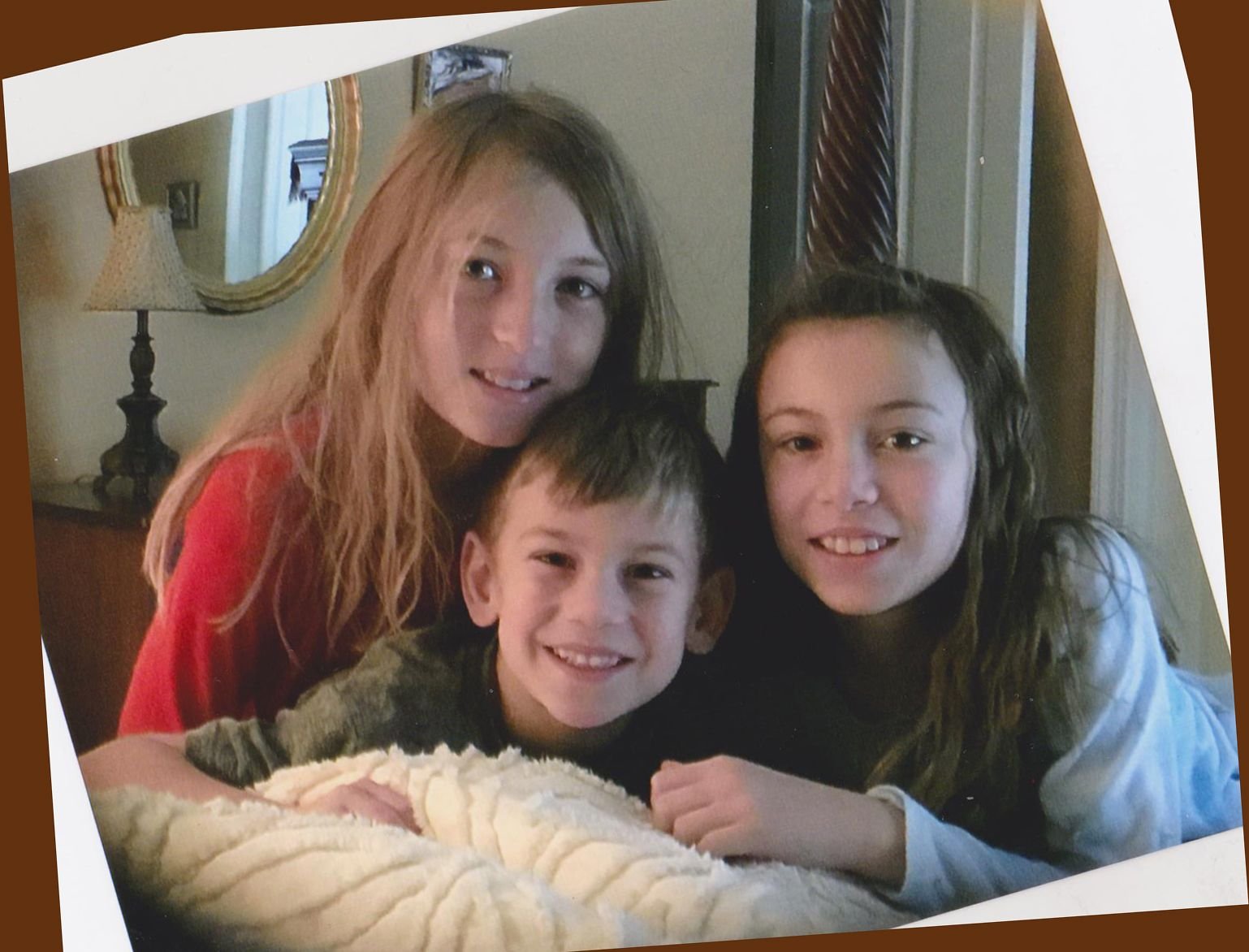
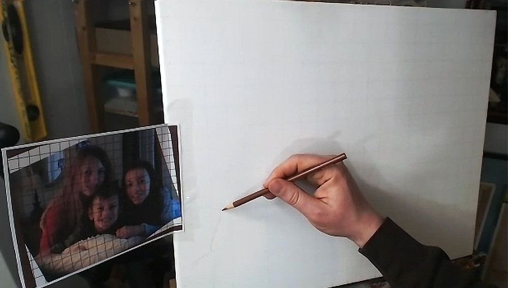
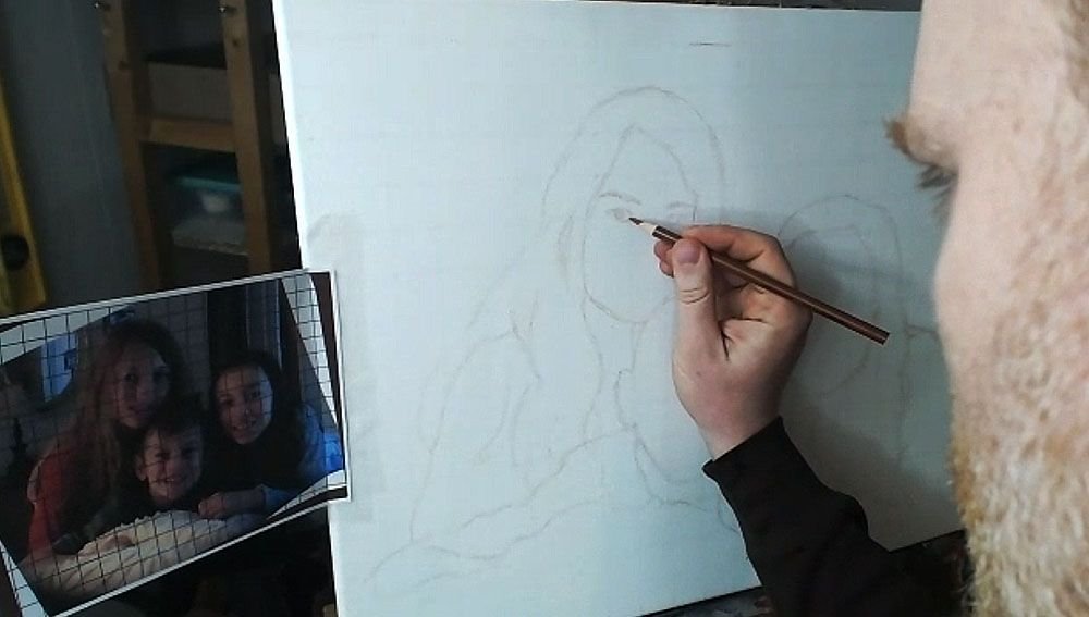
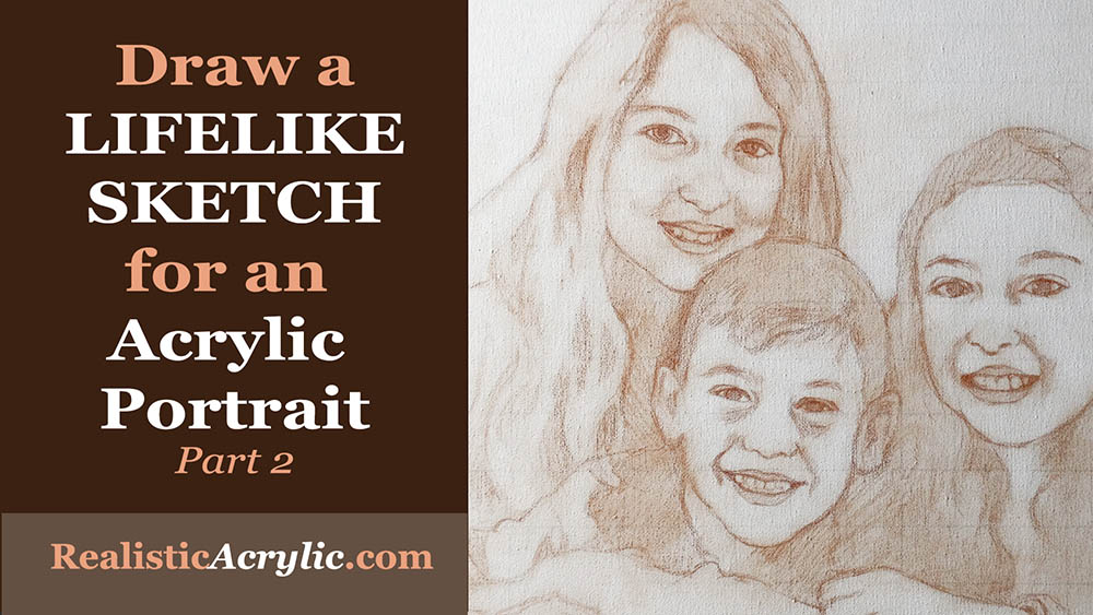
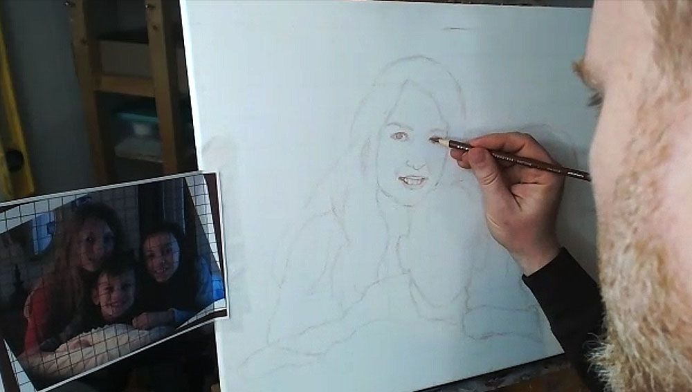
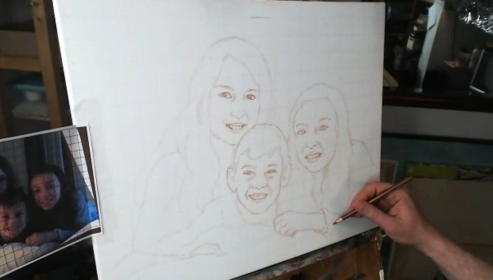
Today, I’m going to show you how I drew the sketch for a commissioned 16″ x 20″ acrylic portrait I’m working on of three children…
…based off a candid photo of them just hanging out on a bed. I tilted the image because I thought it was at an awkward angle. You can obviously see the original angle in shown in the edges.
Tools Needed:
You’ll want to use a sepia-toned colored pencil, like burnt ochre, dark brown, or terra cotta.
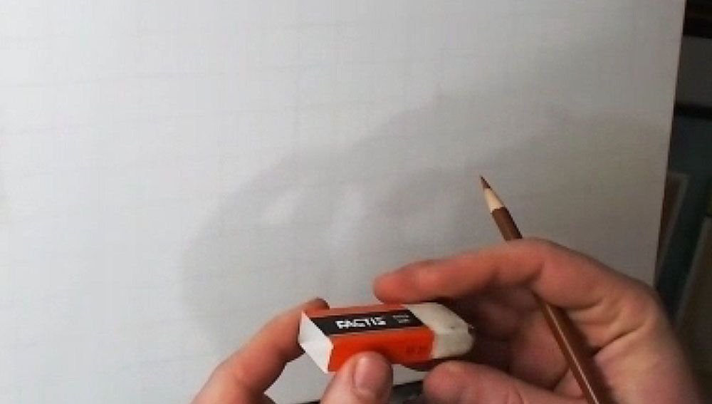
And then a white eraser.
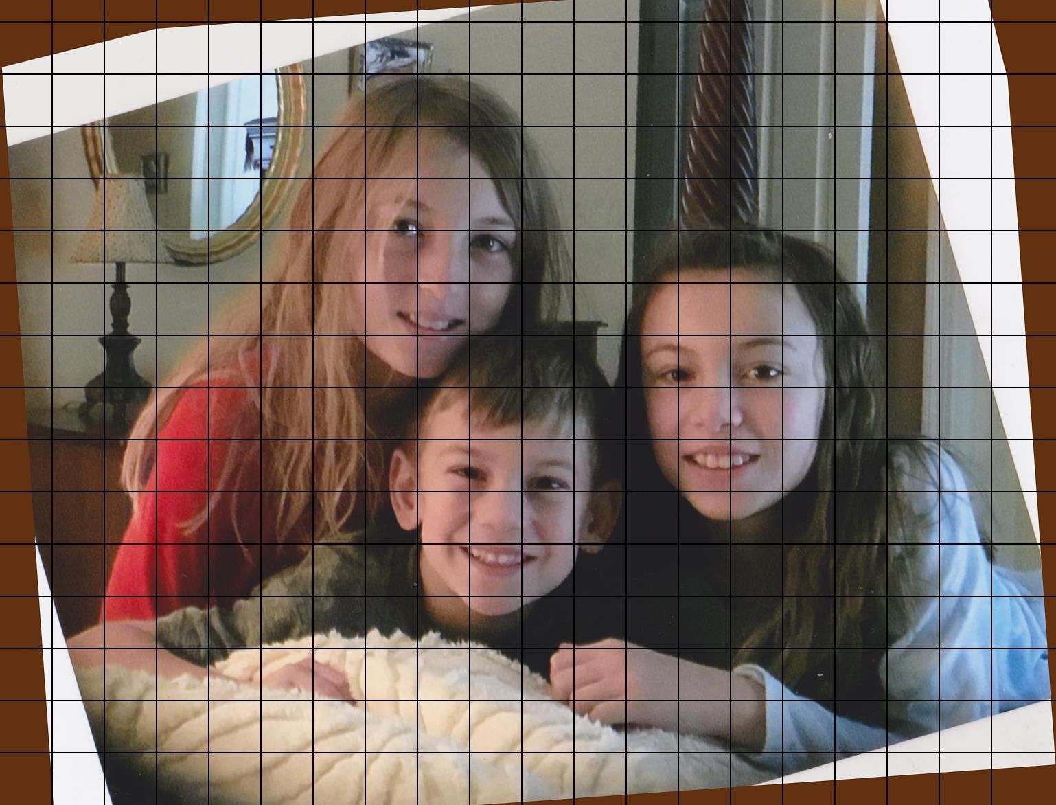
I started with a canvas that I drew a grid on–with 1″ squares, using a light colored pencil (light grey, tan or peach is fine). It is important to seal the grid in with a mixture of matte medium and gesso. This provides a barrier on the canvas so that when you need to erase anything on your sketch, you will not disturb the grid lines beneath. Also, it makes it amazingly easy to erase a sketch on your canvas–much easier than graphite pencil. This is a technique I discovered just by being frustrated with pencil and experimenting.
The photo reference is also gridded correspondingly to match the squares on the canvas. I used a grid drawing tool at ArtTutor.com and then printed out the image.
Alright, now let’s begin…
Step 1: Get Started in the Right Place
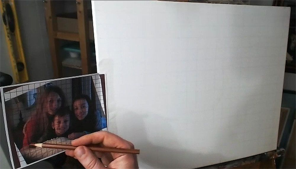
When using the grid technique, it’s so important to make sure you start sketching in the right place. Otherwise, you may end up sketching for a while, only to realize your composition will be off.
Yes, I made this mistake.
So, count off your squares, and double-check that you’re matching up on your canvas, what is on your reference photo.
Watch this video to see the beginning portion of the sketching process…
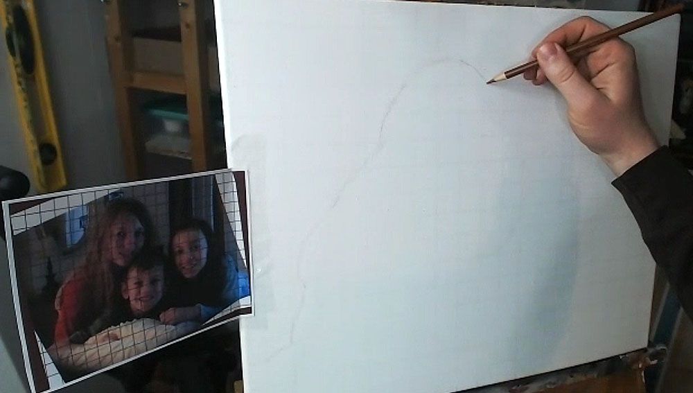
Step 2: Start Your Outlining the Forms of the Subjects
Here, we only want to get just the outside edges of the subjects and then fill them in. I start usually in the lower left corner and then work my way up and across. You don’t need to achieve perfection in this. But it is good to see where the major lines representing the shapes are intersecting the squares. Break it up into fractions.
(Uggh, math again. It’s OK. If I can do it, so can you, believe me!)
You note, “Okay, this line crosses through the vertical line of this square at about 1/2 of the way up.”
Or, “this line intersects the horizontal line of the other square about 2/3 of the way to the edge.”
You may see fractions like 1/4, 1/3, 1/2, 2/5, etc. You’ll begin to see them naturally and not even think about it with some practice. When you learn to do this, your gridded sketching will become very accurate.
Here is the sketch, with all the outlines filled in.
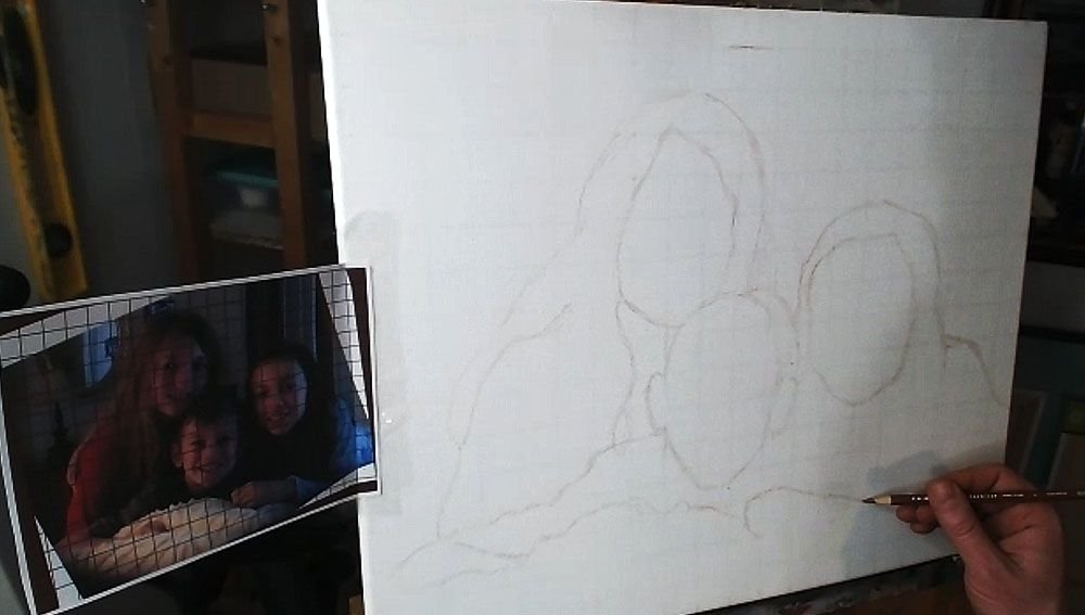
You’ll notice that I made a pretty large mistake, but thank God for erasers! I considered editing it out of the video, but then I figured, “Why not keep it in there, to show an accurate recording of my process?” We all make mistakes, but it’s what we do after we notice them that counts.
Step 3: Fill in the Features
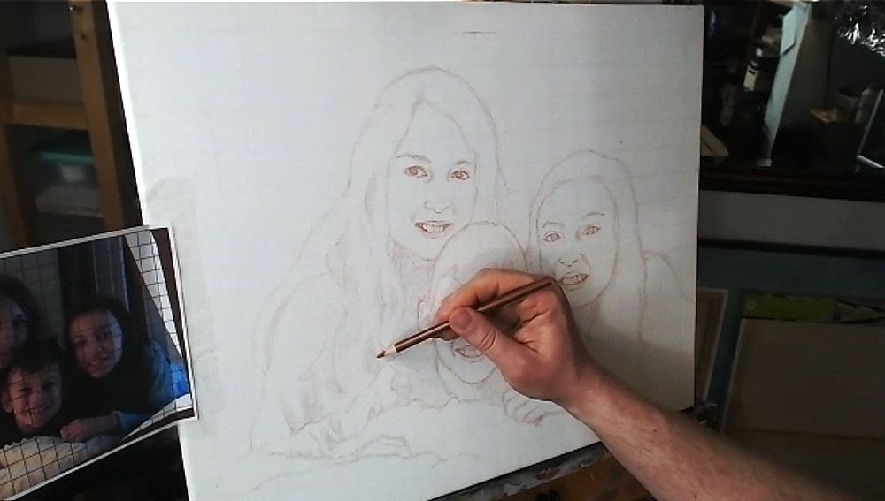
After getting the proportions of the subjects in correctly–the outside edges of the hair, the shoulders, the faces, etc., then you’re ready to move on to drawing the features. The reason we get the main forms defined first, is because we want to make sure we have an accurate foundation to drop the features on. In addition, you’ll be able to tell if you like the overall composition.
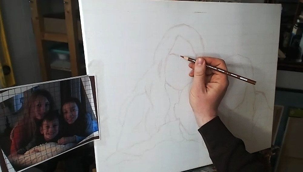
Now, when I start drawing in the facial features, I work from left to right, and then top, down. (Of course, if you’re left handed, you may naturally work in the other direction.)
I start by noting the angle of the eyebrows and sketch them first. Doing this will really establish the alignment of the face and your other features will need to be in conformity with it.
Then I draw the eyes loosely, and not too dark, so I can refine them later. The eyes are the most important feature on the face, so I really pay attention to them.
What is the overall shape? Are they skinny, angled, rounded? Are there prominent eyelids or are they barely perceptible? How far away are they from the eyebrows? How close are they together? Ask yourself these questions as you draw.
If you can get the eyes about 85% or more accurate, you’ll have a good portrait.
If you can get them 95% or more accurate, you’ll have an outstanding portrait, provided the other features are drawn fairly well.
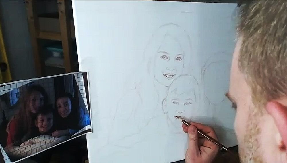
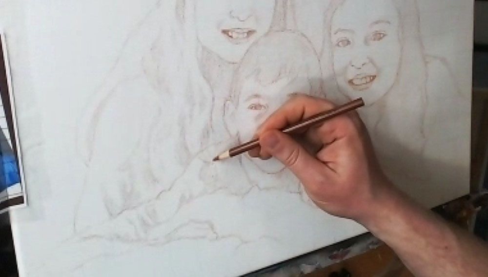
Next, draw in the nose. Observe your reference photo to see how far down the bottom of the nose is from an imaginary line that intersects the eyes. What is the shape of the nose and nostrils? Is it wide, narrow, rounded, sharp? Observe carefully and draw what you see.
After you get the proportions and shape of the nose accurately defined, it’s time to move on to the mouth.
I start with the top of the mouth, drawing in the bottom edge of the top lip and then the top edge of the bottom lip. I sometimes will draw the top edge of the top lip, if it’s very prominent–like, for example, when a woman is wearing lipstick. Of course, that is not the case for this drawing of three children.
I finish with the bottom edge of the bottom lip. Of course, I also draw in the teeth, but only lightly suggesting their form by showing the gumline, and the shadows on the sides where the teeth are foreshortened in perspective, and the lips cast shadows on them. The space between the visible teeth and the edges of the mouth is very important, and you’ll want to indicate it as a dark value, because it is in shadow.
One of the main mistakes I see artists making in their sketch is when they over-define the teeth. It makes the person you’re drawing look like they have braces. Pencil lines are just too dark of a value for the teeth, and it’s hard to overcome in the painting. Draw them lightly, and you’ll get better results.
Watch Part 2 of my video lesson below to see exactly how to do it…
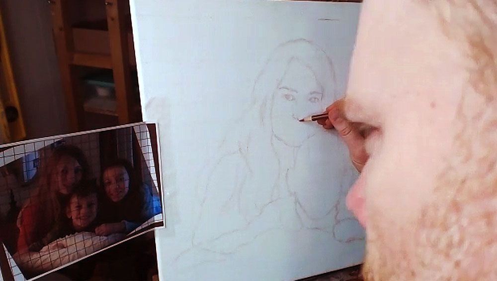
After I get the features sketched in loosely and lightly, then I go back over everything. I darken and refine.
I repeat the process on the other faces.
TIP: Look at your reference photo often as you draw–much more than you are currently. At least 30% is a good rule of thumb.
I can tell you from teaching portraiture in person, that students only rarely look at their reference photo. But you can only draw what you are observing, so observe more and draw better.
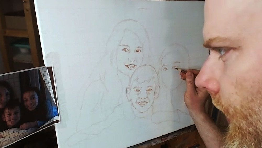
But if you make a mistake, you can always use an eraser!
Step 4: Finish Off the Forms
After filling in the facial features, I draw in the hair, hands, wrinkles for the clothing suggesting the shoulders and arms.
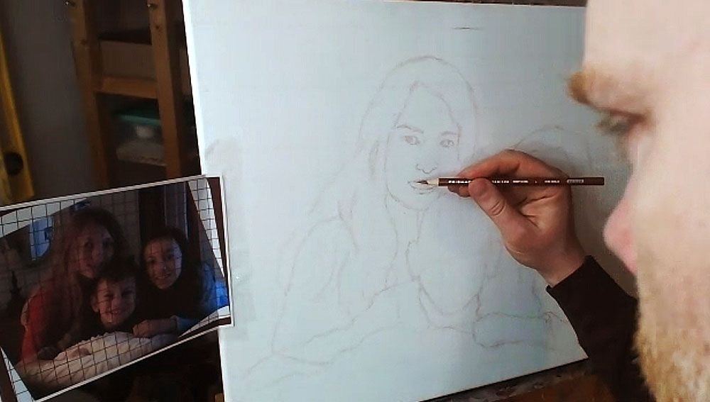
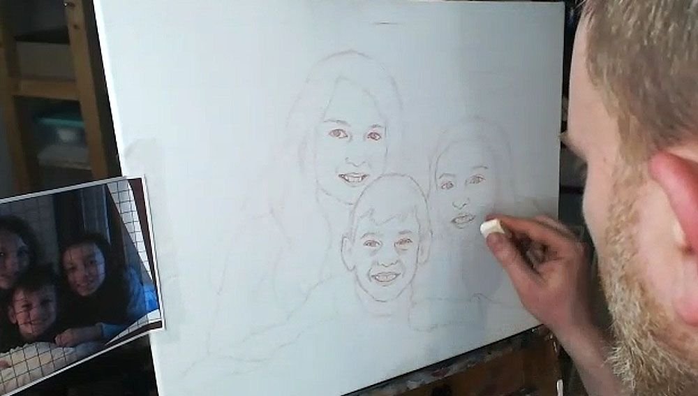
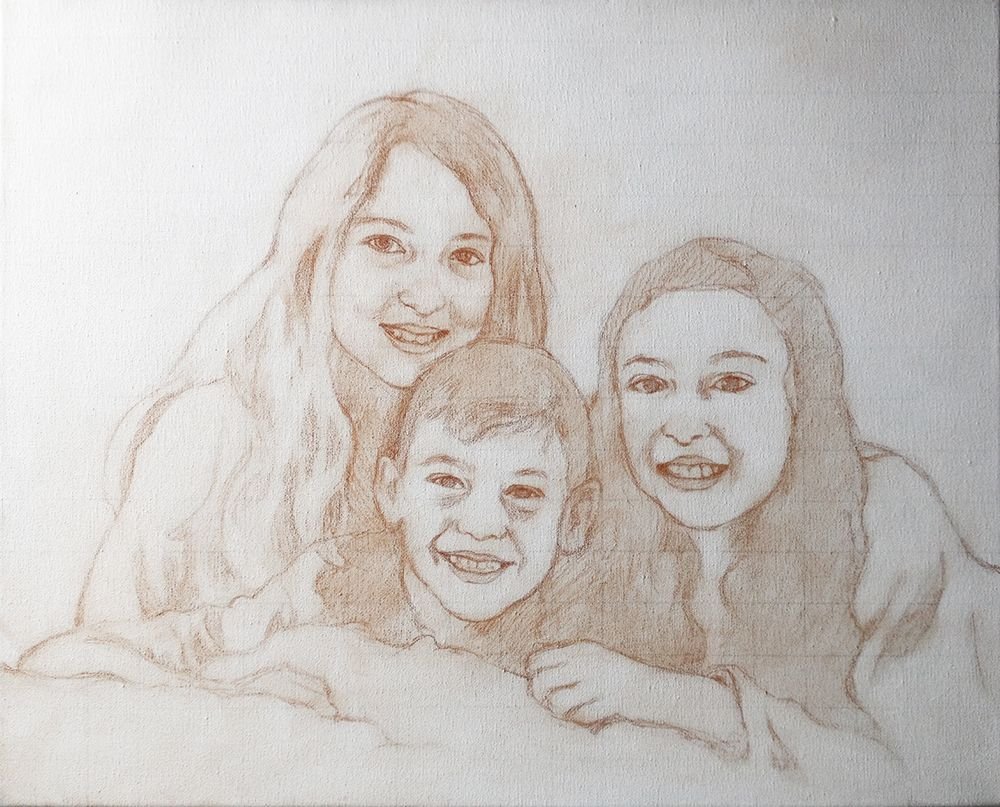
Step 5: Shade in the Major Values
Everything we see in the three-dimensional world is viewed in the context of differences in value and color. There really aren’t lines separating anything in nature, even though the concept of a line exists in geometry and we can obviously draw them.
So, with that , I feel it’s important to define the major values in your painting during the sketch stage. You’ll be much better prepared when you start painting. You won’t have to wonder subconsciously, “What do those bunch of lines represent?”
The values will let you know where to apply your first layers in the blocking-in stage of your painting. You can dive right in and do it.
So I fill them in, using the side of my pencil lead, rapidly. It doesn’t need to take much time. I just try to see the major areas of contrast, like the shadows under the faces, wrinkles in the clothing, locks of hair that aren’t illuminated, and represent it on the canvas.
Lastly, you can double-check the facial features on everything, and make sure it’s accurate.
And here’s the final sketch. Not perfect. But close enough that I can rectify any mistakes in the painting and bring it closer to a very accurate likeness.
I’ll be showing more of the process of this painting, breaking it down step-by-step and teaching you as I go along. I look forward to sharing more with you !
Have a blessed day,
P.S. Did you find this post helpful or encouraging? If so, send it on ahead! Let others know with the share buttons below. I’d love to hear your comments. Thank you so much! Also, do you have a question on acrylic portrait painting you’d like answered? Let me know, and I’d be happy to help!

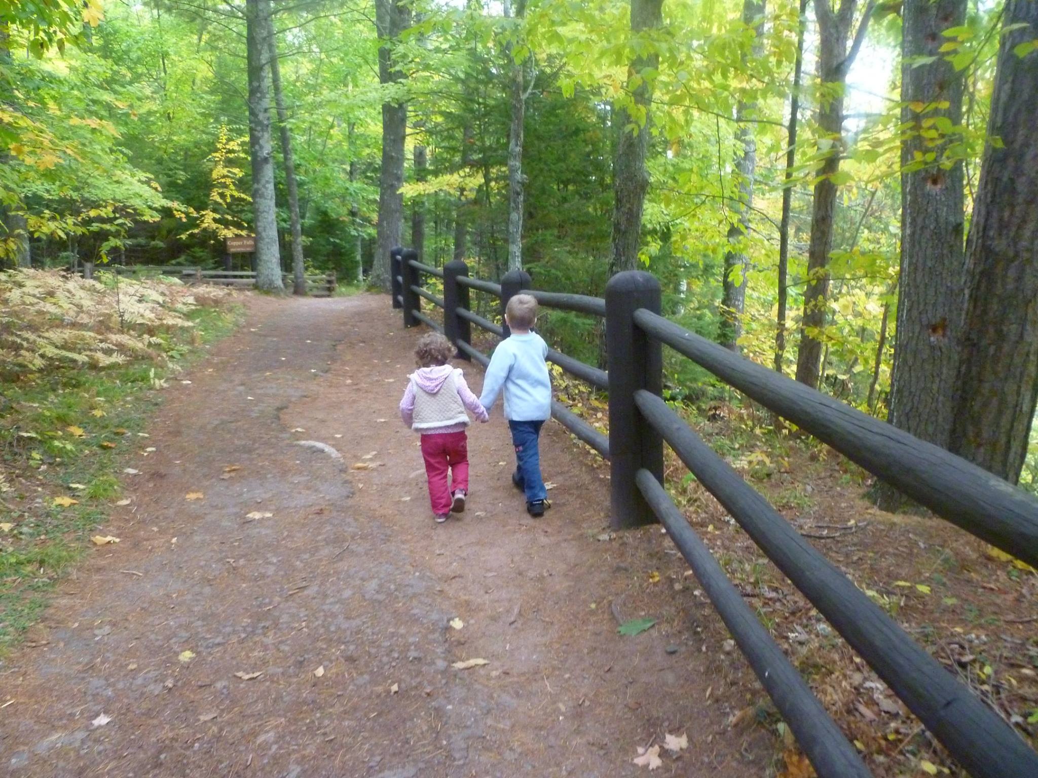
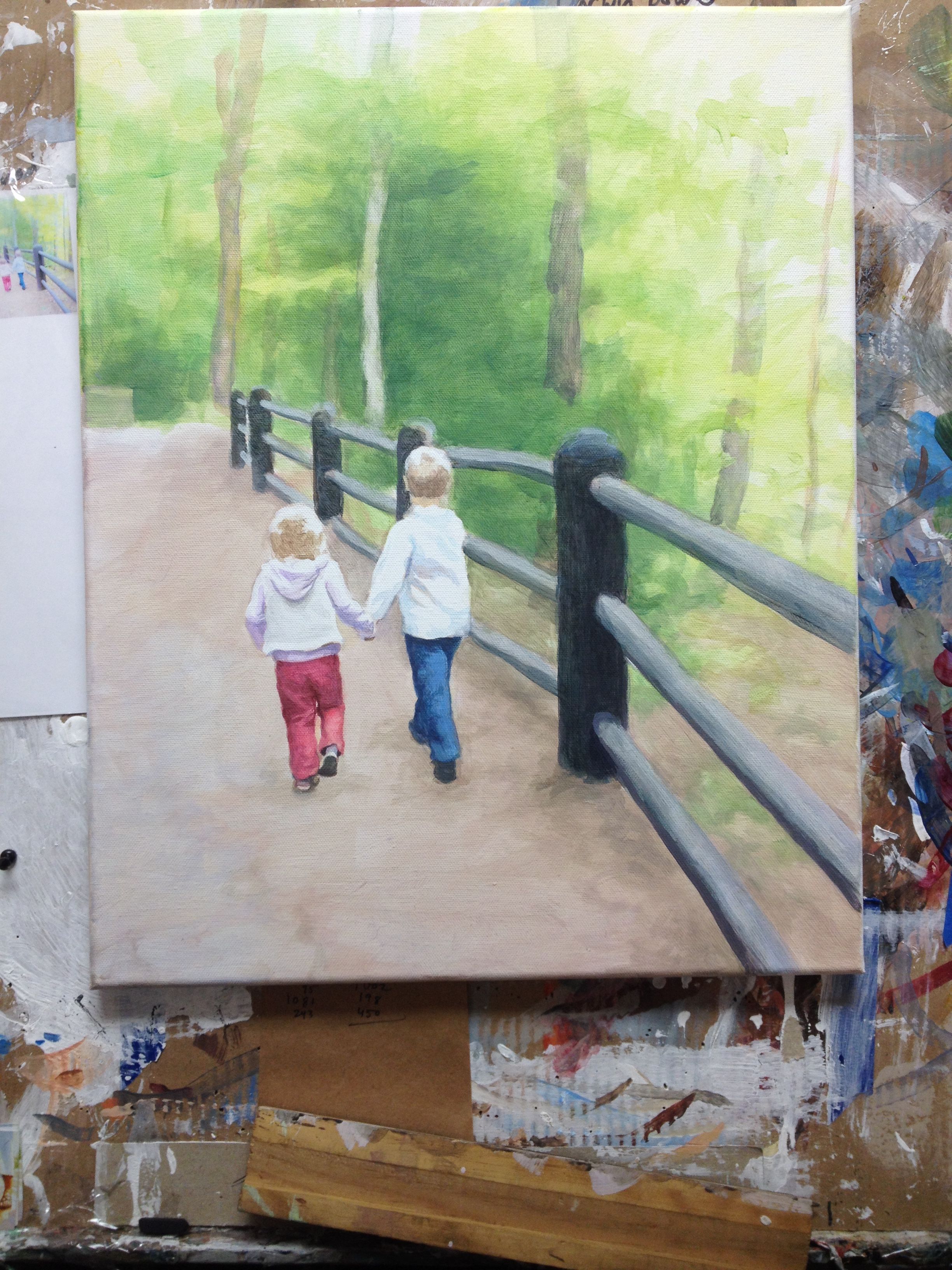
How to Paint a Children Walking in the Woods
Here is the final painting of my children walking through the woods, “Come as Children,” 16″ x 20″ acrylic on canvas, with a step-by-step breakdown of how I did it.
It will be used for a book cover illustration of Charles Spurgeon’s Devotionals for children. Below I want to do a recap of my previous posts from Facebook and Steemit, showing you the process of how I did this painting.
Reference Photo
In Progress Painting
Step 1: Blocking In the Forms
I start off very faint, just blocking in the colors with glazes. I mix about 90% clear acrylic medium to about 10% paint and just block in the composition, suggesting where the future colors will go. Here is my palette…
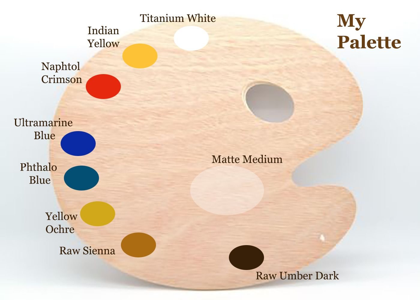
Normally, I use burnt sienna, but to challenge myself and also to enhance the color harmony within the painting, I omitted it.
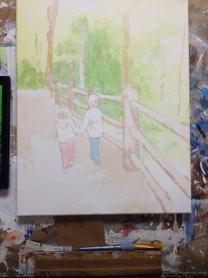
The first layers consisted of raw sienna, yellow ochre, phthalo blue and indian yellow for the background, and then for the posts: raw umber dark, ultramarine blue and napthol crimson. I blocked in the blue jeans with phthalo blue, and my daughter’s pants with napthol crimson.
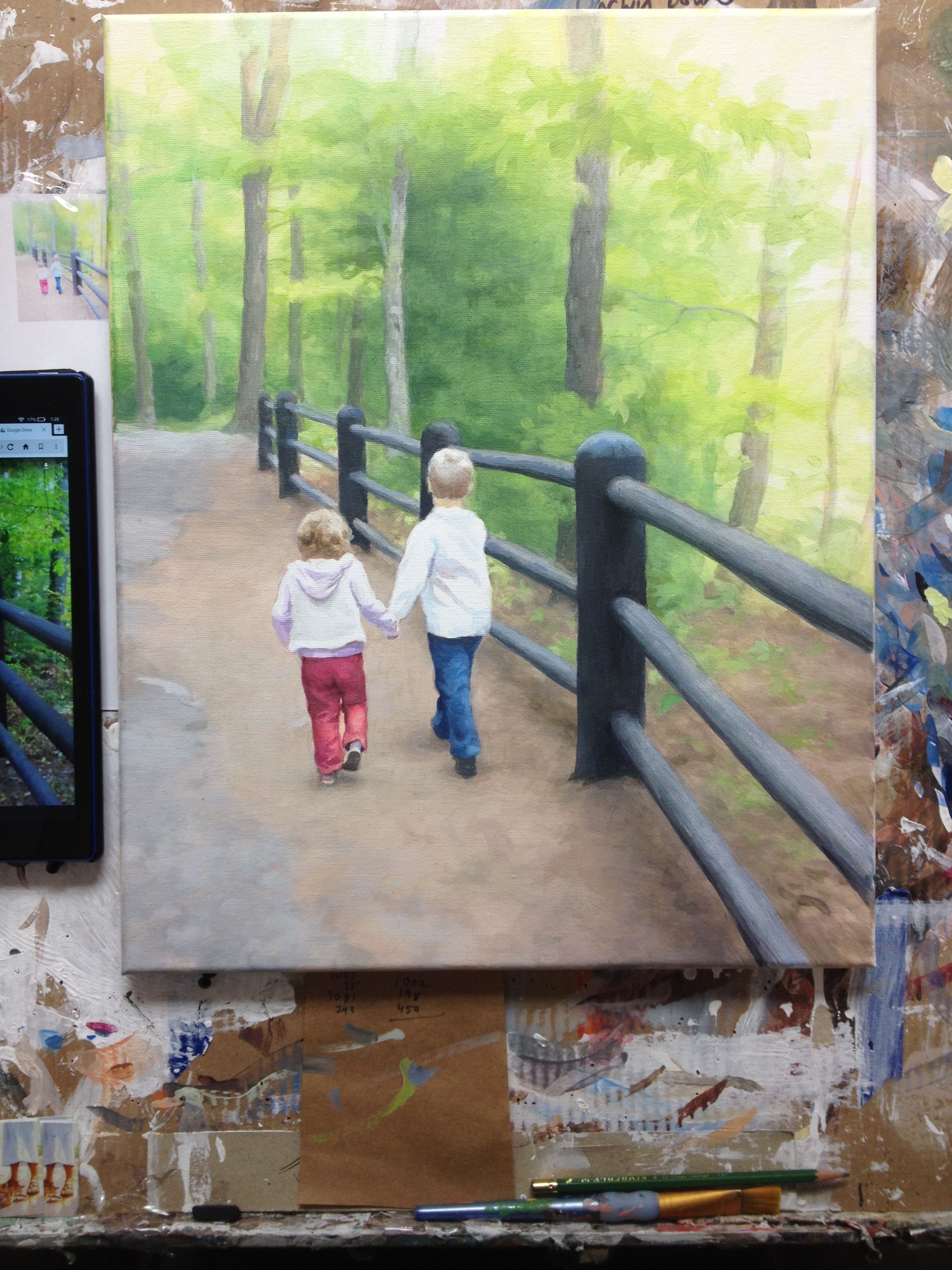
Step 2: Establishing Contrast
In this step, I added some phthalo blue, raw sienna and yellow ochre in a glaze to the background to suggest trees, and went over the trees with some raw umber dark, napthol crimson and ultramarine blue.
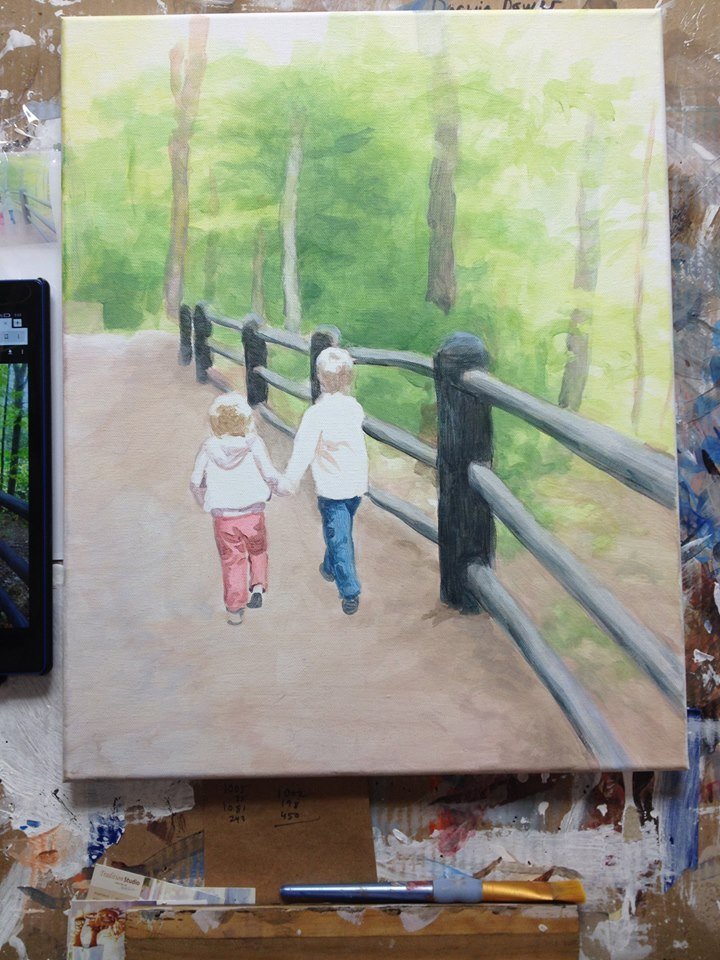
Step 3: Creating Nuances
In this step, I added in more layers of green to the background, and filled in the colors for both kids’ pants. I also added in some shadows as well below the fence posts and filled in the shadows a little deeper and more dramatically.
Step 4: Adding Detail to Background and Figures
I added some more detail to the background and shading to the children, especially my daughter’s hair. Overall, since I use the glazing technique, I incrementally darken the entire surface, bringing out more details and nuances by “pushing and pulling” the paint: darkening certain areas and lightening others.
With the winter weather we’ve been having in Wisconsin, a walk on a warm day like this picture looks pretty good.
Step 5: Refining With Highlights and Additional Detail
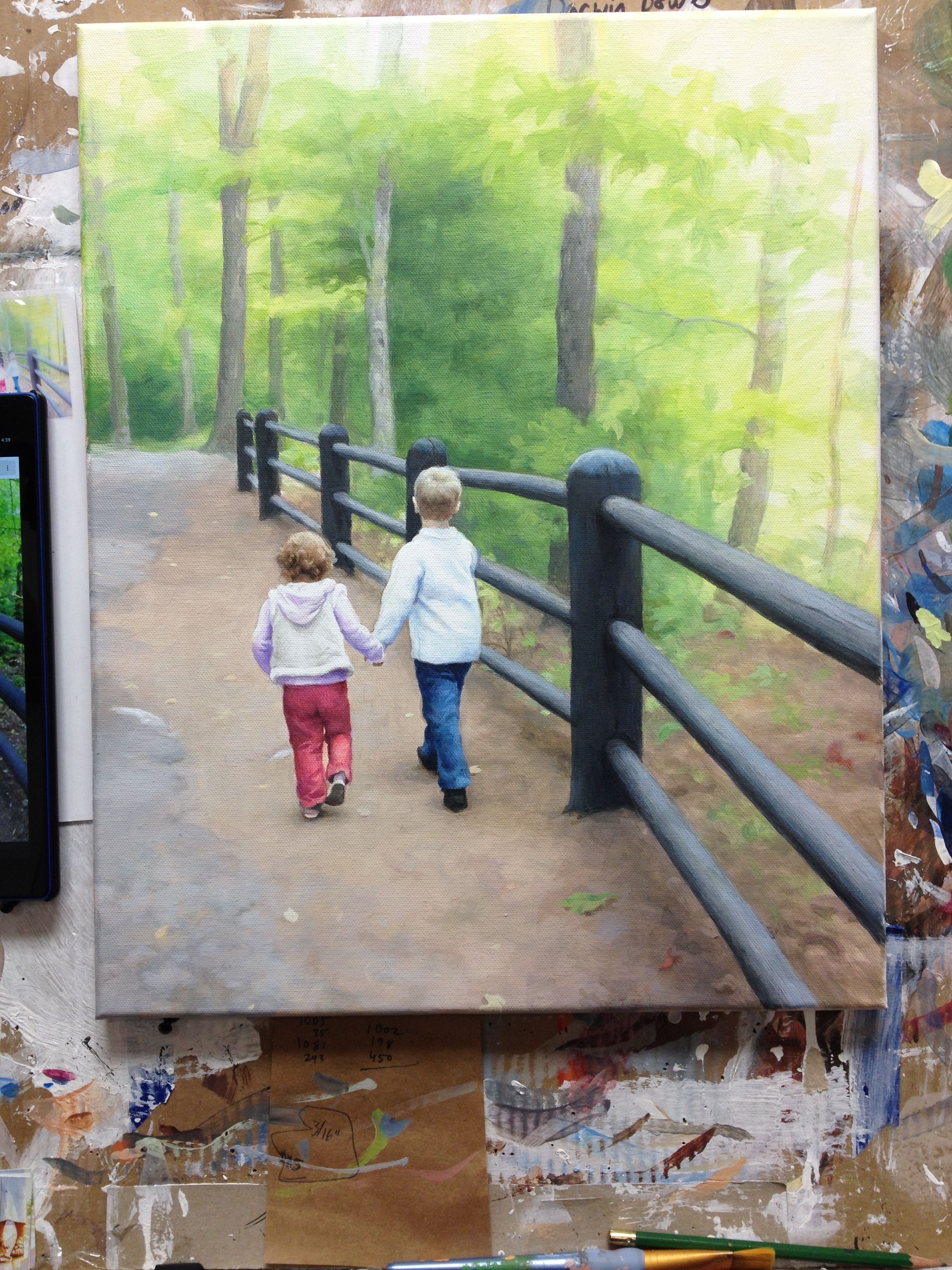
I’m almost done with this painting: I added some contrast to the posts, more nuances within the clothing, some fallen leaves, and some darker areas within the trees in the background to tie the values in with the posts. Still not quite there yet.
I’ll need to substantially darken the overall value of the background to match the much darker and more vivid foreground. Sometimes creating art can be a balancing act. But it’s much safer than being on the high beam!
Final Painting
In the final rendition, I darkened the values in the background, to tie them in with the very dark posts of the fence, and even the shadows on the children. I also added a few details to the children’s hair, and highlights to edges of the clothing to make them stand out more. Lastly, I put a few more glazes of raw umber dark, ultramarine blue, and titanium white for the trees.
This painting took about 20 hours to do. It was my pleasure going on this journey with you, showing the process, and maybe even help you to think about warmer weather at a time when many of us are ready for spring!
A Video Demonstration Showing Part of the Process
Be blessed in your painting,
P.S. Did you find this post helpful or encouraging? If so, send it on ahead! Let others know with the share buttons below. I’d love to hear your comments. Thank you so much!

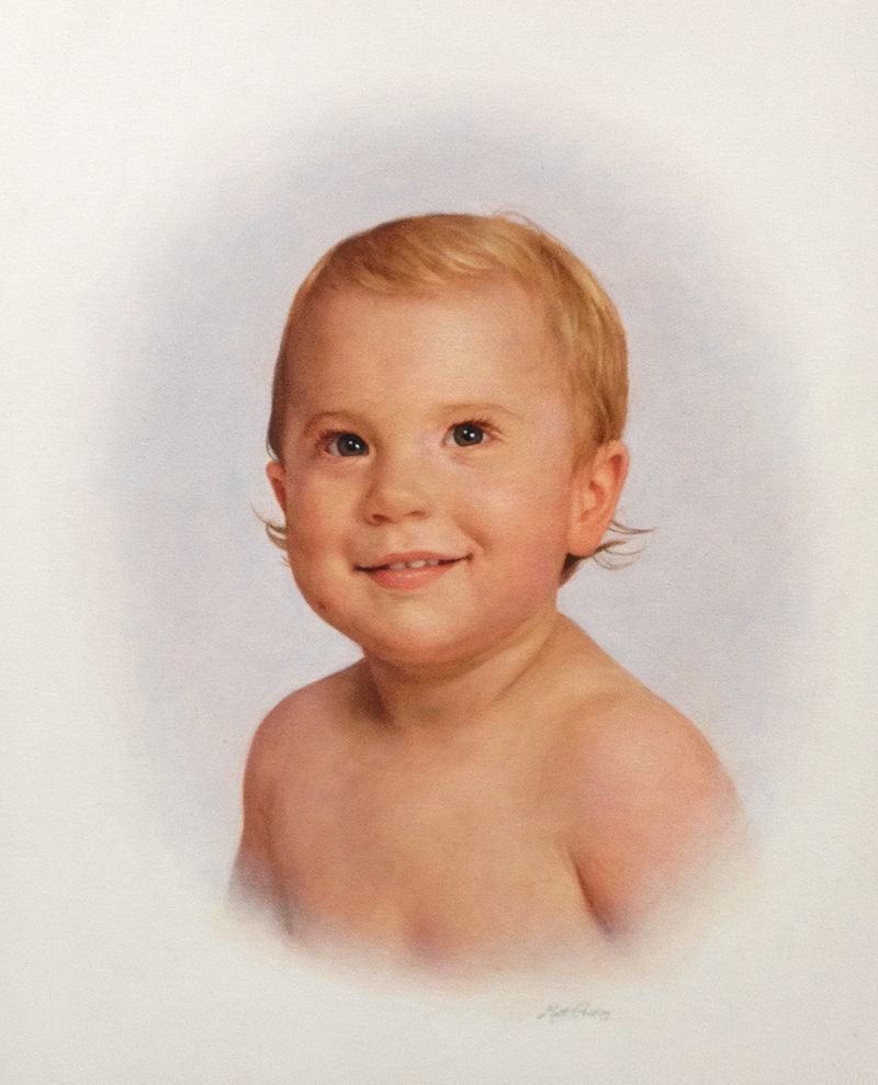
7 Steps on How to Paint a Realistic Baby
I’d like to show you, step-by-step, how I painted a portrait of a beautiful baby.
This was a commissioned portrait, a 16″ x 20″ acrylic on canvas, and it took me about 25 hours to do. Follow along in the process, and I believe you will learn a new approach to painting portraits in acrylic that will pleasantly surprise you!
Or, if you’ve tried my techniques before, this will be a good review for you.
Acrylic Painting
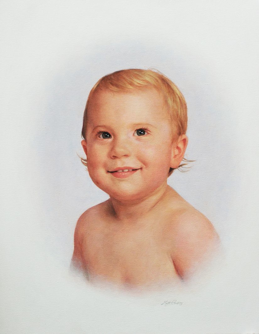
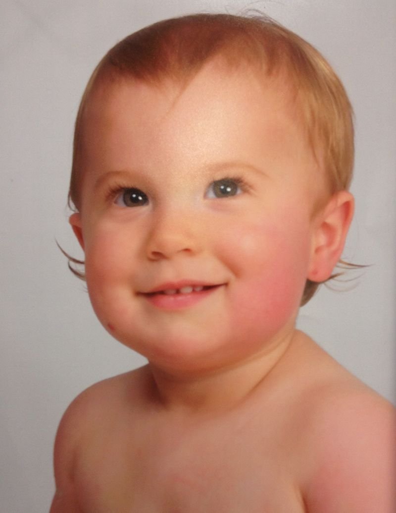
The client wanted a painting that was in an oval vignette style, to match some existing portraits in her home. Here is the photo she supplied me with, to paint from. She wanted me to make his hair combed off to the side, unlike what you see in the photo. That’s an easy enough change to make.
Reference Photo
Now, let’s go through the process on how I painted this portrait.
Step 1: The Sketch
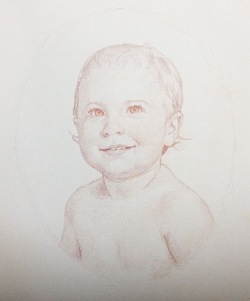
The sketch is the most important part of any portrait painting–whether in acrylic, oil or watercolor. The sketch is the foundation. Just like any house builder won’t build without a blueprint–unless they want a lopsided house–an artist shouldn’t plan do a lifelike portrait without an accurate sketch.
Some artists can work without one, starting very loosely, by just blocking in colors and value roughly, and work their way into detail–but it takes a lot of experience to pull that off. Many of those artists who can do that cut their teeth in learning how to draw, with hours of practice.
So for most artists–I recommend starting your painting with a sketch. You can use a grid or a projector to help if you haven’t done a lot of freehand drawing.
I have found that colored pencil is an amazing way to sketch on canvas. It works so much better than graphite pencil.
Why?
Well, first of all, you can choose a sepia or earth tone that really matches your skin tones within the portrait. Secondly, it is surprisingly easy to erase on a properly prepared canvas. Just go over your canvas with a mixture of 50%/50% gesso and matte medium.
Let it dry. And you’re set. You’ll be able to sketch and erase like a dream.
By the way, I use Prismacolor dark brown or terra cotta for sketching.
In the sketch, I make sure I’ve not only captured the shapes and lines of the baby’s face accurately, but I also want to get the shading in. Shading is what makes the difference on a portrait. So if you can get it in there during the sketch stage, it’s a lot less work figuring out where to go in the painting stage. Basically, all you’re doing is enhancing what you’ve put down in pencil.
Step 2: Sealing in Your Sketch
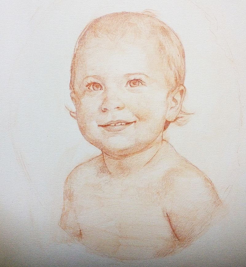
After you’re confident the sketch is looking accurate, the next step is to seal it in. What I mean by that is this: you’ll take some matte medium (that’s the clear acrylic without pigment and dries to a flat finish–get it at your local art store) and you brush it on the sketch to create a barrier between the sketch and your painting.
The last thing you want to have happen is your sketch to get all messed up as you apply the brush in the painting process!
So, what I did was put the medium in a little condiment container (like what you put your ketchup in at a fast food restaurant, and you can buy these inexpensively at Walmart in the food storage section) and then start covering over your sketch. You’ll need to be careful, though, not to smear your sketch work!
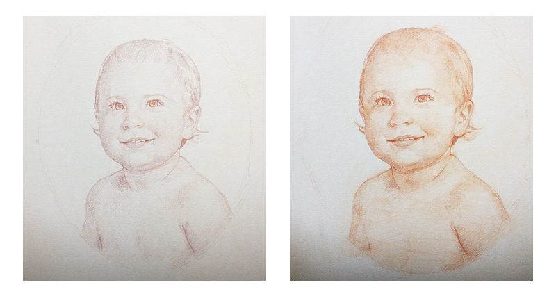
Actually, you can make it work for you. I found that the medium started mixing with colored pencil pigment and turned into a glaze, or faint paint layer. I brushed it on in the direction of the contours of the face, and it enriched the color and contrast of the sketch. You can see the difference between the sketch before and after it was sealed in.
If it makes for less work in the painting stage…why not try something new?
Step 3: Blocking in the Initial Color and Value
Now, in this stage, it’s important to cut yourself a little slack.
Because when you start establishing the colors and value, your sketch is getting covered up a little, and you lose some of the overall cohesion of the values that you drew.
What I mean is that, you’re kind of in an in-between stage, and like any in-between stage in life, it can look a little awkward. If you have children, think of how they looked when they first started to walk. The could crawl like an expert, but once they started to walk, they waddled, wobbled, fell, maybe even cried, and got back up again.
So, in this stage, as you put down a few layers, things may look a little messed up.
No worries.
Just keep going.
Look at your reference photo and keep in mind, you have a blueprint to follow. Sooner or later, your painting will look very similar to what you see in the reference photo.
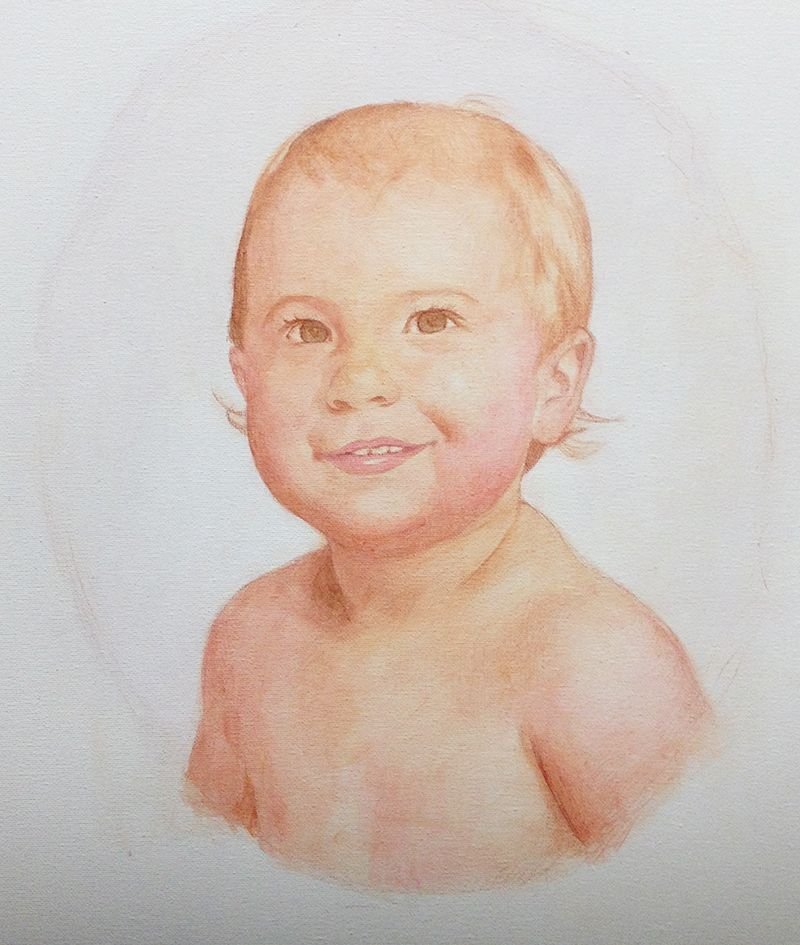
I used raw umber dark for the shadows, raw sienna, and alizarine crimson for the lighter areas. The crimson works well for establishing the pinkish tones in the baby’s cheeks and lips. Everything is very faint. I use matte medium to thin out the paint, and glaze it in with very minute layers. I love this technique. You can easily adjust the direction of your painting on the fly, and you can build up a lot of shading, even though acrylic dries so fast.
Finally, because the layers are translucent, the light shines through the surface, giving you a richness and a depth that will have people often mistaking your acrylic paintings for oils!
Step 4: Bringing out the Dark Values
At this step, I wanted to make sure the baby’s eyes would be dark enough. I also wanted to darken certain spots of the painting so it more closely matched the values of the reference photo: areas like the hair under the ears, the shadow to the left of his neck, and the crevices in the mouth on either side of the teeth.
When you get the darkest values established, then you know what you’re up against. It makes it easier to know how dark to take the rest of the painting. Because with values and colors, everything is relative. Once you darken a certain area, it will look out of place until you darken everything else accordingly.
In addition, I added more color to the face and hair, using a mixture of raw sienna and alizarine crimson. But for the hair, I used mostly raw sienna. The trick with blond hair is to not make it look too yellowish. Many beginning portrait painters do that. It’s easy to do, because we’re conditioned to think of blond hair as yellow from the cartoons we’ve seen as children, and the way we’ve been taught to use yellow crayons to color it in coloring books.
But blond hair is actually a pale golden brown. And there’s other nuances of color in it too, depending on the lighting and even what colored objects are around that could reflect onto it.
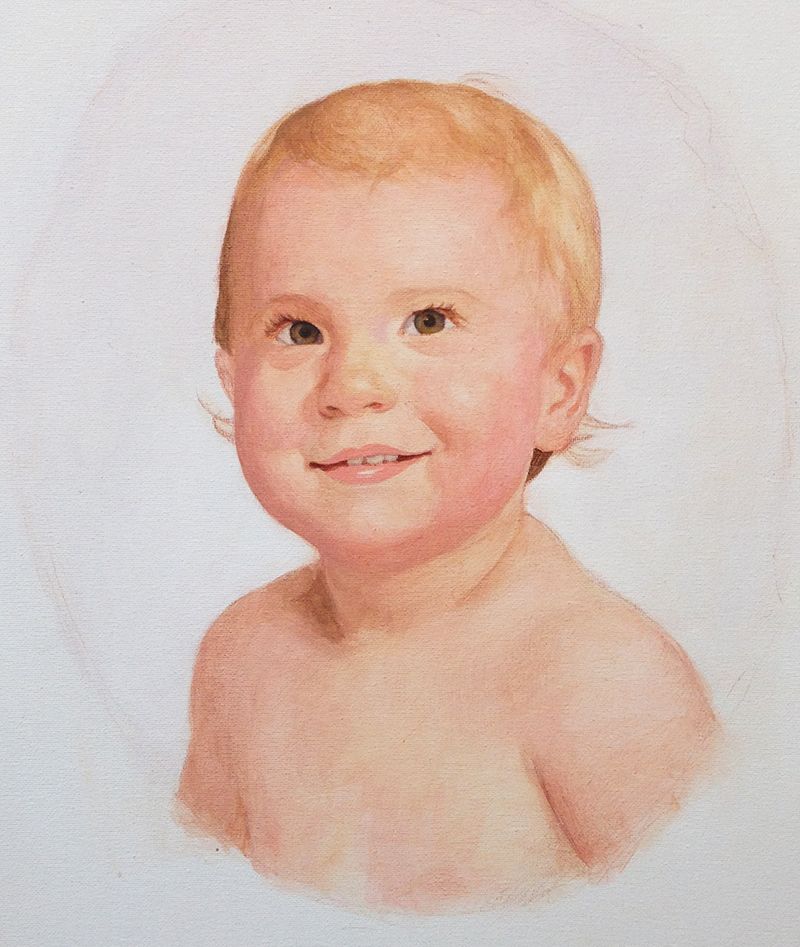
Step 5: Blending the Skin Tones and Adding Nuances
Now the portrait is starting to look realistic. But there’s still a lot of work to do. 50% of your time will be spent getting the portrait to a stage where it looks passable. The other half is spent on smoothing things out and refining details. If you want your portrait painting to go to the next level, and have a portrait you can be proud to show others, you can’t miss the final steps. It takes some patience, but it’s worth it.
In this step, I added the reflections in the baby’s eyes. They’re not finished yet, but I started them. I added two light blue dots in the correct places within the pupil. That way, in the next step, I can add a smaller white dot in the middle of them and then they will look like there’s truly light reflecting off of them.
For the mouth, it’s important to make sure the coloring of the lips is correct, and that the teeth are not too white.
Again, because of our symbolic association of teeth being white, we often paint them with…white. But in actuality, most’ people’s teeth are not white even with a bright light shining on them. And then the shadows from the mouth itself causes them to appear even darker.
So what I did was mix raw umber dark and a little titanium white and then went over the teeth with that. I developed some shadows just around the edges with a few more layers, so they don’t look paper-flat. I pay attention to the shadows on the corners of the mouth, and that’s where it creates depth. Teeth should be lighter towards the center–the front teeth–because that’s where the light is hitting them.
For the background, I’ve been adding several layers of ultramarine blue, with a little raw umber dark, and alizarine crimson. This will create the oval vignette look that the client requested, and also some differentiation between the foreground and background. With this, the warmer colors of the face will come forward in space against the cooler tones of the background.
And that’s exactly what we want: to create depth.
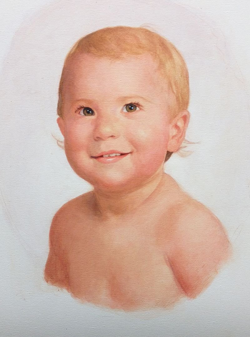
Step 6: Smoothing Out the Roughness
One of the downsides of the glazing technique is that it creates a lot of unwanted texture. That’s because the semi-transparent glazes pool up in the pits of the canvas surface and creates an uneven look, when you view it closely.
To compensate for that, we have smooth it out.
I used the same colors I had throughout the painting, but then add a little titanium white to make the layers more opaque. You only want enough to partially cover over the previous layers. You still want all the other layer-work to shine through. It’s something you have to play with to get the correct amount. Also, keep in mind that when you add white to the layers, you cool them down color-wise, and so you have to add some warmer colors to compensate.
Unless you’re trying to cool the skin tones down on purpose. Then the white can help you with that!
I found that my skin tones overall were just a bit too warm, so I used the white–again, mixed in with other colors, and still thinned out with a glaze–to cool them down. You can’t do that so much on top of the darker values, however, or you’ll muddy up the color. There you’ll have to use raw sienna (which is very opaque) and mix a bit of alizarine crimson and ultramarine blue to offset the yellow.
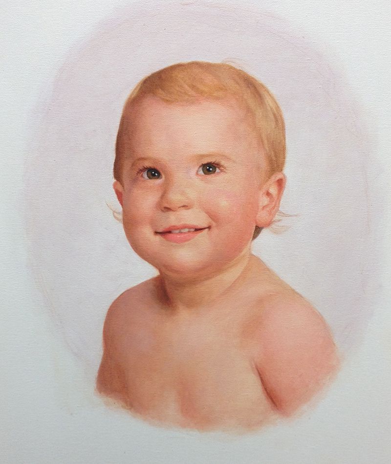
Step 7: The Final Details and Finishing it Up
At this step, you feel pretty good about the painting. It looks just about done, and because you’ve layered everything, you don’t have any white space left on the canvas, that would indicate the painting is not done.
And that’s a good thing.
But it’s good just to take it a bit further.
I went over everything: enhancing the contrast, putting in some final details within the eyelashes, the teeth, the shiny reflection on the lower lip to make it look moist (as you can imagine a baby’s mouth usually is.)
The hair needed a little more realism, so I added some highlights with raw sienna, indian yellow, and titanium white.
Also, I darkened the background with a few more layers to really heighten the contrast. And then I used some glazes of titanium white the smooth out the edges of the vignette oval and give it a cloudy look.
Although I could continue working on the painting for hours more, there is a point where the law of diminishing returns comes into play. At a certain point, you’re just pushing paint. You’re not really making a significant difference in the overall impact of the painting. And you are even starting to undo the good things you’ve accomplished!
That’s when you know it’s time to call it done. And so I did.
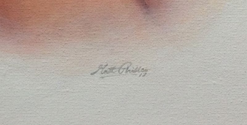
Finally, I signed it. That was the most fun step of all!
When you sign your painting, I recommend making your signature legible, but not too prominent, that it overshadows your work. It’s also good to use a color that’s similar to what’s already in the painting so it matches. In this case, I used ultramarine blue, and raw umber dark mixed with white.
After the painting was finished I emailed an image to the client for approval. When you’re happy and your client is happy, then your job is done.
Time to go out to dinner and celebrate!
An Extra Bonus:
Here’s a time-lapse video showing the whole progression of the portrait as I painted it. The video is about 5 minutes long. Enjoy!
Have a blessed day,
LEARN MORE
- Sketching Your Painting Accurately
- Beginning a Pet Portrait in Acrylic
- The Mystery of Realism in Painting
- Apply A Burnt Sienna Glaze to a Portrait
- Learn How to Sketch a Portrait Freehand in 45 Minutes
- Adding highlights to your acrylic painting
- 5 Excellent Reasons to Use Aluminum Foil
- Paint Realistic Wrinkles in Acrylic
- Painting Clothing in an Acrylic Portrait
- Paint a Cloudy Sky Acrylic
- How to add Semi-Opaque Highlights
- How to Enhance the Contrast in Your Acrylic
- How to Add Glaze to Your Acrylic Painting
- Paint Realistic Reflections on Eyeglasses in an Acrylic Portrait
- Build Up Depth on Your Acrylic Portrait Backgrounds
- How Do You Do Layers With the Glazing Technique?
- Learn How to Paint Wrinkles in Acrylic
Read more about how to paint a portrait that you can surely be proud of!

P.S. Did you find this post helpful or encouraging? If so, send it on ahead! Let others know with the share buttons below. I’d love to hear your comments. Thank you so much!