- You are here:
- Home »
- Blog »
- Facial Features »
- How to Draw a Lifelike Sketch for an Acrylic Portrait

How to Draw a Lifelike Sketch for an Acrylic Portrait
Lifelike Sketch + Accurate Acrylic Layers + Patience= Realistic Acrylic Portrait. The equation works every time.
Even when you make mistakes. 🙂
Don’t worry, this won’t be a math lesson. That was not one of my better subjects in school!
But there is something to be said laying down a good foundation for your acrylic portrait with a lifelike sketch. When I mean lifelike, I don’t mean that it looks photographic, but rather that you capture the likeness of the subject–the person (or pet) you’re going to paint.
When you do that, you exponentially increase your chances for success in painting a realistic acrylic portrait.
Notice I didn’t say perfect. You don’t have to have a perfect sketch, just one that is as accurate as you can make it.
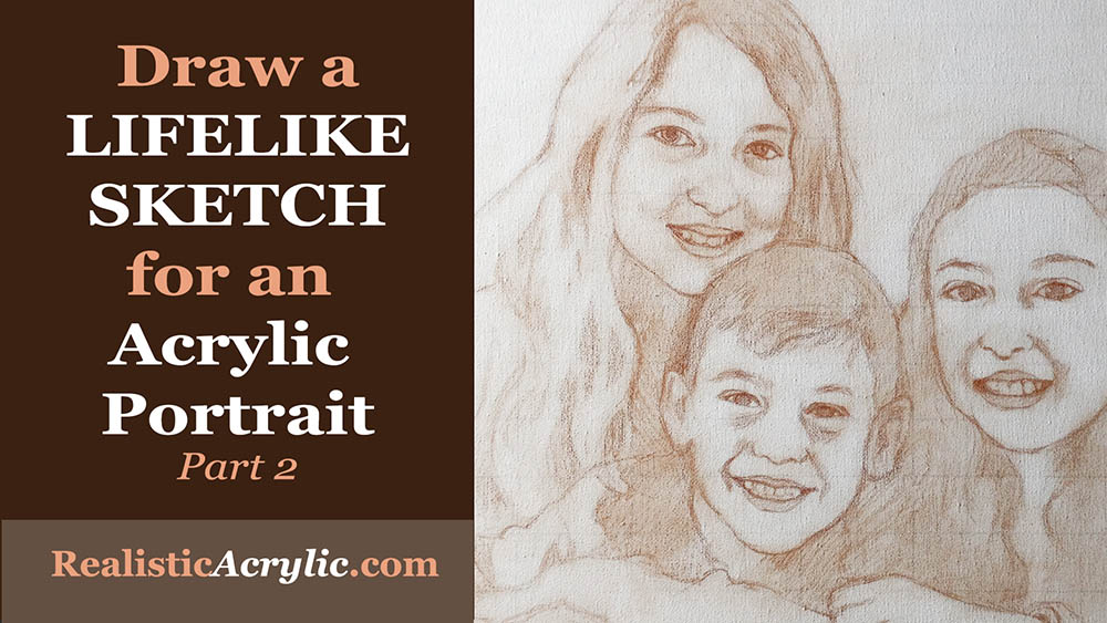
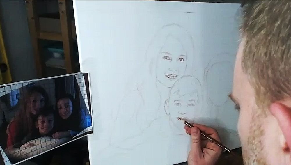
Today, I’m going to show you how I drew the sketch for a commissioned 16″ x 20″ acrylic portrait I’m working on of three children…
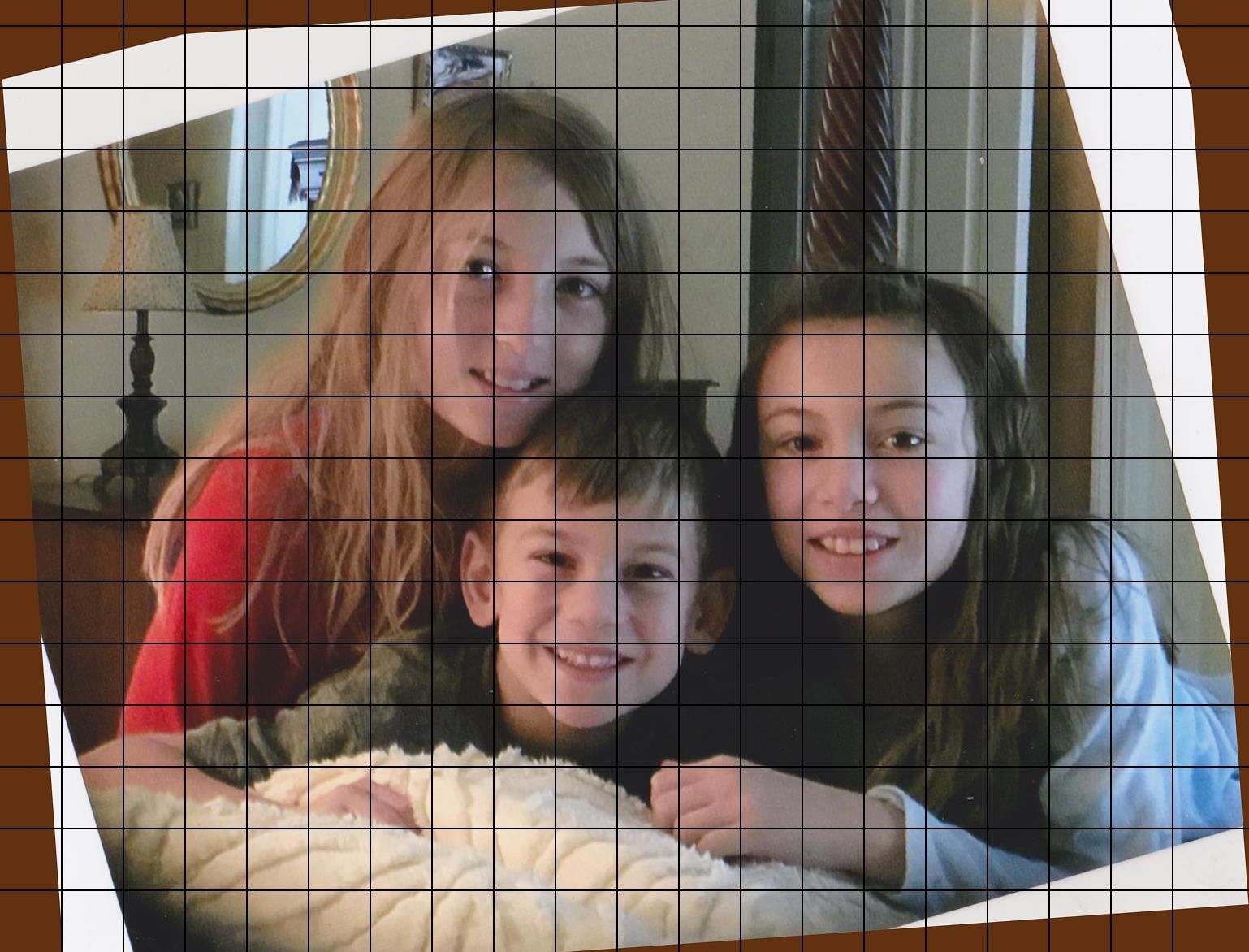
…based off a candid photo of them just hanging out on a bed. I tilted the image because I thought it was at an awkward angle. You can obviously see the original angle in shown in the edges.

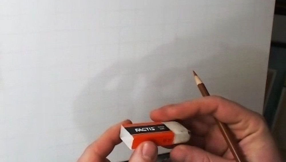
Tools Needed:
You’ll want to use a sepia-toned colored pencil, like burnt ochre, dark brown, or terra cotta.
And then a white eraser.
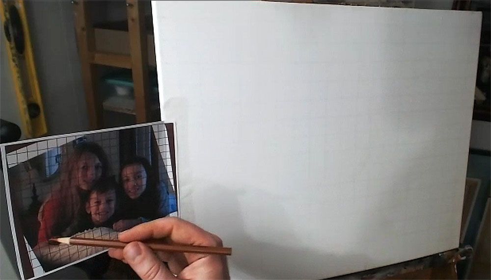
I started with a canvas that I drew a grid on–with 1″ squares, using a light colored pencil (light grey, tan or peach is fine). It is important to seal the grid in with a mixture of matte medium and gesso. This provides a barrier on the canvas so that when you need to erase anything on your sketch, you will not disturb the grid lines beneath. Also, it makes it amazingly easy to erase a sketch on your canvas–much easier than graphite pencil. This is a technique I discovered just by being frustrated with pencil and experimenting.
The photo reference is also gridded correspondingly to match the squares on the canvas. I used a grid drawing tool at ArtTutor.com and then printed out the image.
Alright, now let’s begin…
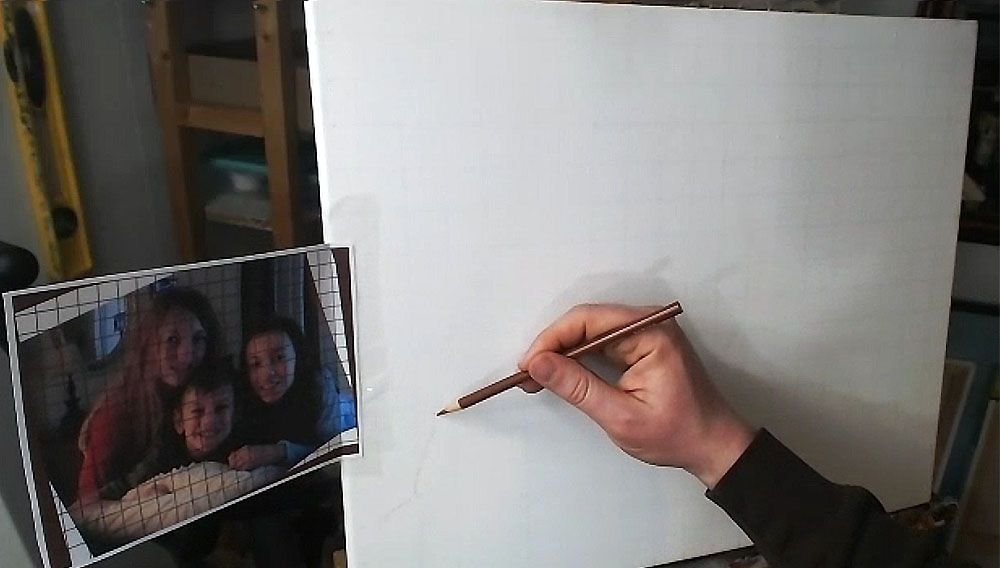
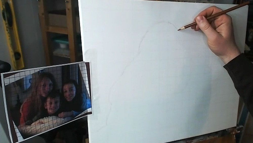
Step 1: Get Started in the Right Place
When using the grid technique, it’s so important to make sure you start sketching in the right place. Otherwise, you may end up sketching for a while, only to realize your composition will be off.
Yes, I made this mistake.
So, count off your squares, and double-check that you’re matching up on your canvas, what is on your reference photo.
Watch this video to see the beginning portion of the sketching process…
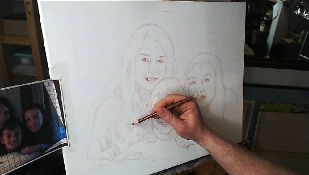
Step 2: Start Your Outlining the Forms of the Subjects
Here, we only want to get just the outside edges of the subjects and then fill them in. I start usually in the lower left corner and then work my way up and across. You don’t need to achieve perfection in this. But it is good to see where the major lines representing the shapes are intersecting the squares. Break it up into fractions.
(Uggh, math again. It’s OK. If I can do it, so can you, believe me!)
You note, “Okay, this line crosses through the vertical line of this square at about 1/2 of the way up.”
Or, “this line intersects the horizontal line of the other square about 2/3 of the way to the edge.”
You may see fractions like 1/4, 1/3, 1/2, 2/5, etc. You’ll begin to see them naturally and not even think about it with some practice. When you learn to do this, your gridded sketching will become very accurate.
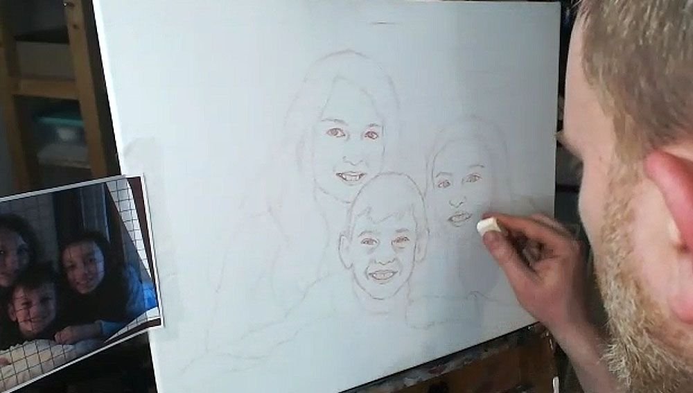
Here is the sketch, with all the outlines filled in.
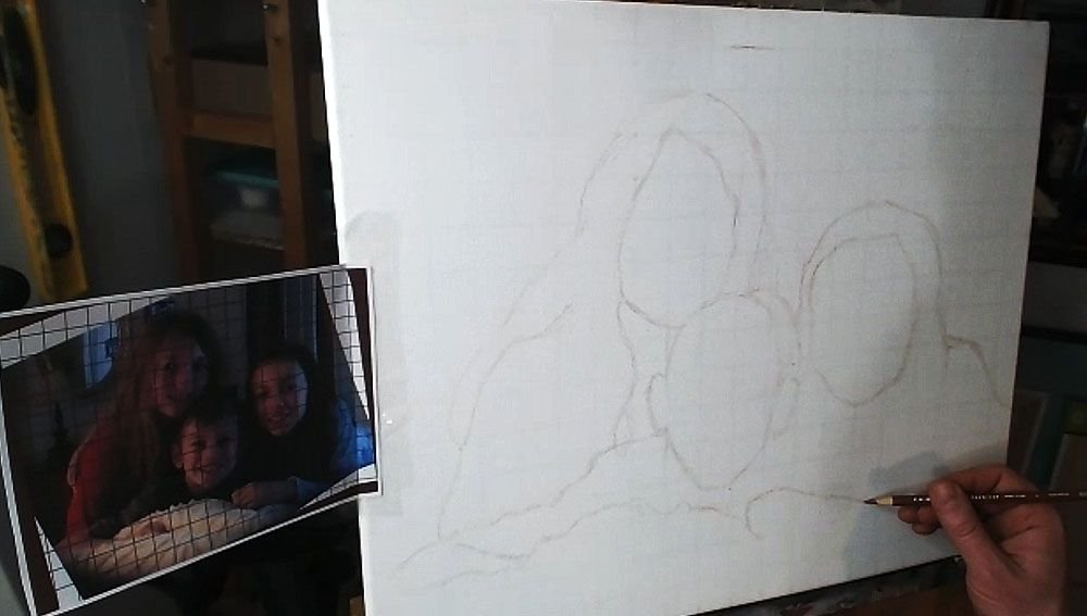
You’ll notice that I made a pretty large mistake, but thank God for erasers! I considered editing it out of the video, but then I figured, “Why not keep it in there, to show an accurate recording of my process?” We all make mistakes, but it’s what we do after we notice them that counts.
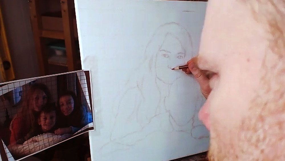
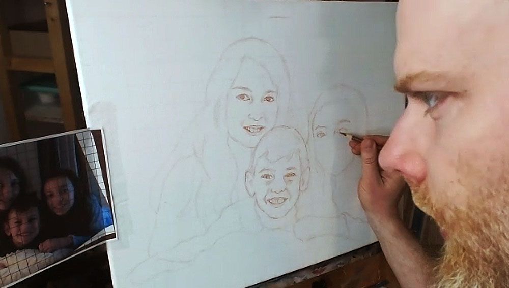
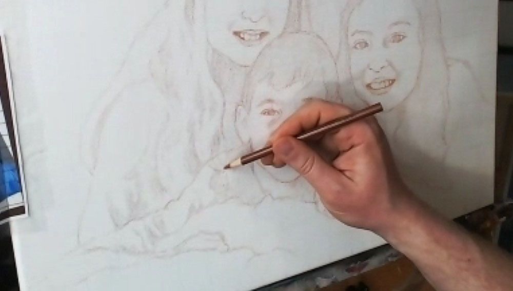
Step 3: Fill in the Features
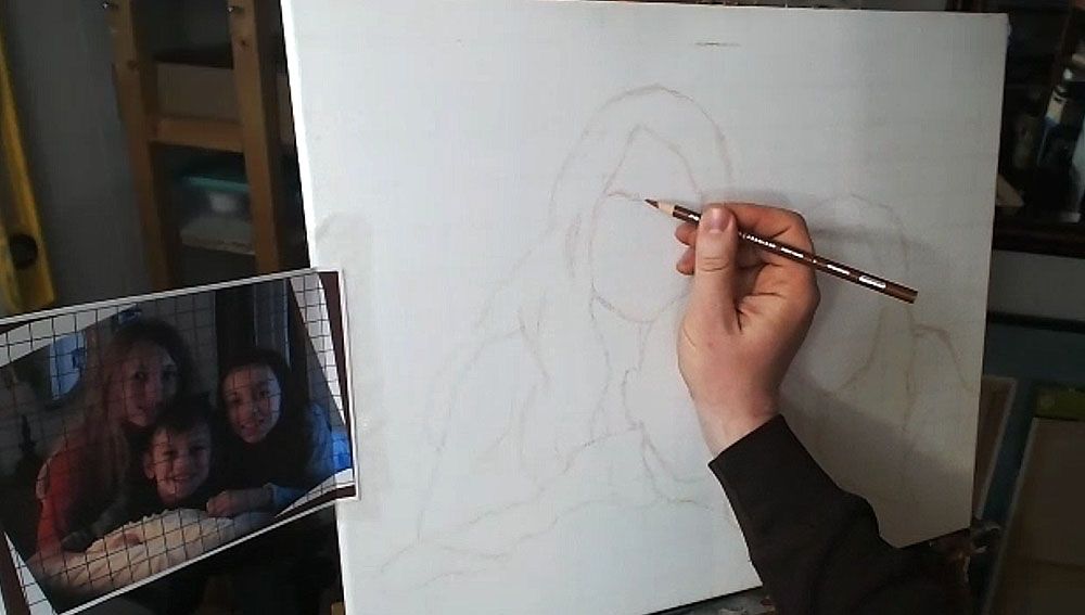
After getting the proportions of the subjects in correctly–the outside edges of the hair, the shoulders, the faces, etc., then you’re ready to move on to drawing the features. The reason we get the main forms defined first, is because we want to make sure we have an accurate foundation to drop the features on. In addition, you’ll be able to tell if you like the overall composition.
Now, when I start drawing in the facial features, I work from left to right, and then top, down. (Of course, if you’re left handed, you may naturally work in the other direction.)
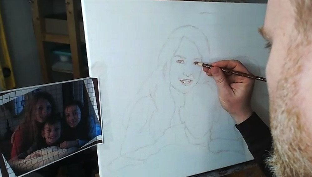
I start by noting the angle of the eyebrows and sketch them first. Doing this will really establish the alignment of the face and your other features will need to be in conformity with it.
Then I draw the eyes loosely, and not too dark, so I can refine them later. The eyes are the most important feature on the face, so I really pay attention to them.
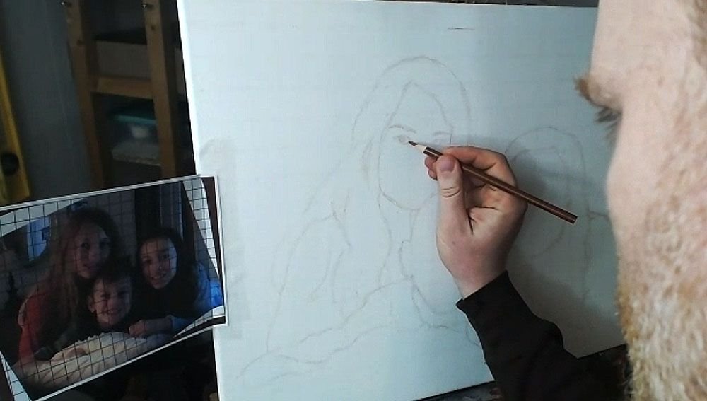
What is the overall shape? Are they skinny, angled, rounded? Are there prominent eyelids or are they barely perceptible? How far away are they from the eyebrows? How close are they together? Ask yourself these questions as you draw.
If you can get the eyes about 85% or more accurate, you’ll have a good portrait.
If you can get them 95% or more accurate, you’ll have an outstanding portrait, provided the other features are drawn fairly well.
Next, draw in the nose. Observe your reference photo to see how far down the bottom of the nose is from an imaginary line that intersects the eyes. What is the shape of the nose and nostrils? Is it wide, narrow, rounded, sharp? Observe carefully and draw what you see.
After you get the proportions and shape of the nose accurately defined, it’s time to move on to the mouth.
I start with the top of the mouth, drawing in the bottom edge of the top lip and then the top edge of the bottom lip. I sometimes will draw the top edge of the top lip, if it’s very prominent–like, for example, when a woman is wearing lipstick. Of course, that is not the case for this drawing of three children.
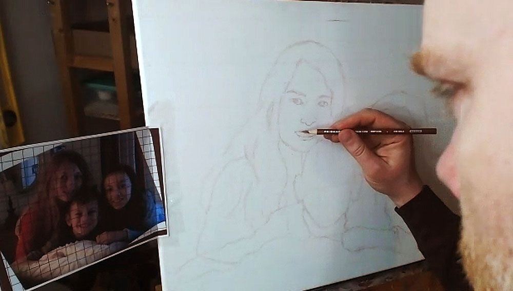
I finish with the bottom edge of the bottom lip. Of course, I also draw in the teeth, but only lightly suggesting their form by showing the gumline, and the shadows on the sides where the teeth are foreshortened in perspective, and the lips cast shadows on them. The space between the visible teeth and the edges of the mouth is very important, and you’ll want to indicate it as a dark value, because it is in shadow.
One of the main mistakes I see artists making in their sketch is when they over-define the teeth. It makes the person you’re drawing look like they have braces. Pencil lines are just too dark of a value for the teeth, and it’s hard to overcome in the painting. Draw them lightly, and you’ll get better results.
Watch Part 2 of my video lesson below to see exactly how to do it…
After I get the features sketched in loosely and lightly, then I go back over everything. I darken and refine.
I repeat the process on the other faces.
TIP: Look at your reference photo often as you draw–much more than you are currently. At least 30% is a good rule of thumb.
I can tell you from teaching portraiture in person, that students only rarely look at their reference photo. But you can only draw what you are observing, so observe more and draw better.
But if you make a mistake, you can always use an eraser!
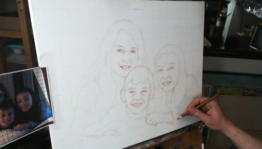
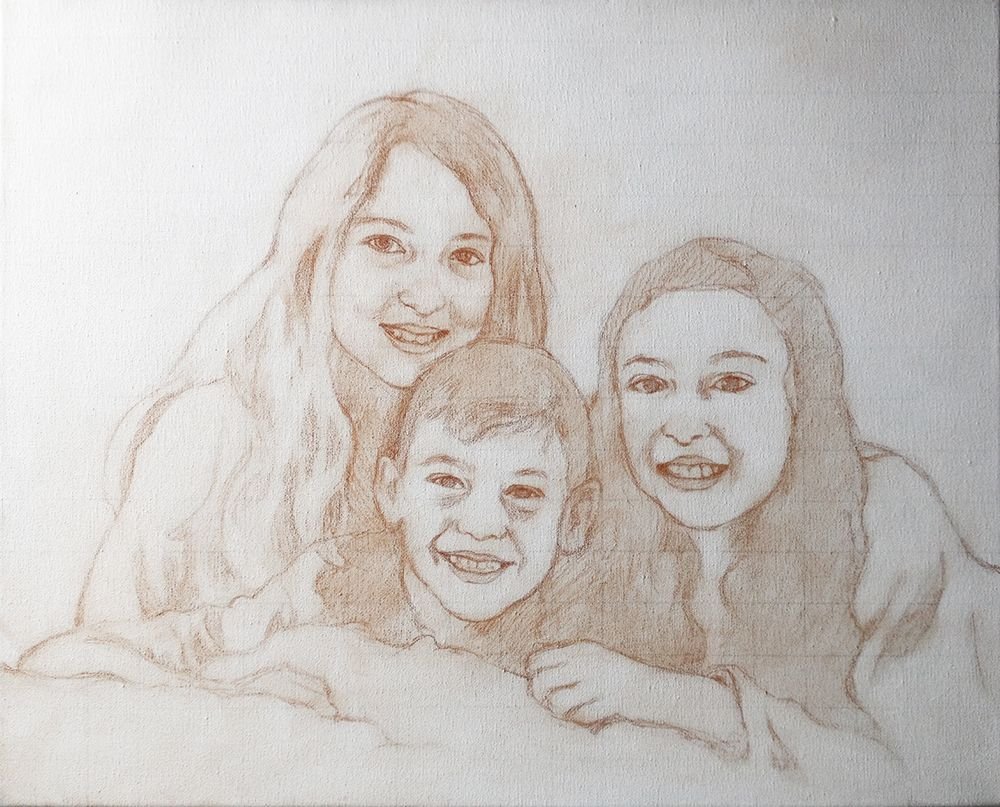
Step 4: Finish Off the Forms
After filling in the facial features, I draw in the hair, hands, wrinkles for the clothing suggesting the shoulders and arms.
Step 5: Shade in the Major Values
Everything we see in the three-dimensional world is viewed in the context of differences in value and color. There really aren’t lines separating anything in nature, even though the concept of a line exists in geometry and we can obviously draw them.
So, with that , I feel it’s important to define the major values in your painting during the sketch stage. You’ll be much better prepared when you start painting. You won’t have to wonder subconsciously, “What do those bunch of lines represent?”
The values will let you know where to apply your first layers in the blocking-in stage of your painting. You can dive right in and do it.
So I fill them in, using the side of my pencil lead, rapidly. It doesn’t need to take much time. I just try to see the major areas of contrast, like the shadows under the faces, wrinkles in the clothing, locks of hair that aren’t illuminated, and represent it on the canvas.
Lastly, you can double-check the facial features on everything, and make sure it’s accurate.
And here’s the final sketch. Not perfect. But close enough that I can rectify any mistakes in the painting and bring it closer to a very accurate likeness.
I’ll be showing more of the process of this painting, breaking it down step-by-step and teaching you as I go along. I look forward to sharing more with you !
Have a blessed day,

P.S. Did you find this post helpful or encouraging? If so, send it on ahead! Let others know with the share buttons below. I’d love to hear your comments. Thank you so much! Also, do you have a question on acrylic portrait painting you’d like answered? Let me know, and I’d be happy to help!