Category Archives for Q & A

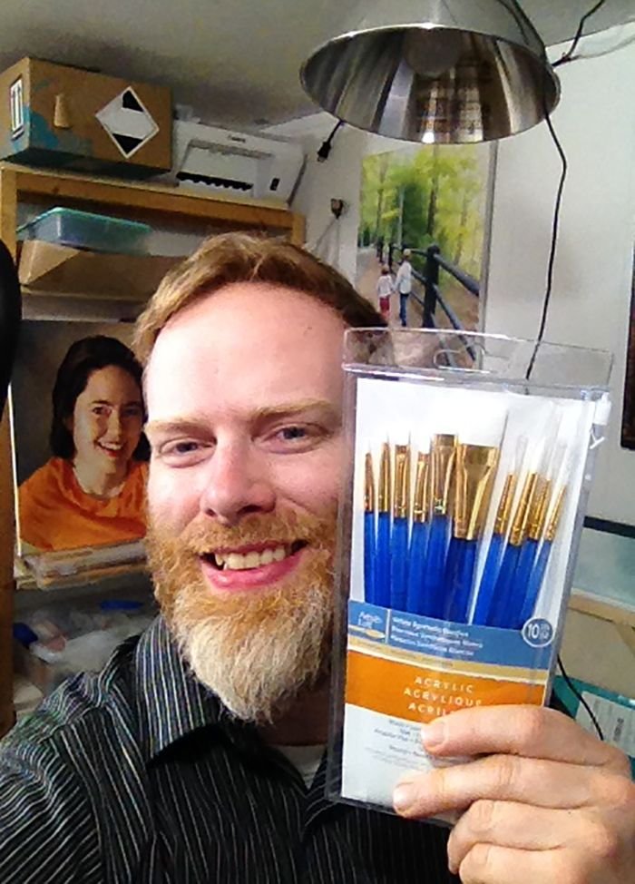
3 Ways How to Keep your Acrylic Paint Wet
Learn the techniques to manage the fast drying time of acrylic paints
Acrylic paint is known for its quick drying time, which can be a double-edged sword for artists. On one hand, it allows for faster layering and quicker completion of artworks. On the other hand, it can be challenging to keep the paint wet long enough to blend colors and create smooth transitions. In this tutorial, we’ll explore three effective ways to manage the fast drying time of acrylic paints, helping you achieve better results in your artwork.
1. Master Blending and Brush Work
One of the most effective ways to work with acrylics is to improve your blending and brush techniques. Instead of trying to slow down the drying process, focus on mastering the following skills:
Fast Brush Strokes: Apply paint quickly and smoothly to keep a wet edge. This prevents harsh lines and ensures seamless blending. Fast brush strokes are crucial in getting the paint down before it starts to dry.
Smooth It Out: After applying the paint, use gentle brush strokes to smooth out the surface. This technique is especially useful for creating soft textures, such as fur in pet portraits.
Practice Different Techniques: Spend time practicing various brush techniques to become more comfortable with the fast drying time of acrylics. Experiment with different brush types and sizes to see which ones work best for your style.
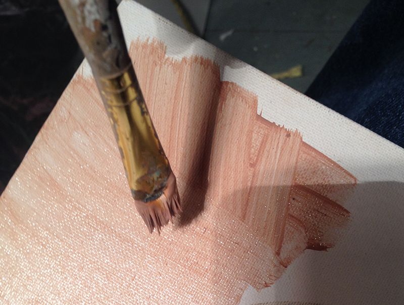
2. Use Layers for Depth and Realism
Layering is a fundamental aspect of the acrylic glazing technique. By building up layers of translucent paint, you can create a rich, three-dimensional effect. Here’s how to do it:
Mixing the Glaze: Combine a small amount of acrylic paint with a larger amount of matte medium. This creates a translucent mixture that allows light to pass through, adding depth to your painting.
Applying Layers: Apply the glaze in thin, even coats. Allow each layer to dry completely before adding the next one. Over time, these layers will build up to create a smooth, blended look similar to the techniques used by old masters like Leonardo da Vinci.
Light and Depth: The light shines through the different layers, bounces off the white primer of the canvas beneath, and then back to your eye. This gives the painting a great sense of vibrancy and depth.
3. Maintain a Moist Painting Environment
Creating the right environment for painting can significantly impact the drying time of acrylics. Here are some tips to maintain a moist environment:
Use a Spray Mist: Keep a spray bottle filled with water nearby. Lightly mist your palette and painting surface occasionally to keep the paint wet longer. Be careful not to oversaturate the paint, as this can dilute the colors.
Humidifier: If you live in a dry climate or paint in a dry environment, consider using a humidifier in your studio. This adds moisture to the air and can help slow down the drying time of acrylic paint.
Avoid Direct Heat: Avoid painting in direct sunlight or near heaters, as heat can speed up the drying process. If you use a wood heater, like Matt does in his Wisconsin studio, make sure to balance it with a humidifier to maintain an ideal painting environment.
Tips and Techniques for Working with Acrylics
- Keep a Wet Palette: Invest in a wet palette, which helps keep your paint moist and workable for longer periods. Wet palettes are especially useful for blending colors.
- Plan Your Painting: Plan your painting in stages, working on different sections while others dry. This allows you to make the most of acrylics’ quick drying time without feeling rushed.
- Use Retarders Sparingly: While retarder mediums can slow down the drying time, they can also introduce other challenges. Use them sparingly and focus on the techniques mentioned above for better control.
By mastering blending and brush work, using layers effectively, and maintaining a moist painting environment, you can overcome the challenges of acrylics’ fast drying time. These ways not only help keep your acrylic paint wet but also enhance the overall quality of your artwork. Embrace the unique properties of acrylics and let them work for you, not against you.
Read more about my additional resources, tutorials, to learn more and check out my free courses. Whether you’re a beginner or an experienced artist, there’s always something new to learn and apply to your paintings. Happy painting!
LEARN MORE
- Sketching Your Painting Accurately
- Beginning a Pet Portrait in Acrylic
- The Mystery of Realism in Painting
- Apply A Burnt Sienna Glaze to a Portrait
- Learn How to Sketch a Portrait Freehand in 45 Minutes
- Adding highlights to your acrylic painting
- 5 Excellent Reasons to Use Aluminum Foil
- Paint Realistic Wrinkles in Acrylic
- Painting Clothing in an Acrylic Portrait
- Paint a Cloudy Sky Acrylic
- How to add Semi-Opaque Highlights
- How to Enhance the Contrast in Your Acrylic
- How to Add Glaze to Your Acrylic Painting
- Paint Realistic Reflections on Eyeglasses in an Acrylic Portrait
- Build Up Depth on Your Acrylic Portrait Backgrounds
- How Do You Do Layers With the Glazing Technique?
- Learn How to Paint Wrinkles in Acrylic
Read more about how to paint a portrait that you can surely be proud of!
I’d love to hear your thoughts on this video. Please share it with your friends and family. Let me know if you have any further questions. I’ll greatly help you.
If you’d like to learn more, sign up for my free email tips and video class today.
Learn How to Paint Acrylic Portraits With My Free Mini-Video Course!
Thank you so much for taking the time to read this tutorial and watch the video. That means a lot to me. I hope you find it very helpful in your portrait painting.
Yours for Better Portraits,

P.S. Did you find this post helpful or encouraging? If so, send it in ahead! Let others know with the share buttons below. I’d love to hear your comments. Thank you so much! Also, do you have a question on acrylic portrait painting you’d like answered? Let me know, and I’d be happy to help!

Matte Medium vs. Gloss Medium for Acrylic Glazing
Students who are new to my glazing technique have a lot of questions. So many mediums to choose from. Which ones are best to use…and why?
That’s what I want to discuss today.
Here’s a portion of an email I got from one of my students:
As you know, I am currently working on your portrait course at the moment, however, I have a question that I hope you can clarify. All previous information I have looked up indicates that when applying glazes, acrylic matte medium dries cloudy and gloss medium dries clear and obviously glossy. Can you just explain it for me why we only use matte medium for glazing in your tutorial, as my initial thoughts would be that the cloudiness would just build up? Or am I just missing the l point in that this is how we build up the underpainting of the portrait? Many Thanks, R—
This is a good question.
So, what’s better for glazing? Matte medium or gloss medium?
Let me answer that with the reply I sent back to my student.
I use matte medium for three reasons:
1. It dries to a flat finish and so it doesn’t react with the lights in my studio, producing distracting glare.
2. Because it dries to a flat finish, it is closer to the sheen of paint, and so when you have areas that are more opaque and less opaque, they match up better. In other words, you can perceive the values more accurately. A glossy finish will make colors look more saturated and deepen values. When you put a varnish over the painting, it would present a problem, causing certain subtle nuances that seemed to look correct, suddenly become inaccurate. (Yes, this happened to me!)
3. Matte medium is usually less expensive than gloss medium. With the copious amounts of medium that I use, this adds up!
Now, I don’t find that matte medium builds up cloudiness, in the way that I teach. It will get cloudy, if you have areas of your painting that are quite dark or saturated, and you overlap those areas with a very transparent (high ratio of matte medium to paint) glaze.
But I don’t do it that way in my paintings. Rather, I start off very transparent, (95-5) then shift to more translucent (80-20), and finally end up with semi-opaque layers (50-50) over portions of the work.
Acrylic portrait painting challenge example in progressm using the acrylic glazing technique, 16 x 20, acrylic on canvas by artist and instructor Matt Philleo
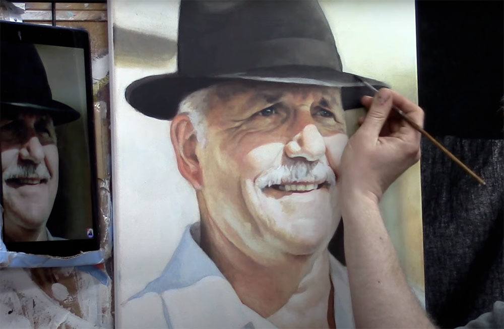
Matt Philleo painting an acrylic portrait from a photo for the Spring Portrait Painting Challenge ©2020 by Matt Philleo
This prevents that cloudiness from occurring and gives a rich saturation of color too. But we still retain the benefits of the smooth shading, vibrancy, and depth that glazing produces.
I finish my painting with a satin or semi-gloss varnish and that’s where we can add some extra saturation of value and vibrancy.
What is YOUR experience with acrylic mediums? Which do you prefer…and why? Let me know in the comments below.
Look forward to sharing more tips and tutorials with you.
Yours for Better Portraits,
![]()
If you found this post helpful or encouraging, would you send it on ahead? Let others know with the share buttons below. I’d love to hear your comments. Thank you so much!

Value vs. Color in an Acrylic Painting
One of the trickiest things about acrylic portrait painting, especially when using the glazing technique, is knowing how to achieve color. How many layers do you use?
I’ve said it before, and I’ll say it again. There is something more important than color, even skin tones in a portrait.
Here is a recent question from a subscriber:
Currently, I am working on a portrait of my friend’s grandfather. My reference photo is of him as a young man in his dress greens from his younger days in the Army. I really want to capture his likeness and be proud to present this to her as it is a gift for her mother but I’m finding myself “stuck” in a sense. From watching your videos and using the matte medium as a glazing technique, I am having trouble building up the layers of his uniform to the correct tone and shade of green. I find the medium lightens the acrylic paint. I’ve only applied one layer so I still have time to correct it before making a mess of it. Should I have painted in the dark value of his uniform before going in with a glaze to help it along or just keep applying layer after layer until the desired color is achieved?
Regarding your question–yes, you can keep building up the green glazes for his uniform. However, it’s best to think of values before color. What I mean is, you are right to think that you should have done the dark value of the uniform first. That’s exactly right.
The reason is, value is more important than color. Value (light and dark and the difference between them) describes all the contours and three dimensions of a face or body. If it weren’t for the strategic placement of those values, we wouldn’t know whether it was a person, animal, rock or tree that we painted.
Theoretically, you could have a person whose skin tone or clothing was a bit too red, or greenish–whatever–but it the values were accurate, it would still look human, and would look like a pretty good portrait. You can see in this painting I did, the colors are a bit too red. (I also intensified them on Photoshop, exaggerating them a bit to make a point.)
Acrylic portrait from photo by Matt Philleo, Eau Claire area portrait artist and instructor
But flip that around: make the skin tone or coloring right on, and the values completely off, and you will have a terrible portrait.
So, when I instruct my students in painting, I teach them to see the value structure first. We start off simple, using one or two colors, and then add as we go along. Much more important is seeing the overall lighting in the portrait–where the light source is, the darkest values (whether clothing, hair or just deep shadows, it makes no difference) and the mid-tones and capturing them faithfully. Of course, this assumes that you have the form correct. That is, that the proportions of the face and anatomy are accurate.
So, is your painting ruined? No, not at all. Just keep building up layers. But it helps to build up the darkest values first. Don’t neglect them. Think of your painting as an old polaroid photo. The print shoots out of the camera and fades in slowly, all together. You don’t get eyes, then hair, then a mouth, then the body. No. You get everything at once, but it’s all light. Then, in about 30 seconds, you have a print.
(Wow! Imagine that. I’m old enough to remember how cool it was to have an instant photo before digital cameras.) 🙂
So, you want to paint your painting like a polaroid. All at once, just fade everything in. As much as possible. That means that you hit those dark values first, and then work your way into the lighter ones.
As an example, let me show you this. Here is an image of how I did “Smoldering Wick,” an acrylic portrait illustrating a time when I struggled, and found encouragement in the scriptures.
All of these many layers is how you make an acrylic look like an oil. I learned this glazing technique several years ago from Norbert Kox, a university art professor. It made all the difference for me in my portrait painting with acrylic. Learning this technique and applying it will make the difference for you too.
If you’d like to learn more, sign up for my free email tips and videos today.
Learn How to Paint Acrylic Portraits With My Free Mini-Video Course!
And of course, let me know if you have any questions or comments. I’ll be happy to help!
Yours for Better Portraits,

P.S. Did you find this post helpful or encouraging? If so, send it on ahead! Let others know with the share buttons below. I’d love to hear your comments. Thank you so much! Also, do you have a question on acrylic portrait painting you’d like answered? Let me know, and I’d be happy to help!

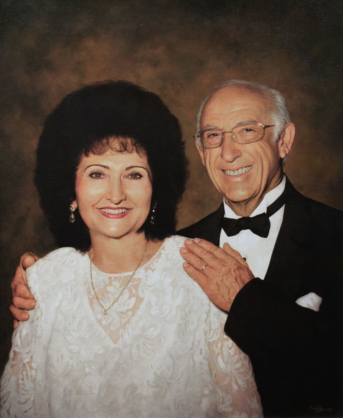
4 Questions About Acrylic Portrait Painting, Answered
Recently, I was asked some questions about acrylic portrait painting. I hope the answers I shared with this artist can be of help to you as well.
1. How do you prepare your canvas panel for painting with Acrylics?
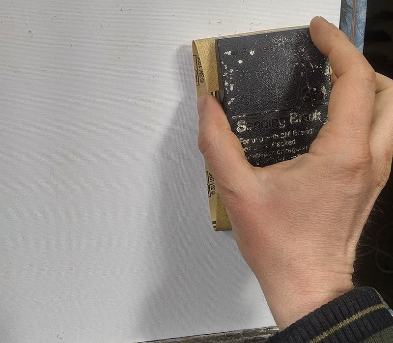
Sanding a canvas panel in preparation for painting an acrylic portrait
2. You spoke of layering your paint when composing a portrait. Please briefly explain.
I use the glazing technique to slowly bring the portrait from a white canvas to completion. The glazing technique is achieved by mixing your paint with clear acrylic medium (usually matte medium) to disperse the pigment, thus allowing light to pass through.
Although you could use water, it’s not recommended, because it breaks down the acrylic resin binder, causing a rough visual texture and possible poor adhesion. For a smoother look, you want to use clear acrylic medium.
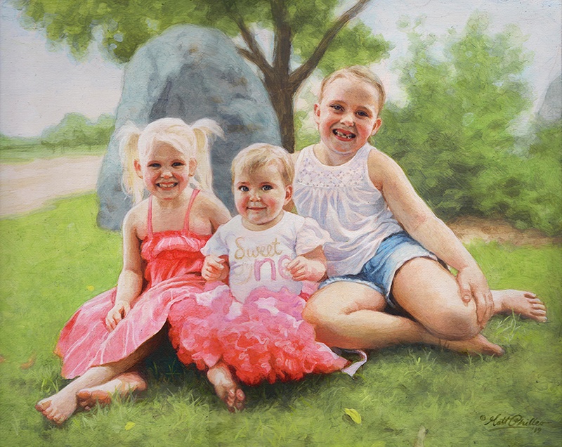
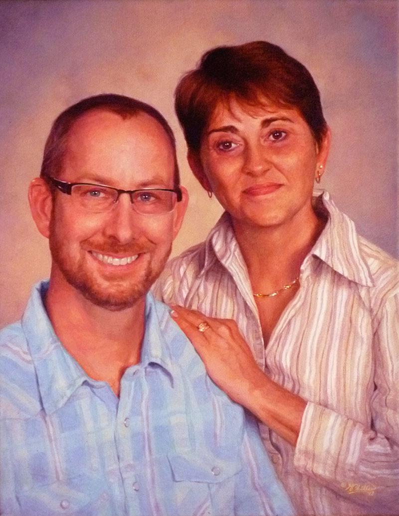
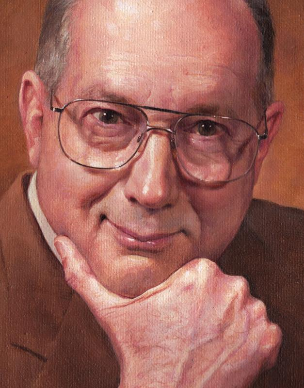
Custom commissioned realistic acrylic portrait from a photo painted by Eau Claire area artist Matt Philleo, ©2019 Fine Art by Matt Philleo
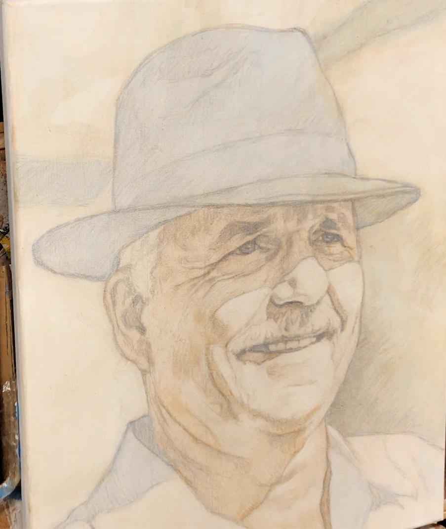
3. You mentioned using a Prismacolor pencil for making your diagram. What color do you recommend?
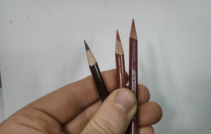
Using colored pencil for your acrylic portrait sketch makes things a lot easier. Technique discovered and developed by Matt Philleo.
4. Do you do the painting from start to finish in one setting?

Acrylic portrait artist Matt Philleo posing in front of a 48″ x 72″ commission painting for a client in Brunei
I hope these questions and answers were helpful to you as well. I know some of this stuff seems pretty basic, but it’s good for all of us to pause and think about why we do what we do. It then makes the doing that much more significant.
Let me know if you have any questions of your own about acrylic portrait painting and I’ll do my best to help!
P.S. Did you find this post helpful or encouraging? If so, send it on ahead! Let others know with the share buttons below. I’d love to hear your comments. Thank you so much! Also, do you have a question on acrylic portrait painting you’d like answered? Let me know, and I’d be happy to help!

Top 7 Powerful Techniques for Starting Out in Acrylic Portraits
Begin your portrait painting journey with confidence using these essential acrylic techniques
Are you just starting your journey into acrylic portrait painting? With so many techniques to learn, it’s easy to feel overwhelmed. That’s why I am covering the essential techniques for starting out in acrylic portraits, from choosing the right colors and brushes to creating smooth blends and more. In this post, you’ll find answers to common beginner questions, giving you the tools to bring your portraits to life with ease and confidence! Let’s dive in and explore these foundational techniques together.
Today, I’m going to answer seven fantastic questions from a follower of mine named Andrea. The questions deal with everything from what colors and brushes to use, to blending, to some advanced techniques.
Read below to find out if one of your questions gets answered…
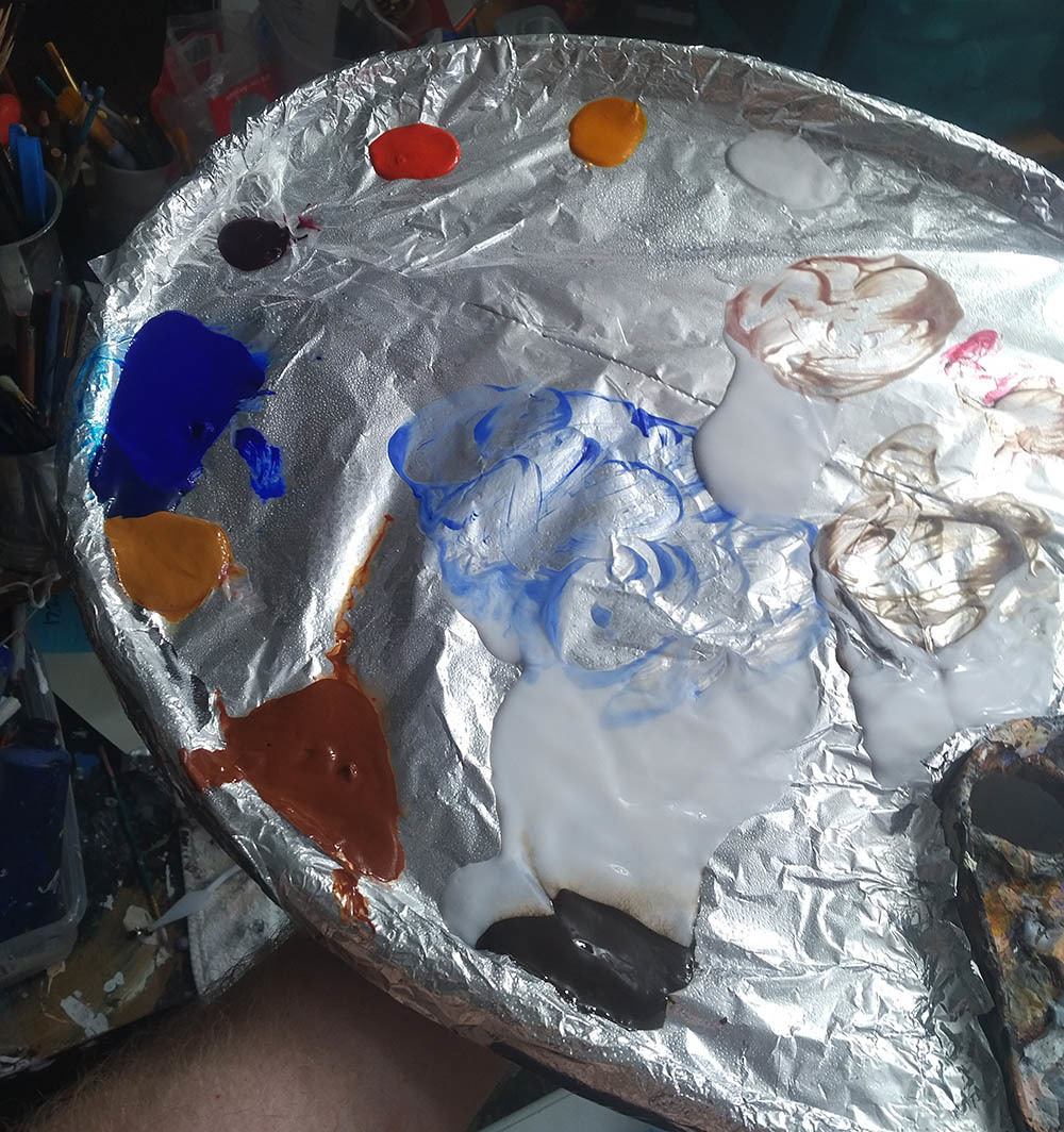
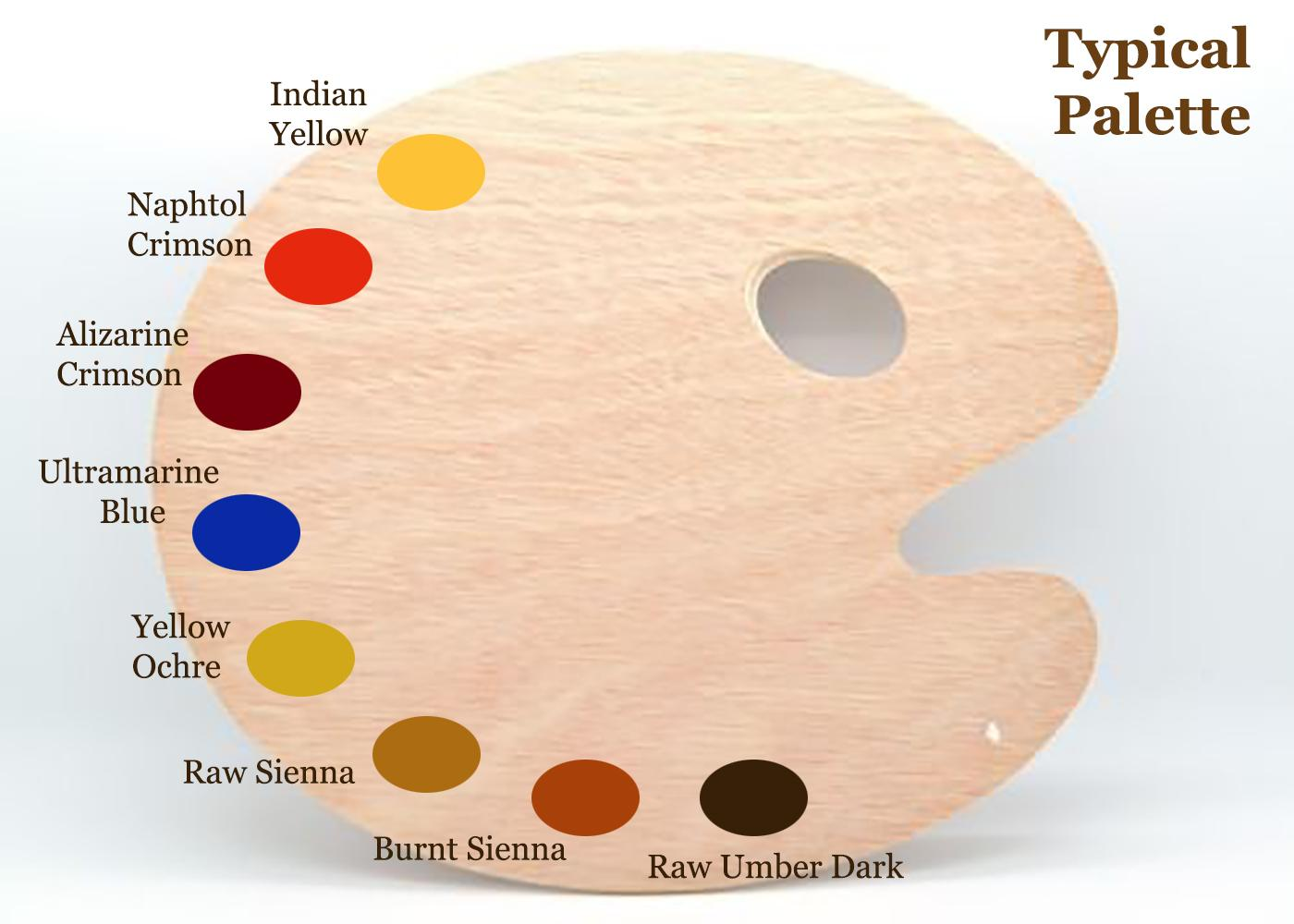
Q #1: What should be my basic color palette for portraits, and mixes for shading?
A: This is my basic palette for painting portraits. I would also have titanium white on it in the upper corner, by the indian yellow. Typically, I start out with raw umber dark and ultramarine blue thinned down with clear matte medium to block in the darker values. I make them into a very translucent glaze of 90% or more medium to 10% or less pigment. Eventually, I work my way into the warmer tones with burnt sienna, raw sienna, and alizarine crimson. The raw umber dark is used to counter-balance those glazes so they don’t get too warm/ orangish.
Q #2: What sort of brushes should I be using?
A: I don’t use anything fancy. Just brushes you can buy at your local art store in a multi-pack, ranging from 1″ flat/ 1/2″ flat, 3/8, flat, and a varied assortment of rounds from size 4 to 3/0. I go through a lot of brushes, so I don’t get anything expensive. But I do have a few nice ones for surface shading and the final varnish coat.
Q #3: How do I keep my paints from drying up, or drying immediately they are applied before I have chance to blend them? I do have retarder but should I be adding this to every color on my palette before I start?
A: No, I don’t recommend a retarder. Some artists like it, but for the classical glazing technique that I use, the faster the paint dries, the better (within reason). Basically, I love the quick drying glazes. It means I can be ready for another coat in about 10-15 minutes. I work various parts of the painting, cycling from the background to the foreground, from the hair to the face, from the clothing, the eyes–whatever. That way, when I move to another part of the portrait, it’s already dry and ready to work on.
Q #4: How do I shade?
A: I have five different ways to blend. Check out my latest blog post here for more info on these techniques…
How I Painted the Portrait of My Pastor and His Wife
How I Painted the Portrait of My Pastor and His Wife
If you’d like to delve further into how to shade, I created a course on it: “Shade With Acrylic Like a Master.”
Q #5: In what order should I paint? I started with the background.
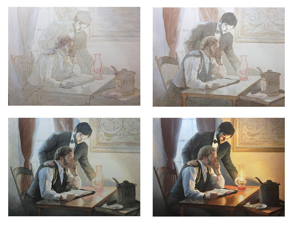
A: I sometimes start with the background, but not always. I want to establish contrast as soon as possible. So I try to fill in the darkest values first. It may be the background, but not necessarily. You can see the progression of how I work below on this example painting, “Smoldering Wick” (30″ x 40″ acrylic on canvas).
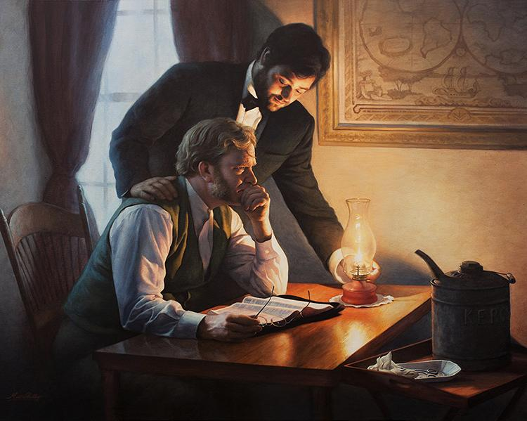
Notice, I filled in the darkest values first, and then moved to the lighter areas last…
Q #6: How do I tackle difficult aspects, such as deep creases from the nose to the mouth, the sides of the mouth and wrinkles?
A: I need to do a course on this. Others have chimed in as well, saying they really would like to see how it’s done. I’ll probably start out with a couple videos on the topic and then move into a longer course. But to answer your question, I’ll say this: look for the shadow first. Notice where the light source is at, and then the crease will be shaded on the opposite side. On the side facing the light, there will be a highlight.
Here’s how you do it:
- You paint the shadow of the crease in first, with a thin that’s fairly faint, and that’s one layer.
- Next, you go over that with another layer, that darkens just a few spots within that crease. In any crease or wrinkle, there will always be some areas that are deeper than others, and those need to be darker.
- You paint a thicker line on top of the first line. This line should be even more faint than the existing line, and the color should be slightly warmer.
- You paint a highlight on the opposite side. It should be about the same color as the flesh tone surrounding the crease, but a couple shades lighter and warmer too.
- You may need to add a couple more layers to both the shadow and the highlight to blend it in appropriately.
One quick tip: start out faint and go progressively darker. This is the number one mistake I see in portraits. Artists notice creases and wrinkles, but they paint way too prominently.
Would you like to learn more about how to paint wrinkles? If so, let me know by clicking the button below, and I’ll create a video tutorial/ course for you!
Q #7: What colors should I use for each area, especially the top eyelid, the mouth and the shadows under the eye?
A: This depends on the person. You need to really pay attention to the colors in the picture you’re working from. Generally under the eye, the colors are a bit cooler, because the skin is thinner there and you see the blood vessels on the surface. So, use some ultramarine blue, alizarine crimson, and raw umber dark mixed together and thinned out into a very light glaze. Then go over the area under the eyes with that.
For the mouth, you’ll need alizarine crimson, and napthol red, but it depends on the person. Obviously, a woman with lipstick will need more red on her lips. But even some men have lips that are more red than others.

Let me know how this post helps in your portrait painting. (If you’re not an artist, but you found this interesting, I’d love to hear about it. )
May God bless your painting,
P.S. Is there a question YOU have that wasn’t covered in this post? Just ask! I’d love to help.
If you found this post helpful or encouraging, would you send it on ahead? Let others know with the share buttons below. I’d love to hear your comments. Thank you so much!