- You are here:
- Home »
- Blog »
- Written Tutorial »
- 4 Steps on How to Paint a Pastor and His Wife

4 Steps on How to Paint a Pastor and His Wife
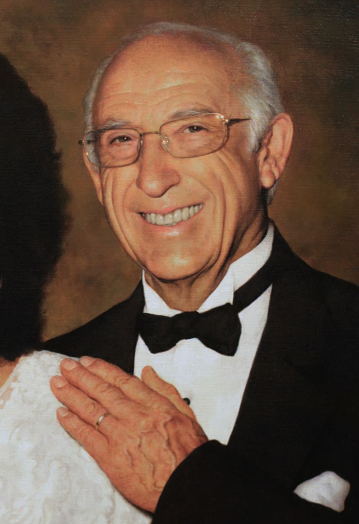
Retired at age 91.
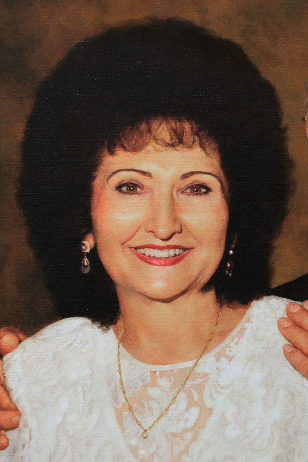
My pastor served for a very long time at my church, over 40 years, and almost 70 years in ministry. He asked me to do a portrait of he and his wife. I’m going to show you how I did it.
This was a 25″ x 31,” acrylic on linen. I stretched this canvas and primed it myself with about three coats of gesso to make sure it was an extra smooth surface.
Step 1: Creating the Sketch
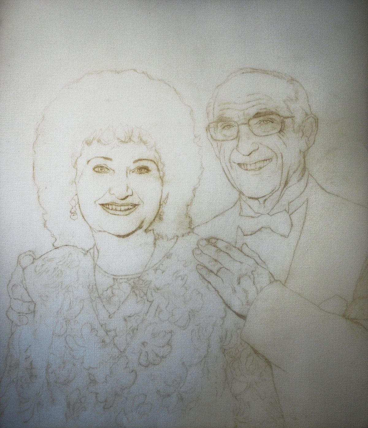
For the sketch, I used a dark pastel pencil and drew in almost every contour of the faces. Even the detail in the dress of my pastor’s wife wife was meticulously reproduced from the reference photo.
Having a detailed, accurate sketch is an excellent foundation to apply the layers of paint to, just like a construction company needs to lay down solid cement to build a home on.
I didn’t want to leave anything out.
During the consultation with the clients, my pastor’s wife said, “Don’t paint any wrinkles on me. But you can paint them on Pastor, though.”
I laughed.
I guess that’s the beauty of hiring an artist to paint your picture instead of relying on the harsh, unforgiving camera lens.
She didn’t have too many wrinkles to edit out, anyway. 🙂
Once the sketch was finished, I sealed it in with matte medium. You never should use a spray fixative to seal in a fine art painting sketch. You could end up having problems with the paint adhering to the surface. Instead, do it the old fashioned way, with clear acrylic medium and a brush.
Step 2: Blocking in the Values
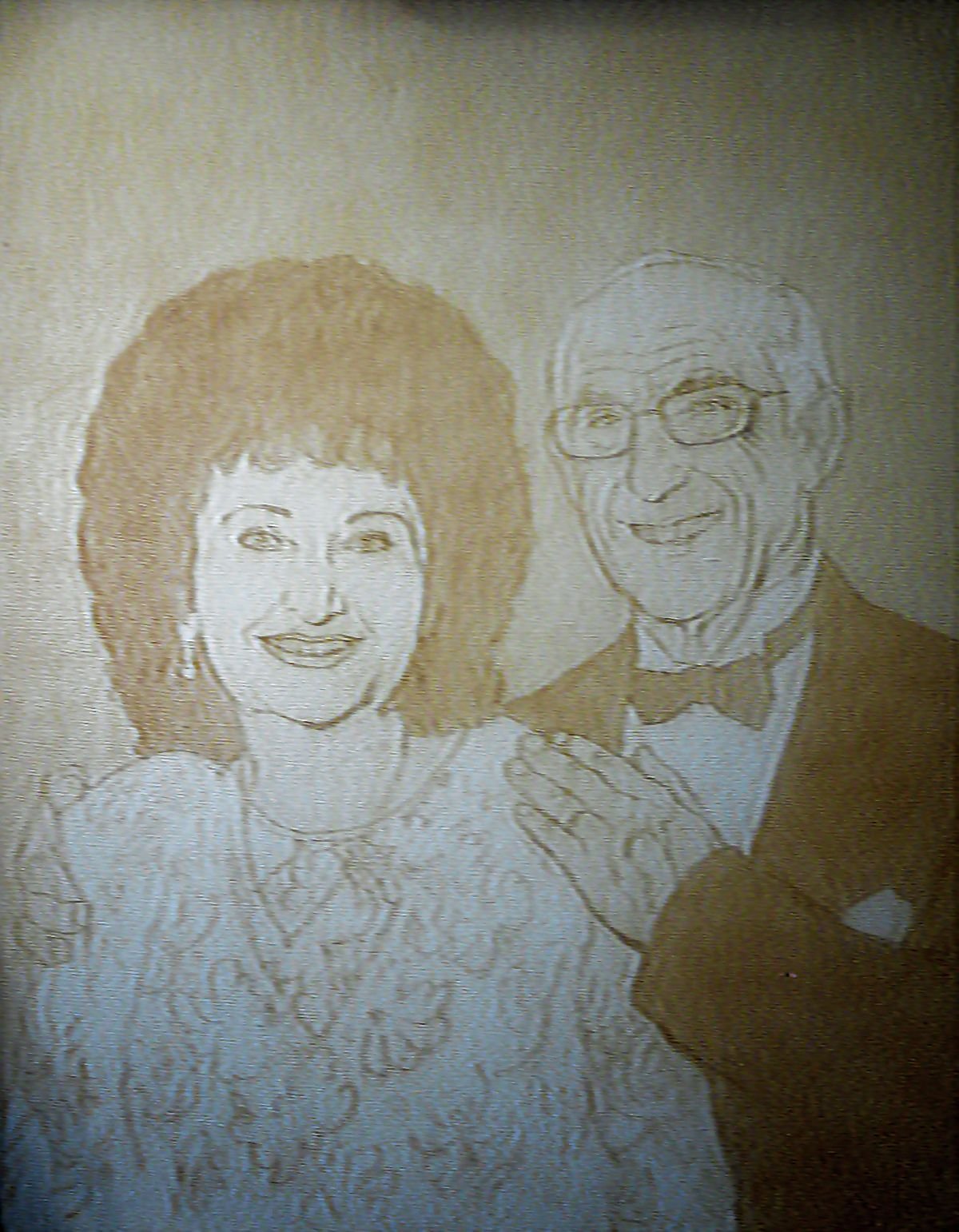
This is probably the second-most fun stage of painting. (The absolute most fun stage is finishing and signing!) I love to set the stage for the entire look of the picture by quickly blocking in the values–that is, the light and dark areas that create contrast, visual interest and realism.
To do that, I used raw umber dark mixed at a ratio of 90% medium to 10% paint. I filled in the hair and the suit right away, and also the background. To differentiate between the foreground and background, I used more layers on the people. Alternating between the raw umber dark, I also used phthalo blue, alizarine crimson, and dioxazine purple.
Did you know that dioxazine purple is darker than black?
I wanted to make sure the black areas were very dark. That makes the lighter values pop even more, giving the whole painting a greater visual impact.
Step 3: Smoothing Out and Adding Details
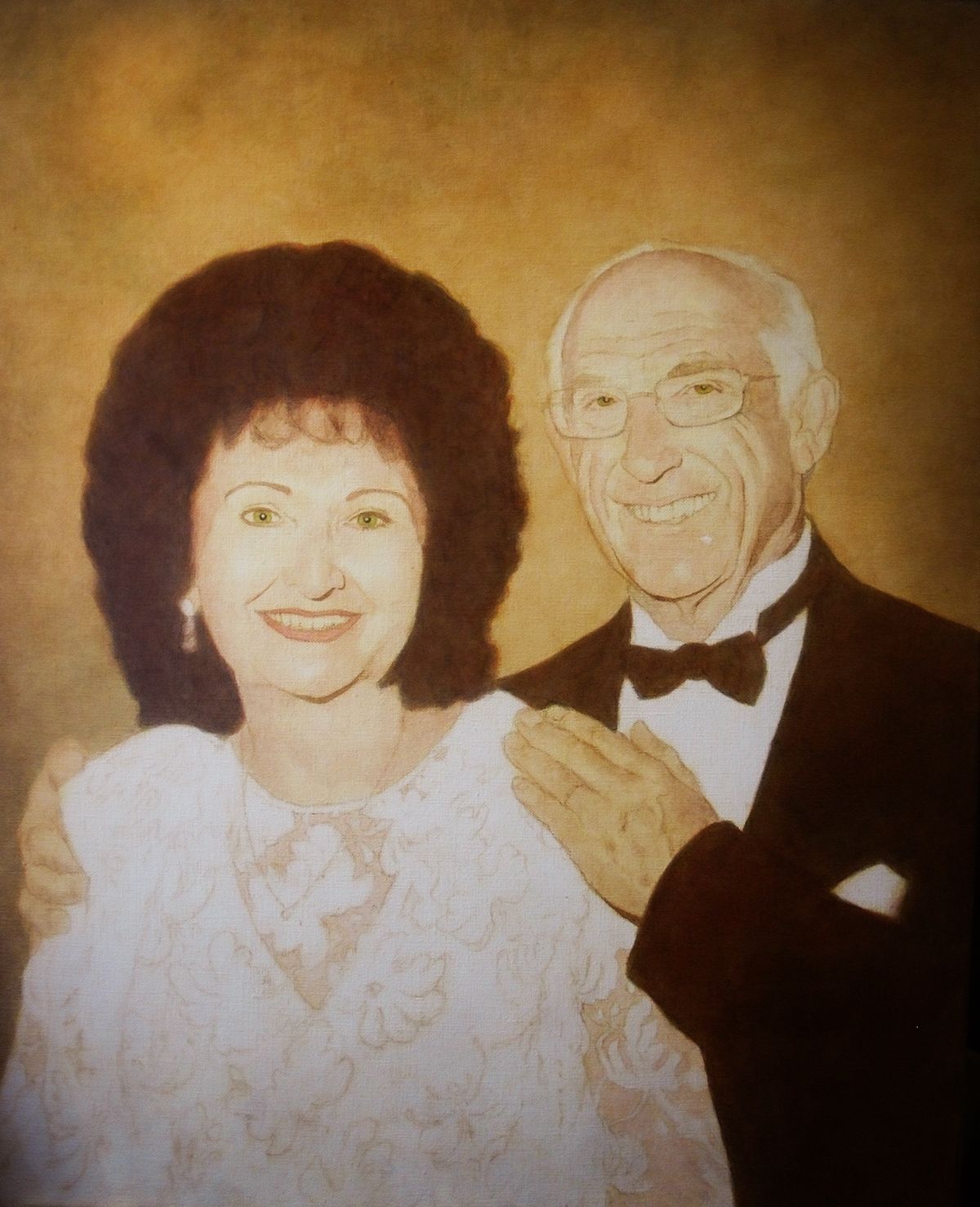
In this step, I build up three dimensional form by utilizing 5 different blending techniques:
1. Segmented Glazing. Creating gradations by using several layers and intentionally placing more layers upon areas that are darker in value, and less upon those that should be lighter. Generally, I use this method in the first stages of the painting, when very smooth gradations are not necessary, and I’m just building up the values.
2. Dilution Glazing. Creating gradations by applying a glaze over a section, and then dipping your brush into pure matte medium (which is clear) and blending it into the edge of the section of glaze, thus thinning it out gradually and creating a smooth transition in the process.
3. Dry Brushing. You apply the paint normally at first, but then when the supply of paint on your brush is almost exhausted, you “feather” out the remainder, and get a transition from dark to light.
4. Dabbing. This is unorthodox, but it works for me. I also blend with my finger. If my glaze was a bit too strong in an area, I smooth and lift up some of the pigment with my fingers, and wipe the excess on a towel. No worries, because acrylic is non-toxic!
5. Wet-on-Wet. This would typically be done with a more opaque layer, but the layer could still be 50% translucent. Think of a sky: You start with a dark blue and paint it halfway down, and then switch to a lighter, aqua blue, fill that area in , and quickly blend the two together while they are still wet. We will assume that you have some layers of color underneath, and not just a white canvas as you apply this wet-on-wet layer.
In addition, I start filling in the color in certain detailed areas such as the eyes, using a series of glazes. To make hazel eyes that look realistic, you use blue on the perimeter and yellowish brown (raw sienna) in the center. This gives it a jewel-like effect, just like a real eye!
Step 4: Refining and Finalizing Details
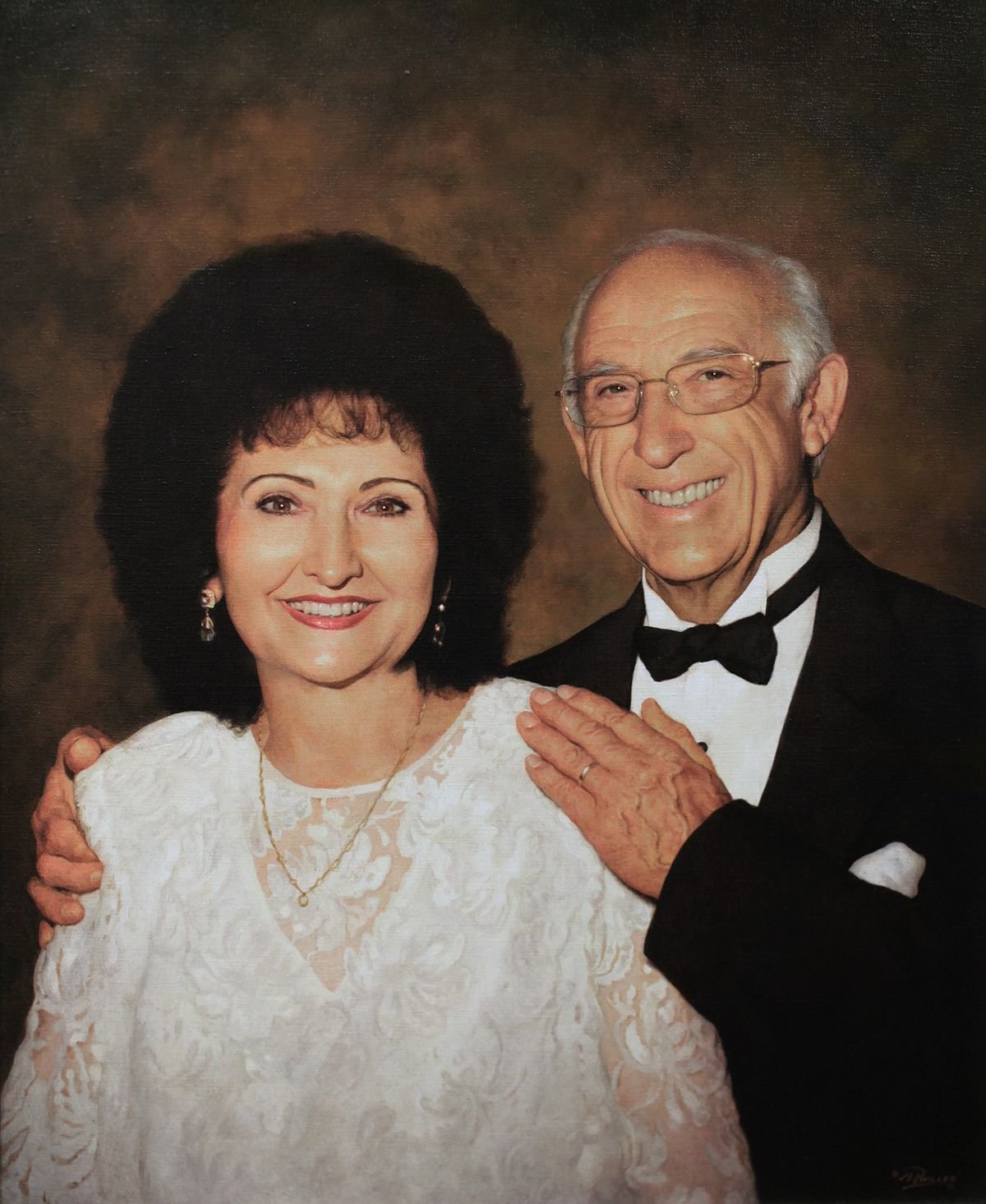
I love this part of the painting. This is where you feel like the painting is mostly done and some onlookers would even say it’s done. But you want to give it “that special something” so that when you look at it up close, you see amazing little nuances and subtleties of color that rewards the viewer for taking a closer look.
Although the glazing technique is fantastic at achieving depth and shading, it leaves a grainy texture behind. To counteract that effect, I use semi-opaque layers on the top to smooth that out and blend everything in. I heighten the contrast on the subject’s faces, darkening the background enough so they stand out.
On the man’s hand, I glaze with blue to capture the veins. But it’s also the shading that helps describe that too. I add shadows under the veins and highlights on the top, and that really helps make it look real.
In the eyes and teeth, I add highlights to give the impression of moisture and glossiness. Every detail counts.
And finally, I call the painting done!
Hope you enjoyed this tutorial. Let me know if you have any questions and I’ll be in touch,

P.S. Did you find this post helpful or encouraging? If so, send it on ahead! Let others know with the share buttons below. I’d love to hear your comments. Thank you so much!