Archive Monthly Archives: January 2018

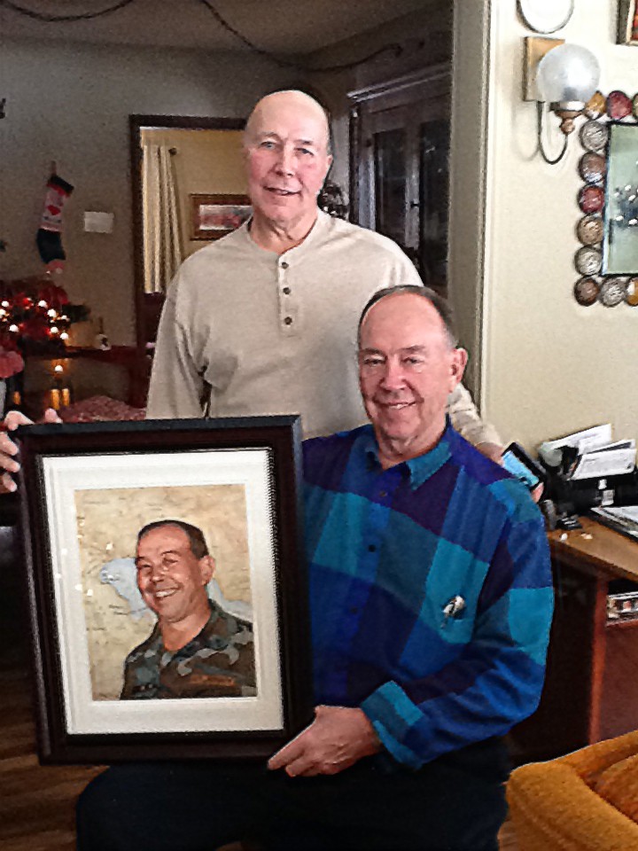
4 Steps on How to Paint a Pastor and His Wife
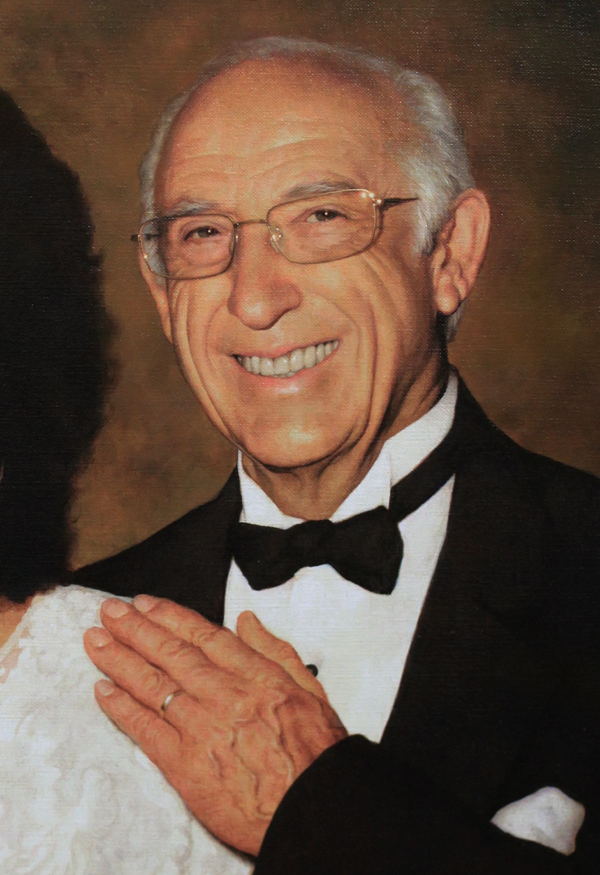
Retired at age 91.
My pastor served for a very long time at my church, over 40 years, and almost 70 years in ministry. He asked me to do a portrait of he and his wife. I’m going to show you how I did it.
This was a 25″ x 31,” acrylic on linen. I stretched this canvas and primed it myself with about three coats of gesso to make sure it was an extra smooth surface.
Step 1: Creating the Sketch
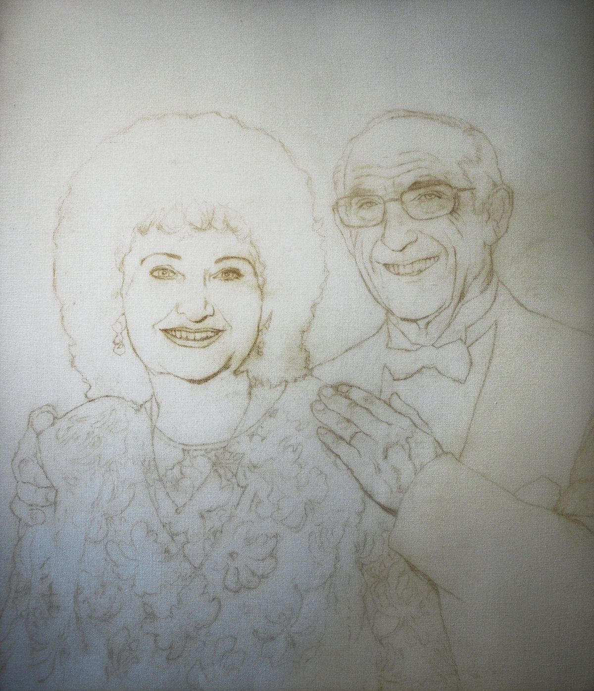
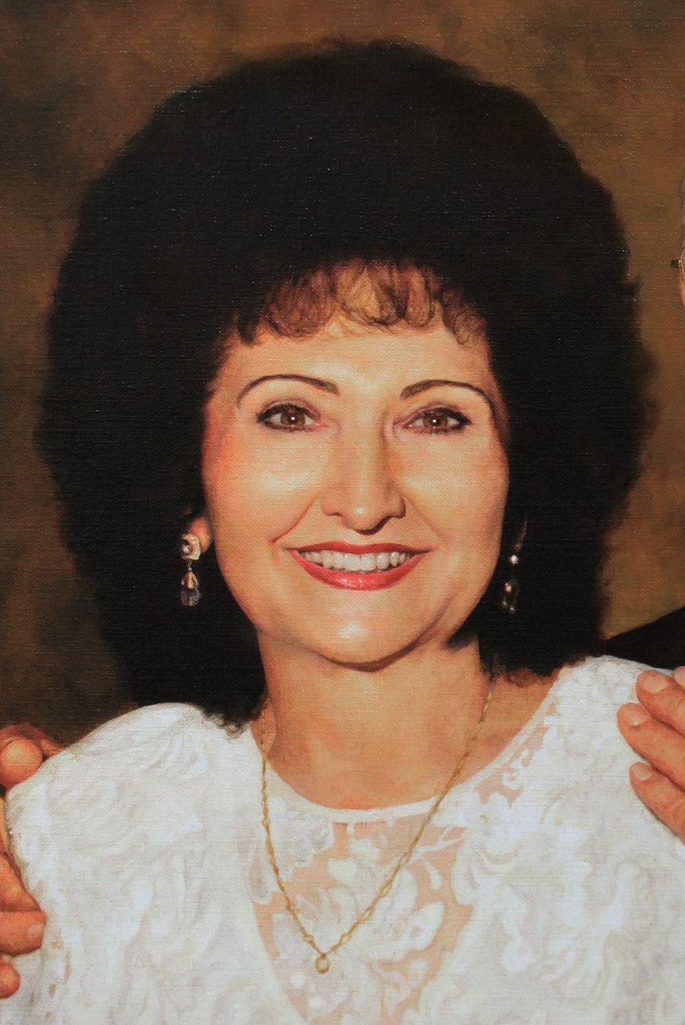
For the sketch, I used a dark pastel pencil and drew in almost every contour of the faces. Even the detail in the dress of my pastor’s wife wife was meticulously reproduced from the reference photo.
Having a detailed, accurate sketch is an excellent foundation to apply the layers of paint to, just like a construction company needs to lay down solid cement to build a home on.
I didn’t want to leave anything out.
During the consultation with the clients, my pastor’s wife said, “Don’t paint any wrinkles on me. But you can paint them on Pastor, though.”
I laughed.
I guess that’s the beauty of hiring an artist to paint your picture instead of relying on the harsh, unforgiving camera lens.
She didn’t have too many wrinkles to edit out, anyway. 🙂
Once the sketch was finished, I sealed it in with matte medium. You never should use a spray fixative to seal in a fine art painting sketch. You could end up having problems with the paint adhering to the surface. Instead, do it the old fashioned way, with clear acrylic medium and a brush.
Step 2: Blocking in the Values
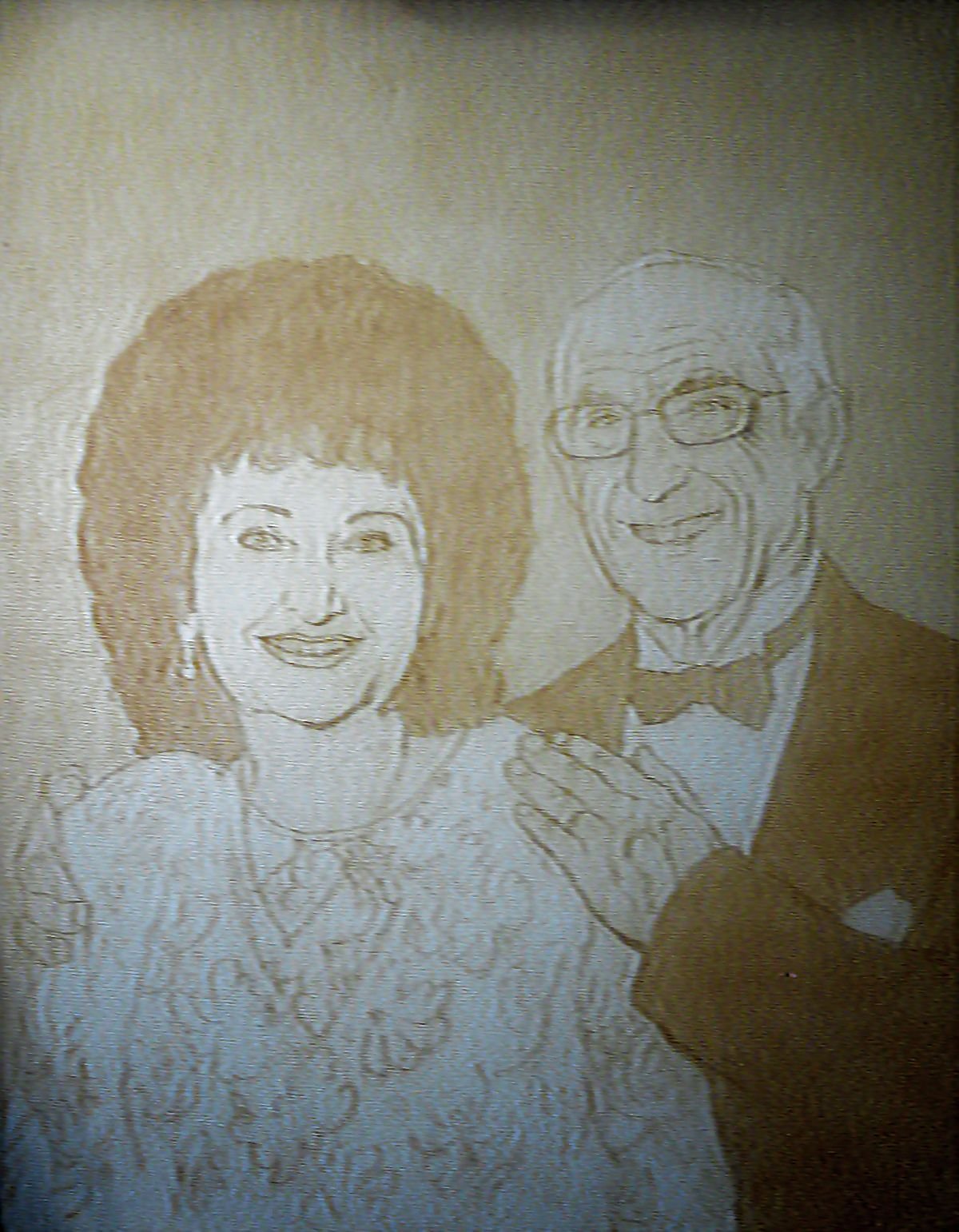
This is probably the second-most fun stage of painting. (The absolute most fun stage is finishing and signing!) I love to set the stage for the entire look of the picture by quickly blocking in the values–that is, the light and dark areas that create contrast, visual interest and realism.
To do that, I used raw umber dark mixed at a ratio of 90% medium to 10% paint. I filled in the hair and the suit right away, and also the background. To differentiate between the foreground and background, I used more layers on the people. Alternating between the raw umber dark, I also used phthalo blue, alizarine crimson, and dioxazine purple.
Did you know that dioxazine purple is darker than black?
I wanted to make sure the black areas were very dark. That makes the lighter values pop even more, giving the whole painting a greater visual impact.
Step 3: Smoothing Out and Adding Details
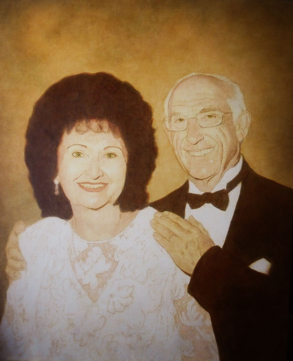
In this step, I build up three dimensional form by utilizing 5 different blending techniques:
1. Segmented Glazing. Creating gradations by using several layers and intentionally placing more layers upon areas that are darker in value, and less upon those that should be lighter. Generally, I use this method in the first stages of the painting, when very smooth gradations are not necessary, and I’m just building up the values.
2. Dilution Glazing. Creating gradations by applying a glaze over a section, and then dipping your brush into pure matte medium (which is clear) and blending it into the edge of the section of glaze, thus thinning it out gradually and creating a smooth transition in the process.
3. Dry Brushing. You apply the paint normally at first, but then when the supply of paint on your brush is almost exhausted, you “feather” out the remainder, and get a transition from dark to light.
4. Dabbing. This is unorthodox, but it works for me. I also blend with my finger. If my glaze was a bit too strong in an area, I smooth and lift up some of the pigment with my fingers, and wipe the excess on a towel. No worries, because acrylic is non-toxic!
5. Wet-on-Wet. This would typically be done with a more opaque layer, but the layer could still be 50% translucent. Think of a sky: You start with a dark blue and paint it halfway down, and then switch to a lighter, aqua blue, fill that area in , and quickly blend the two together while they are still wet. We will assume that you have some layers of color underneath, and not just a white canvas as you apply this wet-on-wet layer.
In addition, I start filling in the color in certain detailed areas such as the eyes, using a series of glazes. To make hazel eyes that look realistic, you use blue on the perimeter and yellowish brown (raw sienna) in the center. This gives it a jewel-like effect, just like a real eye!
Step 4: Refining and Finalizing Details
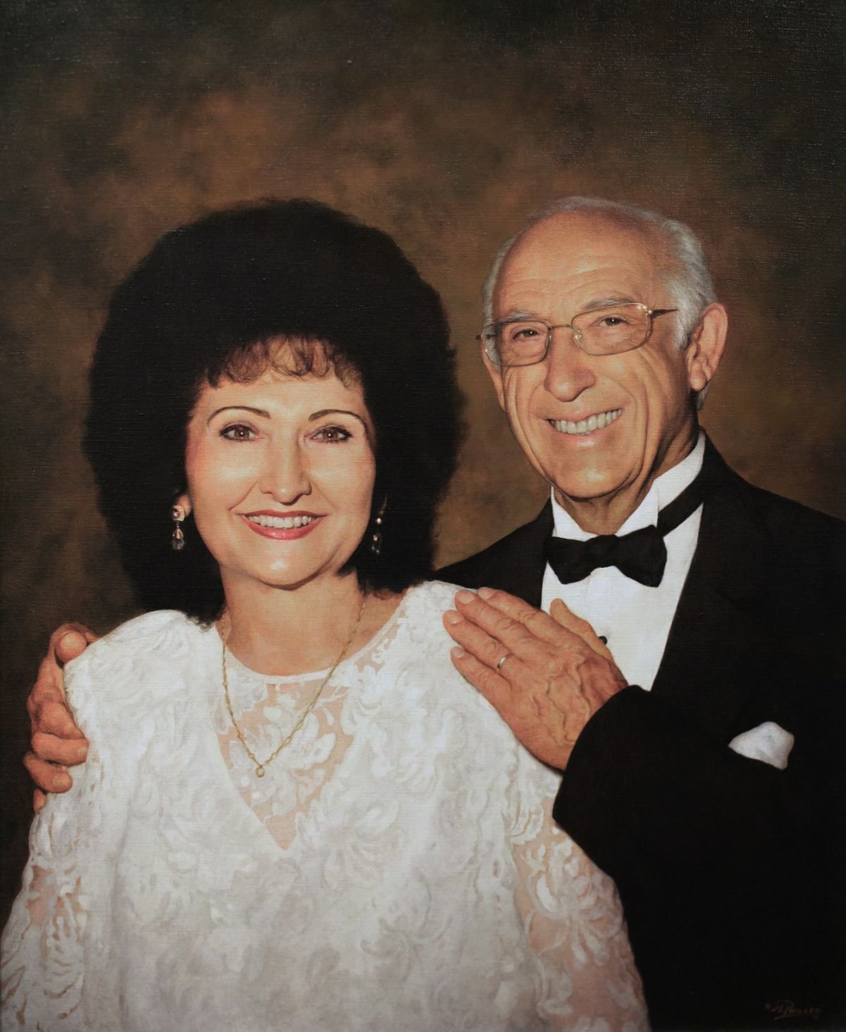
I love this part of the painting. This is where you feel like the painting is mostly done and some onlookers would even say it’s done. But you want to give it “that special something” so that when you look at it up close, you see amazing little nuances and subtleties of color that rewards the viewer for taking a closer look.
Although the glazing technique is fantastic at achieving depth and shading, it leaves a grainy texture behind. To counteract that effect, I use semi-opaque layers on the top to smooth that out and blend everything in. I heighten the contrast on the subject’s faces, darkening the background enough so they stand out.
On the man’s hand, I glaze with blue to capture the veins. But it’s also the shading that helps describe that too. I add shadows under the veins and highlights on the top, and that really helps make it look real.
In the eyes and teeth, I add highlights to give the impression of moisture and glossiness. Every detail counts.
And finally, I call the painting done!
Hope you enjoyed this tutorial. Let me know if you have any questions and I’ll be in touch,

P.S. Did you find this post helpful or encouraging? If so, send it on ahead! Let others know with the share buttons below. I’d love to hear your comments. Thank you so much!

2017 Year-End Survey Results
“What do you want me to teach on in 2018?”
At the end of last year, (which was not long ago as I write this) I sent out a survey to my students and email subscribers asking this question–in many different ways.
Specifically, I asked 12 questions to nearly 800 subscribers.
From those who participated, the responses to the survey surprised me a bit. They may surprise you as well!
Question #1
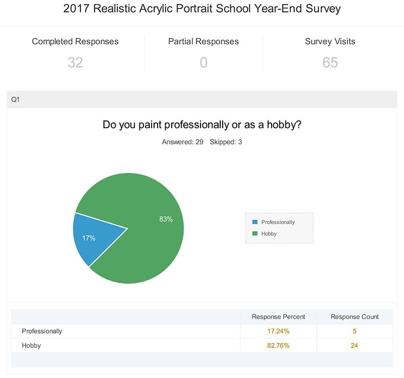
Interesting. I knew most of my subscribers were hobbyists but I didn’t know the percentage was that high.
Question #2
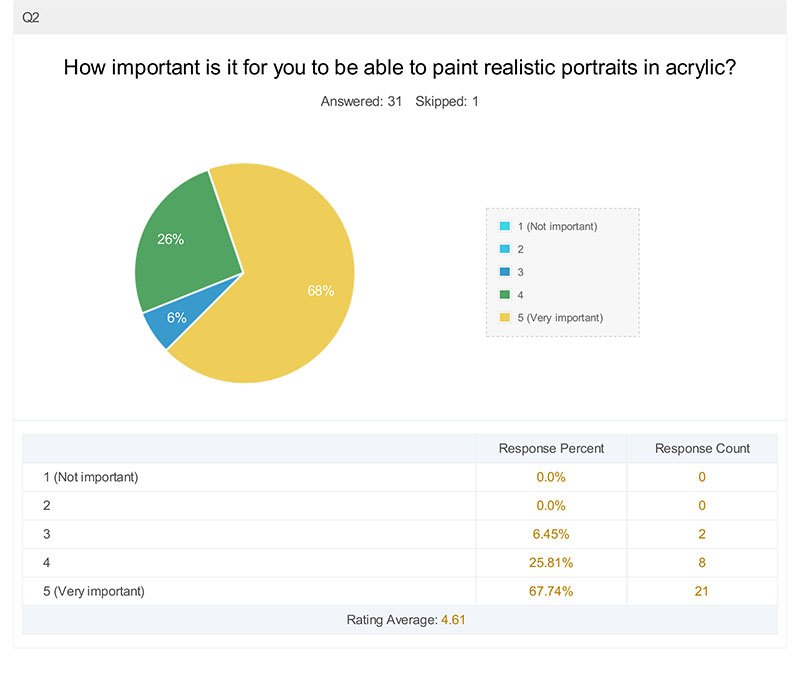
This is good for me to know. Because if you want to learn how to paint abstract portraits, for example, you’re probably in the wrong place!
Question #3

I knew skin tones would be the highest scoring, based on the conversations I’ve had on Facebook and in direct emails. Shading comes in at second place. So I guess it’s good that I already did a course on shading.
But apparently I should do one on skin tones! 🙂 And there’s plenty of other topics I can teach on too.
Question #4
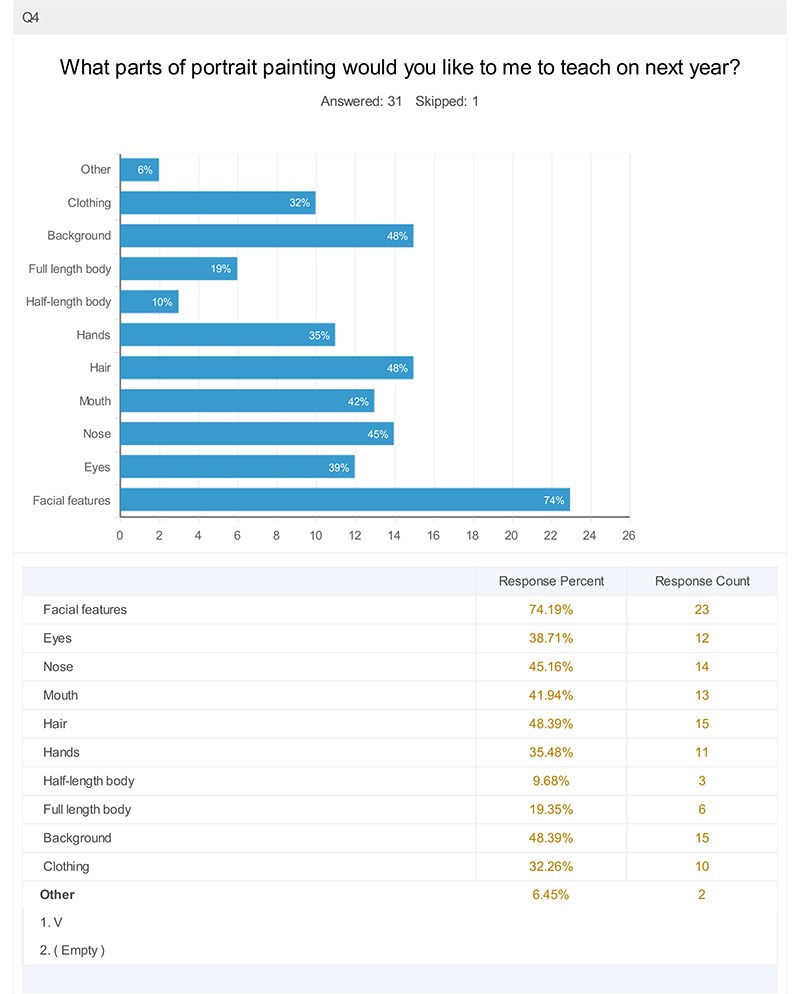
Now, I probably should have phrased my question better. Facial features really are eyes, nose and mouth all put together. But I think my subscribers were trying to say they’d like to learn how to do accurate portraits. How to capture the likeness correctly…yes?
I find it interesting that learning how to paint hair score higher than eyes. And the nose came in right after that.
Well, noses are tricky.
Maybe a course on painting noses would sound a little odd, but I’ll do it if that helps my students paint better portraits!
Question #5
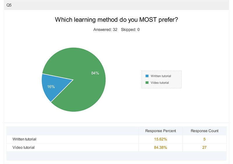
This totally amazed me. I know people like videos, but that is conclusive. I need to do more videos. I’ll still do some written tutorials here, but I am going to imbed some videos into the articles as much as possible.
Question #6
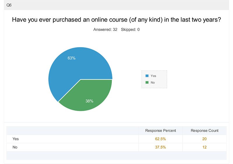
It’s pretty amazing that a majority of my readers have purchased an online course. Amazing what technology can do and how it can bring us together from all parts of the globe!
Question #7
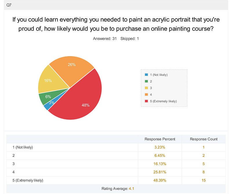
This is a good stat right here. Nearly half of my subscribers would buy a course if they KNEW they would learn everything they needed to be able to paint that amazing portrait. And another fourth would be pretty likely to, again if they were confident they’d get the outcome they’re seeking.
My goal then, will be to show you that I can teach you exactly what you need to do just that, and to make the transaction risk-free as possible for you.
Question #8
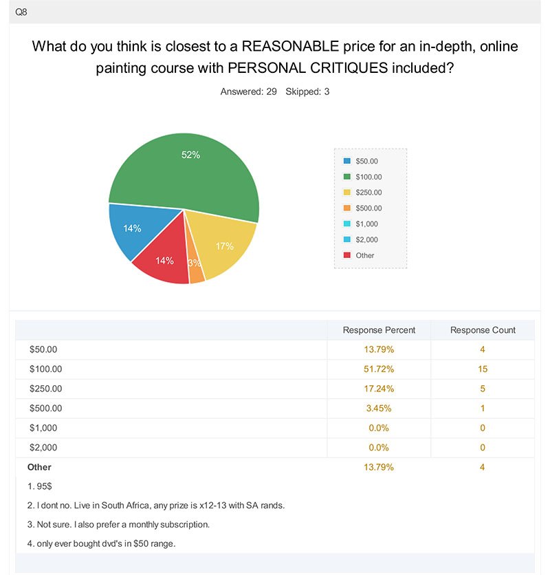
Okay, so it looks like I’m right on the money with what I charge for my course. Good to know. Obviously, I need to make a living as an artist and teacher and don’t want to under-price my labors, but I don’t want the price so high, that you can’t afford it. I can’t tell you how many times I’ve wanted to purchase a course on blogging or marketing, and then the price is $2,000 or more.
Really?
I could buy a nice used mini-van for that to haul more of my paintings around!
Question #9
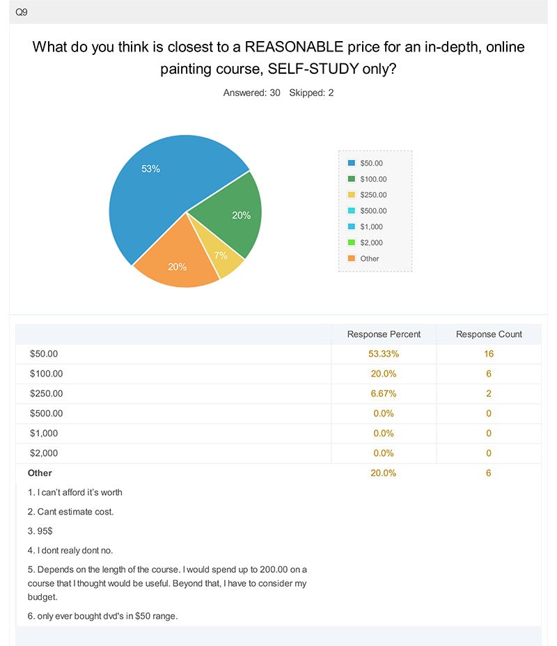
I’m glad that everyone could see the value of a course with critiques included. I love doing critiques and seeing the results my students get with them, but they take time, and so I need to charge a little more for that. And of course, less for a course without critiques. I think my subscriber’s responses here are intelligent and reasonable.
I should have added the question, “How important is a personal critique in a course? Or, put another way, do you prefer “self-study?”
(You can answer that in the comments below if you’d like 🙂 )
Question #10
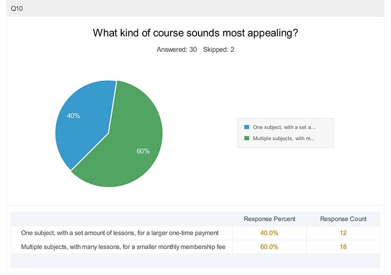
It seems that a majority of my subscribers would like a monthly membership program. I do have one right now: Realistic Acrylic All-Access Membership. With it, you get access to all the courses, plus personal critiques every month.
Question #11
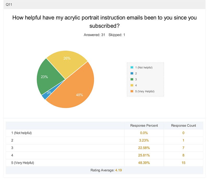
Nearly half have found my emails very helpful, and another quarter have found them pretty helpful. The remainder have found them decent, but not great. I’m glad I’m doing a good job overall, sharing lessons and tips that are useful, but it looks like I can still use some improvement.
I should have done a follow-up question or two: What can I improve on? What would you like to see more of?
Well, I’m asking you right now. 🙂 Let me know!
Question #12
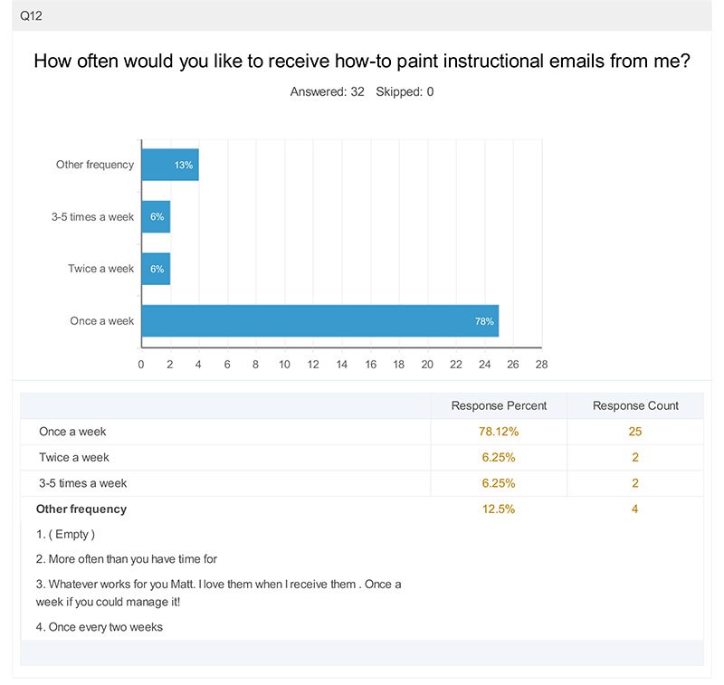
This wasn’t surprising. After all, I normally send an email about once a week, so that is what my subscribers are used to. I recently opted in on an email list for marketing tips, and at a certain point, they sent me 2-3 emails a day!
My inbox could only take so much. Unsubscribed.
Occasionally, I send out an email twice a week, when I have an announcement on a new course or something that’s time sensitive, but I promise my subscribers to never inundate their inboxes!
Additional Comments
Finally, this last question was a freebie. It was wonderful to hear so many honest comments. Since the survey was anonymous, I was unable to respond back personally via email to the people who left the comments, but I will take the opportunity to do that now…
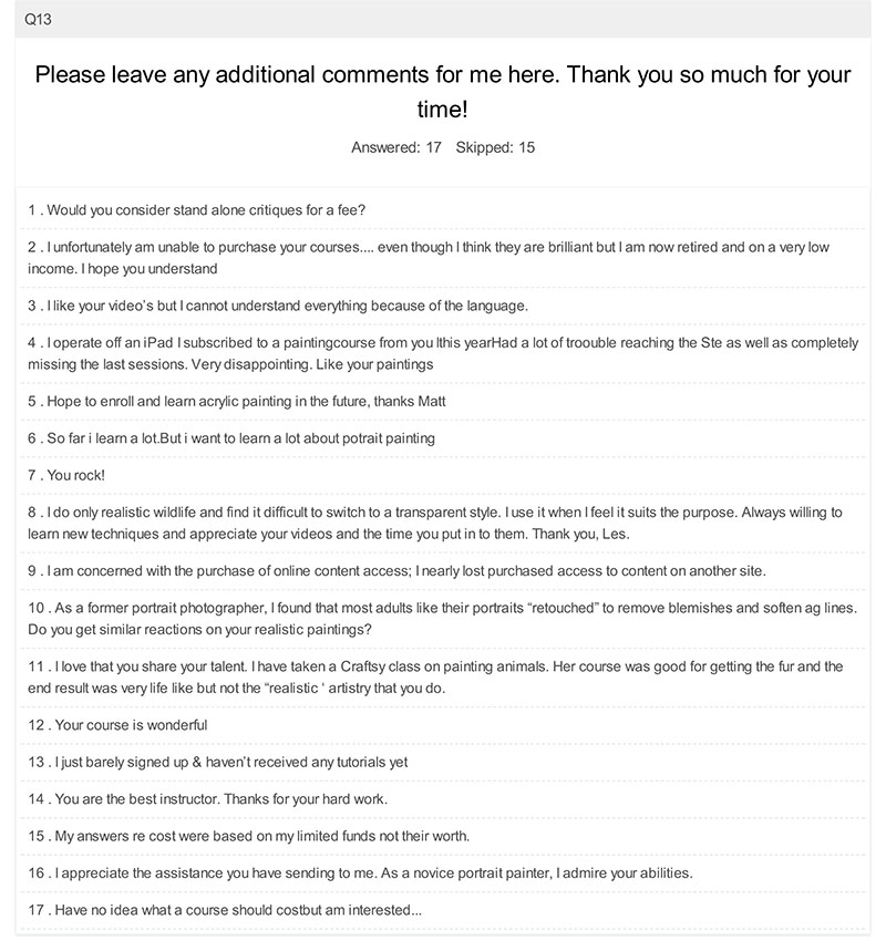
Here are my answers…
1. Would you consider stand alone critiques for a fee?
I would do standalone critiques for a fee, if that works best for you. Although I include a month worth of free critiques within my painting course, I would offer standalone critiques for $15 each.
These are personalized video critiques, like this one here, (approximately 15 minutes long) where I compare your painting next to the original image, discuss what’s working well, and show you exactly how to correct what may be off.
So, if you’re interested, just email me and let me know. I’ll set it up with you.
2 . I unfortunately am unable to purchase your courses…. even though I think they are brilliant but I am now retired and on a very low
income. I hope you understand
Of course I understand. I am still very glad that you’re a subscriber and you can still benefit from my free lessons and videos.
3 . I like your video’s but I cannot understand everything because of the language.
I am sorry about the language issue. Not sure if I can correct that, since I only speak English! Maybe there’s translation services out there for videos?
4 . I operate off an iPad. I subscribed to a painting course from you this year. Had a lot of trouble reaching the site as well as completely
missing the last sessions. Very disappointing. Like your paintings.
Thanks for the compliments on my paintings. I’m sorry if you were disappointed in not being able to access the later videos in the course. Email me. I think I can upload them to a private YouTube channel so you can see them.
5 . Hope to enroll and learn acrylic painting in the future, thanks Matt.
Ok, great, I look forward to teaching you. Maybe you already enrolled! 🙂
6 . So far I learn a lot. But I want to learn a lot about portrait painting.
Good. That’s what I’m here for!
7 . You rock!
Hey, thanks. God has been good to me…just want to pass the blessings along!
8 . I do only realistic wildlife and find it difficult to switch to a transparent style. I use it when I feel it suits the purpose. Always willing to
learn new techniques and appreciate your videos and the time you put in to them. Thank you, Les.
Hi Les, and glad you like the videos and appreciate the time I put into them. I plan on doing a lot more this year!
9 . I am concerned with the purchase of online content access; I nearly lost purchased access to content on another site.
Yikes! That would make me upset too. My courses are hosted by Teachable, and although they are not perfect, they are one of the most dependable learning management systems out there. Most of my students have had a great experience there. However, my course is satisfaction guaranteed, and you can always reach me by email or phone if you’re having problems with anything.
10 . As a former portrait photographer, I found that most adults like their portraits “retouched” to remove blemishes and soften ag lines. Do you get similar reactions on your realistic paintings?
Yes. One client said, “You can take my wrinkles out,” but to leave them on her husband. 🙂
11 . I love that you share your talent. I have taken a Craftsy class on painting animals. Her course was good for getting the fur and the
end result was very life like but not the “realistic ‘ artistry that you do.
Thank you. I am looking to fill a void here on the internet. There’s many teachers, but I haven’t found any that specialize in teaching realistic acrylic portrait painting. So, voila!
12 . Your course is wonderful.
Thank you so much!
13 . I just barely signed up & haven’t received any tutorials yet.
I’m sorry you didn’t get any tutorials yet. It might have been a glitch in my email service provider. Email me if you can and let me know if you still haven’t gotten anything yet!
14 . You are the best instructor. Thanks for your hard work.
Wow, thank you for the kind words!
15 . My answers re: cost were based on my limited funds, not their worth.
Sure, that helps to know that. Thanks!
16 . I appreciate the assistance you have sending to me. As a novice portrait painter, I admire your abilities.
My pleasure. Be blessed in your painting and may God take the skills He’s blessed you with and multiply them ten-fold this year!
17 . Have no idea what a course should cost but am interested…
My main online course, “Paint Your First Amazing Acrylic Portrait” is $97, one time fee. You can find out more or enroll right here.
That wraps it up for my first survey results. Did it surprise you? Does it make you think of anything you’d like to ask me?
Or maybe you’d like to leave a comment on what you’d like me to teach on. How have I been doing and how can I improve? I’d love to hear your thoughts.
Have a blessed day,


7 Steps on How to Paint a Realistic Baby
I’d like to show you, step-by-step, how I painted a portrait of a beautiful baby.
This was a commissioned portrait, a 16″ x 20″ acrylic on canvas, and it took me about 25 hours to do. Follow along in the process, and I believe you will learn a new approach to painting portraits in acrylic that will pleasantly surprise you!
Or, if you’ve tried my techniques before, this will be a good review for you.
Acrylic Painting
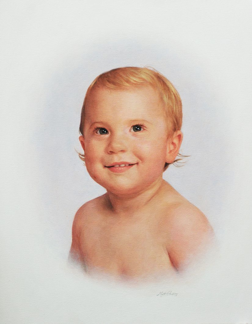
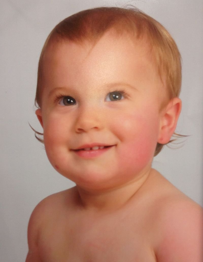
The client wanted a painting that was in an oval vignette style, to match some existing portraits in her home. Here is the photo she supplied me with, to paint from. She wanted me to make his hair combed off to the side, unlike what you see in the photo. That’s an easy enough change to make.
Reference Photo
Now, let’s go through the process on how I painted this portrait.
Step 1: The Sketch
The sketch is the most important part of any portrait painting–whether in acrylic, oil or watercolor. The sketch is the foundation. Just like any house builder won’t build without a blueprint–unless they want a lopsided house–an artist shouldn’t plan do a lifelike portrait without an accurate sketch.
Some artists can work without one, starting very loosely, by just blocking in colors and value roughly, and work their way into detail–but it takes a lot of experience to pull that off. Many of those artists who can do that cut their teeth in learning how to draw, with hours of practice.
So for most artists–I recommend starting your painting with a sketch. You can use a grid or a projector to help if you haven’t done a lot of freehand drawing.
I have found that colored pencil is an amazing way to sketch on canvas. It works so much better than graphite pencil.
Why?
Well, first of all, you can choose a sepia or earth tone that really matches your skin tones within the portrait. Secondly, it is surprisingly easy to erase on a properly prepared canvas. Just go over your canvas with a mixture of 50%/50% gesso and matte medium.
Let it dry. And you’re set. You’ll be able to sketch and erase like a dream.
By the way, I use Prismacolor dark brown or terra cotta for sketching.
In the sketch, I make sure I’ve not only captured the shapes and lines of the baby’s face accurately, but I also want to get the shading in. Shading is what makes the difference on a portrait. So if you can get it in there during the sketch stage, it’s a lot less work figuring out where to go in the painting stage. Basically, all you’re doing is enhancing what you’ve put down in pencil.
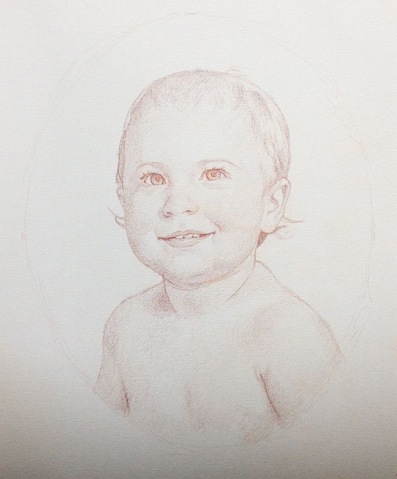
Step 2: Sealing in Your Sketch
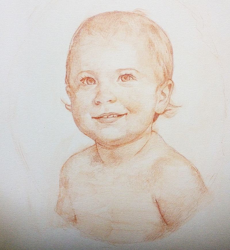
After you’re confident the sketch is looking accurate, the next step is to seal it in. What I mean by that is this: you’ll take some matte medium (that’s the clear acrylic without pigment and dries to a flat finish–get it at your local art store) and you brush it on the sketch to create a barrier between the sketch and your painting.
The last thing you want to have happen is your sketch to get all messed up as you apply the brush in the painting process!
So, what I did was put the medium in a little condiment container (like what you put your ketchup in at a fast food restaurant, and you can buy these inexpensively at Walmart in the food storage section) and then start covering over your sketch. You’ll need to be careful, though, not to smear your sketch work!
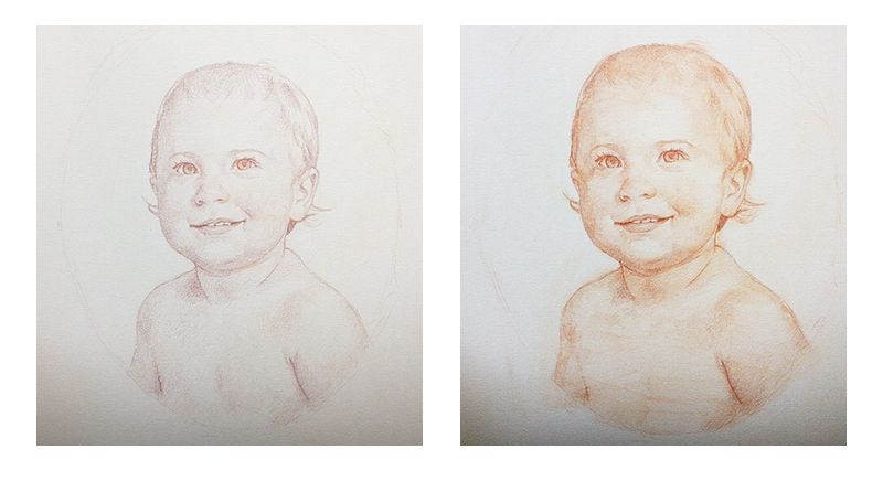
Actually, you can make it work for you. I found that the medium started mixing with colored pencil pigment and turned into a glaze, or faint paint layer. I brushed it on in the direction of the contours of the face, and it enriched the color and contrast of the sketch. You can see the difference between the sketch before and after it was sealed in.
If it makes for less work in the painting stage…why not try something new?
Step 3: Blocking in the Initial Color and Value
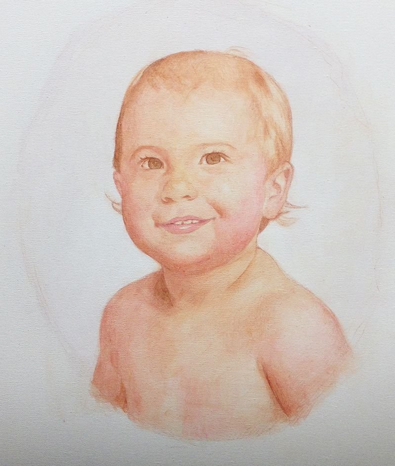
Now, in this stage, it’s important to cut yourself a little slack.
Because when you start establishing the colors and value, your sketch is getting covered up a little, and you lose some of the overall cohesion of the values that you drew.
What I mean is that, you’re kind of in an in-between stage, and like any in-between stage in life, it can look a little awkward. If you have children, think of how they looked when they first started to walk. The could crawl like an expert, but once they started to walk, they waddled, wobbled, fell, maybe even cried, and got back up again.
So, in this stage, as you put down a few layers, things may look a little messed up.
No worries.
Just keep going.
Look at your reference photo and keep in mind, you have a blueprint to follow. Sooner or later, your painting will look very similar to what you see in the reference photo.
I used raw umber dark for the shadows, raw sienna, and alizarine crimson for the lighter areas. The crimson works well for establishing the pinkish tones in the baby’s cheeks and lips. Everything is very faint. I use matte medium to thin out the paint, and glaze it in with very minute layers. I love this technique. You can easily adjust the direction of your painting on the fly, and you can build up a lot of shading, even though acrylic dries so fast.
Finally, because the layers are translucent, the light shines through the surface, giving you a richness and a depth that will have people often mistaking your acrylic paintings for oils!
Step 4: Bringing out the Dark Values
At this step, I wanted to make sure the baby’s eyes would be dark enough. I also wanted to darken certain spots of the painting so it more closely matched the values of the reference photo: areas like the hair under the ears, the shadow to the left of his neck, and the crevices in the mouth on either side of the teeth.
When you get the darkest values established, then you know what you’re up against. It makes it easier to know how dark to take the rest of the painting. Because with values and colors, everything is relative. Once you darken a certain area, it will look out of place until you darken everything else accordingly.
In addition, I added more color to the face and hair, using a mixture of raw sienna and alizarine crimson. But for the hair, I used mostly raw sienna. The trick with blond hair is to not make it look too yellowish. Many beginning portrait painters do that. It’s easy to do, because we’re conditioned to think of blond hair as yellow from the cartoons we’ve seen as children, and the way we’ve been taught to use yellow crayons to color it in coloring books.
But blond hair is actually a pale golden brown. And there’s other nuances of color in it too, depending on the lighting and even what colored objects are around that could reflect onto it.
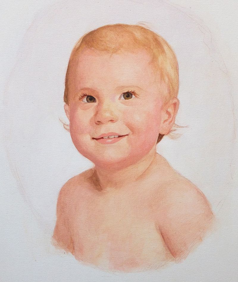
Step 5: Blending the Skin Tones and Adding Nuances
Now the portrait is starting to look realistic. But there’s still a lot of work to do. 50% of your time will be spent getting the portrait to a stage where it looks passable. The other half is spent on smoothing things out and refining details. If you want your portrait painting to go to the next level, and have a portrait you can be proud to show others, you can’t miss the final steps. It takes some patience, but it’s worth it.
In this step, I added the reflections in the baby’s eyes. They’re not finished yet, but I started them. I added two light blue dots in the correct places within the pupil. That way, in the next step, I can add a smaller white dot in the middle of them and then they will look like there’s truly light reflecting off of them.
For the mouth, it’s important to make sure the coloring of the lips is correct, and that the teeth are not too white.
Again, because of our symbolic association of teeth being white, we often paint them with…white. But in actuality, most’ people’s teeth are not white even with a bright light shining on them. And then the shadows from the mouth itself causes them to appear even darker.
So what I did was mix raw umber dark and a little titanium white and then went over the teeth with that. I developed some shadows just around the edges with a few more layers, so they don’t look paper-flat. I pay attention to the shadows on the corners of the mouth, and that’s where it creates depth. Teeth should be lighter towards the center–the front teeth–because that’s where the light is hitting them.
For the background, I’ve been adding several layers of ultramarine blue, with a little raw umber dark, and alizarine crimson. This will create the oval vignette look that the client requested, and also some differentiation between the foreground and background. With this, the warmer colors of the face will come forward in space against the cooler tones of the background.
And that’s exactly what we want: to create depth.
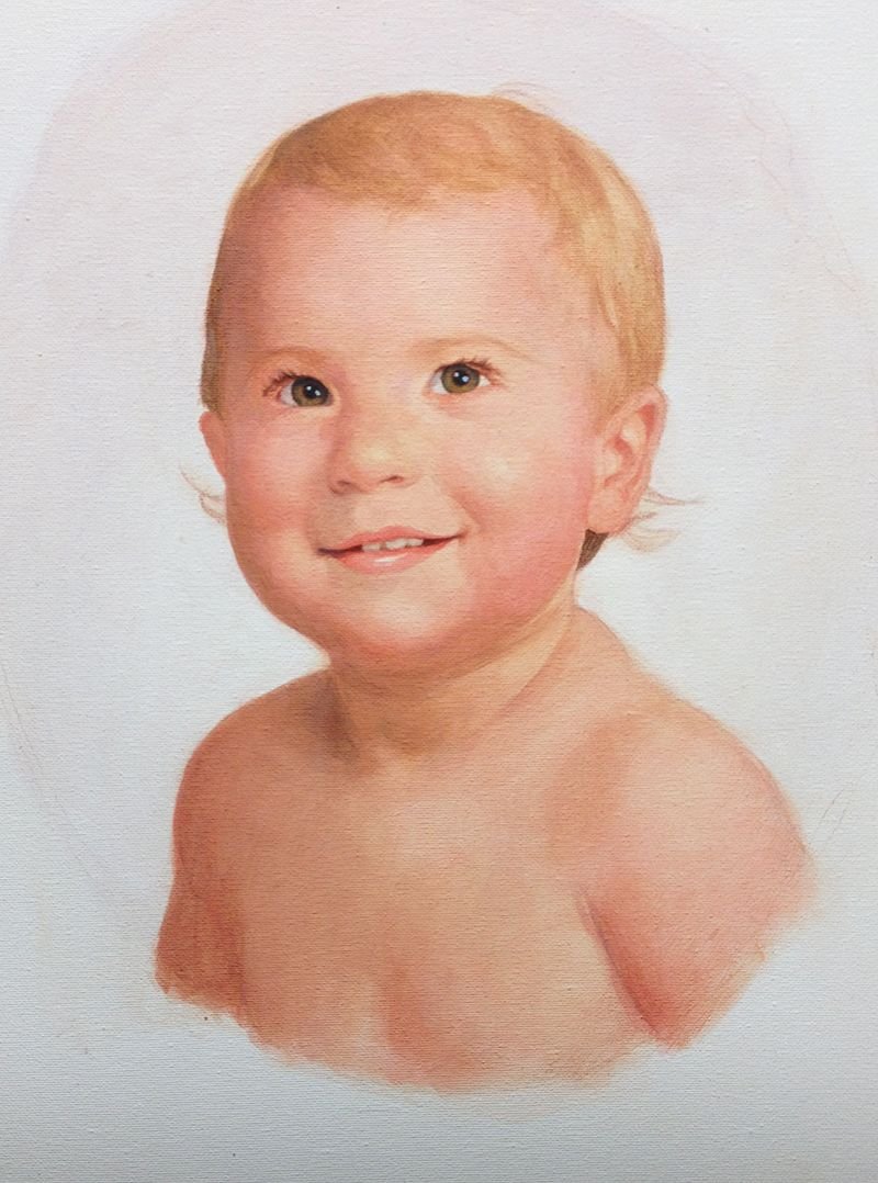
Step 6: Smoothing Out the Roughness
One of the downsides of the glazing technique is that it creates a lot of unwanted texture. That’s because the semi-transparent glazes pool up in the pits of the canvas surface and creates an uneven look, when you view it closely.
To compensate for that, we have smooth it out.
I used the same colors I had throughout the painting, but then add a little titanium white to make the layers more opaque. You only want enough to partially cover over the previous layers. You still want all the other layer-work to shine through. It’s something you have to play with to get the correct amount. Also, keep in mind that when you add white to the layers, you cool them down color-wise, and so you have to add some warmer colors to compensate.
Unless you’re trying to cool the skin tones down on purpose. Then the white can help you with that!
I found that my skin tones overall were just a bit too warm, so I used the white–again, mixed in with other colors, and still thinned out with a glaze–to cool them down. You can’t do that so much on top of the darker values, however, or you’ll muddy up the color. There you’ll have to use raw sienna (which is very opaque) and mix a bit of alizarine crimson and ultramarine blue to offset the yellow.
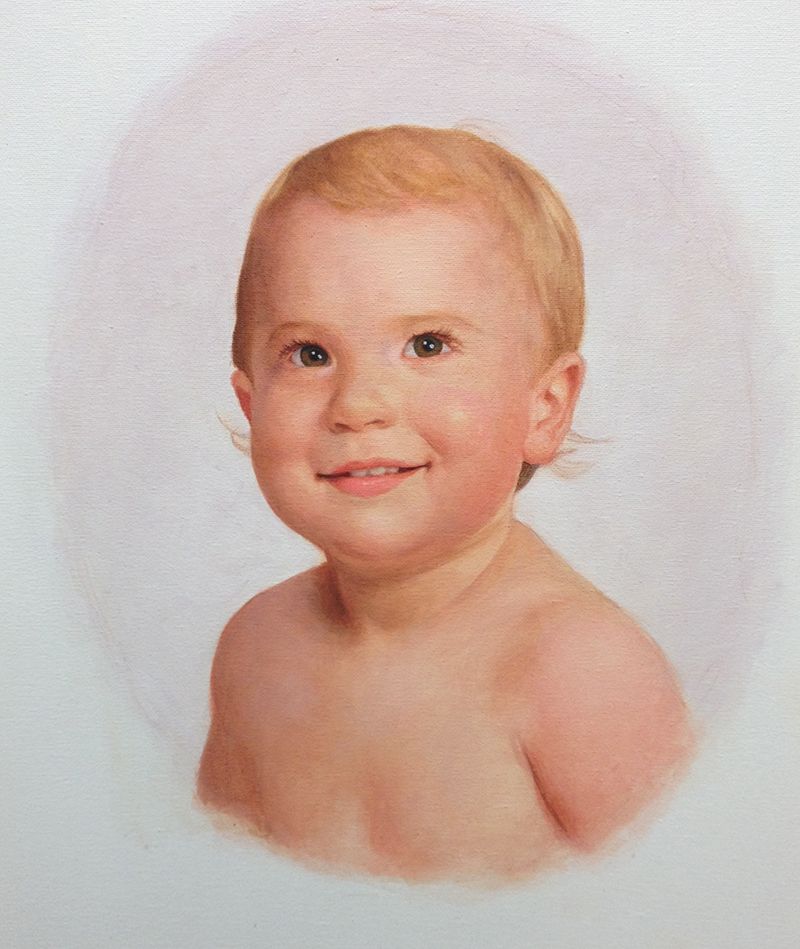
Step 7: The Final Details and Finishing it Up
At this step, you feel pretty good about the painting. It looks just about done, and because you’ve layered everything, you don’t have any white space left on the canvas, that would indicate the painting is not done.
And that’s a good thing.
But it’s good just to take it a bit further.
I went over everything: enhancing the contrast, putting in some final details within the eyelashes, the teeth, the shiny reflection on the lower lip to make it look moist (as you can imagine a baby’s mouth usually is.)
The hair needed a little more realism, so I added some highlights with raw sienna, indian yellow, and titanium white.
Also, I darkened the background with a few more layers to really heighten the contrast. And then I used some glazes of titanium white the smooth out the edges of the vignette oval and give it a cloudy look.
Although I could continue working on the painting for hours more, there is a point where the law of diminishing returns comes into play. At a certain point, you’re just pushing paint. You’re not really making a significant difference in the overall impact of the painting. And you are even starting to undo the good things you’ve accomplished!
That’s when you know it’s time to call it done. And so I did.
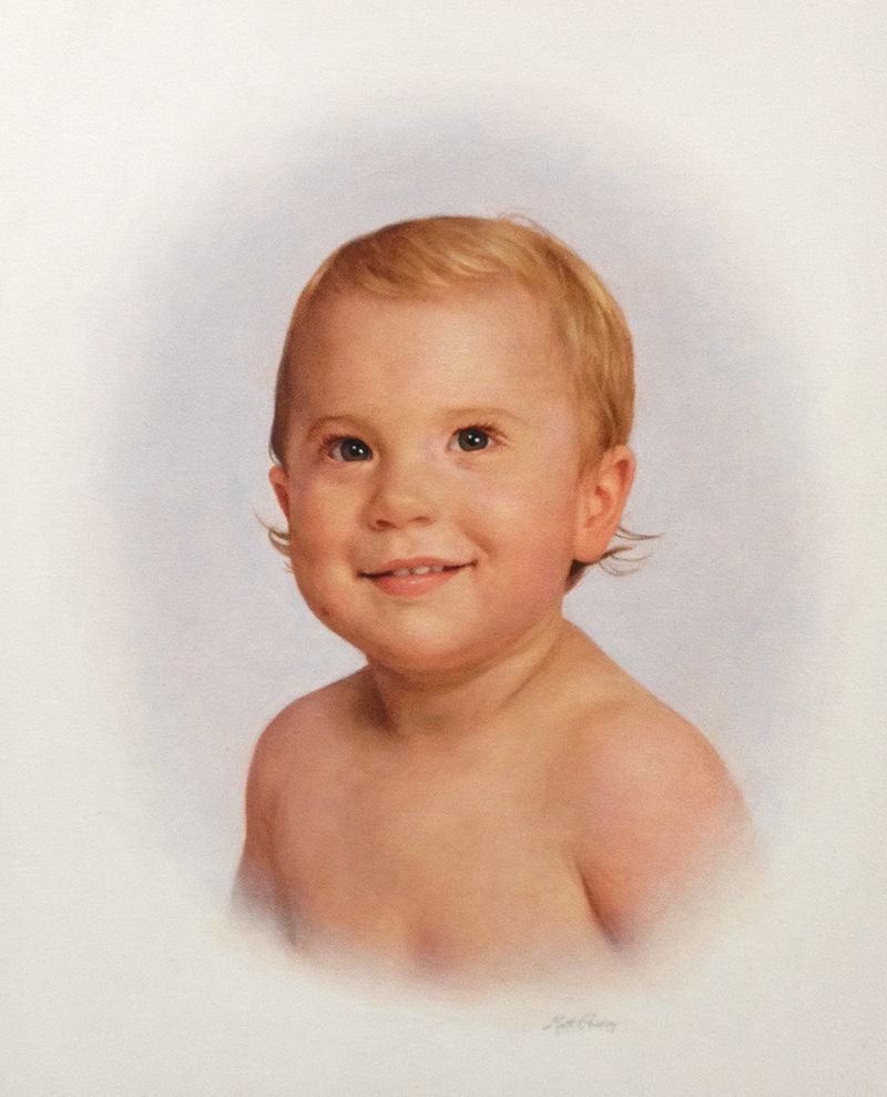
Finally, I signed it. That was the most fun step of all!
When you sign your painting, I recommend making your signature legible, but not too prominent, that it overshadows your work. It’s also good to use a color that’s similar to what’s already in the painting so it matches. In this case, I used ultramarine blue, and raw umber dark mixed with white.
After the painting was finished I emailed an image to the client for approval. When you’re happy and your client is happy, then your job is done.
Time to go out to dinner and celebrate!
An Extra Bonus:
Here’s a time-lapse video showing the whole progression of the portrait as I painted it. The video is about 5 minutes long. Enjoy!
Have a blessed day,
LEARN MORE
- Sketching Your Painting Accurately
- Beginning a Pet Portrait in Acrylic
- The Mystery of Realism in Painting
- Apply A Burnt Sienna Glaze to a Portrait
- Learn How to Sketch a Portrait Freehand in 45 Minutes
- Adding highlights to your acrylic painting
- 5 Excellent Reasons to Use Aluminum Foil
- Paint Realistic Wrinkles in Acrylic
- Painting Clothing in an Acrylic Portrait
- Paint a Cloudy Sky Acrylic
- How to add Semi-Opaque Highlights
- How to Enhance the Contrast in Your Acrylic
- How to Add Glaze to Your Acrylic Painting
- Paint Realistic Reflections on Eyeglasses in an Acrylic Portrait
- Build Up Depth on Your Acrylic Portrait Backgrounds
- How Do You Do Layers With the Glazing Technique?
- Learn How to Paint Wrinkles in Acrylic
Read more about how to paint a portrait that you can surely be proud of!
P.S. Did you find this post helpful or encouraging? If so, send it on ahead! Let others know with the share buttons below. I’d love to hear your comments. Thank you so much!

Paint Your Best Portrait Ever in 2018!
2017 is over. 2018 is underway. We’ve already begun to make our resolutions.
Losing weight, quitting smoking, exercising–so many fun things to choose from.
I don’t know if you’ve resolved to paint your best portrait ever in 2018, but it would be a fantastic thing to achieve wouldn’t it?
And a lot more enjoyable.
Imagine that you just painted a realistic portrait you’re really proud of. You show it to your family and friends, and they are amazed at what you created. Maybe you even give it as a gift, and the person who gets it is speechless. Wow. That would be amazing.
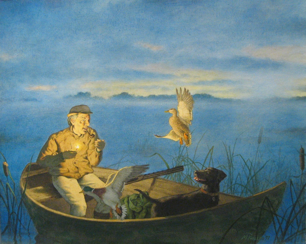
Acrylic on canvas portrait of a gulf war veteran, by Matt Philleo
Where Do You Start?
There’s a lot of tips, techniques, tutorials, time-lapse videos that show many different ways to paint. Some of it is worth reading and watching. Some of it will lead you down a wrong path.
Much of the advice out there is based on oil painting or drawing techniques and just doesn’t apply to acrylic. There are some teachers who paint in acrylic very well, but they teach everything–portraits, landscapes, still lifes, abstracts, impressionism, surrealism, cubism, youcandoanythingism–so much, that you just get bogged down and confused on what to do.
I’d like to cut through all of that.
I’ve been painting portraits in acrylic since 1993, when I was still in high school.
Acrylic was hard to figure out at first. It dried so fast. How do you mix the colors? And mediums? So many to choose from, and what will they do to my painting?
The hardest part to figure out was how I could do a detailed sketch and then not obliterate it with paint. I mean, as soon as you touch the brush to the canvas, the graphite starts smearing and it looks terrible! Not to mention, the details are all covered up, so how can you keep the likeness in tact…so that the portrait looks like the person you’re trying to paint when you’re all done?
Needless to say, I was a bit over my head and very confused.
Then I went to a summer art camp at the University of Wisconsin-Green Bay, and that changed everything for me. I learned the glazing technique from instructor Norbert Kox, and it opened up a new world of possibilities in acrylic painting!
Here is one of my very first acrylic paintings done with the glazing technique, back in 1997…
“Morning Burst,” painting by Matt Philleo, acrylic on canvas, 1997
I learned that you can slowly glaze over your sketch with several faint, translucent layers of paint. The sketch can always be seen until the very end. What’s more, the light shines through, going through the layers of paint, reflecting off the white canvas beneath and back to your eye.
The painting almost glows.
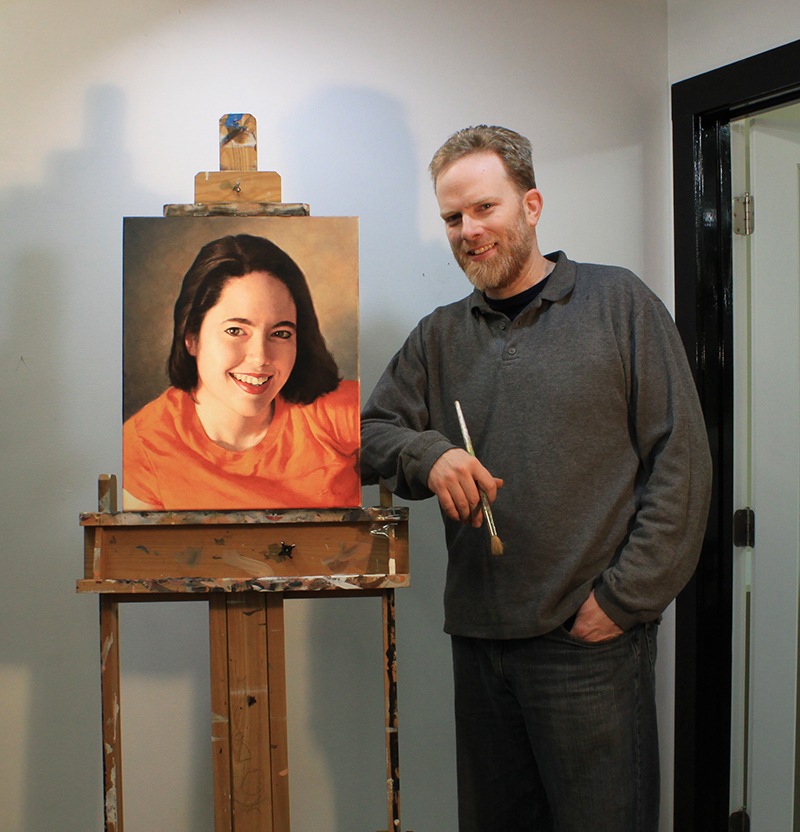
Matt Philleo, artist, in his studio, posing next to a portrait of his wife, 16″ x 20″ acrylic on canvas, painted in 2017.
This is how the Old Masters created their masterpieces over 400 years ago. It is with that same technique, with a few modifications, that I plan to teach you through this site. My goal, this year, is to fill Realistic Acrylic Portrait School with a ton of useful information on how to paint lifelike acrylic portraits that I’ve learned from over 25 years of painting…from one artist to another.
LEARN MORE
- Sketching Your Painting Accurately
- Beginning a Pet Portrait in Acrylic
- The Mystery of Realism in Painting
- Apply A Burnt Sienna Glaze to a Portrait
- Learn How to Sketch a Portrait Freehand in 45 Minutes
- Adding highlights to your acrylic painting
- 5 Excellent Reasons to Use Aluminum Foil
- Paint Realistic Wrinkles in Acrylic
- Painting Clothing in an Acrylic Portrait
- Paint a Cloudy Sky Acrylic
- How to add Semi-Opaque Highlights
- How to Enhance the Contrast in Your Acrylic
- How to Add Glaze to Your Acrylic Painting
- Paint Realistic Reflections on Eyeglasses in an Acrylic Portrait
- Build Up Depth on Your Acrylic Portrait Backgrounds
- How Do You Do Layers With the Glazing Technique?
- Learn How to Paint Wrinkles in Acrylic
So, sign up for my free personal email tips and guidance below, grab a brush and some paint, and let’s do this!
Sign up for my personal tips2018 can be your year to create the best portrait you’ve ever done.
All the best,
P.S. Did you find this post helpful or encouraging? If so, send it on ahead! Let others know with the share buttons below. I’d love to hear your comments. Thank you so much!