Category Archives for Blocking-In

How to Block In Skin Tone Values Using Glazing Technique
A step-by-step guide to glazing technique in acrylic portraits
Achieving realistic skin tones in acrylic portraits requires a nuanced approach, combining color theory with technique. The glazing technique, a method involving the layering of transparent color, can be highly effective for this purpose. In this post, we will explore how to block in skin tone values using the glazing technique, drawing from a practical demonstration by artist Matt Philleo. Whether you’re aiming for lifelike detail or a more stylized finish, this guide will help you understand and implement the essential steps in your acrylic painting.
Understanding the Glazing Technique
The glazing technique in acrylic painting involves applying thin, transparent layers of paint over a dry underpainting. This method enhances depth and richness in colors without overwhelming the underlying details. When blocking in skin tones, glazing allows for subtle gradations and realistic shading, critical for achieving lifelike results.
Step-by-Step Guide to Blocking In Skin Tone Values
- Prepare Your Palette: Start by setting up your palette with essential colors. For skin tones, commonly used colors include raw umber dark, raw sienna, alizarine crimson, and occasionally ultramarine blue. But these colors will form the base of your glazes, which are mixed with a matte medium to achieve transparency.
- Block In Basic Shapes and Values: Begin by analyzing your reference photo to identify the key shapes and values on the subject’s face. Because, blocking in these shapes with a darker tone, such as raw umber dark mixed with matte medium, helps establish the foundational values. But, this step is crucial for building the structure of the portrait.
- Technique Tip: Use a round brush for precision. This allows you to carefully place glazes in specific areas, such as the darker regions of the face, while preserving the light areas.
- Layering Glazes: Apply your first glaze layer over the basic shapes. For example, mix raw umber dark with raw sienna and alizarine crimson to create a flesh tone, and apply it to the areas where shadows naturally occur. This layer should be thin and transparent, gradually building up the color intensity.
- Technique Tip: Patience is key. When glazing requires multiple layers to achieve depth. Because it allow each layer to dry before applying the next to avoid mixing colors unintentionally.
- Adjusting Skin Tones: As can be seen your progress, you may need to adjust skin tones to match different areas of your reference photo. For cooler skin tones, incorporate a touch of ultramarine blue into your glaze mix. For warmer tones, consider adding pyrrole orange or indian yellow. Adjusting these colors will help you match the diverse skin tones present in your portrait.
- Technique Tip: Monitor the transparency of your glazes. Adding more matte medium will help maintain the transparency necessary for effective glazing.
- Refining Details: Once the basic values are in place, focus on refining details. Use a smaller brush to add more precise glazes to areas such as shadows around the eyes or lips. This step helps in achieving a more nuanced and realistic appearance.
- Technique Tip: Apply glazes in thin, smooth layers to avoid creating harsh lines. Gradually build up the color to achieve the desired effect.
- Final Adjustments: After blocking in and refining your skin tones, assess the overall portrait. Make any necessary adjustments to ensure consistency and harmony in skin tones across the portrait. This may involve adding additional layers of glaze or adjusting existing ones.
- Technique Tip: Stepping back from your work periodically can help you see it from a different perspective and make more informed adjustments.
Blocking in skin tone values using the glazing technique is a powerful method for creating depth and realism in acrylic portraits. By layering transparent colors and carefully adjusting tones, you can achieve lifelike results that capture the essence of your subject. But remember, patience and practice are essential in mastering this technique. With time, you’ll find that glazing becomes an invaluable tool in your acrylic painting repertoire.
Tips and Techniques Recap:
- Use a round brush for precision in blocking in values.
- Mix colors with matte medium to create transparent glazes.
- Apply glazes in thin, smooth layers and allow each to dry before adding more.
- Adjust colors based on skin tone variations and monitor glaze transparency.
- Refine details with smaller brushes and assess the overall portrait for consistency.
By following these steps, you’ll be well on your way to mastering the art of blocking in skin tone values using the glazing technique.
Read more about my additional resources, tutorials, to learn more and check out my free courses here. . Whether you’re a beginner or an experienced artist, there’s always something new to learn and apply to your paintings. Happy painting!
- Adding highlights to your acrylic painting
- 5 Excellent Reasons to Use Aluminum Foil
- Paint Realistic Wrinkles in Acrylic
- Painting Clothing in an Acrylic Portrait
- Paint a Cloudy Sky Acrylic
- How to add Semi-Opaque Highlights
- How to Enhance the Contrast in Your Acrylic
- How to Add Glaze to Your Acrylic Painting
- Paint Realistic Reflections on Eyeglasses in an Acrylic Portrait
- Build Up Depth on Your Acrylic Portrait Backgrounds
- How Do You Do Layers With the Glazing Technique?
- Learn How to Paint Wrinkles in Acrylic
Read more about how to paint a portrait that you can surely be proud of!
I’d love to hear your thoughts on this video. Please share it with your friends and family. Let me know if you have any further questions. I’ll greatly help you.
If you’d like to learn more, sign up for my free email tips and video class today.
Learn How to Paint Acrylic Portraits With My Free Mini-Video Course!
Thank you so much for taking the time to read this tutorial and watch the video. That means a lot to me. I hope you find it very helpful in your portrait painting.
Yours for Better Portraits,

P.S. Did you find this post helpful or encouraging? If so, send it on ahead! Let others know with the share buttons below. I’d love to hear your comments. Thank you so much! Also, do you have a question on acrylic portrait painting you’d like answered? Let me know, and I’d be happy to help!

How to Block In Shading & Skin Tones in Your Acrylic
How to add depth and dimension to your portrait with layering
Acrylic portrait painting requires understanding shading, value, and skin tone to capture the subject’s essence. In this post, you’ll learn how to block in shading and skin tones using acrylic glazing techniques, without losing detail or vibrancy.
Creating realistic skin tones and shading is a crucial aspect of acrylic portrait painting. This technique, known as blocking in, helps you define mid-tones and shadows early on, setting the stage for a vibrant and lifelike portrait. Using acrylic glazing, this process ensures a smooth transition from sketch to finished painting, retaining the likeness while building depth and luminosity. In this tutorial, we will break down how to block in shading and skin tones, offering a step-by-step guide to enhance your portrait’s realism.
Understanding the Glazing Technique
Acrylic glazing involves applying thin layers of translucent paint over a base to create depth and smooth transitions. Because combining paint with matte medium, you can control the transparency, allowing the underpainting to shine through. Then this method is ideal for building subtle layers of skin tones without overpowering the original sketch.
Tip: Start with light glazes and build up gradually. Also, use more medium for lighter glazes and increase pigment for darker tones.
Preparing Your Materials
Before diving into shading, gather the following materials:
- Acrylic paints: Raw sienna, pyrrole orange, matte medium
- Brushes: Soft, round brushes for detailed application
- Matte Medium: Thins the paint and creates a translucent effect
- Palette: To mix your glazes
Tip: Matte medium works best for glazing because it dries flat, ensuring you maintain control over the values. Avoid gloss mediums, as they can create distracting reflections while working.
Step 1: Begin with a Detailed Sketch
Start by ensuring your portrait sketch is clear and precise. The sketch provides the foundation for your shading and color work. Because it focus on the key areas where light and shadow fall, as these will guide your shading process.
Tip: Preserve the luminosity by keeping the lighter areas, such as the forehead, untouched during initial layers. This helps maintain brightness in the final result.
Step 2: Apply the First Glaze
Mix raw sienna with matte medium to create your first glaze. Raw sienna is an excellent base color for skin tones, providing a natural warmth that can be built upon. Apply this glaze lightly across the mid-tones of the face, avoiding the highlights.
Technique Insight: When, glazing allows you to enhance skin tones subtly without covering the entire surface. And then translucent layers let you build up depth without losing the detailed sketch beneath.
Step 3: Focus on Value, Not Just Color
While color is important, value—the lightness or darkness of an area—is even more crucial. Focus on building form by shading the areas that need more depth, like the sides of the face, beneath the chin, and around the nose.
Tip: “Value over color” is a fundamental principle. A black-and-white portrait can still be striking if the values are correct. Don’t rush to perfect the skin tone without ensuring the shadows and highlights are accurate.
Step 4: Building Skin Tones
Basically to enhance your raw sienna base, introduce subtle variations using pyrrole orange. While this color adds a red-orange tint to areas like the cheeks and nose, creating a more natural skin tone. Mix the pyro orange with matte medium to maintain translucency, then applying it in thin layers over the previous glazes.
Technique Insight: For fairer skin, keep the glazes light and gradually build up warmth with minimal layers. For darker or tanned skin tones, you can deepen the shading by increasing the pigment concentration in each glaze.
Step 5: Blending and Refining
As you continue applying glazes, you’ll notice how the layers blend smoothly, creating a gradual transition between light and shadow. Use a soft brush to gently feather the edges of your glazes, ensuring there are no harsh lines between transitions.
Tip: If any areas become too dark, you can lighten them by adding a glaze of matte medium mixed with titanium white. This will soften the area without disrupting the overall value structure.
Step 6: Maintain Light in Highlights
When blocking in shading, it’s essential to preserve the lighter areas, like the forehead and the top of the nose. You can always adjust these areas with subtle glazes later, but maintaining their brightness early on ensures that your portrait remains balanced in terms of light and form.
Tip: Always work in stages, letting each glaze dry before adding another. This allows you to assess the overall effect and make adjustments as necessary.
Step 7: Finishing Touches
Once you have built up your skin tones and shading, you can start adding more opaque layers in areas that need stronger definition. Reduce the amount of matte medium for these layers, focusing on darker shadows and adding detail to features like the eyes, lips, and nose.
Tip: Use smaller brushes for detailing in these final stages, paying attention to the subtle shifts in color and value across the face.
Building a Realistic Portrait
Blocking in shading and skin tones using acrylic glazing takes practice, but the results can be incredibly rewarding. By focusing on value, applying translucent layers, and preserving luminosity, you can create a portrait that has depth, realism, and vibrancy.
Final Tip: Remember, the glazing technique is all about patience. Build up your layers gradually, allowing each one to contribute to the final result.
Read more about my additional resources, tutorials, to learn more and check out my free courses here. . Whether you’re a beginner or an experienced artist, there’s always something new to learn and apply to your paintings. Happy painting!
- Adding highlights to your acrylic painting
- 5 Excellent Reasons to Use Aluminum Foil
- Paint Realistic Wrinkles in Acrylic
- Painting Clothing in an Acrylic Portrait
- Paint a Cloudy Sky Acrylic
- How to add Semi-Opaque Highlights
- How to Enhance the Contrast in Your Acrylic
- How to Add Glaze to Your Acrylic Painting
- Paint Realistic Reflections on Eyeglasses in an Acrylic Portrait
- Build Up Depth on Your Acrylic Portrait Backgrounds
- How Do You Do Layers With the Glazing Technique?
- Learn How to Paint Wrinkles in Acrylic
Read more about how to paint a portrait that you can surely be proud of!
I’d love to hear your thoughts on this video. Please share it with your friends and family. Let me know if you have any further questions. I’ll greatly help you.
If you’d like to learn more, sign up for my free email tips and video class today.
Learn How to Paint Acrylic Portraits With My Free Mini-Video Course!
Thank you so much for taking the time to read this tutorial and watch the video. That means a lot to me. I hope you find it very helpful in your portrait painting.
Yours for Better Portraits,
P.S. Did you find this post helpful or encouraging? If so, send it on ahead! Let others know with the share buttons below. I’d love to hear your comments. Thank you so much! Also, do you have a question on acrylic portrait painting you’d like answered? Let me know, and I’d be happy to help!

How to Varnish an Acrylic Painting in One Step
Discover the easy technique for how to varnish an acrylic painting in one step to enhance and preserve your artwork’s vibrancy
There’s a lot of controversy surrounding this topic, or at least, many different opinions on how to do it right.
Some say you need an isolation coat. But others say you should spray apply the varnish. And then there are some who pour it on or use a sponge!
I’m not here to dismiss any of those methods. If they work for that particular artist, more power to them.
Rather, I’d like to share with you the method I’ve been using for over 20 years as a portrait painter. And then it’s easy, and you can do it one step.
Let me break down this one-step acrylic varnishing method into how to actually do it…
- Lay your canvas flat on a table, oriented horizontally, but at an angle.
- Raise your canvas up, on four scraps of wood placed under each corner (make sure it’s level. 1″ x 2″s work well )
- Get your 4″ varnishing brush (Liquitex Freestyle works well)
- Pour matte varnish (Novacolor or Liquitex) into a clean yogurt container or any plastic container large enough to accommodate the width of the brush. Be sure to stir the varnish if it’s been sitting for a while! Over time the polymer resin can separate from the water in the mixture. If you don’t mix it, you may have streaks.
- “Sweep” any dust or debris off of the canvas surface with a large brush before you begin.
- Dip your brush into the varnish container, so the bristles are coated with varnish 1/3-1/2 of the way up from the tip.
- Begin brushing the varnish on the surface, starting with the end farthest from you. Brush in the longest direction of the canvas.
- Let your brush hit 1/3″ of the way from the left edge of the canvas. Apply even pressure and bring the brush all the way to the left edge.
- Bring the brush all the way to the right edge.
- Wipe any excess varnish that remains on your brush inside the top lip of your container.
- Flip the brush over and smooth out the entire first application, overlapping the edge slightly with 1-2 strokes. Do not overbrush!
- Dip your brush into the varnish container and repeat the process. Let your stroke slightly overlap the first (about 1/4″)
- You will be working your way toward your body. This will keep you from accidentally dripping onto the finished varnished surface.
- If you have any extra varnish that drips onto the side of the canvas, use a 3/4 flat brush to wipe it off. If the canvas will be framed, the side-drips are usually not a problem and can be left alone.
- Let your canvas dry flat on a table. It might look milky white in areas. Resist the temptation to brush it! If you followed my method, the varnish should dry crystal clear. It should dry completely within 3-5 hours, depending on humidity.
Disclaimer: I have used this method with great results in over 20 years of portrait painting. Because your results are up to you, how you apply this method, and the humidity levels of your studio space. I cannot be held responsible for any painting that gets damaged during the varnishing process. Then it would be a good idea to varnish a test piece first. You can add another layer (after 3-5 hours of dry time) if you feel the first one didn’t cover as well as you’d like, but most of the time, you won’t need to.
Watch this video below to see the process in action…
If you’re looking for more instructional videos on how to improve your acrylic painting, visit www.realisticacrylic.com for more tutorials and check out my free courses here. .
Let me know if you have any questions and I look forward to teaching you more!
LEARN MORE
- How to Paint Foliage Using the Acrylic Glazing Technique
- How to Trace for an Accurate Portrait Sketch
- How to Paint Realistic Eyes in Your Acrylic Portrait
- How to Add Raw Umber Dark & Ultramarine Blue to Your Portrait
- How to Make Your Own Raw Umber Dark
- How to Paint Realistic Trees & Grass in Your Acrylic
- How to Block In Skin Tone Values Using Glazing Technique
- How to Paint Vibrant Reds in Your Acrylic Portrait
- How to Glaze Background Colors & More Acrylic Portrait
- How to Paint White Clothing in Your Acrylic Portrait
- How to Easily Transition from a Sketch to a Painting
- How to Block In Shading & Skin Tones in Your Acrylic
- How to Build Up Color on Acrylic Pet Portrait
- How to Build Up Form on Clothing with Acrylic
- How to Paint Dark Clothing Using Acrylic Glazing Technique
- How to Paint a 24 x 30 Acrylic With 30 People
- How to Do Smooth Shading with Acrylic
- How to Sketch an Acrylic Portrait with a Grid
Read more about how to paint a portrait that you can surely be proud of!
I’d love to hear your thoughts about this video. Please share it with your friends and family. Let me know if you have any further questions. I’ll greatly help you.
If you’d like to learn more, sign up for my free email tips and video class today.
Learn How to Paint Acrylic Portraits With My Free Mini-Video Course!
Thank you so much for taking the time to read this tutorial and watch the video. That means a lot to me. I hope you find it very helpful in your portrait painting.
Yours for Better Portraits,
P.S. Did you find this post helpful or encouraging? If so, send it on ahead! Let others know with the share buttons below. I’d love to hear your comments. Thank you so much! Also, do you have a question on acrylic portrait painting you’d like answered? Let me know, and I’d be happy to help!

3 Tips on How to Draw Better Pencil Portraits
Unlock the secrets to realistic portraits with these essential pencil drawing techniques
Drawing realistic pencil portraits can be a rewarding yet challenging experience. If you’re looking to improve your pencil drawing skills, it’s essential to focus on technique, control, and mastering shading. Whether you’re a beginner or a seasoned artist, improving your pencil drawings can drastically boost your portrait painting skills, especially if you primarily work in acrylic. In this blog post, you’ll learn 3 valuable tips that will help you create lifelike pencil portraits.
1. Master Cross-Hatching for Realistic Shading
Cross-hatching is a time-tested technique that involves layering pencil strokes in a criss-cross pattern to build depth and texture in your drawings. In this method, parallel lines are drawn in one direction, and then a second set of lines is added at an angle across the first set. This overlapping of lines creates a rich texture and smooth tonal gradation.
To start, use a soft pencil like a 4B, which produces dark, rich tones. You’ll want to keep your pencil strokes close together, allowing minimal gaps between them. This technique is perfect for areas that require detailed shadowing, such as the contours of a face or fur on an animal. Then the secret lies in maintaining consistent pressure and evenly spacing your strokes.
To take it a step further, try cross-hatching at a 45-degree angle. Because this adds an extra layer of dimension and allows you to control the light and dark values more effectively. When shading, remember to follow the natural form of the subject to make the drawing appear more realistic.
By mastering cross-hatching, then you’ll find that your pencil drawings will have smoother textures and enhanced depth, making your portraits stand out with their intricate details.
2. Protect Your Drawing from Smudges
One of the biggest challenges when drawing with pencils is avoiding smudges. Then as you work, your hand can easily smudge the graphite, causing unwanted marks and ruining the clean lines of your portrait.
A simple yet effective way to prevent smudging is to place a piece of scrap paper under your drawing hand. Because this will act as a barrier between your hand and the drawing, keeping the graphite from smearing as you work. Not only does this keep the drawing neat, but it also prevents the natural oils from your skin from warping the paper.
It’s also important to work from left to right if you’re right-handed, or right to left if you’re left-handed, to reduce the risk of accidentally smudging what you’ve already drawn. Working in layers, starting with the lighter areas first, and finishing with the darkest parts will also minimize smudging.
By taking care to protect your drawing, you ensure that your portrait remains sharp and polished, free from unnecessary smears.
3. Blend with Tissue for a Smooth Finish
Blending is a powerful technique for smoothing out pencil strokes and achieving a soft, even tone. Many artists use blending stumps or their fingers, but using a piece of tissue paper offers a superior finish without over-smearing the details.
When you blend effectively, gently rub the tissue across the shaded areas of your drawing in small, circular motions. Then be careful not to press too hard, as this can overly blend the graphite and flatten the texture. And of course the goal is to lightly blend the surface to achieve smooth gradation between shadows and highlights.
One benefit of using tissue is that it preserves the texture of the paper underneath while softening the shading. This keeps the drawing realistic without losing detail. Additionally, after blending with tissue, you can go back and add more layers of pencil to intensify the values. This layering process creates richer depth in the drawing, allowing you to achieve darker areas without overworking the graphite.
By combining the precision of cross-hatching with the gentle blending of tissue, your portraits will exhibit a refined, professional quality, with smooth transitions between light and dark areas.
Technique Recap:
- Cross-Hatching: Start with closely-spaced, diagonal strokes at a 45-degree angle, layering them in opposite directions to create smooth, realistic shading.
- Prevent Smudging: Use a piece of scrap paper under your hand to keep the graphite from smearing, and work from top to bottom to avoid unintentional marks.
- Tissue Blending: Gently blend shaded areas with tissue for a polished look, allowing for added layers to deepen your values.
Conclusion:
Drawing better pencil portraits comes down to mastering basic techniques that bring out the realism in your work. With cross-hatching, careful blending, and preventing smudges, you can elevate your portrait skills and create lifelike, professional-quality art. Whether you’re sketching as a hobby or enhancing your painting skills, these pencil drawing tips will give you a solid foundation.
To keep improving, don’t forget to practice these techniques regularly. With time, you’ll see remarkable improvements in the depth, detail, and overall quality of your portraits.
Did you find these tips helpful? Be sure to subscribe to my YouTube channel for more art tutorials and visit my website, RealisticAcrylic.com, where you’ll find in-depth resources to help you create stunning portraits. Let’s bring your artwork to the next level!
Questions? Suggestions? Thoughts? Let me know, below in the comments. Please share this post with your friends!
- How to Paint Foliage Using the Acrylic Glazing Technique
- How to Trace for an Accurate Portrait Sketch
- How to Paint Realistic Eyes in Your Acrylic Portrait
- How to Add Raw Umber Dark & Ultramarine Blue to Your Portrait
- How to Make Your Own Raw Umber Dark
- How to Paint Realistic Trees & Grass in Your Acrylic
- How to Block In Skin Tone Values Using Glazing Technique
- How to Paint Vibrant Reds in Your Acrylic Portrait
- How to Glaze Background Colors & More Acrylic Portrait
- How to Paint White Clothing in Your Acrylic Portrait
- How to Easily Transition from a Sketch to a Painting
- How to Block In Shading & Skin Tones in Your Acrylic
- How to Build Up Color on Acrylic Pet Portrait
- How to Build Up Form on Clothing with Acrylic
- How to Paint Dark Clothing Using Acrylic Glazing Technique
- How to Paint a 24 x 30 Acrylic With 30 People
- How to Do Smooth Shading with Acrylic
- How to Sketch an Acrylic Portrait with a Grid
Read more about how to paint a portrait that you can surely be proud of!
I’d love to hear your thoughts about this video. Please share it with your friends and family. Let me know if you have any further questions. I’ll greatly help you.
If you’d like to learn more, sign up for my free email tips and video class today.
Learn How to Paint Acrylic Portraits With My Free Mini-Video Course!
Thank you so much for taking the time to read this tutorial and watch the video. That means a lot to me. I hope you find it very helpful in your portrait painting.
Yours for Better Portraits,
P.S. Did you find this post helpful or encouraging? If so, send it on ahead! Let others know with the share buttons below. I’d love to hear your comments. Thank you so much! Also, do you have a question on acrylic portrait painting you’d like answered? Let me know, and I’d be happy to help!

How to Add Initial Highlights to Your Acrylic Portrait
Unlock the secrets of applying initial highlights to your acrylic portraits for added depth and realism.
Adding highlights is a crucial step in bringing your acrylic portraits to life because it adds depth, dimension, and a sense of realism to the painting. In this tutorial, we’ll explore how to add initial highlights to your acrylic portrait after laying down a toning layer, using titanium white mixed with Indian yellow for a warm, vibrant touch. Then these highlights will help define the light source, making your portrait stand out.
Materials You Will Need
Before we dive into the process, gather these materials:
- Titanium White Paint: For a bright, opaque base.
- Indian Yellow Paint: To warm up the white highlights.
- Matte Medium: Thins the paint for smoother application.
- Flat Size 14 Brush: Ideal for blocking in larger areas.
- Smaller Detail Brushes: Useful for adding precise highlights.
- Palette Knife (Optional): For mixing paint and mediums.
Step-by-Step Guide to Adding Initial Highlights
1. Mixing the Paint
The first step in adding highlights is preparing the right paint mixture. Because in this technique, we mix titanium white with a small amount of Indian yellow. Then the combination will create warm, natural highlights. So that the thin mixture with matte medium to around 50% opacity. This will also allow the highlights to blend seamlessly with the underlying layers without overpowering them.
Using matte medium ensures that the paint remains flexible and doesn’t dry too quickly, giving you ample time to work on the highlights.
2. Restoring Lost Highlights After Toning
After applying a toning layer, some highlights may have been muted or lost. Now it’s time to restore them. Start by focusing on the areas of your portrait where the light hits directly, such as the sky, the subject’s face, or their clothing. Then these areas need to stand out against the mid-tones and shadows.
Using the size 14 flat brush, gently block in the highlights. When you apply light, controlled strokes to ensure the paint doesn’t cover too much of the surrounding areas. Then keep your strokes smooth to avoid hard edges.
3. Adding Highlights to the Sky and Clouds
Begin with the sky and clouds, especially if you’re painting an outdoor portrait. Because when you apply the titanium white and Indian yellow mixture to the parts of the sky where the light source is strongest. This will create a glowing effect, giving the sky a more realistic appearance.
In this case, incorporating highlights into the clouds will help to define their shape and make them stand out from the background. Use soft brush strokes to add highlights along the edges, creating a gradual transition from light to shadow.
4. Highlighting Clothing
Next, move on to your subject’s clothing. Clothing often reflects light differently than skin, so it’s important to be mindful of texture. For smoother fabrics, such as silk or satin, use long, even brush strokes. Then for rougher fabrics like wool or cotton, stipple the highlights to mimic the texture of the material.
Start with broader highlights and then use a smaller brush to add more precise details, such as folds and creases. So remember that, these highlights should enhance the form of the clothing and help convey the fabric’s texture.
Techniques for Effective Highlighting
1. Build Gradually
When adding highlights, it’s essential to build up the light areas slowly. And then begin with lighter tones and gradually add more layers as needed. Because this ensures a more natural transition between highlights and shadows, enhancing the three-dimensional effect.
2. Focus on Light Source
Always keep the direction of the light source in mind. Highlights should reflect where the light is hitting the subject the most directly. In this tutorial, the highlights were added primarily to the face, clothing, and parts of the background, such as the sky and clouds.
3. Use Warm Colors for Depth
Instead of using pure white for highlights, adding a warm color like Indian yellow can create a more realistic effect. This warmth will help your highlights blend into the mid-tones and make the subject appear more vibrant.
Common Mistakes to Avoid
1. Overuse of Highlights
Too many highlights can make your portrait look flat and overexposed. Then focus on applying highlights sparingly in key areas where the light hits most directly. And less is often more when it comes to achieving a natural look.
2. Hard Edges
When applying highlights, avoid hard, defined edges unless you’re working on a very reflective surface like glass. Because most highlights, especially on skin and fabric, should have soft transitions to blend naturally with the rest of the painting.
Adding Final Details
As you finish applying the initial highlights, step back and observe your painting from a distance. This helps you see how the highlights interact with the rest of the painting and determine if they need any adjustments. If the highlights appear too bright or harsh, you can soften them by glazing over them with a thin layer of mid-tone color.
For areas like the face and hair, use a smaller brush to add subtle highlights that bring out the details. In the tutorial, highlights were applied to areas like the clothing, face, and even the sky to create depth and realism. For instance, on the subject’s face, highlights were applied to key areas such as the forehead and cheekbones, which receive the most light.
Conclusion
Adding initial highlights to your acrylic portrait is an essential step in creating depth and realism. By using a mixture of titanium white and Indian yellow, thinning it with matte medium, and applying it carefully to the key areas, you can restore lost highlights and breathe life into your portrait. As you continue to refine your highlights, remember to stay mindful of the light source, apply highlights gradually, and avoid overworking the painting.
Whether you’re painting a sky full of clouds or the fine details on a subject’s face, mastering the art of highlights will take your acrylic portraits to the next level.
For more tips and techniques on creating realistic portraits, visit www.realisticacrylic.com. Keep practicing, and you’ll soon be painting portraits you can be proud of!
Questions? Suggestions? Thoughts? Let me know, below in the comments. Please share this post with your friends!
- How to Paint Foliage Using the Acrylic Glazing Technique
- How to Trace for an Accurate Portrait Sketch
- How to Paint Realistic Eyes in Your Acrylic Portrait
- How to Add Raw Umber Dark & Ultramarine Blue to Your Portrait
- How to Make Your Own Raw Umber Dark
- How to Paint Realistic Trees & Grass in Your Acrylic
- How to Block In Skin Tone Values Using Glazing Technique
- How to Paint Vibrant Reds in Your Acrylic Portrait
- How to Glaze Background Colors & More Acrylic Portrait
- How to Paint White Clothing in Your Acrylic Portrait
- How to Easily Transition from a Sketch to a Painting
- How to Block In Shading & Skin Tones in Your Acrylic
- How to Build Up Color on Acrylic Pet Portrait
- How to Build Up Form on Clothing with Acrylic
- How to Paint Dark Clothing Using Acrylic Glazing Technique
- How to Paint a 24 x 30 Acrylic With 30 People
- How to Do Smooth Shading with Acrylic
- How to Sketch an Acrylic Portrait with a Grid
Read more about how to paint a portrait that you can surely be proud of!
I’d love to hear your thoughts about this video. Please share it with your friends and family. Let me know if you have any further questions. I’ll greatly help you.
If you’d like to learn more, sign up for my free email tips and video class today.
Learn How to Paint Acrylic Portraits With My Free Mini-Video Course!
Thank you so much for taking the time to read this tutorial and watch the video. That means a lot to me. I hope you find it very helpful in your portrait painting.
Yours for Better Portraits,
P.S. Did you find this post helpful or encouraging? If so, send it on ahead! Let others know with the share buttons below. I’d love to hear your comments. Thank you so much! Also, do you have a question on acrylic portrait painting you’d like answered? Let me know, and I’d be happy to help!

How to Blocking-in a 30″ x 40″ Acrylic Battle Scene Painting
Learn the technique of blocking-in a large 30″ x 40″ acrylic battle scene to establish strong foundations for your painting with depth and detail.
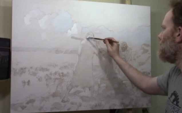
When tackling a large-scale project like blocking-in a 30″ x 40″ acrylic battle scene painting, the initial steps are crucial to setting the stage for a dynamic and cohesive composition. Because by using these combination of broad strokes and carefully placed color, this foundational layer helps you define the major forms, balance your composition, and create a sense of depth right from the start. Whether you’re an experienced artist or just starting out with larger works, mastering the blocking-in process will ensure your painting flows smoothly.
So in this demonstration, I am using a 30″ x 40″ acrylic painting I was commissioned to create, a battle scene between ancient Israel and the Amalekites. Then I asked my friends to come over to my home early in the morning, at sunrise, and model for the painting.
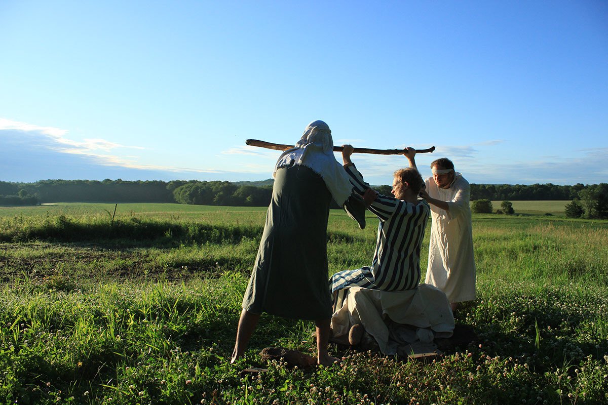
Yes, that’s me in the middle!
In this battle, when the Israelite leader Moses held up his staff, the power of God would flow. Then it caused the Israelite army to defeat their battlefield enemies. But, as the battle lasted for hours, Moses grew tired and couldn’t hold up his staff. Then the Amalekites got the advantage over the Israelites!
His assistants, Aaron and Hur came up with an idea. They had Moses sit on a rock. Then they held up his arms on either side, so once again, the Israelites could prevail.
This painting is meant to depict the struggle in praying, and how when others come alongside of us, they can ease the burden. And then their faith strengthens ours, and we can get the victory!
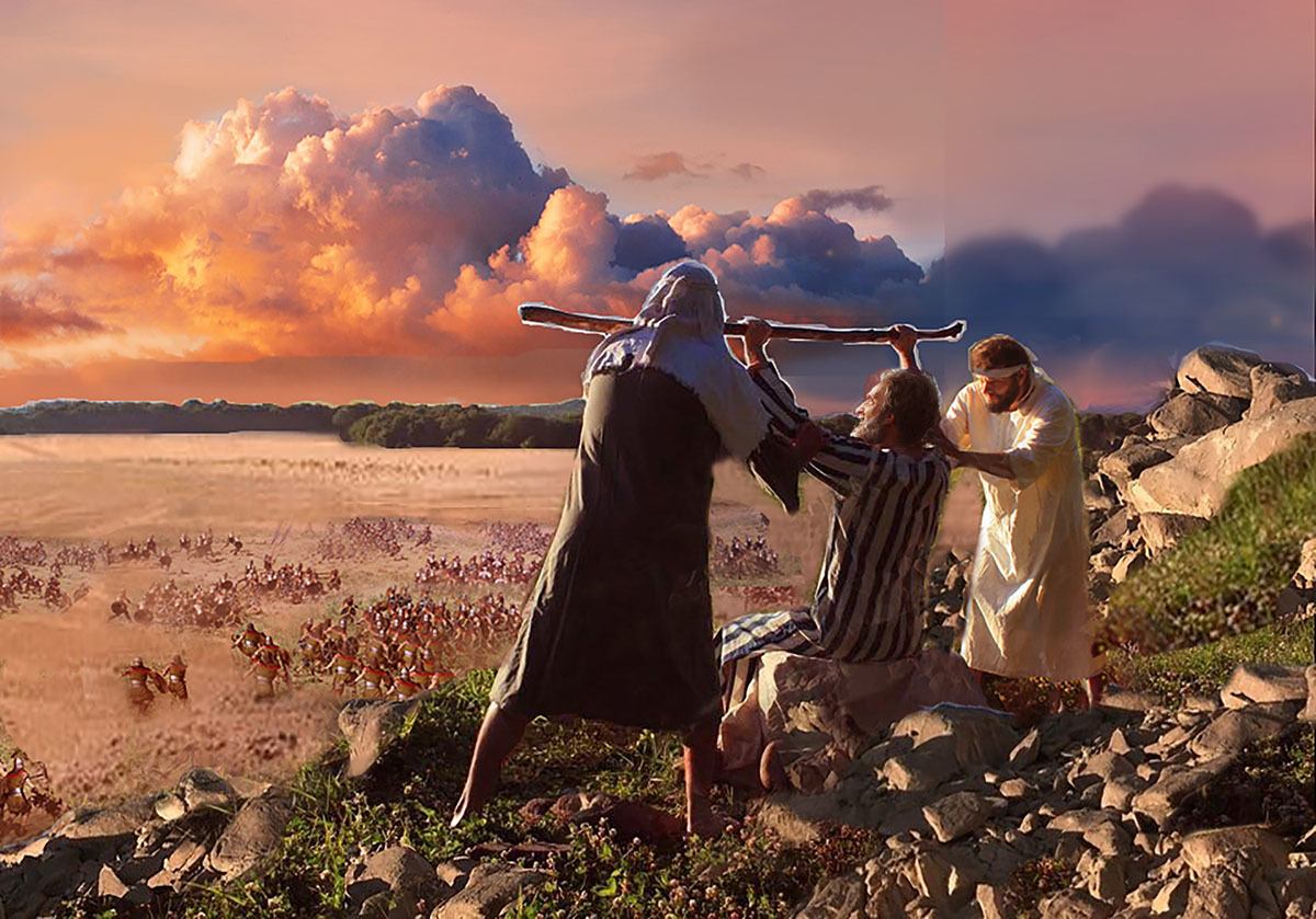
Here is my layout for the painting that I edited on Photoshop…
Now for the blocking-in video…
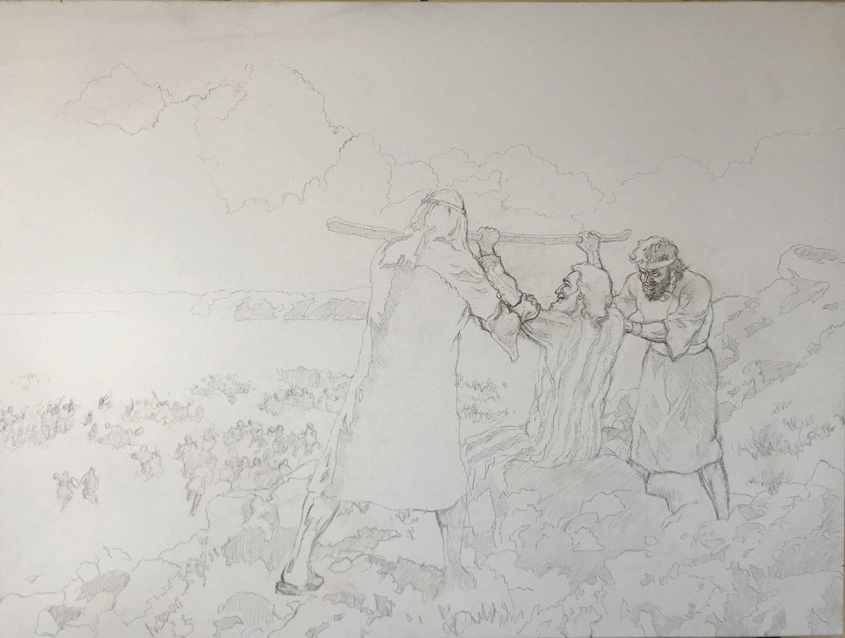
We start with an accurate sketch. Then, my goal is to quickly identify the major areas of contrast within the reference photo.
Then we apply a layer of raw umber dark, ultramarine blue and matte medium to the shadow areas designated on the sketch…
Tips and Techniques
- Start with Prayer & Purpose: Before beginning your painting, consider focusing on the purpose behind it. In this case, the painting represents a moment of intercessory prayer, symbolizing perseverance and spiritual victory. This mindfulness sets the tone for intentionality in your artwork.
- Use Matte Medium for Glazing: Apply matte medium to your palette before mixing in your colors. For blocking-in, ensure that your paint is heavily diluted with matte medium, aiming for a mixture that’s about 90-95% medium to 5-10% paint. This creates translucent layers, allowing for smooth blending and luminosity in the final work.
- Choose Your Colors: Use a traditional palette with earthy tones like raw umber, burnt sienna, and ultramarine blue, mixed with other colors such as titanium white for highlights. These colors create a natural, muted foundation for blocking-in shadows and light.
- Block-in Major Values: Start by blocking-in large value structures, such as the shadows on the figures and the surrounding landscape. Keep the application light to allow for adjustments later. Work across the whole canvas, focusing on dominant shapes and transitions between light and dark areas.
- Work with Large Brushes: Use larger, flat brushes, such as a three-quarter inch, to block-in broad areas quickly and efficiently. This prevents getting stuck in details too early, allowing you to build up the entire scene cohesively.
- Blend with Confidence: As you block-in, keep your brushstrokes fluid and in multiple directions to ensure smooth blending. Make sure to maintain a wet edge to avoid streaks and allow for easy adjustments.
- Don’t Fear Corrections: Because the paint is thin, any mistakes in the blocking-in phase can be easily corrected. You can always layer additional glazes or shift values as the painting progresses.
By focusing on blocking-in the large value structures early in the process, you create a solid foundation for your 30″ x 40″ acrylic battle scene, allowing the details to emerge naturally as you build layers.
If you’re interested in learning more about acrylic glazing or portrait painting techniques, be sure to explore the resources available at realisticacrylic.com. and download my free gift for you here.
Questions? Suggestions? Thoughts? Let me know, below in the comments. Please share this post with your friends!
- How to Paint Foliage Using the Acrylic Glazing Technique
- How to Trace for an Accurate Portrait Sketch
- How to Paint Realistic Eyes in Your Acrylic Portrait
- How to Add Raw Umber Dark & Ultramarine Blue to Your Portrait
- How to Make Your Own Raw Umber Dark
- How to Paint Realistic Trees & Grass in Your Acrylic
- How to Block In Skin Tone Values Using Glazing Technique
- How to Paint Vibrant Reds in Your Acrylic Portrait
- How to Glaze Background Colors & More Acrylic Portrait
- How to Paint White Clothing in Your Acrylic Portrait
- How to Easily Transition from a Sketch to a Painting
- How to Block In Shading & Skin Tones in Your Acrylic
- How to Build Up Color on Acrylic Pet Portrait
- How to Build Up Form on Clothing with Acrylic
- How to Paint Dark Clothing Using Acrylic Glazing Technique
- How to Paint a 24 x 30 Acrylic With 30 People
- How to Do Smooth Shading with Acrylic
- How to Sketch an Acrylic Portrait with a Grid
Read more about how to paint a portrait that you can surely be proud of!
I’d love to hear your thoughts about this video. Please share it with your friends and family. Let me know if you have any further questions. I’ll greatly help you.
If you’d like to learn more, sign up for my free email tips and video class today.
Learn How to Paint Acrylic Portraits With My Free Mini-Video Course!
Thank you so much for taking the time to read this tutorial and watch the video. That means a lot to me. I hope you find it very helpful in your portrait painting.
Yours for Better Portraits,
P.S. Did you find this post helpful or encouraging? If so, send it on ahead! Let others know with the share buttons below. I’d love to hear your comments. Thank you so much! Also, do you have a question on acrylic portrait painting you’d like answered? Let me know, and I’d be happy to help!

[PORTRAIT CHALLENGE] Masterclass Lesson #7: Painting Fantastic Facial Features
The Acrylic Portrait Painting Challenge Masterclass, Lesson #7, is out!
In our last lesson, I showed you how to visualize your painting as a map, and add shading and skin tones to specific spots on your portrait.
Now, in this lesson, I want to show you how to “dial-in” the facial features.
(To be upfront, I want you to know there is some video footage after Lesson 6 that I just couldn’t capture in this lesson, so it didn’t get too long for a YouTube video. All of the “in-between” BONUS videos will be posted within Realistic Acrylic All-Access Membership, after I’m finished posting these challenge lessons. The main Masterclass Lessons will be there as well as one complete course, and I will also segment them for easier viewing, since the learning interface makes that possible.)
For most of the students I serve, they do their portraits as gifts for loved ones, and on commission. So, unless you are painting only for an academic exercise, it’s important that you capture an accurate likeness of your subject.
I have painted many portraits over the years, and I can tell you from experience, it doesn’t matter how much detail I add to the painting, if the picture doesn’t look like Aunt Betty, it’s not going to sell. 🙂
So, as you are aiming for realism—that is, the accurate form, tonal values, skin tones, shading, detail, etc., you also want to work to achieve a true likeness.
Does it need to be perfect? No, just close. Usually 85-90% as accurate as the photo you’re working from (and even that is not as accurate as real life) and you’ll do well. But shoot for the 100% every time.
Let’s dive in…
Here’s what to do…
STEP ONE
- Redefine the eye-socket region.
- Redefine the eyelid folds.
- Dial-in the coloring of his eyes
STEP TWO
- Adjust the length and shape of nose (if needed) and add shading.
STEP THREE
- Add more depth to the eyes.
STEP FOUR
- Refine the mouth and mustache.
Ready to paint?
Now, before you begin…(Yes, still need to ask, because some folks are just discovering these Masterclass lessons 🙂 )
Are you registered for the challenge?
If not, register below for FREE and I’ll send you:
- a downloadable/ printable”Welcome Kit” with a Supplies List and a Palette Color Layout Guide.
- high-resolution images of the photo we’ll be painting from for this challenge.
- each new lesson that comes out in this Masterclass series.
- a link to my private Facebook group, where you can do this challenge with other artists, get feedback and help on your portrait, and not feel alone.
REGISTER TODAY. The challenge is ongoing, something you can do at your own pace. It’s not too late to enter!
Watch my in-depth Masterclass acrylic online tutorial below to see these steps in action.
After learning from this video, you’ll know exactly how to do it.
Make sure to watch the ENTIRE video first before diving into the painting. It will be worth it to do that. Then, I’d like you to go back and refer to whatever steps you need to as you paint. That way, you won’t miss any of the instruction and tips that will help you make this portrait your very best.
Here’s the video…
[PORTRAIT CHALLENGE] Masterclass Lesson #7: Painting Fantastic Facial Features
Moving Forward…
Thank you so much for all your effort you’ve put into doing this challenge with me and so many other artists. You’re almost there…your finished portrait is in sight.
Hey, if you’re having some challenges with your Portrait Challenge portrait, I just want to let you know, that’s natural! Painting portraits is difficult even for artists who have been doing it for years. But step-by-step instruction and encouragement from other students helps a lot. Many people in our group are doing with little to no experience, and they’re doing a knock-out job, even if they’re struggling in certain areas.
So, if you do feel stuck at this point, or find your results are less than what you expected, keep in mind this is a learning experience. You will get better as you practice painting portraits in the glazing technique, as so many others have.
That being said, if I can help in any way, please leave a comment or send me an email. I get a lot of requests, but I’ll do my very best to help. Also, make sure you join our amazing Facebook group, Realistic Acrylic Portraits, because you will receive helpful tips and encouragement from other students, some of whom are farther ahead in the portrait painting journey.
I’ll see you in our next class! What is it going to be? Painting the Final Details, Nuances, and Finishing Well. I’m excited to share that with you! Until then, be blessed in your painting and you and your family stay safe and healthy.
Yours for Better Portraits,
![]()
If you found this post helpful or encouraging, would you send it on ahead? Let others know with the share buttons below. I’d love to hear your comments. Thank you so much!
Let me know if you have any questions about the challenge that I didn’t answer. Leave your question in the comments below and I’ll get back to you!

[PORTRAIT CHALLENGE] Masterclass Lesson #6: Creating Smooth Blending and Skin Tones
The Acrylic Portrait Painting Challenge Masterclass, Lesson #6, is out!
In our last lesson, I showed you how to add depth to the dark value of the hat, shadowed areas of the face, and some of the darker areas within the background.
Now that we have a good underpainting foundation in place, it’s time to transition into the “middle” portion of the painting. In other words, we’re working our way towards what the final surface of the portrait will look like.
I want to show you specifically how to create smooth blending and establish realistic skin tones.
It’s important to think of this process like outlining the boundaries of a nation, state (province) or county.
I know, we shouldn’t mix geography with art lessons, but I think this metaphor will help you understand the concept I’m trying to get across…
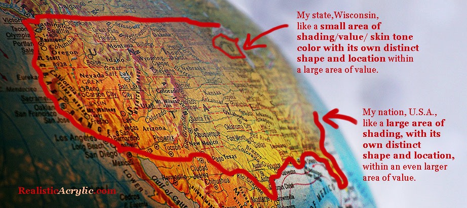
How a US map is like color, shading, and value in an acrylic portrait
I live in the state of Wisconsin, U.S.A. It has its own distinct shape and location within the United States of America. Now, the U.S.A. has its own distinct shape and location within the continent of North America.
In the same way, in a portrait, you may have a small area of value/ skin tone with its own distinct shape and location within the larger area of value/ skin tone. What you want to do is pay attention to the boundary lines on these specific shapes by studying your reference photo.
You won’t see a sharp line you will on a map, unfortunately. But you will see a marked difference where one value/ color ends and another begins.
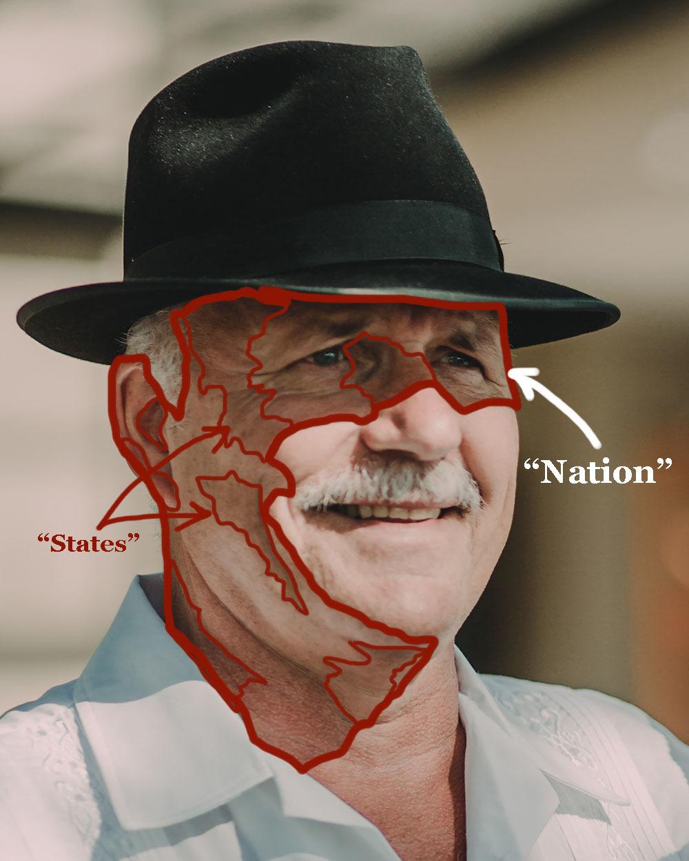
How to use the idea of a map to improve the realism on your acrylic portrait
You will see a shape emerge. Note that shape.
Then transfer what you see onto your painting. It’s as simple (and challenging!) as that.
You will see shapes within shapes within shapes. The more you can train your eyes to spot these shapes, the better you will become at realistic painting. That’s half the battle. The other half is technique: getting the paint to do what you want it to do.
This concept of “Nations and States” is powerful once you get a hold of it and use it regularly in your acrylic portrait painting! Now, let’s get onto the lesson…
What we want to do at this stage:
Begin the process of adding smooth shading and skin tones throughout the portrait.
We will be adding:
- a large “warming” glaze to the entire shadow area of the man’s face.
- glaze on the highlighted area of the face, adding depth and the beginning of skin tones, so the area is not just plain white or off white.
- small glazes (“states”) on the shadow side (“nation”) of the face to further define the pinkish skin tones.
We will do this using the acrylic glazing technique, where we mix a TINY amount of acrylic paint into a LARGE amount of clear acrylic matte medium. It’s best to go very, very light when you start your painting. You should just barely see a difference. However, at this stage you will getting a bit more opaque, because you have enough layers down already to give you some smoothness in the overall appearance.
Also, as always, make sure you rinse your brush off thoroughly between glazes. Any extra water in the heel of the brush may cause your glazes to drip or get streaky.
Here’s how to do it:
STEP ONE
- First, mix the “warming glaze” for the shadow side of the face: Use raw sienna and mix with a large amount of matte medium (10% paint to 90% medium) as shown in the video lesson. “Scoop” a large amount of glaze onto your 3/4″or 1″ flat brush. A few of the glazes will get a little darker, with ratios of as much as 30% paint to 70% medium. Make sure you watch the video to know where and when to change the ratio. “Next, glaze
- Glaze on the highlight side of face, to “tie-in” with the shadow side, develop mid-tones and create depth: Use raw sienna and organic pyrrole orange (or a cadmium orange) and mix it 5% paint to 95% matte medium. Test the glaze and see if you need to add more pigment or more medium. You should just barely see a difference in what you apply.
- Add small glazes in specific locations (“states”) on the shadow side of face using organic pyrrole orange, raw sienna, and a bit of alizarine crimson if needed to darken the glaze without adding too much chromatic intensity.
STEP TWO
- Add another layer of shading to the man’s hat and the background: Use raw umber dark, ultramarine blue, and a touch of alizarine crimson. How much of each? It depends on what the hat looks like right now as you paint. Is it too bluish? Add more raw umber dark. Is it too brownish? Add more ultramarine blue. Is it too greenish? Add alizarine crimson—just a pinch.
- Take the same glaze you used for the hat and add some shadows below his hat: Because it is right underneath the brim of his hat, the shadows will be quite dark in value. Add a bit of raw umber dark (or raw umber) and a bit of alizarin crimson if necessary to warm up the glaze, especially as you transition into the lighter parts of the skin tones.
- Clean off your brush and apply a blue glaze to the highlighted areas in his shirt: Mix ultramarine blue and phthalo blue (just a bit—it’s a VERY strong pigment) into a large amount of matte medium (95% to 5%, ratio to start with, and test to see if you need to change it) We want to bridge the gap between the shadows and the highlights, adding much-needed depth to this area of the painting.
STEP THREE
- Repeat Step 1, with slight adjustments. Follow the video for more detailed instruction.
Ready to paint?
Now, before you begin…(Yes, still need to ask, because some folks are just discovering these Masterclass lessons 🙂 )
Are you registered for the challenge?
If not, register below for FREE and I’ll send you:
- a downloadable/ printable”Welcome Kit” with a Supplies List and a Palette Color Layout Guide.
- high-resolution images of the photo we’ll be painting from for this challenge.
- each new lesson that comes out in this Masterclass series.
- a link to my private Facebook group, where you can do this challenge with other artists, get feedback and help on your portrait, and not feel alone.
REGISTER TODAY. The challenge is ongoing, something you can do at your own pace. It’s not too late to enter!
Watch my in-depth Masterclass acrylic online tutorial below to see these steps in action.
After learning from this video, you’ll know exactly how to do it.
Make sure to watch the ENTIRE video first before diving into the painting. It will be worth it to do that. Then, I’d like you to go back and refer to whatever steps you need to as you paint. That way, you won’t miss any of the instruction and tips that will help you make this portrait your very best.
Here’s the video…
[PORTRAIT CHALLENGE] Masterclass Lesson #6: Creating Smooth Blending and Skin Tones
Moving Forward…
If you have gotten this far in the challenge, I’m proud of you! It’s not easy to try something new, especially during a challenging time (COVID-19 as I write) but you are making a difference in your own life by developing the talent God gave you and you will be making a difference in others lives when you freely share the beautiful artwork you create with those you love or want to impact.
I’ll see you in our next class! What is it going to be? Painting fantastic facial features. I’m excited to share that with you! Until then, be blessed in your painting and you and your family stay safe and healthy.
Yours for Better Portraits,
![]()
If you found this post helpful or encouraging, would you send it on ahead? Let others know with the share buttons below. I’d love to hear your comments. Thank you so much!
Let me know if you have any questions about the challenge that I didn’t answer. Leave your question in the comments below and I’ll get back to you!

[PORTRAIT CHALLENGE] Masterclass Lesson #5: Building up Depth With Glazes
The Acrylic Portrait Painting Challenge Masterclass Lesson #5 is out!
In our last two lessons, I showed you how to cover your entire canvas with a series of three glazes covering the entire surface of the canvas as one layer.
Now, with this lesson, I’ll show you how to continue the process of adding layers on top of layers. We want to “rotate,” going back to the first glaze we did, and go on top of it with another glaze. And then to the next, and so on. Remember volleyball? It’s kind of like that. Every person gets a turn.
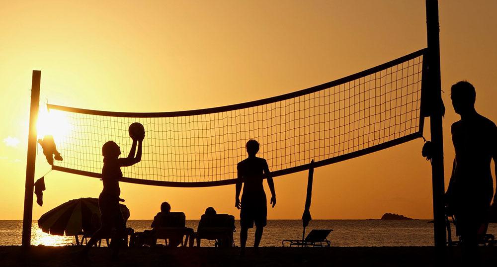
Volleyball rotation like rotating glaze layers in your acrylic portrait
Here in the portrait using the acrylic glazing technique, every part of the picture gets a turn, having another glaze added to it. (There are some times when we break this rule, and I’ll show you that in the video lesson)
Here is where I’m at in the portrait, prior to this video lesson, after the work I did on Lesson #4.
Acrylic portrait painting challenge example in progress using the acrylic glazing technique, 16 x 20, acrylic on canvas by artist and instructor Matt Philleo
What we want to do at this stage:
Since we already have locked in the major differences in the color scheme and tonal value very simply, now we want to add more complexity to the painting.
We will be adding:
- depth to the dark value of the hat
- shadowed areas of the face
- and some of the darker areas within the background.
We will do this using the acrylic glazing technique, where we mix a TINY amount of acrylic paint into a LARGE amount of clear acrylic matte medium. It’s best to go very, very light when you start your painting. You should just barely see a difference.
Also, make sure you rinse your brush off thoroughly between glazes. Any extra water in the heel of the brush may cause your glazes to drip or get streaky.
Here’s how to do it:
- Mix your Glaze for Hat: Use small, fairly equal amounts of ultramarine blue and raw umber dark, and mix with a large amount of matte medium (5% paint to 95% medium) as shown in the video lesson. “Scoop” a large amount of glaze onto your 3/4″or 1″ flat brush. A few of the glazes will get a little darker, with ratios of as much as 30% paint to 70% medium. Make sure you watch the video to know where and when to change the ratio.
- Apply the Glaze: Start on the left-hand side of hat and apply the glaze with firm pressure to cut along the edges. Spread the paint out toward the right, keeping a wet edge. Flip the brush over to make use of the paint that is on both sides.
- Smooth Out the Glaze: Use diagonal criss-cross strokes to blend the glaze out rapidly. Use very light pressure at the end, just barely grazing your brush across the top. Don’t overwork the glaze. TIP: It dries quickly. If it starts to get blotchy or tacky, just leave it alone, or you’ll make it worse. You will be able to smooth it out later with more layers on top.
- See Where Else You Can Employ the Glaze: Because you don’t want to waste the paint and medium, and to save time, use this same glaze on the background, adding as shown in the video lesson.
- Add a Shadow Glaze to the Face. What we want to do is add a shadow on top of the shadow. Start at the left side of his face, underneath the hat, and cut up along the edge, working your way right, and bring the glaze down into the forehead wrinkles as I show in the video. Follow the distinct shapes and patterns that you see on your reference photo.
You will repeat this process another time, with some variations.
Ready to paint?
Now, before you begin (yes, I have to ask you again, just in case 🙂 )…
Are you registered for the challenge?
If not, register below for FREE and I’ll send you:
- a downloadable/ printable”Welcome Kit” with a Supplies List and a Palette Color Layout Guide.
- high-resolution images of the photo we’ll be painting from for this challenge.
- each new lesson that comes out in this Masterclass series.
- a link to my private Facebook group, where you can do this challenge with other artists, get feedback and help on your portrait, and not feel alone.
REGISTER TODAY. The challenge is ongoing, something you can do at your own pace. It’s not too late to enter!
Watch my in-depth Masterclass acrylic online tutorial below to see these steps in action.
After learning from this video, you’ll know exactly how to do it.
Make sure to watch the ENTIRE video first before diving into the painting. It will be worth it to do that. Then, I’d like you to go back and refer to whatever steps you need to as you paint. That way, you won’t miss any of the instruction and tips that will help you make this portrait your very best.
Here’s the video…
[PORTRAIT CHALLENGE] Masterclass Lesson #5: Building up Depth With Glazes
Moving Forward…
Excellent job staying with me and the other artists for this challenging portrait! The acrylic glazing technique takes some getting used to, but once you really “get it” you will be able to paint with a freedom, confidence, and sense of realism that will keep you encouraged to keep on painting more and more.
In our next class, I’ll show you how to add more glazes and build up the skin tones. It’s something so many artists aspire to: create those lifelike skin tones that just look real. And now with a good foundation in place, we can do it!
I’ll see you in our next class! Until then be blessed in your painting and you and your family stay safe and healthy.
Yours for Better Portraits,
![]()
If you found this post helpful or encouraging, would you send it on ahead? Let others know with the share buttons below. I’d love to hear your comments. Thank you so much!
Let me know if you have any questions about the challenge that I didn’t answer. Leave your question in the comments below and I’ll get back to you!

[PORTRAIT CHALLENGE] Masterclass Lesson #4, LIVE: Establishing Your Color and Values
For a change of pace, we did the Acrylic Portrait Challenge Masterclass Lesson #4 as a LIVE class, and I’m excited to share it with you!
In our last lesson, I showed you how to prepare your canvas for painting by whiting out the grid lines, sealing in and muting the sketch, and preparing your palette.
Finally, we began the actual painting process with a glaze of ultramarine blue (a glaze is a small amount of acrylic paint mixed into a large amount of clear acrylic medium, usually matte medium).
Now, in this lesson (recorded LIVE), I will show you how to add the next two glazes, which will nearly cover the entire canvas with one layer.
Whereas the sketch is the actual foundation for the painting, this first layer is very important. It is like the floor joists when a house is built. The rest of the structure attaches to that, and so housebuilders take extra time to make sure they do it correctly. If they don’t they’ll end up with a structure that will end up sagging years, or even worse, collapsing!
In the same way, we want to make sure we have this first layer done correctly. Don’t feel nervous about it. You can still fix a painting that hasn’t been started correctly, and end up with a truly realistic acrylic portrait. It just will take you more time and effort to correct, and so it’s best to avoid that hassle if possible.
What we want to do at this stage:
Our main goal right now is to establish the main value and color scheme of the portrait, simultaneously. We want to “lock-in” the contrast between the lights and dark values, paying attention to their specific edges, boundaries, and shapes. If you did the sketch according to Lesson #2, then you will know almost exactly where to place your initial glazes, because your sketch tells you where to put it.
We also want to observe the major differences in color within the reference photo, simplify it to “warm and cool” tones and use our inital glazes to plot that out. Then, future layers will be added on top of them, getting more and more complex as we go along.
But the initial glaze will serve us well.
It’s like how a major highway was often once a foot trail, then a cowpath, then a dirt road, then a paved road, and finally a highway. It’s a lot easier to upgrade a road, than to try to build a new one. You’d have to bulldoze trees, cut through rocks, level the land, and even remove homes if necessary.

In the same way, with the glazing technique, we are getting the compounded effect of each previous layer adding richness and depth to the ones that come after them. That’s why you want to start off right.
Again, as I’ve said in the last lesson: begin the painting lightly. Much lighter than you think. And certainly more than you’re used to painting, if you’ve painted for a while. If you just barely see a difference in this first layer, you’re doing it exactly right!
Let’s dive into the process…
Here’s how to do it:
- Mix your Glaze for the Skin Tone Foundation Layer: Use a small amount of burnt sienna and raw umber dark, and mix with a large amount of matte medium (5% paint to 95% medium) as shown in the video lesson. “Scoop” a large amount of glaze onto your 3/4″or 1″ flat brush.
- Apply the Glaze: Start on the left-hand side of the man’s face, and apply the glaze with firm pressure to cut along the edge of the ear, neck, and along the collar. Spread the paint out toward the right, keeping a wet edge. Flip the brush over to make use of the paint that is on both sides.
- Smooth Out the Glaze: Use diagonal criss-cross strokes to blend the glaze out rapidly. Use very light pressure at the end, just barely grazing your brush across the top. Don’t overwork the glaze. TIP: It dries quickly. If it starts to get blotchy or tacky, just leave it alone, or you’ll make it worse. You will be able to smooth it out later with more layers on top.
- Mix the Glaze for the Background Foundation Layer: Now, if you followed my steps from Lesson #3, you should have an ultramarine blue glaze already on the background’s darkest values. This glaze will go on top of that, and will start the basic color for the mid-tone area in the right direction. Take a small amount of raw sienna as the base, smaller amount of raw umber (or raw umber dark) and and even smaller amount of ultramarine blue, and mix them slowly into the matte medium as I show in the video.
- Add the Glaze and Smooth it Out. Apply this similarly as the skin tone glaze, but this time, you only need to cut up along the edge of objects with very light tonal value, such as the shirt or the illuminated portion of the man’s face. The glaze can go on top of the hat, because the final tonal value of that area will be so dark, so there’s no need to worry about trying to “keep within the lines” there.
Ready to paint?
Now, before you begin (yes, I have to ask you again, just in case 🙂 )…
Are you registered for the challenge?
If not, register below for FREE and I’ll send you:
- a downloadable/ printable”Welcome Kit” with a Supplies List and a Palette Color Layout Guide.
- high-resolution images of the photo we’ll be painting from for this challenge.
- each new lesson that comes out in this Masterclass series.
- a link to my private Facebook group, where you can do this challenge with other artists, get feedback and help on your portrait, and not feel alone.
REGISTER TODAY. The challenge is ongoing, something you can do at your own pace. It’s not too late to enter!
Watch my in-depth Masterclass acrylic online tutorial below to see these steps in action.
After learning from this video, you’ll know exactly how to do it.
Make sure to watch the ENTIRE video first before diving into the painting. It will be worth it to do that. Then, I’d like you to go back and refer to whatever steps you need to as you paint. That way, you won’t miss any of the instruction and tips that will help you make this portrait your very best.
Here’s the video…
[PORTRAIT CHALLENGE] Masterclass Lesson #4, LIVE: Establishing Your Color and Values
Moving Forward…
If you made it this far, congratulations! It’s not easy to start a painting so light, when your natural instinct is paint thick and dark right away. So, if you’ve followed my steps as best you can, high fives and hat’s off to you! Stick with this process, and you will be able to paint more confidently and realistically than you ever have before.
Now, since we have the complete glaze foundation work done on the painting—the hat, the face, the shirt, the background all has paint on it, we can move on and add more and more glazes—building up richness, depth, and detail. The painting will look more and more amazing each time we add another layer. There may be a few times where you’ll hit a few rough spots, but by God’s grace, I’ll show you how to navigate those challenges and finish your portrait well.
I’ll see you in our next class! Until then be blessed in your painting and may God guide your every brushstroke!
Yours for Better Portraits,
![]()
If you found this post helpful or encouraging, would you send it on ahead? Let others know with the share buttons below. I’d love to hear your comments. Thank you so much!
Let me know if you have any questions about the challenge that I didn’t answer. Leave your question in the comments below and I’ll get back to you!