
P.S. Did you find this post helpful or encouraging? If so, send it on ahead! Let others know with the share buttons below. I’d love to hear your comments. Thank you so much!

When you’re close to completing your acrylic portrait, the final touches can make all the difference. These finishing touches are where your painting truly comes to life, capturing light and shadow to give your subject depth and realism. In this tutorial, we’ll explore how to add those critical final highlights and nuances, using a mix of titanium white and warm colors to create a polished, professional look.
Before diving into the highlights, it’s essential to prepare your palette. Start by adding a small amount of matte medium to your palette. This medium helps in achieving a smoother, more fluid consistency for your paint. Next, squeeze out some fresh titanium white—the key color for highlights. Mixing this white with matte medium will allow you to apply it more smoothly and blend it seamlessly into your existing colors.
The first step in adding highlights is to identify the light source in your painting. In most portraits, the light source comes from above, which means the top of the head, forehead, nose, and cheeks will catch the most light. Using a round brush, pick up some titanium white mixed with matte medium and carefully apply it to these areas.
For instance, when adding highlights to a subject’s forehead, you may notice that the white appears too stark against the skin tone. To soften this, blend a small amount of Indian yellow and Pyrrole orange into the white. This combination introduces warmth to the highlight, making it look more natural and less harsh.
Blending highlights into the existing skin tones can be challenging but is crucial for achieving a realistic effect. After applying the white highlights, take a small, soft brush and gently blend the edges into the surrounding colors. This step ensures that the highlights don’t appear as abrupt streaks but rather as soft transitions from light to shadow.
For example, after placing a highlight on a subject’s nose, you may need to blend it with a touch of Indian yellow to warm it up. This blending process creates a subtle nuance that makes the portrait appear more lifelike.
While highlights are essential for showing where the light hits, shadows play an equally important role in creating depth. To enhance the shadows in your portrait, use a darker mix of the existing skin tones. You can achieve this by adding a small amount of burnt umber or Payne’s gray to your palette.
When applying shadows, focus on areas like the underside of the chin, the sides of the nose, and the hollows of the cheeks. These are the places where the light naturally falls off, creating depth and dimension in your portrait. Remember, the goal is to enhance the existing shadows subtly, not to overpower the highlights.
The final step in finishing your acrylic portrait involves adding highlights to any clothing or accessories in the composition. Just like with the skin, use titanium white mixed with a bit of matte medium to create these highlights.
For example, if your subject is wearing glasses, a small highlight on the frames can make them pop. Similarly, adding a slight highlight to the fabric of the clothing can suggest texture and light interaction. Be sure to apply these highlights sparingly and blend them well, as too much can distract from the overall portrait.
Adding the finishing touches to your acrylic portrait involves more than just a few dabs of white paint. It requires a thoughtful approach to blending, shading, and color selection. By carefully applying and blending your highlights, enhancing shadows, and paying attention to the finer details, you can bring your portrait to life with a professional polish.
These techniques will help you create portraits that not only capture the likeness of your subject but also convey a sense of light and space, making them truly stand out.
Read more about my additional resources, tutorials, to learn more and check out my free courses here. . Whether you’re a beginner or an experienced artist, there’s always something new to learn and apply to your paintings. Happy painting!
Read more about how to paint a portrait that you can surely be proud of!
I’d love to hear your thoughts on this video. Please share it with your friends and family. Let me know if you have any further questions. I’ll greatly help you.
If you’d like to learn more, sign up for my free email tips and video class today.
Learn How to Paint Acrylic Portraits With My Free Mini-Video Course!
Thank you so much for taking the time to read this tutorial and watch the video. That means a lot to me. I hope you find it very helpful in your portrait painting.
Yours for Better Portraits,
P.S. Did you find this post helpful or encouraging? If so, send it on ahead! Let others know with the share buttons below. I’d love to hear your comments. Thank you so much! Also, do you have a question on acrylic portrait painting you’d like answered? Let me know, and I’d be happy to help!

Every challenge presents opportunities. This is one of those occasions. Many of us have more time on our hands, so I decided to open up a portrait painting challenge!
Why not use this extra time to create something beautiful—an acrylic portrait we can be proud of. I want to give you three reasons why you should take the challenge…
This challenge is FREE to join and I also plan on teaching you step-by-step, with video instruction, precisely how to paint the portrait.
Would you like to join me and many other artists on this challenge?
Great! Watch this video…
Then, sign up for the challenge below.
I’m interested in the challenge!
Look forward to seeing you in the challenge!
![]()
Matt
If you found this post helpful or encouraging, would you send it on ahead? Let others know with the share buttons below. I’d love to hear your comments. Thank you so much!

Is it time to “call it quits?” on your painting? How can you tell?
You don’t want to overdo it, but neither do you want to leave the portrait looking unfinished. You want to amaze people with that picture, give a great gift or get paid, and have the satisfaction of a job well done.
But how?
Here are 5 ways to know your painting is done. In this article, I’m going to use a little tough love, artist-to-artist. Ok with that? Alright, here we go…
If you’ve been working on a one-subject 16″ x 20″ portrait for say, 50 hours, it’s time to say enough is enough.
Test: get an “innocent bystander” (in my case, usually it’s my wife) to look at your painting from a distance of six feet away, and then come back into your studio a couple of hours later. If they can’t tell the difference, you’re done.
By continuing on, you’re not adding anything significant to the bottom line of the painting.
You’re not adding any value.
Nobody will notice the little details you’re adding if they don’t make an impact from six feet away. Most of the time, as artists, we fuss over some small portion of the painting that has us stumped. It’s like the kid who takes all his time on one question in the timed exam and then fails the test because he should have skipped the question, completed the rest of the test, and then come back and finish that one problem.
Don’t get me wrong, I’m not saying details aren’t important. I love detail and it makes an acrylic portrait look fantastic. But if you’re struggling with one square inch of your painting, leave it alone and come back to it if you need to. But chances are, you don’t.
Yes, it’s possible to make a painting worse, the more you work on it.
I’ve done that.
I’ve had some paintings where I should have left well enough alone. That little dimple on the persons’ face was so good, I thought I should make it perfect.
But then I messed it up. So I had to try to restore what I had before, and then leave it alone. Then I found myself messing up another area.
Pretty soon, I realized, the painting is done. Time to sign it!
If you are a professional or semi-professional artist, doing portraits on commission, you know what I’m talking about when I say you hit the end of a deadline. Or you might be doing it as a hobby, but you have an occasion, like a birthday or Christmas, that dictates the painting must be done and wrapped by a certain time.
You know that a portrait must get in the client’s hands today, or at the very least, you have to email a proof image for the client to approve. You put in as many hours as you can. You bring out the coffee and energy drinks if you have to (have you ever tried coffee with a couple of black tea bags thrown in?...that will keep you up!) and you pull an all-nighter if need be.
But eventually, you run out of hours, and you just have to call the painting done, out of necessity.
This, by the way, is why I advocate the glazing technique. You can work your entire painting at once, and even if you feel like it is 80% done, oftentimes, it’s done enough to please the client.
If you’re like those artists who have a white canvas and work it like a drawing, from left to right, making everything detailed and finished section-by-section, then you’ll always have a white section of canvas that’s undone until the very end.
And there’s no way you can pass off that portrait as finished.
Now, that’s not to say we don’t strive for our best work. Don’t turn in a painting to a client that’s not representative of your style, that’s not finished well. But the 80%-100% level of completion in a painting is a very grey area, a very thin line. It’s where you may not be adding much value to the portrait.
There’s a saying: “your work will expand to fill the time you allot for it.”
That holds true with paintings as well. If you have a tight deadline to meet, if you value your reputation as an artist, you’ll find a way to get the artwork done.
Unless the client is able to give you some wiggle room on the deadline, better to turn in a painting that doesn’t look perfect to you, than say, “Sorry, it’s not done,” when they absolutely needed it by a certain time.
Again, let’s say you are a professional artist and you email your client a proof image. They love it. They are ready to pay you.
Don’t you dare add one more drop of paint to that canvas! It’s done.
“But I just noticed an eyelash that’s missing,” you say. “I’ve got to paint it in there.”
No. Leave it. Your client approved this version of the painting, and if you add more paint, it’s a different version. When they come to pick it up, they might say, “it doesn’t look like the proof. Something’s different.”
Then you’d have to try and restore it to what it was. What a nightmare! You’d waste the client’s time, your time, and possibly even lose the commission.
Not worth the gamble.
They approve it=you’re done.
If you think the painting could be improved, save that sentiment for your next painting.
Now, with all these points, it’s good to remember that sometimes a painting is not done and needs more work. Some artists give up on a painting too early. Don’t do that. If you stick with a painting that’s causing you frustration, it will build your endurance as an artist, and you will be able to paint better the next time. It’s just like working out at a gym. Finish your reps, and you will be stronger the next week.
As an example of how to finish a painting successfully, here is a portrait I did not too long ago of a pastor, a memoriam portrait. It’s one of my favorites. I posted some videos of it in the past, but here I want to show you how I finish and sign it.
Let me know how this article helps! It’s been a while since I’ve last posted, but I hope to get back into the swing of things again!
If you have any questions or comments for me, please leave them below. May God bless you in your painting!
Yours for Better Portraits,

If you found this post helpful or encouraging, would you send it on ahead? Let others know with the share buttons below. I’d love to hear your comments. Thank you so much!

…to give as a high quality gift, display in a show, or to get a “thumbs up” and a good price for your artwork when you do a commission? How would it feel to not struggle with finding the right skin tone, or get the blending in the colors right? Or to be able to paint a person’s face and not have it look flat?
Imagine how it would feel to know how to mix the paint and control the brush..and get a realistic result…predictably.
I’ve been painting portraits in acrylic for over 20 years, and started teaching out of my studio two years ago.
The next year I started teaching online when one of my email subscribers, in her mid-80’s, urged me to put a course together. We chatted on the phone and she asked me how much I would charge for an online painting class.
“How about $97?” I replied.
“I’ll mail you a check right away.”
Just like that, I had a paying student…I had to teach the class now!
I asked some other folks on my email list if they wanted in, and about 10 more students instantly enrolled. Since then, I’ve taught almost 100 students literally all over the world, and it’s been so enjoyable to see the progress they’ve made.
If you want to learn how to paint a portrait in acrylic that you’ll be proud of, then learning directly in a step-by-step video course is best way to cut through the fog, and achieve results fast.
![]()
It’s a complete step by step video course, showing you exactly how to paint a portrait in acrylic, from the sketch to the finished, signed painting. All the lessons are online, available for you to watch at your own pace, 24/7.
Click here to learn more/ enroll
Judy, one of my students in this course, just started acrylic portrait painting a couple months ago. She was having some difficulty and felt stuck in her painting progress, so she emailed me asking for a critique. (You can request a personal critique, too, as a student of my course!)
Here’s what she emailed me after I sent her the interactive video critique…
“Hi Matt,
Thank you so much, that is so helpful. You said it so well when you talked about “being intimidated by the painting” that was exactly how I felt – a kind of stage fright, haha maybe “easel anxiety” anyway as I listened to your critique I just felt it unlock.

I feel excited about making those changes. I laughed when I saw that despite staring at the photo for hours and hours I never noticed a piece of his ear was missing in my painting.
Then Judy finished that painting, utilizing the techniques in my course and some tips in my critique, and wrote me again:
“Hi Matt,
Here is my painting that I’ve been working on. I’m really thrilled with it and it will work with Maurice’s portrait.
I’ve been learning so much – how to fix a mistake, and how to wait patiently for paint to dry.


I made a mistake straight off by using a lead pencil instead of the one you recommended I use ( which was right there next to it). Bet I will never do that again! I’m really getting a feel for mixing glazes and I’m having so much fun.
Thank you so much you inspiring teacher!”
Cheers,
Judy
I love the beautiful husband/ wife portraits Judy did side by side. Not only has she enjoyed the painting process, but she has two paintings she’s proud to show. And she has only started painting.
You can do this too. You can save time, paint, and frustration. You can learn how to paint a lifelike portrait that you can confidently show others, by taking my course.
I’d love to have you as a student!
All the best,
P.S. It is the one-year anniversary since I created this course in April of ’17. If you are wanting to take the next step in painting, here’s your best opportunity. I truly believe if you take the course, your portraits will dramatically improve. Why? Because the techniques work, and that is what I have seen happen for several of my students. Hope you’ll be one of them!
Click here to learn more/ enroll

Would we talk about girls and shoot hoops? Or maybe play guitar? (that’s more up my alley)
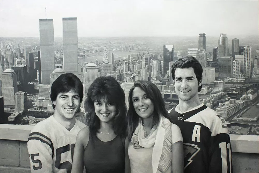
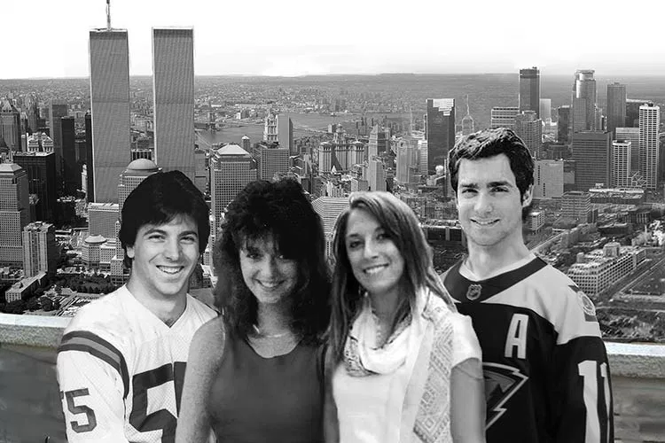
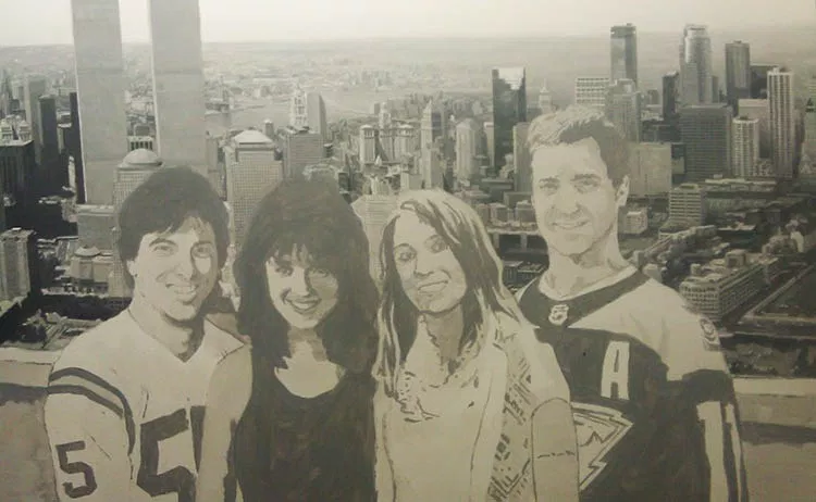
I had a client who brought that idea to life. It was his idea, actually that he wanted me to paint–a massive 48″ x 72″ realistic acrylic portrait–in black and white– of he and his wife as they looked in their 20’s, along with their two children, who are currently in their 20’s, all hanging out in the same time and place. In the background is New York City, where they were originally from, merging into Minneapolis, which is close to where they and their kids now live.
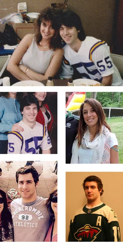
After meeting together, I got to work putting together a layout of what the painting would look like when finished. It always helps to have a good-looking family to do your painting from! My client kind of reminds me of Scott Baio or Tony Danza in these photos.
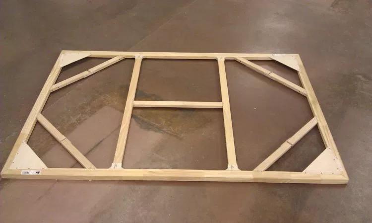
During the layout and approval process, I also worked on building the canvas. I started with professional stretcher bars made in the USA, complete with locking mitre joints and beveled edges, and assembled them. It is extremely important to have a strong support for a 4″ x 6″ canvas, to be able to withstand the tension of the stretched fabric, and to keep from warping. I made sure to include cross braces and diagonal braces as well.
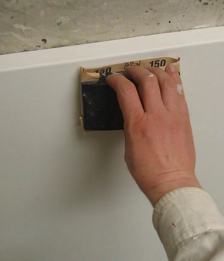
Next, I stretched the canvas with pliers and stapled it extremely carefully, measuring every mark to ensure even tension. Just this process alone took several hours.
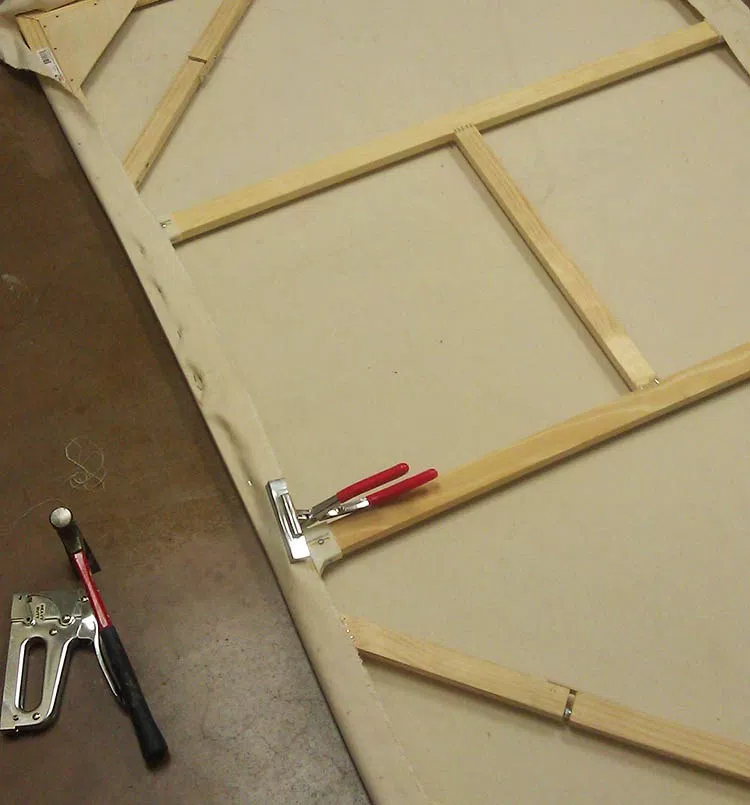
Finally, the stretched canvas! I apply hot water with a brush to add just a bit more tension and get out any wrinkles. If you tap it, it sounds like a drum!
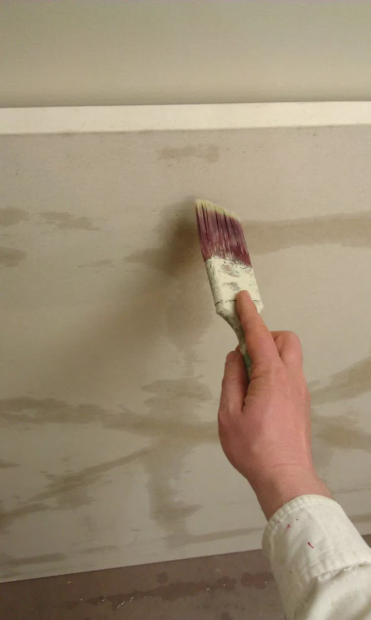
The next step was to gesso (prime) the canvas. I use a high quality gesso, which is white acrylic paint plus ground pumice to make it sandable. I used three or four coats to get a really smooth and durable surface.
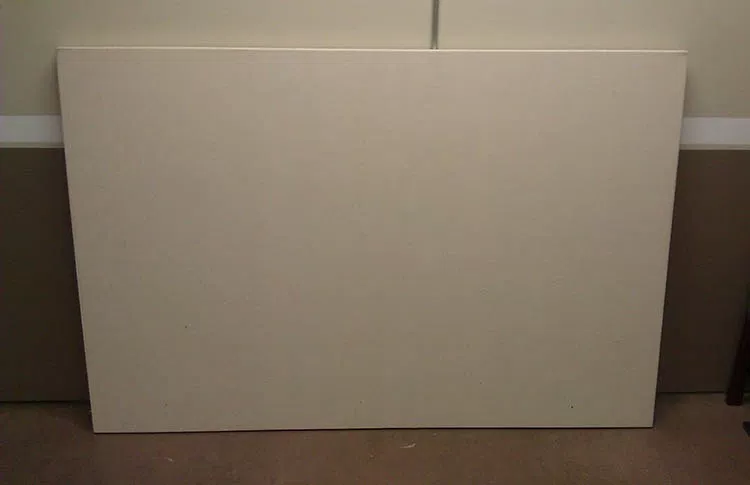
With a blank canvas to work with, I feel good.
It doesn’t feel daunting. It’s like a clean slate, ready to add something beautiful and intricate to. It makes me think of what God does in our lives when He forgives our sins through Jesus Christ, and then we are clean, perfect, and ready for Him to work with us to create a masterpiece!
It was around the beginning of March when I started painting. My client and his family approved the layout after a few changes, and so I was ready to go! I decided to skip the pencil sketch, and get into the painting process right away.
Many people ask me how I do the sketching process. It depends on the project. Most often for small portraits, I freehand sketch them. For a large scale and incredibly detailed project like this on a canvas, I will either grid or project the design with an overhead transparency projector. Canvas is very difficult to sketch on with a pencil. In this case, I projected the design I created in Photoshop, using a small brush and a grey paint to quickly capture the lines of the image.
The portrait took nearly 200 hours to complete, from the time taken to build the sizable canvas stretcher frame to the last dab of paint.
Although it is easier to do a painting this way than full-blown color, it presented a few difficulties that I didn’t foresee, at least to the extent that surfaced in this work.
You would think that to do a black and white painting that you would simply just use black and white paint and mix various amounts to arrive at the grey tones in between.
It didn’t work that way for me.
I typically paint with a translucent glazing technique that allows light to reflect through the canvas and back to your eye through the layers of paint, like the Old Masters, giving the final painting a vibrance that is hard to capture with opaque paint alone.
So, when you mix black with the clear acrylic medium, even mixed with some white, and apply it to the canvas, the resulting color is not slate grey, but a brownish grey, because the light shining through the canvas warms up the color.
Then, when certain areas become more opaque than others, the predominance of white mixed in with layers gives the grey shade a cooler, bluish cast.
Maybe I’m just picky, but I don’t want certain areas of the painting to look brown or blue (at least without my say so) when I’m shooting for black and white. If the client commissions a black and white painting, that’s what he expects to get.
The solution?

I included brown (raw umber dark), yellow (raw sienna and indian yellow), and blue (ultramarine blue) on my palette and mixed it back into the colors to correct anything that was off. If the shade was too cool, I warmed it up with brown and yellow. If it was too warm, I cooled it down with blue.
So even in a monochromatic painting, I still end up using color!
But that’s OK, because color is fun to use. 🙂
Now I did make the background just a bit cooler in tone, so that it would visually recede. But it’s nice to be able to do that, when you, the artist chooses to, not just letting the paint do whatever it wants to.
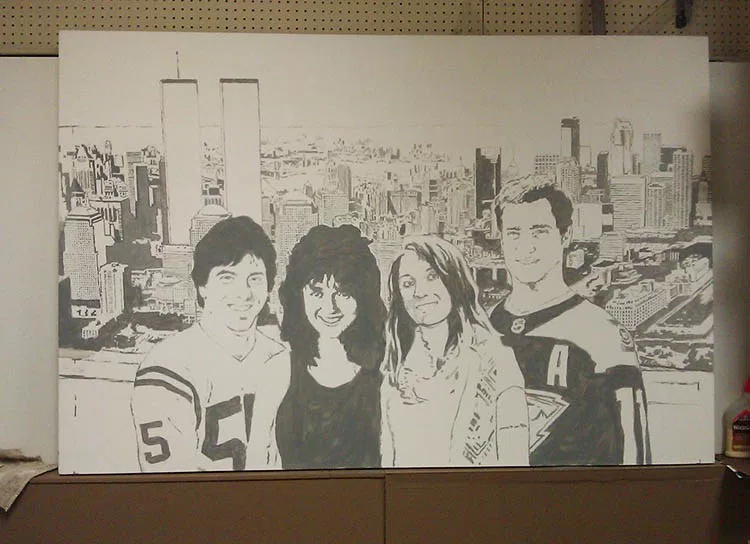
Next, I painted a glaze over the entire painting, to give me a mid-value grey tone to work from. I add in darker values and highlights, working my way across from left to right. I try to develop the painting as a whole and not get too hung up in any one area.
It took over fifty hours to paint the background. I thought I was making it too dark, and had to constantly remind myself that the subjects, the people in the front would be much darker, with areas of pure black paint, and make the background look lighter by comparison. I wanted to “fix the background” and try to lighten it up, but I kept telling myself, “just wait until you paint the people.”
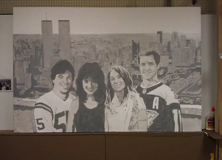
After finishing up the background, I really honed in on the people in the foreground. Here are some photos of me working taken by a talented photographer, Tom Gardner, at Artisan Forge Studios, where I used to work. At this stage I am nearly finished with the portrait. Yes, I can see the finish line from here!

How often in our lives do we judge something or someone prematurely? We ought to reserve judgment on many things in our lives, and especially in others’ lives, believing the best, and wait until everything shakes out. God has a purpose and a plan that we don’t always see. Things can look horribly wrong, when God is creating something wonderful behind the scenes.
When I finally finished it, hours upon hours later, I was satisfied with the results.

Here is a closeup of the father when he was young…

And then the mother…

The daughter…

And the son…

Here is a detail of New York City, with the Brooklyn Bridge in the background.

On the right side of the painting is Minneapolis, with that recognizable round tower…

The best part of the entire project was to deliver it to the client and later to see it hanging in his home. What a conversation piece!

Hope you enjoyed this post and have a blessed day,
P.S. Did you find this post helpful or encouraging? If so, send it on ahead! Let others know with the share buttons below. I’d love to hear your comments. Thank you so much!

His name was Verlyn. He used to come by my house and he’d have his station wagon full of bread, bakery items and other things that he gave to people in the neighborhood as a ministry.
We developed a nice friendship along the way. His wife was ailing at the time and then sadly passed away. I did this portrait for him last year to help encourage him in his time of loss. He is still going strong, even in his 80’s and after everything, he’s taking care of a disabled man!

Here is the reference photo. I took the liberty to lighten up the background and change it to a more neutral color. Also, I brought the two of them a bit closer together, so I could give the portrait an aesthetically pleasing vertical orientation.
And now for the step-by-step process…
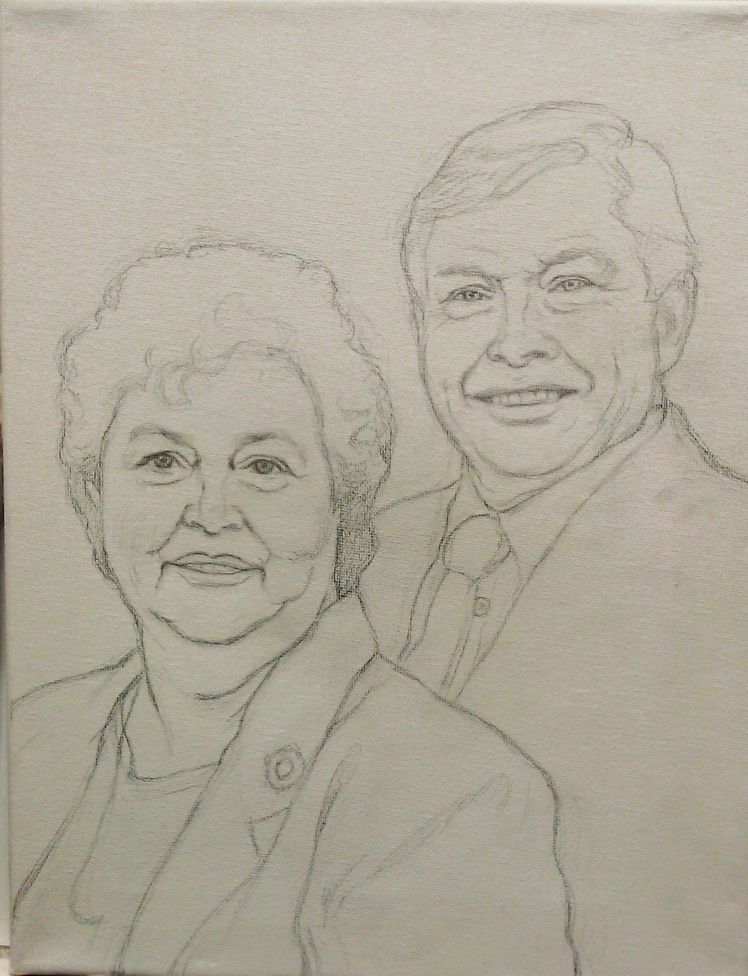
This was done freehand. In this stage, I try to get it as accurate as possible, so I have a good foundation to build my painting upon. But there are inevitably a few things that may be off, that have to be addressed in the painting stage. And that’s OK, because with paint it is easy to make corrections. Usually, I sketch in colored pencil, but I think, looking back, I might have run out of them and so used a graphite pencil, even though it is harder to work with.

In this stage, I start by adding some light layers of color: ultramarine blue mixed with raw umber dark, and a alizarine crimson. I like to start my paintings with just one or two different colors and then build from that. So, even though he has pink hair for now, I’m not going to worry about it! The goal is to quickly separate cool hues from warm, and get the values blocked in quickly to build up depth.

Meanwhile, I keep darkening the background with a mixture of raw umber dark and ultramarine blue to make grey. All of these layers, by the way, are thinned down with matte medium and applied with the glazing technique to give the painting richness and depth.
Would you like to learn how to do this technique? Get my free video lessons below…
Learn How to Paint Acrylic Portraits With My Free Mini-Video Course!
At this level, the colors are getting very intense, but there’s still a lot of nuances to add yet, to smooth out the major shaded areas of the face. It’s important to remember that your sketch can’t capture a likeness as precisely as a full-shaded in portrait. The subtleties of values sculpt the dimensions of the face.
So when you’re sketching, cut yourself a little slack if you haven’t captured the likeness perfectly. Just get it close.
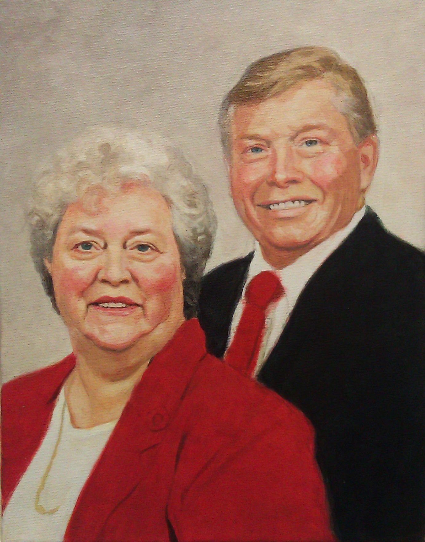
It’s starting to look closer, but there’s more details work to be done. As you can tell, the pin on the woman’s lapel can be seen, faintly under the glazes. It’s time to paint it in. And there’s more work to do on the man’s tie–shadows on the edges that will give it depth and make it look like it’s really there, resting on his shirt.
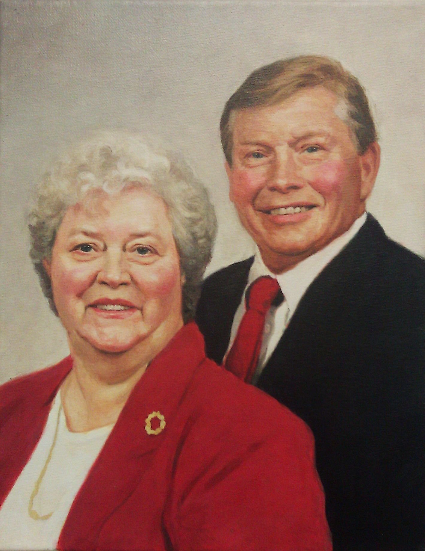
I feel like I’m in the home stretch at this stage, where I could call this finished, but there’s just a few final details yet: The details on the woman’s necklace, the tie-in values (where you take sharply defined shadows and merge them into smooth gradations) on the man’s tie. Highlights on the faces. And even just a few spots on his forehead to give him some character.
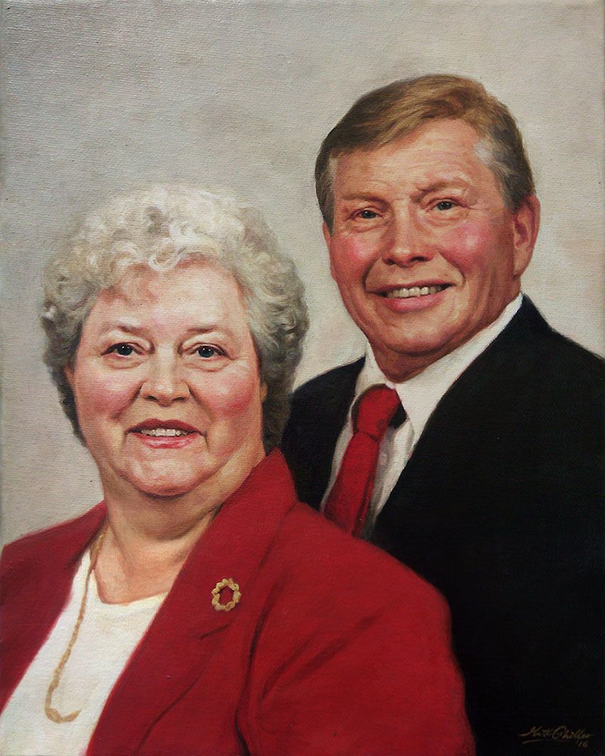
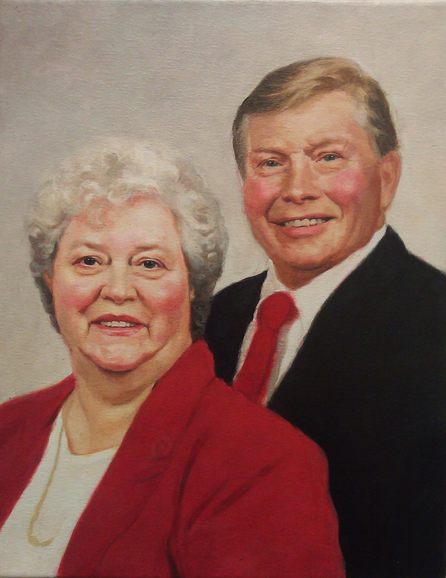
Done! All in all, this painting has dozens of layers of translucent paint and over 25 hours of work put into it. It was worth every minute. My friend really appreciated it, and it brought a lot of encouragement as it helped to keep this memory alive.
Let me know what you think of this mini-tutorial, and how I can improve these for you in the future. Share your paintings with me anytime and let me know how I can help you become a better artist.
Be blessed in your painting,
P.S. Did you find this post helpful or encouraging? If so, send it on ahead! Let others know with the share buttons below. I’d love to hear your comments. Thank you so much!

Losing weight, quitting smoking, exercising–so many fun things to choose from.
I don’t know if you’ve resolved to paint your best portrait ever in 2018, but it would be a fantastic thing to achieve wouldn’t it?
And a lot more enjoyable.
Imagine that you just painted a realistic portrait you’re really proud of. You show it to your family and friends, and they are amazed at what you created. Maybe you even give it as a gift, and the person who gets it is speechless. Wow. That would be amazing.
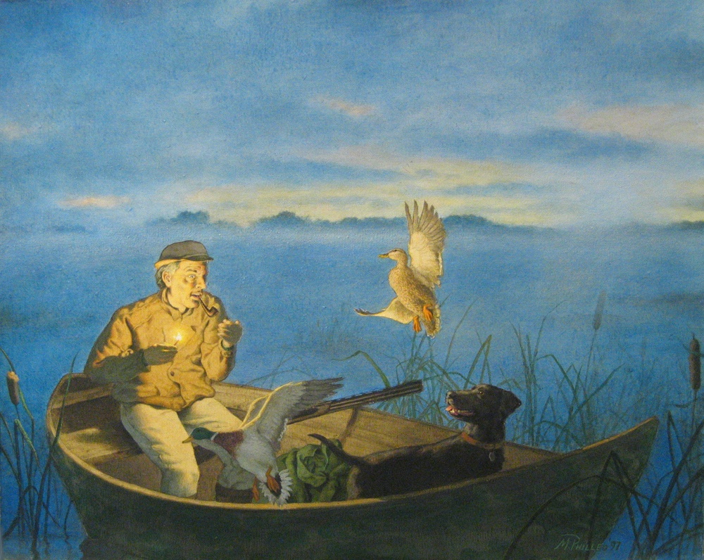
Acrylic on canvas portrait of a gulf war veteran, by Matt Philleo
There’s a lot of tips, techniques, tutorials, time-lapse videos that show many different ways to paint. Some of it is worth reading and watching. Some of it will lead you down a wrong path.
Much of the advice out there is based on oil painting or drawing techniques and just doesn’t apply to acrylic. There are some teachers who paint in acrylic very well, but they teach everything–portraits, landscapes, still lifes, abstracts, impressionism, surrealism, cubism, youcandoanythingism–so much, that you just get bogged down and confused on what to do.
I’d like to cut through all of that.
I’ve been painting portraits in acrylic since 1993, when I was still in high school.
Acrylic was hard to figure out at first. It dried so fast. How do you mix the colors? And mediums? So many to choose from, and what will they do to my painting?
The hardest part to figure out was how I could do a detailed sketch and then not obliterate it with paint. I mean, as soon as you touch the brush to the canvas, the graphite starts smearing and it looks terrible! Not to mention, the details are all covered up, so how can you keep the likeness in tact…so that the portrait looks like the person you’re trying to paint when you’re all done?
Needless to say, I was a bit over my head and very confused.
Then I went to a summer art camp at the University of Wisconsin-Green Bay, and that changed everything for me. I learned the glazing technique from instructor Norbert Kox, and it opened up a new world of possibilities in acrylic painting!
Here is one of my very first acrylic paintings done with the glazing technique, back in 1997…
“Morning Burst,” painting by Matt Philleo, acrylic on canvas, 1997
I learned that you can slowly glaze over your sketch with several faint, translucent layers of paint. The sketch can always be seen until the very end. What’s more, the light shines through, going through the layers of paint, reflecting off the white canvas beneath and back to your eye.
The painting almost glows.
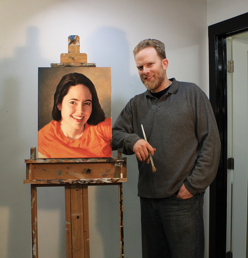
Matt Philleo, artist, in his studio, posing next to a portrait of his wife, 16″ x 20″ acrylic on canvas, painted in 2017.
This is how the Old Masters created their masterpieces over 400 years ago. It is with that same technique, with a few modifications, that I plan to teach you through this site. My goal, this year, is to fill Realistic Acrylic Portrait School with a ton of useful information on how to paint lifelike acrylic portraits that I’ve learned from over 25 years of painting…from one artist to another.
So, sign up for my free personal email tips and guidance below, grab a brush and some paint, and let’s do this!
2018 can be your year to create the best portrait you’ve ever done.
All the best,
P.S. Did you find this post helpful or encouraging? If so, send it on ahead! Let others know with the share buttons below. I’d love to hear your comments. Thank you so much!