- You are here:
- Home »
- Blog »
- Encouraging Thoughts »
- Monochromatic Acrylic Portrait of a Family in the Cities

Monochromatic Acrylic Portrait of a Family in the Cities
When I was younger I often thought, “What would it be like if I hung out with my dad when he was my age?
Would we talk about girls and shoot hoops? Or maybe play guitar? (that’s more up my alley)
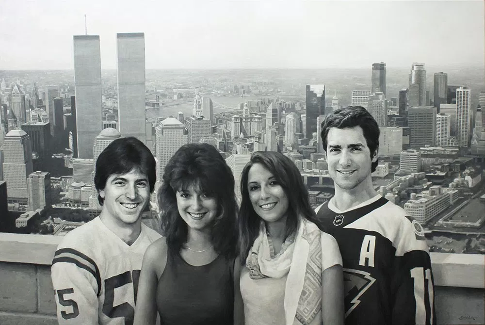
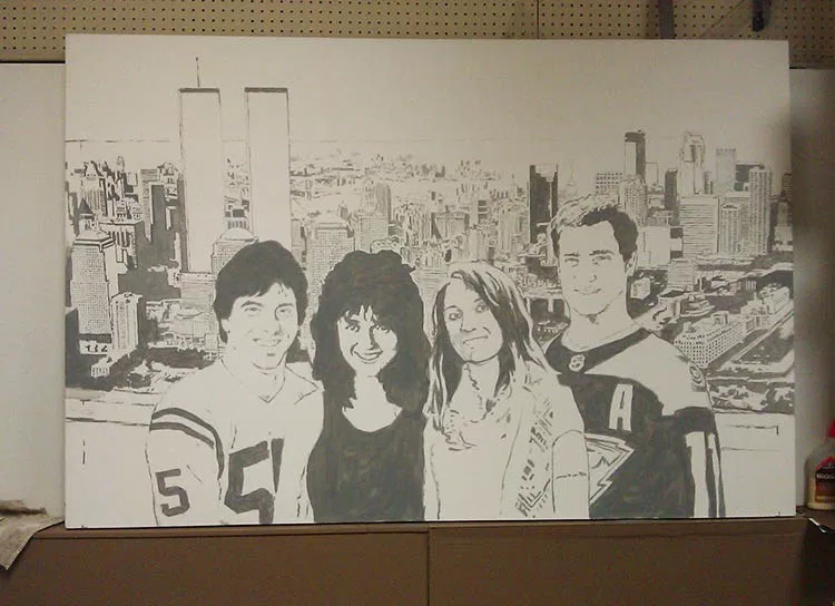
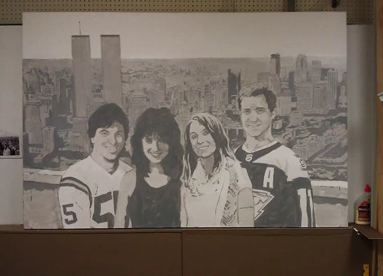
I had a client who brought that idea to life. It was his idea, actually that he wanted me to paint–a massive 48″ x 72″ realistic acrylic portrait–in black and white– of he and his wife as they looked in their 20’s, along with their two children, who are currently in their 20’s, all hanging out in the same time and place. In the background is New York City, where they were originally from, merging into Minneapolis, which is close to where they and their kids now live.

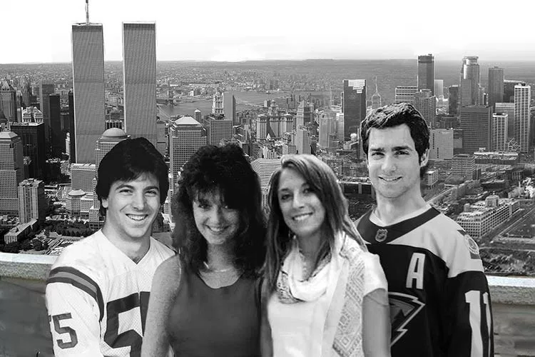
After meeting together, I got to work putting together a layout of what the painting would look like when finished. It always helps to have a good-looking family to do your painting from! My client kind of reminds me of Scott Baio or Tony Danza in these photos.
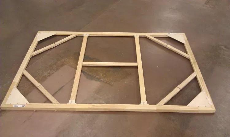
During the layout and approval process, I also worked on building the canvas. I started with professional stretcher bars made in the USA, complete with locking mitre joints and beveled edges, and assembled them. It is extremely important to have a strong support for a 4″ x 6″ canvas, to be able to withstand the tension of the stretched fabric, and to keep from warping. I made sure to include cross braces and diagonal braces as well.
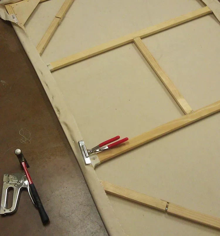
Next, I stretched the canvas with pliers and stapled it extremely carefully, measuring every mark to ensure even tension. Just this process alone took several hours.
Finally, the stretched canvas! I apply hot water with a brush to add just a bit more tension and get out any wrinkles. If you tap it, it sounds like a drum!
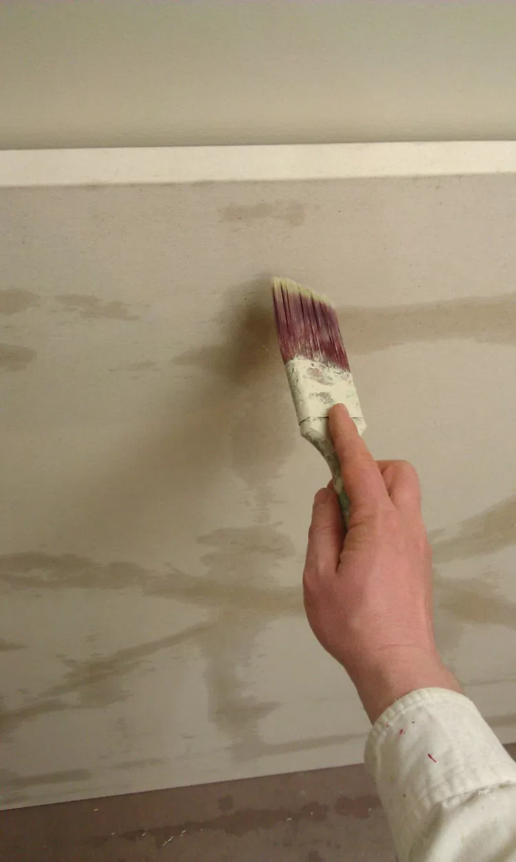
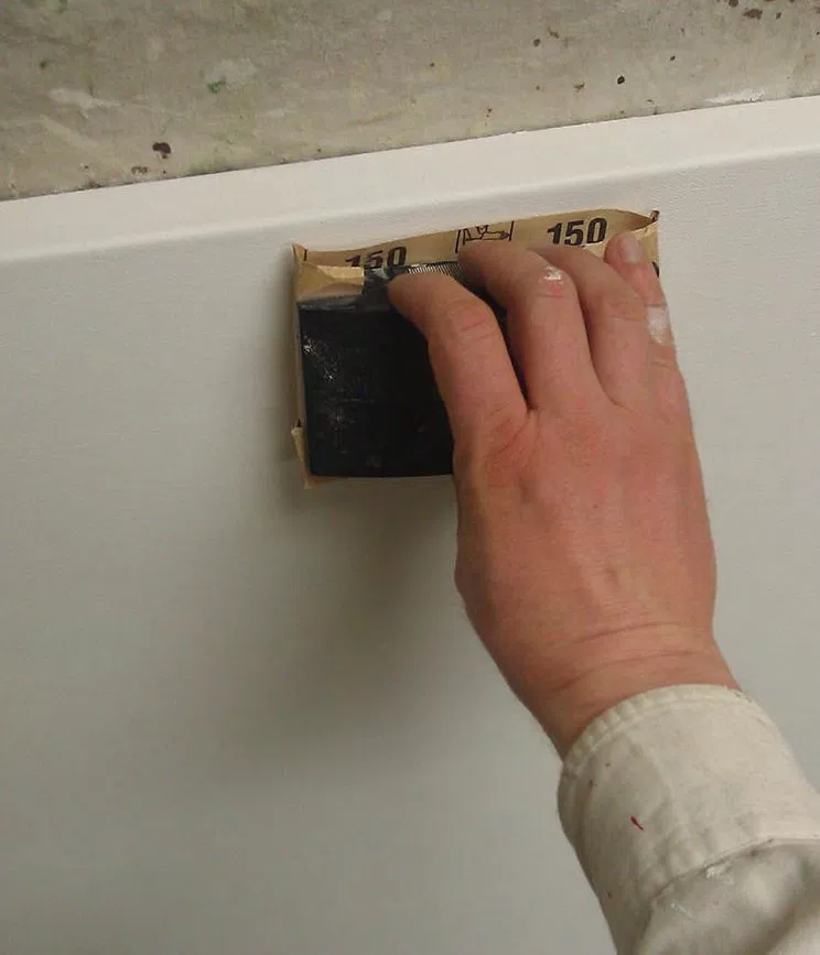
The next step was to gesso (prime) the canvas. I use a high quality gesso, which is white acrylic paint plus ground pumice to make it sandable. I used three or four coats to get a really smooth and durable surface.
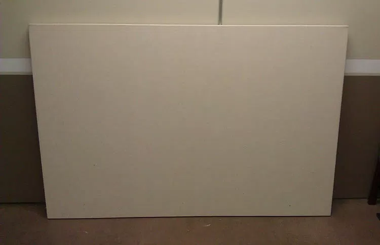
With a blank canvas to work with, I feel good.
It doesn’t feel daunting. It’s like a clean slate, ready to add something beautiful and intricate to. It makes me think of what God does in our lives when He forgives our sins through Jesus Christ, and then we are clean, perfect, and ready for Him to work with us to create a masterpiece!
It was around the beginning of March when I started painting. My client and his family approved the layout after a few changes, and so I was ready to go! I decided to skip the pencil sketch, and get into the painting process right away.
Many people ask me how I do the sketching process. It depends on the project. Most often for small portraits, I freehand sketch them. For a large scale and incredibly detailed project like this on a canvas, I will either grid or project the design with an overhead transparency projector. Canvas is very difficult to sketch on with a pencil. In this case, I projected the design I created in Photoshop, using a small brush and a grey paint to quickly capture the lines of the image.
The portrait took nearly 200 hours to complete, from the time taken to build the sizable canvas stretcher frame to the last dab of paint.
I underestimated the challenge of painting in monochromatic.
Although it is easier to do a painting this way than full-blown color, it presented a few difficulties that I didn’t foresee, at least to the extent that surfaced in this work.
You would think that to do a black and white painting that you would simply just use black and white paint and mix various amounts to arrive at the grey tones in between.
It didn’t work that way for me.
I typically paint with a translucent glazing technique that allows light to reflect through the canvas and back to your eye through the layers of paint, like the Old Masters, giving the final painting a vibrance that is hard to capture with opaque paint alone.
So, when you mix black with the clear acrylic medium, even mixed with some white, and apply it to the canvas, the resulting color is not slate grey, but a brownish grey, because the light shining through the canvas warms up the color.
Then, when certain areas become more opaque than others, the predominance of white mixed in with layers gives the grey shade a cooler, bluish cast.
Maybe I’m just picky, but I don’t want certain areas of the painting to look brown or blue (at least without my say so) when I’m shooting for black and white. If the client commissions a black and white painting, that’s what he expects to get.
The solution?

I included brown (raw umber dark), yellow (raw sienna and indian yellow), and blue (ultramarine blue) on my palette and mixed it back into the colors to correct anything that was off. If the shade was too cool, I warmed it up with brown and yellow. If it was too warm, I cooled it down with blue.
So even in a monochromatic painting, I still end up using color!
But that’s OK, because color is fun to use. 🙂
Now I did make the background just a bit cooler in tone, so that it would visually recede. But it’s nice to be able to do that, when you, the artist chooses to, not just letting the paint do whatever it wants to.
Next, I painted a glaze over the entire painting, to give me a mid-value grey tone to work from. I add in darker values and highlights, working my way across from left to right. I try to develop the painting as a whole and not get too hung up in any one area.
It took over fifty hours to paint the background. I thought I was making it too dark, and had to constantly remind myself that the subjects, the people in the front would be much darker, with areas of pure black paint, and make the background look lighter by comparison. I wanted to “fix the background” and try to lighten it up, but I kept telling myself, “just wait until you paint the people.”
After finishing up the background, I really honed in on the people in the foreground. Here are some photos of me working taken by a talented photographer, Tom Gardner, at Artisan Forge Studios, where I used to work. At this stage I am nearly finished with the portrait. Yes, I can see the finish line from here!

How often in our lives do we judge something or someone prematurely? We ought to reserve judgment on many things in our lives, and especially in others’ lives, believing the best, and wait until everything shakes out. God has a purpose and a plan that we don’t always see. Things can look horribly wrong, when God is creating something wonderful behind the scenes.
When I finally finished it, hours upon hours later, I was satisfied with the results.

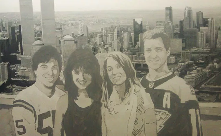
Here is a closeup of the father when he was young…

And then the mother…

The daughter…

And the son…

Here is a detail of New York City, with the Brooklyn Bridge in the background.

On the right side of the painting is Minneapolis, with that recognizable round tower…

The best part of the entire project was to deliver it to the client and later to see it hanging in his home. What a conversation piece!

Hope you enjoyed this post and have a blessed day,

P.S. Did you find this post helpful or encouraging? If so, send it on ahead! Let others know with the share buttons below. I’d love to hear your comments. Thank you so much!