Archive Monthly Archives: May 2019

Value vs. Color in an Acrylic Painting
One of the trickiest things about acrylic portrait painting, especially when using the glazing technique, is knowing how to achieve color. How many layers do you use?
I’ve said it before, and I’ll say it again. There is something more important than color, even skin tones in a portrait.
Here is a recent question from a subscriber:
Currently, I am working on a portrait of my friend’s grandfather. My reference photo is of him as a young man in his dress greens from his younger days in the Army. I really want to capture his likeness and be proud to present this to her as it is a gift for her mother but I’m finding myself “stuck” in a sense. From watching your videos and using the matte medium as a glazing technique, I am having trouble building up the layers of his uniform to the correct tone and shade of green. I find the medium lightens the acrylic paint. I’ve only applied one layer so I still have time to correct it before making a mess of it. Should I have painted in the dark value of his uniform before going in with a glaze to help it along or just keep applying layer after layer until the desired color is achieved?
Regarding your question–yes, you can keep building up the green glazes for his uniform. However, it’s best to think of values before color. What I mean is, you are right to think that you should have done the dark value of the uniform first. That’s exactly right.
The reason is, value is more important than color. Value (light and dark and the difference between them) describes all the contours and three dimensions of a face or body. If it weren’t for the strategic placement of those values, we wouldn’t know whether it was a person, animal, rock or tree that we painted.
Theoretically, you could have a person whose skin tone or clothing was a bit too red, or greenish–whatever–but it the values were accurate, it would still look human, and would look like a pretty good portrait. You can see in this painting I did, the colors are a bit too red. (I also intensified them on Photoshop, exaggerating them a bit to make a point.)
Acrylic portrait from photo by Matt Philleo, Eau Claire area portrait artist and instructor
But flip that around: make the skin tone or coloring right on, and the values completely off, and you will have a terrible portrait.
So, when I instruct my students in painting, I teach them to see the value structure first. We start off simple, using one or two colors, and then add as we go along. Much more important is seeing the overall lighting in the portrait–where the light source is, the darkest values (whether clothing, hair or just deep shadows, it makes no difference) and the mid-tones and capturing them faithfully. Of course, this assumes that you have the form correct. That is, that the proportions of the face and anatomy are accurate.
So, is your painting ruined? No, not at all. Just keep building up layers. But it helps to build up the darkest values first. Don’t neglect them. Think of your painting as an old polaroid photo. The print shoots out of the camera and fades in slowly, all together. You don’t get eyes, then hair, then a mouth, then the body. No. You get everything at once, but it’s all light. Then, in about 30 seconds, you have a print.
(Wow! Imagine that. I’m old enough to remember how cool it was to have an instant photo before digital cameras.) 🙂
So, you want to paint your painting like a polaroid. All at once, just fade everything in. As much as possible. That means that you hit those dark values first, and then work your way into the lighter ones.
As an example, let me show you this. Here is an image of how I did “Smoldering Wick,” an acrylic portrait illustrating a time when I struggled, and found encouragement in the scriptures.
All of these many layers is how you make an acrylic look like an oil. I learned this glazing technique several years ago from Norbert Kox, a university art professor. It made all the difference for me in my portrait painting with acrylic. Learning this technique and applying it will make the difference for you too.
If you’d like to learn more, sign up for my free email tips and videos today.
Learn How to Paint Acrylic Portraits With My Free Mini-Video Course!And of course, let me know if you have any questions or comments. I’ll be happy to help!
Yours for Better Portraits,

P.S. Did you find this post helpful or encouraging? If so, send it on ahead! Let others know with the share buttons below. I’d love to hear your comments. Thank you so much! Also, do you have a question on acrylic portrait painting you’d like answered? Let me know, and I’d be happy to help!

4 Questions About Acrylic Portrait Painting, Answered
Recently, I was asked some questions about acrylic portrait painting. I hope the answers I shared with this artist can be of help to you as well.
1. How do you prepare your canvas panel for painting with Acrylics?
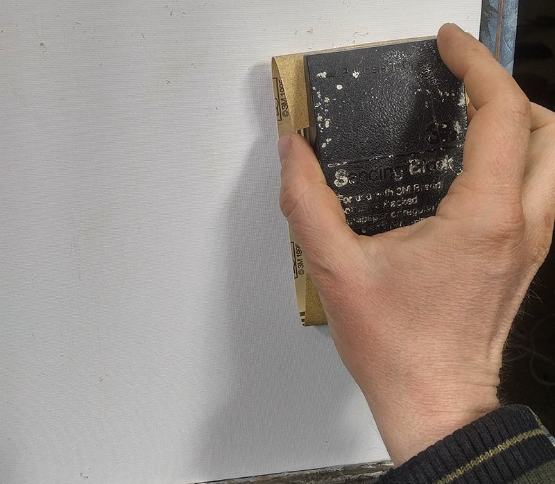
Sanding a canvas panel in preparation for painting an acrylic portrait
2. You spoke of layering your paint when composing a portrait. Please briefly explain.
I use the glazing technique to slowly bring the portrait from a white canvas to completion. The glazing technique is achieved by mixing your paint with clear acrylic medium (usually matte medium) to disperse the pigment, thus allowing light to pass through.
Although you could use water, it’s not recommended, because it breaks down the acrylic resin binder, causing a rough visual texture and possible poor adhesion. For a smoother look, you want to use clear acrylic medium.
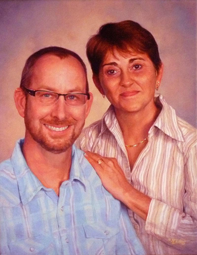
Custom commissioned realistic acrylic portrait from a photo painted by Eau Claire area artist Matt Philleo, ©2019 Fine Art by Matt Philleo
3. You mentioned using a Prismacolor pencil for making your diagram. What color do you recommend?
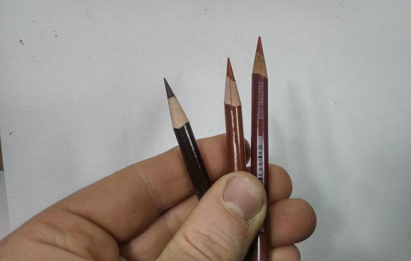
Using colored pencil for your acrylic portrait sketch makes things a lot easier. Technique discovered and developed by Matt Philleo.
4. Do you do the painting from start to finish in one setting?

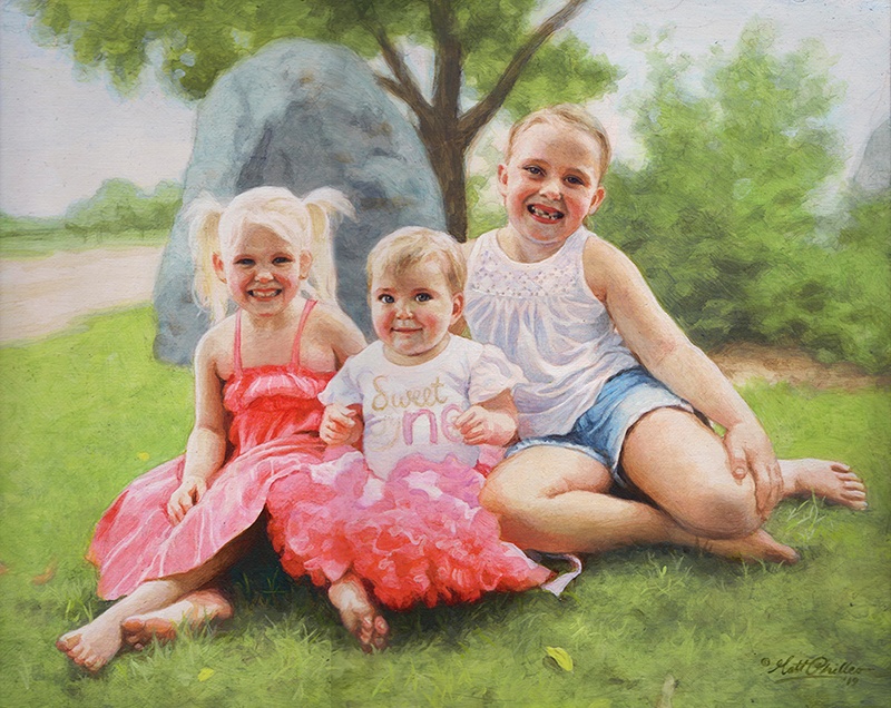
Acrylic portrait artist Matt Philleo posing in front of a 48″ x 72″ commission painting for a client in Brunei
I hope these questions and answers were helpful to you as well. I know some of this stuff seems pretty basic, but it’s good for all of us to pause and think about why we do what we do. It then makes the doing that much more significant.
Let me know if you have any questions of your own about acrylic portrait painting and I’ll do my best to help!
P.S. Did you find this post helpful or encouraging? If so, send it on ahead! Let others know with the share buttons below. I’d love to hear your comments. Thank you so much! Also, do you have a question on acrylic portrait painting you’d like answered? Let me know, and I’d be happy to help!

My New Studio Set-up and Latest Art
It’s been a while since I’ve posted to this blog! As you may already be aware, my family purchased a home about a month ago (April 2019) and moved in a couple of weeks ago.
God has blessed us with a beautiful home in the country, and a separate building for a studio after renting and working out of a small apartment for 16 years. You can read more about that here…http://mattphilleo.com/2019/04/19/telling-the-easter-story-through-a-big-painting/
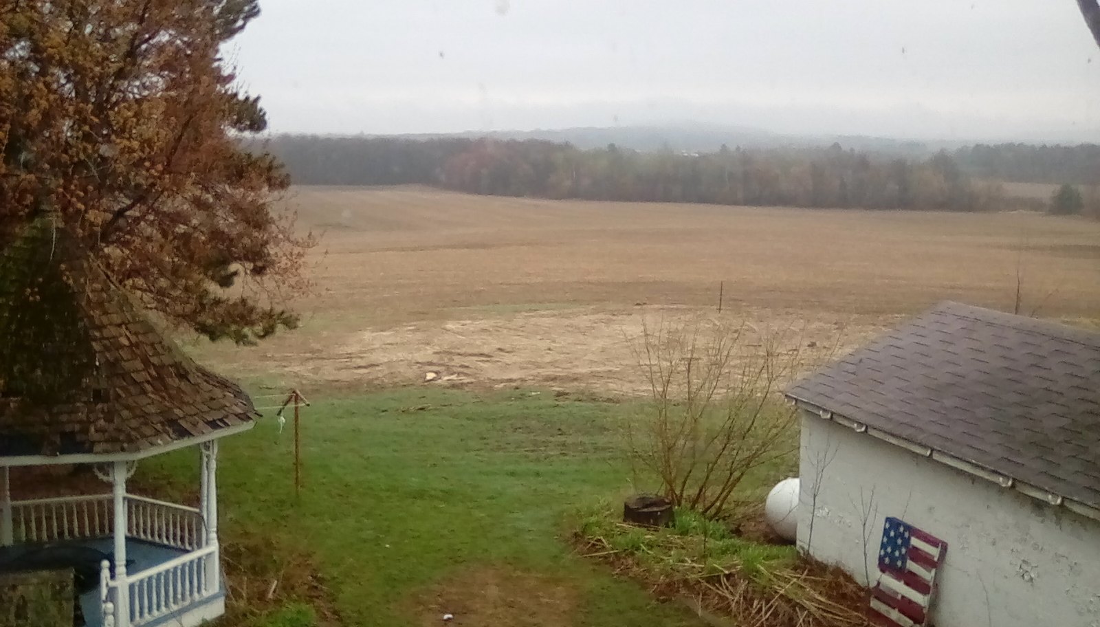
Fine Art by Matt Philleo studio, Town of Lafayette, Chippewa Falls, WI backyard
It was challenging to get internet access out in the country, but I found a solution through a wireless hotspot. I am finally connected!
This past week, I moved out my easel, art supplies, lighting, and computer and set it up in the new studio. I’m now at a place where I can paint and produce video tutorials again!
Acrylic portrait painter Matt Philleo in his new studio in Chippewa Falls WI, Eau Claire area by Autumn Harvest Winery and Orchard
Here is a mini-tour of the studio and a sneak peek at what I’m currently working on.
My new studio address is:
20109 30th Ave, Chippewa Falls, WI 54729 (about 1/2 mile past Autumn Harvest Winery & Orchard on County Rd. J / 30th Ave)
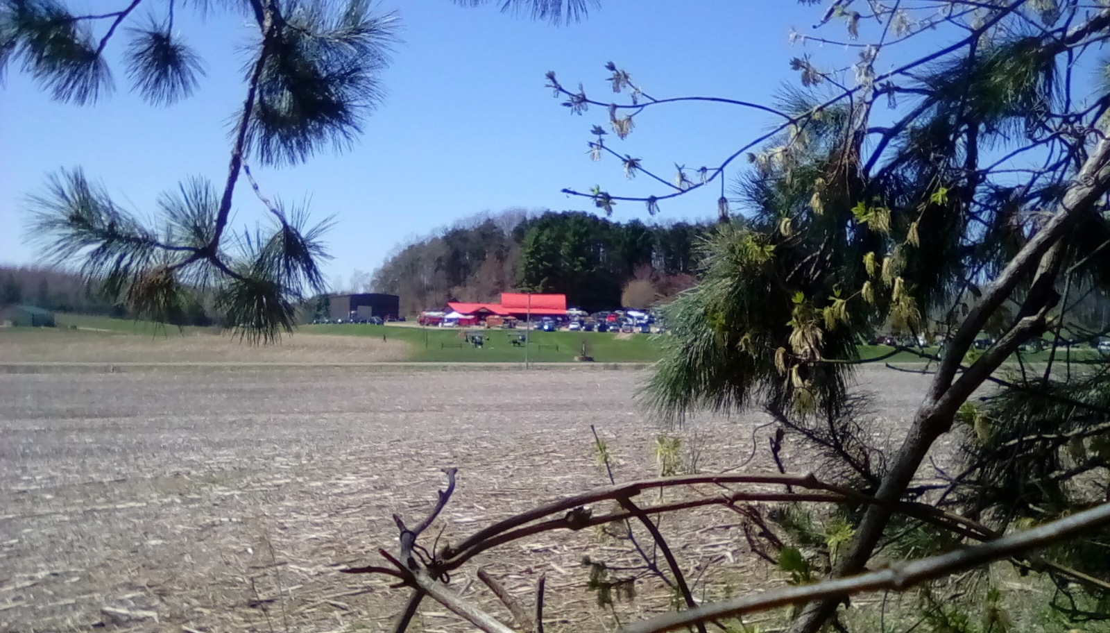
View of Autumn Harvest Winery and Orchard from Fine Art by Matt Philleo studio during their May 4, 2019 Season Opening Event
Have a blessed day as always and I’ll be in touch with my latest art and tutorials!
P.S. Did you find this post helpful or encouraging? If so, send it on ahead! Let others know with the share buttons below. I’d love to hear your comments. Thank you so much! Also, do you have a question on acrylic portrait painting you’d like answered? Let me know, and I’d be happy to help!