
Matte Medium vs. Gloss Medium for Acrylic Glazing
Students who are new to my glazing technique have a lot of questions. So many mediums to choose from. Which ones are best to use…and why?
That’s what I want to discuss today.
Here’s a portion of an email I got from one of my students:
As you know, I am currently working on your portrait course at the moment, however, I have a question that I hope you can clarify. All previous information I have looked up indicates that when applying glazes, acrylic matte medium dries cloudy and gloss medium dries clear and obviously glossy. Can you just explain it for me why we only use matte medium for glazing in your tutorial, as my initial thoughts would be that the cloudiness would just build up? Or am I just missing the l point in that this is how we build up the underpainting of the portrait? Many Thanks, R—
This is a good question.
So, what’s better for glazing? Matte medium or gloss medium?
Let me answer that with the reply I sent back to my student.
I use matte medium for three reasons:
1. It dries to a flat finish and so it doesn’t react with the lights in my studio, producing distracting glare.
2. Because it dries to a flat finish, it is closer to the sheen of paint, and so when you have areas that are more opaque and less opaque, they match up better. In other words, you can perceive the values more accurately. A glossy finish will make colors look more saturated and deepen values. When you put a varnish over the painting, it would present a problem, causing certain subtle nuances that seemed to look correct, suddenly become inaccurate. (Yes, this happened to me!)
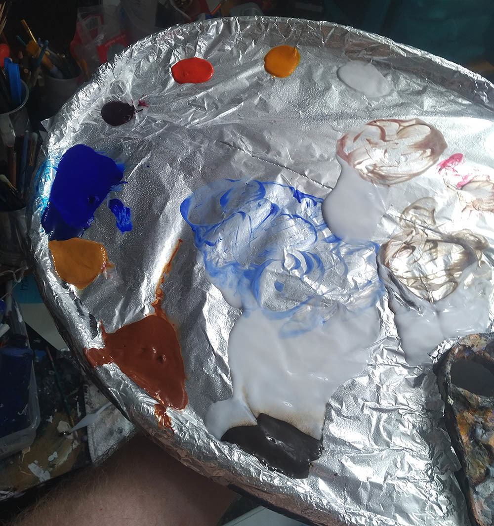
3. Matte medium is usually less expensive than gloss medium. With the copious amounts of medium that I use, this adds up!
Now, I don’t find that matte medium builds up cloudiness, in the way that I teach. It will get cloudy, if you have areas of your painting that are quite dark or saturated, and you overlap those areas with a very transparent (high ratio of matte medium to paint) glaze.
But I don’t do it that way in my paintings. Rather, I start off very transparent, (95-5) then shift to more translucent (80-20), and finally end up with semi-opaque layers (50-50) over portions of the work.
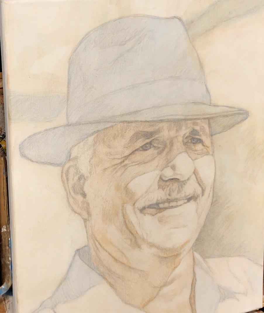
Acrylic portrait painting challenge example in progressm using the acrylic glazing technique, 16 x 20, acrylic on canvas by artist and instructor Matt Philleo
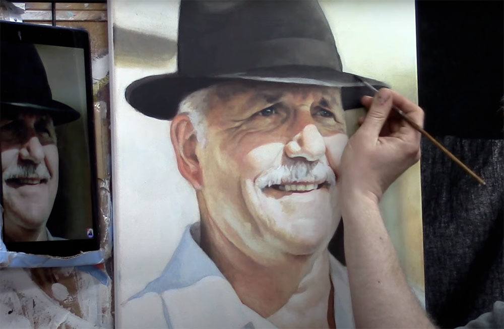
Matt Philleo painting an acrylic portrait from a photo for the Spring Portrait Painting Challenge ©2020 by Matt Philleo
This prevents that cloudiness from occurring and gives a rich saturation of color too. But we still retain the benefits of the smooth shading, vibrancy, and depth that glazing produces.
I finish my painting with a satin or semi-gloss varnish and that’s where we can add some extra saturation of value and vibrancy.
What is YOUR experience with acrylic mediums? Which do you prefer…and why? Let me know in the comments below.
Look forward to sharing more tips and tutorials with you.
Yours for Better Portraits,
![]()
If you found this post helpful or encouraging, would you send it on ahead? Let others know with the share buttons below. I’d love to hear your comments. Thank you so much!