Category Archives for Written Tutorial

How to do Portrait Adjustments: Here is the Step-by-Step Guide
Learn how to enhance value and color in your portraits with glazing techniques.
Introduction
Portrait painting is an intricate art that requires attention to detail, especially when it comes to adjusting values and colors. In this free guide, we’ll explore how to make nuanced adjustments to your portrait painting using glazing techniques. And based on insights from a recent tutorial. Whether you’re an experienced artist or a beginner, these tips will help you enhance your portraits and bring them to life.
Here is a step-by-step guide to portrait painting adjustments
Understand the basic of portrait painting adjustment
The key to successful portrait painting adjustments lies in an understanding of value and color. Value refers to the lightness or darkness of a color, while the color itself can be modified with tints (adding white) and shades (adding black). In this tutorial, the focus is on using glazes to make subtle adjustments that can significantly improve the overall look of your portrait.
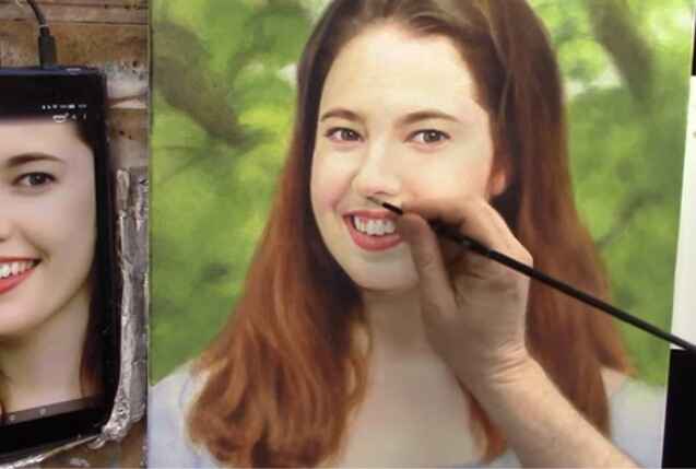
Step 1: Darkening the Right Eyelid Start with the right eyelid by using small round brushes. Mix both raw umber dark with a bit of napthol red and raw sienna. This combination creates a cooler tint that can be applied between the eyebrow and the eye. Transparent glazes can be used at any stage of the painting to add depth and adjust tones without overpowering the existing layers.
Step 2: Adjusting the Shadow Under the Nose Next, work on darkening the shadow under the nose. Use the same glaze mixture and add a touch of titanium white for smoothness. During this adjustment it requires patience, as it might take several layers to achieve the desired effect. The key is to apply the glaze lightly, blending with your finger to create a natural transition.
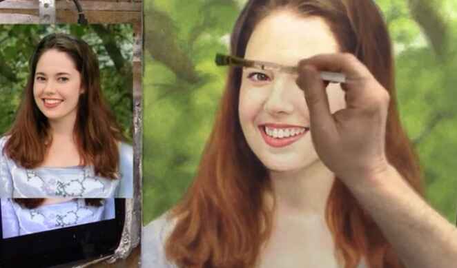
Step 3: Enhancing the Background Finally, focus on the background. Use a combination of ultramarine blue, Indian yellow, and raw sienna to create a rich, sap green color. Adding titanium white will cool and smooth out the glaze. Apply this selectively to darken areas and bring out the nuances in the background, creating a realistic depth of field.
Additional Tips:
- Use a value checker tool to evaluate your painting and identify areas needing adjustment. While not mandatory, it can provide an accurate measure for making precise changes. You can check my value checker and get it for free.
- Darker values in your painting should generally be cooler in tone to maintain a balanced look.
- Be patient with the process, as building up layers gradually will yield the best results.
Adjusting values and colors in your portraits can transform them from good to extraordinary. By following these acrylic glazing techniques and being mindful of value and color, you’ll be able to enhance your portraits with ease. Keep practicing and experimenting with different mixtures to find what works best for your unique style. Happy painting!
With these insights and techniques, you’re now equipped to make impactful adjustments to your portrait paintings. Remember, art is a journey, and as a result, each stroke brings you closer to mastering your portrait painting.
Watch the Process
For a detailed guide, watch the complete video tutorial below.
LEARN MORE
- Sketching Your Painting Accurately
- Beginning a Pet Portrait in Acrylic
- The Mystery of Realism in Painting
- Apply A Burnt Sienna Glaze to a Portrait
- Learn How to Sketch a Portrait Freehand in 45 Minutes
- Adding highlights to your acrylic painting
- 5 Excellent Reasons to Use Aluminum Foil
- Paint Realistic Wrinkles in Acrylic
- Painting Clothing in an Acrylic Portrait
- Paint a Cloudy Sky Acrylic
- How to add Semi-Opaque Highlights
- How to Enhance the Contrast in Your Acrylic
- How to Add Glaze to Your Acrylic Painting
- Paint Realistic Reflections on Eyeglasses in an Acrylic Portrait
- Build Up Depth on Your Acrylic Portrait Backgrounds
- How Do You Do Layers With the Glazing Technique?
- Learn How to Paint Wrinkles in Acrylic
Read more about how to paint a portrait that you can surely be proud of!
I’d love to hear your thoughts on this video. Please share it with your friends and family. Let me know if you have any further questions. I’ll greatly help you.
If you’d like to learn more, sign up for my free email tips and video class today.
Learn How to Paint Acrylic Portraits With My Free Mini-Video Course!
Thank you so much for taking the time to read this tutorial and watch the video. That means a lot to me. I hope you find it very helpful in your portrait painting.
Yours for Better Portraits,

P.S. Did you find this post helpful or encouraging? If so, send it in ahead! Let others know with the share buttons below. I’d love to hear your comments. Thank you so much! Also, do you have a question on acrylic portrait painting you’d like answered? Let me know, and I’d be happy to help!

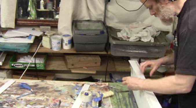
7 Best Ways To Ship Your Acrylic Paintings Secure!
Securely package your portrait for safe delivery with these step-by-step guide
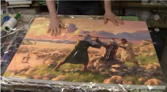
Here are the 7 best ways to ship your large acrylic paintings securely!
Shipping large paintings, especially delicate acrylic paintings, requires careful attention to detail to ensure they arrive safely. As a professional artist, I’ve developed an effective method for packaging large paintings that minimizes the risk of damage during transit. Whether you’re shipping acrylic or oil paintings, follow these step-by-step instructions to protect your artwork and ensure it reaches its destination in perfect condition.
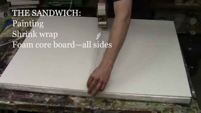
Step 1: Shrink Wrap the Painting
Start by wrapping your painting in shrink wrap to create a protective barrier. Place the painting face down and cover it completely with shrink wrap. This initial layer shields the surface of the artwork from scratches and scuffs. Fold the shrink wrap over and secure it with packaging tape. There’s no need to use a heat gun; the wrap should be tight enough to protect the painting.
Step 2: Add Foam Core
Lay the shrink-wrapped painting on top of two pieces of foam core. These will serve as the first protective layer. Fold the shrink wrap over the foam core and tape it in place. The foam core provides cushioning and prevents the painting from moving inside the package.
Step 3: Protect the Edges
Cut strips of foam core to match the thickness of your canvas (typically around one inch). Tape these strips along the edges of the painting to create a protective buffer. This step ensures that the edges of the canvas are well protected and reduces the risk of dents or damage during shipping.
Step 4: Add Hardboard and Styrofoam
Sandwich the painting between two pieces of hardboard. The hardboard provides a sturdy protective layer that reinforces the package. Next, add two pieces of Styrofoam insulation board (3/4 inch to 1 inch thick) on either side of the hardboard. The Styrofoam offers additional cushioning and shock absorption.
Step 5: Encase in Cardboard
Wrap the entire package in a large piece of cardboard. If you don’t have a single piece large enough, you can piece together several smaller pieces. Use a utility knife to cut and crease the cardboard, ensuring it fits snugly around the package. Secure the cardboard with packaging tape, making sure all sides and corners are well protected.
Step 6: Secure with Additional Tape
Once the cardboard is in place, reinforce all edges and corners with extra layers of packaging tape. Pay special attention to the corners, as they are more susceptible to damage. Ensure the tape is applied smoothly and firmly to prevent the package from coming apart during transit.
Step 7: Label and Ship
Finally, attach the shipping label to the package. It’s a good idea to add “Fragile” and “Handle with Care” stickers to alert the shipping company that the contents are delicate. Choose a reliable shipping service that offers tracking and insurance to safeguard your artwork.
Additional Tips for Safe Shipping
- Insurance: Always insure your painting for its full value. In case of any damage or loss, insurance will provide coverage for your artwork.
- Documentation: Include a packing list and documentation inside the package with details of the painting, your contact information, and the recipient’s information.
- Weather Considerations: If you’re shipping during extreme weather conditions, be mindful of temperature fluctuations and humidity, as they can affect the painting.
- Communication: Inform the recipient about the delivery date and provide them with the tracking number. This helps ensure that someone is available to receive the package promptly.
- Test the Packaging: Before shipping, gently shake the package to check if there’s any movement inside. If you hear or feel movement, add more padding to secure the painting further.
By following these steps and tips, you can ship your large acrylic paintings with confidence, knowing they are well-protected against potential damage. This packaging step-by-step guide has been tested and proven effective, ensuring your artwork arrives safely at its destination.
DISCLAIMER: I cannot be held responsible for damages incurred while using this method of shipping. It is just what has worked well for me. Also, purchasing insurance is advisable any time you ship an expensive painting.
I hope this guide has been helpful. If you have any questions or need further assistance, feel free to reach out. Safe shipping!
Watch my video below for the process on how I did it.
LEARN MORE
- Sketching Your Painting Accurately
- Beginning a Pet Portrait in Acrylic
- The Mystery of Realism in Painting
- Apply A Burnt Sienna Glaze to a Portrait
- Learn How to Sketch a Portrait Freehand in 45 Minutes
- Adding highlights to your acrylic painting
- 5 Excellent Reasons to Use Aluminum Foil
- Paint Realistic Wrinkles in Acrylic
- Painting Clothing in an Acrylic Portrait
- Paint a Cloudy Sky Acrylic
- How to add Semi-Opaque Highlights
- How to Enhance the Contrast in Your Acrylic
- How to Add Glaze to Your Acrylic Painting
- Paint Realistic Reflections on Eyeglasses in an Acrylic Portrait
- Build Up Depth on Your Acrylic Portrait Backgrounds
- How Do You Do Layers With the Glazing Technique?
- Learn How to Paint Wrinkles in Acrylic
Read more about how to paint a portrait that you can surely be proud of!
I’d love to hear your thoughts on this video. Please share it with your friends and family. Let me know if you have any further questions. I’ll greatly help you.
If you’d like to learn more, sign up for my free email tips and video class today.
Learn How to Paint Acrylic Portraits With My Free Mini-Video Course!
Thank you so much for taking the time to read this tutorial and watch the video. That means a lot to me. I hope you find it very helpful in your portrait painting.
Yours for Better Portraits,

P.S. Did you find this post helpful or encouraging? If so, send it in ahead! Let others know with the share buttons below. I’d love to hear your comments. Thank you so much! Also, do you have a question on acrylic portrait painting you’d like answered? Let me know, and I’d be happy to help!

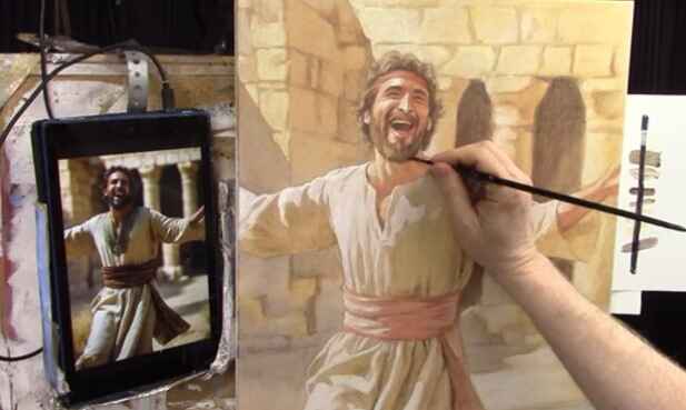
How To Use Contrast And Vibrancy: Acrylic Grisaille Technique
Unlock the secrets to dynamic paintings with the acrylic grisaille technique
Discover how to bring your portrait to life with vibrant contrasts and nuanced details using the acrylic grisaille technique.
In the realm of acrylic painting, learning the art of contrast and vibrancy can elevate your work to new heights. In this tutorial, we delve into the acrylic grisaille technique, a method that adds depth, richness, and dynamic energy to your paintings. Follow along as we explore the final steps in creating a painting of King David dancing as the Arc of the Covenant returns to Jerusalem.
What is the acrylic grisaille technique?
The acrylic grisaille technique begins with a monochromatic underpainting, typically done in shades of gray or sepia. This foundation allows artists to focus on values and contrasts without the distraction of color. Once the grisaille layer is complete, transparent glazes of color are applied, building up layers to create a rich and vibrant final image.
Enhancing Contrast and Vibrancy
In this demonstration, the artist uses a variety of techniques to enhance the contrast and vibrancy of the painting:
- Adding Halation for Vibrancy: Halation involves adding vibrant colors to the areas where bright highlights meet darker tones. By mixing organic orange, Indian yellow, and titanium white, the artist creates a glowing effect that makes the white clothing of King David pop against the background.
- Layering Glazes: Multiple glazes of color are applied over the sepia-toned underpainting. This layering process builds depth and richness, allowing the artist to fine-tune the vibrancy of the painting.
- Nuanced Details: Small round brushes are used to add intricate details and highlights, particularly in areas of high contrast. These details draw the viewer’s eye and add a sense of realism and movement to the painting.

Step-by-Step Process
- Prepare the Underpainting: Start with a monochromatic sepia tone. Focus on establishing the values and contrasts that will guide the final image.
- Mix Vibrant Colors: Create a mix of organic orange, Indian yellow, and titanium white. Adjust the strength of the color to suit the desired level of vibrancy.
- Apply Halation Effects: Carefully apply the vibrant mix to the edges of bright highlights. This technique enhances the contrast and makes the lighter areas stand out more vividly.
- Layer Glazes: Apply transparent glazes over the underpainting. Use a combination of colors to build depth and richness, allowing each layer to dry before adding the next.
- Add Nuanced Details: Use small brushes to add highlights and details. Focus on areas of high contrast to draw the viewer’s eye and add a sense of movement and realism.
Final Touches
The final steps involve signing the painting and adding any last-minute highlights or details. The artist emphasizes the importance of placing the signature in a way that complements the composition, ensuring it is visible but not intrusive
By learning the acrylic grisaille technique, you, as artists, can create paintings that are not only visually striking but also rich in depth and detail. Whether you are a seasoned artist or a beginner, these tips and techniques will help you bring your portrait to life.
For more detailed tutorial, watch the video below: Finishing the Painting of King David Dancing in Jerusalem (Acrylic Grisaille Technique)
LEARN MORE
- Sketching Your Painting Accurately
- Beginning a Pet Portrait in Acrylic
- The Mystery of Realism in Painting
- Apply A Burnt Sienna Glaze to a Portrait
- Learn How to Sketch a Portrait Freehand in 45 Minutes
- Adding highlights to your acrylic painting
- 5 Excellent Reasons to Use Aluminum Foil
- Paint Realistic Wrinkles in Acrylic
- Painting Clothing in an Acrylic Portrait
- Paint a Cloudy Sky Acrylic
- How to add Semi-Opaque Highlights
- How to Enhance the Contrast in Your Acrylic
- How to Add Glaze to Your Acrylic Painting
- Paint Realistic Reflections on Eyeglasses in an Acrylic Portrait
- Build Up Depth on Your Acrylic Portrait Backgrounds
- How Do You Do Layers With the Glazing Technique?
- Learn How to Paint Wrinkles in Acrylic
Read more about how to paint a portrait that you can surely be proud of!
I’d love to hear your thoughts on this video. Please share it with your friends and family. Let me know if you have any further questions. I’ll greatly help you.
If you’d like to learn more, sign up for my free email tips and video class today.
Learn How to Paint Acrylic Portraits With My Free Mini-Video Course!
Thank you so much for taking the time to read this tutorial and watch the video. That means a lot to me. I hope you find it very helpful in your portrait painting.
Yours for Better Portraits,

P.S. Did you find this post helpful or encouraging? If so, send it in ahead! Let others know with the share buttons below. I’d love to hear your comments. Thank you so much! Also, do you have a question on acrylic portrait painting you’d like answered? Let me know, and I’d be happy to help!

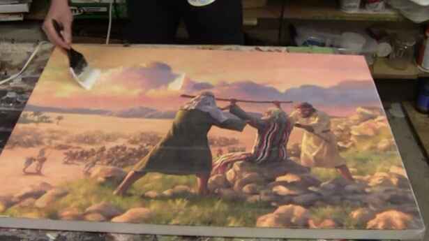
How To Varnish Your LARGE Acrylic Painting
How do you achieve long-lasting protection for your large acrylic portrait?
Introduction
Varnishing your acrylic painting is an essential step to protect it and give it a professional finish. In this guide, we’ll cover how to varnish a large acrylic painting, ensuring your artwork looks its best and remains protected for years to come.
Why is varnishing your large acrylic portrait important?
Varnishing your painting not only enhances its appearance by evening out the sheen but also protects it from UV rays, dust, and scratches. It adds a professional touch, making your artwork look polished and complete.
Supplies You’ll Need
Before you start varnishing, gather the following supplies:
- Varnishing Brush: A large 10-inch brush is ideal for covering large areas quickly and evenly.
- Matte Varnish: Opt for a high-quality matte varnish. A satin finish can provide a subtle shine without being too glossy.
- Container: Use a clean container for your varnish. An old yogurt container works well.
- Stir Stick: Ensure the varnish is well-mixed before application.
- Rag: Keep a rag handy for wiping off any drips.
- Pipe Wrench: This might be necessary to open a stuck varnish container.
Preparation Steps
- Stir the Varnish: Over time, varnish can separate. Stir it thoroughly with a stir stick to ensure it’s well-mixed. If stirring isn’t an option, gently shake the container.
- Clean Your Canvas: Wipe off any dust or debris from your painting using a clean rag. This step is crucial to avoid trapping particles under the varnish.
- Lay the Canvas Flat: Position your painting flat on a table to prevent drips and ensure an even application.
Applying the Varnish
- Start Far Away: Begin varnishing from the farthest point on the painting and work your way towards yourself. This method helps avoid drips and ensures a smooth application.
- Dip and Brush: Dip your brush into the varnish container, ensuring both sides are evenly coated. Start about a quarter of the way from the edge and brush across the canvas.
- Smooth Strokes: Use long, smooth strokes to apply the varnish. Avoid overbrushing, which can cause streakiness.
- Overlap Strokes: Slightly overlap each stroke to ensure even coverage. Reload your brush as needed.
- Wipe Drips: Wipe off any drips that occur on the sides of the painting using a rag.
Tips and Techniques
- Don’t Overbrush: Overbrushing can lead to cloudiness and streakiness. Apply the varnish in one or two smooth strokes and leave it to dry.
- Keep a Wet Edge: Maintain a wet edge as you work to prevent the varnish from drying too quickly and causing streaks.
- Check for Streaks: Pay extra attention to dark areas of the painting, where streaks are more visible.
- Drying Time: Allow the varnish to dry for a few hours. It should be dry to the touch within an hour and fully dry within four hours, depending on the temperature and humidity.
Common varnishing your large acrylic portraits mistakes to avoid
Varnishing can be a straightforward process, but there are common mistakes that can be easily avoided with a bit of caution:
- Skipping the Stirring: Always stir your varnish before application to avoid uneven sheen and consistency.
- Overbrushing: Applying too many strokes can cause the varnish to become cloudy. Less is more in this case.
- Incorrect Drying Position: Never dry your painting vertically. Always lay it flat to prevent drips and runs.
- Ignoring Dust: Ensure your work area and canvas are dust-free before starting to varnish. Dust particles can become trapped and ruin the smooth finish.
Frequently asked questions about varnishing large acrylic paintings
1. What kind of varnish do I use?
For varnishing large acrylic paintings, I recommend using a matte varnish, specifically one that dries to a satin finish. I use a matte varnish from Nova Color, which comes in gallon jugs that I transfer into quart-sized containers for easier use. This type of varnish not only enhances the appearance of your painting but also provides UV protection and a professional finish.
2. What kind of brush?
A large brush is essential for varnishing large paintings effectively. I use a 10-inch Liquitex varnishing brush. This brush covers a lot of ground quickly and ensures an even application of the varnish. It’s important to have a brush that’s wide enough to make long, smooth strokes across your canvas.
3. Should I use an isolation coat?
In my process, I do not use an isolation coat. Instead, I treat the varnish layer as another layer of acrylic. The reason behind this is the flexibility to restore or touch up the painting if needed. Since the matte varnish is essentially clear acrylic without pigment, it can be painted over if any issues arise over time.
4. How should I apply the varnish?
To apply the varnish, follow these steps:
- Start by wiping off any dust from the canvas with a clean brush or cloth.
- Lay your canvas flat on a table to prevent drips.
- Stir the varnish well to mix any separated components.
- Pour a small amount of varnish into a container.
- Dip your brush into the varnish and start applying it from the area farthest away from you, working your way inward.
- Use long, even strokes and avoid overbrushing to prevent streakiness and cloudiness.
- Overlap your strokes slightly and lift the brush at the end of each stroke to maintain a wet edge.
- Allow the varnish to dry completely, which usually takes a few hours for a large painting.
5. Why should I varnish a painting in the first place?
Varnishing your painting serves several important purposes:
- It enhances the overall appearance by evening out the sheen and bringing out the colors.
- It provides a protective layer against UV rays, dust, and other environmental factors.
- It gives your artwork a professional finish, making it more appealing to clients and viewers.
- It helps preserve the painting over time, ensuring it looks its best for years to come.
6. How often should I varnish my paintings?
Once varnished, your painting typically does not need to be re-varnished. However, if the varnish gets damaged or wears off over time, you can apply another coat after proper cleaning.
7. Can I use the same varnish for all my paintings?
It depends on the finish you desire. Matte varnish provides a non-reflective finish, while gloss varnish gives it a shiny appearance. Choose the varnish based on your preference for each artwork.
8. What if I make a mistake while varnishing?
If you notice a mistake while the varnish is still wet, you can carefully remove it with a damp cloth and reapply it. Once dry, mistakes can be challenging to fix, so it’s best to apply varnish carefully and avoid overbrushing.
Watch the full video tutorial below!
Varnishing your large acrylic painting is a crucial step in preserving and enhancing its beauty. By following these steps and tips, you can achieve a professional finish that protects your artwork and makes it shine. Remember to gather your supplies, prepare your canvas, and apply the varnish with care. Happy painting!
LEARN MORE
- Sketching Your Painting Accurately
- Beginning a Pet Portrait in Acrylic
- The Mystery of Realism in Painting
- Apply A Burnt Sienna Glaze to a Portrait
- Learn How to Sketch a Portrait Freehand in 45 Minutes
- Adding highlights to your acrylic painting
- 5 Excellent Reasons to Use Aluminum Foil
- Paint Realistic Wrinkles in Acrylic
- Painting Clothing in an Acrylic Portrait
- Paint a Cloudy Sky Acrylic
- How to add Semi-Opaque Highlights
- How to Enhance the Contrast in Your Acrylic
- How to Add Glaze to Your Acrylic Painting
- Paint Realistic Reflections on Eyeglasses in an Acrylic Portrait
- Build Up Depth on Your Acrylic Portrait Backgrounds
- How Do You Do Layers With the Glazing Technique?
- Learn How to Paint Wrinkles in Acrylic
Read more about how to paint a portrait that you can surely be proud of!
I’d love to hear your thoughts on this video. Please share it with your friends and family. Let me know if you have any further questions. I’ll greatly help you.
If you’d like to learn more, sign up for my free email tips and video class today.
Learn How to Paint Acrylic Portraits With My Free Mini-Video Course!
Thank you so much for taking the time to read this tutorial and watch the video. That means a lot to me. I hope you find it very helpful in your portrait painting.
Yours for Better Portraits,

P.S. Did you find this post helpful or encouraging? If so, send it in ahead! Let others know with the share buttons below. I’d love to hear your comments. Thank you so much! Also, do you have a question on acrylic portrait painting you’d like answered? Let me know, and I’d be happy to help!

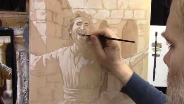
How To Build Depth And Shading In A Narrative Painting
Enhance depth and drama in your paintings with renaissance techniques
Creating a narrative painting that conveys a powerful story and emotion requires mastering depth and shading. In this tutorial, we will explore how to build up shading and depth in a portrait, focusing on the painting of King David dancing as the Ark of the Covenant enters Jerusalem. Using Renaissance techniques, we’ll transform a monochromatic underpainting into a vibrant, expressive work of art.
Understanding the Basics: The Underpainting
The foundation of this painting begins with a monochromatic underpainting, also known as a “grisaille.” This involves using just three tones: darks, highlights, and midtones. For this portrait, we used a combination of ultramarine blue, organic orange, Napthol red, and burnt sienna to develop the skin tones, contrasting them with the clothing.
Preparing Your Palette
Start by setting up your palette with the following colors:
- Raw Umber Dark
- Burnt Sienna
- Raw Sienna
- Phthalo Blue
- Ultramarine Blue
- Alizarine Crimson
- Napthol Red
- Organic Orange
- Indian Yellow
- Titanium White
Step 1: Monochromatic Underpainting
Start with a monochromatic underpainting, using three different tones: dark tones, highlights, and midtones. This step is crucial as it sets the foundation for the colors and shading that will follow. For this painting, the underpainting is created using raw umber dark, focusing on capturing the facial expressions and basic forms.
Step 2: Adding Color Glazes
With the underpainting complete, begin adding color glazes to develop the skin tones and separate different elements of the painting.
Skin Tones:
- Mix ultramarine blue, organic orange, and Naphthol red with a bit of burnt sienna.
- Apply these glazes to create a natural skin tone, ensuring to differentiate the skin from the clothing.
Hair and Beard:
- Use a mix of raw umber dark, ultramarine blue, and alizarine crimson to darken the beard and shadows inside the temple.
- This mix creates a rich, dark hue that enhances the depth of the facial features.
Step 3: Enhancing Depth with Glazes
The key to achieving depth is the strategic placement of glazes. Use matte medium to thin your paint and create transparent layers.
Eyes and Eyebrows:
- Apply a darker glaze to the eyes and eyebrows using raw umber dark mixed with ultramarine blue and alizarine crimson.
- Focus the glaze on specific areas, such as the middle of the eyebrows, to create a sense of shading and depth.
Nose and Mouth:
- Darken the nasal labial folds and the interior of the mouth with the same glaze mixture.
- This step accentuates the expressions and adds realism to the painting.
Step 4: Balancing Shadows and Highlights
When placing glazes, ensure that the dark values are consistently applied throughout the painting. This consistency is crucial for creating a cohesive look.
Clothing and Background:
- Identify areas in the reference photo where shadows naturally fall, such as above the sash and by the armpits.
- Apply glazes to these areas to enhance the contrast and depth.
Structural Elements:
- Darken areas within the background structure, such as the temple’s pillars, to balance the dark values in the figure.
- Use short, choppy brush strokes to push the paint into the canvas weave, then smooth it out with longer strokes.
Step 5: Customizing Colors and Textures
To achieve the right temperature and tone, customize your black and grey hues by varying the mix of raw umber dark, ultramarine blue, and alizarine crimson.
Temperature Control:
- Test the color mixture on a white card to gauge its warmth or coolness.
- Adjust by adding more ultramarine blue for cooler tones or more raw umber dark and alizarine crimson for warmer hues.
Step 6: Final Touches
As you near completion, focus on the fine details and textures.
Facial Hair:
- Add texture to the mustache and sideburns to ensure they blend naturally with the rest of the beard.
- Use a dry brushing technique to create subtle gradations and shading on the perimeter edges of the face.
Clothing and Accessories:
- Darken areas on the clothing that need more shadow to enhance the three-dimensional effect.
- Use controlled brush strokes to ensure precision and consistency.
Tips and Techniques for Mastering Glazing
- Layering: Build layers gradually to control the depth and richness of colors. Each layer should be thin and transparent.
- Color Mixing: Experiment with different combinations of colors to create custom blacks and grays. This adds uniqueness to your painting.
- Brush Pressure: Vary the pressure on your brush to achieve different textures. Light pressure can create a dry brushing effect, perfect for subtle shading.
- Matte Medium: Use matte medium to thin your paint and create glazes. It helps in achieving smooth transitions and blending.
- Reference Photos: Always use a reference photo to guide your shading and ensure realistic light and shadow play.
Building depth and shading in a narrative painting, like this portrait of King David, requires patience and strategic application of glazes. By following these steps and techniques, you can create paintings that not only tell a story but also captivate viewers with their depth and realism.
LEARN MORE
- Sketching Your Painting Accurately
- Beginning a Pet Portrait in Acrylic
- The Mystery of Realism in Painting
- Apply A Burnt Sienna Glaze to a Portrait
- Learn How to Sketch a Portrait Freehand in 45 Minutes
- Adding highlights to your acrylic painting
- 5 Excellent Reasons to Use Aluminum Foil
- Paint Realistic Wrinkles in Acrylic
- Painting Clothing in an Acrylic Portrait
- Paint a Cloudy Sky Acrylic
- How to add Semi-Opaque Highlights
- How to Enhance the Contrast in Your Acrylic
- How to Add Glaze to Your Acrylic Painting
- Paint Realistic Reflections on Eyeglasses in an Acrylic Portrait
- Build Up Depth on Your Acrylic Portrait Backgrounds
- How Do You Do Layers With the Glazing Technique?
- Learn How to Paint Wrinkles in Acrylic
Read more about how to paint a portrait that you can surely be proud of!
I’d love to hear your thoughts on this video. Please share it with your friends and family. Let me know if you have any further questions. I’ll greatly help you.
If you’d like to learn more, sign up for my free email tips and video class today.
Learn How to Paint Acrylic Portraits With My Free Mini-Video Course!
Thank you so much for taking the time to read this tutorial and watch the video. That means a lot to me. I hope you find it very helpful in your portrait painting.
Yours for Better Portraits,

P.S. Did you find this post helpful or encouraging? If so, send it in ahead! Let others know with the share buttons below. I’d love to hear your comments. Thank you so much! Also, do you have a question on acrylic portrait painting you’d like answered? Let me know, and I’d be happy to help!

How to Add Color Glazes in Acrylic to Your Grisaille
Learn how to enhance your grisaille with color glazes for a vibrant finish
Introduction
Adding color glazes to a grisaille painting is a transformative technique that can infuse your artwork with vibrant hues and rich textures. This process, rooted in historical painting methods, allows artists to achieve a remarkable depth of color and detail. In this guide, we’ll explore the step-by-step method for applying color glazes over a grisaille base, helping you bring your acrylic paintings to life with stunning results.
Understanding Grisaille
Grisaille is a monochromatic painting technique using shades of gray to create a value study. Historically, Old Masters employed this method to establish the tonal structure of their paintings before applying color. This monochromatic layer acts as a foundation, providing a strong value structure that guides the application of subsequent color layers.
Why Use Grisaille?
Using grisaille as a foundation that allows artists to focus on value and composition without being distracted by color. It’s an effective way to ensure that your painting has a strong structure before introducing color glazes.
Materials Needed
- Acrylic Paints: Titanium White, Raw Umber, Burnt Sienna, Indian Yellow, Ultramarine Blue, Phthalo Blue, Napthol Red
- Matte Medium: To mix with the paint for glazing
- Brushes: Flat and round brushes for different applications
- Palette: For mixing paints and mediums
- White Card: For testing glaze colors
Step-by-Step Guide to Adding Color Glazes
- Prepare Your Grisaille Base
Ensure your grisaille painting is fully dried before beginning the glazing process. The grisaille layer should have clear contrasts between light and dark areas, establishing a solid value foundation. - Mix Your Glaze
Glazing involves mixing a small amount of acrylic paint with a larger quantity of matte medium. The matte medium dilutes the paint, creating a translucent layer that allows the underlying grisaille to show through. For skin tones, mix Burnt Sienna with a touch of Organic Orange and Raw Sienna to create a warm, earthy color. For background elements, combine Raw Sienna and Indian Yellow for a warm, golden hue. - Apply the First Glaze Layer
Start by applying a thin glaze of the mixed color over specific areas, such as skin tones or clothing. Use a light brush with minimal pressure to ensure the glaze is even and translucent. For example, apply a faint Burnt Sienna glaze to the skin areas to introduce warmth and create subtle tonal variations. - Layering and Building Up Color
Allow each glaze layer to dry completely before applying subsequent layers. Build up color gradually, adjusting the intensity as needed. For example, apply additional layers of Raw Sienna to the background to deepen the color and create a more unified look. Incorporate cooler tones like Ultramarine Blue and Phthalo Blue for areas affected by the sky, adding a sense of atmosphere and depth. - Refining Details
Use a smaller brush to apply color glazes to specific details, such as shadows and highlights. For instance, use a mix of Napthol Red and Burnt Sienna for the sash, ensuring a warmer tone in the shadowed areas and a more vibrant color in the highlights. This approach helps to differentiate between various elements and adds richness to the painting. - Blending and Adjusting Colors
As you apply the glazes, step back frequently to assess the overall effect. Adjust colors as needed to ensure harmony and balance. For example, if the background appears too warm, tone it down with a cooler glaze. Conversely, enhance warm areas with additional glazes to achieve the desired effect. - Final Touches
After completing the glazing process, evaluate your painting for any final adjustments. Add finishing touches to enhance specific areas or correct any imbalances. Ensure that the color glazes blend seamlessly with the underlying grisaille, creating a cohesive and vibrant final piece.
Tips for Successful Glazing
- Test Glazes First: Use a white card to test glaze mixtures and ensure the desired color and transparency.
- Work in Thin Layers: Apply glazes in thin, translucent layers to maintain the depth and value of the grisaille layer.
- Allow Drying Time: Ensure each glaze layer is completely dry before applying the next to avoid muddying the colors.
- Use Appropriate Brushes: Choose brushes suitable for glazing to achieve smooth, even applications.
Incorporating color glazes into your grisaille paintings is a powerful technique that adds complexity and vibrancy to your artwork. By following these steps and employing careful color mixing and layering, you can achieve stunning results that bring your acrylic paintings to life. Experiment with different colors and glazes to discover unique effects and enhance your artistic skills.
LEARN MORE
- Sketching Your Painting Accurately
- Beginning a Pet Portrait in Acrylic
- The Mystery of Realism in Painting
- Apply A Burnt Sienna Glaze to a Portrait
- Learn How to Sketch a Portrait Freehand in 45 Minutes
- Adding highlights to your acrylic painting
- 5 Excellent Reasons to Use Aluminum Foil
- Paint Realistic Wrinkles in Acrylic
- Painting Clothing in an Acrylic Portrait
- Paint a Cloudy Sky Acrylic
- How to add Semi-Opaque Highlights
- How to Enhance the Contrast in Your Acrylic
- How to Add Glaze to Your Acrylic Painting
- Paint Realistic Reflections on Eyeglasses in an Acrylic Portrait
- Build Up Depth on Your Acrylic Portrait Backgrounds
- How Do You Do Layers With the Glazing Technique?
- Learn How to Paint Wrinkles in Acrylic
Read more about how to paint a portrait that you can surely be proud of!
I’d love to hear your thoughts on this video. Please share it with your friends and family. Let me know if you have any further questions. I’ll greatly help you.
If you’d like to learn more, sign up for my free email tips and video class today.
Learn How to Paint Acrylic Portraits With My Free Mini-Video Course!
Thank you so much for taking the time to read this tutorial and watch the video. That means a lot to me. I hope you find it very helpful in your portrait painting.
Yours for Better Portraits,

P.S. Did you find this post helpful or encouraging? If so, send it in ahead! Let others know with the share buttons below. I’d love to hear your comments. Thank you so much! Also, do you have a question on acrylic portrait painting you’d like answered? Let me know, and I’d be happy to help!

How To Add Dark Contrast: Acrylic Grisaille Painting
Learn the grisaille that enhances depth and dimension with dark contrast in acrylic painting
Adding dark contrast to your painting is essential for creating depth and dimension, especially in grisaille painting. Grisaille is a monochromatic painting technique that uses shades of gray to create a detailed underpainting, which can then be glazed with color.
This method, reminiscent of the techniques used by the old masters like Caravaggio, allows artists to achieve a high level of realism and tonal complexity. In this tutorial, we will explore how to effectively add dark tonal values to your acrylic grisaille painting, enhancing your portrait with rich contrast.
Understanding Grisaille Painting
Grisaille painting involves creating a detailed monochromatic underpainting that serves as a foundation for further color glazes. The technique is particularly useful for developing a strong value structure in your painting. When working with shades of gray, you can focus on the tonal values without the distraction of color, ensuring a solid foundation for your final piece.
Materials Needed
- Acrylic paints: raw umber, ultramarine blue, alizarine crimson, and titanium white
- Matte medium
- Brushes: Flat brushes (size 4), Round brushes (size 0 and 4)
- Palette
- Canvas or painting surface
Step-by-Step Guide on How to Add Darks to Your Acrylic Grisaille Painting
Step 1: Preparing the Underpainting
- Initial Sketch: Begin with a detailed sketch of your subject on your painting surface. This will serve as your guide for the underpainting.
- Ground Layer: Apply a thin, even layer of an earth-tone color (such as raw umber) to your canvas. This serves as the ground layer and helps unify the painting.
- Highlight Layer: Using titanium white, add highlights to your sketch. This step helps establish the lightest areas in your painting, creating a clear distinction between different tonal values.
Step 2: Mixing the Dark Glaze
- Palette Setup: On your palette, mix raw umber, ultramarine blue, and alizarine crimson. Use a larger amount of raw umber compared to the other two pigments.
- Adding Medium: Incorporate matte medium into your mixture. The matte medium helps create a transparent glaze that you can layer over your painting without losing the underlying details.
Step 3: Applying the Dark Glaze
- Glazing Technique: Start applying the dark glaze to the areas of your painting that you have designated as shadows. Use a flat brush for larger areas and a round brush for smaller, more detailed sections.
- Creating Contrast: Focus on building three main tonal values: highlights, midtones, and shadows. This triad simplifies the process and ensures a balanced composition.
- Detailing: Use a smaller round brush (size 0) for intricate details such as facial features, nostrils, and eyelids. This precision helps maintain the realism in your painting.
Step 4: Enhancing Shadows
- Depth in Shadows: Darken the eyes, mouth, and other deep shadow areas to add more depth. These elements create a focal point and enhance the three-dimensionality of your subject.
- Shading and Blending: Smoothly blend the dark glaze into the midtones to avoid harsh transitions. This creates a natural gradient and enhances the realism of your painting.
Step 5: Refining Details
- Facial Features: Continue to refine the details on the face, focusing on the beard, mustache, and hair. Treat these elements as shapes with specific tonal values rather than individual features.
- Clothing and Accessories: Add dark tonal values to the clothing and other accessories. This helps create a cohesive look and ensures that every part of your painting is harmonized in terms of contrast and depth.
Tips and Techniques
- Consistency in Glaze: Ensure that your glaze mixture is consistent throughout the painting process. This prevents unwanted streaks and uneven application.
- Layering: Apply multiple layers of glaze if necessary. Allow each layer to dry completely before adding another to achieve the desired depth.
- Value Shapes: Start on recognizing and painting value shapes rather than specific details. This approach helps maintain the overall structure and coherence of the painting.
- Patience and Precision: Take your time with the detailing process. Patience and precision are key to achieving a realistic and impactful final piece.
By learning this technique of adding dark contrast to acrylic grisaille paintings, you can significantly enhance the depth and dimension of your artwork. This method not only simplifies the painting process but also provides a solid foundation for further color glazes. With practice and attention to detail, you can create stunning, realistic paintings that capture the essence of your subject.
Read more about my additional resources, tutorials, to learn more and check my free courses designed to help you improve your portrait painting skills.
Happy painting, and God bless!.
LEARN MORE
- Sketching Your Painting Accurately
- Beginning a Pet Portrait in Acrylic
- The Mystery of Realism in Painting
- Apply A Burnt Sienna Glaze to a Portrait
- Learn How to Sketch a Portrait Freehand in 45 Minutes
- Adding highlights to your acrylic painting
- 5 Excellent Reasons to Use Aluminum Foil
- Paint Realistic Wrinkles in Acrylic
- Painting Clothing in an Acrylic Portrait
- Paint a Cloudy Sky Acrylic
- How to add Semi-Opaque Highlights
- How to Enhance the Contrast in Your Acrylic
- How to Add Glaze to Your Acrylic Painting
- Paint Realistic Reflections on Eyeglasses in an Acrylic Portrait
- Build Up Depth on Your Acrylic Portrait Backgrounds
- How Do You Do Layers With the Glazing Technique?
- Learn How to Paint Wrinkles in Acrylic
Read more about how to paint a portrait that you can surely be proud of!
I’d love to hear your thoughts on this video. Please share it with your friends and family. Let me know if you have any further questions. I’ll greatly help you.
If you’d like to learn more, sign up for my free email tips and video class today.
Learn How to Paint Acrylic Portraits With My Free Mini-Video Course!
Thank you so much for taking the time to read this tutorial and watch the video. That means a lot to me. I hope you find it very helpful in your portrait painting.
Yours for Better Portraits,

P.S. Did you find this post helpful or encouraging? If so, send it in ahead! Let others know with the share buttons below. I’d love to hear your comments. Thank you so much! Also, do you have a question on acrylic portrait painting you’d like answered? Let me know, and I’d be happy to help!

How to paint Solar Eclipse: 30-Minute Acrylic Landscape Painting
Learn how to capture the solar eclipse in just 30 minutes using acrylic landscapes.
In this tutorial, we’ll guide you through creating a captivating 30-minute acrylic painting of a solar eclipse. Inspired by the recent Great American Eclipse, this lesson will teach you how to capture the dramatic lighting and unique atmosphere of the event in a fast-paced, yet comprehensive, painting session.
Materials Needed
- Acrylic Paints: Raw umber, burnt sienna, raw sienna, phthalo blue, ultramarine blue, alizarine crimson, napthol red, organic orange, Indian yellow, and titanium white.
- Brushes: Flat and round brushes (variety pack).
- Canvas: 8×10 canvas board.
- Additional Tools: Matte medium, water spray bottle.
Step-by-Step Painting Guide of 30-Minute Acrylic Landscape Painting
1. Setting the Scene
Start by setting up your canvas and palette. Begin by mixing a base color for the sky using raw umber, ultramarine blue, and titanium white. Aim for a periwinkle blue shade that will form the foundation of your sky. Apply this color across the top half of your canvas, blending it downward.
Tip: Use smooth, even strokes to cover the canvas, pushing hard to ensure the paint fills the weave of the canvas.
2. Creating Depth in the Sky
Once the base layer is applied, mix a lighter color using more titanium white and a touch of phthalo blue. Apply this lighter shade to the lower half of the sky to create a gradient effect. Add hints of indian yellow and organic orange to introduce a warm glow that reflects the twilight atmosphere of the eclipse.
Tip: Blend these colors gently where they meet to avoid harsh lines, and incorporate a few wispy clouds to enhance realism.
3. Painting the Horizon and Tree Line
For the horizon, mix a darker color with raw umber, ultramarine blue, and a bit of raw sienna. Use a flat-edged brush to block in the silhouette of the tree line. Keep the texture rough to suggest the trees and their branches without too much detail.
Tip: To create depth, use darker colors for thicker branches and lighter shades for thinner branches. This technique adds a sense of realism to your painting.
4. Adding the Solar Eclipse
As the painting progresses, focus on the solar eclipse. Mix titanium white with a small amount of napthol red and organic orange to create a base color for the eclipse. Use a small detail brush to paint the eclipse as a ring in the sky, placing it slightly off-center for a better compositional balance.
Tip: Add darker shades around the outer edge of the eclipse to emphasize its glow and create a sense of depth.
5. Enhancing Details and Final Touches
Once the eclipse is painted, add finer details such as solar prominences using a slightly lighter mixture of Titanium White and other colors. This step will bring a realistic fiery edge to the eclipse.
Tip: Use a dry brushing technique with matte medium to glaze over the painting, adding a final layer of depth and blending. Adjust the colors as needed to achieve the desired intensity and atmospheric effect.
6. Finishing Up
In the final minutes, make any necessary adjustments to the branches, add a bit more glow around the eclipse if needed, and ensure the overall balance of the painting is visually appealing.
Tip: Don’t rush the final touches; even with a 30-minute time constraint, small adjustments can make a significant difference in the overall appearance of your painting.
With this step-by-step guide, you should now have a vibrant and dramatic painting of a solar eclipse. Remember, practice makes perfect, so don’t be discouraged if your first attempt isn’t flawless. Enjoy the process and continue experimenting with different techniques to enhance your acrylic painting skills.
Read more about my additional resources, tutorials, to learn more and check my free courses. Whether you’re a beginner or an experienced artist, there’s always something new to learn and apply to your paintings. Happy painting!
LEARN MORE
- Sketching Your Painting Accurately
- Beginning a Pet Portrait in Acrylic
- The Mystery of Realism in Painting
- Apply A Burnt Sienna Glaze to a Portrait
- Learn How to Sketch a Portrait Freehand in 45 Minutes
- Adding highlights to your acrylic painting
- 5 Excellent Reasons to Use Aluminum Foil
- Paint Realistic Wrinkles in Acrylic
- Painting Clothing in an Acrylic Portrait
- Paint a Cloudy Sky Acrylic
- How to add Semi-Opaque Highlights
- How to Enhance the Contrast in Your Acrylic
- How to Add Glaze to Your Acrylic Painting
- Paint Realistic Reflections on Eyeglasses in an Acrylic Portrait
- Build Up Depth on Your Acrylic Portrait Backgrounds
- How Do You Do Layers With the Glazing Technique?
- Learn How to Paint Wrinkles in Acrylic
Read more about how to paint a portrait that you can surely be proud of!
I’d love to hear your thoughts on this video. Please share it with your friends and family. Let me know if you have any further questions. I’ll greatly help you.
If you’d like to learn more, sign up for my free email tips and video class today.
Learn How to Paint Acrylic Portraits With My Free Mini-Video Course!
Thank you so much for taking the time to read this tutorial and watch the video. That means a lot to me. I hope you find it very helpful in your portrait painting.
Yours for Better Portraits,

P.S. Did you find this post helpful or encouraging? If so, send it in ahead! Let others know with the share buttons below. I’d love to hear your comments. Thank you so much! Also, do you have a question on acrylic portrait painting you’d like answered? Let me know, and I’d be happy to help!

How to Add Details and Finish Your Pet Portrait
Learn the detail and finishing touches your acrylic pet portraits
Creating a pet portrait that captures the essence of your beloved animal companion requires not only a good understanding of basic painting techniques but also a keen eye for details. In this tutorial, we will explore how to add intricate details and finish your pet portrait using acrylic paints. Whether you’re a beginner or an experienced artist, these tips and techniques will help you enhance the realism of your artwork.
The Glazing Technique
One of the key techniques used in creating a realistic pet portrait is glazing. Glazing involves mixing a small amount of paint with a large amount of matte medium. This creates a translucent layer that can be applied over existing paint to build depth and richness in color. Here’s how you can use the glazing technique in your pet portrait:
- Start with Darker Values: Begin by blocking in the darker areas of your portrait. This helps establish contrast, which is crucial for creating a realistic image. Use a mixture of ultramarine blue, raw umber, and dark alizarine crimson for rich, deep blacks instead of straight ivory black.
- Build Midtones and Highlights: After establishing the dark values, move on to the midtones. Use glazes to gradually build up the colors and textures. Add highlights using lighter colors, like titanium white mixed with your base colors.
- Layering for Depth: Apply multiple layers of glazes to create depth and dimension. Each layer should be thin and allow the underlying colors to show through. This technique is especially useful for rendering the soft, fluffy texture of fur.
Achieving Realistic Textures
Textures play a significant role in bringing your pet portrait to life. Here are some tips for achieving realistic textures:
- Fur Texture: Use a small round brush to add fine details to the fur. Vary your brush strokes to mimic the natural direction and flow of the fur. For areas with longer fur, use longer, sweeping strokes. For shorter fur, use shorter, more controlled strokes.
- Eyes: Eyes are often the focal point of a pet portrait. Treat them like parabolic mirrors that reflect the surrounding environment. Use colors like ultramarine blue and phthalo blue to create reflections and highlights in the eyes. Pay attention to the placement of light and shadow to make the eyes look lifelike.
- Nose and Muzzle: The nose and muzzle should have a soft, three-dimensional look. Use a combination of dark and light glazes to create the shape and texture. Pay special attention to the shadows and highlights around the nose and mouth.
Blending and Smoothing
Blending is essential for creating smooth transitions between different areas of your portrait. Here’s how you can achieve seamless blending:
- Use Matte Medium: Mix your paint with matte medium to create a smooth, translucent layer. This allows you to blend colors without losing their vibrancy.
- Work Quickly: Acrylic paint dries fast, so work quickly to blend colors while they’re still wet. This helps prevent harsh lines and create smooth transitions.
- Layering: Build up layers gradually, blending each layer into the previous one. This technique helps create a unified, cohesive look.
Finishing Touches
The finishing touches are what bring your portrait to completion. Here are some steps to ensure your pet portrait looks polished and professional:
- Add Final Details: Go over your painting and add any final details. This could include small highlights, additional fur texture, or refining the shadows.
- Check for Balance: Ensure that your painting has a balanced composition. Pay attention to the distribution of light and dark areas, as well as the overall harmony of colors.
- Ground Your Subject: Make sure your pet doesn’t look like it’s floating. Add shadows beneath the feet and around the body to ground your subject and create a sense of space.
- Sign and Varnish: Once you’re satisfied with your painting, sign it. Apply a final varnish to protect your artwork and enhance the colors.
Tips and Techniques
- Contrast is Key: High contrast between light and dark areas is essential for creating a realistic and engaging portrait.
- Use a Value Checker: A value checker tool can help you measure the lightness and darkness of your colors, ensuring accurate values.
- Keep Your Paint Wet: Acrylics dry quickly, so keep your paint wet by using a palette with a wet sponge or misting your palette with water.
- Work from General to Specific: Start with general shapes and values, then gradually add more specific details.
- Practice Patience: Building up layers and details takes time. Be patient and enjoy the process.
Creating a detailed and realistic pet portrait with acrylics requires practice and attention to detail. By using techniques like glazing, careful blending, and adding finishing touches, you can create a portrait that truly captures the spirit of your pet. Remember, the key to a successful painting is patience and persistence.
Read more about my additional resources, tutorials, to learn more and check out my free courses. Whether you’re a beginner or an experienced artist, there’s always something new to learn and apply to your paintings. Happy painting!
LEARN MORE
- Sketching Your Painting Accurately
- Beginning a Pet Portrait in Acrylic
- The Mystery of Realism in Painting
- Apply A Burnt Sienna Glaze to a Portrait
- Learn How to Sketch a Portrait Freehand in 45 Minutes
- Adding highlights to your acrylic painting
- 5 Excellent Reasons to Use Aluminum Foil
- Paint Realistic Wrinkles in Acrylic
- Painting Clothing in an Acrylic Portrait
- Paint a Cloudy Sky Acrylic
- How to add Semi-Opaque Highlights
- How to Enhance the Contrast in Your Acrylic
- How to Add Glaze to Your Acrylic Painting
- Paint Realistic Reflections on Eyeglasses in an Acrylic Portrait
- Build Up Depth on Your Acrylic Portrait Backgrounds
- How Do You Do Layers With the Glazing Technique?
- Learn How to Paint Wrinkles in Acrylic
Read more about how to paint a portrait that you can surely be proud of!
I’d love to hear your thoughts on this video. Please share it with your friends and family. Let me know if you have any further questions. I’ll greatly help you.
If you’d like to learn more, sign up for my free email tips and video class today.
Learn How to Paint Acrylic Portraits With My Free Mini-Video Course!
Thank you so much for taking the time to read this tutorial and watch the video. That means a lot to me. I hope you find it very helpful in your portrait painting.
Yours for Better Portraits,

P.S. Did you find this post helpful or encouraging? If so, send it in ahead! Let others know with the share buttons below. I’d love to hear your comments. Thank you so much! Also, do you have a question on acrylic portrait painting you’d like answered? Let me know, and I’d be happy to help!

How to Build Shading & Color: Acrylic Grisaille Techniques
I’ll show you the blending techniques to smooth out transitions
Introduction
Achieving depth and realism in acrylic painting requires a strong foundation in shading and color techniques. And also, one of the most effective methods to build this foundation is through the grisaille technique—a monochrome painting method that sets the stage for vibrant colors. In this guide, we will explore how to build up shading and color using acrylic grisaille techniques methods. Whether you’re a seasoned artist or just beginning, these techniques will help you elevate your portrait painting skills.
The Importance of a Strong Foundation: Understanding Grisaille
The grisaille technique involves creating a detailed underpainting in shades of gray or another neutral tone. This method allows artists to focus on the tonal values, ensuring that the light and shadows are accurately represented before introducing color. By mastering grisaille, you build a solid foundation for your painting, making the subsequent application of color much more effective.
Tip: When working with grisaille, it’s crucial to achieve a full range of tonal values—from the darkest shadows to the lightest highlights. This range will serve as the backbone of your painting, giving it depth and realism.
Transitioning from Grisaille to Color
Once your grisaille underpainting is complete, the next step is to start building color on top. Glazing involves applying transparent layers of paint over the monochrome underpainting, allowing the underlying tones to influence the color above.
Technique: Start by mixing small amounts of your chosen colors with a glazing medium to create a translucent effect. This ensures that your initial layers are light and can be easily built up. Apply these layers gradually ,but focusing on the areas that require more warmth or coolness.
Enhancing Depth with Strategic Shading
Shading is essential for creating the illusion of three-dimensionality. Of course, in this stage, darker tones are applied to areas that naturally recede or are less exposed to light. I use ultramarine blue, alizarine crimson, and raw umber dark to create a rich black for deep shadows.
Tip: Use a larger brush to blend these dark tones smoothly into the surrounding areas. This blending technique is particularly effective in creating the soft transitions found in realistic portraits.
Example: I apply dark tones in both of the subject’s head and around the arm, emphasizing the depth and making the figure stand out against the darker background.
Balancing Light and Color
As you continue to add layers, it’s important to maintain a balance between light and color. I mix raw sienna with ultramarine blue and alizarine crimson, then adding a touch of titanium white. This mix is used to lighten areas while maintaining the chromatic intensity, ensuring that the colors remain vibrant but not overpowering.
Technique: Gradually build up the highlights by layering lighter colors over the initial glaze. This creates a smooth transition from shadow to light, enhancing the overall realism.
Example: Lighter tones are introduced to the area around the window, where the light source is imagined to be, creating a natural-looking glow that contrasts with the darker areas.
Final Touches: Adding Details and Textures
The final stage involves refining the details and textures that bring the portrait to life. This includes subtle adjustments to the facial features, hair, and clothing. I’ll show you how to add texture to the hair by mixing raw sienna and burnt sienna, then applying it with small, deliberate strokes.
Tip: Use a fine brush for detailed work, especially when working on delicate areas like the eyes, nose, and mouth. This precision will help you capture the nuances of the subject’s expression.
Example: I carefully shades the area under the subject’s nostrils and adds a slight shadow below the mustache, giving the face more dimension and character.
Mastering the Art of Shading and Color Building
The transition from grisaille to full color is a crucial step in creating a realistic and vibrant portrait. By following the techniques outlined in this guide—starting with a strong grisaille foundation, applying color through glazing, and enhancing depth with strategic shading—you can achieve stunning results in your acrylic paintings. Remember, patience and attention to detail are keys. Take your time with each layer, and don’t be afraid to experiment with different color combinations to find what works best for your piece.
Read more about my additional resources, tutorials, to learn more and check out my free courses here. . Whether you’re a beginner or an experienced artist, there’s always something new to learn and apply to your paintings. Happy painting!
- Sketching Your Painting Accurately
- Beginning a Pet Portrait in Acrylic
- The Mystery of Realism in Painting
- Apply A Burnt Sienna Glaze to a Portrait
- Learn How to Sketch a Portrait Freehand in 45 Minutes
- Adding highlights to your acrylic painting
- 5 Excellent Reasons to Use Aluminum Foil
- Paint Realistic Wrinkles in Acrylic
- Painting Clothing in an Acrylic Portrait
- Paint a Cloudy Sky Acrylic
- How to add Semi-Opaque Highlights
- How to Enhance the Contrast in Your Acrylic
- How to Add Glaze to Your Acrylic Painting
- Paint Realistic Reflections on Eyeglasses in an Acrylic Portrait
- Build Up Depth on Your Acrylic Portrait Backgrounds
- How Do You Do Layers With the Glazing Technique?
- Learn How to Paint Wrinkles in Acrylic
Read more about how to paint a portrait that you can surely be proud of!
I’d love to hear your thoughts on this video. Please share it with your friends and family. Let me know if you have any further questions. I’ll greatly help you.
If you’d like to learn more, sign up for my free email tips and video class today.
Learn How to Paint Acrylic Portraits With My Free Mini-Video Course!
Thank you so much for taking the time to read this tutorial and watch the video. That means a lot to me. I hope you find it very helpful in your portrait painting.
Yours for Better Portraits,

P.S. Did you find this post helpful or encouraging? If so, send it on ahead! Let others know with the share buttons below. I’d love to hear your comments. Thank you so much! Also, do you have a question on acrylic portrait painting you’d like answered? Let me know, and I’d be happy to help!