- You are here:
- Home »
- Blog »
- Facial Features »
- 7 Steps on How to Paint a Montage Acrylic Portrait

7 Steps on How to Paint a Montage Acrylic Portrait
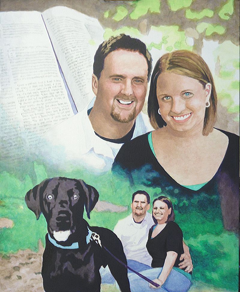
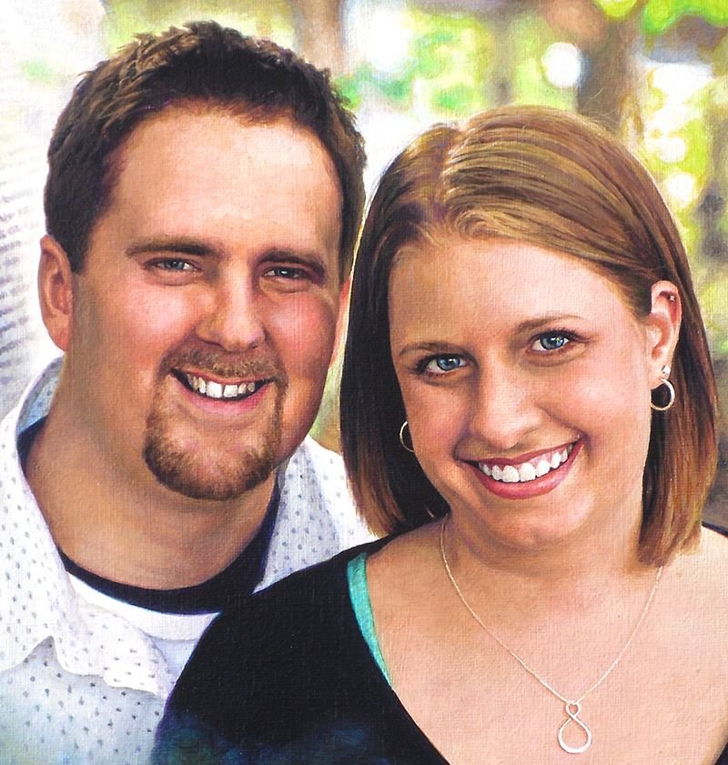
Today, I’d like to show you how I painted a montage portrait–several images put together into one design. This is one of my favorite portraits from several years ago, a 16″ x 20″ acrylic on canvas.
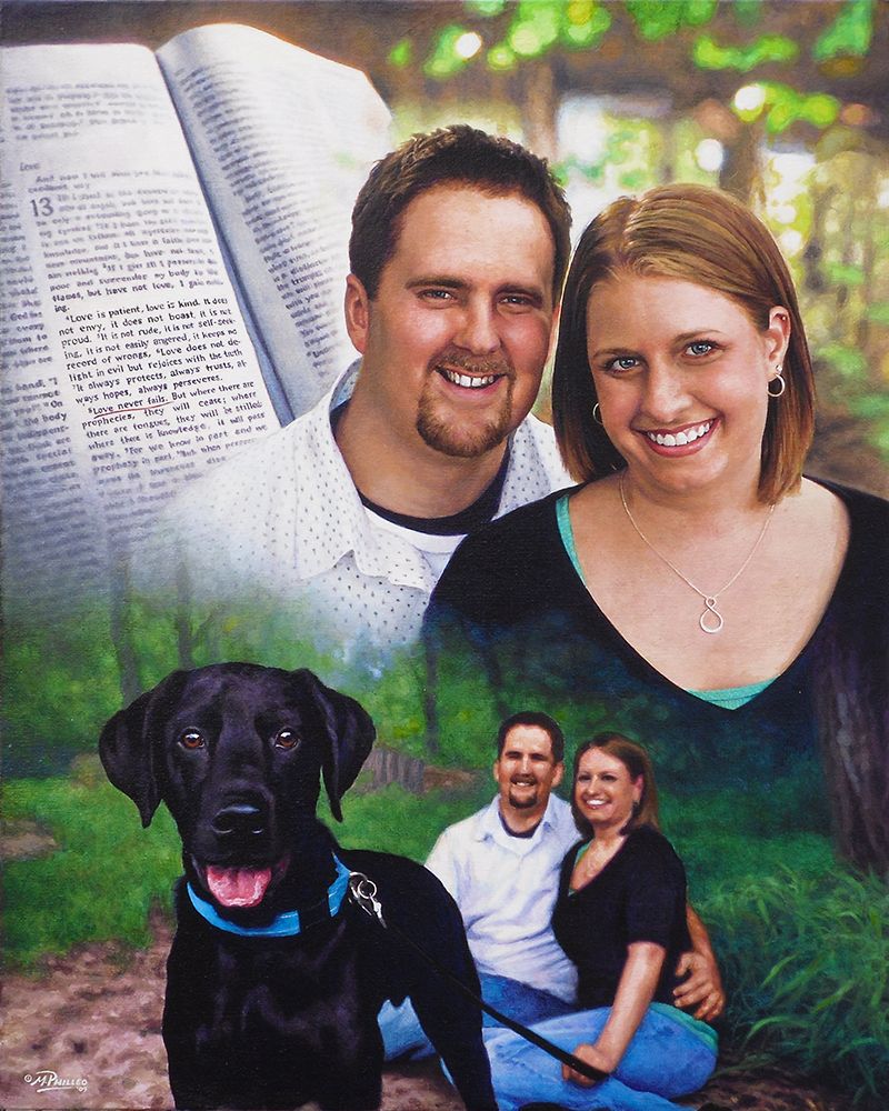
This was to be given as a gift from the mother to her son and his fiance as a unique wedding gift. The idea was to incorporate a large image of them, a picture of them with their dog, and then a scripture verse in the background, that would go with the marriage theme.
Here’s how I did it.
Step 1: The Sketch
After getting my photos together from the client, I did a layout.
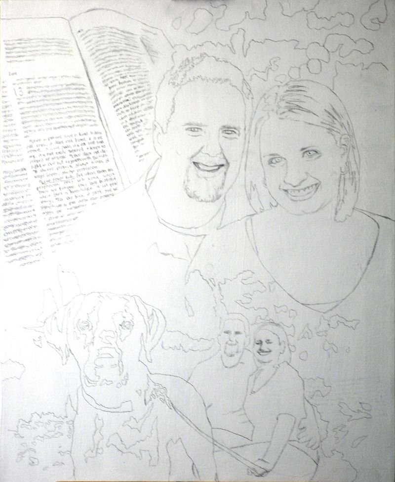
This was before I started using the grid method, so I sketched it with a projector and pencil, following the outlines of the photographs closely. The projector sometimes gets things wrong, so you have to go back, double-check your lines and refine accordingly.
Step 2: The Foundation with Light Glazes
The purpose of this step is to quickly establish the tonality of the portrait by getting the colors in the right place. Secondarily, I want to set up my values, by creating immediate contrast between light and dark. I start attacking the darkest values first, using cooler colors like ultramarine blue, raw umber dark and dioxazine purple to create a rich, nuanced black.
This way, when it’s all done, and the viewer takes a close look at the painting, it won’t be flat. You will be able to sense the folds of fabric, and contours around the body of the person within.
My goal is always to create a painting that has immediate impact, but also rewards the viewer for taking a closer look.
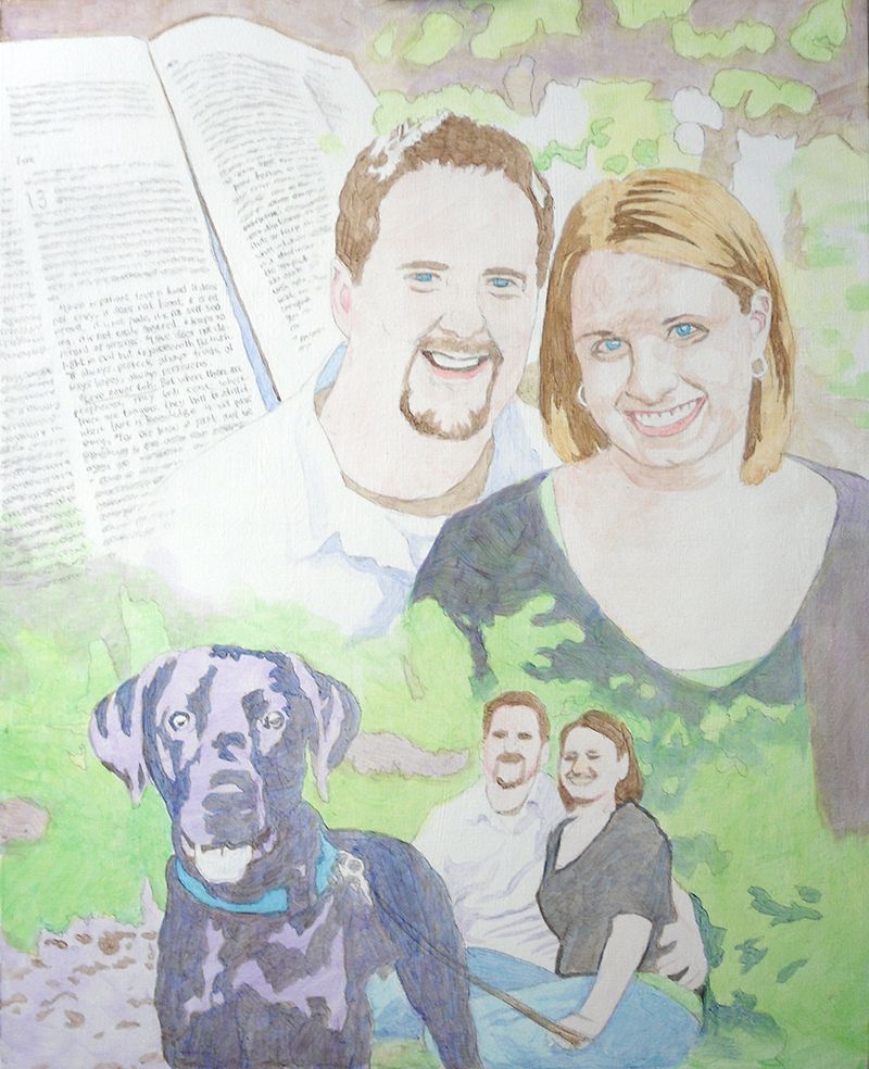
For the subjects, I use raw umber dark for the darker values within the hair, raw sienna for the lighter values, and burnt sienna, raw sienna, raw umber dark, and alizarine crimson for the skin tones.
Of course, as with virtually all my painting, the pigment is mixed with a generous portion of matte medium to thin it out, and create the translucent depth that’s similar to the Old Master’s techniques.
Notice how for the trees and background I use a light green, made up of phthalo green, raw sienna, and a little indian yellow. It will give it a lot of luminosity as the light shines through the layers.
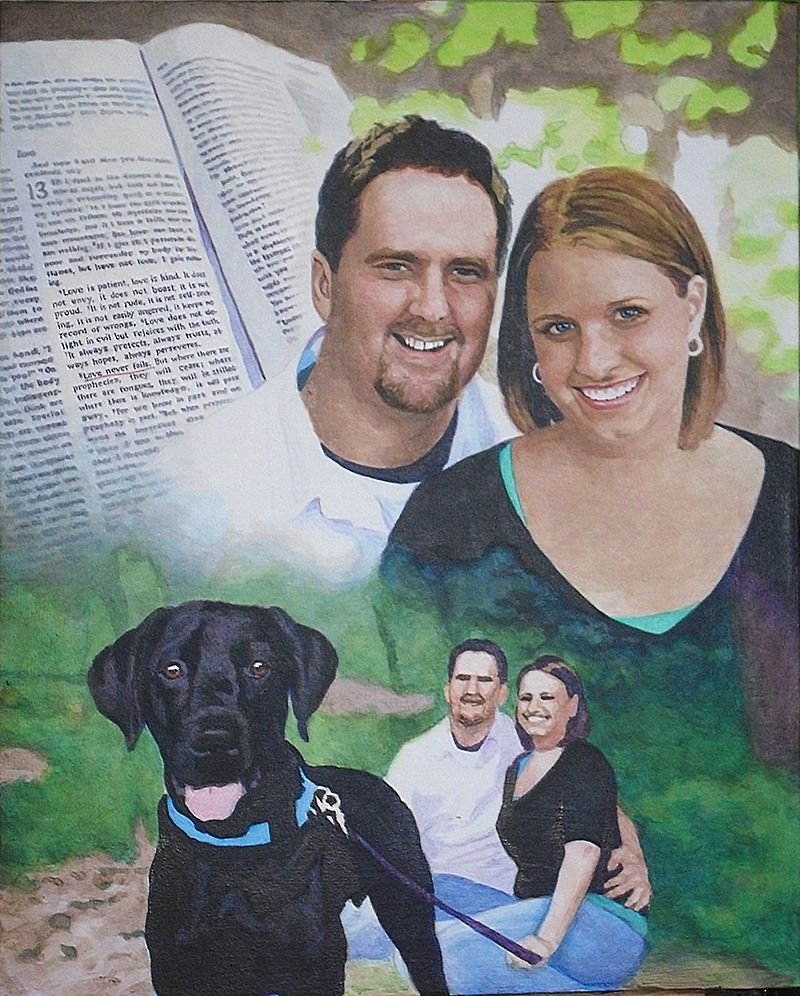
Step 3: Darkening the Deep and Mid-Tone Values
Now that I have the foundation, I go back and add several layers to all the areas within the painting. But mostly, I want to bring the darkest values to about 80% of their full strength. This will give me something to work with as I move the other values in the picture in accord.
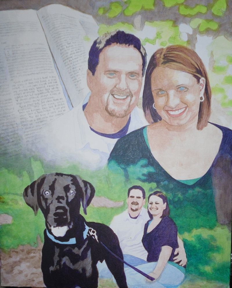
I could just go and use full strength pigment, but it gives the painting a nicer finish to darken everything slowly. In addition to that, it gives me the ability to precisely blend even within the dark areas.
Is a black shirt just straight black?
No.
Not when there’s light shining on it. We don’t want to use straight black. Otherwise how can you paint the shadows in representing the beginning and end of arms, chest, waist, and all the appropriate wrinkles within the fabric? Instead we get it dark enough and leave room for the shadows.
And by the way, ivory black is not the darkest color you can get. You’ll get an even deeper black with dioxazine purple, aliazarine crimson, phthalo blue and raw umber dark mixed together.
Why not just settle for black? Well, it’s the same reason why HDTVs boast of having higher contrast. I used to sell LCD TVs years ago when they first came out on the market. They were terrible. The darkest values on the screen were just grey. Therefore the lightest values were not very impressive, and so the whole picture looked weak.
With a painting, you will get a way more dramatic effect if you can use really dark values to set of your lighter areas by contrast. It just reminds me of the way the darkness of sin makes the righteousness of God through Jesus Christ that much more glorious. You have to have some darkness to set off the light. Enough said.
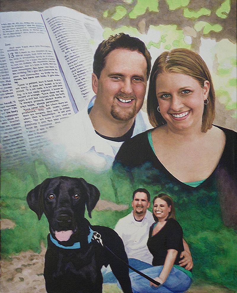
Step 4: Adding Nuances to the Faces
At this point here, it’s time to turn my attention to the most important part of the portrait: the people. And especially their faces. In the previous step, I blocked in the darkest shadows within their faces, but now, I want to add some tie-in values. Those are the tones that bridge the gap between the lightest and darkest values.
So I keep the ones I put down as a good foundation. But now, I’m adding more on top, glazing over translucently, so the bottom layers still remain. That’s how we do this with acrylic–with layers.
I feel like their features–the important ones–like the eyes, eyebrows, nose, and mouth need some work. So I begin to darken them, adding detail wherever it needs it.
It’s good to remember the old adage, “Rome wasn’t built in day.” You have see the big picture and slowly comform your painting to the reference photos. Patience is key. For example, I darken the eyebrows as one solid mass of color–just one shade, but I know after this layer dries, I’ll come back to it again–and again, if need be. Then I will go in and darken just a portion of the eyebrow, while leaving the other part with whatever I did in the previous layer.
By doing this, I can suggest that the eyebrow hairs are thicker in a certain area, or the eye sockets are creating a shadow over that portion. That’s all you have to do. You don’t have to get crazy with drawing each individual hair. That actually detracts from your realism. Just hint at it and let the viewer’s mind’s eye interpret the rest and create the reality for you.
Step 5: Building Up More Nuances Everywhere
In this step, I keep on adding layers to the faces: more layers of alizarine crimson, raw sienna, and some titanium white. Using a average size flat brush (3/8 or smaller) I keep adding nuances to the faces. When I start a portrait I use my largest brushes: typically 1″ or even larger. But as I get toward the end of the project I switch to smaller.
Why?
The smaller brush is good not only for detail work, but also those precise areas of nuances–the subtle transition of shading from the cheek to the area below the eye socket. Or the fleshy area under the chin and neck where the light is reflecting from another illuminated surface.
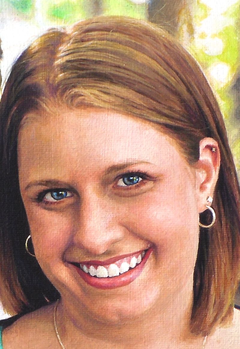
In this portrait, that is happening: we have the woman’s illuminated chest area reflecting as a secondary light source onto her chin. And so with that, I have to make sure I don’t paint the shadow underneath too dark. Since both the man and woman are outside, it makes sense that the light will really illuminate them well and the shadows won’t get very dark, except on the darker clothing and hair.
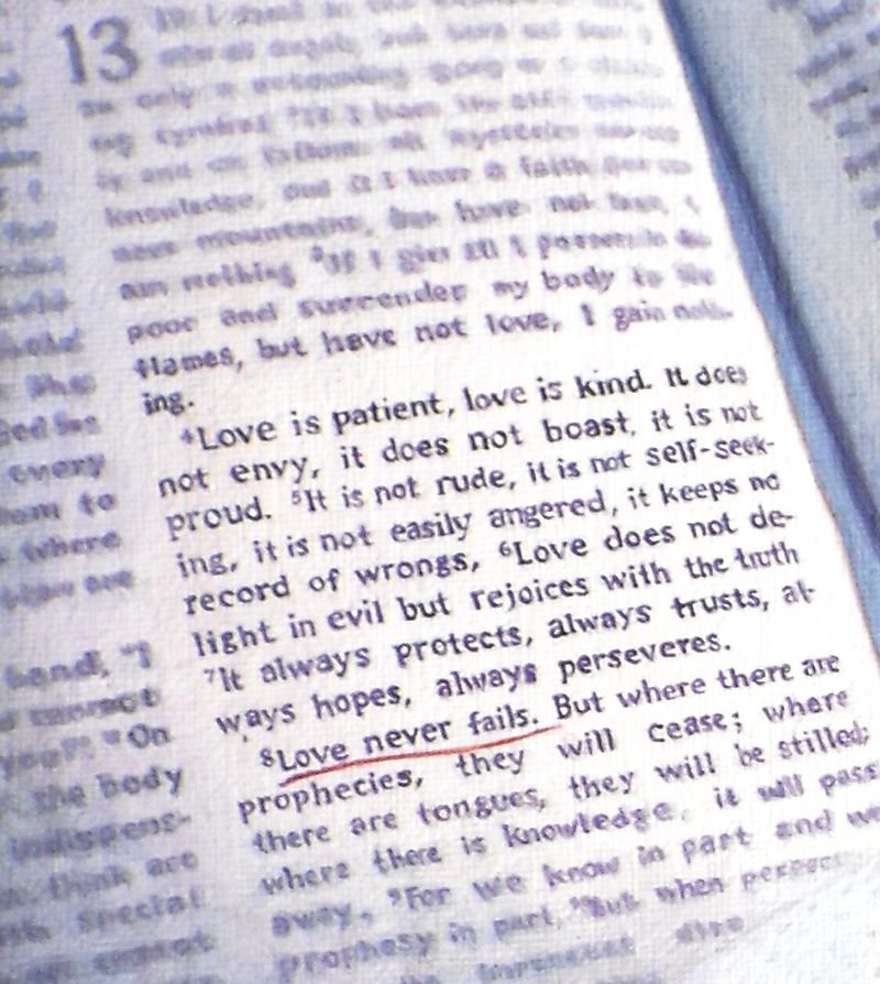
Another area I want to touch on is the Bible, which shows the scripture verse. That’s important part of the painting. I chose to just suggest the text by creating random out-of-focus lines. But the actual verse, “Love never fails” from the famous Corinthians 13 passage, is clearly in focus.
To paint something this detailed on canvas, you have to really make sure you have a nice detail brush, like 1/0 or smaller round, twisted to a point, with very fluid paint. Mist your palette and make sure the paint is about as thin as it can go before getting watery, and it will glide right over the canvas.
It makes painting text a whole lot easier.
Finally, I went over the greenery of the background trees and grass, just adding more nuances. I used phthalo blue, ultramarine blue, and raw sienna for the darker shades. Once you have your initial light green set up, it really sets it off beautifully.
In addition, I painted the dog’s eyes, using brown tones to give it some contrast. I still left the areas representing reflections quite light.
Step 6: Highlights and Advanced Blending
The portrait, at this stage, is starting to look done, but there’s still a lot of work to do. One of the things that can really enhance the realism is using highlights. Although I do like to leave a lot of areas of the canvas untouched for creating my lighter values, it is nice to go back in with some opaque highlights for certain areas.
I feel it gives me the best of both worlds: Glazing is fantastic for building depth and achieving fine gradations in shading, but it creates a roughness that must be overcome with some opaque layers. The trick is to use them just in a few areas.
The hair is one example. Here, I go back in and add just a little titanium white toned down with raw sienna to add the look of diffused light reflecting just at the top of the woman’s silky smooth, straight hair. I also go in and add some slightly darker highlights to the man’s textured short haircut. I already have the base color and value down. Now as I add these highlights, it will quickly change add depth to that area.
Also, I add detail to their teeth. We want to make sure that we don’t overdo it though. We want to use just enough of a light amber grey to suggest that there is separation between them. Raw umber dark mixed with titanium white and thinned by matte medium) is a fantastic way to create shadows for the teeth–in the right value and color.
Once I have the teeth darkened slightly, I can add even more depth by going over with a pin-point highlight of pure titanium white. With this, we just suggest reflections of light over the moist teeth. After it dries, add a tiny glaze of indian yellow, thinned with medium and it will give that white a bit more warmth and luminosity.
You can also do this on the gums. For some people, depending on the structure of their mouth, and the lighting, the gums will catch more of those highlights than the teeth. That was the case for this portrait.
Step 7: Adding the Details
Because this is a collage–or montage–portrait, there’s a lot different elements that need attention. So just when you think you are done, there’s just a little more.
Now, it’s time to add in some more detail to this couple’s background portrait. I noticed that the woman appeared to be looking away from the camera, but by adding just a few darker spots within her eyes on the right side, we suggest that she is looking toward us. It’s just a small amount of work, but it pays dividends in creating that visual connection with the viewer.
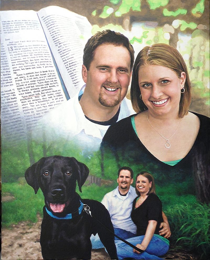
It’s time to add the long blades of grass in. I already have the base tones in. It’s just a matter of putting in some darker shadows in angular shapes, and then going over with highlights. Phthalo blue, ultramarine blue, raw sienna, even some yellow ochre and titanium white is what’s used, from darkest to lightest in capturing the effect.
Moving to the left of that, I tackle the jeans for both the man and woman, using the same two blues on my palette. I tend to use ultramarine blue for the darker values and phthalo blue for the lighter. For the darkest shadows I add in some diox purple and raw umber dark so it doesn’t get too bluish.
The Final Painting
With some more nuances here and there, I can call the painting done!
Here are a couple detail shots…
LEARN MORE
- How to Paint Foliage Using the Acrylic Glazing Technique
- How to Trace for an Accurate Portrait Sketch
- How to Paint Realistic Eyes in Your Acrylic Portrait
- How to Add Raw Umber Dark & Ultramarine Blue to Your Portrait
- How to Make Your Own Raw Umber Dark
- How to Paint Realistic Trees & Grass in Your Acrylic
- How to Block In Skin Tone Values Using Glazing Technique
- How to Paint Vibrant Reds in Your Acrylic Portrait
- How to Glaze Background Colors & More Acrylic Portrait
- How to Paint White Clothing in Your Acrylic Portrait
- How to Easily Transition from a Sketch to a Painting
- How to Block In Shading & Skin Tones in Your Acrylic
- How to Build Up Color on Acrylic Pet Portrait
- How to Build Up Form on Clothing with Acrylic
- How to Paint Dark Clothing Using Acrylic Glazing Technique
- How to Paint a 24 x 30 Acrylic With 30 People
- How to Do Smooth Shading with Acrylic
- How to Sketch an Acrylic Portrait with a Grid
Read more about how to paint a portrait that you can surely be proud of!
I hope you enjoyed this post and found it valuable. If you have any questions on the techniques used to create this portrait, I would love to help.
Have a blessed day,

P.S. Did you find this post helpful or encouraging? If so, send it on ahead! Let others know with the share buttons below. I’d love to hear your comments. Thank you so much! Also, do you have a question on acrylic portrait painting you’d like answered? Let me know, and I’d be happy to help!