Tag Archives for " online art tutorials "

How to Paint an Acrylic Portrait You Can Be Proud Of
What would it feel like for you to truly be able to paint a portrait in acrylic you could be proud of?
…to give as a high quality gift, display in a show, or to get a “thumbs up” and a good price for your artwork when you do a commission? How would it feel to not struggle with finding the right skin tone, or get the blending in the colors right? Or to be able to paint a person’s face and not have it look flat?
Imagine how it would feel to know how to mix the paint and control the brush..and get a realistic result…predictably.
I’ve been painting portraits in acrylic for over 20 years, and started teaching out of my studio two years ago.
The next year I started teaching online when one of my email subscribers, in her mid-80’s, urged me to put a course together. We chatted on the phone and she asked me how much I would charge for an online painting class.
“How about $97?” I replied.
“I’ll mail you a check right away.”
Just like that, I had a paying student…I had to teach the class now!
I asked some other folks on my email list if they wanted in, and about 10 more students instantly enrolled. Since then, I’ve taught almost 100 students literally all over the world, and it’s been so enjoyable to see the progress they’ve made.
If you want to learn how to paint a portrait in acrylic that you’ll be proud of, then learning directly in a step-by-step video course is best way to cut through the fog, and achieve results fast.
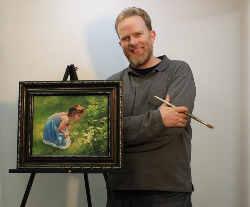
That’s why I created an online course called “Paint Your First Amazing Acrylic Portrait.”
![]()
It’s a complete step by step video course, showing you exactly how to paint a portrait in acrylic, from the sketch to the finished, signed painting. All the lessons are online, available for you to watch at your own pace, 24/7.
Click here to learn more/ enroll
Judy, one of my students in this course, just started acrylic portrait painting a couple months ago. She was having some difficulty and felt stuck in her painting progress, so she emailed me asking for a critique. (You can request a personal critique, too, as a student of my course!)
Here’s what she emailed me after I sent her the interactive video critique…
“Hi Matt,
Thank you so much, that is so helpful. You said it so well when you talked about “being intimidated by the painting” that was exactly how I felt – a kind of stage fright, haha maybe “easel anxiety” anyway as I listened to your critique I just felt it unlock.

I feel excited about making those changes. I laughed when I saw that despite staring at the photo for hours and hours I never noticed a piece of his ear was missing in my painting.
Then Judy finished that painting, utilizing the techniques in my course and some tips in my critique, and wrote me again:
“Hi Matt,
Here is my painting that I’ve been working on. I’m really thrilled with it and it will work with Maurice’s portrait.
I’ve been learning so much – how to fix a mistake, and how to wait patiently for paint to dry.


I made a mistake straight off by using a lead pencil instead of the one you recommended I use ( which was right there next to it). Bet I will never do that again! I’m really getting a feel for mixing glazes and I’m having so much fun.
Thank you so much you inspiring teacher!”
Cheers,
Judy
I love the beautiful husband/ wife portraits Judy did side by side. Not only has she enjoyed the painting process, but she has two paintings she’s proud to show. And she has only started painting.
You can do this too. You can save time, paint, and frustration. You can learn how to paint a lifelike portrait that you can confidently show others, by taking my course.
I’d love to have you as a student!
All the best,

P.S. It is the one-year anniversary since I created this course in April of ’17. If you are wanting to take the next step in painting, here’s your best opportunity. I truly believe if you take the course, your portraits will dramatically improve. Why? Because the techniques work, and that is what I have seen happen for several of my students. Hope you’ll be one of them!
Click here to learn more/ enroll

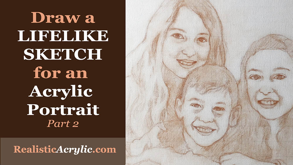
How to Draw a Lifelike Sketch for an Acrylic Portrait
Lifelike Sketch + Accurate Acrylic Layers + Patience= Realistic Acrylic Portrait. The equation works every time.
Even when you make mistakes. 🙂
Don’t worry, this won’t be a math lesson. That was not one of my better subjects in school!
But there is something to be said laying down a good foundation for your acrylic portrait with a lifelike sketch. When I mean lifelike, I don’t mean that it looks photographic, but rather that you capture the likeness of the subject–the person (or pet) you’re going to paint.
When you do that, you exponentially increase your chances for success in painting a realistic acrylic portrait.
Notice I didn’t say perfect. You don’t have to have a perfect sketch, just one that is as accurate as you can make it.
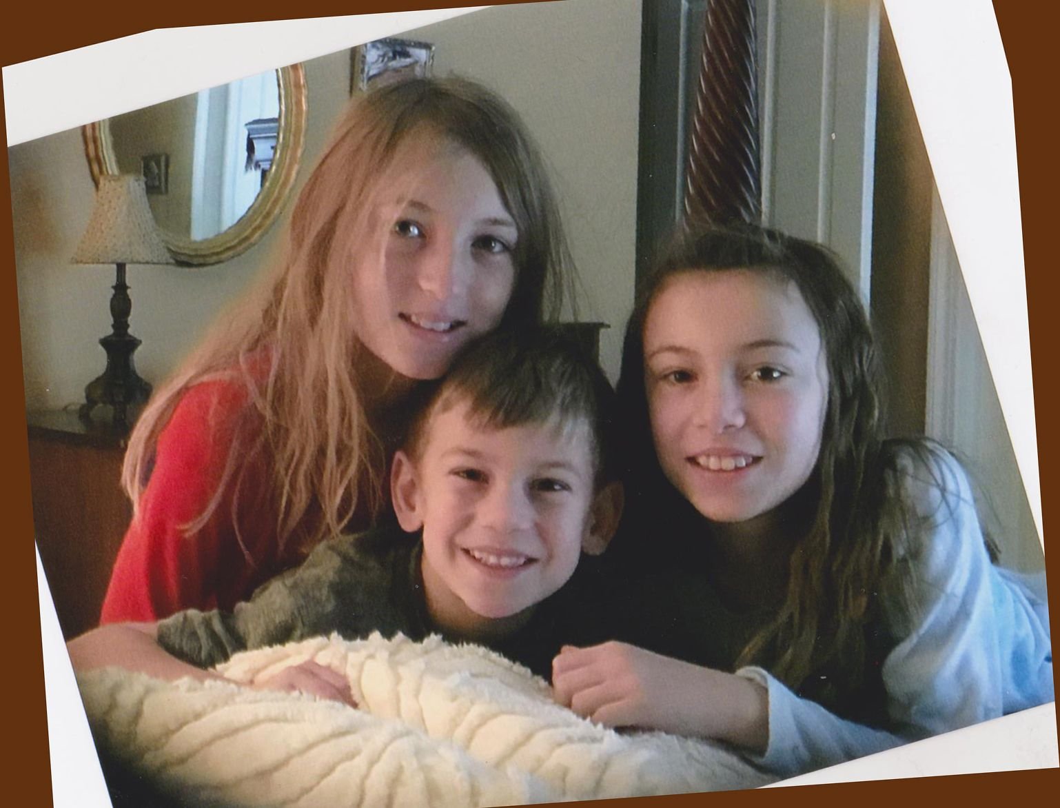
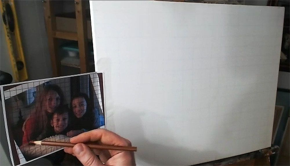
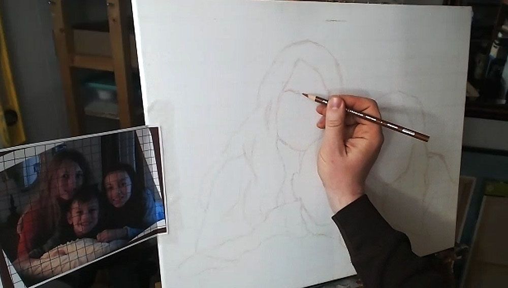
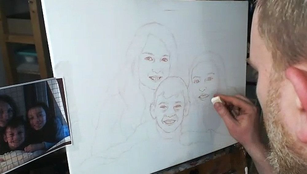
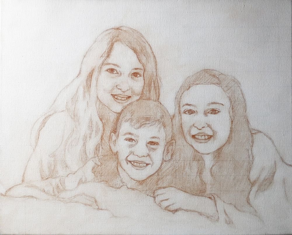
Today, I’m going to show you how I drew the sketch for a commissioned 16″ x 20″ acrylic portrait I’m working on of three children…
…based off a candid photo of them just hanging out on a bed. I tilted the image because I thought it was at an awkward angle. You can obviously see the original angle in shown in the edges.
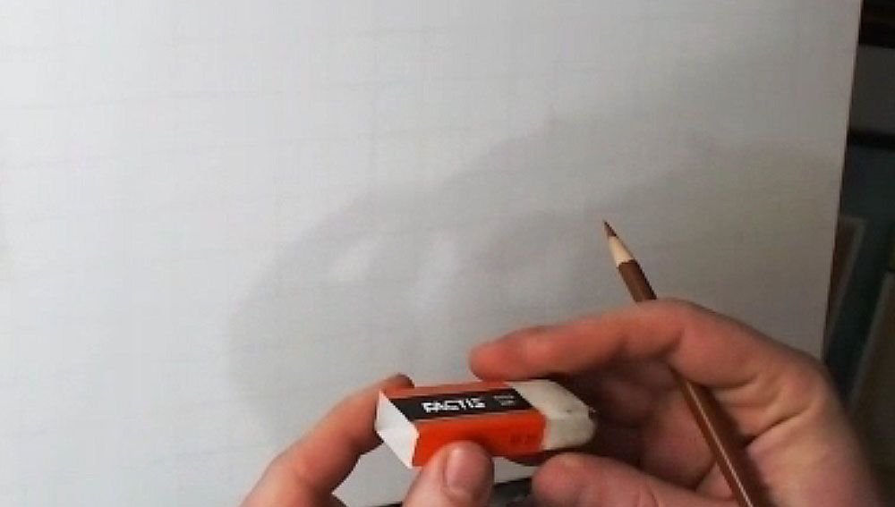
Tools Needed:
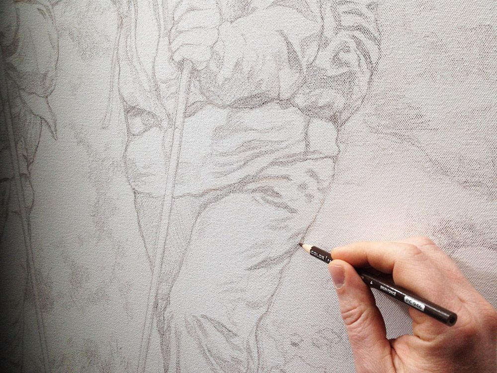
You’ll want to use a sepia-toned colored pencil, like burnt ochre, dark brown, or terra cotta.
And then a white eraser.
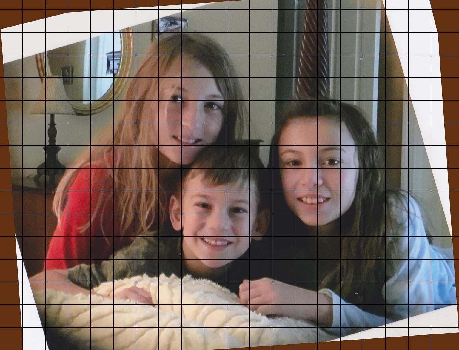
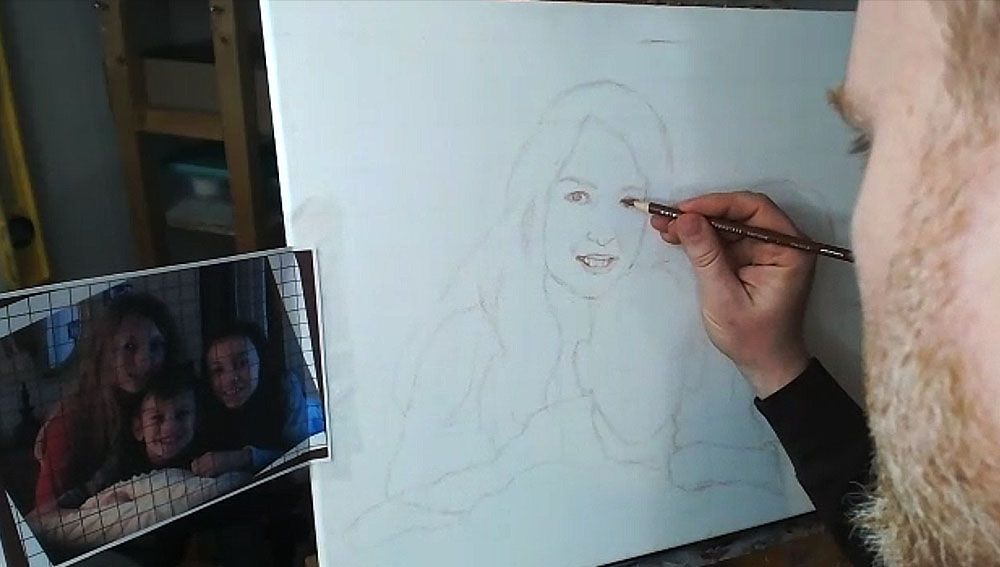
I started with a canvas that I drew a grid on–with 1″ squares, using a light colored pencil (light grey, tan or peach is fine). It is important to seal the grid in with a mixture of matte medium and gesso. This provides a barrier on the canvas so that when you need to erase anything on your sketch, you will not disturb the grid lines beneath. Also, it makes it amazingly easy to erase a sketch on your canvas–much easier than graphite pencil. This is a technique I discovered just by being frustrated with pencil and experimenting.
The photo reference is also gridded correspondingly to match the squares on the canvas. I used a grid drawing tool at ArtTutor.com and then printed out the image.
Alright, now let’s begin…
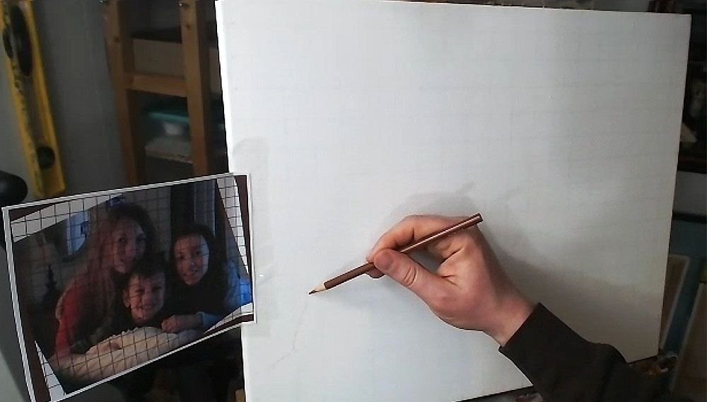
Step 1: Get Started in the Right Place
When using the grid technique, it’s so important to make sure you start sketching in the right place. Otherwise, you may end up sketching for a while, only to realize your composition will be off.
Yes, I made this mistake.
So, count off your squares, and double-check that you’re matching up on your canvas, what is on your reference photo.
Watch this video to see the beginning portion of the sketching process…
Step 2: Start Your Outlining the Forms of the Subjects
Here, we only want to get just the outside edges of the subjects and then fill them in. I start usually in the lower left corner and then work my way up and across. You don’t need to achieve perfection in this. But it is good to see where the major lines representing the shapes are intersecting the squares. Break it up into fractions.
(Uggh, math again. It’s OK. If I can do it, so can you, believe me!)
You note, “Okay, this line crosses through the vertical line of this square at about 1/2 of the way up.”
Or, “this line intersects the horizontal line of the other square about 2/3 of the way to the edge.”
You may see fractions like 1/4, 1/3, 1/2, 2/5, etc. You’ll begin to see them naturally and not even think about it with some practice. When you learn to do this, your gridded sketching will become very accurate.
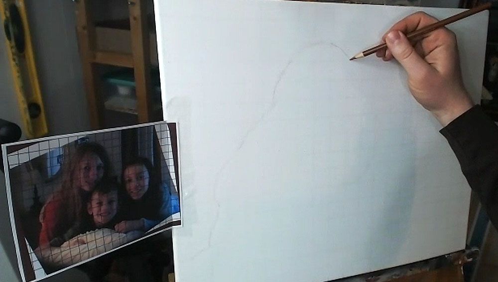
Here is the sketch, with all the outlines filled in.
You’ll notice that I made a pretty large mistake, but thank God for erasers! I considered editing it out of the video, but then I figured, “Why not keep it in there, to show an accurate recording of my process?” We all make mistakes, but it’s what we do after we notice them that counts.
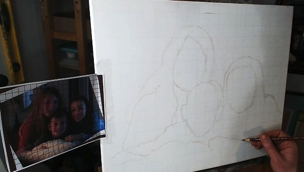
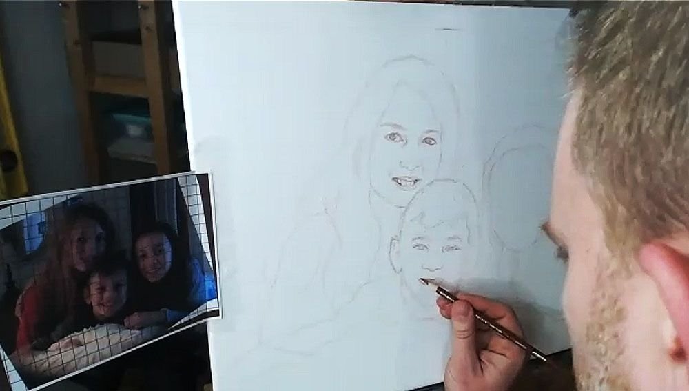
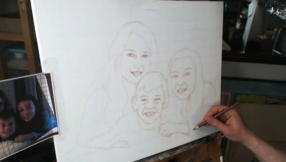
Step 3: Fill in the Features
After getting the proportions of the subjects in correctly–the outside edges of the hair, the shoulders, the faces, etc., then you’re ready to move on to drawing the features. The reason we get the main forms defined first, is because we want to make sure we have an accurate foundation to drop the features on. In addition, you’ll be able to tell if you like the overall composition.
Now, when I start drawing in the facial features, I work from left to right, and then top, down. (Of course, if you’re left handed, you may naturally work in the other direction.)
I start by noting the angle of the eyebrows and sketch them first. Doing this will really establish the alignment of the face and your other features will need to be in conformity with it.
Then I draw the eyes loosely, and not too dark, so I can refine them later. The eyes are the most important feature on the face, so I really pay attention to them.
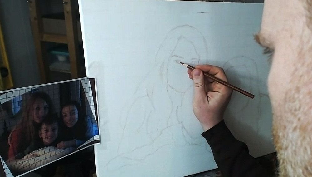
What is the overall shape? Are they skinny, angled, rounded? Are there prominent eyelids or are they barely perceptible? How far away are they from the eyebrows? How close are they together? Ask yourself these questions as you draw.
If you can get the eyes about 85% or more accurate, you’ll have a good portrait.
If you can get them 95% or more accurate, you’ll have an outstanding portrait, provided the other features are drawn fairly well.
Next, draw in the nose. Observe your reference photo to see how far down the bottom of the nose is from an imaginary line that intersects the eyes. What is the shape of the nose and nostrils? Is it wide, narrow, rounded, sharp? Observe carefully and draw what you see.
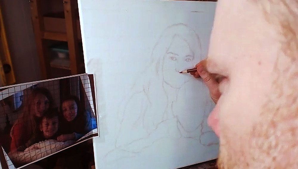
After you get the proportions and shape of the nose accurately defined, it’s time to move on to the mouth.
I start with the top of the mouth, drawing in the bottom edge of the top lip and then the top edge of the bottom lip. I sometimes will draw the top edge of the top lip, if it’s very prominent–like, for example, when a woman is wearing lipstick. Of course, that is not the case for this drawing of three children.
I finish with the bottom edge of the bottom lip. Of course, I also draw in the teeth, but only lightly suggesting their form by showing the gumline, and the shadows on the sides where the teeth are foreshortened in perspective, and the lips cast shadows on them. The space between the visible teeth and the edges of the mouth is very important, and you’ll want to indicate it as a dark value, because it is in shadow.
One of the main mistakes I see artists making in their sketch is when they over-define the teeth. It makes the person you’re drawing look like they have braces. Pencil lines are just too dark of a value for the teeth, and it’s hard to overcome in the painting. Draw them lightly, and you’ll get better results.
Watch Part 2 of my video lesson below to see exactly how to do it…
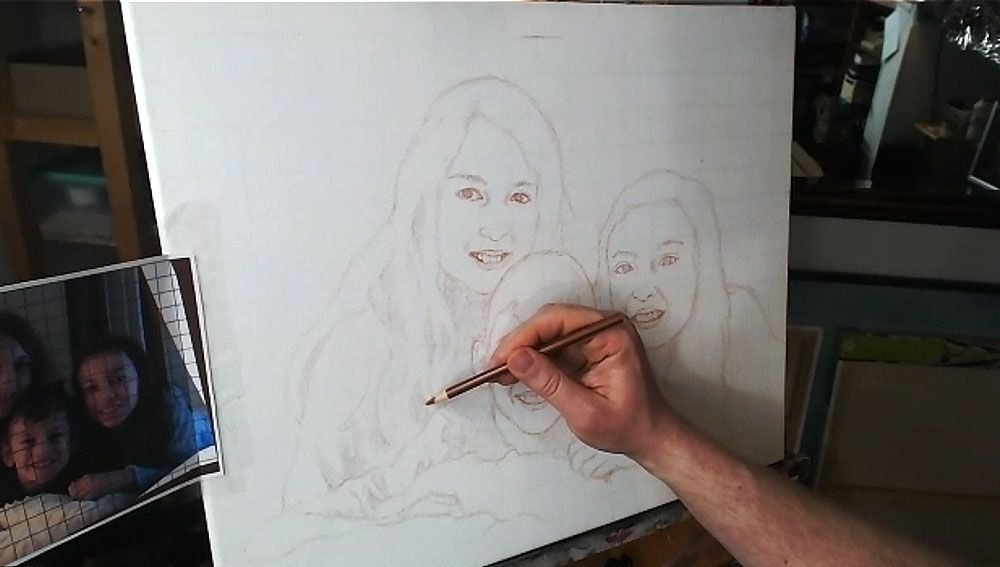
After I get the features sketched in loosely and lightly, then I go back over everything. I darken and refine.
I repeat the process on the other faces.
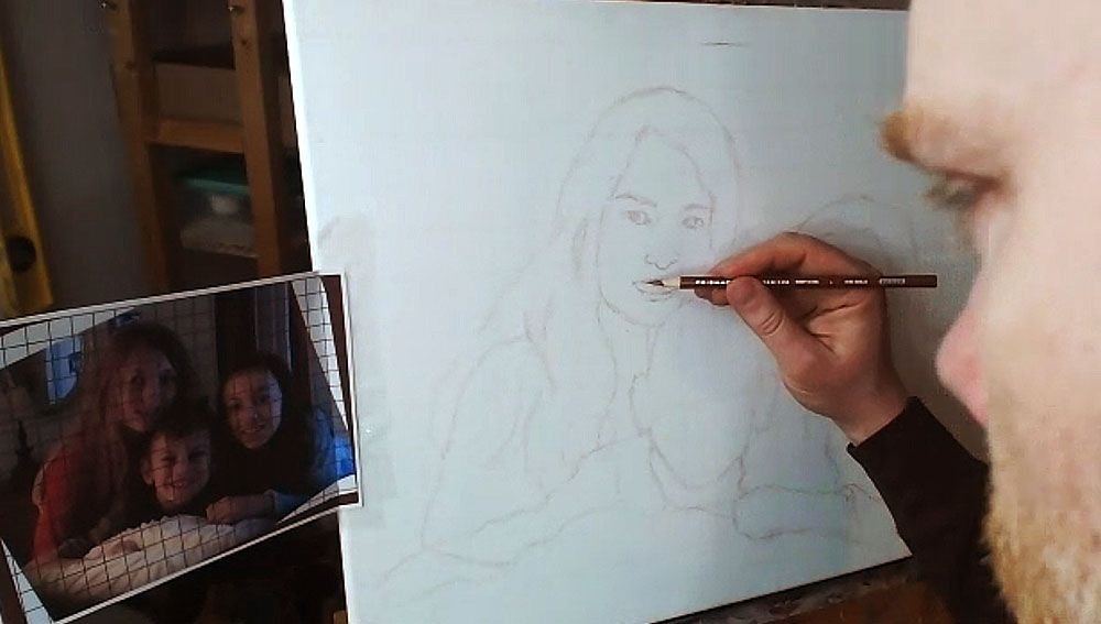
TIP: Look at your reference photo often as you draw–much more than you are currently. At least 30% is a good rule of thumb.
I can tell you from teaching portraiture in person, that students only rarely look at their reference photo. But you can only draw what you are observing, so observe more and draw better.
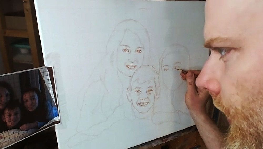
But if you make a mistake, you can always use an eraser!
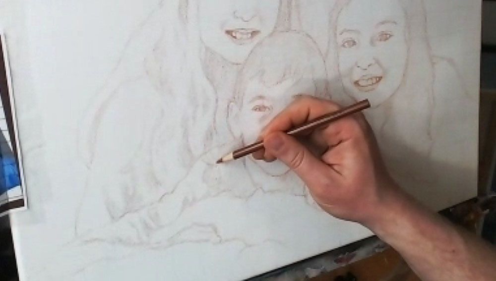
Step 4: Finish Off the Forms
After filling in the facial features, I draw in the hair, hands, wrinkles for the clothing suggesting the shoulders and arms.
Step 5: Shade in the Major Values
Everything we see in the three-dimensional world is viewed in the context of differences in value and color. There really aren’t lines separating anything in nature, even though the concept of a line exists in geometry and we can obviously draw them.
So, with that , I feel it’s important to define the major values in your painting during the sketch stage. You’ll be much better prepared when you start painting. You won’t have to wonder subconsciously, “What do those bunch of lines represent?”
The values will let you know where to apply your first layers in the blocking-in stage of your painting. You can dive right in and do it.
So I fill them in, using the side of my pencil lead, rapidly. It doesn’t need to take much time. I just try to see the major areas of contrast, like the shadows under the faces, wrinkles in the clothing, locks of hair that aren’t illuminated, and represent it on the canvas.
Lastly, you can double-check the facial features on everything, and make sure it’s accurate.
And here’s the final sketch. Not perfect. But close enough that I can rectify any mistakes in the painting and bring it closer to a very accurate likeness.
I’ll be showing more of the process of this painting, breaking it down step-by-step and teaching you as I go along. I look forward to sharing more with you !
Have a blessed day,
P.S. Did you find this post helpful or encouraging? If so, send it on ahead! Let others know with the share buttons below. I’d love to hear your comments. Thank you so much! Also, do you have a question on acrylic portrait painting you’d like answered? Let me know, and I’d be happy to help!

How to Paint A 48″ x 72″ Commissioned Portrait: My Adventure
Last week, I shared with you the beginning of my adventure on painting a huge 48″ x 72″ portrait.
Thank you so much for all your kind words and feedback on this project!
In that post, I mentioned how I tracked down the canvas, brought it back, and then created a layout for the portrait with Photoshop.

Today, I’m going to show you the sketching process, and with that, maybe spark a little controversy! 🙂
Controversy? How can sketching be controversial?
Well, there’s a huge debate in the artist community on tracing/ using projectors and whether or not it is cheating.
I’m going to show you the process I used and argue that it is not cheating. But I am open to discuss it.
First of all, I wondered with this big canvas, “should sketch on it using the grid method, or even freehand?” I’ve done hundreds of freehand sketches for portrait drawings and paintings, and in fact, it was the only way I ever drew anything from my childhood up until I started doing murals in 1999, when I was 22.
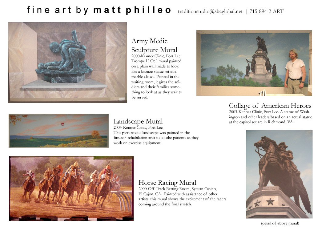
Then, through a contact I made while studying at the Milwaukee Institute of Art & Design, I got in touch with Bob Jenny, a prolific and successful muralist from Ft. Lauderdale. We did several murals together, starting with two 6′ x 30′ murals in Womack Army Hospital in Fort Bragg, NC, and then a couple in Kenner Clinic in Fort Lee, VA.
Here are some images of those murals…
“You paint like an artist!” Bob chided me when he saw my technique. I used tiny brushes, piddling away on a large surface.
It would be like trying to paint your average 16″ x 20″ portrait using toothpicks.
Not only that, but I attempted to sketch out an expansive scene of the army medic serving in World War I & II in freehand on the hospital wall.
It looked good, but it was taking way, way too long. It wasn’t just a matter of it eating into our profits, but it was also the fact that there were many contractors working in the hospital, and the thing had to be done by a certain time.
So Bob showed me how to paint like a painter. He taught me how to use large brushes and even a roller to cover large areas quickly and effectively.
For setting up the sketch, Bob instructed me to use a projector. Some artists spend a fortune on snazzy art projectors that can project a regular photo print on the wall, but Bob used just an overhead projector–the kind that people used for teaching and media presentations, “back in the day” before PowerPoint became the thing.
You just make a transparency of your photo reference at your local copy shop and you’re ready to go. Or, you can buy transparency film that runs in your inkjet home printer and make your own.
Using the projector on a mural or large painting saves a ton of time. It’s very difficult and time consuming to get accurate proportions drawing freehand over a large surface. Your brain just can’t see the whole picture. So, I learned to use a projector while working with Bob, and it’s been great for quickly getting a sketch up on my canvas or panel.
Some artists feel like it’s cheating.
I don’t.
I see it as a tool. It’s the same way you would expect a carpenter to use a ruler, level, clamps, power saws, power sanders, nail-guns, etc. to get his job done quickly, reliably, and effectively.
But as an artist, you don’t want to use it all the time. It’s important to learn how to draw freehand as well. You can use a grid to start with. And then go completely freehand as you gain confidence. These drawing skills will translate into painting skills–because painting a realistic portrait is always fighting the internal battle of painting what you actually see, rather than what you think you see.
If you want to paint a portrait from a photo, and do it well, it will be a lot easier if you learn how to draw.
With this 48″ x 72″ portrait, the size is large enough that I decided to use a projector to accurately transfer my Photoshop design onto the canvas. I thought about using the grid system for a moment, but I decided it would take too long to set up all the grid lines, seal them in, and then try to mask them out at the end after doing the sketch.
The figures in the portrait just have too much detail for that to work, not to mention the background.
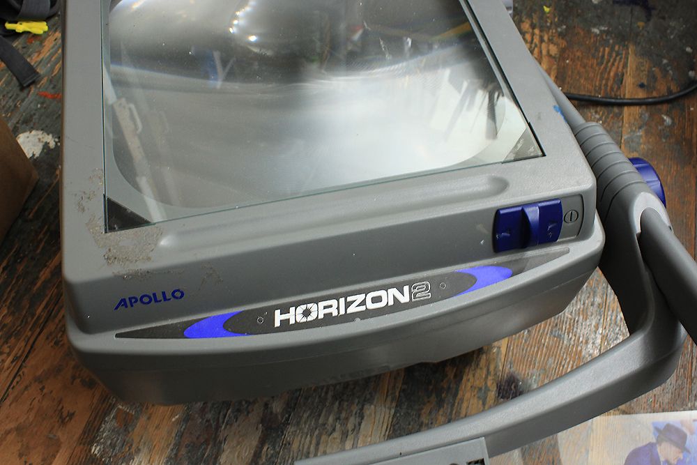
So I set up my projector. I use an Apollo Horizon 2, which I purchased for about $200 several years ago.
I printed off the design on my inkjet printer and then laid it flat on the surface of the projector.
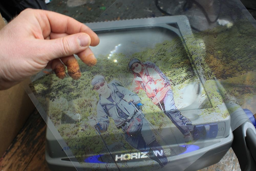
Now, you will find that the lightweight plastic sheet will want to curl on you from the projector’s heat. So, if you put a piece of glass on the top (I tape the edges with masking tape, so it doesn’t cut me by accident) it will be enough to keep your transparency in place.
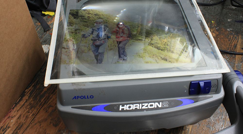
After that, I set up my canvas vertically against the wall. I have pretty small studio, but the room is long, so I faced it so I had room get the projection lined up straight on the canvas.
Next, I turned on the projector and lined it up. There were a few inches on either side that I couldn’t cover, but that would be easy enough to fill in later. Also, I needed to move that chair out of the way! 🙂
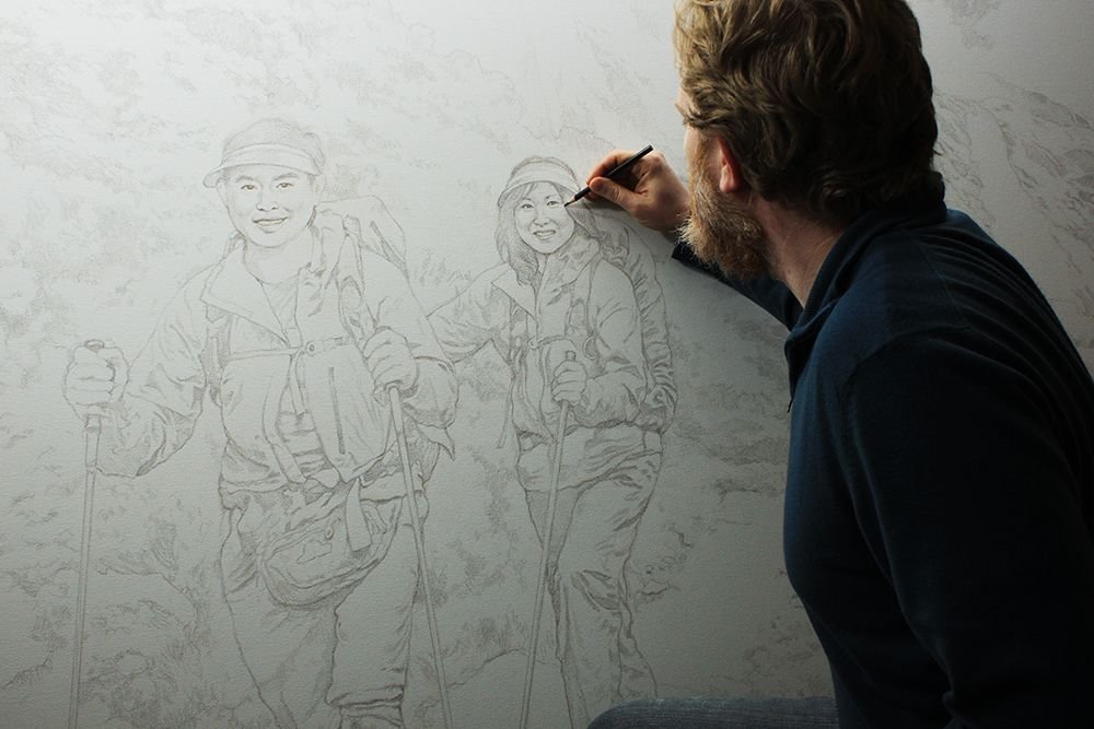
I used a sepia toned-colored pencil to do the tracing. I work from the left to the right, keeping my body from obscuring the projection.
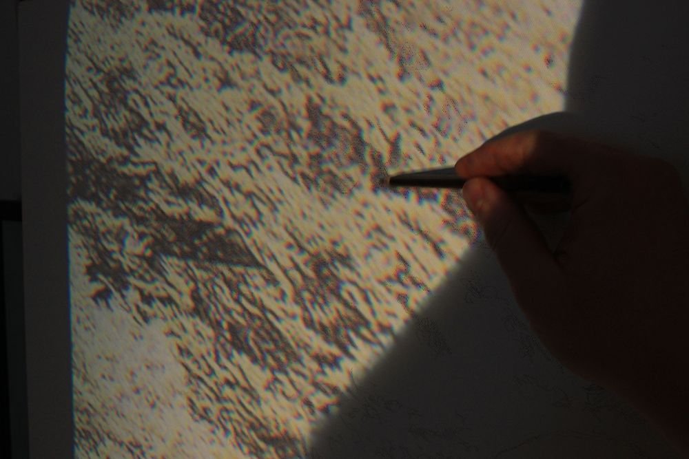
You would think that tracing is just a mindless process, and so simple that a caveman could do it. But you have to discern what lines are important and what are excessive.
Why?
The projection will take the image and flatten it out. Background, foreground, subjects all become a jumbled mess of contours and details. You will lose discernment over what you’re actually tracing when you are close to the image. It’s good to hold a printed image of what you are tracing, or tape it up next to your canvas. That way, you’ll see the whole picture and if you can’t tell what it is that you are tracing, you’ll get a clue from your reference photo.
It’s good to fill in some of the shadow areas even while tracing, or you’ll have a tough time recognizing what the lines represent visually, when you shut your projector off.
It took me over an hour just to trace everything. And with that, my work only had just begun.
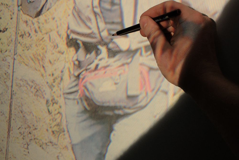
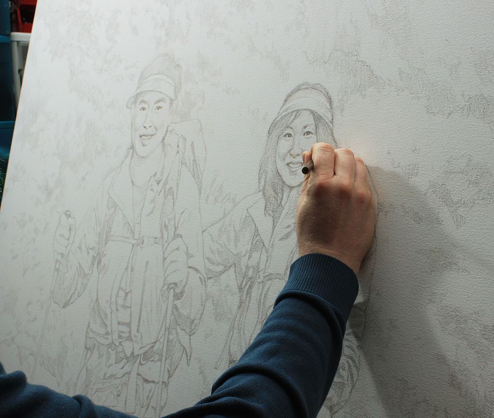
When you have a tracing done, you are not finished yet. Not by a long shot.
This is where your freehand drawing skills come into play. If you want an accurate sketch as a solid foundation for your portrait, you have to go back over the tracing and enhance it.
You may be able to pin-point where the eyes or mouth are on the face with the projected image, but you’ll have to actually draw their shapes in. You’ll need to take the jumbled lines representing the background and subjects and add detail to them. The projection just won’t do that for you. All it does is give you the overall composition and proportions.
You’ll also need to darken some of the lines, and leave other lines light.
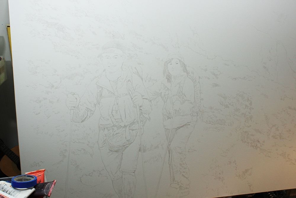
That’s what I did with this picture. In addition to that, the client wanted some changes. I think I mentioned that in my previous post. He wanted he and his wife to look younger, and their sunglasses to be removed.
So, after I finished the tracing, I put in a couple hours changing their faces, using reference photos that the client supplied as a guide.
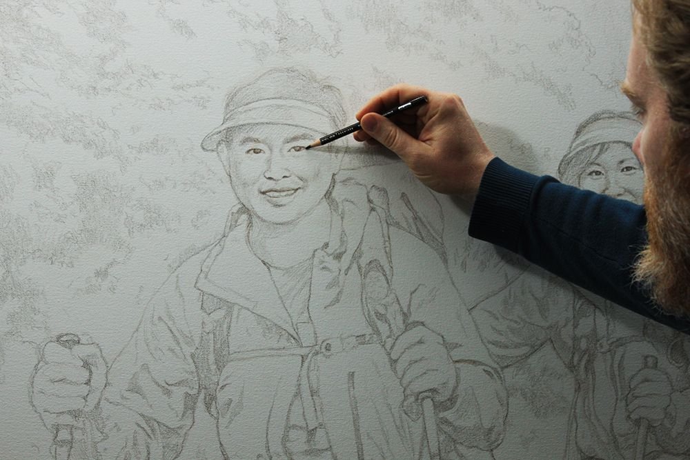
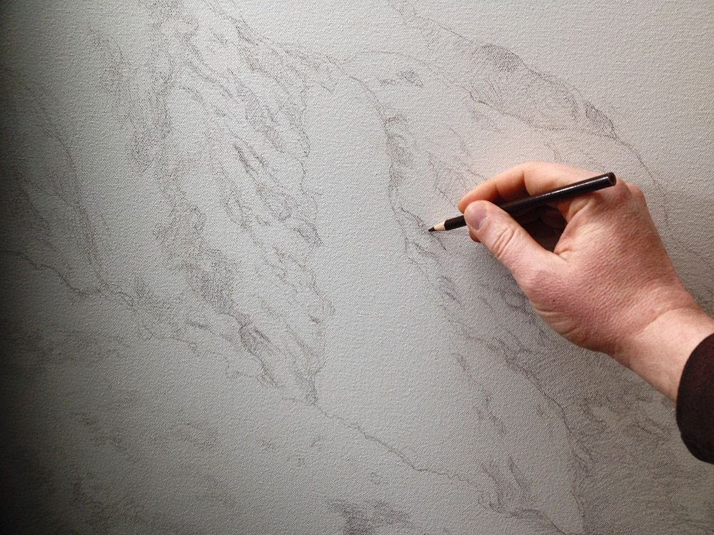
I also refined the details of their clothing, supplying the visual information that the projection left out. I went into the background, making sure I could identify what were the edges of hills, and what was just foliage within the hills.
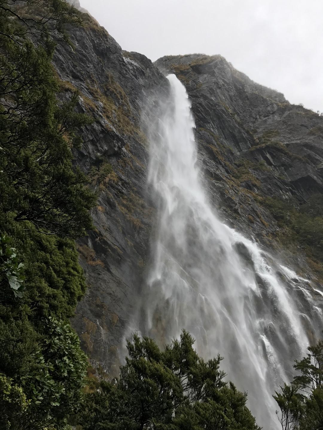
I defined the edges and rock formations within the waterfall, because in the tracing, I could only make out just a couple angles and nothing more.
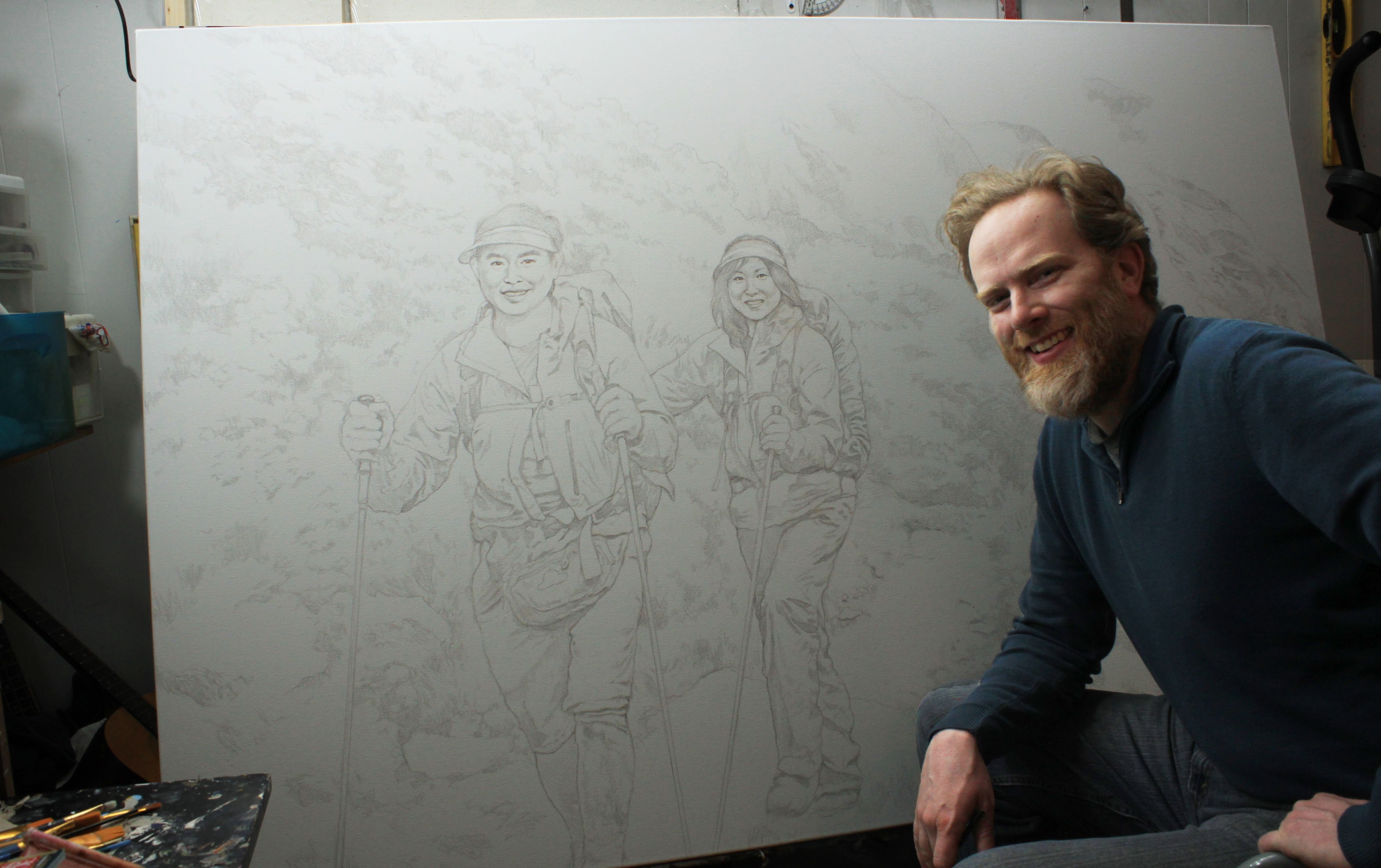
Finally, after about five hours or so, I’ve got the sketch finished!
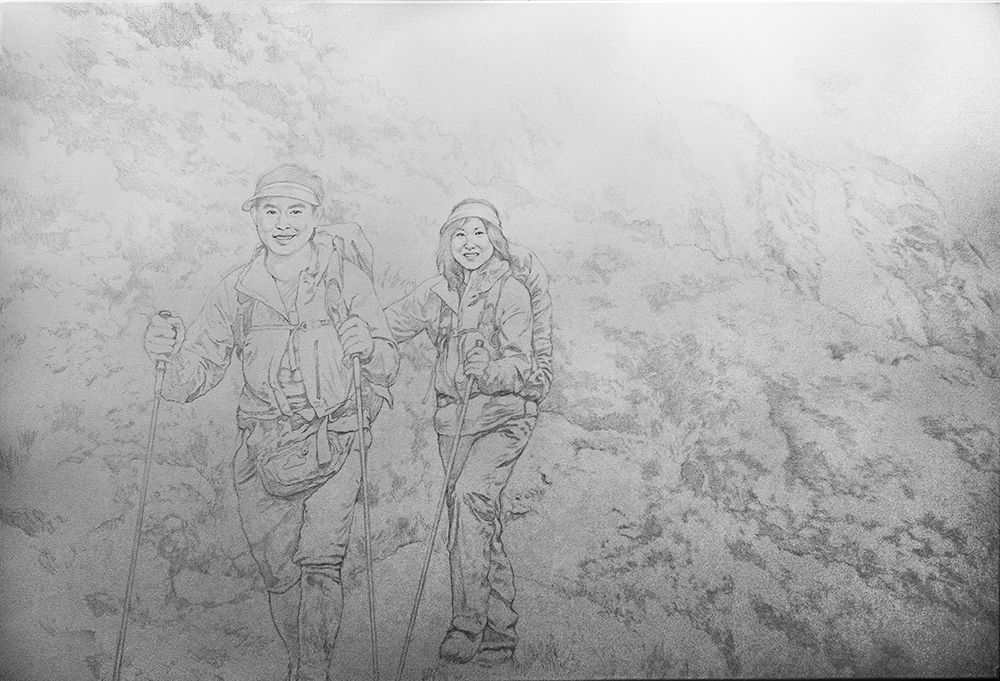
The client has approved it, and now I am ready to paint. I’ll share that part of the adventure next time. ‘Til then, have a fantastic Easter/ Resurrection Sunday, and I’ll be in touch! (Here is a video I recorded where I talk about a mural that a friend and I painted that goes along with the Easter theme. Enjoy!)
Be blessed in your painting and creative ventures…
All the best,
P.S. Did you find this post helpful or encouraging? If so, send it on ahead! Let others know with the share buttons below. I’d love to hear your comments. Thank you so much! Also, do you have a question on acrylic portrait painting you’d like answered? Let me know, and I’d be happy to help!

A 48″ x 72″ Commissioned Portrait Adventure, Part 1
There’s something about a large painting.
It just seems to have more impact.
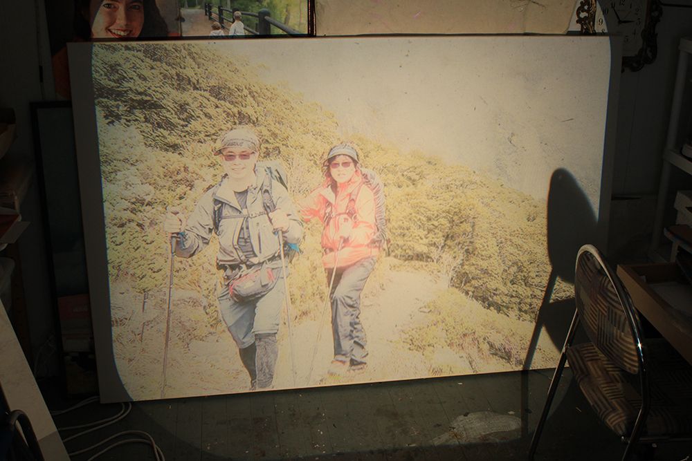
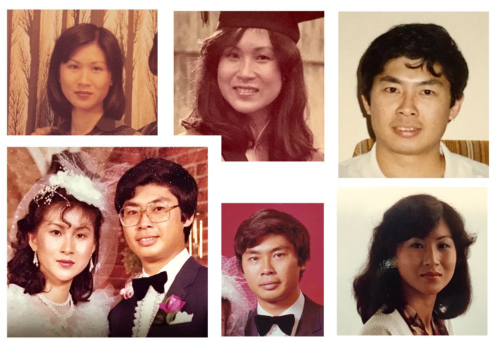
Recently, I was commissioned to do a 48″ x 72″ portrait by a man in Brunei (an island near China) of he and his wife hiking in New Zealand.
It was based off this photo.

It’s a beautiful scene, showing the couple winding their way up the scenic mountain ridge, with gorgeous hills and a misty waterfall in the background. I feel honored to be asked to capture this moment–and adventure–for them. This project ties up for the largest canvas painting I have ever done, and it will keep me busy for a while.
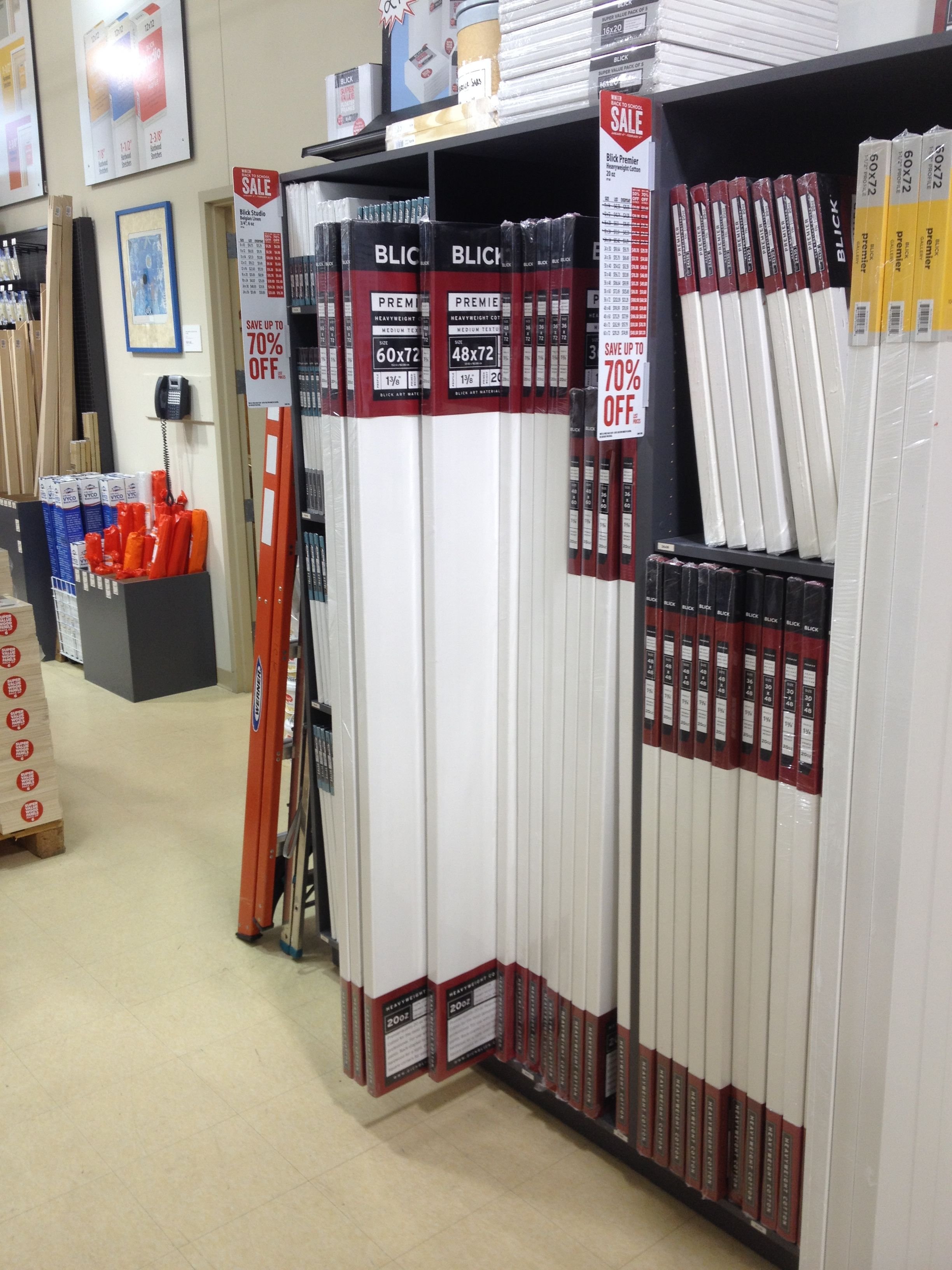
One of the challenges is to be able to find the 4′ x 6′ canvas for the painting. My local art store doesn’t carry any that big. But after doing some research, I found out Blick Art Materials in nearby Minneapolis carries them.
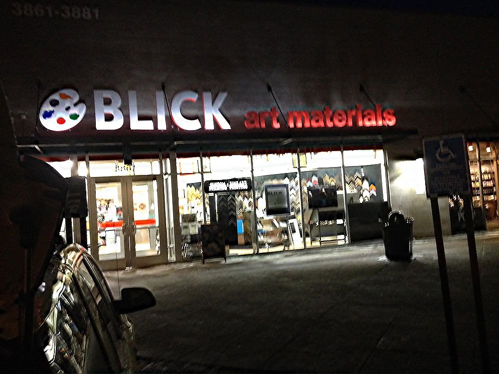
Although I have stretched canvases before, in this case, the cost for a high-quality 20 oz. pre-stretched canvas was only slightly more than what it would cost to stretch it myself. And I know there are purists who say you must stretch your own, but I would rather spend my time painting than stretching.
So off I went to hunt down a canvas.
I had never been to that store before. When I walked through it was love at first sight. I have only been to arts and crafts stores. But to be at a true art supply store, and especially one this size was amazing!

It didn’t take long to find my canvas.
Buying it was easy…
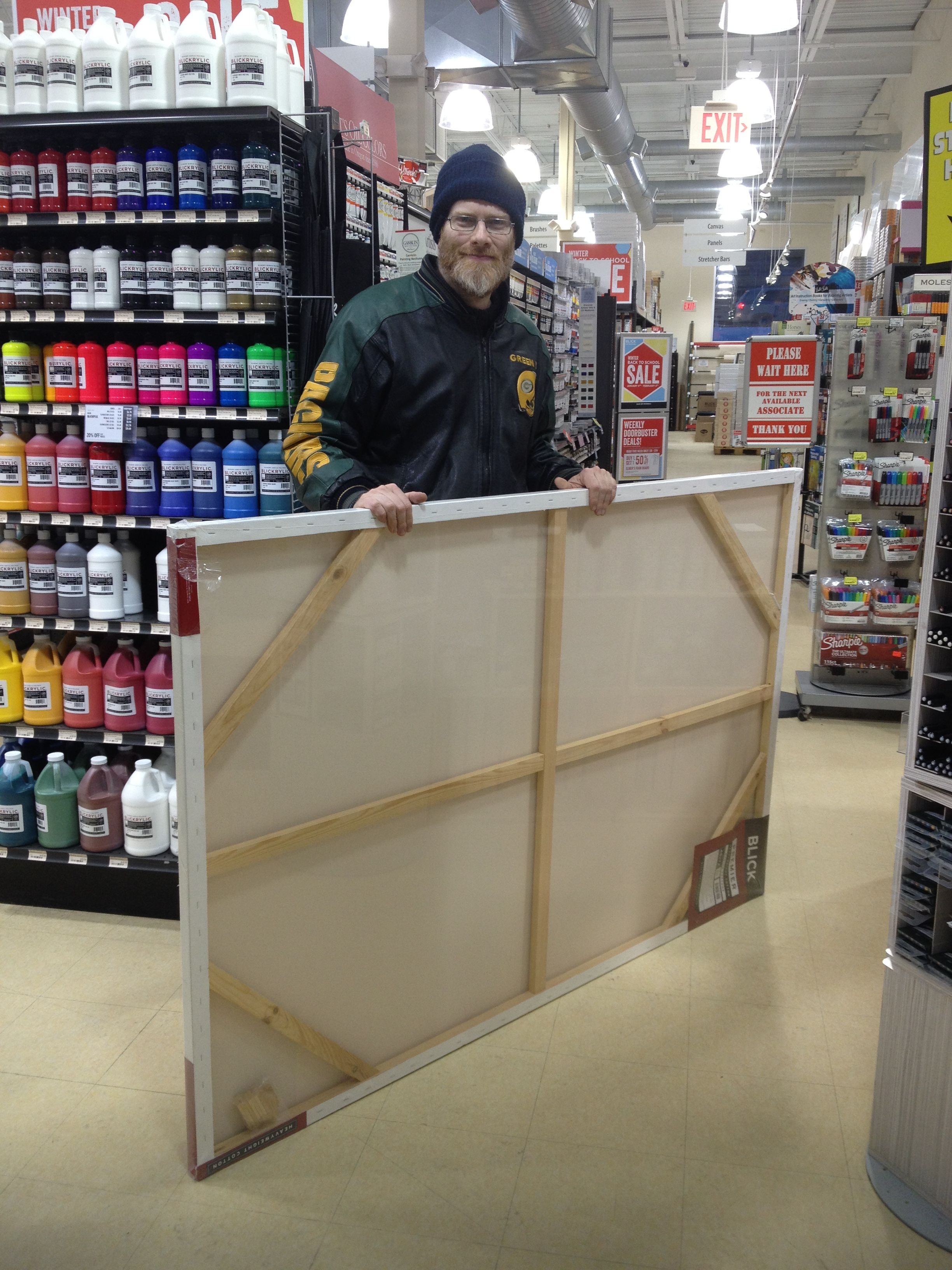
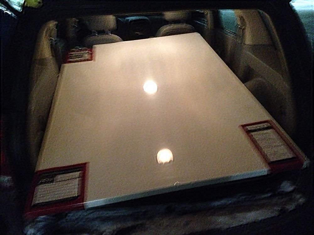
Getting it to fit in my SUV was a little more challenging! Would it fit?
Like a glove.
Learn How to Paint Acrylic Portraits With My Free Mini-Video Course!
Once I had it home, the next step was to prepare the design. The client didn’t want a straight-up reproduction of the photo he sent me.
First, he wanted he and his wife to look younger.
Second, he wanted the two of them to be much larger, more prominent within the image.
Third, he wanted the waterfall in the background to be larger.
This sounded like a job for Photoshop!
The first step was to cut out the figures, so I could resize them larger and insert them back into the image. That takes a little work! After that, I cut and pasted pieces of the background and stitched them together to cover over the areas left by my earlier incisions.

I felt it would be good to move the man and wife close together, and have them slightly overlapping to enhance the three-dimensional effect of one being slightly closer than the other.


Because the format of the photo is a different proportional ratio that the canvas I will be painting on, I had to add extra material to the top. But my client also wanted a larger waterfall.
So I took this picture and added it in…
And then cut and pasted pieces of the hill together. It’s a process of cutting, stretching, warping, sometimes even rotating the pieces like a jigsaw puzzle to make them work.
Finally, I got a cohesive design, ready to paint from.

With the client’s approval, I am ready to begin the sketch. But that will be an adventure I’ll save for another day!
Be Blessed,
P.S. Did you find this post helpful or encouraging? If so, send it on ahead! Let others know with the share buttons below. I’d love to hear your comments. Thank you so much! Also, do you have a question on acrylic portrait painting you’d like answered? Let me know, and I’d be happy to help!

2017 Year-End Survey Results
“What do you want me to teach on in 2018?”
At the end of last year, (which was not long ago as I write this) I sent out a survey to my students and email subscribers asking this question–in many different ways.
Specifically, I asked 12 questions to nearly 800 subscribers.
From those who participated, the responses to the survey surprised me a bit. They may surprise you as well!
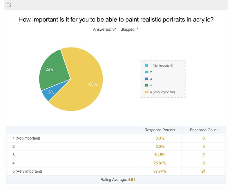
Question #1
Interesting. I knew most of my subscribers were hobbyists but I didn’t know the percentage was that high.
Question #2
This is good for me to know. Because if you want to learn how to paint abstract portraits, for example, you’re probably in the wrong place!
Question #3

I knew skin tones would be the highest scoring, based on the conversations I’ve had on Facebook and in direct emails. Shading comes in at second place. So I guess it’s good that I already did a course on shading.
But apparently I should do one on skin tones! 🙂 And there’s plenty of other topics I can teach on too.
Question #4

Now, I probably should have phrased my question better. Facial features really are eyes, nose and mouth all put together. But I think my subscribers were trying to say they’d like to learn how to do accurate portraits. How to capture the likeness correctly…yes?
I find it interesting that learning how to paint hair score higher than eyes. And the nose came in right after that.
Well, noses are tricky.
Maybe a course on painting noses would sound a little odd, but I’ll do it if that helps my students paint better portraits!
Question #5
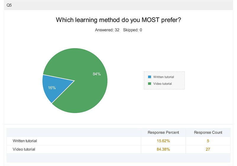
This totally amazed me. I know people like videos, but that is conclusive. I need to do more videos. I’ll still do some written tutorials here, but I am going to imbed some videos into the articles as much as possible.
Question #6

It’s pretty amazing that a majority of my readers have purchased an online course. Amazing what technology can do and how it can bring us together from all parts of the globe!
Question #7
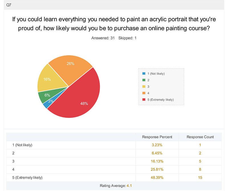
This is a good stat right here. Nearly half of my subscribers would buy a course if they KNEW they would learn everything they needed to be able to paint that amazing portrait. And another fourth would be pretty likely to, again if they were confident they’d get the outcome they’re seeking.
My goal then, will be to show you that I can teach you exactly what you need to do just that, and to make the transaction risk-free as possible for you.
Question #8
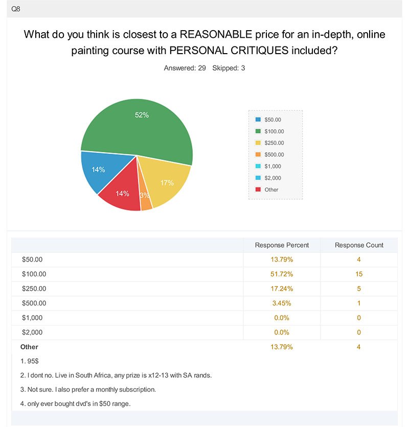
Okay, so it looks like I’m right on the money with what I charge for my course. Good to know. Obviously, I need to make a living as an artist and teacher and don’t want to under-price my labors, but I don’t want the price so high, that you can’t afford it. I can’t tell you how many times I’ve wanted to purchase a course on blogging or marketing, and then the price is $2,000 or more.
Really?
I could buy a nice used mini-van for that to haul more of my paintings around!
Question #9

I’m glad that everyone could see the value of a course with critiques included. I love doing critiques and seeing the results my students get with them, but they take time, and so I need to charge a little more for that. And of course, less for a course without critiques. I think my subscriber’s responses here are intelligent and reasonable.
I should have added the question, “How important is a personal critique in a course? Or, put another way, do you prefer “self-study?”
(You can answer that in the comments below if you’d like 🙂 )
Question #10

It seems that a majority of my subscribers would like a monthly membership program. I do have one right now: Realistic Acrylic All-Access Membership. With it, you get access to all the courses, plus personal critiques every month.
Question #11
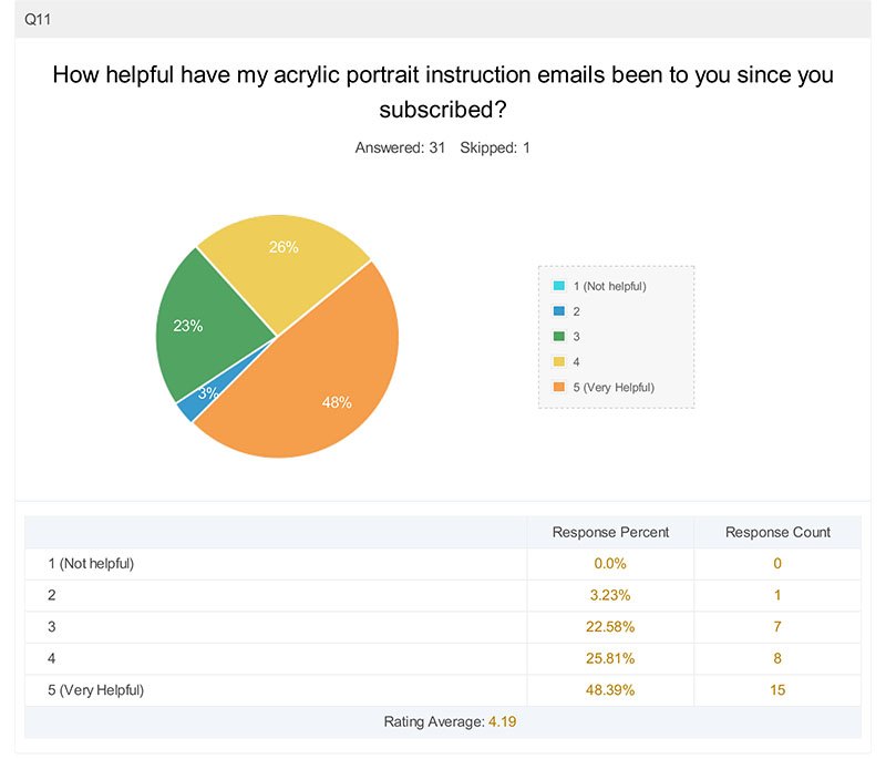
Nearly half have found my emails very helpful, and another quarter have found them pretty helpful. The remainder have found them decent, but not great. I’m glad I’m doing a good job overall, sharing lessons and tips that are useful, but it looks like I can still use some improvement.
I should have done a follow-up question or two: What can I improve on? What would you like to see more of?
Well, I’m asking you right now. 🙂 Let me know!
Question #12

This wasn’t surprising. After all, I normally send an email about once a week, so that is what my subscribers are used to. I recently opted in on an email list for marketing tips, and at a certain point, they sent me 2-3 emails a day!
My inbox could only take so much. Unsubscribed.
Occasionally, I send out an email twice a week, when I have an announcement on a new course or something that’s time sensitive, but I promise my subscribers to never inundate their inboxes!
Additional Comments
Finally, this last question was a freebie. It was wonderful to hear so many honest comments. Since the survey was anonymous, I was unable to respond back personally via email to the people who left the comments, but I will take the opportunity to do that now…
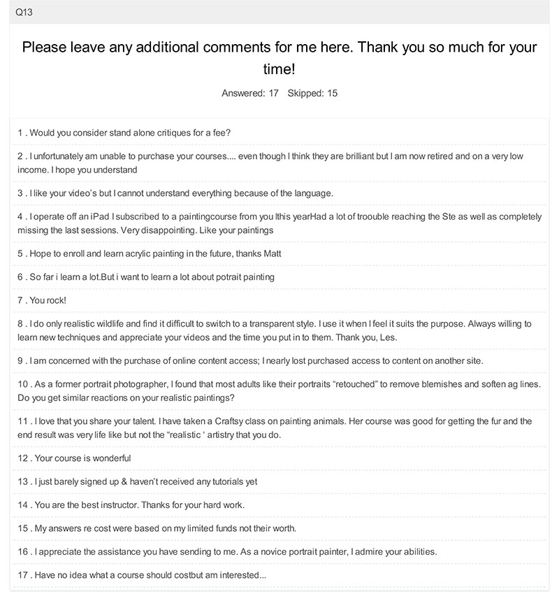
Here are my answers…
1. Would you consider stand alone critiques for a fee?
I would do standalone critiques for a fee, if that works best for you. Although I include a month worth of free critiques within my painting course, I would offer standalone critiques for $15 each.
These are personalized video critiques, like this one here, (approximately 15 minutes long) where I compare your painting next to the original image, discuss what’s working well, and show you exactly how to correct what may be off.
So, if you’re interested, just email me and let me know. I’ll set it up with you.
2 . I unfortunately am unable to purchase your courses…. even though I think they are brilliant but I am now retired and on a very low
income. I hope you understand
Of course I understand. I am still very glad that you’re a subscriber and you can still benefit from my free lessons and videos.
3 . I like your video’s but I cannot understand everything because of the language.
I am sorry about the language issue. Not sure if I can correct that, since I only speak English! Maybe there’s translation services out there for videos?
4 . I operate off an iPad. I subscribed to a painting course from you this year. Had a lot of trouble reaching the site as well as completely
missing the last sessions. Very disappointing. Like your paintings.
Thanks for the compliments on my paintings. I’m sorry if you were disappointed in not being able to access the later videos in the course. Email me. I think I can upload them to a private YouTube channel so you can see them.
5 . Hope to enroll and learn acrylic painting in the future, thanks Matt.
Ok, great, I look forward to teaching you. Maybe you already enrolled! 🙂
6 . So far I learn a lot. But I want to learn a lot about portrait painting.
Good. That’s what I’m here for!
7 . You rock!
Hey, thanks. God has been good to me…just want to pass the blessings along!
8 . I do only realistic wildlife and find it difficult to switch to a transparent style. I use it when I feel it suits the purpose. Always willing to
learn new techniques and appreciate your videos and the time you put in to them. Thank you, Les.
Hi Les, and glad you like the videos and appreciate the time I put into them. I plan on doing a lot more this year!
9 . I am concerned with the purchase of online content access; I nearly lost purchased access to content on another site.
Yikes! That would make me upset too. My courses are hosted by Teachable, and although they are not perfect, they are one of the most dependable learning management systems out there. Most of my students have had a great experience there. However, my course is satisfaction guaranteed, and you can always reach me by email or phone if you’re having problems with anything.
10 . As a former portrait photographer, I found that most adults like their portraits “retouched” to remove blemishes and soften ag lines. Do you get similar reactions on your realistic paintings?
Yes. One client said, “You can take my wrinkles out,” but to leave them on her husband. 🙂
11 . I love that you share your talent. I have taken a Craftsy class on painting animals. Her course was good for getting the fur and the
end result was very life like but not the “realistic ‘ artistry that you do.
Thank you. I am looking to fill a void here on the internet. There’s many teachers, but I haven’t found any that specialize in teaching realistic acrylic portrait painting. So, voila!
12 . Your course is wonderful.
Thank you so much!
13 . I just barely signed up & haven’t received any tutorials yet.
I’m sorry you didn’t get any tutorials yet. It might have been a glitch in my email service provider. Email me if you can and let me know if you still haven’t gotten anything yet!
14 . You are the best instructor. Thanks for your hard work.
Wow, thank you for the kind words!
15 . My answers re: cost were based on my limited funds, not their worth.
Sure, that helps to know that. Thanks!
16 . I appreciate the assistance you have sending to me. As a novice portrait painter, I admire your abilities.
My pleasure. Be blessed in your painting and may God take the skills He’s blessed you with and multiply them ten-fold this year!
17 . Have no idea what a course should cost but am interested…
My main online course, “Paint Your First Amazing Acrylic Portrait” is $97, one time fee. You can find out more or enroll right here.
That wraps it up for my first survey results. Did it surprise you? Does it make you think of anything you’d like to ask me?
Or maybe you’d like to leave a comment on what you’d like me to teach on. How have I been doing and how can I improve? I’d love to hear your thoughts.
Have a blessed day,
