Tag Archives for " online art tutorials "

Learn How to Sketch a Portrait Freehand: 45 Minutes
Unlock the secrets to freehand portrait drawing with precision and confidence
Sketching a portrait freehand can seem daunting, especially when capturing someone’s likeness. However, with patience and the right approach, anyone can create a compelling portrait in just 45 minutes. In this tutorial, we’ll break down a step-by-step method for sketching a portrait freehand using three simple pencils. Whether you’re a beginner or looking to refine your skills, this guide will help you confidently sketch portraits with more precision.
1. Prepare Your Materials: Start Simple for Success
Before diving into your sketch, it’s important to have the right tools.
- Pencils: HB (light), 3B (medium), and 8B (dark).
- Kneaded Eraser: Gentle on the paper and flexible for different erasing needs.
- Painter’s Tape: To secure the paper and prevent it from shifting.
Tip: Simplicity is key. Stick with just three pencils to avoid overwhelming yourself with too many options. This will help you focus on the drawing process without distraction.
2. Start with Basic Shapes: Defining the Composition
To begin, lightly sketch the outline of the head using simple, fluid lines. I suggest starting with the overall shape of the face, which is often oval. By using an HB pencil, the lightest in your set, you can make adjustments easily without committing too much at this stage.
Technique: Use long, gentle strokes to block in the general form. Avoid adding too much detail at first. Your goal is to get a feel for the proportions and placement of key features like the eyes, nose, and mouth.
Tip: Leave room on the top and bottom of the paper to avoid cramping the portrait. This ensures you can later fill in features like the hair and chin without running out of space.
3. Measure Proportions: The Key to Realism
Proportions are crucial for a successful portrait. One common rule is that the eyes should be roughly in the middle of the head. I emphasize using the eyes as a reference point for measuring the other facial features.
Here’s a quick breakdown:
- Eyes are typically located halfway between the top of the head and the chin.
- The nose usually falls about one-third of the way down from the eyes to the chin.
- The mouth is located between the nose and chin, often aligning with the middle of the eyes.
Technique: I advises using your pencil as a measuring tool. You can hold the pencil up against your reference photo, measure the angles of the face, and compare them directly with your sketch.
4. Focus on the Eyes: The Window to the Soul
I stress the importance of the eyes in any portrait. If the eyes are accurate, the rest of the portrait is more likely to fall into place. Start by lightly sketching the overall shape of the eyes and ensuring they are properly aligned with one another.
Technique: Notice the subtle curves in the eyelids and pay attention to the shadows. Use cross-hatching to create depth around the eyes. For reflections within the eyes, darken the pupils with a 3B pencil, leaving highlights for a realistic, lively appearance.
Tip: Take breaks to step back and assess the accuracy of your work. This will help you spot any inconsistencies in the alignment of the eyes or other features.
5. Gradually Add Features: Build Up with Confidence
Once the eyes are in place, you can move on to sketching the nose and mouth. I recommend focusing on the spacing between the features and the angles of the face. Be mindful of the direction of the mouth—it may curve slightly upward or downward depending on the expression.
Tip: The space between the nose and the upper lip is crucial in portraying a lifelike expression. Check that these distances match the reference photo to maintain accuracy.
6. Capture Expression: Use Wrinkles and Shadows
Facial expressions are often conveyed through the eyes and the subtle wrinkles around them. I emphasize how the cheeks and wrinkles near the eyes can reveal whether someone is smiling.
Technique: For wrinkles, use your 3B pencil to create soft, sketchy lines. Be careful not to press too hard. You can always build up the darker areas later with an 8B pencil. Incorporate shadows along the cheekbones and around the nose to give the face a sense of dimension.
7. Refine the Details: Darken and Shade for Depth
As you become more confident in the proportions, start darkening certain areas to define the form more clearly. The 8B pencil is perfect for emphasizing deep shadows, especially in areas like the hair and under the chin.
Technique: Use cross-hatching in areas where more shading is needed. Hold the pencil on its side to create broader strokes for shading larger areas, like the forehead or jawline. Be sure to leave highlights in places where light would naturally fall, such as the tip of the nose or the forehead.
8. Final Adjustments: Add Hair and Clothing
Finally, sketch in the hair and any clothing details. Hair can be tricky, but I also suggest starting with the general shape and then breaking it down into smaller sections. Don’t try to draw every strand—focus on capturing the overall flow and texture.
Tip: When sketching hair, leave some areas lighter to create the illusion of shine. For clothing, use lighter pencils for the fabric’s folds and darker ones for the shadows and creases.
Sketching a portrait freehand may seem like a challenge, but by following these steps, you’ll find the process manageable and rewarding. With careful attention to proportions, the right shading techniques, and consistent practice, you’ll be able to complete a lifelike portrait in just 45 minutes. Keep refining your skills, and soon you’ll be sketching portraits with confidence and accuracy.
Final Tips:
Practice cross-hatching to create depth and dimension in your shading.
Use a light touch with your pencils, especially in the beginning stages.
Regularly step back to assess your work from a distance.
Remember that accuracy in the eyes often determines the success of the entire portrait.
Read more about my additional resources, tutorials, to learn more and check out my free courses here. . Whether you’re a beginner or an experienced artist, there’s always something new to learn and apply to your paintings. Happy painting!
Learn How to Sketch a Portrait Freehand in 45 Minutes!
- How to Paint Foliage Using the Acrylic Glazing Technique
- How to Trace for an Accurate Portrait Sketch
- How to Paint Realistic Eyes in Your Acrylic Portrait
- How to Add Raw Umber Dark & Ultramarine Blue to Your Portrait
- How to Make Your Own Raw Umber Dark
- How to Paint Realistic Trees & Grass in Your Acrylic
- How to Block In Skin Tone Values Using Glazing Technique
- How to Paint Vibrant Reds in Your Acrylic Portrait
- How to Glaze Background Colors & More Acrylic Portrait
- How to Paint White Clothing in Your Acrylic Portrait
- How to Easily Transition from a Sketch to a Painting
- How to Block In Shading & Skin Tones in Your Acrylic
- How to Build Up Color on Acrylic Pet Portrait
- How to Build Up Form on Clothing with Acrylic
- How to Paint Dark Clothing Using Acrylic Glazing Technique
- How to Paint a 24 x 30 Acrylic With 30 People
- How to Do Smooth Shading with Acrylic
- How to Sketch an Acrylic Portrait with a Grid
Read more about how to paint a portrait that you can surely be proud of!
I’d love to hear your thoughts on this video. Please share it with your friends and family. Let me know if you have any further questions. I’ll greatly help you.
If you’d like to learn more, sign up for my free email tips and video class today.
Learn How to Paint Acrylic Portraits With My Free Mini-Video Course!
Thank you so much for taking the time to read this tutorial and watch the video. That means a lot to me. I hope you find it very helpful in your portrait painting.
Yours for Better Portraits,

P.S. Did you find this post helpful or encouraging? If so, send it on ahead! Let others know with the share buttons below. I’d love to hear your comments. Thank you so much! Also, do you have a question on acrylic portrait painting you’d like answered? Let me know, and I’d be happy to help!

How to Varnish an Acrylic Painting: Step by Step
Protect and enhance your acrylic painting with a smooth varnish finish
Varnishing is a crucial step in protecting your acrylic painting and ensuring it lasts for years. This clear coat not only safeguards your art from dust, UV rays, and moisture but also enhances the colors and depth of your painting. While the varnishing process might seem intimidating, with the right techniques, you can achieve a professional finish. In this guide, you’ll learn how to varnish an acrylic painting step by step, using the best tools and tips to get the job done smoothly.
Outline
- Introduction
- Why Varnishing is Important
- Tools Needed to Varnish an Acrylic Painting
- Preparation Before Varnishing
- Step-by-Step Varnishing Process
- Common Mistakes to Avoid
- Drying and Finishing Touches
- Final Thoughts
Why Varnishing is Important
Varnishing an acrylic painting does more than add a glossy or matte finish. It serves as a protective layer, preventing damage from environmental elements. Whether you choose a glossy, satin, or matte varnish, the layer helps:
- Protect the painting from dust, dirt, and moisture
- Shield the colors from UV radiation, which can cause fading over time
- Even out the painting’s sheen, creating a unified look
- Add depth to your colors, making them appear more vibrant
By varnishing your acrylic painting, you are ensuring its longevity, making it a worthwhile investment.
Tools Needed to Varnish an Acrylic Painting
Before starting, gather the following materials to ensure a smooth varnishing process:
- Matte, satin, or gloss varnish (choose your preferred finish)
- A soft, flat brush (2-3 inches wide for larger surfaces)
- A clean cup or container for holding the varnish
- A spray bottle of water
- A rag or paper towel to wipe excess varnish
- Optional: Gloves to protect your hands from varnish
Preparation Before Varnishing
Preparation is key to a flawless varnish application. Here’s how to get started:
- Clean the Painting Surface: Make sure your painting is completely dry (wait at least 24 hours after finishing your artwork) and free of dust or debris. Lightly dust the surface with a clean, soft cloth if necessary.
- Choose Your Workspace: When varnishing, it should be done in a clean, dust-free environment with good ventilation so that you can avoid inhaling fumes.
- Position the Canvas: Tilt the painting at a slight angle, which makes it easier to apply the varnish without creating streaks. Many artists prefer working with the painting laid flat or angled slightly toward them.
- Wet Your Brush: Lightly dampen the brush with water to ensure the varnish spreads smoothly and doesn’t clump up on the brush.
Step-by-Step Varnishing Process
Now that your tools and painting are ready, you can begin the varnishing process. Follow these steps for an even coat:
- Step 1: Prepare the Varnish
- Pour the varnish into a clean container or cup because it allows for easy dipping and ensures you don’t contaminate the varnish bottle. Then make sure to use only the amount you need for the session.
- Step 2: Start from the Left Side
- Begin applying the varnish from one side of the painting (typically the left side if you are right-handed). Then dip the brush into the varnish and use long, even strokes, and continue working in the section to ensure full coverage.
- Step 3: Work Horizontally
- Hold the brush at a slight angle and apply the varnish horizontally, then working from left to right. Use a gentle hand, when applying light pressure to avoid streaks or brush marks.
- Step 4: Blend Overlapping Areas
- Slightly overlap each stroke to blend the varnish and avoid visible lines and then continue across the canvas, maintaining a consistent amount of varnish on the brush.
- Step 5: Wipe Excess Varnish
- If you notice any buildup of varnish on the edges or sides of the painting, then use a clean rag or a flat brush to wipe it away. Because this ensures a uniform layer of varnish without drips or excess buildup.
- Step 6: Avoid Over-Brushing
- Once the varnish is applied, avoid brushing over the same area multiple times, as this can lead to streaks and cloudiness. One or two smoothing strokes are all that’s necessary.
- Step 7: Let It Dry
- After varnishing, allow the painting to dry in a dust-free area for at least an hour. Depending on the varnish type, full curing might take longer (up to 24 hours). Avoid touching the surface until it is completely dry.
Common Mistakes to Avoid
While varnishing can be tricky if you’re not careful. So, to ensure the best results, avoid these common pitfalls:
- Using too much varnish: The excess varnish leads to thick, uneven coats that can result in streaks or a cloudy finish so do not over varnish.
- Over-brushing: Repeatedly brushing over areas already varnished can also cause the varnish to become sticky and uneven.
- Varnishing too soon: Ensure the painting is fully dry before applying varnish, or it can trap moisture and cause the colors to smudge.
- Not protecting the painting: When you varnish it, should be in a clean, well-ventilated space to avoid dust or particles sticking to the wet varnish.
Drying and Finishing Touches
Once the varnish has dried, inspect the painting under good lighting. Then if you notice any spots where the varnish appears uneven or thin, you can apply a second coat using the same technique. However, it’s important to wait for the first coat to dry fully before reapplying.
For added protection, consider adding a protective glass or acrylic cover, especially if the painting will be displayed in a high-traffic area.
While varnishing is a simple yet vital step in preserving and enhancing the beauty of your acrylic paintings. Then you need to follow these steps, so that you can achieve a professional finish that protects your artwork for years to come. But always remember to work in a clean environment, use smooth strokes, and allow ample drying time between coats.
Your painting will not only look polished and professional but will also stand the test of time. Happy varnishing!
Get your free gift from me here!
- How to Paint Foliage Using the Acrylic Glazing Technique
- How to Trace for an Accurate Portrait Sketch
- How to Paint Realistic Eyes in Your Acrylic Portrait
- How to Add Raw Umber Dark & Ultramarine Blue to Your Portrait
- How to Make Your Own Raw Umber Dark
- How to Paint Realistic Trees & Grass in Your Acrylic
- How to Block In Skin Tone Values Using Glazing Technique
- How to Paint Vibrant Reds in Your Acrylic Portrait
- How to Glaze Background Colors & More Acrylic Portrait
- How to Paint White Clothing in Your Acrylic Portrait
- How to Easily Transition from a Sketch to a Painting
- How to Block In Shading & Skin Tones in Your Acrylic
- How to Build Up Color on Acrylic Pet Portrait
- How to Build Up Form on Clothing with Acrylic
- How to Paint Dark Clothing Using Acrylic Glazing Technique
- How to Paint a 24 x 30 Acrylic With 30 People
- How to Do Smooth Shading with Acrylic
- How to Sketch an Acrylic Portrait with a Grid
Read more about how to paint a portrait that you can surely be proud of!
I’d love to hear your thoughts on this video. Please share it with your friends and family. Let me know if you have any further questions. I’ll greatly help you.
If you’d like to learn more, sign up for my free email tips and video class today.
Learn How to Paint Acrylic Portraits With My Free Mini-Video Course!Thank you so much for taking the time to read this tutorial and watch the video. That means a lot to me. I hope you find it very helpful in your portrait painting.
Yours for Better Portraits,
P.S. Did you find this post helpful or encouraging? If so, send it on ahead! Let others know with the share buttons below. I’d love to hear your comments. Thank you so much! Also, do you have a question on acrylic portrait painting you’d like answered? Let me know, and I’d be happy to help!

How to Paint Over a Detailed in First Few Layers of Acrylic
Learn the first few layers of acrylic glazing for depth and realism
Laying the Foundation with Acrylic Glazing
When it comes to portrait painting, the initial layers play a critical role in defining the composition, tone, and depth of the artwork. In this tutorial, we will explore how to paint over a detailed in first few layers of an acrylic portrait using the glazing technique. This method, often used by the old masters like Leonardo da Vinci and Titian, allows for the creation of subtle depth, rich shading, and enhanced realism.
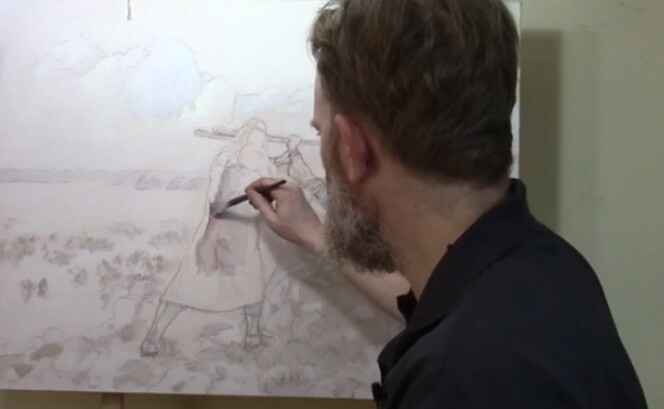
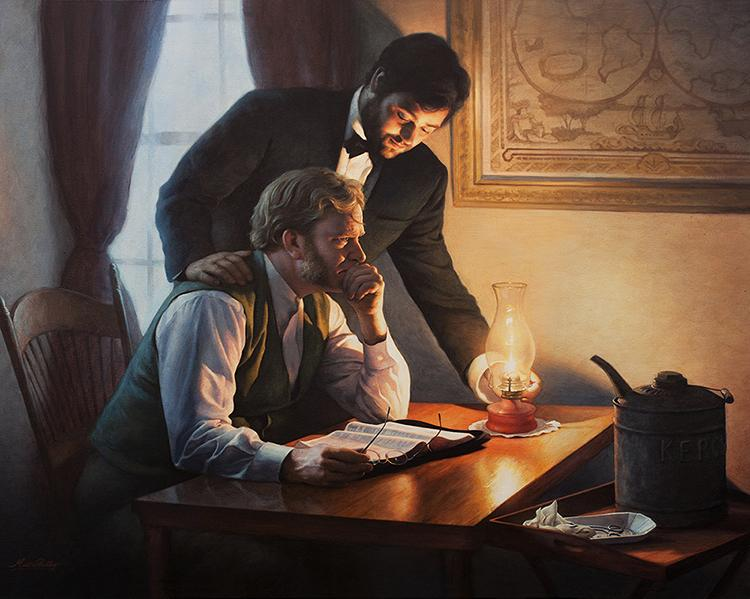
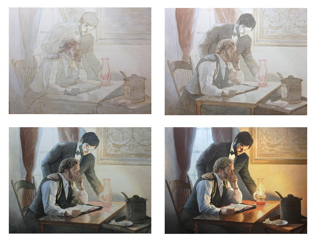
In this lesson, we will delve into a commissioned piece depicting the biblical story of Moses, Aaron, and Hur during the ancient Israeli-Amalekite battle. The symbolism of this painting reflects intercessory prayer, where Moses’ raised staff determined the outcome of the battle, supported by Aaron and Hur. Let’s walk through the process of painting the first layers while maintaining the intricate details of the sketch.
Step 1: Blocking in the Shading
The first step in building up the painting is to block in the shading. Starting with a small flat brush, begin by mixing raw umber dark with a little ultramarine blue and blending it into matte medium. This mixture allows for transparent layering, known as glazing, which will help maintain the underlying sketch without disturbing its details.
- Tip: Use small amounts of acrylic paint mixed with large amounts of matte medium for best results. This creates translucent layers that gradually build depth.
As you apply this mixture, focus on blocking in the shadows and edges of the figure. In this case, we’re focusing on the figure of Moses. The goal here is not to add too much detail but to establish the overall value structure—the lights and darks that will give the portrait its dimensionality. Keep the paint wet and blend softly to avoid harsh lines.
Step 2: Maintaining the Integrity of the Sketch
One of the advantages of the glazing technique is that it allows you to retain the integrity of your detailed sketch. Unlike opaque painting methods, where the initial sketch can get lost under thick layers of paint, glazing preserves every line. This is especially helpful when working on complex portraits that require precision and subtlety.
- Technique: Build the layers slowly. The acrylic glazing method requires patience as each layer dries before the next is applied. This results in richer shading and more nuanced transitions between light and shadow.
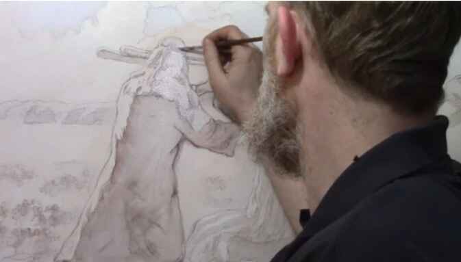
Step 3: Applying the Glaze to the Headdress
After blocking in the shadows, it’s time to move on to more specific areas, such as Moses’ headdress. Here, switch to ultramarine blue for a cooler tone. Apply this thin glaze using a round brush, gently working it into the edges and interior details. The goal is to subtly enhance the color while maintaining the transparency of the paint.
- Tip: Always zoom in to focus on intricate details. This ensures that the smaller elements of your painting, such as folds in fabric or facial features, receive the attention they need.
By layering the blue glaze, you start to see the headdress take on more depth, creating a subtle contrast between the cool blues and the warmer tones of Moses’ skin.
Step 4: Blocking Out Old Elements
As with many paintings, revisions are often necessary. In this instance, the figure of Aaron needed to be moved to improve the overall composition. To block out the remnants of the previous version, use titanium white mixed with raw sienna. This combination will effectively cover up old lines and prepare the canvas for new elements.
- Technique: Blocking out sections with lighter colors helps create a clean slate for adjustments. Don’t be afraid to revisit areas that need correcting, as painting is a fluid process of refinement.
Step 5: Letting the Layers Dry
After applying the first few layers, it’s essential to let the painting dry. This is one of the key aspects of acrylic glazing—patience. Each layer needs time to set before the next one is applied to avoid muddying the colors or losing the delicate balance of transparency.
- Tip: Allow ample drying time between layers. This prevents the colors from blending unintentionally and helps you achieve the sharpness needed for realistic portraits.
Once the initial layers are dry, you can return to the painting to add further nuances and build upon the foundation you’ve created.
The Benefits of Acrylic Glazing
The glazing technique offers several advantages, especially for detailed portrait painting:
- Preservation of Details: Because you are working with thin layers of transparent paint, you can retain all the intricate details of your original sketch.
- Depth and Realism: Glazing allows for gradual transitions between light and shadow, creating a more lifelike and three-dimensional appearance.
- Low Pressure: Unlike opaque techniques, where you need to get the colors and values right on the first try, glazing offers more flexibility. Each layer builds upon the previous one, so mistakes can be easily corrected with additional glazes.
- Historical Significance: This technique has been used by master painters for centuries to achieve the luminous quality seen in classical portraits.
Conclusion: Building a Strong Foundation
Mastering the first few layers of an acrylic portrait is crucial to achieving depth and realism in your painting. When using the glazing technique, you can preserve the details of your sketch while gradually building up the shading and values. Because this method requires patience but ultimately results in a more nuanced and lifelike portrait.
If you’re interested in learning more about acrylic glazing or portrait painting techniques, be sure to explore the resources available at RealisticAcrylic.com. and download my free gift for you here. With practice, you’ll be able to master this technique and bring your portraits to life with rich depth and realism.
- Adding highlights to your acrylic painting
- 5 Excellent Reasons to Use Aluminum Foil
- Paint Realistic Wrinkles in Acrylic
- Painting Clothing in an Acrylic Portrait
- Paint a Cloudy Sky Acrylic
- How to add Semi-Opaque Highlights
- How to Enhance the Contrast in Your Acrylic
- How to Add Glaze to Your Acrylic Painting
- Paint Realistic Reflections on Eyeglasses in an Acrylic Portrait
- Build Up Depth on Your Acrylic Portrait Backgrounds
- How Do You Do Layers With the Glazing Technique?
- Learn How to Paint Wrinkles in Acrylic
Read more about how to paint a portrait that you can surely be proud of!
I’d love to hear your thoughts on this video. Please share it with your friends and family. Let me know if you have any further questions. I’ll greatly help you.
If you’d like to learn more, sign up for my free email tips and video class today.
Learn How to Paint Acrylic Portraits With My Free Mini-Video Course!
Thank you so much for taking the time to read this tutorial and watch the video. That means a lot to me. I hope you find it very helpful in your portrait painting.
Yours for Better Portraits,
P.S. Did you find this post helpful or encouraging? If so, send it on ahead! Let others know with the share buttons below. I’d love to hear your comments. Thank you so much! Also, do you have a question on acrylic portrait painting you’d like answered? Let me know, and I’d be happy to help!

How To Darken Background & Clothing: Acrylic Glazing Technique
Discover the acrylic glazing technique to add depth, richness, and contrast to your portraits by darkening the background and clothing with ease.
One of the challenges portrait artists face is creating a balanced contrast between the subject and the background. Acrylic glazing is an excellent technique for solving this problem, offering the ability to subtly darken elements like the background and clothing while maintaining depth and luminosity. In this tutorial, we’ll explore how to use acrylic glazing to darken the background and clothing in your portraits. Then the key to success in this technique lies in building up light layers of color, allowing the paint to create a rich, oil-like effect that transforms your artwork.
Because at the end of this guide, you’ll be able to create striking contrasts, enhance the mood of your painting, and master acrylic glazing for darker tones.
Materials Needed
To achieve the best results with the acrylic glazing technique, you’ll need the following materials:
- Acrylic paints (ultramarine blue, burnt sienna, raw umber, titanium white, etc.)
- Matte medium (or glazing medium)
- Reference photo
- Various brushes (detail brushes, medium flat brush, and large round brush)
- Palette for mixing
- Water and a clean rag
Understanding Acrylic Glazing
Acrylic glazing is a technique where you mix a small amount of pigment with a large amount of matte medium to create thin, transparent layers of color. Each layer allows light to pass through, giving the painting added depth and richness. This technique mimics the effects of oil painting but with the faster drying time of acrylics, making it a versatile choice for many artists.
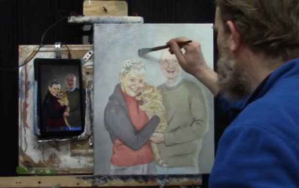
In this video, we follow the steps to darken the background and clothing of a 16×20 acrylic portrait of a couple and their cat. The key to achieving a smooth glaze is to ensure your base sketch is solid, allowing the layers to enhance rather than correct the painting.
Step 1: Starting with a Solid Sketch
Before applying glazes, it’s essential to have a strong and accurate sketch. As I have mention, that if you want to make sure that the proportions and likeness are perfect before you begin glazing. Because the foundation is key to a successful final product.
When creating your sketch:
- Focus on achieving correct proportions of your subject.
- Make sure the key areas such as the eyes, nose, and mouth are aligned.
- Use light pencil marks that won’t interfere with the transparency of your glaze.
Step 2: Mixing the First Glaze for the Background
In this painting, the client requested a bluish tone for the background. To create a blue glaze, follow these steps:
- Mix Ultramarine Blue: Add a small amount of ultramarine blue to your palette.
- Add Matte Medium: Mix the blue with matte medium until the paint is very translucent. Matte medium is milky white but dries completely clear, allowing the underlying layers to shine through.
- Apply the Glaze: Using short, choppy brush strokes, begin layering the blue glaze onto the background. This creates a smooth transition between the subject and background, enhancing depth.
One of the advantages of glazing is its flexibility. If the glaze looks too intense, you can always add more matte medium or water to lighten it.
Step 3: Building Up Contrast Between the Subject and Background
After applying the initial glaze, focus on enhancing the contrast between the subject (in this case, the couple and their cat) and the background. This step is crucial to making the subject stand out. You want to:
- Gradually increase the opacity of the glazes on the background to push it further into the distance.
- Use darker tones in the background compared to the foreground to create depth.
To darken the background even more, add layers of raw umber or burnt sienna mixed with matte medium on top of the blue glaze. This will give the background a more muted, shadowy effect while still allowing the initial blue tone to shine through.
Step 4: Glazing the Clothing
Next, shift focus to darkening the clothing using a similar glazing technique. The subject in this portrait is wearing darker-toned clothes, and I use the combination of raw umber and ultramarine blue to darken the clothing in a natural, gradual way.
- Mix Raw Umber and Blue: Combine raw umber with ultramarine blue and matte medium. This creates a nice neutral dark glaze that adds depth to the clothing without making it look flat.
- Apply the Glaze: Begin layering this darker glaze on the clothing, focusing on areas of shadow or where more depth is needed.
- Build Layer by Layer: Since glazing is a cumulative process, each layer adds more intensity to the clothing. Don’t worry about getting the perfect color right away. With each layer, the colors will mix and blend, creating a more realistic tone.
Remember, glazing allows you to make adjustments easily. If the color feels too cool or too warm, add a thin glaze of raw sienna or alizarin crimson to adjust the warmth or coolness.
Step 5: Enhancing Details and Finishing Touches
Once the base glazes are in place, use smaller detail brushes to enhance the finer areas, such as the edges of the clothing or folds in the fabric. For example, I use raw sienna to highlight certain areas of the shirt’s wrinkles. Then this subtle addition of color adds a lifelike quality to the painting.
At this stage, pay attention to:
- Wrinkles and folds in the clothing: Use a small brush to carefully apply thin glazes to highlight these details.
- Edge details: Glaze carefully around the edges where the subject meets the background, ensuring a smooth transition.
Tips for Acrylic Glazing Technique
- Use Light Layers: Always apply thin glazes and build up gradually. Heavy applications will obscure the previous layers.
- Dry Between Layers: Allow each glaze to dry before adding the next. This prevents muddying the colors.
- Experiment with Color: Don’t be afraid to adjust the color temperature with warm or cool glazes.
- Less Is More: A little pigment goes a long way when glazing. Be mindful of how much color you mix in with the medium.
- Work from Light to Dark: Build up your painting by working from lighter glazes to darker ones to maintain luminosity and depth.
Conclusion
The acrylic glazing technique offers artists a powerful tool for adding depth and richness to their paintings. When layering transparent color, you can gradually darken backgrounds and clothing without losing the vibrancy of the initial layers. This method also allows for flexibility, as adjustments can be made throughout the process without the pressure of getting it right on the first try.
In this painting of a couple and their cat, the careful use of glazing brings out the contrast between the subjects and their background, creating a compelling portrait. With practice, you’ll be able to master this technique and apply it to your own projects, transforming your portraits into luminous works of art.
If you’re looking for more instructional videos on how to improve your acrylic painting, visit www.realisticacrylic.com for more tutorials and check out my free courses here. .
- Adding highlights to your acrylic painting
- 5 Excellent Reasons to Use Aluminum Foil
- Paint Realistic Wrinkles in Acrylic
- Painting Clothing in an Acrylic Portrait
- Paint a Cloudy Sky Acrylic
- How to add Semi-Opaque Highlights
- How to Enhance the Contrast in Your Acrylic
- How to Add Glaze to Your Acrylic Painting
- Paint Realistic Reflections on Eyeglasses in an Acrylic Portrait
- Build Up Depth on Your Acrylic Portrait Backgrounds
- How Do You Do Layers With the Glazing Technique?
- Learn How to Paint Wrinkles in Acrylic
Read more about how to paint a portrait that you can surely be proud of!
I’d love to hear your thoughts on this video. Please share it with your friends and family. Let me know if you have any further questions. I’ll greatly help you.
If you’d like to learn more, sign up for my free email tips and video class today.
Learn How to Paint Acrylic Portraits With My Free Mini-Video Course!
Thank you so much for taking the time to read this tutorial and watch the video. That means a lot to me. I hope you find it very helpful in your portrait painting.
Yours for Better Portraits,
P.S. Did you find this post helpful or encouraging? If so, send it on ahead! Let others know with the share buttons below. I’d love to hear your comments. Thank you so much! Also, do you have a question on acrylic portrait painting you’d like answered? Let me know, and I’d be happy to help!

5 Steps on How to Paint a Vibrant Acrylic Portrait
Learn the classical glazing technique for depth and luminosity
Acrylic painting is an exciting medium known for its versatility, but achieving the depth and vibrancy often associated with oil paintings can seem challenging. However, by employing the classical glazing technique, a method favored by old masters like Rembrandt, Titian, and Vermeer then you can produce rich, luminous results with acrylics. This blog post will guide you through 5 essential steps to create a vibrant acrylic portrait using this time-tested method.
This tutorial shows the entire process of painting a portrait. Here are the steps I show in this tutorial:
- Start with a Detailed Sketch.
- Apply the Initial Glaze Layers
- Layer and Build Gradation
- Introduce Vibrant Colors
- Focus on Nuances and Details
1. Start with a Detailed Sketch
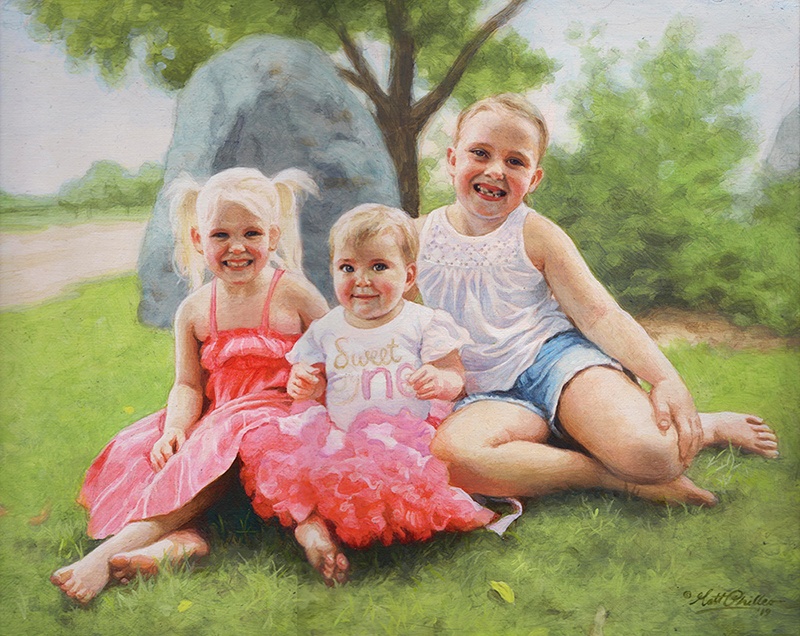
Every masterpiece begins with a solid foundation, and in portrait painting, that foundation is the sketch. Before you start adding color to your canvas, take time to create a detailed and accurate sketch of your subject. For this project, an 11×14 portrait of three girls in a park serves as an example.
By using a sepia-tone prismacolor colored pencil, you can establish proportions and likeness. Accuracy in this stage helps set the stage for a calm and confident painting process. Once your sketch is ready, seal it with a clear matte medium. This acts as a protective layer, ensuring that the pencil lines remain intact as you begin adding paint.
- Tip: Use a flat brush (¾ inch to 1 inch wide) to apply the matte medium. Make sure the application is smooth and even, allowing it to dry thoroughly before proceeding to the next step.
2. Apply the Initial Glaze Layers
The heart of this painting method lies in glazing, where thin, transparent layers of paint are applied over one another to build depth and richness. Unlike traditional opaque acrylic painting, the classical glazing technique requires a mixture of 95% matte medium to 5% paint. This creates a very light wash that enables you to gradually build colors without overwhelming the canvas.
Begin by mixing raw umber dark with ultramarine blue to create lifelike skin tones and shadow areas. These first layers will be almost imperceptible, but they provide a strong base for the layers that follow.
- Tip: The first layers of glaze should be incredibly light. This allows for adjustments in color or value without the need to paint over mistakes. The glazing method helps avoid the common frustration of muddy colors often encountered in acrylic painting.
3. Layer and Build Gradation
Once the initial glaze is applied, it’s time to focus on layering. As you build up more layers, you’ll notice how the painting starts to take on a more vibrant and realistic appearance. The goal here is to create a seamless transition between light and dark values, blending tones smoothly to replicate the natural shading found in your reference photo.
In this step, more raw umber dark and ultramarine blue are used to deepen the shadows on the forehead and hair. This layering process helps achieve the subtle gradation required for realistic portraits.
- Technique: As you layer, ensure that each glaze is thin and transparent. Too much paint in a single layer can cause the painting to look heavy and lose the delicate transparency that glazing provides.
4. Introduce Vibrant Colors
To make your portrait truly vibrant, it’s essential to introduce bold colors into the glazing process. In this example, a dash of Liquitex hot pink was added to the dress to intensify the color and give it a glowing effect. The key is to use these bright colors sparingly, applying them in thin layers so that they blend harmoniously with the existing hues.
When applying glazes to areas like the clothing, make sure to leave the white areas exposed. This technique, known as “preserving the luminosity,” ensures that highlights remain bright and eye-catching, adding to the overall vibrancy of the portrait.
- Tip: When adding vibrant glazes, thin the paint with medium and apply it cautiously. This helps prevent overpowering the existing layers while enhancing the color saturation.
5. Focus on Nuances and Details
The final step in this process involves refining the smaller details and nuances that bring a portrait to life. For example, the highlights in the hair, shadows in the creases of clothing, and the subtle changes in skin tone around the eyes require careful attention.
In the final layers, you can also experiment with a semi-opaque mixture, using titanium white, raw umber dark, and organic red-orange to add warmth and depth to the skin tones. With each new layer, the portrait takes on more life, depth, and realism. At this stage, it’s important to use more opaque layers sparingly, as glazing is best suited for large areas, while more detailed parts, such as fingernails or eyes, may benefit from a slightly thicker application of paint.
- Technique: If you notice that certain areas appear too flat or lack depth, consider adding a dark glaze to emphasize the shadows. Because mixing ultramarine blue with raw umber dark creates a rich, deep tone perfect for refining these darker areas without relying on black paint.
Conclusion: Patience Is Key
As you add each layer of glaze, then always remember that patience is vital. Because acrylic glazing requires multiple layers, sometimes ten or more to achieve the desired depth and luminosity. Each layer builds upon the last, contributing to the portrait’s final vibrancy. While it may take time, the results are well worth the effort.
By following these five steps, you can create a stunning acrylic portrait with vibrant colors and lifelike depth, all while employing the classical glazing technique favored by the old masters.
For further resources and guides, visit realisticacrylic.com and check out my free courses to enhance your acrylic painting journey.
- How to Paint Foliage Using the Acrylic Glazing Technique
- How to Trace for an Accurate Portrait Sketch
- How to Paint Realistic Eyes in Your Acrylic Portrait
- How to Add Raw Umber Dark & Ultramarine Blue to Your Portrait
- How to Make Your Own Raw Umber Dark
- How to Paint Realistic Trees & Grass in Your Acrylic
- How to Block In Skin Tone Values Using Glazing Technique
- How to Paint Vibrant Reds in Your Acrylic Portrait
- How to Glaze Background Colors & More Acrylic Portrait
- How to Paint White Clothing in Your Acrylic Portrait
- How to Easily Transition from a Sketch to a Painting
- How to Block In Shading & Skin Tones in Your Acrylic
- How to Build Up Color on Acrylic Pet Portrait
- How to Build Up Form on Clothing with Acrylic
- How to Paint Dark Clothing Using Acrylic Glazing Technique
- How to Paint a 24 x 30 Acrylic With 30 People
- How to Do Smooth Shading with Acrylic
- How to Sketch an Acrylic Portrait with a Grid
Read more about how to paint a portrait that you can surely be proud of!
I’d love to hear your thoughts about this video. Please share it with your friends and family. Let me know if you have any further questions. I’ll greatly help you.
If you’d like to learn more, sign up for my free email tips and video class today.
Learn How to Paint Acrylic Portraits With My Free Mini-Video Course!
Thank you so much for taking the time to read this tutorial and watch the video. That means a lot to me. I hope you find it very helpful in your portrait painting.
Yours for Better Portraits,
P.S. Did you find this post helpful or encouraging? If so, send it on ahead! Let others know with the share buttons below. I’d love to hear your comments. Thank you so much! Also, do you have a question on acrylic portrait painting you’d like answered? Let me know, and I’d be happy to help!

4 Questions About Acrylic Portrait Painting, Answered
Recently, I was asked some questions about acrylic portrait painting. I hope the answers I shared with this artist can be of help to you as well.
1. How do you prepare your canvas panel for painting with Acrylics?
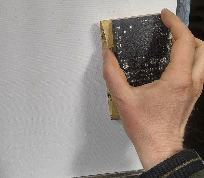
Sanding a canvas panel in preparation for painting an acrylic portrait
2. You spoke of layering your paint when composing a portrait. Please briefly explain.
I use the glazing technique to slowly bring the portrait from a white canvas to completion. The glazing technique is achieved by mixing your paint with clear acrylic medium (usually matte medium) to disperse the pigment, thus allowing light to pass through.
Although you could use water, it’s not recommended, because it breaks down the acrylic resin binder, causing a rough visual texture and possible poor adhesion. For a smoother look, you want to use clear acrylic medium.
Custom commissioned realistic acrylic portrait from a photo painted by Eau Claire area artist Matt Philleo, ©2019 Fine Art by Matt Philleo
3. You mentioned using a Prismacolor pencil for making your diagram. What color do you recommend?
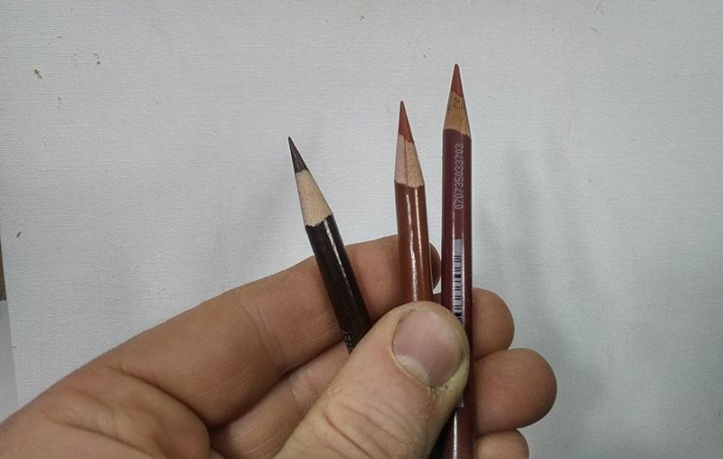
Using colored pencil for your acrylic portrait sketch makes things a lot easier. Technique discovered and developed by Matt Philleo.
4. Do you do the painting from start to finish in one setting?

Acrylic portrait artist Matt Philleo posing in front of a 48″ x 72″ commission painting for a client in Brunei
I hope these questions and answers were helpful to you as well. I know some of this stuff seems pretty basic, but it’s good for all of us to pause and think about why we do what we do. It then makes the doing that much more significant.
Let me know if you have any questions of your own about acrylic portrait painting and I’ll do my best to help!
P.S. Did you find this post helpful or encouraging? If so, send it on ahead! Let others know with the share buttons below. I’d love to hear your comments. Thank you so much! Also, do you have a question on acrylic portrait painting you’d like answered? Let me know, and I’d be happy to help!

How to Paint Realistic Wrinkles in Acrylic: My New Course
Everyone has at least a few wrinkles.
And so as portrait artists, we need to learn how to paint realistic wrinkles–whether we’re painting someone old or young. Painting wrinkles well can really help to capture a person’s likeness in a portrait. They can add so much to the personality.
But it’s not easy. There’s so much to it: the shape, the coloring of the shadows, the highlights, and the blending. How do you do it, without it looking fake?
Do You Struggle To…
- paint wrinkles that look like they are actually wrinkles?
- paint the creases from nose to mouth convincingly, to make it look the person is really smiling?
- show the expression and personality of the person by painting the wrinkles in the forehead correctly?
- paint the different nuances in light and shade, the shadows on the wrinkles and how to make them look natural?
- choose, mix and blend the colors to create realistic shadows and skin tone?
- accentuate the wrinkles without making them too prominent?
- create smooth gradients on your wrinkles, with correct shadows and highlights blending together, cohesively?
- see the correct shape of the wrinkles from your reference photo and accurately represent that on your canvas?
- capture the likeness of the person you’re painting by painting wrinkles realistically?
If you’re an an acrylic portrait painter who struggles with painting wrinkles, then I’d love to help you get better at it.
Introducing My New Course…
“Paint Realistic Wrinkles in Acrylic”
Why did I decide to do a course on painting wrinkles?
I’ve been painting portraits in acrylic for nearly 25 years and teaching classes for the last two. During that time, I’ve taught over 100 students how to paint an acrylic portrait, step-by-step. That course covers a lot of material and it’s been wonderful to see students take it and get noticeably better at their portrait painting.
But one of my students was really struggling with how to paint wrinkles. So I thought, “Why not teach an online class on it?” After getting feedback from my other students, I realized there are other artists who struggle with this as well.
And so, now I’m excited to teach you, too, how to paint wrinkles realistically!
What will we cover in the course?
- Why painting wrinkles well is important and how it can make your paintings better
- The 5 different kinds of wrinkles in the face and how to see them accurately, so you can paint them accurately
- How to sketch wrinkles accurately, and do the “heavy lifting” here so the painting part is way easier.
- Choosing the right colors, mixing and blending so they don’t get muddy.
- Achieving accurate values for both the colors and highlights so the wrinkles actually have depth to them
- Finishing up with a gentle touch, painting smooth gradients, resulting in a portrait that just begs to be looked at
- And more!
Here’s How We’ll Do it
> This is a brand new course, so I will teach a lesson every week, recorded in my studio on Tuesday and released Wednesday morning for the next four weeks. I will upload them to this site, and you will get instant access as soon as they are up. The lessons will start June 6th.
> Each lesson will be about an hour long, and broken up into smaller segments so you can easily watch them and come back to them when you like.
> I’ll respond to your feedback and questions, making sure I’m teaching exactly what you need to succeed.
> You will have lifetime access to these videos on this site (as long as technology holds out) and can watch them at your own pace 24/7.
Personal Critiques to Help You When You Feel Stuck
If you need extra help, I’d be happy to record a personal video just for you and critique your work. I’ll point out any areas that could be corrected or refined. I’ll show you exactly with my Crystal Clear Critique method of drawing on top of your reference photo and your portrait in progress, while explaining how to improve an area you’re struggling with. You’ll know exactly what to do to get your sketch or painting back on track.
Getting a Critique is Easy & Effective:
Step 1: In the critique, you email me ([email protected]) a photo of your work in progress, and the reference photo(s) you’re working with, along with your comments on what you’d like addressed or any frustrations you have.
Step 2: I’ll set your portrait up on my video screen and set up the recording.
Step 3: Then I compare and contrast your painting with the reference photo, literally showing you gently (but clearly) what’s working and what could use improvement. This is all on a private, personalized video, not in a group setting. So you never have to feel awkward as if anyone else is judging your work!
Step 4: I send the recorded video back to you (usually within 24 hours or less), where you can access it online via a personalized link, just for you. The critique will typically be about 15 minutes long.
Step 5: You take whatever suggestions you like from my critique, and incorporate them into the painting. Your painting looks great. You feel great about it. You finish the sign the painting and hang it up, send it to the client, or give it to that loved one!
Will it Work?
You might be thinking, “Matt, I know you can teach this stuff, but will this course work for me?” I want to ensure you that it will: if you watch the lessons, put them into practice, and ask me any questions if you aren’t sure about something.
I can’t promise you’ll paint a portrait like Rembrandt. That’s just not a realistic goal starting out. But I can guarantee that your portraits, and more specifically, your ability to paint wrinkles WILL improve as a result of taking this course.
Here’s just a small sampling of comments I receive from my students. It makes my day!
“Wow! This class is one of the most amazing classes I have ever attended. I really felt like I was present in the classroom. You have taught each and every important part of gridding so well. And your lively talks kept us all smiling all the time. Thanks a lot for the excellent advices.”
–Aastha Thakur
“Just a quick thank you for your help. I had written down the colors that you used for your glazing technique on portraits and I can’t believe how much easier it is for me now. I have been dreading this portrait that I volunteered for since last year… I was using too opaque of colors and it caused me to be nervous to lay down any paint in fear that I would make a mistake. The glazing technique is more forgiving and it was like it flowed off my paintbrush. I’ve had blending gel but never really used it so now I’m going to buy stock in it. LOL. I can say that this portrait I’ve done is my best and I have an emotional bond with it because of the circumstances.”
–Keri Sparenga
–Kelly Dywer
I feel so blessed that I can paint and teach portrait painting for a living, and to hear back from my students is extra special to me. These are the kinds of results that most of my students are experiencing, not just a select few. Now, just in case you’re still wanting a little extra assurance, I get you. I want to take away all your risk by promising you a bold satisfaction guarantee…
My Win-Win 30-Day Satisfaction Guarantee
Try the course for 30 days. Get some quick wins by trying out a few of the techniques. And if for some reason, you don’t see either the value of what I’m teaching or don’t feel like you’re getting the results you wanted, just email me and let me know. I will gladly refund your entire enrollment fee back, no questions asked.
However…
I only ask one thing: that you watch the lessons. Why? Because I know if you do, and utilize the techniques I teach you, they will work. If you are patient with yourself and consistently practice what you learn, you will see improvement.
Here’s how it will be a win for both of us: If you go through the course, and put the techniques to use, you’ll be able to paint a realistic portrait you can be proud of. And it will be a win for me, because I’ll be happy to see the amazing paintings you create. I’ll let other potential students know they can do it too–which will most likely increase enrollments in the class.
I will do everything I can to help you learn how to paint realistic wrinkles in acrylic. That’s my promise to you.
Imagine what it would feel like to finally paint a portrait that looks real…
…and looks like the person.
A portrait you can be proud to hang on your wall or give as a high quality, unique gift.
Let me know if you have any questions, and I look forward to teaching you within the course!
All the best,
P.S. Because of different time zones and schedules of potential students all over the world, we will not be doing live classes. But you will get immediate access to the lessons, after I upload them weekly on Wednesdays, starting June 6.
Enroll today. See you inside the course!

5 Steps on How to Paint Wrinkles in Acrylic
There’s nothing quite as difficult as painting wrinkles. There’s so many details and shapes to get right, and how do you shade them in? That’s what I want to answer in today’s post.
Learning how to paint wrinkles is a crucial skill for adding realism and depth to your acrylic portraits. Capturing the fine lines and textures of wrinkles can make a painting truly lifelike, conveying the story and character of your subject. With techniques like layering, shading, and glazing. This topic of wrinkles has come up a few times since I started teaching portrait painting two years ago, and most recently when a student asked me how to do it. I shared briefly the steps how in my previous article, “7 Questions About Portrait Painting, Answered.”
Now I want to dive a little deeper.
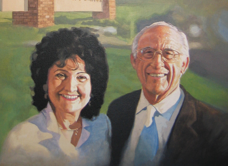
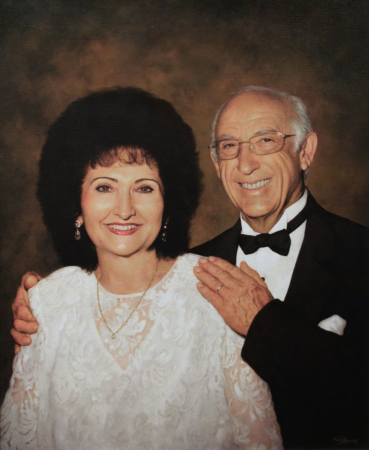
For an example, I’m going to use one of my favorite paintings–a portrait I did for my pastor, Philip Palser, of Bethel Church in Eau Claire, Wis., to commemorate his 80th birthday. As I write, he is turning 93 this month!
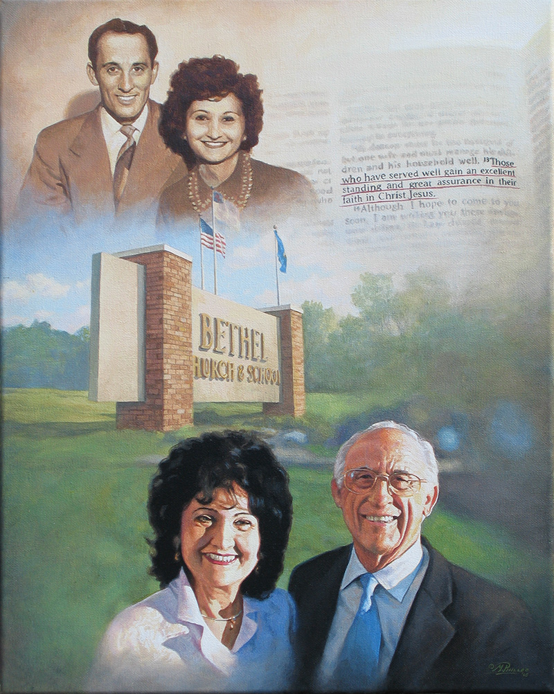
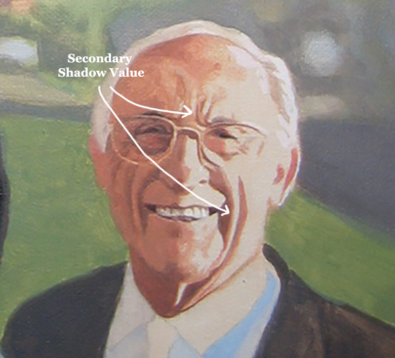
Portrait of Pastor & Mrs. Philip Palser of Bethel Church, Eau Claire, Wis., 16″ x 20″ acrylic on canvas, by artist Matt Philleo to commemorate Pastor’s 80th birthday.
He actually doesn’t have to many more wrinkles than what he had 13 years ago. But they may have deepened a bit with age, signifying his experience. 🙂 Both he and his wife are in amazing health for their age.
Now back to the topic of painting wrinkles…
I’m going to show you just the portion of when they are older–mostly concentrating just on my pastor’s face, because his wrinkles are more apparent.
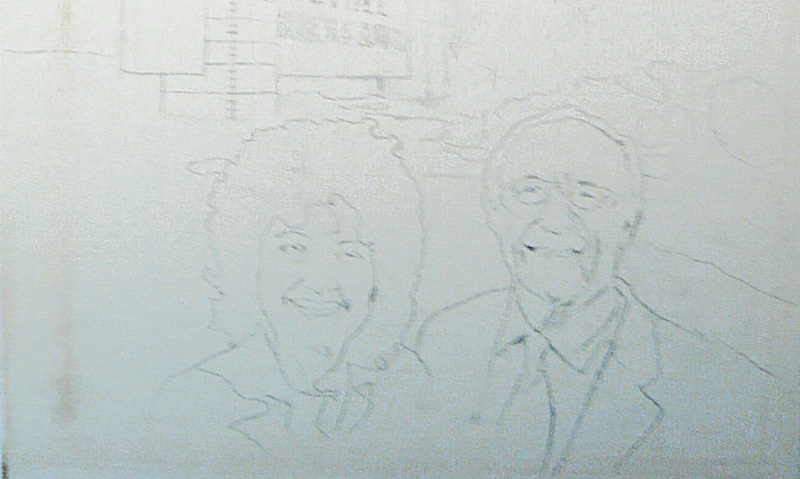
Step 1: the Sketch
I started with a sketch outlining the major details–such as the the creases around the mouth and the major wrinkles in the forehead.
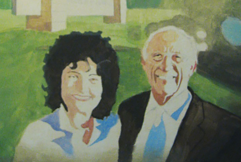
Step 2: Blocking in the Values
Next, I filled in the major values, without a lot of fuss. It is important to accurately define the shapes of the predominant shadows, and put them in their place. They need to stay within their pre-defined boundaries, which ideally would be outlined in the sketch. Now, of course strong lighting–in this case, from the sun–makes this a lot easier.
You may not always have control over this in your portraits, especially if you’re doing a commissioned portrait painting from a photo. But if you can, choose a photo that has strong lighting with a lot of contrast. It really helps model the face, emphasizing its three dimensional form.
Step 3: Strengthening the Shadows
In this step, I am taking what I did in the previous step and darkening everything. I use burnt sienna and raw umber dark to strengthen the contrast. The vertical wrinkles especially in the man’s forehead and the horizontal crows-feet wrinkles by his eyes are more apparent now. But they are still pretty basic. I did paint in just a slight gradation on the wrinkles that run from the nose to the mouth. But it’s still pretty simple.
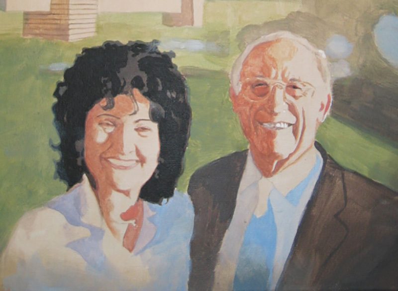
To explain, I broke down the shadows into three categories: the main shadow value, the secondary shadow value, and then the transitional value. These are terms I’ve made up just to differentiate between everything. If you keep things simple to begin with and build on a firm foundation, you will find it a lot easier to achieve the realism you’re shooting for.
It makes me think of a verse where Jesus says, “Anyone who listens to my teaching and follows it is wise, like a person who builds a house on solid rock.” (Matthew 7:24)
If you can teach yourself to see these abstract shapes within your reference photo, and then replicate them on your canvas, you will experience amazing growth in your skills as a portrait painter.
After getting these values locked in, the trick is to bridge them together with some shading and gradation. Notice the highlighted part of his face is flat.
That is OK.
Later, I’ll paint more depth in that area, but for now, it’s not necessary.
Would you like to learn more about how to paint wrinkles? If so, let me know by clicking the button below, and I’ll create a video tutorial/ course for you!
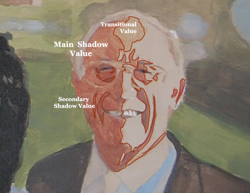
Step 4: Bridging the Gaps
Although I try to give these stages precise beginnings and endings, I don’t want you to think that I am only “bridging the gaps”–transitioning between values only in this stage. But it is at this time, that I’m concentrating on that the most. You can see I added more detail to the transitional value on his forehead.
And then, in the image below, you can see how I added more of the secondary value (the same value that’s within the wrinkles on the shadow side) to the vertical wrinkles between his eyebrow ridge and the crease alongside his mouth. Now what that does is add another layer of depth to the wrinkles.
And now also, the underside of the wrinkles look like they’re catching some light from the highlighted part of the face. And that increases the realism.
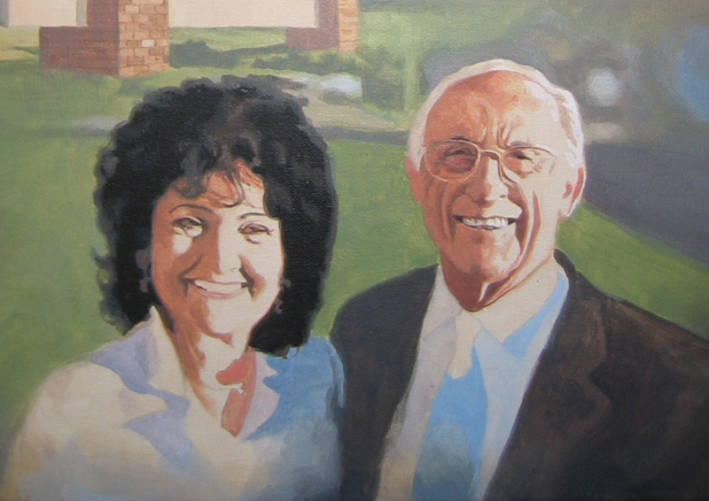
Step 5: Smoothing out and Finishing With Detail
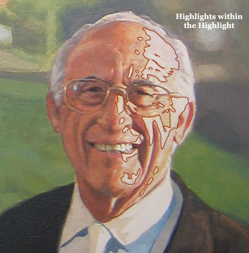
In this step, I take what I built in the previous foundation, and embellish it. When you have a good foundation and you bring it far enough along, the structure of the wrinkles can just about stand up on their own. But by adding some more shading, we can really make it look nice–like putting on the trim. 🙂
What I did here was add highlights on top of the main highlighted area. This give us one more layer of depth to the face. I put the detail in for the horizontal wrinkles in the forehead as well as some highlights that heightened the creases running alongside the mouth. Some of the thin areas of the forehead wrinkles that you would think would be painted with small round brush were actually created by painting the lighter value and “closing them in.”
However, I would use a small brush to refine them if necessary.
Here is a detail image of the final painting…
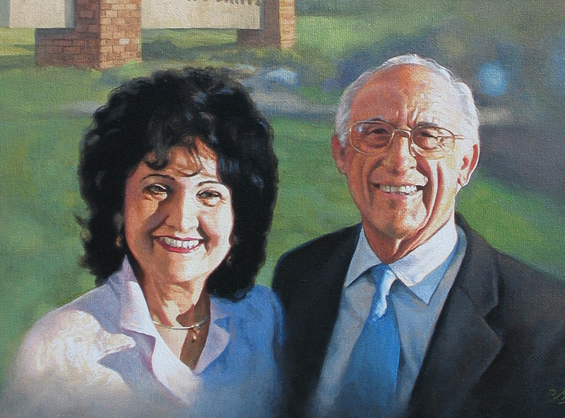
How to Paint Wrinkles in an Acrylic Portrait, with step-by-step tutorial, based off 16″ x 20″ acrylic on canvas portrait by Matt Philleo, final
That’s it for now. Hope you found this tutorial helpful. Let me know if you’re interested in learning more on how to paint realistic wrinkles in acrylic. As I write this, I’m considering doing an online course on the topic. But I need to hear from you first, to see if it’s something you would find interesting and benefit from. Let me know!
Have a blessed day, enjoy painting, enjoy life,

P.S. Did you find this post helpful or encouraging? If so, send it on ahead! Let others know with the share buttons below. I’d love to hear your comments. Thank you so much! Also, do you have a question on acrylic portrait painting you’d like answered? Let me know, and I’d be happy to help!

Top 7 Powerful Techniques for Starting Out in Acrylic Portraits
Begin your portrait painting journey with confidence using these essential acrylic techniques
Are you just starting your journey into acrylic portrait painting? With so many techniques to learn, it’s easy to feel overwhelmed. That’s why I am covering the essential techniques for starting out in acrylic portraits, from choosing the right colors and brushes to creating smooth blends and more. In this post, you’ll find answers to common beginner questions, giving you the tools to bring your portraits to life with ease and confidence! Let’s dive in and explore these foundational techniques together.
Today, I’m going to answer seven fantastic questions from a follower of mine named Andrea. The questions deal with everything from what colors and brushes to use, to blending, to some advanced techniques.
Read below to find out if one of your questions gets answered…
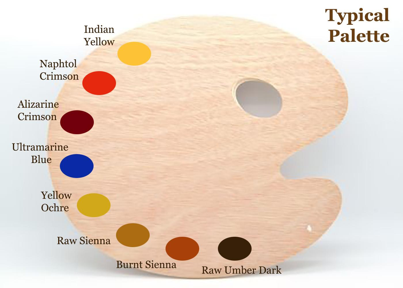
Q #1: What should be my basic color palette for portraits, and mixes for shading?
A: This is my basic palette for painting portraits. I would also have titanium white on it in the upper corner, by the indian yellow. Typically, I start out with raw umber dark and ultramarine blue thinned down with clear matte medium to block in the darker values. I make them into a very translucent glaze of 90% or more medium to 10% or less pigment. Eventually, I work my way into the warmer tones with burnt sienna, raw sienna, and alizarine crimson. The raw umber dark is used to counter-balance those glazes so they don’t get too warm/ orangish.
Q #2: What sort of brushes should I be using?
A: I don’t use anything fancy. Just brushes you can buy at your local art store in a multi-pack, ranging from 1″ flat/ 1/2″ flat, 3/8, flat, and a varied assortment of rounds from size 4 to 3/0. I go through a lot of brushes, so I don’t get anything expensive. But I do have a few nice ones for surface shading and the final varnish coat.
Q #3: How do I keep my paints from drying up, or drying immediately they are applied before I have chance to blend them? I do have retarder but should I be adding this to every color on my palette before I start?
A: No, I don’t recommend a retarder. Some artists like it, but for the classical glazing technique that I use, the faster the paint dries, the better (within reason). Basically, I love the quick drying glazes. It means I can be ready for another coat in about 10-15 minutes. I work various parts of the painting, cycling from the background to the foreground, from the hair to the face, from the clothing, the eyes–whatever. That way, when I move to another part of the portrait, it’s already dry and ready to work on.
Q #4: How do I shade?
A: I have five different ways to blend. Check out my latest blog post here for more info on these techniques…
How I Painted the Portrait of My Pastor and His Wife
How I Painted the Portrait of My Pastor and His Wife
If you’d like to delve further into how to shade, I created a course on it: “Shade With Acrylic Like a Master.”
Q #5: In what order should I paint? I started with the background.
A: I sometimes start with the background, but not always. I want to establish contrast as soon as possible. So I try to fill in the darkest values first. It may be the background, but not necessarily. You can see the progression of how I work below on this example painting, “Smoldering Wick” (30″ x 40″ acrylic on canvas).
Notice, I filled in the darkest values first, and then moved to the lighter areas last…
Q #6: How do I tackle difficult aspects, such as deep creases from the nose to the mouth, the sides of the mouth and wrinkles?
A: I need to do a course on this. Others have chimed in as well, saying they really would like to see how it’s done. I’ll probably start out with a couple videos on the topic and then move into a longer course. But to answer your question, I’ll say this: look for the shadow first. Notice where the light source is at, and then the crease will be shaded on the opposite side. On the side facing the light, there will be a highlight.
Here’s how you do it:
- You paint the shadow of the crease in first, with a thin that’s fairly faint, and that’s one layer.
- Next, you go over that with another layer, that darkens just a few spots within that crease. In any crease or wrinkle, there will always be some areas that are deeper than others, and those need to be darker.
- You paint a thicker line on top of the first line. This line should be even more faint than the existing line, and the color should be slightly warmer.
- You paint a highlight on the opposite side. It should be about the same color as the flesh tone surrounding the crease, but a couple shades lighter and warmer too.
- You may need to add a couple more layers to both the shadow and the highlight to blend it in appropriately.
One quick tip: start out faint and go progressively darker. This is the number one mistake I see in portraits. Artists notice creases and wrinkles, but they paint way too prominently.
Would you like to learn more about how to paint wrinkles? If so, let me know by clicking the button below, and I’ll create a video tutorial/ course for you!
Q #7: What colors should I use for each area, especially the top eyelid, the mouth and the shadows under the eye?
A: This depends on the person. You need to really pay attention to the colors in the picture you’re working from. Generally under the eye, the colors are a bit cooler, because the skin is thinner there and you see the blood vessels on the surface. So, use some ultramarine blue, alizarine crimson, and raw umber dark mixed together and thinned out into a very light glaze. Then go over the area under the eyes with that.
For the mouth, you’ll need alizarine crimson, and napthol red, but it depends on the person. Obviously, a woman with lipstick will need more red on her lips. But even some men have lips that are more red than others.
Let me know how this post helps in your portrait painting. (If you’re not an artist, but you found this interesting, I’d love to hear about it. )
May God bless your painting,
P.S. Is there a question YOU have that wasn’t covered in this post? Just ask! I’d love to help.
If you found this post helpful or encouraging, would you send it on ahead? Let others know with the share buttons below. I’d love to hear your comments. Thank you so much!

3 Common Portrait Painting Mistakes & How to Avoid
Do you struggle sometimes with getting your acrylic portraits to look lifelike? Many artists do. It may be possible that you are making one or more of the three common mistakes I’ll mention in this article.
I’ve been painting portraits for nearly 25 years, and teaching for the last two. While teaching and critiquing students’ work, I’ve noticed similar mistakes crop up again and again.
The purpose of this article is not to put anyone down.
My goal is to simply show you a few of these mistakes–identify and take the mystery out of them–so that you can be intentional as an artist and avoid making them in your portrait painting.
So, to demonstrate, we’ll use a photograph of an attractive young woman. I’ll post it here in it’s unedited form. Obviously, this is not a painting, but rather a photo. But since we strive for realism that would be on par with a photograph (or better if painting from life) this picture will be an example of a fantastic, realistic portrait.
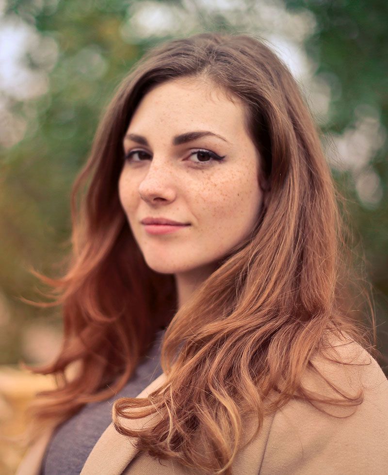
Notice the pose: the woman is smiling gently, the lighting is smooth and even over her face. If I painted a portrait like this, I would be very happy with the results, and I think you would too. The form of her face is accurate, the values, shading, tints and colors, are all in the right place.
That is why it looks realistic.
Now, using Photoshop, I edited this image, and I’ll do a side-by-side comparison between the original photo (we’ll call it the reference) and then the versions with the mistakes. I’ll show you three of the most common. But not many artists are aware of them. Here they are…
Mistake #1: Over-emphasizing certain details
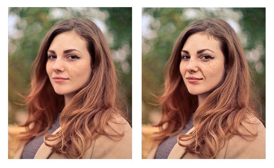
An artist may see a wrinkle under the eye for example, or running from the nose to the mouth, but the tendency is to make it way darker than it really is–in real life–or as shown by the reference photo. It’s great to be able to see the detail, but too much detail can detract from realism, rather than create it.
You’ll notice angle of the eyebrows are exaggerated. Even the freckles are too large and too dark. That happens often. We observe a feature, a characteristic on someone’s face. But then we overdo it. Like a caricature, we unintentionally make it too prominent. And that detracts from realism.
Mistake #2: Over-simplifying complex shapes or angles
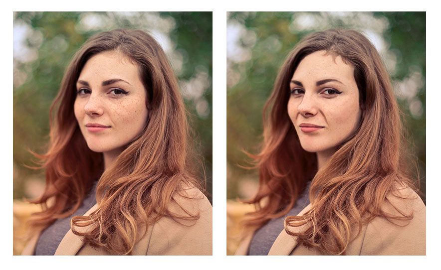
Artists may see the wrinkle stretching from the nose to mouth that shows when the subject is smiling. But they paint the shape as one straight line when, in reality, there are a couple different angles merging together to create what looks like one straight line.
In other words, they take a jagged kind of line and smooth it out.
The angle of the woman’s cheek and jaw on the left side (her right) is another example of this. Notice how in the reference photo, it has three distinct curves (you could call them hills) running from the eye down to her chin. But when this over-simplification mistake is made, those curves are merged together into one line–dull, lifeless, and inaccurate.
One final example would be the woman’s eyebrows. Whereas in the original reference photo they have a slight peak to them, here they are completely smooth and curved.
The result looks as if they are painted on.
In realism though, even though everything is painted on, we are always trying to defeat that fact, and create the illusion of three dimensional reality on a two-dimensional surface. Nevertheless, the mistake of over-simplifying details often persists.
Why?
Because, as human beings we want to order our world–make things look more even, more refined. But in nature, there is randomness; that’s the way God created it.
There is beauty in that irregularity. So we need to learn to see what’s really there, and paint that, rather than what we think is there. That is always the challenge. Every artist, no matter how experienced, has to fight that tendency, myself included!
Mistake #3: Painting (and drawing) symbolically rather than representationally
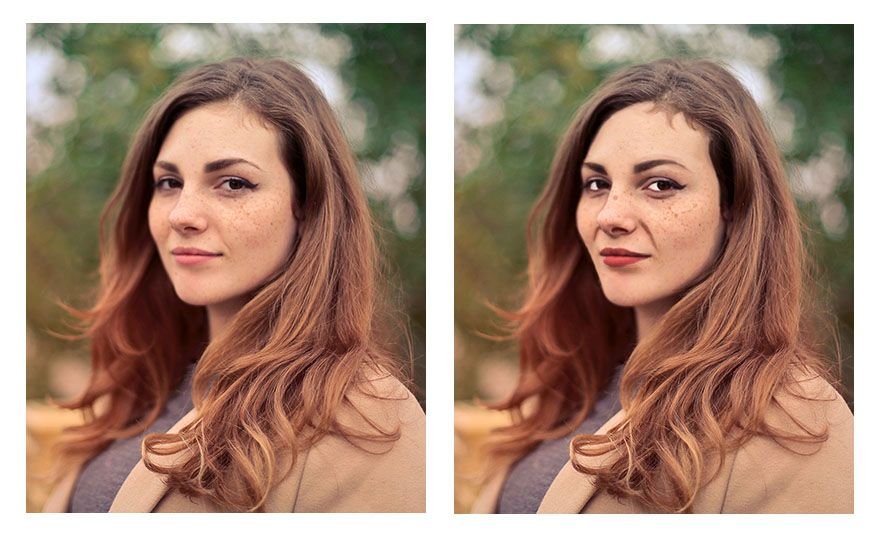
We are taught from childhood that eyes are white, blond hair is colored yellow, lips are red, and so on.
That’s just how we learned to color our coloring books. And so we take that into creating realistic paintings. And we end up with eyes that are way too white, and all the other things.
In reality, eyes actually appear grey, and they can be darker than the skin around them.
Why?
Because the eyebrow ridge, eyelids, and eyelashes cast their shadows over the eye, but once you get below the eye into the cheek, the shadow dissipates. And the skin is actually lighter in value that the eye. That is just one example. But we make that mistake more often than we realize.
You can see from the image how odd it looks to have eyes that are that white. Especially when you compare it side-by-side with the reference photo. The reason is that the values are just completely incorrect with reality.
A tool to help you paint better values and realism
A great tool to overcome this is the Value Checker tool. You can print this out, and what you do is hold up the square that has the closest color and value next to the area in question on your painting. Then set that same square above the corresponding area on your reference photo–and see what the difference is.
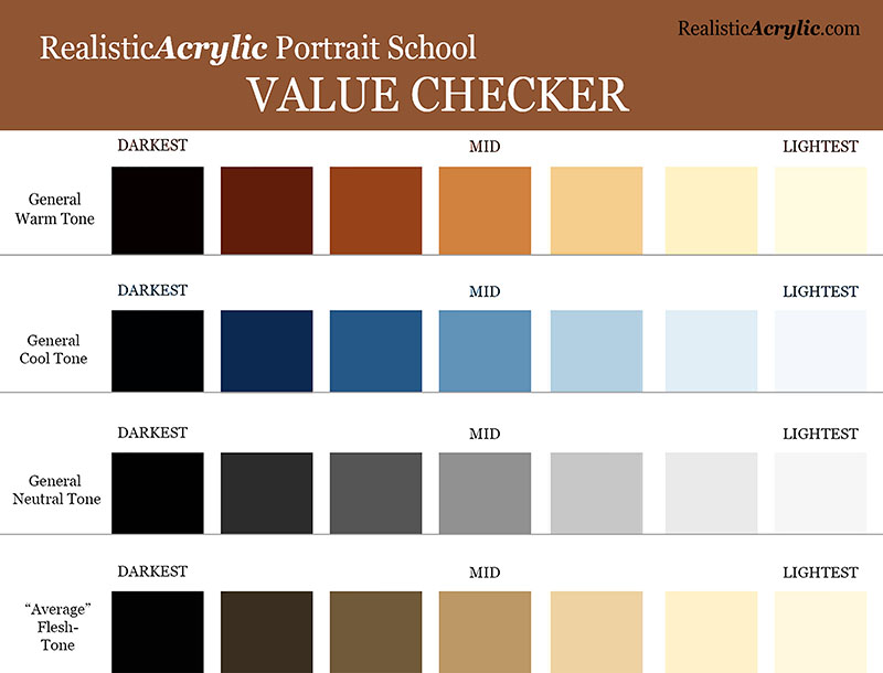
Get the downloadable, printable Value Checker Tool from Realistic Acrylic Portrait School to double check the values in your portraits and make sure they are accurate.
Do you need to go darker or lighter?
Or, do they match? That’s obviously what we’re shooting for. If they don’t, now you know exactly how far off you are, and you can adjust as needed.
It’s not cheating.
It’s a tool to double-check yourself and help you do your best work possible.
You can download a full resolution version, below, for free and then print it out and keep it as a handy tool in your studio. Let me know how it helps.
I’ll sum up with this: it’s a never ending struggle to paint realism, because we have to fight inherent human tendencies. But it’s a worthy struggle. If you continue in the battle, you’ll amaze yourself at the beauty you can add to the world with your well-crafted fine art portraits.
Here’s my advice on how to improve…
Be aware of these three mistakes. That’s the first step. Then you can catch yourself making them.
When you do, make the necessary adjustments by carefully observing your reference photo. Print it out smaller and tape it with low-tack tape onto your canvas so it’s right next to what you’re painting. Study it and compare the difference.
If you can’t see what to do next, ask an artist friend to critique your work–or ask me. I’d love to help.
However, just the fact that you read this article to the end shows that you have what it takes to improve and create a realistic portrait that you can be proud to show. May God bless you in your portrait painting adventures!
All the best,
P.S. Did you find this post helpful or encouraging? If so, send it on ahead! Let others know with the share buttons below. I’d love to hear your comments. Thank you so much! Also, do you have a question on acrylic portrait painting you’d like answered? Let me know, and I’d be happy to help!