Tag Archives for " learn to paint portraits "

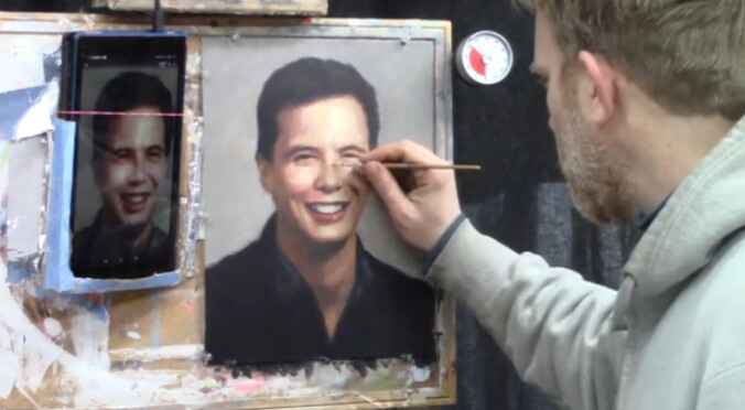
How to Paint a Face in Acrylic Portrait: Glazing Technique
I’ll show you how to paint professional-looking nuances on your acrylic portrait.
Painting a face in acrylic is a rewarding yet challenging endeavor. So this blog post explores the glazing technique, a method that enhances depth and realism in portraits .Then, by utilizing a combination of colors and layering techniques, artists can achieve stunning results. In this guide, essential tips and techniques will be provided, ensuring that your portrait painting is both beautiful and lifelike.
Understanding the Glazing Technique
The glazing technique involves applying thin layers of translucent paint over a dried base layer. This method allows for a rich depth of color and creates realistic effects, especially in portrait painting. When the layers build up, the underlying tones interact with the glazes, resulting in a vibrant, luminous finish.
Step-by-Step Process of Painting a Face
1. Preparation of Materials
Before starting, gather your materials. You will need:
- Acrylic paints: Ivory black, alizarine crimson, burnt sienna, and matte medium.
- Brushes: A round brush (size 12) is recommended for detail work.
- Palette: To mix your colors.
- Canvas: Pre-stretched or a panel suitable for acrylics.
2. Establishing the Base Layer
So, let’s begin by painting the initial base layer of the face using a mid-tone skin color. This layer should be allowed to dry completely before applying any glazes. And then well-dried base layer is crucial, as it will affect the application of subsequent layers.
3. Adding Contrast and Depth
Once the base layer is dry, it’s time to enhance the facial features:
Darkening the Values: Using a mixture of ivory black and alizarine crimson, can create a warm, dark tone. Basically this will prevent the color from appearing lifeless.
Then gently pinpoint the darkest areas in the eyes and eyebrows with your round brush. Besides, black should be thinned with matte medium to ensure smooth application.Detailing the Eyes: Focus on adding depth to the eyes by darkening the eyelashes and the area around the iris. This can be done by lightly touching the brush to the canvas, ensuring that the dark values contrast well with the mid-tones of the face.
4. Enhancing Features with Textural Variations
To create a lifelike representation, it is essential to capture the texture of the features:
Eyebrows: Observe the reference images closely, also with different shades can be used to create a more natural look. Then use your brush to graze across the canvas, mimicking the appearance of individual eyebrow hairs.
Mouth and Nose Shadows: Darken the area under the nostrils and around the mouth for added definition because this step can greatly enhance the three-dimensionality of the face.
5. Blending Techniques
As the layers of paint accumulate, blending becomes crucial:
Using Your Finger: For subtle transitions between shades, your finger can be an effective blending tool. It allows for a seamless merge of colors, particularly where the differences are minimal.
Maintaining Highlights: While darkening certain areas, it is important to retain the highlights.
Then blend the darkest values into mid-tones without overpowering the lighter areas. Because this technique creates a more realistic effect, as the play of light and shadow is essential in portrait painting.
6. Final Touches and Details
As you approach the completion of the portrait, add the final touches:
Hair and Shadows: Darken areas beneath the hat or hairline to enhance the contrast further. This will add depth to the overall composition.
Refinement of Features: Review the entire painting and identify areas that may need additional detailing. Small adjustments in shadow and light can significantly impact the portrait’s realism.
Tips and Techniques for Success
Layer Gradually: Start with light glazes and gradually build up to darker tones. This method helps in achieving the desired intensity without overwhelming the underlying layers.
Use Reference Photos: Keep the reference images handy for accurate details because you can observe different angles and expressions can guide the detailing process effectively.
Be Patient: Allow each layer to dry before applying the next. Rushing this process can muddy your colors and compromise the glazing effect.
As a matter of fact glazing technique offers incredible potential for artists looking to elevate their acrylic portrait painting. Through understanding how to manipulate color and light, so you can create a face that appears lifelike and full of character. Also remember to practice patience, utilize your resources, and don’t hesitate to experiment with different layering techniques.
As you embark on your journey of painting a face in acrylic, these tips and techniques will guide you towards creating portraits you can be proud of. Happy painting!
- How to Paint Foliage Using the Acrylic Glazing Technique
- How to Trace for an Accurate Portrait Sketch
- How to Paint Realistic Eyes in Your Acrylic Portrait
- How to Add Raw Umber Dark & Ultramarine Blue to Your Portrait
- How to Make Your Own Raw Umber Dark
- How to Paint Realistic Trees & Grass in Your Acrylic
- How to Block In Skin Tone Values Using Glazing Technique
- How to Paint Vibrant Reds in Your Acrylic Portrait
- How to Glaze Background Colors & More Acrylic Portrait
- How to Paint White Clothing in Your Acrylic Portrait
- How to Easily Transition from a Sketch to a Painting
- How to Block In Shading & Skin Tones in Your Acrylic
- How to Build Up Color on Acrylic Pet Portrait
- How to Build Up Form on Clothing with Acrylic
- How to Paint Dark Clothing Using Acrylic Glazing Technique
- How to Paint a 24 x 30 Acrylic With 30 People
- How to Do Smooth Shading with Acrylic
- How to Sketch an Acrylic Portrait with a Grid
Read more about how to paint a portrait that you can surely be proud of!
I’d love to hear your thoughts on this video. Please share it with your friends and family. Let me know if you have any further questions. I’ll greatly help you.
If you’d like to learn more, sign up for my free email tips and video class today.
Learn How to Paint Acrylic Portraits With My Free Mini-Video Course!
Thank you so much for taking the time to read this tutorial and watch the video. That means a lot to me. I hope you find it very helpful in your portrait painting.
Yours for Better Portraits,
P.S. Did you find this post helpful or encouraging? If so, send it on ahead! Let others know with the share buttons below. I’d love to hear your comments. Thank you so much! Also, do you have a question on acrylic portrait painting you’d like answered? Let me know, and I’d be happy to help!

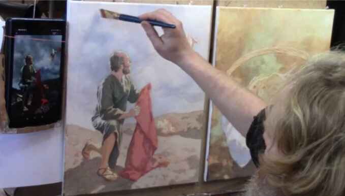
How to Create Depth and Realism in Your Portrait
How to achieve smooth layers and realistic effects in your acrylic portraits”
When creating a portrait, one of the most effective techniques for achieving depth, realism, and smooth transitions between shadows and highlights is glazing. In this blog post, we’ll explore the glazing process through the lens of painting Daniel praying. Glazing involves layering thin, transparent layers of paint to build up color gradually. With this method, you can create lifelike effects that bring your painting to life.
Let’s dive into the step-by-step process of using a raw umber dark glaze, blocking in shadows, and wiping away highlights to develop a well-balanced, luminous portrait.
The Glazing Process
Step 1: Applying a Ground Layer
Before diving into the details, it’s important to set the stage with a warm ground tone. In this case, a mixture of raw umber dark and matte medium was applied across the entire canvas. However, this initial glaze acts as a base, adding richness and warmth to the final piece.
So start by blocking in the background, ensuring smooth, vertical strokes for an even application. Then the key to glazing is to maintain a wet edge—this means you should work quickly to avoid patches and blotches. But always remember to blend layers seamlessly by overlapping strokes.
Tip: Always work with light, smooth strokes toward the end of each section. This ensures a consistent, polished finish.
Step 2: Building Layers for Depth
In glazing, every layer adds another dimension to your painting. Then after applying the initial ground, the next step is to deepen certain areas, like the folds of clothing or shadows around the figure. Because using the same raw umber glaze, begin filling in areas where darker values are needed. But for Daniel’s figure, the focus was on filling in the curtain backdrop and some of the facial shadows.
Each layer should be applied with care to avoid blotchy areas. The trick is to gently build color with each successive glaze while keeping brush strokes light and smooth. So always keep the brush moving to prevent the paint from drying unevenly.
Technique: When painting the background or large areas, use a larger brush and apply the glaze uniformly across the surface. This technique mimics a grisaille style of painting, where you first block in monochrome tones before adding color.
Step 3: Blending for Smoothness
One of the most common struggles artists face with glazing is achieving smooth blending between layers. But the secret lies in the “wet edge” technique—keeping each layer wet enough to blend smoothly. In this video, vertical strokes were employed, and the second layer was blended with the first by using a light hand.
If you’re too heavy-handed, the paint will clump or streak. Use the tip of your brush to blend areas gently. This allows the layers to melt together, creating a seamless transition between dark and light values.
Tip: For best results, blend each layer while it’s still wet and don’t wait too long to transition to the next section.
Wiping Away Highlights
Step 4: Creating Highlights Through Subtraction
A unique approach to glazing is the subtraction method—wiping away paint to reveal highlights. Once a glaze is applied, you have a small window of opportunity (around 5-10 minutes) to remove paint from areas that will eventually be lighter in value. In this painting of Daniel, highlights on his face and clothing were wiped away to bring focus to illuminated areas.
To do this, take a clean rag and gently wipe away paint from areas where light naturally falls. Reference photos are crucial at this stage to guide you. Keep the rag moving lightly across the surface to avoid harsh lines or streaks.
Technique: Wipe away gradually and in controlled motions. If the paint dries too fast, lightly mist the surface with water to extend the working time.
Step 5: Adjusting Based on Conditions
Environmental factors, such as humidity, can affect how fast your glaze dries. In this case, high humidity in Wisconsin during the summer meant that the glaze stayed wet longer, giving more time to manipulate the layers. On drier days, however, the process may be quicker, so it’s important to adapt to your local conditions.
Tip: If you live in a drier climate, consider misting the surface with water to slow down drying and give you more time to blend.
Fine Tuning the Details
Step 6: Enhancing Contrast and Depth
After establishing the main layers and highlights, the next step is to go back and enhance the details. For example, in the video, a lighter glaze was used on Daniel’s stone surroundings to differentiate between the lighter and darker areas of the painting. You can adjust the intensity of your glazes by altering the ratio of matte medium to paint.
A higher matte medium ratio (around 90-95%) will create a lighter, more transparent glaze. This allows you to refine subtle transitions, such as the differentiation between fabric folds or the glow on skin tones.
Technique: When working on detailed areas like faces or hands, switch to a smaller brush for greater control and precision.
Step 7: Final Touches
As you near the end of the glazing process, take the time to evaluate the overall smoothness and tonal range of your painting. If you notice any areas that seem blotchy, you can apply another thin glaze in a perpendicular direction to the previous layer. This will help smooth out any inconsistencies.
Tip: Don’t overwork the surface. A few well-placed strokes can often be more effective than constant adjustments.
Glazing Tips for Success
- Use a Wet Edge: Always keep your edge wet by working swiftly. This prevents streaks and uneven patches.
- Layer Lightly: Thin, transparent layers are the key to depth. Avoid trying to achieve your final result in one pass.
- Wipe Away Quickly: After applying a glaze, be sure to wipe away highlights before the paint dries completely.
- Adapt to Conditions: Work in a climate-controlled environment, and adjust techniques based on humidity or temperature.
- Smooth Out Blotches: Apply additional layers in opposite directions to even out any areas that feel inconsistent.
The glazing technique is a powerful tool for achieving depth, smooth transitions, and a luminous quality in acrylic portrait painting. By mastering light, subtle layering, and the wet edge technique, you can create portraits with a realistic, professional finish.
If you’re looking for more instructional videos on how to improve your acrylic painting, visit RealisticAcrylic.com for more tutorials and check out my free courses here. .
- How to Paint Foliage Using the Acrylic Glazing Technique
- How to Trace for an Accurate Portrait Sketch
- How to Paint Realistic Eyes in Your Acrylic Portrait
- How to Add Raw Umber Dark & Ultramarine Blue to Your Portrait
- How to Make Your Own Raw Umber Dark
- How to Paint Realistic Trees & Grass in Your Acrylic
- How to Block In Skin Tone Values Using Glazing Technique
- How to Paint Vibrant Reds in Your Acrylic Portrait
- How to Glaze Background Colors & More Acrylic Portrait
- How to Paint White Clothing in Your Acrylic Portrait
- How to Easily Transition from a Sketch to a Painting
- How to Block In Shading & Skin Tones in Your Acrylic
- How to Build Up Color on Acrylic Pet Portrait
- How to Build Up Form on Clothing with Acrylic
- How to Paint Dark Clothing Using Acrylic Glazing Technique
- How to Paint a 24 x 30 Acrylic With 30 People
- How to Do Smooth Shading with Acrylic
- How to Sketch an Acrylic Portrait with a Grid
Read more about how to paint a portrait that you can surely be proud of!
I’d love to hear your thoughts on this video. Please share it with your friends and family. Let me know if you have any further questions. I’ll greatly help you.
If you’d like to learn more, sign up for my free email tips and video class today.
Learn How to Paint Acrylic Portraits With My Free Mini-Video Course!
Thank you so much for taking the time to read this tutorial and watch the video. That means a lot to me. I hope you find it very helpful in your portrait painting.
Yours for Better Portraits,

P.S. Did you find this post helpful or encouraging? If so, send it on ahead! Let others know with the share buttons below. I’d love to hear your comments. Thank you so much! Also, do you have a question on acrylic portrait painting you’d like answered? Let me know, and I’d be happy to help!

How to Deepen the Contrast in Your Acrylic
Elevate your acrylic art with advanced glazing techniques to achieve dramatic contrast and realism
Adding depth and contrast to your acrylic paintings is key to making your artwork pop with realism and vibrance. Because by employing advanced glazing techniques, you can enhance the dynamic range of values and create a compelling sense of depth. So in this post, we will explore how to deepen the contrast in your acrylic work, focusing on the effective use of glazing to build layers, define forms, and emphasize highlights.
What is Acrylic Glazing?
Acrylic glazing involves applying thin, translucent layers of paint to create depth, richness, and contrast in your painting. Because this technique allows the underpainting to show through, adding complexity to the colors and values. And then the glaze is typically made by mixing acrylic paint with a glazing medium, which thins the paint while maintaining its transparency.
Why Use Glazes for Contrast?
Glazing is one of the most effective ways to control contrast in acrylic painting. Instead of directly applying opaque colors, glazes allow you to build up subtle layers that gradually darken or lighten areas, depending on your goals. Then use darker glazes, you can add shadows and deepen contrast without losing the luminosity of the underpainting.
Step-by-Step: Deepening Contrast in an Acrylic Portrait
In this example, we will focus on a portrait painting of Daniel praying, because I will demonstrates how to apply multiple glazes to enhance contrast. And then we will use a combination of ultramarine blue, raw umber dark, and raw sienna to darken the background and make the highlights stand out. So let’s dive into the process.
1. Mixing Your Glaze
To begin, mix your glaze using ultramarine blue, raw umber dark, and raw sienna. This combination will create a deep, neutral tone perfect for adding contrast to the background. For better opacity, you can also add a touch of titanium white to the mix.
Tip: Always test your glaze on a scrap surface or a small section of the painting to ensure you achieve the desired transparency and color balance.
2. Applying the First Glaze
Once your glaze is ready, begin applying it to the background of the painting. Then use a flat-edged brush to smooth out the glaze evenly across the canvas, working in small sections. Think of it as painting a wall, applying consistent strokes to avoid streaking.
Be sure to “cut in” around the edges of the subject—here, Daniel’s hand and fingers. This creates a sharp definition between the background and the illuminated parts of the figure.
Tip: Don’t be afraid to overlap the glaze slightly onto the subject, if necessary, you can always wipe away excess glaze before it dries.
3. Smoothing the Glaze
After applying the glaze, use long, smooth strokes to blend it evenly across the surface. And the this will help eliminate any harsh lines or patches, ensuring a smooth transition between the background and the subject.
Tip: Apply firm pressure as you drag the brush along the contours of the form to ensure the glaze gets embedded into the canvas texture.
4. Adding Warmth Near the Light Source
In areas where light plays a key role, such as around a lamp or a torch in your painting, you’ll want to soften the glaze to allow for translucence. Mix in a little matte medium to dilute the glaze, creating a lighter, more transparent layer.
By using a warmer glaze—such as one mixed with red and yellow—around the light source, you can create the illusion of light emanating from the lamp. This technique will make your painting appear more vibrant and luminous.
5. Emphasizing Shadows on the Subject
Now that the background glaze is complete, you can focus on deepening the shadows on your subject. On Daniel’s face, for example, apply a glaze to the side of his nose, cheeks, and brow, adding depth to his facial features.
Tip: Study your reference photo carefully to observe how light interacts with the subject. In this case, Daniel’s head is tilted slightly backward, causing the light to illuminate the underside of his brow area. This requires a different shading approach than in typical portraits.
6. Maintaining Value Over Color
While color is important, value is even more critical when using glazes. So as you apply darker layers, ensure you leave the highlighted areas open for future glazing. Because this will prevent your painting from becoming muddy and ensure that your highlights maintain their vibrancy.
Tip: Avoid overcomplicating your glazes by adding too many colors at once. Focus on getting the values right first, then gradually build up the color intensity in later layers.
7. Layering and Blending
After adding the first few layers of glazes, assess the overall effect. You should start to see a sense of dimension forming, with contrasts between light and dark areas becoming more pronounced.
Continue building up layers of glaze to deepen the contrast further. For example, on Daniel’s hand, you can use a warmer glaze—like burnt sienna or alizarine crimson—to emphasize the structure and tension of his fingers, which are spread out in prayer.
Tip: Use a small round brush to add fine details, such as the tendons and veins in the hand. This will help convey a sense of movement and emotion in the painting.
8. Restoring Lost Highlights
As you apply darker glazes, you may occasionally lose some of the initial highlights. So do not worry—this can be easily fixed. Because it simply mix some titanium white with a glazing medium and go back over the highlighted areas, restoring the luminosity.
For example, in the area near the lamp, you may need to reapply a light glaze to ensure that the light source maintains its brightness and clarity. Doing this early in the process will save you from having to restore luminosity later, which can be more challenging.
Tips and Techniques for Successful Glazing
- Use Transparent Paints: Glazing works best with transparent pigments. Some good choices include ultramarine blue, raw sienna, and burnt sienna.
- Work in Layers: Glazing is a gradual process. Don’t rush to apply heavy layers. Instead, build up the depth of color and contrast slowly with thin applications.
- Dilute for Control: Use a matte or gloss medium to control the transparency of your glaze. Adding too much water can weaken the adhesive properties of acrylic paint.
- Focus on Value First: Always prioritize value over color when glazing. Ensuring the correct distribution of light and dark areas will make your painting more realistic and dynamic.
- Smooth with Pressure: Apply firm pressure when dragging your brush to ensure smooth transitions, especially in shadow areas.
Deepening the contrast in your acrylic paintings with glazing techniques not only adds depth but also brings life and realism to your artwork. By following these steps, you can effectively use glazes to define sharp edges, enhance shadows, and create glowing highlights. Remember, the key to glazing is patience and precision—each layer builds upon the last, contributing to the overall richness of the painting.
Experiment with different glaze mixtures, values, and pressures to achieve your desired effects, and then watch your painting come alive with contrast and clarity.
This technique of deepening contrast with glazes will transform your approach to acrylic painting. Then offering a powerful tool to create stunning, luminous portraits or any other subject you choose to paint.
If you’re looking for more instructional videos on how to improve your acrylic painting, visit www.realisticacrylic.com for more tutorials and check out my free courses here. .
LEARN MORE
- How to Paint Foliage Using the Acrylic Glazing Technique
- How to Trace for an Accurate Portrait Sketch
- How to Paint Realistic Eyes in Your Acrylic Portrait
- How to Add Raw Umber Dark & Ultramarine Blue to Your Portrait
- How to Make Your Own Raw Umber Dark
- How to Paint Realistic Trees & Grass in Your Acrylic
- How to Block In Skin Tone Values Using Glazing Technique
- How to Paint Vibrant Reds in Your Acrylic Portrait
- How to Glaze Background Colors & More Acrylic Portrait
- How to Paint White Clothing in Your Acrylic Portrait
- How to Easily Transition from a Sketch to a Painting
- How to Block In Shading & Skin Tones in Your Acrylic
- How to Build Up Color on Acrylic Pet Portrait
- How to Build Up Form on Clothing with Acrylic
- How to Paint Dark Clothing Using Acrylic Glazing Technique
- How to Paint a 24 x 30 Acrylic With 30 People
- How to Do Smooth Shading with Acrylic
- How to Sketch an Acrylic Portrait with a Grid
Read more about how to paint a portrait that you can surely be proud of!
I’d love to hear your thoughts on this video. Please share it with your friends and family. Let me know if you have any further questions. It’ll greatly help you.
If you’d like to learn more, sign up for my free email tips and video class today.
Learn How to Paint Acrylic Portraits With My Free Mini-Video Course!
Thank you so much for taking the time to read this tutorial and watch the video. That means a lot to me. I hope you find it very helpful in your portrait painting.
Yours for Better Portraits,
P.S. Did you find this post helpful or encouraging? If so, send it on ahead! Let others know with the share buttons below. I’d love to hear your comments. Thank you so much! Also, do you have a question on acrylic portrait painting you’d like answered? Let me know, and I’d be happy to help!

How to add Semi-Opaque Highlights to Acrylic
Learn the art of semi-opaque highlights for stunning acrylic portraits
Adding semi-opaque highlights to acrylic portraits can transform a simple painting into a stunning work of art. By mastering this technique, artists can create depth, enhance realism, and draw the viewer’s attention to the focal points of their work. This blog post will provide detailed insights into the process of adding semi-opaque highlights, focusing on tips, techniques, and best practices to improve your acrylic painting skills.
Understanding Semi-Opaque Highlights
Semi-opaque highlights are essential for achieving a lifelike appearance in portraits. So these highlights are applied over a base layer of paint, allowing some of the underlying colors to show through. Then this technique adds dimension and vibrancy to the painting, making it visually appealing.
In this section, we will discuss the importance of using the right materials, including brushes, paint, and mediums, to achieve the desired effect.
Materials Needed
Before beginning the process, it is crucial to gather the necessary materials:
- Acrylic Paints: Choose a range of colors, including titanium white, alizarine crimson, raw sienna, and organic red orange.
- Brushes: A variety of brushes, including round and flat edge brushes, then will allow for different stroke techniques.
- Palette: A smooth surface for mixing paint.
- Matte Medium: This medium helps in achieving a more translucent effect when blending highlights.
- Water Spray Bottle: To keep your paint workable and maintain moisture.
Step-by-Step Process for Adding Semi-Opaque Highlights
1. Prepare Your Canvas and Initial Layers
Start by preparing your canvas and laying down the initial layers of paint. Basically in the video, I will begin with a basic portrait of a pastor, ensuring that the initial colors are well-blended and that the proportions are accurate.
Tip: Regularly step back to assess the overall composition and make necessary adjustments before applying highlights.
2. Mix Your Colors
So I emphasize the importance of combining colors to get the appropriate tones. And then for the semi-opaque highlights, I combine titanium white with a dab of your preferred skin tone. Given that this mixture should be light while still retaining some transparency.
Technique: Adding a matte medium to your mixture can enhance the transparency, allowing for better blending with the underlying colors.
3. Apply the Highlights
Using a round brush, you begin applying the semi-opaque highlight mixture to the areas of the portrait that need emphasis, such as the forehead, cheeks, and chin. Then I will demonstrate how to build up the highlights gradually.
Tip: Use lighter strokes and focus on the areas where light naturally hits the face. This technique ensures that the highlights do not overpower the base colors but instead complement them.
4. Blend for a Natural Look
While blending is crucial in achieving a seamless transition between highlights and the base layers. I also advise to use a slightly darker color to define the edges of the highlights. Then this contrast will help the highlights pop.
Technique: Wipe off excess paint from your brush frequently while blending to avoid muddying the colors. But utilize a flat edge brush for smoother transitions between strokes.
5. Adjust and Refine
Once you finish applying the highlights, it is important to step back and assess your work. Because as I have discuss the necessity of making adjustments, such as darkening certain areas or enhancing the cheekbones for added dimension.
Tip: Continuous evaluation of the composition helps maintain balance and ensures that all elements work harmoniously together.
6. Final Touches
Once the highlights have been applied and blended, take the time to add any final touches. Because this might include refining the eyes or adding small details to enhance the overall realism of the portrait.
Technique: Use a very light mixture for the final highlights, ensuring they are applied sparingly for a more realistic effect.
Common Challenges and Solutions
1. Over-application of Highlights
One of the common challenge is when you apply too much highlight, which can lead to a flat appearance. In this case, always remember that semi-opaque highlights should enhance, not dominate.
Solution: So to start with a small amount of paint and build up gradually.
2. Muddy Colors
While mixing too many colors can lead to muddy results. So it is essential to keep the mixtures clean and distinct.
Solution: Clean brushes frequently and then use separate areas on the palette for different colors.
When learning the technique of adding semi-opaque highlights in acrylic portrait painting can greatly enhance your artwork. And also by following the steps outlined in this post and incorporating the tips and techniques discussed, you can create lifelike portraits that captivate viewers.
So don’t forget to practice regularly and explore different color combinations to find what works best for your style. Happy painting!
If you’re looking for more instructional videos on how to improve your acrylic painting, visit www.realisticacrylic.com for more tutorials and check out my free courses here. .
LEARN MORE
- Adding highlights to your acrylic painting
- 5 Excellent Reasons to Use Aluminum Foil
- How Photoshop alter your Photo
- Painting Clothing in an Acrylic Portrait
- Paint a Cloudy Sky Acrylic
- How to add Semi-Opaque Highlights
- How to Enhance the Contrast in Your Acrylic
- How to Add Glaze to Your Acrylic Painting
- Paint Realistic Reflections on Eyeglasses in an Acrylic Portrait
- Build Up Depth on Your Acrylic Portrait Backgrounds
- How Do You Do Layers With the Glazing Technique?
Read more about how to paint a portrait that you can surely be proud of!
I’d love to hear your thoughts on this video. Please share it with your friends and family. Let me know if you have any further questions. It’ll greatly help you.
If you’d like to learn more, sign up for my free email tips and video class today.
Learn How to Paint Acrylic Portraits With My Free Mini-Video Course!
Thank you so much for taking the time to read this tutorial and watch the video. That means a lot to me. I hope you find it very helpful in your portrait painting.
Yours for Better Portraits,
P.S. Did you find this post helpful or encouraging? If so, send it on ahead! Let others know with the share buttons below. I’d love to hear your comments. Thank you so much! Also, do you have a question on acrylic portrait painting you’d like answered? Let me know, and I’d be happy to help!

Easier Way to Paint a Cloudy Sky with Acrylic
Creating luminous skies: unlock simple techniques for stunning cloudy landscapes with acrylics”
In the realm of acrylic painting, capturing the beauty of a cloudy sky can be a rewarding yet challenging endeavor. Because the play of light, the depth of shadows, and the nuances of color all contribute to the sky’s dynamic character. However, many artists struggle with creating lifelike skies, often ending up with flat or muddy colors. So in this blog post, an easier way to paint a cloudy sky using the acrylic glazing technique will be explored, enabling artists to achieve stunning, luminous results.
Understanding Acrylic Glazing
The acrylic glazing technique involves applying thin layers of translucent paint to create depth and luminosity. Unlike traditional methods that rely on opaque colors, glazing allows for a more vibrant appearance by letting the underlayers show through. This technique not only enhances the richness of colors but also enables seamless blending, resulting in skies that appear to glow.
Preparing Your Workspace
Before diving into painting, it is crucial to prepare your workspace effectively. The following tools and materials are essential:
- Acrylic paints: Ultramarine blue, raw umber dark, alizarine crimson, and any other preferred colors.
- Brushes: A variety of brushes, including flat and round brushes for different techniques.
- Palette: For mixing colors.
- Clear acrylic matte medium: To create the glazing effect.
- Canvas: A white canvas is recommended to start the layering process.
Setting up a clean, well-lit workspace will enhance the painting experience and provide better visibility of color mixing.
Step-by-Step Process to Paint a Cloudy Sky
Layering the Base Color
So start with a white canvas as your base. because this white background serves as a foundation for the layers of color that will be built upon it. And then to achieve the desired sky color, mix ultramarine blue with clear acrylic matte medium. Given that the medium adds transparency, allowing the underlying white canvas to enhance the vibrancy of the blue.
Building Layers for Depth
In this case the base color established, gradually add layers of color. Where the glazing technique thrives on transparency; thus, each layer should be thin. So this process allows the colors to build upon one another without becoming overly opaque. By the time you finish, the final sky should appear rich and luminous, akin to a Polaroid photograph developing over time.
Creating Cloud Shapes and Shadows
Next, is to focus on forming the clouds. While using a mixture of raw umber dark and your blue glaze, create a neutral gray tone that will be used for shading. As you apply this mixture, remember to maintain a light touch. Instead employ short, choppy diagonal strokes to create texture, simulating the soft, fluffy appearance of clouds.
Final Touches
To enhance luminosity, use alizarine crimson sparingly to add warmth to the clouds. And then apply this color strategically to areas where a reddish tone is desired, thereby achieving a more dynamic color balance. It is important not to cover previously painted areas entirely, as this can disrupt the layering effect achieved through glazing.
Tips and Techniques for Successful Skies
- Color Mixing: Pay attention to the colors being mixed. Using lighter, opaque reds can detract from the desired translucency.
- Working with Light and Shadow: Establishing strong contrasts between light and shadow will give depth to your clouds.
- Using a Light Touch: Glazing works best when a gentle touch is maintained. Overworking the paint can lead to a muddy appearance.
Common Mistakes to Avoid
Artists often fall into the trap of overworking the paint, which can lead to loss of vibrancy and flatness. Another common mistake is neglecting color balance. Always step back and assess your work to ensure that colors harmonize and contribute to the overall composition.
While acrylic glazing technique offers an easier and more enjoyable way to paint a cloudy sky. You can also embrace the layering process and understanding the nuances of color mixing, and achieve stunning, luminous skies that bring their paintings to life. So feel free to experiment with this technique and share your results. Happy painting!
If you’re looking for more instructional videos on how to improve your acrylic painting, visit www.realisticacrylic.com for more tutorials and check out my free courses here.
Easier Way to Paint a Cloudy Sky with Acrylic
LEARN MORE
- Adding highlights to your acrylic painting
- 5 Excellent Reasons to Use Aluminum Foil
- How Photoshop alter your Photo
- Painting Clothing in an Acrylic Portrait
- Paint a Cloudy Sky Acrylic
- How to add Semi-Opaque Highlights
- How to Enhance the Contrast in Your Acrylic
- How to Add Glaze to Your Acrylic Painting
- Paint Realistic Reflections on Eyeglasses in an Acrylic Portrait
- Build Up Depth on Your Acrylic Portrait Backgrounds
- How Do You Do Layers With the Glazing Technique?
Read more about how to paint a portrait that you can surely be proud of!
I’d love to hear your thoughts on this video. Please share it with your friends and family. Let me know if you have any further questions. I’ll greatly help you.
If you’d like to learn more, sign up for my free email tips and video class today.
Learn How to Paint Acrylic Portraits With My Free Mini-Video Course!
Thank you so much for taking the time to read this tutorial and watch the video. That means a lot to me. I hope you find it very helpful in your portrait painting.
Yours for Better Portraits,
P.S. Did you find this post helpful or encouraging? If so, send it on ahead! Let others know with the share buttons below. I’d love to hear your comments. Thank you so much! Also, do you have a question on acrylic portrait painting you’d like answered? Let me know, and I’d be happy to help!

How to Paint Clothing in Acrylic Portrait
Unleash your artistic potential: Learning clothing techniques for stunning acrylic portraits
Painting clothing in acrylic portraits is a vital skill that enhances the overall composition and realism of your artwork. Then the nuances of fabric texture and color play a crucial role in bringing your subject to life. In this post, essential techniques will be explored to help you master painting clothing in acrylic portraiture.
Materials Needed
To get started, a few key materials will be necessary:
- Acrylic Paints: Choose a variety of colors, including skin tones and fabric shades.
- Brushes: Flat and round brushes for different techniques.
- Palette: For mixing colors.
- Canvas or Board: Prepare your surface with gesso.
- Water: For cleaning brushes and thinning paint.
Color Mixing Techniques
So understanding the color wheel is fundamental in painting clothing. Once mixing primary colors, you can create a wide range of realistic fabric tones. And then a mixture of warm and cool colors will add depth and dimension to your palette.
Preparing the Canvas
Before you begin painting, it is essential to set up your workspace. So apply gesso to your canvas for better paint adhesion. Because this preparation creates a smooth surface that enhances the paint application process.
5. Layering Techniques
Layering is crucial in acrylic painting. Whereas it allows for the gradual buildup of colors and textures. Then start with a base layer, applying a diluted mixture of your main color. Allow it to dry before adding additional layers for shading and highlights.
6. Shadows and Highlights
While creating shadows and highlights will give your fabric depth and dimension. You also need to observe the light source in your reference photo to understand how it interacts with the clothing. And then use darker tones for shadows and lighter tones for highlights to enhance realism.
7. Capturing Texture and Details
Different fabrics require specific techniques to replicate their texture accurately. For instance, cotton may be smoother, while wool may require more brush strokes to convey its texture. And then close observation of reference photos is essential in capturing the intricacies of the clothing.
8. Practical Step-by-Step Process
- Step 1: Start by sketching the clothing outline on your canvas while you use light pencil marks to guide your paint application.
- Step 2: Apply the base layer using a large flat brush while you choose to a mid-tone color that represents the fabric.
- Step 3: Once the base layer dries, add shadows using a darker shade. Focus on areas where the fabric folds and overlaps to create depth.
- Step 4: Finish by adding highlights and detailing the fabric. Use a fine brush for intricate designs and texture work, ensuring the highlights are consistent with your light source.
9. Common Challenges and Solutions
It is common for artists to struggle with achieving realistic fabric textures. So I had a few tips for you to overcoming these challenges include:
- Practice regularly to build your confidence in observing and replicating fabric.
- Be patient with layering. It may take several layers to achieve the desired effect.
- Experiment with different brush techniques to find what works best for you.
Conclusion
Painting clothing in acrylic portraits is a rewarding skill that enhances your overall artistic ability. Then by applying these techniques, your portraits will become more lifelike and captivating. You need also to practice regularly, observe closely, and don’t hesitate to experiment with different styles and techniques. For further learning, consider enrolling in acrylic painting workshops or exploring online resources that focus on fabric painting techniques.
- How to Paint Foliage Using the Acrylic Glazing Technique
- How to Trace for an Accurate Portrait Sketch
- How to Paint Realistic Eyes in Your Acrylic Portrait
- How to Add Raw Umber Dark & Ultramarine Blue to Your Portrait
- How to Make Your Own Raw Umber Dark
- How to Paint Realistic Trees & Grass in Your Acrylic
- How to Block In Skin Tone Values Using Glazing Technique
- How to Paint Vibrant Reds in Your Acrylic Portrait
- How to Glaze Background Colors & More Acrylic Portrait
- How to Paint White Clothing in Your Acrylic Portrait
- How to Easily Transition from a Sketch to a Painting
- How to Block In Shading & Skin Tones in Your Acrylic
- How to Build Up Color on Acrylic Pet Portrait
- How to Build Up Form on Clothing with Acrylic
- How to Paint Dark Clothing Using Acrylic Glazing Technique
- How to Paint a 24 x 30 Acrylic With 30 People
- How to Do Smooth Shading with Acrylic
- How to Sketch an Acrylic Portrait with a Grid
Read more about how to paint a portrait that you can surely be proud of!
I’d love to hear your thoughts on this video. Please share it with your friends and family. Let me know if you have any further questions. I’ll greatly help you.
If you’d like to learn more, sign up for my free email tips and video class today.
Learn How to Paint Acrylic Portraits With My Free Mini-Video Course!
Thank you so much for taking the time to read this tutorial and watch the video. That means a lot to me. I hope you find it very helpful in your portrait painting.
Yours for Better Portraits,
P.S. Did you find this post helpful or encouraging? If so, send it on ahead! Let others know with the share buttons below. I’d love to hear your comments. Thank you so much! Also, do you have a question on acrylic portrait painting you’d like answered? Let me know, and I’d be happy to help!

5 Reasons Why Aluminum Foil is Perfect Palette
Discover the practical benefits of using aluminum foil as your paint palette, saving you time, money, and boosting your creative flow.
Using aluminum foil as a paint palette might seem unconventional, but this simple tool offers numerous advantages for artists, especially those who work with acrylics. Whether you’re an experienced artist or just starting, aluminum foil can simplify your process and save you money in the long run. Here are five reasons why you should consider using aluminum foil for your painting palette.
Reason #1: Easy to Clean
Cleaning a palette can be one of the most time-consuming and frustrating tasks for any artist. With traditional palettes, especially glass or wood, it can take a lot of effort to remove dried paint. Acrylic paints, which dry quickly, can create a messy mixing area that’s difficult to clean.
Aluminum foil eliminates this issue. When your mixing area gets messy, all you need to do is peel off the used foil and replace it with a fresh sheet. There’s no need for scrubbing or scraping, and you don’t lose time cleaning up. Simply crumple the foil and toss it out. In moments, you’re ready to continue your creative flow.
- Tip: Keep a roll of aluminum foil nearby so you can quickly swap out sheets as needed.
- Technique: Tape the foil snugly onto your palette, ensuring it stays in place. This will allow for easy replacement without interrupting your workflow.
Reason #2: Saves Paint
Acrylic paints can be expensive, so minimizing waste is crucial. When using a standard palette, you often lose paint by cleaning off the surface before it’s fully used. Aluminum foil helps save your paint by allowing you to keep fresh, untouched colors on the sides of the palette.
Once your mixing area becomes too muddled, you can replace only the soiled section, preserving the rest of your colors. This method prevents unnecessary paint waste, helping you stretch your supplies further.
- Tip: Place your main paint colors around the edges of the foil, keeping the center free for mixing. This setup will maximize paint conservation.
- Technique: For artists who use glazing techniques, replacing the mixing area without disturbing the main colors is a time-saver and cost-effective.
Reason #3: Keeps You in the Flow
Maintaining the flow of creativity is essential for any artist. Interrupting your painting process to clean a palette or reset colors can break your concentration and creative rhythm. Aluminum foil ensures you stay focused on your art without any lengthy clean-up.
When your mixing area gets too messy, simply peel off the used foil and replace it with a new sheet in seconds. If necessary, you can even layer multiple sheets of foil over one another. Each new sheet will stick to the one beneath it due to the wet paint, allowing you to seamlessly continue your work.
- Tip: Prepare a few sheets of foil ahead of time, so they are ready to go when needed.
- Technique: Use packaging tape to secure foil in place and prevent shifting during your painting session.
Reason #4: Makes You Money
Believe it or not, aluminum foil can actually make you money. While this method may not work in every area, some recycling centers accept used aluminum foil, even if it’s covered in paint. In some cases, you can get paid by the pound for recycling the foil.
By saving your used foil, crumpling it into balls, and bringing it to your local recycling center, you can recover some of your costs. The payoff might be small, but it adds up over time. Plus, you’re helping the environment by recycling your materials instead of throwing them away.
- Tip: Check with your local recycling center to see if they accept soiled aluminum foil under “old sheet aluminum.”
- Technique: Gather and store your used foil in a large container until you have enough to make a recycling trip worthwhile.
Reason #5: Affordable and Accessible
One of the most appealing aspects of using aluminum foil as a palette is its affordability and accessibility. Unlike specialized palettes, which can be expensive and difficult to find, aluminum foil is available in almost every household. You won’t need to buy any fancy or pricey art materials to get started.
Whether you are at home, in the studio, or traveling, you can always find aluminum foil to cover your palette. It’s a reliable and cost-effective solution that every artist can access.
- Tip: Buy heavy-duty aluminum foil for extra durability. This will help prevent tearing and allow for smoother handling.
- Technique: Use foil as a temporary cover for your paint when taking breaks during your session. This can help keep acrylic paints from drying out too quickly.
Conclusion
If you’re looking for an inexpensive, practical, and time-saving solution for your paint palette, aluminum foil is an excellent option. It’s easy to clean, saves paint, helps maintain your creative flow, and even offers a way to make a little extra money through recycling. Plus, it’s affordable and easy to find. Consider giving it a try on your next project and see how it can improve your painting process.
If you’re looking for more instructional videos on how to improve your acrylic painting, visit www.realisticacrylic.com for more tutorials and check out my free courses here. .
LEARN MORE
- How to Paint Foliage Using the Acrylic Glazing Technique
- How to Trace for an Accurate Portrait Sketch
- How to Paint Realistic Eyes in Your Acrylic Portrait
- How to Add Raw Umber Dark & Ultramarine Blue to Your Portrait
- How to Make Your Own Raw Umber Dark
- How to Paint Realistic Trees & Grass in Your Acrylic
- How to Block In Skin Tone Values Using Glazing Technique
- How to Paint Vibrant Reds in Your Acrylic Portrait
- How to Glaze Background Colors & More Acrylic Portrait
- How to Paint White Clothing in Your Acrylic Portrait
- How to Easily Transition from a Sketch to a Painting
- How to Block In Shading & Skin Tones in Your Acrylic
- How to Build Up Color on Acrylic Pet Portrait
- How to Build Up Form on Clothing with Acrylic
- How to Paint Dark Clothing Using Acrylic Glazing Technique
- How to Paint a 24 x 30 Acrylic With 30 People
- How to Do Smooth Shading with Acrylic
- How to Sketch an Acrylic Portrait with a Grid
Read more about how to paint a portrait that you can surely be proud of!
I’d love to hear your thoughts on this video. Please share it with your friends and family. Let me know if you have any further questions. It’ll greatly help you.
If you’d like to learn more, sign up for my free email tips and video class today.
Learn How to Paint Acrylic Portraits With My Free Mini-Video Course!
Thank you so much for taking the time to read this tutorial and watch the video. That means a lot to me. I hope you find it very helpful in your portrait painting.
Yours for Better Portraits,
P.S. Did you find this post helpful or encouraging? If so, send it on ahead! Let others know with the share buttons below. I’d love to hear your comments. Thank you so much! Also, do you have a question on acrylic portrait painting you’d like answered? Let me know, and I’d be happy to help!

How to Add Initial Highlights in Acrylic Painting
Achieve depth and realism by enhancing your acrylic painting with well-placed highlights
Why Highlights Matter in Acrylic Painting
In acrylic painting, adding highlights can make a significant difference in the overall depth and realism of your artwork. Because highlights are essential for bringing out details and creating a sense of three-dimensional form. So, in this blog post, we’ll break down the step-by-step process of adding initial highlights to your acrylic painting. And then you’ll learn the tools, techniques, and tips necessary to make your paintings more lifelike and vibrant.
Outline:
- Importance of Highlights
- Materials and Tools Needed
- Step-by-Step Process for Adding Initial Highlights
- Using Titanium White and Indian Yellow
- Brush Techniques for Smooth Highlights
- Common Mistakes to Avoid
- Tips for Effective Highlighting
- Final Thoughts and Conclusion
Materials and Tools Needed
Before we begin, gather the following materials to add highlights:
- Titanium White acrylic paint
- Indian Yellow acrylic paint
- Matte medium
- Various brushes (flat size 14 brush, smaller detail brush)
- A well-lit workspace
- Water and a palette
Step-by-Step Process for Adding Initial Highlights
1. Prepare Your Highlighting Mixture
To start, you’ll need to create a mixture using titanium white and indian yellow. And then combine these colors with matte medium to thin the paint down to around 50% opacity. Accordingly, this ensures that your highlights blend naturally with the rest of the painting without appearing too harsh or overwhelming.
2. Blocking in Highlights on the Sky
You can now begin by adding highlights to the sky, then focusing on the clouds. Also, you’ll want to switch to a larger brush, like a flat size 14 for broader areas. Then pay attention to the direction of light and where it naturally hits the clouds. Adjust your brushwork accordingly, using soft strokes to blend the highlights seamlessly into the surrounding areas.
3. Refining the Clothing Highlights
Move on to smaller areas, such as the clothing in your painting. Then switch to a smaller detail brush to carefully add highlights to folds and areas where light would naturally reflect. Because this adds texture and dimension to the fabric, bringing it to life.
4. Adjusting Highlights Based on Glare and Lighting
While working on highlights, it’s important to frequently step back and adjust your lighting. Because sometimes, the glare from the paint can obscure your view. When turning off overhead lights or changing your angle will help you see the true contrast between highlights and shadows.
Using Titanium White and Indian Yellow for Warm Highlights
Using a combination of titanium white and indian yellow allows you to create warm highlights that complement the overall toning layer of your painting. The addition of yellow gives the highlights a natural warmth, which is especially effective for skin tones and areas that are bathed in sunlight.
This mixture is not only great for clouds and sky, but also for adding depth to hair, clothing, and other textured elements within your painting. Then keep the opacity thin, allowing you to build up layers gradually and refine your highlights as needed.
Brush Techniques for Smooth Highlights
Using the correct brush technique is essential for applying smooth, natural-looking highlights. Here are some key techniques to keep in mind:
- Feathering: Use gentle strokes and gradually fade the highlights into the mid-tones of the painting.
- Dabbing: For more textured surfaces like clouds or clothing, a dabbing technique can create the illusion of light breaking through.
- Layering: Apply highlights in thin layers to build up intensity without overpowering the base colors.
When switching between larger brushes for broad areas and smaller brushes for fine details will give you the control necessary for varied textures.
Common Mistakes to Avoid
When adding highlights, avoid these common pitfalls:
- Overloading your brush: Too much paint can result in harsh, unblended highlights.
- Neglecting light sources: Always consider where your light source is coming from to ensure highlights are placed accurately.
- Over-highlighting: Adding too many highlights can flatten your painting and remove its depth.
Instead, focus on subtlety and restraint. Then the highlights should enhance the painting without becoming the focal point.
Tips for Effective Highlighting
Here are some additional tips to keep in mind when adding initial highlights:
- Use a limited color palette: Stick to one or two highlight colors to maintain color harmony.
- Work slowly: Gradually build up the highlights, allowing each layer to dry before adding more.
- Blend with matte medium: Matte medium helps thin the paint and ensures smooth transitions between highlighted areas and surrounding tones.
- Check your progress: Step back frequently to check how the highlights are affecting the overall composition.
Conclusion
Adding initial highlights in acrylic painting is so crucial step in creating depth, contrast, and realism. Because by using a combination of titanium white and Indian yellow, thinned with matte medium, and applying careful brushwork, you can enhance your painting dramatically. Then highlights bring out the dimensionality of forms and can make your artwork truly stand out.
Lastly, as always, remember to practice patience, as acrylic highlights often require layers and adjustments. Because with the right technique and mindset, you’ll be able to create a painting that radiates light and life. And then, if you found this guide helpful, be sure to subscribe for more painting tutorials and tips.
If you’re looking for more instructional videos on how to improve your acrylic painting, visit www.realisticacrylic.com for more tutorials and check out my free courses here. .
- How to Paint Foliage Using the Acrylic Glazing Technique
- How to Trace for an Accurate Portrait Sketch
- How to Paint Realistic Eyes in Your Acrylic Portrait
- How to Add Raw Umber Dark & Ultramarine Blue to Your Portrait
- How to Make Your Own Raw Umber Dark
- How to Paint Realistic Trees & Grass in Your Acrylic
- How to Block In Skin Tone Values Using Glazing Technique
- How to Paint Vibrant Reds in Your Acrylic Portrait
- How to Glaze Background Colors & More Acrylic Portrait
- How to Paint White Clothing in Your Acrylic Portrait
- How to Easily Transition from a Sketch to a Painting
- How to Block In Shading & Skin Tones in Your Acrylic
- How to Build Up Color on Acrylic Pet Portrait
- How to Build Up Form on Clothing with Acrylic
- How to Paint Dark Clothing Using Acrylic Glazing Technique
- How to Paint a 24 x 30 Acrylic With 30 People
- How to Do Smooth Shading with Acrylic
- How to Sketch an Acrylic Portrait with a Grid
Read more about how to paint a portrait that you can surely be proud of!
I’d love to hear your thoughts on this video. Please share it with your friends and family. Let me know if you have any further questions. I’ll greatly help you.
If you’d like to learn more, sign up for my free email tips and video class today.
Learn How to Paint Acrylic Portraits With My Free Mini-Video Course!
Thank you so much for taking the time to read this tutorial and watch the video. That means a lot to me. I hope you find it very helpful in your portrait painting.
Yours for Better Portraits,
P.S. Did you find this post helpful or encouraging? If so, send it on ahead! Let others know with the share buttons below. I’d love to hear your comments. Thank you so much! Also, do you have a question on acrylic portrait painting you’d like answered? Let me know, and I’d be happy to help!

How to Paint a Portrait Outside: Glazing Technique
Master the art of outdoor portrait painting using glazing techniques for depth and realism
Outdoor portrait painting can be a rewarding experience that connects artists with nature. The beauty of the natural light offers a unique perspective that can enhance the realism of your artwork. One effective technique to achieve depth and vibrancy in your portraits is glazing. This method involves applying thin layers of transparent color over dried paint, allowing the underlying layers to shine through.
Understanding Glazing Techniques
Definition of Glazing
Glazing is a painting technique where transparent layers of paint are applied over a dried base layer. So this process creates a luminous effect, enhancing colors and adding depth to your artwork.
How Glazing Enhances Color and Depth
By using glazing, so artists can build up complex colors and tones gradually. The layering effect allows for subtle changes in color, making the portrait appear more lifelike. As each layer dries, the artist can assess the depth and adjust accordingly.
Essential Materials
Before starting your outdoor portrait, gather the following materials:
Recommended Colors for Glazing
- Raw Umber Dark: Ideal for adding depth and shadow.
- Titanium White: Provides opacity and brightness.
- Burnt Sienna: Useful for warm skin tones and shading.
- Alizarine Crimson: Adds richness to the color palette.
Tools Required for Outdoor Painting
- Canvas or panel
- Palette for mixing colors
- Brushes (various sizes for different applications)
- Rags for cleaning brushes
- Easel for stability
- Water container for cleaning brushes
Step-by-Step Process
Preparing Your Canvas
Then start with a prepared canvas. Make sure it is dry before applying any paint. Because this preparation allows for better adhesion and a smoother finish.
Layering Colors Using Glazes
- Apply the Base Layer: Begin with an initial layer of paint to establish your color base. This layer can be more opaque.
- Mix Colors: Create a glaze by mixing raw umber dark with titanium white to form a more opaque mixture. Then this will be used to darken specific areas.
- Test the Colors: Before applying, test the mixed colors on a rag to ensure the desired tone and opacity.
Adding Depth with Shadows and Highlights
- Identify Areas for Glazing: Look for areas that need more depth, such as shadows under the chin or around the neck where the hair casts a shadow.
- Apply Glaze: Using a soft brush, apply the glaze over the selected areas. Allow the paint to dry for a few minutes before assessing the color.
- Layering: After the initial glaze dries, apply another layer of color, gradually building depth.
Tips for Success
- Working with Natural Light: Pay attention to how natural light changes throughout the day. Because this can affect the appearance of colors and shadows in your painting.
- Adjusting Colors for Outdoor Conditions: Outdoor lighting can vary, so adjust your palette accordingly. Warmer colors may be needed to balance the coolness of shade or overcast skies.
- Patience in Layering: Take your time with each layer. Allow glazes to dry fully before applying the next layer to prevent mudding of colors.
Conclusion
In conclusion, glazing is a powerful technique for outdoor portrait painting that can add depth and luminosity to your work. Because by understanding how to layer colors effectively and adjust to natural light, artists can create stunning and realistic portraits. Whether painting from life or a reference photo, the practice of glazing will enhance your skills and results. So grab your materials, head outdoors, and enjoy the process of capturing the beauty around you.
If you’re looking for more instructional videos on how to improve your acrylic painting, visit www.realisticacrylic.com for more tutorials and check out my free courses here. .
- Adding highlights to your acrylic painting
- 5 Excellent Reasons to Use Aluminum Foil
- Paint Realistic Wrinkles in Acrylic
- Painting Clothing in an Acrylic Portrait
- Paint a Cloudy Sky Acrylic
- How to add Semi-Opaque Highlights
- How to Enhance the Contrast in Your Acrylic
- How to Add Glaze to Your Acrylic Painting
- Paint Realistic Reflections on Eyeglasses in an Acrylic Portrait
- Build Up Depth on Your Acrylic Portrait Backgrounds
- How Do You Do Layers With the Glazing Technique?
- Learn How to Paint Wrinkles in Acrylic
Read more about how to paint a portrait that you can surely be proud of!
I’d love to hear your thoughts on this video. Please share it with your friends and family. Let me know if you have any further questions. I’ll greatly help you.
If you’d like to learn more, sign up for my free email tips and video class today.
Learn How to Paint Acrylic Portraits With My Free Mini-Video Course!
Thank you so much for taking the time to read this tutorial and watch the video. That means a lot to me. I hope you find it very helpful in your portrait painting.
Yours for Better Portraits,
P.S. Did you find this post helpful or encouraging? If so, send it on ahead! Let others know with the share buttons below. I’d love to hear your comments. Thank you so much! Also, do you have a question on acrylic portrait painting you’d like answered? Let me know, and I’d be happy to help!

How to Paint Pensive Young Woman: 30-Minute Acrylic Portrait
Master the alla prima technique to capture expression, lighting, and form in a half-hour acrylic portrait.
Welcome to another 30-minute acrylic portrait session! In this tutorial, we will walk through the process of painting a pensive young woman with red hair. While acrylic painting can take several hours or even days using layered techniques, today we’ll focus on alla prima—a method where you paint wet-on-wet in one sitting. This exercise helps artists become more efficient by focusing on capturing the subject’s gesture and overall expression in a short period. With practice, you can improve your speed, brushstroke accuracy, and confidence.
Follow this step-by-step guide to complete a beautiful, expressive portrait in just 30 minutes.
Materials and Color Palette
Before diving into the actual painting process, it’s essential to know the materials you’ll be using. For this quick portrait, the following supplies are necessary:
- Colors:
- Ivory Black
- Raw Umber Dark
- Burnt Sienna
- Raw Sienna
- Ultramarine Blue
- Alizarine Crimson
- Pyrrole Red Orange (or Cadmium Red Medium)
- Indian Yellow
- Titanium White
- Brushes:
A mix of flat and round brushes, including filberts for blending skin tones and hair. - Canvas Preparation:
The canvas is pre-toned with a light wash of burnt sienna mixed with titanium white, giving the flesh tones a warm underlayer. This helps speed up the process since the mid-tones are already in place, leaving you to focus on shadows and highlights.
Step 1: Sketching the Composition and Features
Blocking in the Shapes:
Start by mixing raw umber dark with ivory black and a little matte medium to thin the paint. Use a flat brush to sketch the basic composition of the portrait. Focus on capturing the shapes of the young woman’s hair, face, and neck. This quick block-in will define the main forms and ensure your proportions are correct.
- Tip: Focus on the overall gesture and avoid getting bogged down with small details at this stage. Pay attention to the negative spaces between the subject’s contours and the background.
Step 2: Identifying Shadows and Highlights
With the basic form sketched out, move on to blocking in shadows. Using the same mixture of raw umber black, deepen the darker areas, such as her neck, jawline, and the left side of her face.
For the highlights, mix titanium white with burnt sienna and pyrrole red orange to create a warm skin tone. Apply this mixture to the areas where light naturally hits her face, including the forehead, cheeks, and chin. This initial contrast between light and dark will help shape the face’s three-dimensional look.
- Tip: Use a filbert brush to blend these highlights smoothly into the surrounding skin tones for a softer transition. Quick, choppy strokes can help with texture, while longer, smoother strokes are ideal for refining the skin’s appearance.
Step 3: Refining the Facial Features
Now that the major shadows and highlights are established, begin working on the facial features. Thin the paint with matte medium to give yourself flexibility in making corrections. Use a smaller round brush to block in her eyes, nose, and mouth.
- Eyes: Place the eyes about two-thirds of the way up from the chin to the top of the head. Make small marks to indicate their placement, followed by the eyebrows, nose, and mouth.
- Nose: The bottom of the nose should align with the lower third of the face. Use shadows to accentuate its form and add dimension.
- Mouth: Capture the subtle expression by carefully observing the shape of her lips and how they relate to the other facial features. There’s a slight smile, so a careful balance of shading around the mouth will be essential.
Step 4: Painting the Hair
For the red hair, create a mixture of burnt sienna, pyrrole red orange, and a hint of alizarine crimson. This combination will yield a vibrant, natural red that complements the subject’s expression.
Work in layers, starting with the darker shadows to indicate the depth of the hair. Then, add mid-tones and finish with highlights using a lighter mixture of titanium white and pyrrole red orange.
- Tip: The texture of the hair can be suggested using short, directional strokes to mimic the flow and volume. Pay attention to where light hits the hair, adding highlights in those areas.
Step 5: Final Touches and Enhancing Contrast
To bring everything together, add the final highlights and enhance the contrast in key areas, such as the bridge of the nose, the cheekbones, and the lips. For the background, use a mixture of raw sienna and burnt umber to create a neutral tone that contrasts with the warm colors of her face and hair.
As the painting progresses, keep in mind the subtle shadows that give depth to her expression. Soft transitions between light and shadow will make the portrait feel more lifelike.
- Tip: Step back from your painting regularly to check the overall balance of the portrait. This will allow you to see the piece with fresh eyes and make any necessary adjustments before the timer runs out.
Technique and Tips for Success
- Alla Prima Technique: This wet-on-wet approach forces you to make decisive brushstrokes and prevents overworking the paint. Embrace the loose and expressive nature of this method.
- Color Harmony: Use a limited palette to ensure harmony in the skin tones, shadows, and highlights. The pre-toned canvas will help unify the colors.
- Efficient Brushwork: Each brushstroke counts in a 30-minute portrait. Focus on broad strokes for the initial block-in, then refine with smaller brushes for detail work as time allows.
Conclusion: Practice Makes Perfect
Completing your artwork in a 30-minute acrylic portrait painting is challenging but highly rewarding. Because with practice, this exercise will sharpen your skills, improve your brush control, and help you capture the essence of your subject quickly and confidently. By then focusing on the most important aspects of light, shadow, and expression, you’ll be amazed at what you can achieve in a short time.
Start with this tutorial and see how your speed and efficiency improve over time!
For further resources and guides, visit realisticacrylic.com and check out my free courses to enhance your acrylic painting journey.
- Adding highlights to your acrylic painting
- 5 Excellent Reasons to Use Aluminum Foil
- Paint Realistic Wrinkles in Acrylic
- Painting Clothing in an Acrylic Portrait
- Paint a Cloudy Sky Acrylic
- How to add Semi-Opaque Highlights
- How to Enhance the Contrast in Your Acrylic
- How to Add Glaze to Your Acrylic Painting
- Paint Realistic Reflections on Eyeglasses in an Acrylic Portrait
- Build Up Depth on Your Acrylic Portrait Backgrounds
- How Do You Do Layers With the Glazing Technique?
- Learn How to Paint Wrinkles in Acrylic
Read more about how to paint a portrait that you can surely be proud of!
I’d love to hear your thoughts on this video. Please share it with your friends and family. Let me know if you have any further questions. I’ll greatly help you.
If you’d like to learn more, sign up for my free email tips and video class today.
Learn How to Paint Acrylic Portraits With My Free Mini-Video Course!
Thank you so much for taking the time to read this tutorial and watch the video. That means a lot to me. I hope you find it very helpful in your portrait painting.
Yours for Better Portraits,
P.S. Did you find this post helpful or encouraging? If so, send it on ahead! Let others know with the share buttons below. I’d love to hear your comments. Thank you so much! Also, do you have a question on acrylic portrait painting you’d like answered? Let me know, and I’d be happy to help!