Tag Archives for " learn painting "
How to Paint Smiling Girl in Yellow: 30-Minute Acrylic Portrait
Create a stunning 30-minute acrylic portrait of a smiling girl in yellow with easy-to-follow techniques
Creating a captivating 30-Minute Acrylic Portrait of a smiling girl in yellow can be a fulfilling and enjoyable artistic endeavor. In just half an hour, you can capture the essence of joy and vibrancy, making this project perfect for artists of all skill levels. Whether you’re a seasoned painter looking for a quick challenge or a beginner eager to experiment with color and expression, this guide will provide you with step-by-step instructions to bring your vision to life on canvas. Let’s dive into the techniques and tips that will help you create a stunning portrait that radiates happiness!
For today’s portrait, I’ll be painting a picture of a young woman ( a still shot image from Ray Comfort’s video interviews ) with a beautiful dark complexion and attractive smile. I like the dark shadows and forms within her face and hair, and I thought it would make for a fantastic little portrait.
This will be an 8 x 10, acrylic on canvas board.
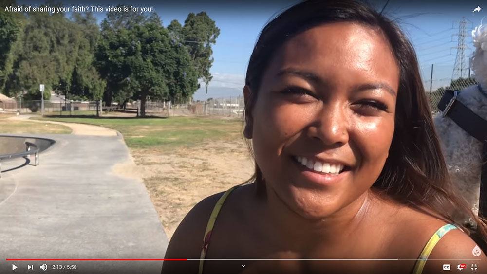
I’ll demonstrate how you can paint a quick portrait study with an aggressive opaque, alla prima technique. The idea is to see what you can accomplish within 30 minutes. It will force you to think quickly, and find out what the most important aspects are that will convey the subject’s likeness and just paint them without fuss.
At the same time, I encourage you to enjoy the process and don’t fret over whether the painting looks good or not. Of course it won’t look as good as a painting you’ve spent hours on! But it’s OK. Just enjoy the process.
Later on, you can always add more layers to the painting and give it a finished look.
Ready to dive in?
Season 1, Episode 3 of the 30-Minute Acrylic Portrait…
After watching it, leave me a comment here below. I really look forward to reading and answering your thoughts and questions. Let me know how I can help and have a blessed and productive day!
Yours for better portraits,

P.S. Did you find this post helpful or encouraging? If so, send it on ahead! Let others know with the share buttons below. I’d love to hear your comments. Thank you so much! Also, do you have a question on acrylic portrait painting you’d like answered? Let me know, and I’d be happy to help!
“How to Paint a Young Man in White” in 30 Minutes
Thank you to everyone who left encouraging comments and kind words on my first episode of the “30-Minute Acrylic Portrait.” Now, it’s on to Episode #2.
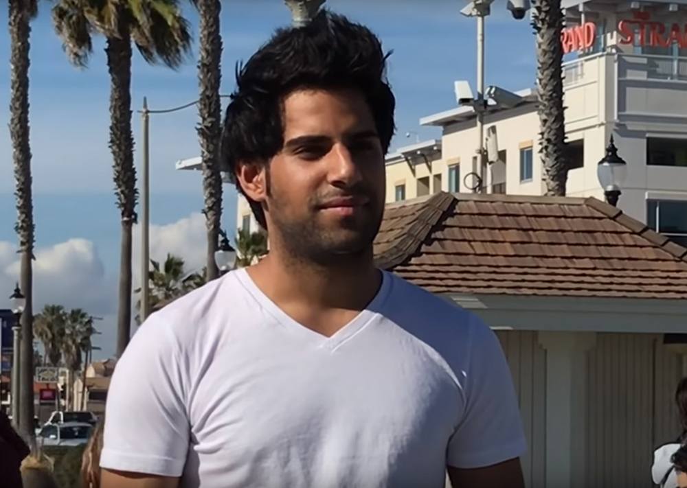
For today’s portrait, I’ll be painting a picture of a young man dressed in white, named Mohammed.
How did I come across this photo?
Well, I was looking for interesting reference images to paint from, scouring the internet and couldn’t find much. Even stock photo sites like Pexels and Pixabay came up short.
Then I recalled a YouTube channel that I frequently watch (or have playing in the background as I paint): Living Waters.
On this channel, there are literally hundreds of videos of people being interviewed by Ray Comfort, a Christian author, evangelist and short movie producer. Every person is different and unique. I noticed the lighting on several of these interesting characters was fantastic, and the video quality high enough that I could grab some screenshots of the footage and then paint from them.

Of course, I needed to get permission first.
So I contacted the ministry’s general email address, and got an expected automated response.
The next day, however, I got an unexpected call from Ray Comfort, granting me permission to paint portraits based on his videos. I was blown away by his generosity and thought this was also another confirmation from God to continue doing the series. I should have enough images to keep me busy for months, maybe even years. 🙂
So here we go.
Season 1, Episode 2 of the 30-Minute Acrylic Portrait…
As always, let me know what you think of this video. I encourage you to try this exercise for yourself. You don’t have to feel pressured to come up with a masterpiece. Just enjoy the process and see what you can do within half an hour.
Or you might just want to keep watching these videos for fun, sipping some coffee or tea. 🙂 Either way, thank you for watching, and I look forward to sharing more with you.
Yours for better portraits,
P.S. Did you find this post helpful or encouraging? If so, send it on ahead! Let others know with the share buttons below. I’d love to hear your comments. Thank you so much! Also, do you have a question on acrylic portrait painting you’d like answered? Let me know, and I’d be happy to help!
How to Paint an Acrylic Portrait in 30 Minutes
Discover the quick and simple method to capture portraits with speed and precision
As a child, I was amazed as I watched “The Joy of Painting” host Bob Ross paint a beautiful landscape in less than 30 minutes. I was captivated by his gentle touch, his fast wet-on-wet technique, and the way he could totally put you at ease.
I can’t say I wanted to be just like Bob when I grew up, but he did help inspire me to paint.
Later on, I learned the more methodical glazing technique from Norbert Kox, where you apply layer after layer of translucent paint. It’s very time consuming, but it creates fantastic realistic effects. This is the style I have become known for.
But sometimes I just want to knock out a quick painting, have fun with it, and yet push myself.
Can I paint a somewhat respectable looking painting in half an hour?
If I do it often, will I get faster?
Could it help me paint faster, and more confidently in my “typical” more detailed portraits?
Could an exercise like this help YOU to do the same?
There’s only one way to find out.
So, with that, I’m launching a new series of videos, or something like a show called, “The 30-Minute Acrylic Portrait” Season One, Episode 1…
Tips for Success in Fast-Paced Portrait Painting
- Set a Timer: Keep yourself on track by setting a timer. This helps maintain focus and prevents overworking areas.
- Keep Your Palette Organized: Lay out your colors clearly, so you can mix shades quickly without delay.
- Use a Limited Palette: Working with fewer colors will simplify the process and give the portrait a harmonious look.
- Practice Blocking and Simplifying: Learn to capture shapes and shadows quickly by focusing on big-picture composition.
Common Mistakes to Avoid
- Focusing Too Much on Detail: With only 30 minutes, try to avoid getting caught up in minute details.
- Using Too Many Colors: Stick with a few main colors for consistency and ease.
- Overthinking the Process: Embrace a relaxed approach, letting the process unfold naturally.
Conclusion
Creating a 30-minute acrylic portrait requires simplifying techniques, focusing on essential shapes, and mastering the art of blocking in shadows and highlights. This method allows for creative expression while enhancing your confidence and ability to capture a portrait quickly. Practice makes perfect, so keep experimenting with colors, tones, and brush techniques.
Read more about my additional resources, tutorials, to learn more and check out my free courses here. . Whether you’re a beginner or an experienced artist, there’s always something new to learn and apply to your paintings. Happy painting!
Let me know what you think of this video. Is it helpful? Interesting? Would you like to see more?
I’d love to hear back from you with your honest thoughts.
LEARN MORE
- How to Paint Foliage Using the Acrylic Glazing Technique
- How to Trace for an Accurate Portrait Sketch
- How to Paint Realistic Eyes in Your Acrylic Portrait
- How to Add Raw Umber Dark & Ultramarine Blue to Your Portrait
- How to Make Your Own Raw Umber Dark
- How to Paint Realistic Trees & Grass in Your Acrylic
- How to Block In Skin Tone Values Using Glazing Technique
- How to Paint Vibrant Reds in Your Acrylic Portrait
- How to Glaze Background Colors & More Acrylic Portrait
- How to Paint White Clothing in Your Acrylic Portrait
- How to Easily Transition from a Sketch to a Painting
- How to Block In Shading & Skin Tones in Your Acrylic
- How to Build Up Color on Acrylic Pet Portrait
- How to Build Up Form on Clothing with Acrylic
- How to Paint Dark Clothing Using Acrylic Glazing Technique
- How to Paint a 24 x 30 Acrylic With 30 People
- How to Do Smooth Shading with Acrylic
- How to Sketch an Acrylic Portrait with a Grid
Read more about how to paint a portrait that you can surely be proud of!
Yours for better portraits,
P.S. Did you find this post helpful or encouraging? If so, send it on ahead! Let others know with the share buttons below. I’d love to hear your comments. Thank you so much! Also, do you have a question on acrylic portrait painting you’d like answered? Let me know, and I’d be happy to help!

Paint an Acrylic Portrait With Me in 2019!
Would you like to learn portrait painting from me in person?
I’d like to let you know that I’ll be teaching at the Chippewa Valley Cultural Association (Heyde Center for the Arts, Chippewa Falls, WI) on March 12-13, 10:30am-3:30pm, a two-day intensive acrylic portrait painting workshop. The class size is limited to 10 people to make sure I can give each student feedback and individual instruction.
Learn more/ register by clicking the image below…
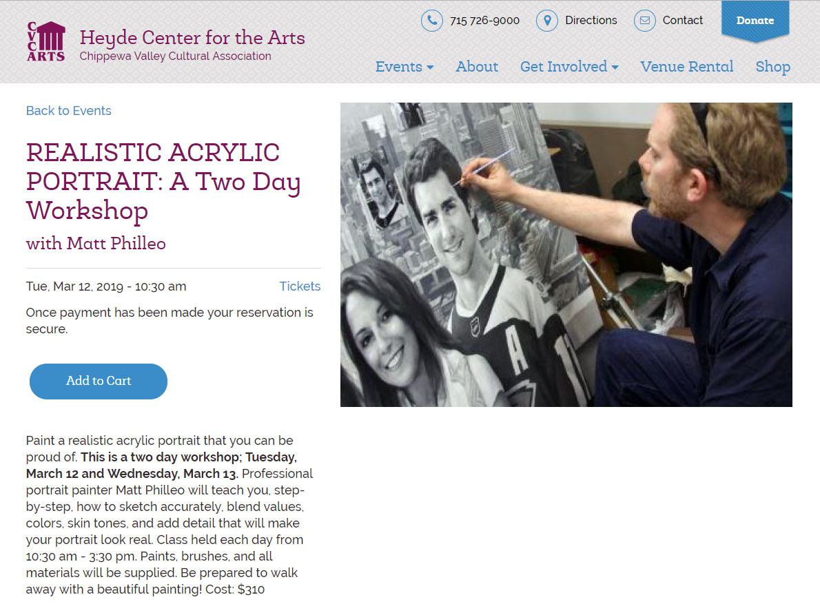
Learn how to paint realistic acrylic portraits with a two-day intensive , held at the Heyde Center in Chippewa Falls, WI workshop by artist Matt Philleo on March 12-13, 10:30-3:30pm
If you live or will be in the St. Paul/ Minneapolis-Eau Claire, WI area around that time and would like to learn how to paint with me, I would love to see you then!
Or maybe you know someone that may be interested. Could you please let them know about this? Thank you so much! Let me know if you have any questions.
Yours for better portraits,
P.S. Did you find this post helpful or encouraging? If so, send it on ahead! Let others know with the share buttons below. I’d love to hear your comments. Thank you so much! Also, do you have a question on acrylic portrait painting you’d like answered? Let me know, and I’d be happy to help!
Realistic Acrylic Portrait School, awarded 10 Top Acrylic Painting Blogs for 2019, by Feedspot.

How to Paint 8 x 10 Realistic Acrylic Portrait Timelapse
Just prior to Christmas, I finished this portrait of a local engineer.
Creating a realistic acrylic portrait can be a rewarding experience, especially when utilizing the glazing technique. This method involves layering transparent paints to build depth and luminosity in your artwork. In this tutorial, a step-by-step guide is provided to help artists of all levels achieve impressive results in an 8 x 10 portrait.
Understanding the Glazing Technique
The glazing technique is foundational in creating depth and realism in acrylic painting. It is characterized by the application of thin, transparent layers of color, allowing the underlying layers to shine through. This method is often compared to photography, where an image starts light and gradually gains depth.
Materials Required
Before beginning, ensure that the following materials are prepared:
- Acrylic paints: Ultramarine blue, brownish tone (raw umber or dark), and skin tones
- Clear acrylic matte medium
- Brushes: Small round brushes, flat brushes, and a small detail brush
- Palette for mixing colors
- Canvas (8 x 10 inches recommended)
- Water for rinsing brushes
Step-by-Step Process
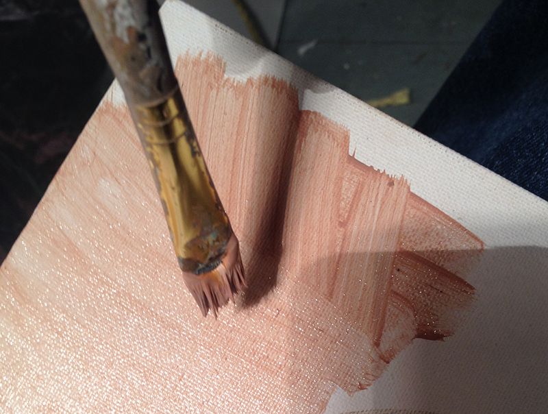
Step 1: Preparing the Background
To commence, a light glaze is applied to the background using clear acrylic matte medium. This initial layer serves as a foundation for subsequent colors and adds a soft, ethereal quality to the painting.
Step 2: Adding Foreground Details
Once the background is set, the first layer of details can be added. Ultramarine blue is used to paint the hat, while the brownish tone is applied to create depth in the background. Care is taken to let these layers dry before continuing with additional details.
Step 3: Building Up Layers
The glazing technique thrives on layering. After the initial foreground details have dried, the focus shifts to the face and scarf. By layering thin glazes, the desired colors are built up gradually, allowing the light to penetrate through the layers.
- Tip: Work from foreground to background to maintain focus on the subject. This approach helps keep details sharp and defined.
Step 4: Detailing the Features
Attention is drawn to the finer details in the face, such as the eyes and lips. Using various skin tones, nuances are added to create dimension. This is achieved by carefully layering pinkish tones on the cheeks and around the eyes, emphasizing features like eyebrows and the mustache with darker shades.
- Technique: When applying glazes, it is essential to work thinly. The use of a clear acrylic medium mixed with paint ensures translucency, allowing for subtle color variations.
Step 5: Refining and Smoothing
As the painting progresses, the need to refine details becomes evident. Skip around the canvas, working on different sections to ensure balance and harmony in the overall composition. Smoothing out areas with a gentle hand helps in creating a realistic appearance.
- Tip: Varying brush sizes and techniques can significantly enhance texture. Larger brushes are suitable for broader areas, while smaller brushes are ideal for intricate details.
Step 6: Enhancing Realism
To achieve a realistic finish, darker tones are added under the chin and in shadowed areas, enhancing the sense of depth. Highlights are strategically placed to simulate the effect of light on the face and clothing.
- Technique: As the final layers are applied, incorporating more opaque white paint helps achieve smoother transitions between colors.
Step 7: Final Touches
At the later stages of the painting, I continue to add details and shading. Varying line thickness and texture are key components to realism. Then moves back and forth between different areas of the portrait, ensuring that the final touches are cohesive and enhance the overall image.
Step 8: Signing the Artwork
After all the details have been finalized, the painting is signed. This not only signifies the completion of the work but also adds a personal touch to the artwork.
Conclusion
This step-by-step guide on painting a realistic acrylic portrait using the glazing technique showcases how layered approaches can bring an image to life. By utilizing transparency and careful detailing, you can create stunning, lifelike portraits that capture the essence of their subjects.
Whether you are an experienced artist or just starting, mastering the glazing technique will enhance your acrylic painting skills.
Additional Tips and Techniques
- Experiment with Colors: Don’t hesitate to mix different colors to achieve unique skin tones and shades.
- Practice Patience: Building up layers takes time, but the results are worth the effort.
- Use Reference Images: Having a clear reference will guide your color choices and proportions, making the process smoother.
By following these steps, you can enhance your painting techniques and create stunning, realistic portraits. Embrace the glazing method and enjoy the process of bringing your artistic visions to life!
For further resources and guides, visit realisticacrylic.com and check out my free courses to enhance your acrylic painting journey
Would you like to learn how to paint like this, with individual lessons broken down and explained?
Learn How to Paint Acrylic Portraits With My Free Mini-Video Course!(The lessons show me painting a different picture, but the technique is the same. Enjoy! 🙂
LEARN MORE
- How to Paint Foliage Using the Acrylic Glazing Technique
- How to Trace for an Accurate Portrait Sketch
- How to Paint Realistic Eyes in Your Acrylic Portrait
- How to Add Raw Umber Dark & Ultramarine Blue to Your Portrait
- How to Make Your Own Raw Umber Dark
- How to Paint Realistic Trees & Grass in Your Acrylic
- How to Block In Skin Tone Values Using Glazing Technique
- How to Paint Vibrant Reds in Your Acrylic Portrait
- How to Glaze Background Colors & More Acrylic Portrait
- How to Paint White Clothing in Your Acrylic Portrait
- How to Easily Transition from a Sketch to a Painting
- How to Block In Shading & Skin Tones in Your Acrylic
- How to Build Up Color on Acrylic Pet Portrait
- How to Build Up Form on Clothing with Acrylic
- How to Paint Dark Clothing Using Acrylic Glazing Technique
- How to Paint a 24 x 30 Acrylic With 30 People
- How to Do Smooth Shading with Acrylic
- How to Sketch an Acrylic Portrait with a Grid
Read more about how to paint a portrait that you can surely be proud of!
Let me know how this helps.
Yours for better portraits,

P.S. Did you find this post helpful or encouraging? If so, send it on ahead! Let others know with the share buttons below. I’d love to hear your comments. Thank you so much! Also, do you have a question on acrylic portrait painting you’d like answered? Let me know, and I’d be happy to help!

How to Paint Realistic Wrinkles in Acrylic: My New Course
Everyone has at least a few wrinkles.
And so as portrait artists, we need to learn how to paint realistic wrinkles–whether we’re painting someone old or young. Painting wrinkles well can really help to capture a person’s likeness in a portrait. They can add so much to the personality.
But it’s not easy. There’s so much to it: the shape, the coloring of the shadows, the highlights, and the blending. How do you do it, without it looking fake?
Do You Struggle To…
- paint wrinkles that look like they are actually wrinkles?
- paint the creases from nose to mouth convincingly, to make it look the person is really smiling?
- show the expression and personality of the person by painting the wrinkles in the forehead correctly?
- paint the different nuances in light and shade, the shadows on the wrinkles and how to make them look natural?
- choose, mix and blend the colors to create realistic shadows and skin tone?
- accentuate the wrinkles without making them too prominent?
- create smooth gradients on your wrinkles, with correct shadows and highlights blending together, cohesively?
- see the correct shape of the wrinkles from your reference photo and accurately represent that on your canvas?
- capture the likeness of the person you’re painting by painting wrinkles realistically?
If you’re an an acrylic portrait painter who struggles with painting wrinkles, then I’d love to help you get better at it.
Introducing My New Course…
“Paint Realistic Wrinkles in Acrylic”
Why did I decide to do a course on painting wrinkles?
I’ve been painting portraits in acrylic for nearly 25 years and teaching classes for the last two. During that time, I’ve taught over 100 students how to paint an acrylic portrait, step-by-step. That course covers a lot of material and it’s been wonderful to see students take it and get noticeably better at their portrait painting.
But one of my students was really struggling with how to paint wrinkles. So I thought, “Why not teach an online class on it?” After getting feedback from my other students, I realized there are other artists who struggle with this as well.
And so, now I’m excited to teach you, too, how to paint wrinkles realistically!
What will we cover in the course?
- Why painting wrinkles well is important and how it can make your paintings better
- The 5 different kinds of wrinkles in the face and how to see them accurately, so you can paint them accurately
- How to sketch wrinkles accurately, and do the “heavy lifting” here so the painting part is way easier.
- Choosing the right colors, mixing and blending so they don’t get muddy.
- Achieving accurate values for both the colors and highlights so the wrinkles actually have depth to them
- Finishing up with a gentle touch, painting smooth gradients, resulting in a portrait that just begs to be looked at
- And more!
Here’s How We’ll Do it
> This is a brand new course, so I will teach a lesson every week, recorded in my studio on Tuesday and released Wednesday morning for the next four weeks. I will upload them to this site, and you will get instant access as soon as they are up. The lessons will start June 6th.
> Each lesson will be about an hour long, and broken up into smaller segments so you can easily watch them and come back to them when you like.
> I’ll respond to your feedback and questions, making sure I’m teaching exactly what you need to succeed.
> You will have lifetime access to these videos on this site (as long as technology holds out) and can watch them at your own pace 24/7.
Personal Critiques to Help You When You Feel Stuck
If you need extra help, I’d be happy to record a personal video just for you and critique your work. I’ll point out any areas that could be corrected or refined. I’ll show you exactly with my Crystal Clear Critique method of drawing on top of your reference photo and your portrait in progress, while explaining how to improve an area you’re struggling with. You’ll know exactly what to do to get your sketch or painting back on track.
Getting a Critique is Easy & Effective:
Step 1: In the critique, you email me ([email protected]) a photo of your work in progress, and the reference photo(s) you’re working with, along with your comments on what you’d like addressed or any frustrations you have.
Step 2: I’ll set your portrait up on my video screen and set up the recording.
Step 3: Then I compare and contrast your painting with the reference photo, literally showing you gently (but clearly) what’s working and what could use improvement. This is all on a private, personalized video, not in a group setting. So you never have to feel awkward as if anyone else is judging your work!
Step 4: I send the recorded video back to you (usually within 24 hours or less), where you can access it online via a personalized link, just for you. The critique will typically be about 15 minutes long.
Step 5: You take whatever suggestions you like from my critique, and incorporate them into the painting. Your painting looks great. You feel great about it. You finish the sign the painting and hang it up, send it to the client, or give it to that loved one!
Will it Work?
You might be thinking, “Matt, I know you can teach this stuff, but will this course work for me?” I want to ensure you that it will: if you watch the lessons, put them into practice, and ask me any questions if you aren’t sure about something.
I can’t promise you’ll paint a portrait like Rembrandt. That’s just not a realistic goal starting out. But I can guarantee that your portraits, and more specifically, your ability to paint wrinkles WILL improve as a result of taking this course.
Here’s just a small sampling of comments I receive from my students. It makes my day!
“Wow! This class is one of the most amazing classes I have ever attended. I really felt like I was present in the classroom. You have taught each and every important part of gridding so well. And your lively talks kept us all smiling all the time. Thanks a lot for the excellent advices.”
–Aastha Thakur
“Just a quick thank you for your help. I had written down the colors that you used for your glazing technique on portraits and I can’t believe how much easier it is for me now. I have been dreading this portrait that I volunteered for since last year… I was using too opaque of colors and it caused me to be nervous to lay down any paint in fear that I would make a mistake. The glazing technique is more forgiving and it was like it flowed off my paintbrush. I’ve had blending gel but never really used it so now I’m going to buy stock in it. LOL. I can say that this portrait I’ve done is my best and I have an emotional bond with it because of the circumstances.”
–Keri Sparenga
–Kelly Dywer
I feel so blessed that I can paint and teach portrait painting for a living, and to hear back from my students is extra special to me. These are the kinds of results that most of my students are experiencing, not just a select few. Now, just in case you’re still wanting a little extra assurance, I get you. I want to take away all your risk by promising you a bold satisfaction guarantee…
My Win-Win 30-Day Satisfaction Guarantee
Try the course for 30 days. Get some quick wins by trying out a few of the techniques. And if for some reason, you don’t see either the value of what I’m teaching or don’t feel like you’re getting the results you wanted, just email me and let me know. I will gladly refund your entire enrollment fee back, no questions asked.
However…
I only ask one thing: that you watch the lessons. Why? Because I know if you do, and utilize the techniques I teach you, they will work. If you are patient with yourself and consistently practice what you learn, you will see improvement.
Here’s how it will be a win for both of us: If you go through the course, and put the techniques to use, you’ll be able to paint a realistic portrait you can be proud of. And it will be a win for me, because I’ll be happy to see the amazing paintings you create. I’ll let other potential students know they can do it too–which will most likely increase enrollments in the class.
I will do everything I can to help you learn how to paint realistic wrinkles in acrylic. That’s my promise to you.
Imagine what it would feel like to finally paint a portrait that looks real…
…and looks like the person.
A portrait you can be proud to hang on your wall or give as a high quality, unique gift.
Let me know if you have any questions, and I look forward to teaching you within the course!
All the best,
P.S. Because of different time zones and schedules of potential students all over the world, we will not be doing live classes. But you will get immediate access to the lessons, after I upload them weekly on Wednesdays, starting June 6.
Enroll today. See you inside the course!

5 Steps on How to Paint Wrinkles in Acrylic
There’s nothing quite as difficult as painting wrinkles. There’s so many details and shapes to get right, and how do you shade them in? That’s what I want to answer in today’s post.
Learning how to paint wrinkles is a crucial skill for adding realism and depth to your acrylic portraits. Capturing the fine lines and textures of wrinkles can make a painting truly lifelike, conveying the story and character of your subject. With techniques like layering, shading, and glazing. This topic of wrinkles has come up a few times since I started teaching portrait painting two years ago, and most recently when a student asked me how to do it. I shared briefly the steps how in my previous article, “7 Questions About Portrait Painting, Answered.”
Now I want to dive a little deeper.
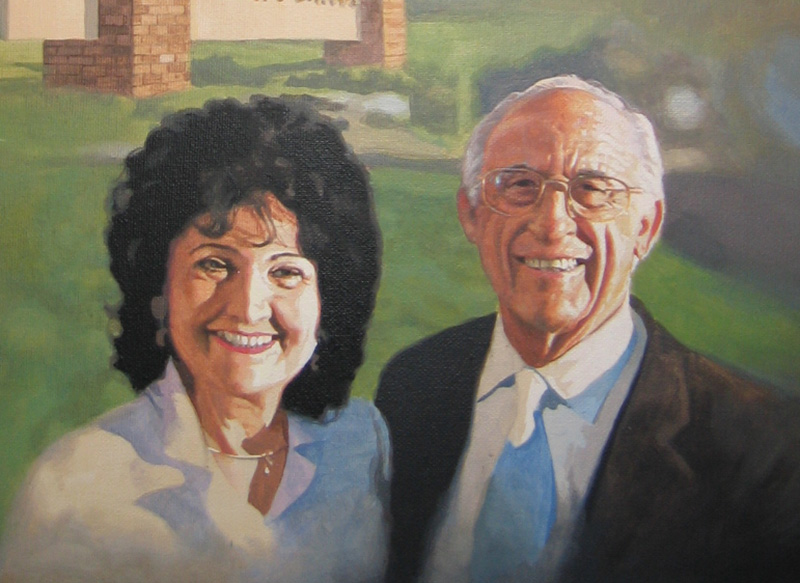
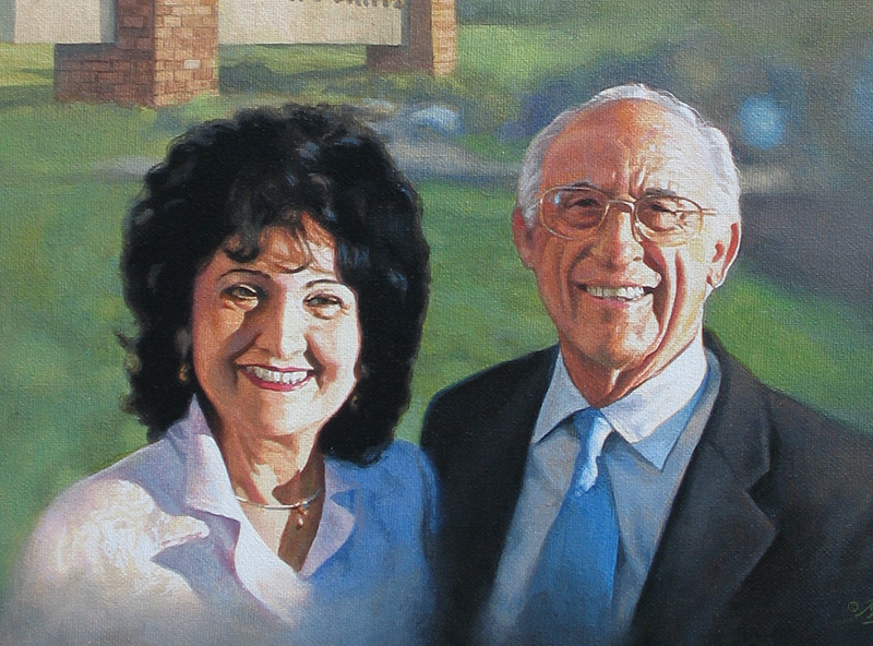
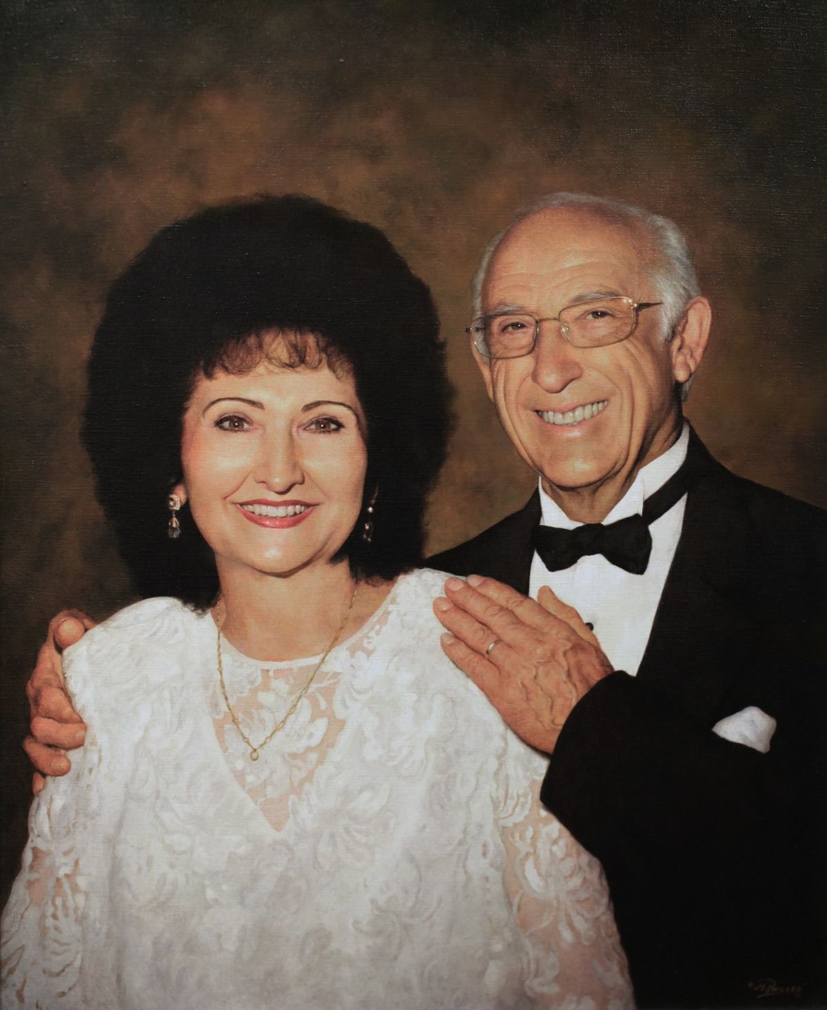
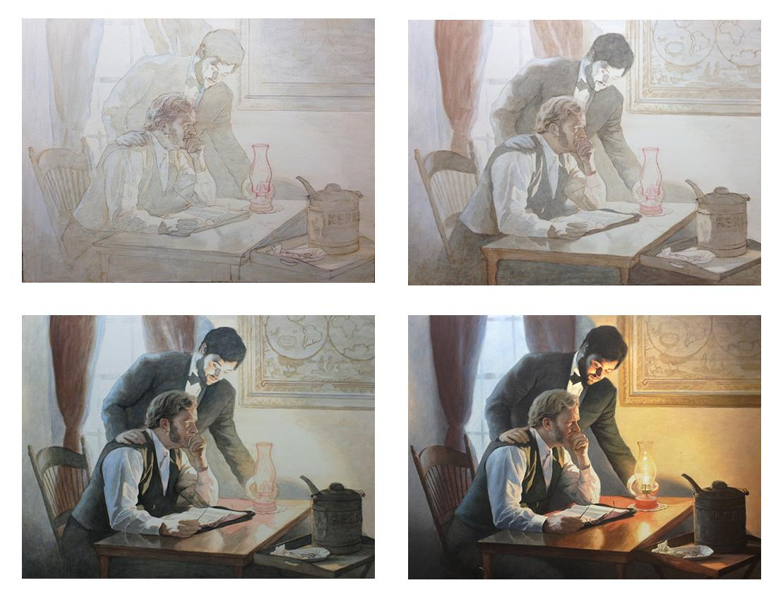
For an example, I’m going to use one of my favorite paintings–a portrait I did for my pastor, Philip Palser, of Bethel Church in Eau Claire, Wis., to commemorate his 80th birthday. As I write, he is turning 93 this month!
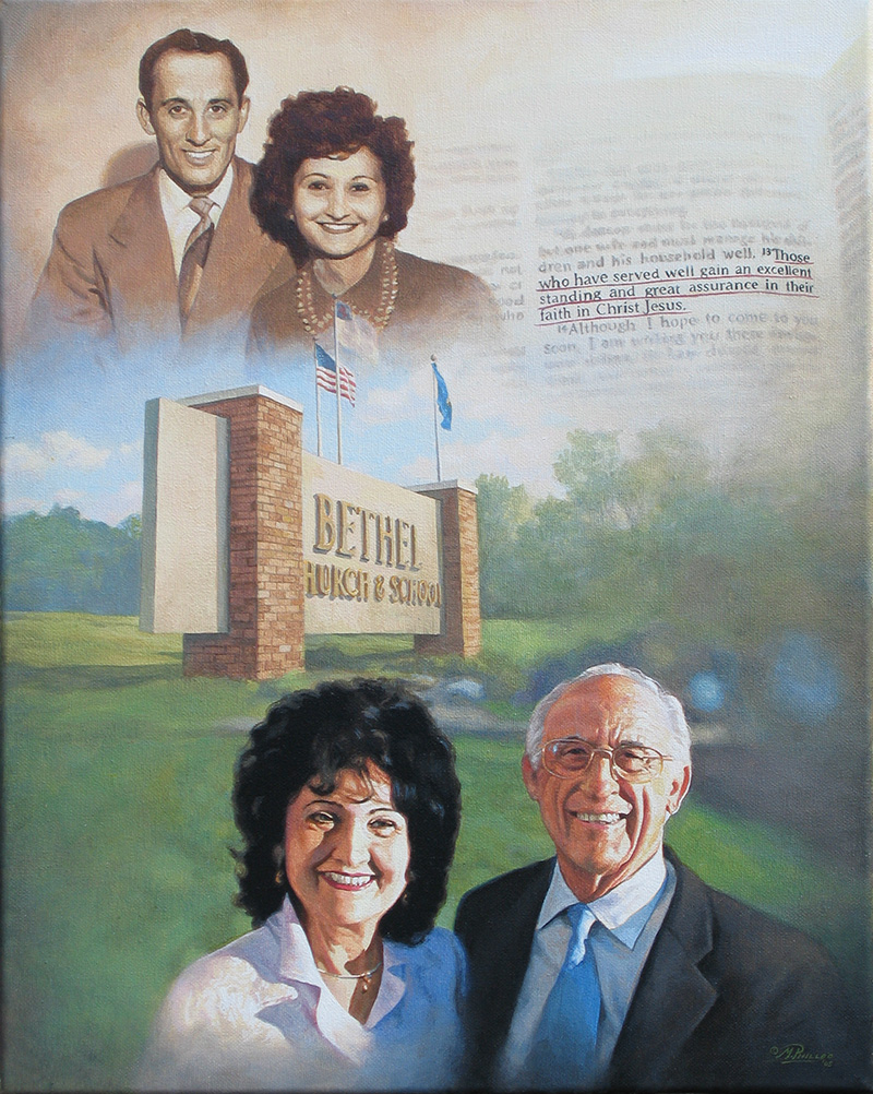
Portrait of Pastor & Mrs. Philip Palser of Bethel Church, Eau Claire, Wis., 16″ x 20″ acrylic on canvas, by artist Matt Philleo to commemorate Pastor’s 80th birthday.
He actually doesn’t have to many more wrinkles than what he had 13 years ago. But they may have deepened a bit with age, signifying his experience. 🙂 Both he and his wife are in amazing health for their age.
Now back to the topic of painting wrinkles…
I’m going to show you just the portion of when they are older–mostly concentrating just on my pastor’s face, because his wrinkles are more apparent.
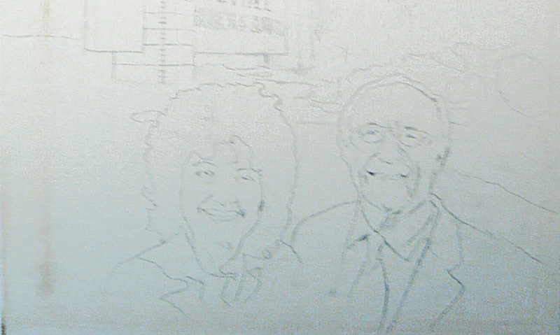
Step 1: the Sketch
I started with a sketch outlining the major details–such as the the creases around the mouth and the major wrinkles in the forehead.
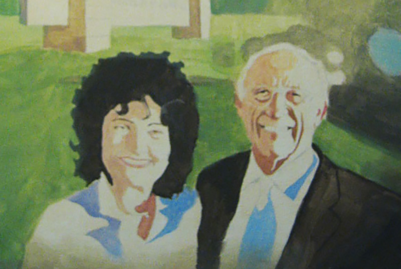
Step 2: Blocking in the Values
Next, I filled in the major values, without a lot of fuss. It is important to accurately define the shapes of the predominant shadows, and put them in their place. They need to stay within their pre-defined boundaries, which ideally would be outlined in the sketch. Now, of course strong lighting–in this case, from the sun–makes this a lot easier.
You may not always have control over this in your portraits, especially if you’re doing a commissioned portrait painting from a photo. But if you can, choose a photo that has strong lighting with a lot of contrast. It really helps model the face, emphasizing its three dimensional form.
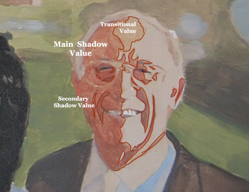
Step 3: Strengthening the Shadows
In this step, I am taking what I did in the previous step and darkening everything. I use burnt sienna and raw umber dark to strengthen the contrast. The vertical wrinkles especially in the man’s forehead and the horizontal crows-feet wrinkles by his eyes are more apparent now. But they are still pretty basic. I did paint in just a slight gradation on the wrinkles that run from the nose to the mouth. But it’s still pretty simple.
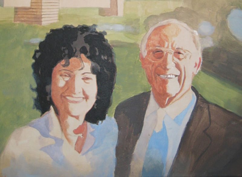
To explain, I broke down the shadows into three categories: the main shadow value, the secondary shadow value, and then the transitional value. These are terms I’ve made up just to differentiate between everything. If you keep things simple to begin with and build on a firm foundation, you will find it a lot easier to achieve the realism you’re shooting for.
It makes me think of a verse where Jesus says, “Anyone who listens to my teaching and follows it is wise, like a person who builds a house on solid rock.” (Matthew 7:24)
If you can teach yourself to see these abstract shapes within your reference photo, and then replicate them on your canvas, you will experience amazing growth in your skills as a portrait painter.
After getting these values locked in, the trick is to bridge them together with some shading and gradation. Notice the highlighted part of his face is flat.
That is OK.
Later, I’ll paint more depth in that area, but for now, it’s not necessary.
Would you like to learn more about how to paint wrinkles? If so, let me know by clicking the button below, and I’ll create a video tutorial/ course for you!
Step 4: Bridging the Gaps
Although I try to give these stages precise beginnings and endings, I don’t want you to think that I am only “bridging the gaps”–transitioning between values only in this stage. But it is at this time, that I’m concentrating on that the most. You can see I added more detail to the transitional value on his forehead.
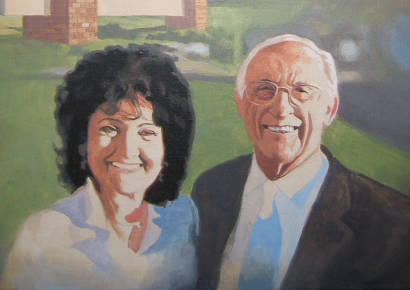
And then, in the image below, you can see how I added more of the secondary value (the same value that’s within the wrinkles on the shadow side) to the vertical wrinkles between his eyebrow ridge and the crease alongside his mouth. Now what that does is add another layer of depth to the wrinkles.
And now also, the underside of the wrinkles look like they’re catching some light from the highlighted part of the face. And that increases the realism.
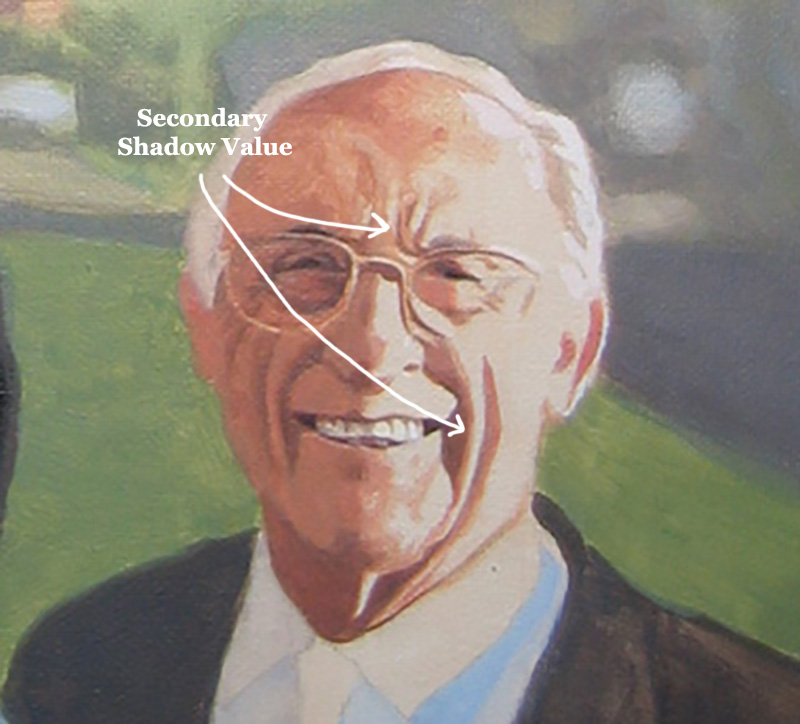
Step 5: Smoothing out and Finishing With Detail
In this step, I take what I built in the previous foundation, and embellish it. When you have a good foundation and you bring it far enough along, the structure of the wrinkles can just about stand up on their own. But by adding some more shading, we can really make it look nice–like putting on the trim. 🙂
What I did here was add highlights on top of the main highlighted area. This give us one more layer of depth to the face. I put the detail in for the horizontal wrinkles in the forehead as well as some highlights that heightened the creases running alongside the mouth. Some of the thin areas of the forehead wrinkles that you would think would be painted with small round brush were actually created by painting the lighter value and “closing them in.”
However, I would use a small brush to refine them if necessary.
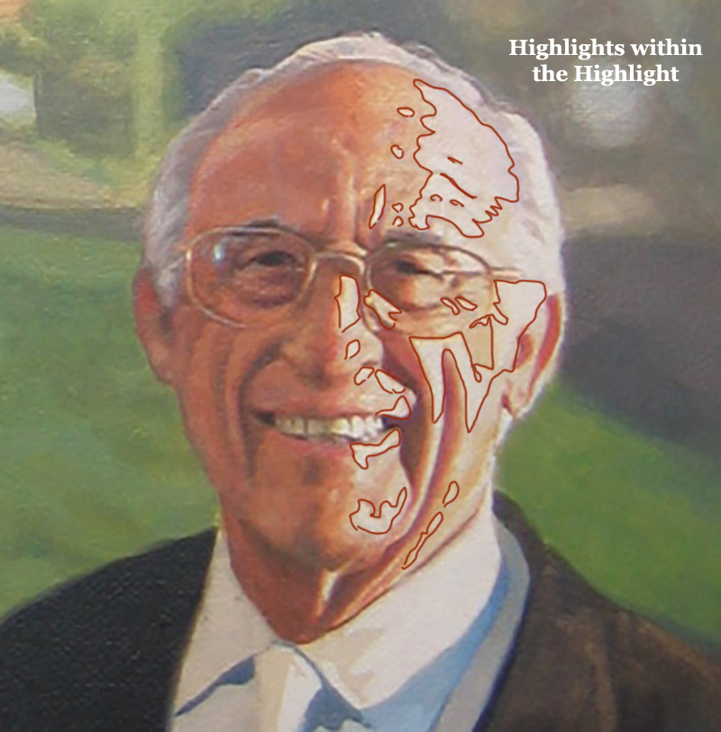
Here is a detail image of the final painting…
How to Paint Wrinkles in an Acrylic Portrait, with step-by-step tutorial, based off 16″ x 20″ acrylic on canvas portrait by Matt Philleo, final
That’s it for now. Hope you found this tutorial helpful. Let me know if you’re interested in learning more on how to paint realistic wrinkles in acrylic. As I write this, I’m considering doing an online course on the topic. But I need to hear from you first, to see if it’s something you would find interesting and benefit from. Let me know!
Have a blessed day, enjoy painting, enjoy life,

P.S. Did you find this post helpful or encouraging? If so, send it on ahead! Let others know with the share buttons below. I’d love to hear your comments. Thank you so much! Also, do you have a question on acrylic portrait painting you’d like answered? Let me know, and I’d be happy to help!

Top 7 Powerful Techniques for Starting Out in Acrylic Portraits
Begin your portrait painting journey with confidence using these essential acrylic techniques
Are you just starting your journey into acrylic portrait painting? With so many techniques to learn, it’s easy to feel overwhelmed. That’s why I am covering the essential techniques for starting out in acrylic portraits, from choosing the right colors and brushes to creating smooth blends and more. In this post, you’ll find answers to common beginner questions, giving you the tools to bring your portraits to life with ease and confidence! Let’s dive in and explore these foundational techniques together.
Today, I’m going to answer seven fantastic questions from a follower of mine named Andrea. The questions deal with everything from what colors and brushes to use, to blending, to some advanced techniques.
Read below to find out if one of your questions gets answered…
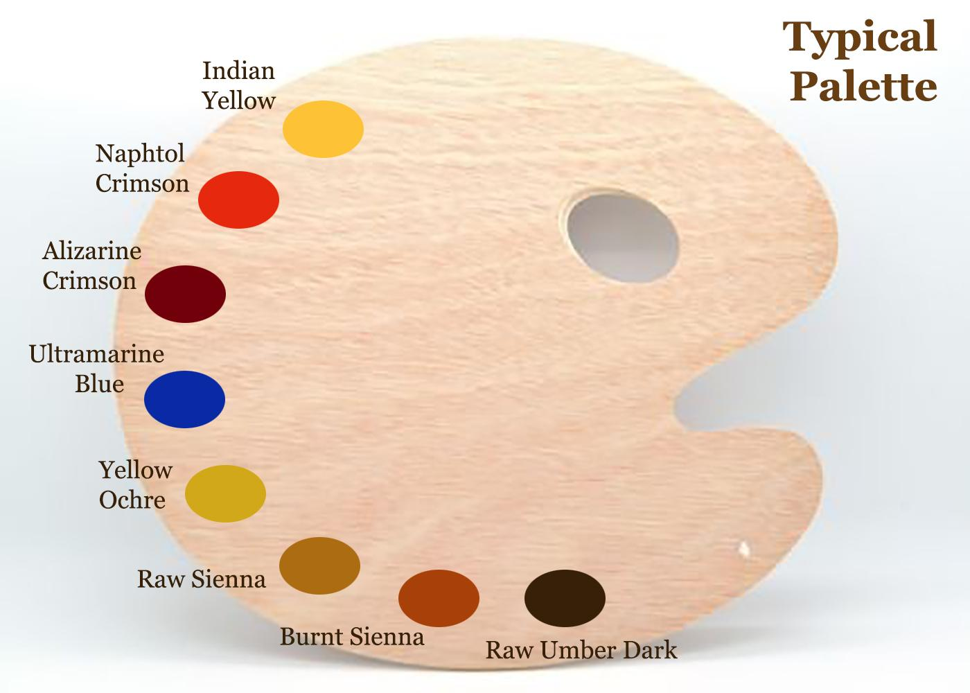
Q #1: What should be my basic color palette for portraits, and mixes for shading?
A: This is my basic palette for painting portraits. I would also have titanium white on it in the upper corner, by the indian yellow. Typically, I start out with raw umber dark and ultramarine blue thinned down with clear matte medium to block in the darker values. I make them into a very translucent glaze of 90% or more medium to 10% or less pigment. Eventually, I work my way into the warmer tones with burnt sienna, raw sienna, and alizarine crimson. The raw umber dark is used to counter-balance those glazes so they don’t get too warm/ orangish.
Q #2: What sort of brushes should I be using?
A: I don’t use anything fancy. Just brushes you can buy at your local art store in a multi-pack, ranging from 1″ flat/ 1/2″ flat, 3/8, flat, and a varied assortment of rounds from size 4 to 3/0. I go through a lot of brushes, so I don’t get anything expensive. But I do have a few nice ones for surface shading and the final varnish coat.
Q #3: How do I keep my paints from drying up, or drying immediately they are applied before I have chance to blend them? I do have retarder but should I be adding this to every color on my palette before I start?
A: No, I don’t recommend a retarder. Some artists like it, but for the classical glazing technique that I use, the faster the paint dries, the better (within reason). Basically, I love the quick drying glazes. It means I can be ready for another coat in about 10-15 minutes. I work various parts of the painting, cycling from the background to the foreground, from the hair to the face, from the clothing, the eyes–whatever. That way, when I move to another part of the portrait, it’s already dry and ready to work on.
Q #4: How do I shade?
A: I have five different ways to blend. Check out my latest blog post here for more info on these techniques…
How I Painted the Portrait of My Pastor and His Wife
How I Painted the Portrait of My Pastor and His Wife
If you’d like to delve further into how to shade, I created a course on it: “Shade With Acrylic Like a Master.”
Q #5: In what order should I paint? I started with the background.
A: I sometimes start with the background, but not always. I want to establish contrast as soon as possible. So I try to fill in the darkest values first. It may be the background, but not necessarily. You can see the progression of how I work below on this example painting, “Smoldering Wick” (30″ x 40″ acrylic on canvas).
Notice, I filled in the darkest values first, and then moved to the lighter areas last…
Q #6: How do I tackle difficult aspects, such as deep creases from the nose to the mouth, the sides of the mouth and wrinkles?
A: I need to do a course on this. Others have chimed in as well, saying they really would like to see how it’s done. I’ll probably start out with a couple videos on the topic and then move into a longer course. But to answer your question, I’ll say this: look for the shadow first. Notice where the light source is at, and then the crease will be shaded on the opposite side. On the side facing the light, there will be a highlight.
Here’s how you do it:
- You paint the shadow of the crease in first, with a thin that’s fairly faint, and that’s one layer.
- Next, you go over that with another layer, that darkens just a few spots within that crease. In any crease or wrinkle, there will always be some areas that are deeper than others, and those need to be darker.
- You paint a thicker line on top of the first line. This line should be even more faint than the existing line, and the color should be slightly warmer.
- You paint a highlight on the opposite side. It should be about the same color as the flesh tone surrounding the crease, but a couple shades lighter and warmer too.
- You may need to add a couple more layers to both the shadow and the highlight to blend it in appropriately.
One quick tip: start out faint and go progressively darker. This is the number one mistake I see in portraits. Artists notice creases and wrinkles, but they paint way too prominently.
Would you like to learn more about how to paint wrinkles? If so, let me know by clicking the button below, and I’ll create a video tutorial/ course for you!
Q #7: What colors should I use for each area, especially the top eyelid, the mouth and the shadows under the eye?
A: This depends on the person. You need to really pay attention to the colors in the picture you’re working from. Generally under the eye, the colors are a bit cooler, because the skin is thinner there and you see the blood vessels on the surface. So, use some ultramarine blue, alizarine crimson, and raw umber dark mixed together and thinned out into a very light glaze. Then go over the area under the eyes with that.
For the mouth, you’ll need alizarine crimson, and napthol red, but it depends on the person. Obviously, a woman with lipstick will need more red on her lips. But even some men have lips that are more red than others.
Let me know how this post helps in your portrait painting. (If you’re not an artist, but you found this interesting, I’d love to hear about it. )
May God bless your painting,
P.S. Is there a question YOU have that wasn’t covered in this post? Just ask! I’d love to help.
If you found this post helpful or encouraging, would you send it on ahead? Let others know with the share buttons below. I’d love to hear your comments. Thank you so much!

3 Common Portrait Painting Mistakes & How to Avoid
Do you struggle sometimes with getting your acrylic portraits to look lifelike? Many artists do. It may be possible that you are making one or more of the three common mistakes I’ll mention in this article.
I’ve been painting portraits for nearly 25 years, and teaching for the last two. While teaching and critiquing students’ work, I’ve noticed similar mistakes crop up again and again.
The purpose of this article is not to put anyone down.
My goal is to simply show you a few of these mistakes–identify and take the mystery out of them–so that you can be intentional as an artist and avoid making them in your portrait painting.
So, to demonstrate, we’ll use a photograph of an attractive young woman. I’ll post it here in it’s unedited form. Obviously, this is not a painting, but rather a photo. But since we strive for realism that would be on par with a photograph (or better if painting from life) this picture will be an example of a fantastic, realistic portrait.
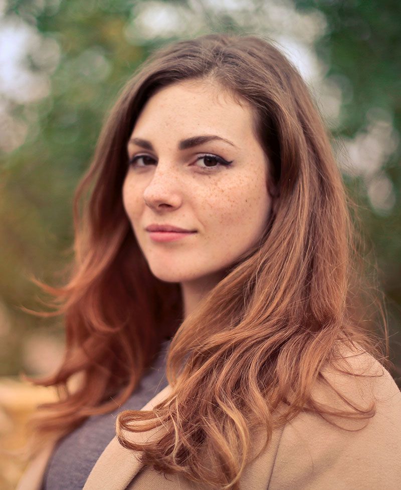
Notice the pose: the woman is smiling gently, the lighting is smooth and even over her face. If I painted a portrait like this, I would be very happy with the results, and I think you would too. The form of her face is accurate, the values, shading, tints and colors, are all in the right place.
That is why it looks realistic.
Now, using Photoshop, I edited this image, and I’ll do a side-by-side comparison between the original photo (we’ll call it the reference) and then the versions with the mistakes. I’ll show you three of the most common. But not many artists are aware of them. Here they are…
Mistake #1: Over-emphasizing certain details
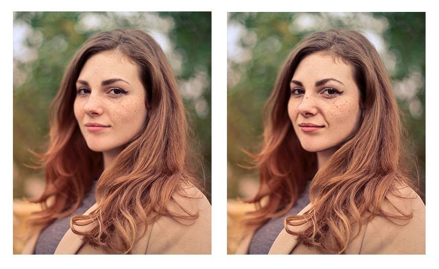
An artist may see a wrinkle under the eye for example, or running from the nose to the mouth, but the tendency is to make it way darker than it really is–in real life–or as shown by the reference photo. It’s great to be able to see the detail, but too much detail can detract from realism, rather than create it.
You’ll notice angle of the eyebrows are exaggerated. Even the freckles are too large and too dark. That happens often. We observe a feature, a characteristic on someone’s face. But then we overdo it. Like a caricature, we unintentionally make it too prominent. And that detracts from realism.
Mistake #2: Over-simplifying complex shapes or angles
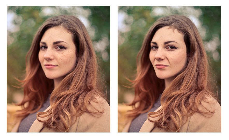
Artists may see the wrinkle stretching from the nose to mouth that shows when the subject is smiling. But they paint the shape as one straight line when, in reality, there are a couple different angles merging together to create what looks like one straight line.
In other words, they take a jagged kind of line and smooth it out.
The angle of the woman’s cheek and jaw on the left side (her right) is another example of this. Notice how in the reference photo, it has three distinct curves (you could call them hills) running from the eye down to her chin. But when this over-simplification mistake is made, those curves are merged together into one line–dull, lifeless, and inaccurate.
One final example would be the woman’s eyebrows. Whereas in the original reference photo they have a slight peak to them, here they are completely smooth and curved.
The result looks as if they are painted on.
In realism though, even though everything is painted on, we are always trying to defeat that fact, and create the illusion of three dimensional reality on a two-dimensional surface. Nevertheless, the mistake of over-simplifying details often persists.
Why?
Because, as human beings we want to order our world–make things look more even, more refined. But in nature, there is randomness; that’s the way God created it.
There is beauty in that irregularity. So we need to learn to see what’s really there, and paint that, rather than what we think is there. That is always the challenge. Every artist, no matter how experienced, has to fight that tendency, myself included!
Mistake #3: Painting (and drawing) symbolically rather than representationally
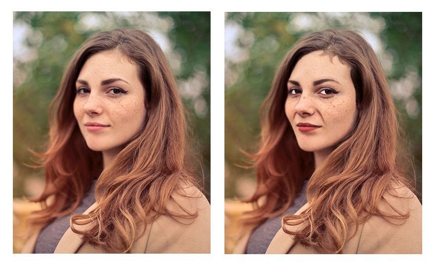
We are taught from childhood that eyes are white, blond hair is colored yellow, lips are red, and so on.
That’s just how we learned to color our coloring books. And so we take that into creating realistic paintings. And we end up with eyes that are way too white, and all the other things.
In reality, eyes actually appear grey, and they can be darker than the skin around them.
Why?
Because the eyebrow ridge, eyelids, and eyelashes cast their shadows over the eye, but once you get below the eye into the cheek, the shadow dissipates. And the skin is actually lighter in value that the eye. That is just one example. But we make that mistake more often than we realize.
You can see from the image how odd it looks to have eyes that are that white. Especially when you compare it side-by-side with the reference photo. The reason is that the values are just completely incorrect with reality.
A tool to help you paint better values and realism
A great tool to overcome this is the Value Checker tool. You can print this out, and what you do is hold up the square that has the closest color and value next to the area in question on your painting. Then set that same square above the corresponding area on your reference photo–and see what the difference is.
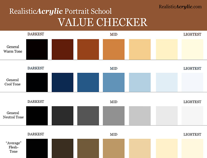
Get the downloadable, printable Value Checker Tool from Realistic Acrylic Portrait School to double check the values in your portraits and make sure they are accurate.
Do you need to go darker or lighter?
Or, do they match? That’s obviously what we’re shooting for. If they don’t, now you know exactly how far off you are, and you can adjust as needed.
It’s not cheating.
It’s a tool to double-check yourself and help you do your best work possible.
You can download a full resolution version, below, for free and then print it out and keep it as a handy tool in your studio. Let me know how it helps.
I’ll sum up with this: it’s a never ending struggle to paint realism, because we have to fight inherent human tendencies. But it’s a worthy struggle. If you continue in the battle, you’ll amaze yourself at the beauty you can add to the world with your well-crafted fine art portraits.
Here’s my advice on how to improve…
Be aware of these three mistakes. That’s the first step. Then you can catch yourself making them.
When you do, make the necessary adjustments by carefully observing your reference photo. Print it out smaller and tape it with low-tack tape onto your canvas so it’s right next to what you’re painting. Study it and compare the difference.
If you can’t see what to do next, ask an artist friend to critique your work–or ask me. I’d love to help.
However, just the fact that you read this article to the end shows that you have what it takes to improve and create a realistic portrait that you can be proud to show. May God bless you in your portrait painting adventures!
All the best,
P.S. Did you find this post helpful or encouraging? If so, send it on ahead! Let others know with the share buttons below. I’d love to hear your comments. Thank you so much! Also, do you have a question on acrylic portrait painting you’d like answered? Let me know, and I’d be happy to help!

How to Paint an Acrylic Portrait You Can Be Proud Of
What would it feel like for you to truly be able to paint a portrait in acrylic you could be proud of?
…to give as a high quality gift, display in a show, or to get a “thumbs up” and a good price for your artwork when you do a commission? How would it feel to not struggle with finding the right skin tone, or get the blending in the colors right? Or to be able to paint a person’s face and not have it look flat?
Imagine how it would feel to know how to mix the paint and control the brush..and get a realistic result…predictably.
I’ve been painting portraits in acrylic for over 20 years, and started teaching out of my studio two years ago.
The next year I started teaching online when one of my email subscribers, in her mid-80’s, urged me to put a course together. We chatted on the phone and she asked me how much I would charge for an online painting class.
“How about $97?” I replied.
“I’ll mail you a check right away.”
Just like that, I had a paying student…I had to teach the class now!
I asked some other folks on my email list if they wanted in, and about 10 more students instantly enrolled. Since then, I’ve taught almost 100 students literally all over the world, and it’s been so enjoyable to see the progress they’ve made.
If you want to learn how to paint a portrait in acrylic that you’ll be proud of, then learning directly in a step-by-step video course is best way to cut through the fog, and achieve results fast.
That’s why I created an online course called “Paint Your First Amazing Acrylic Portrait.”
![]()
It’s a complete step by step video course, showing you exactly how to paint a portrait in acrylic, from the sketch to the finished, signed painting. All the lessons are online, available for you to watch at your own pace, 24/7.
Click here to learn more/ enroll
Judy, one of my students in this course, just started acrylic portrait painting a couple months ago. She was having some difficulty and felt stuck in her painting progress, so she emailed me asking for a critique. (You can request a personal critique, too, as a student of my course!)
Here’s what she emailed me after I sent her the interactive video critique…
“Hi Matt,
Thank you so much, that is so helpful. You said it so well when you talked about “being intimidated by the painting” that was exactly how I felt – a kind of stage fright, haha maybe “easel anxiety” anyway as I listened to your critique I just felt it unlock.

I feel excited about making those changes. I laughed when I saw that despite staring at the photo for hours and hours I never noticed a piece of his ear was missing in my painting.
Then Judy finished that painting, utilizing the techniques in my course and some tips in my critique, and wrote me again:
“Hi Matt,
Here is my painting that I’ve been working on. I’m really thrilled with it and it will work with Maurice’s portrait.
I’ve been learning so much – how to fix a mistake, and how to wait patiently for paint to dry.


I made a mistake straight off by using a lead pencil instead of the one you recommended I use ( which was right there next to it). Bet I will never do that again! I’m really getting a feel for mixing glazes and I’m having so much fun.
Thank you so much you inspiring teacher!”
Cheers,
Judy
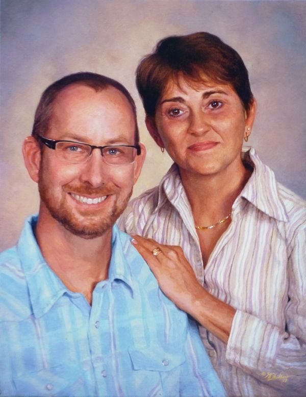
I love the beautiful husband/ wife portraits Judy did side by side. Not only has she enjoyed the painting process, but she has two paintings she’s proud to show. And she has only started painting.
You can do this too. You can save time, paint, and frustration. You can learn how to paint a lifelike portrait that you can confidently show others, by taking my course.
I’d love to have you as a student!
All the best,
P.S. It is the one-year anniversary since I created this course in April of ’17. If you are wanting to take the next step in painting, here’s your best opportunity. I truly believe if you take the course, your portraits will dramatically improve. Why? Because the techniques work, and that is what I have seen happen for several of my students. Hope you’ll be one of them!
Click here to learn more/ enroll