Category Archives for Step-by-Step Tutorial
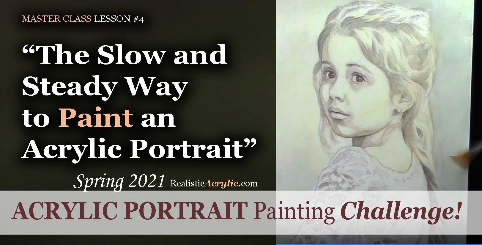
Spring 2021 Acrylic Portrait Painting Challenge: The Slow and Steady Way to Paint an Acrylic Portrait
If you remember the childhood story, “The Tortoise and the Hare,” you recall that the hare started out really fast and put the tortoise to shame. But then the rabbit took a nap, while the slow, while the turtle, with his slow methodical steps, passed him up and won the race!

Sometimes slow is better for painting an acrylic portrait.
Likewise, in an acrylic portrait, we often want to see quick results. But if we take our time, and just add one layer on top of another, even though it looks like hardly anything is happening, eventually, we will end up with a great painting!
I’d like to show you how to slow down a bit, take your time, and paint your acrylic portrait layer by layer, using the acrylic glazing technique.
Take the Acrylic Portrait Painting Challenge (it’s FREE!) and paint along with us!
REGISTER TODAY. The challenge is ongoing, something you can do at your own pace. It’s not too late to enter! After you join, I’ll send you the supplies list and reference photos to paint from.
Register for the Challenge!
WATCH NOW…
Lesson #4: The Slow and Steady Way to Paint an Acrylic Portrait
In this master class lesson #4, I demonstrate how to continue darkening your darkest values on the face and background, and then work in some warmer glazes to set up the skin tones on her face. We’re going very light, using a large amount of matte medium (95%) to a small amount of paint (5%)
Watch how to do it here…

Learn how to paint an acrylic portrait slowly and correctly, step-by-step in this FREE master class lesson by Matt Philleo at Realistic Acrylic Portrait School!
Would like to paint this portrait with me and hundreds of other artists?
Take the 2021 Spring Portrait Painting Challenge!
You can register below and get started. It is completely FREE to join the challenge and participate. When you join, I’ll send you the “Welcome Kit” which includes:
- The Supplies List (so you know what you need to paint with us, your shopping list. 🙂 )
- The Reference Photo with and without the grid, high resolution, that you can download ready to print out or display on your tablet. You’ll be able to create an accurate portrait this way.
- The Palette Layout Guide showing you how to arrange your colors so they don’t get muddy on your palette
- The Master Class Lesson Schedule
- the Lessons emailed to you
- A private Facebook group to cheer you and help answer your questions
- And a few “bonuses” like opportunities to win my paid online classes
REGISTER TODAY. The challenge is ongoing, something you can do at your own pace. It’s not too late to enter!
Register for the Challenge!Let me know if you have any questions and I look forward to teaching you more!
—Matt
Questions? Suggestions? Thoughts? Let me know, below in the comments. Please share your sketches in our Facebook group and share this post with your friends!
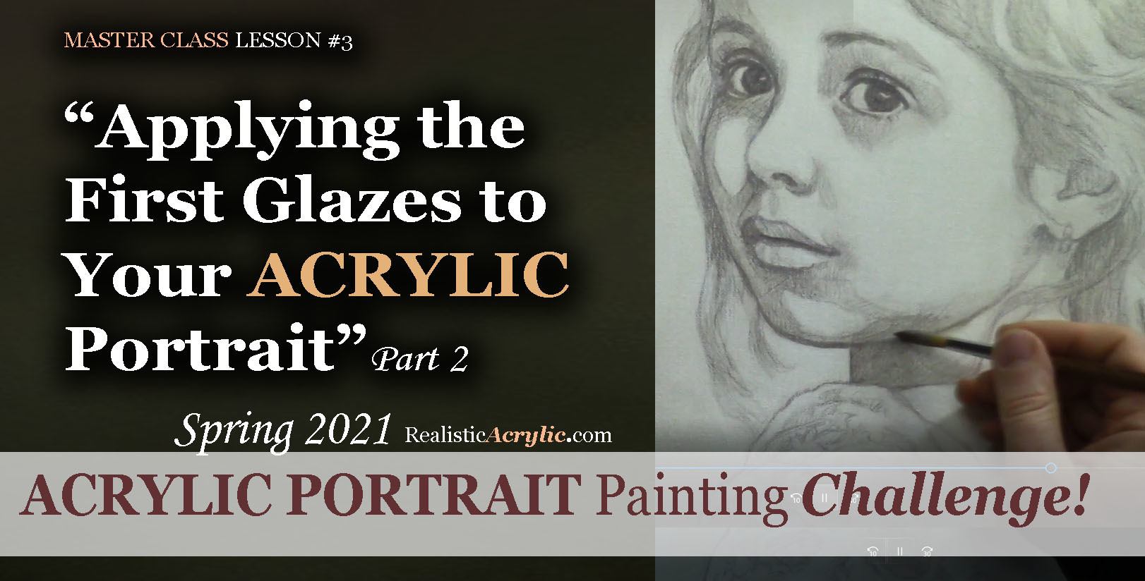
Spring 2021 Acrylic Portrait Painting Challenge: Applying Your First Glazes
Think of the acrylic glazing technique as a Polaroid camera print.
Remember those? You would load up the small film sheets, snap a picture and out popped the print. Back in those days (yes, I’m old enough to remember them) this was amazing. You wouldn’t have to drop off your film and wait 3 days (or even an hour!) for it to process.
But even then, it wasn’t immediate. The image would slowly fade in, and you’d watch a vague outline of your scene start to materialize. Finally, after a minute, you’d have a beautiful print!
In the same way, instead of painting our portrait one section at a time, with thick, opaque applications of paint, we slowly fade it in, covering the entire canvas at once, in stages. We use the classical acrylic glazing technique, just like Da Vinci, Titian and Vermeer used during the Renaissance to achieve smooth, subtle nuances of color and value, vibrant colors, and incredible depth.
I’ll show you how to do it!
But first, make sure you’re registered for the challenge!
REGISTER TODAY. The challenge is ongoing, something you can do at your own pace. It’s not too late to enter! After you join, I’ll send you the supplies list and reference photos to paint from.
Register for the Challenge!
WATCH NOW…
Applying the First Glazes to Your Acrylic Portrait, Part 1
Before we can begin the painting, first we must seal in the sketch, so it doesn’t smear or muddy up our paint. Next, we need to white-out the grid lines so they don’t distract from our final painting presentation. Lastly, we mute the sketch and tone the canvas in one step, so that we don’t have a white canvas staring us in the face, and so that the sketch is softened—easier to convert to a painting.
Watch how to do it here…

Learn to paint a realistic acrylic portrait using the classical glazing technique in this free online class. Lesson 3: Beginning the painting process–sealing in the sketch, whiting
Applying the First Glazes to Your Acrylic Portrait, Part 2
Let’s begin the actual painting process! I’ll show you what colors we are using, how to block in the value structure simply with just two colors and matte medium. We’re going to go light and leave room to correct any mistakes. This will be the foundation we’ll build off of from here on out…

Learn to paint a realistic acrylic portrait using the classical glazing technique in this free online class. Lesson 3: Beginning the painting process
Would like to paint this portrait with me and hundreds of other artists?
Take the 2021 Spring Portrait Painting Challenge!
You can register below and get started. It is completely FREE to join the challenge and participate. When you join, I’ll send you the “Welcome Kit” which includes:
- The Supplies List (so you know what you need to paint with us, your shopping list. 🙂 )
- The Reference Photo with and without the grid, high resolution, that you can download ready to print out or display on your tablet. You’ll be able to create an accurate portrait this way.
- The Palette Layout Guide showing you how to arrange your colors so they don’t get muddy on your palette
- The Master Class Lesson Schedule
- the Lessons emailed to you
- A private Facebook group to cheer you and help answer your questions
- And a few “bonuses” like opportunities to win my paid online classes
REGISTER TODAY. The challenge is ongoing, something you can do at your own pace. It’s not too late to enter!
Register for the Challenge!Let me know if you have any questions and I look forward to teaching you more!
—Matt
Questions? Suggestions? Thoughts? Let me know, below in the comments. Please share your sketches in our Facebook group and share this post with your friends!
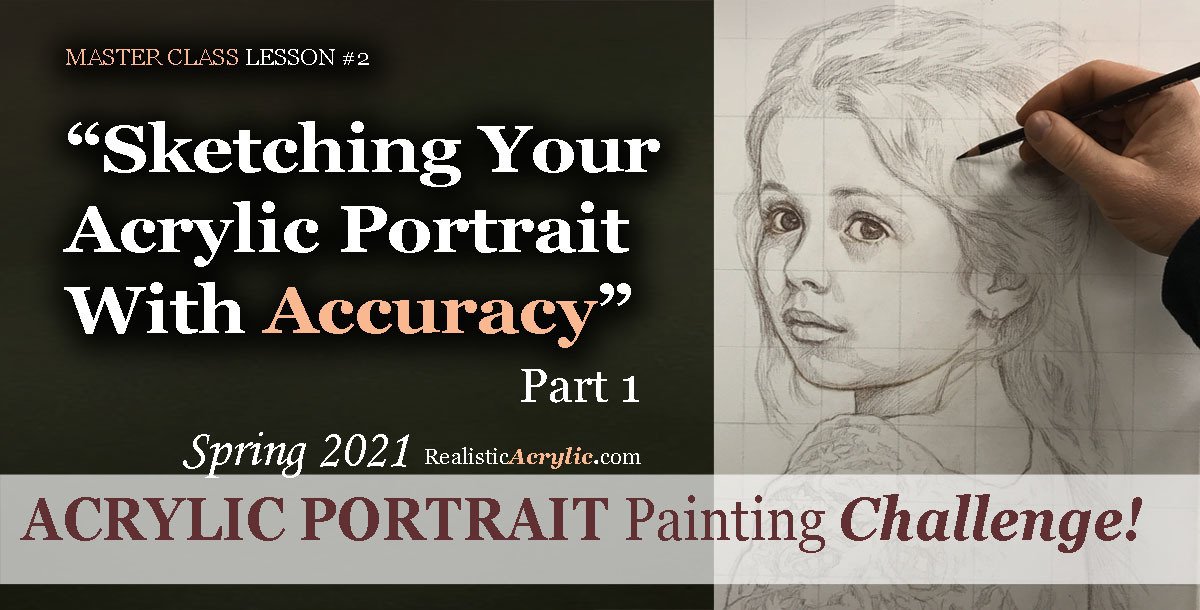
Spring 2021 Acrylic Portrait Painting Challenge: Sketching Your Portrait with Accuracy
Just like a contractor would never dream of building a home without a sure foundation, we shouldn’t try to paint an acrylic portrait without the same.
A sketch serves as an excellent foundation to build upon. I will show you in this series of Master Class Lessons how to sketch your portrait accurately.
With an accurate sketch, you are already halfway there to a beautiful painting.
I’ll show you how to do it, step-by-step, using the grid method.
With the grid method, even a beginner can create a realistic sketch. With that in place, I can help you build on top, layer by layer using the glazing technique to create smooth transitions of value and lifelike skin tones. You can do this. I’ll be here to help.
Ready? Let’s get started!
I’ll show you exactly how to do it in the lessons below. But first, make sure you’re registered for the challenge!
REGISTER TODAY. The challenge is ongoing, something you can do at your own pace. It’s not too late to enter! After you join, I’ll send you the supplies list and reference photos to paint from.
Register for the Challenge!
WATCH NOW…
Sketching Your Portrait With Accuracy, Part 1
Let’s begin the sketch! Get out your colored pencil and start making some simple marks. Look at the squares and see where the lines fall. All we need to do at this stage is loosely capture the outline of the subject—the girl—and later on, we will fill in the details. “What if I make a mistake?” No problem. That’s what erasers are for!
Learn how to sketch a portrait accurately with Realistic Acrylic Portrait School’s FREE Challenge Master Class Lessons!
Sketching Your Portrait With Accuracy, Part 2
Learn how to paint a realistic acrylic portrait by creating a solid sketch. In this in-depth video lesson, I’ll show you how to refine the facial features on your portrait drawing. After watching, you’ll be able to capture a better likeness and also plot out where your shadows and highlights will be.
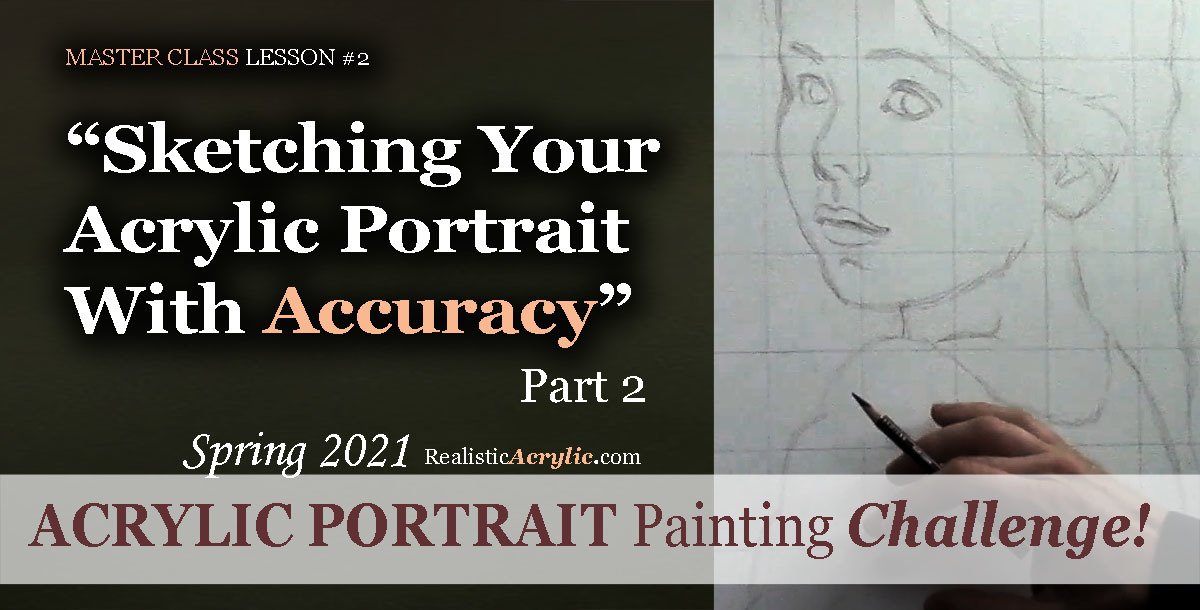
Learn how to sketch a portrait accurately with Realistic Acrylic Portrait School’s FREE Challenge Master Class Lessons!
Sketching Your Portrait With Accuracy, Part 3
We’re going further in this sketch for the Acrylic Portrait Painting Challenge! I show you how to add detail to the girl’s hair. It’s important to break down the complex shapes into something simple, and then add the complexity back in again, to make it realistic. I’ll show you how to do it.
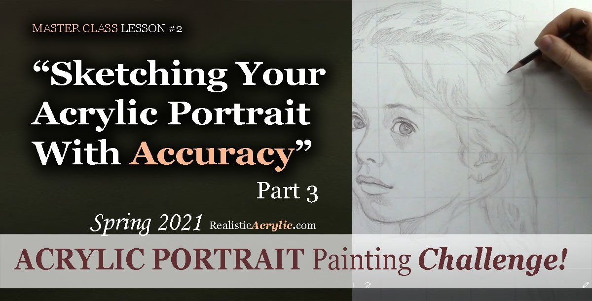
Learn how to sketch a portrait accurately with Realistic Acrylic Portrait School’s FREE Challenge Master Class Lessons!
Sketching Your Portrait With Accuracy, Part 4
In this Master Class Lesson, I will be teaching you how to sketch the lace for the girl’s dress top. It is an extremely detailed portion of the photo, but again, we will follow the method of breaking the complex into simple. That way, we don’t spend all day sketching this portrait and it will be easier to block in during the painting process.
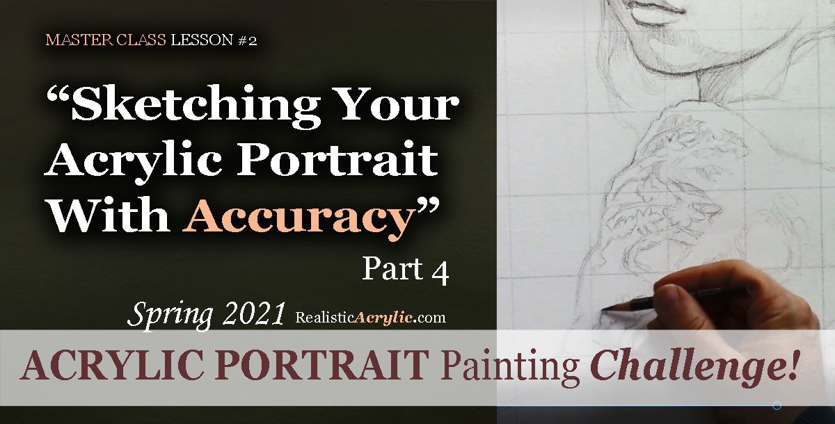
Learn to paint a realistic acrylic portrait successfully by first doing an accurate sketch, as taught by professional artist and instructor, Matt Philleo of Realistic Acrylic Portrait School
Sketching Your Portrait With Accuracy, Part 5
Let’s finish this sketch up! In this lesson, I’ll show you how to add the final touches to the lace, the girl’s face, and some additional details to make this drawing as realistic as possible. Then, we can dive into the painting process with confidence!
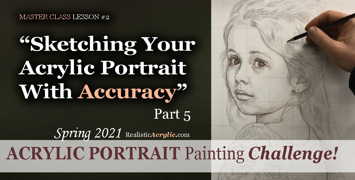
Learn to paint a realistic acrylic portrait successfully by first doing an accurate sketch, as taught by professional artist and instructor, Matt Philleo of Realistic Acrylic Portrait School
Would like to paint this portrait with me and hundreds of other artists?
Take the 2021 Spring Portrait Painting Challenge!
You can register below and get started. It is completely FREE to join the challenge and participate. When you join, I’ll send you the “Welcome Kit” which includes:
- The Supplies List (so you know what you need to paint with us, your shopping list. 🙂 )
- The Reference Photo with and without the grid, high resolution, that you can download ready to print out or display on your tablet. You’ll be able to create an accurate portrait this way.
- The Palette Layout Guide showing you how to arrange your colors so they don’t get muddy on your palette
- The Master Class Lesson Schedule
- the Lessons emailed to you
- A private Facebook group to cheer you and help answer your questions
- And a few “bonuses” like opportunities to win my paid online classes
REGISTER TODAY. The challenge is ongoing, something you can do at your own pace. It’s not too late to enter!
Register for the Challenge!Let me know if you have any questions and I look forward to teaching you more!
—Matt
Questions? Suggestions? Thoughts? Let me know, below in the comments. Please share your sketches in our Facebook group and share this post with your friends!

Spring 2021 Acrylic Portrait Painting Challenge: Gridding Your Canvas for an Accurate Sketch
One of the biggest struggles portrait artists have is getting an accurate likeness. In this lesson, I will show you how to grid your canvas, so that you will be able to not only make a sketch with good proportions but also get a good likeness too.
I’ll show you exactly how to do it in this video…
Gridding Your Portrait for an Accurate Sketch
Would like to paint this portrait with me and hundreds of other artists?
Take the 2021 Spring Portrait Painting Challenge!
You can register below and get started. It is completely FREE to join the challenge and participate. When you join, I’ll send you the “Welcome Kit” which includes:
- The Supplies List (so you know what you need to paint with us, your shopping list. 🙂 )
- The Reference Photo with and without the grid, high resolution, that you can download ready to print out or display on your tablet. You’ll be able to create an accurate portrait this way.
- The Palette Layout Guide showing you how to arrange your colors so they don’t get muddy on your palette
- The Master Class Lesson Schedule
- the Lessons emailed to you
- A private Facebook group to cheer you and help answer your questions
- And a few “bonuses” like opportunities to win my paid online classes
REGISTER TODAY. The challenge is ongoing, something you can do at your own pace. It’s not too late to enter!
Register for the Challenge!Let me know if you have any questions and I look forward to teaching you more!
—Matt
You Can Learn How to Paint a Realistic Acrylic Portrait
“Can I paint a portrait?”
This is the question so many of my students asked themselves prior to taking my master class for the Acrylic Portrait Painting Challenge.
The fact is: yes, you can.
“But,” you may ask right now as you read this, “Will it look terrible? Will it even look human? Will the skin tones be muddy? Will I be able to get a good likeness? Will the paint layers get blotchy? How exactly do I paint a portrait?”
Again, these questions have been asked before. You’re not alone.
And I’m happy to say, that many of my students, an aspiring artist just like you, have taken these questions to the canvas, started painting following my step-by-step video instruction, and created a beautiful portrait. Even as beginners.
Then now, I can’t promise you’ll be able to paint a Rembrandt your very first try.
But I will promise this: if you come with a mindset of being willing to try, and being willing to hang in there when the painting process gets challenging, you will create a portrait that is way better than you ever thought possible!
Some of my students create portraits that look professional on their very first attempt. Others create portraits that are much improved from what they previously did, but they will need to keep practicing to get better. (We all need to keep working to get better, myself included! 🙂 )
So you can do this! And then I’ll show you how, and you won’t be alone.
Last year, I launched our inaugural spring portrait painting challenge, just as the lockdowns of the coronavirus hit. And then Over 700 artists took the challenge, and I have personally seen many, many portraits that look amazing considering it was the very first portrait they ever did.
In this case, you would think they had been painting for years! When they posted their portraits to social media, they started getting commissions! Of course, others started painting portraits of family members to give as unique gifts.
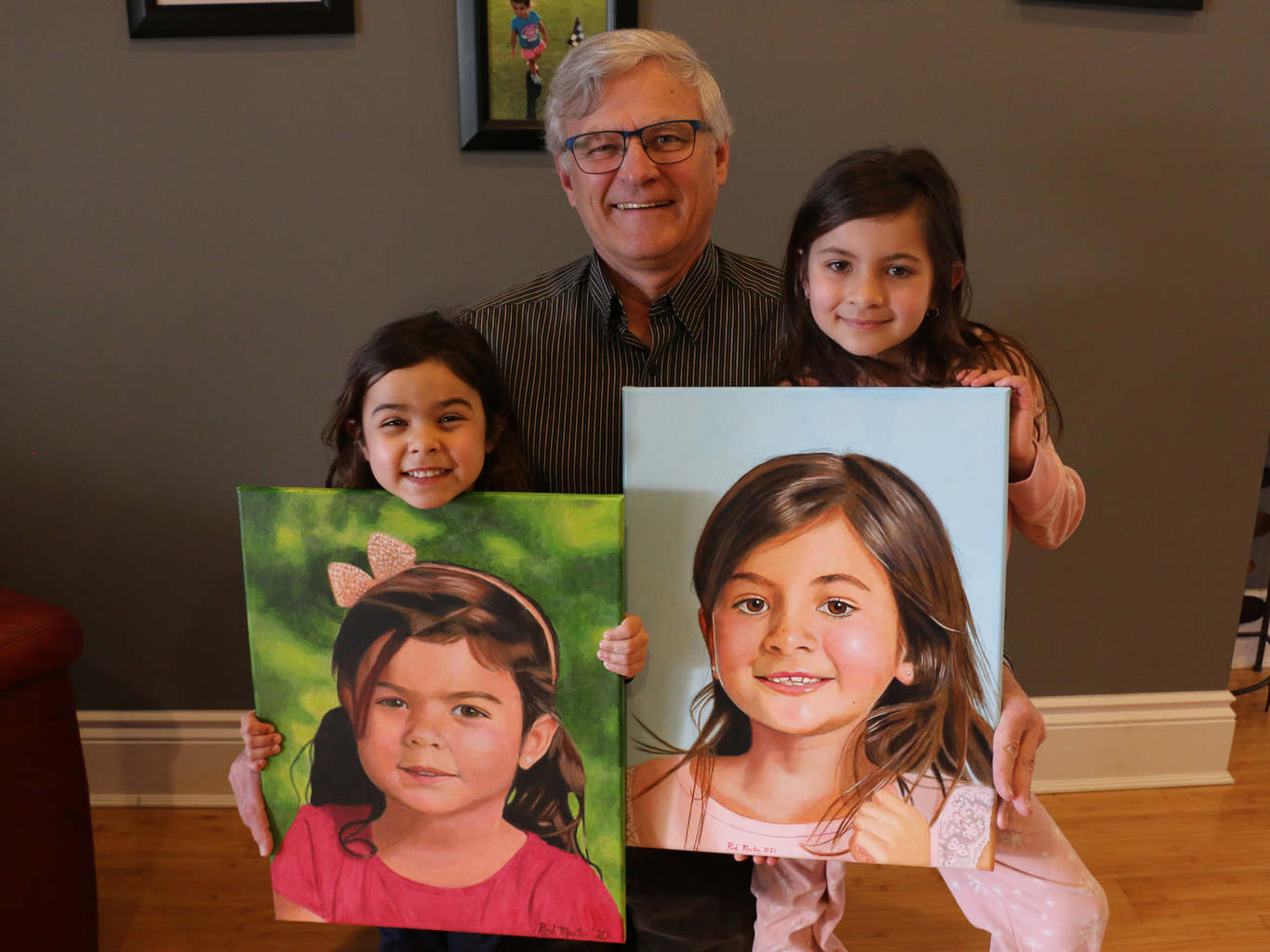
Then here’s what my student Rod Martin (part of the Realistic Acrylic All-Access Membership) created. So below is his very first acrylic portrait (on the left) and a more recent one on the right. And when I write this, he’s only been with me for a year!
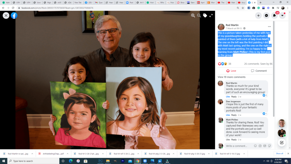
I am not going to boast in myself or my teaching. I do really care for my students, and then I put everything I have into helping them paint portraits they can be proud of. But the real secret is I pray and God helps me not only to teach, but my students to apply the teaching and create something amazing. They take the knowledge I give them, put into practice with tenacity, and they produce a fantastic portrait.
So, take the 2021 Spring Portrait Painting Challenge!
You can register below and get started. It is completely FREE to join the challenge and participate. When you join, I’ll send you the “Welcome Kit” which includes:
- The Supplies List (so you know what you need to paint with us, your shopping list. 🙂 )
- The Reference Photo with and without the grid, then with high resolution, that you can download ready to print out or display on your tablet. You’ll be able to create an accurate portrait this way.
- The Palette Layout Guide showing you how to arrange your colors so they don’t get muddy on your palette
- The Master Class Lesson Schedule
- the Lessons emailed to you
- A private Facebook group to cheer you and help answer your questions
- And a few “bonuses” like opportunities to win my paid online classes
REGISTER TODAY. The challenge is ongoing, something you can do at your own pace. It’s not too late to enter!
Register for the Challenge!- How to Paint Foliage Using the Acrylic Glazing Technique
- How to Trace for an Accurate Portrait Sketch
- How to Paint Realistic Eyes in Your Acrylic Portrait
- How to Add Raw Umber Dark & Ultramarine Blue to Your Portrait
- How to Make Your Own Raw Umber Dark
- How to Paint Realistic Trees & Grass in Your Acrylic
- How to Block In Skin Tone Values Using Glazing Technique
- How to Paint Vibrant Reds in Your Acrylic Portrait
- How to Glaze Background Colors & More Acrylic Portrait
- How to Paint White Clothing in Your Acrylic Portrait
- How to Easily Transition from a Sketch to a Painting
- How to Block In Shading & Skin Tones in Your Acrylic
- How to Build Up Color on Acrylic Pet Portrait
- How to Build Up Form on Clothing with Acrylic
- How to Paint Dark Clothing Using Acrylic Glazing Technique
- How to Paint a 24 x 30 Acrylic With 30 People
- How to Do Smooth Shading with Acrylic
- How to Sketch an Acrylic Portrait with a Grid
Read more about how to paint a portrait that you can surely be proud of!
Look forward to teaching you!
—Matt
Questions? Comments? Share your thoughts below. Please share this post with your friends!
2021 Spring Acrylic Portrait Painting Challenge is Coming!
It was last year around this time that I got news of my state doing a lockdown because of the new coronavirus that was spreading like wildfire.
I thought, What would happen to my art business? I won’t be able to do art shows or teach classes anymore. If the economy tumbles, will I be able to pay the mortgage?
You probably had similar thoughts brewing in your mind too. You still remember what it felt like after the initial news of this unknown pandemic.
Many businesses were hunkering down, trying to stay afloat while the sea of uncertainty and fear poured in around them.
I didn’t know what to do either.
But one of my business mentors, Graham Cochrane, said “this is not a time to hold back. This is a time to be generous.”
I thought, “I could do a portrait challenge. Many artists are stuck at home, sheltering in place. It would not only give us all something productive to do, but would help conquer the fear that can come from just letting our thoughts run wild.”
Additionally, I could teach a whole class on how to paint this portrait, for free, showing all the steps from start to finish.
But then the other side of my mind protested, “If you do that, if you give it all away for free, who will ever buy your courses again?”
“No!” the right side of my brain said.“I’m going to trust God. I’ll be generous like Jesus is to me and just trust God will take care of me and my family!”
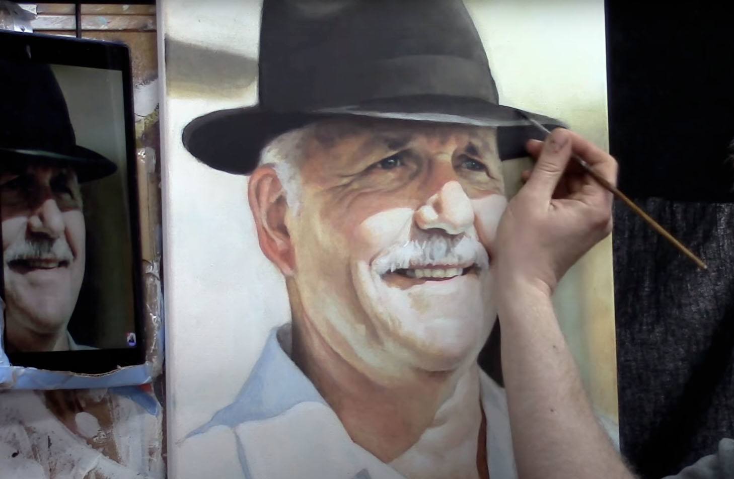
So I listened to that part of my brain (and God) and launched the Spring Portrait Acrylic Painting Challenge. We painted this portrait of “Lockdown Larry” the man with the hat, supplied by
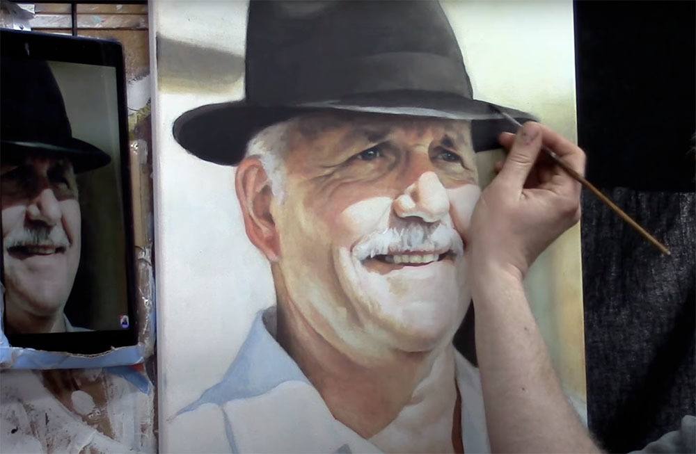
Matt Philleo painting an acrylic portrait from a photo for the Spring Portrait Painting Challenge, ©2020 by Matt Philleo
Over 700 artists took the challenge. Many never painted a portrait before, but through their hard work and perseverance, at the end of the challenge produced a portrait they could be proud of!
Some even said they were struggling with severe depression, and the challenge helped lift them out of it!
When the challenge was over, some of these artists went on to do commissioned portraits and are now thriving! Others are painting portraits of their grandchildren, loving every moment of creating a special gift they can give and capture memories.
What a joy to hear these stories and be a part of it!
And the teaching side of my art business has increased incredibly since the challenge last year. God has blessed me and my family. The best part is, I am part of a wonderful community of artists in the All-Access Membership. We have such a great time learning and encouraging each other to do our very best portrait work.![]()
Well, it’s almost spring here in Wisconsin and we are doing the challenge again. I will soon be putting out a call for images that we can vote on as a group to paint from.
I am excited and look forward to teaching you and helping you paint a portrait you can be proud of!
—Matt
YOUR NEXT STEP: Please share this Challenge posting with your friends, by using the social media links below. The more that see it, the more artists we can help all over the world. Thank you!
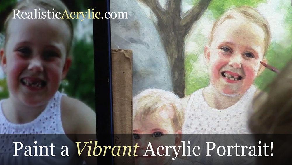
5 Steps on How to Paint a Vibrant Acrylic Portrait
Learn the classical glazing technique for depth and luminosity
Acrylic painting is an exciting medium known for its versatility, but achieving the depth and vibrancy often associated with oil paintings can seem challenging. However, by employing the classical glazing technique, a method favored by old masters like Rembrandt, Titian, and Vermeer then you can produce rich, luminous results with acrylics. This blog post will guide you through 5 essential steps to create a vibrant acrylic portrait using this time-tested method.
This tutorial shows the entire process of painting a portrait. Here are the steps I show in this tutorial:
- Start with a Detailed Sketch.
- Apply the Initial Glaze Layers
- Layer and Build Gradation
- Introduce Vibrant Colors
- Focus on Nuances and Details
1. Start with a Detailed Sketch
Every masterpiece begins with a solid foundation, and in portrait painting, that foundation is the sketch. Before you start adding color to your canvas, take time to create a detailed and accurate sketch of your subject. For this project, an 11×14 portrait of three girls in a park serves as an example.
By using a sepia-tone prismacolor colored pencil, you can establish proportions and likeness. Accuracy in this stage helps set the stage for a calm and confident painting process. Once your sketch is ready, seal it with a clear matte medium. This acts as a protective layer, ensuring that the pencil lines remain intact as you begin adding paint.
- Tip: Use a flat brush (¾ inch to 1 inch wide) to apply the matte medium. Make sure the application is smooth and even, allowing it to dry thoroughly before proceeding to the next step.
2. Apply the Initial Glaze Layers
The heart of this painting method lies in glazing, where thin, transparent layers of paint are applied over one another to build depth and richness. Unlike traditional opaque acrylic painting, the classical glazing technique requires a mixture of 95% matte medium to 5% paint. This creates a very light wash that enables you to gradually build colors without overwhelming the canvas.
Begin by mixing raw umber dark with ultramarine blue to create lifelike skin tones and shadow areas. These first layers will be almost imperceptible, but they provide a strong base for the layers that follow.
- Tip: The first layers of glaze should be incredibly light. This allows for adjustments in color or value without the need to paint over mistakes. The glazing method helps avoid the common frustration of muddy colors often encountered in acrylic painting.
3. Layer and Build Gradation
Once the initial glaze is applied, it’s time to focus on layering. As you build up more layers, you’ll notice how the painting starts to take on a more vibrant and realistic appearance. The goal here is to create a seamless transition between light and dark values, blending tones smoothly to replicate the natural shading found in your reference photo.
In this step, more raw umber dark and ultramarine blue are used to deepen the shadows on the forehead and hair. This layering process helps achieve the subtle gradation required for realistic portraits.
- Technique: As you layer, ensure that each glaze is thin and transparent. Too much paint in a single layer can cause the painting to look heavy and lose the delicate transparency that glazing provides.
4. Introduce Vibrant Colors
To make your portrait truly vibrant, it’s essential to introduce bold colors into the glazing process. In this example, a dash of Liquitex hot pink was added to the dress to intensify the color and give it a glowing effect. The key is to use these bright colors sparingly, applying them in thin layers so that they blend harmoniously with the existing hues.
When applying glazes to areas like the clothing, make sure to leave the white areas exposed. This technique, known as “preserving the luminosity,” ensures that highlights remain bright and eye-catching, adding to the overall vibrancy of the portrait.
- Tip: When adding vibrant glazes, thin the paint with medium and apply it cautiously. This helps prevent overpowering the existing layers while enhancing the color saturation.
5. Focus on Nuances and Details
The final step in this process involves refining the smaller details and nuances that bring a portrait to life. For example, the highlights in the hair, shadows in the creases of clothing, and the subtle changes in skin tone around the eyes require careful attention.
In the final layers, you can also experiment with a semi-opaque mixture, using titanium white, raw umber dark, and organic red-orange to add warmth and depth to the skin tones. With each new layer, the portrait takes on more life, depth, and realism. At this stage, it’s important to use more opaque layers sparingly, as glazing is best suited for large areas, while more detailed parts, such as fingernails or eyes, may benefit from a slightly thicker application of paint.
- Technique: If you notice that certain areas appear too flat or lack depth, consider adding a dark glaze to emphasize the shadows. Because mixing ultramarine blue with raw umber dark creates a rich, deep tone perfect for refining these darker areas without relying on black paint.
Conclusion: Patience Is Key
As you add each layer of glaze, then always remember that patience is vital. Because acrylic glazing requires multiple layers, sometimes ten or more to achieve the desired depth and luminosity. Each layer builds upon the last, contributing to the portrait’s final vibrancy. While it may take time, the results are well worth the effort.
By following these five steps, you can create a stunning acrylic portrait with vibrant colors and lifelike depth, all while employing the classical glazing technique favored by the old masters.
For further resources and guides, visit realisticacrylic.com and check out my free courses to enhance your acrylic painting journey.
- How to Paint Foliage Using the Acrylic Glazing Technique
- How to Trace for an Accurate Portrait Sketch
- How to Paint Realistic Eyes in Your Acrylic Portrait
- How to Add Raw Umber Dark & Ultramarine Blue to Your Portrait
- How to Make Your Own Raw Umber Dark
- How to Paint Realistic Trees & Grass in Your Acrylic
- How to Block In Skin Tone Values Using Glazing Technique
- How to Paint Vibrant Reds in Your Acrylic Portrait
- How to Glaze Background Colors & More Acrylic Portrait
- How to Paint White Clothing in Your Acrylic Portrait
- How to Easily Transition from a Sketch to a Painting
- How to Block In Shading & Skin Tones in Your Acrylic
- How to Build Up Color on Acrylic Pet Portrait
- How to Build Up Form on Clothing with Acrylic
- How to Paint Dark Clothing Using Acrylic Glazing Technique
- How to Paint a 24 x 30 Acrylic With 30 People
- How to Do Smooth Shading with Acrylic
- How to Sketch an Acrylic Portrait with a Grid
Read more about how to paint a portrait that you can surely be proud of!
I’d love to hear your thoughts about this video. Please share it with your friends and family. Let me know if you have any further questions. I’ll greatly help you.
If you’d like to learn more, sign up for my free email tips and video class today.
Learn How to Paint Acrylic Portraits With My Free Mini-Video Course!
Thank you so much for taking the time to read this tutorial and watch the video. That means a lot to me. I hope you find it very helpful in your portrait painting.
Yours for Better Portraits,

P.S. Did you find this post helpful or encouraging? If so, send it on ahead! Let others know with the share buttons below. I’d love to hear your comments. Thank you so much! Also, do you have a question on acrylic portrait painting you’d like answered? Let me know, and I’d be happy to help!
How to Paint Smiling Girl in Yellow: 30-Minute Acrylic Portrait
Create a stunning 30-minute acrylic portrait of a smiling girl in yellow with easy-to-follow techniques
Creating a captivating 30-Minute Acrylic Portrait of a smiling girl in yellow can be a fulfilling and enjoyable artistic endeavor. In just half an hour, you can capture the essence of joy and vibrancy, making this project perfect for artists of all skill levels. Whether you’re a seasoned painter looking for a quick challenge or a beginner eager to experiment with color and expression, this guide will provide you with step-by-step instructions to bring your vision to life on canvas. Let’s dive into the techniques and tips that will help you create a stunning portrait that radiates happiness!
For today’s portrait, I’ll be painting a picture of a young woman ( a still shot image from Ray Comfort’s video interviews ) with a beautiful dark complexion and attractive smile. I like the dark shadows and forms within her face and hair, and I thought it would make for a fantastic little portrait.
This will be an 8 x 10, acrylic on canvas board.
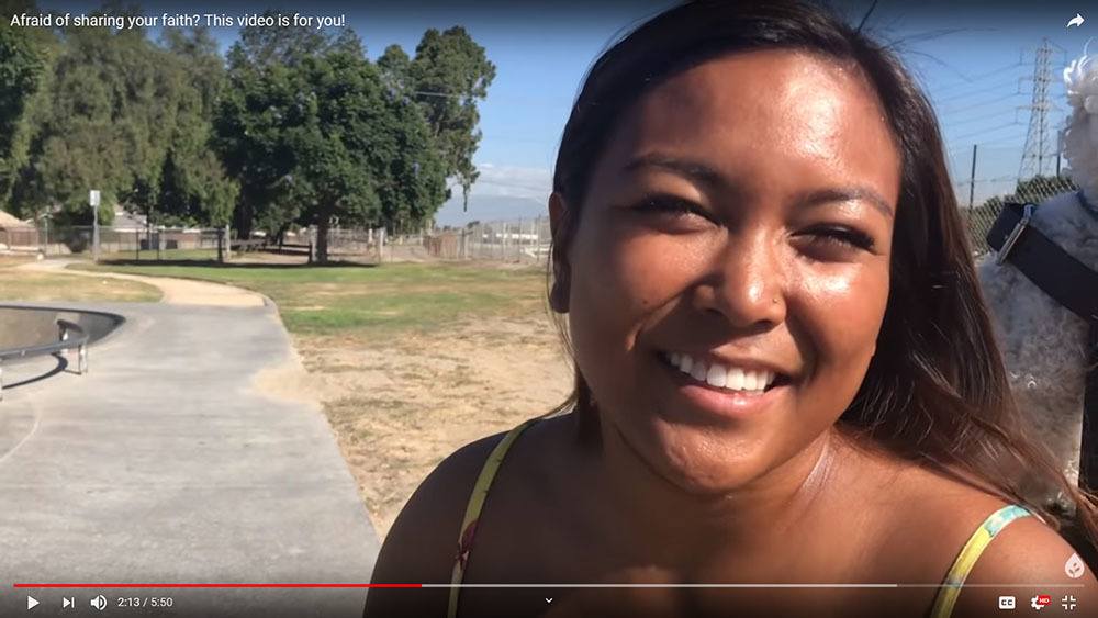
I’ll demonstrate how you can paint a quick portrait study with an aggressive opaque, alla prima technique. The idea is to see what you can accomplish within 30 minutes. It will force you to think quickly, and find out what the most important aspects are that will convey the subject’s likeness and just paint them without fuss.
At the same time, I encourage you to enjoy the process and don’t fret over whether the painting looks good or not. Of course it won’t look as good as a painting you’ve spent hours on! But it’s OK. Just enjoy the process.
Later on, you can always add more layers to the painting and give it a finished look.
Ready to dive in?
Season 1, Episode 3 of the 30-Minute Acrylic Portrait…
After watching it, leave me a comment here below. I really look forward to reading and answering your thoughts and questions. Let me know how I can help and have a blessed and productive day!
Yours for better portraits,

P.S. Did you find this post helpful or encouraging? If so, send it on ahead! Let others know with the share buttons below. I’d love to hear your comments. Thank you so much! Also, do you have a question on acrylic portrait painting you’d like answered? Let me know, and I’d be happy to help!
“How to Paint a Young Man in White” in 30 Minutes
Thank you to everyone who left encouraging comments and kind words on my first episode of the “30-Minute Acrylic Portrait.” Now, it’s on to Episode #2.
For today’s portrait, I’ll be painting a picture of a young man dressed in white, named Mohammed.

How did I come across this photo?
Well, I was looking for interesting reference images to paint from, scouring the internet and couldn’t find much. Even stock photo sites like Pexels and Pixabay came up short.
Then I recalled a YouTube channel that I frequently watch (or have playing in the background as I paint): Living Waters.
On this channel, there are literally hundreds of videos of people being interviewed by Ray Comfort, a Christian author, evangelist and short movie producer. Every person is different and unique. I noticed the lighting on several of these interesting characters was fantastic, and the video quality high enough that I could grab some screenshots of the footage and then paint from them.

Of course, I needed to get permission first.
So I contacted the ministry’s general email address, and got an expected automated response.
The next day, however, I got an unexpected call from Ray Comfort, granting me permission to paint portraits based on his videos. I was blown away by his generosity and thought this was also another confirmation from God to continue doing the series. I should have enough images to keep me busy for months, maybe even years. 🙂
So here we go.
Season 1, Episode 2 of the 30-Minute Acrylic Portrait…
As always, let me know what you think of this video. I encourage you to try this exercise for yourself. You don’t have to feel pressured to come up with a masterpiece. Just enjoy the process and see what you can do within half an hour.
Or you might just want to keep watching these videos for fun, sipping some coffee or tea. 🙂 Either way, thank you for watching, and I look forward to sharing more with you.
Yours for better portraits,

P.S. Did you find this post helpful or encouraging? If so, send it on ahead! Let others know with the share buttons below. I’d love to hear your comments. Thank you so much! Also, do you have a question on acrylic portrait painting you’d like answered? Let me know, and I’d be happy to help!
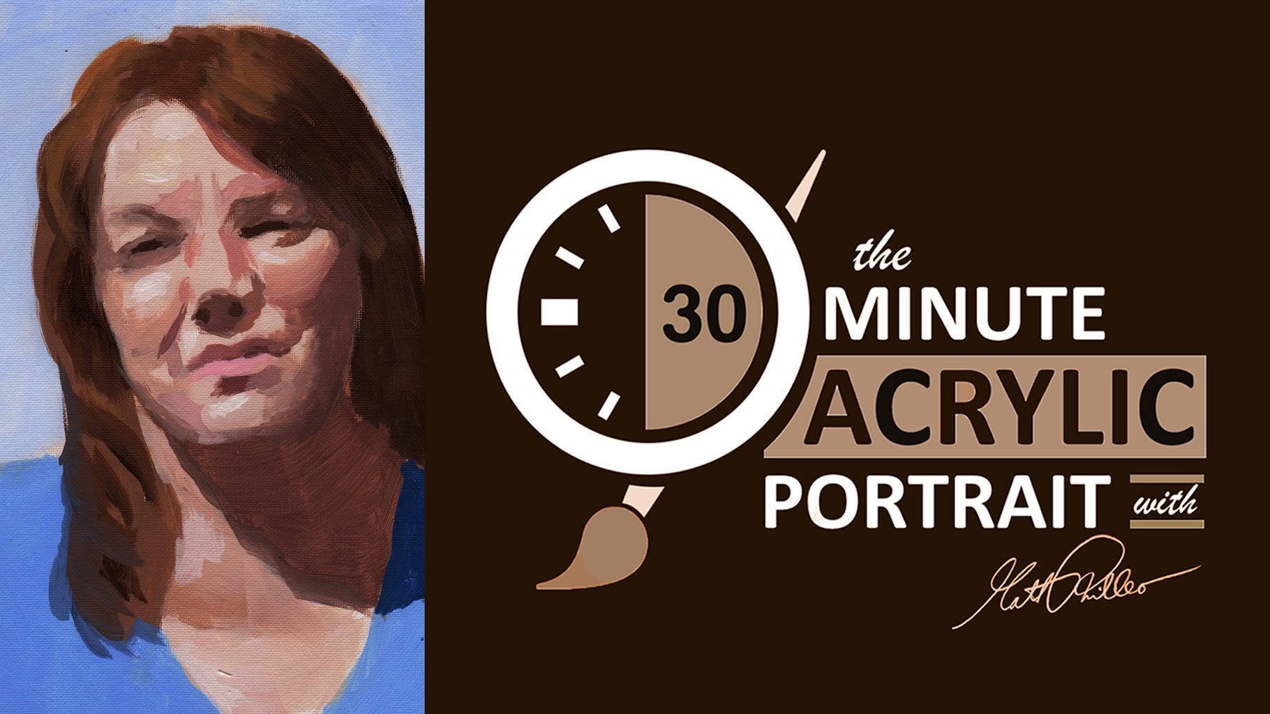
How to Paint an Acrylic Portrait in 30 Minutes
Discover the quick and simple method to capture portraits with speed and precision
As a child, I was amazed as I watched “The Joy of Painting” host Bob Ross paint a beautiful landscape in less than 30 minutes. I was captivated by his gentle touch, his fast wet-on-wet technique, and the way he could totally put you at ease.
I can’t say I wanted to be just like Bob when I grew up, but he did help inspire me to paint.
Later on, I learned the more methodical glazing technique from Norbert Kox, where you apply layer after layer of translucent paint. It’s very time consuming, but it creates fantastic realistic effects. This is the style I have become known for.
But sometimes I just want to knock out a quick painting, have fun with it, and yet push myself.
Can I paint a somewhat respectable looking painting in half an hour?
If I do it often, will I get faster?
Could it help me paint faster, and more confidently in my “typical” more detailed portraits?
Could an exercise like this help YOU to do the same?
There’s only one way to find out.
So, with that, I’m launching a new series of videos, or something like a show called, “The 30-Minute Acrylic Portrait” Season One, Episode 1…
Tips for Success in Fast-Paced Portrait Painting
- Set a Timer: Keep yourself on track by setting a timer. This helps maintain focus and prevents overworking areas.
- Keep Your Palette Organized: Lay out your colors clearly, so you can mix shades quickly without delay.
- Use a Limited Palette: Working with fewer colors will simplify the process and give the portrait a harmonious look.
- Practice Blocking and Simplifying: Learn to capture shapes and shadows quickly by focusing on big-picture composition.
Common Mistakes to Avoid
- Focusing Too Much on Detail: With only 30 minutes, try to avoid getting caught up in minute details.
- Using Too Many Colors: Stick with a few main colors for consistency and ease.
- Overthinking the Process: Embrace a relaxed approach, letting the process unfold naturally.
Conclusion
Creating a 30-minute acrylic portrait requires simplifying techniques, focusing on essential shapes, and mastering the art of blocking in shadows and highlights. This method allows for creative expression while enhancing your confidence and ability to capture a portrait quickly. Practice makes perfect, so keep experimenting with colors, tones, and brush techniques.
Read more about my additional resources, tutorials, to learn more and check out my free courses here. . Whether you’re a beginner or an experienced artist, there’s always something new to learn and apply to your paintings. Happy painting!
Let me know what you think of this video. Is it helpful? Interesting? Would you like to see more?
I’d love to hear back from you with your honest thoughts.
LEARN MORE
- How to Paint Foliage Using the Acrylic Glazing Technique
- How to Trace for an Accurate Portrait Sketch
- How to Paint Realistic Eyes in Your Acrylic Portrait
- How to Add Raw Umber Dark & Ultramarine Blue to Your Portrait
- How to Make Your Own Raw Umber Dark
- How to Paint Realistic Trees & Grass in Your Acrylic
- How to Block In Skin Tone Values Using Glazing Technique
- How to Paint Vibrant Reds in Your Acrylic Portrait
- How to Glaze Background Colors & More Acrylic Portrait
- How to Paint White Clothing in Your Acrylic Portrait
- How to Easily Transition from a Sketch to a Painting
- How to Block In Shading & Skin Tones in Your Acrylic
- How to Build Up Color on Acrylic Pet Portrait
- How to Build Up Form on Clothing with Acrylic
- How to Paint Dark Clothing Using Acrylic Glazing Technique
- How to Paint a 24 x 30 Acrylic With 30 People
- How to Do Smooth Shading with Acrylic
- How to Sketch an Acrylic Portrait with a Grid
Read more about how to paint a portrait that you can surely be proud of!
Yours for better portraits,

P.S. Did you find this post helpful or encouraging? If so, send it on ahead! Let others know with the share buttons below. I’d love to hear your comments. Thank you so much! Also, do you have a question on acrylic portrait painting you’d like answered? Let me know, and I’d be happy to help!
