Learn the step-by-step process of enhancing depth and realism with a secondary glaze technique on your acrylic painting.
Acrylic glazing is a powerful technique that can take your artwork to the next level by enhancing depth, subtle color transitions, and realism. In this tutorial, we will explore how to add a secondary glaze to an acrylic painting, using a portrait inspired by the biblical story of Daniel. So I’ll walk through the process step-by-step, using ultramarine blue, matte medium, and raw umber dark to create rich, translucent layers that bring life and realism to your painting.
Step-by-Step Guide to Applying a Secondary Glaze
1. Preparing Your Glaze Mixture
The first step in glazing is to prepare the secondary glaze by mixing ultramarine blue with a matte medium. Because this medium helps thin out the paint and makes it translucent, allowing the underlying layers to show through. And then the translucency of the glaze is key to creating depth, as light will pass through the glaze and reflect back, giving your painting vibrancy.
Tip: Always ensure that your glaze mixture is balanced you want it to be semi-transparent, so it adds color without overpowering the previous layers. A ratio of 1:3 (paint to medium) works well for most glazes.
2. Applying the Secondary Glaze
Once your glaze is mixed, begin applying it to your painting. For this demonstration, we are focusing on adding shadow and depth to the figure of Daniel in the painting. Because the existing glaze of raw umber dark provides a good foundation, and now the ultramarine blue adds a cool, shadowy effect that contrasts well with the warmth of the figure.
Technique: Hold your brush perpendicular to the canvas to push the glaze into the texture. Once applied, smooth it out gently to avoid brush marks.The goal is to create a smooth, even layer of glaze across the areas where you want to deepen shadows, such as the left side of Daniel’s face, his clothing, and the background. The ultramarine blue mixes with raw umber to form a neutral gray, which is perfect for shadowed areas.
3. Establishing Light and Dark Values
One of the most important aspects of glazing is to decide where your light and dark values will be. In this painting, the figure of Daniel is illuminated by a light source from the right side, while the left side remains in shadow. As you apply the secondary glaze, keep in mind which parts of the painting will be darker and which will remain lighter.
Tip: Before worrying about color accuracy, lock in your values (the lightness or darkness of different parts of the painting). Having a clear distinction between light and dark areas will make your painting more realistic, even if the color isn’t perfect.
4. Glazing for Depth and Detail
The secondary glaze also helps to create a sense of separation between the figure of Daniel and the background. Once applying the glaze to his clothing and areas of shadow, we enhance the contrast between the figure and the surrounding elements. And then this makes Daniel stand out, creating a three-dimensional effect.
Once you’ve applied the glaze, it’s time to refine the details. Work into areas such as Daniel’s hair and beard, where the shadows are deepest. The combination of ultramarine blue and raw umber dark creates a Payne’s gray effect that is perfect for these dark, shadowed areas.
Technique: Use a smaller brush to apply glaze to detailed areas like the hair and beard. This allows for precision and ensures that the darker tones blend smoothly into the rest of the painting.
5. Glazing Over Highlighted Areas
While glazing works wonders for shadows, it’s equally effective for enhancing highlights. In this painting, the light shines from the right side, and we want to leave some areas of the canvas almost untouched by the glaze to maintain brightness. As you work, leave the highlights lighter and let the white of the canvas shine through the layers of translucent color.
Tip:When glazing over highlights, use an even thinner glaze mixture to avoid dulling the brightness. This creates a luminous effect as the light reflects off the white canvas beneath the glaze.
6. Enhancing the Background and Rug
As you continue glazing, think about how the colors in the background and surrounding areas affect the overall composition. In this case, the red tones of the Persian rug that Daniel kneels on are glazed using a mixture of alizarine crimson and burnt sienna. This vibrant glaze contrasts beautifully with the cooler blue tones in the shadows, creating visual interest.
Technique:Apply the glaze with long, smooth brush strokes to create an even finish. The glaze should add richness to the rug without overpowering the other elements in the painting.
7. Final Touches and Adjustments
After the secondary glaze has dried, step back and assess your work. Are there areas that need more depth or contrast? Glazing is a gradual process, and you can always add more layers to build up the desired effect. In this case, additional glazes of ultramarine blue were added to Daniel’s clothing and hair to deepen the shadows and enhance the three-dimensional effect.
Tip:Always wait for one layer of glaze to dry before adding another. This prevents muddiness and ensures that each layer maintains its translucency.
Why Glazing is Important in Acrylic Painting
Glazing is a technique that allows you to build up color and depth gradually, which is particularly useful in acrylic painting. Acrylics dry quickly, so traditional blending techniques can be challenging. Glazing, however, lets you apply thin, transparent layers of color without losing the underlying details.
By using glazes, you can create a sense of realism and luminosity in your painting. The light passes through the layers, creating a glow that adds life to your artwork. Whether you’re working on portraits, landscapes, or still lifes, glazing gives you control over color and value in a way that direct painting doesn’t.
Adding a secondary glaze to your acrylic painting is an effective way to enhance depth, create realistic shadows, and build contrast between light and dark areas. And then by carefully applying translucent layers of ultramarine blue, mixed with matte medium, you can add richness and dimension to your work. Remember, glazing is a process that requires patience and precision, but the results are well worth the effort.
Whether you’re working on portraits or other subjects, mastering the art of glazing will elevate your acrylic paintings to new levels of realism and vibrancy.
I’d love to hear your thoughts on this video. Please share it with your friends and family. Let me know if you have any further questions. I’ll greatly help you.
If you’d like to learn more, sign up for my free email tips and video class today.
Thank you so much for taking the time to read this tutorial and watch the video. That means a lot to me. I hope you find it very helpful in your portrait painting.
Yours for Better Portraits,
P.S. Did you find this post helpful or encouraging? If so, send it on ahead! Let others know with the share buttons below. I’d love to hear your comments. Thank you so much! Also, do you have a question on acrylic portrait painting you’d like answered? Let me know, and I’d be happy to help!
Discover the power of the alla prima acrylic technique with a quick and efficient 30-minute portrait painting exercise.
Painting a portrait in just 30 minute acrylic might seem like a daunting task, but with the right technique and a little practice, you can create stunning results. So in this guide, we’ll walk through how to paint a young woman with black hair using acrylics, focusing on the alla prima technique, where you paint wet-on-wet in one session. Because this exercise will help you improve your speed and efficiency, making it easier to tackle more detailed and time-consuming works in the future. Let’s dive into the process!
Materials and Tools Needed:
Before you start, gather the following materials:
Canvas: 8×10 inch toned canvas board (gray works best for portraits).
Acrylic Paints: Ivory black, raw umber dark, burnt sienna, raw sienna, ultramarine blue, titanium white, alizarin crimson, and phthalo blue.
Brushes: A variety of flats, filberts, and rounds (inexpensive brushes like “Fine Touch” work well for portraits).
Palette: For mixing colors.
Matte Medium: To adjust the fluidity of the paint.
Step 1: Preparing the Canvas and Plotting the Portrait
To begin, tone your canvas with a neutral gray to establish a balanced base. Then gray background allows for better contrast between your light and dark areas and helps guide your values throughout the painting process.
Using a mixture of raw umber dark, ivory black, and matte medium, start by loosely sketching the proportions of the young woman’s face. So it’s crucial to get the structure right at this stage. Focus on blocking out key elements like the position of the eyes, nose, mouth, and overall shape of the head.
Tip: Take your time to plot out the general anatomy and features. Once the structure is clear, the rest of the painting will flow smoothly.
Step 2: Blocking in the Hair
In this case the hair, start by mixing ivory black with a bit of raw sienna and ultramarine blue. Because ultramarine blue adds richness and depth to the black, making the hair appear more dynamic. While using a flat brush, block in the larger shapes of the hair, paying attention to where the light hits and where the shadows fall.
Leave room for highlights by using lighter brushstrokes in specific areas, such as the top of the head and the strands framing the face.
Tip: Then use firm pressure to make sure the paint penetrates the texture of the canvas and blending the darker areas with lighter values will give the hair more volume and realism.
Step 3: Adding Facial Features
Now that the hair is blocked in, it’s time to focus on the face. Then begin with the lighter skin tones. Mix titanium white with a bit of raw sienna and pyro red orange. Because this combination provides a warm, natural skin tone, apply the highlight colors to the areas where light hits the most, such as the forehead, cheeks, and chin.
For the shadows, mix raw umber dark with alizarin crimson to create a soft, reddish shadow. Apply this to the areas that fall into shadow, particularly on the right side of the face where light is less prominent.
Pay close attention to the subtle transitions between light and dark. This is key to achieving a realistic, three-dimensional effect.
Tip: Use smaller round brushes for the finer details like the eyes, nose, and mouth. Keep the brushstrokes loose, especially in the early stages, to avoid overworking the paint.
Step 4: Defining Light and Shadow
The success of a portrait depends heavily on how well you capture the play of light and shadow. In this painting, the light source is on the left, casting most of the face in a soft glow. The right side of the face falls into shadow, which adds depth and contrast.
To enhance this, add more ivory black and burnt sienna to the shadow areas on the face and neck. The interplay between light and dark will help define the features and make the portrait more striking.
Tip: Don’t be afraid to use more intense shadows. They can be adjusted later with highlights or softened through blending.
Step 5: Refining the Details
At this point, it’s time to go back and refine the smaller details. Use a fine brush to suggest the eyebrows, eyes, and mouth. For the eyes, a mix of raw umber dark and a tiny bit of alizarin crimson will give depth to the pupils, while white highlights can be added for reflection.
For the lips, mix pyro red orange with alizarin crimson to create a subtle pink tone. The lips should be softly blended into the surrounding skin, paying attention to where light and shadow fall on them.
Step 6: Final Touches and Adjustments
As the portrait nears completion, make any necessary adjustments to the values and colors. Add more contrast where needed, especially in the hair and facial features. Blend areas that appear too harsh and add highlights to areas that need more light.
Finally, step back from your painting and evaluate it from a distance. This will help you see the overall composition and balance.
Tips for Painting Efficiently:
Set a Timer: Limiting yourself to 30 minutes encourages you to work quickly and make decisive brushstrokes.
Practice Frequently: The more you paint quick portraits, the better you’ll get at gauging proportions and capturing likenesses in less time.
Use a Limited Palette: Restricting your color choices can speed up the mixing process and ensure consistency throughout the painting.
Focus on Large Shapes First: Start with the overall shapes and proportions before moving to the details. This prevents overworking smaller areas and maintains balance.
Take Breaks to Evaluate: Step away from the painting to view it with fresh eyes. This will help you identify areas that need improvement or adjustment.
Conclusion
Painting a young woman with black hair in 30 minute acrylics is an excellent way to hone your skills, improve your speed, and gain confidence. By focusing on the key elements of light and shadow, blocking in major shapes, and refining the details efficiently, you can create a striking portrait in a short amount of time. Try incorporating this exercise into your regular painting routine to see significant improvement in your portraits.
Remember, practice is key, and with each portrait, you’ll get closer to mastering the alla prima technique. Happy painting!
I’d love to hear your thoughts on this video. Please share it with your friends and family. Let me know if you have any further questions. I’ll greatly help you.
If you’d like to learn more, sign up for my free email tips and video class today.
Thank you so much for taking the time to read this tutorial and watch the video. That means a lot to me. I hope you find it very helpful in your portrait painting.
Yours for Better Portraits,
P.S. Did you find this post helpful or encouraging? If so, send it on ahead! Let others know with the share buttons below. I’d love to hear your comments. Thank you so much! Also, do you have a question on acrylic portrait painting you’d like answered? Let me know, and I’d be happy to help!
Learn how to draw realistic facial features with pencil sketch techniques—Tips for perfecting eyes, nose, lips, and more.
Drawing realistic facial features in a pencil sketch requires attention to detail, patience, and a clear understanding of proportion and shading. Whether you’re working on a self-portrait or creating a likeness of someone else, refining key elements such as the eyes, nose, and lips is essential to achieving a lifelike representation. In this guide, we will walk you through the process of drawing facial features with a focus on capturing the unique characteristics of each part of the face.
Getting Started with Basic Outlines
In the initial phase of drawing, it is important to loosely block in the outlines of the facial features. This helps establish the general proportions and placement of the eyes, nose, mouth, and other elements. A 2H pencil is recommended for these initial light strokes since it produces faint lines that are easier to adjust as needed.
Grid Method: Using a grid is a helpful tool to maintain the correct proportions and ensure that facial features are aligned accurately. Lightly sketch the outlines of the eyes, nose, lips, and overall head shape using the grid as a guide.
Basic Shapes: The eyes are often drawn as almond shapes or football-like structures, but it’s essential to avoid making them overly stylized or cartoony. Each person’s eyes differ in size and shape based on their eyelids and other factors.
Drawing the Eyes
Eyes are arguably the most important feature when it comes to capturing expression and realism in a portrait. The goal is to draw them in a way that reflects their actual appearance rather than relying on preconceived ideas of how eyes look.
Shape of the Iris and Pupil: Start by drawing the iris, the round part of the eye. It’s common for beginners to make the iris appear too flat or symmetrical, but this doesn’t account for natural variations in eye shape. The pupil is drawn in the center of the iris but with care taken to ensure it looks natural.
Upper Eyelid and Fold: The upper eyelid often casts a shadow over the iris, creating depth in the eye. Add the crease or fold above the eyelid if applicable—this fold is more prominent in some people and less so in others. Remember, eyes appear squintier in some angles, so adjust based on your reference.
Reflection in the Eye: A small highlight or reflection is usually seen on the surface of the eye, which should be placed carefully. This reflection comes from light sources in the environment and adds a realistic touch.
Adding Eyelashes and Eyebrows: Be subtle when drawing the eyelashes—overdoing it can make the portrait look exaggerated. For eyebrows, use soft, feathered strokes to simulate the hair texture, paying attention to the density and shape.
Refining the Nose
The nose can be tricky due to its three-dimensional structure, but using shading can greatly assist in creating depth and realism.
Nostril Shape: Focus on drawing the correct nostril shapes without making them too bold. The nostrils should not be drawn as harsh, circular outlines but rather suggested through soft shading and curvature.
Shading and Contours: The nose has subtle curves and contours that require delicate shading. The areas around the nose bridge and the sides should be shaded to indicate depth. Pay close attention to the light source, as it will dictate where shadows fall.
Drawing the Mouth and Teeth
The mouth, especially the lips, can define the emotion and personality of the subject.
Shape of the Lips: When drawing the lips, focus on the shape and volume of both the upper and lower lips. The upper lip typically has a more defined curve, while the bottom lip is fuller. The key is to use shading to indicate the volume rather than relying on harsh outlines.
Teeth Placement: When drawing teeth, avoid drawing each tooth with equal emphasis. The front two teeth are generally more prominent, while the side teeth appear smaller due to perspective. Pay attention to how the teeth curve in the mouth, as they are never viewed head-on in a natural smile.
Creases and Shadows: The small crevices or gaps between the teeth and lips, as well as the shadow under the bottom lip, are essential for a realistic representation. These areas should be subtly shaded to create depth and natural transitions between features.
Adding Final Details and Shading
At this stage, your portrait will have all the major features sketched out. Now, it’s time to refine the details and add depth through shading.
Refining the Eyes: Darken the pupil slightly while maintaining the reflection highlight. Add more definition to the iris by shading its outer edges lightly.
Highlighting with Erasers: Use a kneaded eraser to pick out highlights, especially on the cheekbones, tip of the nose, and the top of the upper lip. This helps to bring out the areas that naturally catch more light.
Blending for Smooth Transitions: Use a blending stump or tissue to soften harsh lines and blend shading smoothly across the face. This helps create a realistic, three-dimensional effect, especially around curved areas like the cheeks and forehead.
Layering Shading: Build up the depth of the sketch by gradually darkening certain areas, such as the eyes, nostrils, and under the chin. Shading should be applied in layers rather than all at once to give more control over the darkness and contrast.
Tips and Techniques for a Realistic Pencil Sketch
Use Reference Photos: Always refer back to your subject or a reference image, as it’s easy to fall into drawing features as you think they look rather than how they truly appear.
Be Patient with Details: Taking the time to refine small details, such as the reflections in the eyes or the shadows around the nose, can make a significant difference in the overall realism of your drawing.
Avoid Over-Shading: While shading adds depth, too much shading can flatten the image or create unnecessary contrast. Subtle transitions between light and dark areas are key.
Stay Loose in the Early Stages: Keep your lines loose and light during the blocking stage. It’s easier to adjust proportions and correct mistakes if the initial lines are not too bold.
Use the Grid Method: If you’re struggling with proportions, a grid can help break down the facial features into smaller, manageable sections, making it easier to replicate accurately.
By following these steps and techniques, you will be well on your way to creating a lifelike and expressive pencil sketch portrait. Remember, practice is essential, and over time, you’ll improve your ability to capture the subtle details that make each face unique.
I’d love to hear your thoughts on this video. Please share it with your friends and family. Let me know if you have any further questions. I’ll greatly help you.
If you’d like to learn more, sign up for my free email tips and video class today.
Thank you so much for taking the time to read this tutorial and watch the video. That means a lot to me. I hope you find it very helpful in your portrait painting.
Yours for Better Portraits,
P.S. Did you find this post helpful or encouraging? If so, send it on ahead! Let others know with the share buttons below. I’d love to hear your comments. Thank you so much! Also, do you have a question on acrylic portrait painting you’d like answered? Let me know, and I’d be happy to help!
It was last year around this time that I got news of my state doing a lockdown because of the new coronavirus that was spreading like wildfire.
I thought, What would happen to my art business? I won’t be able to do art shows or teach classes anymore. If the economy tumbles, will I be able to pay the mortgage?
You probably had similar thoughts brewing in your mind too. You still remember what it felt like after the initial news of this unknown pandemic.
Many businesses were hunkering down, trying to stay afloat while the sea of uncertainty and fear poured in around them.
I didn’t know what to do either.
But one of my business mentors, Graham Cochrane, said“this is not a time to hold back. This is a time to be generous.”
I thought, “I could do a portrait challenge. Many artists are stuck at home, sheltering in place. It would not only give us all something productive to do, but would help conquer the fear that can come from just letting our thoughts run wild.”
Additionally, I could teach a whole class on how to paint this portrait, for free, showing all the steps from start to finish.
But then the other side of my mind protested, “If you do that, if you give it all away for free, who will ever buy your courses again?”
“No!” the right side of my brain said.“I’m going to trust God. I’ll be generous like Jesus is to me and just trust God will take care of me and my family!”
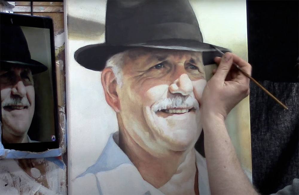
So I listened to that part of my brain (and God) and launched the Spring Portrait Acrylic Painting Challenge. We painted this portrait of “Lockdown Larry” the man with the hat, supplied by
Over 700 artists took the challenge. Many never painted a portrait before, but through their hard work and perseverance, at the end of the challenge produced a portrait they could be proud of!
Some even said they were struggling with severe depression, and the challenge helped lift them out of it!
When the challenge was over, some of these artists went on to do commissioned portraits and are now thriving! Others are painting portraits of their grandchildren, loving every moment of creating a special gift they can give and capture memories.
What a joy to hear these stories and be a part of it!
And the teaching side of my art business has increased incredibly since the challenge last year. God has blessed me and my family. The best part is, I am part of a wonderful community of artists in the All-Access Membership. We have such a great time learning and encouraging each other to do our very best portrait work.
Well, it’s almost spring here in Wisconsin and we are doing the challenge again. I will soon be putting out a call for images that we can vote on as a group to paint from.
I am excited and look forward to teaching you and helping you paint a portrait you can be proud of!
—Matt
YOUR NEXT STEP: Please share this Challenge posting with your friends, by using the social media links below. The more that see it, the more artists we can help all over the world. Thank you!
Discover why teeth in portraits should not be painted white and learn how to achieve realistic results in acrylic painting
When painting portraits, especially in acrylics, artists often encounter a common misconception: that teeth should be painted pure white. However, this approach can lead to unrealistic and unnatural results. In this blog post, we’ll explore why teeth are not actually white and how to paint them realistically in your portraits. This guide will help you create a more lifelike appearance in your acrylic paintings by adjusting the way you depict teeth.
Why Are Teeth Not White in Portraits?
One of the biggest mistakes beginner artists make is painting teeth too white in their portraits. While it’s easy to assume that teeth are white, the reality is far from it. Teeth are not naturally as bright as we imagine them. When you compare a piece of white paper next to the teeth in your reference photo, you will notice a significant difference in value. Even in the best lighting conditions, teeth tend to appear darker due to various factors.
Light and Shadows Affect Teeth Color
A key reason why teeth are not as white as you think is because of the shadows cast by the mouth, lips, and other surrounding features. When you observe a person, you’ll notice that these shadows darken the teeth significantly. Even in bright lighting, the teeth may still appear off-white rather than pure white. For instance, mustaches or beards can further reduce the perceived brightness of teeth, making them look even darker.
How to Paint Teeth Realistically in Acrylic
When painting teeth in a portrait, it’s essential to capture this balance between light and shadow. Here’s a step-by-step guide to help you create a more natural depiction of teeth:
1. Analyze Your Reference Photo
Before applying any paint, take a close look at your reference photo. Hold a piece of white paper up to the teeth and notice the difference in value. This will give you a clear idea of how much darker the teeth are compared to pure white. Observing this contrast will help you determine the right shades to use in your painting.
2. Use Off-White Tones
Instead of using pure white, opt for off-white tones to depict the teeth. Colors such as a soft ivory, light gray, or a pale beige are excellent choices. Mixing a touch of raw umber or burnt sienna into your white paint can help you achieve a more realistic tone for the teeth.
3. Add Shadows for Depth
The shadows cast by the lips and mouth should not be overlooked. Use darker tones around the edges of the teeth to emphasize the depth created by these shadows. You can blend a mix of dark brown or blue-gray tones to add subtle shadows, making the teeth recede naturally into the mouth.
4. Highlight Selectively
While teeth are not pure white, they do have highlights in certain areas where light directly hits them. These highlights can be painted with white, but should only be applied sparingly. Focus on small areas, such as the tips of the teeth or the spots where light reflects the most. By adding these highlights carefully, you’ll make the teeth appear shiny and dimensional without them looking unnaturally bright.
5. Blend for a Smooth Transition
Teeth have a smooth surface, so it’s important to blend the colors and shades gently. Avoid harsh lines or abrupt transitions between shadows and highlights. Use a soft brush to blend the darker tones into the lighter areas for a seamless finish.
Common Mistakes to Avoid
When it comes to painting teeth realistically, there are a few common pitfalls to watch out for:
Avoid using pure white for the entire tooth surface. This can make the teeth appear flat and unnatural.
Don’t ignore the shadows around the mouth and lips. These shadows are what give the teeth depth and realism.
Don’t over-highlight the teeth. Applying too much white will make them stand out unnaturally. Only use highlights in select areas where light naturally hits.
Tips for Achieving Lifelike Results
Here are some additional tips to ensure your teeth look realistic in your acrylic portrait:
Layer your colors: Start with darker tones for the base of the teeth and gradually layer lighter shades on top to build depth.
Use small brushes: Precision is key when painting teeth, so opt for small, fine-tipped brushes to work on the details.
Work with a reference: Always keep a reference photo handy to guide you in accurately capturing the teeth’s value and shading.
Conclusion
Teeth in a portrait should never be painted stark white. Understanding the role of light, shadows, and the natural off-white color of teeth is crucial for creating a realistic portrait. By following the techniques outlined in this post, using off white tones, incorporating shadows, and highlighting selectively, you can paint teeth that look natural and lifelike in your acrylic portraits.
For more tips and tutorials on painting realistic acrylic portraits, visit RealisticAcrylic.com and check out our other tutorials for more insights into mastering portrait painting.
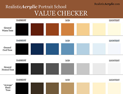
As you can see, teeth are darker value, and you can often achieve it by using a mixture of raw umber and titanium white for the shadows, raw sienna-titanium white for the mid-tones and titanium white-slight bit of indian yellow only for the highlights.
It all comes down to painting correct tonal value–that is, the correct level of light and dark. If you’d like a tool to help you with that, then I have something for you…
I created a tool that you can use to measure the tonal value of any area of your portrait in question against your reference photo. I call it the “Value Checker.” Download and print a copy for yourself today and apply it to the portrait you are currently working on. And you will see an immediate improvement in the realism!
Get the full-resolution 8 1/2″ x 11″ version below…
Let me know how this helps! What did you think of this tip on NOT painting teeth white? Did it surprise you?
I’d love to hear how your art journey is going. Shoot me an email and let me know. Or leave a comment. Be blessed in your portrait painting!
Yours for Better Portraits,
Matt
If you found this post helpful or encouraging, would you send it on ahead? Let others know with the share buttons below. I’d love to hear your comments. Thank you so much!
Learn the art of layering to create stunning backgrounds
Creating depth in your acrylic portrait backgrounds can transform your artwork from flat and uninviting to vibrant and lifelike. This comprehensive guide will explore techniques and tips that can be utilized to effectively build depth in your acrylic paintings. Through careful layering, color mixing, and thoughtful brushwork, your backgrounds will not only enhance your portraits but also engage viewers and add emotional resonance.
Acrylic portrait painting of three children, by artist Matt Philleo, 16 x 20, acrylic on canvas
Understanding Depth in Art
Depth in art refers to the illusion of three-dimensionality on a two-dimensional surface. It involves creating a sense of space, distance, and perspective. In acrylic portrait painting, the background plays a crucial role in establishing depth and can significantly influence the viewer’s perception of the subject.
Techniques for Building Depth
1. Layering with Glazes
Layering is one of the most effective techniques for creating depth. It involves applying transparent layers of paint over one another, allowing underlying colors and textures to show through.
Start with a Base Layer: Begin with a solid background color that will serve as your foundation. A mid-tone color can be effective for this purpose.
Apply Transparent Glazes: Use a mix of acrylic paint and a glazing medium to create transparent layers. Ultramarine blue and raw umber dark can be mixed to achieve subtle variations.
By layering these glazes, different values can be developed. The key is to allow each layer to dry before applying the next, which helps to create a sense of depth through the transparency and complexity of the colors.
2. Creating Gradation
Gradation can be used to suggest distance and atmosphere in your backgrounds. This can be achieved through both blending and glazing techniques.
Segmented Areas: Instead of blending wet colors, use segmented areas of glazing to create smooth transitions. By touching certain areas while leaving others untouched, a subtle blend can be achieved. This method provides a more natural appearance and enhances the depth of the painting.
Use of Color Temperature: Varying color temperature can add to the perception of depth. Cool colors, such as blues and greens, can recede in the background, while warmer tones tend to come forward. For instance, using a cooler ultramarine blue in the background while maintaining warmer tones in the foreground can create a compelling contrast.
3. Employing Contrast
Contrast is essential in making your subject stand out against the background. By darkening background areas, the foreground subjects will naturally become more pronounced.
Darkening Techniques: When applying darker glazes, consider how the light interacts with your subject. By ensuring that the background is darker than the portrait, the subjects will appear more luminous.
This can be particularly effective when using glazes, as they dry quickly, allowing for rapid layering without mudding colors. As highlighted in the video, the layering properties of acrylics can be leveraged to achieve a depth that feels rich and engaging.
4. Incorporating Patterns and Textures
Adding textures or patterns can create interest in the background and contribute to the overall depth of the painting.
Marble-like Backgrounds: A painterly, marble-like appearance can be achieved by varying brush strokes and layering colors. Short, diagonal strokes can create a textured effect that draws the viewer’s eye without overwhelming the portrait.
This not only enhances depth but also gives the background a dynamic quality that complements the portrait.
Tips for Effective Backgrounds
Use a Limited Palette: A limited color palette can help maintain harmony in your painting. This also makes it easier to create depth, as the colors will blend and layer more cohesively.
Experiment with Brush Techniques: Different brush types and strokes can create varying effects. Experimenting with short strokes, glazing, and layering will allow for discovering unique methods of adding depth.
Balance Between Foreground and Background: Always consider the balance of colors and values between your foreground and background. This ensures that your subject remains the focal point while the background supports its presence.
Stay Patient: Building depth takes time. Allow layers to dry completely between applications to achieve the best results.
Conclusion
Building depth in your acrylic portrait backgrounds is a rewarding endeavor that can significantly enhance your artwork. By employing layering techniques, creating gradation, utilizing contrast, and incorporating textures, your backgrounds will not only support your subjects but also engage viewers on a deeper level.
As you continue to practice and refine these techniques, your portraits will come to life, showcasing the beauty of depth in acrylic painting. The journey of learning and experimenting is essential for any artist, and through consistent practice, remarkable improvements will be evident in your work.
Let me know how this helps! If you have questions on your portrait painting, feel free to contact me ([email protected])
Yours for better portraits,
P.S. Did you find this post helpful or encouraging? If so, send it on ahead! Let others know with the share buttons below. I’d love to hear your comments. Thank you so much! Also, do you have a question on acrylic portrait painting you’d like answered? Let me know, and I’d be happy to help!
Would you like to learn portrait painting from me in person?
I’d like to let you know that I’ll be teaching at the Chippewa Valley Cultural Association (Heyde Center for the Arts, Chippewa Falls, WI) on March 12-13, 10:30am-3:30pm, a two-day intensive acrylic portrait painting workshop. The class size is limited to 10 people to make sure I can give each student feedback and individual instruction. For more details, visit my events page here…https://realisticacrylic.com/paint-an-acrylic-portrait-with-me-in-2019/
Learn the art of skin tones: A step-by-step guide for realistic acrylic portraits
What do you MOST want to learn?
This is a question I asked the artists in my Facebook group. The #1 answer was skin tones.
So I decided to put together a 5-week live video class, showing the whole process of painting an acrylic portrait, step-by-step, concentrating on flesh tones.
Most people know me as the guy that does slow, methodical glazes. But in this series, I wanted to meet artists where they’re at and do the portrait in more of an opaque technique. We had a great response to the class, with about eighty students on board right away during the first lesson!
I decided to create a printable guide that shows what we covered during the classes, although obviously not in as much depth as you’d get out of watching 5 hours of video! I think you’ll find this guide helpful. This online tutorial is an adaptation of the guide, showing a portrait from a photo I painted of my wife. If you take the video course (now open for enrollment) it will complement it well, and give you something to keep next to your easel as you paint. It can stand on its own, too. If you put the techniques to practice, you’ll see improvement in your portrait painting, for sure.
Either way, enjoy this tutorial, and I look forward to teaching you more!
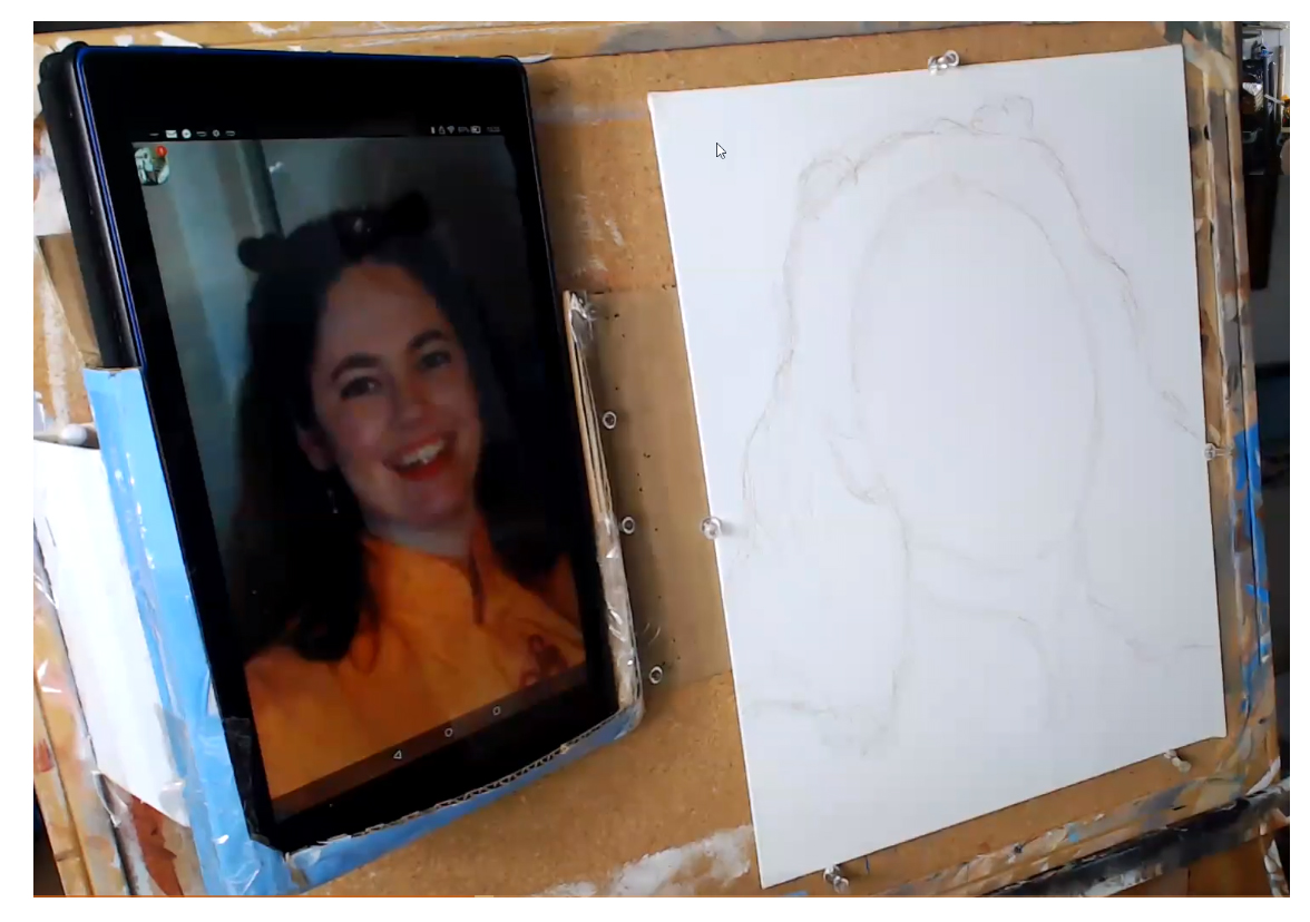
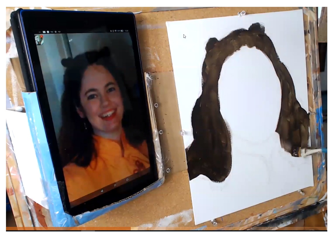
Step 1: Create a Basic Sketch
To begin your portrait, just fill in the outlines of the face. Don’t draw in the features. All you need is enough information to know where to block in the color. You can sketch it freehand if you’re comfortable with the process, or grid if necessary.
Step 2: Block in the Hair Color and Value
Although we are concentrating on skin tones, quickly blocking in the hair color and value frames the face. It will help us determine what colors to use for the skin tone, and make sure it is accurate. When you paint on top of plain white, you will think your skin tone is too dark, when in reality it’s not. We look for the predominant color in the hair. In this example, I’m using raw umber dark, and applying with a 3/4” -1” flat brush.
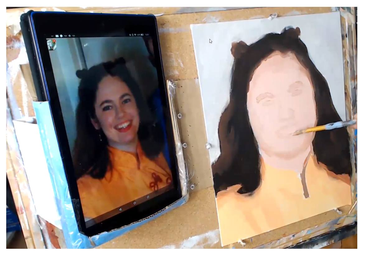
Step 3: Fill in the Skin Tone Base
In this step, I’m using a mixture of titanium white, burnt sienna, and organic red orange for the first, foundational skin tone layer. Make the paint as fluid as you can, by adding a little matte medium (10%) and brush quickly, just filling the whole area in.
Print off Your Own Guide to Paint Realistic Skin Tones in Acrylic
I created a handy reference guide that covers all the steps in this article in a 7 page PDF. You can download it right now, print it, and set it next to your easel, so you know exactly what colors, what techniques and what steps to take when you paint skin tones on your portrait. Download it below…
Now it’s time to get the fun part: actually painting in the facial features–the eyes, nose and mouth. But we don’t want to paint them too dark right away. Lightly “suggest” them in using a mixture of the skin tone base from the previous layer and burnt sienna. Painting the features this way at first will allow you to adjust them if necessary.
Step 5: Darken and Refine the Features
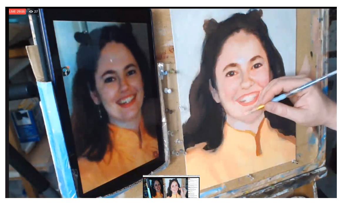
After the facial features dry, you can go over them with a darker color. Just add a little more burnt sienna for the eyebrows and nose. For the eyes, a bit of raw umber will cool down the color enough so that if the eyes are a different color than brown, you can easily adjust it. We’re not trying to dial in the exact eye color; rather, we’re just trying to ger the main shape and value established. For the lips, in this case, I’m using napthol red and burnt sienna, diluted a bit by the main flesh tone color.
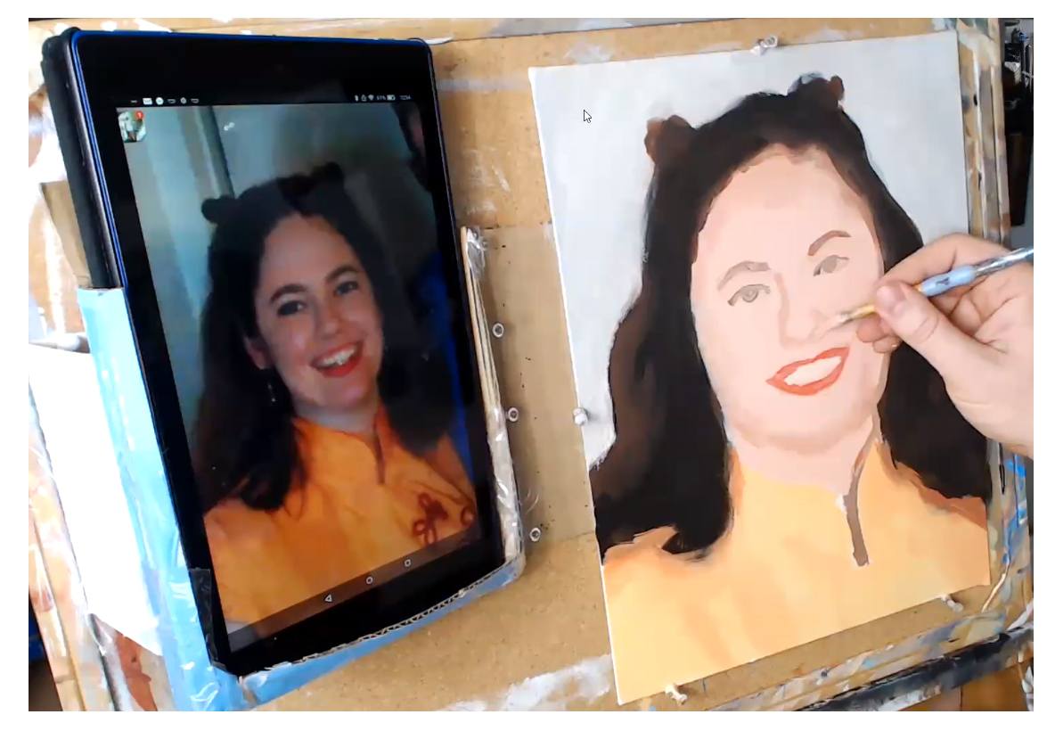
Step 6: Block in the Mid-tone Shadows
Unless we add in shadows on the face, it will look flat. That is obvious. The trick is to use the right color and value. And then to place that tone in the right places to give the illusion of three dimensionality, In my example, I use a similar color to what I used for the previous step, and lightened it up just a bit with the main skin tone color, so it’s easy to control and doesn’t get too dark.
Step 7: Refine the Eyebrows
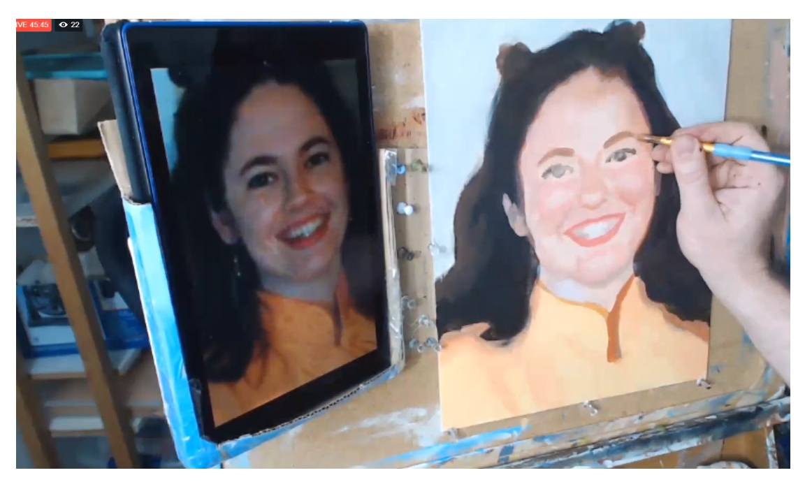
The eyebows up to this point look too thin. So what I’m doing here is creating a mixture of raw umber dark, alizarine crimson, raw sienna, and a touch of burnt sienna. Then, I carefully go over the eyebrow areas, and also thicken them up a bit too. You have to think of the eyebrows not just as hairs but also the shadow under the eye socket. What we’re doing is actually painting the base tone for the eyebrows. Then we go over with a darker color to suggest the hairs.
Tired of Muddy Colors?
Get my complete guide on painting skin tones, for free, and start mixing and blending realistic skin tones right away…
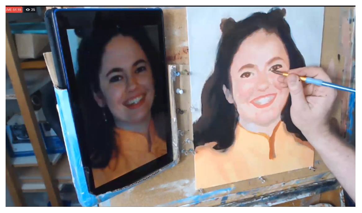
The eyes also need to get darker. So I take some raw umber dark, alizarine crimson and mix it into some of the skin tone base. Next, I paint that slowly with a small round brush, suggesting her eyelashes, eyeliner, and even the thickness of her eyelids.
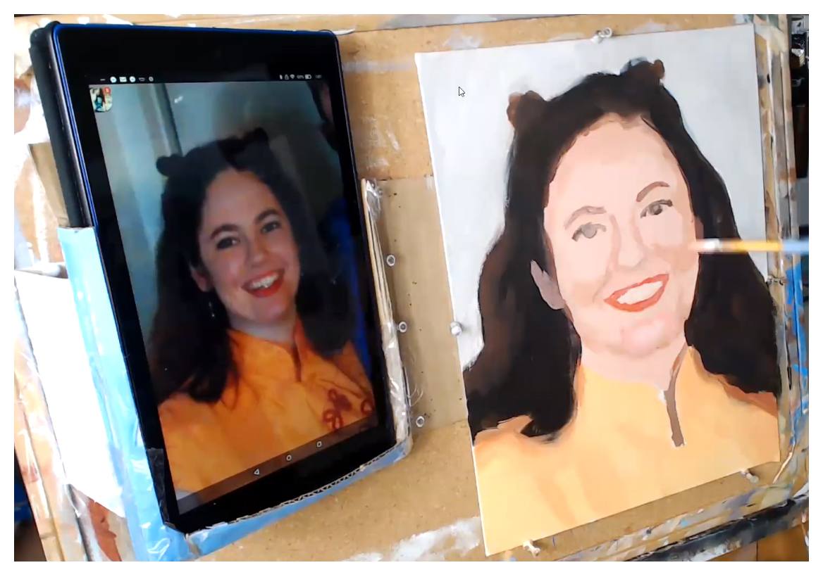
Step 9: Turn the Form
“Turning the form” means we bring out the three-dimensionality of the facial structure by placing shading and gradation in just the right spots. In this step, I use a color just slightly darker than the main skin tone and add more depth to her chin. In addition, I deepen some of the shadows alongside her nose, and under her eyes, to make the cheeks appear as if they are projecting forward in space a little bit.
Step 10: Refine the Teeth Details
Establishing the shadows on the sides of the teeth gives the jaw three-dimensionality. That’s what we want. I use raw umber, titanium white, and a bit of alizarine crimson. For the highlights, I use titanium white and a bit of raw sienna. You can use a size 10 round brush if you twist the end to a point with paint that is fluid enough. Spray your paint with a mist of water, if necessary, to achieve that.
Step 11: Add Highlights and Final Touches
We also added highlights in some of the previous steps too, but toward the end of the painting is where you can really make it shine with great use of high- lights. The colors will vary depending on what part of the face they are applied to. The forehead high- lights have some titanium white and alizarine crimson mixed in, to suggest the cool color of window light shining, in addition to incandescent lamps.
Step 12: Finished–Enjoy Your Painting!
Now, it’s your turn! Paint with this guide and let me know how it’s helped you!
I enjoyed creating this helpful reference on painting realistic skin tones in acrylic. I know that if you put the steps into practice, you will see a dramatic improvement on your portrait painting, especially if you’re just starting out. If you found this helpful, would you send me an email and let me know? I can be reached at [email protected].
Make you print off the skin tones guide so you can paint a lifelike portrait you can be proud to show. Click the button below to download it.
I have a video course available which shows each step I covered in this guide in greater detail. The course is about 5 hours long, and it’s a total package of five workshops that you can watch, step-by-step, at your own convenience. To learn more visit: Courses.realisticacrylic.com Even if you aren’t able take the course, be sure to get the free printable reference guide on painting skin tones in acrylic. Email me if you have a question or need a quick tip. I’ll be happy to help.
Acrylic portrait artist Matt Philleo posing next to a painting of his wife, painted for the Paint Realistic Skin Tones in Acrylic online class, teaching you how to paint with step-by-step lessons.
Let your fellow artists know about Realistic Acrylic Portrait School. My desire is to help artists learn how to paint an acrylic portrait they can be proud of. As I do for all my students, I pray that God would bless you with His peace in your painting process, direct your brush-strokes, that your paintings would encourage those who seem them, and that you would have all the provision you need, as your heart is drawn to Him, in Jesus’ name, Amen.
Blessings to you!
P.S. Did you find this post helpful or encouraging? If so, send it on ahead! Let others know with the share buttons below. I’d love to hear your comments. Thank you so much! Also, do you have a question on acrylic portrait painting you’d like answered? Let me know, and I’d be happy to help!
To create a realistic portrait you need a lot of different elements all working together.
The main three elements are accurate form, value, and color.
All of these elements are tied together, and even overlap a bit. Today, I want to show how form and value work together, and how you need to represent value accurately to portray correct form.
One of my students recently asked to have his portrait critiqued, while in the sketch stage. As I was recording his critique, the idea of capturing value to portray a realistic likeness came up.
In other words, if you want the person you’re painting to look like them, you have to pay close attention to the shadows. It’s just as important to capture these shadows as it is to draw the features such as the eyes, nose, mouth, etc. with correct placement, proportions, and shape. The ability to see the shadows on a face is vitally important to create the illusion of three-dimensionality on the canvas. You need to be able to see the inherent shape of a shadow from your reference photo–its hard edge and soft edge.
On a photograph that can be hard to discern.
You have an almost unlimited array of values with micro-nuances that can make it very challenging to see the “big picture” of the main shapes of the shadows. But if you can train yourself to see those main, abstract shapes you will go a long way to being able to draw and paint realistically.
By the way, the edges are defined not only by shadows, but differences in value due to the actual value (light and dark) of the objects themselves. (For example, the contrast between the man’s flesh tone and white suit. Or, on a smaller level, the difference between his black beard on his dark brown skin.
There are borders to all the shadows and values Your job is to see the most obvious edge, pick a line, and define it.
Watch the video below and I’ll show you what I’m discussing here, using this student’s portrait sketch (supplied with his permission) as an example.
Mastering the ability to see shapes within the shadows takes practice. But it all starts with being aware of the need to do so. As you hone in this skill, you’ll see these shapes all over the place, learn how to paint what you see, and your portraits will come alive with realism!. Visit other free tutorial here.
Yours for realistic acrylic portraits,
P.S. Did you find this post helpful or encouraging? If so, send it on ahead! Let others know with the share buttons below. I’d love to hear your comments. Thank you so much! Also, do you have a question on acrylic portrait painting you’d like answered? Let me know, and I’d be happy to help!
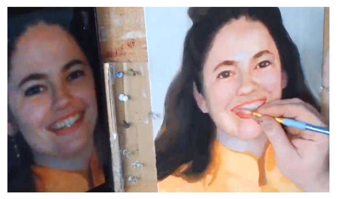
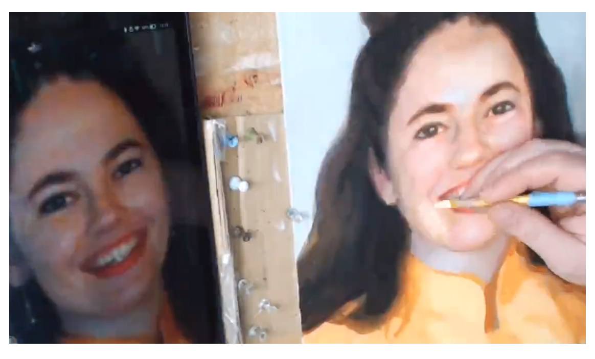
Painting the mouth, especially the teeth, in an acrylic portrait can be tricky.
It’s one of the hardest parts of the face to get right, but it is so important. Teeth are not easy to paint, because of the very subtle shapes, shades of color, and nuances you have to capture correctly to convey a convincing reality of a beautiful smile.
Today, I’m going to show you how to paint realistic teeth using my Old Master’s glazing technique.
1. Using a small round brush grab a little bit of napthol red off your palette…
2. Then a little bit of titanium white…
3. Mix into a warmer color like raw sienna, and dilute with a small amount of matte medium…
4. And then add the shadows just above the teeth, in the crevices between them, on top of the previously painted gums (that have just a light pink glaze on them)…
There’s a lot more! Watch it all here…
The 12-Minute Video Tutorial
(Instruction on painting teeth starts at 3:30 in the video)
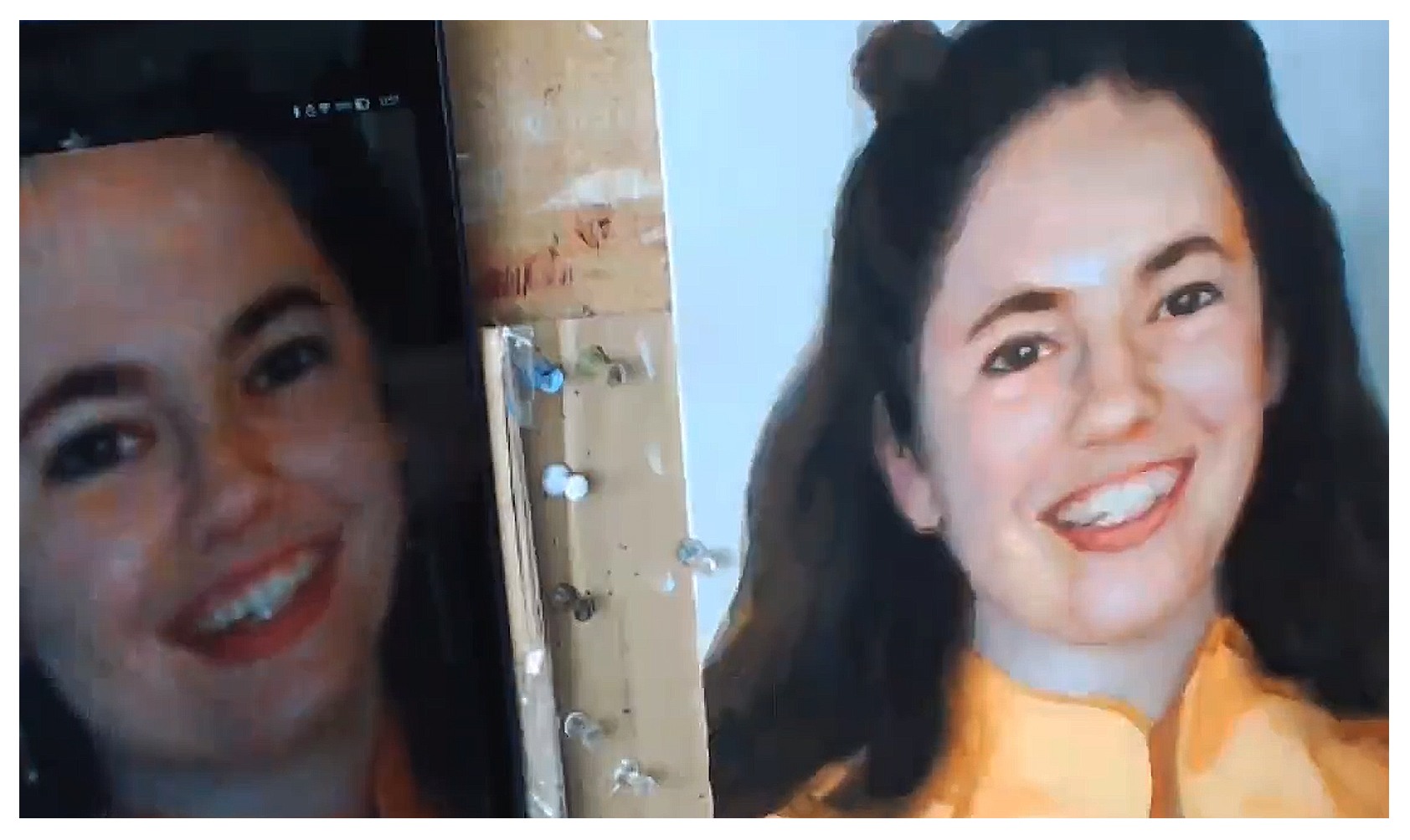
And here is the completed portrait of my wife…
Hope you enjoyed this post, and have a blessed day,
P.S. Did you find this post helpful or encouraging? If so, send it on ahead! Let others know with the share buttons below. I’d love to hear your comments. Thank you so much! Also, do you have a question on acrylic portrait painting you’d like answered? Let me know, and I’d be happy to help!
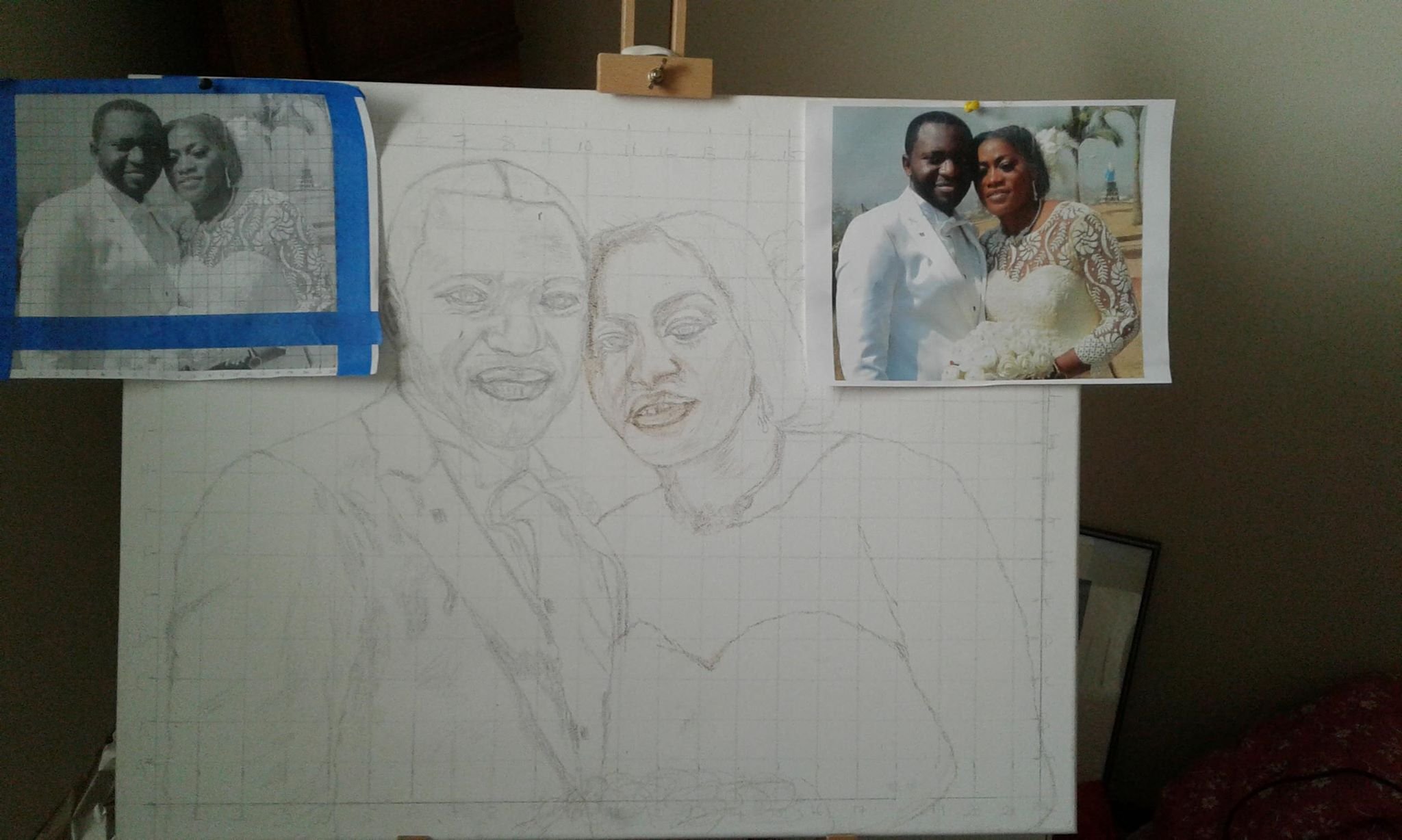
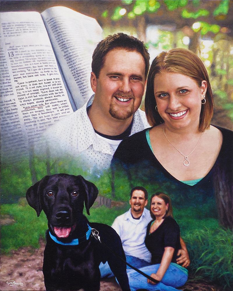
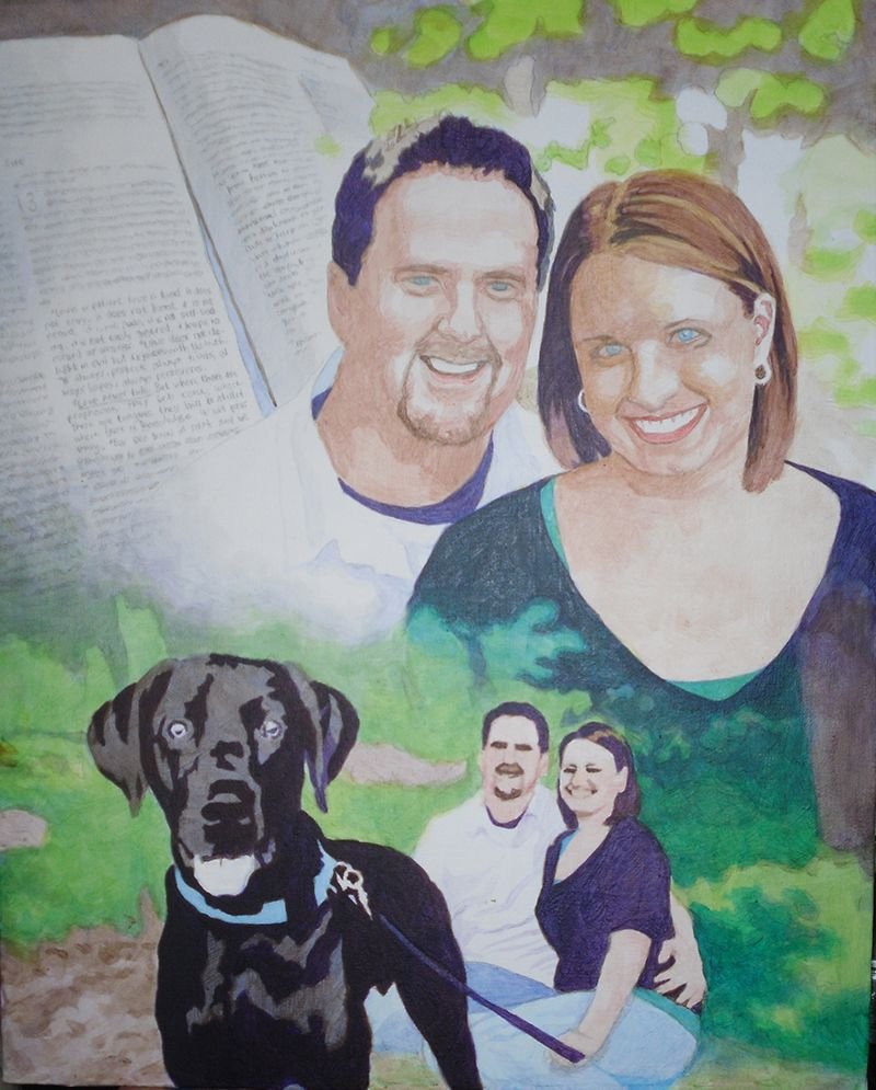
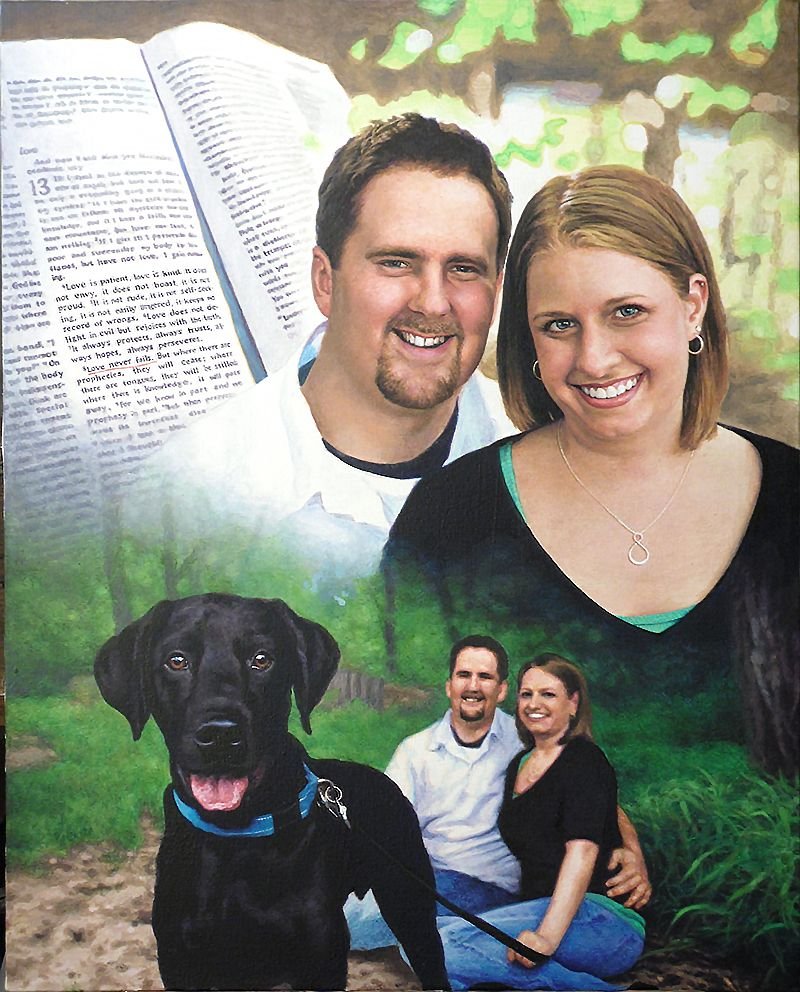
Today, I’d like to show you how I painted a montage portrait–several images put together into one design. This is one of my favorite portraits from several years ago, a 16″ x 20″ acrylic on canvas.
This was to be given as a gift from the mother to her son and his fiance as a unique wedding gift. The idea was to incorporate a large image of them, a picture of them with their dog, and then a scripture verse in the background, that would go with the marriage theme.
Here’s how I did it.
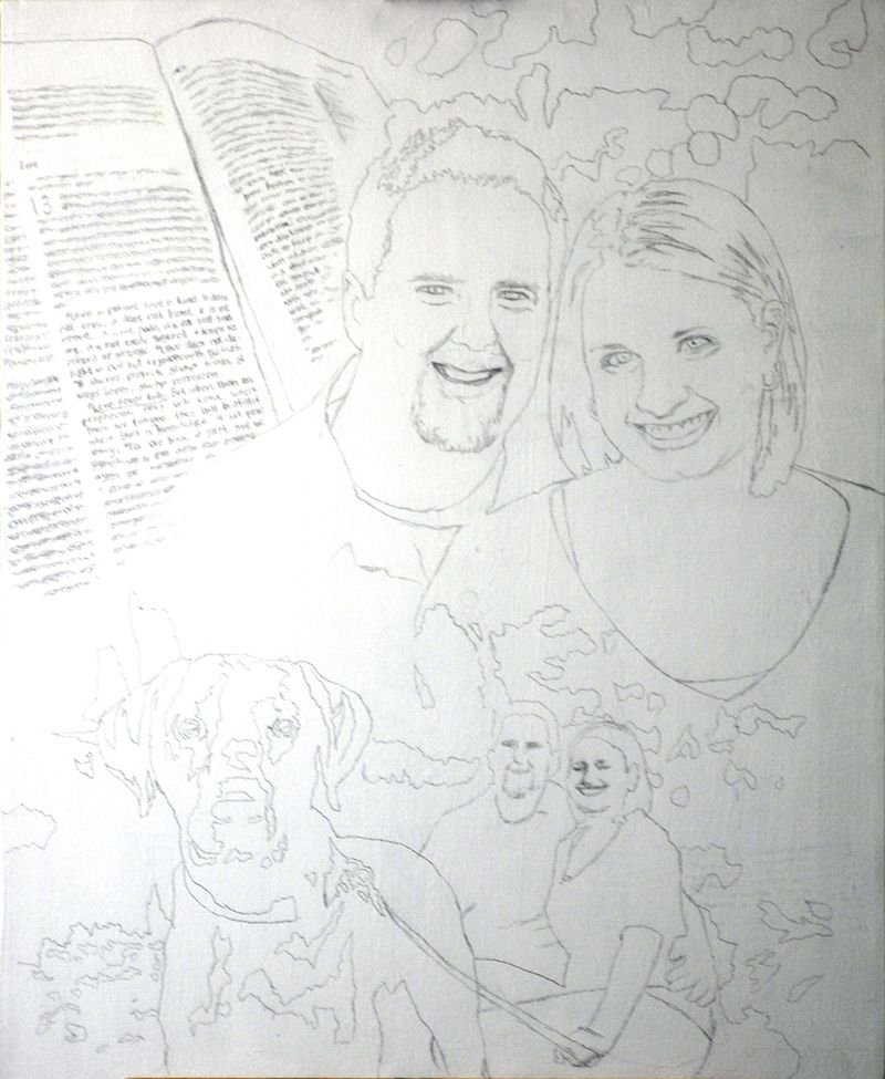
Step 1: The Sketch
After getting my photos together from the client, I did a layout.
This was before I started using the grid method, so I sketched it with a projector and pencil, following the outlines of the photographs closely. The projector sometimes gets things wrong, so you have to go back, double-check your lines and refine accordingly.
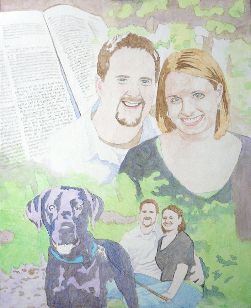
Step 2: The Foundation with Light Glazes
The purpose of this step is to quickly establish the tonality of the portrait by getting the colors in the right place. Secondarily, I want to set up my values, by creating immediate contrast between light and dark. I start attacking the darkest values first, using cooler colors like ultramarine blue, raw umber dark and dioxazine purple to create a rich, nuanced black.
This way, when it’s all done, and the viewer takes a close look at the painting, it won’t be flat. You will be able to sense the folds of fabric, and contours around the body of the person within.
My goal is always to create a painting that has immediate impact, but also rewards the viewer for taking a closer look.
For the subjects, I use raw umber dark for the darker values within the hair, raw sienna for the lighter values, and burnt sienna, raw sienna, raw umber dark, and alizarine crimson for the skin tones.
Of course, as with virtually all my painting, the pigment is mixed with a generous portion of matte medium to thin it out, and create the translucent depth that’s similar to the Old Master’s techniques.
Notice how for the trees and background I use a light green, made up of phthalo green, raw sienna, and a little indian yellow. It will give it a lot of luminosity as the light shines through the layers.
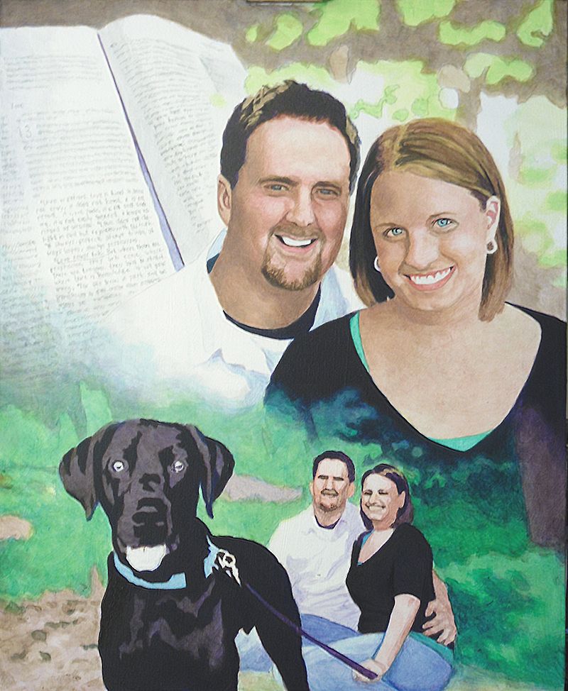
Step 3: Darkening the Deep and Mid-Tone Values
Now that I have the foundation, I go back and add several layers to all the areas within the painting. But mostly, I want to bring the darkest values to about 80% of their full strength. This will give me something to work with as I move the other values in the picture in accord.
I could just go and use full strength pigment, but it gives the painting a nicer finish to darken everything slowly. In addition to that, it gives me the ability to precisely blend even within the dark areas.
Is a black shirt just straight black?
No.
Not when there’s light shining on it. We don’t want to use straight black. Otherwise how can you paint the shadows in representing the beginning and end of arms, chest, waist, and all the appropriate wrinkles within the fabric? Instead we get it dark enough and leave room for the shadows.
And by the way, ivory black is not the darkest color you can get. You’ll get an even deeper black with dioxazine purple, aliazarine crimson, phthalo blue and raw umber dark mixed together.
Why not just settle for black? Well, it’s the same reason why HDTVs boast of having higher contrast. I used to sell LCD TVs years ago when they first came out on the market. They were terrible. The darkest values on the screen were just grey. Therefore the lightest values were not very impressive, and so the whole picture looked weak.
With a painting, you will get a way more dramatic effect if you can use really dark values to set of your lighter areas by contrast. It just reminds me of the way the darkness of sin makes the righteousness of God through Jesus Christ that much more glorious. You have to have some darkness to set off the light. Enough said.
Step 4: Adding Nuances to the Faces
At this point here, it’s time to turn my attention to the most important part of the portrait: the people. And especially their faces. In the previous step, I blocked in the darkest shadows within their faces, but now, I want to add some tie-in values. Those are the tones that bridge the gap between the lightest and darkest values.
So I keep the ones I put down as a good foundation. But now, I’m adding more on top, glazing over translucently, so the bottom layers still remain. That’s how we do this with acrylic–with layers.
I feel like their features–the important ones–like the eyes, eyebrows, nose, and mouth need some work. So I begin to darken them, adding detail wherever it needs it.
It’s good to remember the old adage, “Rome wasn’t built in day.” You have see the big picture and slowly comform your painting to the reference photos. Patience is key. For example, I darken the eyebrows as one solid mass of color–just one shade, but I know after this layer dries, I’ll come back to it again–and again, if need be. Then I will go in and darken just a portion of the eyebrow, while leaving the other part with whatever I did in the previous layer.
By doing this, I can suggest that the eyebrow hairs are thicker in a certain area, or the eye sockets are creating a shadow over that portion. That’s all you have to do. You don’t have to get crazy with drawing each individual hair. That actually detracts from your realism. Just hint at it and let the viewer’s mind’s eye interpret the rest and create the reality for you.
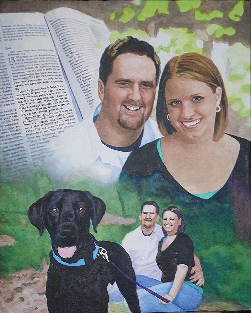
Step 5: Building Up More Nuances Everywhere
In this step, I keep on adding layers to the faces: more layers of alizarine crimson, raw sienna, and some titanium white. Using a average size flat brush (3/8 or smaller) I keep adding nuances to the faces. When I start a portrait I use my largest brushes: typically 1″ or even larger. But as I get toward the end of the project I switch to smaller.
Why?
The smaller brush is good not only for detail work, but also those precise areas of nuances–the subtle transition of shading from the cheek to the area below the eye socket. Or the fleshy area under the chin and neck where the light is reflecting from another illuminated surface.
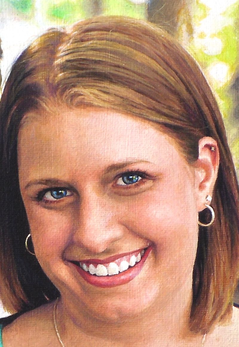
In this portrait, that is happening: we have the woman’s illuminated chest area reflecting as a secondary light source onto her chin. And so with that, I have to make sure I don’t paint the shadow underneath too dark. Since both the man and woman are outside, it makes sense that the light will really illuminate them well and the shadows won’t get very dark, except on the darker clothing and hair.
Another area I want to touch on is the Bible, which shows the scripture verse. That’s important part of the painting. I chose to just suggest the text by creating random out-of-focus lines. But the actual verse, “Love never fails” from the famous Corinthians 13 passage, is clearly in focus.
To paint something this detailed on canvas, you have to really make sure you have a nice detail brush, like 1/0 or smaller round, twisted to a point, with very fluid paint. Mist your palette and make sure the paint is about as thin as it can go before getting watery, and it will glide right over the canvas.
It makes painting text a whole lot easier.
Finally, I went over the greenery of the background trees and grass, just adding more nuances. I used phthalo blue, ultramarine blue, and raw sienna for the darker shades. Once you have your initial light green set up, it really sets it off beautifully.
In addition, I painted the dog’s eyes, using brown tones to give it some contrast. I still left the areas representing reflections quite light.
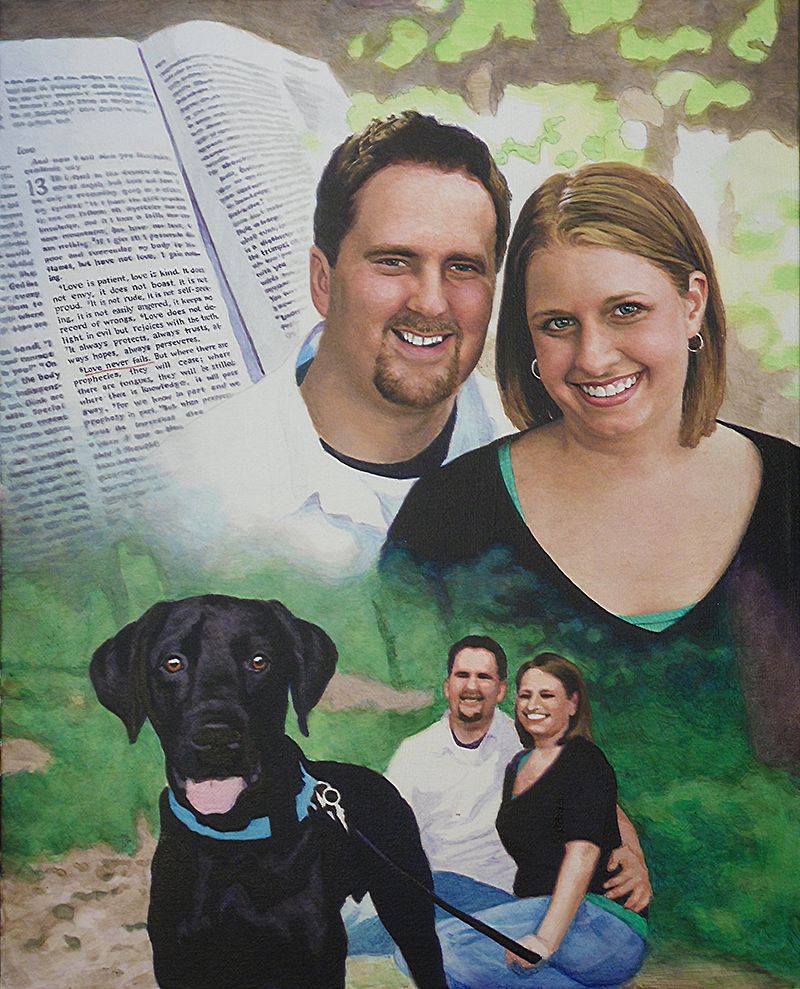
Step 6: Highlights and Advanced Blending
The portrait, at this stage, is starting to look done, but there’s still a lot of work to do. One of the things that can really enhance the realism is using highlights. Although I do like to leave a lot of areas of the canvas untouched for creating my lighter values, it is nice to go back in with some opaque highlights for certain areas.
I feel it gives me the best of both worlds: Glazing is fantastic for building depth and achieving fine gradations in shading, but it creates a roughness that must be overcome with some opaque layers. The trick is to use them just in a few areas.
The hair is one example. Here, I go back in and add just a little titanium white toned down with raw sienna to add the look of diffused light reflecting just at the top of the woman’s silky smooth, straight hair. I also go in and add some slightly darker highlights to the man’s textured short haircut. I already have the base color and value down. Now as I add these highlights, it will quickly change add depth to that area.
Also, I add detail to their teeth. We want to make sure that we don’t overdo it though. We want to use just enough of a light amber grey to suggest that there is separation between them. Raw umber dark mixed with titanium white and thinned by matte medium) is a fantastic way to create shadows for the teeth–in the right value and color.
Once I have the teeth darkened slightly, I can add even more depth by going over with a pin-point highlight of pure titanium white. With this, we just suggest reflections of light over the moist teeth. After it dries, add a tiny glaze of indian yellow, thinned with medium and it will give that white a bit more warmth and luminosity.
You can also do this on the gums. For some people, depending on the structure of their mouth, and the lighting, the gums will catch more of those highlights than the teeth. That was the case for this portrait.
Step 7: Adding the Details
Because this is a collage–or montage–portrait, there’s a lot different elements that need attention. So just when you think you are done, there’s just a little more.
Now, it’s time to add in some more detail to this couple’s background portrait. I noticed that the woman appeared to be looking away from the camera, but by adding just a few darker spots within her eyes on the right side, we suggest that she is looking toward us. It’s just a small amount of work, but it pays dividends in creating that visual connection with the viewer.
It’s time to add the long blades of grass in. I already have the base tones in. It’s just a matter of putting in some darker shadows in angular shapes, and then going over with highlights. Phthalo blue, ultramarine blue, raw sienna, even some yellow ochre and titanium white is what’s used, from darkest to lightest in capturing the effect.
Moving to the left of that, I tackle the jeans for both the man and woman, using the same two blues on my palette. I tend to use ultramarine blue for the darker values and phthalo blue for the lighter. For the darkest shadows I add in some diox purple and raw umber dark so it doesn’t get too bluish.
The Final Painting
With some more nuances here and there, I can call the painting done!
I hope you enjoyed this post and found it valuable. If you have any questions on the techniques used to create this portrait, I would love to help.
Have a blessed day,
P.S. Did you find this post helpful or encouraging? If so, send it on ahead! Let others know with the share buttons below. I’d love to hear your comments. Thank you so much! Also, do you have a question on acrylic portrait painting you’d like answered? Let me know, and I’d be happy to help!