Category Archives for Video Tutorial

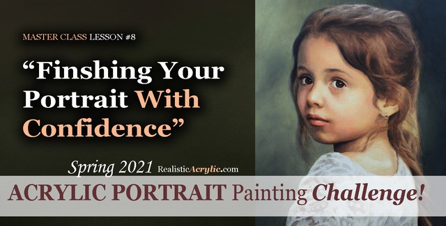
Spring 2021 Acrylic Portrait Painting Challenge: Finishing Your Portrait With Confidence
Let’s help you finish your painting!
In this lesson, we will be wrapping up the Masterclass series for the challenge! I’ll show you how to add some more nuances and details to the portrait of “Cora.” First, we’ll add a glaze to her hair to enrich the overall color. Next, we will enhance some nuances on her eyebrows, dial in the color of the eyes, and paint in the reflections. Finally, we’ll add in the skin tone for her arm in the lower corner and follow up with some work on her lace.
But even though we are nearly done with this portrait painting, it’s not too late to join in the fun!
YOU, too, can paint a portrait!
Take the Acrylic Portrait Painting Challenge (it’s FREE!) and paint along with us!
REGISTER TODAY. The challenge is ongoing, something you can do at your own pace. It’s not too late to enter! After you join, I’ll send you the supplies list and reference photos to paint from.
Register for the Challenge!WATCH NOW…
Lesson #8: Finishing Your Portrait Confidently
Professional artist and instructor Matt Philleo will teach you how to paint an acrylic portrait you can be proud of with this Portrait Painting Challenge!
Would like to paint this portrait with me and hundreds of other artists?
Take the 2021 Spring Portrait Painting Challenge!
You can register below and get started. It is completely FREE to join the challenge and participate. When you join, I’ll send you the “Welcome Kit” which includes:
- The Supplies List (so you know what you need to paint with us, your shopping list. 🙂 )
- The Reference Photo with and without the grid, high resolution, that you can download ready to print out or display on your tablet. You’ll be able to create an accurate portrait this way.
- The Palette Layout Guide showing you how to arrange your colors so they don’t get muddy on your palette
- The Master Class Lesson Schedule
- the Lessons emailed to you
- A private Facebook group to cheer you and help answer your questions
- And a few “bonuses” like opportunities to win my paid online classes
REGISTER TODAY. The challenge is ongoing, something you can do at your own pace. It’s not too late to enter!
Register for the Challenge!Let me know if you have any questions and I look forward to teaching you more!
—Matt
Questions? Suggestions? Thoughts? Let me know, below in the comments. Please share your sketches in our Facebook group and share this post with your friends!

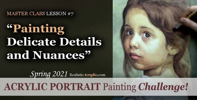
Spring 2021 Acrylic Portrait Painting Challenge: Painting Delicate Details and Nuances
After building the foundation with several layers of value, form, and color, we can then start to “dial in” the detail and nuances.
In this master class lesson (7 of 8), I’ll demonstrate how to add specific detail shapes to “Cora’s” hair. I’ll also add some additional shading to her forehead with a very translucent glaze. Next, I darken the left side of her face while smoothing out some of the rough application of previous glazes with a semi-opaque layer that’s cooler in tone. Finally, I add nuances to her eyes, lips and chin.
But even though we are well along in this portrait painting, it’s not too late to join in the fun!
YOU, too, can paint a portrait!
Take the Acrylic Portrait Painting Challenge (it’s FREE!) and paint along with us!
REGISTER TODAY. The challenge is ongoing, something you can do at your own pace. It’s not too late to enter! After you join, I’ll send you the supplies list and reference photos to paint from.
Register for the Challenge!WATCH NOW…
Lesson #7: Painting Delicate Details and Nuances
Learn how to do smooth shading, skin tones, details, and nuances in this FREE online portrait painting class by Matt Philleo at Realistic Acrylic Portrait School
Would like to paint this portrait with me and hundreds of other artists?
Take the 2021 Spring Portrait Painting Challenge!
You can register below and get started. It is completely FREE to join the challenge and participate. When you join, I’ll send you the “Welcome Kit” which includes:
- The Supplies List (so you know what you need to paint with us, your shopping list. 🙂 )
- The Reference Photo with and without the grid, high resolution, that you can download ready to print out or display on your tablet. You’ll be able to create an accurate portrait this way.
- The Palette Layout Guide showing you how to arrange your colors so they don’t get muddy on your palette
- The Master Class Lesson Schedule
- the Lessons emailed to you
- A private Facebook group to cheer you and help answer your questions
- And a few “bonuses” like opportunities to win my paid online classes
REGISTER TODAY. The challenge is ongoing, something you can do at your own pace. It’s not too late to enter!
Register for the Challenge!Let me know if you have any questions and I look forward to teaching you more!
—Matt
Questions? Suggestions? Thoughts? Let me know, below in the comments. Please share your sketches in our Facebook group and share this post with your friends!
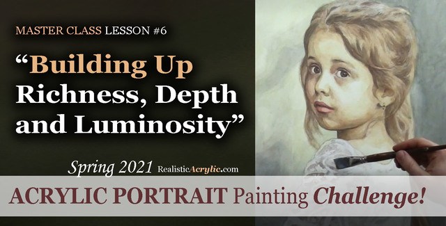
Spring 2021 Acrylic Portrait Painting Challenge: Building Up Richness, Depth and Luminosity
Acrylic is a fantastic medium for portrait painting, but it can be so challenging to use! That is why I am teaching you the glazing technique to open a lot of possibilities and ease your frustration.
Historically, the Old Masters used small amounts of pigment dispersed in larger amounts of linseed oil or mineral spirits to create a sense of volume and depth in their paintings. Light shines through and you can see a bit of each layer beneath the ones on top.
We can use that technique to our advantage with acrylic. By applying several translucent layers, there is an increased sense of depth, shading, contrast and color saturation and luminosity.
In this particular lesson, I’ll demonstrate how to add richness to the mid-tones of the girl’s face and hair. We will also add more contrast to the image with a couple of layers to the background, and turn the form of her figure with a precisely placed glaze on her clothing.
But even though we are well along in this portrait painting, it’s not too late to join in the fun!
Take the Acrylic Portrait Painting Challenge (it’s FREE!) and paint along with us!
REGISTER TODAY. The challenge is ongoing, something you can do at your own pace. It’s not too late to enter! After you join, I’ll send you the supplies list and reference photos to paint from.
Register for the Challenge!WATCH NOW…
Lesson #6: Building Up Richness, Depth, and Luminosity
Learn how to create a vibrant acrylic portrait where the colors are not flat or muddy. In this FREE step by step master class, I’ll show you how!
Would like to paint this portrait with me and hundreds of other artists?
Take the 2021 Spring Portrait Painting Challenge!
You can register below and get started. It is completely FREE to join the challenge and participate. When you join, I’ll send you the “Welcome Kit” which includes:
- The Supplies List (so you know what you need to paint with us, your shopping list. 🙂 )
- The Reference Photo with and without the grid, high resolution, that you can download ready to print out or display on your tablet. You’ll be able to create an accurate portrait this way.
- The Palette Layout Guide showing you how to arrange your colors so they don’t get muddy on your palette
- The Master Class Lesson Schedule
- the Lessons emailed to you
- A private Facebook group to cheer you and help answer your questions
- And a few “bonuses” like opportunities to win my paid online classes
REGISTER TODAY. The challenge is ongoing, something you can do at your own pace. It’s not too late to enter!
Register for the Challenge!Let me know if you have any questions and I look forward to teaching you more!
—Matt
Questions? Suggestions? Thoughts? Let me know, below in the comments. Please share your sketches in our Facebook group and share this post with your friends!

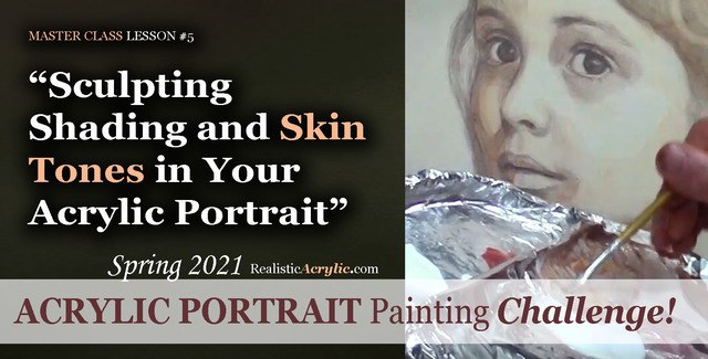
Spring 2021 Acrylic Portrait Painting Challenge: Sculpting Shading and Skin Tones in Your Acrylic Portrait
Acrylic portrait painting, in many ways, is like creating a sculpture. We want to truly make our faces look realistic and three-dimensional. In this master class video lesson, I show you how to do exactly that.
We’re breaking a fine art portrait painting down into bite-size steps that YOU can do.
Specifically, in this video lesson, I demonstrate how darkening your background can really make the face stand out in a lifelike way.
What colors should we use for the shadows? I’ll show you how to mix them, what brushes to use to apply them, and HOW to do it. Get the shadows right, and 80% of the battle is won, so to speak in your portrait.
What colors for the skin tones?
In this video, you’ll learn the correct color to mix, how to create glazes with matte medium and apply it to the face smoothly.
This is still very much the beginning. More lessons to come.
Take the Acrylic Portrait Painting Challenge (it’s FREE!) and paint along with us!
REGISTER TODAY. The challenge is ongoing, something you can do at your own pace. It’s not too late to enter! After you join, I’ll send you the supplies list and reference photos to paint from.
Register for the Challenge!
WATCH NOW…
Lesson #5: Sculpting Shading and Skin Tones in Your Acrylic Portrait
Acrylic Portrait Painting Challenge Lesson #5: Sculpting Shading and Skin Tones in Your Acrylic Portrait
Would like to paint this portrait with me and hundreds of other artists?
Take the 2021 Spring Portrait Painting Challenge!
You can register below and get started. It is completely FREE to join the challenge and participate. When you join, I’ll send you the “Welcome Kit” which includes:
- The Supplies List (so you know what you need to paint with us, your shopping list. 🙂 )
- The Reference Photo with and without the grid, high resolution, that you can download ready to print out or display on your tablet. You’ll be able to create an accurate portrait this way.
- The Palette Layout Guide showing you how to arrange your colors so they don’t get muddy on your palette
- The Master Class Lesson Schedule
- the Lessons emailed to you
- A private Facebook group to cheer you and help answer your questions
- And a few “bonuses” like opportunities to win my paid online classes
REGISTER TODAY. The challenge is ongoing, something you can do at your own pace. It’s not too late to enter!
Register for the Challenge!What’s coming up in the next lesson? More shading, more skin tones, and the start of some detail work. Follow the lessons and you will be able to create a portrait you can be proud of…even if you’re a complete beginner!
Let me know if you have any questions and I look forward to teaching you more!
—Matt
Questions? Suggestions? Thoughts? Let me know, below in the comments. Please share your sketches in our Facebook group and share this post with your friends!

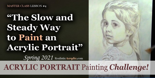
Spring 2021 Acrylic Portrait Painting Challenge: The Slow and Steady Way to Paint an Acrylic Portrait
If you remember the childhood story, “The Tortoise and the Hare,” you recall that the hare started out really fast and put the tortoise to shame. But then the rabbit took a nap, while the slow, while the turtle, with his slow methodical steps, passed him up and won the race!
Sometimes slow is better for painting an acrylic portrait.
Likewise, in an acrylic portrait, we often want to see quick results. But if we take our time, and just add one layer on top of another, even though it looks like hardly anything is happening, eventually, we will end up with a great painting!
I’d like to show you how to slow down a bit, take your time, and paint your acrylic portrait layer by layer, using the acrylic glazing technique.
Take the Acrylic Portrait Painting Challenge (it’s FREE!) and paint along with us!
REGISTER TODAY. The challenge is ongoing, something you can do at your own pace. It’s not too late to enter! After you join, I’ll send you the supplies list and reference photos to paint from.
Register for the Challenge!
WATCH NOW…
Lesson #4: The Slow and Steady Way to Paint an Acrylic Portrait
In this master class lesson #4, I demonstrate how to continue darkening your darkest values on the face and background, and then work in some warmer glazes to set up the skin tones on her face. We’re going very light, using a large amount of matte medium (95%) to a small amount of paint (5%)
Watch how to do it here…
Learn how to paint an acrylic portrait slowly and correctly, step-by-step in this FREE master class lesson by Matt Philleo at Realistic Acrylic Portrait School!
Would like to paint this portrait with me and hundreds of other artists?
Take the 2021 Spring Portrait Painting Challenge!
You can register below and get started. It is completely FREE to join the challenge and participate. When you join, I’ll send you the “Welcome Kit” which includes:
- The Supplies List (so you know what you need to paint with us, your shopping list. 🙂 )
- The Reference Photo with and without the grid, high resolution, that you can download ready to print out or display on your tablet. You’ll be able to create an accurate portrait this way.
- The Palette Layout Guide showing you how to arrange your colors so they don’t get muddy on your palette
- The Master Class Lesson Schedule
- the Lessons emailed to you
- A private Facebook group to cheer you and help answer your questions
- And a few “bonuses” like opportunities to win my paid online classes
REGISTER TODAY. The challenge is ongoing, something you can do at your own pace. It’s not too late to enter!
Register for the Challenge!Let me know if you have any questions and I look forward to teaching you more!
—Matt
Questions? Suggestions? Thoughts? Let me know, below in the comments. Please share your sketches in our Facebook group and share this post with your friends!

Spring 2021 Acrylic Portrait Painting Challenge: Applying Your First Glazes
Think of the acrylic glazing technique as a Polaroid camera print.
Remember those? You would load up the small film sheets, snap a picture and out popped the print. Back in those days (yes, I’m old enough to remember them) this was amazing. You wouldn’t have to drop off your film and wait 3 days (or even an hour!) for it to process.
But even then, it wasn’t immediate. The image would slowly fade in, and you’d watch a vague outline of your scene start to materialize. Finally, after a minute, you’d have a beautiful print!
In the same way, instead of painting our portrait one section at a time, with thick, opaque applications of paint, we slowly fade it in, covering the entire canvas at once, in stages. We use the classical acrylic glazing technique, just like Da Vinci, Titian and Vermeer used during the Renaissance to achieve smooth, subtle nuances of color and value, vibrant colors, and incredible depth.
I’ll show you how to do it!
But first, make sure you’re registered for the challenge!
REGISTER TODAY. The challenge is ongoing, something you can do at your own pace. It’s not too late to enter! After you join, I’ll send you the supplies list and reference photos to paint from.
Register for the Challenge!
WATCH NOW…
Applying the First Glazes to Your Acrylic Portrait, Part 1
Before we can begin the painting, first we must seal in the sketch, so it doesn’t smear or muddy up our paint. Next, we need to white-out the grid lines so they don’t distract from our final painting presentation. Lastly, we mute the sketch and tone the canvas in one step, so that we don’t have a white canvas staring us in the face, and so that the sketch is softened—easier to convert to a painting.
Watch how to do it here…
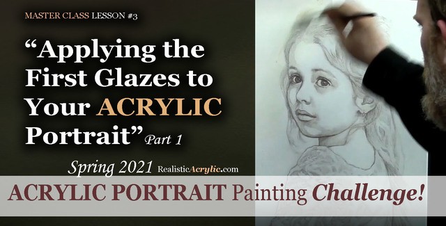
Learn to paint a realistic acrylic portrait using the classical glazing technique in this free online class. Lesson 3: Beginning the painting process–sealing in the sketch, whiting
Applying the First Glazes to Your Acrylic Portrait, Part 2
Let’s begin the actual painting process! I’ll show you what colors we are using, how to block in the value structure simply with just two colors and matte medium. We’re going to go light and leave room to correct any mistakes. This will be the foundation we’ll build off of from here on out…
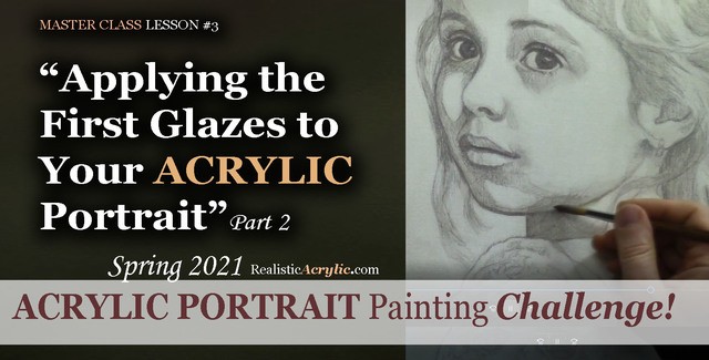
Learn to paint a realistic acrylic portrait using the classical glazing technique in this free online class. Lesson 3: Beginning the painting process
Would like to paint this portrait with me and hundreds of other artists?
Take the 2021 Spring Portrait Painting Challenge!
You can register below and get started. It is completely FREE to join the challenge and participate. When you join, I’ll send you the “Welcome Kit” which includes:
- The Supplies List (so you know what you need to paint with us, your shopping list. 🙂 )
- The Reference Photo with and without the grid, high resolution, that you can download ready to print out or display on your tablet. You’ll be able to create an accurate portrait this way.
- The Palette Layout Guide showing you how to arrange your colors so they don’t get muddy on your palette
- The Master Class Lesson Schedule
- the Lessons emailed to you
- A private Facebook group to cheer you and help answer your questions
- And a few “bonuses” like opportunities to win my paid online classes
REGISTER TODAY. The challenge is ongoing, something you can do at your own pace. It’s not too late to enter!
Register for the Challenge!Let me know if you have any questions and I look forward to teaching you more!
—Matt
Questions? Suggestions? Thoughts? Let me know, below in the comments. Please share your sketches in our Facebook group and share this post with your friends!

Spring 2021 Acrylic Portrait Painting Challenge: Sketching Your Portrait with Accuracy
Just like a contractor would never dream of building a home without a sure foundation, we shouldn’t try to paint an acrylic portrait without the same.
A sketch serves as an excellent foundation to build upon. I will show you in this series of Master Class Lessons how to sketch your portrait accurately.
With an accurate sketch, you are already halfway there to a beautiful painting.
I’ll show you how to do it, step-by-step, using the grid method.
With the grid method, even a beginner can create a realistic sketch. With that in place, I can help you build on top, layer by layer using the glazing technique to create smooth transitions of value and lifelike skin tones. You can do this. I’ll be here to help.
Ready? Let’s get started!
I’ll show you exactly how to do it in the lessons below. But first, make sure you’re registered for the challenge!
REGISTER TODAY. The challenge is ongoing, something you can do at your own pace. It’s not too late to enter! After you join, I’ll send you the supplies list and reference photos to paint from.
Register for the Challenge!
WATCH NOW…
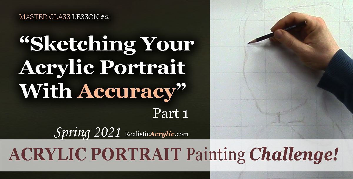
Sketching Your Portrait With Accuracy, Part 1
Let’s begin the sketch! Get out your colored pencil and start making some simple marks. Look at the squares and see where the lines fall. All we need to do at this stage is loosely capture the outline of the subject—the girl—and later on, we will fill in the details. “What if I make a mistake?” No problem. That’s what erasers are for!
Learn how to sketch a portrait accurately with Realistic Acrylic Portrait School’s FREE Challenge Master Class Lessons!
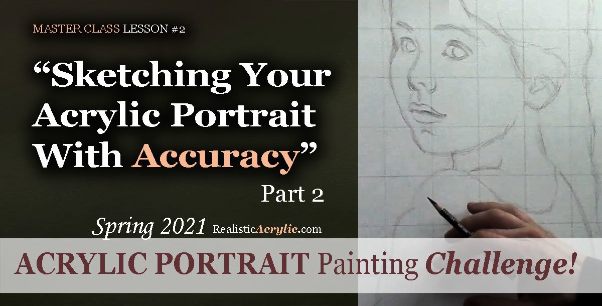
Sketching Your Portrait With Accuracy, Part 2
Learn how to paint a realistic acrylic portrait by creating a solid sketch. In this in-depth video lesson, I’ll show you how to refine the facial features on your portrait drawing. After watching, you’ll be able to capture a better likeness and also plot out where your shadows and highlights will be.
Learn how to sketch a portrait accurately with Realistic Acrylic Portrait School’s FREE Challenge Master Class Lessons!
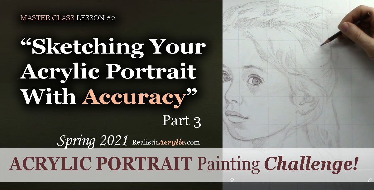
Sketching Your Portrait With Accuracy, Part 3
We’re going further in this sketch for the Acrylic Portrait Painting Challenge! I show you how to add detail to the girl’s hair. It’s important to break down the complex shapes into something simple, and then add the complexity back in again, to make it realistic. I’ll show you how to do it.
Learn how to sketch a portrait accurately with Realistic Acrylic Portrait School’s FREE Challenge Master Class Lessons!
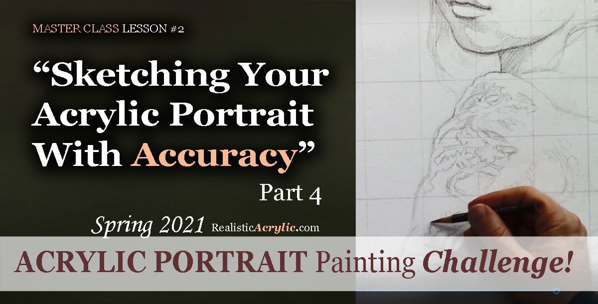
Sketching Your Portrait With Accuracy, Part 4
In this Master Class Lesson, I will be teaching you how to sketch the lace for the girl’s dress top. It is an extremely detailed portion of the photo, but again, we will follow the method of breaking the complex into simple. That way, we don’t spend all day sketching this portrait and it will be easier to block in during the painting process.
Learn to paint a realistic acrylic portrait successfully by first doing an accurate sketch, as taught by professional artist and instructor, Matt Philleo of Realistic Acrylic Portrait School
Sketching Your Portrait With Accuracy, Part 5
Let’s finish this sketch up! In this lesson, I’ll show you how to add the final touches to the lace, the girl’s face, and some additional details to make this drawing as realistic as possible. Then, we can dive into the painting process with confidence!
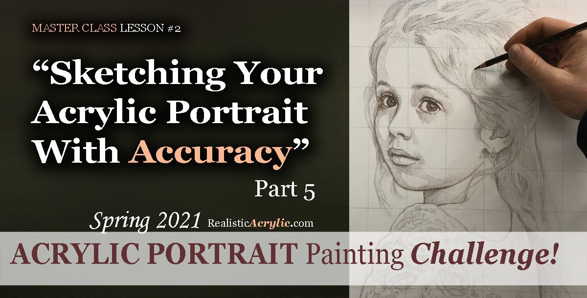
Learn to paint a realistic acrylic portrait successfully by first doing an accurate sketch, as taught by professional artist and instructor, Matt Philleo of Realistic Acrylic Portrait School
Would like to paint this portrait with me and hundreds of other artists?
Take the 2021 Spring Portrait Painting Challenge!
You can register below and get started. It is completely FREE to join the challenge and participate. When you join, I’ll send you the “Welcome Kit” which includes:
- The Supplies List (so you know what you need to paint with us, your shopping list. 🙂 )
- The Reference Photo with and without the grid, high resolution, that you can download ready to print out or display on your tablet. You’ll be able to create an accurate portrait this way.
- The Palette Layout Guide showing you how to arrange your colors so they don’t get muddy on your palette
- The Master Class Lesson Schedule
- the Lessons emailed to you
- A private Facebook group to cheer you and help answer your questions
- And a few “bonuses” like opportunities to win my paid online classes
REGISTER TODAY. The challenge is ongoing, something you can do at your own pace. It’s not too late to enter!
Register for the Challenge!Let me know if you have any questions and I look forward to teaching you more!
—Matt
Questions? Suggestions? Thoughts? Let me know, below in the comments. Please share your sketches in our Facebook group and share this post with your friends!

Spring 2021 Acrylic Portrait Painting Challenge: Gridding Your Canvas for an Accurate Sketch
One of the biggest struggles portrait artists have is getting an accurate likeness. In this lesson, I will show you how to grid your canvas, so that you will be able to not only make a sketch with good proportions but also get a good likeness too.
I’ll show you exactly how to do it in this video…
How to grid your canvas to get an accurate sketch for your acrylic portrait
Gridding Your Portrait for an Accurate Sketch
Would like to paint this portrait with me and hundreds of other artists?
Take the 2021 Spring Portrait Painting Challenge!
You can register below and get started. It is completely FREE to join the challenge and participate. When you join, I’ll send you the “Welcome Kit” which includes:
- The Supplies List (so you know what you need to paint with us, your shopping list. 🙂 )
- The Reference Photo with and without the grid, high resolution, that you can download ready to print out or display on your tablet. You’ll be able to create an accurate portrait this way.
- The Palette Layout Guide showing you how to arrange your colors so they don’t get muddy on your palette
- The Master Class Lesson Schedule
- the Lessons emailed to you
- A private Facebook group to cheer you and help answer your questions
- And a few “bonuses” like opportunities to win my paid online classes
REGISTER TODAY. The challenge is ongoing, something you can do at your own pace. It’s not too late to enter!
Register for the Challenge!Let me know if you have any questions and I look forward to teaching you more!
—Matt

You Can Learn How to Paint a Realistic Acrylic Portrait
“Can I paint a portrait?”
This is the question so many of my students asked themselves prior to taking my master class for the Acrylic Portrait Painting Challenge.
The fact is: yes, you can.
“But,” you may ask right now as you read this, “Will it look terrible? Will it even look human? Will the skin tones be muddy? Will I be able to get a good likeness? Will the paint layers get blotchy? How exactly do I paint a portrait?”
Again, these questions have been asked before. You’re not alone.
And I’m happy to say, that many of my students, an aspiring artist just like you, have taken these questions to the canvas, started painting following my step-by-step video instruction, and created a beautiful portrait. Even as beginners.
Then now, I can’t promise you’ll be able to paint a Rembrandt your very first try.
But I will promise this: if you come with a mindset of being willing to try, and being willing to hang in there when the painting process gets challenging, you will create a portrait that is way better than you ever thought possible!
Some of my students create portraits that look professional on their very first attempt. Others create portraits that are much improved from what they previously did, but they will need to keep practicing to get better. (We all need to keep working to get better, myself included! 🙂 )
So you can do this! And then I’ll show you how, and you won’t be alone.
Last year, I launched our inaugural spring portrait painting challenge, just as the lockdowns of the coronavirus hit. And then Over 700 artists took the challenge, and I have personally seen many, many portraits that look amazing considering it was the very first portrait they ever did.
In this case, you would think they had been painting for years! When they posted their portraits to social media, they started getting commissions! Of course, others started painting portraits of family members to give as unique gifts.
Then here’s what my student Rod Martin (part of the Realistic Acrylic All-Access Membership) created. So below is his very first acrylic portrait (on the left) and a more recent one on the right. And when I write this, he’s only been with me for a year!
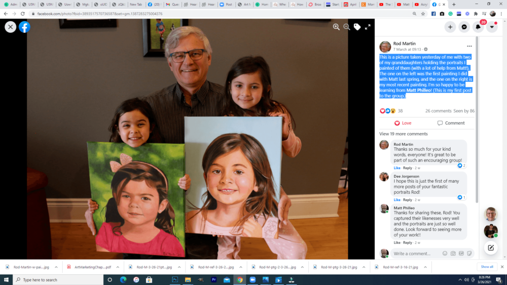
I am not going to boast in myself or my teaching. I do really care for my students, and then I put everything I have into helping them paint portraits they can be proud of. But the real secret is I pray and God helps me not only to teach, but my students to apply the teaching and create something amazing. They take the knowledge I give them, put into practice with tenacity, and they produce a fantastic portrait.
So, take the 2021 Spring Portrait Painting Challenge!
You can register below and get started. It is completely FREE to join the challenge and participate. When you join, I’ll send you the “Welcome Kit” which includes:
- The Supplies List (so you know what you need to paint with us, your shopping list. 🙂 )
- The Reference Photo with and without the grid, then with high resolution, that you can download ready to print out or display on your tablet. You’ll be able to create an accurate portrait this way.
- The Palette Layout Guide showing you how to arrange your colors so they don’t get muddy on your palette
- The Master Class Lesson Schedule
- the Lessons emailed to you
- A private Facebook group to cheer you and help answer your questions
- And a few “bonuses” like opportunities to win my paid online classes
REGISTER TODAY. The challenge is ongoing, something you can do at your own pace. It’s not too late to enter!
Register for the Challenge!- How to Paint Foliage Using the Acrylic Glazing Technique
- How to Trace for an Accurate Portrait Sketch
- How to Paint Realistic Eyes in Your Acrylic Portrait
- How to Add Raw Umber Dark & Ultramarine Blue to Your Portrait
- How to Make Your Own Raw Umber Dark
- How to Paint Realistic Trees & Grass in Your Acrylic
- How to Block In Skin Tone Values Using Glazing Technique
- How to Paint Vibrant Reds in Your Acrylic Portrait
- How to Glaze Background Colors & More Acrylic Portrait
- How to Paint White Clothing in Your Acrylic Portrait
- How to Easily Transition from a Sketch to a Painting
- How to Block In Shading & Skin Tones in Your Acrylic
- How to Build Up Color on Acrylic Pet Portrait
- How to Build Up Form on Clothing with Acrylic
- How to Paint Dark Clothing Using Acrylic Glazing Technique
- How to Paint a 24 x 30 Acrylic With 30 People
- How to Do Smooth Shading with Acrylic
- How to Sketch an Acrylic Portrait with a Grid
Read more about how to paint a portrait that you can surely be proud of!
Look forward to teaching you!
—Matt
Questions? Comments? Share your thoughts below. Please share this post with your friends!

How to Trace? Is it OK to Trace as a Portrait Artist?
Let’s address the elephant in the room: tracing as a portrait artist. Is it OK? Is it cheating?
I’m going to answer that question today.
Up until COVID-19 hit, I participated in a Fall studio art tour every year. An artist on the tour, who was also the founder and coordinator for it, had some strong opinions about tracing.
“Matt, tell me you didn’t trace that sketch for the mural project you did.”
“I’m not going to lie,” I told her. “I did use a projector to get the proportions up, and then refine it freehand.”
“How could you do that? What if your client found out?”
“Well, first of all, this project was done for my church, as a gift,” I replied. “And secondly, I would be upfront with them if they asked about my process.”
She chided me in a motherly kind of way, and I listened respectfully and smiled.
This is the first time I ever really thought about the concept of tracing as being a bad thing, at least to this degree. But is it?
I’m going to give you 5 reasons why I believe tracing is OK.
- Tracing saves time. Let’s face it. Drawing freehand, or with a grid is a time-consuming process. You have to measure, re-measure your proportions, and if you lack much drawing experience, often have to settle for eyes that are too large, noses that are unnatural, and mouths that aren’t aligned properly. I have many commissions to do, and so tracing expedites my workflow. I don’t trace all of my portraits, but for some, I choose to do so.
- Tracing helps you get accurate proportions, especially for a large painting. I had always drawn freehand and never even thought of tracing until 1999, when I did mural work with a well-known Florida muralist, Bob Jenny. He had hired me to do a series of murals depicting army medics serving in American wars at some VA hospitals. They were large—two 6′ x 30′ murals. One day, he came by to check on my work. He saw me meticulously sketching a battle scene, freehand. “We’re going to be here for months if you do it that way!” he exclaimed. “Let me show you how to do it.”And he taught me how to use an overhead projector to transfer the design up quickly and effectively.
- Tracing helps you to see distinctions in value. When you trace, especially using a projector, details become blurred and you readily notice differences in value—those distinct shapes that create the planes, the forms we see—whether they are the forehead, nose, cheekbones, or locks of hair. You can trace along the edges of those distinctions. It can be a beneficial exercise to help you in your portrait painting.
- There is historical precedent for tracing. Jan Vermeer reportedly used a camera obscura to project scenes from outside onto his surface to create exact replications of landscapes. So there is so shame. I think we can all appreciate the work of Vermeer. Art historians and art appreciators alike marvel at his skills.
- Tracing is a tool. It can be used like a contractor uses a nail gun to frame a house. The same work could be done by old-fashioned hammer and nail, but the nail-gun will do it faster. Obviously, this metaphor doesn’t translate entirely in terms of portrait painting, but the idea I’m trying to convey is that it’s just a tool.
Now, with all that said, here are some caveats on tracing.
- If you ONLY trace, and never do freehand sketching or use the grid method, your portrait painting skills will suffer. You will either stagnate, or take a very long time to progress past the beginners’ level. I get emails often from artists asking me to help them with skin tones, but because they haven’t put in the time to observe proportions and render them on the canvas, they don’t create realistic value shapes. The result is a portrait that looks falls far short of their goals. Anatomy and values must come first, skin tones after. And freehand sketching is the best way to develop it. I drew freehand for years as a child, before beginning to use acrylic in high school, and the observational skills I learned were priceless. Tracing is not cheating. But if you rely on it too much, it will cheat you, as an artist, of growth. This is why I teach my classes mostly using the grid method. It’s a good middle-of-the-road option between freehand and tracing. It helps artists create a solid sketch, so they can do a portrait they’re proud of without having to spend years getting proficient at freehand sketching. It helps them to see proportions and shapes, and then carry that confidence into their painting process!
- Tracing helps you to quickly establish proportions on your canvas, but it by itself, it’s not enough. The process often omits fine details and nuances that can only be achieved by refining your sketch with freehand sketching. In fact, tracing can flat-out distort your photo reference. In a scene, it totally obliterates the distinction between foreground and background. It can cause areas with lighter value to exceed the proper boundaries. If you want an accurate sketch to work from, you must evaluate your tracing and go back on top of it with more work, to fix mistakes and supply detail that is lacking.
- If you trace, be honest about your process. You are not obligated to tell the whole world, “I traced this!” But if your client or Facebook follower asks, did you do this freehand (most will never ask) be sure to answer them honestly and confidently about your process. If you don’t feel ashamed about it, they won’t think any less of you as an artist. Even with a traced/ projected sketch, it still takes an incredible amount of skill to do the remaining work: selecting colors, mixing them, applying them in the right places, and finishing with detail.
Here is a fun video I did on tracing. I go over a few of the ideas I shared with you above, and I also show you, if you choose to trace, how to do it, using a painting I’m doing right now as an example…
Is it OK to Trace as a Portrait Artist?
What are YOUR thoughts on tracing? Let me know below, in the comments!
- How to Paint Foliage Using the Acrylic Glazing Technique
- How to Trace for an Accurate Portrait Sketch
- How to Paint Realistic Eyes in Your Acrylic Portrait
- How to Add Raw Umber Dark & Ultramarine Blue to Your Portrait
- How to Make Your Own Raw Umber Dark
- How to Paint Realistic Trees & Grass in Your Acrylic
- How to Block In Skin Tone Values Using Glazing Technique
- How to Paint Vibrant Reds in Your Acrylic Portrait
- How to Glaze Background Colors & More Acrylic Portrait
- How to Paint White Clothing in Your Acrylic Portrait
- How to Easily Transition from a Sketch to a Painting
- How to Block In Shading & Skin Tones in Your Acrylic
- How to Build Up Color on Acrylic Pet Portrait
- How to Build Up Form on Clothing with Acrylic
- How to Paint Dark Clothing Using Acrylic Glazing Technique
- How to Paint a 24 x 30 Acrylic With 30 People
- How to Do Smooth Shading with Acrylic
- How to Sketch an Acrylic Portrait with a Grid
Read more about how to paint a portrait that you can surely be proud of!
I’d love to hear your thoughts about this video. Please share it with your friends and family. Let me know if you have any further questions. I’ll greatly help you.
If you’d like to learn more, sign up for my free email tips and video class today.
Learn How to Paint Acrylic Portraits With My Free Mini-Video Course!
Thank you so much for taking the time to read this tutorial and watch the video. That means a lot to me. I hope you find it very helpful in your portrait painting.
Yours for Better Portraits,

P.S. Did you find this post helpful or encouraging? If so, send it on ahead! Let others know with the share buttons below. I’d love to hear your comments. Thank you so much! Also, do you have a question on acrylic portrait painting you’d like answered? Let me kno