Category Archives for Uncategorized

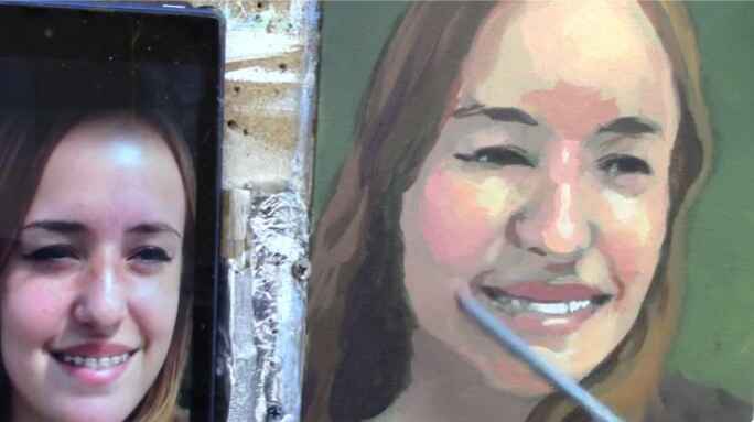
The Secrets on How to Paint Realistic Shadows
Transform your paintings with these 6 steps to perfectly capture shadows.
When it comes to acrylic portrait painting, achieving the right depth and contrast can make all the difference in bringing your artwork to life. One technique that can dramatically enhance the shadows in your painting involves using a color that’s even darker than black: Deoxazine Purple. In this guide, we’ll explore how to incorporate this secret color into your acrylic portraits to create rich, deep shadows that add drama and realism.
Why Deoxazine Purple?
Deoxazine Purple is a unique and intense color that can achieve a darker value than traditional black paints like ivory black or mars black. This color is perfect for creating shadows with a richness that pure black alone can’t provide. While black can sometimes make a painting look flat and lifeless, deoxazine purple adds a subtle complexity, making your shadows appear deeper and more vibrant.
Materials You’ll Need:
- Deoxazine purple acrylic paint
- Ivory Black or Mars black acrylic paint
- Ultramarine blue acrylic paint
- Indian yellow acrylic paint
- Matte medium
- A selection of brushes
Step 1: Preparing Your Palette
Start by preparing your palette with deoxazine purple, ivory black, ultramarine blue, and indian yellow. While you might not use all of these colors immediately, having them on hand will allow you to make adjustments as needed.
Step 2: Mixing the Perfect Shadow Color
Begin by applying deoxazine purple to your palette. Notice how it appears almost black until it’s mixed with a medium or other colors. To create a shadow color that’s darker than black, mix deoxazine purple with a touch of ivory black and ultramarine blue. This combination will produce a rich, dark hue that can be applied in areas where you want the deepest shadows.
For added warmth, incorporate a small amount of Indian Yellow. This step might seem counterintuitive, as yellow is a lighter color, but when mixed with purple, it creates a deep brown that enriches the shadow without lightening the value significantly.
Step 3: Applying the Shadow
Once you’ve mixed your shadow color, it’s time to apply it to your painting. In this example, we’ll be working on a portrait of Paul the apostle in a caravaggio-esque style, emphasizing dramatic contrasts and deep shadows.
Using a soft brush, apply the deoxazine purple mixture to areas where you want the darkest shadows, such as behind the figure or in the folds of clothing. Be mindful of the consistency of the paint; you want it to be slightly thinned with matte medium to allow for smooth blending.
Step 4: Blending for Depth
Blending is key to creating realistic shadows. As you apply the shadow color, blend it outwards to create a gradient effect. This technique helps the shadow transition smoothly into lighter areas, adding depth and volume to the painting.
If the color appears too intense or too purple, you can tone it down by mixing in a bit of ultramarine blue or raw umber. These colors help neutralize the purple, making it blend more naturally with the surrounding areas.
Step 5: Enhancing with Additional Layers
For even more depth, consider adding additional layers of glaze. A glaze is a thin, transparent layer of paint that can be built up gradually to deepen the shadow. In this case, mix a small amount of deoxazine purple with matte medium and apply it over the shadowed areas. Each layer will intensify the shadow, creating a sense of richness and dimension.
Step 6: Final Touches
As you continue working, pay close attention to the balance of colors in your painting. You may need to adjust the warmth or coolness of the shadows by adding small amounts of indian yellow or ultramarine blue. Remember that deoxazine purple is a powerful color, so use it sparingly and with intention.
Once the shadows are in place, you can proceed with refining other areas of the painting, ensuring that the contrast between light and dark enhances the overall composition.
Tips for Success:
- Practice Blending: Blending is essential for achieving smooth transitions between light and shadow. Practice this technique on a separate canvas before applying it to your final piece.
- Use Matte Medium: Matte medium helps to thin the paint without losing its intensity, making it easier to apply and blend multiple layers.
- Experiment with Colors: Don’t be afraid to mix in other colors like Raw Umber or Burnt Sienna to adjust the tone of your shadows. Each painting is unique, and experimentation can lead to discovering the perfect color balance.
Deoxazine purple is a game-changer for artists looking to create shadows that are richer and deeper than traditional black. By mastering this technique, you can add a new level of depth and realism to your acrylic portraits, making them stand out with dramatic contrast and lifelike vibrancy. Whether you’re aiming for a caravaggio-inspired masterpiece or simply want to enhance the shadows in your work, this powerful color will help you achieve your artistic vision.
Yes, you can use my “secret” color to increase the contrast in your acrylic portrait.
One of the best ways to make your portrait “POP” is to give it more contrast. In other words, to make the dark values darker, which in turn, makes the light values look lighter.
And if you can get your darkest values as dark as they can go, that will really help your portrait to look it’s best.
But what do you use? Black is the color most of us artists would reach for. But let me show you another color that works even better…
Watch the video below to learn more how I increase the contrast in your portrait with my secret color.
- Sketching Your Painting Accurately
- Beginning a Pet Portrait in Acrylic
- The Mystery of Realism in Painting
- Apply A Burnt Sienna Glaze to a Portrait
- Learn How to Sketch a Portrait Freehand in 45 Minutes
- Adding highlights to your acrylic painting
- 5 Excellent Reasons to Use Aluminum Foil
- Paint Realistic Wrinkles in Acrylic
- Painting Clothing in an Acrylic Portrait
- Paint a Cloudy Sky Acrylic
- How to add Semi-Opaque Highlights
- How to Enhance the Contrast in Your Acrylic
- How to Add Glaze to Your Acrylic Painting
- Paint Realistic Reflections on Eyeglasses in an Acrylic Portrait
- Build Up Depth on Your Acrylic Portrait Backgrounds
- How Do You Do Layers With the Glazing Technique?
- Learn How to Paint Wrinkles in Acrylic
Read more about how to paint a portrait that you can surely be proud of!
I’d love to hear your thoughts on this video. Please share it with your friends and family. Let me know if you have any further questions. I’ll greatly help you.
If you’d like to learn more, sign up for my free email tips and video class today.
Learn How to Paint Acrylic Portraits With My Free Mini-Video Course!
Thank you so much for taking the time to read this tutorial and watch the video. That means a lot to me. I hope you find it very helpful in your portrait painting.
Yours for Better Portraits,

P.S. Did you find this post helpful or encouraging? If so, send it on ahead! Let others know with the share buttons below. I’d love to hear your comments. Thank you so much! Also, do you have a question on acrylic portrait painting you’d like answered? Let me know, and I’d be happy to help!

How to Paint Titanium White Clothing Highlights
Learn grisaille with expert tips on painting highlights and shadows in Acrylic
A grisaille is a monochromatic painting over a earth-toned ground (background) that you add color glazes on top of. Using my portrait painting of Paul the Apostle praying, I’ll show you how to use a small round brush and make your clothing look realistic with the strategic placement of highlights. You can use this technique in your portraits today!
Painting titanium white clothing highlights in an acrylic grisaille is a technique that adds a remarkable depth and realism to your portraits. In this tutorial, we’ll explore how to turn the form from dark to light using layers of paint, achieving a stunning chiaroscuro effect inspired by the old masters. This guide will walk you through the steps to create lifelike clothing folds and wrinkles, focusing on the careful balance of light and shadow.
Understanding the Grisaille Technique
Grisaille is a monochromatic painting technique often used as a foundation for creating depth and form before adding color. It involves painting in shades of gray to establish the light and dark areas of your composition. This technique is particularly effective when working with acrylics, as it allows for layering and glazing to build up nuanced tones.
Materials You’ll Need
- Titanium White Acrylic Paint
- Raw Umber
- Ultramarine Blue
- Dioxazine Purple
- Burnt Sienna
- Matte Medium
- Small Round Brush
- Flat Brush
Step 1: Laying Down the Foundation
Begin by applying a grisaille layer to your painting surface. This initial layer will serve as the foundation for your highlights and shadows. Mix Raw Umber with a touch of Ultramarine Blue to create a brownish-gray tone, and apply it evenly over your sketch. This underpainting will help guide the placement of your highlights later on.
Step 2: Blocking in the Shadows
Next, focus on the shadow areas of the clothing. Use a mix of Raw Umber, Ultramarine Blue, and Dioxazine Purple to create a deep, rich shadow color. Apply this mixture to the folds and creases of the clothing, emphasizing the areas where light is least likely to reach. This step is crucial for creating the contrast needed to make the highlights pop.
Step 3: Introducing Titanium White Highlights
Now it’s time to add the titanium white highlights. Mix Titanium White with a small amount of raw sienna to warm up the color slightly, preventing it from appearing too stark against the darker tones. Using a small round brush, carefully apply the white paint to the areas where light naturally hits the fabric. Focus on the tops of folds, the edges of wrinkles, and any raised areas that would catch the light.
Step 4: Blending for a Smooth Transition
To achieve a realistic look, it’s essential to blend the highlights into the surrounding shadow areas. Add a touch of matte medium to your palette to thin the white paint, making it more translucent. Gently blend the white into the adjacent darker areas using a flat brush. This blending technique creates a smooth transition between light and dark, enhancing the three-dimensionality of the fabric.
Step 5: Enhancing the Nuances
After the initial highlight layer, take a step back and assess the overall balance of light and dark in your painting. If needed, add additional layers of titanium white to intensify the highlights. Conversely, you can deepen the shadows by glazing over them with a mixture of burnt sienna and raw umber. The key is to build up the layers gradually, allowing each one to dry before applying the next.
Step 6: Fine-Tuning the Details
The final step involves refining the details to bring the fabric to life. Use a small round brush to add sharper highlights to the most prominent areas, such as the edges of folds or the tips of wrinkles. This attention to detail will make the clothing appear crisp and well-defined. For softer areas, use a blending brush to gently feather the edges of the highlights, creating a more subtle transition.
Tips and Techniques
- Use a Reference Photo: Working from a reference photo can help you accurately place the highlights and shadows on the clothing. Study how light interacts with the fabric and try to replicate those effects in your painting.
- Layering: Acrylics dry quickly, so take advantage of this by building up layers of paint to create depth. Start with thinner, more transparent layers and gradually increase the opacity as you refine the details.
- Balance Sharp and Soft Edges: For a realistic effect, balance sharp edges where the light hits the fabric directly with softer edges where the light fades into shadow. This contrast adds dimension to the painting.
- Experiment with Glazes: Glazing allows you to adjust the color temperature and value of your highlights and shadows without losing the underlying detail. Try glazing with burnt sienna to warm up the highlights or with ultramarine blue to cool down the shadows.
- Patience is Key: Achieving realistic highlights and shadows takes time and patience. Don’t rush the process—allow each layer to dry fully before applying the next to avoid muddying the colors.
Mastering the technique of painting titanium white clothing highlights in an acrylic grisaille is a rewarding process that can dramatically improve the realism of your portraits. By carefully layering and blending light and shadow, you can create clothing that appears lifelike and three-dimensional. Practice these techniques, and with time, you’ll find that your portraits take on a new level of depth and sophistication.
Read more about my additional resources, tutorials, to learn more and check out my free courses here. . Whether you’re a beginner or an experienced artist, there’s always something new to learn and apply to your paintings. Happy painting!
- Sketching Your Painting Accurately
- Beginning a Pet Portrait in Acrylic
- The Mystery of Realism in Painting
- Apply A Burnt Sienna Glaze to a Portrait
- Learn How to Sketch a Portrait Freehand in 45 Minutes
- Adding highlights to your acrylic painting
- 5 Excellent Reasons to Use Aluminum Foil
- Paint Realistic Wrinkles in Acrylic
- Painting Clothing in an Acrylic Portrait
- Paint a Cloudy Sky Acrylic
- How to add Semi-Opaque Highlights
- How to Enhance the Contrast in Your Acrylic
- How to Add Glaze to Your Acrylic Painting
- Paint Realistic Reflections on Eyeglasses in an Acrylic Portrait
- Build Up Depth on Your Acrylic Portrait Backgrounds
- How Do You Do Layers With the Glazing Technique?
- Learn How to Paint Wrinkles in Acrylic
Read more about how to paint a portrait that you can surely be proud of!
I’d love to hear your thoughts on this video. Please share it with your friends and family. Let me know if you have any further questions. I’ll greatly help you.
If you’d like to learn more, sign up for my free email tips and video class today.
Learn How to Paint Acrylic Portraits With My Free Mini-Video Course!
Thank you so much for taking the time to read this tutorial and watch the video. That means a lot to me. I hope you find it very helpful in your portrait painting.
Yours for Better Portraits,
P.S. Did you find this post helpful or encouraging? If so, send it on ahead! Let others know with the share buttons below. I’d love to hear your comments. Thank you so much! Also, do you have a question on acrylic portrait painting you’d like answered? Let me know, and I’d be happy to help!

Weird Way How to Apply Gesso to Your Canvas
Most store-bought canvases are not primed very well and can benefit from another layer or two of gesso.
Introduction:
When it comes to preparing a canvas for painting, most artists stick to traditional methods. However, there’s an unconventional technique that can give you a smoother surface and enhance the detail in your work. In this tutorial, we’ll explore a unique way to apply gesso to your canvas using a drywall taping knife. This method not only helps in creating a finer texture but also saves you from extensive sanding later on. Let’s dive into this step-by-step guide.
The Tools You’ll Need:
Before starting, gather the necessary tools and materials. You’ll need:
- Gesso: The base primer for your canvas.
- Matte Medium: Helps to smooth out the gesso and make it more fluid.
- Drywall Taping Knife (6-inch): The star of this method for spreading the gesso evenly.
- Flat Edge Paintbrush: For initial application.
- Yogurt Container: To mix the gesso and matte medium.
- Gloves and Apron: To protect your hands and clothing.
Preparing the Gesso Mixture:
- Mixing the Gesso: Begin by pouring a small amount of gesso into a container—an empty yogurt cup works perfectly. Fill it about a quarter of the way.
- Adding Matte Medium: To ensure a smoother application, add a few squirts of matte medium into the gesso. This addition will make the mixture more fluid, helping it spread more easily across the canvas.
- Stirring: Use a palette knife to thoroughly mix the gesso and matte medium. Ensure the consistency is even, with no lumps or dry spots.
Applying the Gesso:
- Initial Application with a Brush: Dip your flat edge paintbrush into the gesso mixture, and apply it to the top left corner of your canvas. Brush downwards, covering the entire surface. Aim for a generous, even coat.
- Smoothing with the Drywall Taping Knife: After applying the gesso, grab your drywall taping knife. Starting at the top, use even pressure to smooth the gesso down the canvas. Work in long, continuous strokes to avoid leaving streaks or ridges.
- Feathering the Edges: As you work, you may notice ridges forming on the surface. To remove these, lightly graze the surface with the taping knife, using minimal pressure. This technique will help blend the gesso evenly across the canvas.
Troubleshooting Common Issues:
- Dealing with Ridges: If ridges persist, continue feathering them out with the knife. Adjust your pressure as needed, moving from firm to light strokes to achieve a smooth finish.
- Applying Additional Layers: If the first coat is too thin, allow it to dry and then apply a second coat using the same method. This additional layer can further enhance the smoothness of your canvas.
Final Touches:
After the gesso has dried, it’s time to inspect the canvas. Look for any remaining ridges or imperfections. If you find any, lightly sand the surface using a 250 or 300-grit sandpaper. This step will ensure an ultra-smooth finish, ready for painting.
Tips for Success:
- Work Quickly: Gesso can dry fast, especially in a warm environment. To prevent streaks, work swiftly when applying and smoothing the gesso.
- Use the Right Tools: While a larger drywall trowel can be used, a 6-inch taping knife offers better control and precision, especially on smaller canvases.
- Practice Makes Perfect: This technique may take some getting used to, but with practice, you’ll find it easier to achieve a smooth, professional-quality canvas.
Using a drywall taping knife to apply gesso might seem unusual, but it’s a powerful technique for artists seeking a smoother canvas surface. By following these steps, you can minimize brush strokes, reduce the need for sanding, and create a better foundation for your paintings.
Read more about my additional resources, tutorials, to learn more and check out my free courses here. . Whether you’re a beginner or an experienced artist, there’s always something new to learn and apply to your paintings. Happy painting!
- Sketching Your Painting Accurately
- Beginning a Pet Portrait in Acrylic
- The Mystery of Realism in Painting
- Apply A Burnt Sienna Glaze to a Portrait
- Learn How to Sketch a Portrait Freehand in 45 Minutes
- Adding highlights to your acrylic painting
- 5 Excellent Reasons to Use Aluminum Foil
- Paint Realistic Wrinkles in Acrylic
- Painting Clothing in an Acrylic Portrait
- Paint a Cloudy Sky Acrylic
- How to add Semi-Opaque Highlights
- How to Enhance the Contrast in Your Acrylic
- How to Add Glaze to Your Acrylic Painting
- Paint Realistic Reflections on Eyeglasses in an Acrylic Portrait
- Build Up Depth on Your Acrylic Portrait Backgrounds
- How Do You Do Layers With the Glazing Technique?
- Learn How to Paint Wrinkles in Acrylic
Read more about how to paint a portrait that you can surely be proud of!
I’d love to hear your thoughts on this video. Please share it with your friends and family. Let me know if you have any further questions. I’ll greatly help you.
If you’d like to learn more, sign up for my free email tips and video class today.
Learn How to Paint Acrylic Portraits With My Free Mini-Video Course!
Thank you so much for taking the time to read this tutorial and watch the video. That means a lot to me. I hope you find it very helpful in your portrait painting.
Yours for Better Portraits,
P.S. Did you find this post helpful or encouraging? If so, send it on ahead! Let others know with the share buttons below. I’d love to hear your comments. Thank you so much! Also, do you have a question on acrylic portrait painting you’d like answered? Let me know, and I’d be happy to help!

How to Create Contrast in a Chiaroscuro Acrylic Painting
The step-by-step guide to enhancing highlights and shadows
Chiaroscuro, a technique popularized by masters like Caravaggio, is all about the interplay of light and shadow to create a dramatic effect. This method is especially powerful in portrait painting, where it can bring a subject to life with striking realism. In this guide, we’ll explore how to create contrast in a chiaroscuro acrylic painting, focusing on a portrait of Paul the Apostle in prayer. Whether you’re an experienced artist or just beginning your journey with acrylics, this tutorial will help you harness the power of chiaroscuro to add depth and emotion to your work.
1. Preparing Your Palette
To begin, select your colors carefully. For this technique, you’ll need a dark base color like raw umber, mixed with ultramarine blue and a touch of phthalo blue. These hues will form the foundation of your shadows. To add warmth, incorporate a small amount of alizarine crimson. This mix will give you a deep, rich tone that is perfect for building contrast.
Tip: Ensure your colors are well-mixed to avoid any unintended streaks or blotches in your painting. A smooth blend will help you achieve the seamless transitions that are characteristic of chiaroscuro.
2. Applying the First Layer
Start by applying your darkest tones to the areas of deepest shadow. Use a filbert brush to lay down the paint, working in broad strokes that follow the contours of your subject. It’s important to apply the paint lightly at first, gradually building up the intensity of the shadow.
As you work, consider the direction of light in your composition. In this example, the light source is coming from above, creating strong shadows under the eyes, nose, and chin of Paul the Apostle. Emphasize these areas by applying your darkest mix in layers, allowing each layer to dry before adding the next.
Technique: Use a glazing method to create depth in your shadows. Mix a small amount of your base color with a clear matte medium to create a translucent layer. This technique will allow you to build up shadows gradually, achieving a more realistic and dramatic effect.
3. Enhancing the Mid-tones
Once the shadows are established, it’s time to work on the mid-tones. These are the areas where light and shadow meet, creating a smooth transition. For this, you’ll use a slightly lighter version of your base color. Mix in a bit more alizarine crimson and ultramarine blue to warm up the tone.
Apply this mix using diagonal brushstrokes, blending it into the shadowed areas to create a soft gradient. The goal is to ensure that the transition from dark to light is gradual and seamless, enhancing the three-dimensionality of the subject.
Tip: Vary your brushstrokes to add texture and interest. In the initial layers, use vertical strokes to establish the basic forms, then switch to diagonal or horizontal strokes to refine the details.
4. Adding Highlights
The key to a successful chiaroscuro painting is the balance between shadow and light. After establishing your shadows and midtones, the final step is to add highlights. These are the brightest parts of your painting and should be applied sparingly to create maximum contrast.
Use a fine brush and a light color, such as titanium white mixed with a touch of your base color, to apply highlights to areas where the light hits the strongest. In this portrait of Paul the Apostle, the highlights are concentrated on his forehead, the bridge of his nose, and the tops of his cheeks.
Technique: To soften the edges of your highlights and blend them into the surrounding areas, use a dry brush to gently feather the paint outward. This will create a more natural and less harsh transition between light and dark.
5. Final Adjustments
With the highlights in place, step back and assess your work. Look for areas where the contrast can be enhanced or where transitions need to be smoothed out. At this stage, you can also add additional glazes to deepen the shadows or warm up the midtones.
Tip: If you’re finding that some areas of your painting lack depth, try applying another glaze over those sections. A thin layer of raw umber or alizarine crimson can add richness and complexity to your shadows.
Mastering chiaroscuro in acrylic painting requires patience and practice, but the results are well worth the effort. By carefully balancing light and shadow, you can create portraits that are not only realistic but also full of drama and emotion. This technique, inspired by the works of Caravaggio, allows you to breathe life into your subjects and capture the essence of their character.
So, take these tips and techniques, and apply them to your own work. Experiment with different color combinations, brushstrokes, and glazing methods until you find the perfect balance of contrast in your paintings. And remember, the key to chiaroscuro is not just in the darkness, but in the light that shines through.
Read more about my additional resources, tutorials, to learn more and check out my free courses here. . Whether you’re a beginner or an experienced artist, there’s always something new to learn and apply to your paintings. Happy painting!
- Sketching Your Painting Accurately
- Beginning a Pet Portrait in Acrylic
- The Mystery of Realism in Painting
- Apply A Burnt Sienna Glaze to a Portrait
- Learn How to Sketch a Portrait Freehand in 45 Minutes
- Adding highlights to your acrylic painting
- 5 Excellent Reasons to Use Aluminum Foil
- Paint Realistic Wrinkles in Acrylic
- Painting Clothing in an Acrylic Portrait
- Paint a Cloudy Sky Acrylic
- How to add Semi-Opaque Highlights
- How to Enhance the Contrast in Your Acrylic
- How to Add Glaze to Your Acrylic Painting
- Paint Realistic Reflections on Eyeglasses in an Acrylic Portrait
- Build Up Depth on Your Acrylic Portrait Backgrounds
- How Do You Do Layers With the Glazing Technique?
- Learn How to Paint Wrinkles in Acrylic
Read more about how to paint a portrait that you can surely be proud of!
I’d love to hear your thoughts on this video. Please share it with your friends and family. Let me know if you have any further questions. I’ll greatly help you.
If you’d like to learn more, sign up for my free email tips and video class today.
Learn How to Paint Acrylic Portraits With My Free Mini-Video Course!
Thank you so much for taking the time to read this tutorial and watch the video. That means a lot to me. I hope you find it very helpful in your portrait painting.
Yours for Better Portraits,
P.S. Did you find this post helpful or encouraging? If so, send it on ahead! Let others know with the share buttons below. I’d love to hear your comments. Thank you so much! Also, do you have a question on acrylic portrait painting you’d like answered? Let me know, and I’d be happy to help!

How to Fix a Portrait if You’re Not Happy
Improve your acrylic portraits with in 30 minutes
Introduction: Mistakes Happen – Here’s How to Fix Them
Even the most experienced artists encounter moments where a painting doesn’t turn out as planned. It’s easy to feel frustrated when your portrait lacks the desired realism or proportions. In this post, I’ll guide you through the process of fixing a portrait that you’re not entirely happy with. Whether it’s adjusting skin tones or correcting facial features, you’ll learn techniques to elevate your painting and bring it closer to your artistic vision.
Step 1: A Fresh Start—Assess and Plan
Before diving in with your paintbrush, take a moment to analyze what needs improvement. Do the eyes look slightly off? Are the skin tones muddy or too stark? Evaluating your painting will help you focus on the areas requiring attention.
I revisited a previously completed 30-minute portrait. By carefully studying the face, I noticed that the distance between the eyebrows and eyes was too wide, affecting the overall likeness. Correcting proportions and refining features, even after the initial work, is a natural part of the artistic process.
Tip: Use a reference image if you feel lost. This will provide a clearer idea of the adjustments needed, whether it’s the shape of the jawline or skin tone shading.
Step 2: Adjusting Facial Features for Realism
One of the most common issues in portrait painting is inaccurate proportions, especially in the facial features. If the distance between the eyes and eyebrows seems off, it can throw the whole portrait out of balance.
In this portrait, I focused on fixing the eyes and the eyebrows. To start, I used a mix of ivory black and ultramarine blue to redefine the upper eyelid crease. Adding burnt sienna helped tone down the color and add depth. By lowering the eyebrow closer to the eye, the facial expression and overall likeness began to improve dramatically.
Technique: Use a fine, pointed brush for precise work when adjusting the eyes or eyebrows. This will allow you to get clean lines and maintain control over your modifications.
Step 3: Enhancing Skin Tones – Achieving a Natural Glow
Skin tones can be tricky, especially if they’ve turned out too blotchy or chalky. In the video, I needed to soften some areas of the skin while adding warmth to others.
To begin, I mixed titanium white with burnt sienna and raw umber dark to create a base skin tone. Gradually, I added Indian yellow and pyrrole orange to warm up the flesh tones, especially in the forehead and cheeks. This layering technique added a gradient effect, bringing dimension and life to the face.
Tip: When lightening skin tones, avoid using too much white alone, as it can create a chalky effect. Instead, mix in warm colors like Indian yellow or pyrrole orange to maintain a natural appearance.
Step 4: Blending Techniques – Wet on Wet for Smooth Transitions
Blending is an essential skill in acrylic painting, especially when you’re working to fix areas that feel too harsh or unblended. In this portrait, I used the wet-on-wet technique to merge the darker and lighter skin tones. This technique involves working while the paint is still wet, allowing for a seamless transition between colors.
For the neck and chest area, I first applied a base of titanium white mixed with burnt sienna and added raw umber dark for depth. Once the base was down, I blended the colors softly using the edge of a filbert brush. The result was a smoother, more realistic look with better depth and shadow.
Technique: When blending, use a light touch and work in small, circular motions. Don’t press too hard, as this can smear the paint and create unwanted streaks.
Step 5: Adding Highlights – Avoid Chalkiness
Highlights are the final touch that can make your portrait pop. However, it’s essential to be careful with color selection. Adding too much pure white can lead to an unnatural, chalky finish.
In the video, I used a combination of titanium white and Indian yellow for my highlights. The Indian yellow helped to maintain a warmer, more natural glow while still brightening the areas where light would naturally hit, like the forehead and upper cheeks.
Tip: Always mix a bit of a warm color like Indian yellow into your white when applying highlights. This prevents your highlights from looking too stark and helps them blend more harmoniously with the skin tones.
Step 6: Finishing Touches – Fine Details for Likeness
Once the main adjustments have been made, it’s time to step back and look at the fine details. Small tweaks, such as redefining the lips or jawline, can significantly impact the overall realism of the portrait.
In this painting, I worked on refining the jawline using a mix of titanium white and burnt sienna to correct the shape. Subtle strokes on the chin and cheek areas created more depth and better symmetry, which enhanced the likeness of the subject.
Technique: When working on finishing touches, use a small round brush for precision and apply paint sparingly. These final strokes can define your portrait and give it the polished look you desire.
Embrace the Process of Refinement
Fixing a portrait doesn’t have to be a daunting task. In fact, it’s an opportunity to enhance your skills and gain confidence as an artist. By using techniques such as adjusting proportions, improving skin tones, and mastering blending, you can breathe new life into your painting. The key is to approach your work with patience and an open mind, embracing the process of continuous improvement.
If you’re interested in more portrait painting tips, be sure to check out my free guide on fixing muddy skin tones. You’ll learn how to overcome common color mixing issues and elevate your acrylic portraits.
- Sketching Your Painting Accurately
- Beginning a Pet Portrait in Acrylic
- The Mystery of Realism in Painting
- Apply A Burnt Sienna Glaze to a Portrait
- Learn How to Sketch a Portrait Freehand in 45 Minutes
- Adding highlights to your acrylic painting
- 5 Excellent Reasons to Use Aluminum Foil
- Paint Realistic Wrinkles in Acrylic
- Painting Clothing in an Acrylic Portrait
- Paint a Cloudy Sky Acrylic
- How to add Semi-Opaque Highlights
- How to Enhance the Contrast in Your Acrylic
- How to Add Glaze to Your Acrylic Painting
- Paint Realistic Reflections on Eyeglasses in an Acrylic Portrait
- Build Up Depth on Your Acrylic Portrait Backgrounds
- How Do You Do Layers With the Glazing Technique?
- Learn How to Paint Wrinkles in Acrylic
Read more about how to paint a portrait that you can surely be proud of!
I’d love to hear your thoughts on this video. Please share it with your friends and family. Let me know if you have any further questions. I’ll greatly help you.
If you’d like to learn more, sign up for my free email tips and video class today.
Learn How to Paint Acrylic Portraits With My Free Mini-Video Course!
Thank you so much for taking the time to read this tutorial and watch the video. That means a lot to me. I hope you find it very helpful in your portrait painting.
Yours for Better Portraits,
P.S. Did you find this post helpful or encouraging? If so, send it on ahead! Let others know with the share buttons below. I’d love to hear your comments. Thank you so much! Also, do you have a question on acrylic portrait painting you’d like answered? Let me know, and I’d be happy to help!

How to Paint Thoughtful Man in White: 30-Minute Portrait
Back to doing another 30-minute acrylic portrait, where I paint an Alla Prima portrait in about half an hour.
Introduction:
Acrylic portrait painting doesn’t have to be a long, drawn-out process. In this tutorial, we’ll guide you through painting a thoughtful man in white in just 30 minutes. Using basic acrylic colors and simple techniques, you’ll be able to create a striking, realistic portrait, even if you’re short on time. Whether you’re an experienced artist looking for a quick exercise or a beginner learning the basics, this step-by-step process will help you loosen up and enjoy the painting experience.
Materials You’ll Need:
- Acrylic Paints: Burnt sienna, raw sienna, ultramarine blue, pyrrole orange, alizarine crimson, indian yellow, titanium white, matte medium, Ivory black
- Brushes: Ranging from ¾ inch flat to small size 2 rounds
- Palette
- Canvas or Hardboard
Step 1: Block in the Form
Before diving into the finer details, it’s essential to block in the basic shapes and composition of the face. Begin by taking some raw umber dark mixed with matte medium to sketch the outline of the portrait. Using a flat brush, loosely shape the head, focusing on the angles of the facial structure. This stage should remain simple, allowing you to visualize the placement of major features such as the eyes, nose, and mouth.
Key Tip: Don’t worry about precision here—keep your brushstrokes loose and expressive. This helps you to map out the portrait without getting bogged down by small details.
Step 2: Blocking in the Shadows
Once the form is in place, it’s time to focus on the shadows. Mix burnt umber dark with titanium white and a bit of ivory black to create an opaque shadow color. Apply this mixture to areas that are in shadow, such as the left side of the face, under the eyes, and along the nose. This will add depth and contrast, essential for creating a dynamic portrait.
The technique here is reminiscent of chiaroscuro, where light and dark areas are emphasized to create a dramatic effect. Block in the shadows confidently, using bold brushstrokes to establish the form.
Key Tip: Don’t shy away from using darker tones early on. Acrylic paint dries quickly, so building layers can enhance the depth and texture of the painting.
Step 3: Adding Mid-tone Colors
After the shadows are established, it’s time to build the mid-tones, the colors between the darkest shadows and the brightest highlights. Start by mixing titanium white, raw sienna, pyrrole orange, and indian yellow to create a vibrant flesh tone. Adjust the mixture with burnt sienna for darker areas and natural crimson for warmth.
Apply these mid-tones to the face, paying attention to the areas where the light transitions from shadow. The left side should be slightly darker, while the right side, where the light hits, will be lighter. This will give the face dimension and form, making the portrait appear more lifelike.
Key Tip: Use smooth, even strokes when applying mid-tones to maintain a realistic texture. Acrylic paint can be layered easily, so work in gradual transitions from shadow to light.
Step 4: Refining the Details
Now that the base layers are in place, it’s time to refine the details. Add darker tones around the eyes and nose to define the facial structure. For example, darken the area between the eyebrow and the eye socket to create a natural fold. Use a smaller brush to add fine lines and define the contours of the lips and nasolabial fold.
To finish, add small highlights on the right side of the face, especially on the cheekbones, nose, and upper lip. These highlights should be applied sparingly to avoid overpowering the portrait.
Key Tip: Refining doesn’t mean over-detailing. Keep the brushstrokes purposeful and expressive, focusing only on key areas to maintain the loose, painterly feel of the piece.
Step 5: Final Touches
With just a few minutes left on the timer, step back and evaluate your portrait. Are the contrasts between light and shadow strong enough? Does the portrait convey the expression and mood you intended? This is the time to make quick adjustments, such as deepening shadows or adding a bit more brightness to the highlights.
Remember, the goal of this exercise is not perfection but rather to explore a fast, expressive approach to portrait painting.
Key Tip: If you find any areas too intense, simply blend them out with a clean brush and matte medium. This technique softens transitions and adds a professional touch to your artwork.
Completing a thoughtful man’s portrait in just 30 minutes is a great way to practice and improve your acrylic painting skills. This quick exercise allows you to work on shadow, form, and mid-tone application, while also honing your ability to observe and simplify complex details. The best part? You can keep coming back to this technique, each time improving your speed and accuracy.
Tips & Techniques:
Use Bold Brushstrokes: Especially in the blocking stages, don’t hesitate to be bold and expressive with your brushwork.
Use Matte Medium: To keep the paint flexible and transparent when needed.
Work from Dark to Light: Establish shadows first, then build up mid-tones and highlights.
Pay Attention to Light Source: Always keep the direction of light in mind to maintain consistency.
Read more about my additional resources, tutorials, to learn more and check out my free courses here. . Whether you’re a beginner or an experienced artist, there’s always something new to learn and apply to your paintings. Happy painting!
- Sketching Your Painting Accurately
- Beginning a Pet Portrait in Acrylic
- The Mystery of Realism in Painting
- Apply A Burnt Sienna Glaze to a Portrait
- Learn How to Sketch a Portrait Freehand in 45 Minutes
- Adding highlights to your acrylic painting
- 5 Excellent Reasons to Use Aluminum Foil
- Paint Realistic Wrinkles in Acrylic
- Painting Clothing in an Acrylic Portrait
- Paint a Cloudy Sky Acrylic
- How to add Semi-Opaque Highlights
- How to Enhance the Contrast in Your Acrylic
- How to Add Glaze to Your Acrylic Painting
- Paint Realistic Reflections on Eyeglasses in an Acrylic Portrait
- Build Up Depth on Your Acrylic Portrait Backgrounds
- How Do You Do Layers With the Glazing Technique?
- Learn How to Paint Wrinkles in Acrylic
Read more about how to paint a portrait that you can surely be proud of!
I’d love to hear your thoughts on this video. Please share it with your friends and family. Let me know if you have any further questions. I’ll greatly help you.
If you’d like to learn more, sign up for my free email tips and video class today.
Learn How to Paint Acrylic Portraits With My Free Mini-Video Course!
Thank you so much for taking the time to read this tutorial and watch the video. That means a lot to me. I hope you find it very helpful in your portrait painting.
Yours for Better Portraits,
P.S. Did you find this post helpful or encouraging? If so, send it on ahead! Let others know with the share buttons below. I’d love to hear your comments. Thank you so much! Also, do you have a question on acrylic portrait painting you’d like answered? Let me know, and I’d be happy to help!

How to Sketch Realistic Clothing Wrinkles
Learn to draw realistic clothing wrinkles: Tips and techniques for acrylic portrait
Introduction
Creating realistic clothing wrinkles in a sketch is a critical skill for acrylic portrait artists. Wrinkles add depth and dimension, helping the artwork come to life. This guide will teach you how to observe, refine, and accurately draw clothing wrinkles, focusing on natural flow and texture. Whether you’re working on a complex commission or enhancing a personal project, these tips will guide you through each step to ensure a realistic rendering.
Step 1: Refining the Sketch
After tracing your initial sketch, it’s essential to refine the details, especially when it comes to clothing wrinkles. Often, the projection or reference might miss finer details, so you’ll need to manually adjust them.
Tips:
- Review the form carefully and adjust the lines to match the reference image.
- Avoid sticking to rigid, straight lines. Clothing wrinkles follow the body’s contours and should reflect natural flow.
- When refining, aim for wishbone or triangular shapes. Wrinkles often create these forms, adding visual depth.
Step 2: Avoiding Patterns
One of the most common mistakes in sketching wrinkles is creating a uniform pattern. Realistic wrinkles are irregular, varying in shape, length, and direction. Your goal is to break the pattern to achieve a more lifelike appearance.
Techniques to Avoid Patterns:
- Observe the reference closely. Pay attention to the differences in angles, lengths, and spacing between the wrinkles.
- As you draw, ensure the wrinkles vary in both angle and intensity. This will prevent them from looking too mechanical.
- Keep the lines dynamic and natural. Wrinkles don’t follow perfect geometric patterns in real life.
Step 3: Creating Contours and Seams
Edges play a significant role in achieving realism. Focus not only on the inner shapes of the wrinkles but also on the contours—the edges where the fabric meets the body. Seams, such as those at the end of sleeves or edges of garments, add important detail.
Tips:
- Create subtle deviations along the seams, as they rarely appear perfectly straight.
- Use thin lines to outline seams and adjust them as necessary to follow the fabric’s natural flow.
Step 4: Capturing Key Wrinkle Types
Wrinkles form in different directions and areas of clothing, such as across the chest, waist, or arms. They behave differently depending on the pose and tension of the fabric.
Key Areas to Focus On:
- Armpit to Shoulder: Wrinkles radiate from the armpit and spread upwards, often creating complex shapes across the shoulder.
- Abdomen and Waist: These wrinkles are usually horizontal but vary greatly based on body position and movement.
- Sleeves and Arms: Sleeves tend to bunch up near the elbows and wrists, creating horizontal or diagonal creases.
Pay attention to the reference image and ensure you capture these subtle yet crucial details to enhance the overall realism.
Step 5: Adding Final Details
Once the basic forms of the wrinkles are in place, refine the sketch by adding finishing touches. This includes subtle changes in the contour, small wrinkles that add texture, and adjusting the flow of fabric to match the body.
Final Refinement Techniques:
- Use a lighter touch to add smaller, finer lines that follow the overall wrinkle flow.
- Pay attention to how light interacts with the fabric. Wrinkles create shadows that help define the form, so consider how the fabric might look in different lighting.
- Adjust the width of lines in areas where the fabric folds tighter or where the tension is less.
Bonus Section: Drawing Realistic Hands in Your Sketch
Clothing wrinkles are not the only detail that makes a portrait realistic. Hands are another vital area to focus on, especially when they interact with clothing.
Hand Sketching Tips:
- Pay attention to the perspective of the hand. Ensure that fingers follow the right length and angle.
- Consider adding rings or other details like fingernails to increase realism.
- Sketch veins, tendons, and other small details that give the hands a lifelike appearance.
Incorporating these extra details will enhance your overall portrait, adding a sense of depth and texture.
Step 6: Double-Checking the Proportions
When finalizing your sketch, it’s essential to double-check the proportions. Even small adjustments to wrinkle placement can dramatically change the overall look of the portrait. Use the reference image to ensure everything aligns correctly.
Proportional Adjustment Tips:
- Break down the image into sections. Compare wrinkle placement with other reference points, like the body’s form or other folds.
- Measure distances between key wrinkles and adjust as necessary to create a balanced, proportional sketch.
Sketching realistic clothing wrinkles can make a significant difference in the overall quality of your acrylic portrait. By focusing on refining the form, avoiding patterns, creating accurate contours, and paying attention to lighting and texture, your wrinkles will appear natural and lifelike. Keep practicing these techniques to master the art of sketching wrinkles in your portrait paintings.
Read more about my additional resources, tutorials, to learn more and check out my free courses here. . Whether you’re a beginner or an experienced artist, there’s always something new to learn and apply to your paintings. Happy painting!
- Sketching Your Painting Accurately
- Beginning a Pet Portrait in Acrylic
- The Mystery of Realism in Painting
- Apply A Burnt Sienna Glaze to a Portrait
- Learn How to Sketch a Portrait Freehand in 45 Minutes
- Adding highlights to your acrylic painting
- 5 Excellent Reasons to Use Aluminum Foil
- Paint Realistic Wrinkles in Acrylic
- Painting Clothing in an Acrylic Portrait
- Paint a Cloudy Sky Acrylic
- How to add Semi-Opaque Highlights
- How to Enhance the Contrast in Your Acrylic
- How to Add Glaze to Your Acrylic Painting
- Paint Realistic Reflections on Eyeglasses in an Acrylic Portrait
- Build Up Depth on Your Acrylic Portrait Backgrounds
- How Do You Do Layers With the Glazing Technique?
- Learn How to Paint Wrinkles in Acrylic
Read more about how to paint a portrait that you can surely be proud of!
I’d love to hear your thoughts on this video. Please share it with your friends and family. Let me know if you have any further questions. I’ll greatly help you.
If you’d like to learn more, sign up for my free email tips and video class today.
Learn How to Paint Acrylic Portraits With My Free Mini-Video Course!
Thank you so much for taking the time to read this tutorial and watch the video. That means a lot to me. I hope you find it very helpful in your portrait painting.
Yours for Better Portraits,
P.S. Did you find this post helpful or encouraging? If so, send it on ahead! Let others know with the share buttons below. I’d love to hear your comments. Thank you so much! Also, do you have a question on acrylic portrait painting you’d like answered? Let me know, and I’d be happy to help!

AMAZING Way to SHIP a Painting
I’ll show you my amazing way to ship a painting that will definitely save time and money.
Ditch the cardboard and bubble wrap! Let me show you how to ship your painting in a way that will not only save you time and money, but will actually protect it better than the usual packaging.
DISCLAIMER: This method works only for unframed paintings 24″ x 30″ and smaller. Use at your own risk. I cannot be held responsible for damage to your artwork while shipping. I have personally used this method for over five years, and it works great.
- Sketching Your Painting Accurately
- Beginning a Pet Portrait in Acrylic
- The Mystery of Realism in Painting
- Apply A Burnt Sienna Glaze to a Portrait
- Learn How to Sketch a Portrait Freehand in 45 Minutes
- Adding highlights to your acrylic painting
- 5 Excellent Reasons to Use Aluminum Foil
- Paint Realistic Wrinkles in Acrylic
- Painting Clothing in an Acrylic Portrait
- Paint a Cloudy Sky Acrylic
- How to add Semi-Opaque Highlights
- How to Enhance the Contrast in Your Acrylic
- How to Add Glaze to Your Acrylic Painting
- Paint Realistic Reflections on Eyeglasses in an Acrylic Portrait
- Build Up Depth on Your Acrylic Portrait Backgrounds
- How Do You Do Layers With the Glazing Technique?
- Learn How to Paint Wrinkles in Acrylic
Read more about how to paint a portrait that you can surely be proud of!
I’d love to hear your thoughts on this video. Please share it with your friends and family. Let me know if you have any further questions. I’ll greatly help you.
If you’d like to learn more, sign up for my free email tips and video class today.
Learn How to Paint Acrylic Portraits With My Free Mini-Video Course!
Thank you so much for taking the time to read this tutorial and watch the video. That means a lot to me. I hope you find it very helpful in your portrait painting.
Yours for Better Portraits,
P.S. Did you find this post helpful or encouraging? If so, send it on ahead! Let others know with the share buttons below. I’d love to hear your comments. Thank you so much! Also, do you have a question on acrylic portrait painting you’d like answered? Let me know, and I’d be happy to help!

How to Paint Dark Shadows on Acrylic Grisaille
Blocking in dark values: step-by-Step process
Introduction to Painting Dark Shadows in Acrylic Grisaille
Acrylic grisaille is a painting technique that involves creating a monochromatic underpainting, often using shades of gray, before adding layers of color. In this tutorial, we’ll focus on blocking in dark shadows to bring depth and contrast to your acrylic painting. Whether you’re aiming for a tenebristic style like Caravaggio or simply want to add drama to your artwork, understanding how to paint dark shadows is crucial for enhancing realism.
Tools and Materials You Will Need
Before diving into the painting process, ensure you have the following materials:
- Raw umber dark, ultramarine blue, burnt sienna, and alizarine crimson acrylic paints
- Matte medium for thinning paint
- Various flat brushes, including a 5/8 flat brush for detail work
- A palette knife for mixing paints
- A well-lit workspace and a stool to avoid glare
- A reference photo or sketch to guide your shadow placement
Mixing the Perfect Dark Color for Shadows
Start by mixing a dark, rich color for the shadows. Combine raw umber dark and ultramarine blue to create a deep, cool tone. Adding a bit of burnt sienna helps warm the mixture, while a touch of alizarine crimson introduces a subtle richness. Adjust the ratio of colors based on the specific mood or temperature of the scene.
For instance, in this tutorial, a cooler shadow effect was achieved by increasing the ultramarine blue. The result is a dark yet balanced tone that complements the highlights added later.
Blocking in Dark Values: Step-by-Step Process
Begin blocking in the dark values with a larger flat brush. Load your brush generously with the mixed shadow color, and apply it in bold strokes. As demonstrated, this approach works especially well for areas requiring significant contrast, such as the space around Paul the Apostle in this painting.
When cutting around specific features, such as the clothing and hair, be mindful of leaving some negative space. This ensures you can refine the details later without having to repaint the base.
Additionally, remember that acrylics dry quickly, so work efficiently to smooth out the paint before it sets. If any areas dry prematurely, you can always add another layer to even out the tones.
Blending Techniques for Smooth Transitions
Acrylic paint often dries with hard edges, especially when applying darker shades. To prevent this, blend the shadows using diagonal brush strokes. As seen in the demonstration, transitioning between dark and light areas is smoother when using less brush pressure towards the lighter sections.
Use matte medium to thin the paint slightly, allowing more time to blend before it dries. Work in sections and be prepared to layer additional coats if necessary to avoid choppy areas. For the ultimate smoothness, blend back and forth in different directions.
Adding Detail to Create Depth and Contrast
Once the primary shadows are in place, focus on adding smaller details to build depth. Switch to a smaller brush, such as a 5/8 flat, to refine wrinkles in fabric or the curvature of objects in the scene. For example, the shadows in Paul’s clothing and the background elements, like the table and scroll, help emphasize the contrast between light and dark.
Ensure the shadows align with the light source in your painting. In this case, the light enters from a window, so shadows naturally fall on the opposite side of the figure.
Final Touches and Highlights for a Dramatic Effect
With the dark shadows blocked in, the next step is refining the overall composition by adding subtle highlights. This adds dimension and makes the painting come to life. For a tenebristic effect, keep the contrast stark, allowing the dark shadows to enhance the illuminated areas dramatically.
Don’t be afraid to go back and adjust any areas that may need more shadow or blending. Continue to smooth the paint with diagonal strokes to maintain a natural look.
Common Mistakes to Avoid When Painting Shadows
- Using too much water: While thinning paint is essential for blending, avoid over-diluting the paint, as this can lead to unwanted transparency.
- Hard edges everywhere: Without blending properly, hard edges can make the painting look flat. Be strategic about where to leave hard edges for contrast and where to soften them for realism.
- Rushing the drying process: Allow the paint to dry in stages. This is especially important when adding multiple layers of shadows. If the paint is not fully dry, it may smudge or create uneven textures.
- Ignoring the light source: Shadows must fall consistently with the light source in your scene. Always keep this in mind to avoid unrealistic shadow placement.
Painting dark shadows on an acrylic grisaille can elevate your artwork by creating depth, contrast, and drama. Through careful color mixing, strategic blending, and attention to detail, you can achieve a sophisticated look that mimics the style of the Old Masters. Practice these techniques, and soon, your paintings will have a professional, realistic feel that captures the eye of every viewer.
- Sketching Your Painting Accurately
- Beginning a Pet Portrait in Acrylic
- The Mystery of Realism in Painting
- Apply A Burnt Sienna Glaze to a Portrait
- Learn How to Sketch a Portrait Freehand in 45 Minutes
- Adding highlights to your acrylic painting
- 5 Excellent Reasons to Use Aluminum Foil
- Paint Realistic Wrinkles in Acrylic
- Painting Clothing in an Acrylic Portrait
- Paint a Cloudy Sky Acrylic
- How to add Semi-Opaque Highlights
- How to Enhance the Contrast in Your Acrylic
- How to Add Glaze to Your Acrylic Painting
- Paint Realistic Reflections on Eyeglasses in an Acrylic Portrait
- Build Up Depth on Your Acrylic Portrait Backgrounds
- How Do You Do Layers With the Glazing Technique?
- Learn How to Paint Wrinkles in Acrylic
Read more about how to paint a portrait that you can surely be proud of!
I’d love to hear your thoughts on this video. Please share it with your friends and family. Let me know if you have any further questions. I’ll greatly help you.
If you’d like to learn more, sign up for my free email tips and video class today.
Learn How to Paint Acrylic Portraits With My Free Mini-Video Course!
Thank you so much for taking the time to read this tutorial and watch the video. That means a lot to me. I hope you find it very helpful in your portrait painting.
Yours for Better Portraits,
P.S. Did you find this post helpful or encouraging? If so, send it on ahead! Let others know with the share buttons below. I’d love to hear your comments. Thank you so much! Also, do you have a question on acrylic portrait painting you’d like answered? Let me know, and I’d be happy to help!

How to Paint Hands in Your Acrylic Portrait
Achieving the realism in painting hands with acrylic glazing techniques
Painting hands in acrylic portraits can be a challenging but rewarding process. Hands convey emotions, tell stories, and often present unique features such as wrinkles, tendons, and veins. In this tutorial, we’ll explore how to approach painting hands using acrylics, focusing on shading, blending, and capturing lifelike details. We will use the glazing technique, where layers of translucent paint are applied to gradually build depth and form.
Step 1: Preparing Your Colors
Before diving into the painting process, it’s crucial to have a well-prepared palette. The artist in this demonstration uses a combination of matte medium with colors like burnt sienna, raw umber dark, and raw sienna. These muted earth tones provide an excellent base for the shadows and overall structure of the hand.
By starting with a medium tint, you will lay down the foundation of the shadows. This is important because it allows the translucent layers to blend seamlessly and enhances the overall realism of the hand.
Step 2: Building Shadows and Wrinkles
Wrinkles, tendons, and veins on hands often give character and realism to a portrait. In the video, the painter carefully studies the reference photo, noting details like transverse tendons and blood vessels. By slowly applying layers of glaze, these elements are gradually brought to life.
- Tip: Use a small round brush and carefully strengthen the shadows on the hand. This method helps create depth and subtle distinctions, ensuring the hand doesn’t look flat.
As you work, focus on not overdoing the wrinkles. It’s important to capture them delicately, as overemphasizing them can detract from the natural appearance of the hand. Some softening will allow you to keep the realism while maintaining a pleasing aesthetic.
Step 3: Defining Form with Subtle Shading
In painting hands, value plays a significant role in distinguishing between areas like the fingers, knuckles, and palm. The artist emphasizes that value—rather than simply lines—creates realistic separations. For example, shading the knuckles can give them a more prominent appearance, while softer shadows can define the fingers’ thickness.
- Technique: Gently darken areas where shadows naturally fall, such as beneath the fingers and between the knuckles. This will provide dimension and realism to the hands.
Additionally, when painting hands in a portrait, it’s important to pay attention to the interaction between objects. For instance, in this artwork, the man’s hand is holding his wife’s. The shading of his fingers gives weight and solidity to the interaction between the two subjects.
Step 4: Capturing Skin Tones
Getting the right skin tone is essential for making your hand painting realistic. In this portrait, the artist uses a variety of colors, including raw sienna and titanium white, to lighten areas and add more lifelike tones. While painting, observe your reference photo closely. Hands, especially aged hands, may feature more reddish tones around the knuckles and fingertips due to visible blood vessels.
- Tip: Mixing Pyrrole orange and alizarine crimson adds warmth and redness to areas of the hand, which helps balance the cooler, more neutral colors used in the rest of the portrait.
Another key consideration is the variation of tones within the hand itself. For instance, the artist explains that the fingers might appear more pink due to the underlying capillaries, while the arm closer to the hand can have a tanned or yellowish hue. These subtle changes in color help create a more believable and engaging portrait.
Step 5: Layering Glazes for Nuanced Details
The glazing technique allows you to build layers of paint without overwhelming the surface. It’s a process that takes time but offers excellent control over the final result.
- Technique: Dilute your chosen color with matte medium to create a glaze, then apply it gradually over the surface of the hand. This technique enables you to deepen shadows, highlight wrinkles, and blend transitions between different parts of the hand.
I added a subtle reddish tint to the fingertips using a diluted glaze. This not only adds color but also sculpts the fingers’ shape by creating depth. The fingers are distinct from the palm and arm due to their warmth, helping convey realism.
Step 6: Refining Wrinkles and Adding Final Details
As you near the end of the painting, focus on refining the small details, such as individual wrinkles and knuckle highlights. The artist mentions not overloading the portrait with too many wrinkles, as it could overwhelm the subject and make the hand appear unnatural. A balance of soft and strong lines is key to realism.
- Tip: Use a small amount of raw sienna and titanium White to lighten certain areas where skin stretches, such as on the knuckles or palm. This highlights the hand’s structure and adds dimension to the portrait.
If there are specific features like rings or fingernails, take the time to suggest their form subtly without overworking them. Remember, the goal is to add just enough detail to convey the subject’s hands realistically without creating an overly defined or stiff appearance.
Final Thoughts: Patience and Observation
Painting hands can be a meticulous process, but the key is patience. As the video demonstrates, frequent observation of your reference photo is essential. In fact, aiming to look at your reference for 50% of the time while painting can dramatically improve your results.
As you work, remember to use glazes to create soft transitions, deepen shadows, and build up details gradually. The end result will be a set of hands that not only look realistic but also convey the unique characteristics of the person being painted.
By focusing on glazing techniques, careful shading, and attention to skin tones, you can master the art of painting hands in acrylic. Whether you’re painting wrinkled hands full of character or smooth, youthful hands, these techniques will help you create lifelike, detailed portraits.
Watch my free tutorial to learn more about how to paint hands in your acrylic portrait.
- Sketching Your Painting Accurately
- Beginning a Pet Portrait in Acrylic
- The Mystery of Realism in Painting
- Apply A Burnt Sienna Glaze to a Portrait
- Learn How to Sketch a Portrait Freehand in 45 Minutes
- Adding highlights to your acrylic painting
- 5 Excellent Reasons to Use Aluminum Foil
- Paint Realistic Wrinkles in Acrylic
- Painting Clothing in an Acrylic Portrait
- Paint a Cloudy Sky Acrylic
- How to add Semi-Opaque Highlights
- How to Enhance the Contrast in Your Acrylic
- How to Add Glaze to Your Acrylic Painting
- Paint Realistic Reflections on Eyeglasses in an Acrylic Portrait
- Build Up Depth on Your Acrylic Portrait Backgrounds
- How Do You Do Layers With the Glazing Technique?
- Learn How to Paint Wrinkles in Acrylic
Read more about how to paint a portrait that you can surely be proud of!
I’d love to hear your thoughts on this video. Please share it with your friends and family. Let me know if you have any further questions. I’ll greatly help you.
If you’d like to learn more, sign up for my free email tips and video class today.
Learn How to Paint Acrylic Portraits With My Free Mini-Video Course!
Thank you so much for taking the time to read this tutorial and watch the video. That means a lot to me. I hope you find it very helpful in your portrait painting.
Yours for Better Portraits,
P.S. Did you find this post helpful or encouraging? If so, send it on ahead! Let others know with the share buttons below. I’d love to hear your comments. Thank you so much! Also, do you have a question on acrylic portrait painting you’d like answered? Let me know, and I’d be happy to help!