Category Archives for Shading

How to Paint Short Silver Hair in your Acrylic
Discover the secrets to painting realistic short silver hair using the acrylic glazing technique for depth, vibrance, and seamless blending.
Painting realistic short silver hair in acrylic can seem challenging, but with the right techniques, it becomes manageable and rewarding. In this tutorial, I will guide you step-by-step on how to apply the acrylic glazing technique to capture the softness, shine, and texture of silver hair. Whether you’re a beginner or an experienced artist, mastering this technique will help you create stunning portraits with depth and vibrance. We will focus on blending shades, adding highlights, and building subtle nuances for a natural-looking effect.
Understanding Acrylic Glazing for Hair
Acrylic glazing is an essential technique for adding layers of semi-transparent color over your base. By layering different shades, you can achieve depth and a lifelike sheen, perfect for capturing the essence of silver hair. Instead of trying to nail every detail in one go, glazing allows you to build the portrait gradually, adding complexity with each new layer.
Tips for Acrylic Glazing:
- Use a mix of acrylic matte medium with your paint to create a smooth, translucent layer.
- Work with a soft, fine brush to ensure smooth transitions between shades.
- Build layers slowly, allowing each one to dry before adding the next for better control over color depth.
Choosing Your Color Palette
When painting short silver hair, selecting the right color palette is essential. Although silver is often seen as a neutral tone, it actually contains a mixture of hues such as cool blues, grays, and even some warmer tones to reflect light.
For this tutorial, the palette includes:
- Titanium White: For bright highlights and reflective areas.
- Burnt Umber: To add warmth and contrast in the shadows.
- Raw Umber: For mid-tones and foundational shading.
- Ultramarine Blue: Helps cool down areas and enhance the silver effect.
- Alizarine Crimson: Adds subtle warmth and depth.
Tip: Always test your color combinations on a palette before applying them to the canvas. Mix small amounts to see how they interact under different lighting conditions.
Step-by-Step Guide to Painting Short Silver Hair
1. Start with the Underpainting
Before you apply any details, establish a base using a neutral underpainting. This is where you define the overall shapes and contours of the hair. For silver hair, use a mix of raw umber and titanium white to sketch out the general flow and placement of the hair strands. Remember to think of hair not as individual strands but as groups of shapes and shadows.
Technique Tip: Use a soft filbert brush to apply the underpainting in smooth, broad strokes. This will help create a soft foundation for the subsequent layers.
2. Building Mid-Tones with Glazing
Once the underpainting is dry, begin adding mid-tones using the acrylic glazing technique. Mix ultramarine blue and burnt umber with a small amount of matte medium to create a semi-transparent glaze. This mixture will give your hair a cool, metallic feel. Apply the glaze over the darker areas, building the transition from shadow to light.
Technique Tip: Apply the glaze in thin layers, allowing each coat to dry before adding another. This will help create depth and prevent the colors from becoming too muddy or opaque.
3. Adding Highlights
Silver hair catches light in unique ways, often appearing more reflective than other hair colors. To capture this, mix titanium white with a tiny bit of raw umber and alizarine crimson. Use this mixture to gently highlight the areas where the light naturally hits the hair, such as the crown of the head and the edges of the strands.
Tip: Use a small round brush for highlights to add fine, delicate lines. Blend the edges of the highlights into the mid-tones to avoid harsh transitions.
4. Deepening the Shadows
Shadows in silver hair help give it volume and shape. For this, mix a slightly darker glaze with more burnt umber and ultramarine blue. Focus on the areas where the hair overlaps or falls into deeper recesses, such as around the ears or where the hair gathers near the scalp.
Technique Tip: When applying shadows, think of the hair in terms of mass rather than individual strands. Keep the shapes soft and avoid over-defining every strand to maintain a natural look.
5. Refining the Details
As you continue building up the layers of glazes, the hair will start to take on a more realistic appearance. At this stage, focus on refining small details, such as the subtle shifts in tone and light across the hair. Add final touches by applying thin, semi-transparent layers of titanium white mixed with matte medium for the brightest highlights.
Tip: Don’t overwork the painting. Let some of the earlier layers show through to enhance the depth and complexity of the hair.
Common Mistakes to Avoid
- Overloading the Brush: Avoid applying too much paint at once. This can make your glaze too thick and result in harsh lines instead of smooth transitions.
- Skipping the Drying Time: Acrylic paint dries fast, but it’s important to let each layer fully dry before applying the next. Rushing this process can lead to muddy colors and a lack of definition.
- Neglecting the Highlights: For silver hair, highlights are crucial. Make sure to spend enough time building up the light areas to capture the reflective quality of the hair.
Final Thoughts
Painting short silver hair in acrylic requires patience and a careful approach, but the results are worth the effort. By using the glazing technique, you can achieve depth, softness, and shine that will make the hair in your portrait come to life. Whether you’re painting a portrait of a loved one or a professional commission, these techniques will help you capture the unique beauty of silver hair with confidence.
Remember, as with all acrylic painting techniques, practice makes perfect. So, don’t be afraid to experiment with different glazes, brushes, and colors to find what works best for you.
Conclusion
When mastering the art of painting short silver hair is a valuable skill for any portrait artist. With then the right use of acrylic glazing, attention to color blending, and proper brush techniques, you can create stunning, realistic results. By following these steps and tips, you will develop the confidence to tackle even the most challenging portrait hair details.
Keep practicing, and soon, painting silver hair will become second nature!
If you’re looking for more instructional videos on how to improve your acrylic painting, visit www.realisticacrylic.com for more tutorials and check out my free courses here. .
- How to Paint Foliage Using the Acrylic Glazing Technique
- How to Trace for an Accurate Portrait Sketch
- How to Paint Realistic Eyes in Your Acrylic Portrait
- How to Add Raw Umber Dark & Ultramarine Blue to Your Portrait
- How to Make Your Own Raw Umber Dark
- How to Paint Realistic Trees & Grass in Your Acrylic
- How to Block In Skin Tone Values Using Glazing Technique
- How to Paint Vibrant Reds in Your Acrylic Portrait
- How to Glaze Background Colors & More Acrylic Portrait
- How to Paint White Clothing in Your Acrylic Portrait
- How to Easily Transition from a Sketch to a Painting
- How to Block In Shading & Skin Tones in Your Acrylic
- How to Build Up Color on Acrylic Pet Portrait
- How to Build Up Form on Clothing with Acrylic
- How to Paint Dark Clothing Using Acrylic Glazing Technique
- How to Paint a 24 x 30 Acrylic With 30 People
- How to Do Smooth Shading with Acrylic
- How to Sketch an Acrylic Portrait with a Grid
Read more about how to paint a portrait that you can surely be proud of!
I’d love to hear your thoughts on this video. Please share it with your friends and family. Let me know if you have any further questions. I’ll greatly help you.
If you’d like to learn more, sign up for my free email tips and video class today.
Learn How to Paint Acrylic Portraits With My Free Mini-Video Course!
Thank you so much for taking the time to read this tutorial and watch the video. That means a lot to me. I hope you find it very helpful in your portrait painting.
Yours for Better Portraits,

P.S. Did you find this post helpful or encouraging? If so, send it on ahead! Let others know with the share buttons below. I’d love to hear your comments. Thank you so much! Also, do you have a question on acrylic portrait painting you’d like answered? Let me know, and I’d be happy to help!

How to Refine the Shape of Teeth in Your Acrylic Portrait
Master the subtle art of refining teeth in your acrylic portraits for greater accuracy and lifelike results.
Introduction: Why Refining Teeth Matters in Portraiture
When capturing the likeness of a subject in portraiture can hinge on seemingly minor details. One such detail is the refinement of teeth. It may seem small, but accurately painting teeth, especially the bottom ridges, plays a critical role in rendering a realistic, lifelike portrait. Subtle nuances in the shape of the teeth can dramatically alter the facial expression and overall appearance of the subject.
In this tutorial, you will learn how to refine the shape of teeth using acrylics. We’ll focus on the process of painting the subtle bumps on the bottom of the teeth, ensuring that your portraits achieve a more polished and authentic result.
Step 1: Analyzing the Reference Photo
Before picking up your brush, it’s important to thoroughly examine your reference photo. The shape and position of the teeth vary significantly from person to person, and replicating these unique traits is key to capturing the subject’s likeness.
Tip: Zoom in on your reference photo to observe the details of the teeth, especially the bottom edge where subtle bumps and curves may appear. This is where the separation between the teeth and the gums becomes more pronounced.
Technique: Keep the focus on how the light hits the edges of the teeth and gums, as this will guide you in applying shadows and highlights.
Step 2: Mixing the Right Colors
In this next phase, you’ll begin by mixing a base color that is slightly darker than the lip color to define the bottom edge of the teeth. To create this mix, combine the following colors:
- Pyrolle Orange (also known as Organic Orange)
- Alizarine Crimson
- A small amount of Raw Umber Dark
These colors produce a rich, reddish hue that closely matches the natural coloration around the teeth and lips. If needed, adjust the mix by adding a touch of titanium white to lighten the color without losing its vibrancy.
Tip: Use a white card to test your color before applying it to the painting. This will allow you to see how it contrasts with your existing skin tones and lips.
Technique: Apply the color in thin layers, pulling up toward the gums to create the natural transitions between the teeth, gums, and lip area. It’s important to paint with precision to avoid making the teeth appear too long.
Step 3: Adding Subtle Details
To refine the teeth further, you’ll need to add delicate shadows and highlights. Start by mixing a darker color for the shadows:
- Ultramarine Blue
- Alizarine Crimson
- A bit of Raw Umber Dark
This creates a deeper, more muted tone that will help add definition to the bottom of each tooth. You can use this color to subtly separate the teeth from one another.
Tip: Avoid making the lines between the teeth too dark or harsh. The goal is to create a natural look, not to outline each tooth dramatically. A soft, gradual transition between light and dark will ensure that the teeth appear realistic.
Technique: Apply this darker shade right below the teeth, particularly where the bottom row meets the gums. Remember, each tooth has slight variations in shading, so pay attention to your reference photo to determine where the shadows fall.
Step 4: Softening Edges for Realism
Once the main colors and shadows have been applied, it’s time to refine the edges of the teeth. You can soften the hard edges by blending the colors gently where the teeth meet the gums and where the light hits the teeth.
Mix a small amount of titanium white with raw umber dark to create a subtle highlight color. Apply this along the top of the teeth where light would naturally reflect off the enamel.
Tip: Don’t overdo the highlights. The key is to add just enough light to define the shape of the teeth without making them look too bright or artificial.
Technique: Lightly brush over the teeth with small, upward strokes. This will give the teeth a more rounded, natural appearance and help avoid a “flat” look.
Step 5: Fine-Tuning the Details
Now that the main shapes and shadows are in place, it’s time to fine-tune the details. Look at the spaces between the teeth and make any necessary adjustments to ensure they aren’t too close together or too far apart. Add any final touches of shadow or highlight that might be missing.
Tip: Step back from your painting occasionally to check how the teeth fit into the overall portrait. Sometimes, it’s easier to notice small errors or imbalances when viewing the piece from a distance.
Technique: Use a small, fine-tipped brush to add the final strokes of detail. These small refinements make a significant difference in the realism of the portrait.
Why This Process Matters
Refining the shape of teeth is one of those small but crucial steps in portrait painting. When done right, it adds to the likeness of the subject and creates a more lifelike portrait. If the teeth are too bright, too long, or inaccurately shaped, it can detract from the overall piece.
By using the techniques outlined above carefully mixing colors, softening edges, and adding subtle highlights and shadows you will ensure that your acrylic portrait looks polished and professional.
Conclusion: Elevate Your Portrait with Refined Details
As you can see, refining the shape of teeth in an acrylic portrait isn’t about painting them with strict lines and bright colors. Instead, it’s about creating soft transitions between light and shadow, observing your reference closely, and painting with patience.
With these techniques, your portraits will capture the likeness and subtle beauty of your subjects, ensuring that every detail, no matter how small, contributes to the overall realism.
If you found this guide helpful, be sure to explore more tutorials on realisticacrylic.com. Whether you’re just starting or looking to refine your skills further, you’ll find valuable resources to help you paint portraits you can be proud of.
Final Tips for Refining Teeth in Acrylic Portraits
- Use small, precise brushes for the detailed work around the teeth and gums.
- Layer your colors rather than applying too much paint at once. Thin layers create depth.
- Test your colors on a white card to ensure they blend naturally with surrounding skin tones.
- Soften hard edges to avoid a flat, unrealistic look.
- Check your reference photo frequently to ensure you’re capturing the unique shape and characteristics of your subject’s teeth.
For further resources and guides, visit realisticacrylic.com and check out my free courses to enhance your acrylic painting journey.
- How to Paint Foliage Using the Acrylic Glazing Technique
- How to Trace for an Accurate Portrait Sketch
- How to Paint Realistic Eyes in Your Acrylic Portrait
- How to Add Raw Umber Dark & Ultramarine Blue to Your Portrait
- How to Make Your Own Raw Umber Dark
- How to Paint Realistic Trees & Grass in Your Acrylic
- How to Block In Skin Tone Values Using Glazing Technique
- How to Paint Vibrant Reds in Your Acrylic Portrait
- How to Glaze Background Colors & More Acrylic Portrait
- How to Paint White Clothing in Your Acrylic Portrait
- How to Easily Transition from a Sketch to a Painting
- How to Block In Shading & Skin Tones in Your Acrylic
- How to Build Up Color on Acrylic Pet Portrait
- How to Build Up Form on Clothing with Acrylic
- How to Paint Dark Clothing Using Acrylic Glazing Technique
- How to Paint a 24 x 30 Acrylic With 30 People
- How to Do Smooth Shading with Acrylic
- How to Sketch an Acrylic Portrait with a Grid
Read more about how to paint a portrait that you can surely be proud of!
I’d love to hear your thoughts on this video. Please share it with your friends and family. Let me know if you have any further questions. I’ll greatly help you.
If you’d like to learn more, sign up for my free email tips and video class today.
Learn How to Paint Acrylic Portraits With My Free Mini-Video Course!
Thank you so much for taking the time to read this tutorial and watch the video. That means a lot to me. I hope you find it very helpful in your portrait painting.
Yours for Better Portraits,
P.S. Did you find this post helpful or encouraging? If so, send it on ahead! Let others know with the share buttons below. I’d love to hear your comments. Thank you so much! Also, do you have a question on acrylic portrait painting you’d like answered? Let me know, and I’d be happy to help!

How to Use Cooler Colors in Your Acrylic Portrait
Learn the art of using cooler tones for shadows and contrast to bring depth and realism to your acrylic portrait painting
Introduction
In acrylic portrait painting, the choice of colors can dramatically impact the realism of your artwork. One technique that often gets overlooked is the use of cooler colors, particularly for creating shadows and depth. Instead of relying on darker versions of the same color or black, incorporating cooler hues like blue and gray can bring out more natural and nuanced details in your portraits. In this tutorial, we will explore how to use cooler colors, specifically in shadows and darker areas, to enhance the depth and contrast of your acrylic portraits.
The Role of Cooler Colors in Acrylic Portraits
Cooler colors, such as blues and grays, are ideal for creating subtle and realistic shadows in portrait painting. Because by using cooler tones in shadowed areas, you avoid overly vibrant or muddy colors that can flatten the subject. Cooler shades also help control the brightness in darker values without overpowering the other tones in your painting. Then shadows should never be too warm, as they might disrupt the balance of the painting. Instead, by adding cooler hues, you’ll create a sense of depth and dimensionality that feels natural.
Why Not Use Black?
It’s tempting to use black or simply darker shades of your base color for shadows. However, this approach often makes shadows look too harsh or unnatural. Instead, combining cooler colors like ultramarine blue mixed with brown tones, such as raw umber, produces a more harmonious, darker value. This method lets you keep the integrity of your portrait’s vibrancy while still defining areas of shade.
Techniques for Using Cooler Colors
1. The Glazing Technique
Glazing is a technique where thin, translucent layers of paint are applied over an existing layer to adjust the hue and value without covering the underlying color completely. In this video, we use ultramarine blue mixed with raw umber dark and matte medium to create a translucent shadow that gently cools the red clothing in the portrait.
- Materials Needed:
- Ultramarine blue
- Raw umber dark
- Matte medium
By using this combination, you get a subtle cooler tone that darkens the red areas without losing the warmth of the original color. The matte medium ensures that the paint layer remains translucent, allowing the original red to shine through but with a softened, shadowed effect. This technique works well for shading clothing, hair, and other elements in a portrait where subtle shadows enhance realism.
2. Dry Brush Technique for Fine Shading
The dry brush technique, as shown in the video, allows for fine-tuning of cooler colors in areas where you want to add texture or smooth gradients. By lightly dragging the nearly dry brush over the surface, you can blend colors gently and gradually. This is particularly effective for textured clothing or rough surfaces where you need shadows to add realism without overpowering the light source.
- Steps to Achieve the Effect:
- Dip your brush in the paint mixture and then wipe off most of it, leaving only a trace amount on the bristles.
- Lightly brush over the desired area, letting the minimal paint layer gradually blend in.
- Continue adding more layers as needed, allowing the painting to build up gradually.
The dry brush technique works best for elements like clothing or textured surfaces in your portrait, where there’s room for a more natural, rough finish. It adds depth without losing the existing colors underneath.
3. Layering Cool Tones
When you apply cooler tones, especially when using the glazing technique, you can layer them to achieve depth. In the video, I use the bluish-gray color not only on the red sweater but also on the surrounding darker areas of the portrait. By layering these cooler tones, you can transition between shadows smoothly, unifying the portrait without jarring contrasts. Each glaze or layer adds a subtle gradation, which makes the painting feel more cohesive.
Where to Use Cooler Colors in a Portrait
- Shadows Under the Chin:
Cooler colors like ultramarine blue mixed with raw umber create a natural shadow under the chin without overpowering the light source. The coolness of the blue offsets the warmth of skin tones, providing a balanced and realistic shadow. - Clothing Shadows:
As demonstrated in the video, applying a cooler glaze to the darker parts of clothing can reduce the vibrancy of warm colors while preserving their richness. This keeps the fabric from looking too harsh or over-saturated in shadowed areas. - Hair and Other Textured Areas:
The dry brush technique works particularly well in areas where texture is important, such as hair. By using cooler tones and a dry brush method, you can add subtle highlights and shadows to hair, enhancing its dimensionality.
Benefits of Using Cooler Colors
- Increased Depth and Dimension:
Cooler colors, particularly in shadows, add depth and realism to a portrait. They allow shadows to recede into the background while keeping the subject looking three-dimensional. - More Natural Shadows:
Rather than simply darkening a color with black or gray, using cooler tones helps create more natural shadows. This results in smoother transitions between light and dark areas. - Control Over Vibrancy:
Cooler tones help reduce the intensity of vibrant colors, especially in shadowed areas, giving your painting a more balanced and professional look.
Tips for Success
- Experiment with Ratios:
The ratio of ultramarine blue to raw umber can be adjusted depending on the desired level of coolness in your shadows. For darker areas, use more blue and less umber to deepen the shadow. - Build in Layers:
Always work in layers when using cooler colors. Apply a thin glaze, let it dry, and then build up the color gradually. This prevents the painting from becoming too dark or muddy. - Use Matte Medium:
Matte medium helps maintain the translucency of your paint layers, allowing you to adjust the color and value without losing the underlying colors. It’s crucial when applying cool tones, especially over warm areas.
Conclusion
Using cooler colors in your acrylic portrait can make all the difference when it comes to creating realistic shadows, depth, and contrast. Techniques like glazing and dry brushing with cooler tones such as ultramarine blue and raw umber dark allow you to darken areas without compromising the vibrancy and balance of your painting. If you’re looking to improve your portrait painting skills, remember that shadows are just as important as highlights—and cooler tones are your secret weapon for mastering them.
For more tutorials on acrylic painting techniques, check out realisticacrylic.com, where you can access free tips, tutorials, and classes to enhance your artistic journey.
- Adding highlights to your acrylic painting
- 5 Excellent Reasons to Use Aluminum Foil
- Paint Realistic Wrinkles in Acrylic
- Painting Clothing in an Acrylic Portrait
- Paint a Cloudy Sky Acrylic
- How to add Semi-Opaque Highlights
- How to Enhance the Contrast in Your Acrylic
- How to Add Glaze to Your Acrylic Painting
- Paint Realistic Reflections on Eyeglasses in an Acrylic Portrait
- Build Up Depth on Your Acrylic Portrait Backgrounds
- How Do You Do Layers With the Glazing Technique?
- Learn How to Paint Wrinkles in Acrylic
Read more about how to paint a portrait that you can surely be proud of!
I’d love to hear your thoughts on this video. Please share it with your friends and family. Let me know if you have any further questions. I’ll greatly help you.
If you’d like to learn more, sign up for my free email tips and video class today.
Learn How to Paint Acrylic Portraits With My Free Mini-Video Course!
Thank you so much for taking the time to read this tutorial and watch the video. That means a lot to me. I hope you find it very helpful in your portrait painting.
Yours for Better Portraits,
P.S. Did you find this post helpful or encouraging? If so, send it on ahead! Let others know with the share buttons below. I’d love to hear your comments. Thank you so much! Also, do you have a question on acrylic portrait painting you’d like answered? Let me know, and I’d be happy to help!

2 Steps on How to Make Teeth More Realistic
Learn how to add realistic depth and dimension to teeth in your acrylic portraits using these simple but effective techniques.
When painting an acrylic portrait, one of the areas that often challenges artists is getting the teeth to look realistic. Many artists fall into the common trap of painting teeth flat white, which detracts from the lifelike quality of a portrait. Teeth, however, are far from being a pure white color. In this guide, you’ll learn two simple yet effective steps that will elevate your skills in painting teeth, making them appear more realistic and natural.
Step 1: Proper Shading – Teeth Are Not White
One of the most frequent mistakes made when painting teeth is assuming they are stark white. In reality, teeth are often a light shade of gray or slightly off-white. In fact, if you compare teeth to a pure white object, you’ll notice they are significantly darker. Painting teeth flat white can give your portrait an artificial look and flatten the depth of the face.
To ensure you are capturing the right tone, use a white card to measure the value of your teeth compared to the background of your reference photo. When you observe closely, you’ll find that teeth have more of a grayish hue. By painting the teeth just a little darker than pure white, you create a realistic foundation that allows you to build up detail.
Here’s how you can achieve this:
- Mix titanium white with a small amount of raw umber dark and ultramarine blue to create a subtle grayish hue. This will be your base color for shading the teeth.
- Apply thin layers, blending the paint carefully, to ensure a smooth transition. The blend should not be too dark, but noticeably darker than pure white.
- To add more depth, mix a bit of matte medium into the paint. Matte medium helps thin the acrylic paint without compromising its color, allowing you to create soft, seamless shading that brings out the three-dimensional quality of the teeth.
By following these steps, you are creating the necessary contrast between the teeth and the bright highlights that will come in the next step.
Tip: Focus on the Surrounding Shadows
Shadows play an important role in shaping the teeth. Gums and lips often cast subtle shadows over teeth, making the edges slightly darker. Pay attention to these areas, especially around the perimeter of the teeth, to enhance the sense of depth. Remember, teeth are curved objects; shading on one side, while leaving the other lighter, will make them appear more dimensional.
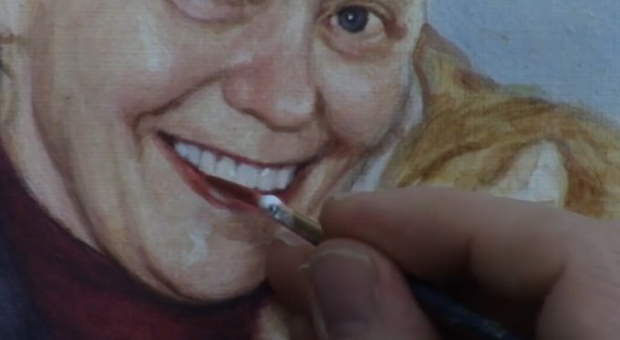
Step 2: Adding Realistic Highlights – Bring the Teeth to Life
Once you’ve laid down the correct base color for the teeth, the next step is to add realistic highlights. These highlights are small but essential details that bring the teeth to life and make them look natural.
Teeth often have tiny reflections of light in certain areas, depending on the lighting in your reference photo. These highlights can be found along the tops of the teeth or on the edges where they catch the light the most. Here’s how you can effectively apply them:
- Use titanium white for these highlights. Unlike the shading, the highlights should be pure white, but use them sparingly to avoid an unnatural appearance.
- With a size 2 liner brush, carefully paint small pinpoint highlights in the appropriate spots, as seen in your reference image. The upper teeth often have highlights near the top, close to where the lips meet the teeth.
- After applying the highlights, blend them gently into the surrounding areas to avoid hard, distracting lines. The goal is to create a soft transition between the shaded and highlighted areas.
If the highlights appear too stark, you can modify the tone by adding a touch of indian yellow to warm them up. By warming the highlights, you mimic the natural hue of teeth, which tend to reflect a warmer tone due to their interaction with light and surrounding skin tones.
Tip: Be Subtle with Separation Lines
While teeth have visible separation lines, especially in close-up portraits, these lines should not be harsh. Use very faint lines to delineate individual teeth. A common mistake is making the lines too bold, which can give the teeth an outlined, cartoonish appearance. The size 2 liner brush is ideal for lightly sketching in these lines, but ensure they are soft enough to blend in with the rest of the portrait.
Additional Techniques to Improve Realism
1. Use Glazing for Depth
To create even more depth and nuance in the teeth, consider using a glazing technique. A glaze is a thin, translucent layer of paint that allows underlying layers to show through, creating a sense of depth.
- Mix a small amount of matte medium with your base gray color and apply it lightly over the teeth, focusing on areas that need more depth, such as the sides or lower parts of each tooth.
- This glazing technique allows you to build up subtle layers, increasing the realistic appearance of your portrait.
2. Pay Attention to Tooth Shape and Size
Not all teeth are the same size or shape, and these variations should be reflected in your painting. The front teeth are typically larger, while the ones on the sides taper off. Make sure to study your reference photo closely and adjust the size and shape of each tooth accordingly. This attention to detail will make your portrait look more realistic and proportional.
Conclusion
Getting the teeth right in an acrylic portrait is an essential step toward achieving realism. By shading the teeth a few tones darker than pure white and adding subtle highlights in the right spots, you can dramatically improve the lifelike quality of your portraits. Using techniques like glazing and paying attention to tooth shape will further enhance the overall effect. Follow these two steps carefully, and you’ll be well on your way to mastering the art of painting realistic teeth in acrylics.
With patience and practice, you’ll see improvements in your portrait painting skills, and your work will stand out for its lifelike qualities.
For further resources and guides, visit realisticacrylic.com and check out my free courses to enhance your acrylic painting journey.
- Adding highlights to your acrylic painting
- 5 Excellent Reasons to Use Aluminum Foil
- Paint Realistic Wrinkles in Acrylic
- Painting Clothing in an Acrylic Portrait
- Paint a Cloudy Sky Acrylic
- How to add Semi-Opaque Highlights
- How to Enhance the Contrast in Your Acrylic
- How to Add Glaze to Your Acrylic Painting
- Paint Realistic Reflections on Eyeglasses in an Acrylic Portrait
- Build Up Depth on Your Acrylic Portrait Backgrounds
- How Do You Do Layers With the Glazing Technique?
- Learn How to Paint Wrinkles in Acrylic
Read more about how to paint a portrait that you can surely be proud of!
I’d love to hear your thoughts on this video. Please share it with your friends and family. Let me know if you have any further questions. I’ll greatly help you.
If you’d like to learn more, sign up for my free email tips and video class today.
Learn How to Paint Acrylic Portraits With My Free Mini-Video Course!
Thank you so much for taking the time to read this tutorial and watch the video. That means a lot to me. I hope you find it very helpful in your portrait painting.
Yours for Better Portraits,
P.S. Did you find this post helpful or encouraging? If so, send it on ahead! Let others know with the share buttons below. I’d love to hear your comments. Thank you so much! Also, do you have a question on acrylic portrait painting you’d like answered? Let me know, and I’d be happy to help!

How to Paint Subtle Nuances in Your Acrylic Portrait
Discover how to add depth, light, and subtle details to your acrylic portrait, enhancing realism and making your subject come alive with nuanced highlights.
Introduction: Why Nuances Matter in Portrait Painting
Portrait painting is more than just capturing the basic features of a subject. Then to make your portrait stand out and come to life, subtle nuances small highlights, color shifts, and light reflections are essential. Because these elements help convey depth, texture, and form, making your painting more dynamic and realistic. In this tutorial, we will break down how to achieve these nuances using acrylic paint, with a special focus on adding highlights to the face, hair, and eyes of your subject.
In this case, I’ll walk through applying nuanced highlights to a 16×20 acrylic portrait, focusing on a woman’s face. These techniques can be applied to any portrait to bring out delicate details that make a big impact.

Materials Needed:
- Acrylic Paints: Titanium White, Indian Yellow, alizarine crimson
- Brushes: Size 2 round brush
- Matte Medium: For blending and creating smooth transitions
- Reference Image: Helps maintain accuracy in light and detail placement
Step-by-Step Guide: Adding Highlights and Nuances
1. Prepare Your Palette
Start by mixing your colors then of course to achieve natural, warm highlights, mix a small amount of titanium white with indian yellow. This combination softens the brightness of white while introducing warmth that complements the skin tones. And then add matte medium to create a fluid consistency, allowing the paint to glide smoothly over your canvas without overwhelming the underlying layers.
2. Highlight the Eyes
When eyes are often the focal point of a portrait so you need to begin by adding subtle highlights to the eyelid fold. When sing the fine point of a size 2 round brush, you need to carefully apply your light mixture to the upper eyelid. Because this touch of light creates dimension and reflects the light source, adding realism to the gaze.
Also, be mindful of your reference photo. Because small highlights in the right places like the inner corner of the eye or along the eyelid an make the eyes appear brighter and more expressive.
Tip: If the paint feels too opaque, mix in more matte medium. Because this technique ensures the highlight blends naturally into the surrounding areas, avoiding any harsh lines.
3. Add Nuances to the Nose
The nose is another critical area for creating form. In this portrait, the nose already has a foundation for highlights that were preserved during previous glazing steps. Then now, gently place a pinpoint highlight on the bridge and tip of the nose, where the light naturally falls. Use small, controlled strokes to build up the light gradually.
Blend the edges of this highlight with the surrounding skin tones by feathering it out with a bit of matte medium, creating a soft, diffused transition.
4. Accent the Cheeks and Chin
The next step involves bringing more light to the cheekbones and chin. These areas are key for defining the structure of the face. Use the same warm highlight mixture and lightly touch the upper areas of the cheeks. Ensure that these highlights are subtle—they should enhance the natural contours without overpowering the mid-tones.
Similarly, add a soft highlight to the chin to round out the lighting scheme. Small, strategic highlights like these give your portrait dimension and balance.
Techniques for Blending and Softening
1. Diffusing the Highlights
After applying your highlights, it’s essential to soften the transitions between light and shadow. When using a clean brush or one slightly loaded with matte medium, it gently fan out the edges of your highlights. This technique ensures that the light appears natural and seamless rather than harsh or abrupt.
For instance, after applying a highlight to the nose, use a dry brush to diffuse the edges, pulling the light into the surrounding areas. This makes the highlight feel integrated rather than sitting starkly on the surface.
2. Layering for Depth
Acrylic paint allows you to layer thin glazes to build up depth gradually. This is particularly useful for refining your highlights. Start with a soft base highlight, and as it dries, return with a slightly thicker mixture of Titanium White to emphasize the center of the light. This creates a three-dimensional effect, making certain features like the nose or cheekbones pop.
Final Touches: Enhancing Hair and Fine Details
1. Adding Highlights to the Hair
To add subtle nuances to the hair, use the same highlight mixture but with more Titanium White for contrast. Just focus on the areas where the light source hits the hair typically the top of the head and along strands that curve outward.
When you apply short, controlled strokes to simulate the texture of hair. Make sure to vary the pressure and direction of your brushstrokes to avoid a flat appearance. Highlights on the hair should complement the overall lighting scheme of the portrait, pulling everything together.
2. Refining Details on the Lips and Chin
For the final touches, go back to smaller areas like the lips and chin. A soft vertical highlight on the lower lip can create a sense of moisture and volume. Similarly, a light stroke across the chin can round out the lower half of the face. At this stage, check your reference photo again to ensure the highlights align with the overall light source.
Conclusion: Nuances Make the Difference
By focusing on subtle highlights and careful layering, you can transform a flat portrait into a vibrant, lifelike piece of art. The nuances you add—whether it’s a soft glow on the cheek or a pinpoint light in the eyes—are what make your portrait feel real. These small touches can elevate your painting and give it the professional finish you’re looking for.
Remember, practice makes perfect. Don’t be afraid to experiment with different levels of brightness and blending techniques to find the balance that works best for your subject. And always take time to step back and assess the overall effect of your nuances.
- Adding highlights to your acrylic painting
- 5 Excellent Reasons to Use Aluminum Foil
- Paint Realistic Wrinkles in Acrylic
- Painting Clothing in an Acrylic Portrait
- Paint a Cloudy Sky Acrylic
- How to add Semi-Opaque Highlights
- How to Enhance the Contrast in Your Acrylic
- How to Add Glaze to Your Acrylic Painting
- Paint Realistic Reflections on Eyeglasses in an Acrylic Portrait
- Build Up Depth on Your Acrylic Portrait Backgrounds
- How Do You Do Layers With the Glazing Technique?
- Learn How to Paint Wrinkles in Acrylic
Read more about how to paint a portrait that you can surely be proud of!
I’d love to hear your thoughts about this video. Please share it with your friends and family. Let me know if you have any further questions. I’ll greatly help you.
If you’d like to learn more, sign up for my free email tips and video class today.
Learn How to Paint Acrylic Portraits With My Free Mini-Video Course!
Thank you so much for taking the time to read this tutorial and watch the video. That means a lot to me. I hope you find it very helpful in your portrait painting.
P.S. Did you find this post helpful or encouraging? If so, send it on ahead! Let others know with the share buttons below. I’d love to hear your comments. Thank you so much! Also, do you have a question on acrylic portrait painting you’d like answered? Let me know, and I’d be happy to help!

How to Paint Earrings in Your Acrylic Portrait
Learn the technique of painting realistic earrings in acrylic portraits with these easy steps
Introduction
Adding realistic details to an acrylic portrait, such as earrings, can elevate the overall quality and depth of your artwork. Painting jewelry is not just about adding a couple of dabs of paint it involves understanding the placement of highlights, shadows, and creating a smooth transition between the elements. In this tutorial, you will learn how to paint earrings in your acrylic portrait using highlights, shadows, and glazing techniques. By the end of this guide, you will have the confidence to create lifelike jewelry that complements your portraits.
Materials Needed:
- Titanium White
- Indian Yellow
- Raw Umber Dark
- Ultramarine Blue
- Alizarine Crimson
- Round Brush (size 2)
- Palette and water
Step 1: Mix Your Colors for the Base Layer
Before starting, gather your reference photo to ensure accurate lighting and color representation. In this case, a frontal flash photo was used, which plays an essential role in determining the highlights and shadows on the earring.
Begin by selecting a size 2 round brush, which is ideal for detail work. Mix titanium white with a small amount of indian yellow. The goal is to create a lighter, warm gray tone, which will serve as the base for the earring. Apply this mixture gently over the earring area, covering a significant portion to build the foundation.
Step 2: Apply a Mid-Tone Glaze
Once the base layer dries, the next step is to create a mid-tone glaze. This technique helps to integrate the light and shadow, giving the earring a more natural appearance. For the mid-tone, blend raw umber dark with the existing base mix (titanium white and Indian yellow).
Carefully apply the glaze in thin layers over the base, making sure not to overpower the light areas. Glazing provides depth and softens the transitions between different values.
Pro Tip: Ensure your glaze layers are thin and translucent. This allows the previous layers to show through, adding subtle complexity to the jewelry.
Step 3: Add Highlights
Now that the mid-tone glaze is in place, it’s time to highlight the earring to create a realistic metallic sheen. Go back to your titanium white and use a fine detail brush to apply small dabs of white on the areas where the light hits directly.
When positioning the highlights, consider the source of light from your reference photo. In this example, the highlights were placed on the upper part of the earring. You can zoom in on your reference photo to get a more precise understanding of where the light falls.
Pro Tip: It’s okay to let the highlight exceed the boundaries of the metal slightly. This will give the earring a more convincing, three-dimensional look, as if the light is reflecting beyond the earring’s surface.
Step 4: Refine the Shadows
Once the highlights are in place, the shadows are crucial to enhance the depth and make the earring stand out. Mix ultramarine blue with a touch of alizarine crimson to create a deep shadow color. This shadow should be applied under the earring where it meets the skin or the hair, depending on the reference photo.
For this step, lightly glaze the darker tones just under the highlighted areas. This step contrasts with the highlight, making the metal of the earring more vibrant and realistic. The shadow will cast a thin, dark line directly adjacent to the bright highlight, creating a striking effect.
Pro Tip: The transition between light and shadow should be smooth. Use a very small amount of paint and blend gently with your brush for a seamless look.
Step 5: Refine and Contrast the Background
To make the earring pop even more, darken the background or surrounding areas. In this case, the artist chose to slightly darken the subject’s sweater in the painting. Adding contrast around the earring helps it stand out against the background and draws the viewer’s eye to the details of the portrait.
Mix raw umber dark with ultramarine blue and lightly apply it to the background behind the earring. This subtle adjustment can enhance the overall composition and emphasize the earring’s presence in the portrait.
Final Thoughts: Evaluate and Adjust
Step back from your painting to assess the overall effect. Are the highlights and shadows properly placed? Is the earring standing out as a focal point in the portrait? Make small adjustments as needed to ensure that the earring looks natural and harmonious within the context of the entire painting.
A well-painted earring should not only be realistic but should also complement the portrait as a whole. Jewelry can bring elegance and detail to your acrylic portrait, and by following these techniques, you can ensure that it adds a professional touch to your work.
Tips and Techniques Recap:
- Use Thin Glazes: Build up layers slowly with thin glazes to add depth and softness to the transitions between light and shadow.
- Highlight Placement: Highlights should be carefully positioned according to the light source. Letting the highlight slightly exceed the boundaries adds realism.
- Smooth Transitions: Blending is key. Use a soft brush to smooth transitions between different tones, especially between the shadows and highlights.
- Contrasting the Background: Slightly darkening the surrounding area, such as the subject’s clothing or background, helps to make the earring pop.
- Evaluate and Adjust: After each layer, step back to evaluate the overall look. Make minor adjustments to perfect the balance of light, shadow, and detail.
Conclusion
Painting earrings in your acrylic portrait may seem like a small detail, but it can significantly impact the realism and professionalism of your artwork. By following the steps outlined in this tutorial, you can master the art of painting jewelry in a way that complements your portrait and adds a subtle yet powerful finishing touch.
For more tips and detailed acrylic portrait tutorials, visit realisticacrylic.com. Happy painting!
- How to Paint Foliage Using the Acrylic Glazing Technique
- How to Trace for an Accurate Portrait Sketch
- How to Paint Realistic Eyes in Your Acrylic Portrait
- How to Add Raw Umber Dark & Ultramarine Blue to Your Portrait
- How to Make Your Own Raw Umber Dark
- How to Paint Realistic Trees & Grass in Your Acrylic
- How to Block In Skin Tone Values Using Glazing Technique
- How to Paint Vibrant Reds in Your Acrylic Portrait
- How to Glaze Background Colors & More Acrylic Portrait
- How to Paint White Clothing in Your Acrylic Portrait
- How to Easily Transition from a Sketch to a Painting
- How to Block In Shading & Skin Tones in Your Acrylic
- How to Build Up Color on Acrylic Pet Portrait
- How to Build Up Form on Clothing with Acrylic
- How to Paint Dark Clothing Using Acrylic Glazing Technique
- How to Paint a 24 x 30 Acrylic With 30 People
- How to Do Smooth Shading with Acrylic
- How to Sketch an Acrylic Portrait with a Grid
Read more about how to paint a portrait that you can surely be proud of!
I’d love to hear your thoughts about this video. Please share it with your friends and family. Let me know if you have any further questions. I’ll greatly help you.
If you’d like to learn more, sign up for my free email tips and video class today.
Learn How to Paint Acrylic Portraits With My Free Mini-Video Course!
Thank you so much for taking the time to read this tutorial and watch the video. That means a lot to me. I hope you find it very helpful in your portrait painting.
Yours for Better Portraits,
P.S. Did you find this post helpful or encouraging? If so, send it on ahead! Let others know with the share buttons below. I’d love to hear your comments. Thank you so much! Also, do you have a question on acrylic portrait painting you’d like answered? Let me know, and I’d be happy to help!

How to Paint a Woman’s Hair Detail with Acrylic
Painting realistic hair in acrylic by learning key techniques for depth, texture, and shine in this step-by-step guide.
Painting hair in acrylic can be a challenging task, especially when you’re aiming for realism. Because it requires a combination of precision, layering, and patience to achieve the right texture and shine. Then in this tutorial, we’ll explore step-by-step how to paint a woman’s hair in acrylic, focusing on creating depth, natural shading, and lifelike highlights.
Whether you’re working on a portrait or enhancing your painting skills, these techniques will help you bring hair to life on your canvas. Using a glazing method, various color mixtures, and brushwork, you can create the illusion of flowing, realistic hair.
1. Setting Up Your Palette
Before diving into painting hair, it’s essential to prepare your palette with the right colors. Hair, even when it appears as a single color, is made up of many hues that need to be layered to achieve realism. For this project, focus on the following colors:
- Raw Sienna
- Raw Umber Dark
- Titanium White
- Ultramarine Blue
- Indian Yellow
These colors provide a good foundation for both the darker shadows and lighter highlights of the hair.
2. Starting with the Base Layer
To begin, use a mixture of raw sienna and raw umber dark to block in the base color of the hair. Because this step creates the groundwork for the shadows and mid-tones. The aim here is not to focus on individual strands but to establish the overall shape and form of the hair.
As the base layer is applied, keep in mind that hair is not uniform. Some areas will be darker, especially where the light does not directly hit the hair. Mix in ultramarine blue to cool down certain areas and give the hair dimension. This mixture is particularly effective for creating shadows that contrast with the warmer tones of Raw Sienna and Indian Yellow.
3. Building Depth with Glazes
After the base layer dries, then it’s time to add depth to the hair using a glazing technique. Hence glazing involves using thin layers of translucent paint to build up color gradually. So, in this tutorial, matte medium was mixed with the paint to create these transparent layers, allowing each previous layer to shine through.
When you mix raw umber dark and titanium white with a small amount of ultramarine blue to create a soft grayish tone. Apply this mixture in the darker areas, emphasizing the parts of the hair that aren’t illuminated. Because glazes help create a smooth transition between light and shadow, giving the hair more realism.
If certain areas appear too light, you can darken them by adding another glaze of raw umber dark and ultramarine blue. It’s essential to remain patient during this process, as multiple layers may be needed to achieve the desired effect.
4. Adding Highlights
Hair shines where it catches the most light, and creating that glossy appearance is key to making hair look realistic. Use a combination of raw sienna, titanium white, and a touch of indian yellow to create a highlight color. Apply this mixture sparingly to the top sections of the hair where the light strikes.
Remember, highlights should not cover too much of the surface. Focus on smaller areas where light naturally reflects off the hair, creating that shiny, smooth effect. Use fine brush strokes to suggest individual strands while blending them into the darker layers underneath.
5. Refining Hair Strands and Texture
Once the overall structure and highlights are established, refine the texture of the hair. Use thin brushes to create subtle striations that mimic hair strands. These strokes should be fine, soft, and follow the natural direction of the hair’s flow.
Layering is vital for texture. Return to the darker areas with another glaze of raw umber dark if necessary, and then blend these shadows into the lighter sections. The combination of light, mid-tones, and dark shadows will give the hair more realism.
In addition, use ultramarine blue mixed with raw umber dark to cool down areas that are too warm. This slight temperature contrast will enhance the depth of the hair, making it look more natural and three-dimensional.
6. Creating Shadows for More Depth
Even blonde or light-colored hair can have deep shadows where the light doesn’t reach. To make these areas more pronounced, mix raw umber dark with ultramarine blue and apply it to the shadowed sections. The trick is to observe how light and shadow interact on your reference image and replicate this in your painting.
By doing this, you prevent the hair from appearing flat. Shadows give the hair its depth, making it stand out against the surrounding elements in the painting.
7. Final Touches and Adjustments
As you finish the painting, take a step back to assess the overall composition. Are the highlights bright enough? Are the shadows deep enough? Make any final adjustments by adding more glazes or highlights to enhance the dimension.
For the finishing touches, consider adding small strands of hair outside the main shape to make the hair look more natural and less “cut out.” These stray strands can be applied lightly with a thin brush, using the highlight color to make them visible against darker backgrounds.
Tips & Techniques Recap
- Use multiple glazes to build up hair color gradually. Glazing allows for more control and depth, especially in darker areas.
- Keep highlights subtle and only in areas that naturally catch the light. Over-highlighting can flatten the painting.
- Mix cool and warm tones to create more dynamic shading. Hair is not just one color; blending contrasting tones will add realism.
- Be patient with layers. Acrylics dry quickly, but that can be a benefit when working in layers to build up depth.
- Use fine brush strokes to suggest individual hair strands, but avoid over-detailing. Too many strands can make the hair look stiff.
By following these techniques, you’ll be able to paint hair that looks realistic, detailed, and full of life. Don’t be afraid to experiment with different glazing layers and color mixtures to achieve the perfect balance of depth and shine.
Now it’s your turn! Grab your acrylics and start bringing your portraits to life with beautifully painted hair.
If you’re looking for more instructional videos on how to improve your acrylic painting, visit www.realisticacrylic.com for more tutorials and check out my free courses here. .
- Adding highlights to your acrylic painting
- 5 Excellent Reasons to Use Aluminum Foil
- Paint Realistic Wrinkles in Acrylic
- Painting Clothing in an Acrylic Portrait
- Paint a Cloudy Sky Acrylic
- How to add Semi-Opaque Highlights
- How to Enhance the Contrast in Your Acrylic
- How to Add Glaze to Your Acrylic Painting
- Paint Realistic Reflections on Eyeglasses in an Acrylic Portrait
- Build Up Depth on Your Acrylic Portrait Backgrounds
- How Do You Do Layers With the Glazing Technique?
- Learn How to Paint Wrinkles in Acrylic
Read more about how to paint a portrait that you can surely be proud of!
I’d love to hear your thoughts on this video. Please share it with your friends and family. Let me know if you have any further questions. I’ll greatly help you.
If you’d like to learn more, sign up for my free email tips and video class today.
Learn How to Paint Acrylic Portraits With My Free Mini-Video Course!Thank you so much for taking the time to read this tutorial and watch the video. That means a lot to me. I hope you find it very helpful in your portrait painting.
P.S. Did you find this post helpful or encouraging? If so, send it on ahead! Let others know with the share buttons below. I’d love to hear your comments. Thank you so much! Also, do you have a question on acrylic portrait painting you’d like answered? Let me know, and I’d be happy to help!

[PORTRAIT CHALLENGE] Masterclass Lesson #8: Finishing Your Portrait Well
The Acrylic Portrait Painting Challenge Masterclass, Lesson #8, is out!
This is our FINAL lesson together.
It’s kind of sad to see the challenge drawing to a close. As I write this, it’s been an entire month since I started this challenge on April 6, 2020.
My goal was to create a way for artists to overcome the challenges of being in COVID-19 lockdown, create something beautiful with their time, and grow their skills as artists.
Many, many have risen to the challenge and done exactly that. If you’re reading this, and you’ve taken the challenge; you’ve gone through steps 1-7, I’m so proud of you! It’s not easy to paint a realistic portrait in acrylic, let alone during a quarantine. But you did it! And you’ve encouraged many others along the way.
Acrylic Portrait Painting Challenge example portrait 16 x 20 acrylic on canvas, ©2020 by Matt Philleo
Because of that, you are a better artist, and have grown in character as a human being.
Your portrait —hopefully—is nearly done. What next? How do we “bring it home”, so to speak?
Let me show you, below!
Six Steps to Finishing Your Portrait Well
STEP ONE: Double-check the tonal values. Use my Value Checker tool for that.
STEP TWO: Double-check and add more detail to the eyes.
STEP THREE: Add vibrance to areas where certain shadows and highlights meet
STEP FOUR: Refine the shadows
STEP FIVE: Redefine the edges of your subject and objects
STEP SIX: Paint pin-point highlights on the face
When is the painting done?
Watch the video to find out…
[PORTRAIT CHALLENGE] Masterclass Lesson #8: Finishing Your Portrait Well
Is it too late to join the challenge? No, not at all. This challenge is meant to be ongoing—something you can do at your own pace. The lessons are free and they aren’t going anywhere.
If not, register below for FREE and I’ll send you:
- a downloadable/ printable”Welcome Kit” with a Supplies List and a Palette Color Layout Guide.
- high-resolution images of the photo we’ll be painting from for this challenge.
- each new lesson that comes out in this Masterclass series.
- a link to my private Facebook group, where you can do this challenge with other artists, get feedback and help on your portrait, and not feel alone.
REGISTER TODAY. It’s not too late to enter!
Where do we go from here?
I am so happy that you have done this challenge with me and hundreds of other artists. I give you a virtual high-five for the effort and dedication you have put in.
First, I give God the glory and thanks for entrusting all of us a talent to use. Next, I thank you and the other artists for taking your time and investing it into yourself as an artist and into others’ lives to encourage them.
You’ve left great comments for each other and your building skills to be able to paint a portrait you can take pleasure in and others can too.
This is what art is about. It transcends a piece of cotton canvas stretched on a wood frame, with plastic polymer resin on it. In the hands of a skilled painter, it becomes something beautiful that can last forever.
When we touch lives, bring hope and encouragement both in the creation and in the giving or selling of the art, we are doing something that has the potential to last for eternity!
So what we all have done in this group, by God’s grace, is amazing. And I believe it is just the start! 🙂
If you would like to work with me more closely, so I can personally help you become the portrait artist you’d like to be, be sure to watch my invitation at the end of the video. Whatever you decide, thank you so much for taking part in this challenge and may God richly bless your talent, and multiply it many times over!
Yours for Better Portraits,
![]()
If you found this post helpful or encouraging, would you send it on ahead? Let others know with the share buttons below. I’d love to hear your comments. Thank you so much!
Let me know if you have any questions about the challenge that I didn’t answer. Leave your question in the comments below and I’ll get back to you!

Portrait Painting of a Veteran at the Yurt
Is it possible to do portrait painting while you’re away from your home, your usual studio area?
This was something I’ve always wanted to do: create art while camping. And for all the years I’ve gone camping, I’ve never been able to successfully do it.
But finally, at the end of June, my brother and I decided to go camping at a rustic yurt up in Cable, WI. Where is that? Let’s just say, it’s “way up north.” 🙂 And what is a yurt? It’s a round tent-like house, a permanent structure made of lattice wood, bound together with steel cable, and covered with fabric. We rented it through Airbnb for two days.

Acrylic portrait artist Matt Philleo ready to paint at a yurt in Cable, Wisconsin
We parked at the bottom of the hill and carried our gear up about a mile. We realized how out of shape we were! I also had my painting supplies: easel, palette, and brushes with me. In the middle of hiking and cooking, we decided to both do a little work: my brother wrote (he’s an author) and I painted.
Painting an acrylic portrait from photo inside a yurt while camping, 11 x 14 acrylic on canvas ©2019 by Eau Claire area portrait artist Matt Philleo
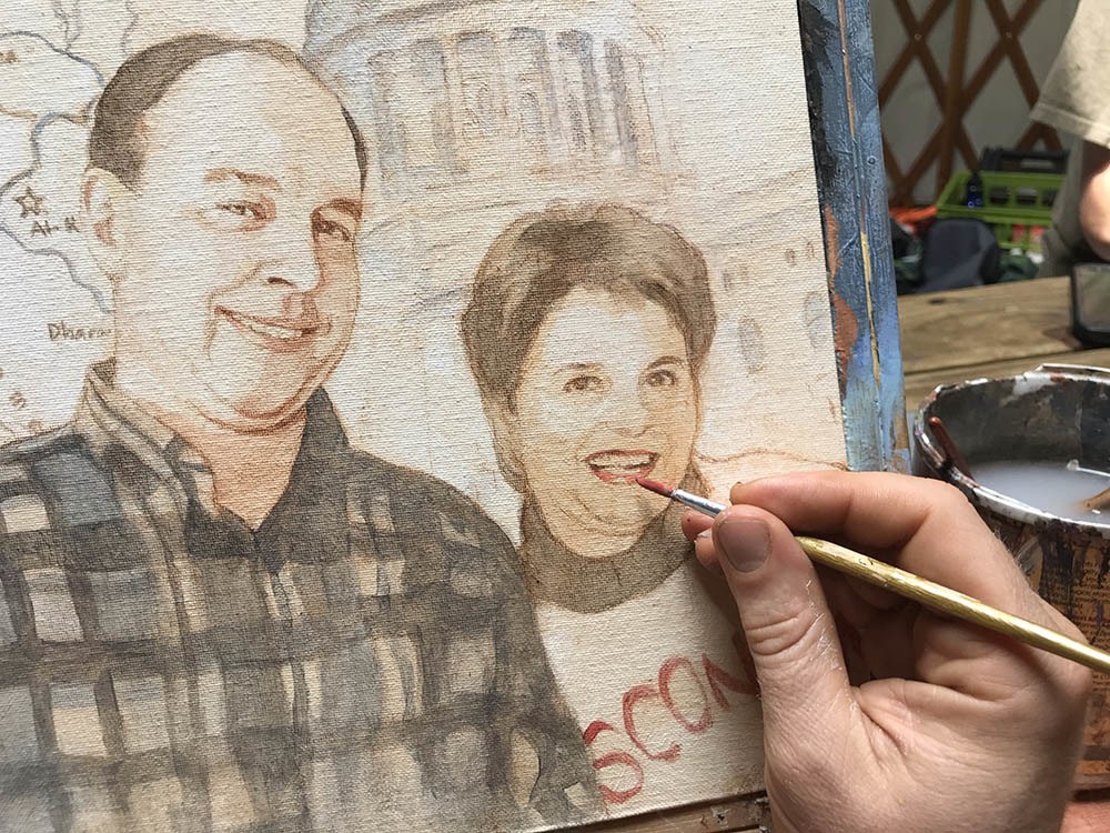
I know. You’re probably thinking I should have painted the scenery up there, and yes, it was beautiful. But I had a commissioned portrait from a photo to get done: a painting of a veteran that served in the gulf war. And I love painting people, so it hardly seemed like work.
After bacon, eggs, and oatmeal for breakfast, it was time for painting.
Here is a video showing the beginning part of the process. In this video, I am basically blocking in the values with just raw umber dark and ultramarine blue. Of course, it’s all thinned out and made translucent with matte medium.
And then, here’s the next video in the process. Here I’m adding some color with burnt sienna, alizarine crimson and a few other colors. We’re starting to build up some skin tones. Also working on the flannel shirt. It takes a lot of layers to get it dark enough to look realistic!
After lunch, we hiked, and then came back and did more work: refining the shadows and making sure the likeness is accurate.
Sometimes your sketch just won’t cut it. It will get you about 80% of the way there, and you do the remaining 20% with paint. As you apply the paint, you can change the shape of the nose, the distance between the eyelids, lengthen the smile, etc., to adjust whatever might have been off during your sketch.
Of course, there is more to go on the painting. I’ll share the rest with you soon. I wasn’t able to finish it at the yurt, but I put in several hours. So, not only did I get to spend some great quality time with my brother, but I got to do some enjoyable work as well. After the big move, I finally feel like I’m getting into a regular groove of painting and posting tutorials. Thanks so much for your patience.
UPDATE: Here is the final video of this portrait, painted at my regular studio…
And a photo of it…
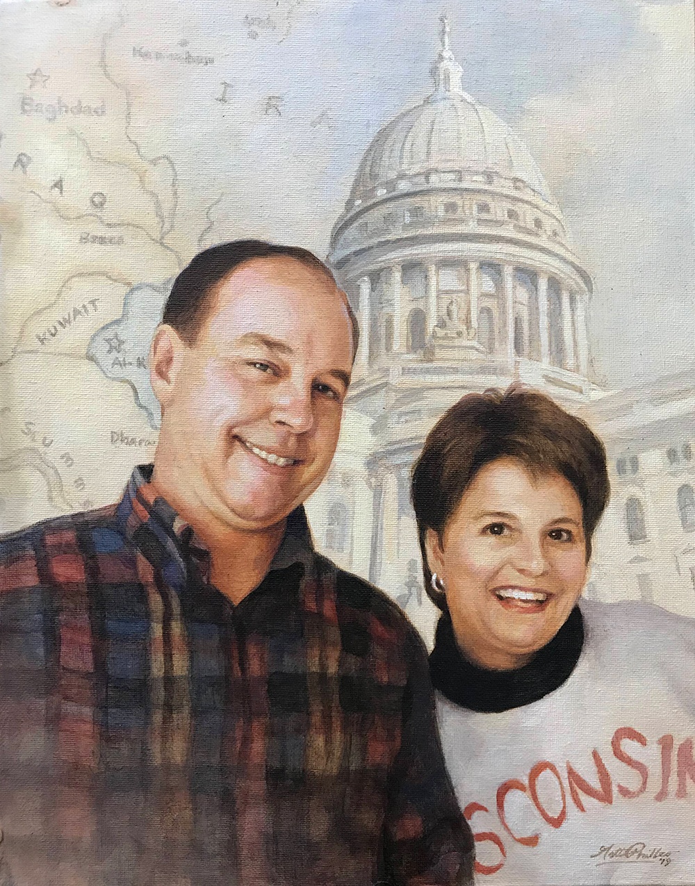
Custom realistic acrylic portrait of a veteran and his wife painted by Eau Claire area portrait artist Matt Philleo, 11 x 14, acrylic on canvas, ©2019 by Matt Philleo
I really enjoyed painting this for the client, putting all the elements–the map of Iraq, the capitol building, and the people together into one cohesive portrait that I hope will be a cherished keepsake for the family for years to come.
I hope this painting has encouraged you and given you some ideas to use in your own portrait painting. I would love to help you learn to paint portraits your very best. Let me know if I can be of more help to you in any way.
Yours for better portraits,
P.S. Did you find this post helpful or encouraging? If so, send it on ahead! Let others know with the share buttons below. I’d love to hear your comments. Thank you so much! Also, do you have a question on acrylic portrait painting you’d like answered? Let me know, and I’d be happy to help!

How to Block in Colors and Values in Your Acrylic Portrait
Unlock the secrets of color and value: a step-by-step guide to acrylic portrait painting
Creating a beautiful acrylic portrait involves several steps, and one of the most crucial is blocking in colors and values. This stage establishes the foundation for your painting, allowing you to build layers of detail and depth. In this blog post, we will delve into the process of blocking in colors and values, drawing insights from me.
What is the best way to start an acrylic portrait?
Do you just begin with a white canvas, and fully paint everything from left to right, as you would in a drawing?
That’s how I used to paint, until I learned the glazing technique. I would painstakingly render every detail, and move across the surface of the canvas. But I always had a lot of white canvas staring me in the face.
After learning the glazing technique, instead, I could begin to slowly develop the portrait, like an Polaroid photograph.
Psychologically, it felt less intimidating. And it was fun to watch the process of the painting methodically taking shape.
In this video tutorial today, I’m going to show you how I begin my painting–what colors I use, where I put them and why, using this 16″ x 20″ commissioned portrait of three children…
LEARN MORE
- How to Paint Foliage Using the Acrylic Glazing Technique
- How to Trace for an Accurate Portrait Sketch
- How to Paint Realistic Eyes in Your Acrylic Portrait
- How to Add Raw Umber Dark & Ultramarine Blue to Your Portrait
- How to Make Your Own Raw Umber Dark
- How to Paint Realistic Trees & Grass in Your Acrylic
- How to Block In Skin Tone Values Using Glazing Technique
- How to Paint Vibrant Reds in Your Acrylic Portrait
- How to Glaze Background Colors & More Acrylic Portrait
- How to Paint White Clothing in Your Acrylic Portrait
- How to Easily Transition from a Sketch to a Painting
- How to Block In Shading & Skin Tones in Your Acrylic
- How to Build Up Color on Acrylic Pet Portrait
- How to Build Up Form on Clothing with Acrylic
- How to Paint Dark Clothing Using Acrylic Glazing Technique
- How to Paint a 24 x 30 Acrylic With 30 People
- How to Do Smooth Shading with Acrylic
- How to Sketch an Acrylic Portrait with a Grid
Read more about how to paint a portrait that you can surely be proud of!
Let me know how this tutorial helps!

P.S. Did you find this post helpful or encouraging? If so, send it on ahead! Let others know with the share buttons below. I’d love to hear your comments. Thank you so much! Also, do you have a question on acrylic portrait painting you’d like answered? Let me know, and I’d be happy to help!