Category Archives for Glazing

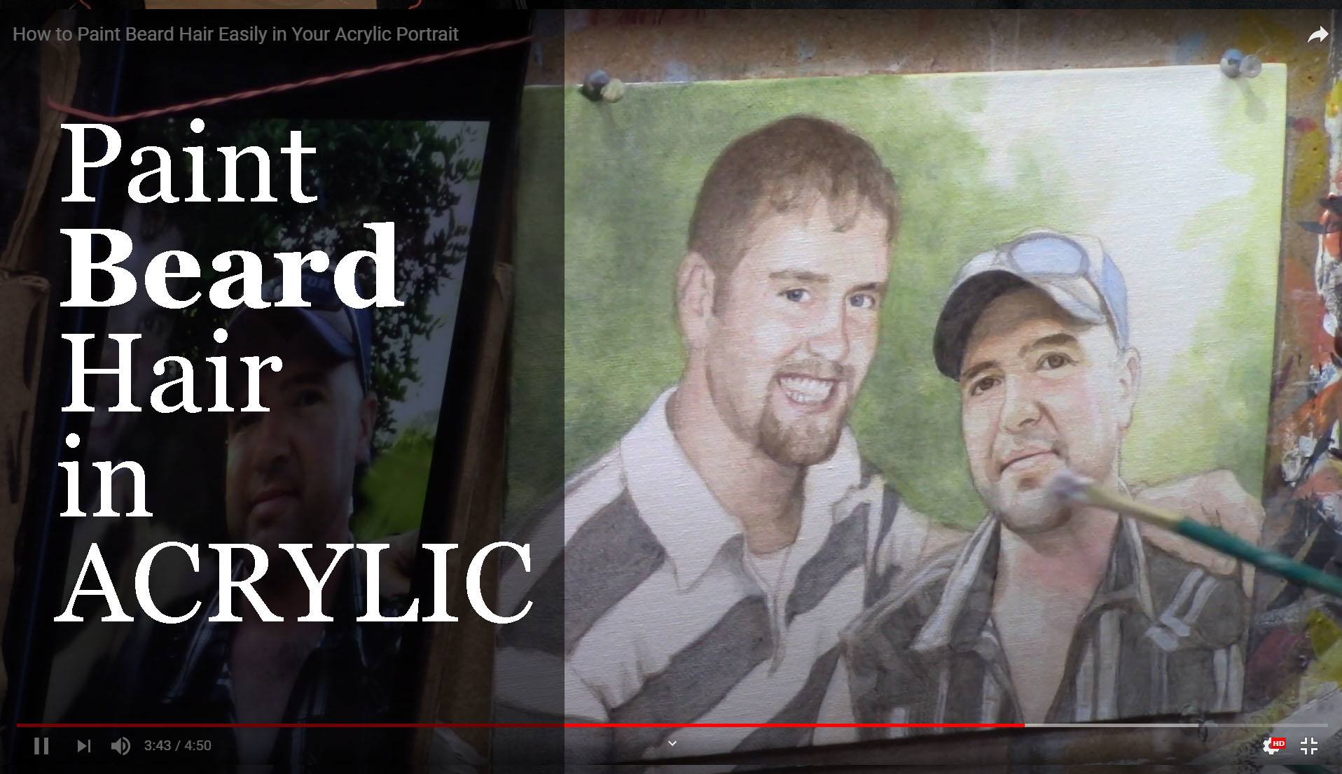
How to Paint Beard Hair Easily in Your Acrylic
Learn the art of painting beard hair with this simple and effective technique
Painting facial hair, such as beards, can be one of the more challenging details in portrait art. It may seem daunting to capture every individual hair in a realistic way, but it doesn’t have to be. In this guide, we’ll break down an easy method for painting beard hair using acrylics that doesn’t involve painstakingly painting each hair strand. Instead, we’ll focus on blocking in colors and values, giving the appearance of detail while keeping the process simple and effective.
Whether you’re a beginner or an experienced artist, this approach will help you add convincing realism to your acrylic portraits without frustration.
Step-by-Step Guide to Painting Beard Hair
1. Start with a Base Color
The key to painting facial hair, like a beard, is to begin with a base color that matches the underlying skin tones and beard shade. Then don’t worry about painting individual strands right away. Instead, follow this process:
- Mix raw umber as a base for the beard.
- Add a touch of alizarine crimson to introduce a slight warmth, and include titanium white to ensure the paint covers the surface effectively.
- For cooler tones in the beard, mix a bit of ultramarine blue into your base to add depth and shadow to your mix.
When you have your base color ready, load it onto a flat edge brush and block in the general area of the beard. This block of color will act as the foundation for the beard hair. Focus on the overall value instead of trying to capture individual strands. This method prevents the painting from looking too busy or artificial.
2. Block in the Values
Instead of painting each beard’s hair, think in terms of values. Then block in the light and shadow areas of the beard, which will provide the necessary contrast and depth.
- Use your cool-toned mixture to paint the stubble or full beard, applying the color in sections.
- Blend as you go to create a soft transition between the skin and the beard.
The key here is to focus on where the light hits the face and then how it interacts with the beard hair. The shadows and highlights will imply the presence of hair, of course, without needing to meticulously paint each one.
3. Create Realism with Minimal Detail
Once your base layers and value blocks are in place, you can add a few finishing touches to suggest individual hairs. Use a detail brush sparingly, picking out just a few strands of hair in key places. Because this technique gives the illusion of individual hairs without overwhelming the painting with too much detail.
In smaller portraits, like 8×10 canvases, it’s unnecessary to paint each hair meticulously. Because simplicity often works best in creating a realistic appearance. Focus on the main areas of light and shadow to convey the overall texture of the beard.
Techniques to Improve Beard Hair Painting
1. Use Color Blocks to Imply Detail
The most efficient way to paint beard hair in acrylic portraits is to rely on blocks of color rather than individual strokes. Because this method implies detail, which can trick the viewer’s eye into perceiving realism without overwhelming the painting with unnecessary detail.
2. Choose the Right Brush
For the base layer, use a flat edge brush to cover larger areas and then create smooth transitions between skin and hair. When adding a few fine hairs for detail, switch to a small, pointed detail brush for better control.
3. Blend Your Colors
Blending is crucial when painting facial hair. You don’t want the beard to look too stark or separated from the face. Softly blend the edges of the beard into the skin tone, paying attention to areas of transition where light hits the skin through the hair.
4. Focus on Contrast
Realism in facial hair is often achieved by strong contrasts between light and shadow. Beard hair, especially in portraits, reflects light differently than other parts of the face. Make sure to adjust your highlights and shadows accordingly.
- Use more titanium white to brighten up areas where the light hits the beard.
- Deepen the shadows with your ultramarine blue mix, especially near the edges of the jawline.
Tips for a Realistic Beard in Acrylics
- Work in Layers: Build the beard gradually, adding more color and depth in layers as you progress.
- Don’t Overwork It: Less is more when painting beard hair. Don’t feel the need to paint every strand. A few details go a long way.
- Play with Texture: Facial hair, especially beards, has texture. Try lightly dry brushing to simulate this texture without going into too much fine detail.
- Observe the Reference: Always refer back to your source image. Look at how the beard flows, where the shadows fall, and how the hair interacts with the face.
Common Mistakes to Avoid
- Overdetailing: Beginners often make the mistake of trying to paint every individual hair, which can result in a cluttered and unnatural look. Instead, focus on the big picture: light, shadow, and overall shape.
- Incorrect Brush Choice: Using a brush that’s too large or too small can cause issues. A flat edge brush is best for blocking in large areas, while a fine detail brush works for final touches.
- Too Many Highlights: Over-highlighting the beard can make it appear unrealistic. Use highlights sparingly to ensure they mimic how light naturally interacts with facial hair.
Conclusion
Learning how to paint beard hair in an acrylic portrait can elevate the realism in your work without requiring an excessive amount of time or detail. By focusing on values, layering colors, and adding minimal detail, you can create the illusion of beard hair that looks natural and lifelike.
Remember, painting doesn’t have to be complicated. Sometimes, simplicity achieves the best results. Experiment with this technique in your next portrait, and you’ll be amazed at how easily you can paint realistic beard hair.
If you’d like to learn more tips and techniques for improving your acrylic portrait skills, check out our full-length tutorials at realisticacrylic.com and download my free mini course, & guide here. Happy painting!
- How to Paint Foliage Using the Acrylic Glazing Technique
- How to Trace for an Accurate Portrait Sketch
- How to Paint Realistic Eyes in Your Acrylic Portrait
- How to Add Raw Umber Dark & Ultramarine Blue to Your Portrait
- How to Make Your Own Raw Umber Dark
- How to Paint Realistic Trees & Grass in Your Acrylic
- How to Block In Skin Tone Values Using Glazing Technique
- How to Paint Vibrant Reds in Your Acrylic Portrait
- How to Glaze Background Colors & More Acrylic Portrait
- How to Paint White Clothing in Your Acrylic Portrait
- How to Easily Transition from a Sketch to a Painting
- How to Block In Shading & Skin Tones in Your Acrylic
- How to Build Up Color on Acrylic Pet Portrait
- How to Build Up Form on Clothing with Acrylic
- How to Paint Dark Clothing Using Acrylic Glazing Technique
- How to Paint a 24 x 30 Acrylic With 30 People
- How to Do Smooth Shading with Acrylic
- How to Sketch an Acrylic Portrait with a Grid
Read more about how to paint a portrait that you can surely be proud of!
I’d love to hear your thoughts about this video. Please share it with your friends and family. Let me know if you have any further questions. I’ll greatly help you.
If you’d like to learn more, sign up for my free email tips and video class today.
Learn How to Paint Acrylic Portraits With My Free Mini-Video Course!
Thank you so much for taking the time to read this tutorial and watch the video. That means a lot to me. I hope you find it very helpful in your portrait painting.
Yours for Better Portraits,

P.S. Did you find this post helpful or encouraging? If so, send it on ahead! Let others know with the share buttons below. I’d love to hear your comments. Thank you so much! Also, do you have a question on acrylic portrait painting you’d like answered? Let me know, and I’d be happy to help!
elpful or encouraging, would you send it on ahead? Let others know with the share buttons below. I’d love to hear your comments. Thank you so much!

[PORTRAIT CHALLENGE] Masterclass Lesson #8: Finishing Your Portrait Well
The Acrylic Portrait Painting Challenge Masterclass, Lesson #8, is out!
This is our FINAL lesson together.
It’s kind of sad to see the challenge drawing to a close. As I write this, it’s been an entire month since I started this challenge on April 6, 2020.
My goal was to create a way for artists to overcome the challenges of being in COVID-19 lockdown, create something beautiful with their time, and grow their skills as artists.
Many, many have risen to the challenge and done exactly that. If you’re reading this, and you’ve taken the challenge; you’ve gone through steps 1-7, I’m so proud of you! It’s not easy to paint a realistic portrait in acrylic, let alone during a quarantine. But you did it! And you’ve encouraged many others along the way.
Acrylic Portrait Painting Challenge example portrait 16 x 20 acrylic on canvas, ©2020 by Matt Philleo
Because of that, you are a better artist, and have grown in character as a human being.
Your portrait —hopefully—is nearly done. What next? How do we “bring it home”, so to speak?
Let me show you, below!
Six Steps to Finishing Your Portrait Well
STEP ONE: Double-check the tonal values. Use my Value Checker tool for that.
STEP TWO: Double-check and add more detail to the eyes.
STEP THREE: Add vibrance to areas where certain shadows and highlights meet
STEP FOUR: Refine the shadows
STEP FIVE: Redefine the edges of your subject and objects
STEP SIX: Paint pin-point highlights on the face
When is the painting done?
Watch the video to find out…
[PORTRAIT CHALLENGE] Masterclass Lesson #8: Finishing Your Portrait Well
Is it too late to join the challenge? No, not at all. This challenge is meant to be ongoing—something you can do at your own pace. The lessons are free and they aren’t going anywhere.
If not, register below for FREE and I’ll send you:
- a downloadable/ printable”Welcome Kit” with a Supplies List and a Palette Color Layout Guide.
- high-resolution images of the photo we’ll be painting from for this challenge.
- each new lesson that comes out in this Masterclass series.
- a link to my private Facebook group, where you can do this challenge with other artists, get feedback and help on your portrait, and not feel alone.
REGISTER TODAY. It’s not too late to enter!
Where do we go from here?
I am so happy that you have done this challenge with me and hundreds of other artists. I give you a virtual high-five for the effort and dedication you have put in.
First, I give God the glory and thanks for entrusting all of us a talent to use. Next, I thank you and the other artists for taking your time and investing it into yourself as an artist and into others’ lives to encourage them.
You’ve left great comments for each other and your building skills to be able to paint a portrait you can take pleasure in and others can too.
This is what art is about. It transcends a piece of cotton canvas stretched on a wood frame, with plastic polymer resin on it. In the hands of a skilled painter, it becomes something beautiful that can last forever.
When we touch lives, bring hope and encouragement both in the creation and in the giving or selling of the art, we are doing something that has the potential to last for eternity!
So what we all have done in this group, by God’s grace, is amazing. And I believe it is just the start! 🙂
If you would like to work with me more closely, so I can personally help you become the portrait artist you’d like to be, be sure to watch my invitation at the end of the video. Whatever you decide, thank you so much for taking part in this challenge and may God richly bless your talent, and multiply it many times over!
Yours for Better Portraits,
![]()
If you found this post helpful or encouraging, would you send it on ahead? Let others know with the share buttons below. I’d love to hear your comments. Thank you so much!
Let me know if you have any questions about the challenge that I didn’t answer. Leave your question in the comments below and I’ll get back to you!

[PORTRAIT CHALLENGE] Masterclass Lesson #7: Painting Fantastic Facial Features
The Acrylic Portrait Painting Challenge Masterclass, Lesson #7, is out!
In our last lesson, I showed you how to visualize your painting as a map, and add shading and skin tones to specific spots on your portrait.
Now, in this lesson, I want to show you how to “dial-in” the facial features.
(To be upfront, I want you to know there is some video footage after Lesson 6 that I just couldn’t capture in this lesson, so it didn’t get too long for a YouTube video. All of the “in-between” BONUS videos will be posted within Realistic Acrylic All-Access Membership, after I’m finished posting these challenge lessons. The main Masterclass Lessons will be there as well as one complete course, and I will also segment them for easier viewing, since the learning interface makes that possible.)
For most of the students I serve, they do their portraits as gifts for loved ones, and on commission. So, unless you are painting only for an academic exercise, it’s important that you capture an accurate likeness of your subject.
I have painted many portraits over the years, and I can tell you from experience, it doesn’t matter how much detail I add to the painting, if the picture doesn’t look like Aunt Betty, it’s not going to sell. 🙂
So, as you are aiming for realism—that is, the accurate form, tonal values, skin tones, shading, detail, etc., you also want to work to achieve a true likeness.
Does it need to be perfect? No, just close. Usually 85-90% as accurate as the photo you’re working from (and even that is not as accurate as real life) and you’ll do well. But shoot for the 100% every time.
Let’s dive in…
Here’s what to do…
STEP ONE
- Redefine the eye-socket region.
- Redefine the eyelid folds.
- Dial-in the coloring of his eyes
STEP TWO
- Adjust the length and shape of nose (if needed) and add shading.
STEP THREE
- Add more depth to the eyes.
STEP FOUR
- Refine the mouth and mustache.
Ready to paint?
Now, before you begin…(Yes, still need to ask, because some folks are just discovering these Masterclass lessons 🙂 )
Are you registered for the challenge?
If not, register below for FREE and I’ll send you:
- a downloadable/ printable”Welcome Kit” with a Supplies List and a Palette Color Layout Guide.
- high-resolution images of the photo we’ll be painting from for this challenge.
- each new lesson that comes out in this Masterclass series.
- a link to my private Facebook group, where you can do this challenge with other artists, get feedback and help on your portrait, and not feel alone.
REGISTER TODAY. The challenge is ongoing, something you can do at your own pace. It’s not too late to enter!
Watch my in-depth Masterclass acrylic online tutorial below to see these steps in action.
After learning from this video, you’ll know exactly how to do it.
Make sure to watch the ENTIRE video first before diving into the painting. It will be worth it to do that. Then, I’d like you to go back and refer to whatever steps you need to as you paint. That way, you won’t miss any of the instruction and tips that will help you make this portrait your very best.
Here’s the video…
[PORTRAIT CHALLENGE] Masterclass Lesson #7: Painting Fantastic Facial Features
Moving Forward…
Thank you so much for all your effort you’ve put into doing this challenge with me and so many other artists. You’re almost there…your finished portrait is in sight.
Hey, if you’re having some challenges with your Portrait Challenge portrait, I just want to let you know, that’s natural! Painting portraits is difficult even for artists who have been doing it for years. But step-by-step instruction and encouragement from other students helps a lot. Many people in our group are doing with little to no experience, and they’re doing a knock-out job, even if they’re struggling in certain areas.
So, if you do feel stuck at this point, or find your results are less than what you expected, keep in mind this is a learning experience. You will get better as you practice painting portraits in the glazing technique, as so many others have.
That being said, if I can help in any way, please leave a comment or send me an email. I get a lot of requests, but I’ll do my very best to help. Also, make sure you join our amazing Facebook group, Realistic Acrylic Portraits, because you will receive helpful tips and encouragement from other students, some of whom are farther ahead in the portrait painting journey.
I’ll see you in our next class! What is it going to be? Painting the Final Details, Nuances, and Finishing Well. I’m excited to share that with you! Until then, be blessed in your painting and you and your family stay safe and healthy.
Yours for Better Portraits,
![]()
If you found this post helpful or encouraging, would you send it on ahead? Let others know with the share buttons below. I’d love to hear your comments. Thank you so much!
Let me know if you have any questions about the challenge that I didn’t answer. Leave your question in the comments below and I’ll get back to you!

[PORTRAIT CHALLENGE] Masterclass Lesson #6: Creating Smooth Blending and Skin Tones
The Acrylic Portrait Painting Challenge Masterclass, Lesson #6, is out!
In our last lesson, I showed you how to add depth to the dark value of the hat, shadowed areas of the face, and some of the darker areas within the background.
Now that we have a good underpainting foundation in place, it’s time to transition into the “middle” portion of the painting. In other words, we’re working our way towards what the final surface of the portrait will look like.
I want to show you specifically how to create smooth blending and establish realistic skin tones.
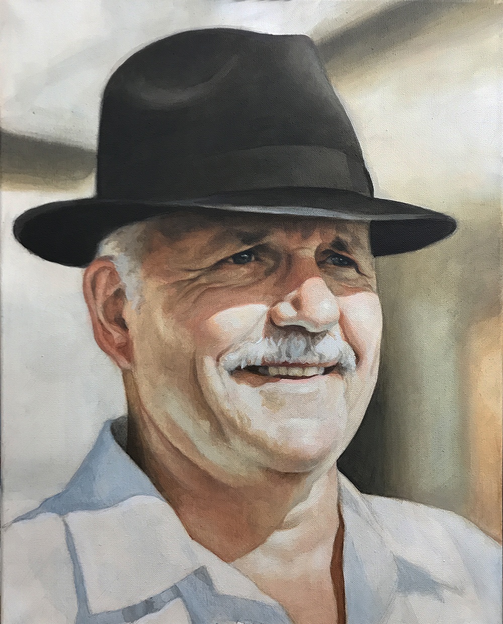
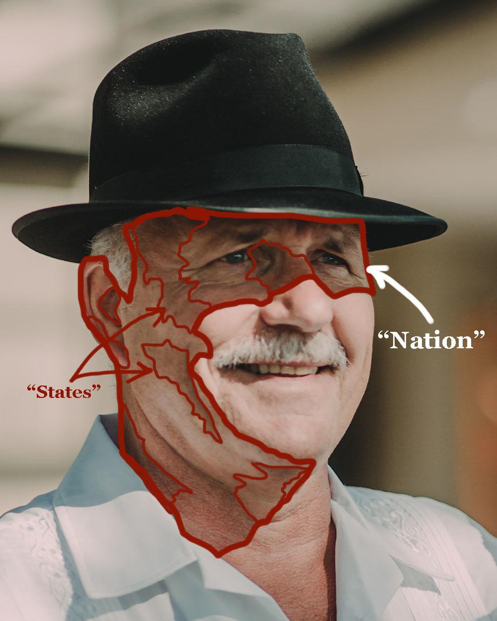
It’s important to think of this process like outlining the boundaries of a nation, state (province) or county.
I know, we shouldn’t mix geography with art lessons, but I think this metaphor will help you understand the concept I’m trying to get across…
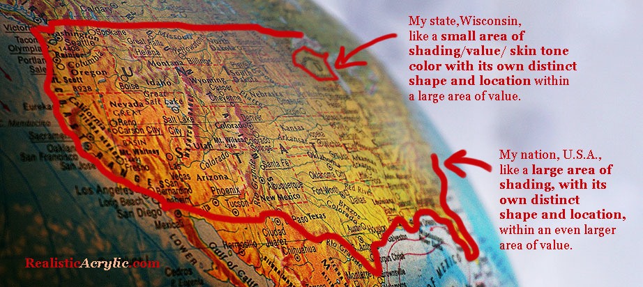
How a US map is like color, shading, and value in an acrylic portrait
I live in the state of Wisconsin, U.S.A. It has its own distinct shape and location within the United States of America. Now, the U.S.A. has its own distinct shape and location within the continent of North America.
In the same way, in a portrait, you may have a small area of value/ skin tone with its own distinct shape and location within the larger area of value/ skin tone. What you want to do is pay attention to the boundary lines on these specific shapes by studying your reference photo.
You won’t see a sharp line you will on a map, unfortunately. But you will see a marked difference where one value/ color ends and another begins.
How to use the idea of a map to improve the realism on your acrylic portrait
You will see a shape emerge. Note that shape.
Then transfer what you see onto your painting. It’s as simple (and challenging!) as that.
You will see shapes within shapes within shapes. The more you can train your eyes to spot these shapes, the better you will become at realistic painting. That’s half the battle. The other half is technique: getting the paint to do what you want it to do.
This concept of “Nations and States” is powerful once you get a hold of it and use it regularly in your acrylic portrait painting! Now, let’s get onto the lesson…
What we want to do at this stage:
Begin the process of adding smooth shading and skin tones throughout the portrait.
We will be adding:
- a large “warming” glaze to the entire shadow area of the man’s face.
- glaze on the highlighted area of the face, adding depth and the beginning of skin tones, so the area is not just plain white or off white.
- small glazes (“states”) on the shadow side (“nation”) of the face to further define the pinkish skin tones.
We will do this using the acrylic glazing technique, where we mix a TINY amount of acrylic paint into a LARGE amount of clear acrylic matte medium. It’s best to go very, very light when you start your painting. You should just barely see a difference. However, at this stage you will getting a bit more opaque, because you have enough layers down already to give you some smoothness in the overall appearance.
Also, as always, make sure you rinse your brush off thoroughly between glazes. Any extra water in the heel of the brush may cause your glazes to drip or get streaky.
Here’s how to do it:
STEP ONE
- First, mix the “warming glaze” for the shadow side of the face: Use raw sienna and mix with a large amount of matte medium (10% paint to 90% medium) as shown in the video lesson. “Scoop” a large amount of glaze onto your 3/4″or 1″ flat brush. A few of the glazes will get a little darker, with ratios of as much as 30% paint to 70% medium. Make sure you watch the video to know where and when to change the ratio. “Next, glaze
- Glaze on the highlight side of face, to “tie-in” with the shadow side, develop mid-tones and create depth: Use raw sienna and organic pyrrole orange (or a cadmium orange) and mix it 5% paint to 95% matte medium. Test the glaze and see if you need to add more pigment or more medium. You should just barely see a difference in what you apply.
- Add small glazes in specific locations (“states”) on the shadow side of face using organic pyrrole orange, raw sienna, and a bit of alizarine crimson if needed to darken the glaze without adding too much chromatic intensity.
STEP TWO
- Add another layer of shading to the man’s hat and the background: Use raw umber dark, ultramarine blue, and a touch of alizarine crimson. How much of each? It depends on what the hat looks like right now as you paint. Is it too bluish? Add more raw umber dark. Is it too brownish? Add more ultramarine blue. Is it too greenish? Add alizarine crimson—just a pinch.
- Take the same glaze you used for the hat and add some shadows below his hat: Because it is right underneath the brim of his hat, the shadows will be quite dark in value. Add a bit of raw umber dark (or raw umber) and a bit of alizarin crimson if necessary to warm up the glaze, especially as you transition into the lighter parts of the skin tones.
- Clean off your brush and apply a blue glaze to the highlighted areas in his shirt: Mix ultramarine blue and phthalo blue (just a bit—it’s a VERY strong pigment) into a large amount of matte medium (95% to 5%, ratio to start with, and test to see if you need to change it) We want to bridge the gap between the shadows and the highlights, adding much-needed depth to this area of the painting.
STEP THREE
- Repeat Step 1, with slight adjustments. Follow the video for more detailed instruction.
Ready to paint?
Now, before you begin…(Yes, still need to ask, because some folks are just discovering these Masterclass lessons 🙂 )
Are you registered for the challenge?
If not, register below for FREE and I’ll send you:
- a downloadable/ printable”Welcome Kit” with a Supplies List and a Palette Color Layout Guide.
- high-resolution images of the photo we’ll be painting from for this challenge.
- each new lesson that comes out in this Masterclass series.
- a link to my private Facebook group, where you can do this challenge with other artists, get feedback and help on your portrait, and not feel alone.
REGISTER TODAY. The challenge is ongoing, something you can do at your own pace. It’s not too late to enter!
Watch my in-depth Masterclass acrylic online tutorial below to see these steps in action.
After learning from this video, you’ll know exactly how to do it.
Make sure to watch the ENTIRE video first before diving into the painting. It will be worth it to do that. Then, I’d like you to go back and refer to whatever steps you need to as you paint. That way, you won’t miss any of the instruction and tips that will help you make this portrait your very best.
Here’s the video…
[PORTRAIT CHALLENGE] Masterclass Lesson #6: Creating Smooth Blending and Skin Tones
Moving Forward…
If you have gotten this far in the challenge, I’m proud of you! It’s not easy to try something new, especially during a challenging time (COVID-19 as I write) but you are making a difference in your own life by developing the talent God gave you and you will be making a difference in others lives when you freely share the beautiful artwork you create with those you love or want to impact.
I’ll see you in our next class! What is it going to be? Painting fantastic facial features. I’m excited to share that with you! Until then, be blessed in your painting and you and your family stay safe and healthy.
Yours for Better Portraits,
![]()
If you found this post helpful or encouraging, would you send it on ahead? Let others know with the share buttons below. I’d love to hear your comments. Thank you so much!
Let me know if you have any questions about the challenge that I didn’t answer. Leave your question in the comments below and I’ll get back to you!

[PORTRAIT CHALLENGE] Masterclass Lesson #5: Building up Depth With Glazes
The Acrylic Portrait Painting Challenge Masterclass Lesson #5 is out!
In our last two lessons, I showed you how to cover your entire canvas with a series of three glazes covering the entire surface of the canvas as one layer.
Now, with this lesson, I’ll show you how to continue the process of adding layers on top of layers. We want to “rotate,” going back to the first glaze we did, and go on top of it with another glaze. And then to the next, and so on. Remember volleyball? It’s kind of like that. Every person gets a turn.
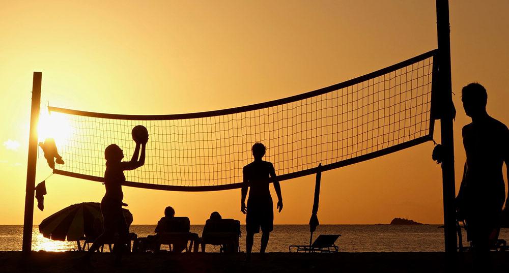
Volleyball rotation like rotating glaze layers in your acrylic portrait
Here in the portrait using the acrylic glazing technique, every part of the picture gets a turn, having another glaze added to it. (There are some times when we break this rule, and I’ll show you that in the video lesson)
Here is where I’m at in the portrait, prior to this video lesson, after the work I did on Lesson #4.
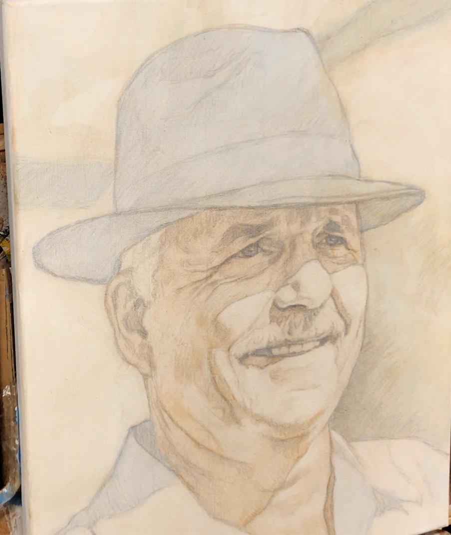
Acrylic portrait painting challenge example in progress using the acrylic glazing technique, 16 x 20, acrylic on canvas by artist and instructor Matt Philleo
What we want to do at this stage:
Since we already have locked in the major differences in the color scheme and tonal value very simply, now we want to add more complexity to the painting.
We will be adding:
- depth to the dark value of the hat
- shadowed areas of the face
- and some of the darker areas within the background.
We will do this using the acrylic glazing technique, where we mix a TINY amount of acrylic paint into a LARGE amount of clear acrylic matte medium. It’s best to go very, very light when you start your painting. You should just barely see a difference.
Also, make sure you rinse your brush off thoroughly between glazes. Any extra water in the heel of the brush may cause your glazes to drip or get streaky.
Here’s how to do it:
- Mix your Glaze for Hat: Use small, fairly equal amounts of ultramarine blue and raw umber dark, and mix with a large amount of matte medium (5% paint to 95% medium) as shown in the video lesson. “Scoop” a large amount of glaze onto your 3/4″or 1″ flat brush. A few of the glazes will get a little darker, with ratios of as much as 30% paint to 70% medium. Make sure you watch the video to know where and when to change the ratio.
- Apply the Glaze: Start on the left-hand side of hat and apply the glaze with firm pressure to cut along the edges. Spread the paint out toward the right, keeping a wet edge. Flip the brush over to make use of the paint that is on both sides.
- Smooth Out the Glaze: Use diagonal criss-cross strokes to blend the glaze out rapidly. Use very light pressure at the end, just barely grazing your brush across the top. Don’t overwork the glaze. TIP: It dries quickly. If it starts to get blotchy or tacky, just leave it alone, or you’ll make it worse. You will be able to smooth it out later with more layers on top.
- See Where Else You Can Employ the Glaze: Because you don’t want to waste the paint and medium, and to save time, use this same glaze on the background, adding as shown in the video lesson.
- Add a Shadow Glaze to the Face. What we want to do is add a shadow on top of the shadow. Start at the left side of his face, underneath the hat, and cut up along the edge, working your way right, and bring the glaze down into the forehead wrinkles as I show in the video. Follow the distinct shapes and patterns that you see on your reference photo.
You will repeat this process another time, with some variations.
Ready to paint?
Now, before you begin (yes, I have to ask you again, just in case 🙂 )…
Are you registered for the challenge?
If not, register below for FREE and I’ll send you:
- a downloadable/ printable”Welcome Kit” with a Supplies List and a Palette Color Layout Guide.
- high-resolution images of the photo we’ll be painting from for this challenge.
- each new lesson that comes out in this Masterclass series.
- a link to my private Facebook group, where you can do this challenge with other artists, get feedback and help on your portrait, and not feel alone.
REGISTER TODAY. The challenge is ongoing, something you can do at your own pace. It’s not too late to enter!
Watch my in-depth Masterclass acrylic online tutorial below to see these steps in action.
After learning from this video, you’ll know exactly how to do it.
Make sure to watch the ENTIRE video first before diving into the painting. It will be worth it to do that. Then, I’d like you to go back and refer to whatever steps you need to as you paint. That way, you won’t miss any of the instruction and tips that will help you make this portrait your very best.
Here’s the video…
[PORTRAIT CHALLENGE] Masterclass Lesson #5: Building up Depth With Glazes
Moving Forward…
Excellent job staying with me and the other artists for this challenging portrait! The acrylic glazing technique takes some getting used to, but once you really “get it” you will be able to paint with a freedom, confidence, and sense of realism that will keep you encouraged to keep on painting more and more.
In our next class, I’ll show you how to add more glazes and build up the skin tones. It’s something so many artists aspire to: create those lifelike skin tones that just look real. And now with a good foundation in place, we can do it!
I’ll see you in our next class! Until then be blessed in your painting and you and your family stay safe and healthy.
Yours for Better Portraits,
![]()
If you found this post helpful or encouraging, would you send it on ahead? Let others know with the share buttons below. I’d love to hear your comments. Thank you so much!
Let me know if you have any questions about the challenge that I didn’t answer. Leave your question in the comments below and I’ll get back to you!

[PORTRAIT CHALLENGE] Masterclass Lesson #4, LIVE: Establishing Your Color and Values
For a change of pace, we did the Acrylic Portrait Challenge Masterclass Lesson #4 as a LIVE class, and I’m excited to share it with you!
In our last lesson, I showed you how to prepare your canvas for painting by whiting out the grid lines, sealing in and muting the sketch, and preparing your palette.
Finally, we began the actual painting process with a glaze of ultramarine blue (a glaze is a small amount of acrylic paint mixed into a large amount of clear acrylic medium, usually matte medium).
Now, in this lesson (recorded LIVE), I will show you how to add the next two glazes, which will nearly cover the entire canvas with one layer.
Whereas the sketch is the actual foundation for the painting, this first layer is very important. It is like the floor joists when a house is built. The rest of the structure attaches to that, and so housebuilders take extra time to make sure they do it correctly. If they don’t they’ll end up with a structure that will end up sagging years, or even worse, collapsing!
In the same way, we want to make sure we have this first layer done correctly. Don’t feel nervous about it. You can still fix a painting that hasn’t been started correctly, and end up with a truly realistic acrylic portrait. It just will take you more time and effort to correct, and so it’s best to avoid that hassle if possible.
What we want to do at this stage:
Our main goal right now is to establish the main value and color scheme of the portrait, simultaneously. We want to “lock-in” the contrast between the lights and dark values, paying attention to their specific edges, boundaries, and shapes. If you did the sketch according to Lesson #2, then you will know almost exactly where to place your initial glazes, because your sketch tells you where to put it.
We also want to observe the major differences in color within the reference photo, simplify it to “warm and cool” tones and use our inital glazes to plot that out. Then, future layers will be added on top of them, getting more and more complex as we go along.
But the initial glaze will serve us well.
It’s like how a major highway was often once a foot trail, then a cowpath, then a dirt road, then a paved road, and finally a highway. It’s a lot easier to upgrade a road, than to try to build a new one. You’d have to bulldoze trees, cut through rocks, level the land, and even remove homes if necessary.
In the same way, with the glazing technique, we are getting the compounded effect of each previous layer adding richness and depth to the ones that come after them. That’s why you want to start off right.
Again, as I’ve said in the last lesson: begin the painting lightly. Much lighter than you think. And certainly more than you’re used to painting, if you’ve painted for a while. If you just barely see a difference in this first layer, you’re doing it exactly right!
Let’s dive into the process…
Here’s how to do it:
- Mix your Glaze for the Skin Tone Foundation Layer: Use a small amount of burnt sienna and raw umber dark, and mix with a large amount of matte medium (5% paint to 95% medium) as shown in the video lesson. “Scoop” a large amount of glaze onto your 3/4″or 1″ flat brush.
- Apply the Glaze: Start on the left-hand side of the man’s face, and apply the glaze with firm pressure to cut along the edge of the ear, neck, and along the collar. Spread the paint out toward the right, keeping a wet edge. Flip the brush over to make use of the paint that is on both sides.
- Smooth Out the Glaze: Use diagonal criss-cross strokes to blend the glaze out rapidly. Use very light pressure at the end, just barely grazing your brush across the top. Don’t overwork the glaze. TIP: It dries quickly. If it starts to get blotchy or tacky, just leave it alone, or you’ll make it worse. You will be able to smooth it out later with more layers on top.
- Mix the Glaze for the Background Foundation Layer: Now, if you followed my steps from Lesson #3, you should have an ultramarine blue glaze already on the background’s darkest values. This glaze will go on top of that, and will start the basic color for the mid-tone area in the right direction. Take a small amount of raw sienna as the base, smaller amount of raw umber (or raw umber dark) and and even smaller amount of ultramarine blue, and mix them slowly into the matte medium as I show in the video.
- Add the Glaze and Smooth it Out. Apply this similarly as the skin tone glaze, but this time, you only need to cut up along the edge of objects with very light tonal value, such as the shirt or the illuminated portion of the man’s face. The glaze can go on top of the hat, because the final tonal value of that area will be so dark, so there’s no need to worry about trying to “keep within the lines” there.
Ready to paint?
Now, before you begin (yes, I have to ask you again, just in case 🙂 )…
Are you registered for the challenge?
If not, register below for FREE and I’ll send you:
- a downloadable/ printable”Welcome Kit” with a Supplies List and a Palette Color Layout Guide.
- high-resolution images of the photo we’ll be painting from for this challenge.
- each new lesson that comes out in this Masterclass series.
- a link to my private Facebook group, where you can do this challenge with other artists, get feedback and help on your portrait, and not feel alone.
REGISTER TODAY. The challenge is ongoing, something you can do at your own pace. It’s not too late to enter!
Watch my in-depth Masterclass acrylic online tutorial below to see these steps in action.
After learning from this video, you’ll know exactly how to do it.
Make sure to watch the ENTIRE video first before diving into the painting. It will be worth it to do that. Then, I’d like you to go back and refer to whatever steps you need to as you paint. That way, you won’t miss any of the instruction and tips that will help you make this portrait your very best.
Here’s the video…
[PORTRAIT CHALLENGE] Masterclass Lesson #4, LIVE: Establishing Your Color and Values
Moving Forward…
If you made it this far, congratulations! It’s not easy to start a painting so light, when your natural instinct is paint thick and dark right away. So, if you’ve followed my steps as best you can, high fives and hat’s off to you! Stick with this process, and you will be able to paint more confidently and realistically than you ever have before.
Now, since we have the complete glaze foundation work done on the painting—the hat, the face, the shirt, the background all has paint on it, we can move on and add more and more glazes—building up richness, depth, and detail. The painting will look more and more amazing each time we add another layer. There may be a few times where you’ll hit a few rough spots, but by God’s grace, I’ll show you how to navigate those challenges and finish your portrait well.
I’ll see you in our next class! Until then be blessed in your painting and may God guide your every brushstroke!
Yours for Better Portraits,
![]()
If you found this post helpful or encouraging, would you send it on ahead? Let others know with the share buttons below. I’d love to hear your comments. Thank you so much!
Let me know if you have any questions about the challenge that I didn’t answer. Leave your question in the comments below and I’ll get back to you!

[PORTRAIT CHALLENGE] Masterclass Lesson #3: Beginning Your Painting Lightly and Confidently
Masterclass Lesson #3 for the Acrylic Portrait Painting Challenge is open!
In this lesson, you will learn how to slowly transition out of the sketch process and into the painting with confidence.
Instead of the typical way of painting—dumping a bunch of paint onto the canvas and hoping something good comes out of it, you will strategically begin your portrait with light, translucent glazing layers.
If you follow the heart of my method, you will not feel like the painting is out of control. You will be guiding the painting to a successful finish, rather the painting taking you and your emotions for a roller-coaster ride.
It takes patience.
So please don’t jump ahead, even though it feels you’re starting so slowly.
You’ll find that once we get the painting moving in the right direction, it will begin to take off, just like a car as it goes into higher gear. Your layers and brushstrokes will get bolder as you hit the midpoint of your painting, like a climax in a good movie or book. You’ll be moving much faster then!
Finally, you’ll slow down again.
You’ll gently add nuances and final touches to bring the portrait home and make it a masterpiece.
In our previous step, I showed you how to sketch your canvas to create a firm foundation for your painting. Not perfect, but accurate.
Now, in this lesson, we will finally get to the painting!
Here’s how to do it:
- White-out the Grid Lines. Use pure titanium white paint, undiluted, to cover your grid lines, so you don’t see them in the final painting.
- Seal in the Sketch. Use pure matte medium to seal in your sketch so you can paint over it without messing up your detail work and muddying your paint.
- Mute the Sketch (Create a toning layer or “ground.”) Make your sketch lines softer and subdued so that you won’t have to work so hard to conceal them with more paint layers later.
- Prepare Your Palette. Arrange your palette colors for this painting as shown on your Palette Layout Guide (last page of the Welcome Kit) so that all the colors are arranged in such a way so that the ones you need most are closest to you and if they bleed into each other, they won’t muddy each other up.
- Add the First Glazing Layer. Start very simple with one basic color mixed into matte medium to make a VERY light glaze (semi-transparent/ translucent) concentrating on your darkest value and cool tones at the same time. This is the blocking-in, or underpainting layer, so it doesn’t need to be dark or complicated.
Ready to paint?
Now, before we begin (yes, I have to ask you again, just in case 🙂 )…
Are you registered for the challenge?
If not, register below for FREE and I’ll send you:
- a downloadable/ printable”Welcome Kit” with a Supplies List and a Palette Color Layout Guide.
- high-resolution images of the photo we’ll be painting from for this challenge.
- each new lesson that comes out in this Masterclass series.
- a link to my private Facebook group, where you can do this challenge with other artists, get feedback and help on your portrait, and not feel alone.
REGISTER TODAY. The challenge is ongoing, something you can do at your own pace. It’s not too late to enter!
Watch my in-depth Masterclass acrylic online tutorial below to see these steps in action.
After learning from this video, you’ll know exactly how to do it.
Make sure to watch the ENTIRE video first before diving into the painting. It will be worth it to do that. Then, I’d like you to go back and refer to whatever steps you need to as you paint. That way, you won’t miss any of the instruction and tips that will help you make this portrait your very best.
Here’s the video…
[PORTRAIT CHALLENGE] Masterclass Lesson #3: Beginning Your Portrait Painting Lightly and Confidently
Moving Forward…
The largest challenge of the glazing technique is overcoming the tendency to go dark and thick with your paint. But if you stick with this, even beyond this portrait, you’ll find the technique “clicking” and you’ll understand how it can help you to create a painting with incredible luminosity, smooth shading, depth, and detail.
In other words, a portrait that will “wow” others and you’ll feel proud to have created. And even more, a portrait you can give as a gift, hang on your wall (or someone else’s) and will be enjoyed for years to come.
There you have it! Now you know exactly how to begin your portrait lightly, and confidently. The next step is to build up depth with more glazes and see the amazing portrait fade in, slowly materialize before your eyes.
I’ll see you in our next class! Until then be blessed in your painting and may God guide your every brushstroke!
Yours for Better Portraits,
![]()
If you found this post helpful or encouraging, would you send it on ahead? Let others know with the share buttons below. I’d love to hear your comments. Thank you so much!
Let me know if you have any questions about the challenge that I didn’t answer. Leave your question in the comments below and I’ll get back to you!

5 Steps on How to Paint a Vibrant Acrylic Portrait
Learn the classical glazing technique for depth and luminosity
Acrylic painting is an exciting medium known for its versatility, but achieving the depth and vibrancy often associated with oil paintings can seem challenging. However, by employing the classical glazing technique, a method favored by old masters like Rembrandt, Titian, and Vermeer then you can produce rich, luminous results with acrylics. This blog post will guide you through 5 essential steps to create a vibrant acrylic portrait using this time-tested method.
This tutorial shows the entire process of painting a portrait. Here are the steps I show in this tutorial:
- Start with a Detailed Sketch.
- Apply the Initial Glaze Layers
- Layer and Build Gradation
- Introduce Vibrant Colors
- Focus on Nuances and Details
1. Start with a Detailed Sketch
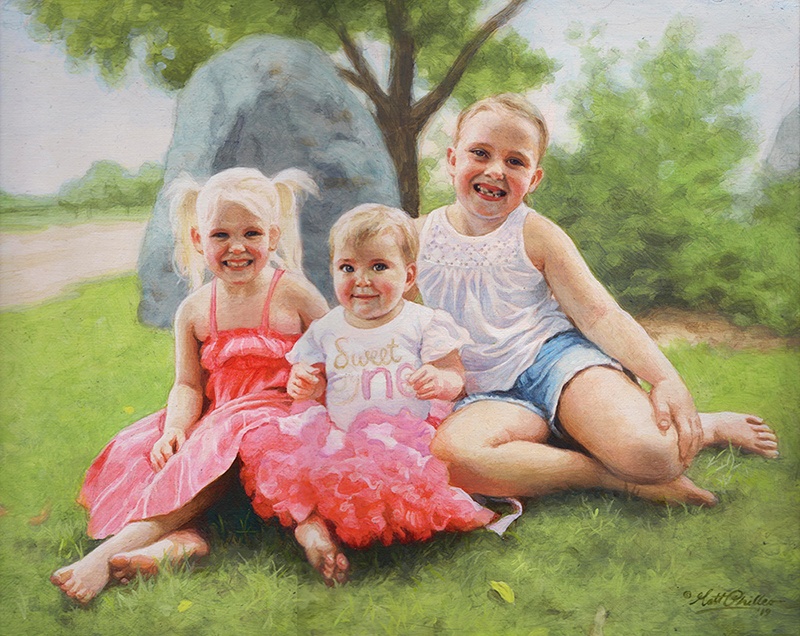
Every masterpiece begins with a solid foundation, and in portrait painting, that foundation is the sketch. Before you start adding color to your canvas, take time to create a detailed and accurate sketch of your subject. For this project, an 11×14 portrait of three girls in a park serves as an example.
By using a sepia-tone prismacolor colored pencil, you can establish proportions and likeness. Accuracy in this stage helps set the stage for a calm and confident painting process. Once your sketch is ready, seal it with a clear matte medium. This acts as a protective layer, ensuring that the pencil lines remain intact as you begin adding paint.
- Tip: Use a flat brush (¾ inch to 1 inch wide) to apply the matte medium. Make sure the application is smooth and even, allowing it to dry thoroughly before proceeding to the next step.
2. Apply the Initial Glaze Layers
The heart of this painting method lies in glazing, where thin, transparent layers of paint are applied over one another to build depth and richness. Unlike traditional opaque acrylic painting, the classical glazing technique requires a mixture of 95% matte medium to 5% paint. This creates a very light wash that enables you to gradually build colors without overwhelming the canvas.
Begin by mixing raw umber dark with ultramarine blue to create lifelike skin tones and shadow areas. These first layers will be almost imperceptible, but they provide a strong base for the layers that follow.
- Tip: The first layers of glaze should be incredibly light. This allows for adjustments in color or value without the need to paint over mistakes. The glazing method helps avoid the common frustration of muddy colors often encountered in acrylic painting.
3. Layer and Build Gradation
Once the initial glaze is applied, it’s time to focus on layering. As you build up more layers, you’ll notice how the painting starts to take on a more vibrant and realistic appearance. The goal here is to create a seamless transition between light and dark values, blending tones smoothly to replicate the natural shading found in your reference photo.
In this step, more raw umber dark and ultramarine blue are used to deepen the shadows on the forehead and hair. This layering process helps achieve the subtle gradation required for realistic portraits.
- Technique: As you layer, ensure that each glaze is thin and transparent. Too much paint in a single layer can cause the painting to look heavy and lose the delicate transparency that glazing provides.
4. Introduce Vibrant Colors
To make your portrait truly vibrant, it’s essential to introduce bold colors into the glazing process. In this example, a dash of Liquitex hot pink was added to the dress to intensify the color and give it a glowing effect. The key is to use these bright colors sparingly, applying them in thin layers so that they blend harmoniously with the existing hues.
When applying glazes to areas like the clothing, make sure to leave the white areas exposed. This technique, known as “preserving the luminosity,” ensures that highlights remain bright and eye-catching, adding to the overall vibrancy of the portrait.
- Tip: When adding vibrant glazes, thin the paint with medium and apply it cautiously. This helps prevent overpowering the existing layers while enhancing the color saturation.
5. Focus on Nuances and Details
The final step in this process involves refining the smaller details and nuances that bring a portrait to life. For example, the highlights in the hair, shadows in the creases of clothing, and the subtle changes in skin tone around the eyes require careful attention.
In the final layers, you can also experiment with a semi-opaque mixture, using titanium white, raw umber dark, and organic red-orange to add warmth and depth to the skin tones. With each new layer, the portrait takes on more life, depth, and realism. At this stage, it’s important to use more opaque layers sparingly, as glazing is best suited for large areas, while more detailed parts, such as fingernails or eyes, may benefit from a slightly thicker application of paint.
- Technique: If you notice that certain areas appear too flat or lack depth, consider adding a dark glaze to emphasize the shadows. Because mixing ultramarine blue with raw umber dark creates a rich, deep tone perfect for refining these darker areas without relying on black paint.
Conclusion: Patience Is Key
As you add each layer of glaze, then always remember that patience is vital. Because acrylic glazing requires multiple layers, sometimes ten or more to achieve the desired depth and luminosity. Each layer builds upon the last, contributing to the portrait’s final vibrancy. While it may take time, the results are well worth the effort.
By following these five steps, you can create a stunning acrylic portrait with vibrant colors and lifelike depth, all while employing the classical glazing technique favored by the old masters.
For further resources and guides, visit realisticacrylic.com and check out my free courses to enhance your acrylic painting journey.
- How to Paint Foliage Using the Acrylic Glazing Technique
- How to Trace for an Accurate Portrait Sketch
- How to Paint Realistic Eyes in Your Acrylic Portrait
- How to Add Raw Umber Dark & Ultramarine Blue to Your Portrait
- How to Make Your Own Raw Umber Dark
- How to Paint Realistic Trees & Grass in Your Acrylic
- How to Block In Skin Tone Values Using Glazing Technique
- How to Paint Vibrant Reds in Your Acrylic Portrait
- How to Glaze Background Colors & More Acrylic Portrait
- How to Paint White Clothing in Your Acrylic Portrait
- How to Easily Transition from a Sketch to a Painting
- How to Block In Shading & Skin Tones in Your Acrylic
- How to Build Up Color on Acrylic Pet Portrait
- How to Build Up Form on Clothing with Acrylic
- How to Paint Dark Clothing Using Acrylic Glazing Technique
- How to Paint a 24 x 30 Acrylic With 30 People
- How to Do Smooth Shading with Acrylic
- How to Sketch an Acrylic Portrait with a Grid
Read more about how to paint a portrait that you can surely be proud of!
I’d love to hear your thoughts about this video. Please share it with your friends and family. Let me know if you have any further questions. I’ll greatly help you.
If you’d like to learn more, sign up for my free email tips and video class today.
Learn How to Paint Acrylic Portraits With My Free Mini-Video Course!
Thank you so much for taking the time to read this tutorial and watch the video. That means a lot to me. I hope you find it very helpful in your portrait painting.
Yours for Better Portraits,
P.S. Did you find this post helpful or encouraging? If so, send it on ahead! Let others know with the share buttons below. I’d love to hear your comments. Thank you so much! Also, do you have a question on acrylic portrait painting you’d like answered? Let me know, and I’d be happy to help!

Portrait Painting of a Veteran at the Yurt
Is it possible to do portrait painting while you’re away from your home, your usual studio area?
This was something I’ve always wanted to do: create art while camping. And for all the years I’ve gone camping, I’ve never been able to successfully do it.
But finally, at the end of June, my brother and I decided to go camping at a rustic yurt up in Cable, WI. Where is that? Let’s just say, it’s “way up north.” 🙂 And what is a yurt? It’s a round tent-like house, a permanent structure made of lattice wood, bound together with steel cable, and covered with fabric. We rented it through Airbnb for two days.
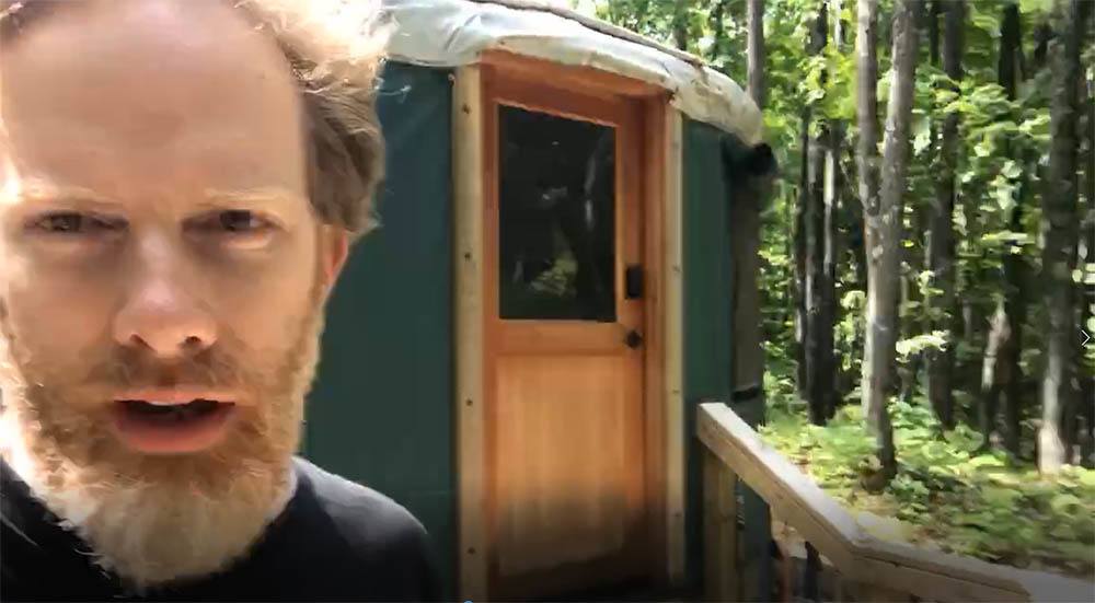
Acrylic portrait artist Matt Philleo ready to paint at a yurt in Cable, Wisconsin
We parked at the bottom of the hill and carried our gear up about a mile. We realized how out of shape we were! I also had my painting supplies: easel, palette, and brushes with me. In the middle of hiking and cooking, we decided to both do a little work: my brother wrote (he’s an author) and I painted.
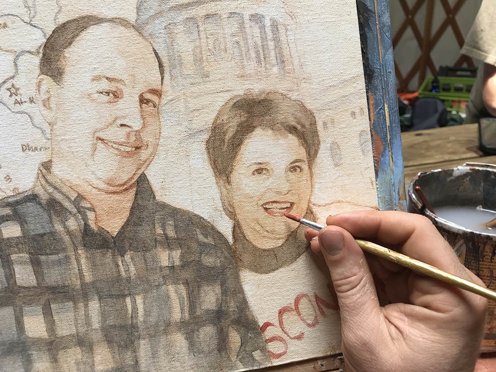
Painting an acrylic portrait from photo inside a yurt while camping, 11 x 14 acrylic on canvas ©2019 by Eau Claire area portrait artist Matt Philleo
I know. You’re probably thinking I should have painted the scenery up there, and yes, it was beautiful. But I had a commissioned portrait from a photo to get done: a painting of a veteran that served in the gulf war. And I love painting people, so it hardly seemed like work.
After bacon, eggs, and oatmeal for breakfast, it was time for painting.
Here is a video showing the beginning part of the process. In this video, I am basically blocking in the values with just raw umber dark and ultramarine blue. Of course, it’s all thinned out and made translucent with matte medium.
And then, here’s the next video in the process. Here I’m adding some color with burnt sienna, alizarine crimson and a few other colors. We’re starting to build up some skin tones. Also working on the flannel shirt. It takes a lot of layers to get it dark enough to look realistic!
After lunch, we hiked, and then came back and did more work: refining the shadows and making sure the likeness is accurate.
Sometimes your sketch just won’t cut it. It will get you about 80% of the way there, and you do the remaining 20% with paint. As you apply the paint, you can change the shape of the nose, the distance between the eyelids, lengthen the smile, etc., to adjust whatever might have been off during your sketch.
Of course, there is more to go on the painting. I’ll share the rest with you soon. I wasn’t able to finish it at the yurt, but I put in several hours. So, not only did I get to spend some great quality time with my brother, but I got to do some enjoyable work as well. After the big move, I finally feel like I’m getting into a regular groove of painting and posting tutorials. Thanks so much for your patience.
UPDATE: Here is the final video of this portrait, painted at my regular studio…
And a photo of it…
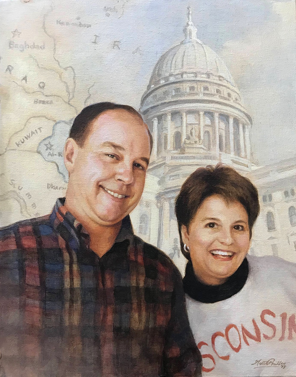
Custom realistic acrylic portrait of a veteran and his wife painted by Eau Claire area portrait artist Matt Philleo, 11 x 14, acrylic on canvas, ©2019 by Matt Philleo
I really enjoyed painting this for the client, putting all the elements–the map of Iraq, the capitol building, and the people together into one cohesive portrait that I hope will be a cherished keepsake for the family for years to come.
I hope this painting has encouraged you and given you some ideas to use in your own portrait painting. I would love to help you learn to paint portraits your very best. Let me know if I can be of more help to you in any way.
Yours for better portraits,
P.S. Did you find this post helpful or encouraging? If so, send it on ahead! Let others know with the share buttons below. I’d love to hear your comments. Thank you so much! Also, do you have a question on acrylic portrait painting you’d like answered? Let me know, and I’d be happy to help!

4 Questions About Acrylic Portrait Painting, Answered
Recently, I was asked some questions about acrylic portrait painting. I hope the answers I shared with this artist can be of help to you as well.
1. How do you prepare your canvas panel for painting with Acrylics?
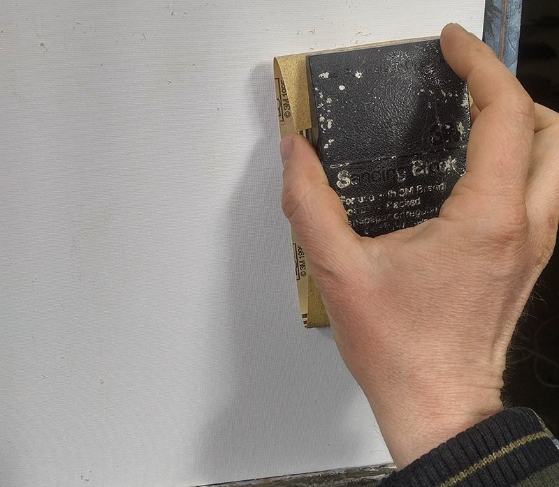
Sanding a canvas panel in preparation for painting an acrylic portrait
2. You spoke of layering your paint when composing a portrait. Please briefly explain.
I use the glazing technique to slowly bring the portrait from a white canvas to completion. The glazing technique is achieved by mixing your paint with clear acrylic medium (usually matte medium) to disperse the pigment, thus allowing light to pass through.
Although you could use water, it’s not recommended, because it breaks down the acrylic resin binder, causing a rough visual texture and possible poor adhesion. For a smoother look, you want to use clear acrylic medium.
Custom commissioned realistic acrylic portrait from a photo painted by Eau Claire area artist Matt Philleo, ©2019 Fine Art by Matt Philleo
3. You mentioned using a Prismacolor pencil for making your diagram. What color do you recommend?
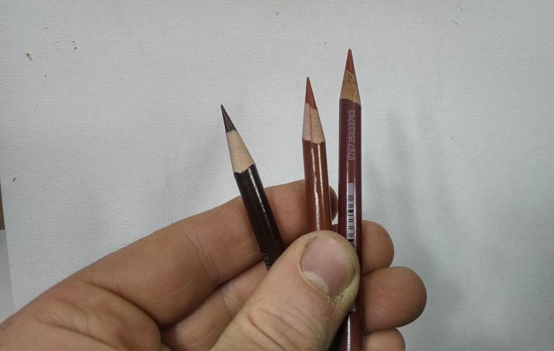
Using colored pencil for your acrylic portrait sketch makes things a lot easier. Technique discovered and developed by Matt Philleo.
4. Do you do the painting from start to finish in one setting?
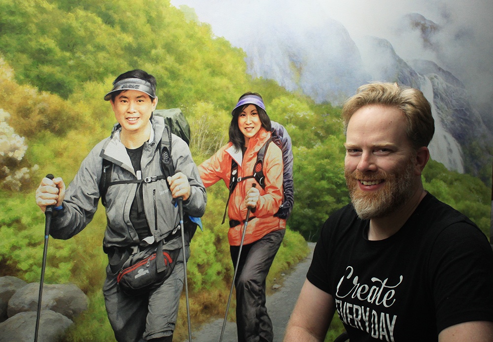
Acrylic portrait artist Matt Philleo posing in front of a 48″ x 72″ commission painting for a client in Brunei
I hope these questions and answers were helpful to you as well. I know some of this stuff seems pretty basic, but it’s good for all of us to pause and think about why we do what we do. It then makes the doing that much more significant.
Let me know if you have any questions of your own about acrylic portrait painting and I’ll do my best to help!
P.S. Did you find this post helpful or encouraging? If so, send it on ahead! Let others know with the share buttons below. I’d love to hear your comments. Thank you so much! Also, do you have a question on acrylic portrait painting you’d like answered? Let me know, and I’d be happy to help!