- You are here:
- Home »
- Blog
- Archive:

How to Paint Two Bubble Frame Oval Acrylic Portraits
Unlock the secrets to creating captivating two bubble frame oval acrylic portraits
Painting two bubble frame oval acrylic portraits offers a unique opportunity to explore creativity and technique while crafting eye-catching artwork. In this guide, you’ll discover the essential steps to create stunning portraits that showcase not only your artistic skills but also the charming oval frames that elevate your paintings. Whether you’re a beginner or an experienced artist, you’ll learn how to blend colors effectively, capture realistic features, and compose your portraits for maximum impact. Let’s dive into the world of acrylic painting and bring your two bubble frame oval acrylic portraits to life!
How is my portrait project coming along?
“Um, I haven’t even started it yet.”
“Oh. Could you do another one and get it done for me by Christmas?”
“Let me check. Sure.”
This is kind of how the conversation went when a client called me on a portrait project that I had scheduled out for a few months. I was backed up with commissions, and it was already well into December.
Do another portrait when I was already behind? Why not? I thrive on a little deadline pressure. I’ve got an extra reserve of midnight oil 🙂
So here are the portraits I created, two convex-oval 14″ x 20″ acrylic on canvas paintings. I decided to work on both at once. And I got them both done in time, too, by God’s grace!
And now I want to show you how I painted them. I’ll take you through the process from the colors I select for the palette, the first few layers, all the way to the completed painting.
How I Painted These Oval Vintage Acrylic Portraits
This tutorial is a work in progress, so I’ll be adding more videos in the future!
Keep in touch and I’ll let you know when I post the next one!
Let me know how this tutorial helps!
Have you ever painted on an oval canvas or unusual surface before? If so, leave a comment and tell me about it. Have a blessed day!
LEARN MORE
- How to Paint Foliage Using the Acrylic Glazing Technique
- How to Trace for an Accurate Portrait Sketch
- How to Paint Realistic Eyes in Your Acrylic Portrait
- How to Add Raw Umber Dark & Ultramarine Blue to Your Portrait
- How to Make Your Own Raw Umber Dark
- How to Paint Realistic Trees & Grass in Your Acrylic
- How to Block In Skin Tone Values Using Glazing Technique
- How to Paint Vibrant Reds in Your Acrylic Portrait
- How to Glaze Background Colors & More Acrylic Portrait
- How to Paint White Clothing in Your Acrylic Portrait
- How to Easily Transition from a Sketch to a Painting
- How to Block In Shading & Skin Tones in Your Acrylic
- How to Build Up Color on Acrylic Pet Portrait
- How to Build Up Form on Clothing with Acrylic
- How to Paint Dark Clothing Using Acrylic Glazing Technique
- How to Paint a 24 x 30 Acrylic With 30 People
- How to Do Smooth Shading with Acrylic
- How to Sketch an Acrylic Portrait with a Grid
Read more about how to paint a portrait that you can surely be proud of!
Yours for better portraits,

P.S. Did you find this post helpful or encouraging? If so, send it on ahead! Let others know with the share buttons below. I’d love to hear your comments. Thank you so much! Also, do you have a question on acrylic portrait painting you’d like answered? Let me know, and I’d be happy to help!

How to Build Depth in Your Acrylic Portrait Backgrounds
Learn the art of layering to create stunning backgrounds
Creating depth in your acrylic portrait backgrounds can transform your artwork from flat and uninviting to vibrant and lifelike. This comprehensive guide will explore techniques and tips that can be utilized to effectively build depth in your acrylic paintings. Through careful layering, color mixing, and thoughtful brushwork, your backgrounds will not only enhance your portraits but also engage viewers and add emotional resonance.
Understanding Depth in Art
Depth in art refers to the illusion of three-dimensionality on a two-dimensional surface. It involves creating a sense of space, distance, and perspective. In acrylic portrait painting, the background plays a crucial role in establishing depth and can significantly influence the viewer’s perception of the subject.
Techniques for Building Depth
1. Layering with Glazes
Layering is one of the most effective techniques for creating depth. It involves applying transparent layers of paint over one another, allowing underlying colors and textures to show through.
- Start with a Base Layer: Begin with a solid background color that will serve as your foundation. A mid-tone color can be effective for this purpose.
- Apply Transparent Glazes: Use a mix of acrylic paint and a glazing medium to create transparent layers. Ultramarine blue and raw umber dark can be mixed to achieve subtle variations.
By layering these glazes, different values can be developed. The key is to allow each layer to dry before applying the next, which helps to create a sense of depth through the transparency and complexity of the colors.
2. Creating Gradation
Gradation can be used to suggest distance and atmosphere in your backgrounds. This can be achieved through both blending and glazing techniques.
- Segmented Areas: Instead of blending wet colors, use segmented areas of glazing to create smooth transitions. By touching certain areas while leaving others untouched, a subtle blend can be achieved. This method provides a more natural appearance and enhances the depth of the painting.
- Use of Color Temperature: Varying color temperature can add to the perception of depth. Cool colors, such as blues and greens, can recede in the background, while warmer tones tend to come forward. For instance, using a cooler ultramarine blue in the background while maintaining warmer tones in the foreground can create a compelling contrast.
3. Employing Contrast
Contrast is essential in making your subject stand out against the background. By darkening background areas, the foreground subjects will naturally become more pronounced.
- Darkening Techniques: When applying darker glazes, consider how the light interacts with your subject. By ensuring that the background is darker than the portrait, the subjects will appear more luminous.
This can be particularly effective when using glazes, as they dry quickly, allowing for rapid layering without mudding colors. As highlighted in the video, the layering properties of acrylics can be leveraged to achieve a depth that feels rich and engaging.
4. Incorporating Patterns and Textures
Adding textures or patterns can create interest in the background and contribute to the overall depth of the painting.
- Marble-like Backgrounds: A painterly, marble-like appearance can be achieved by varying brush strokes and layering colors. Short, diagonal strokes can create a textured effect that draws the viewer’s eye without overwhelming the portrait.
This not only enhances depth but also gives the background a dynamic quality that complements the portrait.
Tips for Effective Backgrounds
- Use a Limited Palette: A limited color palette can help maintain harmony in your painting. This also makes it easier to create depth, as the colors will blend and layer more cohesively.
- Experiment with Brush Techniques: Different brush types and strokes can create varying effects. Experimenting with short strokes, glazing, and layering will allow for discovering unique methods of adding depth.
- Balance Between Foreground and Background: Always consider the balance of colors and values between your foreground and background. This ensures that your subject remains the focal point while the background supports its presence.
- Stay Patient: Building depth takes time. Allow layers to dry completely between applications to achieve the best results.
Conclusion
Building depth in your acrylic portrait backgrounds is a rewarding endeavor that can significantly enhance your artwork. By employing layering techniques, creating gradation, utilizing contrast, and incorporating textures, your backgrounds will not only support your subjects but also engage viewers on a deeper level.
As you continue to practice and refine these techniques, your portraits will come to life, showcasing the beauty of depth in acrylic painting. The journey of learning and experimenting is essential for any artist, and through consistent practice, remarkable improvements will be evident in your work.
With these insights, you are now equipped to enhance your acrylic portrait backgrounds and bring your artistic vision to life. For further resources and guides, visit realisticacrylic.com and check out my free courses to enhance your acrylic painting journey. Happy painting!
The Video Lesson…
- How to Paint Foliage Using the Acrylic Glazing Technique
- How to Trace for an Accurate Portrait Sketch
- How to Paint Realistic Eyes in Your Acrylic Portrait
- How to Add Raw Umber Dark & Ultramarine Blue to Your Portrait
- How to Make Your Own Raw Umber Dark
- How to Paint Realistic Trees & Grass in Your Acrylic
- How to Block In Skin Tone Values Using Glazing Technique
- How to Paint Vibrant Reds in Your Acrylic Portrait
- How to Glaze Background Colors & More Acrylic Portrait
- How to Paint White Clothing in Your Acrylic Portrait
- How to Easily Transition from a Sketch to a Painting
- How to Block In Shading & Skin Tones in Your Acrylic
- How to Build Up Color on Acrylic Pet Portrait
- How to Build Up Form on Clothing with Acrylic
- How to Paint Dark Clothing Using Acrylic Glazing Technique
- How to Paint a 24 x 30 Acrylic With 30 People
- How to Do Smooth Shading with Acrylic
- How to Sketch an Acrylic Portrait with a Grid
Read more about how to paint a portrait that you can surely be proud of!
Let me know how this helps! If you have questions on your portrait painting, feel free to contact me ([email protected])
Yours for better portraits,
P.S. Did you find this post helpful or encouraging? If so, send it on ahead! Let others know with the share buttons below. I’d love to hear your comments. Thank you so much! Also, do you have a question on acrylic portrait painting you’d like answered? Let me know, and I’d be happy to help!
Would you like to learn portrait painting from me in person?
I’d like to let you know that I’ll be teaching at the Chippewa Valley Cultural Association (Heyde Center for the Arts, Chippewa Falls, WI) on March 12-13, 10:30am-3:30pm, a two-day intensive acrylic portrait painting workshop. The class size is limited to 10 people to make sure I can give each student feedback and individual instruction. For more details, visit my events page here…https://realisticacrylic.com/paint-an-acrylic-portrait-with-me-in-2019/

Paint an Acrylic Portrait With Me in 2019!
Would you like to learn portrait painting from me in person?
I’d like to let you know that I’ll be teaching at the Chippewa Valley Cultural Association (Heyde Center for the Arts, Chippewa Falls, WI) on March 12-13, 10:30am-3:30pm, a two-day intensive acrylic portrait painting workshop. The class size is limited to 10 people to make sure I can give each student feedback and individual instruction.
Learn more/ register by clicking the image below…
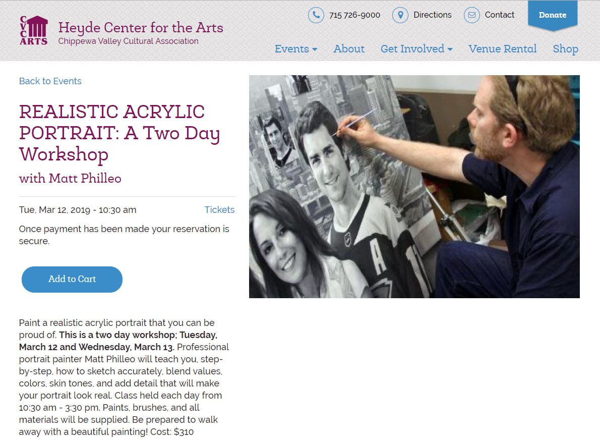
Learn how to paint realistic acrylic portraits with a two-day intensive , held at the Heyde Center in Chippewa Falls, WI workshop by artist Matt Philleo on March 12-13, 10:30-3:30pm
If you live or will be in the St. Paul/ Minneapolis-Eau Claire, WI area around that time and would like to learn how to paint with me, I would love to see you then!
Or maybe you know someone that may be interested. Could you please let them know about this? Thank you so much! Let me know if you have any questions.
Yours for better portraits,
P.S. Did you find this post helpful or encouraging? If so, send it on ahead! Let others know with the share buttons below. I’d love to hear your comments. Thank you so much! Also, do you have a question on acrylic portrait painting you’d like answered? Let me know, and I’d be happy to help!
Realistic Acrylic Portrait School, awarded 10 Top Acrylic Painting Blogs for 2019, by Feedspot.

How to Paint 8 x 10 Realistic Acrylic Portrait Timelapse
Just prior to Christmas, I finished this portrait of a local engineer.
Creating a realistic acrylic portrait can be a rewarding experience, especially when utilizing the glazing technique. This method involves layering transparent paints to build depth and luminosity in your artwork. In this tutorial, a step-by-step guide is provided to help artists of all levels achieve impressive results in an 8 x 10 portrait.
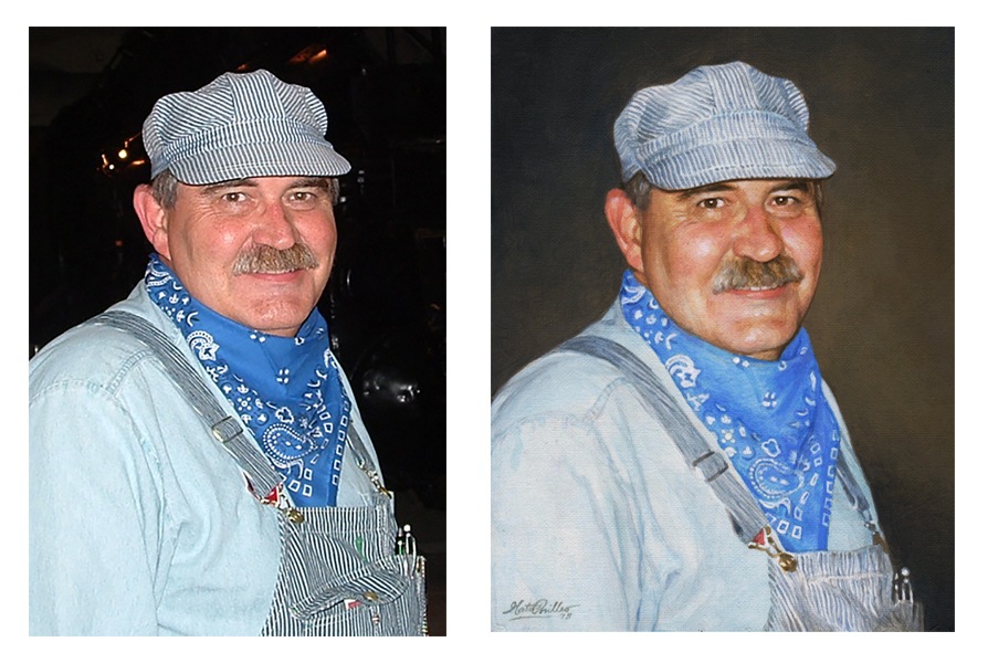
Understanding the Glazing Technique
The glazing technique is foundational in creating depth and realism in acrylic painting. It is characterized by the application of thin, transparent layers of color, allowing the underlying layers to shine through. This method is often compared to photography, where an image starts light and gradually gains depth.
Materials Required
Before beginning, ensure that the following materials are prepared:
- Acrylic paints: Ultramarine blue, brownish tone (raw umber or dark), and skin tones
- Clear acrylic matte medium
- Brushes: Small round brushes, flat brushes, and a small detail brush
- Palette for mixing colors
- Canvas (8 x 10 inches recommended)
- Water for rinsing brushes
Step-by-Step Process
Step 1: Preparing the Background
To commence, a light glaze is applied to the background using clear acrylic matte medium. This initial layer serves as a foundation for subsequent colors and adds a soft, ethereal quality to the painting.
Step 2: Adding Foreground Details
Once the background is set, the first layer of details can be added. Ultramarine blue is used to paint the hat, while the brownish tone is applied to create depth in the background. Care is taken to let these layers dry before continuing with additional details.
Step 3: Building Up Layers
The glazing technique thrives on layering. After the initial foreground details have dried, the focus shifts to the face and scarf. By layering thin glazes, the desired colors are built up gradually, allowing the light to penetrate through the layers.
- Tip: Work from foreground to background to maintain focus on the subject. This approach helps keep details sharp and defined.
Step 4: Detailing the Features
Attention is drawn to the finer details in the face, such as the eyes and lips. Using various skin tones, nuances are added to create dimension. This is achieved by carefully layering pinkish tones on the cheeks and around the eyes, emphasizing features like eyebrows and the mustache with darker shades.
- Technique: When applying glazes, it is essential to work thinly. The use of a clear acrylic medium mixed with paint ensures translucency, allowing for subtle color variations.
Step 5: Refining and Smoothing
As the painting progresses, the need to refine details becomes evident. Skip around the canvas, working on different sections to ensure balance and harmony in the overall composition. Smoothing out areas with a gentle hand helps in creating a realistic appearance.
- Tip: Varying brush sizes and techniques can significantly enhance texture. Larger brushes are suitable for broader areas, while smaller brushes are ideal for intricate details.
Step 6: Enhancing Realism
To achieve a realistic finish, darker tones are added under the chin and in shadowed areas, enhancing the sense of depth. Highlights are strategically placed to simulate the effect of light on the face and clothing.
- Technique: As the final layers are applied, incorporating more opaque white paint helps achieve smoother transitions between colors.
Step 7: Final Touches
At the later stages of the painting, I continue to add details and shading. Varying line thickness and texture are key components to realism. Then moves back and forth between different areas of the portrait, ensuring that the final touches are cohesive and enhance the overall image.
Step 8: Signing the Artwork
After all the details have been finalized, the painting is signed. This not only signifies the completion of the work but also adds a personal touch to the artwork.
Conclusion
This step-by-step guide on painting a realistic acrylic portrait using the glazing technique showcases how layered approaches can bring an image to life. By utilizing transparency and careful detailing, you can create stunning, lifelike portraits that capture the essence of their subjects.
Whether you are an experienced artist or just starting, mastering the glazing technique will enhance your acrylic painting skills.
Additional Tips and Techniques
- Experiment with Colors: Don’t hesitate to mix different colors to achieve unique skin tones and shades.
- Practice Patience: Building up layers takes time, but the results are worth the effort.
- Use Reference Images: Having a clear reference will guide your color choices and proportions, making the process smoother.
By following these steps, you can enhance your painting techniques and create stunning, realistic portraits. Embrace the glazing method and enjoy the process of bringing your artistic visions to life!
For further resources and guides, visit realisticacrylic.com and check out my free courses to enhance your acrylic painting journey
Would you like to learn how to paint like this, with individual lessons broken down and explained?
Learn How to Paint Acrylic Portraits With My Free Mini-Video Course!(The lessons show me painting a different picture, but the technique is the same. Enjoy! 🙂
LEARN MORE
- How to Paint Foliage Using the Acrylic Glazing Technique
- How to Trace for an Accurate Portrait Sketch
- How to Paint Realistic Eyes in Your Acrylic Portrait
- How to Add Raw Umber Dark & Ultramarine Blue to Your Portrait
- How to Make Your Own Raw Umber Dark
- How to Paint Realistic Trees & Grass in Your Acrylic
- How to Block In Skin Tone Values Using Glazing Technique
- How to Paint Vibrant Reds in Your Acrylic Portrait
- How to Glaze Background Colors & More Acrylic Portrait
- How to Paint White Clothing in Your Acrylic Portrait
- How to Easily Transition from a Sketch to a Painting
- How to Block In Shading & Skin Tones in Your Acrylic
- How to Build Up Color on Acrylic Pet Portrait
- How to Build Up Form on Clothing with Acrylic
- How to Paint Dark Clothing Using Acrylic Glazing Technique
- How to Paint a 24 x 30 Acrylic With 30 People
- How to Do Smooth Shading with Acrylic
- How to Sketch an Acrylic Portrait with a Grid
Read more about how to paint a portrait that you can surely be proud of!
Let me know how this helps.
Yours for better portraits,

P.S. Did you find this post helpful or encouraging? If so, send it on ahead! Let others know with the share buttons below. I’d love to hear your comments. Thank you so much! Also, do you have a question on acrylic portrait painting you’d like answered? Let me know, and I’d be happy to help!

Why These Portraits Won the Contest
It is my privilege every week to judge entries for the Realistic Acrylic Portrait School Facebook Contest.
The best 5-6 images get chosen to be included on the Header Image of our 6,000+ member group. But why do I choose the portraits that make it to the top?
In this brief video, I’ll go over the reasons why I awarded these portraits the prizes they received. I also discuss what could be done to improve them.
You can learn from these tips on what makes for a good portrait and how to improve your own.
Also, if you aren’t currently a member of the Realistic Acrylic Portrait School Facebook group (it’s free to join), you should be! Here’s why…
- Get help on your portrait from myself and fellow artists when you feel stuck.
- Share your artwork with others and get inspired to paint more, by seeing what your fellow artists are doing.
- Enter a portrait into the weekly contest, get your work featured, and win a prize!
Join the Realistic Acrylic Portrait School Facebook Group
See you inside the group! Let me know how these tips help, and of course, if you have any questions.
Yours for better portraits,
P.S. Did you find this post helpful or encouraging? If so, send it on ahead! Let others know with the share buttons below. I’d love to hear your comments. Thank you so much! Also, do you have a question on acrylic portrait painting you’d like answered? Let me know, and I’d be happy to help!

How to Ship a Large Painting in a Tube
A step-by-step guide to safely transporting your large portrait painting
Shipping large painting in a tube can often present unique challenges, especially when it comes to ensuring their safe arrival. Many artists find themselves questioning the best methods to transport their artwork without incurring high shipping costs. This guide will explore how to efficiently ship a large painting in a tube, offering tips and techniques for artists and art enthusiasts alike.
Logistics just isn’t my thing.
Nevertheless, when I finished this 48″ x 72″ portrait, for a client from Brunei (about as far as you can get from Wisconsin!) I knew the shipping could cost a pretty penny.

After calling several shipping companies, the cost was going to be in the thousands! Finally, after a lot of back-and-forth, my client suggested that I remove the painting off the stretcher frame and ship it. I have to admit, I never did this before. I have stretched a rolled canvas for someone, so I figured it was basically the same thing, but in reverse!
Understanding the Challenges of Shipping Large Paintings
Shipping oversized artwork can be daunting. Many artists face exorbitant shipping fees when opting for traditional crating methods. In one instance, shipping quotes for a 48 by 72-inch painting reached the $2,000 to $3,000 range. However, there is a more cost-effective and efficient alternative shipping the painting rolled up in a tube.
Step-by-Step Guide to Shipping a Large Painting in a Tube
1. Prepare Your Canvas
The first step in this process involves carefully removing the canvas from the stretcher bars. The canvas is turned over and placed on a drafting table, ensuring ample workspace. Using a flat-head screwdriver, the screws holding the canvas in place are gently pried out. It is essential to avoid tearing the canvas during this step. This is done by scoring the edges of the canvas with an X-Acto blade, allowing for a careful separation.
Tip: Always start from the corners when removing the canvas. This method mimics the way you would stretch a canvas, ensuring the integrity of the artwork is maintained.
2. Roll the Canvas
Once the canvas is detached, a smaller tube with a diameter of around four inches is chosen to provide rigidity during transport. The canvas is rolled slowly and carefully, ensuring it remains straight throughout the process. A thin piece of plastic can be placed between the canvas and the tube to prevent paint from sticking to itself.
Tip: Rolling the canvas in a protective piece of fabric can add an extra layer of protection against dents or creases during shipping.
3. Secure the Canvas
After rolling, the canvas should be covered with craft paper and securely taped at both ends. The rolled canvas can then be placed inside the tube, which should fit snugly. Bubble wrap can be added for extra cushioning, preventing any movement within the tube during transport.
4. Cap the Ends
To ensure the canvas remains secure during shipping, homemade caps can be created for the ends of the tube. These caps can be fashioned from old paint containers, which can be cut and drilled for string ties. This design not only holds the canvas in place but also allows for easy removal upon arrival.
5. Protect Against Moisture
Applying a layer of varnish to the outside of the tube can provide additional protection against moisture during shipping. This added layer of protection can be crucial, especially when shipping to locations with varying climates.
6. Tape Everything Securely
Once the caps are in place, a cardboard cap can be added to the tube. This cap can be made from corrugated cardboard and attached with packaging tape. It is important to ensure that everything is anchored down securely. Several layers of tape can be wrapped around the tube, providing a solid structure for the shipping process.
Tip: It is often better to use more tape than necessary when securing the package, as it will minimize the risk of any damage during transport.
7. Final Checks
Before heading to the shipping facility, hold up the tube to ensure that nothing is rattling inside. A tight fit will help guarantee that the artwork arrives safely at its destination.
Conclusion
The process of shipping a large painting does not need to be an overwhelming task. By following these steps, artists can save on shipping costs while ensuring their artwork arrives in pristine condition. The experience of successfully shipping a large painting in a tube offers peace of mind, knowing that careful preparation can lead to a successful delivery.
Tips for Successful Shipping:
- Use Quality Materials: Always choose sturdy tubes and protective materials to ensure safety.
- Choose the Right Shipping Service: Research and select a reliable shipping service with experience in handling artwork.
- Label Clearly: Include clear labeling on your package to avoid confusion during trans
For further resources and guides, visit realisticacrylic.com and check out my free courses to enhance your acrylic painting journey. Happy painting.
One thing I didn’t mention in the video was that I purchased plenty of insurance. I definitely recommend it.
Great news: I heard back from my client and the painting arrived safely! I guess that means all five pounds of packaging was worth it!
Let me know how these tips help, and have a blessed day!
LEARN MORE
- How to Paint Foliage Using the Acrylic Glazing Technique
- How to Trace for an Accurate Portrait Sketch
- How to Paint Realistic Eyes in Your Acrylic Portrait
- How to Add Raw Umber Dark & Ultramarine Blue to Your Portrait
- How to Make Your Own Raw Umber Dark
- How to Paint Realistic Trees & Grass in Your Acrylic
- How to Block In Skin Tone Values Using Glazing Technique
- How to Paint Vibrant Reds in Your Acrylic Portrait
- How to Glaze Background Colors & More Acrylic Portrait
- How to Paint White Clothing in Your Acrylic Portrait
- How to Easily Transition from a Sketch to a Painting
- How to Block In Shading & Skin Tones in Your Acrylic
- How to Build Up Color on Acrylic Pet Portrait
- How to Build Up Form on Clothing with Acrylic
- How to Paint Dark Clothing Using Acrylic Glazing Technique
- How to Paint a 24 x 30 Acrylic With 30 People
- How to Do Smooth Shading with Acrylic
- How to Sketch an Acrylic Portrait with a Grid
Read more about how to paint a portrait that you can surely be proud of!
P.S. Did you find this post helpful or encouraging? If so, send it on ahead! Let others know with the share buttons below. I’d love to hear your comments. Thank you so much! Also, do you have a question on acrylic portrait painting you’d like answered? Let me know, and I’d be happy to help!

How To Do Layers With the Glazing Technique?
Unlocking the secrets to depth and color in acrylic painting
Acrylic painting offers artists a versatile medium, allowing for various techniques to create depth, shading, and vibrant colors. Among these techniques, the glazing method stands out for its ability to build up layers of color, enhancing the painting’s visual complexity. In this blog post, we will delve into how to do layers with the glazing technique, exploring color selection, layering strategies, and tips to achieve a professional finish.
I have a student named Holly, who has just started painting portraits in acrylic. She is currently working on one of her brother, and she was unsure of how to continue after beginning the glazing process. With her permission, I’m going to share her portrait with you. We all know what it feels like to get stuck during painting, especially when starting out…
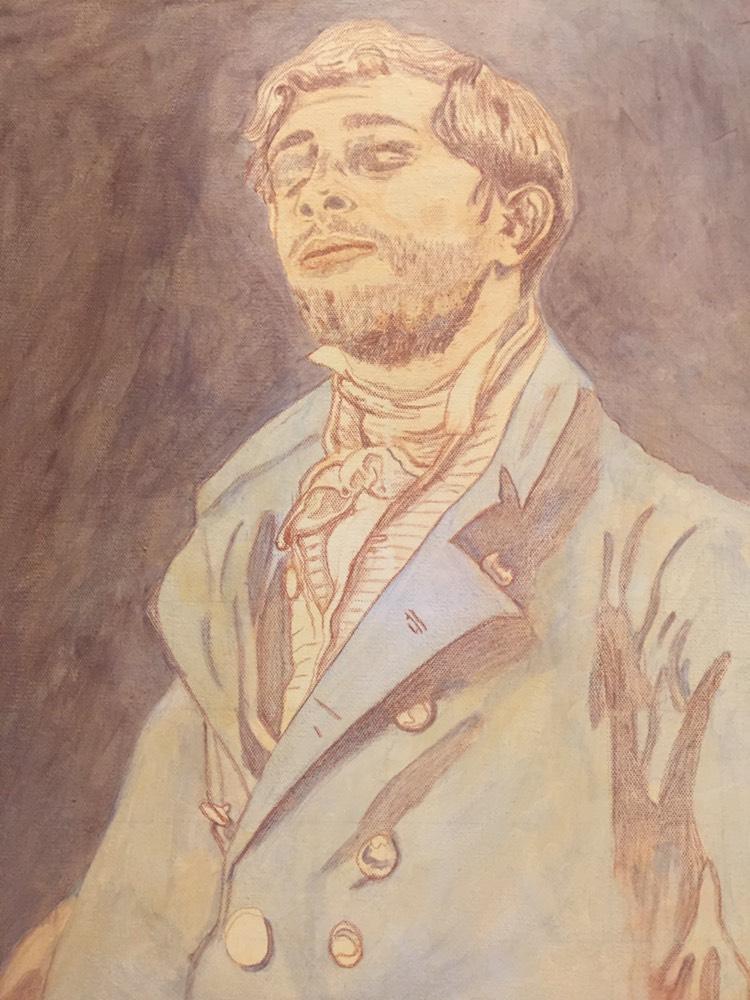
Hi Matt,Thank you for your advice and the progress photos you sent of your artwork. That really helped. I’ve watched a lot of the student videos and I’m trying to apply everything to my painting. I feel like it looks kind of terrible so far so maybe I’m not doing it right. I’m worried about painting any more shadow in on his face because it looks bad – especially his eyes. I definitely feel like I don’t know what I’m doing. Haha. I don’t know what to do about his hair or face. And the white shirt with the dark creases. And the brass jacket buttons. I’m following your list of paint colors to use for the skin tones off of your skin tone video and that is very helpful. But I just feel kind of lost as to the layering process. For instance, for the face, I don’t know how many layers of shadows I’m supposed to do before I move onto layers of midtones. And how many layers of midtones do I do before I move onto highlights? And when I’m painting the midtones, do I paint over the shadow areas as well? Or only paint on the midtone areas?Thank you so much for your help!Holly
What is Glazing?
Glazing is a technique where a thin, transparent layer of paint is applied over a dried layer of paint. This process can be repeated multiple times, gradually building up the desired color and intensity. The final appearance of the artwork results from the interplay of colors beneath the glaze, creating a sense of depth and luminosity that cannot be achieved with opaque paint alone.
Choosing Colors for Shadows, Midtones, and Highlights
One of the most critical aspects of mastering the glazing technique is selecting the right colors for different areas of your painting. This can be particularly challenging when working with shadows, midtones, and highlights.
1. Shadows
When creating shadows, it is essential to choose colors that will blend well with the underlying layers. The shadows should be darker but also retain a sense of warmth or coolness depending on the lighting in your scene. For instance, using a mixture of raw umber dark and a hint of blue can create realistic shadows, providing depth without overpowering the other colors.
2. Midtones
Midtones serve as the bridge between the shadows and highlights. It is essential to mix colors that complement both extremes. For instance, when painting skin tones, a blend of yellow ochre and a touch of red can create a balanced midtone that will seamlessly transition between the shadows and highlights.
3. Highlights
Highlights add life to your painting, drawing the viewer’s eye. To achieve this, consider using lighter versions of your base colors mixed with titanium white or a light yellow. However, ensure that these highlights are still somewhat transparent to maintain the glazing effect.
Layering Process in the Glazing Technique
Once you have selected your colors, it’s time to start layering them using the glazing technique. Here’s a step-by-step approach to help you navigate the process effectively:
Step 1: Prepare Your Canvas
Begin by preparing your canvas with a base layer of acrylic paint. This initial layer should be dry before you start glazing. It can be beneficial to work on a toned canvas, which can help unify the painting’s overall tone.
Step 2: Apply the First Glaze
Using a soft brush, apply your first glaze. This layer should be thin and transparent. A mixture of matte medium with your chosen paint can help achieve the desired transparency. Start with your shadow color, working it into the areas where you want to establish depth.
Step 3: Let It Dry
Allow your glaze to dry completely before adding additional layers. This is crucial, as working on a wet layer can disturb your previous work and muddy your colors.
Step 4: Build Up Midtones
Once the first layer is dry, repeat the glazing process with your midtone color. Apply it over the areas where you want to create form and dimension, using a clean brush to blend the edges.
Step 5: Add Highlights
After your midtones have dried, apply your highlight color using the same glazing technique. This layer should be more transparent than your midtones and should enhance the overall brightness of your painting without losing depth.
Step 6: Repeat as Necessary
The glazing process can take several layers to achieve the desired effect. Don’t be afraid to go back and forth between shadows, midtones, and highlights, building up layers until you reach your goal. Each application should add depth and richness to the final piece.
Tips and Techniques for Effective Glazing
- Use High-Quality Paints: The quality of your paint can significantly affect your glazing results. Invest in artist-grade acrylics to ensure better transparency and mixing capabilities.
- Maintain a Light Touch: When applying glazes, use a gentle hand. It’s easier to add more layers than to remove excess paint.
- Test on a Palette: Before applying any glaze to your painting, test your colors on a palette or scrap canvas. This will give you a better idea of how they will interact.
- Layer Order Matters: Always start with the darkest colors and work towards the lightest. This approach helps maintain control over the overall value and temperature of your painting.
- Keep Brushes Clean: Regularly clean your brushes to avoid muddying your colors. Using separate brushes for each color can also be beneficial.
- Be Patient: Glazing is a slow process that requires patience. Allow each layer to dry fully before proceeding to the next to achieve the best results.
- Practice: The more you practice glazing, the more comfortable you will become with the technique. Experiment with different colors and layering styles to find what works best for you.
Conclusion
The glazing technique is an invaluable method for any acrylic painter looking to enhance the depth and vibrancy of their work. By understanding how to effectively layer colors, choose the right tones for shadows, midtones, and highlights, and employing the right techniques, artists can achieve stunning results that will captivate viewers.
As you embark on your glazing journey, remember to take your time and enjoy the process. Each layer contributes to the overall beauty of your painting, revealing the complexity of color and depth that acrylics can offer. Happy painting!
LEARN MORE
- How to Paint Foliage Using the Acrylic Glazing Technique
- How to Trace for an Accurate Portrait Sketch
- How to Paint Realistic Eyes in Your Acrylic Portrait
- How to Add Raw Umber Dark & Ultramarine Blue to Your Portrait
- How to Make Your Own Raw Umber Dark
- How to Paint Realistic Trees & Grass in Your Acrylic
- How to Block In Skin Tone Values Using Glazing Technique
- How to Paint Vibrant Reds in Your Acrylic Portrait
- How to Glaze Background Colors & More Acrylic Portrait
- How to Paint White Clothing in Your Acrylic Portrait
- How to Easily Transition from a Sketch to a Painting
- How to Block In Shading & Skin Tones in Your Acrylic
- How to Build Up Color on Acrylic Pet Portrait
- How to Build Up Form on Clothing with Acrylic
- How to Paint Dark Clothing Using Acrylic Glazing Technique
- How to Paint a 24 x 30 Acrylic With 30 People
- How to Do Smooth Shading with Acrylic
- How to Sketch an Acrylic Portrait with a Grid
Read more about how to paint a portrait that you can surely be proud of!
P.S. Did you find this post helpful or encouraging? If so, send it on ahead! Let others know with the share buttons below. I’d love to hear your comments. Thank you so much! Also, do you have a question on acrylic portrait painting you’d like answered? Let me know, and I’d be happy to help!

How to Varnish Your Painting
Protect and enhance your artwork: A step-by-step guide to varnishing your painting for a lasting finish.
It was a large portrait on hardboard, about 48″ tall. Having just done some mural work with a well known muralist, I attempted to copy his method of using a household paint roller and a clear coat.
It was a disaster.
The medium looked so milky white while it was drying, that I started to panic like Rowan Atkinson did in the movie “Bean” when he sneezed on Whistler’s Mother. I tried to clean off the half dried medium with a damp towel. To my dismay, the medium started globbing up and totally distorted the fine detail work on the surface. Some areas had no varnish. Other areas were covered with a streaky, bumpy film. My painting was a hideous mess.
I said I would never varnish a painting again.
Except that I did.
I knew I needed to learn how to do it correctly in order to protect my paintings from dust and debris, saturate the colors and dark values more, and give it a uniform finish.
What I’m going to teach you is the process I learned basically from trial and error over the years.
I’m not scared to varnish any more. But I like to say a quick prayer before I put brush to canvas, because if you don’t varnish correctly, you can mess up a good painting very quickly!
Here’s a video that will show you the correct way to do it…
Here are the steps, simplified.
- Use acrylic matte varnish. Not matte medium. (unless you want a flat finish) Matte varnish dries to a satin sheen and looks fantastic. If you want a little more saturation on your dark values and colors, you can add some gloss medium to your matte varnish and mix them together very thoroughly.
- Put your painting on a flat table, or slightly angled. Don’t varnish the painting on a vertical easel or you could get drips and it will look terrible.
- Use a 1″ or larger flat brush that’s in good condition. Put your varnish in a cup or container than is wide enough to accommodate the brush.
- Dip the brush into the varnish and apply from top down, left to right, overlapping slightly. Do not overbrush!
- Continue the process all the way down and when you’re done, leave it alone for a couple hours. It should dry completely clear.
That’s all there is to it!
What do you think? What are YOUR experiences with varnishing? Do you have any stories–or tips–to share? Do you avoid varnishing completely?
Let me know how this tutorial helps.
All the best,
- How to Paint Foliage Using the Acrylic Glazing Technique
- How to Trace for an Accurate Portrait Sketch
- How to Paint Realistic Eyes in Your Acrylic Portrait
- How to Add Raw Umber Dark & Ultramarine Blue to Your Portrait
- How to Make Your Own Raw Umber Dark
- How to Paint Realistic Trees & Grass in Your Acrylic
- How to Block In Skin Tone Values Using Glazing Technique
- How to Paint Vibrant Reds in Your Acrylic Portrait
- How to Glaze Background Colors & More Acrylic Portrait
- How to Paint White Clothing in Your Acrylic Portrait
- How to Easily Transition from a Sketch to a Painting
- How to Block In Shading & Skin Tones in Your Acrylic
- How to Build Up Color on Acrylic Pet Portrait
- How to Build Up Form on Clothing with Acrylic
- How to Paint Dark Clothing Using Acrylic Glazing Technique
- How to Paint a 24 x 30 Acrylic With 30 People
- How to Do Smooth Shading with Acrylic
- How to Sketch an Acrylic Portrait with a Grid
Read more about how to paint a portrait that you can surely be proud of!
P.S. Did you find this post helpful or encouraging? If so, send it on ahead! Let others know with the share buttons below. I’d love to hear your comments. Thank you so much! Also, do you have a question on acrylic portrait painting you’d like answered? Let me know, and I’d be happy to help!

Easy, Inexpensive Artist’s Palette for Acrylic Painting
One of the most important aspects of acrylic portrait painting is setting up your palette.
It’s often overlooked, but having a palette setup that works well for you can minimize frustration, increase productivity, reduce paint costs, and even enhance accuracy in your portrait.
Recently, an artist asked me how I set up my palette. Of course, there’s many ways to do it.
I’m not going to say the way I do it is the right way, but it works for me. And it may work for you as well.
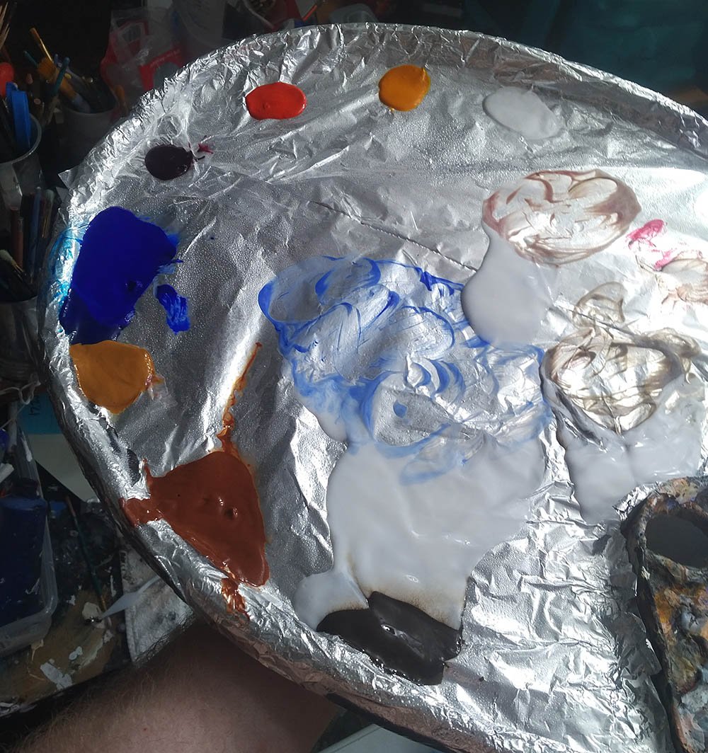
I use a traditional wood palette–about 14″ wide and 18″ long. I customized it a bit by adding a lip to the edge. That keeps my matte medium from dripping off the side. The lip is thick chipboard about 2″ in width that I bent and glued onto the wood. Then I sealed it with gloss medium to keep the moisture from warping it.
Let me help you get started on your new portrait today…
Learn How to Paint Acrylic Portraits With My Free Mini-Video Course!Before I start a new painting, I put aluminum foil over the entire surface, and attach it securely to back of the palette with clear packaging tape. It holds very well.
Then I lay out my paints.
I keep them wet as I can with a spray bottle of water while I work, spraying them about every 15 minutes or so.
When my mixing area gets too full of paint, I add a fresh piece of aluminum foil over the area, folding it over slightly to conform to the rounded shape of the palette. The previous layer of wet paint holds it down. This way I am not wasting paint. All my main colors on the palette remain until my painting is done or they dry up.
I throw the discarded, soiled pieces of aluminum foil away in a bag and then I get paid for them when I recycle them with my aluminum cans. And it doesn’t pollute the environment either!
Here is a video where I explain further how to set this palette up…
Question: What do you use for your palette…and why?
Enjoy your portrait painting and let me know if I can help you in any way.
All the best,
P.S. Did you find this post helpful or encouraging? If so, send it on ahead! Let others know with the share buttons below. I’d love to hear your comments. Thank you so much! Also, do you have a question on acrylic portrait painting you’d like answered? Let me know, and I’d be happy to help!

How To Illuminate Your Art Studio?
Transform your studio with the essential lighting tips for every artist
For acrylic portrait painters and all artists, there is a truth we can’t hide from: we can only paint as well as we can see
So, how well are we seeing in our art studios?
Here’s a question I got from one of my art students:
“I would like to paint in the evening but find out the next day my skin tones are off. I have the room overhead a one lamp with the daylight bulb but doesn’t seem to be enough. I do have cataracts which may be part of the problem but can’t have that fixed until next year. You said you currently have no windows in your studio so what do you use for good lighting? I’m sorry to bother you with a question like this but I was quite upset this morning to see what I did last night!”
Thanks so much and God Bless.
Sharon
Here’s my answer:
Hi Sharon,
It’s annoying to not have enough light. I remember when I first started painting, I would work with those old yellowish incandescent bulbs. When I took my painting outside to photograph it I said, “That’s NOT how it looked in my studio!” The colors were off, and it looked grainy.
Now with LED bulbs being so inexpensive (to buy and to run) I have 10 lights in my studio with 100 watt-equivalent daylight spectrum bulbs. Best part is they only use 14 watts a piece, so it’s pretty energy efficient!
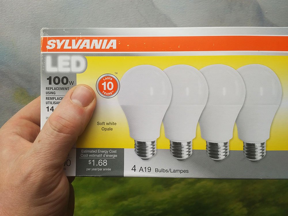
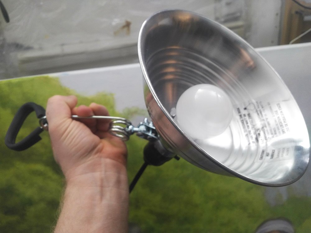
They are simple clamp-style lamps with metal reflectors that you can buy at your home improvement store for about $5-10 a piece. You don’t even have to buy them all at once. You can do it like I did. Every time I ran to Menards, I would buy another lamp. I spaced it out over the course of a couple years!
Here is a shot of my messy, well-used studio with the lights aimed at the ceiling. The reflected light works great to illuminate even a large painting. While I’m working there are virtually no shadows from my hands and arms to interfere with my painting.
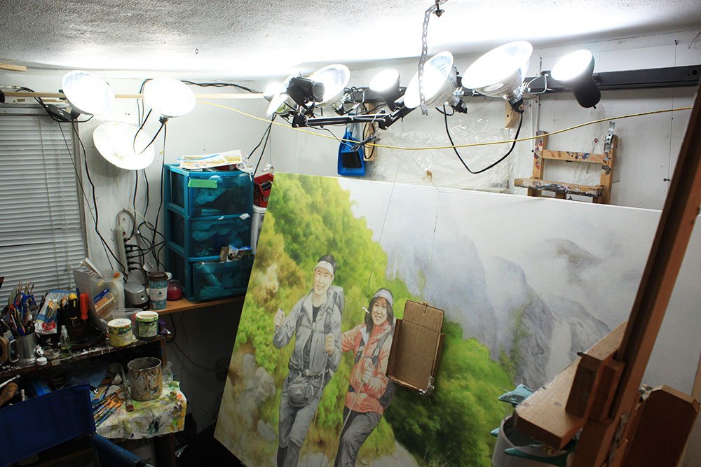
I do have a window in my studio now, but it doesn’t do a lot. It’s mostly the light bubs that illuminate everything for me.
Question: How do you illuminate YOUR studio?
LEARN MORE
- How to Paint Foliage Using the Acrylic Glazing Technique
- How to Trace for an Accurate Portrait Sketch
- How to Paint Realistic Eyes in Your Acrylic Portrait
- How to Add Raw Umber Dark & Ultramarine Blue to Your Portrait
- How to Make Your Own Raw Umber Dark
- How to Paint Realistic Trees & Grass in Your Acrylic
- How to Block In Skin Tone Values Using Glazing Technique
- How to Paint Vibrant Reds in Your Acrylic Portrait
- How to Glaze Background Colors & More Acrylic Portrait
- How to Paint White Clothing in Your Acrylic Portrait
- How to Easily Transition from a Sketch to a Painting
- How to Block In Shading & Skin Tones in Your Acrylic
- How to Build Up Color on Acrylic Pet Portrait
- How to Build Up Form on Clothing with Acrylic
- How to Paint Dark Clothing Using Acrylic Glazing Technique
- How to Paint a 24 x 30 Acrylic With 30 People
- How to Do Smooth Shading with Acrylic
- How to Sketch an Acrylic Portrait with a Grid
Read more about how to paint a portrait that you can surely be proud of!
All the best,
P.S. Did you find this post helpful or encouraging? If so, send it on ahead! Let others know with the share buttons below. I’d love to hear your comments. Thank you so much! Also, do you have a question on acrylic portrait painting you’d like answered? Let me know, and I’d be happy to help!