- You are here:
- Home »
- Blog
- Archive:

[PORTRAIT CHALLENGE] Masterclass Lesson #7: Painting Fantastic Facial Features
The Acrylic Portrait Painting Challenge Masterclass, Lesson #7, is out!
In our last lesson, I showed you how to visualize your painting as a map, and add shading and skin tones to specific spots on your portrait.
Now, in this lesson, I want to show you how to “dial-in” the facial features.
(To be upfront, I want you to know there is some video footage after Lesson 6 that I just couldn’t capture in this lesson, so it didn’t get too long for a YouTube video. All of the “in-between” BONUS videos will be posted within Realistic Acrylic All-Access Membership, after I’m finished posting these challenge lessons. The main Masterclass Lessons will be there as well as one complete course, and I will also segment them for easier viewing, since the learning interface makes that possible.)
For most of the students I serve, they do their portraits as gifts for loved ones, and on commission. So, unless you are painting only for an academic exercise, it’s important that you capture an accurate likeness of your subject.
I have painted many portraits over the years, and I can tell you from experience, it doesn’t matter how much detail I add to the painting, if the picture doesn’t look like Aunt Betty, it’s not going to sell. 🙂
So, as you are aiming for realism—that is, the accurate form, tonal values, skin tones, shading, detail, etc., you also want to work to achieve a true likeness.
Does it need to be perfect? No, just close. Usually 85-90% as accurate as the photo you’re working from (and even that is not as accurate as real life) and you’ll do well. But shoot for the 100% every time.
Let’s dive in…
Here’s what to do…
STEP ONE
- Redefine the eye-socket region.
- Redefine the eyelid folds.
- Dial-in the coloring of his eyes
STEP TWO
- Adjust the length and shape of nose (if needed) and add shading.
STEP THREE
- Add more depth to the eyes.
STEP FOUR
- Refine the mouth and mustache.
Ready to paint?
Now, before you begin…(Yes, still need to ask, because some folks are just discovering these Masterclass lessons 🙂 )
Are you registered for the challenge?
If not, register below for FREE and I’ll send you:
- a downloadable/ printable”Welcome Kit” with a Supplies List and a Palette Color Layout Guide.
- high-resolution images of the photo we’ll be painting from for this challenge.
- each new lesson that comes out in this Masterclass series.
- a link to my private Facebook group, where you can do this challenge with other artists, get feedback and help on your portrait, and not feel alone.
REGISTER TODAY. The challenge is ongoing, something you can do at your own pace. It’s not too late to enter!
Register for the Challenge!
Watch my in-depth Masterclass acrylic online tutorial below to see these steps in action.
After learning from this video, you’ll know exactly how to do it.
Make sure to watch the ENTIRE video first before diving into the painting. It will be worth it to do that. Then, I’d like you to go back and refer to whatever steps you need to as you paint. That way, you won’t miss any of the instruction and tips that will help you make this portrait your very best.
Here’s the video…
[PORTRAIT CHALLENGE] Masterclass Lesson #7: Painting Fantastic Facial Features
Moving Forward…
Thank you so much for all your effort you’ve put into doing this challenge with me and so many other artists. You’re almost there…your finished portrait is in sight.
Hey, if you’re having some challenges with your Portrait Challenge portrait, I just want to let you know, that’s natural! Painting portraits is difficult even for artists who have been doing it for years. But step-by-step instruction and encouragement from other students helps a lot. Many people in our group are doing with little to no experience, and they’re doing a knock-out job, even if they’re struggling in certain areas.
So, if you do feel stuck at this point, or find your results are less than what you expected, keep in mind this is a learning experience. You will get better as you practice painting portraits in the glazing technique, as so many others have.
That being said, if I can help in any way, please leave a comment or send me an email. I get a lot of requests, but I’ll do my very best to help. Also, make sure you join our amazing Facebook group, Realistic Acrylic Portraits, because you will receive helpful tips and encouragement from other students, some of whom are farther ahead in the portrait painting journey.
I’ll see you in our next class! What is it going to be? Painting the Final Details, Nuances, and Finishing Well. I’m excited to share that with you! Until then, be blessed in your painting and you and your family stay safe and healthy.
Yours for Better Portraits,
![]()
If you found this post helpful or encouraging, would you send it on ahead? Let others know with the share buttons below. I’d love to hear your comments. Thank you so much!
Let me know if you have any questions about the challenge that I didn’t answer. Leave your question in the comments below and I’ll get back to you!

[PORTRAIT CHALLENGE] Masterclass Lesson #6: Creating Smooth Blending and Skin Tones
The Acrylic Portrait Painting Challenge Masterclass, Lesson #6, is out!
In our last lesson, I showed you how to add depth to the dark value of the hat, shadowed areas of the face, and some of the darker areas within the background.
Now that we have a good underpainting foundation in place, it’s time to transition into the “middle” portion of the painting. In other words, we’re working our way towards what the final surface of the portrait will look like.
I want to show you specifically how to create smooth blending and establish realistic skin tones.
It’s important to think of this process like outlining the boundaries of a nation, state (province) or county.
I know, we shouldn’t mix geography with art lessons, but I think this metaphor will help you understand the concept I’m trying to get across…
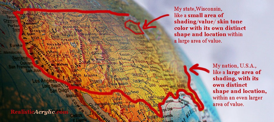
How a US map is like color, shading, and value in an acrylic portrait
I live in the state of Wisconsin, U.S.A. It has its own distinct shape and location within the United States of America. Now, the U.S.A. has its own distinct shape and location within the continent of North America.
In the same way, in a portrait, you may have a small area of value/ skin tone with its own distinct shape and location within the larger area of value/ skin tone. What you want to do is pay attention to the boundary lines on these specific shapes by studying your reference photo.
You won’t see a sharp line you will on a map, unfortunately. But you will see a marked difference where one value/ color ends and another begins.
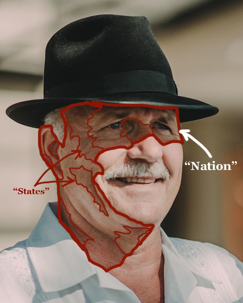
How to use the idea of a map to improve the realism on your acrylic portrait
You will see a shape emerge. Note that shape.
Then transfer what you see onto your painting. It’s as simple (and challenging!) as that.
You will see shapes within shapes within shapes. The more you can train your eyes to spot these shapes, the better you will become at realistic painting. That’s half the battle. The other half is technique: getting the paint to do what you want it to do.
This concept of “Nations and States” is powerful once you get a hold of it and use it regularly in your acrylic portrait painting! Now, let’s get onto the lesson…
What we want to do at this stage:
Begin the process of adding smooth shading and skin tones throughout the portrait.
We will be adding:
- a large “warming” glaze to the entire shadow area of the man’s face.
- glaze on the highlighted area of the face, adding depth and the beginning of skin tones, so the area is not just plain white or off white.
- small glazes (“states”) on the shadow side (“nation”) of the face to further define the pinkish skin tones.
We will do this using the acrylic glazing technique, where we mix a TINY amount of acrylic paint into a LARGE amount of clear acrylic matte medium. It’s best to go very, very light when you start your painting. You should just barely see a difference. However, at this stage you will getting a bit more opaque, because you have enough layers down already to give you some smoothness in the overall appearance.
Also, as always, make sure you rinse your brush off thoroughly between glazes. Any extra water in the heel of the brush may cause your glazes to drip or get streaky.
Here’s how to do it:
STEP ONE
- First, mix the “warming glaze” for the shadow side of the face: Use raw sienna and mix with a large amount of matte medium (10% paint to 90% medium) as shown in the video lesson. “Scoop” a large amount of glaze onto your 3/4″or 1″ flat brush. A few of the glazes will get a little darker, with ratios of as much as 30% paint to 70% medium. Make sure you watch the video to know where and when to change the ratio. “Next, glaze
- Glaze on the highlight side of face, to “tie-in” with the shadow side, develop mid-tones and create depth: Use raw sienna and organic pyrrole orange (or a cadmium orange) and mix it 5% paint to 95% matte medium. Test the glaze and see if you need to add more pigment or more medium. You should just barely see a difference in what you apply.
- Add small glazes in specific locations (“states”) on the shadow side of face using organic pyrrole orange, raw sienna, and a bit of alizarine crimson if needed to darken the glaze without adding too much chromatic intensity.
STEP TWO
- Add another layer of shading to the man’s hat and the background: Use raw umber dark, ultramarine blue, and a touch of alizarine crimson. How much of each? It depends on what the hat looks like right now as you paint. Is it too bluish? Add more raw umber dark. Is it too brownish? Add more ultramarine blue. Is it too greenish? Add alizarine crimson—just a pinch.
- Take the same glaze you used for the hat and add some shadows below his hat: Because it is right underneath the brim of his hat, the shadows will be quite dark in value. Add a bit of raw umber dark (or raw umber) and a bit of alizarin crimson if necessary to warm up the glaze, especially as you transition into the lighter parts of the skin tones.
- Clean off your brush and apply a blue glaze to the highlighted areas in his shirt: Mix ultramarine blue and phthalo blue (just a bit—it’s a VERY strong pigment) into a large amount of matte medium (95% to 5%, ratio to start with, and test to see if you need to change it) We want to bridge the gap between the shadows and the highlights, adding much-needed depth to this area of the painting.
STEP THREE
- Repeat Step 1, with slight adjustments. Follow the video for more detailed instruction.
Ready to paint?
Now, before you begin…(Yes, still need to ask, because some folks are just discovering these Masterclass lessons 🙂 )
Are you registered for the challenge?
If not, register below for FREE and I’ll send you:
- a downloadable/ printable”Welcome Kit” with a Supplies List and a Palette Color Layout Guide.
- high-resolution images of the photo we’ll be painting from for this challenge.
- each new lesson that comes out in this Masterclass series.
- a link to my private Facebook group, where you can do this challenge with other artists, get feedback and help on your portrait, and not feel alone.
REGISTER TODAY. The challenge is ongoing, something you can do at your own pace. It’s not too late to enter!
Register for the Challenge!
Watch my in-depth Masterclass acrylic online tutorial below to see these steps in action.
After learning from this video, you’ll know exactly how to do it.
Make sure to watch the ENTIRE video first before diving into the painting. It will be worth it to do that. Then, I’d like you to go back and refer to whatever steps you need to as you paint. That way, you won’t miss any of the instruction and tips that will help you make this portrait your very best.
Here’s the video…
[PORTRAIT CHALLENGE] Masterclass Lesson #6: Creating Smooth Blending and Skin Tones
Moving Forward…
If you have gotten this far in the challenge, I’m proud of you! It’s not easy to try something new, especially during a challenging time (COVID-19 as I write) but you are making a difference in your own life by developing the talent God gave you and you will be making a difference in others lives when you freely share the beautiful artwork you create with those you love or want to impact.
I’ll see you in our next class! What is it going to be? Painting fantastic facial features. I’m excited to share that with you! Until then, be blessed in your painting and you and your family stay safe and healthy.
Yours for Better Portraits,
![]()
If you found this post helpful or encouraging, would you send it on ahead? Let others know with the share buttons below. I’d love to hear your comments. Thank you so much!
Let me know if you have any questions about the challenge that I didn’t answer. Leave your question in the comments below and I’ll get back to you!

[PORTRAIT CHALLENGE] Masterclass Lesson #5: Building up Depth With Glazes
The Acrylic Portrait Painting Challenge Masterclass Lesson #5 is out!
In our last two lessons, I showed you how to cover your entire canvas with a series of three glazes covering the entire surface of the canvas as one layer.
Now, with this lesson, I’ll show you how to continue the process of adding layers on top of layers. We want to “rotate,” going back to the first glaze we did, and go on top of it with another glaze. And then to the next, and so on. Remember volleyball? It’s kind of like that. Every person gets a turn.
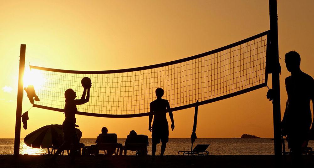
Volleyball rotation like rotating glaze layers in your acrylic portrait
Here in the portrait using the acrylic glazing technique, every part of the picture gets a turn, having another glaze added to it. (There are some times when we break this rule, and I’ll show you that in the video lesson)
Here is where I’m at in the portrait, prior to this video lesson, after the work I did on Lesson #4.
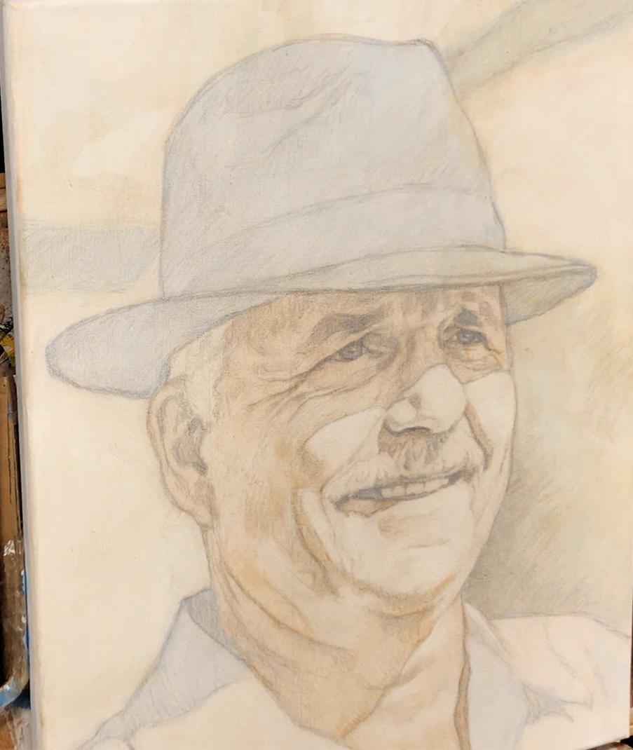
Acrylic portrait painting challenge example in progress using the acrylic glazing technique, 16 x 20, acrylic on canvas by artist and instructor Matt Philleo
What we want to do at this stage:
Since we already have locked in the major differences in the color scheme and tonal value very simply, now we want to add more complexity to the painting.
We will be adding:
- depth to the dark value of the hat
- shadowed areas of the face
- and some of the darker areas within the background.
We will do this using the acrylic glazing technique, where we mix a TINY amount of acrylic paint into a LARGE amount of clear acrylic matte medium. It’s best to go very, very light when you start your painting. You should just barely see a difference.
Also, make sure you rinse your brush off thoroughly between glazes. Any extra water in the heel of the brush may cause your glazes to drip or get streaky.
Here’s how to do it:
- Mix your Glaze for Hat: Use small, fairly equal amounts of ultramarine blue and raw umber dark, and mix with a large amount of matte medium (5% paint to 95% medium) as shown in the video lesson. “Scoop” a large amount of glaze onto your 3/4″or 1″ flat brush. A few of the glazes will get a little darker, with ratios of as much as 30% paint to 70% medium. Make sure you watch the video to know where and when to change the ratio.
- Apply the Glaze: Start on the left-hand side of hat and apply the glaze with firm pressure to cut along the edges. Spread the paint out toward the right, keeping a wet edge. Flip the brush over to make use of the paint that is on both sides.
- Smooth Out the Glaze: Use diagonal criss-cross strokes to blend the glaze out rapidly. Use very light pressure at the end, just barely grazing your brush across the top. Don’t overwork the glaze. TIP: It dries quickly. If it starts to get blotchy or tacky, just leave it alone, or you’ll make it worse. You will be able to smooth it out later with more layers on top.
- See Where Else You Can Employ the Glaze: Because you don’t want to waste the paint and medium, and to save time, use this same glaze on the background, adding as shown in the video lesson.
- Add a Shadow Glaze to the Face. What we want to do is add a shadow on top of the shadow. Start at the left side of his face, underneath the hat, and cut up along the edge, working your way right, and bring the glaze down into the forehead wrinkles as I show in the video. Follow the distinct shapes and patterns that you see on your reference photo.
You will repeat this process another time, with some variations.
Ready to paint?
Now, before you begin (yes, I have to ask you again, just in case 🙂 )…
Are you registered for the challenge?
If not, register below for FREE and I’ll send you:
- a downloadable/ printable”Welcome Kit” with a Supplies List and a Palette Color Layout Guide.
- high-resolution images of the photo we’ll be painting from for this challenge.
- each new lesson that comes out in this Masterclass series.
- a link to my private Facebook group, where you can do this challenge with other artists, get feedback and help on your portrait, and not feel alone.
REGISTER TODAY. The challenge is ongoing, something you can do at your own pace. It’s not too late to enter!
Register for the Challenge!
Watch my in-depth Masterclass acrylic online tutorial below to see these steps in action.
After learning from this video, you’ll know exactly how to do it.
Make sure to watch the ENTIRE video first before diving into the painting. It will be worth it to do that. Then, I’d like you to go back and refer to whatever steps you need to as you paint. That way, you won’t miss any of the instruction and tips that will help you make this portrait your very best.
Here’s the video…
[PORTRAIT CHALLENGE] Masterclass Lesson #5: Building up Depth With Glazes
Moving Forward…
Excellent job staying with me and the other artists for this challenging portrait! The acrylic glazing technique takes some getting used to, but once you really “get it” you will be able to paint with a freedom, confidence, and sense of realism that will keep you encouraged to keep on painting more and more.
In our next class, I’ll show you how to add more glazes and build up the skin tones. It’s something so many artists aspire to: create those lifelike skin tones that just look real. And now with a good foundation in place, we can do it!
I’ll see you in our next class! Until then be blessed in your painting and you and your family stay safe and healthy.
Yours for Better Portraits,
![]()
If you found this post helpful or encouraging, would you send it on ahead? Let others know with the share buttons below. I’d love to hear your comments. Thank you so much!
Let me know if you have any questions about the challenge that I didn’t answer. Leave your question in the comments below and I’ll get back to you!

[PORTRAIT CHALLENGE] Masterclass Lesson #4, LIVE: Establishing Your Color and Values
For a change of pace, we did the Acrylic Portrait Challenge Masterclass Lesson #4 as a LIVE class, and I’m excited to share it with you!
In our last lesson, I showed you how to prepare your canvas for painting by whiting out the grid lines, sealing in and muting the sketch, and preparing your palette.
Finally, we began the actual painting process with a glaze of ultramarine blue (a glaze is a small amount of acrylic paint mixed into a large amount of clear acrylic medium, usually matte medium).
Now, in this lesson (recorded LIVE), I will show you how to add the next two glazes, which will nearly cover the entire canvas with one layer.
Whereas the sketch is the actual foundation for the painting, this first layer is very important. It is like the floor joists when a house is built. The rest of the structure attaches to that, and so housebuilders take extra time to make sure they do it correctly. If they don’t they’ll end up with a structure that will end up sagging years, or even worse, collapsing!
In the same way, we want to make sure we have this first layer done correctly. Don’t feel nervous about it. You can still fix a painting that hasn’t been started correctly, and end up with a truly realistic acrylic portrait. It just will take you more time and effort to correct, and so it’s best to avoid that hassle if possible.
What we want to do at this stage:
Our main goal right now is to establish the main value and color scheme of the portrait, simultaneously. We want to “lock-in” the contrast between the lights and dark values, paying attention to their specific edges, boundaries, and shapes. If you did the sketch according to Lesson #2, then you will know almost exactly where to place your initial glazes, because your sketch tells you where to put it.
We also want to observe the major differences in color within the reference photo, simplify it to “warm and cool” tones and use our inital glazes to plot that out. Then, future layers will be added on top of them, getting more and more complex as we go along.
But the initial glaze will serve us well.
It’s like how a major highway was often once a foot trail, then a cowpath, then a dirt road, then a paved road, and finally a highway. It’s a lot easier to upgrade a road, than to try to build a new one. You’d have to bulldoze trees, cut through rocks, level the land, and even remove homes if necessary.
In the same way, with the glazing technique, we are getting the compounded effect of each previous layer adding richness and depth to the ones that come after them. That’s why you want to start off right.
Again, as I’ve said in the last lesson: begin the painting lightly. Much lighter than you think. And certainly more than you’re used to painting, if you’ve painted for a while. If you just barely see a difference in this first layer, you’re doing it exactly right!
Let’s dive into the process…
Here’s how to do it:
- Mix your Glaze for the Skin Tone Foundation Layer: Use a small amount of burnt sienna and raw umber dark, and mix with a large amount of matte medium (5% paint to 95% medium) as shown in the video lesson. “Scoop” a large amount of glaze onto your 3/4″or 1″ flat brush.
- Apply the Glaze: Start on the left-hand side of the man’s face, and apply the glaze with firm pressure to cut along the edge of the ear, neck, and along the collar. Spread the paint out toward the right, keeping a wet edge. Flip the brush over to make use of the paint that is on both sides.
- Smooth Out the Glaze: Use diagonal criss-cross strokes to blend the glaze out rapidly. Use very light pressure at the end, just barely grazing your brush across the top. Don’t overwork the glaze. TIP: It dries quickly. If it starts to get blotchy or tacky, just leave it alone, or you’ll make it worse. You will be able to smooth it out later with more layers on top.
- Mix the Glaze for the Background Foundation Layer: Now, if you followed my steps from Lesson #3, you should have an ultramarine blue glaze already on the background’s darkest values. This glaze will go on top of that, and will start the basic color for the mid-tone area in the right direction. Take a small amount of raw sienna as the base, smaller amount of raw umber (or raw umber dark) and and even smaller amount of ultramarine blue, and mix them slowly into the matte medium as I show in the video.
- Add the Glaze and Smooth it Out. Apply this similarly as the skin tone glaze, but this time, you only need to cut up along the edge of objects with very light tonal value, such as the shirt or the illuminated portion of the man’s face. The glaze can go on top of the hat, because the final tonal value of that area will be so dark, so there’s no need to worry about trying to “keep within the lines” there.
Ready to paint?
Now, before you begin (yes, I have to ask you again, just in case 🙂 )…
Are you registered for the challenge?
If not, register below for FREE and I’ll send you:
- a downloadable/ printable”Welcome Kit” with a Supplies List and a Palette Color Layout Guide.
- high-resolution images of the photo we’ll be painting from for this challenge.
- each new lesson that comes out in this Masterclass series.
- a link to my private Facebook group, where you can do this challenge with other artists, get feedback and help on your portrait, and not feel alone.
REGISTER TODAY. The challenge is ongoing, something you can do at your own pace. It’s not too late to enter!
Register for the Challenge!
Watch my in-depth Masterclass acrylic online tutorial below to see these steps in action.
After learning from this video, you’ll know exactly how to do it.
Make sure to watch the ENTIRE video first before diving into the painting. It will be worth it to do that. Then, I’d like you to go back and refer to whatever steps you need to as you paint. That way, you won’t miss any of the instruction and tips that will help you make this portrait your very best.
Here’s the video…
[PORTRAIT CHALLENGE] Masterclass Lesson #4, LIVE: Establishing Your Color and Values
Moving Forward…
If you made it this far, congratulations! It’s not easy to start a painting so light, when your natural instinct is paint thick and dark right away. So, if you’ve followed my steps as best you can, high fives and hat’s off to you! Stick with this process, and you will be able to paint more confidently and realistically than you ever have before.
Now, since we have the complete glaze foundation work done on the painting—the hat, the face, the shirt, the background all has paint on it, we can move on and add more and more glazes—building up richness, depth, and detail. The painting will look more and more amazing each time we add another layer. There may be a few times where you’ll hit a few rough spots, but by God’s grace, I’ll show you how to navigate those challenges and finish your portrait well.
I’ll see you in our next class! Until then be blessed in your painting and may God guide your every brushstroke!
Yours for Better Portraits,
![]()
If you found this post helpful or encouraging, would you send it on ahead? Let others know with the share buttons below. I’d love to hear your comments. Thank you so much!
Let me know if you have any questions about the challenge that I didn’t answer. Leave your question in the comments below and I’ll get back to you!

[PORTRAIT CHALLENGE] Masterclass Lesson #3: Beginning Your Painting Lightly and Confidently
Masterclass Lesson #3 for the Acrylic Portrait Painting Challenge is open!
In this lesson, you will learn how to slowly transition out of the sketch process and into the painting with confidence.
Instead of the typical way of painting—dumping a bunch of paint onto the canvas and hoping something good comes out of it, you will strategically begin your portrait with light, translucent glazing layers.
If you follow the heart of my method, you will not feel like the painting is out of control. You will be guiding the painting to a successful finish, rather the painting taking you and your emotions for a roller-coaster ride.
It takes patience.
So please don’t jump ahead, even though it feels you’re starting so slowly.
You’ll find that once we get the painting moving in the right direction, it will begin to take off, just like a car as it goes into higher gear. Your layers and brushstrokes will get bolder as you hit the midpoint of your painting, like a climax in a good movie or book. You’ll be moving much faster then!
Finally, you’ll slow down again.
You’ll gently add nuances and final touches to bring the portrait home and make it a masterpiece.
In our previous step, I showed you how to sketch your canvas to create a firm foundation for your painting. Not perfect, but accurate.
Now, in this lesson, we will finally get to the painting!
Here’s how to do it:
- White-out the Grid Lines. Use pure titanium white paint, undiluted, to cover your grid lines, so you don’t see them in the final painting.
- Seal in the Sketch. Use pure matte medium to seal in your sketch so you can paint over it without messing up your detail work and muddying your paint.
- Mute the Sketch (Create a toning layer or “ground.”) Make your sketch lines softer and subdued so that you won’t have to work so hard to conceal them with more paint layers later.
- Prepare Your Palette. Arrange your palette colors for this painting as shown on your Palette Layout Guide (last page of the Welcome Kit) so that all the colors are arranged in such a way so that the ones you need most are closest to you and if they bleed into each other, they won’t muddy each other up.
- Add the First Glazing Layer. Start very simple with one basic color mixed into matte medium to make a VERY light glaze (semi-transparent/ translucent) concentrating on your darkest value and cool tones at the same time. This is the blocking-in, or underpainting layer, so it doesn’t need to be dark or complicated.
Ready to paint?
Now, before we begin (yes, I have to ask you again, just in case 🙂 )…
Are you registered for the challenge?
If not, register below for FREE and I’ll send you:
- a downloadable/ printable”Welcome Kit” with a Supplies List and a Palette Color Layout Guide.
- high-resolution images of the photo we’ll be painting from for this challenge.
- each new lesson that comes out in this Masterclass series.
- a link to my private Facebook group, where you can do this challenge with other artists, get feedback and help on your portrait, and not feel alone.
REGISTER TODAY. The challenge is ongoing, something you can do at your own pace. It’s not too late to enter!
Register for the Challenge!
Watch my in-depth Masterclass acrylic online tutorial below to see these steps in action.
After learning from this video, you’ll know exactly how to do it.
Make sure to watch the ENTIRE video first before diving into the painting. It will be worth it to do that. Then, I’d like you to go back and refer to whatever steps you need to as you paint. That way, you won’t miss any of the instruction and tips that will help you make this portrait your very best.
Here’s the video…
[PORTRAIT CHALLENGE] Masterclass Lesson #3: Beginning Your Portrait Painting Lightly and Confidently
Moving Forward…
The largest challenge of the glazing technique is overcoming the tendency to go dark and thick with your paint. But if you stick with this, even beyond this portrait, you’ll find the technique “clicking” and you’ll understand how it can help you to create a painting with incredible luminosity, smooth shading, depth, and detail.
In other words, a portrait that will “wow” others and you’ll feel proud to have created. And even more, a portrait you can give as a gift, hang on your wall (or someone else’s) and will be enjoyed for years to come.
There you have it! Now you know exactly how to begin your portrait lightly, and confidently. The next step is to build up depth with more glazes and see the amazing portrait fade in, slowly materialize before your eyes.
I’ll see you in our next class! Until then be blessed in your painting and may God guide your every brushstroke!
Yours for Better Portraits,
![]()
If you found this post helpful or encouraging, would you send it on ahead? Let others know with the share buttons below. I’d love to hear your comments. Thank you so much!
Let me know if you have any questions about the challenge that I didn’t answer. Leave your question in the comments below and I’ll get back to you!

[PORTRAIT CHALLENGE] Masterclass Lesson #2: Sketching Your Portrait for a Firm Foundation
Masterclass Lesson #2 for the Acrylic Portrait Painting Challenge is open!
In this lesson, you will learn how to draw an accurate sketch that will help keep you from getting frustrated while painting. You will also be set up to create a portrait with realistic proportions, and a true likeness—where it really looks like the person you’re trying to paint.
That’s the kind of portrait you’ll be proud to show, sell, or give as an exquisite gift!
Just as a contractor wouldn’t build a house without a proper foundation, you shouldn’t paint a portrait without one either. A rock-solid sketch is the best way to establish a firm foundation for the rest of your portrait to be built upon. Take your time to do it right, and you will set yourself up for success, and avoid a lot of potential hassle later.
Sketching as a firm foundation for your portrait.
In our previous step, I showed you how to prepare your canvas for the sketch by creating a well-formed grid.
If you followed my instruction, you will have sealed that grid with first a layer of matte medium. Then you followed up with a roughly 50%/50% mixture of acrylic matte medium and white acrylic gesso, and let it dry for at least a couple of hours.
Now, you have a canvas that is ready to sketch upon. The matte medium/ gesso layer provides not only a barrier to the grid so you can’t erase it while sketching, but it also gives the canvas the perfect texture to sketch with a colored pencil. Back in 2017, I discovered that colored pencil erases like a dream on a properly prepared canvas. And you can seal it in without minimal loss of detail to your sketch.
Try it, and you’ll find out how fun it can be to sketch on your canvas. 🙂 You’ll never want to go back to graphite pencil again!
Another benefit: you can pick any colored pencil hue you want to match the skin tone of the subject. Remember, with my glazing technique, you will be able to see through the paint layers, down to the colored pencil until you have enough layers to cover it up. And in a few areas, even when your painting is finished, the colored pencil will shine through a bit. So pick a brown color that works best for you. Sepia, Chocolate, brown ochre, and terra cotta are all good colors for sketching.
Ready to go?
Now, before we begin…
Are you registered for the challenge?
If not, register below for FREE and I’ll send you:
- a downloadable/ printable”Welcome Kit” with a Supplies List and a Palette Color Layout Guide.
- high-resolution images of the photo we’ll be painting from for this challenge.
- each new lesson that comes out in this Masterclass series.
- a link to my private Facebook group, where you can do this challenge with other artists, get feedback and help on your portrait, and not feel alone.
REGISTER TODAY. The challenge is ongoing, something you can do at your own pace. It’s not too late to enter!
Register for the Challenge!Here’s the steps to creating a masterful sketch, a firm foundation for your painting.
- Set up your tablet (Kindle, iPad, etc) or printed reference photo next to your canvas, and display the gridded reference photo. Need something to hold your tablet up? My free course shows you how to make your own Reference Photo Holder) The reference photo is your blueprint to paint a portrait from your photo. It’s what your finished painting should look like.
- Sketch the outline first. Pay attention to where you are placing your lines. Try to see the grid squares as fractions. (“the line will intersect here at 1/4 of the way up, or 1/2 of the way over, etc”
- Fill in the features, loosely: eyes, nose, mouth, etc. The eyes are the most important feature, so really make sure you capture the shapes of not only the eyes, but the eyelids and eyebrows.
- Delineate the tonal values. Shade in the areas that are darker, and pay attention to exact forms that the shadows create. Try to think of them as abstract shapes like stretched out triangles, oblong ovals, squished rectangles, for example. As you fill in these values, the planes of the face will start to emerge. You will create a convincing sense of three-dimensional form.
- Refine your sketch and add any missing detail. Step back a bit and make sure you have the proportions correct. The grid will have done the “heavy lifting” for you, by keeping your lines pretty accurate. But you might need to erase and redraw some of the features for greater accuracy. Finish up with the wrinkles in the clothing and on the hat, if needed.
Watch my in-depth Masterclass acrylic online tutorial below to see these steps in action.
After learning from this video, You’ll know exactly how to do it.
Before you watch, I want you to know that this lesson is VERY in depth. It’s one hour long! But please, make the investment in your art talent, grab a cup of coffee or tea, and watch the whole thing. If you do, I promise that you will have greater clarity on how to begin an acrylic portrait from here on out. Every portrait you do will be that much better.
Here’s the video…
Acrylic Portrait Challenge Masterclass Lesson #2: Sketching Your Portrait for a Firm Foundation
Is it done?
How accurate does it need to be? You only need to have a likeness 90% of the way there to have a fantastic sketch.
It doesn’t have to be perfect. The painted layers will dial in the likeness the rest of the way. You don’t need to make this sketch into a drawing. Meaning, you don’t need to shade in everything to the point that it looks like a finished drawing that you could hang on your wall.
No.
The sketch is for YOUR benefit…and also that of the portrait!
It doesn’t have to amaze others at this stage. It just needs to be accurate. It needs to describe the form, the contours, the three-dimensionality of the subject with line and value. You simply need to make yourself a guide so you know where to place your glazes when you segue into the painting process.
Now the painting, when it is finished, let THAT amaze others! (and you 🙂 )
There you have it! Now you know exactly how to create a great sketch for your portrait, a firm foundation you can build the rest of your portrait upon. The next step is to seal in your sketch and ease your portrait into a painting with the first few glazes.
I’ll see you in our next class! Until then have a blessed day and use that talent God gave you to its fullest!
Yours for Better Portraits,
![]()
If you found this post helpful or encouraging, would you send it on ahead? Let others know with the share buttons below. I’d love to hear your comments. Thank you so much!
Let me know if you have any questions about the challenge that I didn’t answer. Leave your question in the comments below and I’ll get back to you!
[PORTRAIT CHALLENGE] Masterclass Lesson #1: Gridding Your Canvas for an Accurate Sketch
I’m so excited to be teaching you the first Masterclass Lesson for the Acrylic Portrait Painting Challenge!
Again, if you are taking the challenge, I commend you. It’s not easy to paint a portrait. Many artists desire to do it, but never actually begin, because it’s difficult to paint a fellow human being accurately. It’s my goal to show you how to do it, so you can paint an amazing portrait from a photo you’ll be proud to show others.
Now, you might feel like rushing this step, but I encourage you to start slowly and build a good foundation for your portrait. You’ll be glad you did.
Before we begin…
Are you registered for the challenge?
If not, register below for FREE and I’ll send you a “Welcome Kit” with a Supplies List and a Palette Color Layout Guide. I’ll also send you high-resolution images of the photo we’ll be painting from for this challenge. (It’s not too late to enter!)
Register for the Challenge!In this video lesson and tutorial, you will learn how to create a grid for your canvas. If you have several years of freehand drawing experience, you could skip this step and start sketching right away, but from my experience in teaching, most artists are not ready to do an accurate sketch for their portrait.
So, most likely, the grid method will be best for you. It allows you to create accurate proportions while still compelling you to use your hand-eye coordination and spatial perception to draw shapes and detailed forms. And that’s how I will be teaching this portrait demonstration for you.
There’s three steps to creating the grid in preparation for sketching:
- Draw it.
- Seal it.
- Mute it.
I’ll show you how, step-by-step, in this video lesson…
And now you know how to create a grid on your canvas, and you’re ready for the next step: sketching the subject! I look forward to being your guide for the rest of this adventure.
I’ll see you in our next class! Until then…
Yours for Better Portraits,
![]()
If you found this post helpful or encouraging, would you send it on ahead? Let others know with the share buttons below. I’d love to hear your comments. Thank you so much!
Let me know if you have any questions about the challenge that I didn’t answer. Leave your question in the comments below and I’ll get back to you!

[ACRYLIC PORTRAIT PAINTING CHALLENGE] What We Will be Painting!
Here is the reference photo we will be painting from for the challenge!!
I’m excited! What a photo–from the challenging and interesting 3/4 angle of the head, to the light and shadow, the pleasant expression, the form of the hat, the blurry background, it will make for a great painting!
And we will be doing it together!
Realistic Acrylic Portrait Painting Challenge
To get the version with a grid overlay, plus the supplies list and all the instructional videos, REGISTER here>>> https://realisticacrylic.com/acrylic-portrait-painting-challenge/
Yours for Better Portraits,
![]()
If you found this post helpful or encouraging, would you send it on ahead? Let others know with the share buttons below. I’d love to hear your comments. Thank you so much!
Let me know if you have any questions about the challenge that I didn’t answer. Leave your question in the comments below and I’ll get back to you!

Portrait Painting Challenge, Q & A
It’s been an exciting week so far with so many people signing up for the Acrylic Portrait Painting Challenge!
With that, I’ve received a lot of questions. I want to take a moment and answer some of them, so that if you it’s your question too, well, you’ll have an answer! Some of the questions are ones that I am anticipating as well….
1. When does the challenge actually start?
Right now, people in my Facebook group are voting for their favorite image until tonight. Once we have the final reference photo, selected, I’ll put a grid overlay on it, and then email it to you here tomorrow (4/8). We will begin the next day, Thursday, April 9th.
2. What if I’m not on Facebook? Can I still participate?
Yes! You can still paint along with us, and keep in touch with me via email. Click here to REGISTER and get your “Welcome Kit” with the supplies list. It’s not too late.
3. What if the photo I like most doesn’t get picked?
Well, I set this challenge up in a democratic way, so that everyone would get involved and vote collectively as a group. Unfortunately, we won’t all get to paint a portrait from the photo we liked most, myself included. But I think we can still recognize the value of painting the final choice image, because all of them are fantastic options, with their own unique qualities.
Also: I will be saving these “runner-up” images for a future challenge or painting class. So I think we’ll have another shot at painting them!
4. Where are you posting the step-by-step demonstration videos?
I will be posting them to Realistic Acrylic Portrait School, on my blog. The videos will be hosted on my YouTube channel, Fine Art by Matt Philleo
5. Is this free?
Yes, the challenge, the Welcome Kit, the video lessons, all of that is free. I want to bless you during this challenging time and allow as many to participate as possible. I will have some additional benefits for you if you are a Realistic Acrylic All-Access Member. If you want to check that out and consider joining if you aren’t already a member, click here to learn more.
6. I can’t find some of the colors on the supplies list. Are there substitutes?
Yes. If you look at the last page of my Welcome Kit, you will see an image of my palette, with all the colors arranged it. Look at it and match up a color that you have on hand that looks close. For example, Raw Umber mixed with a little Ivory Black should work as a substitute for Raw Umber Dark.
7. I can’t find Organic Red Orange on Nova Color’s website. Where is it?
That is my mistake. It is actually called, “Organic Pyrrole Orange.” I have called it Organic Red Orange for the longest time, because it is truly a red-orange pigment, and it differentiates it from other straight red or orange colors on my palette.
8. How often are you going to post instructional videos?
On an almost daily basis. You will be hearing from me very often. If for some reason you feel you are getting too many emails, you can opt-out of the challenge here, and I will not email you anything more about the challenge, no hard feelings. 🙂 And you will still be on my art tips newsletter.
9. What if I get behind on the challenge?
No worries. This is not a race. Think of it more like a group painting party, but where the doors never close. 🙂 You can just keep working at your own pace. The videos will still be there for you to access later.
10. When will the challenge end?
I am shooting to have it done by the end of April, but we are getting started a bit later than I thought. So it might go into the first week of May. I’ll be keeping in touch with you to let you know when we get closer to that time.
Okay, that’s it for now!
I hope this clears up any questions you have. But if you have more questions, shoot me an email and let me know. I’ll be happy to answer you personally.
I’m so excited to start the challenge with you. Look for an email from me tomorrow with the announcement on the reference photo we will be painting from, and a downloadable version with a grid overlay that you can paint from.
Look forward to seeing you in the challenge!
Yours for Better Portraits,
![]()
If you found this post helpful or encouraging, would you send it on ahead? Let others know with the share buttons below. I’d love to hear your comments. Thank you so much!
Let me know if you have any questions about the challenge that I didn’t answer. Leave your question in the comments below and I’ll get back to you!

3 Reasons to take the Acrylic Portrait Painting Challenge!
As I type this, we’re in the middle of the COVID-19 crisis. You know that.
Every challenge presents opportunities. This is one of those occasions. Many of us have more time on our hands, so I decided to open up a portrait painting challenge!
Why not use this extra time to create something beautiful—an acrylic portrait we can be proud of. I want to give you three reasons why you should take the challenge…
- You’ll have the opportunity to walk away with a fantastic acrylic painting you can be proud to show others.
- You will sharpen your skills as a portrait painting artist that you can use for future portraits.
- You will be able to encourage other artists in a sense of community, and that will help you feel connected in a time of isolation.
This challenge is FREE to join and I also plan on teaching you step-by-step, with video instruction, precisely how to paint the portrait.
Would you like to join me and many other artists on this challenge?
Great! Watch this video…
Then, sign up for the challenge below.
I’m interested in the challenge!Look forward to seeing you in the challenge!
![]()
Matt
If you found this post helpful or encouraging, would you send it on ahead? Let others know with the share buttons below. I’d love to hear your comments. Thank you so much!