- You are here:
- Home »
- Blog
- Archive:
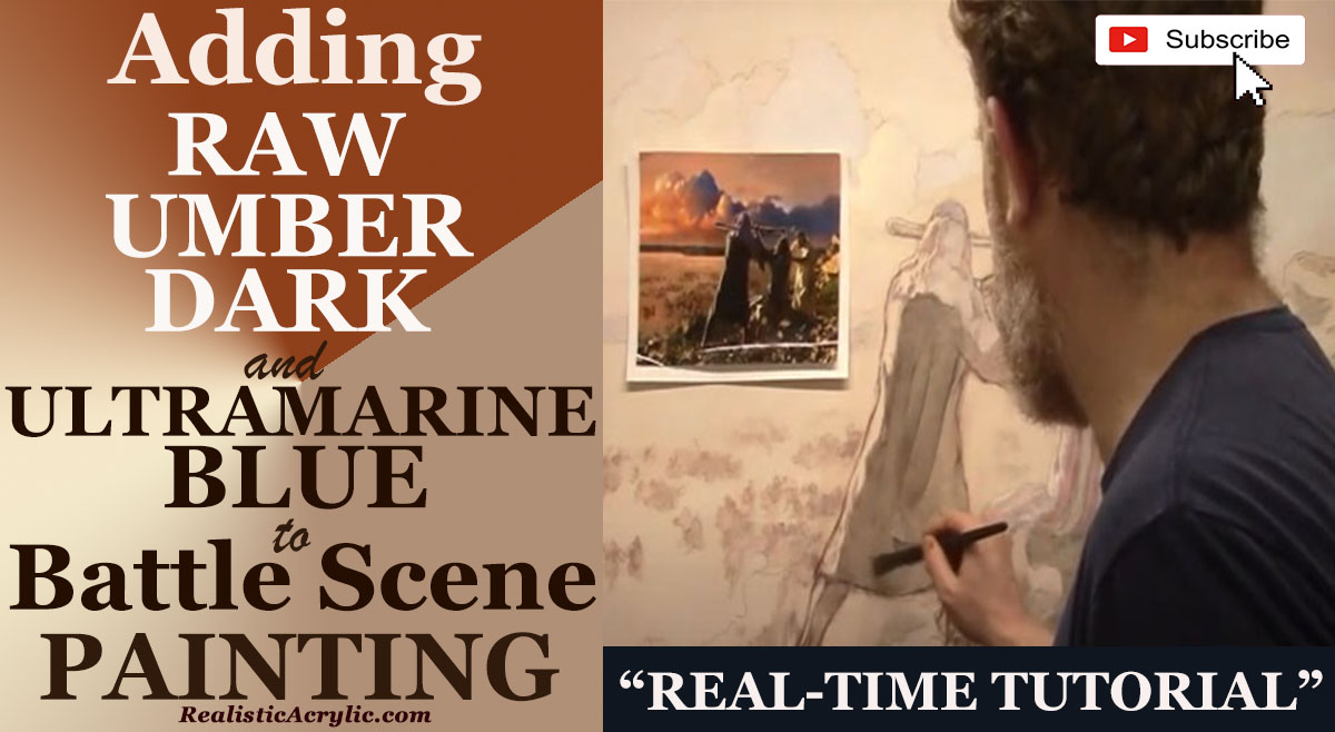
How to Add Raw Umber Dark & Ultramarine Blue to Your Portrait
Unlock the secrets of acrylic glazing: create depth and realism with dark glazes
When working on an acrylic portrait, the strategic use of dark tones like raw umber dark and ultramarine blue can elevate your painting, adding depth, contrast, and a sense of realism. This post will guide you through the process of incorporating these colors into your work using the acrylic glazing technique.
Why Glazing Is Essential for Realistic Portraits
Glazing is a powerful technique where thin layers of paint are applied over dried layers, creating luminous and transparent effects. By using glazes of darker colors such as raw umber dark and ultramarine blue, you can effectively add shadows and nuances that enhance the three-dimensionality of your portrait. These darker hues provide the balance needed to highlight lighter areas, making the portrait more dynamic.
As what I have mention in this painting process of Moses, Aaron, and Hur, “You can’t appreciate the light until you have the dark.” This concept applies to both life and art. The contrast between light and shadow gives a painting its life, much like how challenges define our growth.
Applying Raw Umber Dark and Ultramarine Blue
Step 1: Prepare Your Palette
Begin by setting up your palette with raw umber dark and ultramarine blue. These are ideal for creating natural shadow tones and deepening the values of your painting. Mix them with a glazing medium to maintain their transparency and to build gradual layers of color. It’s important to avoid opaque mixes, as the goal is to subtly darken areas without losing the underlying details of the painting.
Step 2: Select Areas for Darkening
Identify the areas in your portrait that require more depth, typically shadows along the figure’s contours. For example, in the painting of the video, I darkened the areas around Aaron’s back and the surrounding rocks. These sections are vital to grounding the subjects in the scene and providing contrast with lighter areas.
As you apply the glaze, remember to work in layers. “You can’t have big muscles without resistance,” I explained, drawing a parallel between the perseverance required in life and painting. Similarly, layering glazes creates rich shadows that bring depth to your painting.
Step 3: Work Slowly, Let the Layers Build
Glazing is a slow process, but patience pays off. As you apply each glaze, wait for it to dry before adding more. This technique is essential to avoid muddying the paint and to maintain the clarity of your layers. For the raw umber dark and ultramarine blue mix, you’ll want to focus on the darkest parts of your composition, like the creases in fabric or the deep shadows under the chin and neck.
For instance, when I worked on the clouds and sky in the background, I spread the glaze of ultramarine blue to darken the clouds, providing a rich contrast that made the light areas stand out even more. “We can’t appreciate the light until we have the dark,” I noted as I work, blending the dark glaze seamlessly into the composition.
Tips for Successful Glazing
- Use a Soft Brush:
A soft brush allows you to apply thin, even layers without disturbing the paint underneath. This is crucial for glazing, where transparency is key. - Test on a Scrap Surface First:
Before applying your glaze directly onto your portrait, test your mix on a separate surface to ensure the transparency and color are just right. - Focus on Gradual Changes:
Build up the dark areas slowly to maintain control over how much shadow you’re introducing. One of the benefits of glazing is the ability to adjust the depth gradually, so don’t rush the process. - Blend the Edges:
When applying the glaze, blend the edges softly to create a smooth transition from light to dark. Harsh lines can disrupt the realism of your portrait. - Consider the Overall Composition:
When adding dark glazes, ensure they fit into the overall lighting of your painting. Shadows should match the direction of your light source, adding to the coherence of the piece.
The Impact of Ultramarine Blue in Portraits
Ultramarine blue is a versatile color in portrait painting. Its cool tone makes it perfect for creating shadows that contrast with warm skin tones. When mixed with raw umber dark, it achieves a balanced, natural shadow effect, ideal for portraying depth in human figures and backgrounds alike.
In my painting, the combination of these two colors on the rock surfaces and the garments of Moses, Aaron, and Hur emphasized the figures’ prominence and their position in the scene. The shadows darkened by ultramarine blue glaze heightened the contrast, drawing the viewer’s eye to the central action.
Achieving Caravaggio-Like Effects
For artists aiming for a dramatic, chiaroscuro effect in their portraits, studying the techniques of masters like Caravaggio can be highly beneficial. Caravaggio often worked with dark grounds and built up the light in his paintings, using deep shadows to highlight the brightness of his subjects. I mentioned his intention to incorporate a similar approach by using a raw umber-toned background and adding glazes over it to create depth.
Final Thoughts: Perseverance in Art and Life
Adding raw umber dark and ultramarine blue glazes to your portrait is not just about enhancing the aesthetic appeal of your work. It’s a metaphor for the perseverance needed in both art and life. As I always remind you, “Trials produce perseverance, and perseverance must finish its work.”
By patiently applying layers of glaze and embracing the challenges of the painting process, you’ll eventually see the fruits of your labor: a portrait rich in contrast, depth, and meaning.
Glazing with raw umber dark and ultramarine blue provides a powerful method to enhance shadows and add realism to your acrylic portrait. This technique, combined with patience and perseverance, will allow your work to reach new levels of depth and detail.
Watch the video below to learn more about adding raw umber dark and ultramarine blue to battle scene painting.
- Adding highlights to your acrylic painting
- 5 Excellent Reasons to Use Aluminum Foil
- Paint Realistic Wrinkles in Acrylic
- Painting Clothing in an Acrylic Portrait
- Paint a Cloudy Sky Acrylic
- How to add Semi-Opaque Highlights
- How to Enhance the Contrast in Your Acrylic
- How to Add Glaze to Your Acrylic Painting
- Paint Realistic Reflections on Eyeglasses in an Acrylic Portrait
- Build Up Depth on Your Acrylic Portrait Backgrounds
- How Do You Do Layers With the Glazing Technique?
- Learn How to Paint Wrinkles in Acrylic
Read more about how to paint a portrait that you can surely be proud of!
I’d love to hear your thoughts on this video. Please share it with your friends and family. Let me know if you have any further questions. I’ll greatly help you.
If you’d like to learn more, sign up for my free email tips and video class today.
Learn How to Paint Acrylic Portraits With My Free Mini-Video Course!
Thank you so much for taking the time to read this tutorial and watch the video. That means a lot to me. I hope you find it very helpful in your portrait painting.
Yours for Better Portraits,
P.S. Did you find this post helpful or encouraging? If so, send it on ahead! Let others know with the share buttons below. I’d love to hear your comments. Thank you so much! Also, do you have a question on acrylic portrait painting you’d like answered? Let me know, and I’d be happy to help!
How to Make Your Own Raw Umber Dark
Understanding why raw umber dark is essential for acrylic glazing & the step-by-step mixing colors to achieve raw umber dark
It’s a wonderful pigment for creating rich, dark values, shadows, and skin tones in your acrylic portrait. But, to my knowledge, you can only buy it at Nova Color. So, many artists following my method don’t have this color to use. I’ll show you how to make your own raw umber dark.
As an artist, finding the right materials for your painting technique is crucial, especially when working with the acrylic glazing method. One of the key colors often used for building shadows and depth in classical or pseudo-classical styles is raw umber dark. Unfortunately, not all artists have access to this pigment, particularly those living overseas where shipping can be a challenge. In this guide, we’ll show you how to mix your own raw umber dark using commonly available pigments.
Why Raw Umber Dark is Essential
Raw umber dark is a rich, chocolatey brown pigment that is darker and more versatile than regular raw umber. It’s particularly useful for creating realistic shadows and adding depth to your artwork, especially in the glazing technique. But, if you’ve ever found yourself without raw umber dark, or unable to purchase it, don’t worry! Because you can always make a substitute at home with a few simple colors.
Materials You’ll Need
- Raw Umber (regular)
- Ultramarine Blue
- Alizarine Crimson
- Matte Medium
- Ivory Black (optional)
- Palette or canvas for mixing
- Palette knife or brush
Tip: But always make sure that you have a clean, organized palette for easy color mixing and consistency in results.
Step-by-Step Process for Mixing Raw Umber Dark
Before we dive into the process, it’s important to note that while this mixture is not a perfect replica of raw umber dark, it’s a close substitute that will work well in most acrylic painting applications.
- Set up your palette: Start by placing a small amount of regular raw umber on your palette. This will be the base color for your raw umber dark mix.
- Apply Raw Umber Dark as a reference: If you have a small amount of raw umber dark left, apply it to your palette or canvas to compare the shade. This will help you better match the tones as you mix your new color.
- Add Ultramarine Blue: To darken the raw umber, add a touch of ultramarine blue. This will deepen the brown and make it more neutral. Start with a small amount and gradually mix it into the raw umber until the color becomes noticeably darker.
- Balance with Alizarine Crimson: Ultramarine blue alone can make the mixture appear too cool or greenish. To balance it out, add a small amount of alizarine crimson. This warm red pigment will neutralize the blue and help create a deep, rich tone.
- Test the mix: Once you’ve combined the pigments, test the mixture by applying it to your canvas or palette. Compare it to the raw umber dark sample you applied earlier. If the color is still too light or cool, adjust the mixture by adding more ultramarine blue and alizarine crimson in small amounts until you achieve the desired shade.
- Optional: Use Ivory Black: If you want to make the color even darker, you can experiment by adding a small amount of ivory black. This will push the value further towards a deep, shadowy tone, which can be useful in very dark areas of your painting. However, be careful not to overdo it, as black can overpower the mixture.
- Glaze Test: Mix your new raw umber dark with matte medium (about 70% medium to 30% paint) to create a translucent glaze. Apply this to your canvas to see how the color behaves in thin layers, which is essential for the glazing technique. Compare the opacity and darkness with the original raw umber dark glaze.
Tip: Always mix pigments gradually. It’s easier to darken a color than to lighten it once too much pigment has been added.
Understanding the Color Profiles
When comparing raw umber, raw umber dark, and the new mixture, you’ll notice distinct differences. Regular raw umber has a lighter, slightly yellowish tint, while raw umber dark is much deeper and richer. The new mixture you create will closely mimic this, but, making it a suitable substitute for shadows and depth in your artwork.
Here’s how the colors break down:
- Raw Umber: A medium brown with a yellowish tint.
- Raw Umber Dark: A very dark brown, ideal for shadowing and glazing.
- Mixed Raw Umber Dark: A custom blend that sits between the two, close to the deep richness of Raw Umber Dark.
Tip: Keep your mixtures balanced. Too much ultramarine blue or alizarine crimson can throw off the shade, so adjust slowly and test frequently.
Practical Uses of Raw Umber Dark in Acrylic Painting
- Building Shadows: Raw umber dark is perfect for deepening shadows in portrait and landscape paintings. Its dark tone adds a layer of realism, creating more depth and dimension.
- Acrylic Glazing: As a translucent glaze, raw umber dark can build up shadows gradually, allowing for a more natural transition between light and dark areas. It’s especially useful in the glazing technique, where thin layers of color are applied to create luminosity and depth.
- Creating Neutral Tones: This pigment mix can also be used to neutralize overly vibrant colors. Mixing it with bright hues will tone them down, creating more subtle and realistic shades.
Tip: Always test your glaze on a scrap piece of canvas before applying it to your painting. This will help you gauge how transparent and dark your mixture is.
By making your own raw umber dark, you can continue painting without interruption even if the store runs out of your favorite pigment. The process is straightforward, requiring only a few readily available colors. With some practice, you’ll be able to mix a close replica that will serve you well in your acrylic paintings.
Watch my tutorial to learn more about how to make your own raw umber dark.
- Adding highlights to your acrylic painting
- 5 Excellent Reasons to Use Aluminum Foil
- Paint Realistic Wrinkles in Acrylic
- Painting Clothing in an Acrylic Portrait
- Paint a Cloudy Sky Acrylic
- How to add Semi-Opaque Highlights
- How to Enhance the Contrast in Your Acrylic
- How to Add Glaze to Your Acrylic Painting
- Paint Realistic Reflections on Eyeglasses in an Acrylic Portrait
- Build Up Depth on Your Acrylic Portrait Backgrounds
- How Do You Do Layers With the Glazing Technique?
- Learn How to Paint Wrinkles in Acrylic
Read more about how to paint a portrait that you can surely be proud of!
I’d love to hear your thoughts on this video. Please share it with your friends and family. Let me know if you have any further questions. I’ll greatly help you.
If you’d like to learn more, sign up for my free email tips and video class today.
Learn How to Paint Acrylic Portraits With My Free Mini-Video Course!
Thank you so much for taking the time to read this tutorial and watch the video. That means a lot to me. I hope you find it very helpful in your portrait painting.
Yours for Better Portraits,

P.S. Did you find this post helpful or encouraging? If so, send it on ahead! Let others know with the share buttons below. I’d love to hear your comments. Thank you so much! Also, do you have a question on acrylic portrait painting you’d like answered? Let me know, and I’d be happy to help!
How to Paint Realistic Trees & Grass in Your Acrylic
It’s important to know how to paint greenery in your acrylic portrait.
In this tutorial, we’ll explore how to paint realistic trees and grass using the acrylic glazing technique. This approach allows for gradual layering of colors, which adds depth and vibrancy to your landscape. Acrylic glazing helps build up the scene, much like how an oil painting develops, while maintaining the versatility and quick-drying benefits of acrylics.
Whether you’re working on a portrait background or a full landscape, these methods will enhance your painting’s realism. So, grab your brushes and let’s dive in!
Materials You’ll Need
Before starting, make sure you have these essential tools:
- Acrylic paints (Raw umber, ultramarine blue, indian yellow, phthalo blue)
- Matte medium
- Flat brushes
- Palette
- Reference photo (optional)
Step-by-Step Guide to Painting Trees and Grass
1. Prepare Your Palette and Materials
Begin by setting up your palette with the necessary colors. In this painting, raw umber and ultramarine blue will serve as the foundation for shadows, while indian yellow and phthalo blue will add vibrancy to the lighter areas. Make sure to have a matte medium to thin out your paints for glazing.
Transitioning between vibrant and muted colors is key. As you work in darker areas, shift away from highly saturated colors like Indian Yellow to cooler tones like ultramarine blue.
2. Start with a Sketch
Begin with a light sketch on your canvas, which will act as a guide for placing trees and grass. Use thin layers of paint to avoid covering up your sketch too early. In the initial stages, the painting may resemble a watercolor, but as you apply more glazes, it will begin to take on the characteristics of a full-bodied acrylic painting.
3. Apply the First Layer of Glazes for the Grass
When painting grass, start by applying a base layer using vibrant colors like Indian yellow and phthalo blue. This combination gives the grass a rich, glowing appearance. As you move further away into the background or shadows, use cooler and less intense tones like raw umber.
For glazing, thin out your paint with matte medium to make it translucent. This will allow previous layers to show through, creating depth. Layering slowly is crucial—don’t rush the process.
4. Develop Shadows Within the Shadows
Once the initial glaze dries, begin adding darker tones to create depth. In this case, mix raw umber dark with ultramarine blue. The deeper shades of color should be applied sparingly to the areas that are farthest from the light source. This technique, known as adding “shadows within the shadows,” adds dimension and makes your painting more realistic.
In places where light barely reaches, such as underneath trees or in between clumps of grass, carefully brush in darker glazes. Thin these glazes with matte medium to ensure the darkness isn’t overpowering.
5. Blending Techniques for a Smooth Transition
To achieve a seamless blend between light and dark areas, use a dry brush technique. As the paint on your brush begins to run out, use the remaining paint to blend areas softly. Gently sweep the brush back and forth in different directions, blending the layers into each other.
Switching between horizontal and vertical brush strokes can smooth the transitions between glazes, ensuring a more natural look for both trees and grass.
Tips & Techniques for Realistic Trees and Grass
- Use Cooler Colors for Depth: Darker areas should have cooler, less intense colors. Avoid overly vibrant shades in the shadows to maintain realism.
- Layer Gradually: Build your painting slowly, one thin layer at a time. This helps the colors blend well and creates a smooth transition from light to dark.
- Reference Photos: Keep a reference photo nearby to help guide your light and shadow placement. Analyze where the darkest areas should be in relation to the light source.
- Be Patient: The glazing technique takes time. Allow each layer to dry completely before moving on to the next. This prevents muddying your colors and ensures each layer adds value to the final piece.
Read more about my additional resources, tutorials, to learn more and check out my free courses here. . Whether you’re a beginner or an experienced artist, there’s always something new to learn and apply to your paintings. Happy painting!
- Adding highlights to your acrylic painting
- 5 Excellent Reasons to Use Aluminum Foil
- Paint Realistic Wrinkles in Acrylic
- Painting Clothing in an Acrylic Portrait
- Paint a Cloudy Sky Acrylic
- How to add Semi-Opaque Highlights
- How to Enhance the Contrast in Your Acrylic
- How to Add Glaze to Your Acrylic Painting
- Paint Realistic Reflections on Eyeglasses in an Acrylic Portrait
- Build Up Depth on Your Acrylic Portrait Backgrounds
- How Do You Do Layers With the Glazing Technique?
- Learn How to Paint Wrinkles in Acrylic
Read more about how to paint a portrait that you can surely be proud of!
I’d love to hear your thoughts on this video. Please share it with your friends and family. Let me know if you have any further questions. I’ll greatly help you.
If you’d like to learn more, sign up for my free email tips and video class today.
Learn How to Paint Acrylic Portraits With My Free Mini-Video Course!
Thank you so much for taking the time to read this tutorial and watch the video. That means a lot to me. I hope you find it very helpful in your portrait painting.
Yours for Better Portraits,

P.S. Did you find this post helpful or encouraging? If so, send it on ahead! Let others know with the share buttons below. I’d love to hear your comments. Thank you so much! Also, do you have a question on acrylic portrait painting you’d like answered? Let me know, and I’d be happy to help!
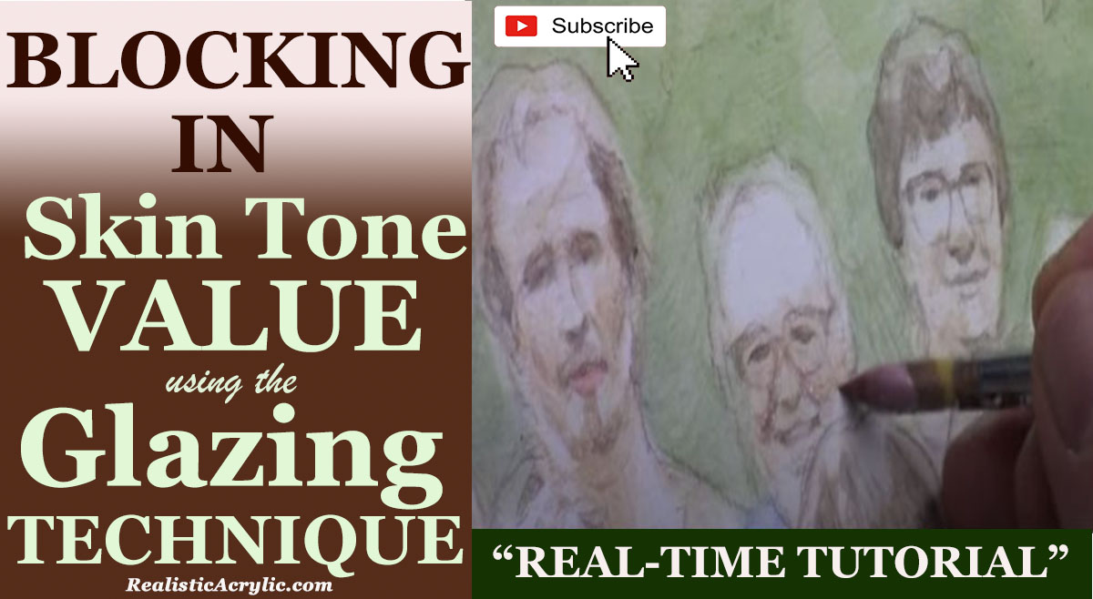
How to Block In Skin Tone Values Using Glazing Technique
A step-by-step guide to glazing technique in acrylic portraits
Achieving realistic skin tones in acrylic portraits requires a nuanced approach, combining color theory with technique. The glazing technique, a method involving the layering of transparent color, can be highly effective for this purpose. In this post, we will explore how to block in skin tone values using the glazing technique, drawing from a practical demonstration by artist Matt Philleo. Whether you’re aiming for lifelike detail or a more stylized finish, this guide will help you understand and implement the essential steps in your acrylic painting.
Understanding the Glazing Technique
The glazing technique in acrylic painting involves applying thin, transparent layers of paint over a dry underpainting. This method enhances depth and richness in colors without overwhelming the underlying details. When blocking in skin tones, glazing allows for subtle gradations and realistic shading, critical for achieving lifelike results.
Step-by-Step Guide to Blocking In Skin Tone Values
- Prepare Your Palette: Start by setting up your palette with essential colors. For skin tones, commonly used colors include raw umber dark, raw sienna, alizarine crimson, and occasionally ultramarine blue. But these colors will form the base of your glazes, which are mixed with a matte medium to achieve transparency.
- Block In Basic Shapes and Values: Begin by analyzing your reference photo to identify the key shapes and values on the subject’s face. Because, blocking in these shapes with a darker tone, such as raw umber dark mixed with matte medium, helps establish the foundational values. But, this step is crucial for building the structure of the portrait.
- Technique Tip: Use a round brush for precision. This allows you to carefully place glazes in specific areas, such as the darker regions of the face, while preserving the light areas.
- Layering Glazes: Apply your first glaze layer over the basic shapes. For example, mix raw umber dark with raw sienna and alizarine crimson to create a flesh tone, and apply it to the areas where shadows naturally occur. This layer should be thin and transparent, gradually building up the color intensity.
- Technique Tip: Patience is key. When glazing requires multiple layers to achieve depth. Because it allow each layer to dry before applying the next to avoid mixing colors unintentionally.
- Adjusting Skin Tones: As can be seen your progress, you may need to adjust skin tones to match different areas of your reference photo. For cooler skin tones, incorporate a touch of ultramarine blue into your glaze mix. For warmer tones, consider adding pyrrole orange or indian yellow. Adjusting these colors will help you match the diverse skin tones present in your portrait.
- Technique Tip: Monitor the transparency of your glazes. Adding more matte medium will help maintain the transparency necessary for effective glazing.
- Refining Details: Once the basic values are in place, focus on refining details. Use a smaller brush to add more precise glazes to areas such as shadows around the eyes or lips. This step helps in achieving a more nuanced and realistic appearance.
- Technique Tip: Apply glazes in thin, smooth layers to avoid creating harsh lines. Gradually build up the color to achieve the desired effect.
- Final Adjustments: After blocking in and refining your skin tones, assess the overall portrait. Make any necessary adjustments to ensure consistency and harmony in skin tones across the portrait. This may involve adding additional layers of glaze or adjusting existing ones.
- Technique Tip: Stepping back from your work periodically can help you see it from a different perspective and make more informed adjustments.
Blocking in skin tone values using the glazing technique is a powerful method for creating depth and realism in acrylic portraits. By layering transparent colors and carefully adjusting tones, you can achieve lifelike results that capture the essence of your subject. But remember, patience and practice are essential in mastering this technique. With time, you’ll find that glazing becomes an invaluable tool in your acrylic painting repertoire.
Tips and Techniques Recap:
- Use a round brush for precision in blocking in values.
- Mix colors with matte medium to create transparent glazes.
- Apply glazes in thin, smooth layers and allow each to dry before adding more.
- Adjust colors based on skin tone variations and monitor glaze transparency.
- Refine details with smaller brushes and assess the overall portrait for consistency.
By following these steps, you’ll be well on your way to mastering the art of blocking in skin tone values using the glazing technique.
Read more about my additional resources, tutorials, to learn more and check out my free courses here. . Whether you’re a beginner or an experienced artist, there’s always something new to learn and apply to your paintings. Happy painting!
- Adding highlights to your acrylic painting
- 5 Excellent Reasons to Use Aluminum Foil
- Paint Realistic Wrinkles in Acrylic
- Painting Clothing in an Acrylic Portrait
- Paint a Cloudy Sky Acrylic
- How to add Semi-Opaque Highlights
- How to Enhance the Contrast in Your Acrylic
- How to Add Glaze to Your Acrylic Painting
- Paint Realistic Reflections on Eyeglasses in an Acrylic Portrait
- Build Up Depth on Your Acrylic Portrait Backgrounds
- How Do You Do Layers With the Glazing Technique?
- Learn How to Paint Wrinkles in Acrylic
Read more about how to paint a portrait that you can surely be proud of!
I’d love to hear your thoughts on this video. Please share it with your friends and family. Let me know if you have any further questions. I’ll greatly help you.
If you’d like to learn more, sign up for my free email tips and video class today.
Learn How to Paint Acrylic Portraits With My Free Mini-Video Course!
Thank you so much for taking the time to read this tutorial and watch the video. That means a lot to me. I hope you find it very helpful in your portrait painting.
Yours for Better Portraits,

P.S. Did you find this post helpful or encouraging? If so, send it on ahead! Let others know with the share buttons below. I’d love to hear your comments. Thank you so much! Also, do you have a question on acrylic portrait painting you’d like answered? Let me know, and I’d be happy to help!
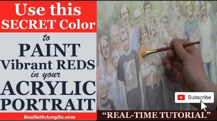
How to Paint Vibrant Reds in Your Acrylic Portrait
Discover the secret to vibrant reds in your acrylic portraits
Achieving rich, vibrant reds in acrylic portrait painting can be a challenge, but with the right technique, your reds will burst with life and color. In this tutorial, we’ll explore how you can use warm undertones and the acrylic glazing technique to enhance the vibrance of red tones in clothing and other areas of your portrait.
Understanding the Acrylic Glazing Technique
Glazing is an essential technique that involves applying thin, transparent layers of paint over a dried base color. This method allows the artist to build up colors gradually, giving the painting a sense of depth and vibrancy that cannot be achieved with solid, opaque layers alone.
When it comes to reds, the glazing technique is particularly useful for enhancing the richness and intensity of the color. Instead of simply applying a red pigment straight from the tube, you can use this method to create a more radiant and realistic red, making your acrylic portrait truly stand out.
The Role of Warm Undertones
One of the main tips for creating vibrant reds is to begin with warm undertones. Although it may seem counterintuitive, using colors like indian yellow and pyrrole orange as a base will help your reds appear more dynamic and alive.
You might wonder, “Why not just use red?” The answer is simple: adding warm undertones underneath your red glaze enhances the warmth and depth of the final color, making it more vibrant than if you used red alone.
Here’s how you can do it:
- Start with a Base Color: Before applying any red, start by mixing Indian yellow and pyrrole orange. These colors may not seem red at first glance, but once you glaze over them, the warmth they provide will enhance the brilliance of your final red layer.
- Apply the Warm Undertone: Using a diluted mix of Indian yellow and pyrrole orange, apply the first layer to areas of your portrait that will feature red clothing or objects. This technique works well for clothing, accessories, or any other elements in your painting that need a pop of red.
- Use Matte Medium for Transparency: When applying glazes, it’s important not to use the paint straight from the tube. Instead, mix your paint with a matte medium to ensure it remains transparent. This will allow the undertones to show through and interact with the top layer of red.
Layering the Red Glaze
After establishing the warm undertone, it’s time to apply the red glaze.
- Choose the Right Red: Select a red pigment that works well for your painting. Consider using a red with slightly cool or neutral undertones, as the warmth from the base layer will balance it out.
- Apply the Glaze in Thin Layers: Using a soft brush, gently apply a thin layer of red over the areas where you’ve already applied the warm undertone. Since this is a glazing technique, it’s important to keep the layers thin and transparent, allowing the undertone to shine through. Each additional layer will build up the color’s intensity.
- Allow Drying Between Layers: Patience is key when using the glazing technique. Allow each layer to dry completely before applying the next. This ensures that the layers remain distinct and prevents the colors from becoming muddy.
Adjusting the Saturation for Different Effects
Not all reds need to be equally vibrant in every part of the portrait. Depending on the light source, shadows, and context of the painting, you may want to vary the intensity of your red tones. Here’s how you can control the saturation of your reds:
- Dilute the Glaze for Subtle Reds: If you want certain areas of the red clothing or object to appear more muted, simply dilute your red paint further with matte medium. This will create a more translucent glaze, allowing more of the warm undertones to come through.
- Increase Layering for Vibrant Reds: For areas where you want the red to pop, you can add multiple layers of red glaze. This will gradually increase the saturation, giving a more vibrant and bold effect.
- Shadows and Highlights: Pay attention to how light interacts with the red areas in your portrait. For shadows, you can mix a small amount of raw umber or burnt sienna into your red glaze to darken it slightly. For highlights, consider using a more diluted glaze or even mixing in a bit of titanium white for a lighter red tone.
Tips for Painting Vibrant Reds
- Use a Soft Brush: A soft, synthetic brush is ideal for applying smooth, even glazes. It allows you to create thin, controlled layers without leaving visible brush marks.
- Patience is Key: Glazing requires patience, as each layer must dry before applying the next. However, the end result will be worth it, as your reds will have a depth and vibrancy that solid layers can’t achieve.
- Experiment with Colors: While this technique focuses on Indian yellow and pyrrole orange, don’t be afraid to experiment with other warm tones for the base layer. Even a touch of cadmium yellow or burnt sienna could create interesting effects.
Common Mistakes to Avoid
- Too Opaque Glazes: One of the most common mistakes when glazing is using paint that is too opaque. Always dilute your paint with matte medium to maintain the transparency that makes glazing effective.
- Not Allowing Layers to Dry: If you rush and apply layers before the previous one is dry, you risk muddying the colors and losing the clarity of the glazing effect.
- Skipping the Warm Undertones: Remember, the warm undertones are what give your reds that extra vibrance. Skipping this step will result in reds that look flat and less dynamic.
Painting vibrant reds in your acrylic portrait requires more than just picking the right red from your palette. By using the glazing technique and applying warm undertones, you can create reds that pop with life and depth. Take your time, layer your colors carefully, and experiment with different red tones to achieve stunning, realistic results in your acrylic portraits.
Read more about my additional resources, tutorials, to learn more and check out my free courses here. . Whether you’re a beginner or an experienced artist, there’s always something new to learn and apply to your paintings. Happy painting!
- Adding highlights to your acrylic painting
- 5 Excellent Reasons to Use Aluminum Foil
- Paint Realistic Wrinkles in Acrylic
- Painting Clothing in an Acrylic Portrait
- Paint a Cloudy Sky Acrylic
- How to add Semi-Opaque Highlights
- How to Enhance the Contrast in Your Acrylic
- How to Add Glaze to Your Acrylic Painting
- Paint Realistic Reflections on Eyeglasses in an Acrylic Portrait
- Build Up Depth on Your Acrylic Portrait Backgrounds
- How Do You Do Layers With the Glazing Technique?
- Learn How to Paint Wrinkles in Acrylic
Read more about how to paint a portrait that you can surely be proud of!
I’d love to hear your thoughts on this video. Please share it with your friends and family. Let me know if you have any further questions. I’ll greatly help you.
If you’d like to learn more, sign up for my free email tips and video class today.
Learn How to Paint Acrylic Portraits With My Free Mini-Video Course!
Thank you so much for taking the time to read this tutorial and watch the video. That means a lot to me. I hope you find it very helpful in your portrait painting.
Yours for Better Portraits,

P.S. Did you find this post helpful or encouraging? If so, send it on ahead! Let others know with the share buttons below. I’d love to hear your comments. Thank you so much! Also, do you have a question on acrylic portrait painting you’d like answered? Let me know, and I’d be happy to help!
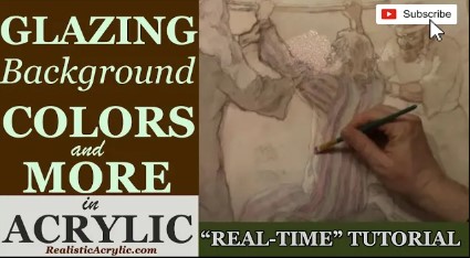
How to Glaze Background Colors & More Acrylic Portrait
Creating seamless transitions in background colors & step-by-step guide in applying glazes
In this tutorial, we will explore the powerful acrylic glazing technique, focusing on how to glaze background colors and more in an acrylic portrait to create depth and vibrancy. This method adds luminosity and realism to your acrylic portraits by layering colors, which can be used not only for the background but also for clothing and other key details. This lesson is based on a 30 x 40 acrylic portrait of Moses, Aaron, and Hur during the ancient battle against the Amalekites.
The Acrylic Glazing Technique
Acrylic glazing is an essential technique that involves mixing a transparent medium, like matte medium, with acrylic paint to create layers of translucent color. As a result is a soft, glowing effect that gives your painting depth and complexity without covering the layers beneath.
Tools and Materials
- Matte Medium
- Acrylic paints (Alizarin Crimson, Blue, etc.)
- Flat Brushes (size 20, 2-inch, ¾ flat)
- Palette
- Reference photo
- Cloth or rag for cleaning
Step 1: Preparing the Background
Before starting, it’s essential to have a reference photo to guide your colors and shading. In this case, we focus on creating a sky that balances warm tones and cool blues, providing an atmospheric background for the figures.
- Mixing Your Glaze:
Basically you begin by mixing a small amount of alizarine crimson with a lot of matte medium. The goal is to have a translucent color that will of course allow the previous layers of paint to show through. But, if the mixture is too opaque, you can add more medium to thin it out. - Applying the Glaze:
Use a large 2-inch flat brush to apply the glaze to the canvas. Then ,start in the upper right corner of the painting, brushing the glaze horizontally across the sky. But, this technique ensures that the background maintains a natural flow and stays consistent with the painting’s perspective. - Using Vertical and Diagonal Strokes:
So to blend the glaze seamlessly, alternate between vertical, diagonal, and horizontal brush strokes. Then this helps spread the paint evenly, preventing streaks. Remember, you can always dilute the glaze if it’s too dark by adding more matte medium or wiping away excess paint with a rag.
Step 2: Building Depth and Adjusting the Colors
After applying the first layer of glaze, assess your work by comparing it to the reference photo. In this example, the right side of the painting is darker and has a slightly pinkish hue, which can be achieved by applying a second layer of alizarine crimson glaze.
- Control Your Mixture:
As you move to different parts of the painting, like the horizon or figures, then you can adjust the glaze’s intensity. Then you can add more matte medium for lighter areas or increase the pigment concentration for deeper shadows. Because this flexibility allows you to control the shading gradually, making it easier to match the reference. - Layering Colors in the Sky:
However you will gradually build up the background by layering different shades of pink and blue. But at the horizon, where the sky meets the land, a hint of pink helps tie the colors together. Then, use soft vertical and diagonal strokes to blend the hues smoothly.
Step 3: Glazing Details on the Figures
Once the background is complete, the same glazing technique can be applied to specific details in the painting, such as the clothing of Moses, Aaron, and Hur.
- Adding Depth to Moses’s Clothing:
For Moses, we applied the same alizarine crimson glaze to his robe. Then, by increasing the ratio of paint to matte medium, the color becomes slightly more vibrant, adding richness to his garments without losing the transparent effect. - Balancing Colors and Tones:
Be mindful of the overall composition. For example, if the colors of Moses’s robe look too much like the American flag (red, white, and blue), adjust by adding green or a neutral shade to balance it out. - Blending and Refining:
For finer details, such as stripes or shading on clothing, use smaller brushes and carefully scrub the glaze into the fabric’s texture. This adds realism without overwhelming the initial colors laid down.
Common Glazing Tips and Techniques
- Dilution is Key:
To avoid overpowering your painting, always mix a high ratio of matte medium to pigment. The goal is to enhance, not obscure, the layers beneath. - Wipe Away Excess Paint:
Glazing offers flexibility; if the color is too intense, you can easily remove it using a damp cloth. This allows for continuous adjustments and experimentation. - Layer Light to Dark:
When working with glazes, start with lighter colors and gradually build up to darker tones. This approach maintains the painting’s luminosity while allowing the colors to interact naturally. - Use a Reference Photo:
Having a clear and close reference photo is essential for glazing. Keep it taped near or on top of your painting to check your colors and values. This ensures you stay on track with the scene’s depth and lighting. - Brush Strokes Matter:
Vary your brush strokes (vertical, diagonal, horizontal) to blend glazes seamlessly. Consistent direction can lead to visible lines that distract from the painting’s flow.
Glazing background colors in acrylic portrait paintings is a powerful way to create depth and atmosphere. By following the layering techniques outlined above, you can achieve a vibrant and realistic sky while also enhancing the finer details of your subjects. Through practice and patience, this method will elevate your acrylic painting skills, giving your artwork a professional and polished look.
Read more about my additional resources, tutorials, to learn more and check out my free courses here. . Whether you’re a beginner or an experienced artist, there’s always something new to learn and apply to your paintings. Happy painting!
- Adding highlights to your acrylic painting
- 5 Excellent Reasons to Use Aluminum Foil
- Paint Realistic Wrinkles in Acrylic
- Painting Clothing in an Acrylic Portrait
- Paint a Cloudy Sky Acrylic
- How to add Semi-Opaque Highlights
- How to Enhance the Contrast in Your Acrylic
- How to Add Glaze to Your Acrylic Painting
- Paint Realistic Reflections on Eyeglasses in an Acrylic Portrait
- Build Up Depth on Your Acrylic Portrait Backgrounds
- How Do You Do Layers With the Glazing Technique?
- Learn How to Paint Wrinkles in Acrylic
Read more about how to paint a portrait that you can surely be proud of!
I’d love to hear your thoughts on this video. Please share it with your friends and family. Let me know if you have any further questions. I’ll greatly help you.
If you’d like to learn more, sign up for my free email tips and video class today.
Learn How to Paint Acrylic Portraits With My Free Mini-Video Course!
Thank you so much for taking the time to read this tutorial and watch the video. That means a lot to me. I hope you find it very helpful in your portrait painting.
Yours for Better Portraits,

P.S. Did you find this post helpful or encouraging? If so, send it on ahead! Let others know with the share buttons below. I’d love to hear your comments. Thank you so much! Also, do you have a question on acrylic portrait painting you’d like answered? Let me know, and I’d be happy to help!
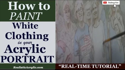
How to Paint White Clothing in Your Acrylic Portrait
Painting clothing can be tricky, especially when the color is white.
Painting white clothing in acrylic portraits might seem straightforward, but achieving realism requires more than just using white paint. White fabrics often reflect surrounding colors and shadows, adding complexity. In this guide, you’ll learn how to paint realistic white clothing in your acrylic portrait, perfecting shadow depth and subtle highlights through glazing techniques.
Understanding the Basics of White Clothing in Acrylic Portraits
White clothing is rarely purely white in real life but It reflects surrounding colors and light, creating a range of tones. In your portrait, the goal is to replicate these tones by incorporating shadows and highlights to make the fabric come to life.
1. Choosing the Right Colors for White Clothing
To paint white fabric, you must go beyond pure white but of course good mix for shadows and tints includes:
- Ultramarine Blue: Adds coolness to shadows.
- Alizarine Crimson: Provides warmth for shadow areas.
- Raw Umber Dark: Helps neutralize other colors, giving a natural gray tone.
Mixing these colors creates a gray base overall, it can be tinted to match the lighting and surrounding hues. For a cooler effect, add more ultramarine blue, while for warmer tones, mix in more alizarine crimson.
2. Layering with Glazes
Since glazing is essential for creating depth in white clothing. Then you need to start by using light, transparent layers of paint and build up shadows gradually. The initial layers will appear faint, but as you add more glazes, the depth increases, giving the clothing a realistic appearance.
Tip: Apply the glaze thinly to ensure transparency. You can always build up the tone by adding more layers, but it’s harder to undo a glaze that’s too dark.
3. Adding Shadows for Dimension
While shadows bring out the fabric’s texture and form. Therefore, in white clothing, the shadows often have cool undertones, depending on the light source. Then you can start by adding a thin, cool-toned glaze in areas that fall away from the light. Focus particularly on creating contrast between shadowed areas and highlights to ensure the fabric doesn’t look flat.
Technique:
Using a round brush will give you more control over the finer details, like wrinkles and folds. For larger areas, switch to a flat brush to apply an even layer of paint.
4. Highlighting Key Areas
Highlights are just as crucial as shadows. Identify the areas where light directly hits the fabric and leave those spaces lighter. You can even add a final layer of pure titanium white for the brightest spots.
Pro Tip: Make sure to blend the edges of the highlights into the surrounding shadows for a smooth transition. This blending enhances the realism, ensuring the highlights don’t look too harsh or out of place.
5. Creating Subtle Wrinkles and Folds
Folds in white clothing can be tricky because they require soft transitions from light to shadow. Use your reference photo to determine where the folds naturally occur. Start with a light wash for the base and build up the darker tones in the deepest parts of the fold using a combination of gray tones. Avoid sharp lines; instead, use soft brush strokes to mimic the natural flow of fabric.
6. Refining the Details
Once the main areas of the clothing are blocked in, it’s time to refine the smaller details. Look for small, intricate wrinkles and folds that catch the light differently. For example, around the arms or midsection, shadows might appear sharper. Strengthen those areas by layering more ultramarine blue or alizarine crimson in the mix.
Tip: Be mindful of not over-darkening areas. White clothing should still appear white, even in shadowed areas, so keep your tones subtle.
7. Balancing Warm and Cool Tones
In your portrait, the fabric’s color will vary based on its surroundings. For instance, if your subject is outdoors, the white clothing might reflect some of the sky, creating a bluish tint in the shadows. On the other hand, indoor lighting might cast warmer reflections. Adjust the color of your glaze to match these conditions.
Pro Tip: Test your color mixes on a separate sheet before applying them to your painting. This ensures you have the correct tone without accidentally adding too much warmth or coolness.
8. Final Touches for Realism
As you near the completion of your painting, step back and examine the overall balance. Do the shadows and highlights create the necessary depth? Does the fabric appear natural? If not, continue to add thin layers of glaze until the tones are balanced.
Once satisfied, add finishing touches by defining the sharpest wrinkles or folds with a fine brush. You can also use pure white on the brightest areas to make the fabric pop.
Tips and Techniques Summary
- Use a mix of ultramarine blue, alizarine crimson, and raw umber dark to create subtle grays for shadowing white clothing.
- Apply glazes in thin, transparent layers to build depth gradually.
- Highlight key areas where the light hits directly, using pure titanium white.
- Balance cool and warm tones based on the environment and light source.
- Refine details by adding shadows to wrinkles and folds using soft brush strokes.
Painting white clothing in an acrylic portrait requires more than just using white paint. With the right color mixes, glazing techniques, and attention to detail, you can create a realistic depiction of white fabric. By building shadows and highlights gradually, your painting will have depth and vibrancy, capturing the essence of the fabric in a natural way.
Read more about my additional resources, tutorials, to learn more and check out my free courses here. . Whether you’re a beginner or an experienced artist, there’s always something new to learn and apply to your paintings. Happy painting!
- Adding highlights to your acrylic painting
- 5 Excellent Reasons to Use Aluminum Foil
- Paint Realistic Wrinkles in Acrylic
- Painting Clothing in an Acrylic Portrait
- Paint a Cloudy Sky Acrylic
- How to add Semi-Opaque Highlights
- How to Enhance the Contrast in Your Acrylic
- How to Add Glaze to Your Acrylic Painting
- Paint Realistic Reflections on Eyeglasses in an Acrylic Portrait
- Build Up Depth on Your Acrylic Portrait Backgrounds
- How Do You Do Layers With the Glazing Technique?
- Learn How to Paint Wrinkles in Acrylic
Read more about how to paint a portrait that you can surely be proud of!
I’d love to hear your thoughts on this video. Please share it with your friends and family. Let me know if you have any further questions. I’ll greatly help you.
If you’d like to learn more, sign up for my free email tips and video class today.
Learn How to Paint Acrylic Portraits With My Free Mini-Video Course!
Thank you so much for taking the time to read this tutorial and watch the video. That means a lot to me. I hope you find it very helpful in your portrait painting.
Yours for Better Portraits,

P.S. Did you find this post helpful or encouraging? If so, send it on ahead! Let others know with the share buttons below. I’d love to hear your comments. Thank you so much! Also, do you have a question on acrylic portrait painting you’d like answered? Let me know, and I’d be happy to help!
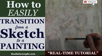
How to Easily Transition from a Sketch to a Painting
Building the foundation of why contrast and form matter more than color initially
Transitioning from a sketch to a detailed painting can be a challenge, but with the right techniques, the process can be simplified. In this post, we will explore how to use acrylic glazing to transform a simple sketch into a vibrant, realistic painting. This method not only builds contrast but also gives the painting depth and life, allowing for gradual layering that enhances detail and realism.
The Importance of Contrast in Your Painting
Before diving into color and skin tones, it’s essential to establish the structural foundation of your painting. Many artists fall into the trap of immediately focusing on skin tones, only to end up with muddy, flat colors due to a lack of contrast. The key is to first build up your dark values to measure your midtones and highlights against them. By doing so, you create a balanced image where light and shadow work harmoniously.
When starting your painting, don’t focus on details like skin tones or small textures right away. Instead, think in terms of light and dark, focusing on the overall contrast. Use your sketch as a guideline and begin with general areas that need darkening. In this tutorial, we will use a combination of raw umber dark and ultramarine blue to create a rich, customizable black that is far more versatile than pre-mixed black paints like mars or ivory black.
Step 1: Preparing Your Glaze
Acrylic glazing is the core technique used to transition from a sketch to a painting. A glaze is simply a thin, translucent layer of paint applied over dry paint to build depth and modify color. For this process, you’ll need two basic components: paint and matte medium. Matte medium helps thin the paint without losing its vibrant color, allowing you to apply multiple layers without muddying the details beneath.
To create your glaze, mix a small amount of raw umber dark with ultramarine blue to make a deep, customizable black. Adjust the warmth or coolness of the black by adding more umber for warmth or more blue for a cooler tone. Once mixed, add in your matte medium to create a smooth glaze.
Step 2: Start by Darkening Large Areas
Once your glaze is ready, begin by applying it to large areas of your painting that require dark tones. For example, in a family portrait with 30 subjects, you might want to start by darkening clothing, hair, and shadows under the neck and face. Work from one side of the painting to the other, applying your glaze in smooth, even strokes.
As you work, keep in mind that the glazing process is all about building up layers gradually. Don’t try to achieve the perfect tone with just one pass. Instead, allow each glaze to dry before adding the next. This method will ensure that your painting remains vibrant and full of depth, rather than becoming flat or muddy.
Step 3: Achieving Smooth Transitions with Your Brush Strokes
When applying your glaze, alternate your brush strokes to create a smooth, seamless transition between light and dark areas. For example, when working on a subject’s shirt, brush horizontally across the fabric and then switch to vertical strokes. This back-and-forth motion helps blend the glaze evenly and prevents blotchiness.
Maintaining a wet edge is crucial during this process. A wet edge allows you to blend the glaze smoothly as you go, creating consistent shading and tone. If you let one area dry before finishing, you might end up with harsh lines or uneven patches.
Step 4: Building Form and Detail Gradually
Once you’ve established the darker areas of your painting, it’s time to move on to more detailed sections. Focus on transitioning from shadows to midtones and highlights. For example, when painting hair or intricate clothing, use your glazing technique to build depth gradually. The shadows in the hair can be darkened while leaving room for highlights, ensuring the subject looks three-dimensional.
At this stage, remember to keep the focus on form and structure. Don’t worry too much about perfect color accuracy just yet. As you layer your glazes, the true colors will emerge, and the painting will gain a natural depth and vibrancy.
Step 5: Avoiding Common Mistakes in Glazing
A common mistake that many artists make is rushing the skin tones too early. Skin tones can be tricky, and if they are not applied with the proper contrast already established, they can easily look flat and lifeless. By focusing first on the shadows and darker values, you will create a foundation on which the skin tones can later be added and adjusted.
When it comes time to start adding skin tones, remember that they should be lighter in comparison to your dark values. This contrast is what brings realism and dimension to your painting.
Tips for Using Glazing to Enhance Your Painting
- Use Matte Medium for Control: Always mix your paint with matte medium to control the transparency of your glaze. Matte medium allows for smoother application and prevents the paint from becoming too thick.
- Build Layers Slowly: Glazing is a gradual process. Apply thin layers and allow each one to dry before adding the next. This approach helps prevent muddiness and ensures each layer enhances the one beneath it.
- Maintain a Wet Edge: As you work, make sure to keep your paint edge wet. This technique allows for smoother blending and prevents harsh lines from forming between different areas.
- Alternate Brush Strokes: Use a combination of horizontal and vertical brush strokes to achieve even blending. This technique ensures that the glaze applies smoothly and evenly.
Elevating Your Sketch into a Painting
Transitioning from a sketch to a painting is a delicate process that requires patience and technique. By using acrylic glazing, you can enhance your artwork by gradually building up contrast, depth, and realism. Focus first on your darker values, slowly layering your glazes, and allow the painting to develop naturally.
Read more about my additional resources, tutorials, to learn more and check out my free courses here. . Whether you’re a beginner or an experienced artist, there’s always something new to learn and apply to your paintings. Happy painting!
- Adding highlights to your acrylic painting
- 5 Excellent Reasons to Use Aluminum Foil
- Paint Realistic Wrinkles in Acrylic
- Painting Clothing in an Acrylic Portrait
- Paint a Cloudy Sky Acrylic
- How to add Semi-Opaque Highlights
- How to Enhance the Contrast in Your Acrylic
- How to Add Glaze to Your Acrylic Painting
- Paint Realistic Reflections on Eyeglasses in an Acrylic Portrait
- Build Up Depth on Your Acrylic Portrait Backgrounds
- How Do You Do Layers With the Glazing Technique?
- Learn How to Paint Wrinkles in Acrylic
Read more about how to paint a portrait that you can surely be proud of!
I’d love to hear your thoughts on this video. Please share it with your friends and family. Let me know if you have any further questions. I’ll greatly help you.
If you’d like to learn more, sign up for my free email tips and video class today.
Learn How to Paint Acrylic Portraits With My Free Mini-Video Course!
Thank you so much for taking the time to read this tutorial and watch the video. That means a lot to me. I hope you find it very helpful in your portrait painting.
Yours for Better Portraits,

P.S. Did you find this post helpful or encouraging? If so, send it on ahead! Let others know with the share buttons below. I’d love to hear your comments. Thank you so much! Also, do you have a question on acrylic portrait painting you’d like answered? Let me know, and I’d be happy to help!
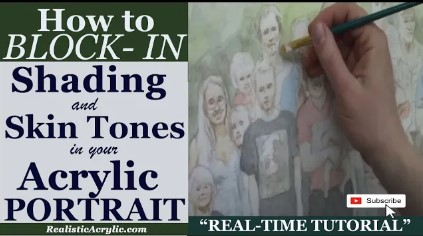
How to Block In Shading & Skin Tones in Your Acrylic
How to add depth and dimension to your portrait with layering
Acrylic portrait painting requires understanding shading, value, and skin tone to capture the subject’s essence. In this post, you’ll learn how to block in shading and skin tones using acrylic glazing techniques, without losing detail or vibrancy.
Creating realistic skin tones and shading is a crucial aspect of acrylic portrait painting. This technique, known as blocking in, helps you define mid-tones and shadows early on, setting the stage for a vibrant and lifelike portrait. Using acrylic glazing, this process ensures a smooth transition from sketch to finished painting, retaining the likeness while building depth and luminosity. In this tutorial, we will break down how to block in shading and skin tones, offering a step-by-step guide to enhance your portrait’s realism.
Understanding the Glazing Technique
Acrylic glazing involves applying thin layers of translucent paint over a base to create depth and smooth transitions. Because combining paint with matte medium, you can control the transparency, allowing the underpainting to shine through. Then this method is ideal for building subtle layers of skin tones without overpowering the original sketch.
Tip: Start with light glazes and build up gradually. Also, use more medium for lighter glazes and increase pigment for darker tones.
Preparing Your Materials
Before diving into shading, gather the following materials:
- Acrylic paints: Raw sienna, pyrrole orange, matte medium
- Brushes: Soft, round brushes for detailed application
- Matte Medium: Thins the paint and creates a translucent effect
- Palette: To mix your glazes
Tip: Matte medium works best for glazing because it dries flat, ensuring you maintain control over the values. Avoid gloss mediums, as they can create distracting reflections while working.
Step 1: Begin with a Detailed Sketch
Start by ensuring your portrait sketch is clear and precise. The sketch provides the foundation for your shading and color work. Because it focus on the key areas where light and shadow fall, as these will guide your shading process.
Tip: Preserve the luminosity by keeping the lighter areas, such as the forehead, untouched during initial layers. This helps maintain brightness in the final result.
Step 2: Apply the First Glaze
Mix raw sienna with matte medium to create your first glaze. Raw sienna is an excellent base color for skin tones, providing a natural warmth that can be built upon. Apply this glaze lightly across the mid-tones of the face, avoiding the highlights.
Technique Insight: When, glazing allows you to enhance skin tones subtly without covering the entire surface. And then translucent layers let you build up depth without losing the detailed sketch beneath.
Step 3: Focus on Value, Not Just Color
While color is important, value—the lightness or darkness of an area—is even more crucial. Focus on building form by shading the areas that need more depth, like the sides of the face, beneath the chin, and around the nose.
Tip: “Value over color” is a fundamental principle. A black-and-white portrait can still be striking if the values are correct. Don’t rush to perfect the skin tone without ensuring the shadows and highlights are accurate.
Step 4: Building Skin Tones
Basically to enhance your raw sienna base, introduce subtle variations using pyrrole orange. While this color adds a red-orange tint to areas like the cheeks and nose, creating a more natural skin tone. Mix the pyro orange with matte medium to maintain translucency, then applying it in thin layers over the previous glazes.
Technique Insight: For fairer skin, keep the glazes light and gradually build up warmth with minimal layers. For darker or tanned skin tones, you can deepen the shading by increasing the pigment concentration in each glaze.
Step 5: Blending and Refining
As you continue applying glazes, you’ll notice how the layers blend smoothly, creating a gradual transition between light and shadow. Use a soft brush to gently feather the edges of your glazes, ensuring there are no harsh lines between transitions.
Tip: If any areas become too dark, you can lighten them by adding a glaze of matte medium mixed with titanium white. This will soften the area without disrupting the overall value structure.
Step 6: Maintain Light in Highlights
When blocking in shading, it’s essential to preserve the lighter areas, like the forehead and the top of the nose. You can always adjust these areas with subtle glazes later, but maintaining their brightness early on ensures that your portrait remains balanced in terms of light and form.
Tip: Always work in stages, letting each glaze dry before adding another. This allows you to assess the overall effect and make adjustments as necessary.
Step 7: Finishing Touches
Once you have built up your skin tones and shading, you can start adding more opaque layers in areas that need stronger definition. Reduce the amount of matte medium for these layers, focusing on darker shadows and adding detail to features like the eyes, lips, and nose.
Tip: Use smaller brushes for detailing in these final stages, paying attention to the subtle shifts in color and value across the face.
Building a Realistic Portrait
Blocking in shading and skin tones using acrylic glazing takes practice, but the results can be incredibly rewarding. By focusing on value, applying translucent layers, and preserving luminosity, you can create a portrait that has depth, realism, and vibrancy.
Final Tip: Remember, the glazing technique is all about patience. Build up your layers gradually, allowing each one to contribute to the final result.
Read more about my additional resources, tutorials, to learn more and check out my free courses here. . Whether you’re a beginner or an experienced artist, there’s always something new to learn and apply to your paintings. Happy painting!
- Adding highlights to your acrylic painting
- 5 Excellent Reasons to Use Aluminum Foil
- Paint Realistic Wrinkles in Acrylic
- Painting Clothing in an Acrylic Portrait
- Paint a Cloudy Sky Acrylic
- How to add Semi-Opaque Highlights
- How to Enhance the Contrast in Your Acrylic
- How to Add Glaze to Your Acrylic Painting
- Paint Realistic Reflections on Eyeglasses in an Acrylic Portrait
- Build Up Depth on Your Acrylic Portrait Backgrounds
- How Do You Do Layers With the Glazing Technique?
- Learn How to Paint Wrinkles in Acrylic
Read more about how to paint a portrait that you can surely be proud of!
I’d love to hear your thoughts on this video. Please share it with your friends and family. Let me know if you have any further questions. I’ll greatly help you.
If you’d like to learn more, sign up for my free email tips and video class today.
Learn How to Paint Acrylic Portraits With My Free Mini-Video Course!
Thank you so much for taking the time to read this tutorial and watch the video. That means a lot to me. I hope you find it very helpful in your portrait painting.
Yours for Better Portraits,

P.S. Did you find this post helpful or encouraging? If so, send it on ahead! Let others know with the share buttons below. I’d love to hear your comments. Thank you so much! Also, do you have a question on acrylic portrait painting you’d like answered? Let me know, and I’d be happy to help!
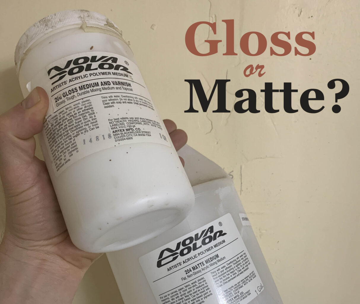
Matte Medium vs. Gloss Medium for Acrylic Glazing
Students who are new to my glazing technique have a lot of questions. So many mediums to choose from. Which ones are best to use…and why?
That’s what I want to discuss today.
Here’s a portion of an email I got from one of my students:
As you know, I am currently working on your portrait course at the moment, however, I have a question that I hope you can clarify. All previous information I have looked up indicates that when applying glazes, acrylic matte medium dries cloudy and gloss medium dries clear and obviously glossy. Can you just explain it for me why we only use matte medium for glazing in your tutorial, as my initial thoughts would be that the cloudiness would just build up? Or am I just missing the l point in that this is how we build up the underpainting of the portrait? Many Thanks, R—
This is a good question.
So, what’s better for glazing? Matte medium or gloss medium?
Let me answer that with the reply I sent back to my student.
I use matte medium for three reasons:
1. It dries to a flat finish and so it doesn’t react with the lights in my studio, producing distracting glare.
2. Because it dries to a flat finish, it is closer to the sheen of paint, and so when you have areas that are more opaque and less opaque, they match up better. In other words, you can perceive the values more accurately. A glossy finish will make colors look more saturated and deepen values. When you put a varnish over the painting, it would present a problem, causing certain subtle nuances that seemed to look correct, suddenly become inaccurate. (Yes, this happened to me!)
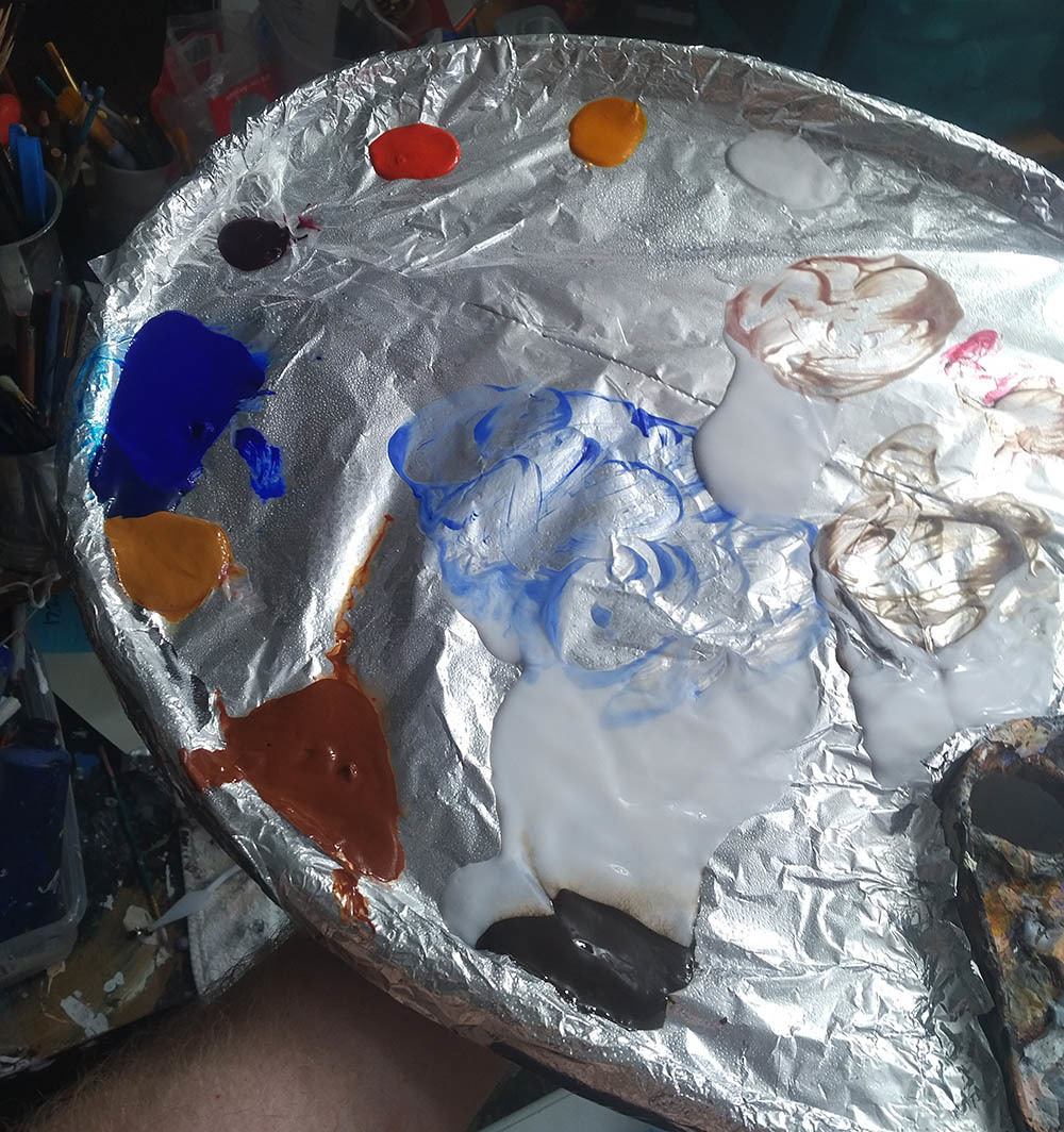
3. Matte medium is usually less expensive than gloss medium. With the copious amounts of medium that I use, this adds up!
Now, I don’t find that matte medium builds up cloudiness, in the way that I teach. It will get cloudy, if you have areas of your painting that are quite dark or saturated, and you overlap those areas with a very transparent (high ratio of matte medium to paint) glaze.
But I don’t do it that way in my paintings. Rather, I start off very transparent, (95-5) then shift to more translucent (80-20), and finally end up with semi-opaque layers (50-50) over portions of the work.
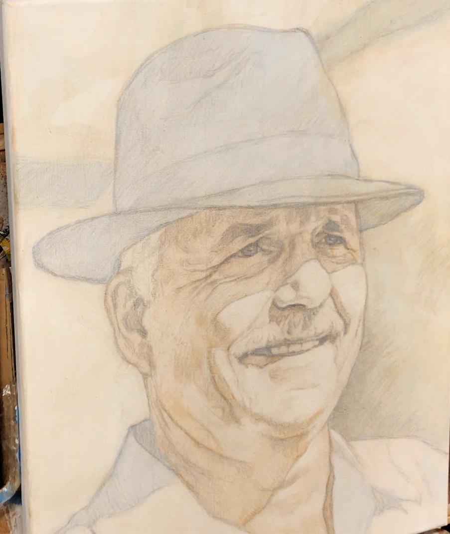
Acrylic portrait painting challenge example in progressm using the acrylic glazing technique, 16 x 20, acrylic on canvas by artist and instructor Matt Philleo
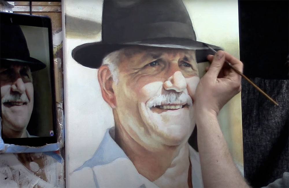
Matt Philleo painting an acrylic portrait from a photo for the Spring Portrait Painting Challenge ©2020 by Matt Philleo
This prevents that cloudiness from occurring and gives a rich saturation of color too. But we still retain the benefits of the smooth shading, vibrancy, and depth that glazing produces.
I finish my painting with a satin or semi-gloss varnish and that’s where we can add some extra saturation of value and vibrancy.
What is YOUR experience with acrylic mediums? Which do you prefer…and why? Let me know in the comments below.
Look forward to sharing more tips and tutorials with you.
Yours for Better Portraits,
![]()
If you found this post helpful or encouraging, would you send it on ahead? Let others know with the share buttons below. I’d love to hear your comments. Thank you so much!
