Tag Archives for " learn painting "

How to Paint Realistic Wrinkles in Acrylic
Learn to paint wrinkles in acrylic: step-by-step techniques for realistic textures
Painting realistic wrinkles in acrylic can be a challenging task, but with the right techniques, you can achieve lifelike textures and depth. In this tutorial, we will guide you through the process using proven methods like the glazing technique. This approach allows you to layer thin washes of color for dynamic shading and realistic detail.
Why Focus on Wrinkles?
Wrinkles are essential when painting portraits or clothing. They give the painting character, texture, and realism. Properly rendered wrinkles convey depth, shadows, and the contours of light, all of which contribute to a three-dimensional look on a two-dimensional surface. Understanding how light interacts with fabric and skin helps you create more accurate portrayals.
Materials You’ll Need
- Acrylic paints (Burnt Sienna, Raw Umber Dark, Titanium White, Ultramarine Blue, Phthalo Blue, Alizarine Crimson)
- Matte medium (for glazing)
- Small round brush (sizes 8 or 10)
- Reference photo (for lighting and contouring)
- Canvas or painting surface
Step-by-Step Guide to Painting Wrinkles
1. Starting with the Light Source
Before diving into the wrinkles, it’s crucial to understand where the light source is coming from. In this example, the light hits from the left-hand side, illuminating the subject’s jacket and face. Always start by identifying your light source, as it will guide the placement of highlights and shadows.
2. Sketch the Wrinkles
Begin by lightly sketching the contours of the wrinkles. Use a reference photo to guide your proportions and direction. Wrinkles often form around natural bends and folds of the fabric or skin, so pay attention to the areas where the material gathers or creases.
3. Layering with the Glazing Technique
The glazing technique is ideal for building realistic depth. To glaze:
- Mix acrylic paint with matte medium until it’s translucent.
- Apply thin, transparent layers of paint, allowing each layer to dry before adding the next. This method enhances the luminosity of your painting while preserving the details underneath.
In this painting, I darkened the background using a glaze of burnt sienna, raw umber dark, and titanium white. This combination helps the face and jacket stand out, creating contrast between the subject and background.
4. Adjusting the Proportions
As you progress, continue refining the details. For instance, the artist noticed the subject’s chin was too long, so they shortened it by applying burnt sienna, adjusting the shadow beneath the chin. This minor correction brings more balance to the composition.
5. Shading the Wrinkles
To achieve realistic shading:
- Use darker tones like raw umber and burnt sienna for the shadows.
- Gradually build up the shadows with thin glazes, following the natural folds and creases in the reference photo.
- A mixture of burnt sienna and titanium white is ideal for adding subtle gradations to the shadows under the chin and on the jacket.
Wrinkles often have a gradient effect, transitioning from light to dark as they curve away from the light source.
6. Highlighting the Creases
Once you’ve established the shadows, begin adding highlights. The wrinkles’ raised edges catch more light, so use lighter tones, such as a mix of titanium white and your base color, to accentuate these areas. By carefully applying highlights along the creases, you give the wrinkles a more three-dimensional appearance.
7. Adding Detail with a Small Brush
For intricate details, like smaller wrinkles or folds in the fabric, switch to a smaller brush (size 8 or 10). Dab a small amount of paint and blend with your finger or a dry brush for smooth transitions. The artist in this tutorial used this technique to soften and refine the shading on the nasolabial fold, giving it a natural, gradual fade.
8. Working on the Jacket’s Texture
The jacket requires a different approach to maintain its texture while capturing the depth of the wrinkles:
- Darken areas like the jacket sleeve or shoulder using a glaze of ultramarine blue, phthalo blue, and a touch of raw umber dark.
- Lighten certain folds by removing some of the glaze to reveal the underlying highlights.
This combination of dark and light glazes enhances the fabric’s texture and makes the wrinkles more realistic.
9. Final Touches
Once you have the basic structure of the wrinkles and shading in place, assess the overall composition. Look for any areas that might need more contrast or subtle details:
- Darken the areas where shadows should be deeper.
- Lighten the areas where the light hits most intensely.
- Ensure that the wrinkles look soft and natural, rather than harsh or overdefined.
The artist’s final touch was glazing over the jacket once more, darkening it to enhance the contrast between light and shadow, while leaving the wrinkles visible.
Tips for Painting Wrinkles in Acrylic
- Use thin layers: The key to realistic wrinkles is subtlety. Build the depth gradually using multiple layers.
- Match the light source: Always consider where the light is coming from. This will guide your highlights and shadows.
- Use glazing for transparency: Glazing allows you to see through layers, which is useful for preserving underlying details.
- Focus on the texture: Wrinkles should look natural, so blend edges softly to avoid harsh lines.
- Work with a reference photo: Photos help guide the correct placement of shadows, highlights, and folds.
Painting realistic wrinkles in acrylic requires patience, layering, and attention to detail. By using the glazing technique and focusing on light and shadow, you can create lifelike textures in your portraits and fabric paintings. Keep practicing and experimenting with different color mixtures and techniques to master this skill.
Read more about my additional resources, tutorials, to learn more and check out my free courses here. . Whether you’re a beginner or an experienced artist, there’s always something new to learn and apply to your paintings. Happy painting!
LEARN MORE
- How to Paint Foliage Using the Acrylic Glazing Technique
- How to Trace for an Accurate Portrait Sketch
- How to Paint Realistic Eyes in Your Acrylic Portrait
- How to Add Raw Umber Dark & Ultramarine Blue to Your Portrait
- How to Make Your Own Raw Umber Dark
- How to Paint Realistic Trees & Grass in Your Acrylic
- How to Block In Skin Tone Values Using Glazing Technique
- How to Paint Vibrant Reds in Your Acrylic Portrait
- How to Glaze Background Colors & More Acrylic Portrait
- How to Paint White Clothing in Your Acrylic Portrait
- How to Easily Transition from a Sketch to a Painting
- How to Block In Shading & Skin Tones in Your Acrylic
- How to Build Up Color on Acrylic Pet Portrait
- How to Build Up Form on Clothing with Acrylic
- How to Paint Dark Clothing Using Acrylic Glazing Technique
- How to Paint a 24 x 30 Acrylic With 30 People
- How to Do Smooth Shading with Acrylic
- How to Sketch an Acrylic Portrait with a Grid
Read more about how to paint a portrait that you can surely be proud of!
I’d love to hear your thoughts on this video. Please share it with your friends and family. Let me know if you have any further questions. I’ll greatly help you.
If you’d like to learn more, sign up for my free email tips and video class today.
Learn How to Paint Acrylic Portraits With My Free Mini-Video Course!
Thank you so much for taking the time to read this tutorial and watch the video. That means a lot to me. I hope you find it very helpful in your portrait painting.
Yours for Better Portraits,

P.S. Did you find this post helpful or encouraging? If so, send it on ahead! Let others know with the share buttons below. I’d love to hear your comments. Thank you so much! Also, do you have a question on acrylic portrait painting you’d like answered? Let me know, and I’d be happy to help!

How to Paint Realistic Hair in Your Acrylic Portrait
How do you paint hair using the glazing technique?
Creating realistic hair in acrylic portraits may seem like a daunting task, but with the right techniques, it becomes manageable. In this guide, you’ll learn how to achieve a lifelike effect using a combination of layering, value adjustments, and color nuances. You’ll discover how to paint realistic hair in your acrylic portrait that looks soft and shiny while blending seamlessly into the portrait’s overall appearance.
Step 1: Set the Foundation for the Hair
Before diving into the details of painting hair, it’s important to set a solid foundation by establishing the values of your painting. So, as I have explain, everything in a painting is relative—if one area is too light, it can throw off the entire balance of the painting. However, in the hair, this means darkening it as needed to match the values of the face.
Of course I highly recommend starting by mixing raw umber dark and ultramarine blue to create a blackish tone. Then with a round brush, apply this mixture to darken the hair, ensuring it complements the shadows of the face. Because the goal at this stage is not perfection but rather establishing a base layer that allows for refinement later.
Step 2: Blend for Realism
After applying the base layer, it’s time to add depth and detail by blending the hair. The key here is building a gradation so, start by applying pressure on one side and gradually ease up as you move to the other side. But make sure this creates a natural transition, which is essential for making hair look soft and voluminous.
When blending, focus on the shapes and striations within the hair. My point out that these shapes often resemble skinny triangles, similar to those you might remember particularly from geometry class. By then creating these subtle shapes, the hair will start to take on a more realistic appearance.
Step 3: Get the Values Right
One of the most critical aspects of painting realistic hair is getting the values right. I “Create hair correctly is all about getting the right values in the right place.” This means focusing on the darker areas, ensuring they are deep enough to create contrast, and leaving lighter spaces for highlights.
Hair does not need to be painted strand by strand. Instead, concentrate on capturing the overall shapes and values. When the dark and light areas are placed correctly, the hair will automatically start to look more realistic.
Step 4: Add Nuances with Glazing
As you progress, it’s essential to add nuances to the hair using glazing techniques. I use the combination of phthalo blue and greenish tones to bring out subtle variations in the hair’s color. These layers of translucent color will give the hair depth, adding complexity that mimics the way light interacts with real hair.
Glazing is particularly effective because it allows you to build striations—the
How to Paint Realistic Hair in Your Acrylic Portrait
Painting realistic hair in an acrylic portrait can be one of the most challenging but rewarding aspects of portrait painting. In this guide, we’ll walk through the essential steps and techniques to master this skill, ensuring that your portraits come to life with depth, texture, and realism. Whether you’re a beginner or an experienced artist, these tips will help you elevate your acrylic painting.
Read more about my additional resources, tutorials, to learn more and check out my free courses here. . Whether you’re a beginner or an experienced artist, there’s always something new to learn and apply to your paintings. Happy painting!
- How to Paint Foliage Using the Acrylic Glazing Technique
- How to Trace for an Accurate Portrait Sketch
- How to Paint Realistic Eyes in Your Acrylic Portrait
- How to Add Raw Umber Dark & Ultramarine Blue to Your Portrait
- How to Make Your Own Raw Umber Dark
- How to Paint Realistic Trees & Grass in Your Acrylic
- How to Block In Skin Tone Values Using Glazing Technique
- How to Paint Vibrant Reds in Your Acrylic Portrait
- How to Glaze Background Colors & More Acrylic Portrait
- How to Paint White Clothing in Your Acrylic Portrait
- How to Easily Transition from a Sketch to a Painting
- How to Block In Shading & Skin Tones in Your Acrylic
- How to Build Up Color on Acrylic Pet Portrait
- How to Build Up Form on Clothing with Acrylic
- How to Paint Dark Clothing Using Acrylic Glazing Technique
- How to Paint a 24 x 30 Acrylic With 30 People
- How to Do Smooth Shading with Acrylic
- How to Sketch an Acrylic Portrait with a Grid
Read more about how to paint a portrait that you can surely be proud of!
I’d love to hear your thoughts on this video. Please share it with your friends and family. Let me know if you have any further questions. I’ll greatly help you.
If you’d like to learn more, sign up for my free email tips and video class today.
Learn How to Paint Acrylic Portraits With My Free Mini-Video Course!
Thank you so much for taking the time to read this tutorial and watch the video. That means a lot to me. I hope you find it very helpful in your portrait painting.
Yours for Better Portraits,
P.S. Did you find this post helpful or encouraging? If so, send it on ahead! Let others know with the share buttons below. I’d love to hear your comments. Thank you so much! Also, do you have a question on acrylic portrait painting you’d like answered? Let me know, and I’d be happy to help!

How to Adjust Color in Your Reference Photo
Learn the simple steps to modify color tones in your reference photo using Photoshop’s hue and saturation tool.
Accurate color representation is vital when using a reference photo for your artwork, especially when the colors appear too bright, too dull, or overly saturated. With Photoshop’s hue and saturation tool, you can easily adjust the color to create a more balanced image, allowing your artwork to reflect the perfect tones. In this tutorial, you’ll learn how to adjust color in your reference photo, ensuring it’s more suitable for your artistic needs.
Step-by-Step Guide to Adjust Color in Your Reference Photo
1. Start by Opening Your Image in Photoshop
To begin, load your image in Photoshop. If you are already familiar with basic photo editing, you can easily access this by selecting “File” > “Open” and browsing for your reference photo. Once the image is loaded, you are ready to proceed with color adjustments.
2. Create a Duplicate Layer
Before making any changes to the original image, it’s crucial to create a duplicate layer. This practice allows you to experiment without worrying about irreversible mistakes.
- Hover over the “Layers” panel in the bottom-right corner.
- Right-click on your background layer and select “Duplicate Layer.”
- A dialog box will pop up. Click “OK.” Now, you can start adjusting the duplicate without affecting the original image.
3. Access the Hue and Saturation Tool
Photoshop provides several methods to modify an image’s color, but the “Hue and Saturation” tool is one of the most versatile.
- Navigate to the top menu and select “Image” > “Adjustments” > “Hue/Saturation.”
- A new dialog box will appear, allowing you to control the hue, saturation, and lightness of your image.
4. Modify the Hue Slider
The “Hue” slider is the key to altering the color tones in your reference photo.
- Slide the “Hue” bar left or right to shift the overall color balance.
- Moving the slider to the right introduces a yellowish tint, while shifting it left creates a redder hue. For example, if your image appears too yellow, moving the slider left will make it more red.
5. Preview Changes with the Preview Button
Photoshop’s “Preview” option allows you to compare your adjustments to the original image.
- As you slide the hue, toggle the “Preview” checkbox on and off to see the before and after effects.
- This feature is particularly useful for ensuring that your color adjustments enhance the image without going overboard.
6. Fine-Tune the Saturation
Then after adjusting the hue, you can modify the saturation to control the intensity of the colors.
- Increase the saturation to make the colors more vibrant, or decrease it to tone them down.
- For instance, if the image feels too vibrant, lowering the saturation will produce more subtle, natural tones.
7. Experiment with Lightness
The “Lightness” slider helps you control the brightness of the image.
- Moving it to the right makes the image lighter, while shifting left darkens it.
- Also use this option cautiously, as drastic changes to lightness can make the image look unnatural.
8. Lock in Your Changes
Once you are satisfied with your adjustments, click “OK” to apply the changes. These modifications will now be applied to the duplicate layer, allowing you to toggle between the original and edited image as needed.
Tips and Techniques for Effective Color Adjustments
- Always Work on a Duplicate Layer: By duplicating your background, you preserve the original image. This step also allows you to compare your edited version to the original.
- Use Preview for Comparison: The “Preview” option in Photoshop provides a side-by-side comparison of your changes. Take advantage of this feature to ensure you’re making gradual, controlled adjustments.
- Avoid Drastic Color Shifts: While it’s tempting to experiment with bold color changes, subtle adjustments often yield more professional results. Also, excessive shifting can distort the reference photo, leading to an inaccurate portrayal.
- Blend Using Opacity Adjustments: Sometimes, a full-color adjustment might be too harsh. You can reduce the intensity of the color changes by lowering the opacity of the adjustment layer.
- Navigate to the “Opacity” option in the “Layers” panel and reduce it to blend the edited layer with the original.
- Experiment with Saturation for Artistic Effects: Depending on your desired outcome, you can either increase or decrease the saturation. If your reference photo seems too dull, slightly increasing saturation brings out richer colors. Conversely, oversaturated colors can be toned down for a softer look.
- Use Different Tabs for Multiple Edits: Photoshop allows you to work with multiple documents simultaneously. Utilize the tab function to switch between different files, making it easier to compare adjustments or transfer settings.
Advanced Techniques: Adjusting Opacity and Blending Colors
1. Adjust the Opacity of the Layer
If the changes you made seem too stark, adjusting the opacity can help.
- Click on the “Opacity” slider in the “Layers” panel.
- Lastly, drag it left to reduce the strength of your adjustment, allowing some of the original color to show through.
2. Blend Layers for More Subtle Effects
Another useful feature in Photoshop is blending layers.
- Select the top layer, and in the “Layers” panel, choose a blending mode like “Soft Light” or “Overlay.”
- Blending modes can help harmonize your adjustments with the original image, making the changes less obvious but more effective.
3. Keep Checking the Balance
Also, always check how your image is progressing. Don’t hesitate to toggle between the before and after views by clicking the “eye” icon next to the layer you are working on. And then this practice helps ensure that your adjustments remain balanced and that the colors in your reference photo accurately reflect your artistic vision.
Conclusion:
When mastering the ability to adjust colors in your reference photo is a crucial skill for artists who rely on accurate color reproduction. Because, using Photoshop’s hue and saturation tool, you can subtly tweak your reference photos, ensuring they serve as ideal templates for your artwork. With careful adjustments, you’ll be able to craft pieces that truly reflect your creative vision while maintaining fidelity to your source material.
Lastly, if you’re looking for more instructional videos on how to improve your acrylic painting, visit www.realisticacrylic.com for more tutorials and check out my free courses here. .
To find out more about Photoshop and make changes to your photo, watch the video below.
LEARN MORE
- Adding highlights to your acrylic painting
- 5 Excellent Reasons to Use Aluminum Foil
- Painting Clothing in an Acrylic Portrait
- Paint a Cloudy Sky Acrylic
- How to add Semi-Opaque Highlights
- How to Enhance the Contrast in Your Acrylic
- How to Add Glaze to Your Acrylic Painting
- Paint Realistic Reflections on Eyeglasses in an Acrylic Portrait
- Build Up Depth on Your Acrylic Portrait Backgrounds
- How Do You Do Layers With the Glazing Technique?
Read more about how to paint a portrait that you can surely be proud of!
I’d love to hear your thoughts on this video. Please share it with your friends and family. Let me know if you have any further questions. I’ll greatly help you.
If you’d like to learn more, sign up for my free email tips and video class today.
Learn How to Paint Acrylic Portraits With My Free Mini-Video Course!
Thank you so much for taking the time to read this tutorial and watch the video. That means a lot to me. I hope you find it very helpful in your portrait painting.
Yours for Better Portraits,
P.S. Did you find this post helpful or encouraging? If so, send it on ahead! Let others know with the share buttons below. I’d love to hear your comments. Thank you so much! Also, do you have a question on acrylic portrait painting you’d like answered? Let me know, and I’d be happy to help!

How to Add Initial Highlights in Acrylic Painting
Achieve depth and realism by enhancing your acrylic painting with well-placed highlights
Why Highlights Matter in Acrylic Painting
In acrylic painting, adding highlights can make a significant difference in the overall depth and realism of your artwork. Because highlights are essential for bringing out details and creating a sense of three-dimensional form. So, in this blog post, we’ll break down the step-by-step process of adding initial highlights to your acrylic painting. And then you’ll learn the tools, techniques, and tips necessary to make your paintings more lifelike and vibrant.
Outline:
- Importance of Highlights
- Materials and Tools Needed
- Step-by-Step Process for Adding Initial Highlights
- Using Titanium White and Indian Yellow
- Brush Techniques for Smooth Highlights
- Common Mistakes to Avoid
- Tips for Effective Highlighting
- Final Thoughts and Conclusion
Materials and Tools Needed
Before we begin, gather the following materials to add highlights:
- Titanium White acrylic paint
- Indian Yellow acrylic paint
- Matte medium
- Various brushes (flat size 14 brush, smaller detail brush)
- A well-lit workspace
- Water and a palette
Step-by-Step Process for Adding Initial Highlights
1. Prepare Your Highlighting Mixture
To start, you’ll need to create a mixture using titanium white and indian yellow. And then combine these colors with matte medium to thin the paint down to around 50% opacity. Accordingly, this ensures that your highlights blend naturally with the rest of the painting without appearing too harsh or overwhelming.
2. Blocking in Highlights on the Sky
You can now begin by adding highlights to the sky, then focusing on the clouds. Also, you’ll want to switch to a larger brush, like a flat size 14 for broader areas. Then pay attention to the direction of light and where it naturally hits the clouds. Adjust your brushwork accordingly, using soft strokes to blend the highlights seamlessly into the surrounding areas.
3. Refining the Clothing Highlights
Move on to smaller areas, such as the clothing in your painting. Then switch to a smaller detail brush to carefully add highlights to folds and areas where light would naturally reflect. Because this adds texture and dimension to the fabric, bringing it to life.
4. Adjusting Highlights Based on Glare and Lighting
While working on highlights, it’s important to frequently step back and adjust your lighting. Because sometimes, the glare from the paint can obscure your view. When turning off overhead lights or changing your angle will help you see the true contrast between highlights and shadows.
Using Titanium White and Indian Yellow for Warm Highlights
Using a combination of titanium white and indian yellow allows you to create warm highlights that complement the overall toning layer of your painting. The addition of yellow gives the highlights a natural warmth, which is especially effective for skin tones and areas that are bathed in sunlight.
This mixture is not only great for clouds and sky, but also for adding depth to hair, clothing, and other textured elements within your painting. Then keep the opacity thin, allowing you to build up layers gradually and refine your highlights as needed.
Brush Techniques for Smooth Highlights
Using the correct brush technique is essential for applying smooth, natural-looking highlights. Here are some key techniques to keep in mind:
- Feathering: Use gentle strokes and gradually fade the highlights into the mid-tones of the painting.
- Dabbing: For more textured surfaces like clouds or clothing, a dabbing technique can create the illusion of light breaking through.
- Layering: Apply highlights in thin layers to build up intensity without overpowering the base colors.
When switching between larger brushes for broad areas and smaller brushes for fine details will give you the control necessary for varied textures.
Common Mistakes to Avoid
When adding highlights, avoid these common pitfalls:
- Overloading your brush: Too much paint can result in harsh, unblended highlights.
- Neglecting light sources: Always consider where your light source is coming from to ensure highlights are placed accurately.
- Over-highlighting: Adding too many highlights can flatten your painting and remove its depth.
Instead, focus on subtlety and restraint. Then the highlights should enhance the painting without becoming the focal point.
Tips for Effective Highlighting
Here are some additional tips to keep in mind when adding initial highlights:
- Use a limited color palette: Stick to one or two highlight colors to maintain color harmony.
- Work slowly: Gradually build up the highlights, allowing each layer to dry before adding more.
- Blend with matte medium: Matte medium helps thin the paint and ensures smooth transitions between highlighted areas and surrounding tones.
- Check your progress: Step back frequently to check how the highlights are affecting the overall composition.
Conclusion
Adding initial highlights in acrylic painting is so crucial step in creating depth, contrast, and realism. Because by using a combination of titanium white and Indian yellow, thinned with matte medium, and applying careful brushwork, you can enhance your painting dramatically. Then highlights bring out the dimensionality of forms and can make your artwork truly stand out.
Lastly, as always, remember to practice patience, as acrylic highlights often require layers and adjustments. Because with the right technique and mindset, you’ll be able to create a painting that radiates light and life. And then, if you found this guide helpful, be sure to subscribe for more painting tutorials and tips.
If you’re looking for more instructional videos on how to improve your acrylic painting, visit www.realisticacrylic.com for more tutorials and check out my free courses here. .
- How to Paint Foliage Using the Acrylic Glazing Technique
- How to Trace for an Accurate Portrait Sketch
- How to Paint Realistic Eyes in Your Acrylic Portrait
- How to Add Raw Umber Dark & Ultramarine Blue to Your Portrait
- How to Make Your Own Raw Umber Dark
- How to Paint Realistic Trees & Grass in Your Acrylic
- How to Block In Skin Tone Values Using Glazing Technique
- How to Paint Vibrant Reds in Your Acrylic Portrait
- How to Glaze Background Colors & More Acrylic Portrait
- How to Paint White Clothing in Your Acrylic Portrait
- How to Easily Transition from a Sketch to a Painting
- How to Block In Shading & Skin Tones in Your Acrylic
- How to Build Up Color on Acrylic Pet Portrait
- How to Build Up Form on Clothing with Acrylic
- How to Paint Dark Clothing Using Acrylic Glazing Technique
- How to Paint a 24 x 30 Acrylic With 30 People
- How to Do Smooth Shading with Acrylic
- How to Sketch an Acrylic Portrait with a Grid
Read more about how to paint a portrait that you can surely be proud of!
I’d love to hear your thoughts on this video. Please share it with your friends and family. Let me know if you have any further questions. I’ll greatly help you.
If you’d like to learn more, sign up for my free email tips and video class today.
Learn How to Paint Acrylic Portraits With My Free Mini-Video Course!
Thank you so much for taking the time to read this tutorial and watch the video. That means a lot to me. I hope you find it very helpful in your portrait painting.
Yours for Better Portraits,
P.S. Did you find this post helpful or encouraging? If so, send it on ahead! Let others know with the share buttons below. I’d love to hear your comments. Thank you so much! Also, do you have a question on acrylic portrait painting you’d like answered? Let me know, and I’d be happy to help!

How to Adjust the Eyes in an Acrylic Portrait
Master the art of eye adjustments to enhance your portraits
When it comes to painting portraits, the eyes are often considered the windows to the soul. Adjust the eyes in acrylic portraits can significantly enhance the overall realism and appeal of your artwork. In this post, the importance of eye adjustments will be discussed, along with effective techniques that artists can utilize to create lifelike portraits.
Understanding Eye Structure
The eye consists of various components, including the iris, pupil, and eyelids. Each of these features plays a critical role in conveying expression and character. Artists often face challenges such as proportions, shape, and placement of the eyes. A solid understanding of eye anatomy can help artists make informed adjustments.
Preparing for Adjustments
Before making any adjustments, artists should gather their materials. Ensure you have your acrylic paints, brushes, a palette, and a reference photo ready. The reference photo serves as a vital tool for accuracy and should be positioned near your painting for easy comparison.
Techniques for Adjusting Eyes
Thickening Lines
To achieve a more balanced and dynamic look, artists should consider thickening the lines above the iris. This technique adds visual weight and reduces the scalloping effect often seen in portraits. Begin by slightly rounding off the existing lines. Instead of following the previous line too closely, raise the line above the iris to create a more natural and appealing shape.
Adjusting the Shape
When adjusting the shape of the eyes, it is crucial to ensure that they are not overly flattened. Slightly round the eye, particularly towards the middle section, to achieve a more lifelike appearance. This adjustment can be made by adding more paint along the upper eyelid and ensuring the iris is adequately framed.
Utilizing Reference Photos
Regularly referencing your photo while painting can make a world of difference. Many artists find it helpful to bring the reference photo onto the canvas or have it displayed nearby. This technique allows for constant comparison and ensures accuracy in adjustments.
Common Mistakes to Avoid
While making adjustments, artists should be cautious of overcorrection. It’s essential to maintain the overall likeness to the subject without altering the unique features that define them. Additionally, symmetry plays a crucial role; both eyes should be balanced in shape and size. Lastly, ensure that enough reference material is used to guide your adjustments effectively.
Final Touches
Once the eyes have been adjusted, take a step back and assess the overall composition. Balancing both eyes is essential for achieving symmetry, while using shadows can add depth and realism. Artists should ensure that the final result closely resembles the reference photo, capturing the subject’s essence.
Conclusion
Adjusting the eyes in an acrylic portrait is a skill that can greatly enhance the overall quality of your artwork. By understanding eye structure and implementing techniques such as thickening lines, adjusting shapes, and utilizing reference photos, artists can create lifelike portraits that resonate with viewers. With practice and patience, these techniques can be mastered, leading to significant improvements in your portrait painting skills.
Tips and Techniques
Don’t Rush: Take your time when making adjustments; a careful approach leads to better results.
Use a Variety of Brushes: Different brush sizes and shapes can help achieve various effects when painting eyes.
Practice Regularly: The more you practice adjusting eyes, the more intuitive the process will become.
Study Real Eyes: Observing real eyes in different lighting conditions can provide insights into how to recreate them in your portraits.
- Adding highlights to your acrylic painting
- 5 Excellent Reasons to Use Aluminum Foil
- Paint Realistic Wrinkles in Acrylic
- Painting Clothing in an Acrylic Portrait
- Paint a Cloudy Sky Acrylic
- How to add Semi-Opaque Highlights
- How to Enhance the Contrast in Your Acrylic
- How to Add Glaze to Your Acrylic Painting
- Paint Realistic Reflections on Eyeglasses in an Acrylic Portrait
- Build Up Depth on Your Acrylic Portrait Backgrounds
- How Do You Do Layers With the Glazing Technique?
- Learn How to Paint Wrinkles in Acrylic
Read more about how to paint a portrait that you can surely be proud of!
I’d love to hear your thoughts on this video. Please share it with your friends and family. Let me know if you have any further questions. I’ll greatly help you.
If you’d like to learn more, sign up for my free email tips and video class today.
Learn How to Paint Acrylic Portraits With My Free Mini-Video Course!
Thank you so much for taking the time to read this tutorial and watch the video. That means a lot to me. I hope you find it very helpful in your portrait painting.
Yours for Better Portraits,
P.S. Did you find this post helpful or encouraging? If so, send it on ahead! Let others know with the share buttons below. I’d love to hear your comments. Thank you so much! Also, do you have a question on acrylic portrait painting you’d like answered? Let me know, and I’d be happy to help!

How to Paint Friendly Young Man in Blue: 30 Minutes
Unlock your artistic potential by learning to paint a vibrant portrait of a young man in just half an hour.
In the world of portrait painting, efficiency and creativity often go hand in hand. This will guide you through the process of painting a friendly young man in blue within 30 minutes. Not only does this exercise encourage quick thinking and decision-making, but it also helps you refine your artistic skills in a time-sensitive manner. The beauty of this approach lies in its simplicity and accessibility, making it perfect for both beginners and experienced artists looking to enhance their techniques.
Materials Needed
To embark on this exciting painting journey, ensure you have the following materials ready:
- Acrylic Paints:
- Ivory Black
- Raw Umber Dark
- Burnt Sienna
- Raw Sienna
- Ultramarine Blue
- Alizarine Crimson
- Pyrrole Red
- Indian Yellow
- Titanium white
- Brushes:
- Round brush for detail work
- Flat brush for broader strokes
- Other Tools:
- Palette for mixing colors
- Matte medium for thinning paint
- Timer for tracking your painting session
- Canvas Preparation:
- An 8×10 canvas panel, toned with a mix of raw umber dark and titanium white
Setting Up the Painting Process
Before diving into the painting, it is essential to prepare your canvas properly. Begin by toning the canvas with a mixture of raw umber dark and titanium white. This step provides a neutral background, allowing for better contrast when adding colors.
Once the canvas is prepared, block in the basic composition of the young man. Using a thin wash of darker paint, outline the general shapes of the head, neck, and shoulders. This initial sketch serves as a guide for placing the facial features accurately.
Blocking in the Composition
Start by identifying key features:
- Earlobe and Hairline: The bottom of the earlobe typically aligns with the halfway point of the face.
- Jawline and Shoulders: Mark where the jawline will curve and where the shoulders begin.
- Eyes and Nose: Establish the placement of the eyes, ensuring they are positioned correctly in relation to the nose and mouth.
By keeping the lines light, adjustments can be made easily without significant disruption to the painting.
Painting Steps
Establishing the Base Colors
After blocking in the main features, it is time to apply the base colors. Begin by mixing the appropriate shades for the skin tones and clothing. The goal is to create a vibrant, friendly appearance for the young man.
- Skin Tone: Use a mix of raw sienna, titanium white, and a touch of alizarine crimson to create a natural skin tone.
- Clothing: For the blue shirt, mix ultramarine blue with a hint of titanium white to achieve a soft, friendly blue shade.
Detailing Facial Features
With the base colors applied, the next step involves refining the facial features. Pay attention to:
- Eyes: Add depth by incorporating darker tones around the edges. Use a mix of burnt sienna and raw umber dark to define the shadows.
- Nose and Mouth: Sculpt the nose by using highlights and shadows to add dimension. For the mouth, emphasize the natural curvature by applying darker shades to the corners and lighter shades to the center.
Creating Shadows and Highlights
Shadows play a crucial role in portrait painting, providing depth and realism. Observe the light source carefully and identify where the shadows fall on the face. Utilize a combination of raw umber dark and ivory black to create darker shadows, and titanium white for highlights.
- Cheekbones and Forehead: Define the cheekbones with darker shades while keeping the forehead lighter to indicate light reflection.
- Jawline: Establish the jawline shadow with a gentle gradient, allowing it to flow seamlessly into the neck.
Tips for Success
To enhance your painting experience, consider these helpful tips:
- Achieving Smooth Skin Tones: Many artists struggle with muddy skin tones. Understanding color theory and using complementary colors can help avoid this common pitfall. Use the free PDF guide “Fix Muddy Skin Tones in Your Acrylic Portrait here,” .
- Using Reference Images: Reference images are invaluable in portrait painting. They provide a clear visual guide for proportions and colors. When selecting an image, look for good lighting and strong contrasts to help create depth in your work.
Conclusion
Painting a friendly young man in blue in just 30 minutes may seem challenging, but with practice and perseverance, it can be a rewarding experience. Because this exercise encourages artistic growth and helps you develop essential skills in portrait painting. Remember to have fun and embrace the process. For further resources and guides, visit realisticacrylic.com to enhance your acrylic painting journey.
- Adding highlights to your acrylic painting
- 5 Excellent Reasons to Use Aluminum Foil
- Paint Realistic Wrinkles in Acrylic
- Painting Clothing in an Acrylic Portrait
- Paint a Cloudy Sky Acrylic
- How to add Semi-Opaque Highlights
- How to Enhance the Contrast in Your Acrylic
- How to Add Glaze to Your Acrylic Painting
- Paint Realistic Reflections on Eyeglasses in an Acrylic Portrait
- Build Up Depth on Your Acrylic Portrait Backgrounds
- How Do You Do Layers With the Glazing Technique?
- Learn How to Paint Wrinkles in Acrylic
Read more about how to paint a portrait that you can surely be proud of!
I’d love to hear your thoughts on this video. Please share it with your friends and family. Let me know if you have any further questions. I’ll greatly help you.
If you’d like to learn more, sign up for my free email tips and video class today.
Learn How to Paint Acrylic Portraits With My Free Mini-Video Course!
Thank you so much for taking the time to read this tutorial and watch the video. That means a lot to me. I hope you find it very helpful in your portrait painting.
Yours for Better Portraits,
P.S. Did you find this post helpful or encouraging? If so, send it on ahead! Let others know with the share buttons below. I’d love to hear your comments. Thank you so much! Also, do you have a question on acrylic portrait painting you’d like answered? Let me know, and I’d be happy to help!

How to Paint Pensive Young Woman: 30-Minute Acrylic Portrait
Master the alla prima technique to capture expression, lighting, and form in a half-hour acrylic portrait.
Welcome to another 30-minute acrylic portrait session! In this tutorial, we will walk through the process of painting a pensive young woman with red hair. While acrylic painting can take several hours or even days using layered techniques, today we’ll focus on alla prima—a method where you paint wet-on-wet in one sitting. This exercise helps artists become more efficient by focusing on capturing the subject’s gesture and overall expression in a short period. With practice, you can improve your speed, brushstroke accuracy, and confidence.
Follow this step-by-step guide to complete a beautiful, expressive portrait in just 30 minutes.
Materials and Color Palette
Before diving into the actual painting process, it’s essential to know the materials you’ll be using. For this quick portrait, the following supplies are necessary:
- Colors:
- Ivory Black
- Raw Umber Dark
- Burnt Sienna
- Raw Sienna
- Ultramarine Blue
- Alizarine Crimson
- Pyrrole Red Orange (or Cadmium Red Medium)
- Indian Yellow
- Titanium White
- Brushes:
A mix of flat and round brushes, including filberts for blending skin tones and hair. - Canvas Preparation:
The canvas is pre-toned with a light wash of burnt sienna mixed with titanium white, giving the flesh tones a warm underlayer. This helps speed up the process since the mid-tones are already in place, leaving you to focus on shadows and highlights.
Step 1: Sketching the Composition and Features
Blocking in the Shapes:
Start by mixing raw umber dark with ivory black and a little matte medium to thin the paint. Use a flat brush to sketch the basic composition of the portrait. Focus on capturing the shapes of the young woman’s hair, face, and neck. This quick block-in will define the main forms and ensure your proportions are correct.
- Tip: Focus on the overall gesture and avoid getting bogged down with small details at this stage. Pay attention to the negative spaces between the subject’s contours and the background.
Step 2: Identifying Shadows and Highlights
With the basic form sketched out, move on to blocking in shadows. Using the same mixture of raw umber black, deepen the darker areas, such as her neck, jawline, and the left side of her face.
For the highlights, mix titanium white with burnt sienna and pyrrole red orange to create a warm skin tone. Apply this mixture to the areas where light naturally hits her face, including the forehead, cheeks, and chin. This initial contrast between light and dark will help shape the face’s three-dimensional look.
- Tip: Use a filbert brush to blend these highlights smoothly into the surrounding skin tones for a softer transition. Quick, choppy strokes can help with texture, while longer, smoother strokes are ideal for refining the skin’s appearance.
Step 3: Refining the Facial Features
Now that the major shadows and highlights are established, begin working on the facial features. Thin the paint with matte medium to give yourself flexibility in making corrections. Use a smaller round brush to block in her eyes, nose, and mouth.
- Eyes: Place the eyes about two-thirds of the way up from the chin to the top of the head. Make small marks to indicate their placement, followed by the eyebrows, nose, and mouth.
- Nose: The bottom of the nose should align with the lower third of the face. Use shadows to accentuate its form and add dimension.
- Mouth: Capture the subtle expression by carefully observing the shape of her lips and how they relate to the other facial features. There’s a slight smile, so a careful balance of shading around the mouth will be essential.
Step 4: Painting the Hair
For the red hair, create a mixture of burnt sienna, pyrrole red orange, and a hint of alizarine crimson. This combination will yield a vibrant, natural red that complements the subject’s expression.
Work in layers, starting with the darker shadows to indicate the depth of the hair. Then, add mid-tones and finish with highlights using a lighter mixture of titanium white and pyrrole red orange.
- Tip: The texture of the hair can be suggested using short, directional strokes to mimic the flow and volume. Pay attention to where light hits the hair, adding highlights in those areas.
Step 5: Final Touches and Enhancing Contrast
To bring everything together, add the final highlights and enhance the contrast in key areas, such as the bridge of the nose, the cheekbones, and the lips. For the background, use a mixture of raw sienna and burnt umber to create a neutral tone that contrasts with the warm colors of her face and hair.
As the painting progresses, keep in mind the subtle shadows that give depth to her expression. Soft transitions between light and shadow will make the portrait feel more lifelike.
- Tip: Step back from your painting regularly to check the overall balance of the portrait. This will allow you to see the piece with fresh eyes and make any necessary adjustments before the timer runs out.
Technique and Tips for Success
- Alla Prima Technique: This wet-on-wet approach forces you to make decisive brushstrokes and prevents overworking the paint. Embrace the loose and expressive nature of this method.
- Color Harmony: Use a limited palette to ensure harmony in the skin tones, shadows, and highlights. The pre-toned canvas will help unify the colors.
- Efficient Brushwork: Each brushstroke counts in a 30-minute portrait. Focus on broad strokes for the initial block-in, then refine with smaller brushes for detail work as time allows.
Conclusion: Practice Makes Perfect
Completing your artwork in a 30-minute acrylic portrait painting is challenging but highly rewarding. Because with practice, this exercise will sharpen your skills, improve your brush control, and help you capture the essence of your subject quickly and confidently. By then focusing on the most important aspects of light, shadow, and expression, you’ll be amazed at what you can achieve in a short time.
Start with this tutorial and see how your speed and efficiency improve over time!
For further resources and guides, visit realisticacrylic.com and check out my free courses to enhance your acrylic painting journey.
- Adding highlights to your acrylic painting
- 5 Excellent Reasons to Use Aluminum Foil
- Paint Realistic Wrinkles in Acrylic
- Painting Clothing in an Acrylic Portrait
- Paint a Cloudy Sky Acrylic
- How to add Semi-Opaque Highlights
- How to Enhance the Contrast in Your Acrylic
- How to Add Glaze to Your Acrylic Painting
- Paint Realistic Reflections on Eyeglasses in an Acrylic Portrait
- Build Up Depth on Your Acrylic Portrait Backgrounds
- How Do You Do Layers With the Glazing Technique?
- Learn How to Paint Wrinkles in Acrylic
Read more about how to paint a portrait that you can surely be proud of!
I’d love to hear your thoughts on this video. Please share it with your friends and family. Let me know if you have any further questions. I’ll greatly help you.
If you’d like to learn more, sign up for my free email tips and video class today.
Learn How to Paint Acrylic Portraits With My Free Mini-Video Course!
Thank you so much for taking the time to read this tutorial and watch the video. That means a lot to me. I hope you find it very helpful in your portrait painting.
Yours for Better Portraits,
P.S. Did you find this post helpful or encouraging? If so, send it on ahead! Let others know with the share buttons below. I’d love to hear your comments. Thank you so much! Also, do you have a question on acrylic portrait painting you’d like answered? Let me know, and I’d be happy to help!

How to Paint Young Woman with Black Hair: 30- Minute Acrylic
Discover the power of the alla prima acrylic technique with a quick and efficient 30-minute portrait painting exercise.
Painting a portrait in just 30 minute acrylic might seem like a daunting task, but with the right technique and a little practice, you can create stunning results. So in this guide, we’ll walk through how to paint a young woman with black hair using acrylics, focusing on the alla prima technique, where you paint wet-on-wet in one session. Because this exercise will help you improve your speed and efficiency, making it easier to tackle more detailed and time-consuming works in the future. Let’s dive into the process!
Materials and Tools Needed:
Before you start, gather the following materials:
- Canvas: 8×10 inch toned canvas board (gray works best for portraits).
- Acrylic Paints: Ivory black, raw umber dark, burnt sienna, raw sienna, ultramarine blue, titanium white, alizarin crimson, and phthalo blue.
- Brushes: A variety of flats, filberts, and rounds (inexpensive brushes like “Fine Touch” work well for portraits).
- Palette: For mixing colors.
- Matte Medium: To adjust the fluidity of the paint.
Step 1: Preparing the Canvas and Plotting the Portrait
To begin, tone your canvas with a neutral gray to establish a balanced base. Then gray background allows for better contrast between your light and dark areas and helps guide your values throughout the painting process.
Using a mixture of raw umber dark, ivory black, and matte medium, start by loosely sketching the proportions of the young woman’s face. So it’s crucial to get the structure right at this stage. Focus on blocking out key elements like the position of the eyes, nose, mouth, and overall shape of the head.
Tip: Take your time to plot out the general anatomy and features. Once the structure is clear, the rest of the painting will flow smoothly.
Step 2: Blocking in the Hair
In this case the hair, start by mixing ivory black with a bit of raw sienna and ultramarine blue. Because ultramarine blue adds richness and depth to the black, making the hair appear more dynamic. While using a flat brush, block in the larger shapes of the hair, paying attention to where the light hits and where the shadows fall.
Leave room for highlights by using lighter brushstrokes in specific areas, such as the top of the head and the strands framing the face.
Tip: Then use firm pressure to make sure the paint penetrates the texture of the canvas and blending the darker areas with lighter values will give the hair more volume and realism.
Step 3: Adding Facial Features
Now that the hair is blocked in, it’s time to focus on the face. Then begin with the lighter skin tones. Mix titanium white with a bit of raw sienna and pyro red orange. Because this combination provides a warm, natural skin tone, apply the highlight colors to the areas where light hits the most, such as the forehead, cheeks, and chin.
For the shadows, mix raw umber dark with alizarin crimson to create a soft, reddish shadow. Apply this to the areas that fall into shadow, particularly on the right side of the face where light is less prominent.
Pay close attention to the subtle transitions between light and dark. This is key to achieving a realistic, three-dimensional effect.
Tip: Use smaller round brushes for the finer details like the eyes, nose, and mouth. Keep the brushstrokes loose, especially in the early stages, to avoid overworking the paint.
Step 4: Defining Light and Shadow
The success of a portrait depends heavily on how well you capture the play of light and shadow. In this painting, the light source is on the left, casting most of the face in a soft glow. The right side of the face falls into shadow, which adds depth and contrast.
To enhance this, add more ivory black and burnt sienna to the shadow areas on the face and neck. The interplay between light and dark will help define the features and make the portrait more striking.
Tip: Don’t be afraid to use more intense shadows. They can be adjusted later with highlights or softened through blending.
Step 5: Refining the Details
At this point, it’s time to go back and refine the smaller details. Use a fine brush to suggest the eyebrows, eyes, and mouth. For the eyes, a mix of raw umber dark and a tiny bit of alizarin crimson will give depth to the pupils, while white highlights can be added for reflection.
For the lips, mix pyro red orange with alizarin crimson to create a subtle pink tone. The lips should be softly blended into the surrounding skin, paying attention to where light and shadow fall on them.
Step 6: Final Touches and Adjustments
As the portrait nears completion, make any necessary adjustments to the values and colors. Add more contrast where needed, especially in the hair and facial features. Blend areas that appear too harsh and add highlights to areas that need more light.
Finally, step back from your painting and evaluate it from a distance. This will help you see the overall composition and balance.
Tips for Painting Efficiently:
- Set a Timer: Limiting yourself to 30 minutes encourages you to work quickly and make decisive brushstrokes.
- Practice Frequently: The more you paint quick portraits, the better you’ll get at gauging proportions and capturing likenesses in less time.
- Use a Limited Palette: Restricting your color choices can speed up the mixing process and ensure consistency throughout the painting.
- Focus on Large Shapes First: Start with the overall shapes and proportions before moving to the details. This prevents overworking smaller areas and maintains balance.
- Take Breaks to Evaluate: Step away from the painting to view it with fresh eyes. This will help you identify areas that need improvement or adjustment.
Conclusion
Painting a young woman with black hair in 30 minute acrylics is an excellent way to hone your skills, improve your speed, and gain confidence. By focusing on the key elements of light and shadow, blocking in major shapes, and refining the details efficiently, you can create a striking portrait in a short amount of time. Try incorporating this exercise into your regular painting routine to see significant improvement in your portraits.
Remember, practice is key, and with each portrait, you’ll get closer to mastering the alla prima technique. Happy painting!
If you struggle with muddy skin tones and blotchiness in your portraits, download my free pdf guide called fix muddy skin tones in your acrylic portrait download here .
- Adding highlights to your acrylic painting
- 5 Excellent Reasons to Use Aluminum Foil
- Paint Realistic Wrinkles in Acrylic
- Painting Clothing in an Acrylic Portrait
- Paint a Cloudy Sky Acrylic
- How to add Semi-Opaque Highlights
- How to Enhance the Contrast in Your Acrylic
- How to Add Glaze to Your Acrylic Painting
- Paint Realistic Reflections on Eyeglasses in an Acrylic Portrait
- Build Up Depth on Your Acrylic Portrait Backgrounds
- How Do You Do Layers With the Glazing Technique?
- Learn How to Paint Wrinkles in Acrylic
Read more about how to paint a portrait that you can surely be proud of!
I’d love to hear your thoughts on this video. Please share it with your friends and family. Let me know if you have any further questions. I’ll greatly help you.
If you’d like to learn more, sign up for my free email tips and video class today.
Learn How to Paint Acrylic Portraits With My Free Mini-Video Course!
Thank you so much for taking the time to read this tutorial and watch the video. That means a lot to me. I hope you find it very helpful in your portrait painting.
Yours for Better Portraits,
P.S. Did you find this post helpful or encouraging? If so, send it on ahead! Let others know with the share buttons below. I’d love to hear your comments. Thank you so much! Also, do you have a question on acrylic portrait painting you’d like answered? Let me know, and I’d be happy to help!

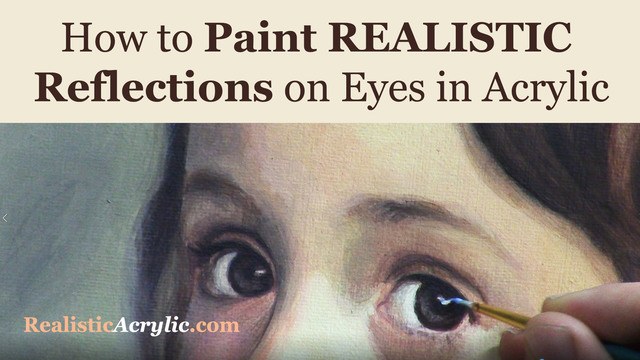
How to Paint Realistic Reflections on Eyes in Your Acrylic Portrait
Eyes are the most important feature of an acrylic portrait. When you paint the eyes correctly, everything else seems to fall into place so much easier.
In this video, I’ll show you how to paint realistic reflections, using two complementary colors in addition to white, and getting the shape of the reflection just right. Then this originally was a BONUS video in the Acrylic Portrait Painting Challenge Master Class, now available in the All-Access Membership at Realistic Acrylic Portrait School.
Even though it is technically over, you can take the Acrylic Portrait Painting Challenge (it’s FREE!) and paint along with us! 8 master class lessons are posted to help you paint a portrait you can be proud of!
REGISTER TODAY. The challenge is ongoing, something you can do at your own pace. It’s not too late to enter! After you join, I’ll send you the supplies list and reference photos to paint from.
Register for the Challenge!WATCH NOW…
Lesson #8: How to Paint Realistic Reflections on Eyes in Acrylic
Questions? Suggestions? Thoughts? Let me know, below in the comments. Please share your sketches in our Facebook group and share this post with your friends!
- How to Paint Foliage Using the Acrylic Glazing Technique
- How to Trace for an Accurate Portrait Sketch
- How to Paint Realistic Eyes in Your Acrylic Portrait
- How to Add Raw Umber Dark & Ultramarine Blue to Your Portrait
- How to Make Your Own Raw Umber Dark
- How to Paint Realistic Trees & Grass in Your Acrylic
- How to Block In Skin Tone Values Using Glazing Technique
- How to Paint Vibrant Reds in Your Acrylic Portrait
- How to Glaze Background Colors & More Acrylic Portrait
- How to Paint White Clothing in Your Acrylic Portrait
- How to Easily Transition from a Sketch to a Painting
- How to Block In Shading & Skin Tones in Your Acrylic
- How to Build Up Color on Acrylic Pet Portrait
- How to Build Up Form on Clothing with Acrylic
- How to Paint Dark Clothing Using Acrylic Glazing Technique
- How to Paint a 24 x 30 Acrylic With 30 People
- How to Do Smooth Shading with Acrylic
- How to Sketch an Acrylic Portrait with a Grid
Read more about how to paint a portrait that you can surely be proud of!
I’d love to hear your thoughts about this video. Please share it with your friends and family. Let me know if you have any further questions. I’ll greatly help you.
Thank you so much for taking the time to read this tutorial and watch the video. That means a lot to me. I hope you find it very helpful in your portrait painting.
P.S. Did you find this post helpful or encouraging? If so, send it on ahead! Let others know with the share buttons below. I’d love to hear your comments. Thank you so much! Also, do you have a question on acrylic portrait painting you’d like answered? Let me know, and I’d be happy to help!

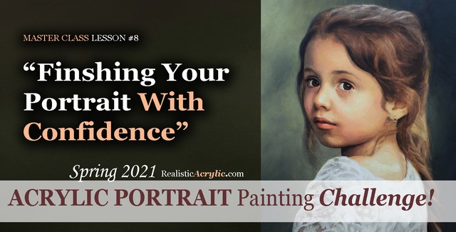
Spring 2021 Acrylic Portrait Painting Challenge: Finishing Your Portrait With Confidence
Let’s help you finish your painting!
In this lesson, we will be wrapping up the Masterclass series for the challenge! I’ll show you how to add some more nuances and details to the portrait of “Cora.” First, we’ll add a glaze to her hair to enrich the overall color. Next, we will enhance some nuances on her eyebrows, dial in the color of the eyes, and paint in the reflections. Finally, we’ll add in the skin tone for her arm in the lower corner and follow up with some work on her lace.
But even though we are nearly done with this portrait painting, it’s not too late to join in the fun!
YOU, too, can paint a portrait!
Take the Acrylic Portrait Painting Challenge (it’s FREE!) and paint along with us!
REGISTER TODAY. The challenge is ongoing, something you can do at your own pace. It’s not too late to enter! After you join, I’ll send you the supplies list and reference photos to paint from.
WATCH NOW…
Lesson #8: Finishing Your Portrait Confidently
Professional artist and instructor Matt Philleo will teach you how to paint an acrylic portrait you can be proud of with this Portrait Painting Challenge!
Would like to paint this portrait with me and hundreds of other artists?
Take the 2021 Spring Portrait Painting Challenge!
You can register below and get started. It is completely FREE to join the challenge and participate. When you join, I’ll send you the “Welcome Kit” which includes:
- The Supplies List (so you know what you need to paint with us, your shopping list. 🙂 )
- The Reference Photo with and without the grid, high resolution, that you can download ready to print out or display on your tablet. You’ll be able to create an accurate portrait this way.
- The Palette Layout Guide showing you how to arrange your colors so they don’t get muddy on your palette
- The Master Class Lesson Schedule
- the Lessons emailed to you
- A private Facebook group to cheer you and help answer your questions
- And a few “bonuses” like opportunities to win my paid online classes
REGISTER TODAY. The challenge is ongoing, something you can do at your own pace. It’s not too late to enter!
Let me know if you have any questions and I look forward to teaching you more!
—Matt
Questions? Suggestions? Thoughts? Let me know, below in the comments. Please share your sketches in our Facebook group and share this post with your friends!