Tag Archives for " acrylic tutorials "

How to Use Cooler Colors for Clothing Shadow
Learning clothing shadows: Cool Color techniques for realism in acrylic portraits
Introduction: Enhancing Realism with Cooler Colors
In acrylic portrait painting, shadows play a pivotal role in creating depth and realism. One technique to elevate your work is using cooler colors for clothing shadow, an approach that may not be immediately obvious. By strategically incorporating cooler tones like blue and gray instead of relying solely on darker shades of the clothing color, you can achieve a subtle and realistic effect. In this tutorial, I’ll walk you through the process of applying cooler colors in clothing shadows using glazing and dry brush techniques to bring your painting to life.
Why Cooler Colors Work for Shadows
The instinct for many artists might be to darken the shadows on clothing with black or a deeper shade of the same color. However, this often leads to overly vibrant or unnatural results. By using cooler tones, such as blue or blue-gray, the shadowed areas can maintain their depth without overpowering the fabric’s natural color.
Key Tip:
When transitioning from light to shadow in your painting, cooler colors help tone down the vibrancy of the clothing while maintaining subtle value shifts.
Materials and Colors Used
For this technique, you’ll need a few specific tools and colors:
- Ultramarine Blue: A rich blue tone that works well for creating cooler shadows.
- Raw Umber Dark: A dark brown that adds depth to the blue without overpowering it.
- Matte Medium: A transparent acrylic medium to thin the paint for glazing.
- Flat Brush: Ideal for applying layers of glazes.
- Dry Brush: Perfect for gently feathering in the colors.
By combining these materials, you’ll have the perfect mix to start creating cooler-toned shadows.
Step 1: Mixing the Right Colors
Firstly, is create the right blend of colors for your shadows. Because in the video, I demonstrate how to mix ultramarine blue with raw umber dark. This combination creates a bluish-gray tone that is subtle and cool enough for shadows but still harmonious with the warmer base colors of the clothing.
Process:
- Begin by adding a small amount of ultramarine blue to your palette.
- Mix in a touch of raw umber dark to reduce the brightness of the blue.
- Incorporate matte medium to make the mixture more translucent, ensuring that the shadow layers don’t become too opaque.
This bluish-gray tone will not only darken the shadowed areas but also cool down the intensity, giving the clothing a realistic sense of depth.
Technique Tip:
Always mix small amounts of color first and test it on a separate surface, such as a white card, to see how it interacts with the base layer before applying it to your painting.
Step 2: Applying the Glaze
The glazing is a technique in which the thin layers of translucent paint are applied over dry areas of the painting, then allowing the underlying colors to show through. As a result, it creates a smooth transition from light to shadow without harsh lines.
Process:
- With a flat brush, apply your blue-gray mixture onto the darker areas of the clothing.
- Start by gently glazing the shadowed sections beneath folds, arms, or under the chin.
- Gradually build up the layers, allowing each one to dry before applying the next.
- The glazing process allows you to control the level of darkness and coolness in the shadow while ensuring that the red or other base color remains visible underneath.
Why It Works: The matte medium makes the glaze translucent, so the original clothing color can still be seen through the shadow, adding depth and subtlety to your portrait.
Step 3: Dry Brush Technique for Soft Blending
After applying your glaze, your next step is to use a dry brush technique to softly blend the cooler shadow into the surrounding areas of the clothing. The dry brush technique is particularly effective for adding texture and blending transitions in fabrics.
Process:
- Lightly load your brush with the blue-gray mixture.
- Dab off excess paint on a paper towel to create a dry brush effect.
- Gently stroke the brush over the edges of the shadows, using quick, soft motions to blend the glaze seamlessly into the lighter areas.
- Continue to feather the paint, allowing the cooler shadow to naturally merge with the highlights of the clothing.
Key Tip: The dry brush method allows for smooth transitions without harsh lines, then mimicking the way light softly falls on fabric in real life.
Step 4: Adjusting for Depth and Nuance
As you build the layers and blend your cooler shadows, you may notice that some areas need more depth or subtle variation. Don’t hesitate to adjust your mixture by adding more raw umber dark if the blue becomes too overpowering.
Important Consideration:
Then shadows should appear less vibrant and cooler as they get darker. And then by adjusting the mixture to include more raw umber dark, you can deepen the shadow without making it too cool or overwhelming.
Creating Realistic Clothing Shadows on Multiple Colors
The beauty of this technique is its versatility. You can apply the same blue-gray glaze to multiple fabric colors. For example, in the video, I use it both on the woman’s red clothing and on a man’s shirt. It works just as effectively on lighter-colored fabric, adjusting the tones slightly with each application.
Because by using the same cooler glaze across different fabrics, you create consistency in the shadows, making the portrait appear cohesive and well-integrated.
Conclusion: Mastering Shadows with Cool Tones
When incorporating cooler colors for shadows on clothing in your acrylic portraits allows for greater realism and depth. Because by utilizing a blue-gray glaze and dry brush blending, you can create nuanced shadows that seamlessly integrate with the base color of the fabric. Whether you’re working on bright red clothing or more muted tones, cooler shadows offer the perfect solution for achieving lifelike contrast and depth.
If you’re looking for more instructional videos on how to improve your acrylic painting, visit www.realisticacrylic.com for more tutorials and check out my free courses here. .
- How to Paint Foliage Using the Acrylic Glazing Technique
- How to Trace for an Accurate Portrait Sketch
- How to Paint Realistic Eyes in Your Acrylic Portrait
- How to Add Raw Umber Dark & Ultramarine Blue to Your Portrait
- How to Make Your Own Raw Umber Dark
- How to Paint Realistic Trees & Grass in Your Acrylic
- How to Block In Skin Tone Values Using Glazing Technique
- How to Paint Vibrant Reds in Your Acrylic Portrait
- How to Glaze Background Colors & More Acrylic Portrait
- How to Paint White Clothing in Your Acrylic Portrait
- How to Easily Transition from a Sketch to a Painting
- How to Block In Shading & Skin Tones in Your Acrylic
- How to Build Up Color on Acrylic Pet Portrait
- How to Build Up Form on Clothing with Acrylic
- How to Paint Dark Clothing Using Acrylic Glazing Technique
- How to Paint a 24 x 30 Acrylic With 30 People
- How to Do Smooth Shading with Acrylic
- How to Sketch an Acrylic Portrait with a Grid
Read more about how to paint a portrait that you can surely be proud of!
I’d love to hear your thoughts on this video. Please share it with your friends and family. Let me know if you have any further questions. I’ll greatly help you.
If you’d like to learn more, sign up for my free email tips and video class today.
Learn How to Paint Acrylic Portraits With My Free Mini-Video Course!
Thank you so much for taking the time to read this tutorial and watch the video. That means a lot to me. I hope you find it very helpful in your portrait painting.
Yours for Better Portraits,

P.S. Did you find this post helpful or encouraging? If so, send it on ahead! Let others know with the share buttons below. I’d love to hear your comments. Thank you so much! Also, do you have a question on acrylic portrait painting you’d like answered? Let me know, and I’d be happy to help!

How to Blocking in Shadows for a LARGE Painting
Learn the art of blocking shadows with acrylic glazing for dramatic depth in large paintings
When creating a large acrylic painting, one of the key elements in bringing it to life is mastering the shadow work. Blocking in shadows helps define the structure and form of your subject, adding realism and depth. Using an acrylic glazing technique enhances the shadowing effect, keeping it translucent while still maintaining control over the darker areas of the painting.
In this blog post, we’ll explore a step-by-step approach on how to block in shadows for a large painting. We’ll cover the essential tools, glazing methods, and tips to help you create a more dynamic, realistic piece of art.
Setting the Stage: Preparing for Shadow Blocking
Before diving into the painting process, it’s important to prepare your materials and mindset. I begin this painting session with a moment of reflection and prayer, setting an intention to create a work that captures emotion and depth. Preparation also involves setting up the canvas, sketching the outline of the subject, and sealing the sketch with a light glaze.
For this demonstration, a mixture of raw umber dark and ultramarine blue was chosen for the shadow work. These colors, when blended, create a rich, cool tone that is perfect for shadows. Here’s how you can apply this to your own painting:
- Prepare Your Canvas: Start with a white canvas, sketch your subject, and seal the sketch with a light glaze using diluted acrylic matte medium.
- Choose Your Colors: For shadows, a mix of raw umber dark and ultramarine blue works beautifully to create a cool-toned effect. These colors blend well and offer the right balance between transparency and opacity.
Step-by-Step: Blocking in Shadows
- Creating the First Glaze Layer
Begin by applying a diluted glaze over the areas where shadows will be present. For large paintings, it’s important to keep a wet edge during the application process to avoid streaks or unwanted lines. Using long, sweeping brushstrokes, layer the glaze in areas where you want shadows to appear. - Maintaining Translucency
The beauty of acrylic glazes is their translucent nature. You can still see the sketch beneath the glaze, preserving the fine details as you work on the shadows. To achieve this effect, ensure that your glaze mixture has more medium than pigment, allowing light to pass through. - Building the Tonal Value Structure
Blocking in shadows is more than just applying darker tones. It’s about understanding the value structure of your reference image. In the demonstration, the artist frequently checks his reference photo to ensure that he’s accurately representing the light and shadow interplay. Study your reference carefully and build the shadows from light to dark.- Tip: Cooler tones work well for shadows. Add a small amount of ultramarine blue to your glaze to give the shadows a cooler, more natural effect.
Techniques for Shadow Blocking in Large Paintings
Blocking in shadows for a large painting requires a few specialized techniques. Here are some essential methods to use:
- Layering Glazes for Depth
Rather than applying one thick layer, build your shadows gradually by adding multiple thin layers of glaze. This will help you control the depth and darkness of the shadow, while still maintaining the luminosity of the overall painting. - Vary Your Brush Strokes
As you apply the glaze, it’s helpful to vary the direction of your brushstrokes. This creates a more natural and organic look, especially in areas with fabric or textures like rocks. For example, the artist worked on the figure’s clothing, carefully brushing in the shadows to maintain the folds and creases. - Use a Smaller Brush for Detail
Once the large areas are blocked in, switch to a smaller brush to refine the edges of the shadows. This technique allows you to add subtle details that make the shadowing more realistic.
Key Tips and Techniques for Effective Shadow Work
- Keep a Wet Edge: When applying a glaze, always maintain a wet edge to prevent harsh lines and streaks. This will ensure smooth transitions between the light and shadowed areas.
- Use Cooler Tones: Shadows should be cooler in tone compared to the lighter areas. Adding a hint of ultramarine blue to your glaze helps achieve this effect.
- Layer Glazes for Control: Don’t rush the shadowing process. Build up the intensity gradually by applying thin layers of glaze until you reach the desired depth.
- Pay Attention to Gradation: Shadows are rarely uniform in tone. They often fade or blend into lighter areas. Adjust your glaze to create smooth gradations between light and dark.
Applying Glazes to Specific Elements
In the video, I focused on several parts of the painting and then demonstrated the blocking in of shadows:
- The Figure’s Clothing: By using a combination of raw umber dark and ultramarine blue, the artist darkened the folds of the figure’s clothing, preserving the highlights and lighter areas.
- The Rocks: Shadows were added to the rocks behind the main figures, using a slightly bolder application of glaze. The cooler tones gave the rocks a natural shadowed effect, which contrasted well with the lighter areas.
- Background Elements: Blocking in shadows for the background elements, such as the sky and distant stones, helps create a sense of depth and distance. In this case, the artist allowed the shadows to blend naturally into the lighter tones, creating a balanced contrast.
Finishing Touches: Refining the Shadows
Once the shadow areas are blocked in, the final step involves refining the details. Then I used a smaller brush to control the finer aspects of the shadows, ensuring that they didn’t overpower the highlights. This delicate balance between light and shadow is what ultimately brings the painting to life.
- Pro Tip: If a glaze feels too bold, you can always lighten it by gently brushing over the area with a bit of water or clear medium to soften the edges.
Conclusion: Mastering the Art of Shadow Blocking
Blocking in shadows is a crucial skill for any artist, especially when working on large paintings. By using acrylic glazing techniques, you can add depth and realism while preserving the underlying details. Remember to take your time, build the shadows in layers, and constantly refer to your reference photo to ensure accuracy.
Master this technique, and you’ll find your large acrylic paintings gaining new levels of dimension and realism.
If you’re looking for more instructional videos on how to improve your acrylic painting, visit www.realisticacrylic.com for more tutorials and check out my free courses here. .
- Adding highlights to your acrylic painting
- 5 Excellent Reasons to Use Aluminum Foil
- Paint Realistic Wrinkles in Acrylic
- Painting Clothing in an Acrylic Portrait
- Paint a Cloudy Sky Acrylic
- How to add Semi-Opaque Highlights
- How to Enhance the Contrast in Your Acrylic
- How to Add Glaze to Your Acrylic Painting
- Paint Realistic Reflections on Eyeglasses in an Acrylic Portrait
- Build Up Depth on Your Acrylic Portrait Backgrounds
- How Do You Do Layers With the Glazing Technique?
- Learn How to Paint Wrinkles in Acrylic
Read more about how to paint a portrait that you can surely be proud of!
I’d love to hear your thoughts on this video. Please share it with your friends and family. Let me know if you have any further questions. I’ll greatly help you.
If you’d like to learn more, sign up for my free email tips and video class today.
Learn How to Paint Acrylic Portraits With My Free Mini-Video Course!
Thank you so much for taking the time to read this tutorial and watch the video. That means a lot to me. I hope you find it very helpful in your portrait painting.
Yours for Better Portraits,
P.S. Did you find this post helpful or encouraging? If so, send it on ahead! Let others know with the share buttons below. I’d love to hear your comments. Thank you so much! Also, do you have a question on acrylic portrait painting you’d like answered? Let me know, and I’d be happy to help!

2 Steps on How to Make Teeth More Realistic
Learn how to add realistic depth and dimension to teeth in your acrylic portraits using these simple but effective techniques.
When painting an acrylic portrait, one of the areas that often challenges artists is getting the teeth to look realistic. Many artists fall into the common trap of painting teeth flat white, which detracts from the lifelike quality of a portrait. Teeth, however, are far from being a pure white color. In this guide, you’ll learn two simple yet effective steps that will elevate your skills in painting teeth, making them appear more realistic and natural.
Step 1: Proper Shading – Teeth Are Not White
One of the most frequent mistakes made when painting teeth is assuming they are stark white. In reality, teeth are often a light shade of gray or slightly off-white. In fact, if you compare teeth to a pure white object, you’ll notice they are significantly darker. Painting teeth flat white can give your portrait an artificial look and flatten the depth of the face.
To ensure you are capturing the right tone, use a white card to measure the value of your teeth compared to the background of your reference photo. When you observe closely, you’ll find that teeth have more of a grayish hue. By painting the teeth just a little darker than pure white, you create a realistic foundation that allows you to build up detail.
Here’s how you can achieve this:
- Mix titanium white with a small amount of raw umber dark and ultramarine blue to create a subtle grayish hue. This will be your base color for shading the teeth.
- Apply thin layers, blending the paint carefully, to ensure a smooth transition. The blend should not be too dark, but noticeably darker than pure white.
- To add more depth, mix a bit of matte medium into the paint. Matte medium helps thin the acrylic paint without compromising its color, allowing you to create soft, seamless shading that brings out the three-dimensional quality of the teeth.
By following these steps, you are creating the necessary contrast between the teeth and the bright highlights that will come in the next step.
Tip: Focus on the Surrounding Shadows
Shadows play an important role in shaping the teeth. Gums and lips often cast subtle shadows over teeth, making the edges slightly darker. Pay attention to these areas, especially around the perimeter of the teeth, to enhance the sense of depth. Remember, teeth are curved objects; shading on one side, while leaving the other lighter, will make them appear more dimensional.
Step 2: Adding Realistic Highlights – Bring the Teeth to Life
Once you’ve laid down the correct base color for the teeth, the next step is to add realistic highlights. These highlights are small but essential details that bring the teeth to life and make them look natural.
Teeth often have tiny reflections of light in certain areas, depending on the lighting in your reference photo. These highlights can be found along the tops of the teeth or on the edges where they catch the light the most. Here’s how you can effectively apply them:
- Use titanium white for these highlights. Unlike the shading, the highlights should be pure white, but use them sparingly to avoid an unnatural appearance.
- With a size 2 liner brush, carefully paint small pinpoint highlights in the appropriate spots, as seen in your reference image. The upper teeth often have highlights near the top, close to where the lips meet the teeth.
- After applying the highlights, blend them gently into the surrounding areas to avoid hard, distracting lines. The goal is to create a soft transition between the shaded and highlighted areas.
If the highlights appear too stark, you can modify the tone by adding a touch of indian yellow to warm them up. By warming the highlights, you mimic the natural hue of teeth, which tend to reflect a warmer tone due to their interaction with light and surrounding skin tones.
Tip: Be Subtle with Separation Lines
While teeth have visible separation lines, especially in close-up portraits, these lines should not be harsh. Use very faint lines to delineate individual teeth. A common mistake is making the lines too bold, which can give the teeth an outlined, cartoonish appearance. The size 2 liner brush is ideal for lightly sketching in these lines, but ensure they are soft enough to blend in with the rest of the portrait.
Additional Techniques to Improve Realism
1. Use Glazing for Depth
To create even more depth and nuance in the teeth, consider using a glazing technique. A glaze is a thin, translucent layer of paint that allows underlying layers to show through, creating a sense of depth.
- Mix a small amount of matte medium with your base gray color and apply it lightly over the teeth, focusing on areas that need more depth, such as the sides or lower parts of each tooth.
- This glazing technique allows you to build up subtle layers, increasing the realistic appearance of your portrait.
2. Pay Attention to Tooth Shape and Size
Not all teeth are the same size or shape, and these variations should be reflected in your painting. The front teeth are typically larger, while the ones on the sides taper off. Make sure to study your reference photo closely and adjust the size and shape of each tooth accordingly. This attention to detail will make your portrait look more realistic and proportional.
Conclusion
Getting the teeth right in an acrylic portrait is an essential step toward achieving realism. By shading the teeth a few tones darker than pure white and adding subtle highlights in the right spots, you can dramatically improve the lifelike quality of your portraits. Using techniques like glazing and paying attention to tooth shape will further enhance the overall effect. Follow these two steps carefully, and you’ll be well on your way to mastering the art of painting realistic teeth in acrylics.
With patience and practice, you’ll see improvements in your portrait painting skills, and your work will stand out for its lifelike qualities.
For further resources and guides, visit realisticacrylic.com and check out my free courses to enhance your acrylic painting journey.
- Adding highlights to your acrylic painting
- 5 Excellent Reasons to Use Aluminum Foil
- Paint Realistic Wrinkles in Acrylic
- Painting Clothing in an Acrylic Portrait
- Paint a Cloudy Sky Acrylic
- How to add Semi-Opaque Highlights
- How to Enhance the Contrast in Your Acrylic
- How to Add Glaze to Your Acrylic Painting
- Paint Realistic Reflections on Eyeglasses in an Acrylic Portrait
- Build Up Depth on Your Acrylic Portrait Backgrounds
- How Do You Do Layers With the Glazing Technique?
- Learn How to Paint Wrinkles in Acrylic
Read more about how to paint a portrait that you can surely be proud of!
I’d love to hear your thoughts on this video. Please share it with your friends and family. Let me know if you have any further questions. I’ll greatly help you.
If you’d like to learn more, sign up for my free email tips and video class today.
Learn How to Paint Acrylic Portraits With My Free Mini-Video Course!
Thank you so much for taking the time to read this tutorial and watch the video. That means a lot to me. I hope you find it very helpful in your portrait painting.
Yours for Better Portraits,
P.S. Did you find this post helpful or encouraging? If so, send it on ahead! Let others know with the share buttons below. I’d love to hear your comments. Thank you so much! Also, do you have a question on acrylic portrait painting you’d like answered? Let me know, and I’d be happy to help!

How to Paint Earrings in Your Acrylic Portrait
Learn the technique of painting realistic earrings in acrylic portraits with these easy steps
Introduction
Adding realistic details to an acrylic portrait, such as earrings, can elevate the overall quality and depth of your artwork. Painting jewelry is not just about adding a couple of dabs of paint it involves understanding the placement of highlights, shadows, and creating a smooth transition between the elements. In this tutorial, you will learn how to paint earrings in your acrylic portrait using highlights, shadows, and glazing techniques. By the end of this guide, you will have the confidence to create lifelike jewelry that complements your portraits.
Materials Needed:
- Titanium White
- Indian Yellow
- Raw Umber Dark
- Ultramarine Blue
- Alizarine Crimson
- Round Brush (size 2)
- Palette and water
Step 1: Mix Your Colors for the Base Layer
Before starting, gather your reference photo to ensure accurate lighting and color representation. In this case, a frontal flash photo was used, which plays an essential role in determining the highlights and shadows on the earring.
Begin by selecting a size 2 round brush, which is ideal for detail work. Mix titanium white with a small amount of indian yellow. The goal is to create a lighter, warm gray tone, which will serve as the base for the earring. Apply this mixture gently over the earring area, covering a significant portion to build the foundation.
Step 2: Apply a Mid-Tone Glaze
Once the base layer dries, the next step is to create a mid-tone glaze. This technique helps to integrate the light and shadow, giving the earring a more natural appearance. For the mid-tone, blend raw umber dark with the existing base mix (titanium white and Indian yellow).
Carefully apply the glaze in thin layers over the base, making sure not to overpower the light areas. Glazing provides depth and softens the transitions between different values.
Pro Tip: Ensure your glaze layers are thin and translucent. This allows the previous layers to show through, adding subtle complexity to the jewelry.
Step 3: Add Highlights
Now that the mid-tone glaze is in place, it’s time to highlight the earring to create a realistic metallic sheen. Go back to your titanium white and use a fine detail brush to apply small dabs of white on the areas where the light hits directly.
When positioning the highlights, consider the source of light from your reference photo. In this example, the highlights were placed on the upper part of the earring. You can zoom in on your reference photo to get a more precise understanding of where the light falls.
Pro Tip: It’s okay to let the highlight exceed the boundaries of the metal slightly. This will give the earring a more convincing, three-dimensional look, as if the light is reflecting beyond the earring’s surface.
Step 4: Refine the Shadows
Once the highlights are in place, the shadows are crucial to enhance the depth and make the earring stand out. Mix ultramarine blue with a touch of alizarine crimson to create a deep shadow color. This shadow should be applied under the earring where it meets the skin or the hair, depending on the reference photo.
For this step, lightly glaze the darker tones just under the highlighted areas. This step contrasts with the highlight, making the metal of the earring more vibrant and realistic. The shadow will cast a thin, dark line directly adjacent to the bright highlight, creating a striking effect.
Pro Tip: The transition between light and shadow should be smooth. Use a very small amount of paint and blend gently with your brush for a seamless look.
Step 5: Refine and Contrast the Background
To make the earring pop even more, darken the background or surrounding areas. In this case, the artist chose to slightly darken the subject’s sweater in the painting. Adding contrast around the earring helps it stand out against the background and draws the viewer’s eye to the details of the portrait.
Mix raw umber dark with ultramarine blue and lightly apply it to the background behind the earring. This subtle adjustment can enhance the overall composition and emphasize the earring’s presence in the portrait.
Final Thoughts: Evaluate and Adjust
Step back from your painting to assess the overall effect. Are the highlights and shadows properly placed? Is the earring standing out as a focal point in the portrait? Make small adjustments as needed to ensure that the earring looks natural and harmonious within the context of the entire painting.
A well-painted earring should not only be realistic but should also complement the portrait as a whole. Jewelry can bring elegance and detail to your acrylic portrait, and by following these techniques, you can ensure that it adds a professional touch to your work.
Tips and Techniques Recap:
- Use Thin Glazes: Build up layers slowly with thin glazes to add depth and softness to the transitions between light and shadow.
- Highlight Placement: Highlights should be carefully positioned according to the light source. Letting the highlight slightly exceed the boundaries adds realism.
- Smooth Transitions: Blending is key. Use a soft brush to smooth transitions between different tones, especially between the shadows and highlights.
- Contrasting the Background: Slightly darkening the surrounding area, such as the subject’s clothing or background, helps to make the earring pop.
- Evaluate and Adjust: After each layer, step back to evaluate the overall look. Make minor adjustments to perfect the balance of light, shadow, and detail.
Conclusion
Painting earrings in your acrylic portrait may seem like a small detail, but it can significantly impact the realism and professionalism of your artwork. By following the steps outlined in this tutorial, you can master the art of painting jewelry in a way that complements your portrait and adds a subtle yet powerful finishing touch.
For more tips and detailed acrylic portrait tutorials, visit realisticacrylic.com. Happy painting!
- How to Paint Foliage Using the Acrylic Glazing Technique
- How to Trace for an Accurate Portrait Sketch
- How to Paint Realistic Eyes in Your Acrylic Portrait
- How to Add Raw Umber Dark & Ultramarine Blue to Your Portrait
- How to Make Your Own Raw Umber Dark
- How to Paint Realistic Trees & Grass in Your Acrylic
- How to Block In Skin Tone Values Using Glazing Technique
- How to Paint Vibrant Reds in Your Acrylic Portrait
- How to Glaze Background Colors & More Acrylic Portrait
- How to Paint White Clothing in Your Acrylic Portrait
- How to Easily Transition from a Sketch to a Painting
- How to Block In Shading & Skin Tones in Your Acrylic
- How to Build Up Color on Acrylic Pet Portrait
- How to Build Up Form on Clothing with Acrylic
- How to Paint Dark Clothing Using Acrylic Glazing Technique
- How to Paint a 24 x 30 Acrylic With 30 People
- How to Do Smooth Shading with Acrylic
- How to Sketch an Acrylic Portrait with a Grid
Read more about how to paint a portrait that you can surely be proud of!
I’d love to hear your thoughts about this video. Please share it with your friends and family. Let me know if you have any further questions. I’ll greatly help you.
If you’d like to learn more, sign up for my free email tips and video class today.
Learn How to Paint Acrylic Portraits With My Free Mini-Video Course!
Thank you so much for taking the time to read this tutorial and watch the video. That means a lot to me. I hope you find it very helpful in your portrait painting.
Yours for Better Portraits,
P.S. Did you find this post helpful or encouraging? If so, send it on ahead! Let others know with the share buttons below. I’d love to hear your comments. Thank you so much! Also, do you have a question on acrylic portrait painting you’d like answered? Let me know, and I’d be happy to help!

How to Paint a Woman’s Hair Detail with Acrylic
Painting realistic hair in acrylic by learning key techniques for depth, texture, and shine in this step-by-step guide.
Painting hair in acrylic can be a challenging task, especially when you’re aiming for realism. Because it requires a combination of precision, layering, and patience to achieve the right texture and shine. Then in this tutorial, we’ll explore step-by-step how to paint a woman’s hair in acrylic, focusing on creating depth, natural shading, and lifelike highlights.
Whether you’re working on a portrait or enhancing your painting skills, these techniques will help you bring hair to life on your canvas. Using a glazing method, various color mixtures, and brushwork, you can create the illusion of flowing, realistic hair.
1. Setting Up Your Palette
Before diving into painting hair, it’s essential to prepare your palette with the right colors. Hair, even when it appears as a single color, is made up of many hues that need to be layered to achieve realism. For this project, focus on the following colors:
- Raw Sienna
- Raw Umber Dark
- Titanium White
- Ultramarine Blue
- Indian Yellow
These colors provide a good foundation for both the darker shadows and lighter highlights of the hair.
2. Starting with the Base Layer
To begin, use a mixture of raw sienna and raw umber dark to block in the base color of the hair. Because this step creates the groundwork for the shadows and mid-tones. The aim here is not to focus on individual strands but to establish the overall shape and form of the hair.
As the base layer is applied, keep in mind that hair is not uniform. Some areas will be darker, especially where the light does not directly hit the hair. Mix in ultramarine blue to cool down certain areas and give the hair dimension. This mixture is particularly effective for creating shadows that contrast with the warmer tones of Raw Sienna and Indian Yellow.
3. Building Depth with Glazes
After the base layer dries, then it’s time to add depth to the hair using a glazing technique. Hence glazing involves using thin layers of translucent paint to build up color gradually. So, in this tutorial, matte medium was mixed with the paint to create these transparent layers, allowing each previous layer to shine through.
When you mix raw umber dark and titanium white with a small amount of ultramarine blue to create a soft grayish tone. Apply this mixture in the darker areas, emphasizing the parts of the hair that aren’t illuminated. Because glazes help create a smooth transition between light and shadow, giving the hair more realism.
If certain areas appear too light, you can darken them by adding another glaze of raw umber dark and ultramarine blue. It’s essential to remain patient during this process, as multiple layers may be needed to achieve the desired effect.
4. Adding Highlights
Hair shines where it catches the most light, and creating that glossy appearance is key to making hair look realistic. Use a combination of raw sienna, titanium white, and a touch of indian yellow to create a highlight color. Apply this mixture sparingly to the top sections of the hair where the light strikes.
Remember, highlights should not cover too much of the surface. Focus on smaller areas where light naturally reflects off the hair, creating that shiny, smooth effect. Use fine brush strokes to suggest individual strands while blending them into the darker layers underneath.
5. Refining Hair Strands and Texture
Once the overall structure and highlights are established, refine the texture of the hair. Use thin brushes to create subtle striations that mimic hair strands. These strokes should be fine, soft, and follow the natural direction of the hair’s flow.
Layering is vital for texture. Return to the darker areas with another glaze of raw umber dark if necessary, and then blend these shadows into the lighter sections. The combination of light, mid-tones, and dark shadows will give the hair more realism.
In addition, use ultramarine blue mixed with raw umber dark to cool down areas that are too warm. This slight temperature contrast will enhance the depth of the hair, making it look more natural and three-dimensional.
6. Creating Shadows for More Depth
Even blonde or light-colored hair can have deep shadows where the light doesn’t reach. To make these areas more pronounced, mix raw umber dark with ultramarine blue and apply it to the shadowed sections. The trick is to observe how light and shadow interact on your reference image and replicate this in your painting.
By doing this, you prevent the hair from appearing flat. Shadows give the hair its depth, making it stand out against the surrounding elements in the painting.
7. Final Touches and Adjustments
As you finish the painting, take a step back to assess the overall composition. Are the highlights bright enough? Are the shadows deep enough? Make any final adjustments by adding more glazes or highlights to enhance the dimension.
For the finishing touches, consider adding small strands of hair outside the main shape to make the hair look more natural and less “cut out.” These stray strands can be applied lightly with a thin brush, using the highlight color to make them visible against darker backgrounds.
Tips & Techniques Recap
- Use multiple glazes to build up hair color gradually. Glazing allows for more control and depth, especially in darker areas.
- Keep highlights subtle and only in areas that naturally catch the light. Over-highlighting can flatten the painting.
- Mix cool and warm tones to create more dynamic shading. Hair is not just one color; blending contrasting tones will add realism.
- Be patient with layers. Acrylics dry quickly, but that can be a benefit when working in layers to build up depth.
- Use fine brush strokes to suggest individual hair strands, but avoid over-detailing. Too many strands can make the hair look stiff.
By following these techniques, you’ll be able to paint hair that looks realistic, detailed, and full of life. Don’t be afraid to experiment with different glazing layers and color mixtures to achieve the perfect balance of depth and shine.
Now it’s your turn! Grab your acrylics and start bringing your portraits to life with beautifully painted hair.
If you’re looking for more instructional videos on how to improve your acrylic painting, visit www.realisticacrylic.com for more tutorials and check out my free courses here. .
- Adding highlights to your acrylic painting
- 5 Excellent Reasons to Use Aluminum Foil
- Paint Realistic Wrinkles in Acrylic
- Painting Clothing in an Acrylic Portrait
- Paint a Cloudy Sky Acrylic
- How to add Semi-Opaque Highlights
- How to Enhance the Contrast in Your Acrylic
- How to Add Glaze to Your Acrylic Painting
- Paint Realistic Reflections on Eyeglasses in an Acrylic Portrait
- Build Up Depth on Your Acrylic Portrait Backgrounds
- How Do You Do Layers With the Glazing Technique?
- Learn How to Paint Wrinkles in Acrylic
Read more about how to paint a portrait that you can surely be proud of!
I’d love to hear your thoughts on this video. Please share it with your friends and family. Let me know if you have any further questions. I’ll greatly help you.
If you’d like to learn more, sign up for my free email tips and video class today.
Learn How to Paint Acrylic Portraits With My Free Mini-Video Course!Thank you so much for taking the time to read this tutorial and watch the video. That means a lot to me. I hope you find it very helpful in your portrait painting.
P.S. Did you find this post helpful or encouraging? If so, send it on ahead! Let others know with the share buttons below. I’d love to hear your comments. Thank you so much! Also, do you have a question on acrylic portrait painting you’d like answered? Let me know, and I’d be happy to help!

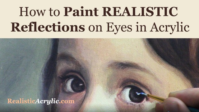
How to Paint Realistic Reflections on Eyes in Your Acrylic Portrait
Eyes are the most important feature of an acrylic portrait. When you paint the eyes correctly, everything else seems to fall into place so much easier.
In this video, I’ll show you how to paint realistic reflections, using two complementary colors in addition to white, and getting the shape of the reflection just right. Then this originally was a BONUS video in the Acrylic Portrait Painting Challenge Master Class, now available in the All-Access Membership at Realistic Acrylic Portrait School.
Even though it is technically over, you can take the Acrylic Portrait Painting Challenge (it’s FREE!) and paint along with us! 8 master class lessons are posted to help you paint a portrait you can be proud of!
REGISTER TODAY. The challenge is ongoing, something you can do at your own pace. It’s not too late to enter! After you join, I’ll send you the supplies list and reference photos to paint from.
Register for the Challenge!WATCH NOW…
Lesson #8: How to Paint Realistic Reflections on Eyes in Acrylic
Questions? Suggestions? Thoughts? Let me know, below in the comments. Please share your sketches in our Facebook group and share this post with your friends!
- How to Paint Foliage Using the Acrylic Glazing Technique
- How to Trace for an Accurate Portrait Sketch
- How to Paint Realistic Eyes in Your Acrylic Portrait
- How to Add Raw Umber Dark & Ultramarine Blue to Your Portrait
- How to Make Your Own Raw Umber Dark
- How to Paint Realistic Trees & Grass in Your Acrylic
- How to Block In Skin Tone Values Using Glazing Technique
- How to Paint Vibrant Reds in Your Acrylic Portrait
- How to Glaze Background Colors & More Acrylic Portrait
- How to Paint White Clothing in Your Acrylic Portrait
- How to Easily Transition from a Sketch to a Painting
- How to Block In Shading & Skin Tones in Your Acrylic
- How to Build Up Color on Acrylic Pet Portrait
- How to Build Up Form on Clothing with Acrylic
- How to Paint Dark Clothing Using Acrylic Glazing Technique
- How to Paint a 24 x 30 Acrylic With 30 People
- How to Do Smooth Shading with Acrylic
- How to Sketch an Acrylic Portrait with a Grid
Read more about how to paint a portrait that you can surely be proud of!
I’d love to hear your thoughts about this video. Please share it with your friends and family. Let me know if you have any further questions. I’ll greatly help you.
Thank you so much for taking the time to read this tutorial and watch the video. That means a lot to me. I hope you find it very helpful in your portrait painting.
P.S. Did you find this post helpful or encouraging? If so, send it on ahead! Let others know with the share buttons below. I’d love to hear your comments. Thank you so much! Also, do you have a question on acrylic portrait painting you’d like answered? Let me know, and I’d be happy to help!

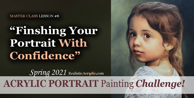
Spring 2021 Acrylic Portrait Painting Challenge: Finishing Your Portrait With Confidence
Let’s help you finish your painting!
In this lesson, we will be wrapping up the Masterclass series for the challenge! I’ll show you how to add some more nuances and details to the portrait of “Cora.” First, we’ll add a glaze to her hair to enrich the overall color. Next, we will enhance some nuances on her eyebrows, dial in the color of the eyes, and paint in the reflections. Finally, we’ll add in the skin tone for her arm in the lower corner and follow up with some work on her lace.
But even though we are nearly done with this portrait painting, it’s not too late to join in the fun!
YOU, too, can paint a portrait!
Take the Acrylic Portrait Painting Challenge (it’s FREE!) and paint along with us!
REGISTER TODAY. The challenge is ongoing, something you can do at your own pace. It’s not too late to enter! After you join, I’ll send you the supplies list and reference photos to paint from.
WATCH NOW…
Lesson #8: Finishing Your Portrait Confidently
Professional artist and instructor Matt Philleo will teach you how to paint an acrylic portrait you can be proud of with this Portrait Painting Challenge!
Would like to paint this portrait with me and hundreds of other artists?
Take the 2021 Spring Portrait Painting Challenge!
You can register below and get started. It is completely FREE to join the challenge and participate. When you join, I’ll send you the “Welcome Kit” which includes:
- The Supplies List (so you know what you need to paint with us, your shopping list. 🙂 )
- The Reference Photo with and without the grid, high resolution, that you can download ready to print out or display on your tablet. You’ll be able to create an accurate portrait this way.
- The Palette Layout Guide showing you how to arrange your colors so they don’t get muddy on your palette
- The Master Class Lesson Schedule
- the Lessons emailed to you
- A private Facebook group to cheer you and help answer your questions
- And a few “bonuses” like opportunities to win my paid online classes
REGISTER TODAY. The challenge is ongoing, something you can do at your own pace. It’s not too late to enter!
Let me know if you have any questions and I look forward to teaching you more!
—Matt
Questions? Suggestions? Thoughts? Let me know, below in the comments. Please share your sketches in our Facebook group and share this post with your friends!

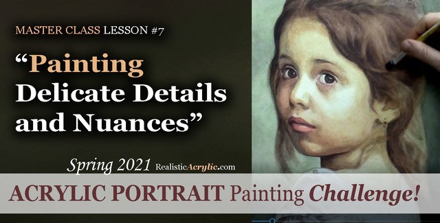
Spring 2021 Acrylic Portrait Painting Challenge: Painting Delicate Details and Nuances
After building the foundation with several layers of value, form, and color, we can then start to “dial in” the detail and nuances.
In this master class lesson (7 of 8), I’ll demonstrate how to add specific detail shapes to “Cora’s” hair. I’ll also add some additional shading to her forehead with a very translucent glaze. Next, I darken the left side of her face while smoothing out some of the rough application of previous glazes with a semi-opaque layer that’s cooler in tone. Finally, I add nuances to her eyes, lips and chin.
But even though we are well along in this portrait painting, it’s not too late to join in the fun!
YOU, too, can paint a portrait!
Take the Acrylic Portrait Painting Challenge (it’s FREE!) and paint along with us!
REGISTER TODAY. The challenge is ongoing, something you can do at your own pace. It’s not too late to enter! After you join, I’ll send you the supplies list and reference photos to paint from.
WATCH NOW…
Lesson #7: Painting Delicate Details and Nuances
Learn how to do smooth shading, skin tones, details, and nuances in this FREE online portrait painting class by Matt Philleo at Realistic Acrylic Portrait School
Would like to paint this portrait with me and hundreds of other artists?
Take the 2021 Spring Portrait Painting Challenge!
You can register below and get started. It is completely FREE to join the challenge and participate. When you join, I’ll send you the “Welcome Kit” which includes:
- The Supplies List (so you know what you need to paint with us, your shopping list. 🙂 )
- The Reference Photo with and without the grid, high resolution, that you can download ready to print out or display on your tablet. You’ll be able to create an accurate portrait this way.
- The Palette Layout Guide showing you how to arrange your colors so they don’t get muddy on your palette
- The Master Class Lesson Schedule
- the Lessons emailed to you
- A private Facebook group to cheer you and help answer your questions
- And a few “bonuses” like opportunities to win my paid online classes
REGISTER TODAY. The challenge is ongoing, something you can do at your own pace. It’s not too late to enter!
Let me know if you have any questions and I look forward to teaching you more!
—Matt
Questions? Suggestions? Thoughts? Let me know, below in the comments. Please share your sketches in our Facebook group and share this post with your friends!
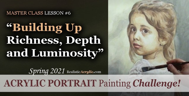
Spring 2021 Acrylic Portrait Painting Challenge: Building Up Richness, Depth and Luminosity
Acrylic is a fantastic medium for portrait painting, but it can be so challenging to use! That is why I am teaching you the glazing technique to open a lot of possibilities and ease your frustration.
Historically, the Old Masters used small amounts of pigment dispersed in larger amounts of linseed oil or mineral spirits to create a sense of volume and depth in their paintings. Light shines through and you can see a bit of each layer beneath the ones on top.
We can use that technique to our advantage with acrylic. By applying several translucent layers, there is an increased sense of depth, shading, contrast and color saturation and luminosity.
In this particular lesson, I’ll demonstrate how to add richness to the mid-tones of the girl’s face and hair. We will also add more contrast to the image with a couple of layers to the background, and turn the form of her figure with a precisely placed glaze on her clothing.
But even though we are well along in this portrait painting, it’s not too late to join in the fun!
Take the Acrylic Portrait Painting Challenge (it’s FREE!) and paint along with us!
REGISTER TODAY. The challenge is ongoing, something you can do at your own pace. It’s not too late to enter! After you join, I’ll send you the supplies list and reference photos to paint from.
WATCH NOW…
Lesson #6: Building Up Richness, Depth, and Luminosity
Learn how to create a vibrant acrylic portrait where the colors are not flat or muddy. In this FREE step by step master class, I’ll show you how!
Would like to paint this portrait with me and hundreds of other artists?
Take the 2021 Spring Portrait Painting Challenge!
You can register below and get started. It is completely FREE to join the challenge and participate. When you join, I’ll send you the “Welcome Kit” which includes:
- The Supplies List (so you know what you need to paint with us, your shopping list. 🙂 )
- The Reference Photo with and without the grid, high resolution, that you can download ready to print out or display on your tablet. You’ll be able to create an accurate portrait this way.
- The Palette Layout Guide showing you how to arrange your colors so they don’t get muddy on your palette
- The Master Class Lesson Schedule
- the Lessons emailed to you
- A private Facebook group to cheer you and help answer your questions
- And a few “bonuses” like opportunities to win my paid online classes
REGISTER TODAY. The challenge is ongoing, something you can do at your own pace. It’s not too late to enter!
Let me know if you have any questions and I look forward to teaching you more!
—Matt
Questions? Suggestions? Thoughts? Let me know, below in the comments. Please share your sketches in our Facebook group and share this post with your friends!

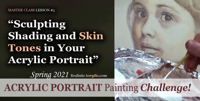
Spring 2021 Acrylic Portrait Painting Challenge: Sculpting Shading and Skin Tones in Your Acrylic Portrait
Acrylic portrait painting, in many ways, is like creating a sculpture. We want to truly make our faces look realistic and three-dimensional. In this master class video lesson, I show you how to do exactly that.
We’re breaking a fine art portrait painting down into bite-size steps that YOU can do.
Specifically, in this video lesson, I demonstrate how darkening your background can really make the face stand out in a lifelike way.
What colors should we use for the shadows? I’ll show you how to mix them, what brushes to use to apply them, and HOW to do it. Get the shadows right, and 80% of the battle is won, so to speak in your portrait.
What colors for the skin tones?
In this video, you’ll learn the correct color to mix, how to create glazes with matte medium and apply it to the face smoothly.
This is still very much the beginning. More lessons to come.
Take the Acrylic Portrait Painting Challenge (it’s FREE!) and paint along with us!
REGISTER TODAY. The challenge is ongoing, something you can do at your own pace. It’s not too late to enter! After you join, I’ll send you the supplies list and reference photos to paint from.
WATCH NOW…
Lesson #5: Sculpting Shading and Skin Tones in Your Acrylic Portrait
Acrylic Portrait Painting Challenge Lesson #5: Sculpting Shading and Skin Tones in Your Acrylic Portrait
Would like to paint this portrait with me and hundreds of other artists?
Take the 2021 Spring Portrait Painting Challenge!
You can register below and get started. It is completely FREE to join the challenge and participate. When you join, I’ll send you the “Welcome Kit” which includes:
- The Supplies List (so you know what you need to paint with us, your shopping list. 🙂 )
- The Reference Photo with and without the grid, high resolution, that you can download ready to print out or display on your tablet. You’ll be able to create an accurate portrait this way.
- The Palette Layout Guide showing you how to arrange your colors so they don’t get muddy on your palette
- The Master Class Lesson Schedule
- the Lessons emailed to you
- A private Facebook group to cheer you and help answer your questions
- And a few “bonuses” like opportunities to win my paid online classes
REGISTER TODAY. The challenge is ongoing, something you can do at your own pace. It’s not too late to enter!
What’s coming up in the next lesson? More shading, more skin tones, and the start of some detail work. Follow the lessons and you will be able to create a portrait you can be proud of…even if you’re a complete beginner!
Let me know if you have any questions and I look forward to teaching you more!
—Matt
Questions? Suggestions? Thoughts? Let me know, below in the comments. Please share your sketches in our Facebook group and share this post with your friends!