Category Archives for Video Tutorial

How to Paint Realistic Skin Tone Glazing Technique
Learn the art of skin tones with acrylic glazing
Introduction
Painting realistic skin tones can be one of the most challenging aspects of portrait painting. The key to achieving lifelike skin tones lies in mastering the glazing technique. In this guide, we’ll also dive into the nuances of using glazes to build depth and realism in your portraits. And I’ll show you how to paint realistic skin tone using glazing technique.
1. Understanding the Glazing Technique
Glazing involves applying thin, transparent layers of paint over a dry layer to create depth and richness in color. This technique allows for subtle transitions and blending that are essential for realistic skin tones.
How to implement:
- Materials Needed: Burnt Sienna, Raw Umber, Titanium White, Pyrrole Orange, Indian Yellow, Alizarine Crimson, Naphthol Red, Matte Medium.
- Mixing Glazes: Combine a small amount of paint with a glazing medium to achieve a translucent consistency. Test the opacity on a white card to ensure it is sufficiently transparent.
2. Starting with a Base Layer
Begin by applying a base layer of mid-tone skin color. This layer should be opaque enough to cover the canvas but still allow for further layers to build upon it.
How to implement:
- Mix titanium white with burnt sienna and raw sienna to create a mid-tone base.
- Apply the base layer smoothly across the face, ensuring even coverage.
3. Adding Shadows and Depth
Once the base layer is dry, start adding shadows to create depth and form. Use darker glazes to build these areas gradually.
How to implement:
- Mix burnt sienna and raw umber with glazing medium to create a darker glaze.
- Apply this glaze to areas such as the sides of the nose, under the chin, and around the eyes. Use a small, round brush for precision.
- Gradually build up the darkness by applying multiple thin layers, allowing each to dry before adding the next.
4. Developing Midtones and Highlights
Next, add midtones and highlights to enhance the skin’s natural variations. This step helps in achieving a balanced, realistic skin tone.
How to implement:
- Mix a lighter glaze using titanium white, raw sienna, and burnt sienna.
- Apply this mixture to areas that catch more light, such as the forehead, cheeks, and bridge of the nose.
- Blend the edges of the highlights into the surrounding areas to create a smooth transition.
5. Smoothing and Blending
Blending is crucial for a realistic finish. Use a variety of brush strokes to ensure a seamless integration of colors.
How to implement:
- Use diagonal, horizontal, and vertical strokes to blend the glazes.
- Maintain a wet edge by working on small sections at a time, ensuring the paint doesn’t dry before you blend it.
- Adjust the pressure of your brush strokes to create smoother transitions.
6. Enhancing Nuances
To capture the subtle nuances of skin tones, add layers of glazing with different hues. This step brings vibrancy and realism to your portrait.
How to implement:
- Mix small amounts of Pyro Orange and Indian Yellow into your glazes for warmth.
- Apply these glazes to areas like the cheeks and around the nose where skin tends to have more warmth.
- Balance these warmer tones with cooler glazes (e.g., adding more Raw Umber) to areas like the shadows on the neck and under the eyes.
7. Final Adjustments
Make final adjustments to perfect the skin tone. This involves tweaking the colors, smoothing out any harsh lines, and ensuring an overall cohesive appearance.
How to implement:
- Assess your painting from a distance to see how the skin tones look overall.
- Use lighter or darker glazes as needed to correct any imbalances.
- Smooth out any areas that appear too harsh or uneven by blending with a clean, damp brush.
Lastly, learning the glazing technique for painting realistic skin tones takes practice and patience. By following these steps and continuously refining your approach, you can of course create portraits with lifelike depth and richness.
Of course always remember to experiment with different colors and glazes to find what works best for your style and subject. With time, you’ll develop an intuitive understanding of how to bring your portraits to life with beautifully realistic skin tones.
Read more about my additional resources, tutorials, to learn more and check out my free courses. Whether you’re a beginner or an experienced artist, there’s always something new to learn and apply to your paintings. Happy painting!
- Sketching Your Painting Accurately
- Beginning a Pet Portrait in Acrylic
- The Mystery of Realism in Painting
- Apply A Burnt Sienna Glaze to a Portrait
- Learn How to Sketch a Portrait Freehand in 45 Minutes
- Adding highlights to your acrylic painting
- 5 Excellent Reasons to Use Aluminum Foil
- Paint Realistic Wrinkles in Acrylic
- Painting Clothing in an Acrylic Portrait
- Paint a Cloudy Sky Acrylic
- How to add Semi-Opaque Highlights
- How to Enhance the Contrast in Your Acrylic
- How to Add Glaze to Your Acrylic Painting
- Paint Realistic Reflections on Eyeglasses in an Acrylic Portrait
- Build Up Depth on Your Acrylic Portrait Backgrounds
- How Do You Do Layers With the Glazing Technique?
- Learn How to Paint Wrinkles in Acrylic
Read more about how to paint a portrait that you can surely be proud of!
I’d love to hear your thoughts on this video. Please share it with your friends and family. Let me know if you have any further questions. I’ll greatly help you.
If you’d like to learn more, sign up for my free email tips and video class today.
Learn How to Paint Acrylic Portraits With My Free Mini-Video Course!
Thank you so much for taking the time to read this tutorial and watch the video. That means a lot to me. I hope you find it very helpful in your portrait painting.
Yours for Better Portraits,

P.S. Did you find this post helpful or encouraging? If so, send it in ahead! Let others know with the share buttons below. I’d love to hear your comments. Thank you so much! Also, do you have a question on acrylic portrait painting you’d like answered? Let me know, and I’d be happy to help!

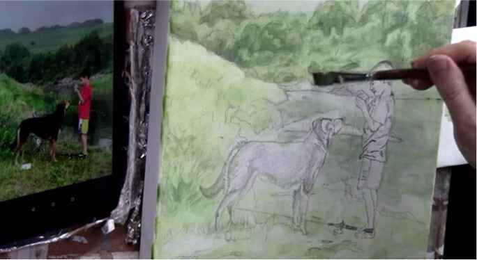
How to Paint Nuances on Dog Fur and Muzzle
Painting dog fur and muzzles
Introduction
Creating realistic fur and muzzle details in dog portraits can transform your painting from good to stunning. This guide will walk you how to paint nuances on the dog fur and muzzle. Through the process of adding the final touches to a dog’s fur and muzzle, ensuring lifelike texture and depth. Whether you’re an experienced artist or just starting, these techniques will help you achieve a convincing portrayal of man’s best friend.
1. Defining the Fur’s Edge
To start, we’ll focus on defining the edge of the dog’s fur, particularly around the forehead area. This involves painting the background over the fur to create a more refined edge.
- Materials Needed: Raw umber dark, ultramarine blue, titanium white, matte medium.
- Mixing the Background Color: Combine raw umber dark, ultramarine blue, and titanium white with a bit of matte medium to thin it out.
- Applying the Background: Use this mixture to paint the background over the edge of the dog’s fur, creating a defined but slightly translucent edge where some fur strands poke through.
- Applying the Background: Use this mixture to paint the background over the edge of the dog’s fur, creating a defined but slightly translucent edge where some fur strands poke through.
2. Adding Wispy Fur Details
Next, add the fine, wispy hairs that give the fur its realistic look. This step involves careful brushwork to mimic the natural flow of fur.
- Color Mixture: Mix raw sienna, titanium white, indian yellow, and Pyrrole red orange.
- Applying Wispy Hairs: Use a fine brush to add small, wispy hairs around the edges of the fur, focusing on areas like the forehead and muzzle. Vary the pressure and direction of your brush strokes to create a natural look.
3. Detailing the Muzzle
The muzzle requires a mix of lighter and darker tones to capture its three-dimensionality and texture.
- Base Colors: Use a mix of raw sienna, titanium white, indian yellow, and burnt sienna.
- Shading the Muzzle: Gradually build up the darker areas on the muzzle using a mix of raw umber dark and burnt sienna. Focus on creating smooth gradations and blending the edges for a soft transition.
- Enhancing Highlights: Add highlights by mixing titanium white with a small amount of the base color mixture. Apply these highlights to the top of the muzzle and other raised areas.
4. Creating Depth in the Fur
To give the fur depth and realism, layer different shades and colors, building up from darker to lighter tones.
- Base Layer: Start with a darker base layer using raw umber dark and burnt sienna.
- Layering Fur: Apply successive layers of lighter colors, gradually transitioning from darker to lighter shades. Use a fine brush and light strokes to mimic the texture of fur.
- Blending: Blend the layers smoothly to avoid harsh lines, ensuring a natural look.
5. Refining the Details
Focus on the small details that bring the portrait to life. This includes the tiny hairs around the muzzle, the shadows under the nose, and the highlights on the nostrils.
- Small Hairs: Use a fine-tipped brush to add tiny hairs around the muzzle. Mix titanium white with a touch of the base color for these fine details.
- Shadow Under the Nose: Use a mix of ultramarine blue and raw umber dark to create a soft shadow under the nose. Blend it carefully to maintain a smooth transition.
- Highlighting the Nostrils: Add a thin line of highlight under the nostrils using titanium white mixed with a small amount of the base color. This highlights the natural wetness and texture of the nose.
6. Final Touches and Adjustments
Before finishing, make any necessary adjustments to ensure the fur and muzzle look cohesive and realistic.
- Review Your Work: Step back and review your painting from a distance. Look for areas that may need additional blending or highlights.
- Adjust Colors: If any areas appear too muddy or grey, adjust the colors by adding warmer or cooler tones as needed.
- Blend Edges: Ensure all edges are smoothly blended, particularly where different fur colors meet.
Lastly, painting the nuances of dog fur and muzzle with acrylics requires patience and attention to detail. By following these steps and practicing regularly, you can achieve a realistic and convincing portrait of your furry subject. Remember, the key lies in the subtle variations and the layering of colors to create depth and texture. Happy painting!
- Sketching Your Painting Accurately
- Beginning a Pet Portrait in Acrylic
- The Mystery of Realism in Painting
- Apply A Burnt Sienna Glaze to a Portrait
- Learn How to Sketch a Portrait Freehand in 45 Minutes
- Adding highlights to your acrylic painting
- 5 Excellent Reasons to Use Aluminum Foil
- Paint Realistic Wrinkles in Acrylic
- Painting Clothing in an Acrylic Portrait
- Paint a Cloudy Sky Acrylic
- How to add Semi-Opaque Highlights
- How to Enhance the Contrast in Your Acrylic
- How to Add Glaze to Your Acrylic Painting
- Paint Realistic Reflections on Eyeglasses in an Acrylic Portrait
- Build Up Depth on Your Acrylic Portrait Backgrounds
- How Do You Do Layers With the Glazing Technique?
- Learn How to Paint Wrinkles in Acrylic
Read more about how to paint a portrait that you can surely be proud of!
I’d love to hear your thoughts on this video. Please share it with your friends and family. Let me know if you have any further questions. I’ll greatly help you.
If you’d like to learn more, sign up for my free email tips and video class today.
Learn How to Paint Acrylic Portraits With My Free Mini-Video Course!
Thank you so much for taking the time to read this tutorial and watch the video. That means a lot to me. I hope you find it very helpful in your portrait painting.
Yours for Better Portraits,
P.S. Did you find this post helpful or encouraging? If so, send it in ahead! Let others know with the share buttons below. I’d love to hear your comments. Thank you so much! Also, do you have a question on acrylic portrait painting you’d like answered? Let me know, and I’d be happy to help!

How to paint a couple with flowers? Glazing Technique
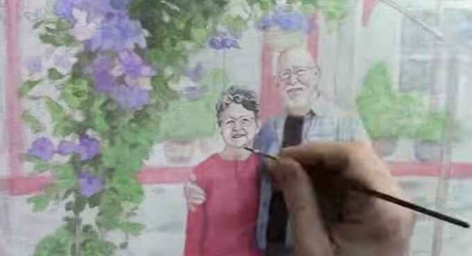
Learn acrylic glazing and paint a stunning couple with floral accents
The glazing technique in acrylic painting offers a fantastic way to achieve depth, richness, and subtle transitions in color. In this step-by-step guide, we’ll explore how to paint a couple with flowers using this glazing technique, allowing the details of your sketch to shine through while building up layers of translucent color.
This technique, reminiscent of the Old Masters, is perfect for artists aiming to create lifelike and detailed portraits. Let’s dive into the process and discover how you can elevate your portrait painting skills.
Tips and Techniques
-
Start with a Detailed Sketch: Begin your painting with a highly detailed sketch of the couple and the surrounding flowers. This will serve as the foundation for your glazing layers, ensuring that the fine details remain intact throughout the process.
-
Mixing Your Glazes: For the glazing technique, mix a small amount of acrylic paint with a large amount of matte medium. This will create a translucent layer that allows the underlying sketch to remain visible while gradually building up color and depth.
-
Layering for Depth: Focus on applying multiple thin layers of glaze rather than trying to achieve full coverage in one go. Each layer should add a subtle shift in color, helping to create depth and realism, especially in the shadows and highlights.
-
Color Harmony: Pay attention to the overall color harmony in your painting. You can intensify certain colors by omitting hues that don’t match and enhancing those that do. For example, when painting flowers, use colors that complement the couple’s clothing and the background.
-
Preserve the Highlights: As you work on the shadows and mid-tones, be careful to preserve the highlights. These areas should remain lighter, creating contrast and bringing the portrait to life.
-
Work in Sections: To keep the process fluid and avoid waiting for paint to dry, rotate between different areas of the painting. This way, you can continuously build up the layers without interruption.
-
Final Touches: As you near the completion of the painting, increase the opacity of your glazes slightly. This will allow you to add finer details and enhance the highlights, bringing the portrait to a finished state.
Step-by-Step Process
-
Sketching the Portrait: Begin by sketching the couple and the flowers with as much detail as possible. The more precise your sketch, the easier it will be to apply the glazes while maintaining the integrity of the details.
-
Applying the First Glazes: Start with the facial features and hair, focusing on the darkest areas of contrast. Use a mix of raw umber, ultramarine blue, and alizarine crimson to establish the shadows. Keep the glaze thin and translucent.
-
Building Up the Shadows: Move on to the shadows within the clothing and foliage. For the foliage, mix ultramarine blue, phthalo blue, raw umber, and raw sienna to achieve the desired depth. Continue layering to develop contrast while keeping the mid-tones and highlights intact.
-
Enhancing the Background: As you work on the background, consider the overall color harmony. Introduce reds and darker values that complement the couple’s clothing. This will help to unify the painting and create a cohesive look.
-
Detailing the Flowers: Use hot pink, dioxazine purple, ultramarine blue, and phthalo blue to paint the flowers. Ensure that the colors harmonize with the rest of the portrait, particularly with the clothing and background.
-
Adding Final Details: As you approach the end of the painting, increase the paint-to-medium ratio for more opacity. Focus on refining the shadows, highlights, and fine details, such as the couple’s facial features and the intricate patterns on their clothing.
-
Final Touches: Use a small round brush to add the final highlights and nuances, particularly in the couple’s faces and the flowers. These last layers will bring the portrait to life, adding depth and realism to the overall composition.
This glazing technique is a powerful tool for artists looking to create detailed and vibrant portraits. By carefully layering translucent colors, you can achieve a level of depth and realism that is both striking and unique. Whether you’re painting a commissioned portrait or working on a personal project, this method will help you elevate your acrylic painting skills to new heights. Happy painting!
- Sketching Your Painting Accurately
- Beginning a Pet Portrait in Acrylic
- The Mystery of Realism in Painting
- Apply A Burnt Sienna Glaze to a Portrait
- Learn How to Sketch a Portrait Freehand in 45 Minutes
- Adding highlights to your acrylic painting
- 5 Excellent Reasons to Use Aluminum Foil
- Paint Realistic Wrinkles in Acrylic
- Painting Clothing in an Acrylic Portrait
- Paint a Cloudy Sky Acrylic
- How to add Semi-Opaque Highlights
- How to Enhance the Contrast in Your Acrylic
- How to Add Glaze to Your Acrylic Painting
- Paint Realistic Reflections on Eyeglasses in an Acrylic Portrait
- Build Up Depth on Your Acrylic Portrait Backgrounds
- How Do You Do Layers With the Glazing Technique?
- Learn How to Paint Wrinkles in Acrylic
Read more about how to paint a portrait that you can surely be proud of!
I’d love to hear your thoughts on this video. Please share it with your friends and family. Let me know if you have any further questions. I’ll greatly help you.
If you’d like to learn more, sign up for my free email tips and video class today.
Learn How to Paint Acrylic Portraits With My Free Mini-Video Course!
Thank you so much for taking the time to read this tutorial and watch the video. That means a lot to me. I hope you find it very helpful in your portrait painting.
Yours for Better Portraits,
P.S. Did you find this post helpful or encouraging? If so, send it in ahead! Let others know with the share buttons below. I’d love to hear your comments. Thank you so much! Also, do you have a question on acrylic portrait painting you’d like answered? Let me know, and I’d be happy to help!

Unlock Your Potential: The Truth Behind Portrait Painting Myths
Transform your portrait painting with these myth-busting insights
Portrait painting is an art form admired by many but often shrouded in misconceptions that can discourage aspiring artists. These myths can create unnecessary barriers, leading you to believe that portrait painting is an unattainable skill reserved for the gifted few. In this article, we’ll debunk three of the most common myths about portrait painting, empowering you to embrace your artistic journey with confidence and clarity.
Myth 1: “You need special talent to paint portraits”
One of the most pervasive myths is the belief that portrait painting requires a special, innate talent that only a select few possess. This notion can be incredibly discouraging, especially for beginners who may feel that they lack the “gift” needed to succeed.
The Truth: desire over talent
The reality is that desire and persistence are far more important than any inherent talent. While some may have a natural inclination toward art, anyone with the passion and commitment to learn can master portrait painting. Think of it like basketball—while players like Michael Jordan may have had a natural predisposition, others, like Spud Webb, defied the odds through sheer determination.
Tips and techniques:
- Cultivate Your Passion: Your desire to create art will drive you to practice and improve continuously.
- Seek Out a Mentor: Just as Luke Skywalker found guidance from Obi-Wan Kenobi, your desire will lead you to the right teacher. Look for instructors who resonate with your artistic goals.
- Practice Regularly: Talent develops through practice. The more you paint, the more skilled you’ll become.
Myth 2: “You must attend art school to be a portrait painter”
Another common myth is that formal education is necessary to become a skilled portrait painter. Many believe that years of art school are required to develop the techniques and knowledge needed to create realistic portraits.
The Truth: Focused learning trumps formal education
While art school can provide valuable training, it is by no means a requirement. In today’s digital age, you can access high-quality instruction from the comfort of your home. Many successful artists, including myself, have learned more from focused, short-term courses than from years of traditional education.
Tips and techniques:
- Find Targeted Instruction: Look for courses that focus specifically on portrait painting techniques, such as acrylic glazing, rather than broad art programs.
- Learn by Doing: Start with one portrait and focus on mastering it before moving on to more complex projects.
- Rinse and Repeat: Use the techniques you learn to create multiple portraits, gradually refining your skills with each attempt.
Myth 3: “Inspiration is necessary to start painting”
The final myth we’ll debunk is the idea that inspiration is a prerequisite for painting. Many artists believe they must wait for a burst of creativity before they can begin a new project.
The Truth: Consistency breeds creativity
Waiting for inspiration can lead to procrastination and missed opportunities. The most successful artists understand that creativity is often the result of consistent effort. By making painting a regular part of your routine, you’ll find that inspiration comes more easily.
Tips and techniques:
- Establish a Routine: Set aside time each day or week to work on your art, even if it’s just for a few minutes.
- Embrace the Process: Understand that not every session will be groundbreaking. The act of painting regularly will eventually lead to creative breakthroughs.
- Replenish Your Inspiration: While consistency is key, it’s also important to nourish your creativity. Spend time in nature, visit art galleries, or engage in activities that inspire you.
By debunking these myths, we hope to remove the barriers that may have been holding you back from pursuing portrait painting. Remember, talent is nurtured through desire, formal education can be replaced with focused learning, and inspiration is often the result of consistent practice. With these truths in mind, you’re well on your way to unlocking your full potential as a portrait artist.
As you continue your artistic journey, keep these insights close. Portrait painting is not reserved for the elite; it’s a skill that can be learned and mastered by anyone willing to put in the time and effort. So pick up your brush, challenge these myths, and start creating portraits you can be proud of!
Read more about my additional resources, tutorials, to learn more and check my free courses. Happy painting!
- Sketching Your Painting Accurately
- Beginning a Pet Portrait in Acrylic
- The Mystery of Realism in Painting
- Apply A Burnt Sienna Glaze to a Portrait
- Learn How to Sketch a Portrait Freehand in 45 Minutes
- Adding highlights to your acrylic painting
- 5 Excellent Reasons to Use Aluminum Foil
- Paint Realistic Wrinkles in Acrylic
- Painting Clothing in an Acrylic Portrait
- Paint a Cloudy Sky Acrylic
- How to add Semi-Opaque Highlights
- How to Enhance the Contrast in Your Acrylic
- How to Add Glaze to Your Acrylic Painting
- Paint Realistic Reflections on Eyeglasses in an Acrylic Portrait
- Build Up Depth on Your Acrylic Portrait Backgrounds
- How Do You Do Layers With the Glazing Technique?
- Learn How to Paint Wrinkles in Acrylic
Read more about how to paint a portrait that you can surely be proud of!
I’d love to hear your thoughts on this video. Please share it with your friends and family. Let me know if you have any further questions. I’ll greatly help you.
If you’d like to learn more, sign up for my free email tips and video class today.
Learn How to Paint Acrylic Portraits With My Free Mini-Video Course!
Thank you so much for taking the time to read this tutorial and watch the video. That means a lot to me. I hope you find it very helpful in your portrait painting.
Yours for Better Portraits,
P.S. Did you find this post helpful or encouraging? If so, send it in ahead! Let others know with the share buttons below. I’d love to hear your comments. Thank you so much! Also, do you have a question on acrylic portrait painting you’d like answered? Let me know, and I’d be happy to help!

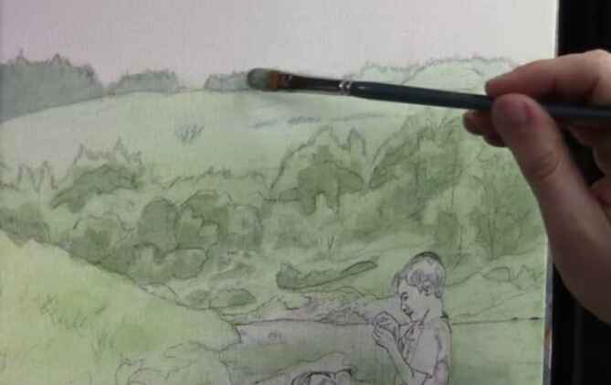
How to Paint Landscapes with Acrylic Glazing in 3 Easy Parts
Learn how to create luminous, layered landscapes with depth and vibrancy
Introduction
Unlock the secrets to how to paint landscapes with acrylic glazing in 3 easy parts. If you’ve ever admired the vibrant, ethereal quality of painted landscapes and wondered how to achieve similar effects, this guide is for you. Acrylic glazing is a technique that involves layering transparent colors to build depth and luminosity, offering an unparalleled way to bring your landscapes to life.
In this blog post, we’ll demystify the acrylic glazing process by breaking it down into three easy-to-follow parts. Whether you’re an experienced artist or just starting, you’ll find clear, actionable steps to enhance your landscape paintings. We’ll cover everything from preparing your canvas to applying and blending layers, providing you with the tools to create landscapes that are not only visually stunning but also rich in detail and emotion. Dive in and discover how you can elevate your landscape paintings with the transformative power of acrylic glazing.
Part 1: Preparing Your Canvas and Initial Layers
1.1 Choosing the Right Materials
Before diving into acrylic glazing, it’s crucial to gather the right materials. You’ll need:
- A primed canvas or acrylic paper
- High-quality acrylic paints
- Glazing medium
- Brushes (various sizes)
- Palette knife
- Spray bottle for water
The glazing medium is essential as it allows you to create transparent layers of paint without compromising the intensity of the colors.
1.2 Creating the Underpainting
The underpainting is the foundation of your landscape. Start by blocking in the basic shapes and colors using a more opaque application of paint. This stage is about setting the mood and composition of your piece. Don’t worry about details yet; focus on the general placement of elements like the sky, mountains, trees, and water.
Tip: Use cooler tones for distant objects to create a sense of depth and warmer tones for objects in the foreground.
1.3 Letting the Underpainting Dry
Once your underpainting is complete, allow it to dry completely. This is crucial before moving on to the glazing process, as any wet paint can muddy the glazes and ruin the transparency of the layers.
Part 2: Building Depth with Glazes
2.1 Mixing Your Glazes
To mix a glaze, combine a small amount of acrylic paint with a generous amount of glazing medium. The goal is to create a translucent wash of color. You can adjust the ratio depending on the desired transparency.
Tip: Start with lighter glazes and gradually build up to darker tones. This layering technique will give your landscape a sense of depth and dimension.
2.2 Applying the First Glaze
Begin by applying a light glaze over the sky or background elements. Use a soft brush to apply the glaze in thin, even layers. Work quickly and smoothly, as acrylics dry fast. If the glaze appears too intense, you can soften it by misting it with water and blending it with a clean brush.
Technique: Apply glazes in a crisscross pattern to avoid streaks and create a more natural look.
2.3 Building Up the Layers
Continue applying glazes, allowing each layer to dry before adding the next. This process can be repeated multiple times to achieve the desired level of depth and richness in your landscape. For instance, you might apply several glazes of blue and purple to create a deep, atmospheric sky or multiple layers of green and brown to add richness to a forested area.
Tip: Vary the colors in your glazes to create subtle shifts in tone and temperature, enhancing the realism of your landscape.
Part 3: Refining Details and Final Touches
3.1 Adding Highlights and Shadows
Once the glazing layers are complete, it’s time to refine the details. Use more opaque paint to add highlights to areas that catch the most light, such as the tops of mountains or the edges of trees. For shadows, apply darker glazes or use more saturated paint to enhance the contrast.
Technique: Use a dry brush technique to softly blend the edges of your highlights and shadows, creating a more cohesive and realistic effect.
3.2 Enhancing Texture
To add texture to your landscape, consider using a palette knife to apply thicker layers of paint in certain areas, such as rocky surfaces or tree bark. You can also create texture by spattering paint with an old toothbrush or flicking it with your fingers.
Tip: Keep the texture subtle, so it doesn’t overpower the soft, glazed layers underneath.
3.3 Final Adjustments
Take a step back and assess your painting. Look for areas that need more depth or highlights, and make any final adjustments. You can add a final glaze to unify the colors and create a cohesive look. Ensure that the painting is balanced in terms of composition, color, and contrast.
Technique: Use a soft brush to gently blend any harsh edges or transitions between colors.
Acrylic glazing is an excellent technique for creating stunning, realistic landscapes. By breaking down the process into three easy parts—preparing your canvas and initial layers, building depth with glazes, and refining details—you can achieve professional results that capture the beauty of nature. Practice these techniques, experiment with different colors and glazes, and watch your landscapes come to life with depth and vibrancy.
Ready to take your landscape painting skills to the next level? Try out these glazing techniques in your next project, and share your results with us in the comments below! Read more about my additional resources, tutorials, to learn more and check my free courses guide here.
LEARN MORE
- Sketching Your Painting Accurately
- Beginning a Pet Portrait in Acrylic
- The Mystery of Realism in Painting
- Apply A Burnt Sienna Glaze to a Portrait
- Learn How to Sketch a Portrait Freehand in 45 Minutes
- Adding highlights to your acrylic painting
- 5 Excellent Reasons to Use Aluminum Foil
- Paint Realistic Wrinkles in Acrylic
- Painting Clothing in an Acrylic Portrait
- Paint a Cloudy Sky Acrylic
- How to add Semi-Opaque Highlights
- How to Enhance the Contrast in Your Acrylic
- How to Add Glaze to Your Acrylic Painting
- Paint Realistic Reflections on Eyeglasses in an Acrylic Portrait
- Build Up Depth on Your Acrylic Portrait Backgrounds
- How Do You Do Layers With the Glazing Technique?
- Learn How to Paint Wrinkles in Acrylic
Read more about how to paint a portrait that you can surely be proud of!
I’d love to hear your thoughts on this video. Please share it with your friends and family. Let me know if you have any further questions. I’ll greatly help you.
If you’d like to learn more, sign up for my free email tips and video class today.
Learn How to Paint Acrylic Portraits With My Free Mini-Video Course!
Thank you so much for taking the time to read this tutorial and watch the video. That means a lot to me. I hope you find it very helpful in your portrait painting.
Yours for Better Portraits,
P.S. Did you find this post helpful or encouraging? If so, send it in ahead! Let others know with the share buttons below. I’d love to hear your comments. Thank you so much! Also, do you have a question on acrylic portrait painting you’d like answered? Let me know, and I’d be happy to help!

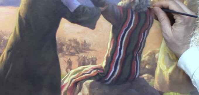
How to Add Final Nuances to Signing Process
How do you finish your acrylic painting?
Introduction
As an artist, the final steps of completing a painting are both exciting and crucial. The finishing touches and the signing process not only conclude your artistic journey but also ensure your work stands out with a professional finish. This guide will walk you through how to add those final nuances to your painting and sign it with precision. Whether you’re an emerging artist or a seasoned professional, these techniques will help you achieve a refined and polished look for your artwork.
Understanding the Significance of Final Nuances
Final nuances are the subtle details that can significantly enhance the overall quality of your painting. These are the adjustments that fine-tune the depth, contrast, and visual impact of your work. By carefully addressing these details, you ensure that every aspect of your painting is harmonious and complete.
This tutorial highlights the process of refining a large-scale painting of the biblical Battle of Rephidim. This step involves evaluating the painting for any areas needing improvement, enhancing shadows and highlights, and smoothing out any inconsistencies.
Step-by-Step Guide to Adding Final Nuances
- Assess Your Painting: Start by stepping back and evaluating your painting from a distance. Look for areas that appear inconsistent or unfinished. This assessment will guide you in making necessary adjustments. In the video, the artist scrutinized the painting for any missed opportunities and areas needing more contrast.
- Enhance Shadows and Highlights: Deepening shadows and brightening highlights can add depth and dimension to your painting. Use a combination of darker and lighter shades to enhance these areas. The artist employed raw umber, burnt sienna, and other colors to improve shadow details and highlight areas.
- Refine Glazes: If your painting has areas with uneven or rough glazes, address them by applying a semi-opaque glaze. Mixing a bit of white with your existing glaze can help smooth out imperfections. This technique ensures a seamless and polished finish.
- Detail Work: Focus on intricate details that require refinement, such as facial expressions or textures in the background. Using a fine script liner brush, as demonstrated in the video, allows for precise and detailed work, enhancing the overall look of the painting.
- Warm Up Transitions: Smooth transitions between dark and light areas can make your painting appear more cohesive. Adding warmer tones to transition points can help achieve a more natural and appealing gradation.
The Signing Process
Signing your painting is a crucial step that signifies the completion of your artwork. Here’s how to ensure your signature is both effective and professional:
- Select the Ideal Color: Choose a color for your signature that contrasts with the background without overpowering the painting. I used a mix of burnt sienna and green to create a neutral color that blends well yet stands out.
- Use the Right Brush: A fine-tipped brush, such as a script liner brush, is essential for a clean and precise signature. This type of brush holds a lot of paint and offers fine control for a professional finish.
- Positioning Your Signature: Place your signature in a location that balances the composition of the painting. The artist chose the left side to avoid disrupting the visual weight of the right side, creating a balanced and harmonious appearance.
- Include the Date: Adding the date to your signature not only marks the completion of your work but also helps in maintaining a record of your artwork. This detail adds to the professional quality of your painting.
- Final Touches: After signing, review your painting one last time to ensure everything is in place. Make any final adjustments to the signature or painting as needed to achieve a flawless finish.
Adding final nuances and signing your painting are integral steps in achieving a professional-quality finish. By carefully refining your artwork and signing it with intention, you ensure that your painting not only reflects your artistic vision but also stands out with a polished and refined look.
For more tips on painting techniques and finishing touches, explore www.realisticacrylic.com. Our tutorials and free guides resources are designed to help you perfect your craft and elevate your artwork to new heights. Happy painting!
- Sketching Your Painting Accurately
- Beginning a Pet Portrait in Acrylic
- The Mystery of Realism in Painting
- Apply A Burnt Sienna Glaze to a Portrait
- Learn How to Sketch a Portrait Freehand in 45 Minutes
- Adding highlights to your acrylic painting
- 5 Excellent Reasons to Use Aluminum Foil
- Paint Realistic Wrinkles in Acrylic
- Painting Clothing in an Acrylic Portrait
- Paint a Cloudy Sky Acrylic
- How to add Semi-Opaque Highlights
- How to Enhance the Contrast in Your Acrylic
- How to Add Glaze to Your Acrylic Painting
- Paint Realistic Reflections on Eyeglasses in an Acrylic Portrait
- Build Up Depth on Your Acrylic Portrait Backgrounds
- How Do You Do Layers With the Glazing Technique?
- Learn How to Paint Wrinkles in Acrylic
Read more about how to paint a portrait that you can surely be proud of!
I’d love to hear your thoughts on this video. Please share it with your friends and family. Let me know if you have any further questions. I’ll greatly help you.
If you’d like to learn more, sign up for my free email tips and video class today.
Learn How to Paint Acrylic Portraits With My Free Mini-Video Course!
Thank you so much for taking the time to read this tutorial and watch the video. That means a lot to me. I hope you find it very helpful in your portrait painting.
Yours for Better Portraits,
P.S. Did you find this post helpful or encouraging? If so, send it in ahead! Let others know with the share buttons below. I’d love to hear your comments. Thank you so much! Also, do you have a question on acrylic portrait painting you’d like answered? Let me know, and I’d be happy to help!

How to Paint Mountains in the Distance with Acrylic
Transform your landscape paintings with these acrylic glazing tips for distant mountains
Painting distant mountains can add a breathtaking sense of depth and realism to your landscape artworks. Using acrylic glazing techniques allows you to achieve this effect with stunning results. In this guide, we’ll explore how to paint mountains in the distance, focusing on essential techniques and tips to enhance your artwork.
Understanding the Basics of Acrylic Glazing
Acrylic glazing involves applying thin, transparent layers of paint over dry layers to modify their color and tone. This technique is particularly effective for creating depth and atmospheric perspective in landscape paintings. To paint distant mountains, you’ll use glazing to create subtle color shifts and soften the edges, mimicking the natural effects of atmospheric conditions.
1. Preparing Your Canvas and Palette
Start by setting up your canvas and preparing your palette with the essential colors. For distant mountains, you’ll need:
- Titanium White: For highlights and mixing with other colors.
- Pyrrole Orange: To warm up certain areas and add vibrancy.
- Indian Yellow: For creating warm undertones.
- Naphthol Red: To introduce a reddish hue where needed.
- Ultramarine Blue: To create cool, distant tones.
- Raw Umber Dark: For deeper shadows and earthy tones.
Mix these colors to achieve a range of cool and warm tones suitable for distant mountains. Remember, cooler tones often recede into the background, while warmer tones advance.
2. Creating the Base Layers
Using a small, round brush, start by applying a base layer of color to your mountains. For distant mountains, use a mix of ultramarine blue and raw umber dark to create a soft, muted base. This will set the foundation for the distant appearance of the mountains.
Apply the paint in broad, sweeping strokes, mimicking the natural contours of mountain ranges. Focus on creating a gradient from darker tones at the base to lighter tones towards the top, simulating distance and elevation.
3. Adding Depth with Glazing
Once your base layer is dry, begin glazing to add depth and nuance. Mix a thin, transparent glaze using titanium white and a touch of pyrrole orange for highlights. Apply this glaze over the base layer to create the appearance of light hitting the mountain peaks.
Tip: Apply glazes in thin layers and build up gradually. This approach allows you to control the intensity and achieve a more natural look.
4. Creating Atmospheric Perspective
Atmospheric perspective is key to making mountains look distant. Use cooler tones, like a mix of ultramarine blue and naphthol red to add a hazy effect. Apply these colors lightly to areas that are farther away, softening the edges and blending them into the background.
Avoid using bright or saturated colors for distant mountains, as this can make them appear closer than they are. Instead, rely on muted, cool colors to maintain the illusion of depth.
5. Adding Highlights and Shadows
To enhance the three-dimensional quality of your mountains, add highlights and shadows. For highlights, use a mix of titanium white and indian yellow. Lightly apply this mixture to the mountain peaks and ridges where the light source is strongest.
For shadows, deepen the areas with raw umber dark mixed with a touch of ultramarine blue. Apply these shadows to areas that are obscured from the light, creating contrast and depth.
Tip: Ensure that your highlights and shadows follow the natural contours of the mountains. This adds realism and prevents your painting from looking flat.
6. Blending and Refining
Once you’ve added highlights and shadows, blend the colors to smooth transitions between different tones. Use a clean, dry brush or a blending brush to gently blend the edges where the colors meet. This technique helps to soften any harsh lines and creates a more seamless look.
Focus on areas where the light and shadow meet, ensuring that the transitions are smooth and natural.
7. Final Touches
Add any final details or touches to enhance the realism of your mountains. Check for any gaps or areas that need additional color adjustments. Use a fine brush to add small details or adjust highlights and shadows as needed.
Tip: Step back from your painting periodically to evaluate the overall effect. This perspective helps you see any areas that might need adjustment or refinement.
Painting mountains in the distance with acrylic glazing techniques can transform your landscape paintings, adding depth and realism. By using cool tones, creating atmospheric perspective, and carefully applying highlights and shadows, you can achieve a stunning portrayal of distant mountain ranges. Practice these techniques, and soon you’ll be able to create landscapes with breathtaking depth and dimension.
For more tips and tutorials on acrylic painting, visit https://realisticacrylic.com/tutorials/ to learn more and check out my free courses. Whether you’re a beginner or an experienced artist, there’s always something new to learn and apply to your paintings. Happy painting!
- Sketching Your Painting Accurately
- Beginning a Pet Portrait in Acrylic
- The Mystery of Realism in Painting
- Apply A Burnt Sienna Glaze to a Portrait
- Learn How to Sketch a Portrait Freehand in 45 Minutes
- Adding highlights to your acrylic painting
- 5 Excellent Reasons to Use Aluminum Foil
- Paint Realistic Wrinkles in Acrylic
- Painting Clothing in an Acrylic Portrait
- Paint a Cloudy Sky Acrylic
- How to add Semi-Opaque Highlights
- How to Enhance the Contrast in Your Acrylic
- How to Add Glaze to Your Acrylic Painting
- Paint Realistic Reflections on Eyeglasses in an Acrylic Portrait
- Build Up Depth on Your Acrylic Portrait Backgrounds
- How Do You Do Layers With the Glazing Technique?
- Learn How to Paint Wrinkles in Acrylic
Read more about how to paint a portrait that you can surely be proud of!
I’d love to hear your thoughts on this video. Please share it with your friends and family. Let me know if you have any further questions. I’ll greatly help you.
If you’d like to learn more, sign up for my free email tips and video class today.
Learn How to Paint Acrylic Portraits With My Free Mini-Video Course!
Thank you so much for taking the time to read this tutorial and watch the video. That means a lot to me. I hope you find it very helpful in your portrait painting.
Yours for Better Portraits,
P.S. Did you find this post helpful or encouraging? If so, send it in ahead! Let others know with the share buttons below. I’d love to hear your comments. Thank you so much! Also, do you have a question on acrylic portrait painting you’d like answered? Let me know, and I’d be happy to help!

How to Paint Golden Dog Fur with Glazes in Acrylic
Learn the art of painting realistic golden fur with layered glazing techniques
Introduction
Painting fur, especially the luxurious golden tones of a dog’s coat, can be both challenging and rewarding. This guide will walk you through the process of how to paint golden dog fur using acrylic glazes to achieve a realistic fur texture. Capturing the softness and depth that make your pet portraits stand out. By layering colors and adding subtle details, you can create a painting that feels lifelike and rich in detail.
Step 1: Preparing Your Painting
Before diving into the glazing process, ensure your painting is at the mid-point of completion. You should have the basic colors, values, and contrasts laid out. For this demonstration, the subject is an 8×10 commission portrait of a dog, with the fur already sketched and the initial layers of paint applied.
Step 2: Choosing Your Colors and Medium
The key to painting realistic fur lies in the selection of colors and the medium. For golden fur, start with a clear glazing medium mixed with raw umber dark—a deep, rich brown that’s essential for adding depth. This color will serve as the base for building up the layers of fur.
Step 3: Applying the First Glaze
Dip your brush into the glazing medium and add a small amount of raw umber. The goal is to create a translucent layer that enhances the existing colors without overwhelming them. Gently brush this glaze over the fur, focusing on areas where you want to deepen the shadows and add warmth. Use your finger to softly blend the edges, ensuring a smooth transition between the glazed areas and the underlying paint.
Step 4: Building Depth with Additional Glazes
Continue adding layers of glaze to build depth in the fur. To enhance the natural tones, mix a touch of alizarine crimson with the raw umber, creating a warm, reddish-brown hue. Apply this mixture to areas like the ears and around the eyes, where the fur naturally darkens. Remember to work in thin layers, gradually building up the color intensity.
Step 5: Adjusting Tones and Highlights
As you layer your glazes, you might find some areas becoming too warm or dark. To balance this, mix in a small amount of white with your glazing medium. White has a cooling effect, which can help to tone down overly warm areas. Apply this cooler glaze to sections of the fur that need to recede or appear lighter. For instance, if the body of the dog appears too dark compared to the reference photo, this cool glaze can help bring it closer to the desired tone.
Step 6: Adding Fine Details
Once you’ve built up the depth and tone, it’s time to add the finer details that make the fur appear realistic. Use a small, pointed brush to carefully darken areas between individual strands of fur, particularly around the dog’s eyes, nose, and forehead. These darker details will give the fur its texture and make the painting pop.
Step 7: Balancing Opacity and Transparency
While glazes add beautiful translucency to your painting, it’s important to balance this with some areas of opacity. Opaque layers, when used sparingly, can enhance the richness and substance of the fur. Mix your paint with less medium to create these opaque layers, and apply them strategically where the fur appears thickest or where you want to emphasize highlights.
Step 8: Final Adjustments and Highlights
As you near the completion of the painting, step back and evaluate the overall composition. Are there areas that need more contrast? Do certain sections of fur need to be lightened or darkened? Make these adjustments with additional glazes or opaque layers as needed. Finally, add the brightest highlights to the fur, using a nearly opaque mix of white and your chosen colors. These highlights should be applied sparingly, focusing on the areas where the light naturally hits the fur.
Tips and Techniques:
- Work in Layers: Building up the fur with multiple thin glazes allows you to achieve a rich, realistic texture.
- Use a Soft Brush: For blending glazes, a soft brush works best to avoid harsh lines.
- Keep Your Palette Fresh: As the medium starts to dry, refresh your palette to maintain the fluidity of the paint.
- Experiment with Color: Don’t be afraid to adjust your glazes with different color mixes to match the fur’s tone.
Painting golden dog fur with acrylic glazes is a technique that requires patience and practice, but the results are well worth the effort. By layering colors and carefully balancing opacity with transparency, you can create a portrait that truly captures the essence of your furry subject. Whether you’re a beginner or an experienced artist, these techniques will help you elevate your pet portraits to new levels of realism.
Read more about my additional resources, tutorials, to learn more and check out my free courses here. Whether you’re a beginner or an experienced artist, there’s always something new to learn and apply to your paintings. Happy painting!
- Sketching Your Painting Accurately
- Beginning a Pet Portrait in Acrylic
- The Mystery of Realism in Painting
- Apply A Burnt Sienna Glaze to a Portrait
- Learn How to Sketch a Portrait Freehand in 45 Minutes
- Adding highlights to your acrylic painting
- 5 Excellent Reasons to Use Aluminum Foil
- Paint Realistic Wrinkles in Acrylic
- Painting Clothing in an Acrylic Portrait
- Paint a Cloudy Sky Acrylic
- How to add Semi-Opaque Highlights
- How to Enhance the Contrast in Your Acrylic
- How to Add Glaze to Your Acrylic Painting
- Paint Realistic Reflections on Eyeglasses in an Acrylic Portrait
- Build Up Depth on Your Acrylic Portrait Backgrounds
- How Do You Do Layers With the Glazing Technique?
- Learn How to Paint Wrinkles in Acrylic
Read more about how to paint a portrait that you can surely be proud of!
I’d love to hear your thoughts on this video. Please share it with your friends and family. Let me know if you have any further questions. I’ll greatly help you.
If you’d like to learn more, sign up for my free email tips and video class today.
Learn How to Paint Acrylic Portraits With My Free Mini-Video Course!
Thank you so much for taking the time to read this tutorial and watch the video. That means a lot to me. I hope you find it very helpful in your portrait painting.
Yours for Better Portraits,
P.S. Did you find this post helpful or encouraging? If so, send it in ahead! Let others know with the share buttons below. I’d love to hear your comments. Thank you so much! Also, do you have a question on acrylic portrait painting you’d like answered? Let me know, and I’d be happy to help!

How to Paint Realistic Trees & Landscapes: Technique
I’ll show you what colors to use (and why), how to mix the paint with matte medium for the glazing technique
Introduction
Creating realistic trees and landscapes in acrylic paintings can be a rewarding yet challenging task. The secret to mastering this lies in the glazing technique, which allows for depth, luminosity, and a natural appearance. In this guide, we’ll walk through a detailed process to help you bring your landscape elements to life. And I’ll show you how I paint realistic trees & landscapes using a technique and a step-by-step process.
Understanding the Glazing Technique
Glazing is a fundamental technique in acrylic painting, where you apply thin layers of translucent paint to build depth and vibrancy. This method is particularly useful when painting backgrounds, like trees in landscapes, as it preserves the underlying sketch while adding color and detail gradually.
Materials Needed:
- Acrylic paints (ultramarine blue, phthalo blue, titanium white, raw sienna, raw umber dark)
- Matte medium
- Brushes (quarter-inch flats, rounds, filberts)
- Palette for mixing colors
Step-by-Step Process:
- Mixing the Glaze: Start by creating your glaze mixture. Combine a small amount of paint with a generous amount of matte medium. The matte medium is a clear acrylic without pigment, allowing for translucent layers that maintain the integrity of your initial sketch.
- Choosing the Right Colors: Begin with subdued colors for the background, as these will give the illusion of distance. For instance, mix ultramarine blue with raw sienna to create a subdued green. To add variety, incorporate phthalo blue and titanium white, adjusting with raw umber dark to neutralize any intensity.
Painting Trees in the Distance
To create realistic trees in the background, focus on cooler, less intense colors. These colors recede visually, making the trees appear further away.
- Block in the Shapes: Use a mix of phthalo blue, ultramarine blue, and a touch of titanium white for the distant trees. Lightly apply this mix to establish the overall shape, not worrying too much about staying within the lines—overlapping can be adjusted later with background colors.
- Adjusting Tones: If your color is too vibrant, add raw umber dark, to tone it down, creating a more natural look. This step is crucial, as it ensures that your distant trees don’t overpower the foreground elements.
- Layering with Glazes: Continue layering glazes to build up the form of the trees. Use a dry-brush technique to add subtle transitions between light and shadow, which will give your trees a more three-dimensional appearance. Remember, the goal is to see the abstraction within realism—simplify complex shapes into manageable forms.
Bringing the Midground to Life
The midground trees and landscape elements should be more defined than those in the background but still less intense than the foreground.
- Creating Midground Colors: For the midground, slightly warm up your color palette by adding more raw sienna to the mix. This will create a gentle contrast between the cooler background trees and the warmer midground.
- Detailing with Brushwork: Use smaller brushes to add details like branches and foliage. Focus on capturing the shapes and shadows without getting too detailed, as this can detract from the overall realism. It’s about striking a balance between simplicity and complexity.
Final Touches: Adding Depth to the Foreground
The foreground is where you can introduce the most detail and contrast, drawing the viewer’s eye.
- Darkening the Shadows: To add depth, mix a darker shade by combining ultramarine blue, phthalo blue, and a bit of raw umber dark. Apply this to the base of the trees and other shadowed areas.
- Highlighting with Glazes: Use warm glazes to highlight areas where light would naturally hit. This will make the trees and landscape pop, giving the impression of sunlight filtering through.
- Maintaining Color Harmony: As you paint, continually ask yourself where else you can apply the current color mix. This promotes harmony across the painting and helps unify the different elements.
The glazing technique is a powerful tool for creating realistic trees and landscapes in acrylic paintings. By layering translucent colors and focusing on the subtle interplay of light and shadow, you can achieve a natural and immersive scene. Remember to be patient and allow the process to unfold gradually. With practice, you’ll find that your ability to capture the beauty of nature in your paintings will significantly improve.
Tips and Techniques Recap:
- Use matte medium to create translucent glazes.
- Start with cooler, subdued colors for distant trees.
- Layer glazes to build depth and form.
- Strike a balance between simplicity and detail.
- Apply color harmony by reusing mixtures across the painting.
By incorporating these techniques, you’ll elevate your landscape paintings, making them more lifelike and captivating.
Read more about my additional resources, tutorials, to learn more and check out my free courses here. Whether you’re a beginner or an experienced artist, there’s always something new to learn and apply to your paintings. Happy painting!
- Sketching Your Painting Accurately
- Beginning a Pet Portrait in Acrylic
- The Mystery of Realism in Painting
- Apply A Burnt Sienna Glaze to a Portrait
- Learn How to Sketch a Portrait Freehand in 45 Minutes
- Adding highlights to your acrylic painting
- 5 Excellent Reasons to Use Aluminum Foil
- Paint Realistic Wrinkles in Acrylic
- Painting Clothing in an Acrylic Portrait
- Paint a Cloudy Sky Acrylic
- How to add Semi-Opaque Highlights
- How to Enhance the Contrast in Your Acrylic
- How to Add Glaze to Your Acrylic Painting
- Paint Realistic Reflections on Eyeglasses in an Acrylic Portrait
- Build Up Depth on Your Acrylic Portrait Backgrounds
- How Do You Do Layers With the Glazing Technique?
- Learn How to Paint Wrinkles in Acrylic
Read more about how to paint a portrait that you can surely be proud of!
I’d love to hear your thoughts on this video. Please share it with your friends and family. Let me know if you have any further questions. I’ll greatly help you.
If you’d like to learn more, sign up for my free email tips and video class today.
Learn How to Paint Acrylic Portraits With My Free Mini-Video Course!
Thank you so much for taking the time to read this tutorial and watch the video. That means a lot to me. I hope you find it very helpful in your portrait painting.
Yours for Better Portraits,
P.S. Did you find this post helpful or encouraging? If so, send it in ahead! Let others know with the share buttons below. I’d love to hear your comments. Thank you so much! Also, do you have a question on acrylic portrait painting you’d like answered? Let me know, and I’d be happy to help!

How to Use Halation to Improve Vibrance and Realism
Learn how to add warmth and depth to your portraits with this simple yet powerful technique
Introduction
When it comes to portrait painting, achieving vibrance and realism can be a challenging task. However, with the right techniques, you can bring your paintings to life with rich colors and dynamic contrast. One such technique is halation, a method that involves adding warmer tones at the edges of light and dark values. This blog post will guide you through the process of using halation to improve the vibrance and realism in your acrylic paintings, inspired by the works of artists like Wayne Thiebaud.
What is Halation?
Halation is a technique where warmer tones are applied at the junctions between light and dark values in a painting. This creates a glowing effect, adding depth and energy to the artwork. The term “halation” is derived from the word “halo,” which refers to the glowing ring often seen around a light source. In painting, this technique can be used to enhance the visual impact of the artwork, especially in scenes with dramatic lighting.
Why Use Halation?
The use of halation can significantly enhance the vibrance and realism of a painting. By adding warm tones, such as reds, oranges, and yellows, at the edges where light meets shadow, the painting gains a dynamic contrast that draws the viewer’s eye. This technique is particularly effective in creating a sense of depth and making the subjects in the painting stand out. Additionally, halation can evoke a warm, glowing atmosphere, which is especially useful in scenes with strong sunlight or other light sources.
The Halation Technique in Action
In the video, I’ll demonstrate the use of halation while working on a 30×40 acrylic portrait of Moses, Aaron, and Hur during the Amalakite battle. The scene is set with extreme lighting, where most subjects are in shadow with strong illumination hitting just the edges. Here’s how halation is applied in this scenario:
- Choosing the Right Colors:
I uses a combination of pyrrole orange and indian yellow to create the warm tones needed for halation. These colors are vibrant and stand out well against the darker background, making them ideal for this technique. - Applying Warm Tones:
Using a round brush, I carefully applies these warm tones at the junctions between light and dark values. For example, around Moses’ face, the edges of the clothing, and even on the rocks and clouds. The goal is to highlight the areas where the light meets the shadow, creating a glowing effect. - Maintaining the Lighting Scenario:
The halation technique is particularly effective in scenes with dramatic lighting, such as the low sunlight depicted in this painting. By adding warm tones in these high-contrast areas, the painting maintains a consistent lighting scenario that enhances the overall realism. - Creating Visual Impact:
As the warmer tones are added, the painting begins to take on a more vibrant and energetic feel. The halation effect draws the viewer’s attention to the key elements of the painting, such as the faces of the subjects and the illuminated edges of their clothing. This not only improves the vibrance but also adds a sense of movement and life to the scene.
Tips and Techniques for Using Halation
- Select the Right Colors:
When choosing colors for halation, opt for warm, vibrant hues like reds, oranges, and yellows. These colors should complement the existing palette of your painting while standing out enough to create the desired contrast. - Use a Fine Brush:
Precision is key when applying halation. Use a fine, round brush to carefully add the warm tones at the edges of light and dark values. This ensures that the halation effect is subtle yet impactful. - Balance the Effect:
While halation can add vibrance, it’s important not to overdo it. Apply the warm tones sparingly, focusing on the areas of highest contrast. This will prevent the painting from becoming too saturated and losing its realism. - Practice on Smaller Areas First:
If you’re new to halation, start by practicing on smaller areas of your painting. Experiment with different colors and brush techniques to see how the effect changes the overall look of the artwork. - Study the Masters:
Artists like Wayne Thiebaud have mastered the halation technique. Study their works to see how they use warm tones to enhance vibrance and realism. This can provide inspiration and guidance as you incorporate halation into your own paintings.
Halation is a powerful technique that can transform your acrylic paintings, adding vibrance and realism by carefully placing warm tones at the edges of light and dark values. Whether you’re working on a dramatic battle scene or a serene portrait, mastering halation will elevate your art to new levels of depth and energy. Start experimenting with this technique today, and watch as your paintings come to life with color and light.
For more tips and tutorials on acrylic painting, be sure to check out my website at www.realisticacrylic.com, and my free course. Where you can find a wealth of resources to help you improve your skills and create stunning artwork. Happy painting!
- Sketching Your Painting Accurately
- Beginning a Pet Portrait in Acrylic
- The Mystery of Realism in Painting
- Apply A Burnt Sienna Glaze to a Portrait
- Learn How to Sketch a Portrait Freehand in 45 Minutes
- Adding highlights to your acrylic painting
- 5 Excellent Reasons to Use Aluminum Foil
- Paint Realistic Wrinkles in Acrylic
- Painting Clothing in an Acrylic Portrait
- Paint a Cloudy Sky Acrylic
- How to add Semi-Opaque Highlights
- How to Enhance the Contrast in Your Acrylic
- How to Add Glaze to Your Acrylic Painting
- Paint Realistic Reflections on Eyeglasses in an Acrylic Portrait
- Build Up Depth on Your Acrylic Portrait Backgrounds
- How Do You Do Layers With the Glazing Technique?
- Learn How to Paint Wrinkles in Acrylic
Read more about how to paint a portrait that you can surely be proud of!
I’d love to hear your thoughts on this video. Please share it with your friends and family. Let me know if you have any further questions. I’ll greatly help you.
If you’d like to learn more, sign up for my free email tips and video class today.
Learn How to Paint Acrylic Portraits With My Free Mini-Video Course!
Thank you so much for taking the time to read this tutorial and watch the video. That means a lot to me. I hope you find it very helpful in your portrait painting.
Yours for Better Portraits,
P.S. Did you find this post helpful or encouraging? If so, send it in ahead! Let others know with the share buttons below. I’d love to hear your comments. Thank you so much! Also, do you have a question on acrylic portrait painting you’d like answered? Let me know, and I’d be happy to help!