Category Archives for Uncategorized

How to Add Shading and Detail in Many People Portrait
Mastering acrylic glazing to bring realism and cohesion to group portraits
Painting a portrait of several people can feel overwhelming, especially when trying to maintain cohesive shading, tonal values, and color harmony. Using the glazing technique in acrylics allows artists to gradually build up depth and detail while preserving the underlying structure.
This approach is particularly effective when working on group portraits, as it enables consistent tonal relationships and a unified visual style.
Preparing Your Portrait
Before beginning your shading and detail work, ensure your portrait has a solid base layer. For a group portrait, it’s essential to block in the structure of all figures first. This means establishing the shapes, positions, and basic color zones. Once the initial layers are in place, you can start building depth and enhancing details using translucent glazes.
Tip: Work on all figures simultaneously rather than finishing one person at a time. This approach helps maintain cohesive contrast and color harmony across the entire portrait.
Understanding the Glazing Technique
Glazing is a process that involves mixing paint with a large proportion of matte medium to create a translucent layer. The typical ratio is about 90% matte medium to 10% paint, though this can be adjusted depending on the opacity needed. By applying multiple thin layers, the artist can gradually intensify shading, deepen colors, and adjust tonal values without obscuring the layers beneath.
Technique:
- Prepare your glaze on a separate mixing area of your palette.
- Control the ratio carefully to ensure subtle, translucent applications.
- Apply with smooth, short strokes, blending as needed to avoid harsh transitions.
Building Background and Depth
Even subtle glazes on the background can enhance the overall depth of a group portrait. Mixing neutral tones, such as raw umber with ultramarine blue, creates a gray that doesn’t compete with the figures while adding warmth and dimension. Apply using short diagonal strokes to keep the texture organic. Avoid overdoing it, and occasionally use a dry brush to create soft, natural transitions.
Pro Tip: Dry brushing is useful but can wear down brushes. Consider using less expensive brushes for this technique, or repurpose old brushes for crafts after use.
Adding Color and Shading to Clothing
Once the background is in place, focus on the clothing and secondary elements. Mix colors to match your reference photo while keeping them slightly desaturated for realism. For example, blending raw sienna with phthalo blue and a touch of ultramarine creates muted green tones suitable for clothing.
Key Points:
- Use a smaller brush for better control and precision.
- If a color isn’t perfect on the first pass, rely on the glazing technique to adjust gradually.
- Introduce small touches of complementary hues across different figures to enhance color harmony.
Example: A greenish hue on one person’s jacket can be repeated subtly in another person’s clothing, promoting cohesion without looking forced.
Working with Tonal Values
Glazes allow you to enhance shadows, contrast, and depth. For areas meant to be black or very dark, apply a few translucent layers first. Each layer adds richness and intensity without flattening the texture of the underlying paint. Smooth, even strokes should be used to push the paint into the weave of the canvas initially, then blend lightly with shorter strokes for a seamless finish.
Tip: Step back frequently to assess tonal relationships across all figures. Adjust glazes to ensure no single area appears disconnected from the rest of the composition.
Maintaining Color Harmony
When painting multiple figures, consider how colors interact across the portrait. You don’t need to strictly replicate the reference photo if a small color adjustment improves overall harmony. For instance, a subtle greenish glaze on one figure’s clothing might also enhance another figure’s pants or accessories, creating a visual connection that strengthens the composition.
Technique: Think of glazes like layers of stained glass: overlapping translucent colors can shift the perception of underlying hues, enhancing depth and cohesion.
Final Adjustments and Tips
- Apply glazes incrementally, building layers rather than rushing for opacity.
- Blend carefully to avoid harsh lines or unintentional textures.
- Use reference photos as a guide but allow artistic judgment for adjustments that improve harmony.
- Focus on working simultaneously on all figures to maintain consistent tonal values.
- Evaluate the portrait under natural light to check for subtle discrepancies in color or contrast.
FAQs
What is the glazing technique?
Glazing uses thin, translucent layers of paint mixed with matte medium to build depth, shading, and detail without covering previous layers.
Should I paint one figure at a time or all at once?
Work on all figures simultaneously for consistent tonal values, contrast, and color harmony across the portrait.
Can I tweak colors from my reference photo?
Yes. Subtle adjustments can improve cohesion and make your portrait more visually appealing.
How do I avoid damaging brushes when glazing?
Use affordable brushes or repurpose old ones. Clean thoroughly after each session to extend their life
How can I darken clothing or backgrounds naturally?
Apply multiple translucent layers, starting with smooth strokes and blending lightly for realistic shadows.
How do I maintain color harmony in a group portrait?
Repeat small touches of a color from one figure subtly on others to create unity and visual balance.
How do I create realistic black or dark areas?
Build darkness gradually with glazes instead of painting opaque black immediately to preserve depth and texture.
How do I know when the portrait is finished?
When shading, tonal balance, and color harmony are consistent, details are preserved, and the overall composition feels cohesive.
Conclusion
Adding shading and detail to a portrait of multiple people requires patience and thoughtful layering. The glazing technique provides a methodical way to enhance depth, tonal value, and color harmony while preserving the details of the initial layers. By working on all figures simultaneously, artists achieve a cohesive, realistic group portrait that reflects careful observation and skillful application.
For more tutorials, tips, and classes on realistic acrylic portrait painting, visit Realistic Acrylic Portrait School.
- How to Paint Foliage Using the Acrylic Glazing Technique
- How to Trace for an Accurate Portrait Sketch
- How to Paint Realistic Eyes in Your Acrylic Portrait
- How to Add Raw Umber Dark & Ultramarine Blue to Your Portrait
- How to Make Your Own Raw Umber Dark
- How to Paint Realistic Trees & Grass in Your Acrylic
- How to Block In Skin Tone Values Using Glazing Technique
- How to Paint Vibrant Reds in Your Acrylic Portrait
- How to Glaze Background Colors & More Acrylic Portrait
- How to Paint White Clothing in Your Acrylic Portrait
- How to Easily Transition from a Sketch to a Painting
- How to Block In Shading & Skin Tones in Your Acrylic
- How to Build Up Color on Acrylic Pet Portrait
- How to Build Up Form on Clothing with Acrylic
- How to Paint Dark Clothing Using Acrylic Glazing Technique
- How to Paint a 24 x 30 Acrylic With 30 People
- How to Do Smooth Shading with Acrylic
- How to Sketch an Acrylic Portrait with a Grid
Read more about how to paint a portrait that you can surely be proud of!
I’d love to hear your thoughts on this video. Please share it with your friends and family. Let me know if you have any further questions. I’ll greatly help you.
If you’d like to learn more, sign up for my free email tips and video class today.
Learn How to Paint Acrylic Portraits With My Free Mini-Video Course!Thank you so much for taking the time to read this tutorial and watch the video. That means a lot to me. I hope you find it very helpful in your portrait painting.
Yours for Better Portraits,

P.S. Did you find this post helpful or encouraging? If so, send it in ahead! Let others know with the share buttons below. I’d love to hear your comments. Thank you so much! Also, do you have a question on acrylic portrait painting you’d like answered? Let me know, and I’d be happy to help!

How to Paint a Young Man with Tie in 30-Minute Acrylic Portrait!
A step-by-step acrylic portrait study using an alla prima approach to build strong values, confident brushwork, and realism in a limited time
Painting an acrylic portrait in just 30 minutes may sound intimidating at first. However, when the process is approached as a focused study rather than a finished masterpiece, speed becomes a powerful teacher.
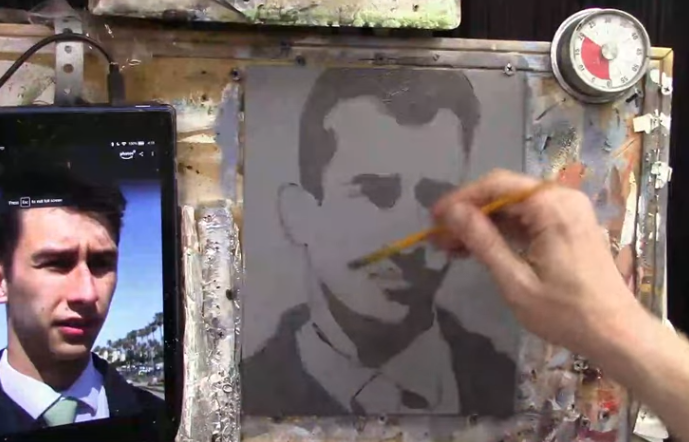
In this portrait exercise, a young man wearing a shirt and tie is painted using strong overhead lighting, bold cast shadows, and an alla prima approach.
This type of time-limited painting is designed to improve efficiency, decision-making, and confidence. Instead of chasing perfection, attention is placed on what truly matters first: composition, values, and clear forms. Over time, these short studies help improve longer, more detailed portraits as well.
Throughout this lesson, the portrait is built from a pre-toned gray surface, using fluid acrylic paint and deliberate brushwork. Each stage builds logically on the previous one, allowing realism to emerge even within a tight time frame.
Why a 30-Minute Acrylic Portrait Study Works
A short portrait session forces simplification. Because time is limited, unnecessary details are avoided and visual priorities are clarified. As a result, the painter is encouraged to see the subject in terms of large shapes and value relationships rather than isolated features.
In addition, painting quickly helps reduce hesitation. Brushstrokes are placed with more confidence, and overworking is naturally minimized. Although the portrait could be developed further with additional layers, the study itself remains valuable as an exercise in observation and control.
Materials and Palette Setup
Before the timer is started, preparation is essential. An 8×10 canvas panel is pre-painted gray to establish a neutral mid-tone. This allows both lights and darks to be judged more accurately.
The acrylic palette includes:
- Ivory Black
- Raw Umber Dark
- Raw Sienna
- Burnt Sienna
- Phthalo Blue
- Ultramarine Blue
- Alizarine Crimson
- Napthol Red
- Organic Orange
- Indian Yellow
- Titanium White
Matte medium is also used to thin the paint without breaking down its binding strength. Because fluid paint moves more easily across the surface, transitions can be created faster and with less effort.
Blocking in the Composition
The first stage of the painting is focused on placement and proportion. Using raw umber dark mixed with matte medium, the head, shoulders, collar, and tie are loosely sketched in. The paint is kept translucent so adjustments can be made easily.
Rather than outlining every feature, the major angles of the face are indicated with short, choppy strokes. The top of the head is intentionally cropped to create a stronger, more modern composition. Throughout this stage, accuracy is approached with flexibility. Precision is not the goal yet. Clarity is.
Special attention is given to eye placement. Because eyes are often placed too high by beginners, they are positioned near the center of the head. This simple correction helps maintain believable proportions from the start.
Establishing the Darkest Values
Once the composition is set, the darkest shadow shapes are blocked in. A mixture of raw umber dark, ivory black, and titanium white is used to create a deep shadow tone. This value is darker than the background, allowing the face to stand out clearly.
These shadows are applied under the brow ridge, along the nose, beneath the eyes, and across the neck. The same color is also used to block in the hair and jacket, keeping the palette unified and efficient.
At this stage, detail is intentionally avoided. The focus remains on grouping shadows into simple, readable shapes. By doing so, the structure of the face begins to emerge naturally.
Adding Variation to the Shadows
To prevent the dark areas from appearing flat, a small amount of ultramarine blue is introduced into the shadow mixture. This subtle shift adds depth and visual interest, especially in the clothing.
Shadows beneath the collar and along the jacket are reinforced, while edges are softened where light gradually transitions into form. Because the paint remains fluid, these blends are achieved quickly without excessive brushing.
Developing the Midtones of the Skin
With the shadows established, attention is turned to the midtones. A flesh tone is mixed using titanium white, raw sienna, burnt sienna, and a small amount of organic orange. This mixture becomes the primary skin color used across the face.
The mid-tone is applied broadly, carefully painted around the shadow shapes rather than over them. Although the background is dark, sufficient opacity is achieved by adjusting the paint mixture and brush pressure.
To indicate form, a slightly darker mid-tone is mixed by adding raw umber dark. This variation is used along the right side of the face and lower planes, where light naturally falls off. These subtle shifts help create a sense of volume without slowing down the process.
Blending Shadows into Midtones
Where shadows meet mid-tones, a transition color is created by mixing the two together. This blended tone is applied along the jawline, cheeks, and lower face, softening edges and increasing realism.
Because acrylics dry quickly, this blending is done efficiently. Rather than chasing perfect gradients, edges are adjusted just enough to suggest form. As a result, the portrait remains fresh and expressive.
Painting the Ear and Facial Accents
The ear is treated with warmer color notes to add life to the portrait. Organic orange and burnt sienna are introduced into the mid-tone mixture, creating a subtle reddish hue. This warmth contrasts nicely with the cooler shadows nearby.
A lighter value is added to the top of the ear to suggest reflected light. Similar warm tones are then used for the lips, tying the facial accents together chromatically.
Although these details are minor, they play an important role in making the portrait feel believable.
Finishing Touches Within the Time Limit
As the timer approaches its end, only essential adjustments are made. Values are checked, edges are clarified, and any overly sharp lines are softened. No attempt is made to refine every feature.
This restraint is intentional. The purpose of a 30-minute portrait is not completeness, but growth. Each study builds skills that carry over into longer, more polished work.
Tips and Techniques for Faster Portrait Painting
- Paint from dark to light to establish structure quickly
- Keep paint fluid using water and matte medium
- Focus on large shapes before small details
- Limit your palette to maintain harmony
- Use short studies to improve efficiency
- Avoid overworking transitions
- Accept imperfection as part of the exercise
Frequently Asked Questions
What is a 30-minute acrylic portrait study?
A 30-minute acrylic portrait study is a timed painting exercise focused on capturing strong values, proportions, and lighting rather than finishing fine details. It is used to improve speed, confidence, and decision-making.
Is alla prima painting suitable for acrylic portraits?
Alla prima painting works well with acrylics when paint is kept fluid and decisions are made quickly. Because layers are applied wet-on-wet, forms are established efficiently.
Why is a gray background used for this portrait?
A gray-toned surface helps both light and dark values stand out more clearly. It allows mid-tones to be judged accurately and speeds up the painting process.
How do you keep acrylic paint workable during fast studies?
Acrylic paint is kept workable by using water, matte medium, and frequent misting of the palette. This prevents the paint from drying too quickly and allows smoother transitions.
What is the most important focus in a 30-minute portrait?
The most important focus is value accuracy. When lights and shadows are placed correctly, likeness and realism are naturally improved, even with minimal detail.
Can this portrait be developed further after 30 minutes?
Yes, the study can be built upon with additional layers, glazing, and refinement. However, it is often best left as-is to preserve freshness and evaluate learning progress.
Are short portrait studies helpful for beginners?
Short portrait studies are very helpful for beginners because they reduce pressure and encourage consistent practice. Over time, efficiency and confidence are strengthened.
Conclusion
Painting a young man with a tie in 30 minutes is a valuable exercise in observation, control, and confidence. By simplifying shapes, prioritizing values, and working with intention, a convincing likeness can be achieved even in a short time.
Although the portrait can be developed further with additional layers, the study itself stands as a powerful learning tool. When practiced consistently, these quick acrylic portraits lead to stronger, more decisive painting in every future project.
- How to Paint Foliage Using the Acrylic Glazing Technique
- How to Trace for an Accurate Portrait Sketch
- How to Paint Realistic Eyes in Your Acrylic Portrait
- How to Add Raw Umber Dark & Ultramarine Blue to Your Portrait
- How to Make Your Own Raw Umber Dark
- How to Paint Realistic Trees & Grass in Your Acrylic
- How to Block In Skin Tone Values Using Glazing Technique
- How to Paint Vibrant Reds in Your Acrylic Portrait
- How to Glaze Background Colors & More Acrylic Portrait
- How to Paint White Clothing in Your Acrylic Portrait
- How to Easily Transition from a Sketch to a Painting
- How to Block In Shading & Skin Tones in Your Acrylic
- How to Build Up Color on Acrylic Pet Portrait
- How to Build Up Form on Clothing with Acrylic
- How to Paint Dark Clothing Using Acrylic Glazing Technique
- How to Paint a 24 x 30 Acrylic With 30 People
- How to Do Smooth Shading with Acrylic
- How to Sketch an Acrylic Portrait with a Grid
Read more about how to paint a portrait that you can surely be proud of!
I’d love to hear your thoughts on this video. Please share it with your friends and family. Let me know if you have any further questions. I’ll greatly help you.
If you’d like to learn more, sign up for my free email tips and video class today.
Learn How to Paint Acrylic Portraits With My Free Mini-Video Course!Thank you so much for taking the time to read this tutorial and watch the video. That means a lot to me. I hope you find it very helpful in your portrait painting.
Yours for Better Portraits,
P.S. Did you find this post helpful or encouraging? If so, send it in ahead! Let others know with the share buttons below. I’d love to hear your comments. Thank you so much! Also, do you have a question on acrylic portrait painting you’d like answered? Let me know, and I’d be happy to help!

How to Paint a Tiny Face in Acrylic
Master the art of small-scale portrait painting with acrylics
Painting a small-scale face in acrylic can be a challenging yet rewarding experience. The limited space requires careful brush control, accurate proportions, and subtle color transitions. Whether you’re working on a miniature portrait or adding a small face to a larger composition, understanding how to paint a tiny face effectively will enhance your skills.
In this guide, we’ll explore essential techniques such as layering, tonal contrast, and light source placement. You’ll also learn tips to avoid over-detailing, ensuring a balanced and realistic final piece.
Step 1: Setting Up Your Colors and Palette
Before starting, it’s important to prepare your color palette. A well-mixed selection of hues will help create natural skin tones and smooth transitions.
Key Colors to Use:
✔ Titanium White – For highlights and softening edges
✔ Raw Umber Dark – For shadows and depth
✔ Alizarin Crimson – Adds warmth to the skin tone
✔ Burnt Sienna – Creates realistic mid-tones
✔ Matte Medium – Helps control opacity and blending
Mixing the Right Tones:
- Combine Titanium White and Raw Umber Dark for neutral shadows.
- Add a touch of Alizarine Crimson to introduce warmth.
- Use Matte Medium to adjust opacity for subtle layering.
Step 2: Understanding Light and Shadow
Proper lighting is crucial when painting a small face. A tiny shift in tone can greatly affect the realism of the portrait.
Primary Light Source:
- The main light, such as sunlight, creates warm highlights.
- Positioned to illuminate the face’s key features, enhancing depth.
Secondary Light Source:
- Often reflected from surrounding objects, such as the sky or nearby surfaces.
- Can introduce cool tones like light blue from a snowy environment.
By carefully balancing these light sources, you can create a realistic three-dimensional effect on the face.
Step 3: Sketching and Adjusting Proportions
A tiny face requires extra attention to proportion. Because of the small scale, even minor errors can become noticeable.
Tips for Proportional Accuracy:
✔ If the face is turned at a ¾ angle, the distance between the left eye and hairline is slightly greater than on the right.
✔ The nose should align naturally with the face’s tilt.
✔ Avoid over-detailing focus on shapes and tonal contrast rather than adding unnecessary fine lines.
Step 4: Blocking in Shadows and Defining Features
Now that proportions are set, begin by adding large blocks of shadow before refining details.
How to Paint Shadows Accurately:
- Start with a diluted mix of Raw Umber Dark and Matte Medium (30% opacity).
- Apply to shadowed areas, such as under the hat’s brim and along the jawline.
- Adjust the tone by adding Alizarine Crimson for a natural skin shadow.
- Use soft blending strokes to avoid harsh lines in smaller areas.
Step 5: Refining Details Without Overworking
Miniature painting requires a balance between precision and simplicity. Too much detail can make a tiny face look unnatural.
Techniques to Achieve Realism:
✔ Use a fine detail brush for subtle refinements, like defining the eyes and lips.
✔ Limit excessive highlights and shadows—too much contrast can make the face look overworked.
✔ Blend gradually using light glazes rather than thick paint applications.
Step 6: Final Adjustments and Enhancements
Before completing your painting, take a step back and observe your work. Small corrections can make a big difference in a tiny portrait.
Final Touches to Improve Realism:
- Adjust facial tones by layering thin glazes of Burnt Sienna for warmth.
- Soften harsh edges by gently blending transitional areas.
- Ensure light reflections in the eyes and highlights on the cheekbones for a lifelike effect.
Mastering how to paint a tiny face in acrylic requires patience, precision, and an understanding of light and shadow. By following these steps setting up the right colors, balancing light sources, maintaining proportions, and using soft layering techniques you can create a miniature portrait with striking realism.
Start practicing today, and soon, painting small faces will feel just as natural as working on larger portraits! 🎨
FAQ: How to Paint a Tiny Face in Acrylic
1. What type of brush is best for painting small faces?
A fine detail brush, such as a liner or round brush (size 0-2), allows for precision in small-scale details.
2. How do I prevent my tiny face from looking overworked?
Use minimal strokes and focus on tonal values rather than excessive detailing. Subtle blending is key.
3. How can I achieve smooth transitions in such a small space?
Thin glazes with Matte Medium help create seamless color shifts without overpowering the painting.
4. What’s the best way to fix mistakes on a tiny face?
Lightly dab with a clean, damp brush to lift excess paint before it dries. Avoid heavy corrections to maintain balance.
5. How do I make sure the proportions are correct?
Sketch lightly first and constantly step back to check alignment before committing to details.
LEARN MORE
- Sketching Your Painting Accurately
- Beginning a Pet Portrait in Acrylic
- The Mystery of Realism in Painting
- Apply A Burnt Sienna Glaze to a Portrait
- Learn How to Sketch a Portrait Freehand in 45 Minutes
- Adding highlights to your acrylic painting
- 5 Excellent Reasons to Use Aluminum Foil
- Paint Realistic Wrinkles in Acrylic
- Painting Clothing in an Acrylic Portrait
- Paint a Cloudy Sky Acrylic
- How to add Semi-Opaque Highlights
- How to Enhance the Contrast in Your Acrylic
- How to Add Glaze to Your Acrylic Painting
- Paint Realistic Reflections on Eyeglasses in an Acrylic Portrait
- Build Up Depth on Your Acrylic Portrait Backgrounds
- How Do You Do Layers With the Glazing Technique?
- Learn How to Paint Wrinkles in Acrylic
Read more about how to paint a portrait that you can surely be proud of!
I’d love to hear your thoughts on this video. Please share it with your friends and family. Let me know if you have any further questions. I’ll greatly help you.
If you’d like to learn more, sign up for my free email tips and video class today.
Learn How to Paint Acrylic Portraits With My Free Mini-Video Course!Thank you so much for taking the time to read this tutorial and watch the video. That means a lot to me. I hope you find it very helpful in your portrait painting.
Yours for Better Portraits,
P.S. Did you find this post helpful or encouraging? If so, send it in ahead! Let others know with the share buttons below. I’d love to hear your

2025 Winter Acrylic Painting Challenge, BONUS Video:Adjusting Colors and Details
Mastering realism: Adjusting colors and details for a lifelike portrait
Refining Your Portrait: Adjusting Colors and Details for Realism
In this bonus lesson of the 2025 Winter Acrylic Painting Challenge, we continue enhancing the portrait by refining colors, deepening shadows, and adding crucial details. Adjusting colors and details at this stage helps bring depth, contrast, and balance to your artwork. Using acrylic glazing techniques, subtle refinements create a more lifelike and polished finish.
Step-by-Step Process for Adjusting Colors and Details
1. Darkening the Mid-tones for Depth
Before highlights can be applied, the mid-tones must be deepened. A translucent glaze of raw umber dark and raw Sienna is layered over the jacket and gloves, enriching their tones without obscuring underlying details.
- Apply a soft glaze over the entire jacket using a size 3/8 flat brush.
- Increase the depth of darker values by layering additional thin washes.
- Allow drying between layers to maintain smoothness.
This gradual build-up ensures that the midtones support the final highlights without overpowering them.
2. Enhancing Contrast in the Background
A portrait isn’t just about the subject it’s also about how it interacts with its surroundings. The reeds and landscape are adjusted to create a better sense of atmospheric depth.
- A mix of raw umber dark and ultramarine blue is used to deepen certain areas in the background.
- A smaller brush is used to chisel in negative space, refining individual reed details.
- The horse’s mane is subtly darkened to help separate it from the background.
3. Adjusting Facial Features for Realism
Facial details are key to a lifelike portrait. Adjustments are made by cooling down some skin tones and warming up others, depending on the light source.
- The left side of the face is slightly darkened using a glaze of raw umber dark and matte medium.
- The nose and cheek highlights are reinforced with titanium white mixed with Indian yellow to reflect light.
- Shadows are softened with alizarine crimson and burnt sienna to avoid harsh contrasts.
Each layer is blended carefully, ensuring smooth transitions that enhance realism.
4. Refining the Hat and Vest Details
The rider’s hat and vest receive special attention in this lesson, ensuring the textures and shading are accurate.
- A mixture of phthalo blue, raw umber dark, and matte medium is applied to the hat for a cooler tone.
- The vest is given a deeper, richer shade by incorporating ultramarine blue into the glaze.
- Shadows and highlights are adjusted around buttons and folds, ensuring they stand out properly.
The layering process ensures each detail is well-integrated without overpowering the rest of the painting.
Tips & Techniques for Adjusting Colors and Details
✅ Work in Layers – Gradual adjustments create smoother transitions and prevent over correction.
✅ Balance Warm & Cool Tones – Mix warm and cool glazes to avoid flat-looking colors.
✅ Use Negative Space – Define background details by adjusting the surrounding colors.
✅ Refine Textures – Use small brushes for details and larger brushes for smooth blending.
✅ Step Back & Assess – Regularly check your painting from a distance to spot needed refinements.
Adjusting colors and details is an essential step in achieving a realistic and visually appealing portrait. By carefully refining tones, deepening shadows, and enhancing highlights, you bring out the depth and character in your painting.
👉 Stay tuned for the next lesson, where we’ll focus on applying final highlights to complete the portrait! Visit our Facebook group here.
Frequently Asked Questions (FAQ)
Q: How do I know when my mid-tones are dark enough?
A: Mid-tones should be noticeably darker than your highlights but not as deep as your shadows. Comparing values with your reference photo helps maintain balance.
Q: What should I do if my glazes look too harsh?
A: Apply a soft dry brush technique to blend edges or add a light glaze of matte medium to soften transitions.
Q: How do I avoid overworking small details?
A: Work in thin layers, stepping back frequently to assess progress. Less is often more when refining details.
Q: Can I still adjust colors after multiple layers?
A: Yes! Acrylic glazing allows continuous adjustments. Just use thin layers to prevent muddying colors.
2025 Winter Acrylic Portrait Painting Challenge Series
2025 Winter Acrylic Portrait Painting Challenge: Steps to Get Started
2025 Winter Acrylic Portrait Challenge Pre-Lesson: Gathering Your Supplies
2025 Winter Acrylic Portrait Challenge, Lesson 1: Prepping Your Canvas for the Portrait
2025 Winter Acrylic Painting Challenge, Lesson 2: Sketching Your Portrait Accurately
2025 Winter Acrylic Painting Challenge, Lesson 3: Sealing in Your Sketch
2025 Winter Acrylic Painting Challenge, Lesson 4: Beginning Your Portrait with Glazes
2025 Winter Acrylic Painting Challenge, Lesson 5: Building Up Color and Contrast
2025 Winter Acrylic Painting Challenge,Bonus Video: Increasing Contrast
2025 Winter Acrylic Painting Challenge, Lesson 6 Shading and Color Nuances
2025 Winter Acrylic Painting Challenge, Lesson 7 Creating Realism in Your Portrait
")
2025 Winter Acrylic Painting Challenge, Lesson 5: Building Up Color and Contrast
Master the art of acrylic glazing to enhance depth and realism in your paintings
Welcome to Lesson 5 of the 2025 Winter Acrylic Painting Challenge! In this session, you will refine your acrylic painting skills by learning to build up color and contrast. This technique not only adds vibrancy but also brings your portrait to life with depth and realism. Whether you are a beginner or an advanced artist, this step-by-step guide will help you achieve stunning results.
Why Focus on Building Up Color and Contrast?
Building up color and contrast is essential for creating dynamic and realistic portraits. By layering glazes, you can achieve smooth transitions, enhance the richness of tones, and bring attention to key elements of your artwork. This method also allows for subtle adjustments and corrections as you progress.
Materials You’ll Need
- Acrylic Paints: Raw Umber Dark, Burnt Sienna, Raw Sienna, Phthalo Blue, Ultramarine Blue, Alizarine Crimson, Titanium White, Organic Orange, Indian Yellow.
- Brushes: 1″ Flat, 3/4″ Flat, Size 5 or 6 Round, 3/8″ Angled Flat.
- Palette: Covered with aluminum foil for easy cleanup.
- Matte Medium: For mixing glazes.
- White Card: To test glaze colors.
- Spray Bottle: To keep your palette moist.
Step-by-Step Guide to Building Up Color and Contrast
1. Prepare Your Palette and Brushes
Start with a fresh piece of aluminum foil on your palette. Arrange your paints for easy access. Spray the palette lightly to keep the paints moist throughout the session.
2. Mixing Your First Glaze
Combine raw umber dark and burnt sienna with matte medium to create a semi-transparent glaze. Adjust the tone by adding organic orange and raw sienna for a warmer, richer hue. Test your glaze on a white card to ensure it has the desired transparency and tone.
3. Apply the Base Glaze
Using a 1″ flat brush, apply the glaze in broad, even strokes. Start from the background and work towards the foreground, ensuring smooth transitions. Use diagonal strokes to create movement and avoid harsh lines.
4. Enhance the Subject with Color Harmony
To maintain color harmony, apply the glaze across various parts of the painting. For areas requiring differentiation, adjust the glaze with slight color variations, such as adding more organic orange for vibrancy.
5. Add Detail and Depth
Switch to smaller brushes for intricate areas, like facial features or objects. Feather the glaze into specific zones to highlight contrast and bring out dimensionality. Remember to let each layer dry completely before adding the next.
6. Refine and Smooth
If streaks appear, remove excess glaze from your brush or blend it out across the canvas. Use firm yet controlled strokes to achieve a polished finish.
Tips and Techniques
- Maintain Moisture: Keep your palette moist by misting it with water. This prevents the glaze from drying too quickly.
- Use a Test Card: Always test your glaze on a white card to ensure the desired opacity and tone before applying it to the canvas.
- Layer Gradually: Build up color and contrast in thin layers to avoid overpowering the painting.
- Check Dryness: Before applying a new glaze, ensure the previous layer is completely dry. Touch the surface gently to confirm.
- Feather Edges: For seamless transitions, feather the glaze at the edges using a light touch.
Frequently Asked Questions
Q: What is the best medium for glazing in acrylic painting?
A: Matte medium works best as it allows for smooth application and dries with a consistent finish.
Q: How do I fix streaks in my glaze?
A: Streaks can be resolved by removing excess glaze from your brush and blending it out across the canvas.
Q: Can I use this technique on any subject?
A: Yes! Building up color and contrast is a versatile technique that can enhance any subject, from portraits to landscapes.
Building up color and contrast is a game-changing technique that transforms flat images into vibrant, lifelike paintings. By layering glazes and adjusting tones, you can achieve professional-level depth and realism. Join the 2025 Winter Acrylic Painting Challenge to further enhance your skills and create a masterpiece you can be proud of
Ready to take your painting skills to the next level? Sign up for the 2025 Winter Acrylic Painting Challenge today and join a community of over 500 artists! Visit realisticacrylic.com for your free welcome kit and start creating stunning portraits.
2025 Winter Acrylic Portrait Painting Challenge Series
2025 Winter Acrylic Portrait Painting Challenge: Steps to Get Started
2025 Winter Acrylic Portrait Challenge Pre-Lesson: Gathering Your Supplies
2025 Winter Acrylic Portrait Challenge, Lesson 1: Prepping Your Canvas for the Portrait
2025 Winter Acrylic Painting Challenge, Lesson 2: Sketching Your Portrait Accurately
2025 Winter Acrylic Painting Challenge, Lesson 3: Sealing in Your Sketch
2025 Winter Acrylic Painting Challenge, Lesson 4: Beginning Your Portrait with Glazes

Which Is More Vibrant Glazing Or Opaque? The Color Theory
Learn the secrets to vibrant colors with glazing and opaque techniques in acrylic.
Introduction
When it comes to achieving vibrancy in acrylic painting, understanding the difference between glazing and opaque techniques is essential. Which is more vibrant glazing or opaque? the color theory delves into these two approaches, each offering unique ways to bring depth and luminosity to your artwork.
Whether you’re layering translucent glazes to create a glowing effect or using opaque colors for bold, solid coverage, mastering these techniques can transform your paintings from ordinary to extraordinary. In this article, we’ll explore how these methods impact color vibrancy and how you can use them to enhance your artistic creations.
The Basics of Opaque Painting
Opaque painting involves mixing colors with white to create solid, non-transparent layers. This technique is straightforward and is often used by artists to create bold, flat areas of color. I started by mixing primary colors—Naphthol red, indian yellow, and ultramarine blue—with titanium white to create secondary hues such as orange, green, and violet.
Opaque colors, when mixed with white, lose some of their natural intensity. For instance, when creating an orange by mixing red and yellow with white, the color becomes lighter and more muted. The same occurs when mixing blue and yellow to create green, or blue and red to create violet. While opaque colors have their place in painting, they lack the luminosity and vibrancy that glazing can achieve.
The Power of Glazing
Glazing, on the other hand, is a technique where thin, transparent layers of color are applied over a base layer. Instead of mixing colors with white, glazing involves mixing them with a medium, such as matte medium, which dilutes the paint and makes it translucent. This allows light to pass through the glaze, reflect off the surface below, and create a luminous effect.
I demonstrated how glazing works by using the same primary colors but mixed with a matte medium instead of white. The result was a series of vibrant, translucent layers that added depth and richness to the colors. For example, the orange created through glazing was much more vibrant than the opaque version, as the underlying colors were allowed to shine through.
Comparing Glazing and Opaque Techniques
When comparing glazing and opaque techniques side by side, the difference is striking. Glazing allows for a more complex interplay of colors, creating a sense of depth that opaque painting cannot achieve. The translucent layers in glazing enhance the vibrancy of the colors, making them appear more luminous and alive.
Opaque painting, while effective for creating solid blocks of color, can sometimes result in colors that appear flat and less dynamic. However, when used in combination with glazing, opaque layers can serve as a strong foundation that supports the vibrant glazes applied on top.
Tips for using glazing in your paintings
-
Start with a Strong Base: Begin your painting with a solid, opaque layer. This will serve as the foundation for your glazes.
-
Use Matte Medium: Mix your acrylic paints with matte medium to create translucent glazes. The more medium you use, the more transparent the glaze will be.
-
Apply Multiple Layers: Build up your painting with several layers of glaze. Each layer will add depth and vibrancy to the colors.
-
Brush in Different Directions: To avoid streaks and ensure even coverage, brush your glazes in different directions. This will help create a smooth, uniform layer.
-
Patience is Key: Allow each layer of glaze to dry before applying the next. This will prevent the colors from muddying and ensure a clean, vibrant finish.
In the world of acrylic painting, both glazing and opaque techniques have their own unique strengths. Opaque layers provide a solid foundation, while glazing adds depth, luminosity, and vibrancy to your artwork. By understanding and combining these techniques, you can create paintings that are rich in color and full of life. Whether you’re a beginner or an experienced artist, experimenting with glazing can open up new possibilities for your creative expression.
Lastly, try out these techniques in your next painting session and see the difference glazing can make. Read more about my additional resource tutorials, to learn more, check out my free courses.
- Sketching Your Painting Accurately
- Beginning a Pet Portrait in Acrylic
- The Mystery of Realism in Painting
- Apply A Burnt Sienna Glaze to a Portrait
- Learn How to Sketch a Portrait Freehand in 45 Minutes
- Adding highlights to your acrylic painting
- 5 Excellent Reasons to Use Aluminum Foil
- Paint Realistic Wrinkles in Acrylic
- Painting Clothing in an Acrylic Portrait
- Paint a Cloudy Sky Acrylic
- How to add Semi-Opaque Highlights
- How to Enhance the Contrast in Your Acrylic
- How to Add Glaze to Your Acrylic Painting
- Paint Realistic Reflections on Eyeglasses in an Acrylic Portrait
- Build Up Depth on Your Acrylic Portrait Backgrounds
- How Do You Do Layers With the Glazing Technique?
- Learn How to Paint Wrinkles in Acrylic
Read more about how to paint a portrait that you can surely be proud of!
I’d love to hear your thoughts on this video. Please share it with your friends and family. Let me know if you have any further questions. I’ll greatly help you.
If you’d like to learn more, sign up for my free email tips and video class today.
Learn How to Paint Acrylic Portraits With My Free Mini-Video Course!
Thank you so much for taking the time to read this tutorial and watch the video. That means a lot to me. I hope you find it very helpful in your portrait painting.
Yours for Better Portraits,

P.S. Did you find this post helpful or encouraging? If so, send it in ahead! Let others know with the share buttons below. I’d love to hear your comments. Thank you so much! Also, do you have a question on acrylic portrait painting you’d like answered? Let me know, and I’d be happy to help!

Unlock Your Potential: The Truth Behind Portrait Painting Myths
Transform your portrait painting with these myth-busting insights
Portrait painting is an art form admired by many but often shrouded in misconceptions that can discourage aspiring artists. These myths can create unnecessary barriers, leading you to believe that portrait painting is an unattainable skill reserved for the gifted few. In this article, we’ll debunk three of the most common myths about portrait painting, empowering you to embrace your artistic journey with confidence and clarity.
Myth 1: “You need special talent to paint portraits”
One of the most pervasive myths is the belief that portrait painting requires a special, innate talent that only a select few possess. This notion can be incredibly discouraging, especially for beginners who may feel that they lack the “gift” needed to succeed.
The Truth: desire over talent
The reality is that desire and persistence are far more important than any inherent talent. While some may have a natural inclination toward art, anyone with the passion and commitment to learn can master portrait painting. Think of it like basketball—while players like Michael Jordan may have had a natural predisposition, others, like Spud Webb, defied the odds through sheer determination.
Tips and techniques:
- Cultivate Your Passion: Your desire to create art will drive you to practice and improve continuously.
- Seek Out a Mentor: Just as Luke Skywalker found guidance from Obi-Wan Kenobi, your desire will lead you to the right teacher. Look for instructors who resonate with your artistic goals.
- Practice Regularly: Talent develops through practice. The more you paint, the more skilled you’ll become.
Myth 2: “You must attend art school to be a portrait painter”
Another common myth is that formal education is necessary to become a skilled portrait painter. Many believe that years of art school are required to develop the techniques and knowledge needed to create realistic portraits.
The Truth: Focused learning trumps formal education
While art school can provide valuable training, it is by no means a requirement. In today’s digital age, you can access high-quality instruction from the comfort of your home. Many successful artists, including myself, have learned more from focused, short-term courses than from years of traditional education.
Tips and techniques:
- Find Targeted Instruction: Look for courses that focus specifically on portrait painting techniques, such as acrylic glazing, rather than broad art programs.
- Learn by Doing: Start with one portrait and focus on mastering it before moving on to more complex projects.
- Rinse and Repeat: Use the techniques you learn to create multiple portraits, gradually refining your skills with each attempt.
Myth 3: “Inspiration is necessary to start painting”
The final myth we’ll debunk is the idea that inspiration is a prerequisite for painting. Many artists believe they must wait for a burst of creativity before they can begin a new project.
The Truth: Consistency breeds creativity
Waiting for inspiration can lead to procrastination and missed opportunities. The most successful artists understand that creativity is often the result of consistent effort. By making painting a regular part of your routine, you’ll find that inspiration comes more easily.
Tips and techniques:
- Establish a Routine: Set aside time each day or week to work on your art, even if it’s just for a few minutes.
- Embrace the Process: Understand that not every session will be groundbreaking. The act of painting regularly will eventually lead to creative breakthroughs.
- Replenish Your Inspiration: While consistency is key, it’s also important to nourish your creativity. Spend time in nature, visit art galleries, or engage in activities that inspire you.
By debunking these myths, we hope to remove the barriers that may have been holding you back from pursuing portrait painting. Remember, talent is nurtured through desire, formal education can be replaced with focused learning, and inspiration is often the result of consistent practice. With these truths in mind, you’re well on your way to unlocking your full potential as a portrait artist.
As you continue your artistic journey, keep these insights close. Portrait painting is not reserved for the elite; it’s a skill that can be learned and mastered by anyone willing to put in the time and effort. So pick up your brush, challenge these myths, and start creating portraits you can be proud of!
Read more about my additional resources, tutorials, to learn more and check my free courses. Happy painting!
- Sketching Your Painting Accurately
- Beginning a Pet Portrait in Acrylic
- The Mystery of Realism in Painting
- Apply A Burnt Sienna Glaze to a Portrait
- Learn How to Sketch a Portrait Freehand in 45 Minutes
- Adding highlights to your acrylic painting
- 5 Excellent Reasons to Use Aluminum Foil
- Paint Realistic Wrinkles in Acrylic
- Painting Clothing in an Acrylic Portrait
- Paint a Cloudy Sky Acrylic
- How to add Semi-Opaque Highlights
- How to Enhance the Contrast in Your Acrylic
- How to Add Glaze to Your Acrylic Painting
- Paint Realistic Reflections on Eyeglasses in an Acrylic Portrait
- Build Up Depth on Your Acrylic Portrait Backgrounds
- How Do You Do Layers With the Glazing Technique?
- Learn How to Paint Wrinkles in Acrylic
Read more about how to paint a portrait that you can surely be proud of!
I’d love to hear your thoughts on this video. Please share it with your friends and family. Let me know if you have any further questions. I’ll greatly help you.
If you’d like to learn more, sign up for my free email tips and video class today.
Learn How to Paint Acrylic Portraits With My Free Mini-Video Course!
Thank you so much for taking the time to read this tutorial and watch the video. That means a lot to me. I hope you find it very helpful in your portrait painting.
Yours for Better Portraits,
P.S. Did you find this post helpful or encouraging? If so, send it in ahead! Let others know with the share buttons below. I’d love to hear your comments. Thank you so much! Also, do you have a question on acrylic portrait painting you’d like answered? Let me know, and I’d be happy to help!

How to Paint Realistic Trees & Landscapes: Technique
I’ll show you what colors to use (and why), how to mix the paint with matte medium for the glazing technique
Introduction
Creating realistic trees and landscapes in acrylic paintings can be a rewarding yet challenging task. The secret to mastering this lies in the glazing technique, which allows for depth, luminosity, and a natural appearance. In this guide, we’ll walk through a detailed process to help you bring your landscape elements to life. And I’ll show you how I paint realistic trees & landscapes using a technique and a step-by-step process.
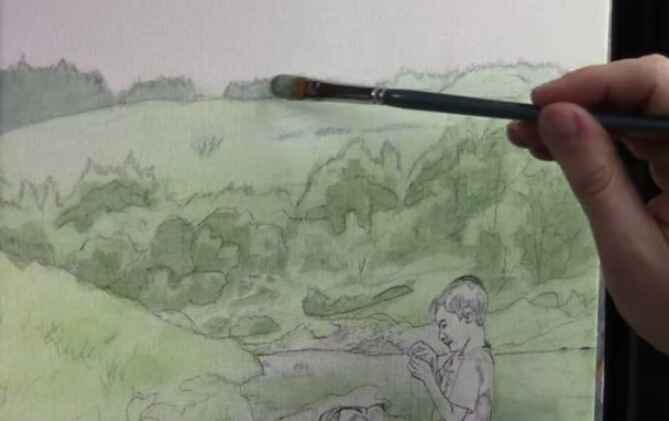
Understanding the Glazing Technique
Glazing is a fundamental technique in acrylic painting, where you apply thin layers of translucent paint to build depth and vibrancy. This method is particularly useful when painting backgrounds, like trees in landscapes, as it preserves the underlying sketch while adding color and detail gradually.
Materials Needed:
- Acrylic paints (ultramarine blue, phthalo blue, titanium white, raw sienna, raw umber dark)
- Matte medium
- Brushes (quarter-inch flats, rounds, filberts)
- Palette for mixing colors
Step-by-Step Process:
- Mixing the Glaze: Start by creating your glaze mixture. Combine a small amount of paint with a generous amount of matte medium. The matte medium is a clear acrylic without pigment, allowing for translucent layers that maintain the integrity of your initial sketch.
- Choosing the Right Colors: Begin with subdued colors for the background, as these will give the illusion of distance. For instance, mix ultramarine blue with raw sienna to create a subdued green. To add variety, incorporate phthalo blue and titanium white, adjusting with raw umber dark to neutralize any intensity.
Painting Trees in the Distance
To create realistic trees in the background, focus on cooler, less intense colors. These colors recede visually, making the trees appear further away.
- Block in the Shapes: Use a mix of phthalo blue, ultramarine blue, and a touch of titanium white for the distant trees. Lightly apply this mix to establish the overall shape, not worrying too much about staying within the lines—overlapping can be adjusted later with background colors.
- Adjusting Tones: If your color is too vibrant, add raw umber dark, to tone it down, creating a more natural look. This step is crucial, as it ensures that your distant trees don’t overpower the foreground elements.
- Layering with Glazes: Continue layering glazes to build up the form of the trees. Use a dry-brush technique to add subtle transitions between light and shadow, which will give your trees a more three-dimensional appearance. Remember, the goal is to see the abstraction within realism—simplify complex shapes into manageable forms.
Bringing the Midground to Life
The midground trees and landscape elements should be more defined than those in the background but still less intense than the foreground.
- Creating Midground Colors: For the midground, slightly warm up your color palette by adding more raw sienna to the mix. This will create a gentle contrast between the cooler background trees and the warmer midground.
- Detailing with Brushwork: Use smaller brushes to add details like branches and foliage. Focus on capturing the shapes and shadows without getting too detailed, as this can detract from the overall realism. It’s about striking a balance between simplicity and complexity.
Final Touches: Adding Depth to the Foreground
The foreground is where you can introduce the most detail and contrast, drawing the viewer’s eye.
- Darkening the Shadows: To add depth, mix a darker shade by combining ultramarine blue, phthalo blue, and a bit of raw umber dark. Apply this to the base of the trees and other shadowed areas.
- Highlighting with Glazes: Use warm glazes to highlight areas where light would naturally hit. This will make the trees and landscape pop, giving the impression of sunlight filtering through.
- Maintaining Color Harmony: As you paint, continually ask yourself where else you can apply the current color mix. This promotes harmony across the painting and helps unify the different elements.
The glazing technique is a powerful tool for creating realistic trees and landscapes in acrylic paintings. By layering translucent colors and focusing on the subtle interplay of light and shadow, you can achieve a natural and immersive scene. Remember to be patient and allow the process to unfold gradually. With practice, you’ll find that your ability to capture the beauty of nature in your paintings will significantly improve.
Tips and Techniques Recap:
- Use matte medium to create translucent glazes.
- Start with cooler, subdued colors for distant trees.
- Layer glazes to build depth and form.
- Strike a balance between simplicity and detail.
- Apply color harmony by reusing mixtures across the painting.
By incorporating these techniques, you’ll elevate your landscape paintings, making them more lifelike and captivating.
Read more about my additional resources, tutorials, to learn more and check out my free courses here. Whether you’re a beginner or an experienced artist, there’s always something new to learn and apply to your paintings. Happy painting!
- Sketching Your Painting Accurately
- Beginning a Pet Portrait in Acrylic
- The Mystery of Realism in Painting
- Apply A Burnt Sienna Glaze to a Portrait
- Learn How to Sketch a Portrait Freehand in 45 Minutes
- Adding highlights to your acrylic painting
- 5 Excellent Reasons to Use Aluminum Foil
- Paint Realistic Wrinkles in Acrylic
- Painting Clothing in an Acrylic Portrait
- Paint a Cloudy Sky Acrylic
- How to add Semi-Opaque Highlights
- How to Enhance the Contrast in Your Acrylic
- How to Add Glaze to Your Acrylic Painting
- Paint Realistic Reflections on Eyeglasses in an Acrylic Portrait
- Build Up Depth on Your Acrylic Portrait Backgrounds
- How Do You Do Layers With the Glazing Technique?
- Learn How to Paint Wrinkles in Acrylic
Read more about how to paint a portrait that you can surely be proud of!
I’d love to hear your thoughts on this video. Please share it with your friends and family. Let me know if you have any further questions. I’ll greatly help you.
If you’d like to learn more, sign up for my free email tips and video class today.
Learn How to Paint Acrylic Portraits With My Free Mini-Video Course!
Thank you so much for taking the time to read this tutorial and watch the video. That means a lot to me. I hope you find it very helpful in your portrait painting.
Yours for Better Portraits,
P.S. Did you find this post helpful or encouraging? If so, send it in ahead! Let others know with the share buttons below. I’d love to hear your comments. Thank you so much! Also, do you have a question on acrylic portrait painting you’d like answered? Let me know, and I’d be happy to help!

5 Tips on How to Draw Better Pencil Portraits
Learn the art of pencil portraits with these essential tips
Introduction
Drawing pencil portraits is a rewarding but challenging art form that requires precision, patience, and the right techniques. Whether you’re a beginner or an experienced artist, there’s always room to refine your skills. In this blog post, I’ll share five tips that will help you create more realistic and visually appealing pencil portraits. These tips will guide you through everything from preventing smudges to achieving perfect proportions, making your drawing process more enjoyable and effective.
Tip 1: Use a Palm Paper to Prevent Smudging
One of the most common issues artists face when working on pencil portraits is smudging. As you draw, the natural oils from your hand can transfer onto the paper, causing unwanted smears and even warping the surface. To avoid this, use what I call a “palm paper.”
A palm paper is simply a piece of paper or cardstock that you place under your drawing hand. This barrier protects your work from smudges and moisture. You can fold the paper in half and adjust its position as you move across the page. This simple yet effective technique will keep your drawings clean and preserve the integrity of the paper.
Tip 2: Use a Dark Lead for High Contrast
Achieving contrast is crucial for creating dynamic and realistic portraits. A dark lead, such as an 8B pencil, can make a significant difference in the depth and vibrancy of your work. While many artists are familiar with standard 6B pencils, stepping up to an 8B will allow you to reach even darker values, perfect for emphasizing areas like pupils, deep shadows, and fine details.
For the best results, consider investing in a pencil set that includes a range of leads from 2B to 8B. This variety will give you the flexibility to build up your shading gradually and achieve the desired contrast in your portraits.
Tip 3: Measure Proportions Using Paper Benchmarks
Accurate proportions are the foundation of any successful portrait. However, getting these proportions right can be tricky, especially when working freehand. A practical approach is to use paper benchmarks to measure and compare key distances within the face.
Start by observing your reference photo and identifying essential landmarks, such as the distance between the eyes, the width of the nose, and the position of the mouth. Use these measurements to create benchmarks on your drawing. For instance, you can draw horizontal and vertical lines that intersect at crucial points, helping you maintain consistency in your proportions.
Even if you prefer to draw freehand, these benchmarks can serve as a valuable guide to ensure that your portrait remains balanced and proportional.
Tip 4: Use Cross Hatching for Effective Shading
Shading is what gives your portrait depth and realism. One technique that can enhance your shading is cross-hatching. This method involves drawing tightly spaced parallel lines in one direction and then overlaying them with lines in the opposite direction. The result is a textured, layered effect that can simulate different values and textures in your portrait.
To practice cross-hatching, start with a simple area of your portrait, such as a cheek or a lip. Make sure your lines are tight and consistent. As you build up the layers, the shading will become more complex and nuanced, creating a more lifelike representation.
Cross-hatching is especially useful when you need to create smooth transitions between light and dark areas, as it allows for greater control over the density and intensity of your shading.
Tip 5: Blend Your Pencil Marks Lightly for Realism
Blending is another essential skill in pencil drawing, but it’s easy to overdo. While blending can soften edges and create smooth gradients, excessive blending can make your portrait look flat and lose the subtle textures that contribute to realism.
A simple way to blend without overdoing it is to use a tissue paper or blending stump. Gently apply it to the areas you want to soften, using circular motions to blend the pencil marks. The key is to use light pressure so that the texture of the pencil strokes remains visible, preserving the natural variation in your shading.
Avoid the temptation to overblend; instead, aim to maintain a balance between blended and unblended areas. This approach will add depth and texture to your portrait, making it appear more lifelike.
Tips
Improving your pencil portraits requires practice, but with these five tips, you can start seeing progress in your work right away. From preventing smudges with palm paper to mastering the art of shading with cross-hatching, these techniques will help you create more realistic and polished portraits. Remember, the key to success lies in patience and attention to detail. Keep practicing, and you’ll continue to refine your skills over time.
If you found these tips helpful and want to learn more, visit Realistic Acrylic Portrait School for additional tutorials and free resources. Drawing is foundational to painting, and mastering these techniques will serve you well in all your artistic endeavors. Happy drawing!
- Sketching Your Painting Accurately
- Beginning a Pet Portrait in Acrylic
- The Mystery of Realism in Painting
- Apply A Burnt Sienna Glaze to a Portrait
- Learn How to Sketch a Portrait Freehand in 45 Minutes
- Adding highlights to your acrylic painting
- 5 Excellent Reasons to Use Aluminum Foil
- Paint Realistic Wrinkles in Acrylic
- Painting Clothing in an Acrylic Portrait
- Paint a Cloudy Sky Acrylic
- How to add Semi-Opaque Highlights
- How to Enhance the Contrast in Your Acrylic
- How to Add Glaze to Your Acrylic Painting
- Paint Realistic Reflections on Eyeglasses in an Acrylic Portrait
- Build Up Depth on Your Acrylic Portrait Backgrounds
- How Do You Do Layers With the Glazing Technique?
- Learn How to Paint Wrinkles in Acrylic
I’d love to hear your thoughts on this video. Please share it with your friends and family. Let me know if you have any further questions. I’ll greatly help you.
If you’d like to learn more, sign up for my free email tips and video class today.
Learn How to Paint Acrylic Portraits With My Free Mini-Video Course!
Thank you so much for taking the time to read this tutorial and watch the video. That means a lot to me. I hope you find it very helpful in your portrait painting.
Yours for Better Portraits,
P.S. Did you find this post helpful or encouraging? If so, send it in ahead! Let others know with the share buttons below. I’d love to hear your comments. Thank you so much! Also, do you have a question on acrylic portrait painting you’d like answered? Let me know, and I’d be happy to help!

How to Repair a Painting with a Hole
Expert tips for fixing holes in your painting!
In this guide, we will explore the essential steps to repair a painting with a hole. Every artist may encounter this issue eventually, and knowing how to fix it can save your cherished painting. Follow these straightforward instructions to address and mend a painting with a hole.
Materials Needed:
- Gloss medium or varnish (Nova Color, Liquitex, or Golden are recommended)
- Artist canvas (raw or from old stretch canvases)
- Foam board insulation or wood for support
- Brush and scissors
- Saran wrap or cling film
- Weights (books, marble, or similar)
Steps to Repair the Painting:
- Prepare the Work Area:
- Lay the painting flat on a table.
- Use foam board or a sturdy piece of wood to support the painting from underneath. This prevents the canvas from tearing when weights are applied.
- Create the Patch:
- Cut a piece of artist canvas slightly larger than the hole. Opt for a rounded or organic shape to blend seamlessly with the painting.
- Apply Gloss Medium:
- Brush gloss medium onto the back of the hole and the canvas patch. This medium acts as an adhesive and will help secure the patch.
- Place and Secure the Patch:
- Position the patch over the hole and press it firmly into place. Cover it with Saran wrap to prevent sticking.
- Apply weights (books, marble, etc.) on top to ensure the patch adheres properly. Leave it undisturbed for 30 minutes to an hour.
- Inspect and Smooth:
- After the patch has dried, remove the weights and Saran wrap. Check the edges of the patch for any gaps and apply additional gloss medium if needed.
- For a smoother finish, use matte medium and a blade to fill any remaining gaps. Allow it to dry thoroughly.
- Final Touches:
- Once the repair is fully dry, inspect the painting for any inconsistencies. If necessary, apply another layer of matte medium for a uniform finish.
Additional Tips:
- This method is best suited for older paintings where the oil paint has dried. For newer oil paintings, consider using a clear Zinser primer sealer to ensure proper adhesion.
Repairing a painting with a hole can seem daunting, but with the right materials and techniques, it is entirely achievable. By following these steps, you can restore your artwork to its original condition and continue to enjoy its beauty for years to come.
Conclusion: Every artist should be prepared to handle minor repairs. This guide provides a practical approach to fixing holes in paintings, ensuring that your artwork remains intact and visually appealing.
DISCLAIMER: Use the knowledge in this video at your own risk. I cannot be held responsible for any painting that is damaged further in the process of utilizing this repair method. But I will say it has worked well for me!
- Sketching Your Painting Accurately
- Beginning a Pet Portrait in Acrylic
- The Mystery of Realism in Painting
- Apply A Burnt Sienna Glaze to a Portrait
- Learn How to Sketch a Portrait Freehand in 45 Minutes
- Adding highlights to your acrylic painting
- 5 Excellent Reasons to Use Aluminum Foil
- Paint Realistic Wrinkles in Acrylic
- Painting Clothing in an Acrylic Portrait
- Paint a Cloudy Sky Acrylic
- How to add Semi-Opaque Highlights
- How to Enhance the Contrast in Your Acrylic
- How to Add Glaze to Your Acrylic Painting
- Paint Realistic Reflections on Eyeglasses in an Acrylic Portrait
- Build Up Depth on Your Acrylic Portrait Backgrounds
- How Do You Do Layers With the Glazing Technique?
- Learn How to Paint Wrinkles in Acrylic
Read more about how to paint a portrait that you can surely be proud of!
I’d love to hear your thoughts on this video. Please share it with your friends and family. Let me know if you have any further questions. I’ll greatly help you.
If you’d like to learn more, sign up for my free email tips and video class today.
Learn How to Paint Acrylic Portraits With My Free Mini-Video Course!
Thank you so much for taking the time to read this tutorial and watch the video. That means a lot to me. I hope you find it very helpful in your portrait painting.
Yours for Better Portraits,
P.S. Did you find this post helpful or encouraging? If so, send it on ahead! Let others know with the share buttons below. I’d love to hear your comments. Thank you so much! Also, do you have a question on acrylic portrait painting you’d like answered? Let me know, and I’d be happy to help!