Category Archives for Tips and Techniques

How to Paint Realistic Reflections on Eyeglasses in Acrylic Portrait
It’s tricky to paint reflections on eyeglasses.
Creating realistic reflections on eyeglasses can significantly enhance the depth and authenticity of an acrylic portrait. In this blog post, you will learn how to paint realistic reflections on eyeglasses in acrylic portrait and then along with tips for mixing colors, layering, and applying highlights. Because these methods will help elevate your acrylic painting skills and bring your portraits to life.
Understanding Reflections in Eyeglasses
Reflections in eyeglasses are not just simple overlays; yet they play a crucial role in conveying the personality and emotion of your subject. Of course, observing how light interacts with surfaces is essential. Hence, it is vital to capture the subtle nuances of reflections to create a convincing portrayal.
Preparing Your Workspace
Before beginning, ensure your workspace is organized. Then have your reference photo at hand, and gather all necessary materials:
- Acrylic paints: Titanium white, raw umber dark, ivory black, burnt sienna, and alizarin crimson
- Brushes: A round size 8 brush for detail work
- Matte medium for thinning paint
- Palette for mixing colors
- A clean rag for touch-ups
Step-by-Step Techniques
Setting Up the Reference Photo
Zoom in on your reference photo to clearly see the reflections in the glasses. Then identify key areas where reflections appear and note their shape and color.
Mixing the Initial Color
Begin with a mixture of titanium white and raw umber dark to create a toned-down white. Because this will avoid stark brightness that can look unnatural, thin this mixture with matte medium to achieve fluidity.
Painting the Reflections
In this case, use the round brush to carefully apply the mixed color to the upper corners of the glasses. This is where the most pronounced reflections typically occur.
Just observe the shape of the reflections in your reference photo and replicate that shape on your canvas and then using different angles of strokes will help smooth out the paint.
Adding Depth with Multiple Layers
Allow the initial layer to dry before adding more highlights. While layering is essential for creating depth.
Mix a slightly lighter shade then by adding more titanium white to your previous mixture. Apply this lighter color to the same areas, focusing on the edges where the light hits most.
Incorporating Background Elements
To make the reflections believable, you need to incorporate faint outlines of elements visible in the background. This adds realism without overwhelming the portrait.
So use a diluted version of your mixture to achieve this effect, ensuring that the reflections do not detract from the subject’s features.
Enhancing the Frame of the Glasses
The frame should also reflect light. And then apply highlights using the same mixture to the inner edges of the frame.
Gradually build up the highlight by layering, allowing each layer to dry before adding the next.
Adding Shadows for Realism
Shadows are critical for grounding the glasses. When mixing burnt sienna and alizarine crimson, you can create a warm shadow color.
Apply this color underneath the glasses and around the frames to suggest depth and interaction with the face.
Refining the Details
After allowing the previous layers to dry, return with titanium white mixed with raw umber dark for the final highlights.
Focus on adding subtle highlights on the corners of the reflections. Use a very light touch to maintain the transparency of the glass.
Final Touches
Once all elements have dried, step back to evaluate your painting. Then adjust any areas that may need further highlights or shadows to ensure balance and realism. Because this reflective interplay between light and dark is what ultimately gives your portrait a lifelike quality.
Conclusion
Painting realistic reflections on eyeglasses requires patience and practice. So by following these techniques, artists can enhance their acrylic portraits with depth and clarity. Remember also that observation is key; study how light interacts with different surfaces to improve your skill. With dedication, anyone can learn how to paint realistic reflections that bring their acrylic portraits to life.
Tips for Painting Reflections:
- Layering is Key: Always allow layers to dry before adding more to achieve depth.
- Use a Light Touch: When applying highlights, a gentle hand creates a more realistic effect.
- Study Real Life: Observe real eyeglasses in different lighting conditions to understand how reflections work.
For further resources and guides, visit realisticacrylic.com and check out my free courses to enhance your acrylic painting journey.
This is a 16 x 20 acrylic on canvas commissioned portrait, and I just delivered it to the client today. She loved it. It was a memoriam portrait, so I pray it will bring comfort to all who see it.
Have a blessed day, and may God use your artistic gifts to bless people far and wide.
- How to Paint Foliage Using the Acrylic Glazing Technique
- How to Trace for an Accurate Portrait Sketch
- How to Paint Realistic Eyes in Your Acrylic Portrait
- How to Add Raw Umber Dark & Ultramarine Blue to Your Portrait
- How to Make Your Own Raw Umber Dark
- How to Paint Realistic Trees & Grass in Your Acrylic
- How to Block In Skin Tone Values Using Glazing Technique
- How to Paint Vibrant Reds in Your Acrylic Portrait
- How to Glaze Background Colors & More Acrylic Portrait
- How to Paint White Clothing in Your Acrylic Portrait
- How to Easily Transition from a Sketch to a Painting
- How to Block In Shading & Skin Tones in Your Acrylic
- How to Build Up Color on Acrylic Pet Portrait
- How to Build Up Form on Clothing with Acrylic
- How to Paint Dark Clothing Using Acrylic Glazing Technique
- How to Paint a 24 x 30 Acrylic With 30 People
- How to Do Smooth Shading with Acrylic
- How to Sketch an Acrylic Portrait with a Grid
Read more about how to paint a portrait that you can surely be proud of!
I’d love to hear your thoughts about this video. Please share it with your friends and family. Let me know if you have any further questions. I’ll greatly help you.
If you’d like to learn more, sign up for my free email tips and video class today.
Learn How to Paint Acrylic Portraits With My Free Mini-Video Course!
Thank you so much for taking the time to read this tutorial and watch the video. That means a lot to me. I hope you find it very helpful in your portrait painting.
Yours for Better Portraits,

P.S. Did you find this post helpful or encouraging? If so, send it on ahead! Let others know with the share buttons below. I’d love to hear your comments. Thank you so much! Also, do you have a question on acrylic portrait painting you’d like answered? Let me know, and I’d be happy to help!

How to Price Your Finished Portrait Painting?
One question I’m asked again and again is, “How much should I charge for a portrait?”
I was asked this question twice in the last two days, so I figure it would be good to answer this in an article.
As a professional portrait painter, I know that what I charge for my portraits affects my bottom line. If I don’t charge enough, I don’t make enough money to keep painting. If I charge too much, I might price myself out of the market.
You may be asking the same thing? What should you do?
There are many factors in pricing.
It depends how long you have been in business, the level of quality of your work, and how much detail will be in your portrait. I charge by the square inch. I have a pricing formula that I came up with where the price increases exponentially as you increase the size of the painting and add more detail (subjects)
Here is what I charge (as of 2019). I can’t say that it will work for you. (Please, DO NOT copy my prices. I am showing it just as an example. )
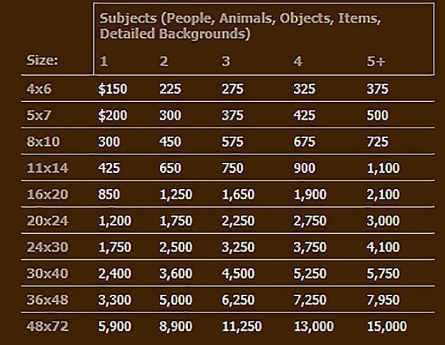
A 16 x 20 with one person—I charge $850 for that. If there are 5 or more subjects (people, objects, detailed backgrounds, etc. ) in the portrait I charge $2,100. The reason I charge more is that it will take longer to paint all the extra detail.
But I have been painting for many years and my prices were less than half this amount when I started out painting portraits full-time, in 2014. Here is my price chart for that year.
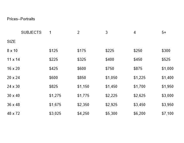
You can see my prices have almost doubled since 2014. And amazingly, at that time, I was struggling to get even one commission! I remember praying every day for a month for a commission, after doing all I knew to do to bring in some work. God did provide one eventually, but I need to learn to trust in Him and be patient. That’s a story for another day. 🙂
The point I’m trying to make is that charging less for your work does not equate to more sales. When I first started I thought I was going well to make minimum wage. That was foolish, because we aren’t painting 100% of the time and we have materials and marketing costs. My wife encouraged me to raise my prices. I was scared to, but it didn’t hurt my business at all. I have been raising them slowly, about 10-20% every year.
So, then, should you charge more at the onset and just watch the sales roll in?
No. It doesn’t work that way either. Charge a fair price for your work, be patient, keep doing portraits, don’t give up when it’s tough, and you will see the results. Raise your prices over time as you build up your clientele.
I try to get paid $50 an hour on my portraits. ( I don’t charge by the hour. This is what I average on my projects.)
Figure out what you’d like to get paid per hour. Then charge approximately 50% more because, as I mentioned earlier, you won’t be painting all the time (you’ve got other business-y things to do) and you have paint and brushes to buy.
Here are some more helpful tips in pricing your art.
1. First of all, create a price chart as I did. This is HUGE. Going to a client meeting to discuss a portrait without a price chart in hand is like going to a smorgasbord buffet line without a plate in hand. It’s going to be messy.
With a price chart all you need to do is ask your client what size they would like–roughly–and then show them a couple of options. You should know how many people will be in the portrait. You simply show them the chart and say, “an 16 x 20 with two subjects will be this much, and a 24 x 30 will be this.” You point to the prices and let the chart do the work.
Let them decide what they want.
There are no negotiations on the price. Because the client sees you have a precise criterion for what you charge—it makes sense—they will not quibble with your price. I can’t recall a time that’s ever happened to me.
Interestingly, I do remember a time when I negotiated my own price down. I offered my client a price that was lower than what I originally quoted. She took the lower price but looked at me strangely and the whole situation was awkward. And I needlessly lost money on the job. Ouch.
Don’t do what I did in that situation.
Quote your price and hold to it. Let them respond.

2. Then, once you have the client locked in on a price, encourage them to pay a down deposit on the spot. If you just give them a business card and let them walk away, chances are, you’ll lose the commission. Of course, if they need to discuss it with another decision maker, that’s fine. But get their phone number or email address so you can follow up with them.
Most of the time, however, they’ll be ready to make a decision if they indeed want a portrait, and not just merely curious.
You can tell them you need the deposit so that you’ll have them booked. That way you can get to their portrait faster.
A deposit is also very important because, with it, the client has “skin in the game.” They’re not as likely to back out of the project.
How much should you ask for a deposit? I ask for 25% up front. Some do 50. But I like 25, because it’s a little less risk for the client to take on, and it also gives me more incentive to finish the project. I get paid a larger amount at the end.
3. Never charge people more because you think they are rich, or less because you think they are poor. Just charge what you charge. Have a size for any budget. The price chart is your best friend. Then you can always point people to your price list and let it do the selling for you.
4. Don’t compete on price. It may be helpful to see what other artists are charging to gauge what you might be able to charge, but don’t make the mistake of thinking you have to beat other artists’ prices. You’re not Walmart. You’re an artist. People will purchase art from you, because they know, like and trust you. They appreciate your unique style, your experience, personality, your connection to them, and that’s a big part of why they will buy from you. So as long as they can technically afford your prices, they will pay them, even if Joe Artist down the street has prices 50% less than you.
5. Never deliver your painting without payment in hand. If you meet with the client personally to deliver the painting, let them know beforehand that you would like to exchange payment for the finished product on the spot. If you are shipping the painting, show them a proof image of the portrait. Once they approve it, ask for the balance to paid in full (along with shipping charges.) When they make payment, then promptly ship the artwork.
That’s it! Of course, there’s more nuances than this to pricing your work, but this article should give you some good information on how to do it, if you’re just starting out in acrylic portrait painting.
Let me know how this helps.
If you are an artist who does commissioned portraits, do you have any tips to share on how YOU price your work? Please share your thoughts in the comments below. 🙂
Yours for better portraits,
P.S. Did you find this post helpful or encouraging? If so, send it on ahead! Let others know with the share buttons below. I’d love to hear your comments. Thank you so much! Also, do you have a question on acrylic portrait painting you’d like answered? Let me know, and I’d be happy to help!

How to Paint Oval Vignette Acrylic Portrait Timelapse
Step-by-step techniques for an elegant oval vignette in acrylic portrait
Creating an acrylic portrait with an oval vignette style is an inspiring technique that allows your subject to stand out elegantly, adding focus and artistry. In this timelapse guide, I’ll walk you through how to achieve an oval vignette acrylic portrait using a unique glazing method. This technique helps you build depth, enhance color vibrancy, and create a finish that rivals the luminosity of oil paintings.
Understanding the Oval Vignette Technique
An oval vignette composition is a traditional approach that frames your subject in a subtle, softly blurred oval shape, gently drawing attention to the portrait’s focal point. This timeless style is ideal for achieving classic, professional results, whether you’re creating family portraits or a commissioned piece.
Step 1: Preparing Your Canvas with Initial Layers
To begin, prep the canvas with a light layer of matte medium and diluted paint. Use raw umber dark, ultramarine blue, and a dash of burnt sienna. This combination will set up foundational tones that help bring warmth and depth later on. Thin layers will be added progressively, each enhancing the portrait’s tonal structure.
Step 2: Blocking in Values and Colors
Blocking in your values provides a strong base for your portrait:
- Start Light: Use thin washes of paint to gradually build values, beginning with the mid-tones.
- Add Color with Glazing: Introduce alizarine crimson and phthalo green in thin layers for the skin, adding natural, warm undertones.
- Maintain Balance: Rather than finishing one section entirely, work across the canvas, applying each color to corresponding areas simultaneously. This approach keeps the portrait harmonious.
Step 3: Building Depth with Glazing Layers
The glazing technique is key to creating a portrait that radiates depth and realism:
- Multiple Layers: Up to 100 ultra-thin layers can be used to achieve a fully nuanced look.
- Lighting Effects: The translucent quality of these layers allows light to reflect off the canvas, creating a sense of depth and vibrancy.
- Oil-Like Finish: This glazing method adds a polish that can make acrylics resemble the look of oil paints, with soft transitions and a luminous finish.
Step 4: Enhancing Realism with Fine Details
As the portrait evolves, focus on adding detail:
- Nuances in Features: To make eyes, lips, and hair appear lifelike, add details like eyelash shadows, fine lines in the lips, and highlights in the irises.
- Gradual Shading: Build up shading in areas like the cheeks, nose, and forehead. A steady hand and attention to small value changes will achieve the realism you want.
- Background and Clothing: Layer in small color adjustments to enhance textures, like the folds of clothing or woodwork in the background.
Step 5: Adding Highlights and Final Touches
In the final stages, highlights and refined details bring the portrait to completion:
- Bright Highlights: Use titanium white mixed with matte medium to add precise highlights to areas like the nose, cheekbones, and chin.
- Softened Borders: To emphasize the oval vignette, blend the edges softly with a semi-dry brush, ensuring a smooth transition from the background to the portrait.
- Review Consistency: Check that all areas of the portrait have been equally developed. Avoid leaving any section overly detailed compared to others, maintaining a cohesive finish.
Tips and Techniques for Glazing Success
- Patience is Key: Building 50-100 layers takes time, but this patience will bring richness and realism.
- Use Matte Medium: It helps dilute the paint to the desired transparency, preserving color vibrancy without compromising texture.
- Rotate Colors: Alternate between colors like raw umber, burnt sienna, and ultramarine blue to create depth and dimension.
- Light Source Consideration: Adjust shading to reflect your portrait’s light source, helping facial features feel three-dimensional.
- Avoid Overworking: While glazing layers add depth, too much reworking can muddy colors. Stick to thin, controlled applications.
Why Glazing Works for Acrylic Portraits
Glazing layers allow light to pass through, reflecting back and adding dimension. Each transparent layer builds on the one before, creating complex color variations. This effect gives the portrait an oil-like appearance, a finish that’s often praised for acrylics. The difference in visual depth between these layers keeps the painting from looking flat and enhances the vignette effect around your subject.
Common Challenges and Solutions
- Colors Look Flat: This can happen if the layers are too thick. Thin out each layer with matte medium and add layers patiently to avoid oversaturation.
- Difficulty with Vignette Edges: Keep edges soft by blending them with a nearly dry brush, creating that gentle fade that defines a vignette style.
- Struggle with Skin Tones: Experiment with a mix of warm and cool shades like raw sienna, burnt sienna, and phthalo green, adjusting layers until the desired tone is achieved.
Final Thoughts
Creating an oval vignette acrylic portrait is a wonderful way to highlight your subject and create a stunning effect that draws the viewer’s eye. With glazing, you can achieve depth and richness that elevate your work and add a touch of timeless beauty. Try this technique on your next portrait to experience the difference it makes in achieving realism and sophistication.
For more tips on acrylic portrait painting, glazing methods, and tutorials on creating depth and realism, visit my site at realisticacrylic.com. This technique, along with many others, will enhance your skills and add a professional touch to your portraits.
Let me know how you enjoyed this video, and if you have any questions on acrylic portrait painting, I’ll be happy to help.
LEARN MORE
- How to Paint Foliage Using the Acrylic Glazing Technique
- How to Trace for an Accurate Portrait Sketch
- How to Paint Realistic Eyes in Your Acrylic Portrait
- How to Add Raw Umber Dark & Ultramarine Blue to Your Portrait
- How to Make Your Own Raw Umber Dark
- How to Paint Realistic Trees & Grass in Your Acrylic
- How to Block In Skin Tone Values Using Glazing Technique
- How to Paint Vibrant Reds in Your Acrylic Portrait
- How to Glaze Background Colors & More Acrylic Portrait
- How to Paint White Clothing in Your Acrylic Portrait
- How to Easily Transition from a Sketch to a Painting
- How to Block In Shading & Skin Tones in Your Acrylic
- How to Build Up Color on Acrylic Pet Portrait
- How to Build Up Form on Clothing with Acrylic
- How to Paint Dark Clothing Using Acrylic Glazing Technique
- How to Paint a 24 x 30 Acrylic With 30 People
- How to Do Smooth Shading with Acrylic
- How to Sketch an Acrylic Portrait with a Grid
Read more about how to paint a portrait that you can surely be proud of!
Let me know how you enjoyed this video and if you have any questions on acrylic portrait painting, I’ll be happy to help.
Yours for better portraits,
P.S. Did you find this post helpful or encouraging? If so, send it on ahead! Let others know with the share buttons below. I’d love to hear your comments. Thank you so much! Also, do you have a question on acrylic portrait painting you’d like answered? Let me know, and I’d be happy to help!

How to Paint Two Bubble Frame Oval Acrylic Portraits
Unlock the secrets to creating captivating two bubble frame oval acrylic portraits
Painting two bubble frame oval acrylic portraits offers a unique opportunity to explore creativity and technique while crafting eye-catching artwork. In this guide, you’ll discover the essential steps to create stunning portraits that showcase not only your artistic skills but also the charming oval frames that elevate your paintings. Whether you’re a beginner or an experienced artist, you’ll learn how to blend colors effectively, capture realistic features, and compose your portraits for maximum impact. Let’s dive into the world of acrylic painting and bring your two bubble frame oval acrylic portraits to life!
How is my portrait project coming along?
“Um, I haven’t even started it yet.”
“Oh. Could you do another one and get it done for me by Christmas?”
“Let me check. Sure.”
This is kind of how the conversation went when a client called me on a portrait project that I had scheduled out for a few months. I was backed up with commissions, and it was already well into December.
Do another portrait when I was already behind? Why not? I thrive on a little deadline pressure. I’ve got an extra reserve of midnight oil 🙂
So here are the portraits I created, two convex-oval 14″ x 20″ acrylic on canvas paintings. I decided to work on both at once. And I got them both done in time, too, by God’s grace!
And now I want to show you how I painted them. I’ll take you through the process from the colors I select for the palette, the first few layers, all the way to the completed painting.
How I Painted These Oval Vintage Acrylic Portraits
This tutorial is a work in progress, so I’ll be adding more videos in the future!
Keep in touch and I’ll let you know when I post the next one!
Let me know how this tutorial helps!
Have you ever painted on an oval canvas or unusual surface before? If so, leave a comment and tell me about it. Have a blessed day!
LEARN MORE
- How to Paint Foliage Using the Acrylic Glazing Technique
- How to Trace for an Accurate Portrait Sketch
- How to Paint Realistic Eyes in Your Acrylic Portrait
- How to Add Raw Umber Dark & Ultramarine Blue to Your Portrait
- How to Make Your Own Raw Umber Dark
- How to Paint Realistic Trees & Grass in Your Acrylic
- How to Block In Skin Tone Values Using Glazing Technique
- How to Paint Vibrant Reds in Your Acrylic Portrait
- How to Glaze Background Colors & More Acrylic Portrait
- How to Paint White Clothing in Your Acrylic Portrait
- How to Easily Transition from a Sketch to a Painting
- How to Block In Shading & Skin Tones in Your Acrylic
- How to Build Up Color on Acrylic Pet Portrait
- How to Build Up Form on Clothing with Acrylic
- How to Paint Dark Clothing Using Acrylic Glazing Technique
- How to Paint a 24 x 30 Acrylic With 30 People
- How to Do Smooth Shading with Acrylic
- How to Sketch an Acrylic Portrait with a Grid
Read more about how to paint a portrait that you can surely be proud of!
Yours for better portraits,
P.S. Did you find this post helpful or encouraging? If so, send it on ahead! Let others know with the share buttons below. I’d love to hear your comments. Thank you so much! Also, do you have a question on acrylic portrait painting you’d like answered? Let me know, and I’d be happy to help!

Why These Portraits Won the Contest
It is my privilege every week to judge entries for the Realistic Acrylic Portrait School Facebook Contest.
The best 5-6 images get chosen to be included on the Header Image of our 6,000+ member group. But why do I choose the portraits that make it to the top?
In this brief video, I’ll go over the reasons why I awarded these portraits the prizes they received. I also discuss what could be done to improve them.
You can learn from these tips on what makes for a good portrait and how to improve your own.
Also, if you aren’t currently a member of the Realistic Acrylic Portrait School Facebook group (it’s free to join), you should be! Here’s why…
- Get help on your portrait from myself and fellow artists when you feel stuck.
- Share your artwork with others and get inspired to paint more, by seeing what your fellow artists are doing.
- Enter a portrait into the weekly contest, get your work featured, and win a prize!
Join the Realistic Acrylic Portrait School Facebook Group
See you inside the group! Let me know how these tips help, and of course, if you have any questions.
Yours for better portraits,

P.S. Did you find this post helpful or encouraging? If so, send it on ahead! Let others know with the share buttons below. I’d love to hear your comments. Thank you so much! Also, do you have a question on acrylic portrait painting you’d like answered? Let me know, and I’d be happy to help!

How to Ship a Large Painting in a Tube
A step-by-step guide to safely transporting your large portrait painting
Shipping large painting in a tube can often present unique challenges, especially when it comes to ensuring their safe arrival. Many artists find themselves questioning the best methods to transport their artwork without incurring high shipping costs. This guide will explore how to efficiently ship a large painting in a tube, offering tips and techniques for artists and art enthusiasts alike.
Logistics just isn’t my thing.
Nevertheless, when I finished this 48″ x 72″ portrait, for a client from Brunei (about as far as you can get from Wisconsin!) I knew the shipping could cost a pretty penny.

After calling several shipping companies, the cost was going to be in the thousands! Finally, after a lot of back-and-forth, my client suggested that I remove the painting off the stretcher frame and ship it. I have to admit, I never did this before. I have stretched a rolled canvas for someone, so I figured it was basically the same thing, but in reverse!
Understanding the Challenges of Shipping Large Paintings
Shipping oversized artwork can be daunting. Many artists face exorbitant shipping fees when opting for traditional crating methods. In one instance, shipping quotes for a 48 by 72-inch painting reached the $2,000 to $3,000 range. However, there is a more cost-effective and efficient alternative shipping the painting rolled up in a tube.
Step-by-Step Guide to Shipping a Large Painting in a Tube
1. Prepare Your Canvas
The first step in this process involves carefully removing the canvas from the stretcher bars. The canvas is turned over and placed on a drafting table, ensuring ample workspace. Using a flat-head screwdriver, the screws holding the canvas in place are gently pried out. It is essential to avoid tearing the canvas during this step. This is done by scoring the edges of the canvas with an X-Acto blade, allowing for a careful separation.
Tip: Always start from the corners when removing the canvas. This method mimics the way you would stretch a canvas, ensuring the integrity of the artwork is maintained.
2. Roll the Canvas
Once the canvas is detached, a smaller tube with a diameter of around four inches is chosen to provide rigidity during transport. The canvas is rolled slowly and carefully, ensuring it remains straight throughout the process. A thin piece of plastic can be placed between the canvas and the tube to prevent paint from sticking to itself.
Tip: Rolling the canvas in a protective piece of fabric can add an extra layer of protection against dents or creases during shipping.
3. Secure the Canvas
After rolling, the canvas should be covered with craft paper and securely taped at both ends. The rolled canvas can then be placed inside the tube, which should fit snugly. Bubble wrap can be added for extra cushioning, preventing any movement within the tube during transport.
4. Cap the Ends
To ensure the canvas remains secure during shipping, homemade caps can be created for the ends of the tube. These caps can be fashioned from old paint containers, which can be cut and drilled for string ties. This design not only holds the canvas in place but also allows for easy removal upon arrival.
5. Protect Against Moisture
Applying a layer of varnish to the outside of the tube can provide additional protection against moisture during shipping. This added layer of protection can be crucial, especially when shipping to locations with varying climates.
6. Tape Everything Securely
Once the caps are in place, a cardboard cap can be added to the tube. This cap can be made from corrugated cardboard and attached with packaging tape. It is important to ensure that everything is anchored down securely. Several layers of tape can be wrapped around the tube, providing a solid structure for the shipping process.
Tip: It is often better to use more tape than necessary when securing the package, as it will minimize the risk of any damage during transport.
7. Final Checks
Before heading to the shipping facility, hold up the tube to ensure that nothing is rattling inside. A tight fit will help guarantee that the artwork arrives safely at its destination.
Conclusion
The process of shipping a large painting does not need to be an overwhelming task. By following these steps, artists can save on shipping costs while ensuring their artwork arrives in pristine condition. The experience of successfully shipping a large painting in a tube offers peace of mind, knowing that careful preparation can lead to a successful delivery.
Tips for Successful Shipping:
- Use Quality Materials: Always choose sturdy tubes and protective materials to ensure safety.
- Choose the Right Shipping Service: Research and select a reliable shipping service with experience in handling artwork.
- Label Clearly: Include clear labeling on your package to avoid confusion during trans
For further resources and guides, visit realisticacrylic.com and check out my free courses to enhance your acrylic painting journey. Happy painting.
One thing I didn’t mention in the video was that I purchased plenty of insurance. I definitely recommend it.
Great news: I heard back from my client and the painting arrived safely! I guess that means all five pounds of packaging was worth it!
Let me know how these tips help, and have a blessed day!
LEARN MORE
- How to Paint Foliage Using the Acrylic Glazing Technique
- How to Trace for an Accurate Portrait Sketch
- How to Paint Realistic Eyes in Your Acrylic Portrait
- How to Add Raw Umber Dark & Ultramarine Blue to Your Portrait
- How to Make Your Own Raw Umber Dark
- How to Paint Realistic Trees & Grass in Your Acrylic
- How to Block In Skin Tone Values Using Glazing Technique
- How to Paint Vibrant Reds in Your Acrylic Portrait
- How to Glaze Background Colors & More Acrylic Portrait
- How to Paint White Clothing in Your Acrylic Portrait
- How to Easily Transition from a Sketch to a Painting
- How to Block In Shading & Skin Tones in Your Acrylic
- How to Build Up Color on Acrylic Pet Portrait
- How to Build Up Form on Clothing with Acrylic
- How to Paint Dark Clothing Using Acrylic Glazing Technique
- How to Paint a 24 x 30 Acrylic With 30 People
- How to Do Smooth Shading with Acrylic
- How to Sketch an Acrylic Portrait with a Grid
Read more about how to paint a portrait that you can surely be proud of!
P.S. Did you find this post helpful or encouraging? If so, send it on ahead! Let others know with the share buttons below. I’d love to hear your comments. Thank you so much! Also, do you have a question on acrylic portrait painting you’d like answered? Let me know, and I’d be happy to help!

How To Do Layers With the Glazing Technique?
Unlocking the secrets to depth and color in acrylic painting
Acrylic painting offers artists a versatile medium, allowing for various techniques to create depth, shading, and vibrant colors. Among these techniques, the glazing method stands out for its ability to build up layers of color, enhancing the painting’s visual complexity. In this blog post, we will delve into how to do layers with the glazing technique, exploring color selection, layering strategies, and tips to achieve a professional finish.
I have a student named Holly, who has just started painting portraits in acrylic. She is currently working on one of her brother, and she was unsure of how to continue after beginning the glazing process. With her permission, I’m going to share her portrait with you. We all know what it feels like to get stuck during painting, especially when starting out…
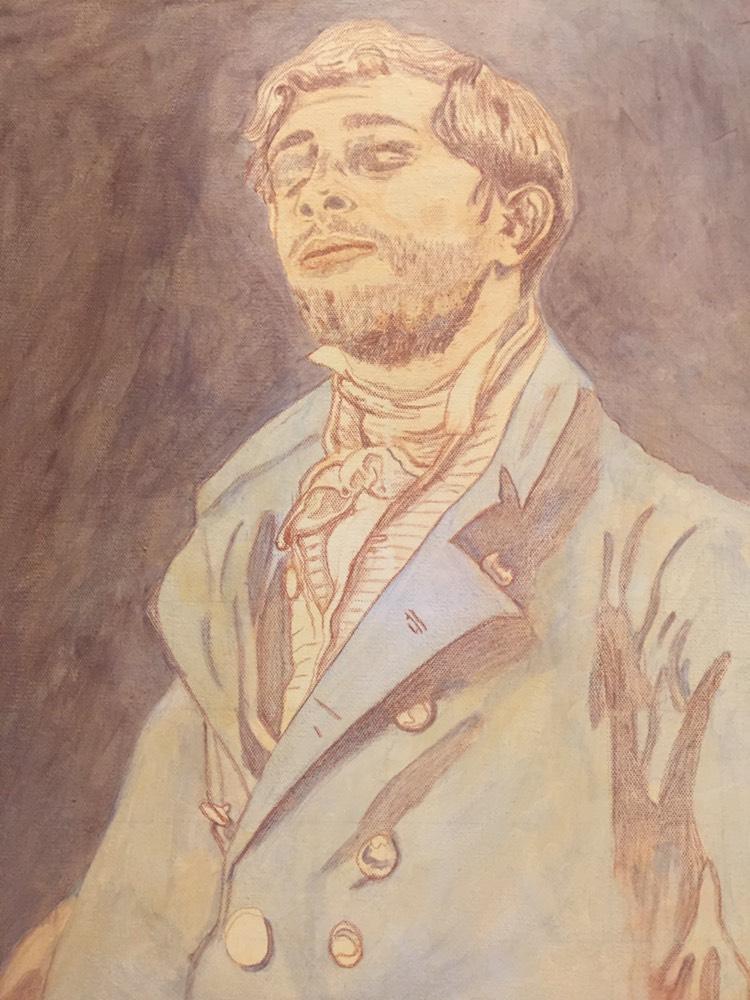
Hi Matt,Thank you for your advice and the progress photos you sent of your artwork. That really helped. I’ve watched a lot of the student videos and I’m trying to apply everything to my painting. I feel like it looks kind of terrible so far so maybe I’m not doing it right. I’m worried about painting any more shadow in on his face because it looks bad – especially his eyes. I definitely feel like I don’t know what I’m doing. Haha. I don’t know what to do about his hair or face. And the white shirt with the dark creases. And the brass jacket buttons. I’m following your list of paint colors to use for the skin tones off of your skin tone video and that is very helpful. But I just feel kind of lost as to the layering process. For instance, for the face, I don’t know how many layers of shadows I’m supposed to do before I move onto layers of midtones. And how many layers of midtones do I do before I move onto highlights? And when I’m painting the midtones, do I paint over the shadow areas as well? Or only paint on the midtone areas?Thank you so much for your help!Holly
What is Glazing?
Glazing is a technique where a thin, transparent layer of paint is applied over a dried layer of paint. This process can be repeated multiple times, gradually building up the desired color and intensity. The final appearance of the artwork results from the interplay of colors beneath the glaze, creating a sense of depth and luminosity that cannot be achieved with opaque paint alone.
Choosing Colors for Shadows, Midtones, and Highlights
One of the most critical aspects of mastering the glazing technique is selecting the right colors for different areas of your painting. This can be particularly challenging when working with shadows, midtones, and highlights.
1. Shadows
When creating shadows, it is essential to choose colors that will blend well with the underlying layers. The shadows should be darker but also retain a sense of warmth or coolness depending on the lighting in your scene. For instance, using a mixture of raw umber dark and a hint of blue can create realistic shadows, providing depth without overpowering the other colors.
2. Midtones
Midtones serve as the bridge between the shadows and highlights. It is essential to mix colors that complement both extremes. For instance, when painting skin tones, a blend of yellow ochre and a touch of red can create a balanced midtone that will seamlessly transition between the shadows and highlights.
3. Highlights
Highlights add life to your painting, drawing the viewer’s eye. To achieve this, consider using lighter versions of your base colors mixed with titanium white or a light yellow. However, ensure that these highlights are still somewhat transparent to maintain the glazing effect.
Layering Process in the Glazing Technique
Once you have selected your colors, it’s time to start layering them using the glazing technique. Here’s a step-by-step approach to help you navigate the process effectively:
Step 1: Prepare Your Canvas
Begin by preparing your canvas with a base layer of acrylic paint. This initial layer should be dry before you start glazing. It can be beneficial to work on a toned canvas, which can help unify the painting’s overall tone.
Step 2: Apply the First Glaze
Using a soft brush, apply your first glaze. This layer should be thin and transparent. A mixture of matte medium with your chosen paint can help achieve the desired transparency. Start with your shadow color, working it into the areas where you want to establish depth.
Step 3: Let It Dry
Allow your glaze to dry completely before adding additional layers. This is crucial, as working on a wet layer can disturb your previous work and muddy your colors.
Step 4: Build Up Midtones
Once the first layer is dry, repeat the glazing process with your midtone color. Apply it over the areas where you want to create form and dimension, using a clean brush to blend the edges.
Step 5: Add Highlights
After your midtones have dried, apply your highlight color using the same glazing technique. This layer should be more transparent than your midtones and should enhance the overall brightness of your painting without losing depth.
Step 6: Repeat as Necessary
The glazing process can take several layers to achieve the desired effect. Don’t be afraid to go back and forth between shadows, midtones, and highlights, building up layers until you reach your goal. Each application should add depth and richness to the final piece.
Tips and Techniques for Effective Glazing
- Use High-Quality Paints: The quality of your paint can significantly affect your glazing results. Invest in artist-grade acrylics to ensure better transparency and mixing capabilities.
- Maintain a Light Touch: When applying glazes, use a gentle hand. It’s easier to add more layers than to remove excess paint.
- Test on a Palette: Before applying any glaze to your painting, test your colors on a palette or scrap canvas. This will give you a better idea of how they will interact.
- Layer Order Matters: Always start with the darkest colors and work towards the lightest. This approach helps maintain control over the overall value and temperature of your painting.
- Keep Brushes Clean: Regularly clean your brushes to avoid muddying your colors. Using separate brushes for each color can also be beneficial.
- Be Patient: Glazing is a slow process that requires patience. Allow each layer to dry fully before proceeding to the next to achieve the best results.
- Practice: The more you practice glazing, the more comfortable you will become with the technique. Experiment with different colors and layering styles to find what works best for you.
Conclusion
The glazing technique is an invaluable method for any acrylic painter looking to enhance the depth and vibrancy of their work. By understanding how to effectively layer colors, choose the right tones for shadows, midtones, and highlights, and employing the right techniques, artists can achieve stunning results that will captivate viewers.
As you embark on your glazing journey, remember to take your time and enjoy the process. Each layer contributes to the overall beauty of your painting, revealing the complexity of color and depth that acrylics can offer. Happy painting!
LEARN MORE
- How to Paint Foliage Using the Acrylic Glazing Technique
- How to Trace for an Accurate Portrait Sketch
- How to Paint Realistic Eyes in Your Acrylic Portrait
- How to Add Raw Umber Dark & Ultramarine Blue to Your Portrait
- How to Make Your Own Raw Umber Dark
- How to Paint Realistic Trees & Grass in Your Acrylic
- How to Block In Skin Tone Values Using Glazing Technique
- How to Paint Vibrant Reds in Your Acrylic Portrait
- How to Glaze Background Colors & More Acrylic Portrait
- How to Paint White Clothing in Your Acrylic Portrait
- How to Easily Transition from a Sketch to a Painting
- How to Block In Shading & Skin Tones in Your Acrylic
- How to Build Up Color on Acrylic Pet Portrait
- How to Build Up Form on Clothing with Acrylic
- How to Paint Dark Clothing Using Acrylic Glazing Technique
- How to Paint a 24 x 30 Acrylic With 30 People
- How to Do Smooth Shading with Acrylic
- How to Sketch an Acrylic Portrait with a Grid
Read more about how to paint a portrait that you can surely be proud of!
P.S. Did you find this post helpful or encouraging? If so, send it on ahead! Let others know with the share buttons below. I’d love to hear your comments. Thank you so much! Also, do you have a question on acrylic portrait painting you’d like answered? Let me know, and I’d be happy to help!

How to Varnish Your Painting
Protect and enhance your artwork: A step-by-step guide to varnishing your painting for a lasting finish.
It was a large portrait on hardboard, about 48″ tall. Having just done some mural work with a well known muralist, I attempted to copy his method of using a household paint roller and a clear coat.
It was a disaster.
The medium looked so milky white while it was drying, that I started to panic like Rowan Atkinson did in the movie “Bean” when he sneezed on Whistler’s Mother. I tried to clean off the half dried medium with a damp towel. To my dismay, the medium started globbing up and totally distorted the fine detail work on the surface. Some areas had no varnish. Other areas were covered with a streaky, bumpy film. My painting was a hideous mess.
I said I would never varnish a painting again.
Except that I did.
I knew I needed to learn how to do it correctly in order to protect my paintings from dust and debris, saturate the colors and dark values more, and give it a uniform finish.
What I’m going to teach you is the process I learned basically from trial and error over the years.
I’m not scared to varnish any more. But I like to say a quick prayer before I put brush to canvas, because if you don’t varnish correctly, you can mess up a good painting very quickly!
Here’s a video that will show you the correct way to do it…
Here are the steps, simplified.
- Use acrylic matte varnish. Not matte medium. (unless you want a flat finish) Matte varnish dries to a satin sheen and looks fantastic. If you want a little more saturation on your dark values and colors, you can add some gloss medium to your matte varnish and mix them together very thoroughly.
- Put your painting on a flat table, or slightly angled. Don’t varnish the painting on a vertical easel or you could get drips and it will look terrible.
- Use a 1″ or larger flat brush that’s in good condition. Put your varnish in a cup or container than is wide enough to accommodate the brush.
- Dip the brush into the varnish and apply from top down, left to right, overlapping slightly. Do not overbrush!
- Continue the process all the way down and when you’re done, leave it alone for a couple hours. It should dry completely clear.
That’s all there is to it!
What do you think? What are YOUR experiences with varnishing? Do you have any stories–or tips–to share? Do you avoid varnishing completely?
Let me know how this tutorial helps.
All the best,
- How to Paint Foliage Using the Acrylic Glazing Technique
- How to Trace for an Accurate Portrait Sketch
- How to Paint Realistic Eyes in Your Acrylic Portrait
- How to Add Raw Umber Dark & Ultramarine Blue to Your Portrait
- How to Make Your Own Raw Umber Dark
- How to Paint Realistic Trees & Grass in Your Acrylic
- How to Block In Skin Tone Values Using Glazing Technique
- How to Paint Vibrant Reds in Your Acrylic Portrait
- How to Glaze Background Colors & More Acrylic Portrait
- How to Paint White Clothing in Your Acrylic Portrait
- How to Easily Transition from a Sketch to a Painting
- How to Block In Shading & Skin Tones in Your Acrylic
- How to Build Up Color on Acrylic Pet Portrait
- How to Build Up Form on Clothing with Acrylic
- How to Paint Dark Clothing Using Acrylic Glazing Technique
- How to Paint a 24 x 30 Acrylic With 30 People
- How to Do Smooth Shading with Acrylic
- How to Sketch an Acrylic Portrait with a Grid
Read more about how to paint a portrait that you can surely be proud of!
P.S. Did you find this post helpful or encouraging? If so, send it on ahead! Let others know with the share buttons below. I’d love to hear your comments. Thank you so much! Also, do you have a question on acrylic portrait painting you’d like answered? Let me know, and I’d be happy to help!

Easy, Inexpensive Artist’s Palette for Acrylic Painting
One of the most important aspects of acrylic portrait painting is setting up your palette.
It’s often overlooked, but having a palette setup that works well for you can minimize frustration, increase productivity, reduce paint costs, and even enhance accuracy in your portrait.
Recently, an artist asked me how I set up my palette. Of course, there’s many ways to do it.
I’m not going to say the way I do it is the right way, but it works for me. And it may work for you as well.
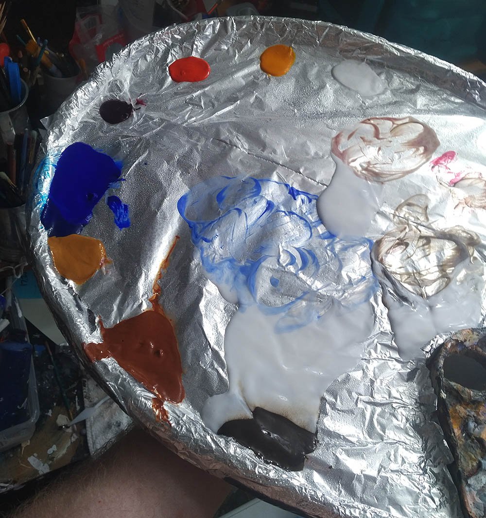
I use a traditional wood palette–about 14″ wide and 18″ long. I customized it a bit by adding a lip to the edge. That keeps my matte medium from dripping off the side. The lip is thick chipboard about 2″ in width that I bent and glued onto the wood. Then I sealed it with gloss medium to keep the moisture from warping it.
Let me help you get started on your new portrait today…
Learn How to Paint Acrylic Portraits With My Free Mini-Video Course!Before I start a new painting, I put aluminum foil over the entire surface, and attach it securely to back of the palette with clear packaging tape. It holds very well.
Then I lay out my paints.
I keep them wet as I can with a spray bottle of water while I work, spraying them about every 15 minutes or so.
When my mixing area gets too full of paint, I add a fresh piece of aluminum foil over the area, folding it over slightly to conform to the rounded shape of the palette. The previous layer of wet paint holds it down. This way I am not wasting paint. All my main colors on the palette remain until my painting is done or they dry up.
I throw the discarded, soiled pieces of aluminum foil away in a bag and then I get paid for them when I recycle them with my aluminum cans. And it doesn’t pollute the environment either!
Here is a video where I explain further how to set this palette up…
Question: What do you use for your palette…and why?
Enjoy your portrait painting and let me know if I can help you in any way.
All the best,
P.S. Did you find this post helpful or encouraging? If so, send it on ahead! Let others know with the share buttons below. I’d love to hear your comments. Thank you so much! Also, do you have a question on acrylic portrait painting you’d like answered? Let me know, and I’d be happy to help!

How To Illuminate Your Art Studio?
Transform your studio with the essential lighting tips for every artist
For acrylic portrait painters and all artists, there is a truth we can’t hide from: we can only paint as well as we can see
So, how well are we seeing in our art studios?
Here’s a question I got from one of my art students:
“I would like to paint in the evening but find out the next day my skin tones are off. I have the room overhead a one lamp with the daylight bulb but doesn’t seem to be enough. I do have cataracts which may be part of the problem but can’t have that fixed until next year. You said you currently have no windows in your studio so what do you use for good lighting? I’m sorry to bother you with a question like this but I was quite upset this morning to see what I did last night!”
Thanks so much and God Bless.
Sharon
Here’s my answer:
Hi Sharon,
It’s annoying to not have enough light. I remember when I first started painting, I would work with those old yellowish incandescent bulbs. When I took my painting outside to photograph it I said, “That’s NOT how it looked in my studio!” The colors were off, and it looked grainy.
Now with LED bulbs being so inexpensive (to buy and to run) I have 10 lights in my studio with 100 watt-equivalent daylight spectrum bulbs. Best part is they only use 14 watts a piece, so it’s pretty energy efficient!
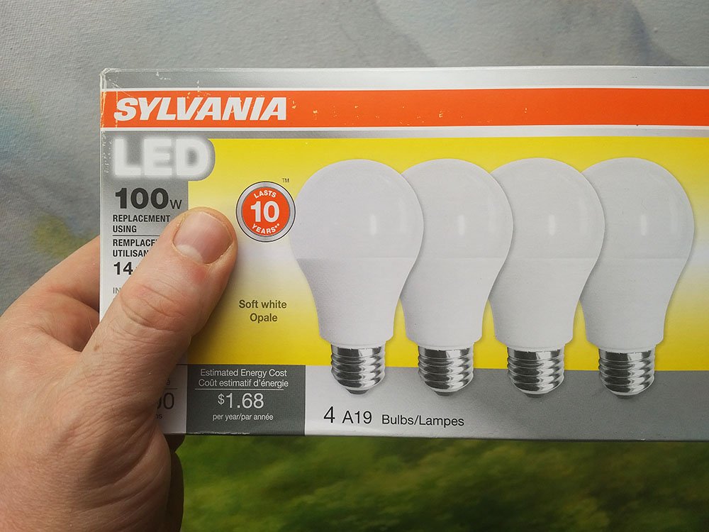
They are simple clamp-style lamps with metal reflectors that you can buy at your home improvement store for about $5-10 a piece. You don’t even have to buy them all at once. You can do it like I did. Every time I ran to Menards, I would buy another lamp. I spaced it out over the course of a couple years!
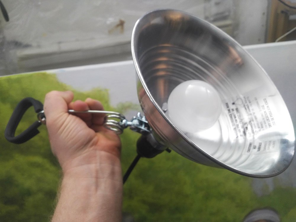
Here is a shot of my messy, well-used studio with the lights aimed at the ceiling. The reflected light works great to illuminate even a large painting. While I’m working there are virtually no shadows from my hands and arms to interfere with my painting.
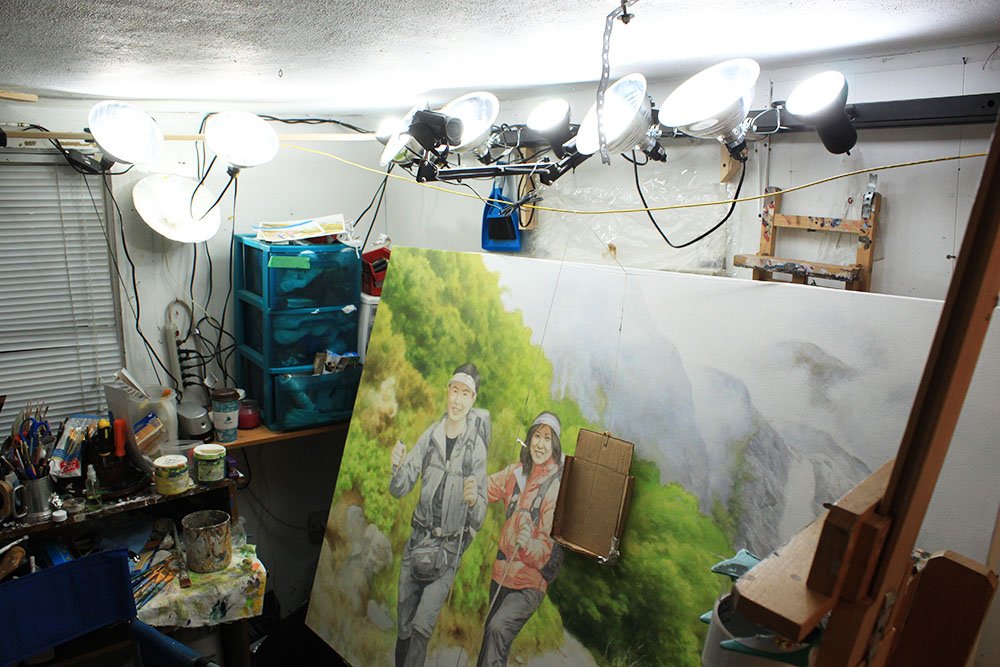
I do have a window in my studio now, but it doesn’t do a lot. It’s mostly the light bubs that illuminate everything for me.
Question: How do you illuminate YOUR studio?
LEARN MORE
- How to Paint Foliage Using the Acrylic Glazing Technique
- How to Trace for an Accurate Portrait Sketch
- How to Paint Realistic Eyes in Your Acrylic Portrait
- How to Add Raw Umber Dark & Ultramarine Blue to Your Portrait
- How to Make Your Own Raw Umber Dark
- How to Paint Realistic Trees & Grass in Your Acrylic
- How to Block In Skin Tone Values Using Glazing Technique
- How to Paint Vibrant Reds in Your Acrylic Portrait
- How to Glaze Background Colors & More Acrylic Portrait
- How to Paint White Clothing in Your Acrylic Portrait
- How to Easily Transition from a Sketch to a Painting
- How to Block In Shading & Skin Tones in Your Acrylic
- How to Build Up Color on Acrylic Pet Portrait
- How to Build Up Form on Clothing with Acrylic
- How to Paint Dark Clothing Using Acrylic Glazing Technique
- How to Paint a 24 x 30 Acrylic With 30 People
- How to Do Smooth Shading with Acrylic
- How to Sketch an Acrylic Portrait with a Grid
Read more about how to paint a portrait that you can surely be proud of!
All the best,
P.S. Did you find this post helpful or encouraging? If so, send it on ahead! Let others know with the share buttons below. I’d love to hear your comments. Thank you so much! Also, do you have a question on acrylic portrait painting you’d like answered? Let me know, and I’d be happy to help!