Category Archives for Sketching

How to Transition Slowly out your Sketch to Portrait
Master the art of realism: A step-by-step guide to transitioning from sketch to portrait
Creating a realistic portrait from a simple sketch requires patience, layering, and precise color adjustments. If you have ever struggled with making a smooth transition from sketch to portrait, this guide will help you step by step. By focusing on brush techniques, glazing methods, and color mixing, you will gradually build depth and realism in your artwork.
Why Transitioning Smoothly Matters
The transition from a sketch to a fully developed portrait is crucial for achieving lifelike results. Rushing through this process can lead to a flat, unbalanced painting. Instead, taking slow and deliberate steps allows for smoother shading, natural skin tones, and a polished finish.
Key Elements of a Smooth Transition:
- Building gradual layers
- Adjusting colors for depth and dimension
- Blending tones for soft, realistic effects
- Refining details without overworking
Step-by-Step Process: From Sketch to Portrait
1. Establishing the Base Layers
Start with a light wash of color to define major shadows and highlights. This will act as an under painting to guide future layers.
- Use thin, transparent layers rather than heavy application.
- Mix colors using a glazing technique to maintain subtle shifts in tone.
- Apply short, choppy strokes with a soft flat brush for smooth blending.
2. Adjusting Skin Tones and Values
To create realistic flesh tones, focus on temperature and saturation.
- For warm, tanned skin: Use Burnt Sienna and Raw Sienna in thin layers.
- For cooler, pale skin: Use Raw Umber Dark with matte medium to create subtle undertones.
- Always start with a faint application and gradually build intensity.
3. Refining Features with Glazing
Glazing allows for controlled adjustments without losing previous layers.
- Apply a thin glaze over darker areas to deepen shadows.
- Use a light, transparent mix to highlight prominent features.
- Work slowly to ensure colors remain balanced and natural.
4. Blending and Final Touches
To unify the portrait and eliminate harsh transitions:
- Pivot between the pointed and flat edge of your brush for smooth blending.
- Introduce subtle highlights on the forehead, nose, and cheekbones.
- Step back frequently to assess the overall composition before making final adjustments.
Tips and Techniques for a Seamless Transition
✔ Use Transparent Layers – Avoid thick, opaque paint layers too early in the process.
✔ Work with the Right Brushes – Flat and round brushes offer better control for blending.
✔ Glaze for Smoothness – Multiple layers of thin paint create realistic depth.
✔ Adjust Colors as Needed – Pale vs. warm skin tones require different pigment ratios.
✔ Take Your Time – Rushing will result in harsh lines and unnatural shading.
Transitioning from sketch to portrait requires patience, layering, and a deep understanding of colors and values. By following these techniques, you can develop a realistic and polished portrait with depth and subtlety.
Are you ready to refine your skills further? Keep practicing, experiment with glazing, and enjoy the process of bringing your sketches to life! 🎨
FAQ: Transitioning from Sketch to Portrait
1. What is the best way to avoid harsh transitions?
Use thin glazes and work in layers. Blending with a soft brush also helps create seamless shading.
2. How do I choose the right colors for skin tones?
Warm skin tones benefit from Burnt Sienna and Raw Sienna, while cooler tones need more Raw Umber Dark with added medium.
3. Should I use slow-drying mediums for blending?
It is not necessary, but you can experiment with retarders if you struggle with acrylic drying times.
4. How do I prevent overworking the painting?
Step back frequently and evaluate your work. If an area looks overworked, use a thin glaze to correct the tone.
LEARN MORE
- Sketching Your Painting Accurately
- Beginning a Pet Portrait in Acrylic
- The Mystery of Realism in Painting
- Apply A Burnt Sienna Glaze to a Portrait
- Learn How to Sketch a Portrait Freehand in 45 Minutes
- Adding highlights to your acrylic painting
- 5 Excellent Reasons to Use Aluminum Foil
- Paint Realistic Wrinkles in Acrylic
- Painting Clothing in an Acrylic Portrait
- Paint a Cloudy Sky Acrylic
- How to add Semi-Opaque Highlights
- How to Enhance the Contrast in Your Acrylic
- How to Add Glaze to Your Acrylic Painting
- Paint Realistic Reflections on Eyeglasses in an Acrylic Portrait
- Build Up Depth on Your Acrylic Portrait Backgrounds
- How Do You Do Layers With the Glazing Technique?
- Learn How to Paint Wrinkles in Acrylic
Read more about how to paint a portrait that you can surely be proud of!
I’d love to hear your thoughts on this video. Please share it with your friends and family. Let me know if you have any further questions. I’ll greatly help you.
If you’d like to learn more, sign up for my free email tips and video class today.
Learn How to Paint Acrylic Portraits With My Free Mini-Video Course!Thank you so much for taking the time to read this tutorial and watch the video. That means a lot to me. I hope you find it very helpful in your portrait painting.
Yours for Better Portraits,

P.S. Did you find this post helpful or encouraging? If so, send it in ahead! Let others know with the share buttons below. I’d love to hear your comments. Thank you so much! Also, do you have a question on acrylic portrait painting you’d like answered? Let me know, and I’d be happy to help!

How to Stretch Your Own Artist Canvas (STEP-BY-STEP)
Learn the art of canvas preparation: A step-by-step guide on how to stretch your own canvas
How to Stretch Your Own Artist Canvas: A Step-by-Step Guide
Creating your own stretched canvas allows for greater flexibility in size, quality, and customization. Whether you’re working on a commissioned piece, seeking higher-quality materials, or simply enjoying the hands-on process, learning how to stretch a canvas is a valuable skill for any artist. This guide will walk you through the essential tools, techniques, and expert tips to ensure your canvas is properly stretched and ready for painting.
Why Stretch Your Own Canvas?
Pre-stretched canvases from stores may not always meet your specific needs. Here are a few reasons why artists prefer stretching their own:
✅ Custom Sizes – Perfect for unique dimensions that store-bought canvases don’t offer.
✅ Better Quality – Store-bought canvases are often thin and prone to warping, while DIY stretching allows for thicker, more durable materials.
✅ Cost-Effective – Buying raw canvas and stretcher bars in bulk can be more affordable in the long run.
✅ Personal Satisfaction – The hands-on process of stretching a canvas provides greater control over your materials.
Materials You Need
Before getting started, gather the following supplies:
- Stretcher Bars – Choose sturdy bars in your desired dimensions.
- Raw Canvas – 10oz to 12oz cotton duck canvas is recommended for durability.
- Staple Gun & Staples – 3/8-inch staples work best for securing the canvas.
- Hammer – Useful for reinforcing staples if needed.
- Canvas Pliers – Helps grip and pull the canvas tightly.
- Measuring Tools – A square ruler ensures the frame is aligned properly.
- Scissors or Utility Knife – For cutting the canvas to size.
Step-by-Step Guide to Stretching Your Canvas
Step 1: Assemble the Stretcher Frame
- Fit the stretcher bars together at right angles to form a square or rectangular frame.
- Use a measuring square to check that all corners are at 90 degrees.
- Press the bars firmly together to ensure they are securely locked in place.
Step 2: Cut the Canvas
- Roll out your raw canvas on a clean, flat surface.
- Place the stretcher frame on top and leave about 3-4 inches of extra canvas on each side.
- Cut the canvas using scissors or a utility knife.
Step 3: Begin Stapling the Canvas
- Start by stapling the canvas to the middle of one stretcher bar, pulling it tight as you go.
- Move to the opposite side and repeat, ensuring even tension.
- Continue this process on the remaining two sides.
Step 4: Work Towards the Corners
- Move outward from the center, stapling every 2-3 inches along each stretcher bar.
- Use canvas pliers to pull the fabric tightly before stapling.
- Avoid overstretching, as the canvas can warp the frame if pulled too tightly.
Step 5: Fold and Secure the Corners
- For clean corners, fold the canvas neatly like wrapping a present.
- Secure the folds with 2-3 staples on each corner.
- Trim any excess fabric if necessary.
Step 6: Reinforce and Check for Tension
- Go over each staple and hammer in any that are loose.
- Flip the canvas over and tap on the surface it should feel taut like a drum.
- If the canvas sags, lightly mist the back with water and let it dry to tighten.
FAQ: Common Questions About Stretching Canvas
1. How do I know if my canvas is stretched tight enough?
A properly stretched canvas should have even tension across the surface and make a slight drum-like sound when tapped.
2. Can I reuse stretcher bars?
Yes! Stretcher bars can be reused for new canvases, but ensure they remain straight and undamaged.
3. Should I prime the canvas after stretching?
Yes, raw canvas should be primed with gesso to create a smooth painting surface and prevent paint from soaking through.
4. How do I prevent my canvas from sagging over time?
If sagging occurs, lightly mist the back of the canvas with water and allow it to dry, which helps tighten the fibers.
Pro Tips for a Perfectly Stretched Canvas
✔️ Use Quality Materials – Investing in high-quality canvas and sturdy stretcher bars will make a noticeable difference.
✔️ Work in a Clean Space – Dust or debris can get trapped in the fabric, affecting the final painting surface.
✔️ Stretch Evenly – Avoid pulling too hard in one area, as it can warp the frame.
✔️ Store Canvases Properly – Keep them in a dry environment to prevent warping.
Mastering how to stretch your own artist canvas gives you control over your materials, enhances durability, and allows for full customization. With practice, you’ll find the process rewarding and beneficial for your art. Whether you’re a beginner or a professional artist, stretching your own canvas is a skill worth developing.
LEARN MORE
- Sketching Your Painting Accurately
- Beginning a Pet Portrait in Acrylic
- The Mystery of Realism in Painting
- Apply A Burnt Sienna Glaze to a Portrait
- Learn How to Sketch a Portrait Freehand in 45 Minutes
- Adding highlights to your acrylic painting
- 5 Excellent Reasons to Use Aluminum Foil
- Paint Realistic Wrinkles in Acrylic
- Painting Clothing in an Acrylic Portrait
- Paint a Cloudy Sky Acrylic
- How to add Semi-Opaque Highlights
- How to Enhance the Contrast in Your Acrylic
- How to Add Glaze to Your Acrylic Painting
- Paint Realistic Reflections on Eyeglasses in an Acrylic Portrait
- Build Up Depth on Your Acrylic Portrait Backgrounds
- How Do You Do Layers With the Glazing Technique?
- Learn How to Paint Wrinkles in Acrylic
Read more about how to paint a portrait that you can surely be proud of!
I’d love to hear your thoughts on this video. Please share it with your friends and family. Let me know if you have any further questions. I’ll greatly help you.
If you’d like to learn more, sign up for my free email tips and video class today.
Learn How to Paint Acrylic Portraits With My Free Mini-Video Course!Thank you so much for taking the time to read this tutorial and watch the video. That means a lot to me. I hope you find it very helpful in your portrait painting.
Yours for Better Portraits,
P.S. Did you find this post helpful or encouraging? If so, send it in ahead! Let others know with the share buttons below. I’d love to hear your comments. Thank you so much! Also, do you have a question on acrylic portrait painting you’d like answered? Let me know, and I’d be happy to help!

How to Paint Lion and Soldier: Glazing Technique & Tips
Learn the acrylic glazing technique to create depth and luminosity in your portraits.
In the realm of acrylic painting, capturing depth and luminosity can elevate your artwork to a new level. Today, we delve into a symbolic and inspirational piece: a 16×20 acrylic on canvas depicting a lion and a soldier. This painting, inspired by the concept of divine guidance and protection, uses the glazing technique to achieve its captivating effect.
The acrylic glazing technique is a powerful technique that has revolutionized the way artists approach acrylic portrait painting. By layering translucent washes of color over a base layer, artists can achieve a depth and luminosity that bring their subjects to life. This method is particularly effective in creating inspiring works such as a Lion and a Soldier, where the interplay of light and shadow can evoke powerful emotions.
Understanding Acrylic Glazing
Acrylic glazing involves applying thin, transparent layers of paint to a dried layer of acrylic. Each layer modifies the color and tone of the underlying layers, allowing artists to build complex, rich hues without the muddiness that can result from mixing colors directly on the palette. The technique requires patience and precision, as each layer must dry completely before the next is applied.
The Concept Behind the Painting
The painting titled “He Goes Ahead of Us” is based on a verse from Deuteronomy, illustrating how divine guidance leads and protects through life’s battles. The lion symbolizes strength and leadership, while the soldier represents our active role in facing life’s challenges. This powerful imagery is brought to life using acrylic paints and the glazing technique.
Materials Needed
Before diving into the process, gather the following materials:
- Canvas (16×20)
- Acrylic paints (raw umber, burnt sienna, raw sienna, phthalo blue, ultramarine blue, alizarine crimson, naphthol red, organic orange, Indian yellow, titanium white)
- Matte medium
- Brushes (various sizes)
- Palette
- Reference photo
Steps to Achieve Acrylic Glazing
- Prepare Your Canvas: Start with a clean, primed canvas. Apply an underpainting if desired, using opaque colors to establish the basic composition and values.
- Mix the Glaze: Combine your chosen acrylic color with a glazing medium to achieve the desired transparency. The ratio of paint to medium can be adjusted based on the effect you want to achieve.
- Apply the Glaze: Using a soft brush, apply the glaze in thin, even layers. Allow each layer to dry completely before adding the next. The drying time will vary depending on the thickness of the glaze and environmental conditions.
- Build Up Layers: Continue adding layers of glaze, gradually building up the color intensity and depth. Pay attention to the interplay of light and shadow, which enhances the three-dimensionality of your subject.
- Final Touches: Once you have achieved the desired effect, add any final details or highlights. Use opaque paints sparingly to avoid disrupting the transparency of the glazes.
Mastering Acrylic Portrait Painting
Acrylic portrait painting benefits immensely from the glazing technique. Portraits require a nuanced approach to capture the subtleties of skin tones, facial features, and expressions. Glazing allows artists to create realistic and lifelike portraits with a sense of depth and dimension.
Key Techniques for Acrylic Portraits
- Underpainting: Start with a monochromatic underpainting to establish the basic values and shapes. This serves as a foundation for the subsequent layers.
- Layering: Use glazing to build up the skin tones gradually. Begin with lighter, more transparent layers, and gradually increase the opacity in the darker areas.
- Blending: Acrylics dry quickly, which can make blending challenging. Use glazing to create smooth transitions between colors and tones.
- Details: Add fine details such as hair, eyes, and textures using a combination of glazing and opaque painting techniques. Use a fine brush for precision.
- Highlights and Shadows: Emphasize the highlights and shadows to enhance the three-dimensionality of the portrait. Glazing allows for subtle adjustments and refinements.
Inspirational Acrylic Painting of a Lion and Soldier
Combining the majestic presence of a lion with the strength and bravery of a soldier creates a powerful and inspirational image. The acrylic glazing technique is particularly suited for capturing the contrasting textures and emotions of such a subject.
Composition and Planning
- Conceptualize: Begin by conceptualizing the composition. Decide on the pose, background, and overall mood of the painting. Sketch out your ideas on paper.
- Reference Materials: Gather reference photos of lions and soldiers. Pay attention to the details of their features, textures, and expressions.
- Composition: Plan the composition on your canvas. Consider the placement of the lion and the soldier, ensuring a balanced and harmonious arrangement.
Painting Process
- Underpainting: Start with a detailed underpainting. Use earthy tones for the lion and neutral tones for the soldier. Establish the basic shapes and values.
- Layering and Glazing: Begin applying glazes to build up the colors and textures. For the lion, use a combination of warm browns, oranges, and yellows to capture the fur. For the soldier, use cooler tones such as blues, greens, and grays.
- Textures: Pay attention to the textures of the lion’s mane and the soldier’s uniform. Use glazing to create a sense of depth and realism.
- Details: Add fine details such as the lion’s whiskers, the soldier’s facial features, and any other intricate elements. Use a combination of glazing and opaque painting for precision.
- Background: Create a background that complements the subjects. Use glazing to create a sense of depth and atmosphere.
- Final Touches: Add any final highlights and shadows to enhance the overall impact of the painting. Ensure that the glazes are smooth and evenly applied.
Watch the full video below
The acrylic glazing technique is a versatile and powerful method that can elevate acrylic portrait paintings to new levels of realism and depth. By mastering this technique, artists can create inspiring and impactful works, such as a painting of a lion and a soldier, that resonate with viewers on an emotional level. Whether you are a beginner or an experienced artist, incorporating glazing into your acrylic painting practice can open up new possibilities and enhance your artistic expression.
LEARN MORE
- Sketching Your Painting Accurately
- Beginning a Pet Portrait in Acrylic
- The Mystery of Realism in Painting
- Apply A Burnt Sienna Glaze to a Portrait
- Learn How to Sketch a Portrait Freehand in 45 Minutes
- Adding highlights to your acrylic painting
- 5 Excellent Reasons to Use Aluminum Foil
- Paint Realistic Wrinkles in Acrylic
- Painting Clothing in an Acrylic Portrait
- Paint a Cloudy Sky Acrylic
- How to add Semi-Opaque Highlights
- How to Enhance the Contrast in Your Acrylic
- How to Add Glaze to Your Acrylic Painting
- Paint Realistic Reflections on Eyeglasses in an Acrylic Portrait
- Build Up Depth on Your Acrylic Portrait Backgrounds
- How Do You Do Layers With the Glazing Technique?
- Learn How to Paint Wrinkles in Acrylic
Read more about how to paint a portrait that you can surely be proud of!
I’d love to hear your thoughts on this video. Please share it with your friends and family. Let me know if you have any further questions. I’ll greatly help you.
If you’d like to learn more, sign up for my free email tips and video class today.
Learn How to Paint Acrylic Portraits With My Free Mini-Video Course!Thank you so much for taking the time to read this tutorial and watch the video. That means a lot to me. I hope you find it very helpful in your portrait painting.
Yours for Better Portraits,

P.S. Did you find this post helpful or encouraging? If so, send it in ahead! Let others know with the share buttons below. I’d love to hear your comments. Thank you so much! Also, do you have a question on acrylic portrait painting you’d like answered? Let me know, and I’d be happy to help!

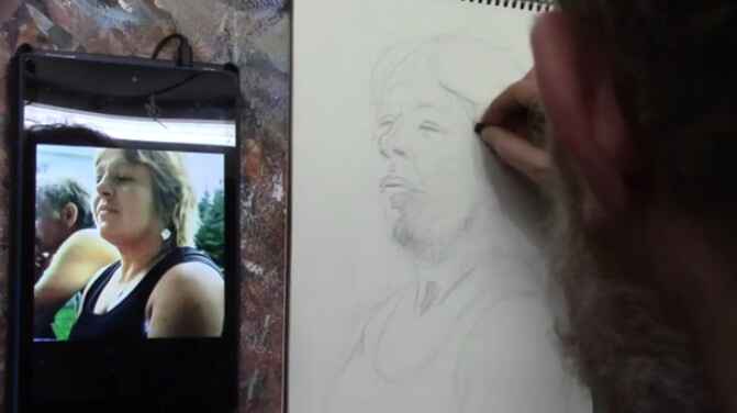
How to Convert a Tracing to Sketch: Painting Process
Transform your tracing into a detailed sketch: techniques for realistic portrait
When creating a detailed portrait painting, a tracing can provide a solid foundation, but the real artistry lies in refining that tracing into a fully realized sketch. Tracing outlines gives you the basic proportions, but they often miss critical details that are essential for realism. In this post, we’ll walk you through the process of converting a traced outline into a well-refined sketch, using the example of a portrait of the apostle Paul praying.
Understanding the Role of Tracing in Art
A Solid Start:
Tracing can save time, especially for complex portraits or when accuracy is critical. By using tools such as a projector, you can quickly lay down the basic structure. However, tracing alone doesn’t provide all the necessary details, especially when aiming for realism. For example, simple outlines of hands or facial features will lack the subtleties of light, shadow, and wrinkles.
Step-by-Step Guide to Refining a Tracing
- Assess the Tracing
After completing your tracing, take a moment to assess its accuracy. Then, look for areas where the proportions are correct but still lack detail. In our example of Paul praying, the tracing provided the basic layout of the figure but left out critical nuances in the facial features and folds in the fabric. - Start with the Most Important Features
Begin with, refining by focusing on the most significant elements of the portrait. In the case of this sketch of Paul, the face is where we started. When, using tracing as the base, it’s essential to add details such as wrinkles, shadows under the eyes, and the curvature of the facial features. But tracings often simplify features, which means you’ll need to carefully draw in the missing details. Also, pay attention to how the light hits the face and creates shadow, especially in areas like the nose and mouth. - Correcting Proportions and Perspectives
If your reference photo features a unique perspective, then like a worm’s eye view (looking up from below), the tracing may not capture all the nuances. In my sketch of Paul, refining the eye’s position and size was crucial, but given the upward angle of the face. While keeping the eyes proportional and always make sure they reflect the right shape is vital to ensuring the overall accuracy of the portrait. - Utilize Tools for Precision
A battery-operated eraser can be a game-changer when correcting small mistakes in a sketch. This tool allows you to erase specific areas without disturbing the rest of your drawing. Erasers also help lighten lines that are too dark, adding more subtlety to your shading. - Refining Shadows and Values
Tracing can often leave large areas of the sketch looking flat or featureless. After refining the major facial features, the next step is to work on the shadows and values. For instance, the shadow under Paul’s chin, the folds in his clothing, and the contours of his hands all required careful attention. By adding shading, you can indicate areas of light and dark, giving the sketch depth and volume. As you shade, remember to leave room for reflected light, which is the subtle illumination on areas that aren’t directly hit by light but still have a glow. - Focusing on Fabric and Wrinkles
The clothing, especially when it has folds and creases, is another area where tracings often fall short. In Paul’s prayer portrait, the tracing missed many of the intricate wrinkles that give the fabric its realistic texture. To add this realism, pay close attention to the way fabric bunches and folds in real life. Observe the direction of the creases, and emphasize key folds to give your sketch depth. Fabric in motion, like the bending of a sleeve, will show wrinkles in a more dynamic manner.
Tips and Techniques for Converting a Tracing to a Sketch
- Don’t Rely Solely on the Tracing: Tracing is just the first step. Always refer back to your reference photo or real-life model to capture the subtleties.
- Take Your Time with Key Features: Spend extra time refining the eyes, nose, and mouth—especially in a portrait. These areas are often simplified in tracings and need additional work to feel realistic.
- Use Multiple Tools: Incorporate erasers, different grades of pencils, and even digital tools (if sketching digitally) to refine your work.
- Pay Attention to Light: Always consider where your light source is coming from. Tracings don’t provide shadows, so it’s up to you to add this layer of realism.
- Zoom in and Out: Step back and view your work from a distance occasionally. This helps you see the sketch as a whole and ensures that the proportions and shading are balanced.
Realism Through Sketch Refinement
One of the major issues with relying too much on tracing is that it simplifies the image. The forms can become too basic, losing the intricate shapes and contours that make a drawing feel realistic. As you continue refining your tracing, keep adding subtle details. In the case of Paul’s hand, for example, the tracing left out the finer details of the fingers clasped together. Adding these small details later can be done by freehand drawing, improving the overall realism.
The Final Sketch
By the end of this process, the sketch of Paul went from a simple traced outline to a fully developed, refined sketch, capturing all the essential details necessary for a realistic portrait. Then remember, tracing is just the foundation; the true artistry comes in the refinement. Through careful observation, adding shadows, correcting shapes, and focusing on details like fabric and facial features, you’ll create a sketch that serves as a strong base for a lifelike painting.
Sketching Fundamentals: From Tracing to Freehand Mastery
1. Starting with a Strong Foundation
When beginning a portrait sketch, the initial step often involves tracing. Although tracing can be a helpful tool, it should not be relied upon exclusively. As shown in the video, How to Convert a Tracing to a Sketch, Part #2 tracing an image with an overhead projector helps establish basic proportions but lacks the fine details and accuracy needed for a refined sketch. To improve the likeness and detail, learning freehand sketching or using a grid method is essential.
2. Choosing the Right Tools
A dark umber or dark brown colored pencil is highly recommended for initial sketching. These pencils provide a good contrast against the canvas, making it easier to refine details. Precision is crucial, and using a battery-operated eraser can greatly enhance accuracy. This tool allows for fine adjustments and corrections, particularly in areas requiring detailed work, such as the fingers in our example.
3. Refining the Sketch
Once the basic outline is established, focus on refining the sketch by adding detailed features. For instance, when sketching Paul the Apostle’s hands, attention must be given to the length and placement of each finger. Details such as fingernails and the interplay of light and shadow play a significant role in achieving realism.
4. Incorporating Reference Photos
Using reference photos is vital for accuracy. In this video, a photo shoot in a studio mimicking the lighting of a Caravaggio painting provided a valuable reference. This photo helps ensure that the contrast and structure of the hands are correctly depicted. When sketching, always use a reference photo to guide the placement of details and ensure a realistic portrayal.
Advanced Techniques for a Professional Finish
5. Shading and Blocking in Values
Shading is crucial for adding depth and dimension to your sketch. I uses shading to differentiate between light and dark areas, such as on the clothing and objects in the scene. This technique help me in creating a three-dimensional effect and enhancing the overall realism of the portrait.
6. Adding Textural Details
For a more lifelike result, add texture to elements like clothing and objects. In the example, I use triangular shapes to suggest folds and creases in the fabric, and shading to indicate the structure of a drinking vessel. Textural details contribute to the overall realism and visual interest of the portrait.
7. Creating a Believable Environment
When sketching elements like the background, it’s important to consider how they contribute to the overall scene. The video demonstrates adding elements such as prison bars and a scroll to place the subject in a believable context. Accurate depiction of the environment adds to the narrative and helps the viewer connect with the portrait.
Final Adjustments and Presentation
8. Reviewing and Making Final Adjustments
Before concluding the sketch, review all elements for accuracy and completeness. This step is essential for a polished and professional finish.
9. Presenting Your Work
Once the sketch is complete, it’s time to prepare for the painting process. Ensure that your sketch is well-detailed and ready to serve as a solid foundation for your acrylic portrait. Proper preparation at this stage will significantly influence the final outcome of your painting.
Tips and Techniques for Effective Portrait Sketching
- Use Quality Materials: Invest in good quality pencils and erasers to achieve precise details.
- Practice Freehand Sketching: Develop your freehand skills to avoid over-reliance on tracing methods.
- Utilize Reference Photos: Use high-quality reference photos to guide details and proportions.
- Focus on Shading: Effective shading adds depth and dimension to your sketches.
- Pay Attention to Texture: Adding textural details enhances the realism of your portrait.
By incorporating these techniques and following a structured approach, you can improve your portrait sketching skills and create more compelling and realistic artwork. For additional tips and resources, visit www.realisticacrylic.com and check out the tutorial on fixing muddy skin tones, then download here.
Feel free to share your own sketching techniques or ask questions in the comments below. Happy sketching!
- Adding highlights to your acrylic painting
- 5 Excellent Reasons to Use Aluminum Foil
- Paint Realistic Wrinkles in Acrylic
- Painting Clothing in an Acrylic Portrait
- Paint a Cloudy Sky Acrylic
- How to add Semi-Opaque Highlights
- How to Enhance the Contrast in Your Acrylic
- How to Add Glaze to Your Acrylic Painting
- Paint Realistic Reflections on Eyeglasses in an Acrylic Portrait
- Build Up Depth on Your Acrylic Portrait Backgrounds
- How Do You Do Layers With the Glazing Technique?
- Learn How to Paint Wrinkles in Acrylic
Read more about how to paint a portrait that you can surely be proud of!
I’d love to hear your thoughts on this video. Please share it with your friends and family. Let me know if you have any further questions. I’ll greatly help you.
If you’d like to learn more, sign up for my free email tips and video class today.
Learn How to Paint Acrylic Portraits With My Free Mini-Video Course!
Thank you so much for taking the time to read this tutorial and watch the video. That means a lot to me. I hope you find it very helpful in your portrait painting.

Yours for Better Portraits,
P.S. Did you find this post helpful or encouraging? If so, send it on ahead! Let others know with the share buttons below. I’d love to hear your comments. Thank you so much! Also, do you have a question on acrylic portrait painting you’d like answered? Let me know, and I’d be happy to help!

How to Critique a Pet Portrait Painting Sketch
I’ll show you how I give critiques of pet portrait sketches to my student.
When working on a pet portrait painting, critiquing your sketch is a vital part of the process. Whether you’re aiming to depict a Maltese or a mixed-breed dog, evaluating your sketch helps to ensure that your final piece captures the true essence and features of the pet. This article will walk you through a detailed critique process with practical tips to improve your work, especially when portraying the texture, forms, and proportions of a pet’s fur and facial features.
Key Focus Areas in a Pet Portrait Critique
- Fur Texture and Detail
- Abstract Forms and Shapes
- Proportions of the Features
- Breaking Down the Sketch Into Sections
1. Analyze Fur Texture for Realism
The first thing to assess when critiquing a pet portrait sketch is the fur texture. Capturing realistic fur is essential to making the portrait resemble the pet you’re painting. If the fur looks flat, you may need to add more detail by observing how the strands of fur interact with the light and shadow in the reference photo.
To enhance the fur texture:
- Observe how the fur clumps together in certain areas. Look for patterns of light and dark where the fur creates shadows or reflects light.
- Sketch the fur in sections rather than treating it as one mass. Look at your reference photo and break down the fur into distinct strands, sketching them individually.
- Use softer, thinner lines to represent fine fur, and more prominent lines for thicker areas of fur.
For example, if the fur on the dog’s head is thicker, you’ll want to draw shorter, more frequent lines, suggesting the texture and fullness. As you progress through the portrait, adding more nuanced strands helps give depth and texture to the sketch.
2. Focus on Abstract Forms Rather than Literal Features
When critiquing, try to see your sketch not as a pet, but as a series of abstract forms. This technique helps you focus on shapes and values, which are more reliable indicators of how the final painting will look.
Here’s how you can shift your mindset to abstract forms:
- Squint at your reference photo or zoom in on specific sections to see the shapes of light and dark. The fur and features should dissolve into patterns that can be sketched as abstract shapes.
- Break down sections of the face and fur into squares or triangles. For example, a section of fur might appear as a triangular shape with dark edges, or a shadow around the eyes might form a rounded rectangle.
By thinking of the sketch as a collection of abstract shapes, you’ll become less focused on replicating hair strands and more on capturing the overall light and shadow. This method helps build a more accurate sketch, especially when detail is hard to interpret.
3. Double-Check the Proportions
One of the most common mistakes in pet portraits is getting the proportions slightly off. During your critique, compare your sketch to the reference photo, paying attention to key features like the nose, eyes, and ears.
- For the nose, make sure it’s not too narrow or too wide. A dog’s nose often forms a rounded triangle, and drawing it slightly off can make the pet look unfamiliar. If your sketch shows a narrow nose, you may need to broaden it and adjust the angles.
- The eyes are critical. If they are too large or small, the whole portrait may feel disproportionate. Measure the eyes in relation to the head and ensure they are the correct size and placed evenly.
It can be useful to divide the reference photo into a grid and sketch each section individually to keep proportions accurate.
4. Break Down Your Sketch Into Smaller Sections
Critiquing a portrait becomes much easier when you break down the reference image and the sketch into smaller, more manageable sections. Working square by square allows you to focus on individual parts of the portrait rather than feeling overwhelmed by the whole.
- Divide your canvas or reference image into squares or sections, and focus on replicating each one accurately.
- Pay attention to the shapes of light and shadow within each square. This method ensures that you capture the most important aspects of the pet’s features, without getting lost in the details.
For example, in a dog’s face, the area around the eyes might form a circular pattern of light and dark. By focusing on these shapes within each section, you can ensure that the overall image comes together cohesively.
Tips for Improving Your Sketch
- Pay Attention to Details Early On: The more effort you put into your sketch, the easier it will be when you start painting. A detailed sketch provides a solid foundation for the painting process, allowing you to focus on color and texture later.
- Use the Glazing Technique for Texture: When painting over your sketch, consider using a glazing technique. This method involves applying thin layers of translucent paint, allowing the underlying sketch to show through. It’s particularly effective for painting fur, as you can layer different colors to create depth.
- Enhance with Opaque Paint: Once you have a solid base with your glazing, you can apply opaque paint to highlight areas such as the fur’s highlights or the reflection in the eyes. These final touches bring the painting to life and give the pet portrait a realistic look.
The Importance of a Good Sketch
Critiquing your pet portrait sketch is essential for producing a realistic and beautiful painting. By focusing on fur texture, abstract shapes, and accurate proportions, you can create a solid foundation for your artwork. Break your reference into manageable sections, and approach your critique with a willingness to adjust and improve.
A well-developed sketch saves you time in the painting process, helping you to produce more accurate and lifelike pet portraits that captivate the viewer.
LEARN MORE
- How to Paint Foliage Using the Acrylic Glazing Technique
- How to Trace for an Accurate Portrait Sketch
- How to Paint Realistic Eyes in Your Acrylic Portrait
- How to Add Raw Umber Dark & Ultramarine Blue to Your Portrait
- How to Make Your Own Raw Umber Dark
- How to Paint Realistic Trees & Grass in Your Acrylic
- How to Block In Skin Tone Values Using Glazing Technique
- How to Paint Vibrant Reds in Your Acrylic Portrait
- How to Glaze Background Colors & More Acrylic Portrait
- How to Paint White Clothing in Your Acrylic Portrait
- How to Easily Transition from a Sketch to a Painting
- How to Block In Shading & Skin Tones in Your Acrylic
- How to Build Up Color on Acrylic Pet Portrait
- How to Build Up Form on Clothing with Acrylic
- How to Paint Dark Clothing Using Acrylic Glazing Technique
- How to Paint a 24 x 30 Acrylic With 30 People
- How to Do Smooth Shading with Acrylic
- How to Sketch an Acrylic Portrait with a Grid
Read more about how to paint a portrait that you can surely be proud of!
I’d love to hear your thoughts on this video. Please share it with your friends and family. Let me know if you have any further questions. I’ll greatly help you.
If you’d like to learn more, sign up for my free email tips and video class today.
Learn How to Paint Acrylic Portraits With My Free Mini-Video Course!
Thank you so much for taking the time to read this tutorial and watch the video. That means a lot to me. I hope you find it very helpful in your portrait painting.
Yours for Better Portraits,
P.S. Did you find this post helpful or encouraging? If so, send it on ahead! Let others know with the share buttons below. I’d love to hear your comments. Thank you so much! Also, do you have a question on acrylic portrait painting you’d like answered? Let me know, and I’d be happy to help!

Learn How to Sketch a Portrait Freehand: 45 Minutes
Unlock the secrets to freehand portrait drawing with precision and confidence
Sketching a portrait freehand can seem daunting, especially when capturing someone’s likeness. However, with patience and the right approach, anyone can create a compelling portrait in just 45 minutes. In this tutorial, we’ll break down a step-by-step method for sketching a portrait freehand using three simple pencils. Whether you’re a beginner or looking to refine your skills, this guide will help you confidently sketch portraits with more precision.
1. Prepare Your Materials: Start Simple for Success
Before diving into your sketch, it’s important to have the right tools.
- Pencils: HB (light), 3B (medium), and 8B (dark).
- Kneaded Eraser: Gentle on the paper and flexible for different erasing needs.
- Painter’s Tape: To secure the paper and prevent it from shifting.
Tip: Simplicity is key. Stick with just three pencils to avoid overwhelming yourself with too many options. This will help you focus on the drawing process without distraction.
2. Start with Basic Shapes: Defining the Composition
To begin, lightly sketch the outline of the head using simple, fluid lines. I suggest starting with the overall shape of the face, which is often oval. By using an HB pencil, the lightest in your set, you can make adjustments easily without committing too much at this stage.
Technique: Use long, gentle strokes to block in the general form. Avoid adding too much detail at first. Your goal is to get a feel for the proportions and placement of key features like the eyes, nose, and mouth.
Tip: Leave room on the top and bottom of the paper to avoid cramping the portrait. This ensures you can later fill in features like the hair and chin without running out of space.
3. Measure Proportions: The Key to Realism
Proportions are crucial for a successful portrait. One common rule is that the eyes should be roughly in the middle of the head. I emphasize using the eyes as a reference point for measuring the other facial features.
Here’s a quick breakdown:
- Eyes are typically located halfway between the top of the head and the chin.
- The nose usually falls about one-third of the way down from the eyes to the chin.
- The mouth is located between the nose and chin, often aligning with the middle of the eyes.
Technique: I advises using your pencil as a measuring tool. You can hold the pencil up against your reference photo, measure the angles of the face, and compare them directly with your sketch.
4. Focus on the Eyes: The Window to the Soul
I stress the importance of the eyes in any portrait. If the eyes are accurate, the rest of the portrait is more likely to fall into place. Start by lightly sketching the overall shape of the eyes and ensuring they are properly aligned with one another.
Technique: Notice the subtle curves in the eyelids and pay attention to the shadows. Use cross-hatching to create depth around the eyes. For reflections within the eyes, darken the pupils with a 3B pencil, leaving highlights for a realistic, lively appearance.
Tip: Take breaks to step back and assess the accuracy of your work. This will help you spot any inconsistencies in the alignment of the eyes or other features.
5. Gradually Add Features: Build Up with Confidence
Once the eyes are in place, you can move on to sketching the nose and mouth. I recommend focusing on the spacing between the features and the angles of the face. Be mindful of the direction of the mouth—it may curve slightly upward or downward depending on the expression.
Tip: The space between the nose and the upper lip is crucial in portraying a lifelike expression. Check that these distances match the reference photo to maintain accuracy.
6. Capture Expression: Use Wrinkles and Shadows
Facial expressions are often conveyed through the eyes and the subtle wrinkles around them. I emphasize how the cheeks and wrinkles near the eyes can reveal whether someone is smiling.
Technique: For wrinkles, use your 3B pencil to create soft, sketchy lines. Be careful not to press too hard. You can always build up the darker areas later with an 8B pencil. Incorporate shadows along the cheekbones and around the nose to give the face a sense of dimension.
7. Refine the Details: Darken and Shade for Depth
As you become more confident in the proportions, start darkening certain areas to define the form more clearly. The 8B pencil is perfect for emphasizing deep shadows, especially in areas like the hair and under the chin.
Technique: Use cross-hatching in areas where more shading is needed. Hold the pencil on its side to create broader strokes for shading larger areas, like the forehead or jawline. Be sure to leave highlights in places where light would naturally fall, such as the tip of the nose or the forehead.
8. Final Adjustments: Add Hair and Clothing
Finally, sketch in the hair and any clothing details. Hair can be tricky, but I also suggest starting with the general shape and then breaking it down into smaller sections. Don’t try to draw every strand—focus on capturing the overall flow and texture.
Tip: When sketching hair, leave some areas lighter to create the illusion of shine. For clothing, use lighter pencils for the fabric’s folds and darker ones for the shadows and creases.
Sketching a portrait freehand may seem like a challenge, but by following these steps, you’ll find the process manageable and rewarding. With careful attention to proportions, the right shading techniques, and consistent practice, you’ll be able to complete a lifelike portrait in just 45 minutes. Keep refining your skills, and soon you’ll be sketching portraits with confidence and accuracy.
Final Tips:
Practice cross-hatching to create depth and dimension in your shading.
Use a light touch with your pencils, especially in the beginning stages.
Regularly step back to assess your work from a distance.
Remember that accuracy in the eyes often determines the success of the entire portrait.
Read more about my additional resources, tutorials, to learn more and check out my free courses here. . Whether you’re a beginner or an experienced artist, there’s always something new to learn and apply to your paintings. Happy painting!
Learn How to Sketch a Portrait Freehand in 45 Minutes!
- How to Paint Foliage Using the Acrylic Glazing Technique
- How to Trace for an Accurate Portrait Sketch
- How to Paint Realistic Eyes in Your Acrylic Portrait
- How to Add Raw Umber Dark & Ultramarine Blue to Your Portrait
- How to Make Your Own Raw Umber Dark
- How to Paint Realistic Trees & Grass in Your Acrylic
- How to Block In Skin Tone Values Using Glazing Technique
- How to Paint Vibrant Reds in Your Acrylic Portrait
- How to Glaze Background Colors & More Acrylic Portrait
- How to Paint White Clothing in Your Acrylic Portrait
- How to Easily Transition from a Sketch to a Painting
- How to Block In Shading & Skin Tones in Your Acrylic
- How to Build Up Color on Acrylic Pet Portrait
- How to Build Up Form on Clothing with Acrylic
- How to Paint Dark Clothing Using Acrylic Glazing Technique
- How to Paint a 24 x 30 Acrylic With 30 People
- How to Do Smooth Shading with Acrylic
- How to Sketch an Acrylic Portrait with a Grid
Read more about how to paint a portrait that you can surely be proud of!
I’d love to hear your thoughts on this video. Please share it with your friends and family. Let me know if you have any further questions. I’ll greatly help you.
If you’d like to learn more, sign up for my free email tips and video class today.
Learn How to Paint Acrylic Portraits With My Free Mini-Video Course!
Thank you so much for taking the time to read this tutorial and watch the video. That means a lot to me. I hope you find it very helpful in your portrait painting.
Yours for Better Portraits,
P.S. Did you find this post helpful or encouraging? If so, send it on ahead! Let others know with the share buttons below. I’d love to hear your comments. Thank you so much! Also, do you have a question on acrylic portrait painting you’d like answered? Let me know, and I’d be happy to help!

How To Sketch Charcoal Portrait in 25 Minutes
If you’re looking at improving your portrait paintings, drawing freehand can really help.
Creating a charcoal portrait sketch in under 30 minutes may sound challenging, but with the right techniques, you can achieve it! Charcoal is a fantastic medium to bring depth, expression, and contrast into your drawings. In this tutorial, we will break down the process of sketching a memorial portrait using charcoal, capturing fine details and key elements in a short time.
Gathering Materials for Your Portrait
Before diving into sketching, ensure you have the right materials. Charcoal pencils offer bold lines and strong contrast compared to graphite, which can be lighter and easier to erase. You’ll also need a kneaded eraser, which is perfect for highlighting and making corrections without leaving behind crumbs.
Materials Needed:
- Charcoal pencils
- Graphite pencils (optional)
- Kneaded eraser
- A quality sketchbook or paper suitable for charcoal
- Blending tools or fingers
Step-by-Step Guide to Sketching a Charcoal Portrait in 25 Minutes
Let’s start with a quick overview of the approach to create a meaningful portrait efficiently. This process involves blocking in the shapes, paying attention to proportions, shading, and capturing details like facial expressions and textures.
1. Begin with Basic Outlines
The first step is to outline the portrait’s structure, then focus on the subject’s head shape and major facial features like the eyes, nose, and mouth. In this demonstration, I sketched the hat, face, and eyes first, using quick and confident strokes to block out the placement of features. The key is to establish proportions early to avoid misalignment later on.
Tip: Use light strokes for your initial outlines. Because charcoal is difficult to erase, so it’s best to start with soft marks that can be adjusted as needed.
2. Focus on the Eyes and Facial Proportions
Once the basic outline is complete, move on to the eyes. The eyes are a crucial part of any portrait because they convey expression. Then begin by drawing the shapes of the eyes, paying close attention to the spacing and size relative to the face. I note that the subject’s prominent eyelids, which became an important characteristic of the portrait.
Tip: Use the charcoal pencil to lightly block in the eye shape, then add shadows around the eyelids to enhance depth.
3. Capture Facial Features and Details
Next, work on the nose, mouth, and other features. In this case, I emphasize the nose, drawing from an angle where the nostrils are visible due to the upward tilt of the face. Similarly, for the mouth, the artist captured the subject’s broad smile and nasolabial fold (the lines from the nose to the corners of the mouth). These folds, alongside wrinkles and other facial structures, define the character and age of the person.
Technique: Cross-hatching can be useful when shading the deeper parts of the face, such as the nasolabial folds and areas beneath the eyes.
4. Emphasize Textures and Hair
Once, the hair and textures bring life to a sketch. Charcoal also allows for expressive strokes that define these elements well. In this case, the subject wore a hat, and the artist carefully illustrated the texture and folds using directional strokes. For the hair flowing out from beneath the hat, then the artist used bolder strokes to give a sense of movement and form.
Tip: You can also create texture with both thick and fine strokes, adding depth to areas like beards, hats, and eyebrows.
The Power of Charcoal in Portrait Sketching
Charcoal is unique in its ability to create stark contrasts and bold shadows, but making it an ideal medium for expressive portraiture. As the artist demonstrated, it’s a bit less forgiving than graphite since it’s harder to erase, but its richness offers the ability to produce dramatic and realistic sketches quickly.
5. Shading and Light Source
Now that the structure and major features are established, it’s time to work on shading. A light source was established in the top-down direction in this portrait, particularly in casting shadows from the hat onto the subject’s face. Because shading plays a huge role in making the portrait appear three-dimensional.
The artist used a kneaded eraser to remove excess shading, which is particularly useful in areas like the nose, cheekbones, and forehead where the light hits the most.
Technique: Use a cross-hatching method to create shading quickly, and remember to darken key areas such as the nostrils, the shadows beneath the lips, and under the eyes.
6. Using Blending and Highlights
Blending charcoal gives a softer finish to the drawing, but making it appear more polished. Then, use blending tools or your fingers to soften transitions between light and shadow. Because in this sketch, subtle blends were applied to areas like the forehead, cheekbones, and under the eyes, enhancing the subject’s expressions.
At the same time, don’t forget highlights. Use your eraser to pull out lighter areas such as the tip of the nose, the glint in the eyes, and the shine on the lips.
Fine-Tuning and Final Touches
As you near completion, review your sketch to ensure the proportions, shading, and details are accurate. Adjust any areas that feel out of balance. The artist often used graphite on top of charcoal to refine finer areas like the hat and beard, creating smoother transitions and a more defined texture.
Tip: Graphite is an excellent complement to charcoal for adding subtle tones without overpowering the deep contrasts.
In just 25 minutes, you can create a meaningful charcoal portrait that captures both likeness and emotion. Of course, with charcoal’s bold strokes and strong contrasts, even a quick sketch can convey depth and detail. And then, by focusing on proportions, using expressive strokes for textures, and carefully blending shadows, you can achieve a dynamic and realistic result.
Also take time to experiment with your materials and embrace the unique qualities that charcoal offers. Then, with a lot of practice, you’ll be able to create compelling portraits in a limited time frame, perfect for warm-up sketches, studies, or even finished works!
Read more about my additional resources, tutorials, to learn more and check out my free courses here. . Whether you’re a beginner or an experienced artist, there’s always something new to learn and apply to your paintings. Happy painting!
- How to Paint Foliage Using the Acrylic Glazing Technique
- How to Trace for an Accurate Portrait Sketch
- How to Paint Realistic Eyes in Your Acrylic Portrait
- How to Add Raw Umber Dark & Ultramarine Blue to Your Portrait
- How to Make Your Own Raw Umber Dark
- How to Paint Realistic Trees & Grass in Your Acrylic
- How to Block In Skin Tone Values Using Glazing Technique
- How to Paint Vibrant Reds in Your Acrylic Portrait
- How to Glaze Background Colors & More Acrylic Portrait
- How to Paint White Clothing in Your Acrylic Portrait
- How to Easily Transition from a Sketch to a Painting
- How to Block In Shading & Skin Tones in Your Acrylic
- How to Build Up Color on Acrylic Pet Portrait
- How to Build Up Form on Clothing with Acrylic
- How to Paint Dark Clothing Using Acrylic Glazing Technique
- How to Paint a 24 x 30 Acrylic With 30 People
- How to Do Smooth Shading with Acrylic
- How to Sketch an Acrylic Portrait with a Grid
Read more about how to paint a portrait that you can surely be proud of!
I’d love to hear your thoughts on this video. Please share it with your friends and family. Let me know if you have any further questions. I’ll greatly help you.
If you’d like to learn more, sign up for my free email tips and video class today.
Learn How to Paint Acrylic Portraits With My Free Mini-Video Course!
Thank you so much for taking the time to read this tutorial and watch the video. That means a lot to me. I hope you find it very helpful in your portrait painting.
Yours for Better Portraits,
P.S. Did you find this post helpful or encouraging? If so, send it on ahead! Let others know with the share buttons below. I’d love to hear your comments. Thank you so much! Also, do you have a question on acrylic portrait painting you’d like answered? Let me know, and I’d be happy to help!

How to Do Freehand Portrait Sketch in 30 Minutes
Learn the essential techniques to sketch a freehand portrait in just 30 minutes and bring your artistic vision to life with accuracy and style.
Sketching a portrait freehand can seem daunting, but with the right techniques and approach, it’s entirely possible to create a compelling likeness within just 30 minutes. In this tutorial, I’ll take you through my process of sketching a portrait freehand, then share tips on proportions, shading, and how to bring out essential features. Whether you’re an experienced artist or a beginner, this guide will provide you with the tools and techniques needed to boost your portrait sketching skills.
Getting Started: Blocking In the Proportions
The first step in freehand portrait sketching is to block in the overall proportions of the face. Because you don’t need to focus on details right away. You can first start by lightly sketching the outline of the head, and then the placement of the eyes, nose, mouth, and neck. In this case, you will use a graphite pencil, charcoal, or even a lead stick whichever medium you’re comfortable with.
It’s important to remember that these first lines are just guidelines. Then don’t be afraid to make changes and adjustments as you go along. Here is the following tips to keep in mind:
- Use light strokes at the beginning to avoid deep indents on the paper.
- Start by marking the key landmarks: the top of the head, the chin, and the midpoint where the eyes will sit.
- Work quickly but with purpose, aiming to capture the basic structure within the first few minutes.
Tip: To help with proportion accuracy, visualize where key features (like the nose and mouth) sit in relation to one another.
Focusing on Facial Features
Once you have the basic structure of the head blocked in, it’s time to focus on adding the facial features. This includes the eyes, nose, and mouth then each of which plays a crucial role in making your sketch recognizable. Here’s how to tackle them:
- Eyes: Start with the placement of the eyes. The space between the eyes is usually about the width of one eye. When sketching freehand, make sure to position the eyes symmetrically. If the head is turned, one eye might be closer to the nose than the other.
- Nose: The nose sits roughly halfway between the eyes and the chin. If the face is tilted, adjust the length of the nose to match the perspective.
- Mouth: The distance from the bottom of the nose to the chin usually equals the space between the eyes. Pay close attention to the shape of the lips, as this can convey emotion and expression.
As you sketch, always take note of angles and proportions. For instance, if the subject’s head is slightly tilted upwards, the nose will appear closer to the eyes. Because this adjustment will ensure your portrait looks lifelike.
Tip: Use a kneaded eraser to make small corrections without disturbing the entire sketch.
Shading and Adding Depth
Shading is where the sketch starts to come to life. Then first begin by identifying light and shadow areas on the face. For example, notice where the light hits the subject’s forehead, cheekbones, and chin, and where shadows form under the nose, around the eyes, and along the neck.
Here’s the following how to approach shading:
- Use the side of your pencil or shading tool to create broad, soft shadows.
- Layer your shading gradually. Start light and darken as needed, paying attention to where the light source is coming from.
- Blend your shading with a tissue or blending stump to smooth transitions between light and dark areas.
Areas like the cheekbones, jawline, and neck often require more subtle shading to give the face a three-dimensional look. Keep your strokes consistent and follow the natural contours of the face.
Tip: Take extra care when shading the eyes and mouth, as these features often draw the viewer’s attention and define the likeness of the portrait.
Refining the Details
After blocking in and shading, it’s time to refine the finer details. Then just focus on key features like the eyes, lips, and hair, which can make or break the realism of the portrait.
- Eyes: Add highlights to the pupils, define the eyelids, and make sure the eyes are aligned properly.
- Lips: Define the shape of the lips, taking care to include subtle shading around the mouth to indicate volume and light.
- Hair: Use long strokes to suggest the texture and flow of the hair. Darker strokes can define the hairline and areas where the hair casts shadows on the face or neck.
The eyebrows and eyelashes should also be refined at this stage. It’s easy to overdo them, so keep your strokes light and controlled, focusing on the natural shape and thickness of these features.
Final Touches and Polishing
As you near the end of your 30-minute session, take a step back and review your work. Make any final adjustments to proportions and shading. Sometimes, a small tweak—such as lowering an eye or softening a shadow—can make a big difference in the overall effect.
Use your eraser to lighten highlights or fix any areas that seem too dark. Smooth out any rough areas with a tissue or blending tool, and make sure your portrait has a clean and polished look.
If time permits, add details to the subject’s clothing or background to complete the portrait. However, remember that the goal is to finish within 30 minutes, so focus primarily on the face and key features.
Tips for Successful Freehand Portrait Sketches
- Practice Regularly: The more you sketch freehand, the better you’ll become at understanding proportions and facial structure.
- Observe Carefully: Pay attention to your reference or model, noting the unique angles and proportions of the face.
- Start Light, Build Layers: Begin with light sketching, and gradually add darker lines and shading as your sketch progresses.
- Use a Variety of Tools: Experiment with different types of pencils and shading tools to find what works best for you.
- Stay Relaxed: Sketching quickly doesn’t mean you have to rush. Stay relaxed and enjoy the process.
Conclusion
Sketching a freehand portrait in 30 minutes is a fantastic exercise in speed, accuracy, and observation. Because by focusing on proportions, shading, and detail refinement, you can create a compelling likeness of your subject within a short time frame. Always remember that practice makes perfect then each sketch you complete helps you improve your artistic abilities.
If you’re looking for more instructional videos on how to improve your acrylic painting, visit www.realisticacrylic.com for more tutorials and check out my free courses here. .
- Adding highlights to your acrylic painting
- 5 Excellent Reasons to Use Aluminum Foil
- Paint Realistic Wrinkles in Acrylic
- Painting Clothing in an Acrylic Portrait
- Paint a Cloudy Sky Acrylic
- How to add Semi-Opaque Highlights
- How to Enhance the Contrast in Your Acrylic
- How to Add Glaze to Your Acrylic Painting
- Paint Realistic Reflections on Eyeglasses in an Acrylic Portrait
- Build Up Depth on Your Acrylic Portrait Backgrounds
- How Do You Do Layers With the Glazing Technique?
- Learn How to Paint Wrinkles in Acrylic
Read more about how to paint a portrait that you can surely be proud of!
I’d love to hear your thoughts on this video. Please share it with your friends and family. Let me know if you have any further questions. I’ll greatly help you.
If you’d like to learn more, sign up for my free email tips and video class today.
Learn How to Paint Acrylic Portraits With My Free Mini-Video Course!
Thank you so much for taking the time to read this tutorial and watch the video. That means a lot to me. I hope you find it very helpful in your portrait painting.
Yours for Better Portraits,
P.S. Did you find this post helpful or encouraging? If so, send it on ahead! Let others know with the share buttons below. I’d love to hear your comments. Thank you so much! Also, do you have a question on acrylic portrait painting you’d like answered? Let me know, and I’d be happy to help!

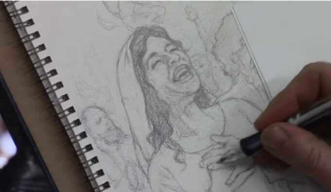
How to Sketch Book Cover Illustration
I’ll show you a sketching book cover illustration.
When creating a sketch for a book cover illustration it is a rewarding and meticulous process that blends creativity with technical skill. In this tutorial, I’ll walk through the steps of sketching a book cover illustration for a Bible commentary, focusing on capturing emotion and detail in every stroke. By the end of this guide, you’ll have actionable techniques to apply to your own projects, whether you’re a beginner or an experienced artist.
In this example, we explore the sketching process for a cover that illustrates the Pentecostal movement from the Book of Acts. This moment depicts the disciples receiving the Holy Spirit, with dramatic expressions of joy and intensity. Let’s dive into the step-by-step process of creating this compelling piece of art.
Step 1: Conceptualizing the Scene
Before starting any sketch, it’s important to have a clear understanding of the subject matter. In this case, the illustration revolves around a significant biblical event, the arrival of the Holy Spirit during Pentecost, described in the Book of Acts. To capture this effectively:
- Research the event: Familiarize yourself with the story by reading the relevant biblical passages. Because this will help you grasp the mood and energy needed for your sketch.
- Determine the key emotions: The illustration should evoke excitement, awe, and spiritual reverence. These emotions will be conveyed through the expressions of the characters and their body language.
- Find reference images: Utilize online reference photos to help with anatomy, facial expressions, and positioning.
In this sketch, the focal point is a woman’s expression of joy, symbolizing the elation felt by the disciples as they received the Holy Spirit.
Step 2: Start with a Rough Sketch
The first stage of creating any illustration is a rough sketch to establish the composition. For this book cover, the sketch began by blocking in the figures and their general positions.
- Freehand drawing: Start by sketching freehand, focusing on the placement and proportion of the characters. This allows for flexibility as you adjust the positioning of different elements.
- Keep it loose: At this stage, don’t worry too much about details. Use light lines to outline the figures and the background. This will give you a basic framework to build on.
Tips for Freehand Sketching:
- Use loose, flowing strokes to keep the composition dynamic.
- Focus on proportions but don’t stress about perfect accuracy early on.
- Keep erasing and refining the composition as needed.
Step 3: Refining the Details
Once the rough sketch is laid out, it’s time to refine the characters and bring out the key details that will make your illustration pop. Because in this project, we will focuses on capturing facial expressions and hand positioning, which are critical for conveying emotion.
Facial Expressions and Hands:
- Faces: Pay special attention to the expressions on your characters’ faces. For this sketch, one figure’s face is drawn with joy, while another figure shows intensity through a furrowed brow and a praying posture.
- Hands: Hands are often one of the hardest parts to draw accurately, but they are essential in conveying emotion. Here, the woman has her hands on her chest, adding to the sense of awe, while another figure has clasped fingers, indicating deep prayer.
Refining these elements involves carefully erasing and reworking lines to get the right anatomy and expression. For example, the wrinkles around the eyes or the positioning of the fingers can greatly impact the emotional depth of the characters.
Technique for Adding Expression:
- Use reference images: Don’t hesitate to consult images to ensure your anatomy and expressions are realistic.
- Focus on the eyes: Eyes are windows to the soul, so ensure they capture the right emotion.
- Subtle shading: Add light shading to emphasize features such as wrinkles, folds, or muscle tension in the hands.
Step 4: Working with Watercolor Paper
In this illustration, watercolor paper was used as the base for the sketch. This surface provides a bit more texture and grip than traditional drawing paper, making it ideal for illustrations that will later be painted.
Benefits of Watercolor Paper for Sketching:
- The texture holds pencil marks well, allowing for smoother shading and erasing.
- It’s sturdy enough to withstand multiple layers of detail, which is beneficial when transitioning from sketching to painting.
Step 5: Final Adjustments and Preparing for Paint
At this point in the sketch, the major elements of the illustration are in place. The characters are well-formed, and their emotions are clearly conveyed through their body language and expressions. However, there are always small adjustments that can be made to improve the sketch before painting.
Making Final Adjustments:
- Shadows and depth: Add subtle shading to the clothing and faces to create depth. For instance, a shadow under the man’s beard gives his face more structure.
- Refine small details: Pay attention to small details like the lines of the fingers or the folds in clothing. Then these small adjustments can make a big difference in the realism of the sketch.
Tips for Transitioning to Paint:
- Ensure that the sketch is as clean and detailed as possible. This will serve as the foundation for the painting stage.
- Consider how your paint medium (whether watercolor, acrylic, or oil) will interact with the pencil lines. Light sketching can easily be painted over, while heavier pencil marks might need to be minimized.
Conclusion
Sketching a book cover illustration requires both creativity and attention to detail. Because by focusing on freehand drawing, refining expressions, and making adjustments based on reference photos, you can create a compelling and emotionally charged sketch. In this project, the sketch captures the pivotal moment of Pentecost, filled with joy and intensity, and lays a solid foundation for a beautiful painted illustration.
If you found this guide helpful and would like to learn more about sketching or painting techniques, visit realisticacrylic.com for more tutorials and check out my free gift for you here
- Adding highlights to your acrylic painting
- 5 Excellent Reasons to Use Aluminum Foil
- Paint Realistic Wrinkles in Acrylic
- Painting Clothing in an Acrylic Portrait
- Paint a Cloudy Sky Acrylic
- How to add Semi-Opaque Highlights
- How to Enhance the Contrast in Your Acrylic
- How to Add Glaze to Your Acrylic Painting
- Paint Realistic Reflections on Eyeglasses in an Acrylic Portrait
- Build Up Depth on Your Acrylic Portrait Backgrounds
- How Do You Do Layers With the Glazing Technique?
- Learn How to Paint Wrinkles in Acrylic
Read more about how to paint a portrait that you can surely be proud of!
I’d love to hear your thoughts on this video. Please share it with your friends and family. Let me know if you have any further questions. I’ll greatly help you.
If you’d like to learn more, sign up for my free email tips and video class today.
Learn How to Paint Acrylic Portraits With My Free Mini-Video Course!
Thank you so much for taking the time to read this tutorial and watch the video. That means a lot to me. I hope you find it very helpful in your portrait painting.
Yours for Better Portraits,
P.S. Did you find this post helpful or encouraging? If so, send it on ahead! Let others know with the share buttons below. I’d love to hear your comments. Thank you so much! Also, do you have a question on acrylic portrait painting you’d like answered? Let me know, and I’d be happy to help!

How to Blocking in Shadows for a LARGE Painting
Learn the art of blocking shadows with acrylic glazing for dramatic depth in large paintings
When creating a large acrylic painting, one of the key elements in bringing it to life is mastering the shadow work. Blocking in shadows helps define the structure and form of your subject, adding realism and depth. Using an acrylic glazing technique enhances the shadowing effect, keeping it translucent while still maintaining control over the darker areas of the painting.
In this blog post, we’ll explore a step-by-step approach on how to block in shadows for a large painting. We’ll cover the essential tools, glazing methods, and tips to help you create a more dynamic, realistic piece of art.
Setting the Stage: Preparing for Shadow Blocking
Before diving into the painting process, it’s important to prepare your materials and mindset. I begin this painting session with a moment of reflection and prayer, setting an intention to create a work that captures emotion and depth. Preparation also involves setting up the canvas, sketching the outline of the subject, and sealing the sketch with a light glaze.
For this demonstration, a mixture of raw umber dark and ultramarine blue was chosen for the shadow work. These colors, when blended, create a rich, cool tone that is perfect for shadows. Here’s how you can apply this to your own painting:
- Prepare Your Canvas: Start with a white canvas, sketch your subject, and seal the sketch with a light glaze using diluted acrylic matte medium.
- Choose Your Colors: For shadows, a mix of raw umber dark and ultramarine blue works beautifully to create a cool-toned effect. These colors blend well and offer the right balance between transparency and opacity.
Step-by-Step: Blocking in Shadows
- Creating the First Glaze Layer
Begin by applying a diluted glaze over the areas where shadows will be present. For large paintings, it’s important to keep a wet edge during the application process to avoid streaks or unwanted lines. Using long, sweeping brushstrokes, layer the glaze in areas where you want shadows to appear. - Maintaining Translucency
The beauty of acrylic glazes is their translucent nature. You can still see the sketch beneath the glaze, preserving the fine details as you work on the shadows. To achieve this effect, ensure that your glaze mixture has more medium than pigment, allowing light to pass through. - Building the Tonal Value Structure
Blocking in shadows is more than just applying darker tones. It’s about understanding the value structure of your reference image. In the demonstration, the artist frequently checks his reference photo to ensure that he’s accurately representing the light and shadow interplay. Study your reference carefully and build the shadows from light to dark.- Tip: Cooler tones work well for shadows. Add a small amount of ultramarine blue to your glaze to give the shadows a cooler, more natural effect.
Techniques for Shadow Blocking in Large Paintings
Blocking in shadows for a large painting requires a few specialized techniques. Here are some essential methods to use:
- Layering Glazes for Depth
Rather than applying one thick layer, build your shadows gradually by adding multiple thin layers of glaze. This will help you control the depth and darkness of the shadow, while still maintaining the luminosity of the overall painting. - Vary Your Brush Strokes
As you apply the glaze, it’s helpful to vary the direction of your brushstrokes. This creates a more natural and organic look, especially in areas with fabric or textures like rocks. For example, the artist worked on the figure’s clothing, carefully brushing in the shadows to maintain the folds and creases. - Use a Smaller Brush for Detail
Once the large areas are blocked in, switch to a smaller brush to refine the edges of the shadows. This technique allows you to add subtle details that make the shadowing more realistic.
Key Tips and Techniques for Effective Shadow Work
- Keep a Wet Edge: When applying a glaze, always maintain a wet edge to prevent harsh lines and streaks. This will ensure smooth transitions between the light and shadowed areas.
- Use Cooler Tones: Shadows should be cooler in tone compared to the lighter areas. Adding a hint of ultramarine blue to your glaze helps achieve this effect.
- Layer Glazes for Control: Don’t rush the shadowing process. Build up the intensity gradually by applying thin layers of glaze until you reach the desired depth.
- Pay Attention to Gradation: Shadows are rarely uniform in tone. They often fade or blend into lighter areas. Adjust your glaze to create smooth gradations between light and dark.
Applying Glazes to Specific Elements
In the video, I focused on several parts of the painting and then demonstrated the blocking in of shadows:
- The Figure’s Clothing: By using a combination of raw umber dark and ultramarine blue, the artist darkened the folds of the figure’s clothing, preserving the highlights and lighter areas.
- The Rocks: Shadows were added to the rocks behind the main figures, using a slightly bolder application of glaze. The cooler tones gave the rocks a natural shadowed effect, which contrasted well with the lighter areas.
- Background Elements: Blocking in shadows for the background elements, such as the sky and distant stones, helps create a sense of depth and distance. In this case, the artist allowed the shadows to blend naturally into the lighter tones, creating a balanced contrast.
Finishing Touches: Refining the Shadows
Once the shadow areas are blocked in, the final step involves refining the details. Then I used a smaller brush to control the finer aspects of the shadows, ensuring that they didn’t overpower the highlights. This delicate balance between light and shadow is what ultimately brings the painting to life.
- Pro Tip: If a glaze feels too bold, you can always lighten it by gently brushing over the area with a bit of water or clear medium to soften the edges.
Conclusion: Mastering the Art of Shadow Blocking
Blocking in shadows is a crucial skill for any artist, especially when working on large paintings. By using acrylic glazing techniques, you can add depth and realism while preserving the underlying details. Remember to take your time, build the shadows in layers, and constantly refer to your reference photo to ensure accuracy.
Master this technique, and you’ll find your large acrylic paintings gaining new levels of dimension and realism.
If you’re looking for more instructional videos on how to improve your acrylic painting, visit www.realisticacrylic.com for more tutorials and check out my free courses here. .
- Adding highlights to your acrylic painting
- 5 Excellent Reasons to Use Aluminum Foil
- Paint Realistic Wrinkles in Acrylic
- Painting Clothing in an Acrylic Portrait
- Paint a Cloudy Sky Acrylic
- How to add Semi-Opaque Highlights
- How to Enhance the Contrast in Your Acrylic
- How to Add Glaze to Your Acrylic Painting
- Paint Realistic Reflections on Eyeglasses in an Acrylic Portrait
- Build Up Depth on Your Acrylic Portrait Backgrounds
- How Do You Do Layers With the Glazing Technique?
- Learn How to Paint Wrinkles in Acrylic
Read more about how to paint a portrait that you can surely be proud of!
I’d love to hear your thoughts on this video. Please share it with your friends and family. Let me know if you have any further questions. I’ll greatly help you.
If you’d like to learn more, sign up for my free email tips and video class today.
Learn How to Paint Acrylic Portraits With My Free Mini-Video Course!
Thank you so much for taking the time to read this tutorial and watch the video. That means a lot to me. I hope you find it very helpful in your portrait painting.
Yours for Better Portraits,
P.S. Did you find this post helpful or encouraging? If so, send it on ahead! Let others know with the share buttons below. I’d love to hear your comments. Thank you so much! Also, do you have a question on acrylic portrait painting you’d like answered? Let me know, and I’d be happy to help!