Category Archives for New Art

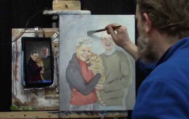
How to Begin an Acrylic Portrait Glazing Technique
Learn the basics of starting an acrylic portrait using the glazing technique, enhancing your art with smooth transitions and vibrant layers.
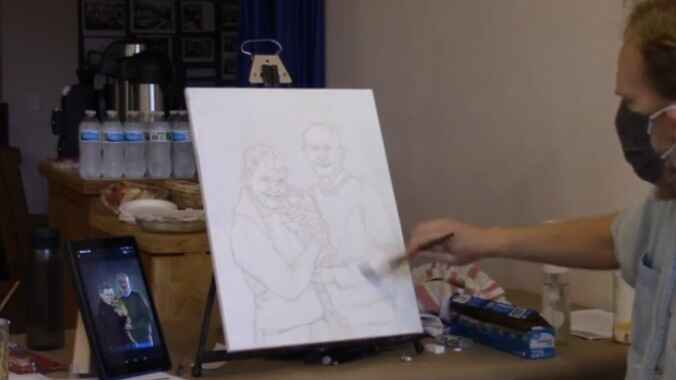
When starting an acrylic portrait, artists often encounter the challenge of creating depth and realism. Because one of the effective way to achieve this is through the glazing technique—a method that allows you to build up layers of translucent paint, adding nuance to your work. Because this article will guide you through the process of beginning an acrylic portrait using glazing, from planning your strategy to applying your first layers of paint. And then you’ll learn how to assess value structures, mix colors effectively, and develop a portrait that has depth and lifelike vibrancy.
Step 1: Preparing for the Glazing Process
Before you dive into painting, it’s important to prepare your palette and understand the key elements that will guide your portrait. The first step involves assessing your reference photo. As I suggested, that you kind of want to plot out your strategy what you’re going to do and how you’re going to paint it.”
Observe the Value Structure
Value structure refers to the overall light and dark areas of your image. Carefully observe whether your subject’s face is lighter or darker than the background. Then this decision will guide your initial glaze and help build contrast.
For instance, if the background is darker and the face is lighter, your strategy should focus on enhancing this contrast. The glazing technique can help you subtly develop these transitions, bringing clarity and definition to your subject. Planning this early ensures a smooth painting process later on.
Step 2: Mixing Your Glaze
Glazing is all about transparency, and the key to a successful glaze lies in the mixture of matte medium and paint. I recommend the ratio is 90-95% matte medium and 5-10% paint. Then this ensures that your glaze is translucent and allows the layers beneath it to show through.
To begin, choose your colors based on the tones in your reference image. In this case, the artist begins with ultramarine blue and raw umber dark, creating a grayish tone that will serve as the first glaze for the background. He emphasizes using a small amount of paint, stating that you should mix a little bit of color at a time and then work it into the medium.
Tip for Mixing:
“Turn your brush over and swirl it,” the artist explains, “distributing the pigment onto the bristles evenly.” This helps to ensure smooth application when you start painting.
Step 3: Applying the First Glaze
Now that your glaze is mixed, it’s time to apply it to the canvas. Then start in the darkest areas of the painting, working your way towards the lighter sections. In this example, I began at the top left corner, which is the darkest area of the background.
One crucial aspect of glazing is to always keep a wet edge—this prevents harsh lines from forming and ensures smooth transitions between areas. As I demonstrated, when applying the glaze in multiple directions (horizontal and vertical strokes) helps to distribute the paint evenly.
Pro Tip:
Use a generous amount of glaze on your brush. “You need a lot of mixture on your brush to get it smooth,” as I advise. Because this helps minimize visible brushstrokes, which can detract from the overall smoothness of your portrait.
Step 4: Building Up Layers
One of the main advantages of the glazing technique is its ability to build up color gradually. In this initial phase, your focus is not on developing shadows or highlights yet; it’s about laying down a foundation layer that establishes the basic tones.
As you progress, each new glaze will add depth to the painting. The translucent nature of the glaze allows the underpainting to show through, creating a richer, more complex color.
Understanding Opacity and Transparency:
- Opaque: No light passes through the paint; it’s completely solid.
- Transparent: Light passes through fully, revealing the layers beneath.
- Translucent: Light partially passes through, which is the goal with glazing.
In the video, I demonstrate the concept using a white card with a black line drawn on it. The line is still slightly visible through the glaze, indicating that the mixture is translucent enough to let underlying layers peek through.
Step 5: Working with Edges
A common challenge when glazing portraits is managing the edges of your subject. Many beginners hesitate to paint over parts of their subject’s face or clothing, fearing they’ll ruin the work. However, leaving a “halo” or white space around the figure can be problematic; it’s much harder to fix later.
Don’t be afraid to go over on top of the people, the subjects.” You can always paint over areas like hair or clothing again, but it’s harder to match the background color if you’ve left an unpainted edge.
Key Technique:
Focus on smoothing the glaze around complex areas, like hair, by using light strokes and ensuring your brush has enough glaze on it. Because this helps maintain clean edges without hard lines.
Step 6: Creating Contrast and Depth
As you apply more layers of glaze, the contrast between light and dark areas will become more apparent. This is especially important in portrait painting, where creating depth in features like eyes, cheekbones, and jawlines adds realism.
The glazing technique is ideal for this because it allows you to slowly darken shadows and adjust highlights without overwhelming the painting. For instance, if a subject has dark shadows under their chin or behind their ear, you can build these shadows layer by layer, achieving a more realistic look over time.
Step 7: Final Thoughts on Glazing
The glazing technique is a powerful tool for acrylic portrait painters, providing a way to create depth, nuance, and smooth transitions. Because by using a combination of matte medium and a small amount of pigment, you can control the transparency of each layer, ensuring that your painting develops gradually and with precision.
Recap of Key Tips:
- Always observe the value structure of your reference photo before starting.
- Use a high ratio of matte medium to paint (90-95% medium).
- Apply glaze in the darkest areas first, working toward lighter areas.
- Keep a wet edge and apply the glaze in multiple directions for smoothness.
- Don’t be afraid to paint over parts of your subject, as it’s easier to fix later than to match an unpainted area.
- Build contrast slowly by adding layers of glaze to create depth and realism.
By following these steps, you’ll have a solid foundation for starting any acrylic portrait, ensuring that your painting is smooth, balanced, and full of life.
- Adding highlights to your acrylic painting
- 5 Excellent Reasons to Use Aluminum Foil
- Paint Realistic Wrinkles in Acrylic
- Painting Clothing in an Acrylic Portrait
- Paint a Cloudy Sky Acrylic
- How to add Semi-Opaque Highlights
- How to Enhance the Contrast in Your Acrylic
- How to Add Glaze to Your Acrylic Painting
- Paint Realistic Reflections on Eyeglasses in an Acrylic Portrait
- Build Up Depth on Your Acrylic Portrait Backgrounds
- How Do You Do Layers With the Glazing Technique?
- Learn How to Paint Wrinkles in Acrylic
Read more about how to paint a portrait that you can surely be proud of!
I’d love to hear your thoughts on this video. Please share it with your friends and family. Let me know if you have any further questions. I’ll greatly help you.
If you’d like to learn more, sign up for my free email tips and video class today.
Learn How to Paint Acrylic Portraits With My Free Mini-Video Course!
Thank you so much for taking the time to read this tutorial and watch the video. That means a lot to me. I hope you find it very helpful in your portrait painting.
Yours for Better Portraits,

P.S. Did you find this post helpful or encouraging? If so, send it on ahead! Let others know with the share buttons below. I’d love to hear your comments. Thank you so much! Also, do you have a question on acrylic portrait painting you’d like answered? Let me know, and I’d be happy to help!

How to Paint Realistic Hair in Acrylic Portrait
Creating lifelike hair in acrylic portraits by using simple layering and glazing techniques.
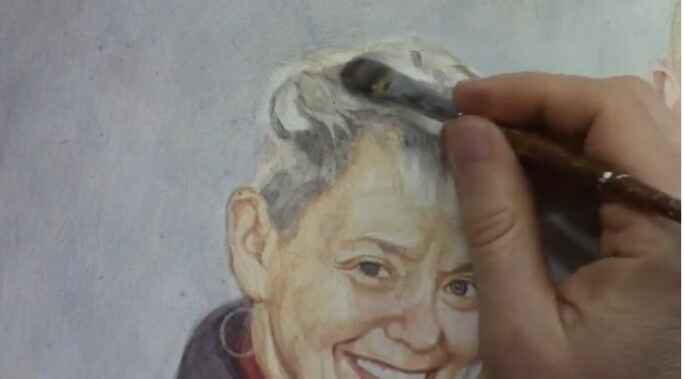
Creating realistic hair in acrylic portraits can be challenging for many artists. However, with a few foundational techniques like glazing, layering, and understanding value shapes, the task becomes much more manageable. In this guide, I’ll walk you through the step-by-step process on how to paint realistic hair in an acrylic portrait, focusing on how to build depth, enhance vibrance, and add nuances through layering.
1. Understanding Glazing for Realism
The glazing technique is an excellent way to create depth, vibrance, and smooth transitions in acrylic paintings. It allows the artist to build color slowly, using thin layers of semi-transparent paint to adjust tones and values. When light shines through these layers, the colors appear richer, resembling the look of oil paintings.
For this portrait of a couple and their cat, I used this method extensively to paint their hair. The first step is to establish a light sketch on the canvas. Then, using multiple thin layers of paint, I gradually build up the color and value of the hair, which creates the illusion of volume and movement.
Tip:
Use a matte medium with your acrylic paint to make it more fluid without diluting the color too much, unlike water.
2. Layering and Building Gradually
Think of painting hair as similar to developing a photograph each layer adds more clarity. When painting hair, you don’t have to finish one section entirely before moving on. Instead, build the entire hair section up gradually with layers. This approach allows you to create smoother transitions between light and shadow, which is key to making the hair look realistic.
In the example of this painting, I began by blocking in mid-tone values, using a combination of burnt sienna, ultramarine blue, and raw umber. The dark tones in the hair were added in stages, with lighter highlights being reserved for later layers.
Tip:
Don’t be afraid to layer over your previous work. Acrylics dry quickly, making them ideal for building layers that add depth and realism.
3. Breaking Hair Down Into Shapes
One of the biggest challenges artists face when painting hair is getting overwhelmed by the fine details. Instead of trying to capture every single strand, think of the hair as a collection of abstract shapes. These shapes represent the shadows, mid-tones, and highlights within the hair.
As a result of focusing on these larger forms, you can create a more structured and realistic base. Because in this video, I demonstrate how to break down the hair into different value shapes, comparing them to geographical features like states and continents. This method helps simplify the process, making the task of painting hair less daunting.
Tip:
Don’t paint hair as individual strands. Instead, focus on grouping them into sections that follow the flow of the hairstyle.
4. Darkening and Adding Richness
Once the base shapes of the hair are laid out, the next step is to start adding depth by darkening certain areas. In this case, I used a mix of raw umber and ultramarine blue to darken the upper sections of the hair, creating contrast against the lighter highlights. Then the darker areas serve to define the shape of the hair, giving it a three-dimensional appearance.
The richness and depth of the hair are enhanced by applying glazes of semi-transparent paint. Then the glazing technique ensures that the darker tones blend seamlessly with the lighter ones, avoiding harsh transitions.
Tip:
Use a filbert brush to help blend the paint smoothly, especially when working on transitions between light and shadow.
5. Adding Highlights and Nuances
Lastly, the final step is to add the highlights and small nuances that bring the hair to life. Because highlights should be placed strategically to mimic the way light interacts with the hair. In this portrait, I used a small round brush to carefully apply titanium white mixed with a bit of yellow to the lighter sections of the hair. These highlights are what give the hair its shine and texture.
Tip:
Apply highlights sparingly and blend them gently into the surrounding areas to avoid a stark, unnatural look.
6. Creating Depth Through Value Shapes
An important concept to remember when painting hair is that it’s all about value shapes. Because value refers to the lightness or darkness of a color, and by using a range of values, you can create depth and form. In the painting, the hair was broken down into sections of dark, mid-tone, and light values, much like a map with different regions. Each value shape contributes to the overall structure of the hair, making it appear more realistic.
Tip:
Think of value shapes as the backbone of your painting. They give structure and guide the placement of details like highlights and shadows.
Conclusion
Painting realistic hair in acrylic portraits may seem challenging, but by following these techniques glazing, layering, and focusing on value shapes you can achieve beautiful, lifelike results. Remember to approach the task patiently, building up the hair gradually through multiple layers, and breaking the complexity of the hair into manageable shapes.
Because by practicing these methods, you’ll be able to create hair that looks natural and three dimensional in your portraits. Then, with time and dedication, the process will become second nature, and you’ll find joy in bringing your acrylic portraits to life.
If you found this guide helpful and would like to learn more about sketching or painting techniques, visit realisticacrylic.com for more tutorials and check out my free gift for you here.
- Adding highlights to your acrylic painting
- 5 Excellent Reasons to Use Aluminum Foil
- Paint Realistic Wrinkles in Acrylic
- Painting Clothing in an Acrylic Portrait
- Paint a Cloudy Sky Acrylic
- How to add Semi-Opaque Highlights
- How to Enhance the Contrast in Your Acrylic
- How to Add Glaze to Your Acrylic Painting
- Paint Realistic Reflections on Eyeglasses in an Acrylic Portrait
- Build Up Depth on Your Acrylic Portrait Backgrounds
- How Do You Do Layers With the Glazing Technique?
- Learn How to Paint Wrinkles in Acrylic
Read more about how to paint a portrait that you can surely be proud of!
I’d love to hear your thoughts on this video. Please share it with your friends and family. Let me know if you have any further questions. I’ll greatly help you.
If you’d like to learn more, sign up for my free email tips and video class today.
Learn How to Paint Acrylic Portraits With My Free Mini-Video Course!
Thank you so much for taking the time to read this tutorial and watch the video. That means a lot to me. I hope you find it very helpful in your portrait painting.
Yours for Better Portraits,
P.S. Did you find this post helpful or encouraging? If so, send it on ahead! Let others know with the share buttons below. I’d love to hear your comments. Thank you so much! Also, do you have a question on acrylic portrait painting you’d like answered? Let me know, and I’d be happy to help!

How to Varnish an Acrylic Portrait in ONE STEP
Learn the simple, foolproof method to varnish your acrylic portraits in one step, ensuring protection, enhanced color, and a professional finish.
When you’ve completed an acrylic portrait, you want to make sure it stands the test of time. Varnishing your artwork is the final touch that not only protects it but also enhances its appearance. Because in this tutorial, we’ll walk you through how to varnish an acrylic portrait in the one-step process, ensuring a professional, smooth finish every time.
Whether you’re new to varnishing or a seasoned artist, this simple technique will leave your acrylic portraits looking polished and ready to shine for years to come.
Why Varnishing Is Essential
Varnishing is often overlooked but is one of the most important steps in preserving your acrylic portraits. Here’s why you should varnish:
- Protection from Dust and Dirt: Varnish acts as a shield, protecting your painting from dirt, dust, and other environmental factors that could damage it over time.
- Prevents Scratches: It adds a layer of defense against accidental scuffs or scratches.
- Enhances Color and Depth: Varnish can bring out the depth and vibrancy in your colors, making your painting look more saturated and alive.
- Even Sheen for a Professional Finish: A good varnish gives your painting a consistent sheen, making it look more professional.
Preparing Your Workspace
Before you begin the varnishing process, it’s important to set up a clean, flat workspace. Unlike painting, where working vertically on an easel is common, varnishing must be done on a horizontal surface. If your painting is at an angle, the varnish can drip and dry unevenly, ruining the finish.
Step 1: Lay Your Painting Flat
Then place your painting on a flat table. To avoid picking up dust or dirt from the surface, elevate the canvas slightly. You can use items like jar lids or small wooden blocks to lift it off the table.
Step 2: Gather Your Materials
Here’s what you’ll need:
- Matte Varnish: For this tutorial, we recommend Nova Color Matte Varnish. Although labeled as matte, it dries to a satin finish, giving your painting a subtle sheen.
- Gloss Medium (Optional): Adding a bit of gloss medium (around 15%) can increase the shine of the varnish, giving it more vibrancy.
- Wide Flat Brush: A 10-inch flat brush works best for larger portraits (16×20 inches). For smaller portraits, use a 2-inch flat brush.
- Towel: Keep a towel nearby to wipe excess varnish from the brush.
Mixing and Preparing the Varnish
Step 1: Stir, Don’t Shake
Pour your varnish into a container, such as a clean yogurt container. Add about 15% gloss medium if you want a shinier finish. Use a whisk or a paint stir stick to thoroughly mix the varnish. Avoid shaking the container, as this can create bubbles that may affect the smoothness of the finish.
Step 2: Prepare Your Brush
Before dipping your brush into the varnish, lightly mist the bristles with water. This helps the varnish spread more evenly across the canvas.
Applying the Varnish
Step 1: Start in Sections
Dip your brush into the varnish, ensuring it’s evenly coated but not overloaded. When you start by applying the varnish about one-third of the way down the canvas. Brush in even strokes from top to bottom, making sure to overlap each section slightly.
Step 2: Use Long, Even Strokes
In this case, as you varnish, use long, smooth strokes to spread the varnish across the painting. Flip your brush over occasionally to ensure an even distribution. Avoid pressing too hard, as this can create streaks.
Step 3: Avoid Over-Brushing
One of the most common mistakes when varnishing is over-brushing. After applying the varnish in a few strokes, resist the urge to keep going over the same areas. Even if the varnish appears streaky or cloudy at first, it will dry clear. Over-brushing can cause the varnish to become uneven and may introduce unwanted bubbles.
If you’re looking for more instructional videos on how to improve your acrylic painting, visit www.realisticacrylic.com for more tutorials and check out my free courses here. .
- Adding highlights to your acrylic painting
- 5 Excellent Reasons to Use Aluminum Foil
- Paint Realistic Wrinkles in Acrylic
- Painting Clothing in an Acrylic Portrait
- Paint a Cloudy Sky Acrylic
- How to add Semi-Opaque Highlights
- How to Enhance the Contrast in Your Acrylic
- How to Add Glaze to Your Acrylic Painting
- Paint Realistic Reflections on Eyeglasses in an Acrylic Portrait
- Build Up Depth on Your Acrylic Portrait Backgrounds
- How Do You Do Layers With the Glazing Technique?
- Learn How to Paint Wrinkles in Acrylic
Read more about how to paint a portrait that you can surely be proud of!
I’d love to hear your thoughts on this video. Please share it with your friends and family. Let me know if you have any further questions. I’ll greatly help you.
If you’d like to learn more, sign up for my free email tips and video class today.
Learn How to Paint Acrylic Portraits With My Free Mini-Video Course!
Thank you so much for taking the time to read this tutorial and watch the video. That means a lot to me. I hope you find it very helpful in your portrait painting.
Yours for Better Portraits,
P.S. Did you find this post helpful or encouraging? If so, send it on ahead! Let others know with the share buttons below. I’d love to hear your comments. Thank you so much! Also, do you have a question on acrylic portrait painting you’d like answered? Let me know, and I’d be happy to help!

How to Use Cooler Colors for Clothing Shadow
Learning clothing shadows: Cool Color techniques for realism in acrylic portraits
Introduction: Enhancing Realism with Cooler Colors
In acrylic portrait painting, shadows play a pivotal role in creating depth and realism. One technique to elevate your work is using cooler colors for clothing shadow, an approach that may not be immediately obvious. By strategically incorporating cooler tones like blue and gray instead of relying solely on darker shades of the clothing color, you can achieve a subtle and realistic effect. In this tutorial, I’ll walk you through the process of applying cooler colors in clothing shadows using glazing and dry brush techniques to bring your painting to life.
Why Cooler Colors Work for Shadows
The instinct for many artists might be to darken the shadows on clothing with black or a deeper shade of the same color. However, this often leads to overly vibrant or unnatural results. By using cooler tones, such as blue or blue-gray, the shadowed areas can maintain their depth without overpowering the fabric’s natural color.
Key Tip:
When transitioning from light to shadow in your painting, cooler colors help tone down the vibrancy of the clothing while maintaining subtle value shifts.
Materials and Colors Used
For this technique, you’ll need a few specific tools and colors:
- Ultramarine Blue: A rich blue tone that works well for creating cooler shadows.
- Raw Umber Dark: A dark brown that adds depth to the blue without overpowering it.
- Matte Medium: A transparent acrylic medium to thin the paint for glazing.
- Flat Brush: Ideal for applying layers of glazes.
- Dry Brush: Perfect for gently feathering in the colors.
By combining these materials, you’ll have the perfect mix to start creating cooler-toned shadows.
Step 1: Mixing the Right Colors
Firstly, is create the right blend of colors for your shadows. Because in the video, I demonstrate how to mix ultramarine blue with raw umber dark. This combination creates a bluish-gray tone that is subtle and cool enough for shadows but still harmonious with the warmer base colors of the clothing.
Process:
- Begin by adding a small amount of ultramarine blue to your palette.
- Mix in a touch of raw umber dark to reduce the brightness of the blue.
- Incorporate matte medium to make the mixture more translucent, ensuring that the shadow layers don’t become too opaque.
This bluish-gray tone will not only darken the shadowed areas but also cool down the intensity, giving the clothing a realistic sense of depth.
Technique Tip:
Always mix small amounts of color first and test it on a separate surface, such as a white card, to see how it interacts with the base layer before applying it to your painting.
Step 2: Applying the Glaze
The glazing is a technique in which the thin layers of translucent paint are applied over dry areas of the painting, then allowing the underlying colors to show through. As a result, it creates a smooth transition from light to shadow without harsh lines.
Process:
- With a flat brush, apply your blue-gray mixture onto the darker areas of the clothing.
- Start by gently glazing the shadowed sections beneath folds, arms, or under the chin.
- Gradually build up the layers, allowing each one to dry before applying the next.
- The glazing process allows you to control the level of darkness and coolness in the shadow while ensuring that the red or other base color remains visible underneath.
Why It Works: The matte medium makes the glaze translucent, so the original clothing color can still be seen through the shadow, adding depth and subtlety to your portrait.
Step 3: Dry Brush Technique for Soft Blending
After applying your glaze, your next step is to use a dry brush technique to softly blend the cooler shadow into the surrounding areas of the clothing. The dry brush technique is particularly effective for adding texture and blending transitions in fabrics.
Process:
- Lightly load your brush with the blue-gray mixture.
- Dab off excess paint on a paper towel to create a dry brush effect.
- Gently stroke the brush over the edges of the shadows, using quick, soft motions to blend the glaze seamlessly into the lighter areas.
- Continue to feather the paint, allowing the cooler shadow to naturally merge with the highlights of the clothing.
Key Tip: The dry brush method allows for smooth transitions without harsh lines, then mimicking the way light softly falls on fabric in real life.
Step 4: Adjusting for Depth and Nuance
As you build the layers and blend your cooler shadows, you may notice that some areas need more depth or subtle variation. Don’t hesitate to adjust your mixture by adding more raw umber dark if the blue becomes too overpowering.
Important Consideration:
Then shadows should appear less vibrant and cooler as they get darker. And then by adjusting the mixture to include more raw umber dark, you can deepen the shadow without making it too cool or overwhelming.
Creating Realistic Clothing Shadows on Multiple Colors
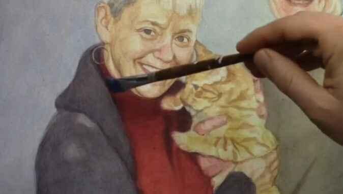
The beauty of this technique is its versatility. You can apply the same blue-gray glaze to multiple fabric colors. For example, in the video, I use it both on the woman’s red clothing and on a man’s shirt. It works just as effectively on lighter-colored fabric, adjusting the tones slightly with each application.
Because by using the same cooler glaze across different fabrics, you create consistency in the shadows, making the portrait appear cohesive and well-integrated.
Conclusion: Mastering Shadows with Cool Tones
When incorporating cooler colors for shadows on clothing in your acrylic portraits allows for greater realism and depth. Because by utilizing a blue-gray glaze and dry brush blending, you can create nuanced shadows that seamlessly integrate with the base color of the fabric. Whether you’re working on bright red clothing or more muted tones, cooler shadows offer the perfect solution for achieving lifelike contrast and depth.
If you’re looking for more instructional videos on how to improve your acrylic painting, visit www.realisticacrylic.com for more tutorials and check out my free courses here. .
- How to Paint Foliage Using the Acrylic Glazing Technique
- How to Trace for an Accurate Portrait Sketch
- How to Paint Realistic Eyes in Your Acrylic Portrait
- How to Add Raw Umber Dark & Ultramarine Blue to Your Portrait
- How to Make Your Own Raw Umber Dark
- How to Paint Realistic Trees & Grass in Your Acrylic
- How to Block In Skin Tone Values Using Glazing Technique
- How to Paint Vibrant Reds in Your Acrylic Portrait
- How to Glaze Background Colors & More Acrylic Portrait
- How to Paint White Clothing in Your Acrylic Portrait
- How to Easily Transition from a Sketch to a Painting
- How to Block In Shading & Skin Tones in Your Acrylic
- How to Build Up Color on Acrylic Pet Portrait
- How to Build Up Form on Clothing with Acrylic
- How to Paint Dark Clothing Using Acrylic Glazing Technique
- How to Paint a 24 x 30 Acrylic With 30 People
- How to Do Smooth Shading with Acrylic
- How to Sketch an Acrylic Portrait with a Grid
Read more about how to paint a portrait that you can surely be proud of!
I’d love to hear your thoughts on this video. Please share it with your friends and family. Let me know if you have any further questions. I’ll greatly help you.
If you’d like to learn more, sign up for my free email tips and video class today.
Learn How to Paint Acrylic Portraits With My Free Mini-Video Course!
Thank you so much for taking the time to read this tutorial and watch the video. That means a lot to me. I hope you find it very helpful in your portrait painting.
Yours for Better Portraits,
P.S. Did you find this post helpful or encouraging? If so, send it on ahead! Let others know with the share buttons below. I’d love to hear your comments. Thank you so much! Also, do you have a question on acrylic portrait painting you’d like answered? Let me know, and I’d be happy to help!

How To Darken Background & Clothing: Acrylic Glazing Technique
Discover the acrylic glazing technique to add depth, richness, and contrast to your portraits by darkening the background and clothing with ease.
One of the challenges portrait artists face is creating a balanced contrast between the subject and the background. Acrylic glazing is an excellent technique for solving this problem, offering the ability to subtly darken elements like the background and clothing while maintaining depth and luminosity. In this tutorial, we’ll explore how to use acrylic glazing to darken the background and clothing in your portraits. Then the key to success in this technique lies in building up light layers of color, allowing the paint to create a rich, oil-like effect that transforms your artwork.
Because at the end of this guide, you’ll be able to create striking contrasts, enhance the mood of your painting, and master acrylic glazing for darker tones.
Materials Needed
To achieve the best results with the acrylic glazing technique, you’ll need the following materials:
- Acrylic paints (ultramarine blue, burnt sienna, raw umber, titanium white, etc.)
- Matte medium (or glazing medium)
- Reference photo
- Various brushes (detail brushes, medium flat brush, and large round brush)
- Palette for mixing
- Water and a clean rag
Understanding Acrylic Glazing
Acrylic glazing is a technique where you mix a small amount of pigment with a large amount of matte medium to create thin, transparent layers of color. Each layer allows light to pass through, giving the painting added depth and richness. This technique mimics the effects of oil painting but with the faster drying time of acrylics, making it a versatile choice for many artists.
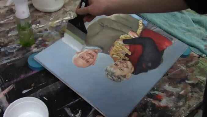
In this video, we follow the steps to darken the background and clothing of a 16×20 acrylic portrait of a couple and their cat. The key to achieving a smooth glaze is to ensure your base sketch is solid, allowing the layers to enhance rather than correct the painting.
Step 1: Starting with a Solid Sketch
Before applying glazes, it’s essential to have a strong and accurate sketch. As I have mention, that if you want to make sure that the proportions and likeness are perfect before you begin glazing. Because the foundation is key to a successful final product.
When creating your sketch:
- Focus on achieving correct proportions of your subject.
- Make sure the key areas such as the eyes, nose, and mouth are aligned.
- Use light pencil marks that won’t interfere with the transparency of your glaze.
Step 2: Mixing the First Glaze for the Background
In this painting, the client requested a bluish tone for the background. To create a blue glaze, follow these steps:
- Mix Ultramarine Blue: Add a small amount of ultramarine blue to your palette.
- Add Matte Medium: Mix the blue with matte medium until the paint is very translucent. Matte medium is milky white but dries completely clear, allowing the underlying layers to shine through.
- Apply the Glaze: Using short, choppy brush strokes, begin layering the blue glaze onto the background. This creates a smooth transition between the subject and background, enhancing depth.
One of the advantages of glazing is its flexibility. If the glaze looks too intense, you can always add more matte medium or water to lighten it.
Step 3: Building Up Contrast Between the Subject and Background
After applying the initial glaze, focus on enhancing the contrast between the subject (in this case, the couple and their cat) and the background. This step is crucial to making the subject stand out. You want to:
- Gradually increase the opacity of the glazes on the background to push it further into the distance.
- Use darker tones in the background compared to the foreground to create depth.
To darken the background even more, add layers of raw umber or burnt sienna mixed with matte medium on top of the blue glaze. This will give the background a more muted, shadowy effect while still allowing the initial blue tone to shine through.
Step 4: Glazing the Clothing
Next, shift focus to darkening the clothing using a similar glazing technique. The subject in this portrait is wearing darker-toned clothes, and I use the combination of raw umber and ultramarine blue to darken the clothing in a natural, gradual way.
- Mix Raw Umber and Blue: Combine raw umber with ultramarine blue and matte medium. This creates a nice neutral dark glaze that adds depth to the clothing without making it look flat.
- Apply the Glaze: Begin layering this darker glaze on the clothing, focusing on areas of shadow or where more depth is needed.
- Build Layer by Layer: Since glazing is a cumulative process, each layer adds more intensity to the clothing. Don’t worry about getting the perfect color right away. With each layer, the colors will mix and blend, creating a more realistic tone.
Remember, glazing allows you to make adjustments easily. If the color feels too cool or too warm, add a thin glaze of raw sienna or alizarin crimson to adjust the warmth or coolness.
Step 5: Enhancing Details and Finishing Touches
Once the base glazes are in place, use smaller detail brushes to enhance the finer areas, such as the edges of the clothing or folds in the fabric. For example, I use raw sienna to highlight certain areas of the shirt’s wrinkles. Then this subtle addition of color adds a lifelike quality to the painting.
At this stage, pay attention to:
- Wrinkles and folds in the clothing: Use a small brush to carefully apply thin glazes to highlight these details.
- Edge details: Glaze carefully around the edges where the subject meets the background, ensuring a smooth transition.
Tips for Acrylic Glazing Technique
- Use Light Layers: Always apply thin glazes and build up gradually. Heavy applications will obscure the previous layers.
- Dry Between Layers: Allow each glaze to dry before adding the next. This prevents muddying the colors.
- Experiment with Color: Don’t be afraid to adjust the color temperature with warm or cool glazes.
- Less Is More: A little pigment goes a long way when glazing. Be mindful of how much color you mix in with the medium.
- Work from Light to Dark: Build up your painting by working from lighter glazes to darker ones to maintain luminosity and depth.
Conclusion
The acrylic glazing technique offers artists a powerful tool for adding depth and richness to their paintings. When layering transparent color, you can gradually darken backgrounds and clothing without losing the vibrancy of the initial layers. This method also allows for flexibility, as adjustments can be made throughout the process without the pressure of getting it right on the first try.
In this painting of a couple and their cat, the careful use of glazing brings out the contrast between the subjects and their background, creating a compelling portrait. With practice, you’ll be able to master this technique and apply it to your own projects, transforming your portraits into luminous works of art.
If you’re looking for more instructional videos on how to improve your acrylic painting, visit www.realisticacrylic.com for more tutorials and check out my free courses here. .
- Adding highlights to your acrylic painting
- 5 Excellent Reasons to Use Aluminum Foil
- Paint Realistic Wrinkles in Acrylic
- Painting Clothing in an Acrylic Portrait
- Paint a Cloudy Sky Acrylic
- How to add Semi-Opaque Highlights
- How to Enhance the Contrast in Your Acrylic
- How to Add Glaze to Your Acrylic Painting
- Paint Realistic Reflections on Eyeglasses in an Acrylic Portrait
- Build Up Depth on Your Acrylic Portrait Backgrounds
- How Do You Do Layers With the Glazing Technique?
- Learn How to Paint Wrinkles in Acrylic
Read more about how to paint a portrait that you can surely be proud of!
I’d love to hear your thoughts on this video. Please share it with your friends and family. Let me know if you have any further questions. I’ll greatly help you.
If you’d like to learn more, sign up for my free email tips and video class today.
Learn How to Paint Acrylic Portraits With My Free Mini-Video Course!
Thank you so much for taking the time to read this tutorial and watch the video. That means a lot to me. I hope you find it very helpful in your portrait painting.
Yours for Better Portraits,
P.S. Did you find this post helpful or encouraging? If so, send it on ahead! Let others know with the share buttons below. I’d love to hear your comments. Thank you so much! Also, do you have a question on acrylic portrait painting you’d like answered? Let me know, and I’d be happy to help!

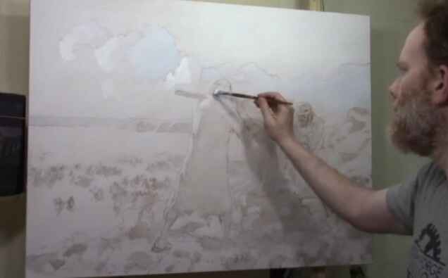
How to Blocking in Shadows for a LARGE Painting
Learn the art of blocking shadows with acrylic glazing for dramatic depth in large paintings
When creating a large acrylic painting, one of the key elements in bringing it to life is mastering the shadow work. Blocking in shadows helps define the structure and form of your subject, adding realism and depth. Using an acrylic glazing technique enhances the shadowing effect, keeping it translucent while still maintaining control over the darker areas of the painting.
In this blog post, we’ll explore a step-by-step approach on how to block in shadows for a large painting. We’ll cover the essential tools, glazing methods, and tips to help you create a more dynamic, realistic piece of art.
Setting the Stage: Preparing for Shadow Blocking
Before diving into the painting process, it’s important to prepare your materials and mindset. I begin this painting session with a moment of reflection and prayer, setting an intention to create a work that captures emotion and depth. Preparation also involves setting up the canvas, sketching the outline of the subject, and sealing the sketch with a light glaze.
For this demonstration, a mixture of raw umber dark and ultramarine blue was chosen for the shadow work. These colors, when blended, create a rich, cool tone that is perfect for shadows. Here’s how you can apply this to your own painting:
- Prepare Your Canvas: Start with a white canvas, sketch your subject, and seal the sketch with a light glaze using diluted acrylic matte medium.
- Choose Your Colors: For shadows, a mix of raw umber dark and ultramarine blue works beautifully to create a cool-toned effect. These colors blend well and offer the right balance between transparency and opacity.
Step-by-Step: Blocking in Shadows
- Creating the First Glaze Layer
Begin by applying a diluted glaze over the areas where shadows will be present. For large paintings, it’s important to keep a wet edge during the application process to avoid streaks or unwanted lines. Using long, sweeping brushstrokes, layer the glaze in areas where you want shadows to appear. - Maintaining Translucency
The beauty of acrylic glazes is their translucent nature. You can still see the sketch beneath the glaze, preserving the fine details as you work on the shadows. To achieve this effect, ensure that your glaze mixture has more medium than pigment, allowing light to pass through. - Building the Tonal Value Structure
Blocking in shadows is more than just applying darker tones. It’s about understanding the value structure of your reference image. In the demonstration, the artist frequently checks his reference photo to ensure that he’s accurately representing the light and shadow interplay. Study your reference carefully and build the shadows from light to dark.- Tip: Cooler tones work well for shadows. Add a small amount of ultramarine blue to your glaze to give the shadows a cooler, more natural effect.
Techniques for Shadow Blocking in Large Paintings
Blocking in shadows for a large painting requires a few specialized techniques. Here are some essential methods to use:
- Layering Glazes for Depth
Rather than applying one thick layer, build your shadows gradually by adding multiple thin layers of glaze. This will help you control the depth and darkness of the shadow, while still maintaining the luminosity of the overall painting. - Vary Your Brush Strokes
As you apply the glaze, it’s helpful to vary the direction of your brushstrokes. This creates a more natural and organic look, especially in areas with fabric or textures like rocks. For example, the artist worked on the figure’s clothing, carefully brushing in the shadows to maintain the folds and creases. - Use a Smaller Brush for Detail
Once the large areas are blocked in, switch to a smaller brush to refine the edges of the shadows. This technique allows you to add subtle details that make the shadowing more realistic.
Key Tips and Techniques for Effective Shadow Work
- Keep a Wet Edge: When applying a glaze, always maintain a wet edge to prevent harsh lines and streaks. This will ensure smooth transitions between the light and shadowed areas.
- Use Cooler Tones: Shadows should be cooler in tone compared to the lighter areas. Adding a hint of ultramarine blue to your glaze helps achieve this effect.
- Layer Glazes for Control: Don’t rush the shadowing process. Build up the intensity gradually by applying thin layers of glaze until you reach the desired depth.
- Pay Attention to Gradation: Shadows are rarely uniform in tone. They often fade or blend into lighter areas. Adjust your glaze to create smooth gradations between light and dark.
Applying Glazes to Specific Elements
In the video, I focused on several parts of the painting and then demonstrated the blocking in of shadows:
- The Figure’s Clothing: By using a combination of raw umber dark and ultramarine blue, the artist darkened the folds of the figure’s clothing, preserving the highlights and lighter areas.
- The Rocks: Shadows were added to the rocks behind the main figures, using a slightly bolder application of glaze. The cooler tones gave the rocks a natural shadowed effect, which contrasted well with the lighter areas.
- Background Elements: Blocking in shadows for the background elements, such as the sky and distant stones, helps create a sense of depth and distance. In this case, the artist allowed the shadows to blend naturally into the lighter tones, creating a balanced contrast.
Finishing Touches: Refining the Shadows
Once the shadow areas are blocked in, the final step involves refining the details. Then I used a smaller brush to control the finer aspects of the shadows, ensuring that they didn’t overpower the highlights. This delicate balance between light and shadow is what ultimately brings the painting to life.
- Pro Tip: If a glaze feels too bold, you can always lighten it by gently brushing over the area with a bit of water or clear medium to soften the edges.
Conclusion: Mastering the Art of Shadow Blocking
Blocking in shadows is a crucial skill for any artist, especially when working on large paintings. By using acrylic glazing techniques, you can add depth and realism while preserving the underlying details. Remember to take your time, build the shadows in layers, and constantly refer to your reference photo to ensure accuracy.
Master this technique, and you’ll find your large acrylic paintings gaining new levels of dimension and realism.
If you’re looking for more instructional videos on how to improve your acrylic painting, visit www.realisticacrylic.com for more tutorials and check out my free courses here. .
- Adding highlights to your acrylic painting
- 5 Excellent Reasons to Use Aluminum Foil
- Paint Realistic Wrinkles in Acrylic
- Painting Clothing in an Acrylic Portrait
- Paint a Cloudy Sky Acrylic
- How to add Semi-Opaque Highlights
- How to Enhance the Contrast in Your Acrylic
- How to Add Glaze to Your Acrylic Painting
- Paint Realistic Reflections on Eyeglasses in an Acrylic Portrait
- Build Up Depth on Your Acrylic Portrait Backgrounds
- How Do You Do Layers With the Glazing Technique?
- Learn How to Paint Wrinkles in Acrylic
Read more about how to paint a portrait that you can surely be proud of!
I’d love to hear your thoughts on this video. Please share it with your friends and family. Let me know if you have any further questions. I’ll greatly help you.
If you’d like to learn more, sign up for my free email tips and video class today.
Learn How to Paint Acrylic Portraits With My Free Mini-Video Course!
Thank you so much for taking the time to read this tutorial and watch the video. That means a lot to me. I hope you find it very helpful in your portrait painting.
Yours for Better Portraits,
P.S. Did you find this post helpful or encouraging? If so, send it on ahead! Let others know with the share buttons below. I’d love to hear your comments. Thank you so much! Also, do you have a question on acrylic portrait painting you’d like answered? Let me know, and I’d be happy to help!

How to Paint Short Silver Hair in your Acrylic
Discover the secrets to painting realistic short silver hair using the acrylic glazing technique for depth, vibrance, and seamless blending.
Painting realistic short silver hair in acrylic can seem challenging, but with the right techniques, it becomes manageable and rewarding. In this tutorial, I will guide you step-by-step on how to apply the acrylic glazing technique to capture the softness, shine, and texture of silver hair. Whether you’re a beginner or an experienced artist, mastering this technique will help you create stunning portraits with depth and vibrance. We will focus on blending shades, adding highlights, and building subtle nuances for a natural-looking effect.
Understanding Acrylic Glazing for Hair
Acrylic glazing is an essential technique for adding layers of semi-transparent color over your base. By layering different shades, you can achieve depth and a lifelike sheen, perfect for capturing the essence of silver hair. Instead of trying to nail every detail in one go, glazing allows you to build the portrait gradually, adding complexity with each new layer.
Tips for Acrylic Glazing:
- Use a mix of acrylic matte medium with your paint to create a smooth, translucent layer.
- Work with a soft, fine brush to ensure smooth transitions between shades.
- Build layers slowly, allowing each one to dry before adding the next for better control over color depth.
Choosing Your Color Palette
When painting short silver hair, selecting the right color palette is essential. Although silver is often seen as a neutral tone, it actually contains a mixture of hues such as cool blues, grays, and even some warmer tones to reflect light.
For this tutorial, the palette includes:
- Titanium White: For bright highlights and reflective areas.
- Burnt Umber: To add warmth and contrast in the shadows.
- Raw Umber: For mid-tones and foundational shading.
- Ultramarine Blue: Helps cool down areas and enhance the silver effect.
- Alizarine Crimson: Adds subtle warmth and depth.
Tip: Always test your color combinations on a palette before applying them to the canvas. Mix small amounts to see how they interact under different lighting conditions.
Step-by-Step Guide to Painting Short Silver Hair
1. Start with the Underpainting
Before you apply any details, establish a base using a neutral underpainting. This is where you define the overall shapes and contours of the hair. For silver hair, use a mix of raw umber and titanium white to sketch out the general flow and placement of the hair strands. Remember to think of hair not as individual strands but as groups of shapes and shadows.
Technique Tip: Use a soft filbert brush to apply the underpainting in smooth, broad strokes. This will help create a soft foundation for the subsequent layers.
2. Building Mid-Tones with Glazing
Once the underpainting is dry, begin adding mid-tones using the acrylic glazing technique. Mix ultramarine blue and burnt umber with a small amount of matte medium to create a semi-transparent glaze. This mixture will give your hair a cool, metallic feel. Apply the glaze over the darker areas, building the transition from shadow to light.
Technique Tip: Apply the glaze in thin layers, allowing each coat to dry before adding another. This will help create depth and prevent the colors from becoming too muddy or opaque.
3. Adding Highlights
Silver hair catches light in unique ways, often appearing more reflective than other hair colors. To capture this, mix titanium white with a tiny bit of raw umber and alizarine crimson. Use this mixture to gently highlight the areas where the light naturally hits the hair, such as the crown of the head and the edges of the strands.
Tip: Use a small round brush for highlights to add fine, delicate lines. Blend the edges of the highlights into the mid-tones to avoid harsh transitions.
4. Deepening the Shadows
Shadows in silver hair help give it volume and shape. For this, mix a slightly darker glaze with more burnt umber and ultramarine blue. Focus on the areas where the hair overlaps or falls into deeper recesses, such as around the ears or where the hair gathers near the scalp.
Technique Tip: When applying shadows, think of the hair in terms of mass rather than individual strands. Keep the shapes soft and avoid over-defining every strand to maintain a natural look.
5. Refining the Details
As you continue building up the layers of glazes, the hair will start to take on a more realistic appearance. At this stage, focus on refining small details, such as the subtle shifts in tone and light across the hair. Add final touches by applying thin, semi-transparent layers of titanium white mixed with matte medium for the brightest highlights.
Tip: Don’t overwork the painting. Let some of the earlier layers show through to enhance the depth and complexity of the hair.
Common Mistakes to Avoid
- Overloading the Brush: Avoid applying too much paint at once. This can make your glaze too thick and result in harsh lines instead of smooth transitions.
- Skipping the Drying Time: Acrylic paint dries fast, but it’s important to let each layer fully dry before applying the next. Rushing this process can lead to muddy colors and a lack of definition.
- Neglecting the Highlights: For silver hair, highlights are crucial. Make sure to spend enough time building up the light areas to capture the reflective quality of the hair.
Final Thoughts
Painting short silver hair in acrylic requires patience and a careful approach, but the results are worth the effort. By using the glazing technique, you can achieve depth, softness, and shine that will make the hair in your portrait come to life. Whether you’re painting a portrait of a loved one or a professional commission, these techniques will help you capture the unique beauty of silver hair with confidence.
Remember, as with all acrylic painting techniques, practice makes perfect. So, don’t be afraid to experiment with different glazes, brushes, and colors to find what works best for you.
Conclusion
When mastering the art of painting short silver hair is a valuable skill for any portrait artist. With then the right use of acrylic glazing, attention to color blending, and proper brush techniques, you can create stunning, realistic results. By following these steps and tips, you will develop the confidence to tackle even the most challenging portrait hair details.
Keep practicing, and soon, painting silver hair will become second nature!
If you’re looking for more instructional videos on how to improve your acrylic painting, visit www.realisticacrylic.com for more tutorials and check out my free courses here. .
- How to Paint Foliage Using the Acrylic Glazing Technique
- How to Trace for an Accurate Portrait Sketch
- How to Paint Realistic Eyes in Your Acrylic Portrait
- How to Add Raw Umber Dark & Ultramarine Blue to Your Portrait
- How to Make Your Own Raw Umber Dark
- How to Paint Realistic Trees & Grass in Your Acrylic
- How to Block In Skin Tone Values Using Glazing Technique
- How to Paint Vibrant Reds in Your Acrylic Portrait
- How to Glaze Background Colors & More Acrylic Portrait
- How to Paint White Clothing in Your Acrylic Portrait
- How to Easily Transition from a Sketch to a Painting
- How to Block In Shading & Skin Tones in Your Acrylic
- How to Build Up Color on Acrylic Pet Portrait
- How to Build Up Form on Clothing with Acrylic
- How to Paint Dark Clothing Using Acrylic Glazing Technique
- How to Paint a 24 x 30 Acrylic With 30 People
- How to Do Smooth Shading with Acrylic
- How to Sketch an Acrylic Portrait with a Grid
Read more about how to paint a portrait that you can surely be proud of!
I’d love to hear your thoughts on this video. Please share it with your friends and family. Let me know if you have any further questions. I’ll greatly help you.
If you’d like to learn more, sign up for my free email tips and video class today.
Learn How to Paint Acrylic Portraits With My Free Mini-Video Course!
Thank you so much for taking the time to read this tutorial and watch the video. That means a lot to me. I hope you find it very helpful in your portrait painting.
Yours for Better Portraits,
P.S. Did you find this post helpful or encouraging? If so, send it on ahead! Let others know with the share buttons below. I’d love to hear your comments. Thank you so much! Also, do you have a question on acrylic portrait painting you’d like answered? Let me know, and I’d be happy to help!

How to Varnish an Acrylic Painting in One Step
Discover the easy technique for how to varnish an acrylic painting in one step to enhance and preserve your artwork’s vibrancy
There’s a lot of controversy surrounding this topic, or at least, many different opinions on how to do it right.
Some say you need an isolation coat. But others say you should spray apply the varnish. And then there are some who pour it on or use a sponge!
I’m not here to dismiss any of those methods. If they work for that particular artist, more power to them.
Rather, I’d like to share with you the method I’ve been using for over 20 years as a portrait painter. And then it’s easy, and you can do it one step.
Let me break down this one-step acrylic varnishing method into how to actually do it…
- Lay your canvas flat on a table, oriented horizontally, but at an angle.
- Raise your canvas up, on four scraps of wood placed under each corner (make sure it’s level. 1″ x 2″s work well )
- Get your 4″ varnishing brush (Liquitex Freestyle works well)
- Pour matte varnish (Novacolor or Liquitex) into a clean yogurt container or any plastic container large enough to accommodate the width of the brush. Be sure to stir the varnish if it’s been sitting for a while! Over time the polymer resin can separate from the water in the mixture. If you don’t mix it, you may have streaks.
- “Sweep” any dust or debris off of the canvas surface with a large brush before you begin.
- Dip your brush into the varnish container, so the bristles are coated with varnish 1/3-1/2 of the way up from the tip.
- Begin brushing the varnish on the surface, starting with the end farthest from you. Brush in the longest direction of the canvas.
- Let your brush hit 1/3″ of the way from the left edge of the canvas. Apply even pressure and bring the brush all the way to the left edge.
- Bring the brush all the way to the right edge.
- Wipe any excess varnish that remains on your brush inside the top lip of your container.
- Flip the brush over and smooth out the entire first application, overlapping the edge slightly with 1-2 strokes. Do not overbrush!
- Dip your brush into the varnish container and repeat the process. Let your stroke slightly overlap the first (about 1/4″)
- You will be working your way toward your body. This will keep you from accidentally dripping onto the finished varnished surface.
- If you have any extra varnish that drips onto the side of the canvas, use a 3/4 flat brush to wipe it off. If the canvas will be framed, the side-drips are usually not a problem and can be left alone.
- Let your canvas dry flat on a table. It might look milky white in areas. Resist the temptation to brush it! If you followed my method, the varnish should dry crystal clear. It should dry completely within 3-5 hours, depending on humidity.
Disclaimer: I have used this method with great results in over 20 years of portrait painting. Because your results are up to you, how you apply this method, and the humidity levels of your studio space. I cannot be held responsible for any painting that gets damaged during the varnishing process. Then it would be a good idea to varnish a test piece first. You can add another layer (after 3-5 hours of dry time) if you feel the first one didn’t cover as well as you’d like, but most of the time, you won’t need to.
Watch this video below to see the process in action…
If you’re looking for more instructional videos on how to improve your acrylic painting, visit www.realisticacrylic.com for more tutorials and check out my free courses here. .
Let me know if you have any questions and I look forward to teaching you more!
LEARN MORE
- How to Paint Foliage Using the Acrylic Glazing Technique
- How to Trace for an Accurate Portrait Sketch
- How to Paint Realistic Eyes in Your Acrylic Portrait
- How to Add Raw Umber Dark & Ultramarine Blue to Your Portrait
- How to Make Your Own Raw Umber Dark
- How to Paint Realistic Trees & Grass in Your Acrylic
- How to Block In Skin Tone Values Using Glazing Technique
- How to Paint Vibrant Reds in Your Acrylic Portrait
- How to Glaze Background Colors & More Acrylic Portrait
- How to Paint White Clothing in Your Acrylic Portrait
- How to Easily Transition from a Sketch to a Painting
- How to Block In Shading & Skin Tones in Your Acrylic
- How to Build Up Color on Acrylic Pet Portrait
- How to Build Up Form on Clothing with Acrylic
- How to Paint Dark Clothing Using Acrylic Glazing Technique
- How to Paint a 24 x 30 Acrylic With 30 People
- How to Do Smooth Shading with Acrylic
- How to Sketch an Acrylic Portrait with a Grid
Read more about how to paint a portrait that you can surely be proud of!
I’d love to hear your thoughts about this video. Please share it with your friends and family. Let me know if you have any further questions. I’ll greatly help you.
If you’d like to learn more, sign up for my free email tips and video class today.
Learn How to Paint Acrylic Portraits With My Free Mini-Video Course!
Thank you so much for taking the time to read this tutorial and watch the video. That means a lot to me. I hope you find it very helpful in your portrait painting.
Yours for Better Portraits,
P.S. Did you find this post helpful or encouraging? If so, send it on ahead! Let others know with the share buttons below. I’d love to hear your comments. Thank you so much! Also, do you have a question on acrylic portrait painting you’d like answered? Let me know, and I’d be happy to help!

3 Tips on How to Draw Better Pencil Portraits
Unlock the secrets to realistic portraits with these essential pencil drawing techniques
Drawing realistic pencil portraits can be a rewarding yet challenging experience. If you’re looking to improve your pencil drawing skills, it’s essential to focus on technique, control, and mastering shading. Whether you’re a beginner or a seasoned artist, improving your pencil drawings can drastically boost your portrait painting skills, especially if you primarily work in acrylic. In this blog post, you’ll learn 3 valuable tips that will help you create lifelike pencil portraits.
1. Master Cross-Hatching for Realistic Shading
Cross-hatching is a time-tested technique that involves layering pencil strokes in a criss-cross pattern to build depth and texture in your drawings. In this method, parallel lines are drawn in one direction, and then a second set of lines is added at an angle across the first set. This overlapping of lines creates a rich texture and smooth tonal gradation.
To start, use a soft pencil like a 4B, which produces dark, rich tones. You’ll want to keep your pencil strokes close together, allowing minimal gaps between them. This technique is perfect for areas that require detailed shadowing, such as the contours of a face or fur on an animal. Then the secret lies in maintaining consistent pressure and evenly spacing your strokes.
To take it a step further, try cross-hatching at a 45-degree angle. Because this adds an extra layer of dimension and allows you to control the light and dark values more effectively. When shading, remember to follow the natural form of the subject to make the drawing appear more realistic.
By mastering cross-hatching, then you’ll find that your pencil drawings will have smoother textures and enhanced depth, making your portraits stand out with their intricate details.
2. Protect Your Drawing from Smudges
One of the biggest challenges when drawing with pencils is avoiding smudges. Then as you work, your hand can easily smudge the graphite, causing unwanted marks and ruining the clean lines of your portrait.
A simple yet effective way to prevent smudging is to place a piece of scrap paper under your drawing hand. Because this will act as a barrier between your hand and the drawing, keeping the graphite from smearing as you work. Not only does this keep the drawing neat, but it also prevents the natural oils from your skin from warping the paper.
It’s also important to work from left to right if you’re right-handed, or right to left if you’re left-handed, to reduce the risk of accidentally smudging what you’ve already drawn. Working in layers, starting with the lighter areas first, and finishing with the darkest parts will also minimize smudging.
By taking care to protect your drawing, you ensure that your portrait remains sharp and polished, free from unnecessary smears.
3. Blend with Tissue for a Smooth Finish
Blending is a powerful technique for smoothing out pencil strokes and achieving a soft, even tone. Many artists use blending stumps or their fingers, but using a piece of tissue paper offers a superior finish without over-smearing the details.
When you blend effectively, gently rub the tissue across the shaded areas of your drawing in small, circular motions. Then be careful not to press too hard, as this can overly blend the graphite and flatten the texture. And of course the goal is to lightly blend the surface to achieve smooth gradation between shadows and highlights.
One benefit of using tissue is that it preserves the texture of the paper underneath while softening the shading. This keeps the drawing realistic without losing detail. Additionally, after blending with tissue, you can go back and add more layers of pencil to intensify the values. This layering process creates richer depth in the drawing, allowing you to achieve darker areas without overworking the graphite.
By combining the precision of cross-hatching with the gentle blending of tissue, your portraits will exhibit a refined, professional quality, with smooth transitions between light and dark areas.
Technique Recap:
- Cross-Hatching: Start with closely-spaced, diagonal strokes at a 45-degree angle, layering them in opposite directions to create smooth, realistic shading.
- Prevent Smudging: Use a piece of scrap paper under your hand to keep the graphite from smearing, and work from top to bottom to avoid unintentional marks.
- Tissue Blending: Gently blend shaded areas with tissue for a polished look, allowing for added layers to deepen your values.
Conclusion:
Drawing better pencil portraits comes down to mastering basic techniques that bring out the realism in your work. With cross-hatching, careful blending, and preventing smudges, you can elevate your portrait skills and create lifelike, professional-quality art. Whether you’re sketching as a hobby or enhancing your painting skills, these pencil drawing tips will give you a solid foundation.
To keep improving, don’t forget to practice these techniques regularly. With time, you’ll see remarkable improvements in the depth, detail, and overall quality of your portraits.
Did you find these tips helpful? Be sure to subscribe to my YouTube channel for more art tutorials and visit my website, RealisticAcrylic.com, where you’ll find in-depth resources to help you create stunning portraits. Let’s bring your artwork to the next level!
Questions? Suggestions? Thoughts? Let me know, below in the comments. Please share this post with your friends!
- How to Paint Foliage Using the Acrylic Glazing Technique
- How to Trace for an Accurate Portrait Sketch
- How to Paint Realistic Eyes in Your Acrylic Portrait
- How to Add Raw Umber Dark & Ultramarine Blue to Your Portrait
- How to Make Your Own Raw Umber Dark
- How to Paint Realistic Trees & Grass in Your Acrylic
- How to Block In Skin Tone Values Using Glazing Technique
- How to Paint Vibrant Reds in Your Acrylic Portrait
- How to Glaze Background Colors & More Acrylic Portrait
- How to Paint White Clothing in Your Acrylic Portrait
- How to Easily Transition from a Sketch to a Painting
- How to Block In Shading & Skin Tones in Your Acrylic
- How to Build Up Color on Acrylic Pet Portrait
- How to Build Up Form on Clothing with Acrylic
- How to Paint Dark Clothing Using Acrylic Glazing Technique
- How to Paint a 24 x 30 Acrylic With 30 People
- How to Do Smooth Shading with Acrylic
- How to Sketch an Acrylic Portrait with a Grid
Read more about how to paint a portrait that you can surely be proud of!
I’d love to hear your thoughts about this video. Please share it with your friends and family. Let me know if you have any further questions. I’ll greatly help you.
If you’d like to learn more, sign up for my free email tips and video class today.
Learn How to Paint Acrylic Portraits With My Free Mini-Video Course!
Thank you so much for taking the time to read this tutorial and watch the video. That means a lot to me. I hope you find it very helpful in your portrait painting.
Yours for Better Portraits,
P.S. Did you find this post helpful or encouraging? If so, send it on ahead! Let others know with the share buttons below. I’d love to hear your comments. Thank you so much! Also, do you have a question on acrylic portrait painting you’d like answered? Let me know, and I’d be happy to help!

How to Add Initial Highlights to Your Acrylic Portrait
Unlock the secrets of applying initial highlights to your acrylic portraits for added depth and realism.
Adding highlights is a crucial step in bringing your acrylic portraits to life because it adds depth, dimension, and a sense of realism to the painting. In this tutorial, we’ll explore how to add initial highlights to your acrylic portrait after laying down a toning layer, using titanium white mixed with Indian yellow for a warm, vibrant touch. Then these highlights will help define the light source, making your portrait stand out.
Materials You Will Need
Before we dive into the process, gather these materials:
- Titanium White Paint: For a bright, opaque base.
- Indian Yellow Paint: To warm up the white highlights.
- Matte Medium: Thins the paint for smoother application.
- Flat Size 14 Brush: Ideal for blocking in larger areas.
- Smaller Detail Brushes: Useful for adding precise highlights.
- Palette Knife (Optional): For mixing paint and mediums.
Step-by-Step Guide to Adding Initial Highlights
1. Mixing the Paint
The first step in adding highlights is preparing the right paint mixture. Because in this technique, we mix titanium white with a small amount of Indian yellow. Then the combination will create warm, natural highlights. So that the thin mixture with matte medium to around 50% opacity. This will also allow the highlights to blend seamlessly with the underlying layers without overpowering them.
Using matte medium ensures that the paint remains flexible and doesn’t dry too quickly, giving you ample time to work on the highlights.
2. Restoring Lost Highlights After Toning
After applying a toning layer, some highlights may have been muted or lost. Now it’s time to restore them. Start by focusing on the areas of your portrait where the light hits directly, such as the sky, the subject’s face, or their clothing. Then these areas need to stand out against the mid-tones and shadows.
Using the size 14 flat brush, gently block in the highlights. When you apply light, controlled strokes to ensure the paint doesn’t cover too much of the surrounding areas. Then keep your strokes smooth to avoid hard edges.
3. Adding Highlights to the Sky and Clouds
Begin with the sky and clouds, especially if you’re painting an outdoor portrait. Because when you apply the titanium white and Indian yellow mixture to the parts of the sky where the light source is strongest. This will create a glowing effect, giving the sky a more realistic appearance.
In this case, incorporating highlights into the clouds will help to define their shape and make them stand out from the background. Use soft brush strokes to add highlights along the edges, creating a gradual transition from light to shadow.
4. Highlighting Clothing
Next, move on to your subject’s clothing. Clothing often reflects light differently than skin, so it’s important to be mindful of texture. For smoother fabrics, such as silk or satin, use long, even brush strokes. Then for rougher fabrics like wool or cotton, stipple the highlights to mimic the texture of the material.
Start with broader highlights and then use a smaller brush to add more precise details, such as folds and creases. So remember that, these highlights should enhance the form of the clothing and help convey the fabric’s texture.
Techniques for Effective Highlighting
1. Build Gradually
When adding highlights, it’s essential to build up the light areas slowly. And then begin with lighter tones and gradually add more layers as needed. Because this ensures a more natural transition between highlights and shadows, enhancing the three-dimensional effect.
2. Focus on Light Source
Always keep the direction of the light source in mind. Highlights should reflect where the light is hitting the subject the most directly. In this tutorial, the highlights were added primarily to the face, clothing, and parts of the background, such as the sky and clouds.
3. Use Warm Colors for Depth
Instead of using pure white for highlights, adding a warm color like Indian yellow can create a more realistic effect. This warmth will help your highlights blend into the mid-tones and make the subject appear more vibrant.
Common Mistakes to Avoid
1. Overuse of Highlights
Too many highlights can make your portrait look flat and overexposed. Then focus on applying highlights sparingly in key areas where the light hits most directly. And less is often more when it comes to achieving a natural look.
2. Hard Edges
When applying highlights, avoid hard, defined edges unless you’re working on a very reflective surface like glass. Because most highlights, especially on skin and fabric, should have soft transitions to blend naturally with the rest of the painting.
Adding Final Details
As you finish applying the initial highlights, step back and observe your painting from a distance. This helps you see how the highlights interact with the rest of the painting and determine if they need any adjustments. If the highlights appear too bright or harsh, you can soften them by glazing over them with a thin layer of mid-tone color.
For areas like the face and hair, use a smaller brush to add subtle highlights that bring out the details. In the tutorial, highlights were applied to areas like the clothing, face, and even the sky to create depth and realism. For instance, on the subject’s face, highlights were applied to key areas such as the forehead and cheekbones, which receive the most light.
Conclusion
Adding initial highlights to your acrylic portrait is an essential step in creating depth and realism. By using a mixture of titanium white and Indian yellow, thinning it with matte medium, and applying it carefully to the key areas, you can restore lost highlights and breathe life into your portrait. As you continue to refine your highlights, remember to stay mindful of the light source, apply highlights gradually, and avoid overworking the painting.
Whether you’re painting a sky full of clouds or the fine details on a subject’s face, mastering the art of highlights will take your acrylic portraits to the next level.
For more tips and techniques on creating realistic portraits, visit www.realisticacrylic.com. Keep practicing, and you’ll soon be painting portraits you can be proud of!
Questions? Suggestions? Thoughts? Let me know, below in the comments. Please share this post with your friends!
- How to Paint Foliage Using the Acrylic Glazing Technique
- How to Trace for an Accurate Portrait Sketch
- How to Paint Realistic Eyes in Your Acrylic Portrait
- How to Add Raw Umber Dark & Ultramarine Blue to Your Portrait
- How to Make Your Own Raw Umber Dark
- How to Paint Realistic Trees & Grass in Your Acrylic
- How to Block In Skin Tone Values Using Glazing Technique
- How to Paint Vibrant Reds in Your Acrylic Portrait
- How to Glaze Background Colors & More Acrylic Portrait
- How to Paint White Clothing in Your Acrylic Portrait
- How to Easily Transition from a Sketch to a Painting
- How to Block In Shading & Skin Tones in Your Acrylic
- How to Build Up Color on Acrylic Pet Portrait
- How to Build Up Form on Clothing with Acrylic
- How to Paint Dark Clothing Using Acrylic Glazing Technique
- How to Paint a 24 x 30 Acrylic With 30 People
- How to Do Smooth Shading with Acrylic
- How to Sketch an Acrylic Portrait with a Grid
Read more about how to paint a portrait that you can surely be proud of!
I’d love to hear your thoughts about this video. Please share it with your friends and family. Let me know if you have any further questions. I’ll greatly help you.
If you’d like to learn more, sign up for my free email tips and video class today.
Learn How to Paint Acrylic Portraits With My Free Mini-Video Course!
Thank you so much for taking the time to read this tutorial and watch the video. That means a lot to me. I hope you find it very helpful in your portrait painting.
Yours for Better Portraits,
P.S. Did you find this post helpful or encouraging? If so, send it on ahead! Let others know with the share buttons below. I’d love to hear your comments. Thank you so much! Also, do you have a question on acrylic portrait painting you’d like answered? Let me know, and I’d be happy to help!