Category Archives for Glazing

How to Block In Shading & Skin Tones in Your Acrylic
How to add depth and dimension to your portrait with layering
Acrylic portrait painting requires understanding shading, value, and skin tone to capture the subject’s essence. In this post, you’ll learn how to block in shading and skin tones using acrylic glazing techniques, without losing detail or vibrancy.
Creating realistic skin tones and shading is a crucial aspect of acrylic portrait painting. This technique, known as blocking in, helps you define mid-tones and shadows early on, setting the stage for a vibrant and lifelike portrait. Using acrylic glazing, this process ensures a smooth transition from sketch to finished painting, retaining the likeness while building depth and luminosity. In this tutorial, we will break down how to block in shading and skin tones, offering a step-by-step guide to enhance your portrait’s realism.
Understanding the Glazing Technique
Acrylic glazing involves applying thin layers of translucent paint over a base to create depth and smooth transitions. Because combining paint with matte medium, you can control the transparency, allowing the underpainting to shine through. Then this method is ideal for building subtle layers of skin tones without overpowering the original sketch.
Tip: Start with light glazes and build up gradually. Also, use more medium for lighter glazes and increase pigment for darker tones.
Preparing Your Materials
Before diving into shading, gather the following materials:
- Acrylic paints: Raw sienna, pyrrole orange, matte medium
- Brushes: Soft, round brushes for detailed application
- Matte Medium: Thins the paint and creates a translucent effect
- Palette: To mix your glazes
Tip: Matte medium works best for glazing because it dries flat, ensuring you maintain control over the values. Avoid gloss mediums, as they can create distracting reflections while working.
Step 1: Begin with a Detailed Sketch
Start by ensuring your portrait sketch is clear and precise. The sketch provides the foundation for your shading and color work. Because it focus on the key areas where light and shadow fall, as these will guide your shading process.
Tip: Preserve the luminosity by keeping the lighter areas, such as the forehead, untouched during initial layers. This helps maintain brightness in the final result.
Step 2: Apply the First Glaze
Mix raw sienna with matte medium to create your first glaze. Raw sienna is an excellent base color for skin tones, providing a natural warmth that can be built upon. Apply this glaze lightly across the mid-tones of the face, avoiding the highlights.
Technique Insight: When, glazing allows you to enhance skin tones subtly without covering the entire surface. And then translucent layers let you build up depth without losing the detailed sketch beneath.
Step 3: Focus on Value, Not Just Color
While color is important, value—the lightness or darkness of an area—is even more crucial. Focus on building form by shading the areas that need more depth, like the sides of the face, beneath the chin, and around the nose.
Tip: “Value over color” is a fundamental principle. A black-and-white portrait can still be striking if the values are correct. Don’t rush to perfect the skin tone without ensuring the shadows and highlights are accurate.
Step 4: Building Skin Tones
Basically to enhance your raw sienna base, introduce subtle variations using pyrrole orange. While this color adds a red-orange tint to areas like the cheeks and nose, creating a more natural skin tone. Mix the pyro orange with matte medium to maintain translucency, then applying it in thin layers over the previous glazes.
Technique Insight: For fairer skin, keep the glazes light and gradually build up warmth with minimal layers. For darker or tanned skin tones, you can deepen the shading by increasing the pigment concentration in each glaze.
Step 5: Blending and Refining
As you continue applying glazes, you’ll notice how the layers blend smoothly, creating a gradual transition between light and shadow. Use a soft brush to gently feather the edges of your glazes, ensuring there are no harsh lines between transitions.
Tip: If any areas become too dark, you can lighten them by adding a glaze of matte medium mixed with titanium white. This will soften the area without disrupting the overall value structure.
Step 6: Maintain Light in Highlights
When blocking in shading, it’s essential to preserve the lighter areas, like the forehead and the top of the nose. You can always adjust these areas with subtle glazes later, but maintaining their brightness early on ensures that your portrait remains balanced in terms of light and form.
Tip: Always work in stages, letting each glaze dry before adding another. This allows you to assess the overall effect and make adjustments as necessary.
Step 7: Finishing Touches
Once you have built up your skin tones and shading, you can start adding more opaque layers in areas that need stronger definition. Reduce the amount of matte medium for these layers, focusing on darker shadows and adding detail to features like the eyes, lips, and nose.
Tip: Use smaller brushes for detailing in these final stages, paying attention to the subtle shifts in color and value across the face.
Building a Realistic Portrait
Blocking in shading and skin tones using acrylic glazing takes practice, but the results can be incredibly rewarding. By focusing on value, applying translucent layers, and preserving luminosity, you can create a portrait that has depth, realism, and vibrancy.
Final Tip: Remember, the glazing technique is all about patience. Build up your layers gradually, allowing each one to contribute to the final result.
Read more about my additional resources, tutorials, to learn more and check out my free courses here. . Whether you’re a beginner or an experienced artist, there’s always something new to learn and apply to your paintings. Happy painting!
- Adding highlights to your acrylic painting
- 5 Excellent Reasons to Use Aluminum Foil
- Paint Realistic Wrinkles in Acrylic
- Painting Clothing in an Acrylic Portrait
- Paint a Cloudy Sky Acrylic
- How to add Semi-Opaque Highlights
- How to Enhance the Contrast in Your Acrylic
- How to Add Glaze to Your Acrylic Painting
- Paint Realistic Reflections on Eyeglasses in an Acrylic Portrait
- Build Up Depth on Your Acrylic Portrait Backgrounds
- How Do You Do Layers With the Glazing Technique?
- Learn How to Paint Wrinkles in Acrylic
Read more about how to paint a portrait that you can surely be proud of!
I’d love to hear your thoughts on this video. Please share it with your friends and family. Let me know if you have any further questions. I’ll greatly help you.
If you’d like to learn more, sign up for my free email tips and video class today.
Learn How to Paint Acrylic Portraits With My Free Mini-Video Course!
Thank you so much for taking the time to read this tutorial and watch the video. That means a lot to me. I hope you find it very helpful in your portrait painting.
Yours for Better Portraits,

P.S. Did you find this post helpful or encouraging? If so, send it on ahead! Let others know with the share buttons below. I’d love to hear your comments. Thank you so much! Also, do you have a question on acrylic portrait painting you’d like answered? Let me know, and I’d be happy to help!

How to Do Smooth Shading with Acrylic
Learn the art of smooth shading with acrylics using the glazing technique.
Smooth shading with acrylics is a key technique for artists aiming to create soft, realistic transitions between colors and tones. This tutorial will walk you through the steps needed to achieve professional-level results, with a focus on the glazing technique, a method used by the Old Masters. By layering translucent paint mixed with a clear medium, you can add depth, vibrancy, and realism to your work.
What You’ll Learn:
- How to mix acrylic paint with medium for smooth shading
- Tips for blending colors seamlessly
- Techniques to add depth and luminosity to your painting
The Power of Glazing for Smooth Shading
The glazing technique is an age-old method used by masters like Leonardo da Vinci, Caravaggio, and Vermeer. This technique involves layering thin, translucent washes of paint to build color and depth gradually. Unlike opaque paint application, glazing gives you control over the level of transparency and allows you to preserve the underlying layers of your painting.
In this tutorial, we’ll focus on how to use this technique effectively to achieve smooth shading and depth, especially in the context of acrylic painting.
Preparing Your Acrylic Paint for Smooth Shading
Step 1: Start with a Clear Medium
Before applying your acrylic paint, begin by mixing your paint with a clear acrylic medium. The medium acts as a binder that thins the paint without losing its strength, making it more transparent and easier to work with. For smooth shading, you’ll want a medium that is fluid but not too runny, allowing you to create soft, even layers.
- Tip: Start with a clear matte medium and mix in small amounts of color like raw umber or yellow ochre, depending on the effect you want.
Building Up Layers for Smooth Transitions
Step 2: Apply Thin Layers of Paint
To create smooth shading, apply multiple thin layers rather than trying to achieve the desired effect in one go. Begin by laying down a base color, then build up successive layers with increasingly translucent washes. Because of layering it allows you to control the intensity and smoothness of the transitions between light and shadow.
- Technique: Use crisscross brushstrokes to blend the paint seamlessly across the surface. Because it helps to avoid harsh lines and ensures that the glaze spreads evenly.
- Tip: If you find that you’ve applied too much paint, because you use your finger to gently dab and smooth out the excess. Then this finger-blending technique can help soften transitions for a more natural look.
Creating Depth with Color Glazing
Step 3: Add Depth with Dark Glazes
Once you’ve established the basic shading, you can deepen the shadows by glazing over areas with darker tones. Mix colors like ultramarine blue or raw sienna with your medium to create darker, semi-transparent layers that can be built up gradually.
- Tip: To maintain control over your shading, always test the darkness of the glaze on a separate surface before applying it to your painting.
- Technique: Work with a flat-edge brush to apply the dark glaze, using long, smooth strokes to cover larger areas. And then, aim for a gradient effect where the paint transitions smoothly from dark to light.
Final Touches for Seamless Blending
Step 4: Blend the Final Layers
As you near the final stages of your painting, use a warmer glaze to enhance the luminosity. For example, you can mix a touch of red or yellow ochre with the medium and apply it over areas where you want to add warmth. This creates a subtle glow and makes the painting feel more cohesive.
- Tip: Use a lighter ratio of paint to medium for these finishing touches. This will allow you to blend the last glaze more easily, creating a smoother, more polished look.
- Technique: Focus on making sure that the transitions between the lightest and darkest areas are as smooth as possible. Because you can blend the paint with a soft brush, using gentle back-and-forth motions to ensure the glaze fades evenly into the surrounding colors.
Achieving the Perfect Finish
When done correctly, the glazing technique will give your painting a rich, luminous quality, with smooth transitions that are both subtle and striking. The key to mastering smooth shading with acrylic is patience—allow each layer to dry before adding the next, and don’t rush the process.
With practice, you’ll be able to use glazing to create depth, add detail, and bring a sense of realism to your artwork.
Key Takeaways
- Glazing is essential for smooth shading because it allows you to layer colors and create depth gradually.
- Thin layers are more effective than thick ones, as they give you control over the transparency and intensity of the color.
- Blend carefully using crisscross brushstrokes and, if necessary, your fingers to smooth out transitions and avoid harsh lines.
- Use dark glazes to deepen shadows, and finish with lighter, warmer glazes to add highlights and create a cohesive finish.
Read more about my additional resources, tutorials, to learn more and check out my free courses here. . Whether you’re a beginner or an experienced artist, there’s always something new to learn and apply to your paintings. Happy painting!
- Adding highlights to your acrylic painting
- 5 Excellent Reasons to Use Aluminum Foil
- Paint Realistic Wrinkles in Acrylic
- Painting Clothing in an Acrylic Portrait
- Paint a Cloudy Sky Acrylic
- How to add Semi-Opaque Highlights
- How to Enhance the Contrast in Your Acrylic
- How to Add Glaze to Your Acrylic Painting
- Paint Realistic Reflections on Eyeglasses in an Acrylic Portrait
- Build Up Depth on Your Acrylic Portrait Backgrounds
- How Do You Do Layers With the Glazing Technique?
- Learn How to Paint Wrinkles in Acrylic
Read more about how to paint a portrait that you can surely be proud of!
I’d love to hear your thoughts on this video. Please share it with your friends and family. Let me know if you have any further questions. I’ll greatly help you.
If you’d like to learn more, sign up for my free email tips and video class today.
Learn How to Paint Acrylic Portraits With My Free Mini-Video Course!
Thank you so much for taking the time to read this tutorial and watch the video. That means a lot to me. I hope you find it very helpful in your portrait painting.
Yours for Better Portraits,
P.S. Did you find this post helpful or encouraging? If so, send it on ahead! Let others know with the share buttons below. I’d love to hear your comments. Thank you so much! Also, do you have a question on acrylic portrait painting you’d like answered? Let me know, and I’d be happy to help!

How to Paint 2 Paintings using Acrylic Glazing Technique
Explore the step-by-step process for painting two stunning pieces using the glazing technique
In the world of acrylic painting, efficiency and creativity often go hand in hand. When faced with tight deadlines, artists can benefit from multitasking by working on two paintings at once. This method not only saves time but also allows for the exploration of different techniques and color applications simultaneously. In this blog post, then we will explore how to paint 2 paintings using the acrylic glazing technique. Because this technique is known for creating rich, luminous surfaces by building layers of color.
Understanding the Acrylic Glazing Technique
Acrylic glazing involves the application of transparent layers of paint to achieve depth and vibrancy in your artwork. Because mixing paint with a clear medium, artists can manipulate color intensity and transparency, allowing for greater control over the final appearance.
Materials Needed
To get started, ensure you have the following materials:
- Acrylic paints (including nashville crimson and yellow)
- Clear acrylic medium (matte medium is preferred)
- Various brushes (flat and round, sizes varying from 1 inch to ½ inch)
- Canvas or hardboard
- Palette for mixing
- Water container
- Paper towels
Step-by-Step Process
- Preparation and Planning
- Before diving into the paintings, plan your compositions. In this case, the two paintings being created are “Elijah Picking Up the Mantle of Elijah” and “The Loaves and Fishes.” So, it is important to work from reference photos to ensure accuracy in color and detail.
- Set up your workspace to allow easy access to all materials and to also create a conducive environment for painting.
- Creating the Initial Glaze
- Begin by preparing your glaze because a typical glaze consists of a mix of a clear medium and a small amount of acrylic paint. For example, combine Nashville crimson with matte medium in a ratio of approximately 70% medium to 30% paint.
- Use a 1-inch flat brush to apply the glaze to the canvas, then ensure to push the color firmly into the grooves of the canvas for an even application.
- Layering Colors
- Once the initial layer has dried, you can move on to layering additional colors. While one painting dries, work on the other to maximize efficiency.
- For the painting of the loaves and fishes, introduce a yellow glaze to enhance luminosity. Apply this glaze using rapid strokes to maintain the distinct separation between the loaves and the fish.
- Reintroducing Colors for Unity
- To create color harmony throughout both paintings, reintroduce colors used in one painting into the other. For instance, use the Nashville crimson in shadowed areas of the loaves and fishes to maintain a cohesive color palette.
- This practice not only unifies the paintings but also adds depth to individual elements.
- Final Touches and Observations
- As you finish, step back to assess both paintings. Each piece will exhibit unique characteristics due to the individual application of glazes and layering techniques.
- Adjust highlights using a cooler color for secondary highlights and a warmer color for primary highlights to add dimensionality to the paintings.
Tips and Techniques for Successful Acrylic Glazing
- Patience is Key: Allow each layer to dry before applying the next. This prevents muddiness and ensures clarity in your colors.
- Experiment with Ratios: Different ratios of medium to paint can yield varying results, so do not hesitate to experiment until you find what works best for your style.
- Use Quality Materials: Invest in quality acrylic paints and mediums to ensure the best results in your work.
- Practice Makes Perfect: The more you practice the glazing technique, the more comfortable you will become. Don’t hesitate to try it on smaller canvases before committing to larger pieces.
Painting two artworks using the acrylic glazing technique can be an enriching experience that enhances your skill set and increases your efficiency. Because when layering colors thoughtfully and maintaining unity between the pieces, stunning results can be achieved. Whether you are a beginner or an experienced artist, this technique offers a wonderful opportunity to explore the depths of color and creativity.
Read more about my additional resources, tutorials, to learn more and check out my free courses here. . Whether you’re a beginner or an experienced artist, there’s always something new to learn and apply to your paintings. Happy painting!
LEARN MORE
- How to Paint Foliage Using the Acrylic Glazing Technique
- How to Trace for an Accurate Portrait Sketch
- How to Paint Realistic Eyes in Your Acrylic Portrait
- How to Add Raw Umber Dark & Ultramarine Blue to Your Portrait
- How to Make Your Own Raw Umber Dark
- How to Paint Realistic Trees & Grass in Your Acrylic
- How to Block In Skin Tone Values Using Glazing Technique
- How to Paint Vibrant Reds in Your Acrylic Portrait
- How to Glaze Background Colors & More Acrylic Portrait
- How to Paint White Clothing in Your Acrylic Portrait
- How to Easily Transition from a Sketch to a Painting
- How to Block In Shading & Skin Tones in Your Acrylic
- How to Build Up Color on Acrylic Pet Portrait
- How to Build Up Form on Clothing with Acrylic
- How to Paint Dark Clothing Using Acrylic Glazing Technique
- How to Paint a 24 x 30 Acrylic With 30 People
- How to Do Smooth Shading with Acrylic
- How to Sketch an Acrylic Portrait with a Grid
Read more about how to paint a portrait that you can surely be proud of!
I’d love to hear your thoughts on this video. Please share it with your friends and family. Let me know if you have any further questions. I’ll greatly help you.
If you’d like to learn more, sign up for my free email tips and video class today.
Learn How to Paint Acrylic Portraits With My Free Mini-Video Course!
Thank you so much for taking the time to read this tutorial and watch the video. That means a lot to me. I hope you find it very helpful in your portrait painting.
Yours for Better Portraits,
P.S. Did you find this post helpful or encouraging? If so, send it on ahead! Let others know with the share buttons below. I’d love to hear your comments. Thank you so much! Also, do you have a question on acrylic portrait painting you’d like answered? Let me know, and I’d be happy to help!

How to Add Secondary Glaze to Your Acrylic Painting
Learn the step-by-step process of enhancing depth and realism with a secondary glaze technique on your acrylic painting.
Acrylic glazing is a powerful technique that can take your artwork to the next level by enhancing depth, subtle color transitions, and realism. In this tutorial, we will explore how to add a secondary glaze to an acrylic painting, using a portrait inspired by the biblical story of Daniel. So I’ll walk through the process step-by-step, using ultramarine blue, matte medium, and raw umber dark to create rich, translucent layers that bring life and realism to your painting.
Step-by-Step Guide to Applying a Secondary Glaze
1. Preparing Your Glaze Mixture
The first step in glazing is to prepare the secondary glaze by mixing ultramarine blue with a matte medium. Because this medium helps thin out the paint and makes it translucent, allowing the underlying layers to show through. And then the translucency of the glaze is key to creating depth, as light will pass through the glaze and reflect back, giving your painting vibrancy.
- Tip: Always ensure that your glaze mixture is balanced you want it to be semi-transparent, so it adds color without overpowering the previous layers. A ratio of 1:3 (paint to medium) works well for most glazes.
2. Applying the Secondary Glaze
Once your glaze is mixed, begin applying it to your painting. For this demonstration, we are focusing on adding shadow and depth to the figure of Daniel in the painting. Because the existing glaze of raw umber dark provides a good foundation, and now the ultramarine blue adds a cool, shadowy effect that contrasts well with the warmth of the figure.
- Technique: Hold your brush perpendicular to the canvas to push the glaze into the texture. Once applied, smooth it out gently to avoid brush marks.The goal is to create a smooth, even layer of glaze across the areas where you want to deepen shadows, such as the left side of Daniel’s face, his clothing, and the background. The ultramarine blue mixes with raw umber to form a neutral gray, which is perfect for shadowed areas.
3. Establishing Light and Dark Values
One of the most important aspects of glazing is to decide where your light and dark values will be. In this painting, the figure of Daniel is illuminated by a light source from the right side, while the left side remains in shadow. As you apply the secondary glaze, keep in mind which parts of the painting will be darker and which will remain lighter.
- Tip: Before worrying about color accuracy, lock in your values (the lightness or darkness of different parts of the painting). Having a clear distinction between light and dark areas will make your painting more realistic, even if the color isn’t perfect.
4. Glazing for Depth and Detail
The secondary glaze also helps to create a sense of separation between the figure of Daniel and the background. Once applying the glaze to his clothing and areas of shadow, we enhance the contrast between the figure and the surrounding elements. And then this makes Daniel stand out, creating a three-dimensional effect.
Once you’ve applied the glaze, it’s time to refine the details. Work into areas such as Daniel’s hair and beard, where the shadows are deepest. The combination of ultramarine blue and raw umber dark creates a Payne’s gray effect that is perfect for these dark, shadowed areas.
- Technique: Use a smaller brush to apply glaze to detailed areas like the hair and beard. This allows for precision and ensures that the darker tones blend smoothly into the rest of the painting.
5. Glazing Over Highlighted Areas
While glazing works wonders for shadows, it’s equally effective for enhancing highlights. In this painting, the light shines from the right side, and we want to leave some areas of the canvas almost untouched by the glaze to maintain brightness. As you work, leave the highlights lighter and let the white of the canvas shine through the layers of translucent color.
- Tip: When glazing over highlights, use an even thinner glaze mixture to avoid dulling the brightness. This creates a luminous effect as the light reflects off the white canvas beneath the glaze.
6. Enhancing the Background and Rug
As you continue glazing, think about how the colors in the background and surrounding areas affect the overall composition. In this case, the red tones of the Persian rug that Daniel kneels on are glazed using a mixture of alizarine crimson and burnt sienna. This vibrant glaze contrasts beautifully with the cooler blue tones in the shadows, creating visual interest.
- Technique: Apply the glaze with long, smooth brush strokes to create an even finish. The glaze should add richness to the rug without overpowering the other elements in the painting.
7. Final Touches and Adjustments
After the secondary glaze has dried, step back and assess your work. Are there areas that need more depth or contrast? Glazing is a gradual process, and you can always add more layers to build up the desired effect. In this case, additional glazes of ultramarine blue were added to Daniel’s clothing and hair to deepen the shadows and enhance the three-dimensional effect.
- Tip: Always wait for one layer of glaze to dry before adding another. This prevents muddiness and ensures that each layer maintains its translucency.
Why Glazing is Important in Acrylic Painting
Glazing is a technique that allows you to build up color and depth gradually, which is particularly useful in acrylic painting. Acrylics dry quickly, so traditional blending techniques can be challenging. Glazing, however, lets you apply thin, transparent layers of color without losing the underlying details.
By using glazes, you can create a sense of realism and luminosity in your painting. The light passes through the layers, creating a glow that adds life to your artwork. Whether you’re working on portraits, landscapes, or still lifes, glazing gives you control over color and value in a way that direct painting doesn’t.
Adding a secondary glaze to your acrylic painting is an effective way to enhance depth, create realistic shadows, and build contrast between light and dark areas. And then by carefully applying translucent layers of ultramarine blue, mixed with matte medium, you can add richness and dimension to your work. Remember, glazing is a process that requires patience and precision, but the results are well worth the effort.
Whether you’re working on portraits or other subjects, mastering the art of glazing will elevate your acrylic paintings to new levels of realism and vibrancy.
If you’re looking for more instructional videos on how to improve your acrylic painting, visit www.realisticacrylic.com for more tutorials and check out my free courses here. .
- How to Paint Foliage Using the Acrylic Glazing Technique
- How to Trace for an Accurate Portrait Sketch
- How to Paint Realistic Eyes in Your Acrylic Portrait
- How to Add Raw Umber Dark & Ultramarine Blue to Your Portrait
- How to Make Your Own Raw Umber Dark
- How to Paint Realistic Trees & Grass in Your Acrylic
- How to Block In Skin Tone Values Using Glazing Technique
- How to Paint Vibrant Reds in Your Acrylic Portrait
- How to Glaze Background Colors & More Acrylic Portrait
- How to Paint White Clothing in Your Acrylic Portrait
- How to Easily Transition from a Sketch to a Painting
- How to Block In Shading & Skin Tones in Your Acrylic
- How to Build Up Color on Acrylic Pet Portrait
- How to Build Up Form on Clothing with Acrylic
- How to Paint Dark Clothing Using Acrylic Glazing Technique
- How to Paint a 24 x 30 Acrylic With 30 People
- How to Do Smooth Shading with Acrylic
- How to Sketch an Acrylic Portrait with a Grid
I’d love to hear your thoughts on this video. Please share it with your friends and family. Let me know if you have any further questions. I’ll greatly help you.
If you’d like to learn more, sign up for my free email tips and video class today.
Learn How to Paint Acrylic Portraits With My Free Mini-Video Course!
Thank you so much for taking the time to read this tutorial and watch the video. That means a lot to me. I hope you find it very helpful in your portrait painting.
Yours for Better Portraits,
P.S. Did you find this post helpful or encouraging? If so, send it on ahead! Let others know with the share buttons below. I’d love to hear your comments. Thank you so much! Also, do you have a question on acrylic portrait painting you’d like answered? Let me know, and I’d be happy to help!

How to Deepen the Contrast in Your Acrylic
Elevate your acrylic art with advanced glazing techniques to achieve dramatic contrast and realism
Adding depth and contrast to your acrylic paintings is key to making your artwork pop with realism and vibrance. Because by employing advanced glazing techniques, you can enhance the dynamic range of values and create a compelling sense of depth. So in this post, we will explore how to deepen the contrast in your acrylic work, focusing on the effective use of glazing to build layers, define forms, and emphasize highlights.
What is Acrylic Glazing?
Acrylic glazing involves applying thin, translucent layers of paint to create depth, richness, and contrast in your painting. Because this technique allows the underpainting to show through, adding complexity to the colors and values. And then the glaze is typically made by mixing acrylic paint with a glazing medium, which thins the paint while maintaining its transparency.
Why Use Glazes for Contrast?
Glazing is one of the most effective ways to control contrast in acrylic painting. Instead of directly applying opaque colors, glazes allow you to build up subtle layers that gradually darken or lighten areas, depending on your goals. Then use darker glazes, you can add shadows and deepen contrast without losing the luminosity of the underpainting.
Step-by-Step: Deepening Contrast in an Acrylic Portrait
In this example, we will focus on a portrait painting of Daniel praying, because I will demonstrates how to apply multiple glazes to enhance contrast. And then we will use a combination of ultramarine blue, raw umber dark, and raw sienna to darken the background and make the highlights stand out. So let’s dive into the process.
1. Mixing Your Glaze
To begin, mix your glaze using ultramarine blue, raw umber dark, and raw sienna. This combination will create a deep, neutral tone perfect for adding contrast to the background. For better opacity, you can also add a touch of titanium white to the mix.
Tip: Always test your glaze on a scrap surface or a small section of the painting to ensure you achieve the desired transparency and color balance.
2. Applying the First Glaze
Once your glaze is ready, begin applying it to the background of the painting. Then use a flat-edged brush to smooth out the glaze evenly across the canvas, working in small sections. Think of it as painting a wall, applying consistent strokes to avoid streaking.
Be sure to “cut in” around the edges of the subject—here, Daniel’s hand and fingers. This creates a sharp definition between the background and the illuminated parts of the figure.
Tip: Don’t be afraid to overlap the glaze slightly onto the subject, if necessary, you can always wipe away excess glaze before it dries.
3. Smoothing the Glaze
After applying the glaze, use long, smooth strokes to blend it evenly across the surface. And the this will help eliminate any harsh lines or patches, ensuring a smooth transition between the background and the subject.
Tip: Apply firm pressure as you drag the brush along the contours of the form to ensure the glaze gets embedded into the canvas texture.
4. Adding Warmth Near the Light Source
In areas where light plays a key role, such as around a lamp or a torch in your painting, you’ll want to soften the glaze to allow for translucence. Mix in a little matte medium to dilute the glaze, creating a lighter, more transparent layer.
By using a warmer glaze—such as one mixed with red and yellow—around the light source, you can create the illusion of light emanating from the lamp. This technique will make your painting appear more vibrant and luminous.
5. Emphasizing Shadows on the Subject
Now that the background glaze is complete, you can focus on deepening the shadows on your subject. On Daniel’s face, for example, apply a glaze to the side of his nose, cheeks, and brow, adding depth to his facial features.
Tip: Study your reference photo carefully to observe how light interacts with the subject. In this case, Daniel’s head is tilted slightly backward, causing the light to illuminate the underside of his brow area. This requires a different shading approach than in typical portraits.
6. Maintaining Value Over Color
While color is important, value is even more critical when using glazes. So as you apply darker layers, ensure you leave the highlighted areas open for future glazing. Because this will prevent your painting from becoming muddy and ensure that your highlights maintain their vibrancy.
Tip: Avoid overcomplicating your glazes by adding too many colors at once. Focus on getting the values right first, then gradually build up the color intensity in later layers.
7. Layering and Blending
After adding the first few layers of glazes, assess the overall effect. You should start to see a sense of dimension forming, with contrasts between light and dark areas becoming more pronounced.
Continue building up layers of glaze to deepen the contrast further. For example, on Daniel’s hand, you can use a warmer glaze—like burnt sienna or alizarine crimson—to emphasize the structure and tension of his fingers, which are spread out in prayer.
Tip: Use a small round brush to add fine details, such as the tendons and veins in the hand. This will help convey a sense of movement and emotion in the painting.
8. Restoring Lost Highlights
As you apply darker glazes, you may occasionally lose some of the initial highlights. So do not worry—this can be easily fixed. Because it simply mix some titanium white with a glazing medium and go back over the highlighted areas, restoring the luminosity.
For example, in the area near the lamp, you may need to reapply a light glaze to ensure that the light source maintains its brightness and clarity. Doing this early in the process will save you from having to restore luminosity later, which can be more challenging.
Tips and Techniques for Successful Glazing
- Use Transparent Paints: Glazing works best with transparent pigments. Some good choices include ultramarine blue, raw sienna, and burnt sienna.
- Work in Layers: Glazing is a gradual process. Don’t rush to apply heavy layers. Instead, build up the depth of color and contrast slowly with thin applications.
- Dilute for Control: Use a matte or gloss medium to control the transparency of your glaze. Adding too much water can weaken the adhesive properties of acrylic paint.
- Focus on Value First: Always prioritize value over color when glazing. Ensuring the correct distribution of light and dark areas will make your painting more realistic and dynamic.
- Smooth with Pressure: Apply firm pressure when dragging your brush to ensure smooth transitions, especially in shadow areas.
Deepening the contrast in your acrylic paintings with glazing techniques not only adds depth but also brings life and realism to your artwork. By following these steps, you can effectively use glazes to define sharp edges, enhance shadows, and create glowing highlights. Remember, the key to glazing is patience and precision—each layer builds upon the last, contributing to the overall richness of the painting.
Experiment with different glaze mixtures, values, and pressures to achieve your desired effects, and then watch your painting come alive with contrast and clarity.
This technique of deepening contrast with glazes will transform your approach to acrylic painting. Then offering a powerful tool to create stunning, luminous portraits or any other subject you choose to paint.
If you’re looking for more instructional videos on how to improve your acrylic painting, visit www.realisticacrylic.com for more tutorials and check out my free courses here. .
LEARN MORE
- How to Paint Foliage Using the Acrylic Glazing Technique
- How to Trace for an Accurate Portrait Sketch
- How to Paint Realistic Eyes in Your Acrylic Portrait
- How to Add Raw Umber Dark & Ultramarine Blue to Your Portrait
- How to Make Your Own Raw Umber Dark
- How to Paint Realistic Trees & Grass in Your Acrylic
- How to Block In Skin Tone Values Using Glazing Technique
- How to Paint Vibrant Reds in Your Acrylic Portrait
- How to Glaze Background Colors & More Acrylic Portrait
- How to Paint White Clothing in Your Acrylic Portrait
- How to Easily Transition from a Sketch to a Painting
- How to Block In Shading & Skin Tones in Your Acrylic
- How to Build Up Color on Acrylic Pet Portrait
- How to Build Up Form on Clothing with Acrylic
- How to Paint Dark Clothing Using Acrylic Glazing Technique
- How to Paint a 24 x 30 Acrylic With 30 People
- How to Do Smooth Shading with Acrylic
- How to Sketch an Acrylic Portrait with a Grid
Read more about how to paint a portrait that you can surely be proud of!
I’d love to hear your thoughts on this video. Please share it with your friends and family. Let me know if you have any further questions. It’ll greatly help you.
If you’d like to learn more, sign up for my free email tips and video class today.
Learn How to Paint Acrylic Portraits With My Free Mini-Video Course!
Thank you so much for taking the time to read this tutorial and watch the video. That means a lot to me. I hope you find it very helpful in your portrait painting.
Yours for Better Portraits,
P.S. Did you find this post helpful or encouraging? If so, send it on ahead! Let others know with the share buttons below. I’d love to hear your comments. Thank you so much! Also, do you have a question on acrylic portrait painting you’d like answered? Let me know, and I’d be happy to help!

How to Paint Over a Detailed in First Few Layers of Acrylic
Learn the first few layers of acrylic glazing for depth and realism
Laying the Foundation with Acrylic Glazing
When it comes to portrait painting, the initial layers play a critical role in defining the composition, tone, and depth of the artwork. In this tutorial, we will explore how to paint over a detailed in first few layers of an acrylic portrait using the glazing technique. This method, often used by the old masters like Leonardo da Vinci and Titian, allows for the creation of subtle depth, rich shading, and enhanced realism.
In this lesson, we will delve into a commissioned piece depicting the biblical story of Moses, Aaron, and Hur during the ancient Israeli-Amalekite battle. The symbolism of this painting reflects intercessory prayer, where Moses’ raised staff determined the outcome of the battle, supported by Aaron and Hur. Let’s walk through the process of painting the first layers while maintaining the intricate details of the sketch.
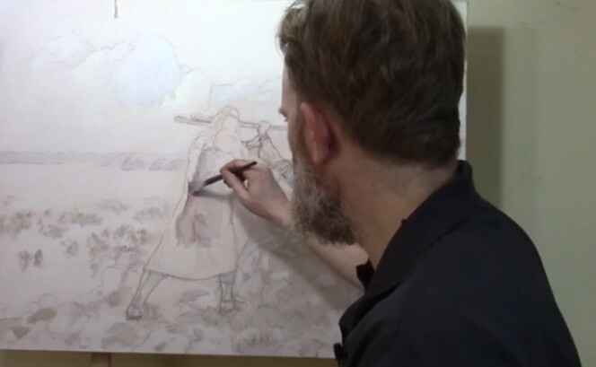
Step 1: Blocking in the Shading
The first step in building up the painting is to block in the shading. Starting with a small flat brush, begin by mixing raw umber dark with a little ultramarine blue and blending it into matte medium. This mixture allows for transparent layering, known as glazing, which will help maintain the underlying sketch without disturbing its details.
- Tip: Use small amounts of acrylic paint mixed with large amounts of matte medium for best results. This creates translucent layers that gradually build depth.
As you apply this mixture, focus on blocking in the shadows and edges of the figure. In this case, we’re focusing on the figure of Moses. The goal here is not to add too much detail but to establish the overall value structure—the lights and darks that will give the portrait its dimensionality. Keep the paint wet and blend softly to avoid harsh lines.
Step 2: Maintaining the Integrity of the Sketch
One of the advantages of the glazing technique is that it allows you to retain the integrity of your detailed sketch. Unlike opaque painting methods, where the initial sketch can get lost under thick layers of paint, glazing preserves every line. This is especially helpful when working on complex portraits that require precision and subtlety.
- Technique: Build the layers slowly. The acrylic glazing method requires patience as each layer dries before the next is applied. This results in richer shading and more nuanced transitions between light and shadow.
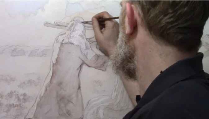
Step 3: Applying the Glaze to the Headdress
After blocking in the shadows, it’s time to move on to more specific areas, such as Moses’ headdress. Here, switch to ultramarine blue for a cooler tone. Apply this thin glaze using a round brush, gently working it into the edges and interior details. The goal is to subtly enhance the color while maintaining the transparency of the paint.
- Tip: Always zoom in to focus on intricate details. This ensures that the smaller elements of your painting, such as folds in fabric or facial features, receive the attention they need.
By layering the blue glaze, you start to see the headdress take on more depth, creating a subtle contrast between the cool blues and the warmer tones of Moses’ skin.
Step 4: Blocking Out Old Elements
As with many paintings, revisions are often necessary. In this instance, the figure of Aaron needed to be moved to improve the overall composition. To block out the remnants of the previous version, use titanium white mixed with raw sienna. This combination will effectively cover up old lines and prepare the canvas for new elements.
- Technique: Blocking out sections with lighter colors helps create a clean slate for adjustments. Don’t be afraid to revisit areas that need correcting, as painting is a fluid process of refinement.
Step 5: Letting the Layers Dry
After applying the first few layers, it’s essential to let the painting dry. This is one of the key aspects of acrylic glazing—patience. Each layer needs time to set before the next one is applied to avoid muddying the colors or losing the delicate balance of transparency.
- Tip: Allow ample drying time between layers. This prevents the colors from blending unintentionally and helps you achieve the sharpness needed for realistic portraits.
Once the initial layers are dry, you can return to the painting to add further nuances and build upon the foundation you’ve created.
The Benefits of Acrylic Glazing
The glazing technique offers several advantages, especially for detailed portrait painting:
- Preservation of Details: Because you are working with thin layers of transparent paint, you can retain all the intricate details of your original sketch.
- Depth and Realism: Glazing allows for gradual transitions between light and shadow, creating a more lifelike and three-dimensional appearance.
- Low Pressure: Unlike opaque techniques, where you need to get the colors and values right on the first try, glazing offers more flexibility. Each layer builds upon the previous one, so mistakes can be easily corrected with additional glazes.
- Historical Significance: This technique has been used by master painters for centuries to achieve the luminous quality seen in classical portraits.
Conclusion: Building a Strong Foundation
Mastering the first few layers of an acrylic portrait is crucial to achieving depth and realism in your painting. When using the glazing technique, you can preserve the details of your sketch while gradually building up the shading and values. Because this method requires patience but ultimately results in a more nuanced and lifelike portrait.
If you’re interested in learning more about acrylic glazing or portrait painting techniques, be sure to explore the resources available at RealisticAcrylic.com. and download my free gift for you here. With practice, you’ll be able to master this technique and bring your portraits to life with rich depth and realism.
- Adding highlights to your acrylic painting
- 5 Excellent Reasons to Use Aluminum Foil
- Paint Realistic Wrinkles in Acrylic
- Painting Clothing in an Acrylic Portrait
- Paint a Cloudy Sky Acrylic
- How to add Semi-Opaque Highlights
- How to Enhance the Contrast in Your Acrylic
- How to Add Glaze to Your Acrylic Painting
- Paint Realistic Reflections on Eyeglasses in an Acrylic Portrait
- Build Up Depth on Your Acrylic Portrait Backgrounds
- How Do You Do Layers With the Glazing Technique?
- Learn How to Paint Wrinkles in Acrylic
Read more about how to paint a portrait that you can surely be proud of!
I’d love to hear your thoughts on this video. Please share it with your friends and family. Let me know if you have any further questions. I’ll greatly help you.
If you’d like to learn more, sign up for my free email tips and video class today.
Learn How to Paint Acrylic Portraits With My Free Mini-Video Course!
Thank you so much for taking the time to read this tutorial and watch the video. That means a lot to me. I hope you find it very helpful in your portrait painting.
Yours for Better Portraits,
P.S. Did you find this post helpful or encouraging? If so, send it on ahead! Let others know with the share buttons below. I’d love to hear your comments. Thank you so much! Also, do you have a question on acrylic portrait painting you’d like answered? Let me know, and I’d be happy to help!

How to Paint a Book Cover Illustration: Glazing Technique
Learn the acrylic glazing technique to create stunning book cover Illustrations with depth and vibrancy
Creating a book cover illustration that tells a story visually and emotionally requires a combination of artistic skill, technique, and a deep understanding of the subject. In this tutorial, I’ll walk you through how to paint a book cover illustration using the acrylic glazing technique to achieve stunning results with rich depth, vibrant colors, and luminosity.
What is the Acrylic Glazing Technique?
The acrylic glazing technique involves applying multiple thin layers of translucent paint mixed with matte medium to create depth and a glowing, luminous effect. The glazing process allows light to pass through the layers, which builds color intensity and gives the painting a rich, oil-like appearance. It is perfect for capturing the complexity and atmosphere needed in book cover illustrations, where light, shadows, and vibrancy are essential.
Step-by-Step Guide to Creating a Book Cover Illustration with Glazing
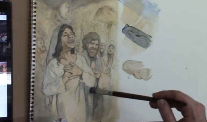
Let’s dive into how I applied this method to paint a book cover illustration for a novel about the Holy Spirit falling on early disciples, based on the book of Acts. This is a spiritual and dramatic scene that requires both light and darkness to emphasize the event’s importance.
1. Start with a Detailed Sketch
To begin, create a detailed sketch of your composition. This is crucial because the glazing technique builds on these initial lines. You’ll want to ensure your sketch is solid, as each layer of glazing will enhance, rather than obscure, the underlying structure.
2. First Layer: Laying the Foundation
Mix a small amount of paint with a large amount of matte medium. This thins out the paint, making it semi-transparent. Apply the first layer of paint to your illustration, ensuring that your strokes are smooth and even. For my painting, I used a base of ultramarine blue and raw sienna to establish the shadows and overall color scheme. Keep the first few layers lighter since you will be building up darker values later.
3. Building Depth Through Dark Values
Once your foundation layer dries, it’s time to build depth. One of the keys to creating luminous, realistic paintings is the interplay between light and dark. In this painting, I focused on ultramarine blue to darken the upper portion, which depicts the dimly lit upper room, creating a stark contrast with the bright flames of the Holy Spirit that will appear later.
Dark values are critical because they allow the lighter, vibrant tones to pop. In the same way, darkness in our lives often brings out blessings. To achieve the desired darkness, slowly add layer upon layer of paint, waiting for each one to dry before applying the next.
4. Transitioning from Cool to Warm Tones
One essential tip when glazing is understanding how to transition between cool and warm tones. In darker areas, the colors tend to be cooler (think blues and purples), while lighter areas feature warmer colors (yellows, reds, and oranges). In this book cover illustration, the darker parts of the room had cool ultramarine blue tones, while the warmer Indian yellow tones were reserved for areas where the fire of the Holy Spirit would shine.
As you apply your glazes, notice how the colors transition and blend naturally, much like light transitioning into shadows. This technique is particularly useful in storytelling illustrations, where light represents hope or divine presence and shadows signify mystery or darkness.
5. Adding Glazes to Create Vibrancy
One of the significant benefits of the acrylic glazing technique is the vibrancy it adds to the painting. As you layer each glaze, you’ll notice that the colors start to shine more brightly, and the image becomes more saturated. This effect is especially noticeable when adding warmer colors, such as the burnt sienna and alizarine crimson for the clothing of the disciples.
The layering effect is like compounded interest in a bank account. Each layer builds upon the last, making the painting look increasingly vibrant. For example, I added green by mixing Indian yellow and ultramarine blue over a woman’s shawl, producing a rich, natural hue.
6. Balancing Colors for Harmony
When glazing, it’s essential to balance your colors across the canvas. If you add a specific color in one area, consider incorporating it elsewhere in the painting to create visual harmony. In this illustration, after applying green to the woman’s shawl, I used a similar hue in another figure’s clothing to achieve balance.
You can also experiment by mixing colors to create subtle, natural transitions. For instance, I mixed burnt sienna and alizarine crimson to add reddish tones to a male figure’s garment, giving it warmth without overpowering the surrounding colors.
7. Final Touches: Highlighting with Warm Glazes
After several layers of glazing, it’s time to add the final touches. For a book cover illustration like this, where the theme involves divine light, the final layers should include warm highlights that make the painting stand out. I used yellow ochre and white to capture the light reflecting off the disciples’ faces and the flames above their heads.
By keeping the upper layers thin, I ensured that the underlying colors remained visible, adding depth and creating a glowing effect. This is the essence of the acrylic glazing technique—allowing light to pass through layers of color, creating an ethereal and vibrant painting.
Tips and Techniques for Mastering the Acrylic Glazing Technique
- Use Matte Medium: Matte medium thins out the paint, making it translucent. The more matte medium you use, the more transparent the glaze will be.
- Work in Layers: Allow each layer to dry before applying the next. This helps you build up color gradually and maintain control over the final effect.
- Balance Warm and Cool Colors: Warmer tones pop against darker, cooler backgrounds. Be mindful of how these two temperature families interact on your canvas.
- Keep the Initial Layers Light: Your first few layers should be light to avoid losing detail. The glazing technique builds on transparency, allowing your sketch to remain visible.
- Experiment with Color Mixing: Combine different pigments with matte medium to create unique shades and effects. For instance, mixing Indian yellow with ultramarine blue produced a rich, green glaze in my painting.
Conclusion
The acrylic glazing technique is a powerful tool for artists who want to create paintings with depth, luminosity, and vibrancy. Whether you’re painting a book cover illustration or any other artwork, the layering process allows you to build color gradually while maintaining control over detail and tonal transitions. By practicing this method and applying the tips outlined above, you can take your painting skills to the next level.
For more in-depth tutorials on acrylic painting, visit Realistic Acrylic Portrait School and check out my free gift for you here
- Adding highlights to your acrylic painting
- 5 Excellent Reasons to Use Aluminum Foil
- Paint Realistic Wrinkles in Acrylic
- Painting Clothing in an Acrylic Portrait
- Paint a Cloudy Sky Acrylic
- How to add Semi-Opaque Highlights
- How to Enhance the Contrast in Your Acrylic
- How to Add Glaze to Your Acrylic Painting
- Paint Realistic Reflections on Eyeglasses in an Acrylic Portrait
- Build Up Depth on Your Acrylic Portrait Backgrounds
- How Do You Do Layers With the Glazing Technique?
- Learn How to Paint Wrinkles in Acrylic
Read more about how to paint a portrait that you can surely be proud of!
I’d love to hear your thoughts on this video. Please share it with your friends and family. Let me know if you have any further questions. I’ll greatly help you.
If you’d like to learn more, sign up for my free email tips and video class today.
Learn How to Paint Acrylic Portraits With My Free Mini-Video Course!
Thank you so much for taking the time to read this tutorial and watch the video. That means a lot to me. I hope you find it very helpful in your portrait painting.
Yours for Better Portraits,
P.S. Did you find this post helpful or encouraging? If so, send it on ahead! Let others know with the share buttons below. I’d love to hear your comments. Thank you so much! Also, do you have a question on acrylic portrait painting you’d like answered? Let me know, and I’d be happy to help!

How To Darken Background & Clothing: Acrylic Glazing Technique
Discover the acrylic glazing technique to add depth, richness, and contrast to your portraits by darkening the background and clothing with ease.
One of the challenges portrait artists face is creating a balanced contrast between the subject and the background. Acrylic glazing is an excellent technique for solving this problem, offering the ability to subtly darken elements like the background and clothing while maintaining depth and luminosity. In this tutorial, we’ll explore how to use acrylic glazing to darken the background and clothing in your portraits. Then the key to success in this technique lies in building up light layers of color, allowing the paint to create a rich, oil-like effect that transforms your artwork.
Because at the end of this guide, you’ll be able to create striking contrasts, enhance the mood of your painting, and master acrylic glazing for darker tones.
Materials Needed
To achieve the best results with the acrylic glazing technique, you’ll need the following materials:
- Acrylic paints (ultramarine blue, burnt sienna, raw umber, titanium white, etc.)
- Matte medium (or glazing medium)
- Reference photo
- Various brushes (detail brushes, medium flat brush, and large round brush)
- Palette for mixing
- Water and a clean rag
Understanding Acrylic Glazing
Acrylic glazing is a technique where you mix a small amount of pigment with a large amount of matte medium to create thin, transparent layers of color. Each layer allows light to pass through, giving the painting added depth and richness. This technique mimics the effects of oil painting but with the faster drying time of acrylics, making it a versatile choice for many artists.
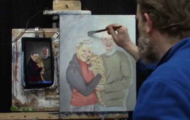
In this video, we follow the steps to darken the background and clothing of a 16×20 acrylic portrait of a couple and their cat. The key to achieving a smooth glaze is to ensure your base sketch is solid, allowing the layers to enhance rather than correct the painting.
Step 1: Starting with a Solid Sketch
Before applying glazes, it’s essential to have a strong and accurate sketch. As I have mention, that if you want to make sure that the proportions and likeness are perfect before you begin glazing. Because the foundation is key to a successful final product.
When creating your sketch:
- Focus on achieving correct proportions of your subject.
- Make sure the key areas such as the eyes, nose, and mouth are aligned.
- Use light pencil marks that won’t interfere with the transparency of your glaze.
Step 2: Mixing the First Glaze for the Background
In this painting, the client requested a bluish tone for the background. To create a blue glaze, follow these steps:
- Mix Ultramarine Blue: Add a small amount of ultramarine blue to your palette.
- Add Matte Medium: Mix the blue with matte medium until the paint is very translucent. Matte medium is milky white but dries completely clear, allowing the underlying layers to shine through.
- Apply the Glaze: Using short, choppy brush strokes, begin layering the blue glaze onto the background. This creates a smooth transition between the subject and background, enhancing depth.
One of the advantages of glazing is its flexibility. If the glaze looks too intense, you can always add more matte medium or water to lighten it.
Step 3: Building Up Contrast Between the Subject and Background
After applying the initial glaze, focus on enhancing the contrast between the subject (in this case, the couple and their cat) and the background. This step is crucial to making the subject stand out. You want to:
- Gradually increase the opacity of the glazes on the background to push it further into the distance.
- Use darker tones in the background compared to the foreground to create depth.
To darken the background even more, add layers of raw umber or burnt sienna mixed with matte medium on top of the blue glaze. This will give the background a more muted, shadowy effect while still allowing the initial blue tone to shine through.
Step 4: Glazing the Clothing
Next, shift focus to darkening the clothing using a similar glazing technique. The subject in this portrait is wearing darker-toned clothes, and I use the combination of raw umber and ultramarine blue to darken the clothing in a natural, gradual way.
- Mix Raw Umber and Blue: Combine raw umber with ultramarine blue and matte medium. This creates a nice neutral dark glaze that adds depth to the clothing without making it look flat.
- Apply the Glaze: Begin layering this darker glaze on the clothing, focusing on areas of shadow or where more depth is needed.
- Build Layer by Layer: Since glazing is a cumulative process, each layer adds more intensity to the clothing. Don’t worry about getting the perfect color right away. With each layer, the colors will mix and blend, creating a more realistic tone.
Remember, glazing allows you to make adjustments easily. If the color feels too cool or too warm, add a thin glaze of raw sienna or alizarin crimson to adjust the warmth or coolness.
Step 5: Enhancing Details and Finishing Touches
Once the base glazes are in place, use smaller detail brushes to enhance the finer areas, such as the edges of the clothing or folds in the fabric. For example, I use raw sienna to highlight certain areas of the shirt’s wrinkles. Then this subtle addition of color adds a lifelike quality to the painting.
At this stage, pay attention to:
- Wrinkles and folds in the clothing: Use a small brush to carefully apply thin glazes to highlight these details.
- Edge details: Glaze carefully around the edges where the subject meets the background, ensuring a smooth transition.
Tips for Acrylic Glazing Technique
- Use Light Layers: Always apply thin glazes and build up gradually. Heavy applications will obscure the previous layers.
- Dry Between Layers: Allow each glaze to dry before adding the next. This prevents muddying the colors.
- Experiment with Color: Don’t be afraid to adjust the color temperature with warm or cool glazes.
- Less Is More: A little pigment goes a long way when glazing. Be mindful of how much color you mix in with the medium.
- Work from Light to Dark: Build up your painting by working from lighter glazes to darker ones to maintain luminosity and depth.
Conclusion
The acrylic glazing technique offers artists a powerful tool for adding depth and richness to their paintings. When layering transparent color, you can gradually darken backgrounds and clothing without losing the vibrancy of the initial layers. This method also allows for flexibility, as adjustments can be made throughout the process without the pressure of getting it right on the first try.
In this painting of a couple and their cat, the careful use of glazing brings out the contrast between the subjects and their background, creating a compelling portrait. With practice, you’ll be able to master this technique and apply it to your own projects, transforming your portraits into luminous works of art.
If you’re looking for more instructional videos on how to improve your acrylic painting, visit www.realisticacrylic.com for more tutorials and check out my free courses here. .
- Adding highlights to your acrylic painting
- 5 Excellent Reasons to Use Aluminum Foil
- Paint Realistic Wrinkles in Acrylic
- Painting Clothing in an Acrylic Portrait
- Paint a Cloudy Sky Acrylic
- How to add Semi-Opaque Highlights
- How to Enhance the Contrast in Your Acrylic
- How to Add Glaze to Your Acrylic Painting
- Paint Realistic Reflections on Eyeglasses in an Acrylic Portrait
- Build Up Depth on Your Acrylic Portrait Backgrounds
- How Do You Do Layers With the Glazing Technique?
- Learn How to Paint Wrinkles in Acrylic
Read more about how to paint a portrait that you can surely be proud of!
I’d love to hear your thoughts on this video. Please share it with your friends and family. Let me know if you have any further questions. I’ll greatly help you.
If you’d like to learn more, sign up for my free email tips and video class today.
Learn How to Paint Acrylic Portraits With My Free Mini-Video Course!
Thank you so much for taking the time to read this tutorial and watch the video. That means a lot to me. I hope you find it very helpful in your portrait painting.
Yours for Better Portraits,
P.S. Did you find this post helpful or encouraging? If so, send it on ahead! Let others know with the share buttons below. I’d love to hear your comments. Thank you so much! Also, do you have a question on acrylic portrait painting you’d like answered? Let me know, and I’d be happy to help!

How to Blocking in Shadows for a LARGE Painting
Learn the art of blocking shadows with acrylic glazing for dramatic depth in large paintings
When creating a large acrylic painting, one of the key elements in bringing it to life is mastering the shadow work. Blocking in shadows helps define the structure and form of your subject, adding realism and depth. Using an acrylic glazing technique enhances the shadowing effect, keeping it translucent while still maintaining control over the darker areas of the painting.
In this blog post, we’ll explore a step-by-step approach on how to block in shadows for a large painting. We’ll cover the essential tools, glazing methods, and tips to help you create a more dynamic, realistic piece of art.
Setting the Stage: Preparing for Shadow Blocking
Before diving into the painting process, it’s important to prepare your materials and mindset. I begin this painting session with a moment of reflection and prayer, setting an intention to create a work that captures emotion and depth. Preparation also involves setting up the canvas, sketching the outline of the subject, and sealing the sketch with a light glaze.
For this demonstration, a mixture of raw umber dark and ultramarine blue was chosen for the shadow work. These colors, when blended, create a rich, cool tone that is perfect for shadows. Here’s how you can apply this to your own painting:
- Prepare Your Canvas: Start with a white canvas, sketch your subject, and seal the sketch with a light glaze using diluted acrylic matte medium.
- Choose Your Colors: For shadows, a mix of raw umber dark and ultramarine blue works beautifully to create a cool-toned effect. These colors blend well and offer the right balance between transparency and opacity.
Step-by-Step: Blocking in Shadows
- Creating the First Glaze Layer
Begin by applying a diluted glaze over the areas where shadows will be present. For large paintings, it’s important to keep a wet edge during the application process to avoid streaks or unwanted lines. Using long, sweeping brushstrokes, layer the glaze in areas where you want shadows to appear. - Maintaining Translucency
The beauty of acrylic glazes is their translucent nature. You can still see the sketch beneath the glaze, preserving the fine details as you work on the shadows. To achieve this effect, ensure that your glaze mixture has more medium than pigment, allowing light to pass through. - Building the Tonal Value Structure
Blocking in shadows is more than just applying darker tones. It’s about understanding the value structure of your reference image. In the demonstration, the artist frequently checks his reference photo to ensure that he’s accurately representing the light and shadow interplay. Study your reference carefully and build the shadows from light to dark.- Tip: Cooler tones work well for shadows. Add a small amount of ultramarine blue to your glaze to give the shadows a cooler, more natural effect.
Techniques for Shadow Blocking in Large Paintings
Blocking in shadows for a large painting requires a few specialized techniques. Here are some essential methods to use:
- Layering Glazes for Depth
Rather than applying one thick layer, build your shadows gradually by adding multiple thin layers of glaze. This will help you control the depth and darkness of the shadow, while still maintaining the luminosity of the overall painting. - Vary Your Brush Strokes
As you apply the glaze, it’s helpful to vary the direction of your brushstrokes. This creates a more natural and organic look, especially in areas with fabric or textures like rocks. For example, the artist worked on the figure’s clothing, carefully brushing in the shadows to maintain the folds and creases. - Use a Smaller Brush for Detail
Once the large areas are blocked in, switch to a smaller brush to refine the edges of the shadows. This technique allows you to add subtle details that make the shadowing more realistic.
Key Tips and Techniques for Effective Shadow Work
- Keep a Wet Edge: When applying a glaze, always maintain a wet edge to prevent harsh lines and streaks. This will ensure smooth transitions between the light and shadowed areas.
- Use Cooler Tones: Shadows should be cooler in tone compared to the lighter areas. Adding a hint of ultramarine blue to your glaze helps achieve this effect.
- Layer Glazes for Control: Don’t rush the shadowing process. Build up the intensity gradually by applying thin layers of glaze until you reach the desired depth.
- Pay Attention to Gradation: Shadows are rarely uniform in tone. They often fade or blend into lighter areas. Adjust your glaze to create smooth gradations between light and dark.
Applying Glazes to Specific Elements
In the video, I focused on several parts of the painting and then demonstrated the blocking in of shadows:
- The Figure’s Clothing: By using a combination of raw umber dark and ultramarine blue, the artist darkened the folds of the figure’s clothing, preserving the highlights and lighter areas.
- The Rocks: Shadows were added to the rocks behind the main figures, using a slightly bolder application of glaze. The cooler tones gave the rocks a natural shadowed effect, which contrasted well with the lighter areas.
- Background Elements: Blocking in shadows for the background elements, such as the sky and distant stones, helps create a sense of depth and distance. In this case, the artist allowed the shadows to blend naturally into the lighter tones, creating a balanced contrast.
Finishing Touches: Refining the Shadows
Once the shadow areas are blocked in, the final step involves refining the details. Then I used a smaller brush to control the finer aspects of the shadows, ensuring that they didn’t overpower the highlights. This delicate balance between light and shadow is what ultimately brings the painting to life.
- Pro Tip: If a glaze feels too bold, you can always lighten it by gently brushing over the area with a bit of water or clear medium to soften the edges.
Conclusion: Mastering the Art of Shadow Blocking
Blocking in shadows is a crucial skill for any artist, especially when working on large paintings. By using acrylic glazing techniques, you can add depth and realism while preserving the underlying details. Remember to take your time, build the shadows in layers, and constantly refer to your reference photo to ensure accuracy.
Master this technique, and you’ll find your large acrylic paintings gaining new levels of dimension and realism.
If you’re looking for more instructional videos on how to improve your acrylic painting, visit www.realisticacrylic.com for more tutorials and check out my free courses here. .
- Adding highlights to your acrylic painting
- 5 Excellent Reasons to Use Aluminum Foil
- Paint Realistic Wrinkles in Acrylic
- Painting Clothing in an Acrylic Portrait
- Paint a Cloudy Sky Acrylic
- How to add Semi-Opaque Highlights
- How to Enhance the Contrast in Your Acrylic
- How to Add Glaze to Your Acrylic Painting
- Paint Realistic Reflections on Eyeglasses in an Acrylic Portrait
- Build Up Depth on Your Acrylic Portrait Backgrounds
- How Do You Do Layers With the Glazing Technique?
- Learn How to Paint Wrinkles in Acrylic
Read more about how to paint a portrait that you can surely be proud of!
I’d love to hear your thoughts on this video. Please share it with your friends and family. Let me know if you have any further questions. I’ll greatly help you.
If you’d like to learn more, sign up for my free email tips and video class today.
Learn How to Paint Acrylic Portraits With My Free Mini-Video Course!
Thank you so much for taking the time to read this tutorial and watch the video. That means a lot to me. I hope you find it very helpful in your portrait painting.
Yours for Better Portraits,
P.S. Did you find this post helpful or encouraging? If so, send it on ahead! Let others know with the share buttons below. I’d love to hear your comments. Thank you so much! Also, do you have a question on acrylic portrait painting you’d like answered? Let me know, and I’d be happy to help!

How to Varnish an Acrylic Painting in One Step
Discover the easy technique for how to varnish an acrylic painting in one step to enhance and preserve your artwork’s vibrancy
There’s a lot of controversy surrounding this topic, or at least, many different opinions on how to do it right.
Some say you need an isolation coat. But others say you should spray apply the varnish. And then there are some who pour it on or use a sponge!
I’m not here to dismiss any of those methods. If they work for that particular artist, more power to them.
Rather, I’d like to share with you the method I’ve been using for over 20 years as a portrait painter. And then it’s easy, and you can do it one step.
Let me break down this one-step acrylic varnishing method into how to actually do it…
- Lay your canvas flat on a table, oriented horizontally, but at an angle.
- Raise your canvas up, on four scraps of wood placed under each corner (make sure it’s level. 1″ x 2″s work well )
- Get your 4″ varnishing brush (Liquitex Freestyle works well)
- Pour matte varnish (Novacolor or Liquitex) into a clean yogurt container or any plastic container large enough to accommodate the width of the brush. Be sure to stir the varnish if it’s been sitting for a while! Over time the polymer resin can separate from the water in the mixture. If you don’t mix it, you may have streaks.
- “Sweep” any dust or debris off of the canvas surface with a large brush before you begin.
- Dip your brush into the varnish container, so the bristles are coated with varnish 1/3-1/2 of the way up from the tip.
- Begin brushing the varnish on the surface, starting with the end farthest from you. Brush in the longest direction of the canvas.
- Let your brush hit 1/3″ of the way from the left edge of the canvas. Apply even pressure and bring the brush all the way to the left edge.
- Bring the brush all the way to the right edge.
- Wipe any excess varnish that remains on your brush inside the top lip of your container.
- Flip the brush over and smooth out the entire first application, overlapping the edge slightly with 1-2 strokes. Do not overbrush!
- Dip your brush into the varnish container and repeat the process. Let your stroke slightly overlap the first (about 1/4″)
- You will be working your way toward your body. This will keep you from accidentally dripping onto the finished varnished surface.
- If you have any extra varnish that drips onto the side of the canvas, use a 3/4 flat brush to wipe it off. If the canvas will be framed, the side-drips are usually not a problem and can be left alone.
- Let your canvas dry flat on a table. It might look milky white in areas. Resist the temptation to brush it! If you followed my method, the varnish should dry crystal clear. It should dry completely within 3-5 hours, depending on humidity.
Disclaimer: I have used this method with great results in over 20 years of portrait painting. Because your results are up to you, how you apply this method, and the humidity levels of your studio space. I cannot be held responsible for any painting that gets damaged during the varnishing process. Then it would be a good idea to varnish a test piece first. You can add another layer (after 3-5 hours of dry time) if you feel the first one didn’t cover as well as you’d like, but most of the time, you won’t need to.
Watch this video below to see the process in action…
If you’re looking for more instructional videos on how to improve your acrylic painting, visit www.realisticacrylic.com for more tutorials and check out my free courses here. .
Let me know if you have any questions and I look forward to teaching you more!
LEARN MORE
- How to Paint Foliage Using the Acrylic Glazing Technique
- How to Trace for an Accurate Portrait Sketch
- How to Paint Realistic Eyes in Your Acrylic Portrait
- How to Add Raw Umber Dark & Ultramarine Blue to Your Portrait
- How to Make Your Own Raw Umber Dark
- How to Paint Realistic Trees & Grass in Your Acrylic
- How to Block In Skin Tone Values Using Glazing Technique
- How to Paint Vibrant Reds in Your Acrylic Portrait
- How to Glaze Background Colors & More Acrylic Portrait
- How to Paint White Clothing in Your Acrylic Portrait
- How to Easily Transition from a Sketch to a Painting
- How to Block In Shading & Skin Tones in Your Acrylic
- How to Build Up Color on Acrylic Pet Portrait
- How to Build Up Form on Clothing with Acrylic
- How to Paint Dark Clothing Using Acrylic Glazing Technique
- How to Paint a 24 x 30 Acrylic With 30 People
- How to Do Smooth Shading with Acrylic
- How to Sketch an Acrylic Portrait with a Grid
Read more about how to paint a portrait that you can surely be proud of!
I’d love to hear your thoughts about this video. Please share it with your friends and family. Let me know if you have any further questions. I’ll greatly help you.
If you’d like to learn more, sign up for my free email tips and video class today.
Learn How to Paint Acrylic Portraits With My Free Mini-Video Course!
Thank you so much for taking the time to read this tutorial and watch the video. That means a lot to me. I hope you find it very helpful in your portrait painting.
Yours for Better Portraits,
P.S. Did you find this post helpful or encouraging? If so, send it on ahead! Let others know with the share buttons below. I’d love to hear your comments. Thank you so much! Also, do you have a question on acrylic portrait painting you’d like answered? Let me know, and I’d be happy to help!