- You are here:
- Home »
- Blog »
- Uncategorized »
- How to Paint Realistic Trees & Landscapes: Technique

How to Paint Realistic Trees & Landscapes: Technique
I’ll show you what colors to use (and why), how to mix the paint with matte medium for the glazing technique
Introduction
Creating realistic trees and landscapes in acrylic paintings can be a rewarding yet challenging task. The secret to mastering this lies in the glazing technique, which allows for depth, luminosity, and a natural appearance. In this guide, we’ll walk through a detailed process to help you bring your landscape elements to life. And I’ll show you how I paint realistic trees & landscapes using a technique and a step-by-step process.
Understanding the Glazing Technique
Glazing is a fundamental technique in acrylic painting, where you apply thin layers of translucent paint to build depth and vibrancy. This method is particularly useful when painting backgrounds, like trees in landscapes, as it preserves the underlying sketch while adding color and detail gradually.
Materials Needed:
- Acrylic paints (ultramarine blue, phthalo blue, titanium white, raw sienna, raw umber dark)
- Matte medium
- Brushes (quarter-inch flats, rounds, filberts)
- Palette for mixing colors
Step-by-Step Process:
- Mixing the Glaze: Start by creating your glaze mixture. Combine a small amount of paint with a generous amount of matte medium. The matte medium is a clear acrylic without pigment, allowing for translucent layers that maintain the integrity of your initial sketch.
- Choosing the Right Colors: Begin with subdued colors for the background, as these will give the illusion of distance. For instance, mix ultramarine blue with raw sienna to create a subdued green. To add variety, incorporate phthalo blue and titanium white, adjusting with raw umber dark to neutralize any intensity.
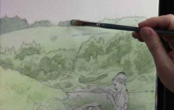
Painting Trees in the Distance
To create realistic trees in the background, focus on cooler, less intense colors. These colors recede visually, making the trees appear further away.
- Block in the Shapes: Use a mix of phthalo blue, ultramarine blue, and a touch of titanium white for the distant trees. Lightly apply this mix to establish the overall shape, not worrying too much about staying within the lines—overlapping can be adjusted later with background colors.
- Adjusting Tones: If your color is too vibrant, add raw umber dark, to tone it down, creating a more natural look. This step is crucial, as it ensures that your distant trees don’t overpower the foreground elements.
- Layering with Glazes: Continue layering glazes to build up the form of the trees. Use a dry-brush technique to add subtle transitions between light and shadow, which will give your trees a more three-dimensional appearance. Remember, the goal is to see the abstraction within realism—simplify complex shapes into manageable forms.
Bringing the Midground to Life
The midground trees and landscape elements should be more defined than those in the background but still less intense than the foreground.
- Creating Midground Colors: For the midground, slightly warm up your color palette by adding more raw sienna to the mix. This will create a gentle contrast between the cooler background trees and the warmer midground.
- Detailing with Brushwork: Use smaller brushes to add details like branches and foliage. Focus on capturing the shapes and shadows without getting too detailed, as this can detract from the overall realism. It’s about striking a balance between simplicity and complexity.
Final Touches: Adding Depth to the Foreground
The foreground is where you can introduce the most detail and contrast, drawing the viewer’s eye.
- Darkening the Shadows: To add depth, mix a darker shade by combining ultramarine blue, phthalo blue, and a bit of raw umber dark. Apply this to the base of the trees and other shadowed areas.
- Highlighting with Glazes: Use warm glazes to highlight areas where light would naturally hit. This will make the trees and landscape pop, giving the impression of sunlight filtering through.
- Maintaining Color Harmony: As you paint, continually ask yourself where else you can apply the current color mix. This promotes harmony across the painting and helps unify the different elements.
The glazing technique is a powerful tool for creating realistic trees and landscapes in acrylic paintings. By layering translucent colors and focusing on the subtle interplay of light and shadow, you can achieve a natural and immersive scene. Remember to be patient and allow the process to unfold gradually. With practice, you’ll find that your ability to capture the beauty of nature in your paintings will significantly improve.
Tips and Techniques Recap:
- Use matte medium to create translucent glazes.
- Start with cooler, subdued colors for distant trees.
- Layer glazes to build depth and form.
- Strike a balance between simplicity and detail.
- Apply color harmony by reusing mixtures across the painting.
By incorporating these techniques, you’ll elevate your landscape paintings, making them more lifelike and captivating.
Read more about my additional resources, tutorials, to learn more and check out my free courses here. Whether you’re a beginner or an experienced artist, there’s always something new to learn and apply to your paintings. Happy painting!
- Sketching Your Painting Accurately
- Beginning a Pet Portrait in Acrylic
- The Mystery of Realism in Painting
- Apply A Burnt Sienna Glaze to a Portrait
- Learn How to Sketch a Portrait Freehand in 45 Minutes
- Adding highlights to your acrylic painting
- 5 Excellent Reasons to Use Aluminum Foil
- Paint Realistic Wrinkles in Acrylic
- Painting Clothing in an Acrylic Portrait
- Paint a Cloudy Sky Acrylic
- How to add Semi-Opaque Highlights
- How to Enhance the Contrast in Your Acrylic
- How to Add Glaze to Your Acrylic Painting
- Paint Realistic Reflections on Eyeglasses in an Acrylic Portrait
- Build Up Depth on Your Acrylic Portrait Backgrounds
- How Do You Do Layers With the Glazing Technique?
- Learn How to Paint Wrinkles in Acrylic
Read more about how to paint a portrait that you can surely be proud of!
I’d love to hear your thoughts on this video. Please share it with your friends and family. Let me know if you have any further questions. I’ll greatly help you.
If you’d like to learn more, sign up for my free email tips and video class today.
Learn How to Paint Acrylic Portraits With My Free Mini-Video Course!
Thank you so much for taking the time to read this tutorial and watch the video. That means a lot to me. I hope you find it very helpful in your portrait painting.
Yours for Better Portraits,

P.S. Did you find this post helpful or encouraging? If so, send it in ahead! Let others know with the share buttons below. I’d love to hear your comments. Thank you so much! Also, do you have a question on acrylic portrait painting you’d like answered? Let me know, and I’d be happy to help!