- You are here:
- Home »
- Blog »
- Video Tutorial »
- How to Paint a Book Cover Illustration: Glazing Technique

How to Paint a Book Cover Illustration: Glazing Technique
Learn the acrylic glazing technique to create stunning book cover Illustrations with depth and vibrancy
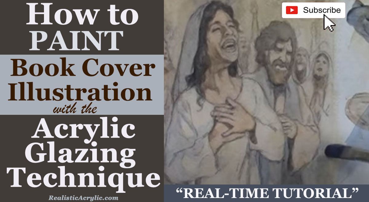
Creating a book cover illustration that tells a story visually and emotionally requires a combination of artistic skill, technique, and a deep understanding of the subject. In this tutorial, I’ll walk you through how to paint a book cover illustration using the acrylic glazing technique to achieve stunning results with rich depth, vibrant colors, and luminosity.
What is the Acrylic Glazing Technique?
The acrylic glazing technique involves applying multiple thin layers of translucent paint mixed with matte medium to create depth and a glowing, luminous effect. The glazing process allows light to pass through the layers, which builds color intensity and gives the painting a rich, oil-like appearance. It is perfect for capturing the complexity and atmosphere needed in book cover illustrations, where light, shadows, and vibrancy are essential.

Step-by-Step Guide to Creating a Book Cover Illustration with Glazing
Let’s dive into how I applied this method to paint a book cover illustration for a novel about the Holy Spirit falling on early disciples, based on the book of Acts. This is a spiritual and dramatic scene that requires both light and darkness to emphasize the event’s importance.
1. Start with a Detailed Sketch
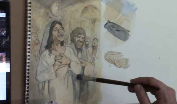
To begin, create a detailed sketch of your composition. This is crucial because the glazing technique builds on these initial lines. You’ll want to ensure your sketch is solid, as each layer of glazing will enhance, rather than obscure, the underlying structure.
2. First Layer: Laying the Foundation
Mix a small amount of paint with a large amount of matte medium. This thins out the paint, making it semi-transparent. Apply the first layer of paint to your illustration, ensuring that your strokes are smooth and even. For my painting, I used a base of ultramarine blue and raw sienna to establish the shadows and overall color scheme. Keep the first few layers lighter since you will be building up darker values later.
3. Building Depth Through Dark Values
Once your foundation layer dries, it’s time to build depth. One of the keys to creating luminous, realistic paintings is the interplay between light and dark. In this painting, I focused on ultramarine blue to darken the upper portion, which depicts the dimly lit upper room, creating a stark contrast with the bright flames of the Holy Spirit that will appear later.
Dark values are critical because they allow the lighter, vibrant tones to pop. In the same way, darkness in our lives often brings out blessings. To achieve the desired darkness, slowly add layer upon layer of paint, waiting for each one to dry before applying the next.
4. Transitioning from Cool to Warm Tones
One essential tip when glazing is understanding how to transition between cool and warm tones. In darker areas, the colors tend to be cooler (think blues and purples), while lighter areas feature warmer colors (yellows, reds, and oranges). In this book cover illustration, the darker parts of the room had cool ultramarine blue tones, while the warmer Indian yellow tones were reserved for areas where the fire of the Holy Spirit would shine.
As you apply your glazes, notice how the colors transition and blend naturally, much like light transitioning into shadows. This technique is particularly useful in storytelling illustrations, where light represents hope or divine presence and shadows signify mystery or darkness.
5. Adding Glazes to Create Vibrancy
One of the significant benefits of the acrylic glazing technique is the vibrancy it adds to the painting. As you layer each glaze, you’ll notice that the colors start to shine more brightly, and the image becomes more saturated. This effect is especially noticeable when adding warmer colors, such as the burnt sienna and alizarine crimson for the clothing of the disciples.
The layering effect is like compounded interest in a bank account. Each layer builds upon the last, making the painting look increasingly vibrant. For example, I added green by mixing Indian yellow and ultramarine blue over a woman’s shawl, producing a rich, natural hue.
6. Balancing Colors for Harmony
When glazing, it’s essential to balance your colors across the canvas. If you add a specific color in one area, consider incorporating it elsewhere in the painting to create visual harmony. In this illustration, after applying green to the woman’s shawl, I used a similar hue in another figure’s clothing to achieve balance.
You can also experiment by mixing colors to create subtle, natural transitions. For instance, I mixed burnt sienna and alizarine crimson to add reddish tones to a male figure’s garment, giving it warmth without overpowering the surrounding colors.
7. Final Touches: Highlighting with Warm Glazes
After several layers of glazing, it’s time to add the final touches. For a book cover illustration like this, where the theme involves divine light, the final layers should include warm highlights that make the painting stand out. I used yellow ochre and white to capture the light reflecting off the disciples’ faces and the flames above their heads.
By keeping the upper layers thin, I ensured that the underlying colors remained visible, adding depth and creating a glowing effect. This is the essence of the acrylic glazing technique—allowing light to pass through layers of color, creating an ethereal and vibrant painting.
Tips and Techniques for Mastering the Acrylic Glazing Technique
- Use Matte Medium: Matte medium thins out the paint, making it translucent. The more matte medium you use, the more transparent the glaze will be.
- Work in Layers: Allow each layer to dry before applying the next. This helps you build up color gradually and maintain control over the final effect.
- Balance Warm and Cool Colors: Warmer tones pop against darker, cooler backgrounds. Be mindful of how these two temperature families interact on your canvas.
- Keep the Initial Layers Light: Your first few layers should be light to avoid losing detail. The glazing technique builds on transparency, allowing your sketch to remain visible.
- Experiment with Color Mixing: Combine different pigments with matte medium to create unique shades and effects. For instance, mixing Indian yellow with ultramarine blue produced a rich, green glaze in my painting.
Conclusion
The acrylic glazing technique is a powerful tool for artists who want to create paintings with depth, luminosity, and vibrancy. Whether you’re painting a book cover illustration or any other artwork, the layering process allows you to build color gradually while maintaining control over detail and tonal transitions. By practicing this method and applying the tips outlined above, you can take your painting skills to the next level.
For more in-depth tutorials on acrylic painting, visit Realistic Acrylic Portrait School and check out my free gift for you here
- Adding highlights to your acrylic painting
- 5 Excellent Reasons to Use Aluminum Foil
- Paint Realistic Wrinkles in Acrylic
- Painting Clothing in an Acrylic Portrait
- Paint a Cloudy Sky Acrylic
- How to add Semi-Opaque Highlights
- How to Enhance the Contrast in Your Acrylic
- How to Add Glaze to Your Acrylic Painting
- Paint Realistic Reflections on Eyeglasses in an Acrylic Portrait
- Build Up Depth on Your Acrylic Portrait Backgrounds
- How Do You Do Layers With the Glazing Technique?
- Learn How to Paint Wrinkles in Acrylic
Read more about how to paint a portrait that you can surely be proud of!
I’d love to hear your thoughts on this video. Please share it with your friends and family. Let me know if you have any further questions. I’ll greatly help you.
If you’d like to learn more, sign up for my free email tips and video class today.
Learn How to Paint Acrylic Portraits With My Free Mini-Video Course!
Thank you so much for taking the time to read this tutorial and watch the video. That means a lot to me. I hope you find it very helpful in your portrait painting.
Yours for Better Portraits,

P.S. Did you find this post helpful or encouraging? If so, send it on ahead! Let others know with the share buttons below. I’d love to hear your comments. Thank you so much! Also, do you have a question on acrylic portrait painting you’d like answered? Let me know, and I’d be happy to help!
