Category Archives for Real Time Tutorial

2025 Winter Acrylic Painting Challenge, Lesson 8 Bringing Your Portrait Home
Master the final touches: Bring your acrylic portrait to life with precision and confidence
Congratulations! You’ve made it to the final stage of your acrylic portrait. This is where all the hard work comes together, and your painting truly comes to life. In Lesson 8: Bringing Your Portrait Home, we will focus on refining details, sharpening edges, and adding those final highlights that make your portrait stand out.
It’s tempting to keep working indefinitely, but knowing when to stop is just as important as knowing how to start. By the end of this lesson, you’ll feel confident that your painting is complete, ready to be signed, and displayed with pride.
Step 1: Assess Your Progress
Before making any final touches, take a step back and evaluate your portrait. Ask yourself:
✔ Are the proportions and facial features balanced?
✔ Is the contrast strong enough to create depth?
✔ Do the highlights and shadows define the form effectively?
✔ Are there any unresolved areas that need attention?
If you notice anything that feels off, now is the time to make minor adjustments.
Step 2: Refining Edges and Enhancing Contrast
One of the most effective ways to bring realism to your portrait is by sharpening edges and boosting contrast.
Techniques for Crisp Edges:
- Use a small round brush with slightly thinned paint for clean, sharp lines.
- Define important areas like the jawline, nose bridge, and lips with subtle refinements.
- Blur unnecessary details in background elements to enhance depth and focus.
Boosting Contrast for Depth:
- Deepen shadows with a mix of raw umber and alizarine crimson for warmth.
- Brighten highlights using titanium white with a touch of yellow ochre for natural skin tones.
- Adjust mid-tones to create smooth transitions between light and shadow.
These small changes will make a significant difference in the overall impact of your portrait.
Step 3: Adding Final Highlights
To make your portrait pop, strategic highlights should be applied.
Where to Place Highlights:
✔ The tip of the nose and cheekbones
✔ The upper eyelids and brow ridge
✔ The edges of the lips and chin
✔ The light-catching areas of clothing or accessories
Using a dry brush technique with minimal paint can help you create soft, natural highlights without overpowering the painting.
Step 4: Knowing When to Stop
It’s easy to overwork a painting, but at some point, you must decide it’s finished. A few signs that your portrait is complete:
✔ The main subject stands out against the background.
✔ The details are refined but not overly complicated.
✔ The colors and contrast look balanced.
✔ You feel satisfied when viewing your work from a distance.
If you can check off these points, it’s time to bring your portrait home and move on to the final step—signing your artwork!
Step 5: Signing Your Painting
A signature is the finishing touch that makes your work official.
Tips for Signing Your Acrylic Painting:
✔ Use a fine brush or acrylic paint pen for precision.
✔ Place your signature in a subtle but visible area (bottom right or left corner).
✔ Keep it small and unobtrusive so it does not distract from the portrait.
✔ Use a color that complements but contrasts slightly with the background.
Once signed, your painting is officially complete!
Celebrate Your Progress!
Completing a portrait is a huge achievement! Whether you’re keeping it for yourself, gifting it, or selling it, take a moment to appreciate your hard work.
If you’ve participated in the 2025 Winter Acrylic Painting Challenge, share your final piece with the community and celebrate your growth as an artist. Remember each finished portrait is a stepping stone to even greater artistic success.
📢 Did you enjoy this challenge? Sign up for the next one and keep improving your portrait painting skills! 🎨✨
FAQs: Bringing Your Portrait Home
1. How do I know when my painting is finished?
If the details, contrast, and composition feel balanced, and you no longer see major issues, it’s time to stop. Overworking a painting can reduce its realism.
2. Should I varnish my painting after finishing?
Yes! A protective varnish will enhance colors and provide longevity. Use a gloss, satin, or matte finish, depending on your preference.
3. How can I fix mistakes in the final stages?
For minor errors, gently layer paint over the area with a dry brush. If needed, use a soft wet cloth to lift fresh paint before it dries.
4. What’s the best way to display my finished portrait?
Frame your painting with a simple, elegant border or display it on a stretched canvas for a professional look.
2025 Winter Acrylic Portrait Painting Challenge Series
2025 Winter Acrylic Portrait Painting Challenge: Steps to Get Started
2025 Winter Acrylic Portrait Challenge Pre-Lesson: Gathering Your Supplies
2025 Winter Acrylic Portrait Challenge, Lesson 1: Prepping Your Canvas for the Portrait
2025 Winter Acrylic Painting Challenge, Lesson 2: Sketching Your Portrait Accurately
2025 Winter Acrylic Painting Challenge, Lesson 3: Sealing in Your Sketch
2025 Winter Acrylic Painting Challenge, Lesson 4: Beginning Your Portrait with Glazes
2025 Winter Acrylic Painting Challenge, Lesson 5: Building Up Color and Contrast
2025 Winter Acrylic Painting Challenge,Bonus Video: Increasing Contrast
2025 Winter Acrylic Painting Challenge, Lesson 6 Shading and Color Nuances
2025 Winter Acrylic Painting Challenge, Lesson 7 Creating Realism in Your Portrait
2025 Winter Acrylic Painting Challenge, BONUS Video:Adjusting Colors and Details

How to Prime Your Own Canvas
Master the art of priming for a flawless painting surface
Priming a canvas is a crucial step in preparing your painting surface. Whether you are working on a custom-sized canvas or looking for better quality than store-bought options, learning how to prime your own canvas will give you full control over your art materials. Without proper priming, paint can absorb unevenly, leading to unwanted textures and reduced longevity. In this guide, you’ll learn the best techniques for stretching, tightening, and applying gesso to your canvas, ensuring a professional-quality surface for your acrylic or oil paintings.
Step 1: Preparing Your Canvas
Before applying gesso, the canvas must be properly stretched and tightened. A loose canvas can cause sagging, making it difficult to work on.
How to Tighten Your Canvas:
- Spray or Brush with Water: Lightly mist the front and back of the canvas with water. As it dries, the fibers will contract, tightening the surface.
- Use Canvas Keys (Optional): If extra tension is needed, insert canvas keys into the corners and tap them gently with a mallet. These should be used as a last resort.
Ensuring that the canvas is tight before priming will create a sturdy and reliable painting surface.
Step 2: Choosing the Right Gesso
Acrylic gesso is the most common primer used for both acrylic and oil painting. Brands like Liquitex and Nova Color offer high-quality options. Gesso comes in different thicknesses, and the type you choose will impact the final texture of your canvas.
Why Use Gesso?
- Prevents paint from soaking into the canvas.
- Provides a smoother and more even painting surface.
- Improves the durability of your artwork.
Shake the gesso well before using it. This ensures that any settled pigments and binders are mixed evenly for a consistent application.
Step 3: Applying the First Layer of Gesso
The first layer of gesso is essential for sealing the raw canvas and preventing excessive paint absorption.
Materials Needed:
✔ Acrylic gesso
✔ 3-inch paintbrush or drywall taping knife
✔ Container for pouring gesso
How to Apply:
- Pour the gesso into a container, such as an empty yogurt cup.
- Load your brush with a generous amount of gesso.
- Apply in smooth, even strokes, working in one direction (either vertical or horizontal).
- Cover the entire canvas, ensuring even distribution.
- Allow it to dry completely before adding additional coats.
The drying time will vary depending on the thickness of the application and the surrounding humidity.
Step 4: Sanding and Additional Layers
To achieve a smoother painting surface, multiple layers of gesso are recommended.
Adding More Layers:
- Apply a second coat in the opposite direction of the first (if the first coat was vertical, apply the second coat horizontally).
- Lightly sand the surface between coats using fine-grit sandpaper for a polished finish.
- Repeat for a third or fourth coat if a smoother surface is desired.
Each layer enhances the texture and longevity of the canvas, making it ideal for detailed brushwork and blending.
Step 5: Letting the Canvas Cure
After the final coat of gesso, the canvas should be left to cure for at least 24 hours. This allows the primer to fully bond with the canvas fibers, ensuring a stable painting surface.
Tips & Techniques for a Perfectly Primed Canvas
✔ Use quality gesso to avoid cracking or peeling over time.
✔ Apply in thin layers for a more even and refined surface.
✔ Sand between coats to remove any brush strokes or ridges.
✔ Ensure proper drying time to prevent tackiness before painting.
✔ Work in a well-ventilated area to speed up drying and avoid inhaling fumes.
Learning how to prime your own canvas gives you complete control over your painting surface. Whether you’re working with acrylics or oils, a properly primed canvas ensures better paint application and a more durable artwork. With these simple steps, you can create a professional-quality foundation for your creative projects.
Are you ready to start your next masterpiece? Try priming your own canvas and see the difference! 🎨
FAQs About Priming a Canvas
1. Why is priming a canvas necessary?
Priming seals the canvas, preventing excessive paint absorption and improving durability. Without gesso, paint can soak into the fibers, leading to uneven textures and fading over time.
2. Can I use regular white paint instead of gesso?
No. Gesso contains specific binders that create an absorbent surface, whereas regular paint does not provide the same adhesion benefits.
3. How many coats of gesso should I apply?
Two to three coats are typically recommended. Additional layers can be added for a smoother surface.
4. Can I use a roller instead of a brush?
Yes, a roller can be used for a more even application, but a brush allows for better control, especially on stretched canvases.
5. How long should I wait before painting on a primed canvas?
It is best to wait at least 24 hours after the final coat of gesso has dried to ensure optimal adhesion.
- Sketching Your Painting Accurately
- Beginning a Pet Portrait in Acrylic
- The Mystery of Realism in Painting
- Apply A Burnt Sienna Glaze to a Portrait
- Learn How to Sketch a Portrait Freehand in 45 Minutes
- Adding highlights to your acrylic painting
- 5 Excellent Reasons to Use Aluminum Foil
- Paint Realistic Wrinkles in Acrylic
- Painting Clothing in an Acrylic Portrait
- Paint a Cloudy Sky Acrylic
- How to add Semi-Opaque Highlights
- How to Enhance the Contrast in Your Acrylic
- How to Add Glaze to Your Acrylic Painting
- Paint Realistic Reflections on Eyeglasses in an Acrylic Portrait
- Build Up Depth on Your Acrylic Portrait Backgrounds
- How Do You Do Layers With the Glazing Technique?
- Learn How to Paint Wrinkles in Acrylic
Read more about how to paint a portrait that you can surely be proud of!
I’d love to hear your thoughts on this video. Please share it with your friends and family. Let me know if you have any further questions. I’ll greatly help you.
If you’d like to learn more, sign up for my free email tips and video class today.
Learn How to Paint Acrylic Portraits With My Free Mini-Video Course!Thank you so much for taking the time to read this tutorial and watch the video. That means a lot to me. I hope you find it very helpful in your portrait painting.
Yours for Better Portraits,

P.S. Did you find this post helpful or encouraging? If so, send it in ahead! Let others know with the share buttons below. I’d love to hear your comments. Thank you so much! Also, do you have a question on acrylic portrait painting you’d like answered? Let me know, and I’d be happy to help!

How to Transition Slowly out your Sketch to Portrait
Master the art of realism: A step-by-step guide to transitioning from sketch to portrait
Creating a realistic portrait from a simple sketch requires patience, layering, and precise color adjustments. If you have ever struggled with making a smooth transition from sketch to portrait, this guide will help you step by step. By focusing on brush techniques, glazing methods, and color mixing, you will gradually build depth and realism in your artwork.
Why Transitioning Smoothly Matters
The transition from a sketch to a fully developed portrait is crucial for achieving lifelike results. Rushing through this process can lead to a flat, unbalanced painting. Instead, taking slow and deliberate steps allows for smoother shading, natural skin tones, and a polished finish.
Key Elements of a Smooth Transition:
- Building gradual layers
- Adjusting colors for depth and dimension
- Blending tones for soft, realistic effects
- Refining details without overworking
Step-by-Step Process: From Sketch to Portrait
1. Establishing the Base Layers
Start with a light wash of color to define major shadows and highlights. This will act as an under painting to guide future layers.
- Use thin, transparent layers rather than heavy application.
- Mix colors using a glazing technique to maintain subtle shifts in tone.
- Apply short, choppy strokes with a soft flat brush for smooth blending.
2. Adjusting Skin Tones and Values
To create realistic flesh tones, focus on temperature and saturation.
- For warm, tanned skin: Use Burnt Sienna and Raw Sienna in thin layers.
- For cooler, pale skin: Use Raw Umber Dark with matte medium to create subtle undertones.
- Always start with a faint application and gradually build intensity.
3. Refining Features with Glazing
Glazing allows for controlled adjustments without losing previous layers.
- Apply a thin glaze over darker areas to deepen shadows.
- Use a light, transparent mix to highlight prominent features.
- Work slowly to ensure colors remain balanced and natural.
4. Blending and Final Touches
To unify the portrait and eliminate harsh transitions:
- Pivot between the pointed and flat edge of your brush for smooth blending.
- Introduce subtle highlights on the forehead, nose, and cheekbones.
- Step back frequently to assess the overall composition before making final adjustments.
Tips and Techniques for a Seamless Transition
✔ Use Transparent Layers – Avoid thick, opaque paint layers too early in the process.
✔ Work with the Right Brushes – Flat and round brushes offer better control for blending.
✔ Glaze for Smoothness – Multiple layers of thin paint create realistic depth.
✔ Adjust Colors as Needed – Pale vs. warm skin tones require different pigment ratios.
✔ Take Your Time – Rushing will result in harsh lines and unnatural shading.
Transitioning from sketch to portrait requires patience, layering, and a deep understanding of colors and values. By following these techniques, you can develop a realistic and polished portrait with depth and subtlety.
Are you ready to refine your skills further? Keep practicing, experiment with glazing, and enjoy the process of bringing your sketches to life! 🎨
FAQ: Transitioning from Sketch to Portrait
1. What is the best way to avoid harsh transitions?
Use thin glazes and work in layers. Blending with a soft brush also helps create seamless shading.
2. How do I choose the right colors for skin tones?
Warm skin tones benefit from Burnt Sienna and Raw Sienna, while cooler tones need more Raw Umber Dark with added medium.
3. Should I use slow-drying mediums for blending?
It is not necessary, but you can experiment with retarders if you struggle with acrylic drying times.
4. How do I prevent overworking the painting?
Step back frequently and evaluate your work. If an area looks overworked, use a thin glaze to correct the tone.
LEARN MORE
- Sketching Your Painting Accurately
- Beginning a Pet Portrait in Acrylic
- The Mystery of Realism in Painting
- Apply A Burnt Sienna Glaze to a Portrait
- Learn How to Sketch a Portrait Freehand in 45 Minutes
- Adding highlights to your acrylic painting
- 5 Excellent Reasons to Use Aluminum Foil
- Paint Realistic Wrinkles in Acrylic
- Painting Clothing in an Acrylic Portrait
- Paint a Cloudy Sky Acrylic
- How to add Semi-Opaque Highlights
- How to Enhance the Contrast in Your Acrylic
- How to Add Glaze to Your Acrylic Painting
- Paint Realistic Reflections on Eyeglasses in an Acrylic Portrait
- Build Up Depth on Your Acrylic Portrait Backgrounds
- How Do You Do Layers With the Glazing Technique?
- Learn How to Paint Wrinkles in Acrylic
Read more about how to paint a portrait that you can surely be proud of!
I’d love to hear your thoughts on this video. Please share it with your friends and family. Let me know if you have any further questions. I’ll greatly help you.
If you’d like to learn more, sign up for my free email tips and video class today.
Learn How to Paint Acrylic Portraits With My Free Mini-Video Course!Thank you so much for taking the time to read this tutorial and watch the video. That means a lot to me. I hope you find it very helpful in your portrait painting.
Yours for Better Portraits,
P.S. Did you find this post helpful or encouraging? If so, send it in ahead! Let others know with the share buttons below. I’d love to hear your comments. Thank you so much! Also, do you have a question on acrylic portrait painting you’d like answered? Let me know, and I’d be happy to help!

How to Stretch Your Own Artist Canvas (STEP-BY-STEP)
Learn the art of canvas preparation: A step-by-step guide on how to stretch your own canvas
How to Stretch Your Own Artist Canvas: A Step-by-Step Guide
Creating your own stretched canvas allows for greater flexibility in size, quality, and customization. Whether you’re working on a commissioned piece, seeking higher-quality materials, or simply enjoying the hands-on process, learning how to stretch a canvas is a valuable skill for any artist. This guide will walk you through the essential tools, techniques, and expert tips to ensure your canvas is properly stretched and ready for painting.
Why Stretch Your Own Canvas?
Pre-stretched canvases from stores may not always meet your specific needs. Here are a few reasons why artists prefer stretching their own:
✅ Custom Sizes – Perfect for unique dimensions that store-bought canvases don’t offer.
✅ Better Quality – Store-bought canvases are often thin and prone to warping, while DIY stretching allows for thicker, more durable materials.
✅ Cost-Effective – Buying raw canvas and stretcher bars in bulk can be more affordable in the long run.
✅ Personal Satisfaction – The hands-on process of stretching a canvas provides greater control over your materials.
Materials You Need
Before getting started, gather the following supplies:
- Stretcher Bars – Choose sturdy bars in your desired dimensions.
- Raw Canvas – 10oz to 12oz cotton duck canvas is recommended for durability.
- Staple Gun & Staples – 3/8-inch staples work best for securing the canvas.
- Hammer – Useful for reinforcing staples if needed.
- Canvas Pliers – Helps grip and pull the canvas tightly.
- Measuring Tools – A square ruler ensures the frame is aligned properly.
- Scissors or Utility Knife – For cutting the canvas to size.
Step-by-Step Guide to Stretching Your Canvas
Step 1: Assemble the Stretcher Frame
- Fit the stretcher bars together at right angles to form a square or rectangular frame.
- Use a measuring square to check that all corners are at 90 degrees.
- Press the bars firmly together to ensure they are securely locked in place.
Step 2: Cut the Canvas
- Roll out your raw canvas on a clean, flat surface.
- Place the stretcher frame on top and leave about 3-4 inches of extra canvas on each side.
- Cut the canvas using scissors or a utility knife.
Step 3: Begin Stapling the Canvas
- Start by stapling the canvas to the middle of one stretcher bar, pulling it tight as you go.
- Move to the opposite side and repeat, ensuring even tension.
- Continue this process on the remaining two sides.
Step 4: Work Towards the Corners
- Move outward from the center, stapling every 2-3 inches along each stretcher bar.
- Use canvas pliers to pull the fabric tightly before stapling.
- Avoid overstretching, as the canvas can warp the frame if pulled too tightly.
Step 5: Fold and Secure the Corners
- For clean corners, fold the canvas neatly like wrapping a present.
- Secure the folds with 2-3 staples on each corner.
- Trim any excess fabric if necessary.
Step 6: Reinforce and Check for Tension
- Go over each staple and hammer in any that are loose.
- Flip the canvas over and tap on the surface it should feel taut like a drum.
- If the canvas sags, lightly mist the back with water and let it dry to tighten.
FAQ: Common Questions About Stretching Canvas
1. How do I know if my canvas is stretched tight enough?
A properly stretched canvas should have even tension across the surface and make a slight drum-like sound when tapped.
2. Can I reuse stretcher bars?
Yes! Stretcher bars can be reused for new canvases, but ensure they remain straight and undamaged.
3. Should I prime the canvas after stretching?
Yes, raw canvas should be primed with gesso to create a smooth painting surface and prevent paint from soaking through.
4. How do I prevent my canvas from sagging over time?
If sagging occurs, lightly mist the back of the canvas with water and allow it to dry, which helps tighten the fibers.
Pro Tips for a Perfectly Stretched Canvas
✔️ Use Quality Materials – Investing in high-quality canvas and sturdy stretcher bars will make a noticeable difference.
✔️ Work in a Clean Space – Dust or debris can get trapped in the fabric, affecting the final painting surface.
✔️ Stretch Evenly – Avoid pulling too hard in one area, as it can warp the frame.
✔️ Store Canvases Properly – Keep them in a dry environment to prevent warping.
Mastering how to stretch your own artist canvas gives you control over your materials, enhances durability, and allows for full customization. With practice, you’ll find the process rewarding and beneficial for your art. Whether you’re a beginner or a professional artist, stretching your own canvas is a skill worth developing.
LEARN MORE
- Sketching Your Painting Accurately
- Beginning a Pet Portrait in Acrylic
- The Mystery of Realism in Painting
- Apply A Burnt Sienna Glaze to a Portrait
- Learn How to Sketch a Portrait Freehand in 45 Minutes
- Adding highlights to your acrylic painting
- 5 Excellent Reasons to Use Aluminum Foil
- Paint Realistic Wrinkles in Acrylic
- Painting Clothing in an Acrylic Portrait
- Paint a Cloudy Sky Acrylic
- How to add Semi-Opaque Highlights
- How to Enhance the Contrast in Your Acrylic
- How to Add Glaze to Your Acrylic Painting
- Paint Realistic Reflections on Eyeglasses in an Acrylic Portrait
- Build Up Depth on Your Acrylic Portrait Backgrounds
- How Do You Do Layers With the Glazing Technique?
- Learn How to Paint Wrinkles in Acrylic
Read more about how to paint a portrait that you can surely be proud of!
I’d love to hear your thoughts on this video. Please share it with your friends and family. Let me know if you have any further questions. I’ll greatly help you.
If you’d like to learn more, sign up for my free email tips and video class today.
Learn How to Paint Acrylic Portraits With My Free Mini-Video Course!Thank you so much for taking the time to read this tutorial and watch the video. That means a lot to me. I hope you find it very helpful in your portrait painting.
Yours for Better Portraits,
P.S. Did you find this post helpful or encouraging? If so, send it in ahead! Let others know with the share buttons below. I’d love to hear your comments. Thank you so much! Also, do you have a question on acrylic portrait painting you’d like answered? Let me know, and I’d be happy to help!
")
2025 Winter Acrylic Painting Challenge, Lesson 7 Creating Realism in Your Portrait
Bringing your portrait to life with realistic detail
Painting a portrait that looks lifelike requires careful attention to shading, contrast, and color blending. In this lesson of the 2025 Winter Acrylic Painting Challenge, we will focus creating realism in your portrait on refining details, adjusting highlights and shadows, and building realistic skin tones using the glazing technique. If you want to take your portrait to the next level, mastering these techniques will make all the difference.
Step-by-Step Process for Creating Realism in Your Portrait
1. Refining Facial Features with Subtle Adjustments
The face is the focal point of any portrait. In this step, we will:
- Deepen the shadows to define the contours of the face.
- Add warm highlights to create a sense of volume.
- Adjust color transitions for smoother blending.
To start, a detailed brush is used to apply a translucent glaze of raw umber dark and ultramarine blue over the shadowed areas. A touch of alizarine crimson is then added to neutralize any harshness.
2. Enhancing Skin Tones for Natural Depth
Acrylic glazing allows for gradual tone building. The following color mixes are applied in thin layers:
- Warm tones: A combination of burnt sienna, raw sienna, and napthol red is used for rich skin undertones.
- Cool tones: A glaze of ultramarine blue and titanium white is added for reflective highlights.
- Midtones: A mix of organic orange and Indian yellow is applied to balance the transitions.
Each layer is blended using a size 2 round brush to create smooth gradations, ensuring the portrait has a lifelike appearance.
3. Strengthening Contrast for Increased Realism
Realism depends on well-executed contrast. By reinforcing the darkest areas and refining highlights, the portrait gains a three-dimensional look.
- The shadows under the hat brim, on the sides of the face, and within the beard are darkened using raw umber dark mixed with matte medium.
- The reflected light from the snow is captured by adding a cooler highlight using titanium white and ultramarine blue.
Applying these techniques ensures that the light and shadows interact naturally, making the subject appear more lifelike.
Tips & Techniques for Creating Realism in Your Portrait
✅ Layer Thinly – Avoid thick applications. Multiple thin glazes create depth.
✅ Use Color Temperature Correctly – Warm tones advance, cool tones recede.
✅ Refine Gradients – Blend shadows and highlights smoothly to avoid harsh transitions.
✅ Observe Reference Photos – Study how light interacts with skin, clothing, and surrounding elements.
✅ Step Back & Assess – Viewing your painting from a distance helps spot necessary adjustments.
Bringing realism to your acrylic portrait requires patience and careful layering. By focusing on shading, contrast, and color nuances, your painting will come to life. Keep refining, keep glazing, and enjoy the process of creating a masterpiece.
👉 Join the challenge today and take your portrait painting skills to the next level!
Frequently Asked Questions (FAQ)
Q: How do I prevent my highlights from looking too harsh?
A: Use a soft brush and apply highlights in thin glazes, gradually building them up rather than adding a thick, opaque layer.
Q: What should I do if my shadows look too flat?
A: Introduce color variations within shadows by using warm and cool tones to create depth. Adding a touch of alizarine crimson or ultramarine blue can help.
Q: How can I make my portrait look less ‘painted’ and more realistic?
A: Focus on smooth transitions and subtle color shifts. Avoid sharp edges unless defining key features like the eyes or lips.
Q: Can I fix an area if I’ve applied too much color?
A: Yes! Acrylic glazing is forgiving. Apply a thin layer of titanium white mixed with matte medium to soften or correct areas.
2025 Winter Acrylic Portrait Painting Challenge Series
2025 Winter Acrylic Portrait Painting Challenge: Steps to Get Started
2025 Winter Acrylic Portrait Challenge Pre-Lesson: Gathering Your Supplies
2025 Winter Acrylic Portrait Challenge, Lesson 1: Prepping Your Canvas for the Portrait
2025 Winter Acrylic Painting Challenge, Lesson 2: Sketching Your Portrait Accurately
2025 Winter Acrylic Painting Challenge, Lesson 3: Sealing in Your Sketch
2025 Winter Acrylic Painting Challenge, Lesson 4: Beginning Your Portrait with Glazes
2025 Winter Acrylic Painting Challenge, Lesson 5: Building Up Color and Contrast
2025 Winter Acrylic Painting Challenge,Bonus Video: Increasing Contrast
2025 Winter Acrylic Painting Challenge, Lesson 6 Shading and Color Nuances

2025 Winter Acrylic Painting Challenge, Lesson 6 Shading and Color Nuances
Shading and color nuances refining depth in your portrait
In this lesson, we focus on refining shading and developing color nuances to bring more depth and realism to our acrylic portrait. By applying glazes strategically, midtones are blended seamlessly, and the transition between highlights and shadows becomes more natural. This technique helps in building the structure of the face, clothing, and background while maintaining smooth tonal gradations.
Before beginning, ensure that your palette is well-prepared. The paints should be moist, making them easier to blend. Using aluminum foil as a mixing surface can provide a fresh start without affecting previous colors.
Recommended Brushes and Materials:
- 1-inch flat brush
- 3/4-inch flat brush
- Round brush (size 5 or 6)
- Matte medium
- Aluminum foil (for palette preparation)
Step 1: Strengthening the Background Contrast
To enhance the overall contrast, the background must be adjusted. This is done by deepening the grass and reeds while subtly refining the hills in the distance.
Mixing the First Glaze:
- Raw umber dark – for depth
- Burnt sienna – to warm up the undertones
- Matte medium – for smooth application
Using a flat brush, apply this glaze in the upper left corner, gradually blending down. Light pressure should be used in some areas to maintain a sense of atmospheric perspective.
Step 2: Adjusting the Right Side with Cooler Tones
To balance out the warmth in the painting, a cooler glaze is introduced.
Mixing the Cool Glaze:
- Raw umber dark – base tone
- Ultramarine blue – cools down the mix
Apply this glaze carefully to the right side, creating a contrast with the warmer reeds on the left. This step ensures variation in color temperature, making the painting feel more dynamic.
Step 3: Developing Mid-tones in Clothing and Facial Features
Now that the background has been balanced, attention shifts to shading the portrait’s clothing and facial features.
Mixing the Midtone Glaze:
- Raw umber dark – primary base
- Burnt sienna – to warm it up
- Titanium white – to introduce opacity
- Raw sienna – softens the transition
Apply this glaze using a round brush in areas that require subtle shading. The transition between shadows and highlights should be gradual. Midtones help define the shape of the jacket, adding depth to folds and creases.
Step 4: Enhancing Contrast with Darker Glazes
To refine the shading and increase contrast, a darker glaze is applied. This helps in defining areas such as:
- The lapel and collar of the jacket
- The brim of the hat
- The creases in the vest and buttons
Mixing the Deep Contrast Glaze:
- Raw umber dark – for depth
- Ultramarine blue – enhances shadows
- Alizarine crimson – adds richness
- Titanium white – to control opacity
Using a detail brush, gently layer this glaze on darker sections, such as the folds of the jacket and the underside of the hat brim. The contrast between these darker areas and the lighter highlights enhances the three-dimensional quality of the portrait.
Step 5: Fine-Tuning Facial Shadows
Shading the face requires a delicate approach to maintain soft transitions. A semi-opaque glaze is mixed using:
- Titanium white – to soften
- Raw sienna – for a warm undertone
- Burnt sienna – adds richness
Apply this glaze to areas such as the shadowed side of the face, beneath the hat, and along the bridge of the nose. Soft strokes ensure the blending appears natural without harsh transitions.
Tips and Techniques for Better Shading and Color Nuances
✅ Use a variety of brushes – Flat brushes are ideal for larger areas, while detail brushes help refine intricate shapes.
✅ Layer gradually – Build up tones slowly rather than applying heavy pigment all at once.
✅ Balance warm and cool tones – A mix of warm browns and cool blues enhances realism.
✅ Keep glazes transparent – Overloading paint can create muddy colors and reduce depth.
✅ Blend softly – Use light pressure when transitioning between tones for a smoother effect.
Incorporating shading and color nuances is crucial for achieving depth in an acrylic portrait. By carefully layering glazes, adjusting midtones, and refining shadows, the painting develops a more lifelike quality. The next lesson will continue refining these details, ensuring the portrait reaches a polished and professional finish.
Would you like to try this technique in your next painting? Share your progress in the Realistic Acrylic Portraits Facebook Group and join fellow artists in the 2025 Winter Acrylic Painting Challenge!
🔹 Join the challenge today: RealisticAcrylic.com
Frequently Asked Questions (FAQs)
1. Why is shading and color nuance important in portrait painting?
Shading creates depth, while color nuances ensure natural transitions between highlights and shadows, making the portrait look more realistic.
2. How do I avoid a chalky appearance when adding highlights?
Mix titanium white with raw sienna or burnt sienna to balance opacity and warmth. Applying too much white alone can make highlights look unnatural.
3. What is the best way to control glaze transparency?
Using matte medium ensures that glazes remain translucent. Adjust the paint-to-medium ratio depending on how strong or subtle you want the effect.
4. How many layers of glazing should be applied?
Multiple thin layers should be applied rather than a single thick one. This method allows for better control over color depth and smooth transitions.
5. Can I use a hairdryer to speed up drying between layers?
Yes, but use a low heat setting to avoid cracking or warping the paint.
2025 Winter Acrylic Portrait Painting Challenge Series
2025 Winter Acrylic Portrait Painting Challenge: Steps to Get Started
2025 Winter Acrylic Portrait Challenge Pre-Lesson: Gathering Your Supplies
2025 Winter Acrylic Portrait Challenge, Lesson 1: Prepping Your Canvas for the Portrait
2025 Winter Acrylic Painting Challenge, Lesson 2: Sketching Your Portrait Accurately
2025 Winter Acrylic Painting Challenge, Lesson 3: Sealing in Your Sketch
2025 Winter Acrylic Painting Challenge, Lesson 4: Beginning Your Portrait with Glazes
2025 Winter Acrylic Painting Challenge, Lesson 5: Building Up Color and Contrast
2025 Winter Acrylic Painting Challenge,Bonus Video: Increasing Contrast

2025 Winter Acrylic Painting Challenge,Bonus Video: Increasing Contrast
Master the art of increasing contrast in your acrylic portraits with simple glazing techniques
In this bonus session of the 2025 Winter Acrylic Painting Challenge, we focus on an essential stepincreasing contrast to create more depth and realism. By building up layers and refining shadows, we can bring out key elements in the portrait before moving into the next lesson.
Why Contrast Matters in Acrylic Painting
Contrast is one of the fundamental principles that makes a painting stand out. It helps define the subject, create a sense of depth, and guide the viewer’s eye. Without proper contrast, an image may appear flat or lifeless.
In this lesson, the focus is on:
- Strengthening shadows and highlights
- Refining shapes with precise brushwork
- Using glazing techniques for smooth transitions
Materials Used
- Raw Umber Dark
- Ultramarine Blue
- Alizarine Crimson
- Titanium White
- Raw Sienna
- Matte Medium
- Round Detail Brush (Size 2)
- Flat Brush (1/4 inch)
Step-by-Step Process for Increasing Contrast
1. Adding Definition to Clothing and Accessories
The first area of focus is the clothing, particularly the buttons and fabric folds. To prevent losing the details, a light mixture of titanium white and raw sienna is applied to the buttons. This ensures they remain visible even after additional layers of paint are added.
- Mix titanium white with raw sienna for an opaque highlight.
- Apply it in thin, controlled strokes to emphasize the button edges.
- Allow the layer to dry before applying additional glazes.
2. Applying a Glaze for Deeper Shadows
To create a darker value for the clothing shadows, a glaze is prepared using raw umber dark, ultramarine blue, and a touch of alizarine crimson mixed with matte medium.
- This mixture is semi-translucent, allowing previous layers to remain visible.
- It is applied to the edges of the clothing and negative spaces between elements.
- A smooth gradient is achieved by feathering out the edges with a dry brush.
3. Refining Shadows in Facial Features
To make the face more three-dimensional, subtle shadows are introduced under the hat brim, around the eyes, and along the mustache and beard.
- A smaller detail brush is used for precision.
- A glaze mixture similar to the clothing shadows is applied in thin layers.
- The darkest areas are carefully deepened while still allowing for soft transitions.
4. Enhancing the Background and Rope Details
The negative space behind the subject is darkened to make the foreground stand out. Additionally, the ropes and scarf details are defined by using precise brush strokes.
- A darker glaze is applied to the background while maintaining soft edges.
- The spaces between the ropes are carefully shaded to enhance contrast.
- Layering shadows on the scarf creates a sense of texture and folds.
Tips for Mastering Contrast in Acrylic Painting
✔ Use a Limited Palette for Shadows: Mixing complementary colors rather than using straight black results in more natural-looking shadows.
✔ Work from General to Specific: Begin with broad shadow areas before refining small details.
✔ Layer Gradually: Instead of applying dark paint all at once, build it up in thin layers to control the intensity.
✔ Utilize Soft and Hard Edges: Hard edges emphasize details, while soft edges create depth and natural transitions.
✔ Check Your Painting in Black and White: Viewing your work in grayscale helps assess contrast levels effectively.
By following these steps and gradually increasing contrast, your painting will gain a greater sense of realism. Whether you are working on clothing, facial features, or background elements, strategic contrast adjustments can make all the difference.
Keep practicing, and don’t be afraid to layer and refine your shadows! What part of contrast enhancement do you find most challenging? Let’s discuss in the comments below.
🚀 Stay tuned for the next lesson in the 2025 Winter Acrylic Painting Challenge! Don’t forget to join my Facebook group, where I post update for the next lessons.
Frequently Asked Questions: Increasing Contrast in Acrylic Painting
Q: Why does my painting still look flat even after adding shadows?
A: The issue might be the lack of balance between shadows and highlights. Try increasing contrast in both areas by brightening highlights and deepening shadows gradually.
Q: How many layers should I use for proper contrast?
A: This depends on the opacity of your paint. Glazing techniques require multiple thin layers, while more opaque applications may need fewer.
Q: How can I blend shadows smoothly in acrylic painting?
A: Using matte medium or water can help create smoother transitions. Also, working while the paint is still wet allows for better blending.
2025 Winter Acrylic Portrait Painting Challenge Series
2025 Winter Acrylic Portrait Painting Challenge: Steps to Get Started
2025 Winter Acrylic Portrait Challenge Pre-Lesson: Gathering Your Supplies
2025 Winter Acrylic Portrait Challenge, Lesson 1: Prepping Your Canvas for the Portrait
2025 Winter Acrylic Painting Challenge, Lesson 2: Sketching Your Portrait Accurately
2025 Winter Acrylic Painting Challenge, Lesson 3: Sealing in Your Sketch
2025 Winter Acrylic Painting Challenge, Lesson 4: Beginning Your Portrait with Glazes
2025 Winter Acrylic Painting Challenge, Lesson 5: Building Up Color and Contrast

2025 Winter Acrylic Painting Challenge, Lesson 4: Beginning Your Portrait with Glazes
How to create depth and vibrancy with translucent layers
Welcome to Lesson 4 of the 2025 Winter Acrylic Painting Challenge! Despite the frosty weather outside, we’re turning up the creative heat in the studio. This lesson, focuses on beginning your portrait with glazes, a transformative technique that brings depth and vibrancy to your artwork.
If you haven’t joined the challenge yet. Sign up at realisticacrylic.com to access a free welcome kit that includes a supply list, palette layout guide, and reference photos. Let’s dive in!
What Are Acrylic Glazes?
Acrylic glazing is a technique where translucent layers of paint are applied over a sealed base to create depth, vibrancy, and subtle color variations. The secret lies in using matte medium to thin the paint, allowing light to pass through the layers, enhancing the richness of the colors.
Materials You’ll Need:
- Paint Colors: Raw Umber Dark, Burnt Sienna, Raw Sienna, Phthalo Blue, Ultramarine Blue, Alizarine Crimson, Napthol Red, Organic Orange, Indian Yellow, Titanium White.
- Brushes: 1-inch flat, 3/8-inch flat, and a round brush (size 12 recommended).
- Other Supplies: Matte medium, palette, spray bottle, paper towel, and a reference photo.
Steps to Begin Your Portrait with Glazes:
1. Prepare Your Canvas
Start with a sealed sketch. Use a mix of matte medium, titanium white, and a hint of ultramarine blue to create a muted base layer. This step ensures your sketch remains intact while providing a smooth surface for glazing.
2. Mix Your Glazes
- Use a ratio of 90% matte medium to 10% paint.
- Test your glaze on a white card or scrap paper to ensure it’s translucent.
- Remember: It’s better to go lighter than you think, as glazes can always be layered for more depth.
3. Block in the Large Areas
Focus on creating contrasts between:
- Warm and Cool Tones: Identify warm areas (reds, oranges) and cool areas (blues, greens) in your reference photo.
- Lights and Darks: Use a scale from white to black to determine the value contrasts.
4. Apply the First Glaze
- Use the 1-inch flat brush to lay down your initial color.
- Begin with the darkest warm areas, such as clothing or background reeds.
- Work in sections, keeping a wet edge to ensure smooth transitions.
5. Build Gradually
Layer additional glazes to develop the richness and subtle tonal shifts. Use thin, even strokes and avoid overworking the paint.
Tips for Success:
- Keep Your Paint Moist: Use a spray bottle to lightly mist your palette as you work.
- Posture Matters: Hold your brush at an angle for better control, especially when cutting around detailed areas.
- Engage with Others: Share your progress in the Realistic Acrylic Portraits Facebook Group for encouragement and feedback.
Frequently Asked Questions
Q: Why use matte medium instead of water?
A: Matte medium maintains the integrity of the paint while creating a translucent effect. Water can weaken the paint film and reduce vibrancy.
Q: How many layers should I apply?
A: There’s no set number. Apply as many layers as needed to achieve the desired depth and richness, allowing each layer to dry thoroughly.
Q: Can I use gloss medium instead?
A: It’s possible but not recommended for this technique. Matte medium provides better control and reduces unwanted shine during the glazing process.
Glazing is a game-changer in portrait painting, allowing you to add depth and realism with ease. By starting with thin, translucent layers, you can build up your painting gradually, achieving vibrant and lifelike results.
Don’t forget to post your work in the Realistic Acrylic Portraits Facebook Group and connect with fellow artists. Whether it’s your first portrait or your tenth, this challenge is designed to help you create a masterpiece you’ll be proud of.
2025 Winter Acrylic Portrait Painting Challenge Series
2025 Winter Acrylic Portrait Painting Challenge: Steps to Get Started
2025 Winter Acrylic Portrait Challenge Pre-Lesson: Gathering Your Supplies
2025 Winter Acrylic Portrait Challenge, Lesson 1: Prepping Your Canvas for the Portrait
2025 Winter Acrylic Painting Challenge, Lesson 2: Sketching Your Portrait Accurately
2025 Winter Acrylic Painting Challenge, Lesson 3: Sealing in Your Sketch

2025 Winter Acrylic Painting Challenge, Lesson 3: Sealing in Your Sketch
Preserving your sketch: A step-by-step guide to starting your acrylic painting with confidence
When embarking on an acrylic painting journey, especially for a portrait or complex composition, a strong foundation is critical. That’s where sealing in your sketch comes into play. In this lesson from the 2025 Winter Acrylic Portrait Painting Challenge, we’ll cover a detailed, beginner-friendly guide on how to preserve your sketch while setting the stage for vibrant and confident painting.
The keyword? Confidence. When your sketch is securely sealed, you’ll paint with ease and precision. Let’s dive into the four-step process that ensures your hard work is protected and ready for layers of color and depth.
Why Sealing in Your Sketch Matters
Your sketch serves as the blueprint of your painting. Without proper sealing, colored pencil marks can smudge or bleed into subsequent layers, disrupting the clarity of your design. Sealing provides a protective barrier, ensuring the sketch remains intact and your painting proceeds without setbacks.
Step-by-Step Guide to Sealing in Your Sketch
Step 1: White Out the Grid
Start by addressing the grid lines. These guide initial proportions but should not remain visible in the final painting.
- Why Use Titanium White Instead of Gesso?
Titanium white paint provides opacity without translucence, unlike gesso. It effectively covers grid lines while maintaining a smooth finish. - What You’ll Need:
- Titanium white paint
- Three brushes: a medium-sized flat brush, a small flat brush, and a small round brush
- Disposable mini cups or a small container for the paint
Process:
- Dip your larger flat brush into titanium white paint.
- Apply it over the grid lines, smoothing the brushstrokes for an even finish.
- Switch to smaller brushes for tighter areas, such as the details near edges and inside lighter value zones.
- Cover grid lines within illuminated areas and transitions like snow tracks or delicate highlights.
Pro Tip: Use firm pressure to cut around intricate details while avoiding overlap with the sketch.
Step 2: Spray Seal the Canvas
Once the grid lines are covered and the titanium white layer has dried completely (allow a few hours for thorough drying):
- Use a clear acrylic spray sealant to lock in the sketch.
- Hold the spray can about 12 inches away from the canvas for an even application.
This step prevents smudging while adding a layer of protection.
Step 3: Brush Seal the Canvas
For added durability, brush seal the canvas after the spray sealant has dried.
- Use a soft, wide brush and a thin coat of matte medium or glazing medium.
- Gently apply in smooth, even strokes, avoiding bubbles or uneven texture.
Allow the canvas to dry fully before proceeding to the next step.
Step 4: Begin Layer One of Painting
With the sketch sealed, it’s time to add your first layer of color. This layer will establish the foundational tones and values, setting the stage for depth and detail in subsequent layers.
- Focus on broad, general areas first, keeping the colors light and translucent.
- Use glazing techniques to gradually build intensity without losing the clarity of your sketch.
Tips for a Smooth Sealing Sketch
- Patience Is Key: Ensure each layer dries thoroughly before moving to the next. This prevents smearing and uneven finishes.
- Use Quality Materials: High-quality titanium white and sealants make a significant difference in coverage and durability.
- Practice Makes Perfect: If you’re new to sealing techniques, practice on a small test canvas before working on your main piece.
Sealing in your sketch is an indispensable step in acrylic painting. By following this four-step process, you’ll create a robust foundation for your artwork, ensuring your sketch remains intact and ready to support vibrant layers of paint.
For more guidance, including reference materials, supply lists, and exclusive painting challenges, watch the video tutorial below and join the 2025 Winter Acrylic Portrait Painting Challenge at www.realisticacrylic.com. It’s free and packed with resources to elevate your painting skills.
Now it’s your turn! Get your brushes, titanium white, and sealants ready, and seal in your sketch with confidence. Don’t forget to join my Facebook community that a lot of artist support each other. Happy painting!
2025 Winter Acrylic Portrait Painting Challenge Series
2025 Winter Acrylic Portrait Painting Challenge: Steps to Get Started
2025 Winter Acrylic Portrait Challenge Pre-Lesson: Gathering Your Supplies
2025 Winter Acrylic Portrait Challenge, Lesson 1: Prepping Your Canvas for the Portrait
2025 Winter Acrylic Painting Challenge, Lesson 2: Sketching Your Portrait Accurately

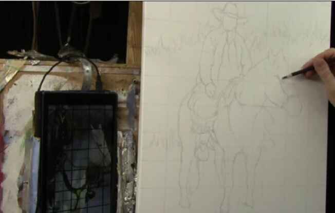
2025 Winter Acrylic Painting Challenge, Lesson 2: Sketching Your Portrait Accurately
Master the art of sketching your portrait accurately: techniques for precision and detail
Creating a stunning acrylic portrait begins with one fundamental skill: sketching your portrait accurately. Whether you’re a beginner or an experienced artist, mastering this foundational step ensures that your final painting shines with realism and precision.
In this blog post, we’ll dive into the process of accurate sketching, covering essential tools, techniques, and tips to help you bring your artistic vision to life.
Why Accurate Sketching is Key
Accurate sketching lays the groundwork for a successful painting. Without it, even the most vibrant colors and refined brushstrokes can’t save a portrait from looking unbalanced or disproportionate.
Sketching ensures:
- Proper proportions and anatomy.
- Consistent composition.
- A clear guide for painting details.
Tools You Need for Sketching
Before starting your sketch, gather the right tools to make the process smoother:
- Canvas: Prepare your canvas with a layer of matte medium and gesso for a smooth base.
- Colored Pencils: Use a dark brown Prismacolor pencil for precise marks. Colored pencils are easier to erase and smear less than graphite.
- Erasers: White erasers or battery-operated erasers help make clean corrections.
- Grid Reference Photo: Print a photo with a grid overlay to maintain accuracy.
Step-by-Step Guide to Sketching Your Portrait
1. Prepare Your Canvas and Grid
- Start with a clean canvas that has been sanded and coated with gesso and matte medium.
- Apply a grid using light-colored pencils. Ensure the grid matches the one on your reference photo for easy alignment.
2. Mark Key Outlines
Begin by marking the rough outlines of the subject:
- Focus on large shapes first, such as the head, torso, and background elements.
- Use your grid to locate where features intersect horizontal and vertical lines.
3. Measure Proportions with Fractions
Observe how features align within the grid:
- For example, if a leg or arm intersects halfway through a square, mark it accordingly.
- Visualize proportions instead of rigidly plotting points to maintain fluidity in your sketch.
4. Add Fine Details
Once the main outlines are in place:
- Begin adding finer details such as facial features, clothing folds, and accessory edges.
- Stay consistent with the grid to avoid distortions.
5. Adjust and Refine
Make adjustments as needed:
- Erase and redraw areas that seem off.
- Use your eraser to clean smudges and maintain sharp lines.
Tips for Sketching Success
- Stay Loose: Avoid rigid lines early on. Keep your sketch fluid and adaptable.
- Use References: Double-check proportions and angles with your reference photo.
- Take Breaks: Step away from your sketch periodically to view it with fresh eyes.
- Pray for Focus: If you’re a faith-driven artist, a moment of prayer or meditation can provide clarity and inspiration.
Filling in Features Loosely
After outlining the portrait, the next step is to fill in the interior features loosely. This stage is all about blocking in shapes and establishing the basic elements of the composition. Here’s how to proceed:
- Sharpen Your Pencil
Use a sharpened pencil for better control and detail as you work on filling in the interior parts. - Start With Large Shapes
Begin sketching the major features, such as the shape of the head, edges of clothing, or other significant elements. For example:- Sketch the edges of hats, saddles, and other accessories if your subject involves detailed attire.
- Use short, choppy strokes to add features like arms or folds in fabric.
- Erase as Needed
Keep a light hand while sketching so that any adjustments can be made easily. Wax-based colored pencils, such as Prismacolor, are ideal because they erase cleanly and don’t smear when sealed. - Avoid Over-Detailing
At this stage, resist the temptation to focus on intricate details. Instead, concentrate on the overall shapes and their placement. For instance:- Block in the basic contours of the face and torso.
- Mark the positions of hands and fingers, but keep them rough.
Tools for Success
- Choose the Right Materials: Always use wax-based colored pencils for sketching. Avoid watercolor pencils, as they can smear during sealing.
- Leverage the Grid Method: Utilizing a grid helps maintain accurate proportions. Match your lines and shapes with the corresponding grid sections for precise placement.
Using Negative Space for Accuracy
One of the most powerful techniques in “Sketching Your Portrait Accurately” is analyzing negative space. Negative space refers to the areas around and between the subject of your sketch. Here’s how to use it effectively:
- Look for small shapes created by the intersections of your grid lines and subject.
- Compare these shapes to the reference image to ensure accuracy.
- Use these shapes as a guide to correct the positioning of features like eyes, hands, or accessories.
For example, if you’re drawing a strap or a buckle, observe how its placement aligns with the grid lines and creates unique negative shapes. Adjust your sketch as needed to match these shapes.
Common Mistakes to Avoid
- Ignoring Proportions: Ensure your subject’s proportions are correct, such as the width of arms or the placement of facial features.
- Overthinking Shapes: Focus on drawing what you see rather than what you think something should look like. Break complex elements into simple geometric shapes for better accuracy.
- Rushing to Details: Prioritize accurate blocking before refining.
Refining and Adding Detail
Once your loose sketch is complete, the next phase is refinement. Tighten the lines, enhance the details, and bring your subject to life. This includes:
- Adding intricate features like facial expressions, folds in clothing, or textures.
- Refining shapes based on feedback from the negative space analysis.
- Layering details to create depth and realism.
Why Accuracy Matters in Sketching
Accuracy in sketching sets the tone for the entire painting process. A well-proportioned sketch allows you to focus on colors, tonal values, and textures during painting. By mastering “Sketching Your Portrait Accurately,” you ensure your artwork resonates with realism and precision.
FAQ About Sketching Your Portrait Accurately
1. Can I use graphite pencils instead of colored pencils?
Yes, but colored pencils are recommended. They erase more cleanly and smear less, especially on a prepared canvas.
2. How do I align my grid correctly?
Ensure your grid matches your reference photo precisely. Double-check measurements and offsets before sketching.
3. How detailed should my sketch be?
Focus on capturing key proportions and outlines. Save intricate details for later stages of painting.
4. What if I make a mistake?
Use a good-quality eraser to make corrections. If your canvas preparation is solid, you can easily adjust your sketch without damaging the surface.
Take the first step today, and don’t forget to check out our Acrylic Portrait Painting Challenge and sign up here. It’s free to join, and you’ll get everything you need to create a masterpiece!
2025 Winter Acrylic Portrait Painting Challenge Series
2025 Winter Acrylic Portrait Painting Challenge: Steps to Get Started
2025 Winter Acrylic Portrait Challenge Pre-Lesson: Gathering Your Supplies
2025 Winter Acrylic Portrait Challenge, Lesson 1: Prepping Your Canvas for the Portrait