- You are here:
- Home »
- Blog
- Archive:
How to Transform Your Acrylic Paintings with Vibrant Colors
Learn to create stunning acrylic paintings using advanced glazing techniques
Transform Your Acrylic Paintings with the Glazing Technique: Step-by-Step Guide
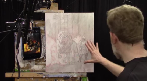
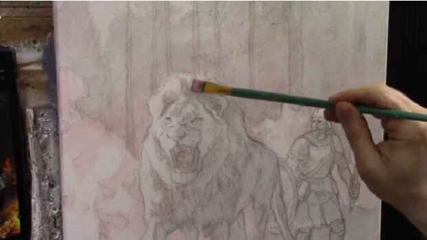
Achieving depth and vibrancy in acrylic paintings can be challenging, but with the right techniques, it becomes an exciting and rewarding process. In my recent tutorial, we continued working on an allegorical painting titled “He Goes Ahead of Us,” depicting a lion and a soldier. This painting symbolizes Jesus fighting our battles, with the lion representing Jesus leading the way.
Understanding the Glazing Technique
The glazing technique involves applying thin layers of paint mixed with a large amount of matte medium. This method builds up depth and luminosity, allowing the underlying layers to show through and creating vibrant, rich colors.
Setting Up the Value Structure
We applied a monochromatic glaze to establish the value structure. A mix of matte medium, raw umber dark, and ultramarine blue was used to create a gray glaze, which was then applied to block in the tonal values throughout the painting.
Adding Organic Orange to My Lion and Soldier Painting
We focused on adding color to our painting using the glazing technique. The key color introduced was organic orange, which adds a warm, vibrant touch to the fiery areas of the painting. This color, mixed with matte medium, creates a translucent glaze that enhances the painting’s luminosity and depth.
Preparing the Glaze
- Select Your Brush:
- Use a flat 5/8 brush for even application.
- Mix the Glaze:
- Combine a small amount of organic orange pigment with a generous amount of matte medium to create a translucent, milky glaze that dries clear.
Applying the Glaze
- Begin with the Fiery Areas:
- Apply the organic orange glaze to the edges and openings of the flames to create dynamic, vibrant effects.
- Build up layers gradually to enhance the luminosity.
- Expand to Other Areas:
- Extend the glaze to other parts of the painting, such as the lion and the soldier, to ensure color harmony and depth.
Tips and Techniques for Effective Glazing
- Use a Reference Photo: Carefully observe your reference photo to accurately place tonal values and colors.
- Apply Thin Layers: Start with light applications of glaze and build up gradually to avoid overpowering the painting.
- Dry Brushing for Shading: Exhaust the paint on the brush to create subtle shading effects.
- Incorporate Color Harmony: Spread the glaze throughout the painting to maintain color unity.
Enhancing the Painting
To create realistic flames, the glaze was applied around the edges and in the openings of the flames. This method enhances luminosity and ensures the fire looks dynamic and vibrant. By layering different colors, such as yellow, on top of the orange glaze, the flames will become even more striking.
Expanding the Glaze to the Background
The warm colors from the fire were extended into the background to capture the effect of the flames lighting up the forest. This creates a cohesive and immersive scene. The glaze was also added to the soldier and the lion, ensuring color harmony throughout the painting.
Detailed Steps in Glazing
- Establish the Darks:
- Apply the glaze in the dark areas first to set the stage for luminosity.
- This step is crucial for achieving a balanced value structure.
- Build the Midtones:
- Gradually apply the glaze to midtone areas, ensuring smooth transitions.
- Use a light touch to avoid overpowering the initial layers.
- Highlight with Light Colors:
- After establishing the darks and midtones, add lighter colors to create highlights.
- Use yellow or other bright colors to enhance the vibrancy of the flames.
Tips for Successful Glazing
- Use Matte Medium Generously: Mix a large amount of matte medium with a small amount of pigment to create a smooth and translucent glaze.
- Build Up in Layers: Gradually build up the glaze in multiple layers to achieve the desired depth and vibrancy.
- Observe and Adjust: Continuously observe your reference photo and adjust the placement of the glaze accordingly.
- Practice Patience: Glazing requires patience and practice, but the results are well worth the effort.
How Do You Make Acrylic Paintings More Vibrant?
To make acrylic paintings more vibrant, mastering the glazing technique is essential. This involves applying thin, translucent layers of paint over a dry layer to create depth and luminosity. Start by mixing a small amount of pigment with a generous amount of matte medium to form a smooth glaze. Apply this in thin layers, building up the color gradually.
Additionally, using high-quality, artist-grade acrylic paints ensures richer, more vibrant colors. Incorporating contrast between light and dark areas, adding bright highlights, and using a limited palette for color harmony are also key strategies. These methods, combined with careful observation of a reference photo and meticulous layering, can transform your acrylic paintings, making them pop with vibrancy and life.
Final Thoughts
The glazing technique is a powerful tool for artists looking to enhance their acrylic paintings. By applying thin, translucent layers of color, you can create depth, vibrancy, and a sense of realism. This method allows for continuous adjustments and refinements, ensuring your painting evolves beautifully.
Watch the video below on how I use the glazing technique to create amazing luminosity in your paintings
By incorporating these techniques and tips into your painting process, you can achieve stunning results that capture the essence and vibrancy of your subject. Keep practicing and experimenting with the glazing technique to unlock your full artistic potential.
LEARN MORE
- Sketching Your Painting Accurately
- Beginning a Pet Portrait in Acrylic
- The Mystery of Realism in Painting
- Apply A Burnt Sienna Glaze to a Portrait
- Learn How to Sketch a Portrait Freehand in 45 Minutes
- Adding highlights to your acrylic painting
- 5 Excellent Reasons to Use Aluminum Foil
- Paint Realistic Wrinkles in Acrylic
- Painting Clothing in an Acrylic Portrait
- Paint a Cloudy Sky Acrylic
- How to add Semi-Opaque Highlights
- How to Enhance the Contrast in Your Acrylic
- How to Add Glaze to Your Acrylic Painting
- Paint Realistic Reflections on Eyeglasses in an Acrylic Portrait
- Build Up Depth on Your Acrylic Portrait Backgrounds
- How Do You Do Layers With the Glazing Technique?
- Learn How to Paint Wrinkles in Acrylic
Read more about how to paint a portrait that you can surely be proud of!
I’d love to hear your thoughts on this video. Please share it with your friends and family. Let me know if you have any further questions. I’ll greatly help you.
If you’d like to learn more, sign up for my free email tips and video class today.
Learn How to Paint Acrylic Portraits With My Free Mini-Video Course!Thank you so much for taking the time to read this tutorial and watch the video. That means a lot to me. I hope you find it very helpful in your portrait painting.
Yours for Better Portraits,
P.S. Did you find this post helpful or encouraging? If so, send it in ahead! Let others know with the share buttons below. I’d love to hear your comments. Thank you so much! Also, do you have a question on acrylic portrait painting you’d like answered? Let me know, and I’d be happy to help!

How to Paint Lion and Soldier: Glazing Technique & Tips
Learn the acrylic glazing technique to create depth and luminosity in your portraits.
In the realm of acrylic painting, capturing depth and luminosity can elevate your artwork to a new level. Today, we delve into a symbolic and inspirational piece: a 16×20 acrylic on canvas depicting a lion and a soldier. This painting, inspired by the concept of divine guidance and protection, uses the glazing technique to achieve its captivating effect.
The acrylic glazing technique is a powerful technique that has revolutionized the way artists approach acrylic portrait painting. By layering translucent washes of color over a base layer, artists can achieve a depth and luminosity that bring their subjects to life. This method is particularly effective in creating inspiring works such as a Lion and a Soldier, where the interplay of light and shadow can evoke powerful emotions.
Understanding Acrylic Glazing
Acrylic glazing involves applying thin, transparent layers of paint to a dried layer of acrylic. Each layer modifies the color and tone of the underlying layers, allowing artists to build complex, rich hues without the muddiness that can result from mixing colors directly on the palette. The technique requires patience and precision, as each layer must dry completely before the next is applied.
The Concept Behind the Painting
The painting titled “He Goes Ahead of Us” is based on a verse from Deuteronomy, illustrating how divine guidance leads and protects through life’s battles. The lion symbolizes strength and leadership, while the soldier represents our active role in facing life’s challenges. This powerful imagery is brought to life using acrylic paints and the glazing technique.
Materials Needed
Before diving into the process, gather the following materials:
- Canvas (16×20)
- Acrylic paints (raw umber, burnt sienna, raw sienna, phthalo blue, ultramarine blue, alizarine crimson, naphthol red, organic orange, Indian yellow, titanium white)
- Matte medium
- Brushes (various sizes)
- Palette
- Reference photo
Steps to Achieve Acrylic Glazing
- Prepare Your Canvas: Start with a clean, primed canvas. Apply an underpainting if desired, using opaque colors to establish the basic composition and values.
- Mix the Glaze: Combine your chosen acrylic color with a glazing medium to achieve the desired transparency. The ratio of paint to medium can be adjusted based on the effect you want to achieve.
- Apply the Glaze: Using a soft brush, apply the glaze in thin, even layers. Allow each layer to dry completely before adding the next. The drying time will vary depending on the thickness of the glaze and environmental conditions.
- Build Up Layers: Continue adding layers of glaze, gradually building up the color intensity and depth. Pay attention to the interplay of light and shadow, which enhances the three-dimensionality of your subject.
- Final Touches: Once you have achieved the desired effect, add any final details or highlights. Use opaque paints sparingly to avoid disrupting the transparency of the glazes.
Mastering Acrylic Portrait Painting
Acrylic portrait painting benefits immensely from the glazing technique. Portraits require a nuanced approach to capture the subtleties of skin tones, facial features, and expressions. Glazing allows artists to create realistic and lifelike portraits with a sense of depth and dimension.
Key Techniques for Acrylic Portraits
- Underpainting: Start with a monochromatic underpainting to establish the basic values and shapes. This serves as a foundation for the subsequent layers.
- Layering: Use glazing to build up the skin tones gradually. Begin with lighter, more transparent layers, and gradually increase the opacity in the darker areas.
- Blending: Acrylics dry quickly, which can make blending challenging. Use glazing to create smooth transitions between colors and tones.
- Details: Add fine details such as hair, eyes, and textures using a combination of glazing and opaque painting techniques. Use a fine brush for precision.
- Highlights and Shadows: Emphasize the highlights and shadows to enhance the three-dimensionality of the portrait. Glazing allows for subtle adjustments and refinements.
Inspirational Acrylic Painting of a Lion and Soldier
Combining the majestic presence of a lion with the strength and bravery of a soldier creates a powerful and inspirational image. The acrylic glazing technique is particularly suited for capturing the contrasting textures and emotions of such a subject.
Composition and Planning
- Conceptualize: Begin by conceptualizing the composition. Decide on the pose, background, and overall mood of the painting. Sketch out your ideas on paper.
- Reference Materials: Gather reference photos of lions and soldiers. Pay attention to the details of their features, textures, and expressions.
- Composition: Plan the composition on your canvas. Consider the placement of the lion and the soldier, ensuring a balanced and harmonious arrangement.
Painting Process
- Underpainting: Start with a detailed underpainting. Use earthy tones for the lion and neutral tones for the soldier. Establish the basic shapes and values.
- Layering and Glazing: Begin applying glazes to build up the colors and textures. For the lion, use a combination of warm browns, oranges, and yellows to capture the fur. For the soldier, use cooler tones such as blues, greens, and grays.
- Textures: Pay attention to the textures of the lion’s mane and the soldier’s uniform. Use glazing to create a sense of depth and realism.
- Details: Add fine details such as the lion’s whiskers, the soldier’s facial features, and any other intricate elements. Use a combination of glazing and opaque painting for precision.
- Background: Create a background that complements the subjects. Use glazing to create a sense of depth and atmosphere.
- Final Touches: Add any final highlights and shadows to enhance the overall impact of the painting. Ensure that the glazes are smooth and evenly applied.
Watch the full video below
The acrylic glazing technique is a versatile and powerful method that can elevate acrylic portrait paintings to new levels of realism and depth. By mastering this technique, artists can create inspiring and impactful works, such as a painting of a lion and a soldier, that resonate with viewers on an emotional level. Whether you are a beginner or an experienced artist, incorporating glazing into your acrylic painting practice can open up new possibilities and enhance your artistic expression.
LEARN MORE
- Sketching Your Painting Accurately
- Beginning a Pet Portrait in Acrylic
- The Mystery of Realism in Painting
- Apply A Burnt Sienna Glaze to a Portrait
- Learn How to Sketch a Portrait Freehand in 45 Minutes
- Adding highlights to your acrylic painting
- 5 Excellent Reasons to Use Aluminum Foil
- Paint Realistic Wrinkles in Acrylic
- Painting Clothing in an Acrylic Portrait
- Paint a Cloudy Sky Acrylic
- How to add Semi-Opaque Highlights
- How to Enhance the Contrast in Your Acrylic
- How to Add Glaze to Your Acrylic Painting
- Paint Realistic Reflections on Eyeglasses in an Acrylic Portrait
- Build Up Depth on Your Acrylic Portrait Backgrounds
- How Do You Do Layers With the Glazing Technique?
- Learn How to Paint Wrinkles in Acrylic
Read more about how to paint a portrait that you can surely be proud of!
I’d love to hear your thoughts on this video. Please share it with your friends and family. Let me know if you have any further questions. I’ll greatly help you.
If you’d like to learn more, sign up for my free email tips and video class today.
Learn How to Paint Acrylic Portraits With My Free Mini-Video Course!Thank you so much for taking the time to read this tutorial and watch the video. That means a lot to me. I hope you find it very helpful in your portrait painting.
Yours for Better Portraits,
P.S. Did you find this post helpful or encouraging? If so, send it in ahead! Let others know with the share buttons below. I’d love to hear your comments. Thank you so much! Also, do you have a question on acrylic portrait painting you’d like answered? Let me know, and I’d be happy to help!

How To Adjust Eyes, Mouth, And More In Your Portrait
Enhance your portraits with detailed adjustments using the glazing technique
Portrait painting is a journey that involves continuous learning and refinement. One of the key skills to master is the ability to make adjustments to the eyes, mouth, and other facial features. These fine-tuning techniques can significantly enhance the likeness and realism of your portraits. In this blog post, we will explore the glazing technique, a method that allows for precise adjustments and seamless blending. By following this step-by-step guide, you will be able to elevate your acrylic painting skills and achieve a more lifelike finish.
Preparing Your Workspace and Materials
Before diving into the painting process, it is crucial to prepare your workspace and materials. A well-lit area is essential, and all necessary supplies should be within reach. For this session, you will need:
- Acrylic paints (including raw umber, ultramarine blue, and alizarine crimson)
- Matte medium
- A variety of brushes (including a Princeton Velvet Touch size 4)
- A reference photo (preferably a lighter version to see details clearly)
By ensuring that your materials are ready, you will be able to focus entirely on the painting process without interruptions.
Assessing and Adjusting the Reference Image
The first step involves assessing your reference image. If the original photo is too dark, it is recommended to create a lighter version to help identify finer details. This step is essential for making accurate adjustments to the eyes, mouth, and other facial features. In the example discussed, the artist used a 20×24 commission portrait and identified areas that needed slight adjustments for better likeness.
Mixing the Right Colors
Next, it is important to mix your paints to create a rich, almost black color. Combine raw umber, ultramarine blue, and alizarine crimson. Adjust the color temperature as needed to achieve the desired shade. This custom mix will help in fine-tuning the details and nuances of the portrait.
Applying the Glaze
The glazing technique involves applying a thin, translucent layer of paint over the existing layers. The brush should be dipped into clear matte medium and mixed with the custom color to create a translucent glaze. This diluted glaze allows for smoother blending and more precise adjustments. For instance, when adjusting the width of the subject’s mouth, the artist added a bit of darkness to the nasal labial fold and then blended it out using the diluted glaze.
Blending Techniques
Blending is a critical aspect of the glazing technique. To achieve seamless transitions, the following method should be used:
- Apply the glaze to the desired area.
- Dab the surface with a finger or a clean brush to soften the edges.
- Repeat the process as needed to build up the desired opacity and smoothness.
This technique ensures that the adjustments blend naturally with the existing layers, creating a lifelike finish.
Enhancing Facial Features
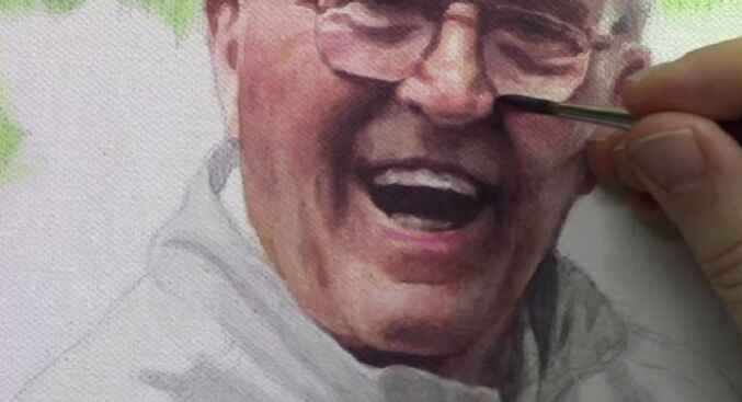
Pay close attention to key facial features, such as the eyes, nose, and mouth. Small adjustments can significantly impact the overall likeness of the portrait. For example, in the video tutorial below, the artist shifted the eyes slightly to the left and added shading to the tear ducts to enhance realism. Similarly, refining the angles and shading of the mouth can make the smile appear more natural and expressive.
Adjusting the Eyes
The eyes are often referred to as the windows to the soul, making their accuracy crucial in portrait painting. To adjust the eyes:
- Study the reference photo closely to determine the necessary adjustments.
- Apply a translucent glaze to the areas that need modification.
- Blend the glaze smoothly to ensure a natural transition.
- Pay attention to the placement of the iris and the overall shape of the eyes.
These steps will help create a more lifelike and expressive look in the eyes of your portrait.
Refining the Mouth
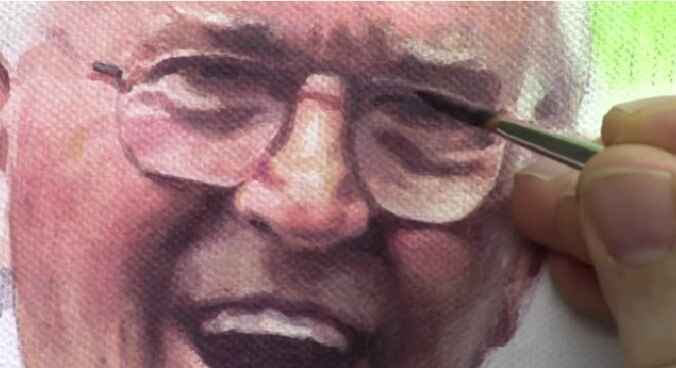
The mouth is another critical feature that can greatly affect the overall expression of the portrait. To refine the mouth:
- Adjust the shape and angles to match the reference photo.
- Use the glazing technique to add depth and definition to the lips.
- Blend the edges carefully to avoid harsh lines.
- Consider the relationship between the mouth and other facial features, such as the nasal labial fold.
These refinements will help in capturing the true character and emotion of the subject.

Final Touches and Refinements
After making the primary adjustments, it is important to take a step back and assess the portrait as a whole. Look for any areas that need additional refinement. The same glazing and blending techniques should be used to enhance these areas. For instance, adding warmth to the nasal labial fold with a bit of alizarin crimson can help the features blend more harmoniously.
Additional Tips for Realistic Portraits
While the glazing technique is powerful, several other tips can enhance your portraits further. Here are some additional suggestions:
- Use high-quality brushes: Investing in good quality brushes can make a significant difference in the application and blending of paint.
- Work in layers: Building up layers gradually can help achieve depth and realism in your portraits.
- Take breaks: Stepping back from your work periodically allows you to see it with fresh eyes and identify areas that need improvement.
- Study anatomy: A solid understanding of facial anatomy can aid in making more accurate adjustments and creating more lifelike portraits.
By incorporating these tips into your process, you can continue to improve your portrait painting skills and create works of art that truly capture the essence of your subjects.
Additional Resources
By following these steps, precise adjustments can be made to the eyes, mouth, and other facial features in your acrylic portrait. The glazing technique is a powerful tool that allows for subtle yet impactful refinements, enhancing the overall likeness and realism of your artwork.
For more tips and techniques, I recommend you download my free gift for you, a free guide, “Fix Muddy Skin Tones in Your Acrylic Portrait.” This comprehensive resource provides additional insights into correcting common issues and achieving a professional finish. Visit the Realistic Acrylic Portrait School for more tutorials, videos, and free downloadable guides to help you paint a portrait you can be proud of.
For a video tutorial, watch the full video below.
LEARN MORE
- Sketching Your Painting Accurately
- Beginning a Pet Portrait in Acrylic
- The Mystery of Realism in Painting
- Apply A Burnt Sienna Glaze to a Portrait
- Learn How to Sketch a Portrait Freehand in 45 Minutes
- Adding highlights to your acrylic painting
- 5 Excellent Reasons to Use Aluminum Foil
- Paint Realistic Wrinkles in Acrylic
- Painting Clothing in an Acrylic Portrait
- Paint a Cloudy Sky Acrylic
- How to add Semi-Opaque Highlights
- How to Enhance the Contrast in Your Acrylic
- How to Add Glaze to Your Acrylic Painting
- Paint Realistic Reflections on Eyeglasses in an Acrylic Portrait
- Build Up Depth on Your Acrylic Portrait Backgrounds
- How Do You Do Layers With the Glazing Technique?
- Learn How to Paint Wrinkles in Acrylic
Read more about how to paint a portrait that you can surely be proud of!
I’d love to hear your thoughts on this video. Please share it with your friends and family. Let me know if you have any further questions. I’ll greatly help you.
If you’d like to learn more, sign up for my free email tips and video class today.
Learn How to Paint Acrylic Portraits With My Free Mini-Video Course!Thank you so much for taking the time to read this tutorial and watch the video. That means a lot to me. I hope you find it very helpful in your portrait painting.
Yours for Better Portraits,
P.S. Did you find this post helpful or encouraging? If so, send it in ahead! Let others know with the share buttons below. I’d love to hear your comments. Thank you so much! Also, do you have a question on acrylic portrait painting you’d like answered? Let me know, and I’d be happy to help
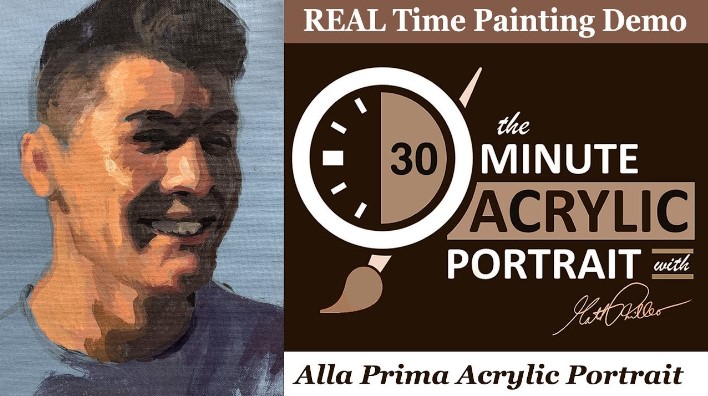
How to Paint a Smiling Man with Dark Hair
A step-by-step guide on painting a captivating portrait in just 30 minutes
Discover the secrets of creating a stunning 30-minute acrylic portrait of a smiling man with dark hair. Perfect for both beginners and experienced artists, this guide will walk you through each step of the process with expert tips and techniques.
Creating a portrait in just 30 minutes may seem like a daunting task, but with the right techniques and materials, it can be an exhilarating and rewarding experience. In this guide, we’ll explore the step-by-step process of painting a smiling man with dark hair using acrylics. Whether you’re a seasoned artist or a beginner looking to improve your skills, this tutorial will provide you with the tools and confidence needed to create a stunning piece of art in just half an hour.
Materials You’ll Need
Before diving into the painting process, ensure you have all the necessary materials at hand:
- Acrylic paints: A basic set including primary colors, white, and black.
- Brushes: A variety of sizes, including a flat brush, a round brush, and a detail brush.
- Canvas or painting surface: Preferably pre-primed for acrylics.
- Palette: For mixing your paints.
- Water and a container: For cleaning brushes.
- Paper towels or rags: For wiping brushes.
Step by- step on how to paint smiling man with dark hair in 30 minute acrylic portrait
Step 1: Prepare Your Workspace
Set up your workspace with all your materials within easy reach. Ensure you have good lighting to accurately see your colors and details. Place your reference photo in a visible spot for easy access.
Step 2: Sketch the Outline
Using a light pencil, sketch the basic outline of the man’s face on the canvas. Focus on the placement of key features such as the eyes, nose, mouth, and hairline. Keep the sketch light to avoid visible lines through the paint.
Step 3: Blocking in the Base Colors
Start by blocking in the base colors of the face. Mix a skin tone using a combination of white, red, yellow, and a touch of blue. Apply the skin tone using a flat brush, covering the entire face area. Don’t worry about details at this stage; focus on creating a smooth and even base layer.
For the hair, mix a dark brown or black shade and block in the hair area. Use broad, sweeping strokes to cover the entire hair section. This will serve as the foundation for adding texture and highlights later.
Step 4: Adding Shadows and Highlights
Once the base layer is dry, begin adding shadows and highlights to create depth and dimension. Mix a slightly darker shade of the skin tone for the shadows and a lighter shade for the highlights.
- Shadows: Apply the darker shade to areas such as under the cheekbones, around the eyes, and along the jawline. Use a soft, round brush to blend the edges, creating a smooth transition between the shadow and the base color.
- Highlights: Apply the lighter shade to areas where light naturally hits the face, such as the forehead, the bridge of the nose, and the tops of the cheeks. Blend the edges to create a seamless transition.
For the hair, add highlights by mixing a lighter shade of the base color and applying it to areas where light would naturally reflect, such as the top of the head and along the strands. Use a smaller brush for finer details.
Step 5: Detailing the Features
Now that the basic tones and shades are in place, focus on adding details to the facial features. This step brings the portrait to life and captures the subject’s expression.
- Eyes: Use a small detail brush to paint the whites of the eyes, leaving the pupils for later. Add shadows around the eye sockets and highlights to the upper eyelids to create depth. Paint the irises using a color that matches the reference photo, and add small highlights to give the eyes a lifelike sparkle.
- Nose: Refine the shape of the nose by adding subtle shadows along the sides and under the tip. Highlight the bridge and the tip to give the nose dimension.
- Mouth: Paint the lips using a mix of red and skin tone. Add shadows to the corners and under the lower lip to create volume. Highlight the center of the lower lip for a fuller appearance.
- Hair: Add fine strands and texture using a small brush and lighter shades of the base color. Pay attention to the direction of the hair growth and the natural flow of the strands.
Step 6: Final Touches
In this final step, refine any areas that need additional work and add the finishing touches. Check for consistency in lighting and shadows across the entire portrait. Add any necessary details, such as subtle wrinkles, moles, or other distinguishing features.
Step 7: Let It Dry
Allow the painting to dry completely before making any further adjustments or displaying it. Acrylic paints dry quickly, but it’s important to ensure all layers are thoroughly dry to prevent smudging or damage.
Tips for Success
- Work quickly: The 30-minute technique relies on swift application and blending. Keep your brush strokes fluid and confident.
- Practice blending: Smooth transitions between shadows, midtones, and highlights are key to creating a realistic portrait. Practice blending techniques on a separate sheet before applying them to your painting.
- Use a limited palette: Working with a limited color palette can help maintain color harmony and simplify the painting process.
By following these steps, you can create a stunning and expressive portrait of a smiling man with dark hair using the 30-minute acrylic portrait painting technique. This method allows you to achieve impressive results in a short amount of time, making it perfect for artists of all skill levels. With practice and patience, you’ll be able to capture the essence of your subjects and bring them to life on canvas.
Remember, the key to learn this technique is practice and experimentation. Don’t be afraid to try different approaches and make adjustments as needed. Happy painting!
Watch the video below for more details.
LEARN MORE
- Sketching Your Painting Accurately
- Beginning a Pet Portrait in Acrylic
- The Mystery of Realism in Painting
- Apply A Burnt Sienna Glaze to a Portrait
- Learn How to Sketch a Portrait Freehand in 45 Minutes
- Adding highlights to your acrylic painting
- 5 Excellent Reasons to Use Aluminum Foil
- Paint Realistic Wrinkles in Acrylic
- Painting Clothing in an Acrylic Portrait
- Paint a Cloudy Sky Acrylic
- How to add Semi-Opaque Highlights
- How to Enhance the Contrast in Your Acrylic
- How to Add Glaze to Your Acrylic Painting
- Paint Realistic Reflections on Eyeglasses in an Acrylic Portrait
- Build Up Depth on Your Acrylic Portrait Backgrounds
- How Do You Do Layers With the Glazing Technique?
- Learn How to Paint Wrinkles in Acrylic
Read more about how to paint a portrait that you can surely be proud of!
I’d love to hear your thoughts on this video. Please share it with your friends and family. Let me know if you have any further questions. I’ll greatly help you.
If you’d like to learn more, sign up for my free email tips and video class today.
Learn How to Paint Acrylic Portraits With My Free Mini-Video Course!Thank you so much for taking the time to read this tutorial and watch the video. That means a lot to me. I hope you find it very helpful in your portrait painting.
Yours for Better Portraits,
P.S. Did you find this post helpful or encouraging? If so, send it in ahead! Let others know with the share buttons below. I’d love to hear your comments. Thank you so much! Also, do you have a question on acrylic portrait painting you’d like answered? Let me know, and I’d be happy to help!

How To Know That Your Portrait Is Done: 4 Ways To Determine
A free guide for you: Recognizing the signs of your acrylic portrait painting is complete.
Painting a portrait is a labor of love, blending meticulous detail with artistic intuition. One of the most common questions artists face is: “How do I know when my portrait is done?” Overworking or underworking a piece can both detract from its final impact. In this comprehensive free guide, we will explore four key indicators to help you determine when your acrylic portrait painting is finished.
Four Ways to Determine When Your Acrylic Portrait Painting is Done
1. You’re Not Adding Value Anymore.
- Avoid Over-Detailing: Adding every tiny detail, such as individual eyebrow hairs or skin pores, can lead to a less realistic overall effect. More detail does not always equate to more realism.
- The Law of Diminishing Returns: As you add more and more detail, the impact of each additional touch decreases. If your changes are no longer enhancing the painting, it’s a sign that it might be time to stop.
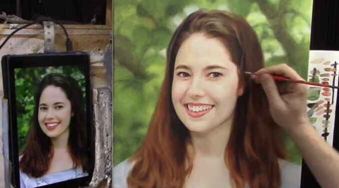
2. You’re Making It Worse
- Quality Over Quantity: Sometimes, pushing a painting too far can actually detract from its quality. Overworking areas can lead to unrealistic textures and tones.
- Correcting Mistakes: If adjustments are making the portrait look worse, it’s better to correct those mistakes and call it done rather than risk further deterioration.
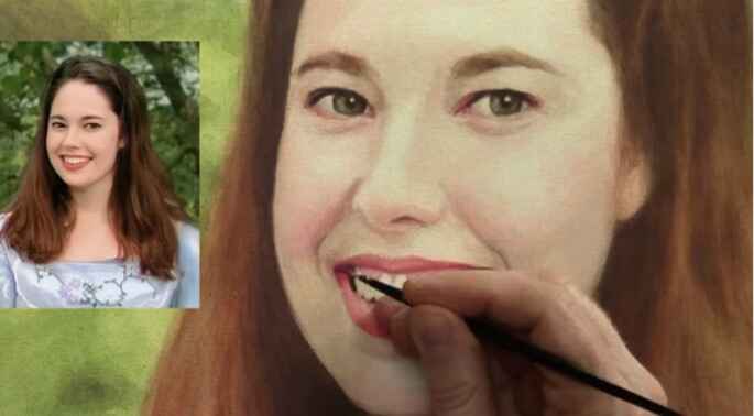
3. Deadlines
- Meeting Deadlines: Whether for an art show, contest, or commission, deadlines can dictate when a painting must be completed. Utilize techniques like glazing to ensure the entire canvas is addressed, even if it’s not perfect.
- Practical Completion: Sometimes, a portrait must be finished because of time constraints. In such cases, ensure all sections of the canvas are covered and presentable.

4. Client Approval
- Satisfaction Guaranteed: When working on commissioned portraits, the client’s approval is a definitive indicator that the work is done. Avoid making additional changes after the client has approved the piece to prevent any dissatisfaction.
- Final Touches: Only make minor adjustments, such as fixing small errors or adding finishing touches, after client approval.
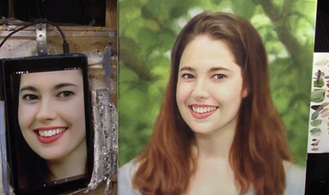
Practical Tips for Finishing Your Portrait Painting
- Take a Step Back: Regularly view your portrait painting from a distance to see the overall effect.
- Seek Critiques: Have your work critiqued by peers or mentors to gain fresh perspectives.
- Compare with References: Consistently compare your portrait painting to your reference photo to ensure accuracy and completeness.
- Push Through Challenges: Avoid abandoning a portrait painting due to frustration. Instead, push past difficulties and aim to complete it to the best of your ability.
- Sign and Varnish: Once you’ve decided your portrait painting is done, sign it, varnish it, and allow it to dry properly before presenting or shipping it.
For a detailed guide, watch the complete video tutorial below
Bonus Tip: Emotional Readiness
Sometimes, prolonged work on a single piece can lead to burnout. If you find yourself loathing the project or feeling emotionally drained, it may be time to wrap it up and move on to new projects. However, ensure you’re not giving up on frustration but rather recognizing a natural conclusion to your efforts.
Knowing when your acrylic portrait painting is done is both a skill and an art. By understanding the signs of overworking, meeting deadlines, and seeking client approval, you can confidently determine when your portrait is ready for the world. Remember, each portrait is a step in your artistic journey, and finishing a piece is an achievement worth celebrating.
Embrace the process, trust your instincts, and continue to refine your skills with each new project. Happy painting!
LEARN MORE
- Sketching Your Painting Accurately
- Beginning a Pet Portrait in Acrylic
- The Mystery of Realism in Painting
- Apply A Burnt Sienna Glaze to a Portrait
- Learn How to Sketch a Portrait Freehand in 45 Minutes
- Adding highlights to your acrylic painting
- 5 Excellent Reasons to Use Aluminum Foil
- Paint Realistic Wrinkles in Acrylic
- Painting Clothing in an Acrylic Portrait
- Paint a Cloudy Sky Acrylic
- How to add Semi-Opaque Highlights
- How to Enhance the Contrast in Your Acrylic
- How to Add Glaze to Your Acrylic Painting
- Paint Realistic Reflections on Eyeglasses in an Acrylic Portrait
- Build Up Depth on Your Acrylic Portrait Backgrounds
- How Do You Do Layers With the Glazing Technique?
- Learn How to Paint Wrinkles in Acrylic
Read more about how to paint a portrait that you can surely be proud of!
I’d love to hear your thoughts on this video. Please share it with your friends and family. Let me know if you have any further questions. I’ll greatly help you.
If you’d like to learn more, sign up for my free email tips and video class today.
Learn How to Paint Acrylic Portraits With My Free Mini-Video Course!Thank you so much for taking the time to read this tutorial and watch the video. That means a lot to me. I hope you find it very helpful in your portrait painting.
Yours for Better Portraits,
P.S. Did you find this post helpful or encouraging? If so, send it in ahead! Let others know with the share buttons below. I’d love to hear your comments. Thank you so much! Also, do you have a question on acrylic portrait painting you’d like answered? Let me know, and I’d be happy to help!

How to Make Your Acrylic Portrait Realistic With Vibrant
From initial sketch to final Glaze: A comprehensive guide to acrylic portrait painting techniques
The process of making a realistic acrylic portrait painting involves mastering various techniques, with shadows being one of the most crucial. In this comprehensive guide, I’ll show you through my process of painting an 11×14 acrylic portrait of a late pastor.
Highlighting the importance of shadows and finishing touches. At the end of this video tutorial, you’ll have a deeper understanding of how to bring your portraits to life with realistic depth and dimension.
The Importance of Shadows in Portrait Painting
Shadows add depth and dimension to a portrait, making it look realistic. They help define the line of the face and other elements, giving the painting a three-dimensional appearance. Here’s how you can make the shadow of your acrylic portrait painting realistic.
- Choosing the Right Colors: Start by selecting a shadow color that complements your base tones. For this portrait, I used a mix of raw umber dark, titanium white, and ultramarine blue. Adjust the mix to avoid overly harsh or light shadows.
- Applying Shadows to the Chin and Jawline: To create a shadow under the chin, I applied the shadow mix to darken the clerical collar, enhancing the depth and realism. Extend the shadows outward from the jawline to create a natural gradient.

- Detailing the Eyes: Adjust the reflections near the eyelids by darkening specific areas to highlight subtle details. This step is crucial for capturing the subject’s expression and character.

- Refining Teeth and Lips: Add fine details to the teeth and lips without overdoing them. Too much detail can make the painting look artificial. Aim for subtlety to maintain a natural look.

- Enhancing Cloths and Accessories: Softly outline the chains and zippers in the subject’s vestment. Use sketch lines as a guide, then soften them to create a realistic appearance.

Step-by-Step Process of Adding Shadows
Step 1: Mixing Shadow Colors
- Mix raw umber dark, titanium white, and ultramarine blue to create a balanced shadow color.
- Adjust the mix if it appears too blue by adding more raw umber.
Step 2: Applying Shadows Under the Chin
- Apply the shadow mix under the chin and along the jawline.
- Darken the clerical collar to emphasize the shadow cast by the chin.
Step 3: Extending Shadows from the Shoulder and Arm
- Gradually extend the shadows from the shoulder and arm area, creating a smooth gradient.
- Use a light touch to blend the shadows seamlessly into the surrounding areas.
Step 4: Adjusting Eye Reflections
- Darken the reflection near the eyelids by adding a small amount of brown at the top.
- Ensure the reflection is subtle to enhance the realism of the eyes.
Step 5: Detailing Teeth and Lips
- Add minimal details to the teeth to suggest their presence without making them too prominent.
- Enhance the highlights on the lips to give them a glossy appearance.
Step 6: Softening Sketch Lines on Cloth.
- Use a mix of white and blue to soften the sketch lines on chains and zippers.
- Break up the lines into small segments to mimic the appearance of chains.
Final Touches
As you near the completion of your portrait, it’s essential to review your work with fresh eyes. Here are some final touches to consider:
First, Emphasizing Highlights: Use titanium white mixed with a touch of red to enhance the highlights on the lips and other reflective areas.
Secondly, Cloth Details: Ensure the chains and zippers are well-defined but not overly harsh. Subtlety is key to achieving a realistic portrait.
Lastly, Balancing Shadows and Highlights: Revisit the shadowed areas and adjust as needed to ensure a balanced contrast with the highlights.
Final Review: Take a break and revisit your painting the next day. A fresh perspective can help identify areas that need improvement.
Watch the Process
For a detailed guide, watch the complete video tutorial here.
Creating a realistic acrylic portrait painting involves patience, practice, and attention to detail. Especially in learning shadow techniques and applying subtle touches. And you can bring your portraits to life with depth and realism. Remember, the key is to balance shadows and highlights, ensuring a natural and lifelike portrait.
Happy painting! Get your free acrylic portrait painting techniques and don’t forget to share your progress and finished works. If you found this tutorial helpful, please give it a thumbs up and subscribe to my YouTube channel for more painting tips and tutorials.
LEARN MORE
- Sketching Your Painting Accurately
- Beginning a Pet Portrait in Acrylic
- The Mystery of Realism in Painting
- Apply A Burnt Sienna Glaze to a Portrait
- Learn How to Sketch a Portrait Freehand in 45 Minutes
- Adding highlights to your acrylic painting
- 5 Excellent Reasons to Use Aluminum Foil
- Paint Realistic Wrinkles in Acrylic
- Painting Clothing in an Acrylic Portrait
- Paint a Cloudy Sky Acrylic
- How to add Semi-Opaque Highlights
- How to Enhance the Contrast in Your Acrylic
- How to Add Glaze to Your Acrylic Painting
- Paint Realistic Reflections on Eyeglasses in an Acrylic Portrait
- Build Up Depth on Your Acrylic Portrait Backgrounds
- How Do You Do Layers With the Glazing Technique?
- Learn How to Paint Wrinkles in Acrylic
Read more about how to paint a portrait that you can surely be proud of!
I’d love to hear your thoughts on this video. Please share it with your friends and family. Let me know if you have any further questions. I’ll greatly help you.
If you’d like to learn more, sign up for my free email tips and video class today.
Learn How to Paint Acrylic Portraits With My Free Mini-Video Course!Thank you so much for taking the time to read this tutorial and watch the video. That means a lot to me. I hope you find it very helpful in your portrait painting.
Yours for Better Portraits,
P.S. Did you find this post helpful or encouraging? If so, send it in ahead! Let others know with the share buttons below. I’d love to hear your comments. Thank you so much! Also, do you have a question on acrylic portrait painting you’d like answered? Let me know, and I’d be happy to help!
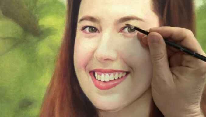
How to do Portrait Adjustments: Here is the Step-by-Step Guide
Learn how to enhance value and color in your portraits with glazing techniques.
Introduction
Portrait painting is an intricate art that requires attention to detail, especially when it comes to adjusting values and colors. In this free guide, we’ll explore how to make nuanced adjustments to your portrait painting using glazing techniques. And based on insights from a recent tutorial. Whether you’re an experienced artist or a beginner, these tips will help you enhance your portraits and bring them to life.
Here is a step-by-step guide to portrait painting adjustments
Understand the basic of portrait painting adjustment
The key to successful portrait painting adjustments lies in an understanding of value and color. Value refers to the lightness or darkness of a color, while the color itself can be modified with tints (adding white) and shades (adding black). In this tutorial, the focus is on using glazes to make subtle adjustments that can significantly improve the overall look of your portrait.
Step 1: Darkening the Right Eyelid Start with the right eyelid by using small round brushes. Mix both raw umber dark with a bit of napthol red and raw sienna. This combination creates a cooler tint that can be applied between the eyebrow and the eye. Transparent glazes can be used at any stage of the painting to add depth and adjust tones without overpowering the existing layers.

Step 2: Adjusting the Shadow Under the Nose Next, work on darkening the shadow under the nose. Use the same glaze mixture and add a touch of titanium white for smoothness. During this adjustment it requires patience, as it might take several layers to achieve the desired effect. The key is to apply the glaze lightly, blending with your finger to create a natural transition.
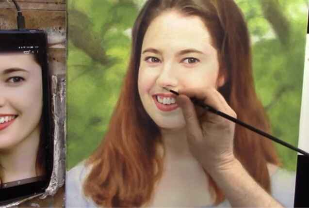
Step 3: Enhancing the Background Finally, focus on the background. Use a combination of ultramarine blue, Indian yellow, and raw sienna to create a rich, sap green color. Adding titanium white will cool and smooth out the glaze. Apply this selectively to darken areas and bring out the nuances in the background, creating a realistic depth of field.
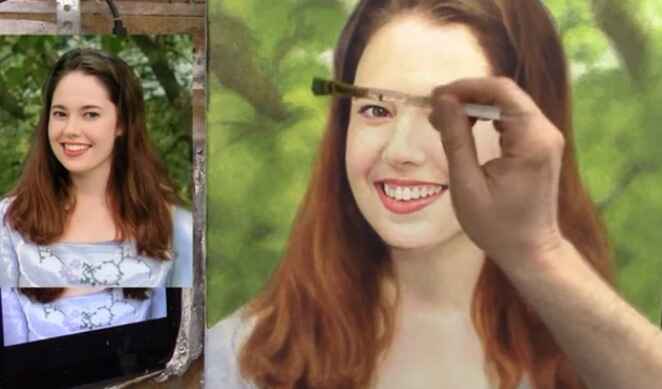
Additional Tips:
- Use a value checker tool to evaluate your painting and identify areas needing adjustment. While not mandatory, it can provide an accurate measure for making precise changes. You can check my value checker and get it for free.
- Darker values in your painting should generally be cooler in tone to maintain a balanced look.
- Be patient with the process, as building up layers gradually will yield the best results.
Adjusting values and colors in your portraits can transform them from good to extraordinary. By following these acrylic glazing techniques and being mindful of value and color, you’ll be able to enhance your portraits with ease. Keep practicing and experimenting with different mixtures to find what works best for your unique style. Happy painting!
With these insights and techniques, you’re now equipped to make impactful adjustments to your portrait paintings. Remember, art is a journey, and as a result, each stroke brings you closer to mastering your portrait painting.
Watch the Process
For a detailed guide, watch the complete video tutorial below.
LEARN MORE
- Sketching Your Painting Accurately
- Beginning a Pet Portrait in Acrylic
- The Mystery of Realism in Painting
- Apply A Burnt Sienna Glaze to a Portrait
- Learn How to Sketch a Portrait Freehand in 45 Minutes
- Adding highlights to your acrylic painting
- 5 Excellent Reasons to Use Aluminum Foil
- Paint Realistic Wrinkles in Acrylic
- Painting Clothing in an Acrylic Portrait
- Paint a Cloudy Sky Acrylic
- How to add Semi-Opaque Highlights
- How to Enhance the Contrast in Your Acrylic
- How to Add Glaze to Your Acrylic Painting
- Paint Realistic Reflections on Eyeglasses in an Acrylic Portrait
- Build Up Depth on Your Acrylic Portrait Backgrounds
- How Do You Do Layers With the Glazing Technique?
- Learn How to Paint Wrinkles in Acrylic
Read more about how to paint a portrait that you can surely be proud of!
I’d love to hear your thoughts on this video. Please share it with your friends and family. Let me know if you have any further questions. I’ll greatly help you.
If you’d like to learn more, sign up for my free email tips and video class today.
Learn How to Paint Acrylic Portraits With My Free Mini-Video Course!Thank you so much for taking the time to read this tutorial and watch the video. That means a lot to me. I hope you find it very helpful in your portrait painting.
Yours for Better Portraits,
P.S. Did you find this post helpful or encouraging? If so, send it in ahead! Let others know with the share buttons below. I’d love to hear your comments. Thank you so much! Also, do you have a question on acrylic portrait painting you’d like answered? Let me know, and I’d be happy to help!
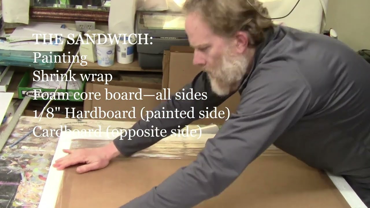
7 Best Ways To Ship Your Acrylic Paintings Secure!
Securely package your portrait for safe delivery with these step-by-step guide
Here are the 7 best ways to ship your large acrylic paintings securely!
Shipping large paintings, especially delicate acrylic paintings, requires careful attention to detail to ensure they arrive safely. As a professional artist, I’ve developed an effective method for packaging large paintings that minimizes the risk of damage during transit. Whether you’re shipping acrylic or oil paintings, follow these step-by-step instructions to protect your artwork and ensure it reaches its destination in perfect condition.
Step 1: Shrink Wrap the Painting
Start by wrapping your painting in shrink wrap to create a protective barrier. Place the painting face down and cover it completely with shrink wrap. This initial layer shields the surface of the artwork from scratches and scuffs. Fold the shrink wrap over and secure it with packaging tape. There’s no need to use a heat gun; the wrap should be tight enough to protect the painting.
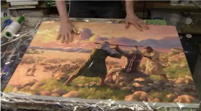
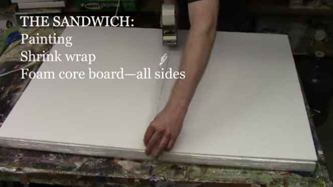
Step 2: Add Foam Core
Lay the shrink-wrapped painting on top of two pieces of foam core. These will serve as the first protective layer. Fold the shrink wrap over the foam core and tape it in place. The foam core provides cushioning and prevents the painting from moving inside the package.
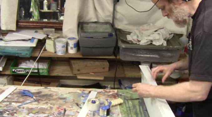
Step 3: Protect the Edges
Cut strips of foam core to match the thickness of your canvas (typically around one inch). Tape these strips along the edges of the painting to create a protective buffer. This step ensures that the edges of the canvas are well protected and reduces the risk of dents or damage during shipping.
Step 4: Add Hardboard and Styrofoam
Sandwich the painting between two pieces of hardboard. The hardboard provides a sturdy protective layer that reinforces the package. Next, add two pieces of Styrofoam insulation board (3/4 inch to 1 inch thick) on either side of the hardboard. The Styrofoam offers additional cushioning and shock absorption.
Step 5: Encase in Cardboard
Wrap the entire package in a large piece of cardboard. If you don’t have a single piece large enough, you can piece together several smaller pieces. Use a utility knife to cut and crease the cardboard, ensuring it fits snugly around the package. Secure the cardboard with packaging tape, making sure all sides and corners are well protected.
Step 6: Secure with Additional Tape
Once the cardboard is in place, reinforce all edges and corners with extra layers of packaging tape. Pay special attention to the corners, as they are more susceptible to damage. Ensure the tape is applied smoothly and firmly to prevent the package from coming apart during transit.
Step 7: Label and Ship
Finally, attach the shipping label to the package. It’s a good idea to add “Fragile” and “Handle with Care” stickers to alert the shipping company that the contents are delicate. Choose a reliable shipping service that offers tracking and insurance to safeguard your artwork.
Additional Tips for Safe Shipping
- Insurance: Always insure your painting for its full value. In case of any damage or loss, insurance will provide coverage for your artwork.
- Documentation: Include a packing list and documentation inside the package with details of the painting, your contact information, and the recipient’s information.
- Weather Considerations: If you’re shipping during extreme weather conditions, be mindful of temperature fluctuations and humidity, as they can affect the painting.
- Communication: Inform the recipient about the delivery date and provide them with the tracking number. This helps ensure that someone is available to receive the package promptly.
- Test the Packaging: Before shipping, gently shake the package to check if there’s any movement inside. If you hear or feel movement, add more padding to secure the painting further.
By following these steps and tips, you can ship your large acrylic paintings with confidence, knowing they are well-protected against potential damage. This packaging step-by-step guide has been tested and proven effective, ensuring your artwork arrives safely at its destination.
DISCLAIMER: I cannot be held responsible for damages incurred while using this method of shipping. It is just what has worked well for me. Also, purchasing insurance is advisable any time you ship an expensive painting.
I hope this guide has been helpful. If you have any questions or need further assistance, feel free to reach out. Safe shipping!
Watch my video below for the process on how I did it.
LEARN MORE
- Sketching Your Painting Accurately
- Beginning a Pet Portrait in Acrylic
- The Mystery of Realism in Painting
- Apply A Burnt Sienna Glaze to a Portrait
- Learn How to Sketch a Portrait Freehand in 45 Minutes
- Adding highlights to your acrylic painting
- 5 Excellent Reasons to Use Aluminum Foil
- Paint Realistic Wrinkles in Acrylic
- Painting Clothing in an Acrylic Portrait
- Paint a Cloudy Sky Acrylic
- How to add Semi-Opaque Highlights
- How to Enhance the Contrast in Your Acrylic
- How to Add Glaze to Your Acrylic Painting
- Paint Realistic Reflections on Eyeglasses in an Acrylic Portrait
- Build Up Depth on Your Acrylic Portrait Backgrounds
- How Do You Do Layers With the Glazing Technique?
- Learn How to Paint Wrinkles in Acrylic
Read more about how to paint a portrait that you can surely be proud of!
I’d love to hear your thoughts on this video. Please share it with your friends and family. Let me know if you have any further questions. I’ll greatly help you.
If you’d like to learn more, sign up for my free email tips and video class today.
Learn How to Paint Acrylic Portraits With My Free Mini-Video Course!Thank you so much for taking the time to read this tutorial and watch the video. That means a lot to me. I hope you find it very helpful in your portrait painting.
Yours for Better Portraits,
P.S. Did you find this post helpful or encouraging? If so, send it in ahead! Let others know with the share buttons below. I’d love to hear your comments. Thank you so much! Also, do you have a question on acrylic portrait painting you’d like answered? Let me know, and I’d be happy to help!
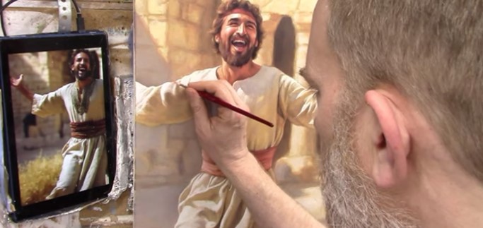
How To Use Contrast And Vibrancy: Acrylic Grisaille Technique
Unlock the secrets to dynamic paintings with the acrylic grisaille technique
Discover how to bring your portrait to life with vibrant contrasts and nuanced details using the acrylic grisaille technique.
In the realm of acrylic painting, learning the art of contrast and vibrancy can elevate your work to new heights. In this tutorial, we delve into the acrylic grisaille technique, a method that adds depth, richness, and dynamic energy to your paintings. Follow along as we explore the final steps in creating a painting of King David dancing as the Arc of the Covenant returns to Jerusalem.
What is the acrylic grisaille technique?
The acrylic grisaille technique begins with a monochromatic underpainting, typically done in shades of gray or sepia. This foundation allows artists to focus on values and contrasts without the distraction of color. Once the grisaille layer is complete, transparent glazes of color are applied, building up layers to create a rich and vibrant final image.
Enhancing Contrast and Vibrancy
In this demonstration, the artist uses a variety of techniques to enhance the contrast and vibrancy of the painting:
- Adding Halation for Vibrancy: Halation involves adding vibrant colors to the areas where bright highlights meet darker tones. By mixing organic orange, Indian yellow, and titanium white, the artist creates a glowing effect that makes the white clothing of King David pop against the background.
- Layering Glazes: Multiple glazes of color are applied over the sepia-toned underpainting. This layering process builds depth and richness, allowing the artist to fine-tune the vibrancy of the painting.
- Nuanced Details: Small round brushes are used to add intricate details and highlights, particularly in areas of high contrast. These details draw the viewer’s eye and add a sense of realism and movement to the painting.

Step-by-Step Process
- Prepare the Underpainting: Start with a monochromatic sepia tone. Focus on establishing the values and contrasts that will guide the final image.
- Mix Vibrant Colors: Create a mix of organic orange, Indian yellow, and titanium white. Adjust the strength of the color to suit the desired level of vibrancy.
- Apply Halation Effects: Carefully apply the vibrant mix to the edges of bright highlights. This technique enhances the contrast and makes the lighter areas stand out more vividly.
- Layer Glazes: Apply transparent glazes over the underpainting. Use a combination of colors to build depth and richness, allowing each layer to dry before adding the next.
- Add Nuanced Details: Use small brushes to add highlights and details. Focus on areas of high contrast to draw the viewer’s eye and add a sense of movement and realism.
Final Touches
The final steps involve signing the painting and adding any last-minute highlights or details. The artist emphasizes the importance of placing the signature in a way that complements the composition, ensuring it is visible but not intrusive
By learning the acrylic grisaille technique, you, as artists, can create paintings that are not only visually striking but also rich in depth and detail. Whether you are a seasoned artist or a beginner, these tips and techniques will help you bring your portrait to life.
For more detailed tutorial, watch the video below: Finishing the Painting of King David Dancing in Jerusalem (Acrylic Grisaille Technique)
LEARN MORE
- Sketching Your Painting Accurately
- Beginning a Pet Portrait in Acrylic
- The Mystery of Realism in Painting
- Apply A Burnt Sienna Glaze to a Portrait
- Learn How to Sketch a Portrait Freehand in 45 Minutes
- Adding highlights to your acrylic painting
- 5 Excellent Reasons to Use Aluminum Foil
- Paint Realistic Wrinkles in Acrylic
- Painting Clothing in an Acrylic Portrait
- Paint a Cloudy Sky Acrylic
- How to add Semi-Opaque Highlights
- How to Enhance the Contrast in Your Acrylic
- How to Add Glaze to Your Acrylic Painting
- Paint Realistic Reflections on Eyeglasses in an Acrylic Portrait
- Build Up Depth on Your Acrylic Portrait Backgrounds
- How Do You Do Layers With the Glazing Technique?
- Learn How to Paint Wrinkles in Acrylic
Read more about how to paint a portrait that you can surely be proud of!
I’d love to hear your thoughts on this video. Please share it with your friends and family. Let me know if you have any further questions. I’ll greatly help you.
If you’d like to learn more, sign up for my free email tips and video class today.
Learn How to Paint Acrylic Portraits With My Free Mini-Video Course!Thank you so much for taking the time to read this tutorial and watch the video. That means a lot to me. I hope you find it very helpful in your portrait painting.
Yours for Better Portraits,
P.S. Did you find this post helpful or encouraging? If so, send it in ahead! Let others know with the share buttons below. I’d love to hear your comments. Thank you so much! Also, do you have a question on acrylic portrait painting you’d like answered? Let me know, and I’d be happy to help!
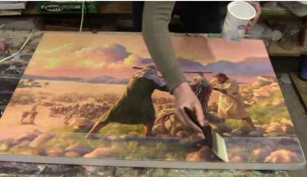
How To Varnish Your LARGE Acrylic Painting
How do you achieve long-lasting protection for your large acrylic portrait?
Introduction
Varnishing your acrylic painting is an essential step to protect it and give it a professional finish. In this guide, we’ll cover how to varnish a large acrylic painting, ensuring your artwork looks its best and remains protected for years to come.
Why is varnishing your large acrylic portrait important?
Varnishing your painting not only enhances its appearance by evening out the sheen but also protects it from UV rays, dust, and scratches. It adds a professional touch, making your artwork look polished and complete.
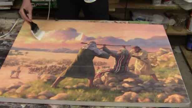
Supplies You’ll Need
Before you start varnishing, gather the following supplies:
- Varnishing Brush: A large 10-inch brush is ideal for covering large areas quickly and evenly.
- Matte Varnish: Opt for a high-quality matte varnish. A satin finish can provide a subtle shine without being too glossy.
- Container: Use a clean container for your varnish. An old yogurt container works well.
- Stir Stick: Ensure the varnish is well-mixed before application.
- Rag: Keep a rag handy for wiping off any drips.
- Pipe Wrench: This might be necessary to open a stuck varnish container.
Preparation Steps
- Stir the Varnish: Over time, varnish can separate. Stir it thoroughly with a stir stick to ensure it’s well-mixed. If stirring isn’t an option, gently shake the container.
- Clean Your Canvas: Wipe off any dust or debris from your painting using a clean rag. This step is crucial to avoid trapping particles under the varnish.
- Lay the Canvas Flat: Position your painting flat on a table to prevent drips and ensure an even application.
Applying the Varnish
- Start Far Away: Begin varnishing from the farthest point on the painting and work your way towards yourself. This method helps avoid drips and ensures a smooth application.
- Dip and Brush: Dip your brush into the varnish container, ensuring both sides are evenly coated. Start about a quarter of the way from the edge and brush across the canvas.
- Smooth Strokes: Use long, smooth strokes to apply the varnish. Avoid overbrushing, which can cause streakiness.
- Overlap Strokes: Slightly overlap each stroke to ensure even coverage. Reload your brush as needed.
- Wipe Drips: Wipe off any drips that occur on the sides of the painting using a rag.
Tips and Techniques
- Don’t Overbrush: Overbrushing can lead to cloudiness and streakiness. Apply the varnish in one or two smooth strokes and leave it to dry.
- Keep a Wet Edge: Maintain a wet edge as you work to prevent the varnish from drying too quickly and causing streaks.
- Check for Streaks: Pay extra attention to dark areas of the painting, where streaks are more visible.
- Drying Time: Allow the varnish to dry for a few hours. It should be dry to the touch within an hour and fully dry within four hours, depending on the temperature and humidity.
Common varnishing your large acrylic portraits mistakes to avoid
Varnishing can be a straightforward process, but there are common mistakes that can be easily avoided with a bit of caution:
- Skipping the Stirring: Always stir your varnish before application to avoid uneven sheen and consistency.
- Overbrushing: Applying too many strokes can cause the varnish to become cloudy. Less is more in this case.
- Incorrect Drying Position: Never dry your painting vertically. Always lay it flat to prevent drips and runs.
- Ignoring Dust: Ensure your work area and canvas are dust-free before starting to varnish. Dust particles can become trapped and ruin the smooth finish.
Frequently asked questions about varnishing large acrylic paintings
1. What kind of varnish do I use?
For varnishing large acrylic paintings, I recommend using a matte varnish, specifically one that dries to a satin finish. I use a matte varnish from Nova Color, which comes in gallon jugs that I transfer into quart-sized containers for easier use. This type of varnish not only enhances the appearance of your painting but also provides UV protection and a professional finish.
2. What kind of brush?
A large brush is essential for varnishing large paintings effectively. I use a 10-inch Liquitex varnishing brush. This brush covers a lot of ground quickly and ensures an even application of the varnish. It’s important to have a brush that’s wide enough to make long, smooth strokes across your canvas.
3. Should I use an isolation coat?
In my process, I do not use an isolation coat. Instead, I treat the varnish layer as another layer of acrylic. The reason behind this is the flexibility to restore or touch up the painting if needed. Since the matte varnish is essentially clear acrylic without pigment, it can be painted over if any issues arise over time.
4. How should I apply the varnish?
To apply the varnish, follow these steps:
- Start by wiping off any dust from the canvas with a clean brush or cloth.
- Lay your canvas flat on a table to prevent drips.
- Stir the varnish well to mix any separated components.
- Pour a small amount of varnish into a container.
- Dip your brush into the varnish and start applying it from the area farthest away from you, working your way inward.
- Use long, even strokes and avoid overbrushing to prevent streakiness and cloudiness.
- Overlap your strokes slightly and lift the brush at the end of each stroke to maintain a wet edge.
- Allow the varnish to dry completely, which usually takes a few hours for a large painting.
5. Why should I varnish a painting in the first place?
Varnishing your painting serves several important purposes:
- It enhances the overall appearance by evening out the sheen and bringing out the colors.
- It provides a protective layer against UV rays, dust, and other environmental factors.
- It gives your artwork a professional finish, making it more appealing to clients and viewers.
- It helps preserve the painting over time, ensuring it looks its best for years to come.
6. How often should I varnish my paintings?
Once varnished, your painting typically does not need to be re-varnished. However, if the varnish gets damaged or wears off over time, you can apply another coat after proper cleaning.
7. Can I use the same varnish for all my paintings?
It depends on the finish you desire. Matte varnish provides a non-reflective finish, while gloss varnish gives it a shiny appearance. Choose the varnish based on your preference for each artwork.
8. What if I make a mistake while varnishing?
If you notice a mistake while the varnish is still wet, you can carefully remove it with a damp cloth and reapply it. Once dry, mistakes can be challenging to fix, so it’s best to apply varnish carefully and avoid overbrushing.
Watch the full video tutorial below!
Varnishing your large acrylic painting is a crucial step in preserving and enhancing its beauty. By following these steps and tips, you can achieve a professional finish that protects your artwork and makes it shine. Remember to gather your supplies, prepare your canvas, and apply the varnish with care. Happy painting!
LEARN MORE
- Sketching Your Painting Accurately
- Beginning a Pet Portrait in Acrylic
- The Mystery of Realism in Painting
- Apply A Burnt Sienna Glaze to a Portrait
- Learn How to Sketch a Portrait Freehand in 45 Minutes
- Adding highlights to your acrylic painting
- 5 Excellent Reasons to Use Aluminum Foil
- Paint Realistic Wrinkles in Acrylic
- Painting Clothing in an Acrylic Portrait
- Paint a Cloudy Sky Acrylic
- How to add Semi-Opaque Highlights
- How to Enhance the Contrast in Your Acrylic
- How to Add Glaze to Your Acrylic Painting
- Paint Realistic Reflections on Eyeglasses in an Acrylic Portrait
- Build Up Depth on Your Acrylic Portrait Backgrounds
- How Do You Do Layers With the Glazing Technique?
- Learn How to Paint Wrinkles in Acrylic
Read more about how to paint a portrait that you can surely be proud of!
I’d love to hear your thoughts on this video. Please share it with your friends and family. Let me know if you have any further questions. I’ll greatly help you.
If you’d like to learn more, sign up for my free email tips and video class today.
Learn How to Paint Acrylic Portraits With My Free Mini-Video Course!Thank you so much for taking the time to read this tutorial and watch the video. That means a lot to me. I hope you find it very helpful in your portrait painting.
Yours for Better Portraits,
P.S. Did you find this post helpful or encouraging? If so, send it in ahead! Let others know with the share buttons below. I’d love to hear your comments. Thank you so much! Also, do you have a question on acrylic portrait painting you’d like answered? Let me know, and I’d be happy to help!
