A simple, effective technique to protect and enhance your acrylic artwork.
Varnishing an acrylic painting is an essential step for artists aiming to protect their work and enhance its vibrancy. The process can seem daunting due to the various opinions on methods and materials. Because this guide presents a straightforward, effective method that has been trusted for over 20 years. By following these steps, artists can achieve a professional-looking finish that preserves their artwork beautifully.
Why Varnish Your Acrylic Portrait?
Protection: Varnishing helps shield your artwork from dust, dirt, and UV rays, preventing fading over time.
Finish: It enhances the colors and adds a desirable sheen, making your artwork stand out.
Durability: A good varnish can protect against scratches and scuffs, so in maintaining the integrity of your painting.
Tools and Materials Needed
Varnish: Permanent varnish (recommended brands include Nova Color and Liquitex).
Brush: A specialized varnishing brush, such as the Liquitex freestyle varnishing brush (4 inches).
Container: A wide-mouthed container for easy access to varnish (a yogurt container works well).
Water: A rinseable water container for cleaning your brush.
Towel: For wiping off the brush if necessary.
Blocks: Furring strips or similar blocks to elevate the painting.
Step-by-Step Varnishing Process
Prepare Your Workspace
Lay the painting flat: Ensure your acrylic portrait is on a stable surface to prevent spills.
Elevate the painting: Use blocks or furring strips to raise your artwork off the table. This prevents debris from getting into the varnish.
Gather materials: Have your varnish, brush, towel, and water container within reach.
Select the Right Varnish
Choose a suitable varnish: Opt for a permanent varnish such as Nova Color matte varnish or Liquitex satin varnish. Then these brands provide good quality at an affordable price. Note that matte varnish dries to a satin sheen, which is ideal for enhancing colors.
Avoid isolation coats: This method does not require an isolation coat, keeping the process straightforward and effective.
Brush Preparation
Use the right brush: A high-quality varnishing brush will yield the best results. Liquitex’s freestyle brush is recommended due to its fine bristles, allowing for a smooth application.
Pour varnish into a container: Transfer the varnish into a wide-mouthed container for easy dipping.
Application Technique
Dip the brush: Immerse the brush about one-third to half of the way into the varnish, avoiding the metal ferrule.
Start varnishing: Begin at the farthest edge of the painting, then brush towards you in long strokes. Wipe any excess varnish back into the container.
Overlap strokes: As you move, overlap your previous stroke slightly to ensure even coverage. And then avoid over-brushing, as this can create streaks or cloudiness.
Let it dry: After applying the varnish, so allow the painting to sit flat undisturbed. It should begin to look great within 30 minutes to an hour.
Inspect and Repeat (If Necessary)
Check for coverage: If you notice that some areas need more protection, a second coat can be applied. Just ensure the first coat is completely dry before doing so.
Additional Tips and Techniques
Use a spray bottle: Lightly spraying the brush with water before dipping into varnish can help with smoother application.
Clean your brush: Rinse your brush frequently to avoid buildup of varnish, ensuring a smooth finish.
Avoid environmental factors: Work in a dust-free environment to minimize debris landing on your painting while varnishing.
Brush direction: Always brush in the direction of the longest part of your canvas, whether horizontal or vertical, to achieve an even finish.
Conclusion
Varnishing your acrylic portrait can significantly enhance its longevity and appearance. By following this one-step method, you can protect your artwork while maintaining its vibrancy and detail. Then recommended materials and techniques simplify the process, making it accessible for artists of all levels. So, gather your supplies, prepare your workspace, and start varnishing with confidence!
I’d love to hear your thoughts on this video. Please share it with your friends and family. Let me know if you have any further questions. I’ll greatly help you.
If you’d like to learn more, sign up for my free email tips and video class today.
Thank you so much for taking the time to read this tutorial and watch the video. That means a lot to me. I hope you find it very helpful in your portrait painting.
Yours for Better Portraits,
P.S. Did you find this post helpful or encouraging? If so, send it on ahead! Let others know with the share buttons below. I’d love to hear your comments. Thank you so much! Also, do you have a question on acrylic portrait painting you’d like answered? Let me know, and I’d be happy to help!
Master the art of eye adjustments to enhance your portraits
When it comes to painting portraits, the eyes are often considered the windows to the soul. Adjust the eyes in acrylic portraits can significantly enhance the overall realism and appeal of your artwork. In this post, the importance of eye adjustments will be discussed, along with effective techniques that artists can utilize to create lifelike portraits.
Understanding Eye Structure
The eye consists of various components, including the iris, pupil, and eyelids. Each of these features plays a critical role in conveying expression and character. Artists often face challenges such as proportions, shape, and placement of the eyes. A solid understanding of eye anatomy can help artists make informed adjustments.
Preparing for Adjustments
Before making any adjustments, artists should gather their materials. Ensure you have your acrylic paints, brushes, a palette, and a reference photo ready. The reference photo serves as a vital tool for accuracy and should be positioned near your painting for easy comparison.
Techniques for Adjusting Eyes
Thickening Lines
To achieve a more balanced and dynamic look, artists should consider thickening the lines above the iris. This technique adds visual weight and reduces the scalloping effect often seen in portraits. Begin by slightly rounding off the existing lines. Instead of following the previous line too closely, raise the line above the iris to create a more natural and appealing shape.
Adjusting the Shape
When adjusting the shape of the eyes, it is crucial to ensure that they are not overly flattened. Slightly round the eye, particularly towards the middle section, to achieve a more lifelike appearance. This adjustment can be made by adding more paint along the upper eyelid and ensuring the iris is adequately framed.
Utilizing Reference Photos
Regularly referencing your photo while painting can make a world of difference. Many artists find it helpful to bring the reference photo onto the canvas or have it displayed nearby. This technique allows for constant comparison and ensures accuracy in adjustments.
Common Mistakes to Avoid
While making adjustments, artists should be cautious of overcorrection. It’s essential to maintain the overall likeness to the subject without altering the unique features that define them. Additionally, symmetry plays a crucial role; both eyes should be balanced in shape and size. Lastly, ensure that enough reference material is used to guide your adjustments effectively.
Final Touches
Once the eyes have been adjusted, take a step back and assess the overall composition. Balancing both eyes is essential for achieving symmetry, while using shadows can add depth and realism. Artists should ensure that the final result closely resembles the reference photo, capturing the subject’s essence.
Conclusion
Adjusting the eyes in an acrylic portrait is a skill that can greatly enhance the overall quality of your artwork. By understanding eye structure and implementing techniques such as thickening lines, adjusting shapes, and utilizing reference photos, artists can create lifelike portraits that resonate with viewers. With practice and patience, these techniques can be mastered, leading to significant improvements in your portrait painting skills.
Tips and Techniques
Don’t Rush: Take your time when making adjustments; a careful approach leads to better results.
Use a Variety of Brushes: Different brush sizes and shapes can help achieve various effects when painting eyes.
Practice Regularly: The more you practice adjusting eyes, the more intuitive the process will become.
Study Real Eyes: Observing real eyes in different lighting conditions can provide insights into how to recreate them in your portraits.
I’d love to hear your thoughts on this video. Please share it with your friends and family. Let me know if you have any further questions. I’ll greatly help you.
If you’d like to learn more, sign up for my free email tips and video class today.
Thank you so much for taking the time to read this tutorial and watch the video. That means a lot to me. I hope you find it very helpful in your portrait painting.
Yours for Better Portraits,
P.S. Did you find this post helpful or encouraging? If so, send it on ahead! Let others know with the share buttons below. I’d love to hear your comments. Thank you so much! Also, do you have a question on acrylic portrait painting you’d like answered? Let me know, and I’d be happy to help!
Master the art of outdoor portrait painting using glazing techniques for depth and realism
Outdoor portrait painting can be a rewarding experience that connects artists with nature. The beauty of the natural light offers a unique perspective that can enhance the realism of your artwork. One effective technique to achieve depth and vibrancy in your portraits is glazing. This method involves applying thin layers of transparent color over dried paint, allowing the underlying layers to shine through.
Understanding Glazing Techniques
Definition of Glazing Glazing is a painting technique where transparent layers of paint are applied over a dried base layer. So this process creates a luminous effect, enhancing colors and adding depth to your artwork.
How Glazing Enhances Color and Depth
By using glazing, so artists can build up complex colors and tones gradually. The layering effect allows for subtle changes in color, making the portrait appear more lifelike. As each layer dries, the artist can assess the depth and adjust accordingly.
Essential Materials
Before starting your outdoor portrait, gather the following materials:
Recommended Colors for Glazing
Raw Umber Dark: Ideal for adding depth and shadow.
Titanium White: Provides opacity and brightness.
Burnt Sienna: Useful for warm skin tones and shading.
Alizarine Crimson: Adds richness to the color palette.
Tools Required for Outdoor Painting
Canvas or panel
Palette for mixing colors
Brushes (various sizes for different applications)
Rags for cleaning brushes
Easel for stability
Water container for cleaning brushes
Step-by-Step Process
Preparing Your Canvas
Then start with a prepared canvas. Make sure it is dry before applying any paint. Because this preparation allows for better adhesion and a smoother finish.
Layering Colors Using Glazes
Apply the Base Layer: Begin with an initial layer of paint to establish your color base. This layer can be more opaque.
Mix Colors: Create a glaze by mixing raw umber dark with titanium white to form a more opaque mixture. Then this will be used to darken specific areas.
Test the Colors: Before applying, test the mixed colors on a rag to ensure the desired tone and opacity.
Adding Depth with Shadows and Highlights
Identify Areas for Glazing: Look for areas that need more depth, such as shadows under the chin or around the neck where the hair casts a shadow.
Apply Glaze: Using a soft brush, apply the glaze over the selected areas. Allow the paint to dry for a few minutes before assessing the color.
Layering: After the initial glaze dries, apply another layer of color, gradually building depth.
Tips for Success
Working with Natural Light: Pay attention to how natural light changes throughout the day. Because this can affect the appearance of colors and shadows in your painting.
Adjusting Colors for Outdoor Conditions: Outdoor lighting can vary, so adjust your palette accordingly. Warmer colors may be needed to balance the coolness of shade or overcast skies.
Patience in Layering: Take your time with each layer. Allow glazes to dry fully before applying the next layer to prevent mudding of colors.
Conclusion
In conclusion, glazing is a powerful technique for outdoor portrait painting that can add depth and luminosity to your work. Because by understanding how to layer colors effectively and adjust to natural light, artists can create stunning and realistic portraits. Whether painting from life or a reference photo, the practice of glazing will enhance your skills and results. So grab your materials, head outdoors, and enjoy the process of capturing the beauty around you.
I’d love to hear your thoughts on this video. Please share it with your friends and family. Let me know if you have any further questions. I’ll greatly help you.
If you’d like to learn more, sign up for my free email tips and video class today.
Thank you so much for taking the time to read this tutorial and watch the video. That means a lot to me. I hope you find it very helpful in your portrait painting.
Yours for Better Portraits,
P.S. Did you find this post helpful or encouraging? If so, send it on ahead! Let others know with the share buttons below. I’d love to hear your comments. Thank you so much! Also, do you have a question on acrylic portrait painting you’d like answered? Let me know, and I’d be happy to help!
Unlock your artistic potential by learning to paint a vibrant portrait of a young man in just half an hour.
In the world of portrait painting, efficiency and creativity often go hand in hand. This will guide you through the process of painting a friendly young man in blue within 30 minutes. Not only does this exercise encourage quick thinking and decision-making, but it also helps you refine your artistic skills in a time-sensitive manner. The beauty of this approach lies in its simplicity and accessibility, making it perfect for both beginners and experienced artists looking to enhance their techniques.
Materials Needed
To embark on this exciting painting journey, ensure you have the following materials ready:
Acrylic Paints:
Ivory Black
Raw Umber Dark
Burnt Sienna
Raw Sienna
Ultramarine Blue
Alizarine Crimson
Pyrrole Red
Indian Yellow
Titanium white
Brushes:
Round brush for detail work
Flat brush for broader strokes
Other Tools:
Palette for mixing colors
Matte medium for thinning paint
Timer for tracking your painting session
Canvas Preparation:
An 8×10 canvas panel, toned with a mix of raw umber dark and titanium white
Setting Up the Painting Process
Before diving into the painting, it is essential to prepare your canvas properly. Begin by toning the canvas with a mixture of raw umber dark and titanium white. This step provides a neutral background, allowing for better contrast when adding colors.
Once the canvas is prepared, block in the basic composition of the young man. Using a thin wash of darker paint, outline the general shapes of the head, neck, and shoulders. This initial sketch serves as a guide for placing the facial features accurately.
Blocking in the Composition
Start by identifying key features:
Earlobe and Hairline: The bottom of the earlobe typically aligns with the halfway point of the face.
Jawline and Shoulders: Mark where the jawline will curve and where the shoulders begin.
Eyes and Nose: Establish the placement of the eyes, ensuring they are positioned correctly in relation to the nose and mouth.
By keeping the lines light, adjustments can be made easily without significant disruption to the painting.
Painting Steps
Establishing the Base Colors
After blocking in the main features, it is time to apply the base colors. Begin by mixing the appropriate shades for the skin tones and clothing. The goal is to create a vibrant, friendly appearance for the young man.
Skin Tone: Use a mix of raw sienna, titanium white, and a touch of alizarine crimson to create a natural skin tone.
Clothing: For the blue shirt, mix ultramarine blue with a hint of titanium white to achieve a soft, friendly blue shade.
Detailing Facial Features
With the base colors applied, the next step involves refining the facial features. Pay attention to:
Eyes: Add depth by incorporating darker tones around the edges. Use a mix of burnt sienna and raw umber dark to define the shadows.
Nose and Mouth: Sculpt the nose by using highlights and shadows to add dimension. For the mouth, emphasize the natural curvature by applying darker shades to the corners and lighter shades to the center.
Creating Shadows and Highlights
Shadows play a crucial role in portrait painting, providing depth and realism. Observe the light source carefully and identify where the shadows fall on the face. Utilize a combination of raw umber dark and ivory black to create darker shadows, and titanium white for highlights.
Cheekbones and Forehead: Define the cheekbones with darker shades while keeping the forehead lighter to indicate light reflection.
Jawline: Establish the jawline shadow with a gentle gradient, allowing it to flow seamlessly into the neck.
Tips for Success
To enhance your painting experience, consider these helpful tips:
Using Reference Images: Reference images are invaluable in portrait painting. They provide a clear visual guide for proportions and colors. When selecting an image, look for good lighting and strong contrasts to help create depth in your work.
Conclusion
Painting a friendly young man in blue in just 30 minutes may seem challenging, but with practice and perseverance, it can be a rewarding experience. Because this exercise encourages artistic growth and helps you develop essential skills in portrait painting. Remember to have fun and embrace the process. For further resources and guides, visit realisticacrylic.com to enhance your acrylic painting journey.
I’d love to hear your thoughts on this video. Please share it with your friends and family. Let me know if you have any further questions. I’ll greatly help you.
If you’d like to learn more, sign up for my free email tips and video class today.
Thank you so much for taking the time to read this tutorial and watch the video. That means a lot to me. I hope you find it very helpful in your portrait painting.
Yours for Better Portraits,
P.S. Did you find this post helpful or encouraging? If so, send it on ahead! Let others know with the share buttons below. I’d love to hear your comments. Thank you so much! Also, do you have a question on acrylic portrait painting you’d like answered? Let me know, and I’d be happy to help!
Master the alla prima technique to capture expression, lighting, and form in a half-hour acrylic portrait.
Welcome to another 30-minute acrylic portrait session! In this tutorial, we will walk through the process of painting a pensive young woman with red hair. While acrylic painting can take several hours or even days using layered techniques, today we’ll focus on alla prima—a method where you paint wet-on-wet in one sitting. This exercise helps artists become more efficient by focusing on capturing the subject’s gesture and overall expression in a short period. With practice, you can improve your speed, brushstroke accuracy, and confidence.
Follow this step-by-step guide to complete a beautiful, expressive portrait in just 30 minutes.
Materials and Color Palette
Before diving into the actual painting process, it’s essential to know the materials you’ll be using. For this quick portrait, the following supplies are necessary:
Colors:
Ivory Black
Raw Umber Dark
Burnt Sienna
Raw Sienna
Ultramarine Blue
Alizarine Crimson
Pyrrole Red Orange (or Cadmium Red Medium)
Indian Yellow
Titanium White
Brushes: A mix of flat and round brushes, including filberts for blending skin tones and hair.
Canvas Preparation: The canvas is pre-toned with a light wash of burnt sienna mixed with titanium white, giving the flesh tones a warm underlayer. This helps speed up the process since the mid-tones are already in place, leaving you to focus on shadows and highlights.
Step 1: Sketching the Composition and Features
Blocking in the Shapes:
Start by mixing raw umber dark with ivory black and a little matte medium to thin the paint. Use a flat brush to sketch the basic composition of the portrait. Focus on capturing the shapes of the young woman’s hair, face, and neck. This quick block-in will define the main forms and ensure your proportions are correct.
Tip: Focus on the overall gesture and avoid getting bogged down with small details at this stage. Pay attention to the negative spaces between the subject’s contours and the background.
Step 2: Identifying Shadows and Highlights
With the basic form sketched out, move on to blocking in shadows. Using the same mixture of raw umber black, deepen the darker areas, such as her neck, jawline, and the left side of her face.
For the highlights, mix titanium white with burnt sienna and pyrrole red orange to create a warm skin tone. Apply this mixture to the areas where light naturally hits her face, including the forehead, cheeks, and chin. This initial contrast between light and dark will help shape the face’s three-dimensional look.
Tip: Use a filbert brush to blend these highlights smoothly into the surrounding skin tones for a softer transition. Quick, choppy strokes can help with texture, while longer, smoother strokes are ideal for refining the skin’s appearance.
Step 3: Refining the Facial Features
Now that the major shadows and highlights are established, begin working on the facial features. Thin the paint with matte medium to give yourself flexibility in making corrections. Use a smaller round brush to block in her eyes, nose, and mouth.
Eyes: Place the eyes about two-thirds of the way up from the chin to the top of the head. Make small marks to indicate their placement, followed by the eyebrows, nose, and mouth.
Nose: The bottom of the nose should align with the lower third of the face. Use shadows to accentuate its form and add dimension.
Mouth: Capture the subtle expression by carefully observing the shape of her lips and how they relate to the other facial features. There’s a slight smile, so a careful balance of shading around the mouth will be essential.
Step 4: Painting the Hair
For the red hair, create a mixture of burnt sienna, pyrrole red orange, and a hint of alizarine crimson. This combination will yield a vibrant, natural red that complements the subject’s expression.
Work in layers, starting with the darker shadows to indicate the depth of the hair. Then, add mid-tones and finish with highlights using a lighter mixture of titanium white and pyrrole red orange.
Tip: The texture of the hair can be suggested using short, directional strokes to mimic the flow and volume. Pay attention to where light hits the hair, adding highlights in those areas.
Step 5: Final Touches and Enhancing Contrast
To bring everything together, add the final highlights and enhance the contrast in key areas, such as the bridge of the nose, the cheekbones, and the lips. For the background, use a mixture of raw sienna and burnt umber to create a neutral tone that contrasts with the warm colors of her face and hair.
As the painting progresses, keep in mind the subtle shadows that give depth to her expression. Soft transitions between light and shadow will make the portrait feel more lifelike.
Tip: Step back from your painting regularly to check the overall balance of the portrait. This will allow you to see the piece with fresh eyes and make any necessary adjustments before the timer runs out.
Technique and Tips for Success
Alla Prima Technique: This wet-on-wet approach forces you to make decisive brushstrokes and prevents overworking the paint. Embrace the loose and expressive nature of this method.
Color Harmony: Use a limited palette to ensure harmony in the skin tones, shadows, and highlights. The pre-toned canvas will help unify the colors.
Efficient Brushwork: Each brushstroke counts in a 30-minute portrait. Focus on broad strokes for the initial block-in, then refine with smaller brushes for detail work as time allows.
Conclusion: Practice Makes Perfect
Completing your artwork in a 30-minute acrylic portrait painting is challenging but highly rewarding. Because with practice, this exercise will sharpen your skills, improve your brush control, and help you capture the essence of your subject quickly and confidently. By then focusing on the most important aspects of light, shadow, and expression, you’ll be amazed at what you can achieve in a short time.
Start with this tutorial and see how your speed and efficiency improve over time!
I’d love to hear your thoughts on this video. Please share it with your friends and family. Let me know if you have any further questions. I’ll greatly help you.
If you’d like to learn more, sign up for my free email tips and video class today.
Thank you so much for taking the time to read this tutorial and watch the video. That means a lot to me. I hope you find it very helpful in your portrait painting.
Yours for Better Portraits,
P.S. Did you find this post helpful or encouraging? If so, send it on ahead! Let others know with the share buttons below. I’d love to hear your comments. Thank you so much! Also, do you have a question on acrylic portrait painting you’d like answered? Let me know, and I’d be happy to help!
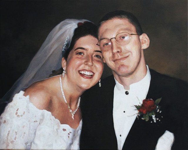
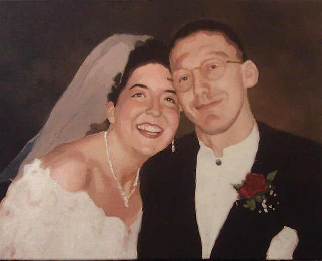
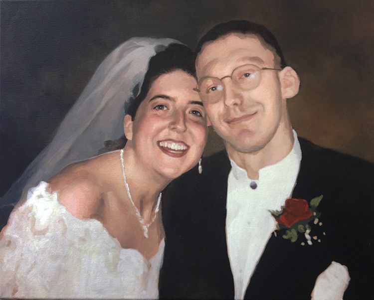
For those of you that know me, I have long championed the technique of glazing paint onto a white canvas, so that the light reflects through the layers of paint, giving it added luminosity and depth. I still think it’s a fantastic way to paint.
But occasionally, I like to try something new.
A client from Brooklyn, who I am doing portraits of rabbis for, asked me if I ever tried painting on a black canvas. The idea is that if your painting already has a lot of black areas and dark values (which rabbi portraits do with their dark suits and hats), why not start with a black canvas and work the other way out?
So that’s what I did.
A couple of old high school friends asked me to paint a portrait of them from their wedding day–and I thought, this would be the perfect opportunity to utilize this technique.
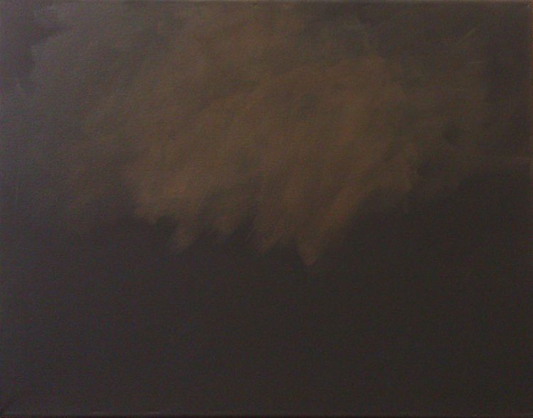
Step 1: Toning the Background
So with that, I bought a 16″ x 20″ canvas already primed with black acrylic gesso. The next step was to tone the background. I used my favorite portrait painting color, raw umber dark and a little bit of raw sienna and burnt sienna, thinned with acrylic medium, applied with a couple layers.
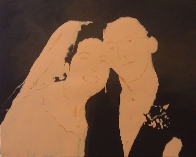
Step 2: Blocking the Forms
I want to be transparent with my process. Although I utilize many techniques for sketching onto a canvas–from tracing, to using a grid, to freehand sketching, to even painting without a sketch, in this particular painting I used a projector to quickly establish the shapes and forms. I mixed a portrait base tone with titanium white, raw sienna, and burnt sienna and applied it with a couple layers to the canvas, following what I saw in the projection. After the final layer dried, I defined some of the details of the faces and clothing using the portrait tone mixed with burnt sienna and raw umber dark.
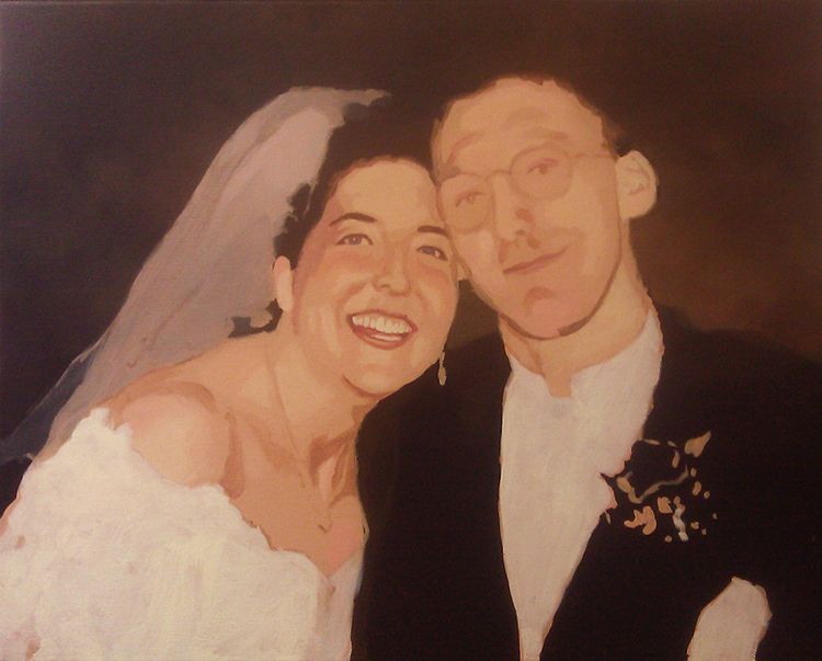
Step 3: Building the Foundational Colors and Values
In the next step, I started establishing some tonal values right away with glazes of raw umber dark, and burnt sienna. On the faces, I darkened the details of the eyes, under the chin, added some depth to the faces by establishing the shadows on the sides of the head, with various mixtures of raw umber dark, burnt sienna, and napthol crimson.
Additionally, I painted in the white of the dress with pure titanium white, thinned down with a small portion of medium to give it a translucency effect of white fabric with the skin behind it.
Then I painted in her veil with a mixture of raw umber dark, white, and a tiny bit of ultramarine blue. Most of the cool tones in that veil are achieved by the mixture of the white paint with raw umber dark. Any time you add white paint, you are cooling down the temperature of the color mix, so this can be used intentionally to create that effect.
Finally, I lightened up the background with a few more glazes of raw umber dark, raw sienna, and burnt sienna. This provides more contrast so that the black value of the suit is more clearly outlined.
Step 4: Heightening the Contrast
In this step, I continued to heighten the contrast in the painting all over. I added more glazes of raw umber dark, burnt sienna, and alizarine crimson for the shadow areas, and raw sienna, titanium white, and a tiny bit of indian yellow and organic orange for the highlights. It’s necessary to warm up these highlights with some colors that have more intensity when you mix white into the glaze. (Because I was starting with a medium-value flesh tone as the base, I glazed in reverse for the highlights, moving from that darker value to lighter.)
You can see I darkened in the eyes and added reflections to the eyeballs. That really brought the painting to a higher level, and made me feel good about how it was progressing.
Moving to the other side of the canvas, I introduced red to the boutonniere with napthol red and raw sienna which, mixed together, is very opaque.
Step 5: Adding More Nuances
Here the painting began to really get close to the finish line. I feel like this was the reward for all the tedious work in layering initial values and colors. I kept adding nuances and tones throughout, with various mixtures of raw umber dark, burnt sienna, napthol crimson, raw sienna, titanium white and couple other colors where necessary.
I darkened the veil with some layers of ultramarine blue mixed with ivory black and white, of course, thinned down with clear acrylic matte medium. I wanted to continue to suggest some of the lace in her dress by adding some flesh tone mixture in various patterns.
Sometimes capturing realism is not found in what you put in, but what you leave out.
I could have gone crazy with adding every little texture of the lace and netted tulle openings, but that would be unnecessary. I would likely have distracted from the realism, and certainly draw your attention away from the most important thing; the bride and groom’s faces, exhibiting the joy of the moment of their wonderful day.
Last Step: Adding Final Nuances and Details
When a painting nears completion, you have to balance a couple different factors.
How much more do I need to add to this so it looks fantastic, finished, without going overboard?
What is the deadline?
In this case, I had some wiggle room on the deadline, so that wasn’t a factor. But as a professional portrait painter, I don’t want to take my time adding details that contribute very little to the overall impact of a painting.
But I had a little more work to do. I needed to add in some important jewelry on the veil, her earrings, and define the necklace, as well as some of the buttons on the groom’s shirt. If those details were not there, we can safely say, the client would notice!
In addition to that, I worked all over the painting, adding a few final nuances–heightening the contrast of the teeth, some of those “shiny” highlights on the face that usually glisten due to sweat on the skin, and also some of the details within her dress.
Finally, I signed it and called it done!
I hope you enjoyed this little painting tutorial, and as always, have a blessed day,
Discover the power of the alla prima acrylic technique with a quick and efficient 30-minute portrait painting exercise.
Painting a portrait in just 30 minute acrylic might seem like a daunting task, but with the right technique and a little practice, you can create stunning results. So in this guide, we’ll walk through how to paint a young woman with black hair using acrylics, focusing on the alla prima technique, where you paint wet-on-wet in one session. Because this exercise will help you improve your speed and efficiency, making it easier to tackle more detailed and time-consuming works in the future. Let’s dive into the process!
Materials and Tools Needed:
Before you start, gather the following materials:
Canvas: 8×10 inch toned canvas board (gray works best for portraits).
Acrylic Paints: Ivory black, raw umber dark, burnt sienna, raw sienna, ultramarine blue, titanium white, alizarin crimson, and phthalo blue.
Brushes: A variety of flats, filberts, and rounds (inexpensive brushes like “Fine Touch” work well for portraits).
Palette: For mixing colors.
Matte Medium: To adjust the fluidity of the paint.
Step 1: Preparing the Canvas and Plotting the Portrait
To begin, tone your canvas with a neutral gray to establish a balanced base. Then gray background allows for better contrast between your light and dark areas and helps guide your values throughout the painting process.
Using a mixture of raw umber dark, ivory black, and matte medium, start by loosely sketching the proportions of the young woman’s face. So it’s crucial to get the structure right at this stage. Focus on blocking out key elements like the position of the eyes, nose, mouth, and overall shape of the head.
Tip: Take your time to plot out the general anatomy and features. Once the structure is clear, the rest of the painting will flow smoothly.
Step 2: Blocking in the Hair
In this case the hair, start by mixing ivory black with a bit of raw sienna and ultramarine blue. Because ultramarine blue adds richness and depth to the black, making the hair appear more dynamic. While using a flat brush, block in the larger shapes of the hair, paying attention to where the light hits and where the shadows fall.
Leave room for highlights by using lighter brushstrokes in specific areas, such as the top of the head and the strands framing the face.
Tip: Then use firm pressure to make sure the paint penetrates the texture of the canvas and blending the darker areas with lighter values will give the hair more volume and realism.
Step 3: Adding Facial Features
Now that the hair is blocked in, it’s time to focus on the face. Then begin with the lighter skin tones. Mix titanium white with a bit of raw sienna and pyro red orange. Because this combination provides a warm, natural skin tone, apply the highlight colors to the areas where light hits the most, such as the forehead, cheeks, and chin.
For the shadows, mix raw umber dark with alizarin crimson to create a soft, reddish shadow. Apply this to the areas that fall into shadow, particularly on the right side of the face where light is less prominent.
Pay close attention to the subtle transitions between light and dark. This is key to achieving a realistic, three-dimensional effect.
Tip: Use smaller round brushes for the finer details like the eyes, nose, and mouth. Keep the brushstrokes loose, especially in the early stages, to avoid overworking the paint.
Step 4: Defining Light and Shadow
The success of a portrait depends heavily on how well you capture the play of light and shadow. In this painting, the light source is on the left, casting most of the face in a soft glow. The right side of the face falls into shadow, which adds depth and contrast.
To enhance this, add more ivory black and burnt sienna to the shadow areas on the face and neck. The interplay between light and dark will help define the features and make the portrait more striking.
Tip: Don’t be afraid to use more intense shadows. They can be adjusted later with highlights or softened through blending.
Step 5: Refining the Details
At this point, it’s time to go back and refine the smaller details. Use a fine brush to suggest the eyebrows, eyes, and mouth. For the eyes, a mix of raw umber dark and a tiny bit of alizarin crimson will give depth to the pupils, while white highlights can be added for reflection.
For the lips, mix pyro red orange with alizarin crimson to create a subtle pink tone. The lips should be softly blended into the surrounding skin, paying attention to where light and shadow fall on them.
Step 6: Final Touches and Adjustments
As the portrait nears completion, make any necessary adjustments to the values and colors. Add more contrast where needed, especially in the hair and facial features. Blend areas that appear too harsh and add highlights to areas that need more light.
Finally, step back from your painting and evaluate it from a distance. This will help you see the overall composition and balance.
Tips for Painting Efficiently:
Set a Timer: Limiting yourself to 30 minutes encourages you to work quickly and make decisive brushstrokes.
Practice Frequently: The more you paint quick portraits, the better you’ll get at gauging proportions and capturing likenesses in less time.
Use a Limited Palette: Restricting your color choices can speed up the mixing process and ensure consistency throughout the painting.
Focus on Large Shapes First: Start with the overall shapes and proportions before moving to the details. This prevents overworking smaller areas and maintains balance.
Take Breaks to Evaluate: Step away from the painting to view it with fresh eyes. This will help you identify areas that need improvement or adjustment.
Conclusion
Painting a young woman with black hair in 30 minute acrylics is an excellent way to hone your skills, improve your speed, and gain confidence. By focusing on the key elements of light and shadow, blocking in major shapes, and refining the details efficiently, you can create a striking portrait in a short amount of time. Try incorporating this exercise into your regular painting routine to see significant improvement in your portraits.
Remember, practice is key, and with each portrait, you’ll get closer to mastering the alla prima technique. Happy painting!
I’d love to hear your thoughts on this video. Please share it with your friends and family. Let me know if you have any further questions. I’ll greatly help you.
If you’d like to learn more, sign up for my free email tips and video class today.
Thank you so much for taking the time to read this tutorial and watch the video. That means a lot to me. I hope you find it very helpful in your portrait painting.
Yours for Better Portraits,
P.S. Did you find this post helpful or encouraging? If so, send it on ahead! Let others know with the share buttons below. I’d love to hear your comments. Thank you so much! Also, do you have a question on acrylic portrait painting you’d like answered? Let me know, and I’d be happy to help!
Master the art of portrait painting in just 30 minutes with this step-by-step guide on how to paint a man wearing a dark brown cap, using quick alla prima techniques.
Creating a portrait in 30 minute acrylic portrait may sound challenging, but with the right technique and mindset, it’s achievable. In this guide, you’ll learn how to paint a man wearing a dark brown cap using the alla prima method. This method focuses on speed and efficiency, helping artists prioritize the most essential details to bring a portrait to life quickly. Here, we break down the steps and share tips on how to improve your acrylic portrait skills.
Introduction to Alla Prima Portrait Painting
Alla prima, or wet-on-wet painting, is a technique that involves completing a painting in one sitting. Unlike traditional methods that allow layers to dry between applications, alla prima encourages you to work quickly and efficiently. This guide demonstrates how to use this method for a 30-minute acrylic portrait of a man in a dark brown cap. The goal isn’t perfection but improvement in speed and technique while capturing the subject’s essence.
Palette and Materials
Before diving into the portrait, it’s crucial to have the right tools. For this tutorial, the following colors are used:
Ivory Black
Raw Umber Dark
Burnt Sienna
Raw Sienna
Ultramarine Blue
Alizarine Crimson
Pyrrole Red Orange
Indian Yellow
Titanium White
You will also need matte medium for thinning the paint, a few brushes (flats and rounds), and a canvas or canvas board. Using matte medium helps create smoother transitions, which is vital when working quickly.
Step-by-Step Guide to Painting
1. Start with a Quick Composition Sketch
The first step is to block in the basic shapes of the portrait. Using a mix of raw umber dark and ultramarine blue, sketch out the composition. The key is to focus on the overall structure and the visual weight of the painting.
Pay attention to the man’s hat, which should slightly extend beyond the picture plane, and block in the large areas like the hat, jawline, and clothing. These early strokes are foundational, so don’t worry too much about small details. Instead, concentrate on the positioning and proportions of the major features.
2. Block in Shadows
Next, switch to a smaller flat brush and begin blocking in the shadows. Shadows are essential for giving the portrait depth. For this step, mix raw umber dark with titanium white for opacity, and add a bit of alizarine crimson and ultramarine blue to neutralize the warmth.
Focus on the shadows under the hat, around the nose, and beneath the chin. The key here is to simplify the shadow shapes—don’t get bogged down with unnecessary details at this stage. Instead, aim for bold, confident strokes that define the light and dark areas.
3. Apply Skin Tones
Now it’s time to paint the skin tones. Use titanium white mixed with raw sienna and burnt sienna to create a base skin tone. You can warm it up with a bit of alizarine crimson for areas that need more pinkish tones, such as the cheeks or lips.
Block in the skin areas quickly but precisely, making sure to cover the face, neck, and ears. Don’t worry if some skin tones blend into the shadow shapes—these can be refined later.
4. Blend and Define Features
Once the basic tones are blocked in, it’s time to refine the features. Using a small brush, blend the darker shadow areas into the lighter skin tones. Pay attention to crucial areas like the nose, cheeks, and eyes.
For the man’s cap, switch to a darker mix of raw umber dark and ivory black to add more dimension. Use the same blend to define the man’s beard and eyebrows, making sure to capture the triangular shadow shapes around the eyes and the strong furrows in his brow.
5. Add Highlights
Highlights are what make the portrait pop. Use titanium white with a bit of burnt sienna to paint the brighter areas of the face. This mix will create a natural, soft glow, mimicking the effect of sunlight hitting the skin. Focus on the forehead, nose bridge, cheekbones, and the top of the lips.
This step is also where you can refine small details like the earring or the slight texture on the man’s lips. Be careful not to overwork these details, though, as you’re working within a tight time frame.
6. Final Touches
In the last few minutes, focus on refining the transitions between light and dark areas. Use a small round brush to add subtle touches to the beard and mustache. Add a bit of ultramarine blue mixed with titanium white to give the shadows a cooler tone, creating more depth.
Don’t forget to check the overall composition. Make sure the man’s cap is correctly placed, and the shadows and highlights are balanced. At this stage, you can also add finishing touches like small wrinkles or texture to the man’s clothing.
Tips and Techniques for Faster Painting
Use Matte Medium: This helps in blending and smoothing out transitions between colors while keeping the paint fluid.
Work in Layers: Block in large shapes first, then refine the details. This method ensures you capture the overall structure before getting too detailed.
Prioritize Important Features: Focus on the essential elements of the face, such as the eyes, nose, and mouth. Minor details can be added later if time permits.
Use Big Strokes: Especially at the beginning, use larger brushes and bold strokes to cover more surface area quickly.
Limit Your Palette: Using a limited palette helps streamline the process and reduces decision fatigue. Stick to the basic colors mentioned earlier for this exercise.
Conclusion
Completing a 30-minute acrylic portrait might seem intimidating, but with practice, it becomes a valuable exercise in efficiency and decision-making. This alla prima approach encourages you to focus on the most important aspects of the portrait, allowing you to improve your painting speed while still capturing the subject’s essence.
Remember, this 30-minute acrylic portrait exercise is a way to enhance your skills, and you can always take your quick study further into a more detailed painting later. With consistent practice, you’ll find yourself becoming faster and more confident in your portrait work.
I’d love to hear your thoughts on this video. Please share it with your friends and family. Let me know if you have any further questions. I’ll greatly help you.
If you’d like to learn more, sign up for my free email tips and video class today.
Thank you so much for taking the time to read this tutorial and watch the video. That means a lot to me. I hope you find it very helpful in your portrait painting.
Yours for Better Portraits,
P.S. Did you find this post helpful or encouraging? If so, send it on ahead! Let others know with the share buttons below. I’d love to hear your comments. Thank you so much! Also, do you have a question on acrylic portrait painting you’d like answered? Let me know, and I’d be happy to help!
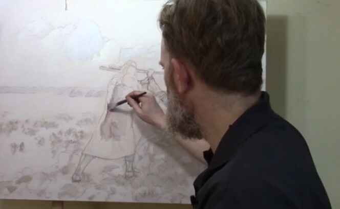
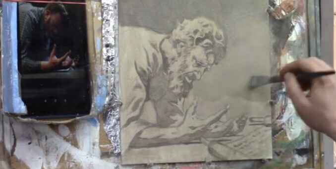
Learn the first few layers of acrylic glazing for depth and realism
Laying the Foundation with Acrylic Glazing
When it comes to portrait painting, the initial layers play a critical role in defining the composition, tone, and depth of the artwork. In this tutorial, we will explore how to paint over a detailed in first few layers of an acrylic portrait using the glazing technique. This method, often used by the old masters like Leonardo da Vinci and Titian, allows for the creation of subtle depth, rich shading, and enhanced realism.
In this lesson, we will delve into a commissioned piece depicting the biblical story of Moses, Aaron, and Hur during the ancient Israeli-Amalekite battle. The symbolism of this painting reflects intercessory prayer, where Moses’ raised staff determined the outcome of the battle, supported by Aaron and Hur. Let’s walk through the process of painting the first layers while maintaining the intricate details of the sketch.
Step 1: Blocking in the Shading
The first step in building up the painting is to block in the shading. Starting with a small flat brush, begin by mixing raw umber dark with a little ultramarine blue and blending it into matte medium. This mixture allows for transparent layering, known as glazing, which will help maintain the underlying sketch without disturbing its details.
Tip: Use small amounts of acrylic paint mixed with large amounts of matte medium for best results. This creates translucent layers that gradually build depth.
As you apply this mixture, focus on blocking in the shadows and edges of the figure. In this case, we’re focusing on the figure of Moses. The goal here is not to add too much detail but to establish the overall value structure—the lights and darks that will give the portrait its dimensionality. Keep the paint wet and blend softly to avoid harsh lines.
Step 2: Maintaining the Integrity of the Sketch
One of the advantages of the glazing technique is that it allows you to retain the integrity of your detailed sketch. Unlike opaque painting methods, where the initial sketch can get lost under thick layers of paint, glazing preserves every line. This is especially helpful when working on complex portraits that require precision and subtlety.
Technique: Build the layers slowly. The acrylic glazing method requires patience as each layer dries before the next is applied. This results in richer shading and more nuanced transitions between light and shadow.
Step 3: Applying the Glaze to the Headdress
After blocking in the shadows, it’s time to move on to more specific areas, such as Moses’ headdress. Here, switch to ultramarine blue for a cooler tone. Apply this thin glaze using a round brush, gently working it into the edges and interior details. The goal is to subtly enhance the color while maintaining the transparency of the paint.
Tip: Always zoom in to focus on intricate details. This ensures that the smaller elements of your painting, such as folds in fabric or facial features, receive the attention they need.
By layering the blue glaze, you start to see the headdress take on more depth, creating a subtle contrast between the cool blues and the warmer tones of Moses’ skin.
Step 4: Blocking Out Old Elements
As with many paintings, revisions are often necessary. In this instance, the figure of Aaron needed to be moved to improve the overall composition. To block out the remnants of the previous version, use titanium white mixed with raw sienna. This combination will effectively cover up old lines and prepare the canvas for new elements.
Technique: Blocking out sections with lighter colors helps create a clean slate for adjustments. Don’t be afraid to revisit areas that need correcting, as painting is a fluid process of refinement.
Step 5: Letting the Layers Dry
After applying the first few layers, it’s essential to let the painting dry. This is one of the key aspects of acrylic glazing—patience. Each layer needs time to set before the next one is applied to avoid muddying the colors or losing the delicate balance of transparency.
Tip: Allow ample drying time between layers. This prevents the colors from blending unintentionally and helps you achieve the sharpness needed for realistic portraits.
Once the initial layers are dry, you can return to the painting to add further nuances and build upon the foundation you’ve created.
The Benefits of Acrylic Glazing
The glazing technique offers several advantages, especially for detailed portrait painting:
Preservation of Details: Because you are working with thin layers of transparent paint, you can retain all the intricate details of your original sketch.
Depth and Realism: Glazing allows for gradual transitions between light and shadow, creating a more lifelike and three-dimensional appearance.
Low Pressure: Unlike opaque techniques, where you need to get the colors and values right on the first try, glazing offers more flexibility. Each layer builds upon the previous one, so mistakes can be easily corrected with additional glazes.
Historical Significance: This technique has been used by master painters for centuries to achieve the luminous quality seen in classical portraits.
Conclusion: Building a Strong Foundation
Mastering the first few layers of an acrylic portrait is crucial to achieving depth and realism in your painting. When using the glazing technique, you can preserve the details of your sketch while gradually building up the shading and values. Because this method requires patience but ultimately results in a more nuanced and lifelike portrait.
If you’re interested in learning more about acrylic glazing or portrait painting techniques, be sure to explore the resources available at RealisticAcrylic.com. and download my free gift for you here. With practice, you’ll be able to master this technique and bring your portraits to life with rich depth and realism.
I’d love to hear your thoughts on this video. Please share it with your friends and family. Let me know if you have any further questions. I’ll greatly help you.
If you’d like to learn more, sign up for my free email tips and video class today.
Thank you so much for taking the time to read this tutorial and watch the video. That means a lot to me. I hope you find it very helpful in your portrait painting.
Yours for Better Portraits,
P.S. Did you find this post helpful or encouraging? If so, send it on ahead! Let others know with the share buttons below. I’d love to hear your comments. Thank you so much! Also, do you have a question on acrylic portrait painting you’d like answered? Let me know, and I’d be happy to help!
Learn the art of glazing to achieve richer, darker tones and depth in your acrylic
When creating a realistic acrylic portrait, understanding how to introduce darker values is essential. But these values help to add depth, drama, and contrast, bringing your painting to life. In this tutorial, we’ll explore how to effectively add darker values using glazing techniques in an acrylic painting. And then you’ll learn how to layer semi-transparent colors, apply shadows, and blend your tones smoothly.
Introduction to Glazing in Acrylics
Glazing is a technique used in acrylic painting where you apply thin, transparent layers of color to achieve depth and complexity. Unlike traditional opaque painting, glazing allows you to build up dark values gradually while maintaining a luminous, rich quality. In this tutorial, we’ll demonstrate this process step-by-step as we work on a portrait of King Hezekiah.
Choosing the Right Colors for Darker Values
The foundation for adding darker values begins with selecting appropriate colors. Because in this painting, we use raw umber dark, ultramarine blue, and titanium white. These colors are perfect for mixing subtle, darker tones that give the painting a more natural and realistic feel.
Raw Umber Dark: This earthy brown is excellent for creating deep shadows without overwhelming the painting.
Ultramarine Blue: Adding a bit of ultramarine blue gives shadows a cooler tone, adding complexity to the darker areas.
Titanium White: Although titanium white is typically used for highlights, mixing it with darker colors helps to control the transparency of the glaze and soften transitions between light and dark.
Step-by-Step Guide to Adding Darker Values
Step 1: Mix the Darker Tones
Start by mixing raw umber dark with a touch of ultramarine blue. Because this will create a bluish-gray tone that can be adjusted depending on how dark or light you want the shadows to appear. Then add a small amount of titanium white to increase opacity and allow for smoother application. The white will also help cover the canvas faster.
Step 2: Apply the Dark Tones to the Background
Using a three-quarter-inch flat brush, gently apply the mixed color to the background of the painting. The goal is to establish a gradation of tones, which means the transition from dark to light should be smooth and subtle. Then, as you work, focus on using directional brushstrokes it will vary in your brush strokes can add energy and interest to the painting, ensuring that it doesn’t feel flat.
Make sure to blend the darker values near the edges of the portrait, especially around the hair and clothing. This contrast will help bring the subject into focus while adding depth to the background.
Step 3: Add More Medium for Transparency
As you continue to layer the glaze, mix in matte medium to increase transparency. This is especially important for areas where you want to build darker tones gradually. Too much paint at once can make the area appear muddy, so patience is key. Because adding medium ensures that the previous layers are visible beneath the new ones, giving your shadows a more natural look.
At this point, the color may seem too cool or toned down. If this happens, simply mix more raw umber dark to warm it up and bring back the richness in the shadow.
Step 4: Develop Darker Tones in Clothing and Hair
Move on to the subject’s clothing and hair. Then for this, mix raw umber dark with a bit of burnt sienna to warm up the shadows. In keeping the tones slightly warmer in these areas, then it will create a natural transition between the shadows and mid-tones.
Begin to add shadows under the subject’s beard and in the folds of the clothing, where deeper shadows would naturally form. Use a half-inch flat brush for precision in these areas. The clothing’s wrinkles and folds will stand out more once the darker values are applied, helping the overall form feel more three-dimensional.
Step 5: Refine Dark Values in the Face
Next, use a round brush (size 8 or 12) to work on the finer details of the face. For a portrait like this, it’s crucial to maintain a consistent value range. Begin by darkening the shadows beneath the subject’s hand and the interior of the face, such as under the nose, along the jawline, and in the eye sockets.
When glazing the face, keep the strokes smooth and the application light. Since the face is a focal point, any harsh transitions or muddy colors will draw unwanted attention. As you add darker values, remember that you will be able to come back and paint highlights on top, restoring any lost details.
Balancing Warm and Cool Shadows
It’s important to maintain a balance between warm and cool shadows when adding darker values. Cooler shadows work well in areas where less light reaches, such as the underside of the face or the back of the hair. In contrast, warmer shadows should be applied where there is more ambient light, such as the edges of the clothing or near the face.
A helpful tip is to introduce a bit of raw sienna into your darker mixes for warmer shadows and ultramarine blue for cooler shadows. This slight variation in temperature will give your painting more dimension and make the shadows appear more realistic.
Techniques to Avoid Muddy Shadows
One of the common challenges when adding darker values is the risk of creating muddy shadows. To avoid this:
Thin out your paint: Always mix your darker tones with a medium to maintain transparency and allow previous layers to shine through.
Use multiple layers: Don’t try to achieve the darkest value in one go. Build up gradually, layer by layer, allowing each glaze to dry before adding another.
Blend edges: Smooth transitions between light and dark areas by lightly blending the edges of your shadows. This creates a soft, natural fade, preventing harsh lines.
Final Thoughts on Adding Dark Values
Adding darker values in acrylic painting is a skill that requires patience, but the results are worth it. Then with glazing, you can build depth and create dynamic contrasts that bring your painting to life. Always remember to balance warm and cool tones, use semi-opaque layers, and be mindful of smooth transitions.
In this tutorial, we’ve worked on developing the mid-tones and darker shadows in the portrait of King Hezekiah. As you continue to work on your paintings, keep experimenting with these techniques and gradually introduce highlights to balance the dark values.
Conclusion
Adding darker values to an acrylic painting helps create depth, drama, and dimension. By using glazing techniques and mixing rich dark tones, you can build up layers that bring realism to your artwork. Remember to balance warm and cool shadows, avoid muddy colors, and let each layer dry before proceeding.
I’d love to hear your thoughts on this video. Please share it with your friends and family. Let me know if you have any further questions. I’ll greatly help you.
If you’d like to learn more, sign up for my free email tips and video class today.
Thank you so much for taking the time to read this tutorial and watch the video. That means a lot to me. I hope you find it very helpful in your portrait painting.
Yours for Better Portraits,
P.S. Did you find this post helpful or encouraging? If so, send it on ahead! Let others know with the share buttons below. I’d love to hear your comments. Thank you so much! Also, do you have a question on acrylic portrait painting you’d like answered? Let me know, and I’d be happy to help!