- You are here:
- Home »
- Blog

How to Add Shading and Detail in Many People Portrait
Mastering acrylic glazing to bring realism and cohesion to group portraits
Painting a portrait of several people can feel overwhelming, especially when trying to maintain cohesive shading, tonal values, and color harmony. Using the glazing technique in acrylics allows artists to gradually build up depth and detail while preserving the underlying structure.
This approach is particularly effective when working on group portraits, as it enables consistent tonal relationships and a unified visual style.
Preparing Your Portrait
Before beginning your shading and detail work, ensure your portrait has a solid base layer. For a group portrait, it’s essential to block in the structure of all figures first. This means establishing the shapes, positions, and basic color zones. Once the initial layers are in place, you can start building depth and enhancing details using translucent glazes.
Tip: Work on all figures simultaneously rather than finishing one person at a time. This approach helps maintain cohesive contrast and color harmony across the entire portrait.
Understanding the Glazing Technique
Glazing is a process that involves mixing paint with a large proportion of matte medium to create a translucent layer. The typical ratio is about 90% matte medium to 10% paint, though this can be adjusted depending on the opacity needed. By applying multiple thin layers, the artist can gradually intensify shading, deepen colors, and adjust tonal values without obscuring the layers beneath.
Technique:
- Prepare your glaze on a separate mixing area of your palette.
- Control the ratio carefully to ensure subtle, translucent applications.
- Apply with smooth, short strokes, blending as needed to avoid harsh transitions.
Building Background and Depth
Even subtle glazes on the background can enhance the overall depth of a group portrait. Mixing neutral tones, such as raw umber with ultramarine blue, creates a gray that doesn’t compete with the figures while adding warmth and dimension. Apply using short diagonal strokes to keep the texture organic. Avoid overdoing it, and occasionally use a dry brush to create soft, natural transitions.
Pro Tip: Dry brushing is useful but can wear down brushes. Consider using less expensive brushes for this technique, or repurpose old brushes for crafts after use.
Adding Color and Shading to Clothing
Once the background is in place, focus on the clothing and secondary elements. Mix colors to match your reference photo while keeping them slightly desaturated for realism. For example, blending raw sienna with phthalo blue and a touch of ultramarine creates muted green tones suitable for clothing.
Key Points:
- Use a smaller brush for better control and precision.
- If a color isn’t perfect on the first pass, rely on the glazing technique to adjust gradually.
- Introduce small touches of complementary hues across different figures to enhance color harmony.
Example: A greenish hue on one person’s jacket can be repeated subtly in another person’s clothing, promoting cohesion without looking forced.
Working with Tonal Values
Glazes allow you to enhance shadows, contrast, and depth. For areas meant to be black or very dark, apply a few translucent layers first. Each layer adds richness and intensity without flattening the texture of the underlying paint. Smooth, even strokes should be used to push the paint into the weave of the canvas initially, then blend lightly with shorter strokes for a seamless finish.
Tip: Step back frequently to assess tonal relationships across all figures. Adjust glazes to ensure no single area appears disconnected from the rest of the composition.
Maintaining Color Harmony
When painting multiple figures, consider how colors interact across the portrait. You don’t need to strictly replicate the reference photo if a small color adjustment improves overall harmony. For instance, a subtle greenish glaze on one figure’s clothing might also enhance another figure’s pants or accessories, creating a visual connection that strengthens the composition.
Technique: Think of glazes like layers of stained glass: overlapping translucent colors can shift the perception of underlying hues, enhancing depth and cohesion.
Final Adjustments and Tips
- Apply glazes incrementally, building layers rather than rushing for opacity.
- Blend carefully to avoid harsh lines or unintentional textures.
- Use reference photos as a guide but allow artistic judgment for adjustments that improve harmony.
- Focus on working simultaneously on all figures to maintain consistent tonal values.
- Evaluate the portrait under natural light to check for subtle discrepancies in color or contrast.
FAQs
What is the glazing technique?
Glazing uses thin, translucent layers of paint mixed with matte medium to build depth, shading, and detail without covering previous layers.
Should I paint one figure at a time or all at once?
Work on all figures simultaneously for consistent tonal values, contrast, and color harmony across the portrait.
Can I tweak colors from my reference photo?
Yes. Subtle adjustments can improve cohesion and make your portrait more visually appealing.
How do I avoid damaging brushes when glazing?
Use affordable brushes or repurpose old ones. Clean thoroughly after each session to extend their life
How can I darken clothing or backgrounds naturally?
Apply multiple translucent layers, starting with smooth strokes and blending lightly for realistic shadows.
How do I maintain color harmony in a group portrait?
Repeat small touches of a color from one figure subtly on others to create unity and visual balance.
How do I create realistic black or dark areas?
Build darkness gradually with glazes instead of painting opaque black immediately to preserve depth and texture.
How do I know when the portrait is finished?
When shading, tonal balance, and color harmony are consistent, details are preserved, and the overall composition feels cohesive.
Conclusion
Adding shading and detail to a portrait of multiple people requires patience and thoughtful layering. The glazing technique provides a methodical way to enhance depth, tonal value, and color harmony while preserving the details of the initial layers. By working on all figures simultaneously, artists achieve a cohesive, realistic group portrait that reflects careful observation and skillful application.
For more tutorials, tips, and classes on realistic acrylic portrait painting, visit Realistic Acrylic Portrait School.
- How to Paint Foliage Using the Acrylic Glazing Technique
- How to Trace for an Accurate Portrait Sketch
- How to Paint Realistic Eyes in Your Acrylic Portrait
- How to Add Raw Umber Dark & Ultramarine Blue to Your Portrait
- How to Make Your Own Raw Umber Dark
- How to Paint Realistic Trees & Grass in Your Acrylic
- How to Block In Skin Tone Values Using Glazing Technique
- How to Paint Vibrant Reds in Your Acrylic Portrait
- How to Glaze Background Colors & More Acrylic Portrait
- How to Paint White Clothing in Your Acrylic Portrait
- How to Easily Transition from a Sketch to a Painting
- How to Block In Shading & Skin Tones in Your Acrylic
- How to Build Up Color on Acrylic Pet Portrait
- How to Build Up Form on Clothing with Acrylic
- How to Paint Dark Clothing Using Acrylic Glazing Technique
- How to Paint a 24 x 30 Acrylic With 30 People
- How to Do Smooth Shading with Acrylic
- How to Sketch an Acrylic Portrait with a Grid
Read more about how to paint a portrait that you can surely be proud of!
I’d love to hear your thoughts on this video. Please share it with your friends and family. Let me know if you have any further questions. I’ll greatly help you.
If you’d like to learn more, sign up for my free email tips and video class today.
Learn How to Paint Acrylic Portraits With My Free Mini-Video Course!Thank you so much for taking the time to read this tutorial and watch the video. That means a lot to me. I hope you find it very helpful in your portrait painting.
Yours for Better Portraits,

P.S. Did you find this post helpful or encouraging? If so, send it in ahead! Let others know with the share buttons below. I’d love to hear your comments. Thank you so much! Also, do you have a question on acrylic portrait painting you’d like answered? Let me know, and I’d be happy to help!

How to Paint Many People on a Small Canvas—First Glaze!
Learn the art of glazing to paint multiple people on one canvas
Painting multiple people on a small canvas can seem intimidating. Balancing facial details, body proportions, and overall composition requires careful planning and technique.
Using the acrylic glazing technique, you can gradually build color, depth, and contrast while preserving the precision of your initial sketch. In this guide, you’ll learn how to start a multi-figure portrait on a 16×20 canvas, from canvas preparation to your first glaze application.
Prepare Your Canvas with a Toning Layer
A properly toned canvas makes the glazing process easier. Apply a mixture of titanium white, raw sienna, and burnt sienna with matte medium as your base layer. This toning layer:
- Reduces the brightness of your initial sketch
- Provides a neutral surface for glazes
- Preserves fine sketch details
Using matte medium makes the paint more fluid and allows it to dry crystal clear. Think of your canvas as a Polaroid developing slowly. Because each glaze adds depth, just like the image emerging on film.
Understanding the Acrylic Glazing Technique
Glazing is a method where semi-transparent layers gradually build color and contrast. This technique ensures that:
- Sketch details remain intact
- Colors develop gradually without overwhelming the painting
- Tonal transitions appear smooth and realistic
Begin with light layers and increase intensity gradually. This approach allows flexibility for adjustments and prevents over painting small details.
Select a Simple Yet Effective Color Palette
A versatile palette reduces complexity and keeps your painting harmonious. Essential colors include:
- Raw Sienna and Burnt Sienna
- Raw Umber Dark
- Ultramarine Blue and Phthalo Blue
- Alizarine Crimson, Napal Red, Organic Orange, Indian Yellow
- Titanium White
- Matte Medium
Aluminum foil also works well as a palette, as it’s inexpensive and easy to clean. Because it keep paints moist by lightly spraying water to maintain a smooth consistency.
Blocking in Colors and Tonal Values
Blocking in tonal values is a key step in painting multiple figures. Start by:
- Identifying the darkest tonal areas in your reference photo
- Mixing a glaze with matte medium and pigments
- Applying paint with small to medium brushes (½–5/8 inch flats)
- Using long, smooth strokes to lift the brush lightly for even coverage
Focus on sections, not individual features, to better see abstract shapes. This approach helps achieve realistic proportions and tonal relationships across multiple figures.
Painting Faces and Clothing with Glazes
When working on multiple figures:
- Apply perpendicular or crisscross strokes for smoother blending
- Maintain light first layers to adjust tones and colors later
- Use cooler colors like blue in shadow areas to maintain color harmony
- Reload brushes frequently to prevent streaks or blotches
Even if some areas appear uneven, additional glaze layers will smooth them out and enhance vibrancy.
Managing Small Details on a Compact Canvas
Small faces and intricate clothing require patience in the following:
- Use lightly loaded brushes for precision
- Work systematically from edges or top to bottom
- Focus on abstracted shapes, not isolated features
- Allow first layers to dry slightly before adding more intensity
This method helps you paint realistically, focusing on what you see instead of what you think you see.
Tips for Smooth and Cohesive Glaze Application
- Apply light pressure: Lift the brush at the end of strokes to avoid harsh lines
- Layer gradually: Build depth and contrast over several thin glazes
- Maintain color consistency: Reuse base colors throughout the painting
- Observe constantly: Compare your work to the reference photo to adjust tonal values
- Work in sections: Treat the painting in blocks rather than individual objects
Following these steps ensures that the first glaze sets a strong foundation for additional layers, leading to a vibrant and lifelike portrait.
Conclusion
Painting many people on a small canvas becomes manageable using the acrylic glazing technique. Because by starting with a toned canvas, blocking in tonal values, and applying multiple thin, controlled layers, you preserve details and gradually develop color, depth, and contrast.
Of course, with patience and careful observation, your multi-figure portrait will emerge cohesive, smooth, and realistic.
For more detailed tutorials and step-by-step guides, you can also visit Realistic Acrylic Portrait School for classes, online tutorials, and videos.
Frequently Asked Questions (FAQs)
What is the first glaze in acrylic painting?
The first glaze is a thin, semi-transparent layer of paint applied over a toned canvas.But it helps establish tonal values, preserves sketch details, and sets the foundation for building depth and contrast gradually.
Why is glazing important when painting multiple people?
Glazing also allows you to gradually develop colors and maintain likenesses for small faces. Then it prevents over painting, ensures color harmony, and keeps all figures visually cohesive on a compact canvas.
How should I prepare my canvas for a multi-person portrait?
Firstly, start with a toned layer using colors like titanium white, raw sienna, and burnt sienna mixed with matte medium. Because, this provides a neutral base that makes initial glazes easier to apply smoothly.
Which colors are best for initial blocking?
Use a limited palette including neutral darks and mid-tones, like ultramarine blue, raw umber, burnt sienna, and complementary colors. But start with darker tonal values and adjust lighter areas gradually.
How do I prevent blotchy paint application?
Use light, lifting brush strokes and avoid overloading your brush. Then, focus on smooth, perpendicular strokes for even coverage. Because any blotchiness can be corrected in subsequent glaze layers.
What brushes work best for small faces and full-length figures?
Small to medium flat brushes (1/4 to 5/8 inch) are ideal for blocking in colors, while small round brushes are perfect for shadows, hair, and fine details. Brush angle adjustment helps achieve a smooth finish.
Can I achieve realistic results on a small canvas?
Yes. By painting in abstracted shapes and using the glazing technique, you can maintain proportions, preserve facial details, and produce a realistic multi-person portrait even on a small canvas.
How many layers of glaze should I apply?
Start with light layers to maintain flexibility. Gradually add more layers, increasing opacity and contrast while refining colors. Multiple layers help create vibrancy and depth without losing detail.
How do I maintain color harmony in multi-subject paintings?
Use consistent colors for shadows and mid-tones across clothing, hair, and background. Cooler tones like blues can unify shadows, while subtle variations add depth and realism.
- How to Paint Foliage Using the Acrylic Glazing Technique
- How to Trace for an Accurate Portrait Sketch
- How to Paint Realistic Eyes in Your Acrylic Portrait
- How to Add Raw Umber Dark & Ultramarine Blue to Your Portrait
- How to Make Your Own Raw Umber Dark
- How to Paint Realistic Trees & Grass in Your Acrylic
- How to Block In Skin Tone Values Using Glazing Technique
- How to Paint Vibrant Reds in Your Acrylic Portrait
- How to Glaze Background Colors & More Acrylic Portrait
- How to Paint White Clothing in Your Acrylic Portrait
- How to Easily Transition from a Sketch to a Painting
- How to Block In Shading & Skin Tones in Your Acrylic
- How to Build Up Color on Acrylic Pet Portrait
- How to Build Up Form on Clothing with Acrylic
- How to Paint Dark Clothing Using Acrylic Glazing Technique
- How to Paint a 24 x 30 Acrylic With 30 People
- How to Do Smooth Shading with Acrylic
- How to Sketch an Acrylic Portrait with a Grid
Read more about how to paint a portrait that you can surely be proud of!
I’d love to hear your thoughts on this video. Please share it with your friends and family. Let me know if you have any further questions. I’ll greatly help you.
If you’d like to learn more, sign up for my free email tips and video class today.
Learn How to Paint Acrylic Portraits With My Free Mini-Video Course!Thank you so much for taking the time to read this tutorial and watch the video. That means a lot to me. I hope you find it very helpful in your portrait painting.
Yours for Better Portraits,
P.S. Did you find this post helpful or encouraging? If so, send it in ahead! Let others know with the share buttons below. I’d love to hear your comments. Thank you so much! Also, do you have a question on acrylic portrait painting you’d like answered? Let me know, and I’d be happy to help!

How to Paint a Young Man with Tie in 30-Minute Acrylic Portrait!
A step-by-step acrylic portrait study using an alla prima approach to build strong values, confident brushwork, and realism in a limited time
Painting an acrylic portrait in just 30 minutes may sound intimidating at first. However, when the process is approached as a focused study rather than a finished masterpiece, speed becomes a powerful teacher.
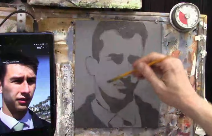
In this portrait exercise, a young man wearing a shirt and tie is painted using strong overhead lighting, bold cast shadows, and an alla prima approach.
This type of time-limited painting is designed to improve efficiency, decision-making, and confidence. Instead of chasing perfection, attention is placed on what truly matters first: composition, values, and clear forms. Over time, these short studies help improve longer, more detailed portraits as well.
Throughout this lesson, the portrait is built from a pre-toned gray surface, using fluid acrylic paint and deliberate brushwork. Each stage builds logically on the previous one, allowing realism to emerge even within a tight time frame.
Why a 30-Minute Acrylic Portrait Study Works
A short portrait session forces simplification. Because time is limited, unnecessary details are avoided and visual priorities are clarified. As a result, the painter is encouraged to see the subject in terms of large shapes and value relationships rather than isolated features.
In addition, painting quickly helps reduce hesitation. Brushstrokes are placed with more confidence, and overworking is naturally minimized. Although the portrait could be developed further with additional layers, the study itself remains valuable as an exercise in observation and control.
Materials and Palette Setup
Before the timer is started, preparation is essential. An 8×10 canvas panel is pre-painted gray to establish a neutral mid-tone. This allows both lights and darks to be judged more accurately.
The acrylic palette includes:
- Ivory Black
- Raw Umber Dark
- Raw Sienna
- Burnt Sienna
- Phthalo Blue
- Ultramarine Blue
- Alizarine Crimson
- Napthol Red
- Organic Orange
- Indian Yellow
- Titanium White
Matte medium is also used to thin the paint without breaking down its binding strength. Because fluid paint moves more easily across the surface, transitions can be created faster and with less effort.
Blocking in the Composition
The first stage of the painting is focused on placement and proportion. Using raw umber dark mixed with matte medium, the head, shoulders, collar, and tie are loosely sketched in. The paint is kept translucent so adjustments can be made easily.
Rather than outlining every feature, the major angles of the face are indicated with short, choppy strokes. The top of the head is intentionally cropped to create a stronger, more modern composition. Throughout this stage, accuracy is approached with flexibility. Precision is not the goal yet. Clarity is.
Special attention is given to eye placement. Because eyes are often placed too high by beginners, they are positioned near the center of the head. This simple correction helps maintain believable proportions from the start.
Establishing the Darkest Values
Once the composition is set, the darkest shadow shapes are blocked in. A mixture of raw umber dark, ivory black, and titanium white is used to create a deep shadow tone. This value is darker than the background, allowing the face to stand out clearly.
These shadows are applied under the brow ridge, along the nose, beneath the eyes, and across the neck. The same color is also used to block in the hair and jacket, keeping the palette unified and efficient.
At this stage, detail is intentionally avoided. The focus remains on grouping shadows into simple, readable shapes. By doing so, the structure of the face begins to emerge naturally.
Adding Variation to the Shadows
To prevent the dark areas from appearing flat, a small amount of ultramarine blue is introduced into the shadow mixture. This subtle shift adds depth and visual interest, especially in the clothing.
Shadows beneath the collar and along the jacket are reinforced, while edges are softened where light gradually transitions into form. Because the paint remains fluid, these blends are achieved quickly without excessive brushing.
Developing the Midtones of the Skin
With the shadows established, attention is turned to the midtones. A flesh tone is mixed using titanium white, raw sienna, burnt sienna, and a small amount of organic orange. This mixture becomes the primary skin color used across the face.
The mid-tone is applied broadly, carefully painted around the shadow shapes rather than over them. Although the background is dark, sufficient opacity is achieved by adjusting the paint mixture and brush pressure.
To indicate form, a slightly darker mid-tone is mixed by adding raw umber dark. This variation is used along the right side of the face and lower planes, where light naturally falls off. These subtle shifts help create a sense of volume without slowing down the process.
Blending Shadows into Midtones
Where shadows meet mid-tones, a transition color is created by mixing the two together. This blended tone is applied along the jawline, cheeks, and lower face, softening edges and increasing realism.
Because acrylics dry quickly, this blending is done efficiently. Rather than chasing perfect gradients, edges are adjusted just enough to suggest form. As a result, the portrait remains fresh and expressive.
Painting the Ear and Facial Accents
The ear is treated with warmer color notes to add life to the portrait. Organic orange and burnt sienna are introduced into the mid-tone mixture, creating a subtle reddish hue. This warmth contrasts nicely with the cooler shadows nearby.
A lighter value is added to the top of the ear to suggest reflected light. Similar warm tones are then used for the lips, tying the facial accents together chromatically.
Although these details are minor, they play an important role in making the portrait feel believable.
Finishing Touches Within the Time Limit
As the timer approaches its end, only essential adjustments are made. Values are checked, edges are clarified, and any overly sharp lines are softened. No attempt is made to refine every feature.
This restraint is intentional. The purpose of a 30-minute portrait is not completeness, but growth. Each study builds skills that carry over into longer, more polished work.
Tips and Techniques for Faster Portrait Painting
- Paint from dark to light to establish structure quickly
- Keep paint fluid using water and matte medium
- Focus on large shapes before small details
- Limit your palette to maintain harmony
- Use short studies to improve efficiency
- Avoid overworking transitions
- Accept imperfection as part of the exercise
Frequently Asked Questions
What is a 30-minute acrylic portrait study?
A 30-minute acrylic portrait study is a timed painting exercise focused on capturing strong values, proportions, and lighting rather than finishing fine details. It is used to improve speed, confidence, and decision-making.
Is alla prima painting suitable for acrylic portraits?
Alla prima painting works well with acrylics when paint is kept fluid and decisions are made quickly. Because layers are applied wet-on-wet, forms are established efficiently.
Why is a gray background used for this portrait?
A gray-toned surface helps both light and dark values stand out more clearly. It allows mid-tones to be judged accurately and speeds up the painting process.
How do you keep acrylic paint workable during fast studies?
Acrylic paint is kept workable by using water, matte medium, and frequent misting of the palette. This prevents the paint from drying too quickly and allows smoother transitions.
What is the most important focus in a 30-minute portrait?
The most important focus is value accuracy. When lights and shadows are placed correctly, likeness and realism are naturally improved, even with minimal detail.
Can this portrait be developed further after 30 minutes?
Yes, the study can be built upon with additional layers, glazing, and refinement. However, it is often best left as-is to preserve freshness and evaluate learning progress.
Are short portrait studies helpful for beginners?
Short portrait studies are very helpful for beginners because they reduce pressure and encourage consistent practice. Over time, efficiency and confidence are strengthened.
Conclusion
Painting a young man with a tie in 30 minutes is a valuable exercise in observation, control, and confidence. By simplifying shapes, prioritizing values, and working with intention, a convincing likeness can be achieved even in a short time.
Although the portrait can be developed further with additional layers, the study itself stands as a powerful learning tool. When practiced consistently, these quick acrylic portraits lead to stronger, more decisive painting in every future project.
- How to Paint Foliage Using the Acrylic Glazing Technique
- How to Trace for an Accurate Portrait Sketch
- How to Paint Realistic Eyes in Your Acrylic Portrait
- How to Add Raw Umber Dark & Ultramarine Blue to Your Portrait
- How to Make Your Own Raw Umber Dark
- How to Paint Realistic Trees & Grass in Your Acrylic
- How to Block In Skin Tone Values Using Glazing Technique
- How to Paint Vibrant Reds in Your Acrylic Portrait
- How to Glaze Background Colors & More Acrylic Portrait
- How to Paint White Clothing in Your Acrylic Portrait
- How to Easily Transition from a Sketch to a Painting
- How to Block In Shading & Skin Tones in Your Acrylic
- How to Build Up Color on Acrylic Pet Portrait
- How to Build Up Form on Clothing with Acrylic
- How to Paint Dark Clothing Using Acrylic Glazing Technique
- How to Paint a 24 x 30 Acrylic With 30 People
- How to Do Smooth Shading with Acrylic
- How to Sketch an Acrylic Portrait with a Grid
Read more about how to paint a portrait that you can surely be proud of!
I’d love to hear your thoughts on this video. Please share it with your friends and family. Let me know if you have any further questions. I’ll greatly help you.
If you’d like to learn more, sign up for my free email tips and video class today.
Learn How to Paint Acrylic Portraits With My Free Mini-Video Course!Thank you so much for taking the time to read this tutorial and watch the video. That means a lot to me. I hope you find it very helpful in your portrait painting.
Yours for Better Portraits,
P.S. Did you find this post helpful or encouraging? If so, send it in ahead! Let others know with the share buttons below. I’d love to hear your comments. Thank you so much! Also, do you have a question on acrylic portrait painting you’d like answered? Let me know, and I’d be happy to help!

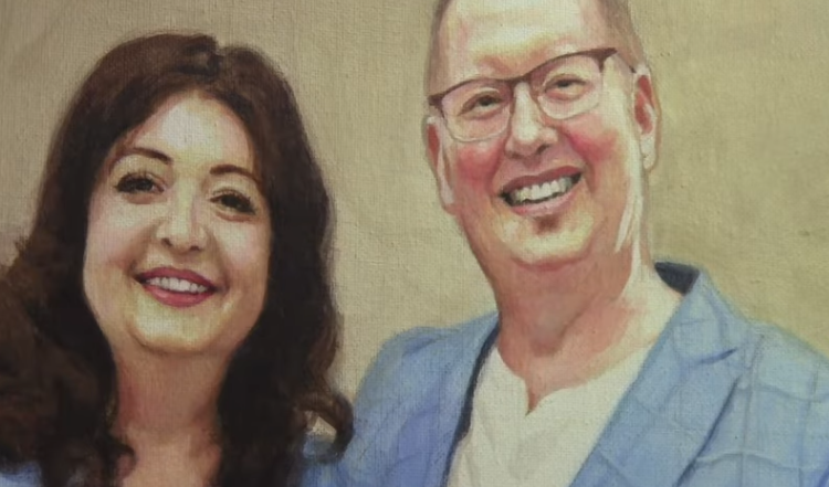
Learn How to Finish your Portrait with Glazing Technique
A step-by-step breakdown of subtle glazing, final adjustments, and professional finishing touches that bring an acrylic portrait to life.
Finishing an acrylic portrait is often where a painting either comes together or falls flat. At this stage, the drawing is already established, the values are mostly correct, and the likeness is present. However, realism is still refined through subtle decisions. This is where the glazing technique becomes essential.
In this lesson, the final stage of a 16 x 20 acrylic portrait of a couple is demonstrated. Rather than making major changes, the focus is placed on small adjustments. These adjustments include nuanced shading, softened transitions, and carefully placed highlights. Through glazing, depth is increased without overpowering the work that has already been done.
What follows is a detailed breakdown of how an acrylic portrait can be finished using controlled glazes, intentional color choices, and thoughtful final touches.
Understanding the Role of Glazing Technique in the Final Stage
Glazing is the process of applying thin, semi-transparent layers of paint over dry areas. In acrylic portrait painting, this method allows color and value to be adjusted gradually. Because the underlying layers remain visible, the portrait retains its structure while gaining richness and realism.
At the finishing stage, glazing is not used to repaint forms. Instead, it is used to enhance them. Shadows are deepened slightly. Warmth is added where skin meets hair. Highlights are refined so forms appear more dimensional. As a result, the portrait begins to feel cohesive rather than pieced together.
It should be noted that restraint is critical. Each glaze is applied lightly, then evaluated. Because acrylics dry quickly, changes can be made efficiently, but overworking must be avoided.
Palette Setup and Color Selection
Before any finishing work is done, the palette is prepared with a consistent set of colors. This consistency ensures harmony across the portrait.
The colors used include:
- Raw Umber Dark
- Burnt Sienna
- Raw Sienna
- Phthalo Blue
- Ultramarine Blue
- Alizarine Crimson
- Natural Red
- Organic Orange
- Indian Yellow
- Titanium White
These colors allow for a wide range of skin tones, warm shadows, and cool accents. Throughout the finishing process, small variations of these colors are mixed rather than introducing new pigments. Because of this, the portrait maintains visual unity.
Refining Forehead and Temple Shadows
One of the first areas addressed is the forehead and temple. At this stage, the values are already correct, but they can be strengthened subtly.
A semi-opaque glaze is mixed using raw umber dark, burnt sienna, and a touch of titanium white. This mixture is applied lightly near the temple and along the side of the forehead. The goal is not to darken dramatically, but to suggest form and depth.
Additionally, warmth is introduced beneath the hairline using organic orange, Indian yellow, and titanium white. This step is especially important. When hair meets skin, a shadow is naturally cast. Without this transition, the hair can appear pasted onto the head.
By glazing warm tones under the hairline, a believable shadow is created. As a result, the hair appears to sit naturally on the skull rather than float above it.
Creating Transitions Along the Jaw and Neck
Next, attention is given to the jawline, neck, and upper chest area. These transitions are often overlooked, yet they play a major role in realism.
A thin glaze is applied along the edge of the jaw to soften the transition between light and shadow. This helps define the structure of the face while keeping the edge from looking too sharp.
Similarly, light shading is added to the neck and upper chest. Because the head casts a shadow downward, this area benefits from a gentle darkening. The glaze is blended carefully so no harsh lines remain.
Through these adjustments, the head appears more convincingly connected to the body.
Subtle Shading on Hands and Fingers with Glazing Technique
The hands are treated with the same care as the face. Light shading is added to the fingers using thin glazes. Rather than outlining forms, shadows are suggested with gradual value shifts.
These glazes are blended softly, allowing the underlying paint to show through. As a result, the hands retain a natural look without appearing overworked.
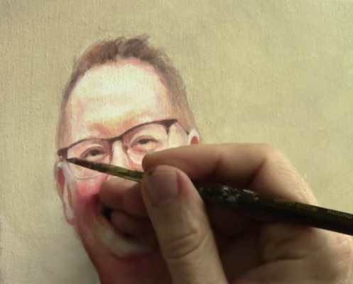
Refining Facial Features on the Second Subject using Glazing Technique
For the second figure, attention is focused on blending skin tones and enhancing projection.
A small amount of shading is added beneath the lower lip. This creates the illusion that the chin projects forward. Without this shadow, the face can appear flat. Titanium white and raw sienna are primarily used, allowing for subtle control.
Once the shadows are adjusted, highlights are refined. Titanium white mixed with a touch of Indian yellow is applied sparingly to the nose, cheek, and chin. These highlights are kept small. Because of this, they enhance form rather than distract from it.
Each highlight is placed with intention, then blended gently at the edges.
Enhancing Highlights on the Male Portrait
The male subject receives similar treatment. Highlights are added to the nose and forehead to increase dimensional. Again, restraint is emphasized. Only a small amount of paint is needed.
Additional warmth is introduced to the ear using organic orange mixed with titanium white. This combination creates a natural pink tone that works well for ears in many cases.
The ear is then refined with both highlights and shadows. Titanium white is added to the lower lobe, while darker tones are used sparingly to increase contrast. These adjustments help the ear sit naturally within the head.
Increasing Contrast Around Facial Details
As the portrait nears completion, contrast is selectively increased.
The glasses frame is darkened slightly using raw umber dark and alizarine crimson. Because, this helps separate the glasses from the face without overpowering the surrounding areas.
The small gap between the teeth and the mouth is filled in using a darker mixture of raw umber dark, ultramarine blue, and natural red. This area is intentionally kept dark. Because of this, the mouth appears more defined and realistic.
Additional contrast is added around the eyes and nostrils. These dark accents are blended outward so they transition smoothly into surrounding skin tones.
Adjusting Shadows Around the Nose and Glasses
A thin glaze of burnt sienna is applied beneath the nostril and blended downward. Because, this subtle adjustment helps the nose feel more three-dimensional.
Shading is also added beneath the glasses frame where it meets the hair and ear. This small detail adds realism by suggesting contact and cast shadow. Even though it is a minor adjustment, it has a noticeable impact.
Final Clothing and Background Touch-Ups
Before signing the painting, small touch-ups are addressed. A missing area in the dress is filled using ultramarine blue, alizarine crimson, and a touch of phthalo blue. The value is adjusted carefully so it matches the surrounding fabric.
Titanium white is added gradually to lighten the area until it blends seamlessly. Any small splotches or inconsistencies are corrected at this stage.
Because these changes are minor, they are handled quickly and with confidence.
Signing the Acrylic Portrait
The final step is signing the painting. A color similar to the background is mixed using raw umber dark and a touch of titanium white. This ensures the signature is visible without drawing unnecessary attention.
A small round brush is used, and the signature is placed in the lower right corner. If visual weight had been present in that area, the signature would have been moved. In this case, the right corner provides balance.
The full name is signed clearly, completing the painting.
Tips and Techniques for Finishing Acrylic Portraits with Glazing
- Thin glazes should be used rather than thick paint
- Warm tones under hairlines create natural shadows
- Highlights should be small and intentional
- Contrast should be increased selectively
- Transitions matter more than sharp edges
- Final details should enhance, not distract
- The signature color should relate to the background
Final Thoughts
Finishing an acrylic portrait using the glazing technique is about refinement rather than reinvention. At this stage, the painting already works. What glazing allows is control. Control over warmth, depth, transitions, and focus.
Through thin, intentional layers, realism is increased without losing freshness. Shadows are softened. Highlights are clarified. Edges are unified. As a result, the portrait feels cohesive and resolved rather than overworked.
When restraint is practiced and each adjustment is evaluated before moving forward, glazing becomes one of the most powerful tools in acrylic portrait painting.
Frequently Asked Questions
What is the glazing technique in acrylic portrait painting?
The glazing technique is the process of applying thin, semi-transparent layers of acrylic paint over dry paint to refine color, depth, and realism without covering underlying details.
When should glazing be used in an acrylic portrait?
Glazing should be used during the final stages of an acrylic portrait, after the drawing, values, and base colors are already established.
Why do acrylic portraits still look flat after glazing?
A portrait can look flat when contrast is too even, highlights are too broad, or shadows are not selectively deepened around key features like the eyes, nose, and mouth.
How thin should an acrylic glaze be?
An acrylic glaze should be thin enough that the paint underneath is clearly visible, with the glaze adjusting tone rather than covering the surface.
Can glazing fix mistakes in an acrylic portrait?
Glazing can correct minor issues such as uneven skin tones or harsh transitions, but it cannot fix major drawing or proportion errors.
What colors are best for glazing skin tones?
Earth tones such as raw umber, burnt sienna, raw sienna, and alizarine crimson are ideal for glazing skin tones, with warm accents added sparingly.
How do you avoid overworking when glazing?
Overworking is avoided by applying one glaze at a time, letting it dry, and reassessing before making additional changes.
Should highlights be glazed or painted opaquely?
Highlights are usually applied more opaquely at the end of the process and should be kept small and intentional.
Where should you sign an acrylic portrait?
An acrylic portrait is usually signed in a low-visual-weight corner using a color that relates to the background.
Is the glazing technique good for beginners?
Yes, glazing is beginner-friendly because it allows gradual adjustments and builds realism without aggressive repainting.
If you want to go deeper into glazing, skin tones, and realistic portrait techniques, more step-by-step training is available.
On realisticacrylic.com, you will find:
- In-depth video tutorials
- Free acrylic portrait classes
- Structured lessons for all skill levels
- Proven techniques for realism and control
Also, these resources are designed to help you paint with confidence and finish your portraits with clarity and intention.
Explore the full library of tutorials and continue building your skills at realisticacrylic.com.
- How to Paint Foliage Using the Acrylic Glazing Technique
- How to Trace for an Accurate Portrait Sketch
- How to Paint Realistic Eyes in Your Acrylic Portrait
- How to Add Raw Umber Dark & Ultramarine Blue to Your Portrait
- How to Make Your Own Raw Umber Dark
- How to Paint Realistic Trees & Grass in Your Acrylic
- How to Block In Skin Tone Values Using Glazing Technique
- How to Paint Vibrant Reds in Your Acrylic Portrait
- How to Glaze Background Colors & More Acrylic Portrait
- How to Paint White Clothing in Your Acrylic Portrait
- How to Easily Transition from a Sketch to a Painting
- How to Block In Shading & Skin Tones in Your Acrylic
- How to Build Up Color on Acrylic Pet Portrait
- How to Build Up Form on Clothing with Acrylic
- How to Paint Dark Clothing Using Acrylic Glazing Technique
- How to Paint a 24 x 30 Acrylic With 30 People
- How to Do Smooth Shading with Acrylic
- How to Sketch an Acrylic Portrait with a Grid
Read more about how to paint a portrait that you can surely be proud of!
I’d love to hear your thoughts on this video. Please share it with your friends and family. Let me know if you have any further questions. I’ll greatly help you.
If you’d like to learn more, sign up for my free email tips and video class today.
Learn How to Paint Acrylic Portraits With My Free Mini-Video Course!Thank you so much for taking the time to read this tutorial and watch the video. That means a lot to me. I hope you find it very helpful in your portrait painting.
Yours for Better Portraits,
P.S. Did you find this post helpful or encouraging? If so, send it in ahead! Let others know with the share buttons below. I’d love to hear your comments. Thank you so much! Also, do you have a question on acrylic portrait painting you’d like answered? Let me know, and I’d be happy to help!

How to Paint Vibrant Foliage an Garden Scene Using Glazing Techniques
Discover how to build rich color, depth, and contrast in your acrylic painting by layering glazes in a serene Garden of Eden scene.
In this step-by-step tutorial, you’ll learn how to add color, detail, and life to your acrylic portrait using the glazing technique. I’ll share how I progresses on his Garden of Eden book illustration featuring Adam and Eve, by painting lush foliage and vibrant skin tones. Acrylic glazing allows color to be built up in translucent layers, preserving the integrity of your sketch while gradually introducing depth, vibrance, and texture.
You’ll follow a real-time demonstration where dark tonal values are layered to suggest depth in the canopy above, and vibrant green hues are blended to bring leaves and floral elements to life all while keeping your values in balance and your details subtle yet intentional.
Why Acrylic Glazing Works for Layering Foliage
Acrylic glazing is a powerful technique for artists seeking to enhance contrast without sacrificing detail. By applying multiple translucent layers of paint, light can pass through and reflect back, creating a natural luminosity in the foliage.
Benefits of this technique include:
- Gradual color build-up for smooth transitions
- Preservation of sketch details
- Greater control over tone, hue, and opacity
- Realistic light and shadow effects
Painting Foliage with Glazing: Step-by-Step Process
1. Mixing Rich, Deep Colors
To begin building contrast in the upper foliage, a mix of raw umber dark, ultramarine blue, and Indian yellow is used. Phthalo blue is added with caution due to its strength. A touch of raw sienna is introduced to increase opacity without dulling the tone, avoiding the flattening effect of titanium white.
Tip: Use raw sienna for opacity without sacrificing vibrancy. White can desaturate your color if used excessively.
2. Blocking in the Canopy
A round brush is applied with heavier pressure to scrub pigment into the upper areas of the composition. Shapes are kept abstract at first this helps set the foundational values before defining the leaf forms later.
Technique Highlight: Holding the brush perpendicular to the surface allows better coverage and helps establish tonal blocks efficiently.
3. Adding Mid-tones and Highlights
To create vibrancy, I mix phthalo blue, a strong yellow, and a touch of white. These colors are layered over the darker base to suggest where sunlight might pass through leaves.
Tip: Glaze with vibrant colors but neutralize as needed using Indian yellow or muted tones if the result is too intense.
4. Enhancing Leaf Definition
At this stage, a smaller brush is used to create more refined leaf shapes. However, forms remain somewhat abstract to allow flexibility for later adjustments. Patterns are introduced gradually to suggest light filtering through the branches.
5. Balancing the Foreground and Background
Foreground foliage is balanced with cooler greens and deeper shadows. The same color mixtures are echoed throughout the scene to keep harmony in the palette.
Technique Note: Glazes can be applied later to unify saturation or adjust the warmth and coolness across the painting.
What You’ll Learn from This Tutorial
- How to build contrast using deep tones and glazes
- How to layer colors for natural foliage vibrancy
- How to control opacity without overusing white
- How to balance abstract and defined shapes
- How to work with strong pigments like Phthalo Blue
Painting the Garden of Eden scene using the acrylic glazing technique allows for beauty and spirituality to merge on the canvas. Each layer tells a story. Each hue adds depth. Each highlight reveals a divine narrative.
By blocking in shadows and adding vibrant leaf patterns, you are not just painting a background you’re building atmosphere, emotion, and connection between the viewer and the scene.
If this process inspired you, be sure to subscribe for more tutorials, download free guides, and join the community of artists growing their skills with every brushstroke.
FAQs
❓What is the glazing technique in acrylic painting?
Acrylic glazing involves applying thin, transparent layers of paint over a dry base layer. This technique helps in building up color slowly while preserving underlying detail.
❓Why avoid using too much white in foliage?
Too much white can flatten your colors, making them appear chalky. Instead, use raw sienna to increase opacity while keeping hues rich.
❓Can you use this method for other elements like skin tones?
Absolutely. The same glazing principles apply when working on skin tones, flowers, or even fabric—making the painting feel cohesive and luminous.
❓What brush is best for glazing?
A round brush works well for smaller areas, while a flat brush can be used to cover broader sections. Soft synthetic brushes are recommended to prevent visible streaks.
- How to Paint Foliage Using the Acrylic Glazing Technique
- How to Trace for an Accurate Portrait Sketch
- How to Paint Realistic Eyes in Your Acrylic Portrait
- How to Add Raw Umber Dark & Ultramarine Blue to Your Portrait
- How to Make Your Own Raw Umber Dark
- How to Paint Realistic Trees & Grass in Your Acrylic
- How to Block In Skin Tone Values Using Glazing Technique
- How to Paint Vibrant Reds in Your Acrylic Portrait
- How to Glaze Background Colors & More Acrylic Portrait
- How to Paint White Clothing in Your Acrylic Portrait
- How to Easily Transition from a Sketch to a Painting
- How to Block In Shading & Skin Tones in Your Acrylic
- How to Build Up Color on Acrylic Pet Portrait
- How to Build Up Form on Clothing with Acrylic
- How to Paint Dark Clothing Using Acrylic Glazing Technique
- How to Paint a 24 x 30 Acrylic With 30 People
- How to Do Smooth Shading with Acrylic
- How to Sketch an Acrylic Portrait with a Grid
Read more about how to paint a portrait that you can surely be proud of!
I’d love to hear your thoughts on this video. Please share it with your friends and family. Let me know if you have any further questions. I’ll greatly help you.
If you’d like to learn more, sign up for my free email tips and video class today.
Learn How to Paint Acrylic Portraits With My Free Mini-Video Course!Thank you so much for taking the time to read this tutorial and watch the video. That means a lot to me. I hope you find it very helpful in your portrait painting.
Yours for Better Portraits,
P.S. Did you find this post helpful or encouraging? If so, send it in ahead! Let others know with the share buttons below. I’d love to hear your comments. Thank you so much! Also, do you have a question on acrylic portrait painting you’d like answered? Let me know, and I’d be happy to help!

How to Add Color Glazes to Black & White Grisaille
Bring vibrant life into your acrylic portraits with the subtle power of glazing over grisaille
The Secret Behind Lifelike Acrylic Portraits
Many artists struggle with making their acrylic portraits look realistic and full of life. Often, the colors appear flat, and the transitions seem abrupt. The solution? A powerful classical technique known as glazing over grisaille.
This tutorial will guide you step-by-step on how to add color glazes to a black and white grisaille acrylic painting just like the Old Masters did. By building transparent color layers over a monochrome underpainting, you can achieve stunning vibrancy, depth, and realism.
What Is Grisaille and Why Use It?
Grisaille is a monochromatic painting technique that uses only shades of gray to establish value, form, and lighting before color is applied. It acts as a detailed foundation that allows artists to focus solely on composition and contrast without the distraction of color.
When used with acrylic glazes, this technique offers control, precision, and flexibility. Because each color glaze is transparent, the values underneath shine through, preserving your drawing while enriching it with color.
Tools & Materials You’ll Need
To get started, here are the basic materials required:
- Acrylic paints (Raw Umber Dark, Ultramarine Blue, Phthalo Blue, Alizarine Crimson, Raw Sienna, Titanium White)
- Matte medium or glazing medium
- Flat and round synthetic brushes
- A black-and-white grisaille painting (prepared ahead)
- Water container and palette
Step-by-Step: How to Add Color Glazes to Your Grisaille Painting
Step 1: Understand the Glazing Medium
A clear matte medium is mixed with small amounts of acrylic paint. This makes the paint transparent and allows it to be layered gently over the grisaille without obscuring details.
Tip: The more medium you use, the more transparent the glaze becomes.
Step 2: Start with the Foreground
Using raw umber dark mixed with raw sienna and matte medium, apply the first glaze to the foreground. This introduces warm earth tones and begins building a sense of depth.
Technique: Use broad, smooth brush strokes and build up layers slowly. Allow each layer to dry before adding another.
Step 3: Add Depth to the Background
Cool tones like ultramarine blue and raw umber are mixed to create a grayish-blue color for the distant mountains and sky. A touch of white is added to soften the transition.
Apply these glazes in multiple layers, adjusting the hue slightly to reflect atmospheric perspective. This subtle shift helps push the background back and brings your subjects forward.
Step 4: Introduce Color to Clothing and Figures
George Washington’s jacket, for example, is painted using a mix of ultramarine blue, phthalo blue, alizarine crimson, and raw umber dark. Apply thin layers, observing how the underlying grayscale defines shadows and highlights.
Tip: Avoid painting over insignias or fine uniform details. Glazes should enhance not hide the line work beneath.
Step 5: Gradually Build Up Layers
It was noted in the video that it may take many layers to achieve a rich, dimensional color. Patience is key. Each glaze builds upon the previous one, creating a luminous effect.
Remember, this process is about refinement. You don’t need to achieve full color saturation in one pass.
Tips & Techniques for Successful Glazing
- Let each layer dry completely before adding another to prevent muddy colors.
- Keep brushes clean and damp to ensure smooth blending.
- Work from dark to light when building glazes to maintain tonal structure.
- Mix cool and warm tones to create more visual interest and realistic lighting.
- Use less paint and more medium for better transparency.
- Avoid overworking one area, which could disturb the grisaille underneath.
Why Use Glazing Instead of Opaque Painting?
Glazing is ideal for artists who want to:
- Maintain the original drawing and detail.
- Add richness without repainting the entire area.
- Control the intensity and temperature of the colors.
- Create subtle transitions and atmospheric effects.
Although acrylics are known for being opaque, this method shows how they can behave more like oils with stunning results.
Why This Technique Matters
By learning how to add color glazes to your black and white grisaille, you’re unlocking a timeless method used by the Old Masters, now made accessible with acrylics. You no longer have to struggle with blending or losing detail. With each translucent layer, your portrait gains life, depth, and expression.
You can paint confidently, knowing that every step enhances what you’ve already built.
Frequently Asked Questions (FAQ)
Q: What is the best medium to use for acrylic glazing?
A: A clear matte medium or glazing medium is recommended. It increases transparency and flow while maintaining the integrity of your underlying layers.
Q: Can I glaze over any acrylic painting?
A: Yes, but the best results come from starting with a value-based grisaille painting. This ensures you have a strong tonal foundation for your glazes to sit on.
Q: How long should I wait between glaze layers?
A: Typically, 15-30 minutes depending on the thickness of your glaze and humidity. Ensure it is completely dry before layering.
Q: Will glazing make my painting shiny?
A: Not necessarily. Using a matte medium helps keep the surface flat. You can adjust gloss levels by varnishing the finished piece with a matte or satin finish.
Q: Is this technique beginner-friendly?
A: Absolutely. As long as you start with a solid black-and-white painting, color glazing can be a simple and forgiving way to explore acrylics.
LEARN MORE
- How to Paint Foliage Using the Acrylic Glazing Technique
- How to Trace for an Accurate Portrait Sketch
- How to Paint Realistic Eyes in Your Acrylic Portrait
- How to Add Raw Umber Dark & Ultramarine Blue to Your Portrait
- How to Make Your Own Raw Umber Dark
- How to Paint Realistic Trees & Grass in Your Acrylic
- How to Block In Skin Tone Values Using Glazing Technique
- How to Paint Vibrant Reds in Your Acrylic Portrait
- How to Glaze Background Colors & More Acrylic Portrait
- How to Paint White Clothing in Your Acrylic Portrait
- How to Easily Transition from a Sketch to a Painting
- How to Block In Shading & Skin Tones in Your Acrylic
- How to Build Up Color on Acrylic Pet Portrait
- How to Build Up Form on Clothing with Acrylic
- How to Paint Dark Clothing Using Acrylic Glazing Technique
- How to Paint a 24 x 30 Acrylic With 30 People
- How to Do Smooth Shading with Acrylic
- How to Sketch an Acrylic Portrait with a Grid
Read more about how to paint a portrait that you can surely be proud of!
I’d love to hear your thoughts on this video. Please share it with your friends and family. Let me know if you have any further questions. I’ll greatly help you.
If you’d like to learn more, sign up for my free email tips and video class today.
Learn How to Paint Acrylic Portraits With My Free Mini-Video Course!Thank you so much for taking the time to read this tutorial and watch the video. That means a lot to me. I hope you find it very helpful in your portrait painting.
Yours for Better Portraits,
P.S. Did you find this post helpful or encouraging? If so, send it in ahead! Let others know with the share buttons below. I’d love to hear your comments. Thank you so much! Also, do you have a question on acrylic portrait painting you’d like answered? Let me know, and I’d be happy to help!

How to Add Color Layers: Wordless Salvation Picture Book.
A personal and powerful project rooted in faith
This blog post is based on a deeply moving and creative video tutorial in which I guide you through the process of painting the first illustration for a wordless picture book about salvation. My wife originally conceptualized this project. The result is a heartfelt tribute to her vision of bringing to life the Garden of Eden with Adam, Eve, and symbolic elements like the lion, all in rich acrylic tones. This is more than just a painting tutorial; it’s a fusion of technique, symbolism, and faith.
Acrylic Painting of Adam and Eve in the Garden of Eden
In this 16×20 inch canvas, I begin with a sealed sketch of Adam and Eve in the lush Garden of Eden. The painting process involves layering transparent and opaque acrylic colors to build a visually engaging and symbolic scene. The process is broken down into the following key steps:
- Toning the canvas with a base green glaze using a mixture of phthalo blue, Indian yellow, and raw sienna.
- Building up layers with deeper glazes and later adding opaque highlights for form and detail.
- Creating contrast and structure with ultramarine blue, titanium white, azo yellow, and other hues.
- Focusing on depth and realism, using cool tones for distant foliage and warmer, darker tones for foreground and character details.
- Detail work with a small round brush for hair, lion’s features, shadows, and skin tones.
- Emphasizing light and value, especially on background lighting through tree canopies.
- Emotional and spiritual significance as the painting unfolds, driven by love, memory, and purpose.
Acrylic Techniques Used in the Painting
1. Toning the Canvas with a Green Glaze
To create a unified atmosphere:
- Use phthalo blue, Indian yellow, and raw sienna.
- Mix these with a clear matte medium.
- Apply with a large flat brush over the entire surface to tint it green.
- Let the first layer dry completely before adding a second for a richer color.
2. Deepening the Foliage with Glazes
To simulate depth in the leaves and trees:
- Add a touch of ultramarine blue for shadows.
- Build contrast slowly with thin, transparent layers.
- Focus on layering darker tones under leaves and around character silhouettes.
3. Adding Opaque Layers for Structure
To define shapes and build form:
- Mix titanium white with phthalo blue, ultramarine, and raw sienna.
- Use this blend for the canopy of leaves, working in lighter tones in the background for sunlight effects.
- Use smaller brushes for fine detail and tighter edges.
4. Creating Atmospheric Perspective
To push elements into the distance:
- Blend cooler blues with white for distant trees and foliage.
- Lighten tonal values in the background.
- Maintain warmer tones (like azo and Indian yellow) in the foreground to draw the eye forward.
Detailing the Characters: Adam, Eve, and the Lion
5. Layering Over Adam and Eve
Although the green tone covers them initially:
- Begin layering shadows and highlights using raw sienna and ultramarine blue.
- For skin tones, use organic orange glazes to warm and define.
- Gradually introduce more color as you develop depth.
6. Building the Lion’s Presence
To make the lion majestic yet integrated:
- Use raw umber dark, ultramarine blue, and touches of alizarine crimson.
- Add titanium white for more opaque contrast.
- Focus on facial features eyes, nose, and mane with a small round brush.
7. Blending and Balancing the Composition
Throughout the painting:
- Balance shadows and highlights across the canvas.
- Adjust saturation and vibrancy using both transparent glazes and opaque strokes.
- Ensure Adam and Eve don’t get lost in the background by adding contrast and tonal variety.
Spiritual Reflections on the Painting Process
This artwork isn’t just about technique it’s a tribute. The artist honors his wife’s concept of a wordless gospel message a children’s book that could explain salvation without a single written word. Through visual storytelling, symbolism, and color, this first illustration sets the stage for a divine narrative.
“Even though she passed away, I want to take what she did in the past and bring it to life.”
Why This Technique Matters for Christian Illustration
- Glazing creates soft transitions, ideal for symbolic scenes.
- Layering communicates visual depth mirroring spiritual truths.
- Opaque details allow focus on expression, character, and emotion.
- Color theory helps you tell a story without words vital for wordless narratives.
Tools and Materials Used
- Canvas Size: 16×20 inches
- Brushes: Large flat for washes, small round for detail
- Medium: Clear matte medium for glazes
- Paints Used:
- Phthalo Blue
- Indian Yellow
- Raw Sienna
- Ultramarine Blue
- Titanium White
- Raw Umber Dark
- Azo Yellow
- Organic Orange
- Alizarine Crimson
Honoring Legacy Through Art
This project, born from our heart and faith, that shows how art can tell powerful stories without a single word. By blending technique, symbolism, and faith, I was able to bring a timeless truth to life on canvas.
If you’re passionate about Christian storytelling through art or want to master acrylic portrait and illustration techniques, follow along as this beautiful project unfolds.
Ready to Start Your Own Inspirational Painting?
Learn how to master the glazing technique, build a portfolio of faith-based art, and express your God-given creativity through brush and canvas.
LEARN MORE
- Sketching Your Painting Accurately
- Beginning a Pet Portrait in Acrylic
- The Mystery of Realism in Painting
- Apply A Burnt Sienna Glaze to a Portrait
- Learn How to Sketch a Portrait Freehand in 45 Minutes
- Adding highlights to your acrylic painting
- 5 Excellent Reasons to Use Aluminum Foil
- Paint Realistic Wrinkles in Acrylic
- Painting Clothing in an Acrylic Portrait
- Paint a Cloudy Sky Acrylic
- How to add Semi-Opaque Highlights
- How to Enhance the Contrast in Your Acrylic
- How to Add Glaze to Your Acrylic Painting
- Paint Realistic Reflections on Eyeglasses in an Acrylic Portrait
- Build Up Depth on Your Acrylic Portrait Backgrounds
- How Do You Do Layers With the Glazing Technique?
- Learn How to Paint Wrinkles in Acrylic
Read more about how to paint a portrait that you can surely be proud of!
I’d love to hear your thoughts on this video. Please share it with your friends and family. Let me know if you have any further questions. I’ll greatly help you.
If you’d like to learn more, sign up for my free email tips and video class today.
Learn How to Paint Acrylic Portraits With My Free Mini-Video Course!Thank you so much for taking the time to read this tutorial and watch the video. That means a lot to me. I hope you find it very helpful in your portrait painting.
Yours for Better Portraits,
P.S. Did you find this post helpful or encouraging? If so, send it in ahead! Let others know with the share buttons below. I’d love to hear your comments. Thank you so much! Also, do you have a question on acrylic portrait painting you’d like answered? Let me know, and I’d be happy to help!

How to Paint a Tiny Face in Acrylic
Master the art of small-scale portrait painting with acrylics
Painting a small-scale face in acrylic can be a challenging yet rewarding experience. The limited space requires careful brush control, accurate proportions, and subtle color transitions. Whether you’re working on a miniature portrait or adding a small face to a larger composition, understanding how to paint a tiny face effectively will enhance your skills.
In this guide, we’ll explore essential techniques such as layering, tonal contrast, and light source placement. You’ll also learn tips to avoid over-detailing, ensuring a balanced and realistic final piece.
Step 1: Setting Up Your Colors and Palette
Before starting, it’s important to prepare your color palette. A well-mixed selection of hues will help create natural skin tones and smooth transitions.
Key Colors to Use:
✔ Titanium White – For highlights and softening edges
✔ Raw Umber Dark – For shadows and depth
✔ Alizarin Crimson – Adds warmth to the skin tone
✔ Burnt Sienna – Creates realistic mid-tones
✔ Matte Medium – Helps control opacity and blending
Mixing the Right Tones:
- Combine Titanium White and Raw Umber Dark for neutral shadows.
- Add a touch of Alizarine Crimson to introduce warmth.
- Use Matte Medium to adjust opacity for subtle layering.
Step 2: Understanding Light and Shadow
Proper lighting is crucial when painting a small face. A tiny shift in tone can greatly affect the realism of the portrait.
Primary Light Source:
- The main light, such as sunlight, creates warm highlights.
- Positioned to illuminate the face’s key features, enhancing depth.
Secondary Light Source:
- Often reflected from surrounding objects, such as the sky or nearby surfaces.
- Can introduce cool tones like light blue from a snowy environment.
By carefully balancing these light sources, you can create a realistic three-dimensional effect on the face.
Step 3: Sketching and Adjusting Proportions
A tiny face requires extra attention to proportion. Because of the small scale, even minor errors can become noticeable.
Tips for Proportional Accuracy:
✔ If the face is turned at a ¾ angle, the distance between the left eye and hairline is slightly greater than on the right.
✔ The nose should align naturally with the face’s tilt.
✔ Avoid over-detailing focus on shapes and tonal contrast rather than adding unnecessary fine lines.
Step 4: Blocking in Shadows and Defining Features
Now that proportions are set, begin by adding large blocks of shadow before refining details.
How to Paint Shadows Accurately:
- Start with a diluted mix of Raw Umber Dark and Matte Medium (30% opacity).
- Apply to shadowed areas, such as under the hat’s brim and along the jawline.
- Adjust the tone by adding Alizarine Crimson for a natural skin shadow.
- Use soft blending strokes to avoid harsh lines in smaller areas.
Step 5: Refining Details Without Overworking
Miniature painting requires a balance between precision and simplicity. Too much detail can make a tiny face look unnatural.
Techniques to Achieve Realism:
✔ Use a fine detail brush for subtle refinements, like defining the eyes and lips.
✔ Limit excessive highlights and shadows—too much contrast can make the face look overworked.
✔ Blend gradually using light glazes rather than thick paint applications.
Step 6: Final Adjustments and Enhancements
Before completing your painting, take a step back and observe your work. Small corrections can make a big difference in a tiny portrait.
Final Touches to Improve Realism:
- Adjust facial tones by layering thin glazes of Burnt Sienna for warmth.
- Soften harsh edges by gently blending transitional areas.
- Ensure light reflections in the eyes and highlights on the cheekbones for a lifelike effect.
Mastering how to paint a tiny face in acrylic requires patience, precision, and an understanding of light and shadow. By following these steps setting up the right colors, balancing light sources, maintaining proportions, and using soft layering techniques you can create a miniature portrait with striking realism.
Start practicing today, and soon, painting small faces will feel just as natural as working on larger portraits! 🎨
FAQ: How to Paint a Tiny Face in Acrylic
1. What type of brush is best for painting small faces?
A fine detail brush, such as a liner or round brush (size 0-2), allows for precision in small-scale details.
2. How do I prevent my tiny face from looking overworked?
Use minimal strokes and focus on tonal values rather than excessive detailing. Subtle blending is key.
3. How can I achieve smooth transitions in such a small space?
Thin glazes with Matte Medium help create seamless color shifts without overpowering the painting.
4. What’s the best way to fix mistakes on a tiny face?
Lightly dab with a clean, damp brush to lift excess paint before it dries. Avoid heavy corrections to maintain balance.
5. How do I make sure the proportions are correct?
Sketch lightly first and constantly step back to check alignment before committing to details.
LEARN MORE
- Sketching Your Painting Accurately
- Beginning a Pet Portrait in Acrylic
- The Mystery of Realism in Painting
- Apply A Burnt Sienna Glaze to a Portrait
- Learn How to Sketch a Portrait Freehand in 45 Minutes
- Adding highlights to your acrylic painting
- 5 Excellent Reasons to Use Aluminum Foil
- Paint Realistic Wrinkles in Acrylic
- Painting Clothing in an Acrylic Portrait
- Paint a Cloudy Sky Acrylic
- How to add Semi-Opaque Highlights
- How to Enhance the Contrast in Your Acrylic
- How to Add Glaze to Your Acrylic Painting
- Paint Realistic Reflections on Eyeglasses in an Acrylic Portrait
- Build Up Depth on Your Acrylic Portrait Backgrounds
- How Do You Do Layers With the Glazing Technique?
- Learn How to Paint Wrinkles in Acrylic
Read more about how to paint a portrait that you can surely be proud of!
I’d love to hear your thoughts on this video. Please share it with your friends and family. Let me know if you have any further questions. I’ll greatly help you.
If you’d like to learn more, sign up for my free email tips and video class today.
Learn How to Paint Acrylic Portraits With My Free Mini-Video Course!Thank you so much for taking the time to read this tutorial and watch the video. That means a lot to me. I hope you find it very helpful in your portrait painting.
Yours for Better Portraits,
P.S. Did you find this post helpful or encouraging? If so, send it in ahead! Let others know with the share buttons below. I’d love to hear your

2025 Winter Acrylic Painting Challenge, Lesson 8 Bringing Your Portrait Home
Master the final touches: Bring your acrylic portrait to life with precision and confidence
Congratulations! You’ve made it to the final stage of your acrylic portrait. This is where all the hard work comes together, and your painting truly comes to life. In Lesson 8: Bringing Your Portrait Home, we will focus on refining details, sharpening edges, and adding those final highlights that make your portrait stand out.
It’s tempting to keep working indefinitely, but knowing when to stop is just as important as knowing how to start. By the end of this lesson, you’ll feel confident that your painting is complete, ready to be signed, and displayed with pride.
Step 1: Assess Your Progress
Before making any final touches, take a step back and evaluate your portrait. Ask yourself:
✔ Are the proportions and facial features balanced?
✔ Is the contrast strong enough to create depth?
✔ Do the highlights and shadows define the form effectively?
✔ Are there any unresolved areas that need attention?
If you notice anything that feels off, now is the time to make minor adjustments.
Step 2: Refining Edges and Enhancing Contrast
One of the most effective ways to bring realism to your portrait is by sharpening edges and boosting contrast.
Techniques for Crisp Edges:
- Use a small round brush with slightly thinned paint for clean, sharp lines.
- Define important areas like the jawline, nose bridge, and lips with subtle refinements.
- Blur unnecessary details in background elements to enhance depth and focus.
Boosting Contrast for Depth:
- Deepen shadows with a mix of raw umber and alizarine crimson for warmth.
- Brighten highlights using titanium white with a touch of yellow ochre for natural skin tones.
- Adjust mid-tones to create smooth transitions between light and shadow.
These small changes will make a significant difference in the overall impact of your portrait.
Step 3: Adding Final Highlights
To make your portrait pop, strategic highlights should be applied.
Where to Place Highlights:
✔ The tip of the nose and cheekbones
✔ The upper eyelids and brow ridge
✔ The edges of the lips and chin
✔ The light-catching areas of clothing or accessories
Using a dry brush technique with minimal paint can help you create soft, natural highlights without overpowering the painting.
Step 4: Knowing When to Stop
It’s easy to overwork a painting, but at some point, you must decide it’s finished. A few signs that your portrait is complete:
✔ The main subject stands out against the background.
✔ The details are refined but not overly complicated.
✔ The colors and contrast look balanced.
✔ You feel satisfied when viewing your work from a distance.
If you can check off these points, it’s time to bring your portrait home and move on to the final step—signing your artwork!
Step 5: Signing Your Painting
A signature is the finishing touch that makes your work official.
Tips for Signing Your Acrylic Painting:
✔ Use a fine brush or acrylic paint pen for precision.
✔ Place your signature in a subtle but visible area (bottom right or left corner).
✔ Keep it small and unobtrusive so it does not distract from the portrait.
✔ Use a color that complements but contrasts slightly with the background.
Once signed, your painting is officially complete!
Celebrate Your Progress!
Completing a portrait is a huge achievement! Whether you’re keeping it for yourself, gifting it, or selling it, take a moment to appreciate your hard work.
If you’ve participated in the 2025 Winter Acrylic Painting Challenge, share your final piece with the community and celebrate your growth as an artist. Remember each finished portrait is a stepping stone to even greater artistic success.
📢 Did you enjoy this challenge? Sign up for the next one and keep improving your portrait painting skills! 🎨✨
FAQs: Bringing Your Portrait Home
1. How do I know when my painting is finished?
If the details, contrast, and composition feel balanced, and you no longer see major issues, it’s time to stop. Overworking a painting can reduce its realism.
2. Should I varnish my painting after finishing?
Yes! A protective varnish will enhance colors and provide longevity. Use a gloss, satin, or matte finish, depending on your preference.
3. How can I fix mistakes in the final stages?
For minor errors, gently layer paint over the area with a dry brush. If needed, use a soft wet cloth to lift fresh paint before it dries.
4. What’s the best way to display my finished portrait?
Frame your painting with a simple, elegant border or display it on a stretched canvas for a professional look.
2025 Winter Acrylic Portrait Painting Challenge Series
2025 Winter Acrylic Portrait Painting Challenge: Steps to Get Started
2025 Winter Acrylic Portrait Challenge Pre-Lesson: Gathering Your Supplies
2025 Winter Acrylic Portrait Challenge, Lesson 1: Prepping Your Canvas for the Portrait
2025 Winter Acrylic Painting Challenge, Lesson 2: Sketching Your Portrait Accurately
2025 Winter Acrylic Painting Challenge, Lesson 3: Sealing in Your Sketch
2025 Winter Acrylic Painting Challenge, Lesson 4: Beginning Your Portrait with Glazes
2025 Winter Acrylic Painting Challenge, Lesson 5: Building Up Color and Contrast
2025 Winter Acrylic Painting Challenge,Bonus Video: Increasing Contrast
2025 Winter Acrylic Painting Challenge, Lesson 6 Shading and Color Nuances
2025 Winter Acrylic Painting Challenge, Lesson 7 Creating Realism in Your Portrait
2025 Winter Acrylic Painting Challenge, BONUS Video:Adjusting Colors and Details

How to Prime Your Own Canvas
Master the art of priming for a flawless painting surface
Priming a canvas is a crucial step in preparing your painting surface. Whether you are working on a custom-sized canvas or looking for better quality than store-bought options, learning how to prime your own canvas will give you full control over your art materials. Without proper priming, paint can absorb unevenly, leading to unwanted textures and reduced longevity. In this guide, you’ll learn the best techniques for stretching, tightening, and applying gesso to your canvas, ensuring a professional-quality surface for your acrylic or oil paintings.
Step 1: Preparing Your Canvas
Before applying gesso, the canvas must be properly stretched and tightened. A loose canvas can cause sagging, making it difficult to work on.
How to Tighten Your Canvas:
- Spray or Brush with Water: Lightly mist the front and back of the canvas with water. As it dries, the fibers will contract, tightening the surface.
- Use Canvas Keys (Optional): If extra tension is needed, insert canvas keys into the corners and tap them gently with a mallet. These should be used as a last resort.
Ensuring that the canvas is tight before priming will create a sturdy and reliable painting surface.
Step 2: Choosing the Right Gesso
Acrylic gesso is the most common primer used for both acrylic and oil painting. Brands like Liquitex and Nova Color offer high-quality options. Gesso comes in different thicknesses, and the type you choose will impact the final texture of your canvas.
Why Use Gesso?
- Prevents paint from soaking into the canvas.
- Provides a smoother and more even painting surface.
- Improves the durability of your artwork.
Shake the gesso well before using it. This ensures that any settled pigments and binders are mixed evenly for a consistent application.
Step 3: Applying the First Layer of Gesso
The first layer of gesso is essential for sealing the raw canvas and preventing excessive paint absorption.
Materials Needed:
✔ Acrylic gesso
✔ 3-inch paintbrush or drywall taping knife
✔ Container for pouring gesso
How to Apply:
- Pour the gesso into a container, such as an empty yogurt cup.
- Load your brush with a generous amount of gesso.
- Apply in smooth, even strokes, working in one direction (either vertical or horizontal).
- Cover the entire canvas, ensuring even distribution.
- Allow it to dry completely before adding additional coats.
The drying time will vary depending on the thickness of the application and the surrounding humidity.
Step 4: Sanding and Additional Layers
To achieve a smoother painting surface, multiple layers of gesso are recommended.
Adding More Layers:
- Apply a second coat in the opposite direction of the first (if the first coat was vertical, apply the second coat horizontally).
- Lightly sand the surface between coats using fine-grit sandpaper for a polished finish.
- Repeat for a third or fourth coat if a smoother surface is desired.
Each layer enhances the texture and longevity of the canvas, making it ideal for detailed brushwork and blending.
Step 5: Letting the Canvas Cure
After the final coat of gesso, the canvas should be left to cure for at least 24 hours. This allows the primer to fully bond with the canvas fibers, ensuring a stable painting surface.
Tips & Techniques for a Perfectly Primed Canvas
✔ Use quality gesso to avoid cracking or peeling over time.
✔ Apply in thin layers for a more even and refined surface.
✔ Sand between coats to remove any brush strokes or ridges.
✔ Ensure proper drying time to prevent tackiness before painting.
✔ Work in a well-ventilated area to speed up drying and avoid inhaling fumes.
Learning how to prime your own canvas gives you complete control over your painting surface. Whether you’re working with acrylics or oils, a properly primed canvas ensures better paint application and a more durable artwork. With these simple steps, you can create a professional-quality foundation for your creative projects.
Are you ready to start your next masterpiece? Try priming your own canvas and see the difference! 🎨
FAQs About Priming a Canvas
1. Why is priming a canvas necessary?
Priming seals the canvas, preventing excessive paint absorption and improving durability. Without gesso, paint can soak into the fibers, leading to uneven textures and fading over time.
2. Can I use regular white paint instead of gesso?
No. Gesso contains specific binders that create an absorbent surface, whereas regular paint does not provide the same adhesion benefits.
3. How many coats of gesso should I apply?
Two to three coats are typically recommended. Additional layers can be added for a smoother surface.
4. Can I use a roller instead of a brush?
Yes, a roller can be used for a more even application, but a brush allows for better control, especially on stretched canvases.
5. How long should I wait before painting on a primed canvas?
It is best to wait at least 24 hours after the final coat of gesso has dried to ensure optimal adhesion.
- Sketching Your Painting Accurately
- Beginning a Pet Portrait in Acrylic
- The Mystery of Realism in Painting
- Apply A Burnt Sienna Glaze to a Portrait
- Learn How to Sketch a Portrait Freehand in 45 Minutes
- Adding highlights to your acrylic painting
- 5 Excellent Reasons to Use Aluminum Foil
- Paint Realistic Wrinkles in Acrylic
- Painting Clothing in an Acrylic Portrait
- Paint a Cloudy Sky Acrylic
- How to add Semi-Opaque Highlights
- How to Enhance the Contrast in Your Acrylic
- How to Add Glaze to Your Acrylic Painting
- Paint Realistic Reflections on Eyeglasses in an Acrylic Portrait
- Build Up Depth on Your Acrylic Portrait Backgrounds
- How Do You Do Layers With the Glazing Technique?
- Learn How to Paint Wrinkles in Acrylic
Read more about how to paint a portrait that you can surely be proud of!
I’d love to hear your thoughts on this video. Please share it with your friends and family. Let me know if you have any further questions. I’ll greatly help you.
If you’d like to learn more, sign up for my free email tips and video class today.
Learn How to Paint Acrylic Portraits With My Free Mini-Video Course!Thank you so much for taking the time to read this tutorial and watch the video. That means a lot to me. I hope you find it very helpful in your portrait painting.
Yours for Better Portraits,
P.S. Did you find this post helpful or encouraging? If so, send it in ahead! Let others know with the share buttons below. I’d love to hear your comments. Thank you so much! Also, do you have a question on acrylic portrait painting you’d like answered? Let me know, and I’d be happy to help!