- You are here:
- Home »
- Blog »
- Video Tutorial »
- Critique 3 Acrylic Portraits From My Painting Challenge!

Critique 3 Acrylic Portraits From My Painting Challenge!
Learn from my critique of three acrylic portrait paintings – key insights and practical tips for improving your portraits.
Welcome to another insightful painting critique session! In this blog post, we’ll dive into the world of acrylic portraiture by reviewing three submissions from my Acrylic Portrait Painting Challenge. These critiques offer a practical learning experience for artists looking to refine their portraits. Whether you’re struggling with details, skin tones, or lighting, this session is filled with tips that can help you elevate your work. Let’s explore these critique 3 acrylic portrait from my painting challenge and discover ways to improve accuracy, contrast, and overall realism in your portraits.
The Value of Critiquing Your Work
As artists, we can often hit a wall with our paintings. You may feel that something is “off” but struggle to identify what needs improvement. This is where having a professional critique can make all the difference. As a commissioned portrait artist with over 20 years of experience, I provide in-depth critiques for my students. In this session, I will review three selected paintings from the Acrylic Portrait Painting Challenge participants, offering constructive feedback and detailed guidance.
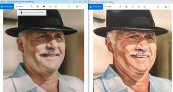
Portrait 1: Karen Campbell’s Portrait
The first critique features Karen Campbell’s painting. Karen has done an outstanding job capturing the likeness and form of the subject. Let’s break down her work and explore what works well, as well as areas that could use improvement. [Please watch the video below]
1.1 Composition and Form
One of the first things I examine in a critique is the composition and form. Karen’s composition is spot-on, largely due to her use of the grid technique. The spacing between the eyes, nose, and mouth is accurate, which gives her portrait a solid foundation. Always ensure that your subject fills the canvas appropriately and that proportions are in check.
1.2 Lighting and Contrast
Next, I assess the lighting. Good lighting is key to creating depth and dimensionality in a portrait. Karen’s portrait shows strong lighting with excellent contrast between darks and lights. However, there are some areas where the contrast is a bit too sharp, especially around the eyes and eyebrows. For example, the highlight on the upper eyelid is too bright, making it appear unnatural. The solution is to soften the contrast by glazing over the highlights using a mixture of burnt sienna, raw sienna, and alizarine crimson.
Tip: Use subtle gradations in value to avoid harsh lines between light and shadow. Glazing is an effective method to soften transitions.
1.3 Skin Tones and Texture
Karen has done a commendable job with skin tones. However, some areas are slightly overworked, making the texture appear too detailed. Realism in portrait painting often relies on suggesting detail rather than rendering every feature with precision. In this case, the wrinkles and shadows near the eyebrows are emphasized too much, making the portrait look harsher than the reference photo. A lighter touch with the brush, and more glazing to blend tones, would soften the portrait and give it a more natural appearance.
Technique: Glaze over exaggerated areas with raw umber mixed with titanium white and ultramarine blue to cool down overly warm tones and smooth out harsh transitions.
Portrait 2: Enhancing Realism with Subtle Adjustments
The second portrait brings attention to value transitions and color balance. The artist in this case struggled slightly with maintaining the subtleties of skin tone and light transitions. [Please watch the video below]
2.1 Adjusting Shadows for Depth
In portraiture, shadows are critical for creating depth. In this painting, the shadows are too stark in certain areas, particularly around the nose and the lower part of the face. The contrast between light and shadow must be more gradual. One effective way to fix this is by layering thin glazes to gradually darken the shadow areas while maintaining a soft, natural look.
Tip: To create soft, realistic shadows, use thin glazes of raw umber mixed with titanium white. Apply in layers until the desired shadow depth is achieved.
2.2 The Importance of Warm and Cool Tones
Another area for improvement is the balance between warm and cool tones. The portrait uses too much warm color in places that should feel cooler, such as the shadows beneath the eyes and along the jawline. Introducing cooler tones, like ultramarine blue or phthalo blue mixed with raw sienna, can create a more natural appearance.
Technique: Mix cool tones like ultramarine blue with earth tones like raw umber to balance warmth in shadows.
Portrait 3: Focus on Eyes – The Window to the Soul
In the final critique, the focus will be on the eyes, which are often referred to as the “windows to the soul.” A common mistake in portrait painting is over-defining the eyes, which can make them look unnatural. In this case, the artist has done a wonderful job capturing the overall structure of the eyes but has overemphasized certain details. [Please watch the video below]
3.1 Simplifying Eye Details for Realism
When painting eyes, less is often more. The artist in this case has drawn every eyelash and wrinkle, which detracts from the overall realism. By softening these details and focusing on the larger shapes and reflections, the eyes will feel more lifelike.
Tip: Focus on the larger forms of the eyes first. Use smaller brushes and fewer strokes to suggest detail rather than over-rendering it.
3.2 Reflections and Highlights
The reflection in the eye is another critical area that needs subtle treatment. If the reflection is too bright, it can give the eyes a “glassy” appearance. In this portrait, the highlight is too intense. I recommend using a glaze of raw sienna and alizarine crimson to soften the brightness and bring balance to the overall light values.
Key Takeaways from the Critique
The critiques in this session highlighted key areas that all portrait artists should focus on: form, lighting, value transitions, skin tones, and detail management. Through subtle adjustments, such as refining contrast or balancing warm and cool tones, you can significantly improve the realism in your acrylic portraits. Remember, the goal is to imply detail where necessary and use glazes to soften transitions between light and shadow.
By implementing these tips and techniques, you’ll be able to take your portrait painting skills to the next level. Whether you’re a beginner or an experienced artist, critiques like these offer valuable insights into improving your work. If you want more personalized feedback, consider joining my Acrylic Portrait Painting Challenge for exclusive critiques and lessons.
Read more about my additional resources, tutorials, to learn more and check out my free courses here. . Whether you’re a beginner or an experienced artist, there’s always something new to learn and apply to your paintings. Happy painting!
- How to Paint Foliage Using the Acrylic Glazing Technique
- How to Trace for an Accurate Portrait Sketch
- How to Paint Realistic Eyes in Your Acrylic Portrait
- How to Add Raw Umber Dark & Ultramarine Blue to Your Portrait
- How to Make Your Own Raw Umber Dark
- How to Paint Realistic Trees & Grass in Your Acrylic
- How to Block In Skin Tone Values Using Glazing Technique
- How to Paint Vibrant Reds in Your Acrylic Portrait
- How to Glaze Background Colors & More Acrylic Portrait
- How to Paint White Clothing in Your Acrylic Portrait
- How to Easily Transition from a Sketch to a Painting
- How to Block In Shading & Skin Tones in Your Acrylic
- How to Build Up Color on Acrylic Pet Portrait
- How to Build Up Form on Clothing with Acrylic
- How to Paint Dark Clothing Using Acrylic Glazing Technique
- How to Paint a 24 x 30 Acrylic With 30 People
- How to Do Smooth Shading with Acrylic
- How to Sketch an Acrylic Portrait with a Grid
Read more about how to paint a portrait that you can surely be proud of!
I’d love to hear your thoughts on this video. Please share it with your friends and family. Let me know if you have any further questions. It’ll greatly help you.
If you’d like to learn more, sign up for my free email tips and video class today.
Learn How to Paint Acrylic Portraits With My Free Mini-Video Course!
Thank you so much for taking the time to read this tutorial and watch the video. That means a lot to me. I hope you find it very helpful in your portrait painting.
Yours for Better Portraits,

P.S. Did you find this post helpful or encouraging? If so, send it on ahead! Let others know with the share buttons below. I’d love to hear your comments. Thank you so much! Also, do you have a question on acrylic portrait painting you’d like answered? Let me know, and I’d be happy to help!