Archive Monthly Archives: August 2024

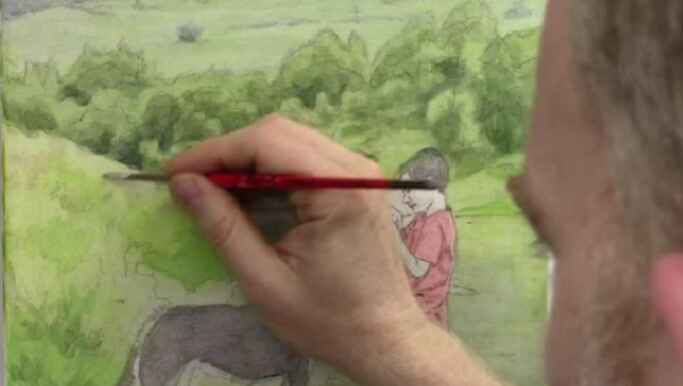
How to Add Color & Value Textures : Landscape Background
Enhance your landscape paintings with expert techniques for adding color and value to mid-ground and foreground textures
Creating a compelling landscape painting involves more than just replicating what you see. It’s about adding depth, texture, and the right balance of colors to make the scene come alive. In this tutorial, we’ll explore how to enhance your landscape paintings by adding color and value textures to the mid-ground and foreground. These techniques will help you create more realistic and vibrant scenes that captivate viewers.
Whether you’re painting a serene lake, a lush forest, or a rugged mountain range, mastering the art of color and value textures is crucial for achieving a convincing landscape. Let’s dive into the process with some expert tips and techniques that will guide you in your painting journey.
Step 1: Setting Up Your Colors and Brushes
Tip 1: Use a Small Round Brush for Precision
- Begin by selecting a small round brush, which offers precision when working on detailed areas like the foreground. This brush type is perfect for adding fine textures and small patches of color.
Tip 2: Mix a Mid-tone Color
- Start by mixing a mid-tone color using raw sienna, phthalo blue, and titanium white. The exact proportions depend on the specific area you’re working on, but generally, raw sienna will serve as the base, with phthalo blue added for coolness and titanium white for opacity.
Technique: Adjusting Color Balance
- If the color mix appears too intense or leans too heavily towards one hue (e.g., too blue), adjust by adding more raw sienna or titanium white. This step ensures that the colors blend seamlessly into the landscape.
Step 2: Applying Color to the Foreground
Tip 3: Work Vertically for Natural Grass Textures
- When adding color to the foreground, particularly in grassy areas, use vertical brush strokes. This technique mimics the natural growth of grass, adding authenticity to your painting.
Tip 4: Keep Brush Strokes Tight and Controlled
- Avoid broad, sweeping motions. Instead, keep your strokes tight to maintain texture without overwhelming the scene. This is particularly important when painting smaller patches of grass or undergrowth.
Technique: Layering for Depth
- Start with a mid-tone color to establish the base layer. Gradually add layers of lighter or darker tones to create depth and variation in the texture. This layering technique helps to differentiate between different elements within the landscape.
Step 3: Adjusting Mid-ground Colors
Tip 5: Subtle Color Changes for Mid-ground Interest
- For the mid-ground, slightly adjust your color mix by adding more titanium white and a small amount of raw umber dark. This desaturates the color, allowing it to recede into the background naturally.
Tip 6: Introduce Complementary Colors
- To avoid a flat appearance, introduce complementary colors, such as a hint of alizarine crimson. This counteracts excessive green hues and adds visual interest.
Technique: Glazing for Smooth Transitions
- Apply thin glazes of color to create smooth transitions between different areas of the mid-ground. Glazing helps achieve a more cohesive look while subtly altering the color and value.
Step 4: Enhancing Foreground Details
Tip 7: Vary Brush Sizes for Different Textures
- Switch between small round brushes and larger flat brushes depending on the area you’re working on. For example, use a quarter-inch flat brush to darken water areas or add broad strokes of color.
Tip 8: Focus on Value Structure
- Pay attention to the value structure of your painting. Darken areas where necessary to create contrast, especially in water reflections or shadowed regions. This step is crucial for making your landscape appear more three-dimensional.
Technique: Blending for Realism
- Blend the edges of different value areas to create a smooth transition. This technique is particularly useful in areas like water reflections, where a gradual change in value is needed to mimic natural light effects.
Step 5: Refining the Overall Landscape
Tip 9: Add Final Touches with Highlights and Shadows
- Use a lighter mix of your base colors to add highlights to the grass, rocks, and water. Similarly, deepen shadows where needed to enhance the sense of depth.
Tip 10: Step Back and Evaluate
- Take a step back from your painting to evaluate the overall composition. Look for areas that might need additional texture or color adjustments to balance the scene.
Technique: Balancing Detail with Overall Composition
- While details are important, ensure that they don’t overwhelm the overall composition. The goal is to maintain a harmonious balance between different elements of the landscape.
By learning the techniques of adding color and value textures, you can take your landscape paintings to the next level. These methods will help you create more dynamic and realistic scenes that engage viewers and convey a true sense of place.
As you continue to practice and refine your skills, remember that the key to a successful landscape painting lies in the careful balance of color, value, and texture. With these tips in hand, you’re well on your way to creating stunning landscapes that capture the beauty of the natural world.
Read more about my additional resources, tutorials, to learn more and check out my free courses. Whether you’re a beginner or an experienced artist, there’s always something new to learn and apply to your paintings. Happy painting!
LEARN MORE
- Sketching Your Painting Accurately
- Beginning a Pet Portrait in Acrylic
- The Mystery of Realism in Painting
- Apply A Burnt Sienna Glaze to a Portrait
- Learn How to Sketch a Portrait Freehand in 45 Minutes
- Adding highlights to your acrylic painting
- 5 Excellent Reasons to Use Aluminum Foil
- Paint Realistic Wrinkles in Acrylic
- Painting Clothing in an Acrylic Portrait
- Paint a Cloudy Sky Acrylic
- How to add Semi-Opaque Highlights
- How to Enhance the Contrast in Your Acrylic
- How to Add Glaze to Your Acrylic Painting
- Paint Realistic Reflections on Eyeglasses in an Acrylic Portrait
- Build Up Depth on Your Acrylic Portrait Backgrounds
- How Do You Do Layers With the Glazing Technique?
- Learn How to Paint Wrinkles in Acrylic
Read more about how to paint a portrait that you can surely be proud of!
I’d love to hear your thoughts on this video. Please share it with your friends and family. Let me know if you have any further questions. I’ll greatly help you.
If you’d like to learn more, sign up for my free email tips and video class today.
Learn How to Paint Acrylic Portraits With My Free Mini-Video Course!Thank you so much for taking the time to read this tutorial and watch the video. That means a lot to me. I hope you find it very helpful in your portrait painting.
Yours for Better Portraits,

P.S. Did you find this post helpful or encouraging? If so, send it in ahead! Let others know with the share buttons below. I’d love to hear your comments. Thank you so much! Also, do you have a question on acrylic portrait painting you’d like answered? Let me know, and I’d be happy to help!

3 Steps: How to Paint FIRE in Your Acrylic Portrait
Paint flames with this simple 3-step technique for vibrant, lifelike results
In this tutorial, you’ll learn how to bring intense, lifelike flames into your acrylic portraits. Flames can add a dramatic effect to your artwork, symbolizing passion, energy, or even a spiritual battle, as seen in the allegorical painting discussed here. By mastering a simple 3-step technique on how to paint fire in your acrylic portrait painting, you can create a fire that looks vibrant, realistic, and full of movement.
Step 1: Darken the Background
The first step in creating realistic flames is to darken the area around where the flames will be. This provides contrast and makes the flames appear brighter and more intense. Start by mixing raw umber with ultramarine blue to create a dark grayish tone. To add a touch of warmth, mix in a small amount of naphthol red. Combine these colors with a matte medium to create a translucent mixture.
- Tip: Use a flat brush to apply the mixture around the area where the flames will be. This brush shape allows you to easily cut around fine details without obscuring them.
Apply the dark glaze around the flames, paying close attention to the edges. Keep the area slightly lighter around the flames themselves to create the illusion that they are giving off light. This contrast is essential for making the flames stand out.
Step 2: Layering with Indian Yellow
Once the background is adequately darkened, it’s time to start building up the color of the flames. Begin by applying a layer of indian yellow. This strong, transparent pigment is perfect for creating a glowing effect. Mix the indian yellow with matte medium to ensure even distribution of the pigment.
- Technique: Apply the indian yellow glaze over the entire flame area, including over any red hues that may already be present from earlier layers. The transparency of the glaze allows the colors underneath to show through, creating a brilliant orange hue as the yellow mixes optically with the red.
Brush the glaze evenly, maintaining a wet edge to avoid streaks. Extend the glaze slightly beyond the flames themselves to blend them into the surrounding areas. This technique helps create a natural transition between the flames and the darker background, enhancing the illusion of glowing fire.
Step 3: Introduce Organic Orange for Depth
The final step in painting realistic flames is to add depth and vibrancy using organic orange. This red-orange color will give the flames a rich, fiery intensity. Mix organic orange with a small amount of indian yellow to create a bright, straight orange tone.
- Tip: Use a smaller flat brush for this step to control the application of color and define the shapes within the flames. Focus on filling in the shadowed areas of the flames, which are the spaces where the fire is less intense.
Apply the orange glaze to specific areas within the flames, based on your reference photo. The goal is to create a sense of movement and realism by varying the tonal values—some areas should be brighter, while others remain darker.
Technique: To enhance the realism, consider the shapes and flow of the flames. Flames are dynamic, so your brushstrokes should reflect that energy. Pay attention to how the flames interact with the surrounding elements in your painting. For example, if the flames are near a figure or object, add a touch of the flame color to that area to suggest reflected light.
Final Touches and Tips
- Layering is Key: The glazing technique used in this tutorial relies on building up thin layers of color to achieve depth and vibrancy. Don’t rush the process; allow each layer to dry before adding the next.
- Use Contrast Wisely: Flames should be surrounded by darker tones to make them pop. However, the transition between light and dark should be gradual to maintain a natural look.
- Observe Real Flames: Whenever possible, study real flames or high-quality reference photos. Notice how the color varies from the base to the tip of the flame and how shadows play within the fire.
Painting realistic fire in acrylics may seem challenging, but by following these three steps—darkening the background, layering with indian yellow, and adding depth with organic orange—you can create flames that leap off the canvas. Experiment with these techniques, and soon you’ll be able to add a fiery touch to any of your acrylic portraits.
Read more about my additional resources, tutorials, to learn more and check out my free courses. Happy painting.
LEARN MORE
- Sketching Your Painting Accurately
- Beginning a Pet Portrait in Acrylic
- The Mystery of Realism in Painting
- Apply A Burnt Sienna Glaze to a Portrait
- Learn How to Sketch a Portrait Freehand in 45 Minutes
- Adding highlights to your acrylic painting
- 5 Excellent Reasons to Use Aluminum Foil
- Paint Realistic Wrinkles in Acrylic
- Painting Clothing in an Acrylic Portrait
- Paint a Cloudy Sky Acrylic
- How to add Semi-Opaque Highlights
- How to Enhance the Contrast in Your Acrylic
- How to Add Glaze to Your Acrylic Painting
- Paint Realistic Reflections on Eyeglasses in an Acrylic Portrait
- Build Up Depth on Your Acrylic Portrait Backgrounds
- How Do You Do Layers With the Glazing Technique?
- Learn How to Paint Wrinkles in Acrylic
Read more about how to paint a portrait that you can surely be proud of!
I’d love to hear your thoughts on this video. Please share it with your friends and family. Let me know if you have any further questions. I’ll greatly help you.
If you’d like to learn more, sign up for my free email tips and video class today.
Learn How to Paint Acrylic Portraits With My Free Mini-Video Course!Thank you so much for taking the time to read this tutorial and watch the video. That means a lot to me. I hope you find it very helpful in your portrait painting.
Yours for Better Portraits,
P.S. Did you find this post helpful or encouraging? If so, send it in ahead! Let others know with the share buttons below. I’d love to hear your comments. Thank you so much! Also, do you have a question on acrylic portrait painting you’d like answered? Let me know, and I’d be happy to help!

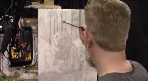
How to Build Up More Lion & Soldier Painting
Layering with translucent glazes to add depth, contrast, and vibrancy to your acrylic portraits
Introduction
In the world of acrylic painting, mastering the art of glazing can take your work from ordinary to extraordinary. In this tutorial, we’ll explore how to build up color, contrast, and depth in your acrylic portraits using the glazing technique. Specifically, on how to build up more on Lion & SoIdier’s painting with glazing technique. A powerful depiction of Jesus fighting our battles. Through this step-by-step guide, you’ll learn how to layer translucent glazes to create a more dynamic and vibrant painting.
Setting the Stage: Preparing Your Canvas
Before diving into the glazing process, it’s essential to start with a well-prepared canvas. In this painting, I begin by applying several layers of mid-tones and shadows. These layers serve as the foundation, ensuring that no part of the canvas remains unfinished. Each area is covered, providing a base for the subsequent translucent glazes that will be applied to develop contrast and depth.
Glazing Technique: The Basics
Glazing involves applying thin, translucent layers of paint mixed with a medium (such as matte medium) over a dry layer of paint. This technique allows you to build up color gradually, adding depth and dimension to your painting without losing the underlying details.
Key Tips for Glazing:
- Use a Flat Brush: I starts with a flat brush, opting for a 5/8 or 3/4 inch size. This brush is ideal for applying broad strokes and achieving smooth transitions between layers.
- Mixing Colors: For this painting, I used a combination of raw umber dark, ultramarine blue, and phthalo blue to create a cool-toned glaze. Each color brings a unique quality to the mix—raw umber for warmth, ultramarine for indigo tones, and phthalo for a touch of aqua.
- Test the Transparency: Before applying the glaze to the canvas, I test its transparency on a white card. This step ensures the glaze is thin enough to allow the underlying layers to show through, creating a subtle but impactful effect.
Applying the Glazes: Building Depth and Contrast
With the colors mixed and brushes ready, it’s time to start glazing. I emphasize the importance of brushwork direction, alternating between horizontal and vertical strokes to create texture and depth.
Techniques to Keep in Mind:
- Directional Brushwork: Varying the direction of your brushstrokes with each glaze layer adds interest and complexity to the painting. For example, using horizontal strokes in one layer and vertical strokes in the next can create the illusion of texture, such as tree limbs in a background scene.
- Gradual Build-Up: One of the advantages of glazing is the ability to make incremental changes. By slowly building up layers, you can refine the painting without making irreversible mistakes. This method is particularly useful for artists who prefer a more cautious approach.
- Focus on Contrast: To achieve dramatic highlights, you must first establish strong darks. Add more raw umber dark and ultramarine blue to the background, creating a richer, deeper contrast that will make the lighter areas pop.
Enhancing Details: The Lion and Soldier
As the painting progresses, I shift focus to the main subjects—the lion and the soldier. Using a smaller brush, begin to add shading and contrast to the lion’s mane, face, and body. The goal here is to create a realistic portrayal by building up layers of shadow and light.
Tips for Detailing:
- Smaller Brushes for Precision: Switching to a smaller brush, such as a quarter-inch flat, allows for more detailed work on areas like the lion’s face and the soldier’s armor.
- Layering Colors: Continue to layer glazes, introducing slight variations in color to add depth and interest. For instance, a glaze with a greenish tint might be added to the soldier’s armor, creating a subtle shift in tone that adds realism.
Final Touches: Creating a Cohesive Composition
As the painting nears completion, I revisit different areas of the canvas to ensure everything works together harmoniously. Darken certain sections, such as the lion’s flanks and the trees in the background, to create a balanced composition. These final glazes tie the painting together, making each element feel part of a unified whole.
The Beauty of Glazing
The glazing technique is a powerful tool in any acrylic painter’s arsenal. It allows for a controlled, gradual build-up of color and contrast, resulting in a painting rich with depth and vibrancy. By following this process, you can apply these techniques to your own work, whether you’re painting a portrait, a landscape, or any other subject.
Read more about my additional resources, tutorials, to learn more and check out my free courses. Whether you’re a beginner or an experienced artist, there’s always something new to learn and apply to your paintings. Happy painting!
LEARN MORE
- Sketching Your Painting Accurately
- Beginning a Pet Portrait in Acrylic
- The Mystery of Realism in Painting
- Apply A Burnt Sienna Glaze to a Portrait
- Learn How to Sketch a Portrait Freehand in 45 Minutes
- Adding highlights to your acrylic painting
- 5 Excellent Reasons to Use Aluminum Foil
- Paint Realistic Wrinkles in Acrylic
- Painting Clothing in an Acrylic Portrait
- Paint a Cloudy Sky Acrylic
- How to add Semi-Opaque Highlights
- How to Enhance the Contrast in Your Acrylic
- How to Add Glaze to Your Acrylic Painting
- Paint Realistic Reflections on Eyeglasses in an Acrylic Portrait
- Build Up Depth on Your Acrylic Portrait Backgrounds
- How Do You Do Layers With the Glazing Technique?
- Learn How to Paint Wrinkles in Acrylic
Read more about how to paint a portrait that you can surely be proud of!
I’d love to hear your thoughts on this video. Please share it with your friends and family. Let me know if you have any further questions. I’ll greatly help you.
If you’d like to learn more, sign up for my free email tips and video class today.
Learn How to Paint Acrylic Portraits With My Free Mini-Video Course!Thank you so much for taking the time to read this tutorial and watch the video. That means a lot to me. I hope you find it very helpful in your portrait painting.
Yours for Better Portraits,
P.S. Did you find this post helpful or encouraging? If so, send it in ahead! Let others know with the share buttons below. I’d love to hear your comments. Thank you so much! Also, do you have a question on acrylic portrait painting you’d like answered? Let me know, and

How to Add More Raw Umber Dark: Acrylic Glazing Technique
Enhance Your Acrylic Paintings with Deep, Rich Tones Using Raw Umber Dark
Introduction
Acrylic glazing is a powerful technique that allows artists to build depth and richness in their paintings layer by layer. When it comes to creating those deep, warm tones that add life to a piece, raw umber dark is an essential color. This tutorial will guide you through the process of how to add more raw umber dark into your acrylic paintings. Specifically focusing on how it can enhance your artwork through careful glazing.
This is based on a painting of a lion and a soldier, symbolizing strength and guidance. Where the glazing technique is used to achieve a harmonious balance of cool and warm tones.
Understanding Raw Umber Dark in Acrylic Glazing
Raw umber dark is a natural earth pigment known for its deep, rich brown tones. It is widely used in acrylic painting to add shadows, warmth, and subtle variations to the color palette. When used in glazing, raw umber dark can enhance the sense of depth and realism in your artwork. Making it an invaluable tool for both portrait and landscape artists.
Glazing involves applying thin, translucent layers of paint over a dry base layer, allowing the underlying colors to subtly show through. This technique is perfect for gradually building up color intensity and creating a cohesive, polished finish.
Step-by-Step Guide to Adding Raw Umber Dark with the Glazing Technique
1. Preparing Your Palette Start by preparing your palette with raw umber dark, a glazing medium, and any other colors you plan to use. For this painting, you may also want to include colors like indian yellow, burnt sienna, and ultramarine blue. Which can be used in combination with raw umber dark to achieve different effects.
2. Applying the First Glaze Begin by mixing raw umber dark with your glazing medium. A typical ratio is one part paint to four parts medium, but you can adjust this based on how translucent you want the glaze to be. Using a soft brush. Apply the glaze to areas where you want to deepen the shadows or add warmth, such as the lion’s fur or the soldier’s cloak.
3. Building Up Layers Allow each layer to dry fully before applying the next. This is where the magic of glazing happens—by slowly building up layers, you create a rich, complex color that adds depth to the painting. For instance, you might start with a lighter glaze of raw umber dark, followed by a slightly darker one to enhance the shadows further.
4. Blending for Smooth Transitions As you add more layers, use a dry brush or a soft cloth to blend the edges of the glaze. This ensures smooth transitions between the glazed areas and the rest of the painting. For example, in the lion’s fur, you might want to blend the raw umber dark glaze into the lighter areas to create a natural-looking gradient.
5. Adjusting and Refining Once you’ve applied several layers, step back and evaluate the overall effect. If some areas need more depth, continue glazing with thin layers until you achieve the desired result. If an area becomes too dark, you can lighten it by applying a glaze of a more transparent color or by gently lifting some of the glaze with a damp cloth before it dries.
Tips for Using Raw Umber Dark in Glazing
- Balance Warm and Cool Tones: When using raw umber dark, consider how it interacts with the other colors in your painting. For instance, in the lion and soldier painting, balancing the warm tones of raw umber dark with cooler tones like ultramarine blue can create a more dynamic composition.
- Layer Gradually: The key to successful glazing is patience. Start with very light glazes and gradually build up the color intensity. This will help you avoid muddying the colors and ensure that each layer adds to the depth of the painting.
- Use Soft Brushes: Soft, synthetic brushes are ideal for glazing because they allow for smooth application without disturbing the underlying layers. Choose brushes that are appropriate for the size of the area you’re glazing—larger brushes for broad areas, and smaller brushes for details.
- Experiment with Different Mediums: While a standard glazing medium works well, you might want to experiment with other mediums to achieve different effects. Some mediums dry slower, allowing for more blending time, while others might add a slight gloss that can enhance the vibrancy of raw umber dark.
- Pay Attention to Light Source: When applying glazes, always keep the light source in mind. Raw umber dark is excellent for deepening shadows. But be careful not to apply it uniformly across the painting—focus on areas where shadows naturally occur to maintain a realistic light effect.
Final Thoughts
Mastering the use of raw umber dark in acrylic glazing can transform your paintings, adding depth, warmth, and a sense of realism that brings your artwork to life. By following the steps outlined in this tutorial. You can confidently incorporate this technique into your practice, whether you’re working on portraits, landscapes, or any other subject matter.
Tips
Remember, the key to successful glazing is patience and practice. With time, you’ll develop an intuitive sense of how to build up layers of raw umber dark to achieve the desired effect. So grab your brushes, prepare your palette, and start exploring the rich possibilities of acrylic glazing today!
Read more about my additional resources, tutorials, to learn more and check out my free courses.
LEARN MORE
- Sketching Your Painting Accurately
- Beginning a Pet Portrait in Acrylic
- The Mystery of Realism in Painting
- Apply A Burnt Sienna Glaze to a Portrait
- Learn How to Sketch a Portrait Freehand in 45 Minutes
- Adding highlights to your acrylic painting
- 5 Excellent Reasons to Use Aluminum Foil
- Paint Realistic Wrinkles in Acrylic
- Painting Clothing in an Acrylic Portrait
- Paint a Cloudy Sky Acrylic
- How to add Semi-Opaque Highlights
- How to Enhance the Contrast in Your Acrylic
- How to Add Glaze to Your Acrylic Painting
- Paint Realistic Reflections on Eyeglasses in an Acrylic Portrait
- Build Up Depth on Your Acrylic Portrait Backgrounds
- How Do You Do Layers With the Glazing Technique?
- Learn How to Paint Wrinkles in Acrylic
Read more about how to paint a portrait that you can surely be proud of!
I’d love to hear your thoughts on this video. Please share it with your friends and family. Let me know if you have any further questions. I’ll greatly help you.
If you’d like to learn more, sign up for my free email tips and video class today.
Learn How to Paint Acrylic Portraits With My Free Mini-Video Course!Thank you so much for taking the time to read this tutorial and watch the video. That means a lot to me. I hope you find it very helpful in your portrait painting.
Yours for Better Portraits,
P.S. Did you find this post helpful or encouraging? If so, send it in ahead! Let others know with the share buttons below. I’d love to hear your comments. Thank you so much! Also, do you have a question on acrylic portrait painting you’d like answered? Let me know, and I’d be happy to help!

How to Add Realistic Shadows in Your Acrylic Painting
Unlock the Power of Shadows to Transform Your Acrylic Paintings
Introduction
Adding shadows to your acrylic paintings is one of the most effective ways to create depth, realism, and drama. Shadows help to anchor objects within your composition, give form and dimension, and can even guide the viewer’s eye across your artwork. In this tutorial, we’ll explore the techniques and tools you need to master the art of shadowing in acrylics. And you well learn how to how to add realistic shadows in your acrylic painting. Whether you’re painting a landscape, portrait, or still life, understanding how to effectively use shadows will elevate your work to a new level.
Tools and Materials
Before diving into the painting process, ensure you have the following materials ready:
- Filbert Brush: A versatile brush that can create broad strokes and fine lines.
- Acrylic Paints: Raw umber, dark burnt sienna, raw sienna, phthalo blue, ultramarine blue, alizarine crimson, naphthol red, organic orange, Indian yellow, titanium white.
- Matte Medium: To make your paint translucent and create glazes.
- Palette: For mixing colors.
- Canvas or Painting Surface: Prepared and ready for painting.
- Reference Photo: To guide your shadow placement.
Creating the Perfect Shadow Color
Shadows are not just a darker version of the object’s color—they are nuanced and require careful mixing. To begin:
- Mix Your Base Color: Start with a 50/50 mix of ultramarine blue and raw umber dark. This combination creates a deep, rich black that forms the foundation of your shadow color.
- Customize Your Shadow: Add a touch of alizarine crimson to warm the shadow or phthalo blue to cool it down. Adjust the balance according to the lighting and mood of your painting.
- Control the Transparency: Add matte medium to your mix. The more medium you add, the more translucent the shadow becomes. This is key for creating realistic, layered shadows.
Applying Shadows: Step-by-Step
1. Start with the Darkest Areas
Begin by applying your mixed shadow color to the darkest areas of your painting. Use a filbert brush to create broad strokes, ensuring you apply the paint in the direction of the light source.
- Tip: Start with larger shadow areas and then gradually work into the finer details. This method prevents your brush from carrying too much paint when working on smaller, more intricate parts.
2. Layering with Glazes
Once the initial layer is dry, add glazes to build up the shadow depth. Glazing involves applying thin, translucent layers of paint over a dry layer. This technique is perfect for creating soft transitions and a sense of volume in your shadows.
- Technique: Use a light hand with your brush to avoid overpowering the underpainting. This allows the lower layers to shine through, adding complexity and realism to your shadows.
3. Fade and Blend
Shadows naturally fade as they move away from the object casting them. To achieve this effect:
- Dry Brushing: Use the dry brushing technique, where you use minimal paint and gently brush over the canvas, allowing the texture to create a natural fade.
- Brush Pressure: Apply less pressure as you move away from the object to soften the shadow. The less paint you have on your brush, the lighter the shadow will appear.
- Tip: Avoid adding white to lighten the shadows, as this can make them appear chalky. Instead, rely on the natural transparency of the glaze and your brush control.
Fine-Tuning and Details
As you refine your painting, pay attention to the subtleties in your shadows:
- Reference Photo: Continually refer back to your reference photo to capture the exact shapes and tones of the shadows. Look at the abstract shapes created by the shadows rather than thinking of them as literal parts of the object.
- Varying Brush Strokes: Use short, choppy strokes for areas like tree branches or fur, where the texture plays a significant role in how the shadow behaves.
- Shadow Direction: The direction and length of your brush strokes should mimic the actual light source and the texture of the object, like the mane of a lion or the bark of a tree.
Adding shadows to your acrylic paintings is a powerful way to bring your artwork to life. By understanding the interplay of light and dark, and using techniques like glazing and dry brushing, you can create realistic and captivating images. Remember, the key is in the subtlety—less is often more when it comes to shadows. Practice these techniques, and you’ll see a remarkable difference in the depth and realism of your paintings.
If you enjoyed this tutorial and want to delve deeper into the world of acrylic painting, download my free guides on skin tones and correct tonal values that make your portrait more realistic than perfect skin tones. These resources are designed to help you achieve even more precision and realism in your artwork.
LEARN MORE
- Sketching Your Painting Accurately
- Beginning a Pet Portrait in Acrylic
- The Mystery of Realism in Painting
- Apply A Burnt Sienna Glaze to a Portrait
- Learn How to Sketch a Portrait Freehand in 45 Minutes
- Adding highlights to your acrylic painting
- 5 Excellent Reasons to Use Aluminum Foil
- Paint Realistic Wrinkles in Acrylic
- Painting Clothing in an Acrylic Portrait
- Paint a Cloudy Sky Acrylic
- How to add Semi-Opaque Highlights
- How to Enhance the Contrast in Your Acrylic
- How to Add Glaze to Your Acrylic Painting
- Paint Realistic Reflections on Eyeglasses in an Acrylic Portrait
- Build Up Depth on Your Acrylic Portrait Backgrounds
- How Do You Do Layers With the Glazing Technique?
- Learn How to Paint Wrinkles in Acrylic
Read more about how to paint a portrait that you can surely be proud of!
I’d love to hear your thoughts on this video. Please share it with your friends and family. Let me know if you have any further questions. I’ll greatly help you.
If you’d like to learn more, sign up for my free email tips and video class today.
Learn How to Paint Acrylic Portraits With My Free Mini-Video Course!Thank you so much for taking the time to read this tutorial and watch the video. That means a lot to me. I hope you find it very helpful in your portrait painting.
Yours for Better Portraits,
P.S. Did you find this post helpful or encouraging? If so, send it in ahead! Let others know with the share buttons below. I’d love to hear your comments. Thank you so much! Also, do you have a