Tag Archives for " sketching "

Learn How to Sketch a Portrait Freehand: 45 Minutes
Unlock the secrets to freehand portrait drawing with precision and confidence
Sketching a portrait freehand can seem daunting, especially when capturing someone’s likeness. However, with patience and the right approach, anyone can create a compelling portrait in just 45 minutes. In this tutorial, we’ll break down a step-by-step method for sketching a portrait freehand using three simple pencils. Whether you’re a beginner or looking to refine your skills, this guide will help you confidently sketch portraits with more precision.
1. Prepare Your Materials: Start Simple for Success
Before diving into your sketch, it’s important to have the right tools.
- Pencils: HB (light), 3B (medium), and 8B (dark).
- Kneaded Eraser: Gentle on the paper and flexible for different erasing needs.
- Painter’s Tape: To secure the paper and prevent it from shifting.
Tip: Simplicity is key. Stick with just three pencils to avoid overwhelming yourself with too many options. This will help you focus on the drawing process without distraction.
2. Start with Basic Shapes: Defining the Composition
To begin, lightly sketch the outline of the head using simple, fluid lines. I suggest starting with the overall shape of the face, which is often oval. By using an HB pencil, the lightest in your set, you can make adjustments easily without committing too much at this stage.
Technique: Use long, gentle strokes to block in the general form. Avoid adding too much detail at first. Your goal is to get a feel for the proportions and placement of key features like the eyes, nose, and mouth.
Tip: Leave room on the top and bottom of the paper to avoid cramping the portrait. This ensures you can later fill in features like the hair and chin without running out of space.
3. Measure Proportions: The Key to Realism
Proportions are crucial for a successful portrait. One common rule is that the eyes should be roughly in the middle of the head. I emphasize using the eyes as a reference point for measuring the other facial features.
Here’s a quick breakdown:
- Eyes are typically located halfway between the top of the head and the chin.
- The nose usually falls about one-third of the way down from the eyes to the chin.
- The mouth is located between the nose and chin, often aligning with the middle of the eyes.
Technique: I advises using your pencil as a measuring tool. You can hold the pencil up against your reference photo, measure the angles of the face, and compare them directly with your sketch.
4. Focus on the Eyes: The Window to the Soul
I stress the importance of the eyes in any portrait. If the eyes are accurate, the rest of the portrait is more likely to fall into place. Start by lightly sketching the overall shape of the eyes and ensuring they are properly aligned with one another.
Technique: Notice the subtle curves in the eyelids and pay attention to the shadows. Use cross-hatching to create depth around the eyes. For reflections within the eyes, darken the pupils with a 3B pencil, leaving highlights for a realistic, lively appearance.
Tip: Take breaks to step back and assess the accuracy of your work. This will help you spot any inconsistencies in the alignment of the eyes or other features.
5. Gradually Add Features: Build Up with Confidence
Once the eyes are in place, you can move on to sketching the nose and mouth. I recommend focusing on the spacing between the features and the angles of the face. Be mindful of the direction of the mouth—it may curve slightly upward or downward depending on the expression.
Tip: The space between the nose and the upper lip is crucial in portraying a lifelike expression. Check that these distances match the reference photo to maintain accuracy.
6. Capture Expression: Use Wrinkles and Shadows
Facial expressions are often conveyed through the eyes and the subtle wrinkles around them. I emphasize how the cheeks and wrinkles near the eyes can reveal whether someone is smiling.
Technique: For wrinkles, use your 3B pencil to create soft, sketchy lines. Be careful not to press too hard. You can always build up the darker areas later with an 8B pencil. Incorporate shadows along the cheekbones and around the nose to give the face a sense of dimension.
7. Refine the Details: Darken and Shade for Depth
As you become more confident in the proportions, start darkening certain areas to define the form more clearly. The 8B pencil is perfect for emphasizing deep shadows, especially in areas like the hair and under the chin.
Technique: Use cross-hatching in areas where more shading is needed. Hold the pencil on its side to create broader strokes for shading larger areas, like the forehead or jawline. Be sure to leave highlights in places where light would naturally fall, such as the tip of the nose or the forehead.
8. Final Adjustments: Add Hair and Clothing
Finally, sketch in the hair and any clothing details. Hair can be tricky, but I also suggest starting with the general shape and then breaking it down into smaller sections. Don’t try to draw every strand—focus on capturing the overall flow and texture.
Tip: When sketching hair, leave some areas lighter to create the illusion of shine. For clothing, use lighter pencils for the fabric’s folds and darker ones for the shadows and creases.
Sketching a portrait freehand may seem like a challenge, but by following these steps, you’ll find the process manageable and rewarding. With careful attention to proportions, the right shading techniques, and consistent practice, you’ll be able to complete a lifelike portrait in just 45 minutes. Keep refining your skills, and soon you’ll be sketching portraits with confidence and accuracy.
Final Tips:
Practice cross-hatching to create depth and dimension in your shading.
Use a light touch with your pencils, especially in the beginning stages.
Regularly step back to assess your work from a distance.
Remember that accuracy in the eyes often determines the success of the entire portrait.
Read more about my additional resources, tutorials, to learn more and check out my free courses here. . Whether you’re a beginner or an experienced artist, there’s always something new to learn and apply to your paintings. Happy painting!
Learn How to Sketch a Portrait Freehand in 45 Minutes!
- How to Paint Foliage Using the Acrylic Glazing Technique
- How to Trace for an Accurate Portrait Sketch
- How to Paint Realistic Eyes in Your Acrylic Portrait
- How to Add Raw Umber Dark & Ultramarine Blue to Your Portrait
- How to Make Your Own Raw Umber Dark
- How to Paint Realistic Trees & Grass in Your Acrylic
- How to Block In Skin Tone Values Using Glazing Technique
- How to Paint Vibrant Reds in Your Acrylic Portrait
- How to Glaze Background Colors & More Acrylic Portrait
- How to Paint White Clothing in Your Acrylic Portrait
- How to Easily Transition from a Sketch to a Painting
- How to Block In Shading & Skin Tones in Your Acrylic
- How to Build Up Color on Acrylic Pet Portrait
- How to Build Up Form on Clothing with Acrylic
- How to Paint Dark Clothing Using Acrylic Glazing Technique
- How to Paint a 24 x 30 Acrylic With 30 People
- How to Do Smooth Shading with Acrylic
- How to Sketch an Acrylic Portrait with a Grid
Read more about how to paint a portrait that you can surely be proud of!
I’d love to hear your thoughts on this video. Please share it with your friends and family. Let me know if you have any further questions. I’ll greatly help you.
If you’d like to learn more, sign up for my free email tips and video class today.
Learn How to Paint Acrylic Portraits With My Free Mini-Video Course!
Thank you so much for taking the time to read this tutorial and watch the video. That means a lot to me. I hope you find it very helpful in your portrait painting.
Yours for Better Portraits,

P.S. Did you find this post helpful or encouraging? If so, send it on ahead! Let others know with the share buttons below. I’d love to hear your comments. Thank you so much! Also, do you have a question on acrylic portrait painting you’d like answered? Let me know, and I’d be happy to help!

3 Tips How to Help You Draw Better Pencil Portraits
Unlock the secrets to creating realistic pencil portraits with these simple yet powerful tips
Creating realistic pencil portraits can be a rewarding experience, but it also takes practice and attention to detail. Whether you’re just starting out or looking to refine your skills, these three essential tips can help you elevate your pencil drawings. In this post, we’ll explore how to use cross-hatching for texture, prevent smudging, and smooth your shading to create a polished and lifelike portrait.
Tip 1: Master Cross-Hatching for Smooth Shading
When one of the key techniques in pencil drawing is cross-hatching, a method of layering pencil strokes to build up depth and texture. Because learning how to cross-hatch correctly can improve the realism of your pencil portraits and give your drawings a polished look. Here’s how to do it:
- Start with a 45-degree angle: Hold your pencil at a 45-degree angle and apply close strokes, making sure the lines are tight and uniform. This will help create a smooth shading effect.
- Layer in different directions: After completing one set of strokes, go over them with perpendicular strokes. This second layer, or cross-hatch, will even out the distribution of graphite and fill in gaps, making the shading appear more solid and realistic.
- Use different pencil grades: For this technique, use a range of pencils, from softer 4B to harder 2H, to add depth and contrast. Softer pencils will create darker tones, while harder pencils are ideal for lighter areas.
This method works particularly well for portraits, as it allows you to blend shadows and highlights naturally. Then cross-hatching technique helps mimic the textures of skin, fur, and other detailed areas in a portrait.
Tip 2: Protect Your Drawing from Smudging
Another common issue when drawing portraits is smudging the graphite as you work. This can ruin hours of effort, especially if you have detailed areas that you want to preserve. To avoid this, follow these steps:
- Use a separate piece of paper: Place a sheet of clean paper under your hand while drawing. Because this will prevent your hand from coming into direct contact with the drawing and smearing the graphite.
- Work from left to right (or right to left): If you’re right-handed, begin shading on the left side of the drawing and gradually move to the right. Left-handed artists should start on the right side. This technique keeps your hand away from areas that have already been worked on.
- Avoid leaning heavily on the paper: Keeping your touch light will help avoid both smudging and leaving unintended marks on the paper.
These simple practices can save your drawing from unnecessary blemishes and ensure that your pencil portrait looks clean and professional.
Tip 3: Use Tissue for Gentle Blending
A subtle yet highly effective way to smooth out your pencil shading is by using tissue paper. So many artists make the mistake of over-blending their drawings with a blending stump, which can result in a muddy, lifeless texture. Here’s how to blend effectively using tissue:
- Gently smooth out the shading: Take a piece of soft tissue and lightly run it over the shaded areas of your drawing. Use a soft touch to avoid pressing too hard, which could over-smooth the texture and dull the contrast.
- Build layers after blending: After you’ve gently smoothed the shading, go back over the area with another layer of pencil. This adds richness and depth to your portrait, while still preserving the natural texture of the paper. It also allows you to darken values without losing the realism of your drawing.
- Avoid smearing: Be cautious not to rub too vigorously, as this can smear the graphite and create unwanted streaks. Tissue blending should be a subtle touch to refine the shading, not overpower it.
Blending with tissue helps achieve a soft and smooth transition between different tonal areas in the portrait, perfect for realistic skin tones and subtle shadows.
Additional Tips & Techniques
- Sharpen your pencil frequently: A sharp pencil gives you better control over fine details, allowing for more precise shading and line work. Electric sharpeners are especially helpful for keeping your pencils in peak condition throughout the drawing process.
- Observe your reference photo closely: Pay attention to the contrasts between light and dark in your reference photo. By focusing on these value shifts, you can replicate them in your drawing to enhance realism.
- Experiment with different pencil strokes: Not every part of your drawing needs to be shaded the same way. Experiment with various stroke patterns to achieve the desired texture. For example, fur or hair can benefit from looser, more directional strokes, while skin might require a more uniform approach.
Conclusion
When mastering cross-hatching, protecting your drawing from smudging, and gently blending with tissue, you’ll notice a marked improvement in your pencil portraits. These techniques are easy to implement but can make a huge difference in the overall quality of your work.
So, next time you sit down to create a pencil portrait, remember these three tips to draw better pencil portraits. Because with practice and attention to detail, you’ll be able to create portraits that capture the essence of your subject with lifelike realism.
If you’re looking for more instructional videos on how to improve your acrylic painting, visit www.realisticacrylic.com for more tutorials and check out my free courses here. .
- How to Paint Foliage Using the Acrylic Glazing Technique
- How to Trace for an Accurate Portrait Sketch
- How to Paint Realistic Eyes in Your Acrylic Portrait
- How to Add Raw Umber Dark & Ultramarine Blue to Your Portrait
- How to Make Your Own Raw Umber Dark
- How to Paint Realistic Trees & Grass in Your Acrylic
- How to Block In Skin Tone Values Using Glazing Technique
- How to Paint Vibrant Reds in Your Acrylic Portrait
- How to Glaze Background Colors & More Acrylic Portrait
- How to Paint White Clothing in Your Acrylic Portrait
- How to Easily Transition from a Sketch to a Painting
- How to Block In Shading & Skin Tones in Your Acrylic
- How to Build Up Color on Acrylic Pet Portrait
- How to Build Up Form on Clothing with Acrylic
- How to Paint Dark Clothing Using Acrylic Glazing Technique
- How to Paint a 24 x 30 Acrylic With 30 People
- How to Do Smooth Shading with Acrylic
- How to Sketch an Acrylic Portrait with a Grid
Read more about how to paint a portrait that you can surely be proud of!
I’d love to hear your thoughts on this video. Please share it with your friends and family. Let me know if you have any further questions. I’ll greatly help you.
If you’d like to learn more, sign up for my free email tips and video class today.
Learn How to Paint Acrylic Portraits With My Free Mini-Video Course!
Thank you so much for taking the time to read this tutorial and watch the video. That means a lot to me. I hope you find it very helpful in your portrait painting.
Yours for Better Portraits,
P.S. Did you find this post helpful or encouraging? If so, send it on ahead! Let others know with the share buttons below. I’d love to hear your comments. Thank you so much! Also, do you have a question on acrylic portrait painting you’d like answered? Let me know, and I’d be happy to help!

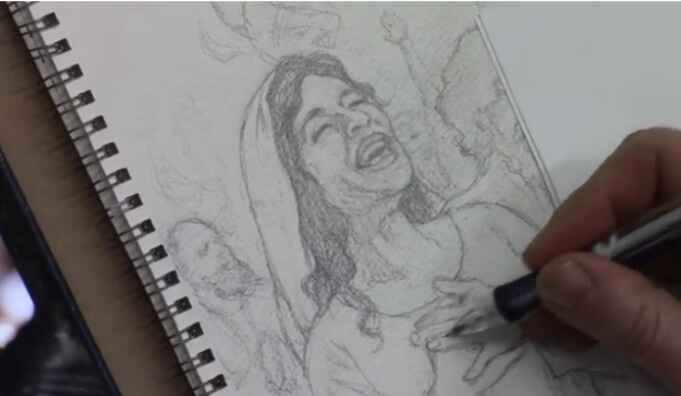
How to Sketch Book Cover Illustration
I’ll show you a sketching book cover illustration.
When creating a sketch for a book cover illustration it is a rewarding and meticulous process that blends creativity with technical skill. In this tutorial, I’ll walk through the steps of sketching a book cover illustration for a Bible commentary, focusing on capturing emotion and detail in every stroke. By the end of this guide, you’ll have actionable techniques to apply to your own projects, whether you’re a beginner or an experienced artist.
In this example, we explore the sketching process for a cover that illustrates the Pentecostal movement from the Book of Acts. This moment depicts the disciples receiving the Holy Spirit, with dramatic expressions of joy and intensity. Let’s dive into the step-by-step process of creating this compelling piece of art.
Step 1: Conceptualizing the Scene
Before starting any sketch, it’s important to have a clear understanding of the subject matter. In this case, the illustration revolves around a significant biblical event, the arrival of the Holy Spirit during Pentecost, described in the Book of Acts. To capture this effectively:
- Research the event: Familiarize yourself with the story by reading the relevant biblical passages. Because this will help you grasp the mood and energy needed for your sketch.
- Determine the key emotions: The illustration should evoke excitement, awe, and spiritual reverence. These emotions will be conveyed through the expressions of the characters and their body language.
- Find reference images: Utilize online reference photos to help with anatomy, facial expressions, and positioning.
In this sketch, the focal point is a woman’s expression of joy, symbolizing the elation felt by the disciples as they received the Holy Spirit.
Step 2: Start with a Rough Sketch
The first stage of creating any illustration is a rough sketch to establish the composition. For this book cover, the sketch began by blocking in the figures and their general positions.
- Freehand drawing: Start by sketching freehand, focusing on the placement and proportion of the characters. This allows for flexibility as you adjust the positioning of different elements.
- Keep it loose: At this stage, don’t worry too much about details. Use light lines to outline the figures and the background. This will give you a basic framework to build on.
Tips for Freehand Sketching:
- Use loose, flowing strokes to keep the composition dynamic.
- Focus on proportions but don’t stress about perfect accuracy early on.
- Keep erasing and refining the composition as needed.
Step 3: Refining the Details
Once the rough sketch is laid out, it’s time to refine the characters and bring out the key details that will make your illustration pop. Because in this project, we will focuses on capturing facial expressions and hand positioning, which are critical for conveying emotion.
Facial Expressions and Hands:
- Faces: Pay special attention to the expressions on your characters’ faces. For this sketch, one figure’s face is drawn with joy, while another figure shows intensity through a furrowed brow and a praying posture.
- Hands: Hands are often one of the hardest parts to draw accurately, but they are essential in conveying emotion. Here, the woman has her hands on her chest, adding to the sense of awe, while another figure has clasped fingers, indicating deep prayer.
Refining these elements involves carefully erasing and reworking lines to get the right anatomy and expression. For example, the wrinkles around the eyes or the positioning of the fingers can greatly impact the emotional depth of the characters.
Technique for Adding Expression:
- Use reference images: Don’t hesitate to consult images to ensure your anatomy and expressions are realistic.
- Focus on the eyes: Eyes are windows to the soul, so ensure they capture the right emotion.
- Subtle shading: Add light shading to emphasize features such as wrinkles, folds, or muscle tension in the hands.
Step 4: Working with Watercolor Paper
In this illustration, watercolor paper was used as the base for the sketch. This surface provides a bit more texture and grip than traditional drawing paper, making it ideal for illustrations that will later be painted.
Benefits of Watercolor Paper for Sketching:
- The texture holds pencil marks well, allowing for smoother shading and erasing.
- It’s sturdy enough to withstand multiple layers of detail, which is beneficial when transitioning from sketching to painting.
Step 5: Final Adjustments and Preparing for Paint
At this point in the sketch, the major elements of the illustration are in place. The characters are well-formed, and their emotions are clearly conveyed through their body language and expressions. However, there are always small adjustments that can be made to improve the sketch before painting.
Making Final Adjustments:
- Shadows and depth: Add subtle shading to the clothing and faces to create depth. For instance, a shadow under the man’s beard gives his face more structure.
- Refine small details: Pay attention to small details like the lines of the fingers or the folds in clothing. Then these small adjustments can make a big difference in the realism of the sketch.
Tips for Transitioning to Paint:
- Ensure that the sketch is as clean and detailed as possible. This will serve as the foundation for the painting stage.
- Consider how your paint medium (whether watercolor, acrylic, or oil) will interact with the pencil lines. Light sketching can easily be painted over, while heavier pencil marks might need to be minimized.
Conclusion
Sketching a book cover illustration requires both creativity and attention to detail. Because by focusing on freehand drawing, refining expressions, and making adjustments based on reference photos, you can create a compelling and emotionally charged sketch. In this project, the sketch captures the pivotal moment of Pentecost, filled with joy and intensity, and lays a solid foundation for a beautiful painted illustration.
If you found this guide helpful and would like to learn more about sketching or painting techniques, visit realisticacrylic.com for more tutorials and check out my free gift for you here
- Adding highlights to your acrylic painting
- 5 Excellent Reasons to Use Aluminum Foil
- Paint Realistic Wrinkles in Acrylic
- Painting Clothing in an Acrylic Portrait
- Paint a Cloudy Sky Acrylic
- How to add Semi-Opaque Highlights
- How to Enhance the Contrast in Your Acrylic
- How to Add Glaze to Your Acrylic Painting
- Paint Realistic Reflections on Eyeglasses in an Acrylic Portrait
- Build Up Depth on Your Acrylic Portrait Backgrounds
- How Do You Do Layers With the Glazing Technique?
- Learn How to Paint Wrinkles in Acrylic
Read more about how to paint a portrait that you can surely be proud of!
I’d love to hear your thoughts on this video. Please share it with your friends and family. Let me know if you have any further questions. I’ll greatly help you.
If you’d like to learn more, sign up for my free email tips and video class today.
Learn How to Paint Acrylic Portraits With My Free Mini-Video Course!
Thank you so much for taking the time to read this tutorial and watch the video. That means a lot to me. I hope you find it very helpful in your portrait painting.
Yours for Better Portraits,
P.S. Did you find this post helpful or encouraging? If so, send it on ahead! Let others know with the share buttons below. I’d love to hear your comments. Thank you so much! Also, do you have a question on acrylic portrait painting you’d like answered? Let me know, and I’d be happy to help!

How to Use Cooler Colors for Clothing Shadow
Learning clothing shadows: Cool Color techniques for realism in acrylic portraits
Introduction: Enhancing Realism with Cooler Colors
In acrylic portrait painting, shadows play a pivotal role in creating depth and realism. One technique to elevate your work is using cooler colors for clothing shadow, an approach that may not be immediately obvious. By strategically incorporating cooler tones like blue and gray instead of relying solely on darker shades of the clothing color, you can achieve a subtle and realistic effect. In this tutorial, I’ll walk you through the process of applying cooler colors in clothing shadows using glazing and dry brush techniques to bring your painting to life.
Why Cooler Colors Work for Shadows
The instinct for many artists might be to darken the shadows on clothing with black or a deeper shade of the same color. However, this often leads to overly vibrant or unnatural results. By using cooler tones, such as blue or blue-gray, the shadowed areas can maintain their depth without overpowering the fabric’s natural color.
Key Tip:
When transitioning from light to shadow in your painting, cooler colors help tone down the vibrancy of the clothing while maintaining subtle value shifts.
Materials and Colors Used
For this technique, you’ll need a few specific tools and colors:
- Ultramarine Blue: A rich blue tone that works well for creating cooler shadows.
- Raw Umber Dark: A dark brown that adds depth to the blue without overpowering it.
- Matte Medium: A transparent acrylic medium to thin the paint for glazing.
- Flat Brush: Ideal for applying layers of glazes.
- Dry Brush: Perfect for gently feathering in the colors.
By combining these materials, you’ll have the perfect mix to start creating cooler-toned shadows.
Step 1: Mixing the Right Colors
Firstly, is create the right blend of colors for your shadows. Because in the video, I demonstrate how to mix ultramarine blue with raw umber dark. This combination creates a bluish-gray tone that is subtle and cool enough for shadows but still harmonious with the warmer base colors of the clothing.
Process:
- Begin by adding a small amount of ultramarine blue to your palette.
- Mix in a touch of raw umber dark to reduce the brightness of the blue.
- Incorporate matte medium to make the mixture more translucent, ensuring that the shadow layers don’t become too opaque.
This bluish-gray tone will not only darken the shadowed areas but also cool down the intensity, giving the clothing a realistic sense of depth.
Technique Tip:
Always mix small amounts of color first and test it on a separate surface, such as a white card, to see how it interacts with the base layer before applying it to your painting.
Step 2: Applying the Glaze
The glazing is a technique in which the thin layers of translucent paint are applied over dry areas of the painting, then allowing the underlying colors to show through. As a result, it creates a smooth transition from light to shadow without harsh lines.
Process:
- With a flat brush, apply your blue-gray mixture onto the darker areas of the clothing.
- Start by gently glazing the shadowed sections beneath folds, arms, or under the chin.
- Gradually build up the layers, allowing each one to dry before applying the next.
- The glazing process allows you to control the level of darkness and coolness in the shadow while ensuring that the red or other base color remains visible underneath.
Why It Works: The matte medium makes the glaze translucent, so the original clothing color can still be seen through the shadow, adding depth and subtlety to your portrait.
Step 3: Dry Brush Technique for Soft Blending
After applying your glaze, your next step is to use a dry brush technique to softly blend the cooler shadow into the surrounding areas of the clothing. The dry brush technique is particularly effective for adding texture and blending transitions in fabrics.
Process:
- Lightly load your brush with the blue-gray mixture.
- Dab off excess paint on a paper towel to create a dry brush effect.
- Gently stroke the brush over the edges of the shadows, using quick, soft motions to blend the glaze seamlessly into the lighter areas.
- Continue to feather the paint, allowing the cooler shadow to naturally merge with the highlights of the clothing.
Key Tip: The dry brush method allows for smooth transitions without harsh lines, then mimicking the way light softly falls on fabric in real life.
Step 4: Adjusting for Depth and Nuance
As you build the layers and blend your cooler shadows, you may notice that some areas need more depth or subtle variation. Don’t hesitate to adjust your mixture by adding more raw umber dark if the blue becomes too overpowering.
Important Consideration:
Then shadows should appear less vibrant and cooler as they get darker. And then by adjusting the mixture to include more raw umber dark, you can deepen the shadow without making it too cool or overwhelming.
Creating Realistic Clothing Shadows on Multiple Colors
The beauty of this technique is its versatility. You can apply the same blue-gray glaze to multiple fabric colors. For example, in the video, I use it both on the woman’s red clothing and on a man’s shirt. It works just as effectively on lighter-colored fabric, adjusting the tones slightly with each application.
Because by using the same cooler glaze across different fabrics, you create consistency in the shadows, making the portrait appear cohesive and well-integrated.
Conclusion: Mastering Shadows with Cool Tones
When incorporating cooler colors for shadows on clothing in your acrylic portraits allows for greater realism and depth. Because by utilizing a blue-gray glaze and dry brush blending, you can create nuanced shadows that seamlessly integrate with the base color of the fabric. Whether you’re working on bright red clothing or more muted tones, cooler shadows offer the perfect solution for achieving lifelike contrast and depth.
If you’re looking for more instructional videos on how to improve your acrylic painting, visit www.realisticacrylic.com for more tutorials and check out my free courses here. .
- How to Paint Foliage Using the Acrylic Glazing Technique
- How to Trace for an Accurate Portrait Sketch
- How to Paint Realistic Eyes in Your Acrylic Portrait
- How to Add Raw Umber Dark & Ultramarine Blue to Your Portrait
- How to Make Your Own Raw Umber Dark
- How to Paint Realistic Trees & Grass in Your Acrylic
- How to Block In Skin Tone Values Using Glazing Technique
- How to Paint Vibrant Reds in Your Acrylic Portrait
- How to Glaze Background Colors & More Acrylic Portrait
- How to Paint White Clothing in Your Acrylic Portrait
- How to Easily Transition from a Sketch to a Painting
- How to Block In Shading & Skin Tones in Your Acrylic
- How to Build Up Color on Acrylic Pet Portrait
- How to Build Up Form on Clothing with Acrylic
- How to Paint Dark Clothing Using Acrylic Glazing Technique
- How to Paint a 24 x 30 Acrylic With 30 People
- How to Do Smooth Shading with Acrylic
- How to Sketch an Acrylic Portrait with a Grid
Read more about how to paint a portrait that you can surely be proud of!
I’d love to hear your thoughts on this video. Please share it with your friends and family. Let me know if you have any further questions. I’ll greatly help you.
If you’d like to learn more, sign up for my free email tips and video class today.
Learn How to Paint Acrylic Portraits With My Free Mini-Video Course!
Thank you so much for taking the time to read this tutorial and watch the video. That means a lot to me. I hope you find it very helpful in your portrait painting.
Yours for Better Portraits,
P.S. Did you find this post helpful or encouraging? If so, send it on ahead! Let others know with the share buttons below. I’d love to hear your comments. Thank you so much! Also, do you have a question on acrylic portrait painting you’d like answered? Let me know, and I’d be happy to help!

How to Refine a Traced Sketch Freehand
Learn the tips and techniques to enhance your traced sketch using freehand refinements for a more dynamic and detailed artwork.
Now what? Begin painting? Not so fast! 🙂 In this video, I’ll show you how to refine a traced sketch freehand and to make it ready to paint upon.
This is for the book of Isaiah by Russell Stendal and it’s an illustration based off this image here of a man in intercessory prayer. And originally, I did a video showing the tracing process, asking whether it’s ok to trace. And I think I answered that question, that it is—as long as you do freehand sketching and work with grids. But especially as you work with freehand sketching, which will help you to improve as an artist.
Now, I’m going to work in this sketch to show you the process of tightening up a sketch done by tracing initally and the tracing process does leave you with a lot of work left to be done. So, I’m going to show you how I’m going to add additional shading in detail and then have a sketch that I can paint on top of.
The Power of Freehand Refinements
Traced sketches are often used by artists to quickly capture the proportions and major features of a subject. However, relying solely on tracing can result in a flat, lifeless image. In this guide we will explore how to refine a traced sketch freehand, enhancing the details, adding depth, and preparing the sketch for the painting stage. By the end of this tutorial, you’ll understand how to transform a traced sketch into a dynamic, polished artwork ready for the next step.
The Importance of Freehand Refinement
When an artist traces an image, they capture the basic outlines but often miss out on critical details like shadows, textures, and fine forms. This is where freehand refinement comes into play. It allows you to go beyond the rigid lines of a traced image and add life to the drawing.
In this tutorial, I’ll demonstrate how to refine a traced sketch freehand based on my work on a sketch of Isaiah or Hezekiah, which was originally traced. The traced lines were helpful to get the basic structure down quickly, but the freehand refinements were crucial for adding the depth, shading, and detail needed for an intercessory prayer-themed illustration.
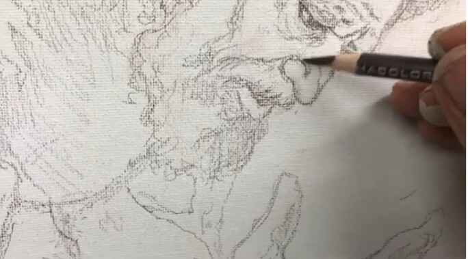
Step 1: Shading and Detailing the Hands
Hands are complex and full of intricate details like tendons, veins, and shadows, which are often missed in a simple traced sketch. To refine the hands in this illustration, start by adding shading to differentiate the forms. Pay attention to areas where light hits the fingers and where shadows fall.
- Tip: Focus on the fingertips and the blood vessels to give a realistic, textured appearance to the hands.
- Technique: Use a light pencil to gently shade in the forms and increase pressure in areas where darker shadows fall, especially around the tendons and between the fingers.
Step 2: Refining Facial Features
The face is another area that greatly benefits from freehand refinement. In this particular sketch, I had traced the basic lines of the face, but it still needed significant work to look convincing. I added texture to the beard and refined the nose’s shading to give it a more three-dimensional appearance.
- Tip: When refining facial features, focus on adding shadow to areas like the nose, cheekbones, and chin. This helps to convey depth and structure.
- Technique: Create subtle distinctions between the different parts of the nose (e.g., the wing and the ball) by gently shading around the contours. Don’t hesitate to erase and rework lines if they aren’t quite right. Precision is key in this step.
Step 3: Adjusting Proportions and Textures
One of the challenges with tracing is that it can sometimes lead to slightly distorted proportions. Freehand refinement allows you to adjust these proportions for greater accuracy. For instance, I changed the hairstyle in this sketch to make it look less like myself (since I modeled for it) and more like the character I intended to depict.
- Tip: Use freehand sketching to add texture to the hair and adjust any features that seem off.
- Technique: When drawing hair, follow the natural flow of the strands, adding texture by varying the direction of your pencil strokes. This adds realism to the hair, especially in areas where light and shadow interact.
Step 4: Refining Clothing and Drapery
Clothing, especially in historical or religious illustrations, requires careful attention to the way fabric drapes and folds. In the sketch of Isaiah/Hezekiah, I added shading to the clothing to give it volume and ensure it looked appropriate for the era being depicted.
- Tip: Study the way fabric falls on the body and add shadow in the deeper folds to create a sense of weight and movement.
- Technique: Use long, fluid strokes to indicate folds, and vary your shading to show where the light hits the fabric versus where it falls into shadow.
Step 5: Adding Final Touches to the Sketch
As you refine your traced sketch freehand, don’t be afraid to go back and rework certain areas that don’t feel quite right. For example, I added a scroll to the hands to illustrate a significant moment in the story of Hezekiah, when he spread a threatening letter before the Lord and prayed for deliverance.
- Tip: Small details, such as props or background elements, can enhance the narrative of your illustration.
- Technique: Incorporate these elements with care, ensuring that they integrate naturally into the composition without overshadowing the main subject.
Final Thoughts on Freehand Refinement
Refining a traced sketch freehand is an essential step for any artist who wants to create dynamic, realistic artwork. The tracing process can save time, but it’s the freehand refinement that brings the sketch to life. By focusing on shading, texture, and proportion, you can take a basic traced image and transform it into a detailed and accurate foundation for painting.
Just like building a house requires a solid foundation, a painting requires a well-executed sketch. The time and effort you put into refining your sketch freehand will set the stage for a more successful painting, allowing you to focus on color and brushwork rather than correcting mistakes.
Conclusion
Refining a traced sketch freehand involves improving proportions, adding textures, and sharpening details to ensure the sketch serves as a strong foundation for painting. This process is especially useful in achieving realistic, dynamic compositions. Remember that tracing is just the starting point; it’s the freehand refinement that makes the difference. Keep practicing your freehand sketching skills to improve your artistic abilities and bring more depth to your work.
If you’re looking for more instructional videos on how to improve your acrylic painting, visit www.realisticacrylic.com for more tutorials and check out my free courses here.
- How to Paint Foliage Using the Acrylic Glazing Technique
- How to Trace for an Accurate Portrait Sketch
- How to Paint Realistic Eyes in Your Acrylic Portrait
- How to Add Raw Umber Dark & Ultramarine Blue to Your Portrait
- How to Make Your Own Raw Umber Dark
- How to Paint Realistic Trees & Grass in Your Acrylic
- How to Block In Skin Tone Values Using Glazing Technique
- How to Paint Vibrant Reds in Your Acrylic Portrait
- How to Glaze Background Colors & More Acrylic Portrait
- How to Paint White Clothing in Your Acrylic Portrait
- How to Easily Transition from a Sketch to a Painting
- How to Block In Shading & Skin Tones in Your Acrylic
- How to Build Up Color on Acrylic Pet Portrait
- How to Build Up Form on Clothing with Acrylic
- How to Paint Dark Clothing Using Acrylic Glazing Technique
- How to Paint a 24 x 30 Acrylic With 30 People
- How to Do Smooth Shading with Acrylic
- How to Sketch an Acrylic Portrait with a Grid
Read more about how to paint a portrait that you can surely be proud of!
I’d love to hear your thoughts about this video. Please share it with your friends and family. Let me know if you have any further questions. I’ll greatly help you.
If you’d like to learn more, sign up for my free email tips and video class today.
Learn How to Paint Acrylic Portraits With My Free Mini-Video Course!
Thank you so much for taking the time to read this tutorial and watch the video. That means a lot to me. I hope you find it very helpful in your portrait painting.
Yours for Better Portraits,
P.S. Did you find this post helpful or encouraging? If so, send it on ahead! Let others know with the share buttons below. I’d love to hear your comments. Thank you so much! Also, do you have a question on acrylic portrait painting you’d like answered? Let me know, and I’d be happy to help!

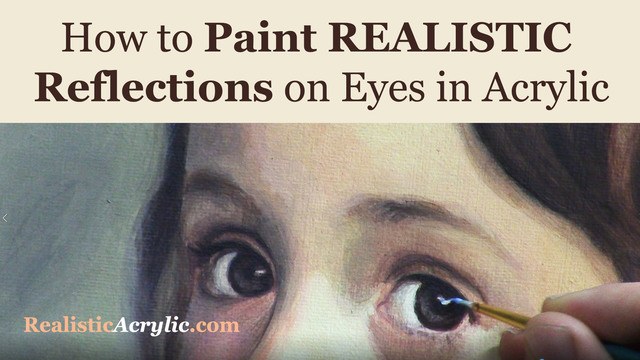
How to Paint Realistic Reflections on Eyes in Your Acrylic Portrait
Eyes are the most important feature of an acrylic portrait. When you paint the eyes correctly, everything else seems to fall into place so much easier.
In this video, I’ll show you how to paint realistic reflections, using two complementary colors in addition to white, and getting the shape of the reflection just right. Then this originally was a BONUS video in the Acrylic Portrait Painting Challenge Master Class, now available in the All-Access Membership at Realistic Acrylic Portrait School.
Even though it is technically over, you can take the Acrylic Portrait Painting Challenge (it’s FREE!) and paint along with us! 8 master class lessons are posted to help you paint a portrait you can be proud of!
REGISTER TODAY. The challenge is ongoing, something you can do at your own pace. It’s not too late to enter! After you join, I’ll send you the supplies list and reference photos to paint from.
Register for the Challenge!WATCH NOW…
Lesson #8: How to Paint Realistic Reflections on Eyes in Acrylic
Questions? Suggestions? Thoughts? Let me know, below in the comments. Please share your sketches in our Facebook group and share this post with your friends!
- How to Paint Foliage Using the Acrylic Glazing Technique
- How to Trace for an Accurate Portrait Sketch
- How to Paint Realistic Eyes in Your Acrylic Portrait
- How to Add Raw Umber Dark & Ultramarine Blue to Your Portrait
- How to Make Your Own Raw Umber Dark
- How to Paint Realistic Trees & Grass in Your Acrylic
- How to Block In Skin Tone Values Using Glazing Technique
- How to Paint Vibrant Reds in Your Acrylic Portrait
- How to Glaze Background Colors & More Acrylic Portrait
- How to Paint White Clothing in Your Acrylic Portrait
- How to Easily Transition from a Sketch to a Painting
- How to Block In Shading & Skin Tones in Your Acrylic
- How to Build Up Color on Acrylic Pet Portrait
- How to Build Up Form on Clothing with Acrylic
- How to Paint Dark Clothing Using Acrylic Glazing Technique
- How to Paint a 24 x 30 Acrylic With 30 People
- How to Do Smooth Shading with Acrylic
- How to Sketch an Acrylic Portrait with a Grid
Read more about how to paint a portrait that you can surely be proud of!
I’d love to hear your thoughts about this video. Please share it with your friends and family. Let me know if you have any further questions. I’ll greatly help you.
Thank you so much for taking the time to read this tutorial and watch the video. That means a lot to me. I hope you find it very helpful in your portrait painting.
P.S. Did you find this post helpful or encouraging? If so, send it on ahead! Let others know with the share buttons below. I’d love to hear your comments. Thank you so much! Also, do you have a question on acrylic portrait painting you’d like answered? Let me know, and I’d be happy to help!

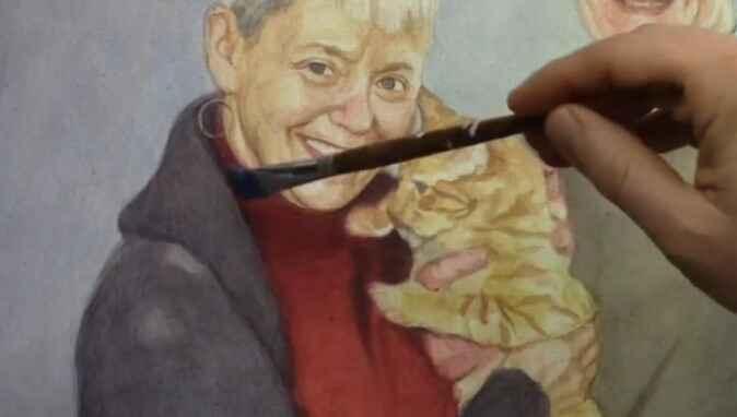
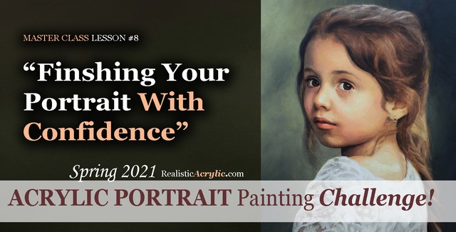
Spring 2021 Acrylic Portrait Painting Challenge: Finishing Your Portrait With Confidence
Let’s help you finish your painting!
In this lesson, we will be wrapping up the Masterclass series for the challenge! I’ll show you how to add some more nuances and details to the portrait of “Cora.” First, we’ll add a glaze to her hair to enrich the overall color. Next, we will enhance some nuances on her eyebrows, dial in the color of the eyes, and paint in the reflections. Finally, we’ll add in the skin tone for her arm in the lower corner and follow up with some work on her lace.
But even though we are nearly done with this portrait painting, it’s not too late to join in the fun!
YOU, too, can paint a portrait!
Take the Acrylic Portrait Painting Challenge (it’s FREE!) and paint along with us!
REGISTER TODAY. The challenge is ongoing, something you can do at your own pace. It’s not too late to enter! After you join, I’ll send you the supplies list and reference photos to paint from.
WATCH NOW…
Lesson #8: Finishing Your Portrait Confidently
Professional artist and instructor Matt Philleo will teach you how to paint an acrylic portrait you can be proud of with this Portrait Painting Challenge!
Would like to paint this portrait with me and hundreds of other artists?
Take the 2021 Spring Portrait Painting Challenge!
You can register below and get started. It is completely FREE to join the challenge and participate. When you join, I’ll send you the “Welcome Kit” which includes:
- The Supplies List (so you know what you need to paint with us, your shopping list. 🙂 )
- The Reference Photo with and without the grid, high resolution, that you can download ready to print out or display on your tablet. You’ll be able to create an accurate portrait this way.
- The Palette Layout Guide showing you how to arrange your colors so they don’t get muddy on your palette
- The Master Class Lesson Schedule
- the Lessons emailed to you
- A private Facebook group to cheer you and help answer your questions
- And a few “bonuses” like opportunities to win my paid online classes
REGISTER TODAY. The challenge is ongoing, something you can do at your own pace. It’s not too late to enter!
Let me know if you have any questions and I look forward to teaching you more!
—Matt
Questions? Suggestions? Thoughts? Let me know, below in the comments. Please share your sketches in our Facebook group and share this post with your friends!

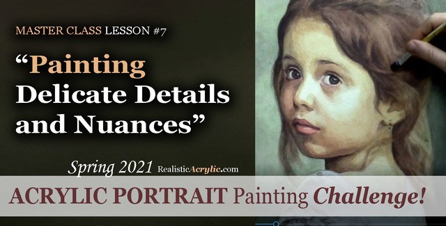
Spring 2021 Acrylic Portrait Painting Challenge: Painting Delicate Details and Nuances
After building the foundation with several layers of value, form, and color, we can then start to “dial in” the detail and nuances.
In this master class lesson (7 of 8), I’ll demonstrate how to add specific detail shapes to “Cora’s” hair. I’ll also add some additional shading to her forehead with a very translucent glaze. Next, I darken the left side of her face while smoothing out some of the rough application of previous glazes with a semi-opaque layer that’s cooler in tone. Finally, I add nuances to her eyes, lips and chin.
But even though we are well along in this portrait painting, it’s not too late to join in the fun!
YOU, too, can paint a portrait!
Take the Acrylic Portrait Painting Challenge (it’s FREE!) and paint along with us!
REGISTER TODAY. The challenge is ongoing, something you can do at your own pace. It’s not too late to enter! After you join, I’ll send you the supplies list and reference photos to paint from.
WATCH NOW…
Lesson #7: Painting Delicate Details and Nuances
Learn how to do smooth shading, skin tones, details, and nuances in this FREE online portrait painting class by Matt Philleo at Realistic Acrylic Portrait School
Would like to paint this portrait with me and hundreds of other artists?
Take the 2021 Spring Portrait Painting Challenge!
You can register below and get started. It is completely FREE to join the challenge and participate. When you join, I’ll send you the “Welcome Kit” which includes:
- The Supplies List (so you know what you need to paint with us, your shopping list. 🙂 )
- The Reference Photo with and without the grid, high resolution, that you can download ready to print out or display on your tablet. You’ll be able to create an accurate portrait this way.
- The Palette Layout Guide showing you how to arrange your colors so they don’t get muddy on your palette
- The Master Class Lesson Schedule
- the Lessons emailed to you
- A private Facebook group to cheer you and help answer your questions
- And a few “bonuses” like opportunities to win my paid online classes
REGISTER TODAY. The challenge is ongoing, something you can do at your own pace. It’s not too late to enter!
Let me know if you have any questions and I look forward to teaching you more!
—Matt
Questions? Suggestions? Thoughts? Let me know, below in the comments. Please share your sketches in our Facebook group and share this post with your friends!
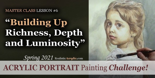
Spring 2021 Acrylic Portrait Painting Challenge: Building Up Richness, Depth and Luminosity
Acrylic is a fantastic medium for portrait painting, but it can be so challenging to use! That is why I am teaching you the glazing technique to open a lot of possibilities and ease your frustration.
Historically, the Old Masters used small amounts of pigment dispersed in larger amounts of linseed oil or mineral spirits to create a sense of volume and depth in their paintings. Light shines through and you can see a bit of each layer beneath the ones on top.
We can use that technique to our advantage with acrylic. By applying several translucent layers, there is an increased sense of depth, shading, contrast and color saturation and luminosity.
In this particular lesson, I’ll demonstrate how to add richness to the mid-tones of the girl’s face and hair. We will also add more contrast to the image with a couple of layers to the background, and turn the form of her figure with a precisely placed glaze on her clothing.
But even though we are well along in this portrait painting, it’s not too late to join in the fun!
Take the Acrylic Portrait Painting Challenge (it’s FREE!) and paint along with us!
REGISTER TODAY. The challenge is ongoing, something you can do at your own pace. It’s not too late to enter! After you join, I’ll send you the supplies list and reference photos to paint from.
WATCH NOW…
Lesson #6: Building Up Richness, Depth, and Luminosity
Learn how to create a vibrant acrylic portrait where the colors are not flat or muddy. In this FREE step by step master class, I’ll show you how!
Would like to paint this portrait with me and hundreds of other artists?
Take the 2021 Spring Portrait Painting Challenge!
You can register below and get started. It is completely FREE to join the challenge and participate. When you join, I’ll send you the “Welcome Kit” which includes:
- The Supplies List (so you know what you need to paint with us, your shopping list. 🙂 )
- The Reference Photo with and without the grid, high resolution, that you can download ready to print out or display on your tablet. You’ll be able to create an accurate portrait this way.
- The Palette Layout Guide showing you how to arrange your colors so they don’t get muddy on your palette
- The Master Class Lesson Schedule
- the Lessons emailed to you
- A private Facebook group to cheer you and help answer your questions
- And a few “bonuses” like opportunities to win my paid online classes
REGISTER TODAY. The challenge is ongoing, something you can do at your own pace. It’s not too late to enter!
Let me know if you have any questions and I look forward to teaching you more!
—Matt
Questions? Suggestions? Thoughts? Let me know, below in the comments. Please share your sketches in our Facebook group and share this post with your friends!

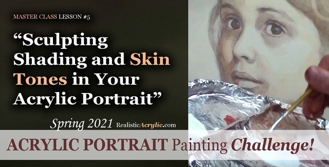
Spring 2021 Acrylic Portrait Painting Challenge: Sculpting Shading and Skin Tones in Your Acrylic Portrait
Acrylic portrait painting, in many ways, is like creating a sculpture. We want to truly make our faces look realistic and three-dimensional. In this master class video lesson, I show you how to do exactly that.
We’re breaking a fine art portrait painting down into bite-size steps that YOU can do.
Specifically, in this video lesson, I demonstrate how darkening your background can really make the face stand out in a lifelike way.
What colors should we use for the shadows? I’ll show you how to mix them, what brushes to use to apply them, and HOW to do it. Get the shadows right, and 80% of the battle is won, so to speak in your portrait.
What colors for the skin tones?
In this video, you’ll learn the correct color to mix, how to create glazes with matte medium and apply it to the face smoothly.
This is still very much the beginning. More lessons to come.
Take the Acrylic Portrait Painting Challenge (it’s FREE!) and paint along with us!
REGISTER TODAY. The challenge is ongoing, something you can do at your own pace. It’s not too late to enter! After you join, I’ll send you the supplies list and reference photos to paint from.
WATCH NOW…
Lesson #5: Sculpting Shading and Skin Tones in Your Acrylic Portrait
Acrylic Portrait Painting Challenge Lesson #5: Sculpting Shading and Skin Tones in Your Acrylic Portrait
Would like to paint this portrait with me and hundreds of other artists?
Take the 2021 Spring Portrait Painting Challenge!
You can register below and get started. It is completely FREE to join the challenge and participate. When you join, I’ll send you the “Welcome Kit” which includes:
- The Supplies List (so you know what you need to paint with us, your shopping list. 🙂 )
- The Reference Photo with and without the grid, high resolution, that you can download ready to print out or display on your tablet. You’ll be able to create an accurate portrait this way.
- The Palette Layout Guide showing you how to arrange your colors so they don’t get muddy on your palette
- The Master Class Lesson Schedule
- the Lessons emailed to you
- A private Facebook group to cheer you and help answer your questions
- And a few “bonuses” like opportunities to win my paid online classes
REGISTER TODAY. The challenge is ongoing, something you can do at your own pace. It’s not too late to enter!
What’s coming up in the next lesson? More shading, more skin tones, and the start of some detail work. Follow the lessons and you will be able to create a portrait you can be proud of…even if you’re a complete beginner!
Let me know if you have any questions and I look forward to teaching you more!
—Matt
Questions? Suggestions? Thoughts? Let me know, below in the comments. Please share your sketches in our Facebook group and share this post with your friends!