Tag Archives for " sketch portrait with grid "

How to Critique a Pet Portrait Painting Sketch
I’ll show you how I give critiques of pet portrait sketches to my student.
When working on a pet portrait painting, critiquing your sketch is a vital part of the process. Whether you’re aiming to depict a Maltese or a mixed-breed dog, evaluating your sketch helps to ensure that your final piece captures the true essence and features of the pet. This article will walk you through a detailed critique process with practical tips to improve your work, especially when portraying the texture, forms, and proportions of a pet’s fur and facial features.
Key Focus Areas in a Pet Portrait Critique
- Fur Texture and Detail
- Abstract Forms and Shapes
- Proportions of the Features
- Breaking Down the Sketch Into Sections
1. Analyze Fur Texture for Realism
The first thing to assess when critiquing a pet portrait sketch is the fur texture. Capturing realistic fur is essential to making the portrait resemble the pet you’re painting. If the fur looks flat, you may need to add more detail by observing how the strands of fur interact with the light and shadow in the reference photo.
To enhance the fur texture:
- Observe how the fur clumps together in certain areas. Look for patterns of light and dark where the fur creates shadows or reflects light.
- Sketch the fur in sections rather than treating it as one mass. Look at your reference photo and break down the fur into distinct strands, sketching them individually.
- Use softer, thinner lines to represent fine fur, and more prominent lines for thicker areas of fur.
For example, if the fur on the dog’s head is thicker, you’ll want to draw shorter, more frequent lines, suggesting the texture and fullness. As you progress through the portrait, adding more nuanced strands helps give depth and texture to the sketch.
2. Focus on Abstract Forms Rather than Literal Features
When critiquing, try to see your sketch not as a pet, but as a series of abstract forms. This technique helps you focus on shapes and values, which are more reliable indicators of how the final painting will look.
Here’s how you can shift your mindset to abstract forms:
- Squint at your reference photo or zoom in on specific sections to see the shapes of light and dark. The fur and features should dissolve into patterns that can be sketched as abstract shapes.
- Break down sections of the face and fur into squares or triangles. For example, a section of fur might appear as a triangular shape with dark edges, or a shadow around the eyes might form a rounded rectangle.
By thinking of the sketch as a collection of abstract shapes, you’ll become less focused on replicating hair strands and more on capturing the overall light and shadow. This method helps build a more accurate sketch, especially when detail is hard to interpret.
3. Double-Check the Proportions
One of the most common mistakes in pet portraits is getting the proportions slightly off. During your critique, compare your sketch to the reference photo, paying attention to key features like the nose, eyes, and ears.
- For the nose, make sure it’s not too narrow or too wide. A dog’s nose often forms a rounded triangle, and drawing it slightly off can make the pet look unfamiliar. If your sketch shows a narrow nose, you may need to broaden it and adjust the angles.
- The eyes are critical. If they are too large or small, the whole portrait may feel disproportionate. Measure the eyes in relation to the head and ensure they are the correct size and placed evenly.
It can be useful to divide the reference photo into a grid and sketch each section individually to keep proportions accurate.
4. Break Down Your Sketch Into Smaller Sections
Critiquing a portrait becomes much easier when you break down the reference image and the sketch into smaller, more manageable sections. Working square by square allows you to focus on individual parts of the portrait rather than feeling overwhelmed by the whole.
- Divide your canvas or reference image into squares or sections, and focus on replicating each one accurately.
- Pay attention to the shapes of light and shadow within each square. This method ensures that you capture the most important aspects of the pet’s features, without getting lost in the details.
For example, in a dog’s face, the area around the eyes might form a circular pattern of light and dark. By focusing on these shapes within each section, you can ensure that the overall image comes together cohesively.
Tips for Improving Your Sketch
- Pay Attention to Details Early On: The more effort you put into your sketch, the easier it will be when you start painting. A detailed sketch provides a solid foundation for the painting process, allowing you to focus on color and texture later.
- Use the Glazing Technique for Texture: When painting over your sketch, consider using a glazing technique. This method involves applying thin layers of translucent paint, allowing the underlying sketch to show through. It’s particularly effective for painting fur, as you can layer different colors to create depth.
- Enhance with Opaque Paint: Once you have a solid base with your glazing, you can apply opaque paint to highlight areas such as the fur’s highlights or the reflection in the eyes. These final touches bring the painting to life and give the pet portrait a realistic look.
The Importance of a Good Sketch
Critiquing your pet portrait sketch is essential for producing a realistic and beautiful painting. By focusing on fur texture, abstract shapes, and accurate proportions, you can create a solid foundation for your artwork. Break your reference into manageable sections, and approach your critique with a willingness to adjust and improve.
A well-developed sketch saves you time in the painting process, helping you to produce more accurate and lifelike pet portraits that captivate the viewer.
LEARN MORE
- How to Paint Foliage Using the Acrylic Glazing Technique
- How to Trace for an Accurate Portrait Sketch
- How to Paint Realistic Eyes in Your Acrylic Portrait
- How to Add Raw Umber Dark & Ultramarine Blue to Your Portrait
- How to Make Your Own Raw Umber Dark
- How to Paint Realistic Trees & Grass in Your Acrylic
- How to Block In Skin Tone Values Using Glazing Technique
- How to Paint Vibrant Reds in Your Acrylic Portrait
- How to Glaze Background Colors & More Acrylic Portrait
- How to Paint White Clothing in Your Acrylic Portrait
- How to Easily Transition from a Sketch to a Painting
- How to Block In Shading & Skin Tones in Your Acrylic
- How to Build Up Color on Acrylic Pet Portrait
- How to Build Up Form on Clothing with Acrylic
- How to Paint Dark Clothing Using Acrylic Glazing Technique
- How to Paint a 24 x 30 Acrylic With 30 People
- How to Do Smooth Shading with Acrylic
- How to Sketch an Acrylic Portrait with a Grid
Read more about how to paint a portrait that you can surely be proud of!
I’d love to hear your thoughts on this video. Please share it with your friends and family. Let me know if you have any further questions. I’ll greatly help you.
If you’d like to learn more, sign up for my free email tips and video class today.
Learn How to Paint Acrylic Portraits With My Free Mini-Video Course!
Thank you so much for taking the time to read this tutorial and watch the video. That means a lot to me. I hope you find it very helpful in your portrait painting.
Yours for Better Portraits,

P.S. Did you find this post helpful or encouraging? If so, send it on ahead! Let others know with the share buttons below. I’d love to hear your comments. Thank you so much! Also, do you have a question on acrylic portrait painting you’d like answered? Let me know, and I’d be happy to help!

How to Apply Burnt Sienna Glaze to a Portrait
Creating depth and warmth with burnt sienna glazes step by step guide
Applying glazes to an acrylic portrait is a great way to add depth and unify the different elements of your painting. One versatile color used by many artists for this purpose is burnt sienna. This reddish-brown hue can bring warmth to shadowed areas and smooth transitions between light and dark, creating a cohesive, harmonious effect across your portrait. In this tutorial, you’ll learn how to apply a burnt sienna glaze step-by-step, ensuring your painting achieves a professional and balanced look.
What You Will Need
- Acrylic paints: Burnt sienna, raw umber dark, ultramarine blue
- Glazing medium
- 3/4-inch flat brush
- Small round brush for details
- Palette for mixing
- A well-textured canvas
Step 1: Preparing the Surface
Before applying the burnt sienna glaze, ensure that your portrait has established base layers with underlying shadows and highlights. In this example, I have already blocked in key elements using raw umber dark and ultramarine blue to define shadows and add depth. These layers are essential for giving the burnt sienna glaze something to interact with, creating richer tones and a natural flow of colors.
Step 2: Mixing the Burnt Sienna Glaze
Start by placing a small amount of burnt sienna on your palette. Mix it with a glazing medium until it reaches a smooth, transparent consistency. It’s important to blend it thoroughly, similar to mixing ingredients when baking a cake. The medium will help thin out the paint, allowing it to create a subtle wash of color over the portrait without losing the underlying details.
Step 3: Applying the Glaze to the Background
Begin with the background of your portrait. Dip the corner of your flat brush into the glaze mixture and apply it with even, horizontal strokes. As you work across the canvas, maintain a wet edge by moving quickly. Use firm pressure initially to push the paint into the texture of the canvas, and then lighten the pressure as you spread the glaze.
Tip: Turn your brush over to use any extra paint on the reverse side for a more efficient application. Lighten the pressure at the edges to smooth out any overlapping brushstrokes, giving your background a seamless transition.
Step 4: Integrating Burnt Sienna into the Portrait
Now that the background has been glazed, consider introducing burnt sienna into the shadows of the portrait, such as the hair, hands, and facial features. This reddish-brown hue adds warmth and depth to the shaded areas, making them stand out more vividly against the lighter tones.
For the hair, apply the glaze in the darker regions, blending it down towards the chin and neck. If you see this tone occurring naturally in the shadowed areas of the face, lightly glaze over these regions. Always make sure to evaluate where the burnt sienna fits best, as it’s a warm color that may not be suitable for cooler-toned areas like clothing.
Tip: When applying glaze to intricate areas such as hair, use a small round brush to control the precision of the strokes. This ensures the glaze enhances the features without overwhelming them.
Step 5: Enhancing Details with Glaze
A burnt sienna glaze can also enhance smaller details, like the fur of an animal in your portrait or the eyelashes. In this example, the artist finds that the glaze works beautifully within the dog’s fur, adding a touch of warmth. Similarly, in the boy’s facial features, it can accentuate the lips, eyebrows, and even parts of the gums and teeth.
When adding glaze to fine details, switch to a small round brush for more accuracy. This will help you control the flow of paint, allowing you to create more nuanced transitions between light and dark areas.
Step 6: Building Layers for Richer Color
Glazing is a technique that benefits from multiple layers. Once your first layer of burnt sienna glaze is dry, you can assess whether additional layers are needed to achieve your desired effect. Applying thin glazes in layers helps you avoid overloading the painting with too much color at once.
Technique Tip: In areas where the value is already dark, like deep shadows, it’s possible to introduce burnt sienna even further. The artist notes that darker areas can handle more layers because the color builds up gradually without overwhelming the overall tone.
Conversely, for lighter areas, avoid too much glazing as it could darken the value and obscure the highlights.
Step 7: Avoid Overglazing in Cooler Tones
One key consideration when using a warm tone like burnt sienna is to avoid applying it over cooler-toned areas of your portrait. For instance, the boy’s shirt in this example has a cooler undertone. While a small amount of burnt sienna may work in the darker parts of the shirt, applying too much can disturb the cooler color harmony.
Tip: Always take a step back from your portrait to evaluate the overall color balance. Introduce burnt sienna only where it naturally complements the existing colors.
Step 8: Final Touches
Once you’ve applied the burnt sienna glaze to all the necessary areas, assess the overall unity of the portrait. Burnt sienna can be an excellent way to tie together different elements of your painting. The artist uses it subtly within the lips, the dog’s fur, and parts of the background to create a consistent, warm feel throughout the composition.
Before moving on to the next stages of your painting, let the glaze dry fully. Once dry, you can continue building up layers, adding more glazes or opaque colors as needed to refine the portrait.
Tips for Applying Burnt Sienna Glaze:
- Use a Glazing Medium: This ensures that the paint remains translucent and allows the underlying layers to shine through.
- Keep a Wet Edge: Work quickly and maintain a wet edge while applying the glaze to avoid harsh lines.
- Layer Gradually: Apply multiple thin layers of glaze to control the intensity of the color.
- Avoid Cooler Areas: Use burnt sienna only in warm-toned areas of the painting to maintain color harmony.
- Use Different Brushes: For large areas, a flat brush is ideal. For small details, switch to a round brush for precision.
Tips
Applying a burnt sienna glaze to your portrait can enhance the warmth and depth of your artwork. It’s a versatile color that works well in shadowed areas and ties together various elements in your painting, creating a cohesive, professional finish. By following these steps and tips, you’ll be able to master this glazing technique and take your acrylic portraits to the next level.
- How to Paint Foliage Using the Acrylic Glazing Technique
- How to Trace for an Accurate Portrait Sketch
- How to Paint Realistic Eyes in Your Acrylic Portrait
- How to Add Raw Umber Dark & Ultramarine Blue to Your Portrait
- How to Make Your Own Raw Umber Dark
- How to Paint Realistic Trees & Grass in Your Acrylic
- How to Block In Skin Tone Values Using Glazing Technique
- How to Paint Vibrant Reds in Your Acrylic Portrait
- How to Glaze Background Colors & More Acrylic Portrait
- How to Paint White Clothing in Your Acrylic Portrait
- How to Easily Transition from a Sketch to a Painting
- How to Block In Shading & Skin Tones in Your Acrylic
- How to Build Up Color on Acrylic Pet Portrait
- How to Build Up Form on Clothing with Acrylic
- How to Paint Dark Clothing Using Acrylic Glazing Technique
- How to Paint a 24 x 30 Acrylic With 30 People
- How to Do Smooth Shading with Acrylic
- How to Sketch an Acrylic Portrait with a Grid
Read more about how to paint a portrait that you can surely be proud of!
I’d love to hear your thoughts on this video. Please share it with your friends and family. Let me know if you have any further questions. I’ll greatly help you.
If you’d like to learn more, sign up for my free email tips and video class today.
Learn How to Paint Acrylic Portraits With My Free Mini-Video Course!
Thank you so much for taking the time to read this tutorial and watch the video. That means a lot to me. I hope you find it very helpful in your portrait painting.
Yours for Better Portraits,
P.S. Did you find this post helpful or encouraging? If so, send it on ahead! Let others know with the share buttons below. I’d love to hear your comments. Thank you so much! Also, do you have a question on acrylic portrait painting you’d like answered? Let me know, and I’d be happy to help!

How to Paint a Portrait Outside: Glazing Technique
Master the art of outdoor portrait painting using glazing techniques for depth and realism
Outdoor portrait painting can be a rewarding experience that connects artists with nature. The beauty of the natural light offers a unique perspective that can enhance the realism of your artwork. One effective technique to achieve depth and vibrancy in your portraits is glazing. This method involves applying thin layers of transparent color over dried paint, allowing the underlying layers to shine through.
Understanding Glazing Techniques
Definition of Glazing
Glazing is a painting technique where transparent layers of paint are applied over a dried base layer. So this process creates a luminous effect, enhancing colors and adding depth to your artwork.
How Glazing Enhances Color and Depth
By using glazing, so artists can build up complex colors and tones gradually. The layering effect allows for subtle changes in color, making the portrait appear more lifelike. As each layer dries, the artist can assess the depth and adjust accordingly.
Essential Materials
Before starting your outdoor portrait, gather the following materials:
Recommended Colors for Glazing
- Raw Umber Dark: Ideal for adding depth and shadow.
- Titanium White: Provides opacity and brightness.
- Burnt Sienna: Useful for warm skin tones and shading.
- Alizarine Crimson: Adds richness to the color palette.
Tools Required for Outdoor Painting
- Canvas or panel
- Palette for mixing colors
- Brushes (various sizes for different applications)
- Rags for cleaning brushes
- Easel for stability
- Water container for cleaning brushes
Step-by-Step Process
Preparing Your Canvas
Then start with a prepared canvas. Make sure it is dry before applying any paint. Because this preparation allows for better adhesion and a smoother finish.
Layering Colors Using Glazes
- Apply the Base Layer: Begin with an initial layer of paint to establish your color base. This layer can be more opaque.
- Mix Colors: Create a glaze by mixing raw umber dark with titanium white to form a more opaque mixture. Then this will be used to darken specific areas.
- Test the Colors: Before applying, test the mixed colors on a rag to ensure the desired tone and opacity.
Adding Depth with Shadows and Highlights
- Identify Areas for Glazing: Look for areas that need more depth, such as shadows under the chin or around the neck where the hair casts a shadow.
- Apply Glaze: Using a soft brush, apply the glaze over the selected areas. Allow the paint to dry for a few minutes before assessing the color.
- Layering: After the initial glaze dries, apply another layer of color, gradually building depth.
Tips for Success
- Working with Natural Light: Pay attention to how natural light changes throughout the day. Because this can affect the appearance of colors and shadows in your painting.
- Adjusting Colors for Outdoor Conditions: Outdoor lighting can vary, so adjust your palette accordingly. Warmer colors may be needed to balance the coolness of shade or overcast skies.
- Patience in Layering: Take your time with each layer. Allow glazes to dry fully before applying the next layer to prevent mudding of colors.
Conclusion
In conclusion, glazing is a powerful technique for outdoor portrait painting that can add depth and luminosity to your work. Because by understanding how to layer colors effectively and adjust to natural light, artists can create stunning and realistic portraits. Whether painting from life or a reference photo, the practice of glazing will enhance your skills and results. So grab your materials, head outdoors, and enjoy the process of capturing the beauty around you.
If you’re looking for more instructional videos on how to improve your acrylic painting, visit www.realisticacrylic.com for more tutorials and check out my free courses here. .
- Adding highlights to your acrylic painting
- 5 Excellent Reasons to Use Aluminum Foil
- Paint Realistic Wrinkles in Acrylic
- Painting Clothing in an Acrylic Portrait
- Paint a Cloudy Sky Acrylic
- How to add Semi-Opaque Highlights
- How to Enhance the Contrast in Your Acrylic
- How to Add Glaze to Your Acrylic Painting
- Paint Realistic Reflections on Eyeglasses in an Acrylic Portrait
- Build Up Depth on Your Acrylic Portrait Backgrounds
- How Do You Do Layers With the Glazing Technique?
- Learn How to Paint Wrinkles in Acrylic
Read more about how to paint a portrait that you can surely be proud of!
I’d love to hear your thoughts on this video. Please share it with your friends and family. Let me know if you have any further questions. I’ll greatly help you.
If you’d like to learn more, sign up for my free email tips and video class today.
Learn How to Paint Acrylic Portraits With My Free Mini-Video Course!
Thank you so much for taking the time to read this tutorial and watch the video. That means a lot to me. I hope you find it very helpful in your portrait painting.
Yours for Better Portraits,
P.S. Did you find this post helpful or encouraging? If so, send it on ahead! Let others know with the share buttons below. I’d love to hear your comments. Thank you so much! Also, do you have a question on acrylic portrait painting you’d like answered? Let me know, and I’d be happy to help!

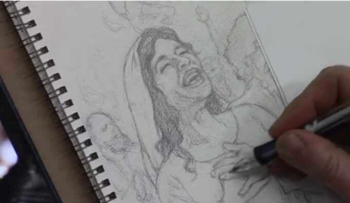
How to Sketch Book Cover Illustration
I’ll show you a sketching book cover illustration.
When creating a sketch for a book cover illustration it is a rewarding and meticulous process that blends creativity with technical skill. In this tutorial, I’ll walk through the steps of sketching a book cover illustration for a Bible commentary, focusing on capturing emotion and detail in every stroke. By the end of this guide, you’ll have actionable techniques to apply to your own projects, whether you’re a beginner or an experienced artist.
In this example, we explore the sketching process for a cover that illustrates the Pentecostal movement from the Book of Acts. This moment depicts the disciples receiving the Holy Spirit, with dramatic expressions of joy and intensity. Let’s dive into the step-by-step process of creating this compelling piece of art.
Step 1: Conceptualizing the Scene
Before starting any sketch, it’s important to have a clear understanding of the subject matter. In this case, the illustration revolves around a significant biblical event, the arrival of the Holy Spirit during Pentecost, described in the Book of Acts. To capture this effectively:
- Research the event: Familiarize yourself with the story by reading the relevant biblical passages. Because this will help you grasp the mood and energy needed for your sketch.
- Determine the key emotions: The illustration should evoke excitement, awe, and spiritual reverence. These emotions will be conveyed through the expressions of the characters and their body language.
- Find reference images: Utilize online reference photos to help with anatomy, facial expressions, and positioning.
In this sketch, the focal point is a woman’s expression of joy, symbolizing the elation felt by the disciples as they received the Holy Spirit.
Step 2: Start with a Rough Sketch
The first stage of creating any illustration is a rough sketch to establish the composition. For this book cover, the sketch began by blocking in the figures and their general positions.
- Freehand drawing: Start by sketching freehand, focusing on the placement and proportion of the characters. This allows for flexibility as you adjust the positioning of different elements.
- Keep it loose: At this stage, don’t worry too much about details. Use light lines to outline the figures and the background. This will give you a basic framework to build on.
Tips for Freehand Sketching:
- Use loose, flowing strokes to keep the composition dynamic.
- Focus on proportions but don’t stress about perfect accuracy early on.
- Keep erasing and refining the composition as needed.
Step 3: Refining the Details
Once the rough sketch is laid out, it’s time to refine the characters and bring out the key details that will make your illustration pop. Because in this project, we will focuses on capturing facial expressions and hand positioning, which are critical for conveying emotion.
Facial Expressions and Hands:
- Faces: Pay special attention to the expressions on your characters’ faces. For this sketch, one figure’s face is drawn with joy, while another figure shows intensity through a furrowed brow and a praying posture.
- Hands: Hands are often one of the hardest parts to draw accurately, but they are essential in conveying emotion. Here, the woman has her hands on her chest, adding to the sense of awe, while another figure has clasped fingers, indicating deep prayer.
Refining these elements involves carefully erasing and reworking lines to get the right anatomy and expression. For example, the wrinkles around the eyes or the positioning of the fingers can greatly impact the emotional depth of the characters.
Technique for Adding Expression:
- Use reference images: Don’t hesitate to consult images to ensure your anatomy and expressions are realistic.
- Focus on the eyes: Eyes are windows to the soul, so ensure they capture the right emotion.
- Subtle shading: Add light shading to emphasize features such as wrinkles, folds, or muscle tension in the hands.
Step 4: Working with Watercolor Paper
In this illustration, watercolor paper was used as the base for the sketch. This surface provides a bit more texture and grip than traditional drawing paper, making it ideal for illustrations that will later be painted.
Benefits of Watercolor Paper for Sketching:
- The texture holds pencil marks well, allowing for smoother shading and erasing.
- It’s sturdy enough to withstand multiple layers of detail, which is beneficial when transitioning from sketching to painting.
Step 5: Final Adjustments and Preparing for Paint
At this point in the sketch, the major elements of the illustration are in place. The characters are well-formed, and their emotions are clearly conveyed through their body language and expressions. However, there are always small adjustments that can be made to improve the sketch before painting.
Making Final Adjustments:
- Shadows and depth: Add subtle shading to the clothing and faces to create depth. For instance, a shadow under the man’s beard gives his face more structure.
- Refine small details: Pay attention to small details like the lines of the fingers or the folds in clothing. Then these small adjustments can make a big difference in the realism of the sketch.
Tips for Transitioning to Paint:
- Ensure that the sketch is as clean and detailed as possible. This will serve as the foundation for the painting stage.
- Consider how your paint medium (whether watercolor, acrylic, or oil) will interact with the pencil lines. Light sketching can easily be painted over, while heavier pencil marks might need to be minimized.
Conclusion
Sketching a book cover illustration requires both creativity and attention to detail. Because by focusing on freehand drawing, refining expressions, and making adjustments based on reference photos, you can create a compelling and emotionally charged sketch. In this project, the sketch captures the pivotal moment of Pentecost, filled with joy and intensity, and lays a solid foundation for a beautiful painted illustration.
If you found this guide helpful and would like to learn more about sketching or painting techniques, visit realisticacrylic.com for more tutorials and check out my free gift for you here
- Adding highlights to your acrylic painting
- 5 Excellent Reasons to Use Aluminum Foil
- Paint Realistic Wrinkles in Acrylic
- Painting Clothing in an Acrylic Portrait
- Paint a Cloudy Sky Acrylic
- How to add Semi-Opaque Highlights
- How to Enhance the Contrast in Your Acrylic
- How to Add Glaze to Your Acrylic Painting
- Paint Realistic Reflections on Eyeglasses in an Acrylic Portrait
- Build Up Depth on Your Acrylic Portrait Backgrounds
- How Do You Do Layers With the Glazing Technique?
- Learn How to Paint Wrinkles in Acrylic
Read more about how to paint a portrait that you can surely be proud of!
I’d love to hear your thoughts on this video. Please share it with your friends and family. Let me know if you have any further questions. I’ll greatly help you.
If you’d like to learn more, sign up for my free email tips and video class today.
Learn How to Paint Acrylic Portraits With My Free Mini-Video Course!
Thank you so much for taking the time to read this tutorial and watch the video. That means a lot to me. I hope you find it very helpful in your portrait painting.
Yours for Better Portraits,
P.S. Did you find this post helpful or encouraging? If so, send it on ahead! Let others know with the share buttons below. I’d love to hear your comments. Thank you so much! Also, do you have a question on acrylic portrait painting you’d like answered? Let me know, and I’d be happy to help!

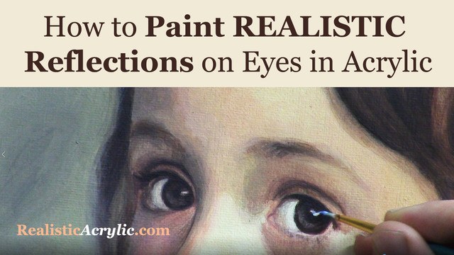
How to Paint Realistic Reflections on Eyes in Your Acrylic Portrait
Eyes are the most important feature of an acrylic portrait. When you paint the eyes correctly, everything else seems to fall into place so much easier.
In this video, I’ll show you how to paint realistic reflections, using two complementary colors in addition to white, and getting the shape of the reflection just right. Then this originally was a BONUS video in the Acrylic Portrait Painting Challenge Master Class, now available in the All-Access Membership at Realistic Acrylic Portrait School.
Even though it is technically over, you can take the Acrylic Portrait Painting Challenge (it’s FREE!) and paint along with us! 8 master class lessons are posted to help you paint a portrait you can be proud of!
REGISTER TODAY. The challenge is ongoing, something you can do at your own pace. It’s not too late to enter! After you join, I’ll send you the supplies list and reference photos to paint from.
Register for the Challenge!WATCH NOW…
Lesson #8: How to Paint Realistic Reflections on Eyes in Acrylic
Questions? Suggestions? Thoughts? Let me know, below in the comments. Please share your sketches in our Facebook group and share this post with your friends!
- How to Paint Foliage Using the Acrylic Glazing Technique
- How to Trace for an Accurate Portrait Sketch
- How to Paint Realistic Eyes in Your Acrylic Portrait
- How to Add Raw Umber Dark & Ultramarine Blue to Your Portrait
- How to Make Your Own Raw Umber Dark
- How to Paint Realistic Trees & Grass in Your Acrylic
- How to Block In Skin Tone Values Using Glazing Technique
- How to Paint Vibrant Reds in Your Acrylic Portrait
- How to Glaze Background Colors & More Acrylic Portrait
- How to Paint White Clothing in Your Acrylic Portrait
- How to Easily Transition from a Sketch to a Painting
- How to Block In Shading & Skin Tones in Your Acrylic
- How to Build Up Color on Acrylic Pet Portrait
- How to Build Up Form on Clothing with Acrylic
- How to Paint Dark Clothing Using Acrylic Glazing Technique
- How to Paint a 24 x 30 Acrylic With 30 People
- How to Do Smooth Shading with Acrylic
- How to Sketch an Acrylic Portrait with a Grid
Read more about how to paint a portrait that you can surely be proud of!
I’d love to hear your thoughts about this video. Please share it with your friends and family. Let me know if you have any further questions. I’ll greatly help you.
Thank you so much for taking the time to read this tutorial and watch the video. That means a lot to me. I hope you find it very helpful in your portrait painting.
P.S. Did you find this post helpful or encouraging? If so, send it on ahead! Let others know with the share buttons below. I’d love to hear your comments. Thank you so much! Also, do you have a question on acrylic portrait painting you’d like answered? Let me know, and I’d be happy to help!

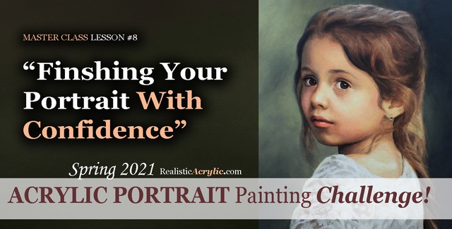
Spring 2021 Acrylic Portrait Painting Challenge: Finishing Your Portrait With Confidence
Let’s help you finish your painting!
In this lesson, we will be wrapping up the Masterclass series for the challenge! I’ll show you how to add some more nuances and details to the portrait of “Cora.” First, we’ll add a glaze to her hair to enrich the overall color. Next, we will enhance some nuances on her eyebrows, dial in the color of the eyes, and paint in the reflections. Finally, we’ll add in the skin tone for her arm in the lower corner and follow up with some work on her lace.
But even though we are nearly done with this portrait painting, it’s not too late to join in the fun!
YOU, too, can paint a portrait!
Take the Acrylic Portrait Painting Challenge (it’s FREE!) and paint along with us!
REGISTER TODAY. The challenge is ongoing, something you can do at your own pace. It’s not too late to enter! After you join, I’ll send you the supplies list and reference photos to paint from.
WATCH NOW…
Lesson #8: Finishing Your Portrait Confidently
Professional artist and instructor Matt Philleo will teach you how to paint an acrylic portrait you can be proud of with this Portrait Painting Challenge!
Would like to paint this portrait with me and hundreds of other artists?
Take the 2021 Spring Portrait Painting Challenge!
You can register below and get started. It is completely FREE to join the challenge and participate. When you join, I’ll send you the “Welcome Kit” which includes:
- The Supplies List (so you know what you need to paint with us, your shopping list. 🙂 )
- The Reference Photo with and without the grid, high resolution, that you can download ready to print out or display on your tablet. You’ll be able to create an accurate portrait this way.
- The Palette Layout Guide showing you how to arrange your colors so they don’t get muddy on your palette
- The Master Class Lesson Schedule
- the Lessons emailed to you
- A private Facebook group to cheer you and help answer your questions
- And a few “bonuses” like opportunities to win my paid online classes
REGISTER TODAY. The challenge is ongoing, something you can do at your own pace. It’s not too late to enter!
Let me know if you have any questions and I look forward to teaching you more!
—Matt
Questions? Suggestions? Thoughts? Let me know, below in the comments. Please share your sketches in our Facebook group and share this post with your friends!

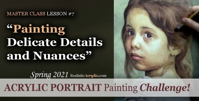
Spring 2021 Acrylic Portrait Painting Challenge: Painting Delicate Details and Nuances
After building the foundation with several layers of value, form, and color, we can then start to “dial in” the detail and nuances.
In this master class lesson (7 of 8), I’ll demonstrate how to add specific detail shapes to “Cora’s” hair. I’ll also add some additional shading to her forehead with a very translucent glaze. Next, I darken the left side of her face while smoothing out some of the rough application of previous glazes with a semi-opaque layer that’s cooler in tone. Finally, I add nuances to her eyes, lips and chin.
But even though we are well along in this portrait painting, it’s not too late to join in the fun!
YOU, too, can paint a portrait!
Take the Acrylic Portrait Painting Challenge (it’s FREE!) and paint along with us!
REGISTER TODAY. The challenge is ongoing, something you can do at your own pace. It’s not too late to enter! After you join, I’ll send you the supplies list and reference photos to paint from.
WATCH NOW…
Lesson #7: Painting Delicate Details and Nuances
Learn how to do smooth shading, skin tones, details, and nuances in this FREE online portrait painting class by Matt Philleo at Realistic Acrylic Portrait School
Would like to paint this portrait with me and hundreds of other artists?
Take the 2021 Spring Portrait Painting Challenge!
You can register below and get started. It is completely FREE to join the challenge and participate. When you join, I’ll send you the “Welcome Kit” which includes:
- The Supplies List (so you know what you need to paint with us, your shopping list. 🙂 )
- The Reference Photo with and without the grid, high resolution, that you can download ready to print out or display on your tablet. You’ll be able to create an accurate portrait this way.
- The Palette Layout Guide showing you how to arrange your colors so they don’t get muddy on your palette
- The Master Class Lesson Schedule
- the Lessons emailed to you
- A private Facebook group to cheer you and help answer your questions
- And a few “bonuses” like opportunities to win my paid online classes
REGISTER TODAY. The challenge is ongoing, something you can do at your own pace. It’s not too late to enter!
Let me know if you have any questions and I look forward to teaching you more!
—Matt
Questions? Suggestions? Thoughts? Let me know, below in the comments. Please share your sketches in our Facebook group and share this post with your friends!
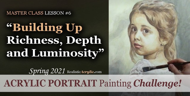
Spring 2021 Acrylic Portrait Painting Challenge: Building Up Richness, Depth and Luminosity
Acrylic is a fantastic medium for portrait painting, but it can be so challenging to use! That is why I am teaching you the glazing technique to open a lot of possibilities and ease your frustration.
Historically, the Old Masters used small amounts of pigment dispersed in larger amounts of linseed oil or mineral spirits to create a sense of volume and depth in their paintings. Light shines through and you can see a bit of each layer beneath the ones on top.
We can use that technique to our advantage with acrylic. By applying several translucent layers, there is an increased sense of depth, shading, contrast and color saturation and luminosity.
In this particular lesson, I’ll demonstrate how to add richness to the mid-tones of the girl’s face and hair. We will also add more contrast to the image with a couple of layers to the background, and turn the form of her figure with a precisely placed glaze on her clothing.
But even though we are well along in this portrait painting, it’s not too late to join in the fun!
Take the Acrylic Portrait Painting Challenge (it’s FREE!) and paint along with us!
REGISTER TODAY. The challenge is ongoing, something you can do at your own pace. It’s not too late to enter! After you join, I’ll send you the supplies list and reference photos to paint from.
WATCH NOW…
Lesson #6: Building Up Richness, Depth, and Luminosity
Learn how to create a vibrant acrylic portrait where the colors are not flat or muddy. In this FREE step by step master class, I’ll show you how!
Would like to paint this portrait with me and hundreds of other artists?
Take the 2021 Spring Portrait Painting Challenge!
You can register below and get started. It is completely FREE to join the challenge and participate. When you join, I’ll send you the “Welcome Kit” which includes:
- The Supplies List (so you know what you need to paint with us, your shopping list. 🙂 )
- The Reference Photo with and without the grid, high resolution, that you can download ready to print out or display on your tablet. You’ll be able to create an accurate portrait this way.
- The Palette Layout Guide showing you how to arrange your colors so they don’t get muddy on your palette
- The Master Class Lesson Schedule
- the Lessons emailed to you
- A private Facebook group to cheer you and help answer your questions
- And a few “bonuses” like opportunities to win my paid online classes
REGISTER TODAY. The challenge is ongoing, something you can do at your own pace. It’s not too late to enter!
Let me know if you have any questions and I look forward to teaching you more!
—Matt
Questions? Suggestions? Thoughts? Let me know, below in the comments. Please share your sketches in our Facebook group and share this post with your friends!

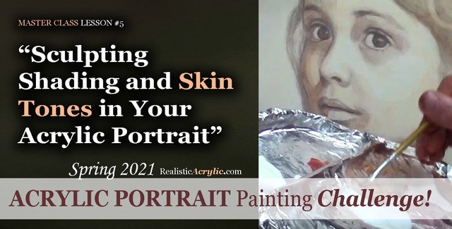
Spring 2021 Acrylic Portrait Painting Challenge: Sculpting Shading and Skin Tones in Your Acrylic Portrait
Acrylic portrait painting, in many ways, is like creating a sculpture. We want to truly make our faces look realistic and three-dimensional. In this master class video lesson, I show you how to do exactly that.
We’re breaking a fine art portrait painting down into bite-size steps that YOU can do.
Specifically, in this video lesson, I demonstrate how darkening your background can really make the face stand out in a lifelike way.
What colors should we use for the shadows? I’ll show you how to mix them, what brushes to use to apply them, and HOW to do it. Get the shadows right, and 80% of the battle is won, so to speak in your portrait.
What colors for the skin tones?
In this video, you’ll learn the correct color to mix, how to create glazes with matte medium and apply it to the face smoothly.
This is still very much the beginning. More lessons to come.
Take the Acrylic Portrait Painting Challenge (it’s FREE!) and paint along with us!
REGISTER TODAY. The challenge is ongoing, something you can do at your own pace. It’s not too late to enter! After you join, I’ll send you the supplies list and reference photos to paint from.
WATCH NOW…
Lesson #5: Sculpting Shading and Skin Tones in Your Acrylic Portrait
Acrylic Portrait Painting Challenge Lesson #5: Sculpting Shading and Skin Tones in Your Acrylic Portrait
Would like to paint this portrait with me and hundreds of other artists?
Take the 2021 Spring Portrait Painting Challenge!
You can register below and get started. It is completely FREE to join the challenge and participate. When you join, I’ll send you the “Welcome Kit” which includes:
- The Supplies List (so you know what you need to paint with us, your shopping list. 🙂 )
- The Reference Photo with and without the grid, high resolution, that you can download ready to print out or display on your tablet. You’ll be able to create an accurate portrait this way.
- The Palette Layout Guide showing you how to arrange your colors so they don’t get muddy on your palette
- The Master Class Lesson Schedule
- the Lessons emailed to you
- A private Facebook group to cheer you and help answer your questions
- And a few “bonuses” like opportunities to win my paid online classes
REGISTER TODAY. The challenge is ongoing, something you can do at your own pace. It’s not too late to enter!
What’s coming up in the next lesson? More shading, more skin tones, and the start of some detail work. Follow the lessons and you will be able to create a portrait you can be proud of…even if you’re a complete beginner!
Let me know if you have any questions and I look forward to teaching you more!
—Matt
Questions? Suggestions? Thoughts? Let me know, below in the comments. Please share your sketches in our Facebook group and share this post with your friends!

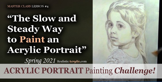
Spring 2021 Acrylic Portrait Painting Challenge: The Slow and Steady Way to Paint an Acrylic Portrait
If you remember the childhood story, “The Tortoise and the Hare,” you recall that the hare started out really fast and put the tortoise to shame. But then the rabbit took a nap, while the slow, while the turtle, with his slow methodical steps, passed him up and won the race!
Sometimes slow is better for painting an acrylic portrait.
Likewise, in an acrylic portrait, we often want to see quick results. But if we take our time, and just add one layer on top of another, even though it looks like hardly anything is happening, eventually, we will end up with a great painting!
I’d like to show you how to slow down a bit, take your time, and paint your acrylic portrait layer by layer, using the acrylic glazing technique.
Take the Acrylic Portrait Painting Challenge (it’s FREE!) and paint along with us!
REGISTER TODAY. The challenge is ongoing, something you can do at your own pace. It’s not too late to enter! After you join, I’ll send you the supplies list and reference photos to paint from.
WATCH NOW…
Lesson #4: The Slow and Steady Way to Paint an Acrylic Portrait
In this master class lesson #4, I demonstrate how to continue darkening your darkest values on the face and background, and then work in some warmer glazes to set up the skin tones on her face. We’re going very light, using a large amount of matte medium (95%) to a small amount of paint (5%)
Watch how to do it here…
Learn how to paint an acrylic portrait slowly and correctly, step-by-step in this FREE master class lesson by Matt Philleo at Realistic Acrylic Portrait School!
Would like to paint this portrait with me and hundreds of other artists?
Take the 2021 Spring Portrait Painting Challenge!
You can register below and get started. It is completely FREE to join the challenge and participate. When you join, I’ll send you the “Welcome Kit” which includes:
- The Supplies List (so you know what you need to paint with us, your shopping list. 🙂 )
- The Reference Photo with and without the grid, high resolution, that you can download ready to print out or display on your tablet. You’ll be able to create an accurate portrait this way.
- The Palette Layout Guide showing you how to arrange your colors so they don’t get muddy on your palette
- The Master Class Lesson Schedule
- the Lessons emailed to you
- A private Facebook group to cheer you and help answer your questions
- And a few “bonuses” like opportunities to win my paid online classes
REGISTER TODAY. The challenge is ongoing, something you can do at your own pace. It’s not too late to enter!
Let me know if you have any questions and I look forward to teaching you more!
—Matt
Questions? Suggestions? Thoughts? Let me know, below in the comments. Please share your sketches in our Facebook group and share this post with your friends!