Elevate your shading skills by understanding light sources and shadows
Shading is an essential technique that transforms a simple drawing into a more dimensional and realistic piece of art. So to truly master shading, it’s important to understand its basic components: the light source and the object or surface. These two key elements form the foundation of all shading techniques, and when applied correctly, they can significantly improve the realism of your drawings.
In this guide, we’ll explore these core components and provide you with actionable tips on how to shade better with my 2 basic components of shading.
The Two Fundamental Components of Shading
At its core, shading revolves around two basic elements that work together to create the illusion of depth and form in your drawings:
Light Source
Object or Surface Receiving or Obscuring the Light
1. Understanding the Light Source
To achieve effective shading, then you first need to recognize the light source in your composition. Because this could be anything from natural sunlight to artificial lighting like lamps. So the light sources can vary in intensity, color, and direction, each affecting how shadows and highlights appear on your objects.
In a simple setup, you may have only one light source, but more complex environments might have multiple lights, each influencing the object differently. However, when starting out, it’s best to focus on a single light source to understand how light interacts with surfaces.
Tip: Always decide the position and intensity of your light source before you begin shading. Because a consistent light direction ensures that your shadows and highlights align properly, creating a more convincing effect.
2. The Role of Objects and Surfaces
The second key element in shading is the object or surface that either receives or obscures the light. When light hits an object, it creates two primary effects: highlights where the light strikes directly and shadows where the light is obstructed.
The surface texture and shape of an object also play a vital role in how light behaves. For example, a smooth surface will have more even, subtle shading, while a textured surface will create more varied and intricate shadow patterns.
Technique: To create convincing shadows, then break down complex forms into simple shapes (like spheres or cubes) and imagine how light interacts with each part of the shape.
Types of Shadows: Cast Shadows and Form Shadows
Shadows are a crucial aspect of shading and are divided into two main types:
Cast Shadow
Form Shadow
1. Cast Shadows
A cast shadow occurs when one object blocks the light from reaching another surface. Because this shadow is usually sharper and darker near the base of the object that’s casting it and fades out as it extends farther from the object.
For example, in a simple setup where a ball is illuminated by a single light source, the cast shadow will appear on the surface where the light is blocked by the ball.
Tip: When drawing cast shadows, pay attention to the angle and distance of the light source. A close light will cast a short, sharp shadow, while a distant light will produce a softer, longer shadow.
2. Form Shadows
Hence, the form shadows appear on the object itself, as parts of the surface curve away from the light source. Unlike cast shadows, form shadows are softer and more gradual. And then they give the object a sense of volume and depth.
Using the same example of a ball, the form shadow would appear on the side of the ball that is turned away from the light. So this shadow helps define the roundness of the object.
Technique: To create smooth form shadows, use a gradual transition from light to dark by blending your shading with light strokes. Because this helps avoid harsh lines and gives your drawing a more realistic look.
Creating Realistic Effects Through Contrast
One of the keys to achieving realistic shading is understanding the contrast between light and dark areas. Then, contrast refers to the difference in value (brightness or darkness) between the highlights and shadows in your drawing.
To make your artwork stand out, focus on enhancing this contrast. The sharper the contrast, the more dramatic and realistic the effect will be. However, you don’t want to overdo it. Balancing contrast with subtle transitions between light and dark is essential for a natural look.
Tip: When shading, squint your eyes to simplify the scene and better distinguish between light and dark values. This helps you identify where the darkest shadows and brightest highlights should be placed.
Shading Techniques to Improve Your Skills
Shading is not just about adding shadows; it’s about building layers and adjusting pressure to create depth and texture. Here are a few basic techniques to help you improve your shading:
1. Hatching and Cross-Hatching
Hatching involves drawing closely spaced parallel lines to create value. The more lines you add, the darker the area will become. Cross-hatching takes it a step further by adding a second layer of lines at an angle to the first.
Technique: Use hatching and cross-hatching to gradually build up your shadows, especially in areas where light transitions into shadow.
2. Blending
Blending involves smoothing out the transitions between light and dark by using a blending stump or even your finger. This technique is useful for creating soft form shadows and smooth surfaces.
Tip: Don’t over-blend. Maintaining some texture helps give your drawing character and realism.
3. Layering
Layering is the process of gradually building up shading by applying multiple layers of graphite or charcoal. Start light and slowly darken areas as needed. This technique gives you more control over the final result.
Tip: Avoid heavy, dark strokes right away. Build up the shading slowly to prevent harsh lines and inconsistencies.
Mastering Shading
By understanding the basic components of shading—light source and object—you can begin to create more realistic effects in your artwork. Whether you’re working with pencils, charcoal, or another medium, mastering the use of shadows and highlights will bring your drawings to life.
Start with these fundamentals, practice regularly, and remember: shading is as much about what you leave out as what you put in. By controlling your light sources, refining your shadows, and balancing your contrast, you’ll elevate your shading skills and add depth to your work.
I’d love to hear your thoughts on this video. Please share it with your friends and family. Let me know if you have any further questions. I’ll greatly help you.
If you’d like to learn more, sign up for my free email tips and video class today.
Thank you so much for taking the time to read this tutorial and watch the video. That means a lot to me. I hope you find it very helpful in your portrait painting.
Yours for Better Portraits,
Signature_200dpi_sm.jpg
P.S. Did you find this post helpful or encouraging? If so, send it on ahead! Let others know with the share buttons below. I’d love to hear your comments. Thank you so much! Also, do you have a question on acrylic portrait painting you’d like answered? Let me know, and I’d be happy to help!
Learn how to add realistic depth and dimension to teeth in your acrylic portraits using these simple but effective techniques.
When painting an acrylic portrait, one of the areas that often challenges artists is getting the teeth to look realistic. Many artists fall into the common trap of painting teeth flat white, which detracts from the lifelike quality of a portrait. Teeth, however, are far from being a pure white color. In this guide, you’ll learn two simple yet effective steps that will elevate your skills in painting teeth, making them appear more realistic and natural.
Step 1: Proper Shading – Teeth Are Not White
One of the most frequent mistakes made when painting teeth is assuming they are stark white. In reality, teeth are often a light shade of gray or slightly off-white. In fact, if you compare teeth to a pure white object, you’ll notice they are significantly darker. Painting teeth flat white can give your portrait an artificial look and flatten the depth of the face.
To ensure you are capturing the right tone, use a white card to measure the value of your teeth compared to the background of your reference photo. When you observe closely, you’ll find that teeth have more of a grayish hue. By painting the teeth just a little darker than pure white, you create a realistic foundation that allows you to build up detail.
Here’s how you can achieve this:
Mix titanium white with a small amount of raw umber dark and ultramarine blue to create a subtle grayish hue. This will be your base color for shading the teeth.
Apply thin layers, blending the paint carefully, to ensure a smooth transition. The blend should not be too dark, but noticeably darker than pure white.
To add more depth, mix a bit of matte medium into the paint. Matte medium helps thin the acrylic paint without compromising its color, allowing you to create soft, seamless shading that brings out the three-dimensional quality of the teeth.
By following these steps, you are creating the necessary contrast between the teeth and the bright highlights that will come in the next step.
Tip: Focus on the Surrounding Shadows
Shadows play an important role in shaping the teeth. Gums and lips often cast subtle shadows over teeth, making the edges slightly darker. Pay attention to these areas, especially around the perimeter of the teeth, to enhance the sense of depth. Remember, teeth are curved objects; shading on one side, while leaving the other lighter, will make them appear more dimensional.
Step 2: Adding Realistic Highlights – Bring the Teeth to Life
Once you’ve laid down the correct base color for the teeth, the next step is to add realistic highlights. These highlights are small but essential details that bring the teeth to life and make them look natural.
Teeth often have tiny reflections of light in certain areas, depending on the lighting in your reference photo. These highlights can be found along the tops of the teeth or on the edges where they catch the light the most. Here’s how you can effectively apply them:
Use titanium white for these highlights. Unlike the shading, the highlights should be pure white, but use them sparingly to avoid an unnatural appearance.
With a size 2 liner brush, carefully paint small pinpoint highlights in the appropriate spots, as seen in your reference image. The upper teeth often have highlights near the top, close to where the lips meet the teeth.
After applying the highlights, blend them gently into the surrounding areas to avoid hard, distracting lines. The goal is to create a soft transition between the shaded and highlighted areas.
If the highlights appear too stark, you can modify the tone by adding a touch of indian yellow to warm them up. By warming the highlights, you mimic the natural hue of teeth, which tend to reflect a warmer tone due to their interaction with light and surrounding skin tones.
Tip: Be Subtle with Separation Lines
While teeth have visible separation lines, especially in close-up portraits, these lines should not be harsh. Use very faint lines to delineate individual teeth. A common mistake is making the lines too bold, which can give the teeth an outlined, cartoonish appearance. The size 2 liner brush is ideal for lightly sketching in these lines, but ensure they are soft enough to blend in with the rest of the portrait.
Additional Techniques to Improve Realism
1. Use Glazing for Depth
To create even more depth and nuance in the teeth, consider using a glazing technique. A glaze is a thin, translucent layer of paint that allows underlying layers to show through, creating a sense of depth.
Mix a small amount of matte medium with your base gray color and apply it lightly over the teeth, focusing on areas that need more depth, such as the sides or lower parts of each tooth.
This glazing technique allows you to build up subtle layers, increasing the realistic appearance of your portrait.
2. Pay Attention to Tooth Shape and Size
Not all teeth are the same size or shape, and these variations should be reflected in your painting. The front teeth are typically larger, while the ones on the sides taper off. Make sure to study your reference photo closely and adjust the size and shape of each tooth accordingly. This attention to detail will make your portrait look more realistic and proportional.
Conclusion
Getting the teeth right in an acrylic portrait is an essential step toward achieving realism. By shading the teeth a few tones darker than pure white and adding subtle highlights in the right spots, you can dramatically improve the lifelike quality of your portraits. Using techniques like glazing and paying attention to tooth shape will further enhance the overall effect. Follow these two steps carefully, and you’ll be well on your way to mastering the art of painting realistic teeth in acrylics.
With patience and practice, you’ll see improvements in your portrait painting skills, and your work will stand out for its lifelike qualities.
I’d love to hear your thoughts on this video. Please share it with your friends and family. Let me know if you have any further questions. I’ll greatly help you.
If you’d like to learn more, sign up for my free email tips and video class today.
Thank you so much for taking the time to read this tutorial and watch the video. That means a lot to me. I hope you find it very helpful in your portrait painting.
Yours for Better Portraits,
P.S. Did you find this post helpful or encouraging? If so, send it on ahead! Let others know with the share buttons below. I’d love to hear your comments. Thank you so much! Also, do you have a question on acrylic portrait painting you’d like answered? Let me know, and I’d be happy to help!
One of the trickiest things about acrylic portrait painting, especially when using the glazing technique, is knowing how to achieve color. How many layers do you use?
I’ve said it before, and I’ll say it again. There is something more important than color, even skin tones in a portrait.
Here is a recent question from a subscriber:
Currently, I am working on a portrait of my friend’s grandfather. My reference photo is of him as a young man in his dress greens from his younger days in the Army. I really want to capture his likeness and be proud to present this to her as it is a gift for her mother but I’m finding myself “stuck” in a sense. From watching your videos and using the matte medium as a glazing technique, I am having trouble building up the layers of his uniform to the correct tone and shade of green. I find the medium lightens the acrylic paint. I’ve only applied one layer so I still have time to correct it before making a mess of it. Should I have painted in the dark value of his uniform before going in with a glaze to help it along or just keep applying layer after layer until the desired color is achieved?
Regarding your question–yes, you can keep building up the green glazes for his uniform. However, it’s best to think of values before color. What I mean is, you are right to think that you should have done the dark value of the uniform first. That’s exactly right.
The reason is, value is more important than color. Value (light and dark and the difference between them) describes all the contours and three dimensions of a face or body. If it weren’t for the strategic placement of those values, we wouldn’t know whether it was a person, animal, rock or tree that we painted.
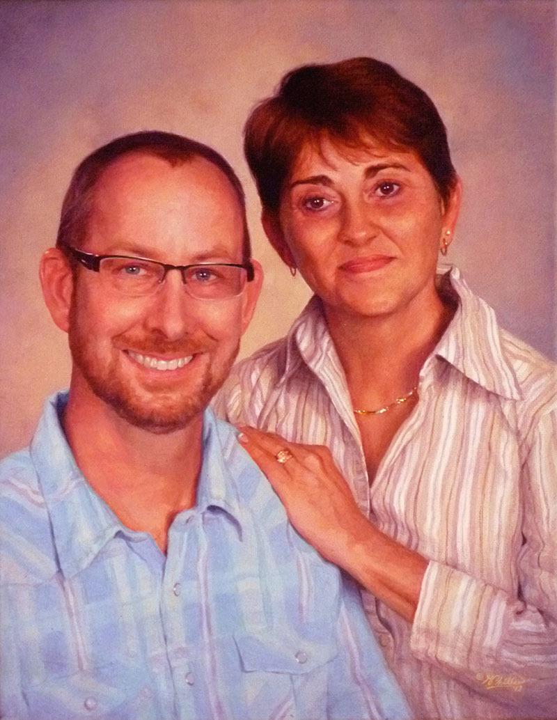
Theoretically, you could have a person whose skin tone or clothing was a bit too red, or greenish–whatever–but it the values were accurate, it would still look human, and would look like a pretty good portrait. You can see in this painting I did, the colors are a bit too red. (I also intensified them on Photoshop, exaggerating them a bit to make a point.)
Acrylic portrait from photo by Matt Philleo, Eau Claire area portrait artist and instructor
But flip that around: make the skin tone or coloring right on, and the values completely off, and you will have a terrible portrait.
So, when I instruct my students in painting, I teach them to see the value structure first. We start off simple, using one or two colors, and then add as we go along. Much more important is seeing the overall lighting in the portrait–where the light source is, the darkest values (whether clothing, hair or just deep shadows, it makes no difference) and the mid-tones and capturing them faithfully. Of course, this assumes that you have the form correct. That is, that the proportions of the face and anatomy are accurate.
So, is your painting ruined? No, not at all. Just keep building up layers. But it helps to build up the darkest values first. Don’t neglect them. Think of your painting as an old polaroid photo. The print shoots out of the camera and fades in slowly, all together. You don’t get eyes, then hair, then a mouth, then the body. No. You get everything at once, but it’s all light. Then, in about 30 seconds, you have a print.
(Wow! Imagine that. I’m old enough to remember how cool it was to have an instant photo before digital cameras.) 🙂
So, you want to paint your painting like a polaroid. All at once, just fade everything in. As much as possible. That means that you hit those dark values first, and then work your way into the lighter ones.
As an example, let me show you this. Here is an image of how I did “Smoldering Wick,” an acrylic portrait illustrating a time when I struggled, and found encouragement in the scriptures.
You can see how it all develops gradually. Notice how I didn’t really even add much color to the servant’s face until the end, after the darker values were well established.
All of these many layers is how you make an acrylic look like an oil. I learned this glazing technique several years ago from Norbert Kox, a university art professor. It made all the difference for me in my portrait painting with acrylic. Learning this technique and applying it will make the difference for you too.
If you’d like to learn more, sign up for my free email tips and videos today.
And of course, let me know if you have any questions or comments. I’ll be happy to help!
Yours for Better Portraits,
P.S. Did you find this post helpful or encouraging? If so, send it on ahead! Let others know with the share buttons below. I’d love to hear your comments. Thank you so much! Also, do you have a question on acrylic portrait painting you’d like answered? Let me know, and I’d be happy to help!
To create a realistic portrait you need a lot of different elements all working together.
The main three elements are accurate form, value, and color.
All of these elements are tied together, and even overlap a bit. Today, I want to show how form and value work together, and how you need to represent value accurately to portray correct form.
One of my students recently asked to have his portrait critiqued, while in the sketch stage. As I was recording his critique, the idea of capturing value to portray a realistic likeness came up.
In other words, if you want the person you’re painting to look like them, you have to pay close attention to the shadows. It’s just as important to capture these shadows as it is to draw the features such as the eyes, nose, mouth, etc. with correct placement, proportions, and shape. The ability to see the shadows on a face is vitally important to create the illusion of three-dimensionality on the canvas. You need to be able to see the inherent shape of a shadow from your reference photo–its hard edge and soft edge.
On a photograph that can be hard to discern.
You have an almost unlimited array of values with micro-nuances that can make it very challenging to see the “big picture” of the main shapes of the shadows. But if you can train yourself to see those main, abstract shapes you will go a long way to being able to draw and paint realistically.
By the way, the edges are defined not only by shadows, but differences in value due to the actual value (light and dark) of the objects themselves. (For example, the contrast between the man’s flesh tone and white suit. Or, on a smaller level, the difference between his black beard on his dark brown skin.
There are borders to all the shadows and values Your job is to see the most obvious edge, pick a line, and define it.
Watch the video below and I’ll show you what I’m discussing here, using this student’s portrait sketch (supplied with his permission) as an example.
Mastering the ability to see shapes within the shadows takes practice. But it all starts with being aware of the need to do so. As you hone in this skill, you’ll see these shapes all over the place, learn how to paint what you see, and your portraits will come alive with realism!. Visit other free tutorial here.
Yours for realistic acrylic portraits,
P.S. Did you find this post helpful or encouraging? If so, send it on ahead! Let others know with the share buttons below. I’d love to hear your comments. Thank you so much! Also, do you have a question on acrylic portrait painting you’d like answered? Let me know, and I’d be happy to help!
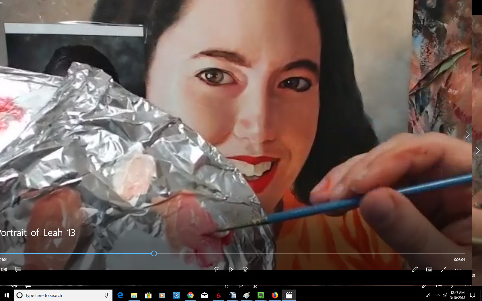
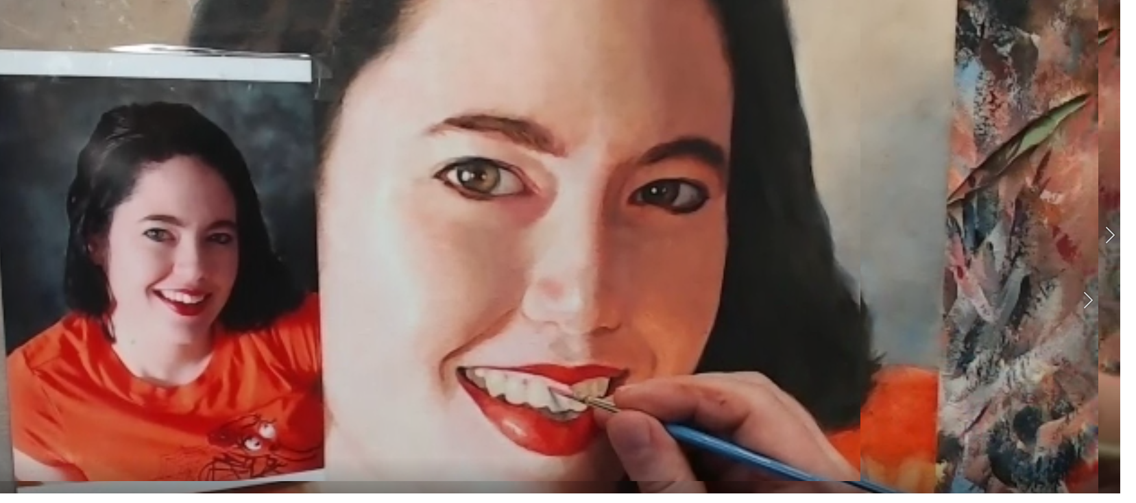
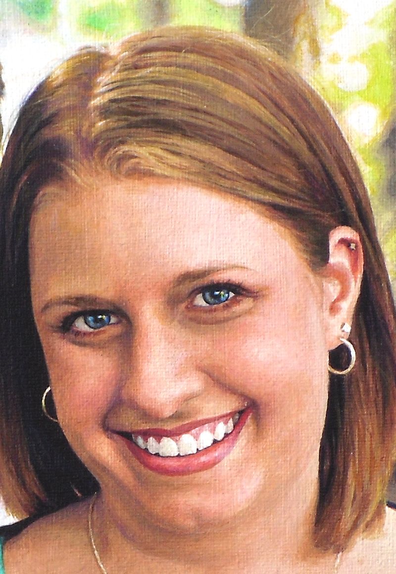
Painting the mouth, especially the teeth, in an acrylic portrait can be tricky.
It’s one of the hardest parts of the face to get right, but it is so important. Teeth are not easy to paint, because of the very subtle shapes, shades of color, and nuances you have to capture correctly to convey a convincing reality of a beautiful smile.
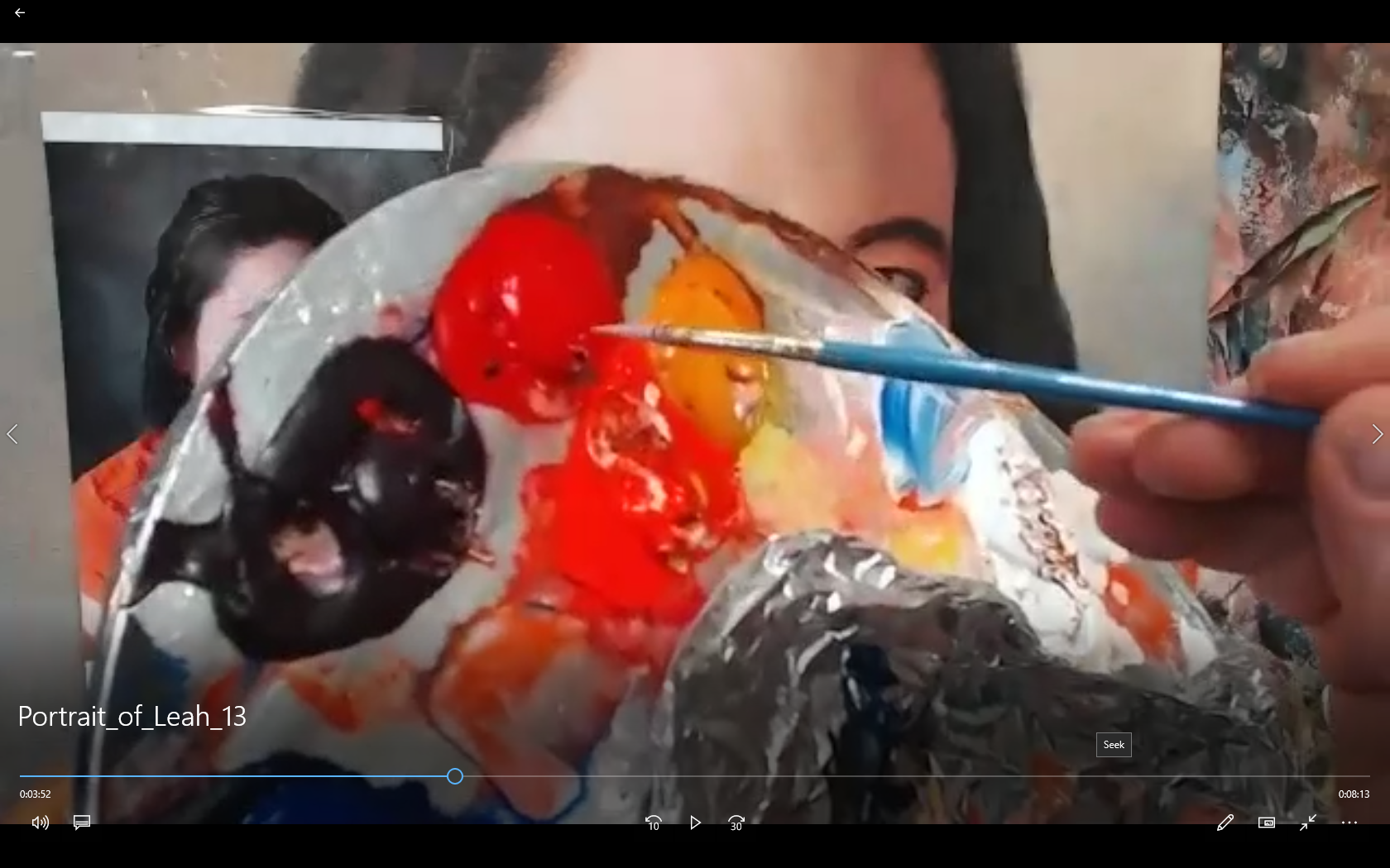
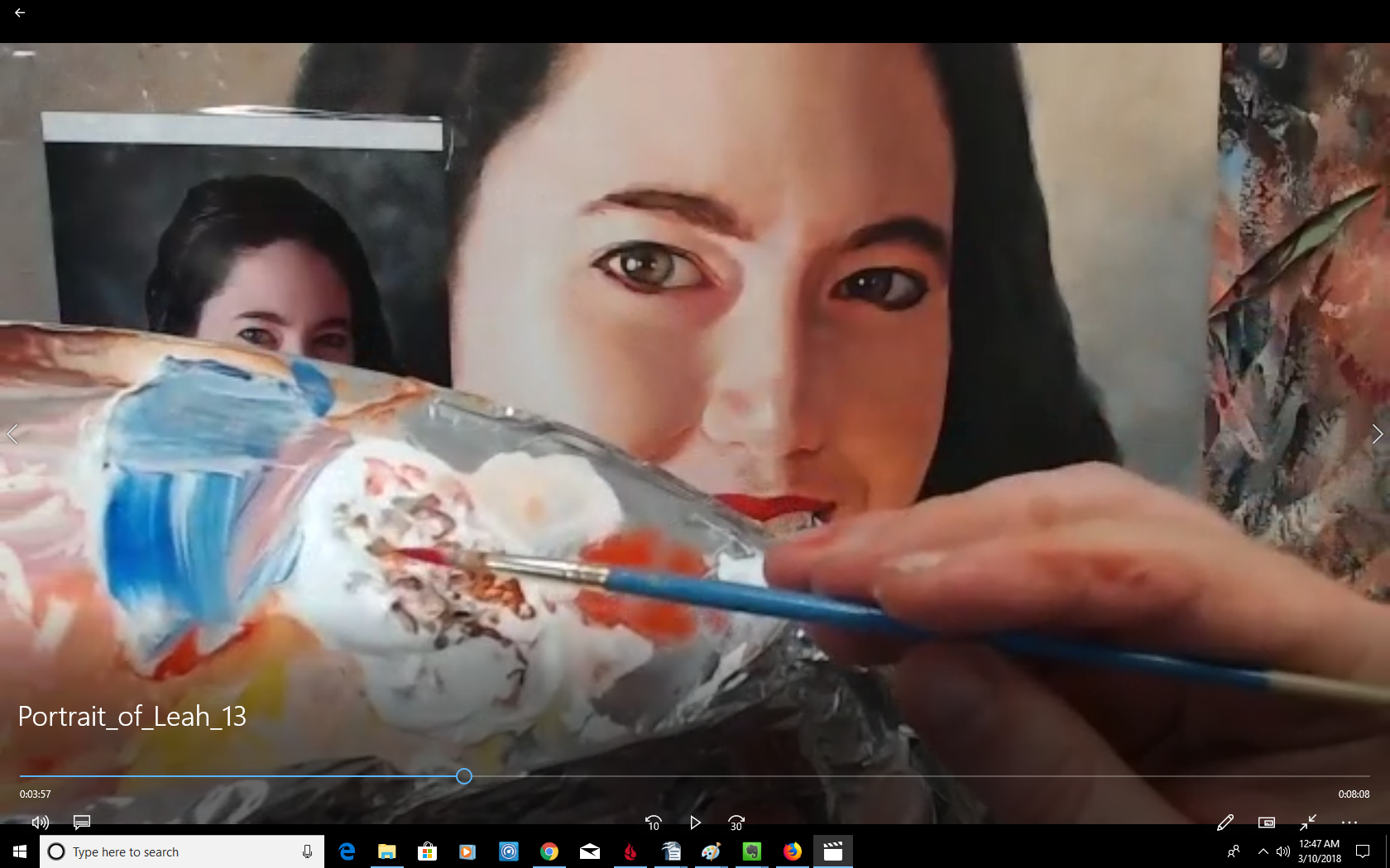
Today, I’m going to show you how to paint realistic teeth using my Old Master’s glazing technique.
1. Using a small round brush grab a little bit of napthol red off your palette…
2. Then a little bit of titanium white…
3. Mix into a warmer color like raw sienna, and dilute with a small amount of matte medium…
4. And then add the shadows just above the teeth, in the crevices between them, on top of the previously painted gums (that have just a light pink glaze on them)…
There’s a lot more! Watch it all here…
The 12-Minute Video Tutorial
(Instruction on painting teeth starts at 3:30 in the video)
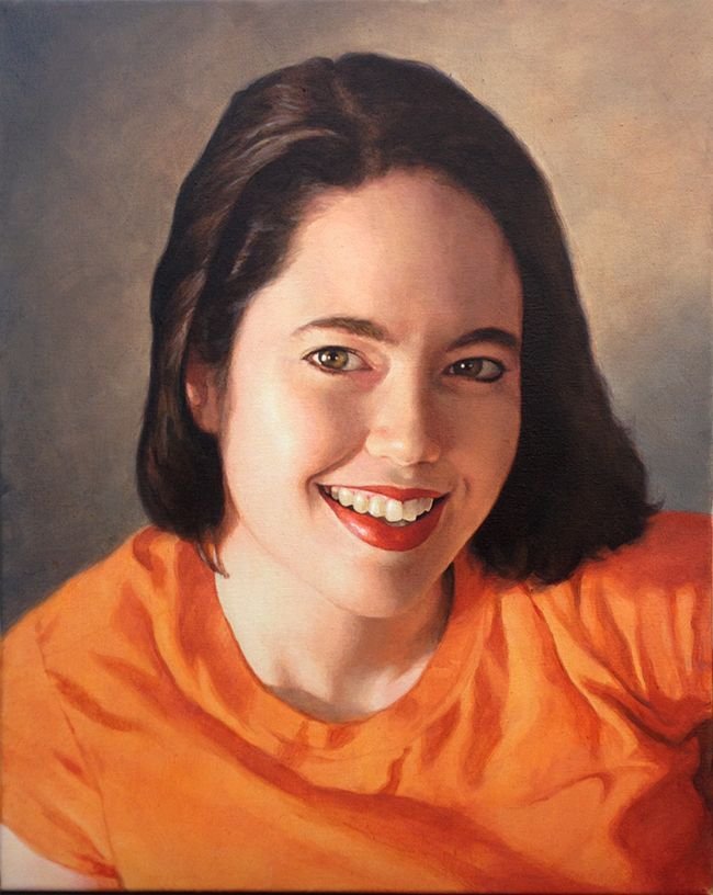
And here is the completed portrait of my wife…
Hope you enjoyed this post, and have a blessed day,
P.S. Did you find this post helpful or encouraging? If so, send it on ahead! Let others know with the share buttons below. I’d love to hear your comments. Thank you so much! Also, do you have a question on acrylic portrait painting you’d like answered? Let me know, and I’d be happy to help!
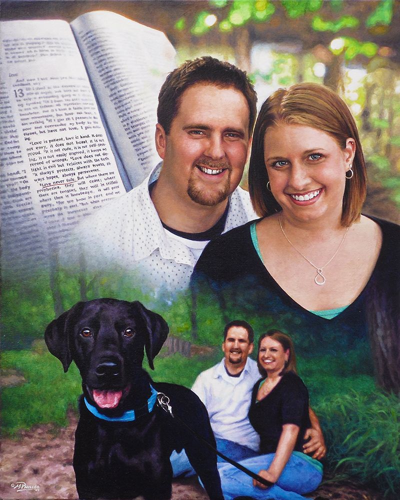
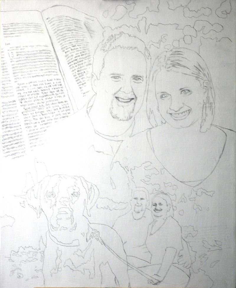
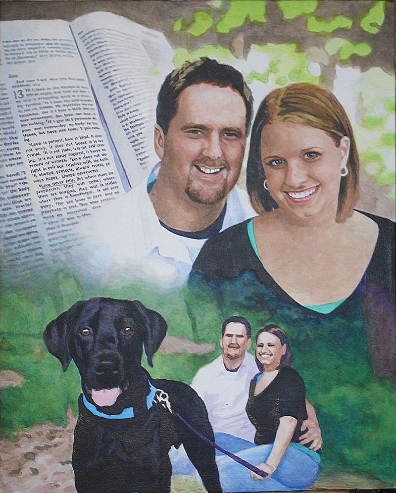
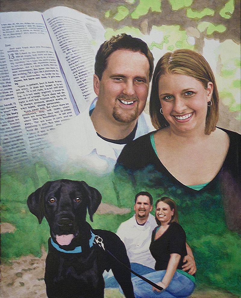
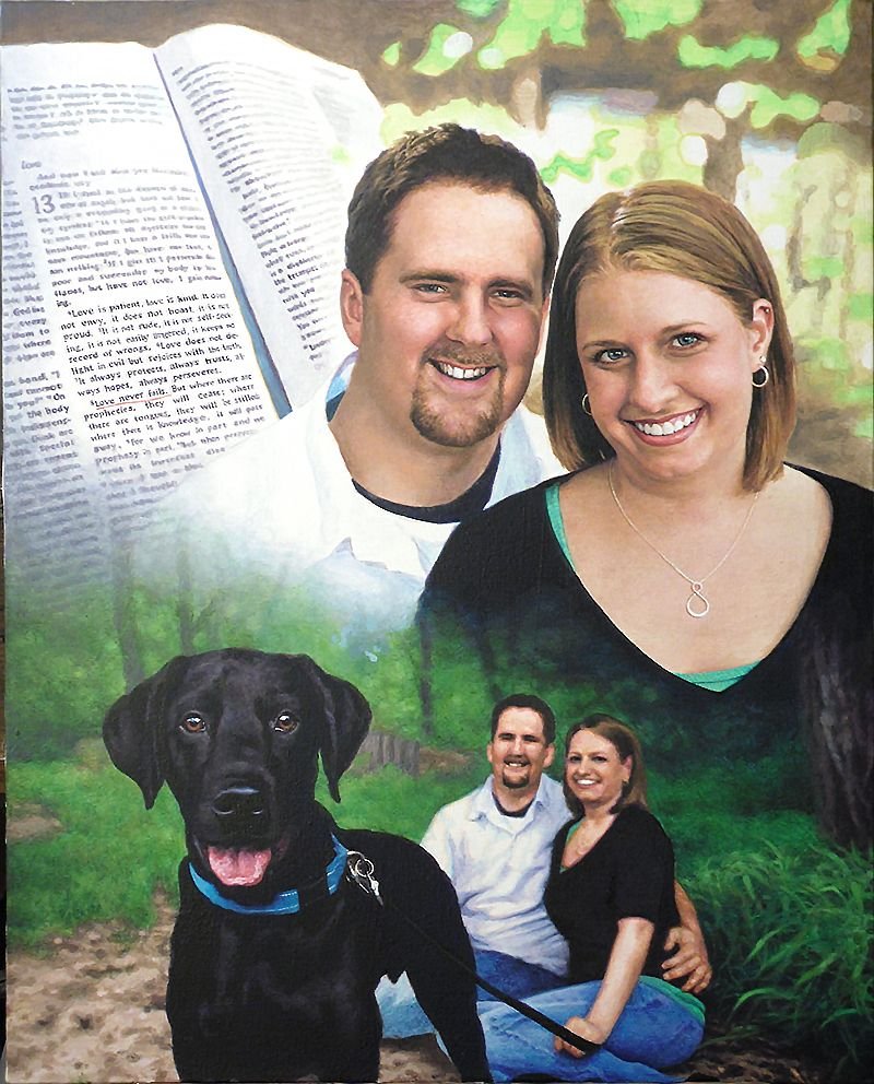
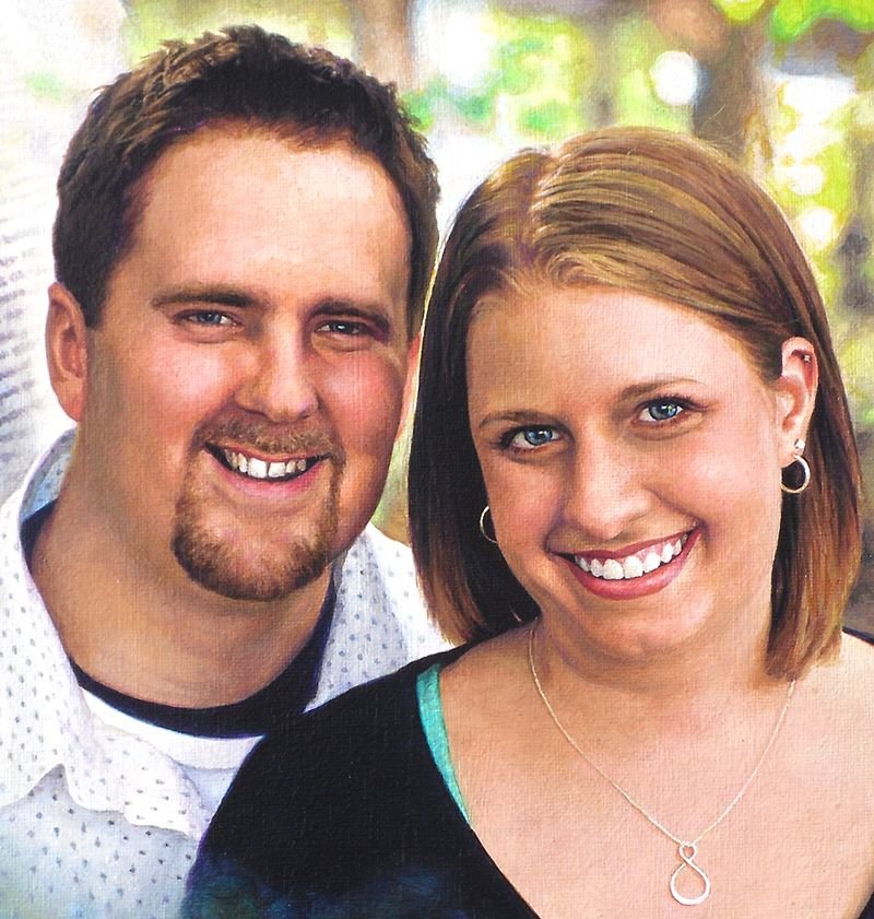
Today, I’d like to show you how I painted a montage portrait–several images put together into one design. This is one of my favorite portraits from several years ago, a 16″ x 20″ acrylic on canvas.
This was to be given as a gift from the mother to her son and his fiance as a unique wedding gift. The idea was to incorporate a large image of them, a picture of them with their dog, and then a scripture verse in the background, that would go with the marriage theme.
Here’s how I did it.
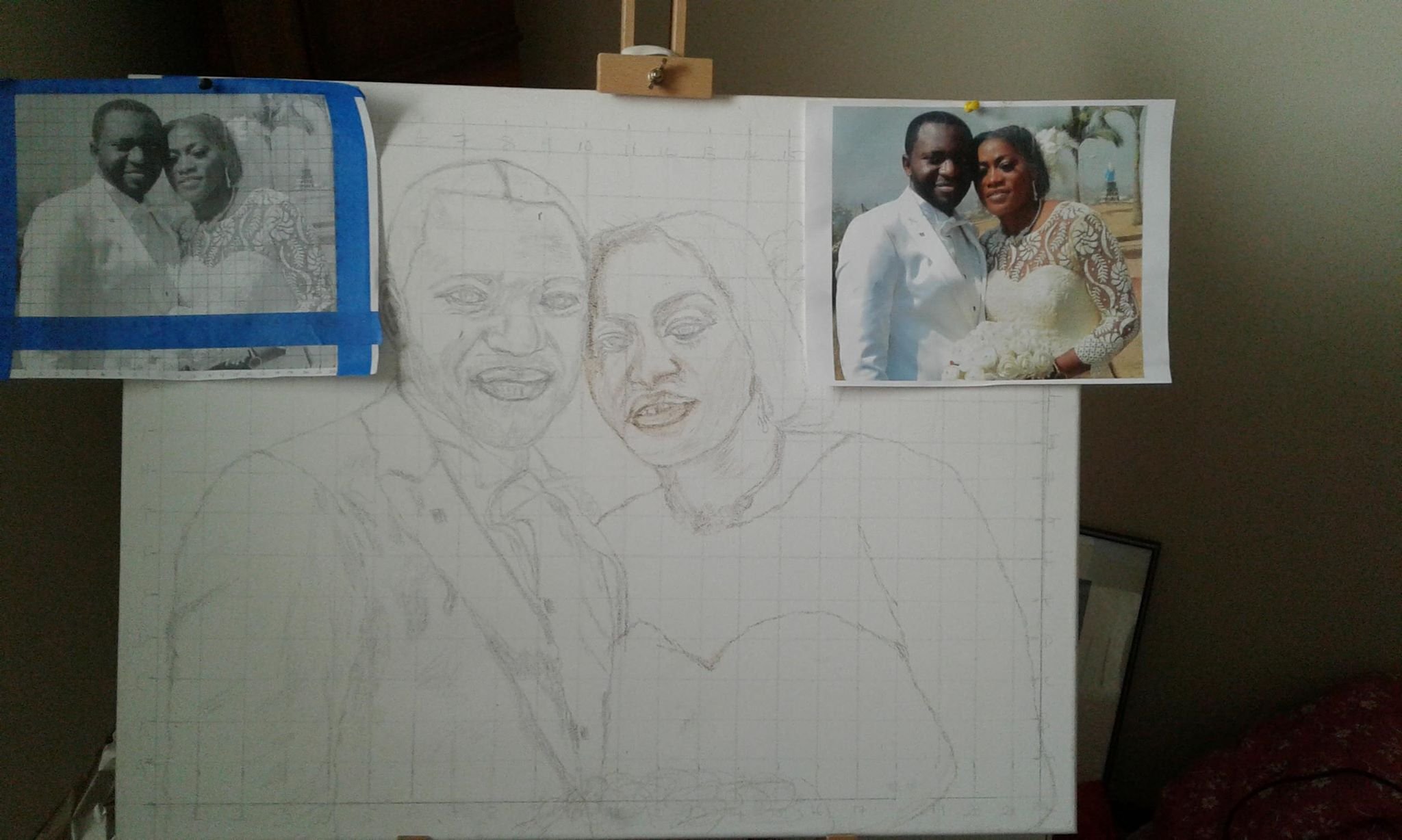
Step 1: The Sketch
After getting my photos together from the client, I did a layout.
This was before I started using the grid method, so I sketched it with a projector and pencil, following the outlines of the photographs closely. The projector sometimes gets things wrong, so you have to go back, double-check your lines and refine accordingly.
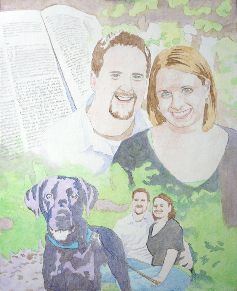
Step 2: The Foundation with Light Glazes
The purpose of this step is to quickly establish the tonality of the portrait by getting the colors in the right place. Secondarily, I want to set up my values, by creating immediate contrast between light and dark. I start attacking the darkest values first, using cooler colors like ultramarine blue, raw umber dark and dioxazine purple to create a rich, nuanced black.
This way, when it’s all done, and the viewer takes a close look at the painting, it won’t be flat. You will be able to sense the folds of fabric, and contours around the body of the person within.
My goal is always to create a painting that has immediate impact, but also rewards the viewer for taking a closer look.
For the subjects, I use raw umber dark for the darker values within the hair, raw sienna for the lighter values, and burnt sienna, raw sienna, raw umber dark, and alizarine crimson for the skin tones.
Of course, as with virtually all my painting, the pigment is mixed with a generous portion of matte medium to thin it out, and create the translucent depth that’s similar to the Old Master’s techniques.
Notice how for the trees and background I use a light green, made up of phthalo green, raw sienna, and a little indian yellow. It will give it a lot of luminosity as the light shines through the layers.
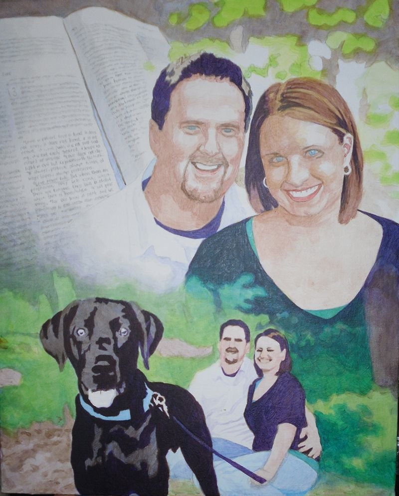
Step 3: Darkening the Deep and Mid-Tone Values
Now that I have the foundation, I go back and add several layers to all the areas within the painting. But mostly, I want to bring the darkest values to about 80% of their full strength. This will give me something to work with as I move the other values in the picture in accord.
I could just go and use full strength pigment, but it gives the painting a nicer finish to darken everything slowly. In addition to that, it gives me the ability to precisely blend even within the dark areas.
Is a black shirt just straight black?
No.
Not when there’s light shining on it. We don’t want to use straight black. Otherwise how can you paint the shadows in representing the beginning and end of arms, chest, waist, and all the appropriate wrinkles within the fabric? Instead we get it dark enough and leave room for the shadows.
And by the way, ivory black is not the darkest color you can get. You’ll get an even deeper black with dioxazine purple, aliazarine crimson, phthalo blue and raw umber dark mixed together.
Why not just settle for black? Well, it’s the same reason why HDTVs boast of having higher contrast. I used to sell LCD TVs years ago when they first came out on the market. They were terrible. The darkest values on the screen were just grey. Therefore the lightest values were not very impressive, and so the whole picture looked weak.
With a painting, you will get a way more dramatic effect if you can use really dark values to set of your lighter areas by contrast. It just reminds me of the way the darkness of sin makes the righteousness of God through Jesus Christ that much more glorious. You have to have some darkness to set off the light. Enough said.
Step 4: Adding Nuances to the Faces
At this point here, it’s time to turn my attention to the most important part of the portrait: the people. And especially their faces. In the previous step, I blocked in the darkest shadows within their faces, but now, I want to add some tie-in values. Those are the tones that bridge the gap between the lightest and darkest values.
So I keep the ones I put down as a good foundation. But now, I’m adding more on top, glazing over translucently, so the bottom layers still remain. That’s how we do this with acrylic–with layers.
I feel like their features–the important ones–like the eyes, eyebrows, nose, and mouth need some work. So I begin to darken them, adding detail wherever it needs it.
It’s good to remember the old adage, “Rome wasn’t built in day.” You have see the big picture and slowly comform your painting to the reference photos. Patience is key. For example, I darken the eyebrows as one solid mass of color–just one shade, but I know after this layer dries, I’ll come back to it again–and again, if need be. Then I will go in and darken just a portion of the eyebrow, while leaving the other part with whatever I did in the previous layer.
By doing this, I can suggest that the eyebrow hairs are thicker in a certain area, or the eye sockets are creating a shadow over that portion. That’s all you have to do. You don’t have to get crazy with drawing each individual hair. That actually detracts from your realism. Just hint at it and let the viewer’s mind’s eye interpret the rest and create the reality for you.
Step 5: Building Up More Nuances Everywhere
In this step, I keep on adding layers to the faces: more layers of alizarine crimson, raw sienna, and some titanium white. Using a average size flat brush (3/8 or smaller) I keep adding nuances to the faces. When I start a portrait I use my largest brushes: typically 1″ or even larger. But as I get toward the end of the project I switch to smaller.
Why?
The smaller brush is good not only for detail work, but also those precise areas of nuances–the subtle transition of shading from the cheek to the area below the eye socket. Or the fleshy area under the chin and neck where the light is reflecting from another illuminated surface.
In this portrait, that is happening: we have the woman’s illuminated chest area reflecting as a secondary light source onto her chin. And so with that, I have to make sure I don’t paint the shadow underneath too dark. Since both the man and woman are outside, it makes sense that the light will really illuminate them well and the shadows won’t get very dark, except on the darker clothing and hair.
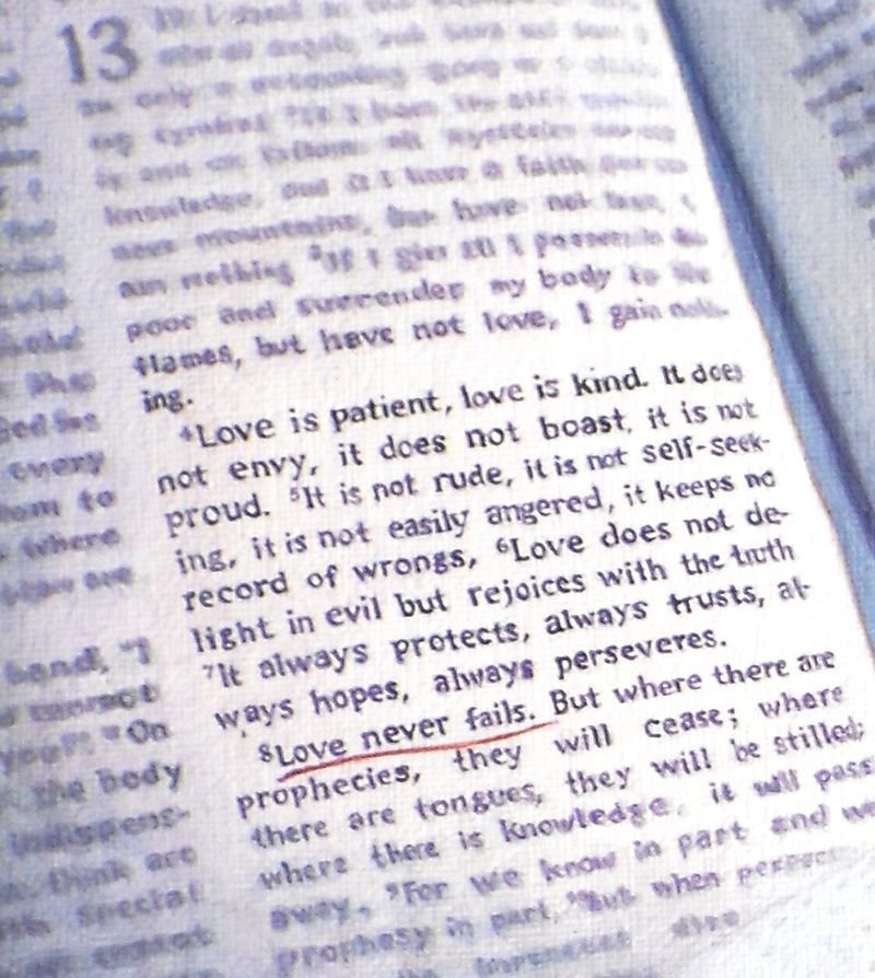
Another area I want to touch on is the Bible, which shows the scripture verse. That’s important part of the painting. I chose to just suggest the text by creating random out-of-focus lines. But the actual verse, “Love never fails” from the famous Corinthians 13 passage, is clearly in focus.
To paint something this detailed on canvas, you have to really make sure you have a nice detail brush, like 1/0 or smaller round, twisted to a point, with very fluid paint. Mist your palette and make sure the paint is about as thin as it can go before getting watery, and it will glide right over the canvas.
It makes painting text a whole lot easier.
Finally, I went over the greenery of the background trees and grass, just adding more nuances. I used phthalo blue, ultramarine blue, and raw sienna for the darker shades. Once you have your initial light green set up, it really sets it off beautifully.
In addition, I painted the dog’s eyes, using brown tones to give it some contrast. I still left the areas representing reflections quite light.
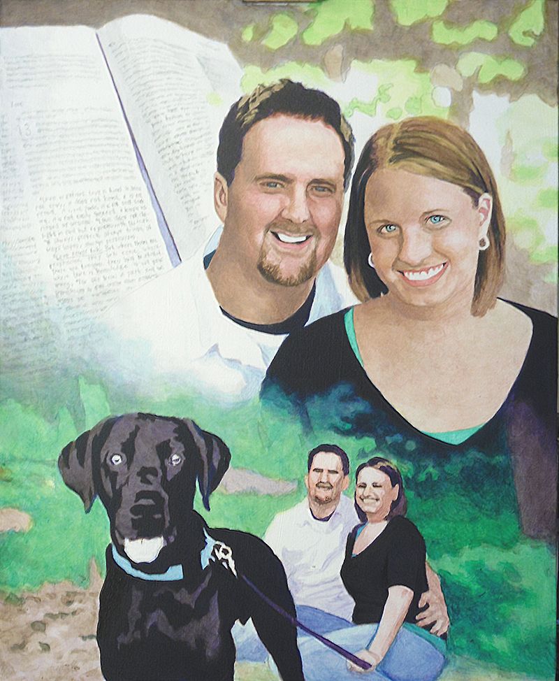
Step 6: Highlights and Advanced Blending
The portrait, at this stage, is starting to look done, but there’s still a lot of work to do. One of the things that can really enhance the realism is using highlights. Although I do like to leave a lot of areas of the canvas untouched for creating my lighter values, it is nice to go back in with some opaque highlights for certain areas.
I feel it gives me the best of both worlds: Glazing is fantastic for building depth and achieving fine gradations in shading, but it creates a roughness that must be overcome with some opaque layers. The trick is to use them just in a few areas.
The hair is one example. Here, I go back in and add just a little titanium white toned down with raw sienna to add the look of diffused light reflecting just at the top of the woman’s silky smooth, straight hair. I also go in and add some slightly darker highlights to the man’s textured short haircut. I already have the base color and value down. Now as I add these highlights, it will quickly change add depth to that area.
Also, I add detail to their teeth. We want to make sure that we don’t overdo it though. We want to use just enough of a light amber grey to suggest that there is separation between them. Raw umber dark mixed with titanium white and thinned by matte medium) is a fantastic way to create shadows for the teeth–in the right value and color.
Once I have the teeth darkened slightly, I can add even more depth by going over with a pin-point highlight of pure titanium white. With this, we just suggest reflections of light over the moist teeth. After it dries, add a tiny glaze of indian yellow, thinned with medium and it will give that white a bit more warmth and luminosity.
You can also do this on the gums. For some people, depending on the structure of their mouth, and the lighting, the gums will catch more of those highlights than the teeth. That was the case for this portrait.
Step 7: Adding the Details
Because this is a collage–or montage–portrait, there’s a lot different elements that need attention. So just when you think you are done, there’s just a little more.
Now, it’s time to add in some more detail to this couple’s background portrait. I noticed that the woman appeared to be looking away from the camera, but by adding just a few darker spots within her eyes on the right side, we suggest that she is looking toward us. It’s just a small amount of work, but it pays dividends in creating that visual connection with the viewer.
It’s time to add the long blades of grass in. I already have the base tones in. It’s just a matter of putting in some darker shadows in angular shapes, and then going over with highlights. Phthalo blue, ultramarine blue, raw sienna, even some yellow ochre and titanium white is what’s used, from darkest to lightest in capturing the effect.
Moving to the left of that, I tackle the jeans for both the man and woman, using the same two blues on my palette. I tend to use ultramarine blue for the darker values and phthalo blue for the lighter. For the darkest shadows I add in some diox purple and raw umber dark so it doesn’t get too bluish.
The Final Painting
With some more nuances here and there, I can call the painting done!
I hope you enjoyed this post and found it valuable. If you have any questions on the techniques used to create this portrait, I would love to help.
Have a blessed day,
P.S. Did you find this post helpful or encouraging? If so, send it on ahead! Let others know with the share buttons below. I’d love to hear your comments. Thank you so much! Also, do you have a question on acrylic portrait painting you’d like answered? Let me know, and I’d be happy to help!
Today, I’m going to post a mini-tutorial on how to get a smooth look with the acrylic glazing technique. Many artists struggle to overcome canvas texture, especially on a portrait–where that smoothness for skin is so important.
One of my online students wrote this question:
After following the videos two aspects I struggle with
The fine detail … I used a 0 and 1 round paintbrush but still I paint above the indentations in the canvas.
Dark colours create a matrix pattern
i.e. paint on top of indentation nothing in the holes
So fine work is a struggle.
Just wondering if I need to push the paint into the canvas as opposed to brushing?
Here’s my answer:
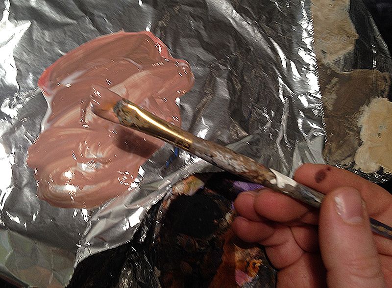
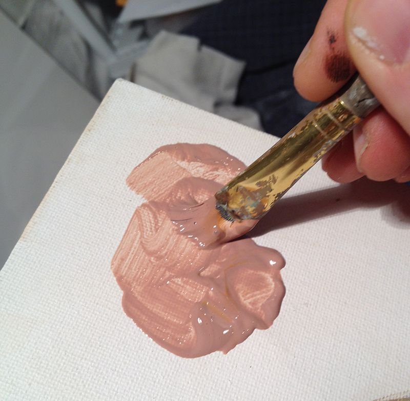
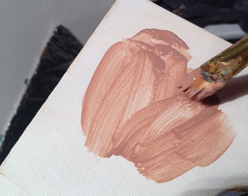
These are some excellent questions, and they get right into the heart of the acrylic glazing technique. I may need to touch on this more in future video lessons. You do need to push the paint in–actually “scrub” the paint into the texture of the canvas. Here’s how to do it, using a flat brush:
The Scrubbing Technique for Glazing
Step 1
First, get a good amount of paint on the edge of your brush, almost “scooping” it from the pile of your mixture onto the edge of the bristles.
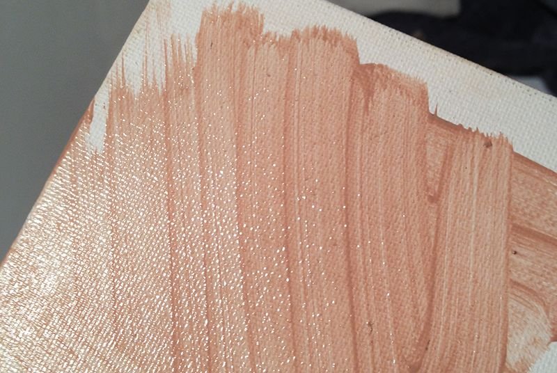
Step 2
Next, “scrub” the paint into the texture of the canvas, pushing the paint in the grooves with edge of the brush more perpendicular to the surface of the canvas, rather than parallel. You can see I’m using quite a bit of pressure to get the paint into the little holes of the canvas weave.
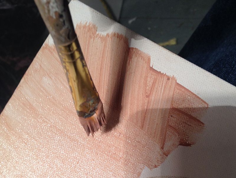
Step 3
Then, spread the paint out.
Step 4
After that, even it out with long strokes, applying lighter pressure. First use diagonal. Then go over with vertical.
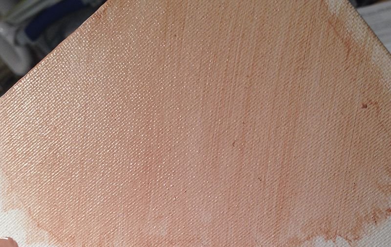
Step 5
Finally, go over the entire area again with diagonal strokes. You may need to criss-cross them to get an even blend. Use even lighter pressure for this. The trick is to just glide over the surface without digging in too far.
Step 6
This is how it should look when you’re done.
Finally
After this layer dries, you can apply more layers, and change the direction of the diagonal strokes to get an even smoother look.
For a small round brush, you can’t scrub or push the paint in. That would ruin your brush or at the very least, lessen your ability to paint precise detail. With that, what you need to do is thin the paint down with a mist of water from your spray bottle and make sure you’re using fresh matte medium in your mix. By keeping the paint fluid it will go into the grooves of the canvas.
However, the glazing technique works even better on a flat surface like hardboard. I love the traditional look of canvas, but sometimes I get tired of fighting the texture and get out a smooth board to work on–especially for smaller paintings.
Let me know how this helps!
Be blessed,
P.S. Did you find this post helpful or encouraging? If so, send it on ahead! Let others know with the share buttons below. I’d love to hear your comments. Thank you so much! Also, do you have a question on acrylic portrait painting you’d like answered? Let me know, and I’d be happy to help!
When I was younger I often thought, “What would it be like if I hung out with my dad when he was my age?
Would we talk about girls and shoot hoops? Or maybe play guitar? (that’s more up my alley)
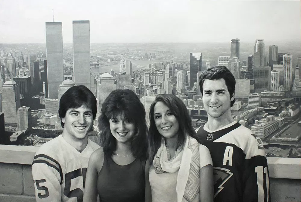
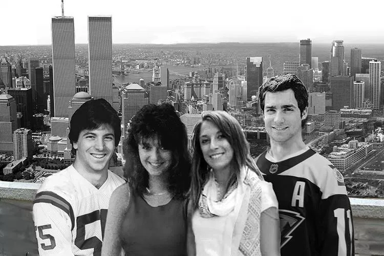
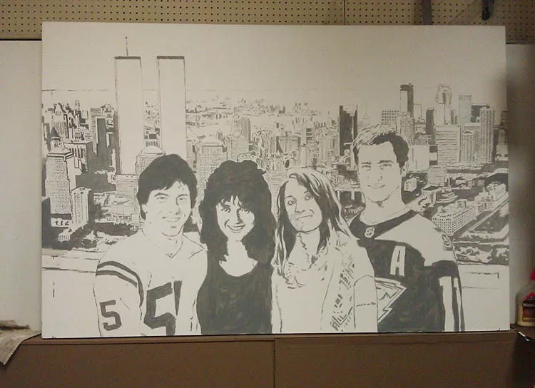
I had a client who brought that idea to life. It was his idea, actually that he wanted me to paint–a massive 48″ x 72″ realistic acrylic portrait–in black and white– of he and his wife as they looked in their 20’s, along with their two children, who are currently in their 20’s, all hanging out in the same time and place. In the background is New York City, where they were originally from, merging into Minneapolis, which is close to where they and their kids now live.
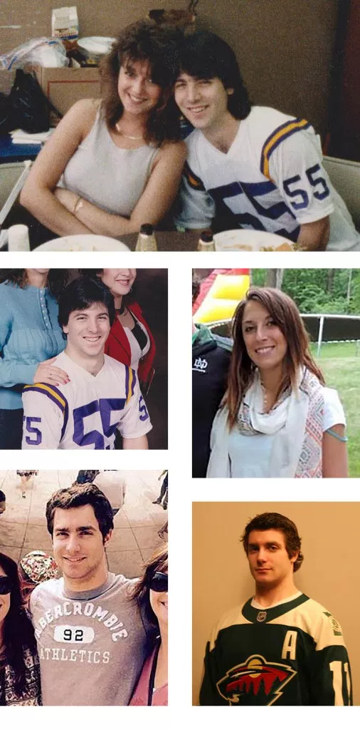
After meeting together, I got to work putting together a layout of what the painting would look like when finished. It always helps to have a good-looking family to do your painting from! My client kind of reminds me of Scott Baio or Tony Danza in these photos.
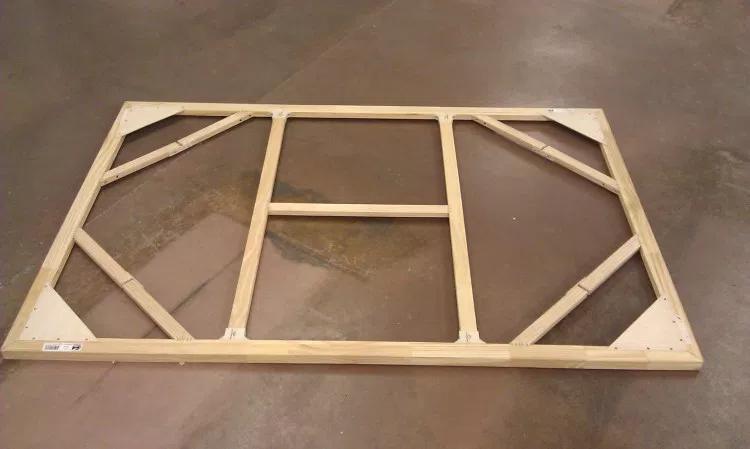
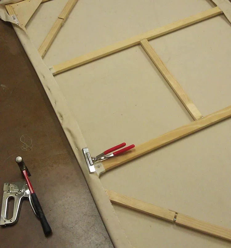
During the layout and approval process, I also worked on building the canvas. I started with professional stretcher bars made in the USA, complete with locking mitre joints and beveled edges, and assembled them. It is extremely important to have a strong support for a 4″ x 6″ canvas, to be able to withstand the tension of the stretched fabric, and to keep from warping. I made sure to include cross braces and diagonal braces as well.
Next, I stretched the canvas with pliers and stapled it extremely carefully, measuring every mark to ensure even tension. Just this process alone took several hours.
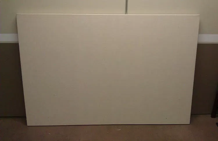
Finally, the stretched canvas! I apply hot water with a brush to add just a bit more tension and get out any wrinkles. If you tap it, it sounds like a drum!
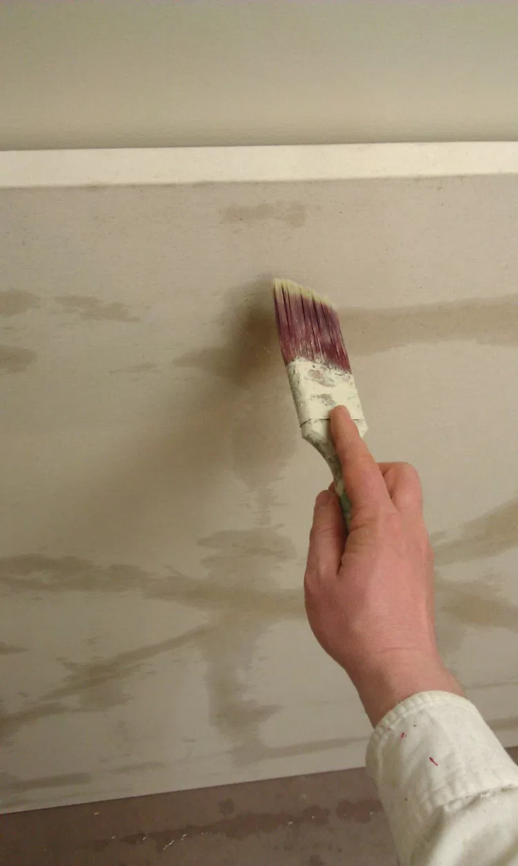
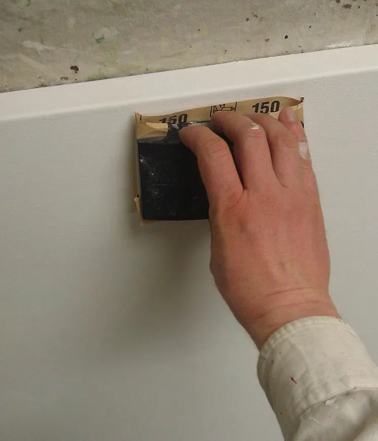
The next step was to gesso (prime) the canvas. I use a high quality gesso, which is white acrylic paint plus ground pumice to make it sandable. I used three or four coats to get a really smooth and durable surface.
With a blank canvas to work with, I feel good.
It doesn’t feel daunting. It’s like a clean slate, ready to add something beautiful and intricate to. It makes me think of what God does in our lives when He forgives our sins through Jesus Christ, and then we are clean, perfect, and ready for Him to work with us to create a masterpiece!
It was around the beginning of March when I started painting. My client and his family approved the layout after a few changes, and so I was ready to go! I decided to skip the pencil sketch, and get into the painting process right away.
Many people ask me how I do the sketching process. It depends on the project. Most often for small portraits, I freehand sketch them. For a large scale and incredibly detailed project like this on a canvas, I will either grid or project the design with an overhead transparency projector. Canvas is very difficult to sketch on with a pencil. In this case, I projected the design I created in Photoshop, using a small brush and a grey paint to quickly capture the lines of the image.
The portrait took nearly 200 hours to complete, from the time taken to build the sizable canvas stretcher frame to the last dab of paint.
I underestimated the challenge of painting in monochromatic.
Although it is easier to do a painting this way than full-blown color, it presented a few difficulties that I didn’t foresee, at least to the extent that surfaced in this work.
You would think that to do a black and white painting that you would simply just use black and white paint and mix various amounts to arrive at the grey tones in between.
It didn’t work that way for me.
I typically paint with a translucent glazing technique that allows light to reflect through the canvas and back to your eye through the layers of paint, like the Old Masters, giving the final painting a vibrance that is hard to capture with opaque paint alone.
So, when you mix black with the clear acrylic medium, even mixed with some white, and apply it to the canvas, the resulting color is not slate grey, but a brownish grey, because the light shining through the canvas warms up the color.
Then, when certain areas become more opaque than others, the predominance of white mixed in with layers gives the grey shade a cooler, bluish cast.
Maybe I’m just picky, but I don’t want certain areas of the painting to look brown or blue (at least without my say so) when I’m shooting for black and white. If the client commissions a black and white painting, that’s what he expects to get.
The solution?
I included brown (raw umber dark), yellow (raw sienna and indian yellow), and blue (ultramarine blue) on my palette and mixed it back into the colors to correct anything that was off. If the shade was too cool, I warmed it up with brown and yellow. If it was too warm, I cooled it down with blue.
So even in a monochromatic painting, I still end up using color!
But that’s OK, because color is fun to use. 🙂
Now I did make the background just a bit cooler in tone, so that it would visually recede. But it’s nice to be able to do that, when you, the artist chooses to, not just letting the paint do whatever it wants to.
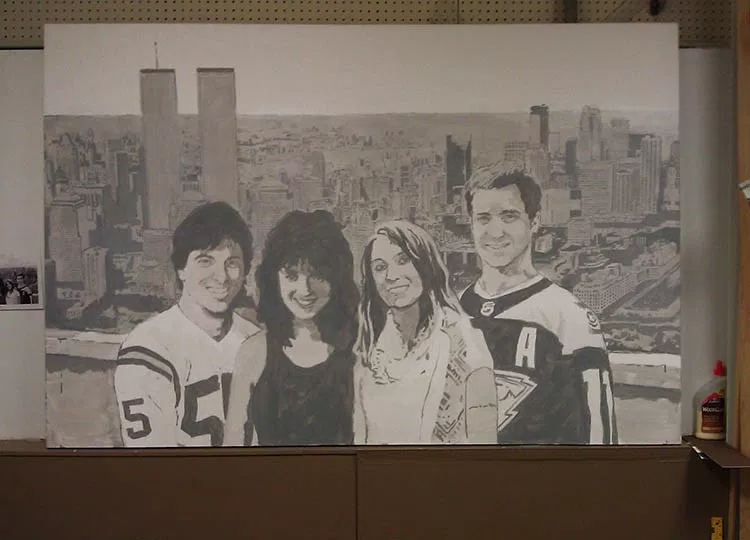
Next, I painted a glaze over the entire painting, to give me a mid-value grey tone to work from. I add in darker values and highlights, working my way across from left to right. I try to develop the painting as a whole and not get too hung up in any one area.
It took over fifty hours to paint the background. I thought I was making it too dark, and had to constantly remind myself that the subjects, the people in the front would be much darker, with areas of pure black paint, and make the background look lighter by comparison. I wanted to “fix the background” and try to lighten it up, but I kept telling myself, “just wait until you paint the people.”
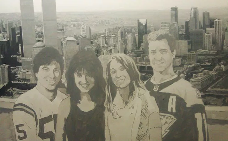
After finishing up the background, I really honed in on the people in the foreground. Here are some photos of me working taken by a talented photographer, Tom Gardner, at Artisan Forge Studios, where I used to work. At this stage I am nearly finished with the portrait. Yes, I can see the finish line from here!
How often in our lives do we judge something or someone prematurely? We ought to reserve judgment on many things in our lives, and especially in others’ lives, believing the best, and wait until everything shakes out. God has a purpose and a plan that we don’t always see. Things can look horribly wrong, when God is creating something wonderful behind the scenes.
When I finally finished it, hours upon hours later, I was satisfied with the results.
Here is a closeup of the father when he was young…
And then the mother…
The daughter…
And the son…
Here is a detail of New York City, with the Brooklyn Bridge in the background.
On the right side of the painting is Minneapolis, with that recognizable round tower…
The best part of the entire project was to deliver it to the client and later to see it hanging in his home. What a conversation piece!
Hope you enjoyed this post and have a blessed day,
P.S. Did you find this post helpful or encouraging? If so, send it on ahead! Let others know with the share buttons below. I’d love to hear your comments. Thank you so much!
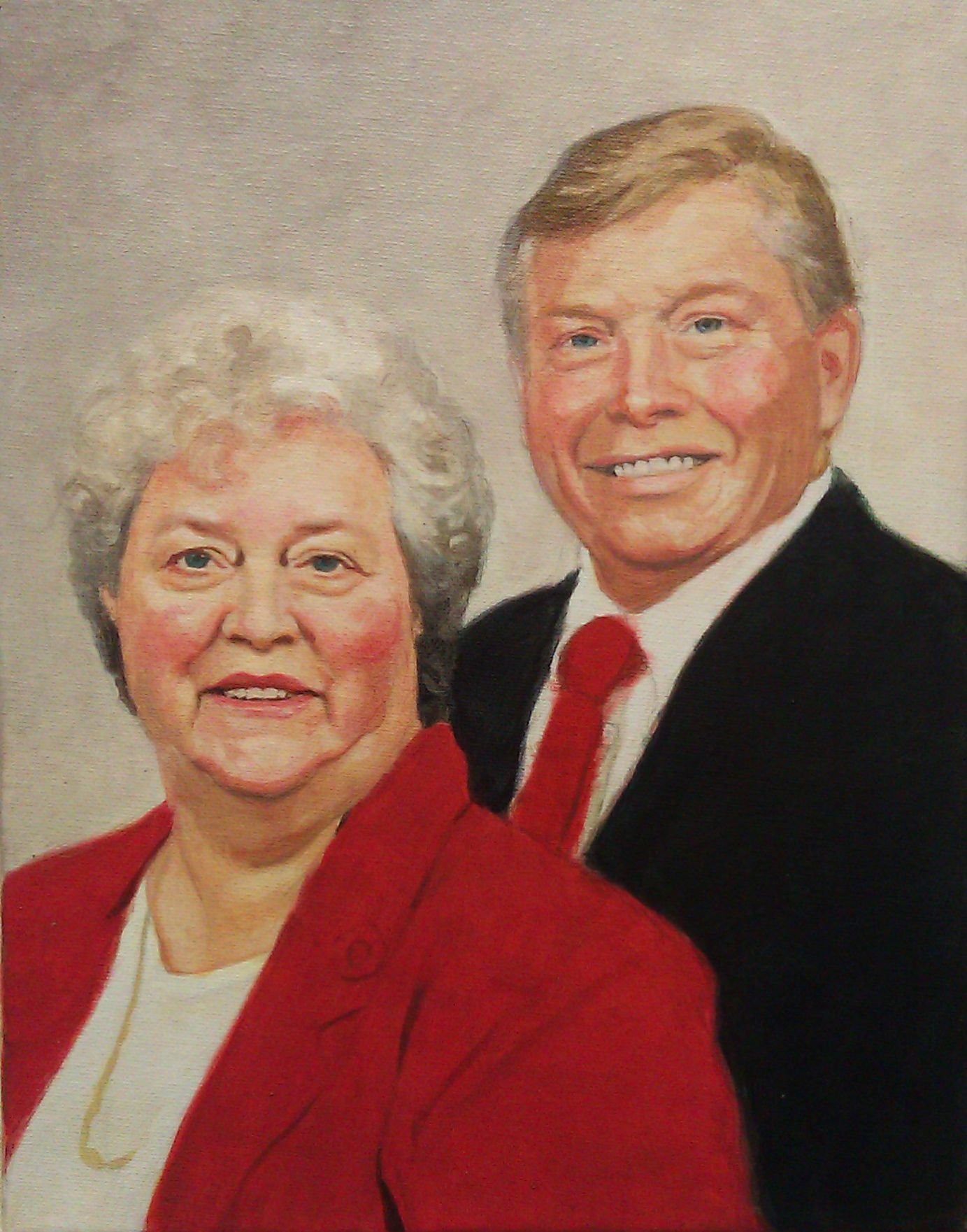
I’ll show you the 6 steps on how I painted a 11″ x 14″ acrylic on canvas portrait of someone who, for a short time, was a special part of my life.
His name was Verlyn. He used to come by my house and he’d have his station wagon full of bread, bakery items and other things that he gave to people in the neighborhood as a ministry.
We developed a nice friendship along the way. His wife was ailing at the time and then sadly passed away. I did this portrait for him last year to help encourage him in his time of loss. He is still going strong, even in his 80’s and after everything, he’s taking care of a disabled man!
Here is the reference photo. I took the liberty to lighten up the background and change it to a more neutral color. Also, I brought the two of them a bit closer together, so I could give the portrait an aesthetically pleasing vertical orientation.
And now for the step-by-step process…
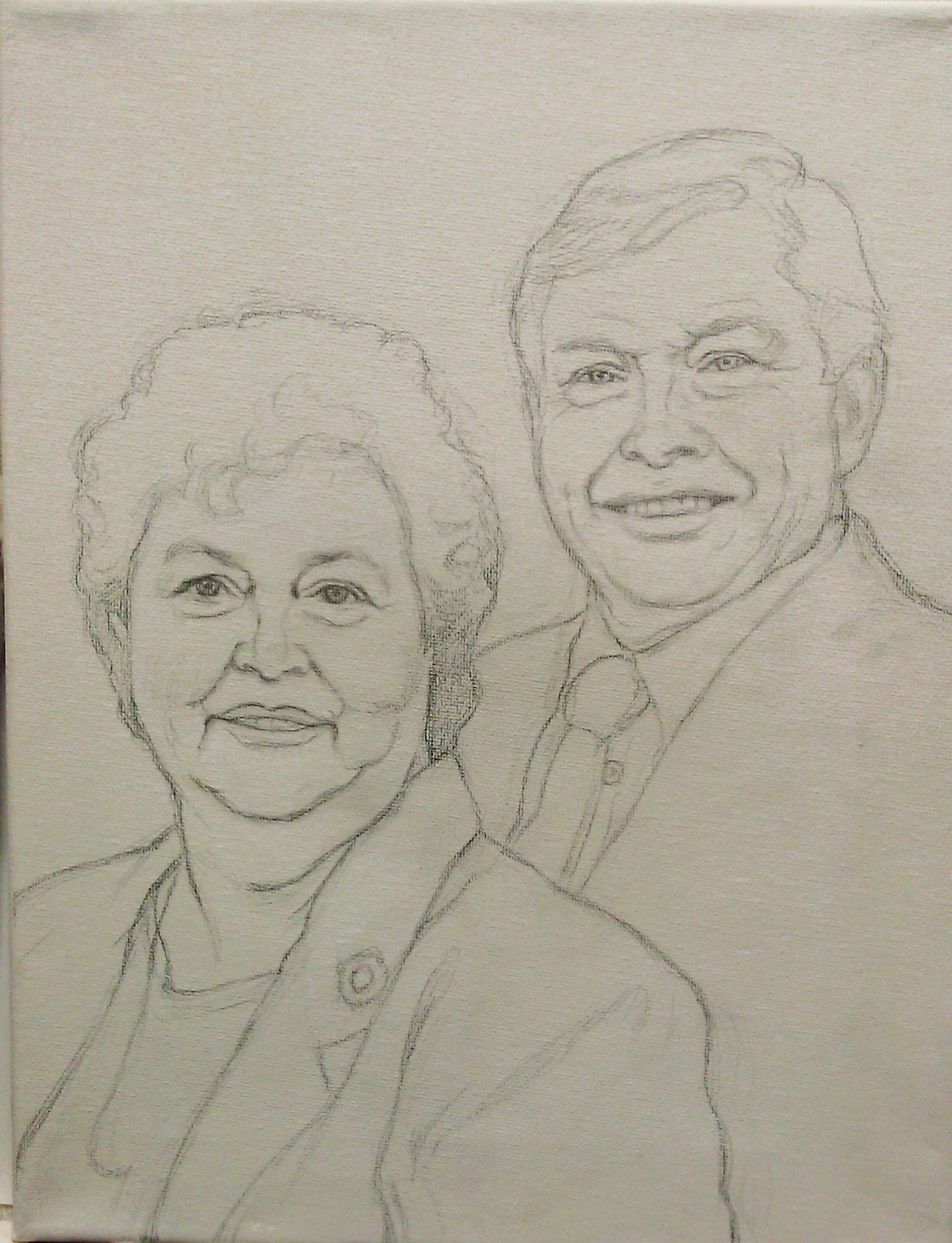
Step1: Starting with the Sketch
This was done freehand. In this stage, I try to get it as accurate as possible, so I have a good foundation to build my painting upon. But there are inevitably a few things that may be off, that have to be addressed in the painting stage. And that’s OK, because with paint it is easy to make corrections. Usually, I sketch in colored pencil, but I think, looking back, I might have run out of them and so used a graphite pencil, even though it is harder to work with.
Step 2: Blocking in Value and Color Simply
In this stage, I start by adding some light layers of color: ultramarine blue mixed with raw umber dark, and a alizarine crimson. I like to start my paintings with just one or two different colors and then build from that. So, even though he has pink hair for now, I’m not going to worry about it! The goal is to quickly separate cool hues from warm, and get the values blocked in quickly to build up depth.
Step 3: Strengthening Value, Color & Tonal Relationships
Meanwhile, I keep darkening the background with a mixture of raw umber dark and ultramarine blue to make grey. All of these layers, by the way, are thinned down with matte medium and applied with the glazing technique to give the painting richness and depth.
Step 4: Intensifying Colors and Smoothing Out Shading on Skin Tones
At this level, the colors are getting very intense, but there’s still a lot of nuances to add yet, to smooth out the major shaded areas of the face. It’s important to remember that your sketch can’t capture a likeness as precisely as a full-shaded in portrait. The subtleties of values sculpt the dimensions of the face.
So when you’re sketching, cut yourself a little slack if you haven’t captured the likeness perfectly. Just get it close.
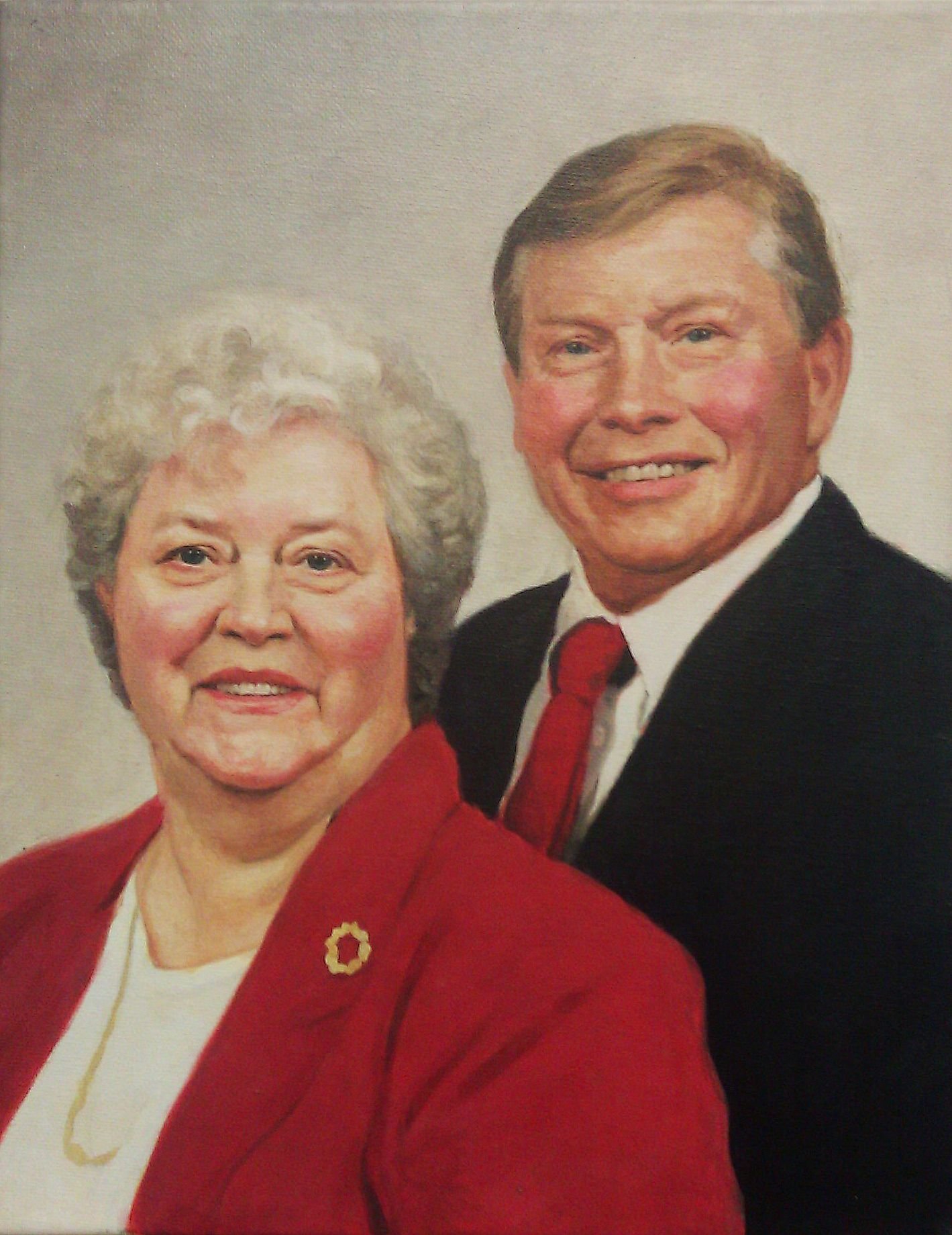
Step 5: Adding Nuances to Facial Features and Deepening Shadows
It’s starting to look closer, but there’s more details work to be done. As you can tell, the pin on the woman’s lapel can be seen, faintly under the glazes. It’s time to paint it in. And there’s more work to do on the man’s tie–shadows on the edges that will give it depth and make it look like it’s really there, resting on his shirt.
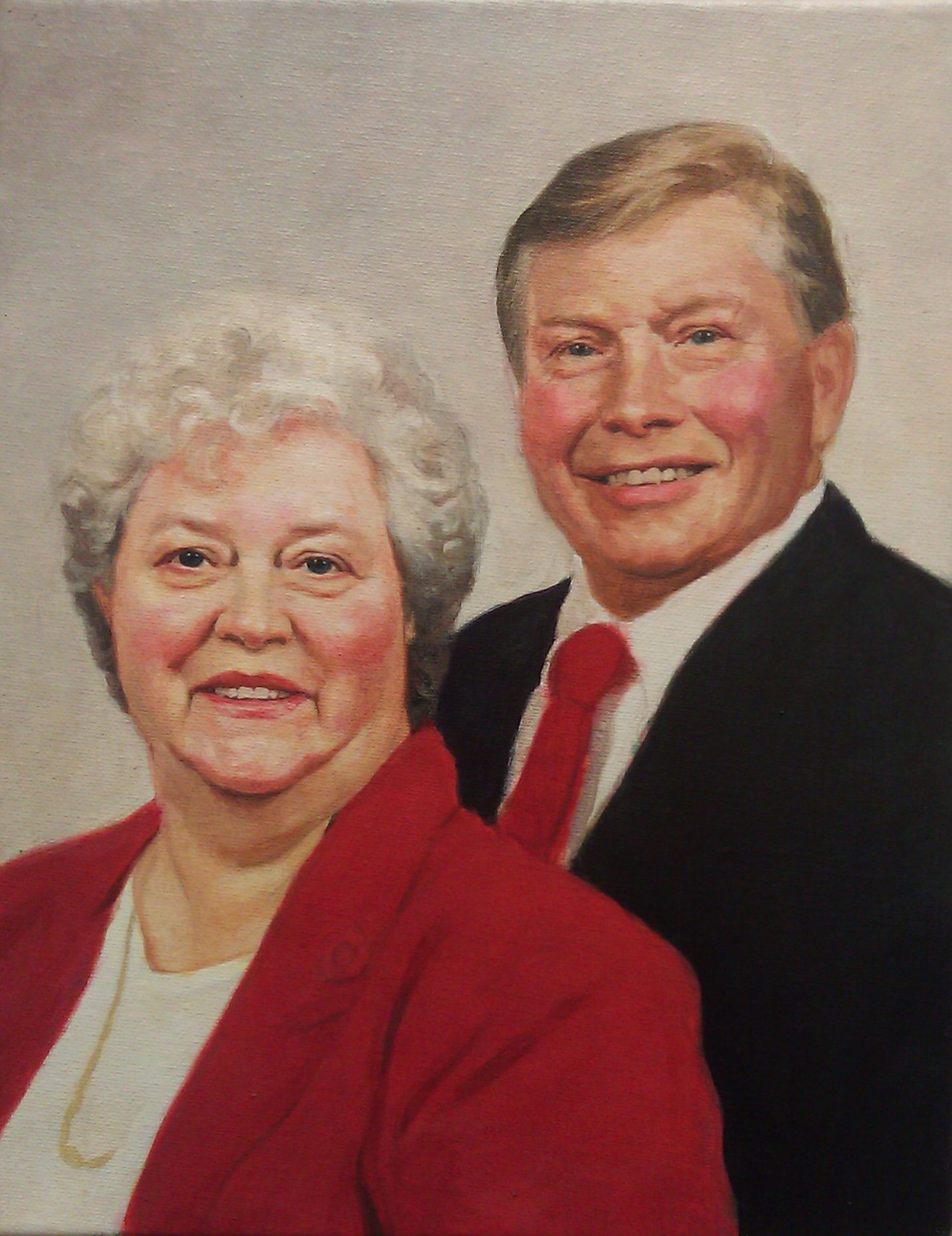
Step 6: Smoothing out and Adding Detail
I feel like I’m in the home stretch at this stage, where I could call this finished, but there’s just a few final details yet: The details on the woman’s necklace, the tie-in values (where you take sharply defined shadows and merge them into smooth gradations) on the man’s tie. Highlights on the faces. And even just a few spots on his forehead to give him some character.
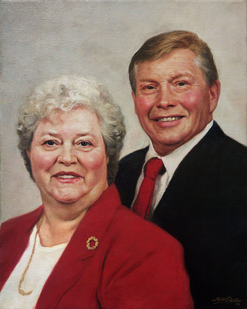
The Finished Painting
Done! All in all, this painting has dozens of layers of translucent paint and over 25 hours of work put into it. It was worth every minute. My friend really appreciated it, and it brought a lot of encouragement as it helped to keep this memory alive.
Let me know what you think of this mini-tutorial, and how I can improve these for you in the future. Share your paintings with me anytime and let me know how I can help you become a better artist.
Be blessed in your painting,
P.S. Did you find this post helpful or encouraging? If so, send it on ahead! Let others know with the share buttons below. I’d love to hear your comments. Thank you so much!
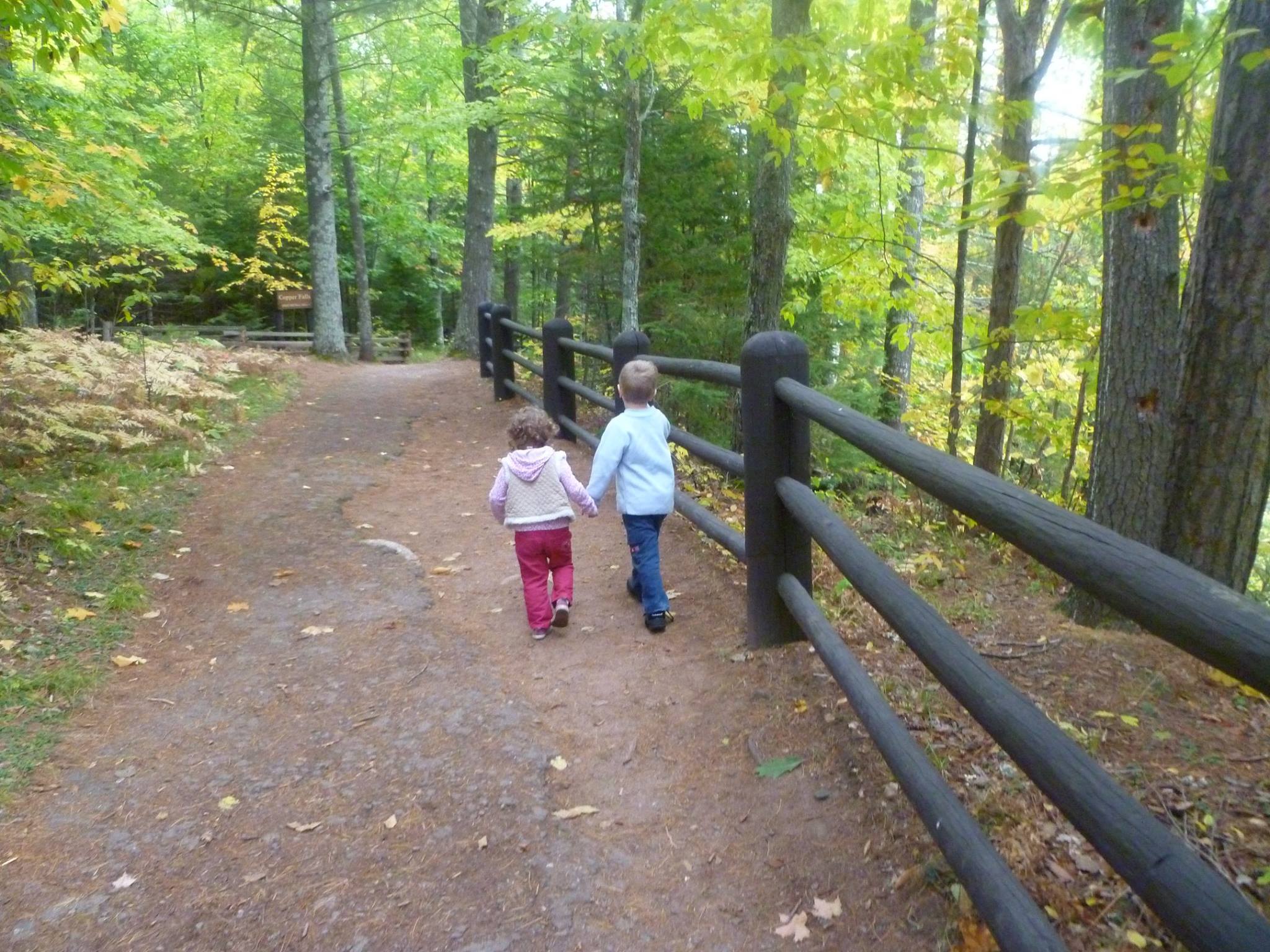
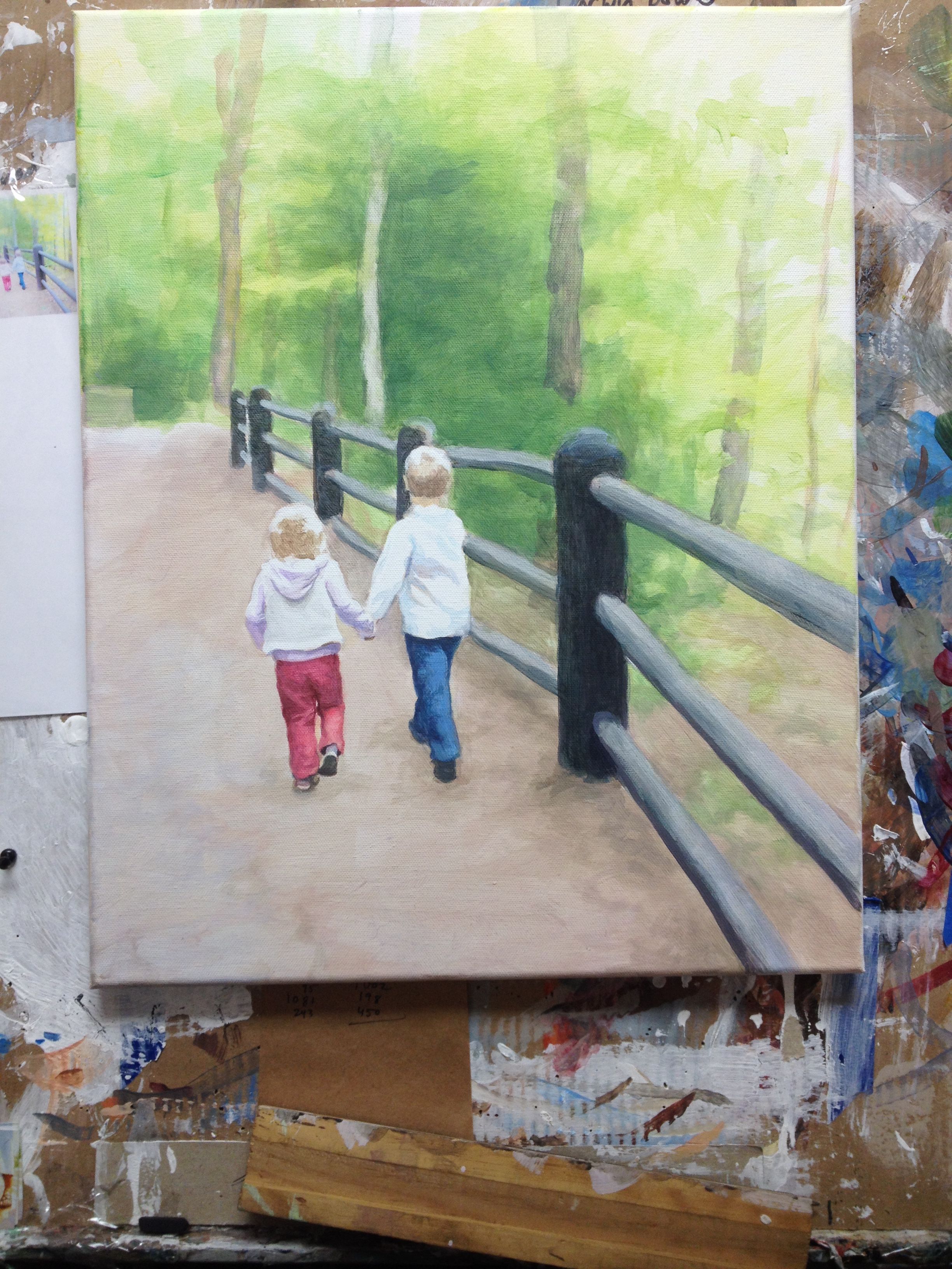
Here is the final painting of my children walking through the woods, “Come as Children,” 16″ x 20″ acrylic on canvas, with a step-by-step breakdown of how I did it.
It will be used for a book cover illustration of Charles Spurgeon’s Devotionals for children. Below I want to do a recap of my previous posts from Facebook and Steemit, showing you the process of how I did this painting.
Reference Photo
In Progress Painting
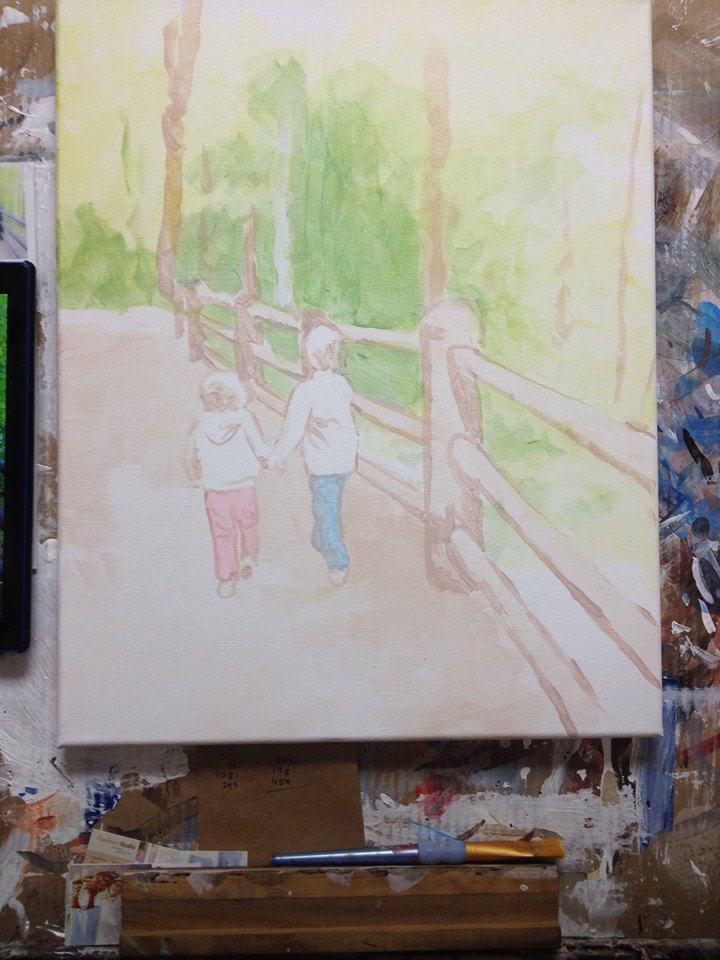
Step 1: Blocking In the Forms
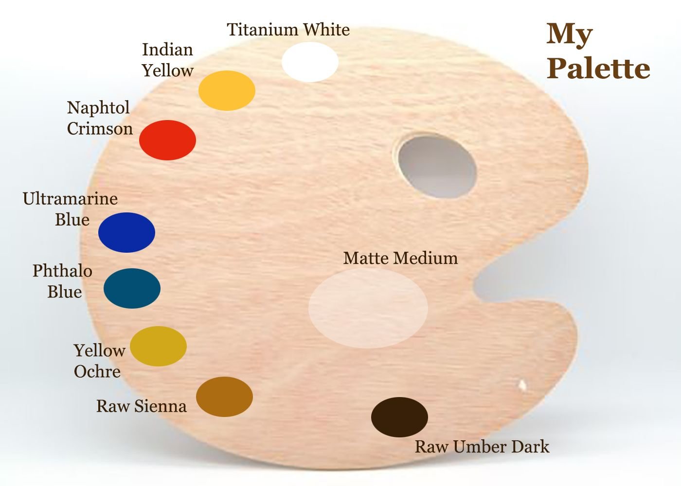
I start off very faint, just blocking in the colors with glazes. I mix about 90% clear acrylic medium to about 10% paint and just block in the composition, suggesting where the future colors will go. Here is my palette…
Normally, I use burnt sienna, but to challenge myself and also to enhance the color harmony within the painting, I omitted it.
The first layers consisted of raw sienna, yellow ochre, phthalo blue and indian yellow for the background, and then for the posts: raw umber dark, ultramarine blue and napthol crimson. I blocked in the blue jeans with phthalo blue, and my daughter’s pants with napthol crimson.
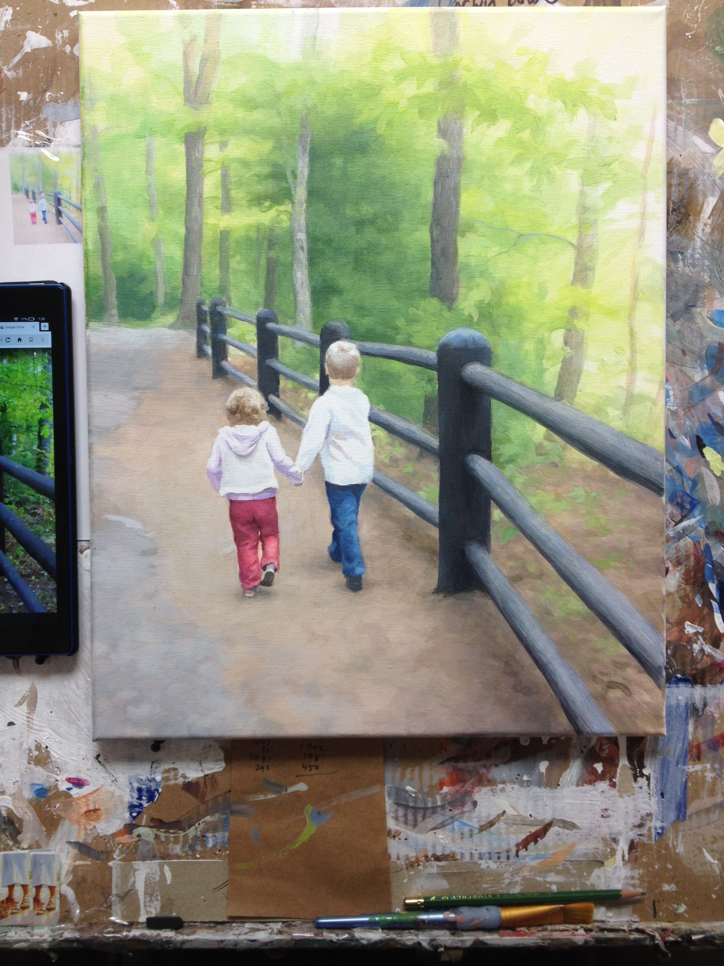
Step 2: Establishing Contrast
In this step, I added some phthalo blue, raw sienna and yellow ochre in a glaze to the background to suggest trees, and went over the trees with some raw umber dark, napthol crimson and ultramarine blue.
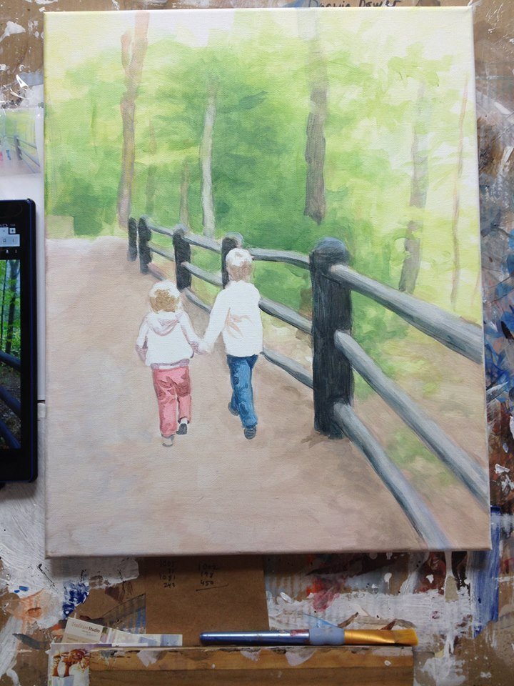
Step 3: Creating Nuances
In this step, I added in more layers of green to the background, and filled in the colors for both kids’ pants. I also added in some shadows as well below the fence posts and filled in the shadows a little deeper and more dramatically.
Step 4: Adding Detail to Background and Figures
I added some more detail to the background and shading to the children, especially my daughter’s hair. Overall, since I use the glazing technique, I incrementally darken the entire surface, bringing out more details and nuances by “pushing and pulling” the paint: darkening certain areas and lightening others.
With the winter weather we’ve been having in Wisconsin, a walk on a warm day like this picture looks pretty good.
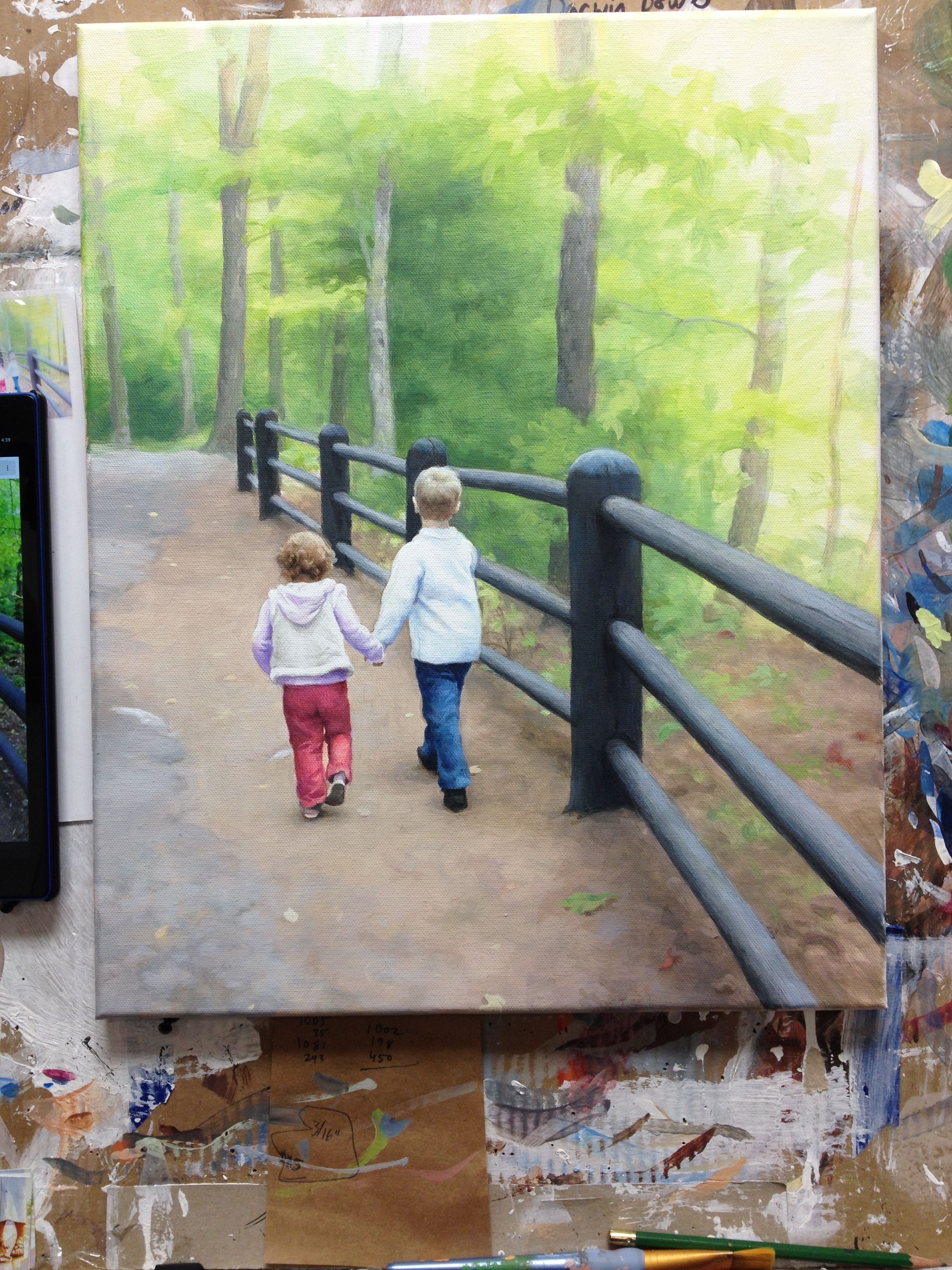
Step 5: Refining With Highlights and Additional Detail
I’m almost done with this painting: I added some contrast to the posts, more nuances within the clothing, some fallen leaves, and some darker areas within the trees in the background to tie the values in with the posts. Still not quite there yet.
I’ll need to substantially darken the overall value of the background to match the much darker and more vivid foreground. Sometimes creating art can be a balancing act. But it’s much safer than being on the high beam!
Final Painting
In the final rendition, I darkened the values in the background, to tie them in with the very dark posts of the fence, and even the shadows on the children. I also added a few details to the children’s hair, and highlights to edges of the clothing to make them stand out more. Lastly, I put a few more glazes of raw umber dark, ultramarine blue, and titanium white for the trees.
This painting took about 20 hours to do. It was my pleasure going on this journey with you, showing the process, and maybe even help you to think about warmer weather at a time when many of us are ready for spring!
A Video Demonstration Showing Part of the Process
Be blessed in your painting,
P.S. Did you find this post helpful or encouraging? If so, send it on ahead! Let others know with the share buttons below. I’d love to hear your comments. Thank you so much!