Tag Archives for " realistic acrylic portrait "

How to Add Initial Highlights in Acrylic Painting
Achieve depth and realism by enhancing your acrylic painting with well-placed highlights
Why Highlights Matter in Acrylic Painting
In acrylic painting, adding highlights can make a significant difference in the overall depth and realism of your artwork. Because highlights are essential for bringing out details and creating a sense of three-dimensional form. So, in this blog post, we’ll break down the step-by-step process of adding initial highlights to your acrylic painting. And then you’ll learn the tools, techniques, and tips necessary to make your paintings more lifelike and vibrant.
Outline:
- Importance of Highlights
- Materials and Tools Needed
- Step-by-Step Process for Adding Initial Highlights
- Using Titanium White and Indian Yellow
- Brush Techniques for Smooth Highlights
- Common Mistakes to Avoid
- Tips for Effective Highlighting
- Final Thoughts and Conclusion
Materials and Tools Needed
Before we begin, gather the following materials to add highlights:
- Titanium White acrylic paint
- Indian Yellow acrylic paint
- Matte medium
- Various brushes (flat size 14 brush, smaller detail brush)
- A well-lit workspace
- Water and a palette
Step-by-Step Process for Adding Initial Highlights
1. Prepare Your Highlighting Mixture
To start, you’ll need to create a mixture using titanium white and indian yellow. And then combine these colors with matte medium to thin the paint down to around 50% opacity. Accordingly, this ensures that your highlights blend naturally with the rest of the painting without appearing too harsh or overwhelming.
2. Blocking in Highlights on the Sky
You can now begin by adding highlights to the sky, then focusing on the clouds. Also, you’ll want to switch to a larger brush, like a flat size 14 for broader areas. Then pay attention to the direction of light and where it naturally hits the clouds. Adjust your brushwork accordingly, using soft strokes to blend the highlights seamlessly into the surrounding areas.
3. Refining the Clothing Highlights
Move on to smaller areas, such as the clothing in your painting. Then switch to a smaller detail brush to carefully add highlights to folds and areas where light would naturally reflect. Because this adds texture and dimension to the fabric, bringing it to life.
4. Adjusting Highlights Based on Glare and Lighting
While working on highlights, it’s important to frequently step back and adjust your lighting. Because sometimes, the glare from the paint can obscure your view. When turning off overhead lights or changing your angle will help you see the true contrast between highlights and shadows.
Using Titanium White and Indian Yellow for Warm Highlights
Using a combination of titanium white and indian yellow allows you to create warm highlights that complement the overall toning layer of your painting. The addition of yellow gives the highlights a natural warmth, which is especially effective for skin tones and areas that are bathed in sunlight.
This mixture is not only great for clouds and sky, but also for adding depth to hair, clothing, and other textured elements within your painting. Then keep the opacity thin, allowing you to build up layers gradually and refine your highlights as needed.
Brush Techniques for Smooth Highlights
Using the correct brush technique is essential for applying smooth, natural-looking highlights. Here are some key techniques to keep in mind:
- Feathering: Use gentle strokes and gradually fade the highlights into the mid-tones of the painting.
- Dabbing: For more textured surfaces like clouds or clothing, a dabbing technique can create the illusion of light breaking through.
- Layering: Apply highlights in thin layers to build up intensity without overpowering the base colors.
When switching between larger brushes for broad areas and smaller brushes for fine details will give you the control necessary for varied textures.
Common Mistakes to Avoid
When adding highlights, avoid these common pitfalls:
- Overloading your brush: Too much paint can result in harsh, unblended highlights.
- Neglecting light sources: Always consider where your light source is coming from to ensure highlights are placed accurately.
- Over-highlighting: Adding too many highlights can flatten your painting and remove its depth.
Instead, focus on subtlety and restraint. Then the highlights should enhance the painting without becoming the focal point.
Tips for Effective Highlighting
Here are some additional tips to keep in mind when adding initial highlights:
- Use a limited color palette: Stick to one or two highlight colors to maintain color harmony.
- Work slowly: Gradually build up the highlights, allowing each layer to dry before adding more.
- Blend with matte medium: Matte medium helps thin the paint and ensures smooth transitions between highlighted areas and surrounding tones.
- Check your progress: Step back frequently to check how the highlights are affecting the overall composition.
Conclusion
Adding initial highlights in acrylic painting is so crucial step in creating depth, contrast, and realism. Because by using a combination of titanium white and Indian yellow, thinned with matte medium, and applying careful brushwork, you can enhance your painting dramatically. Then highlights bring out the dimensionality of forms and can make your artwork truly stand out.
Lastly, as always, remember to practice patience, as acrylic highlights often require layers and adjustments. Because with the right technique and mindset, you’ll be able to create a painting that radiates light and life. And then, if you found this guide helpful, be sure to subscribe for more painting tutorials and tips.
If you’re looking for more instructional videos on how to improve your acrylic painting, visit www.realisticacrylic.com for more tutorials and check out my free courses here. .
- How to Paint Foliage Using the Acrylic Glazing Technique
- How to Trace for an Accurate Portrait Sketch
- How to Paint Realistic Eyes in Your Acrylic Portrait
- How to Add Raw Umber Dark & Ultramarine Blue to Your Portrait
- How to Make Your Own Raw Umber Dark
- How to Paint Realistic Trees & Grass in Your Acrylic
- How to Block In Skin Tone Values Using Glazing Technique
- How to Paint Vibrant Reds in Your Acrylic Portrait
- How to Glaze Background Colors & More Acrylic Portrait
- How to Paint White Clothing in Your Acrylic Portrait
- How to Easily Transition from a Sketch to a Painting
- How to Block In Shading & Skin Tones in Your Acrylic
- How to Build Up Color on Acrylic Pet Portrait
- How to Build Up Form on Clothing with Acrylic
- How to Paint Dark Clothing Using Acrylic Glazing Technique
- How to Paint a 24 x 30 Acrylic With 30 People
- How to Do Smooth Shading with Acrylic
- How to Sketch an Acrylic Portrait with a Grid
Read more about how to paint a portrait that you can surely be proud of!
I’d love to hear your thoughts on this video. Please share it with your friends and family. Let me know if you have any further questions. I’ll greatly help you.
If you’d like to learn more, sign up for my free email tips and video class today.
Learn How to Paint Acrylic Portraits With My Free Mini-Video Course!
Thank you so much for taking the time to read this tutorial and watch the video. That means a lot to me. I hope you find it very helpful in your portrait painting.
Yours for Better Portraits,

P.S. Did you find this post helpful or encouraging? If so, send it on ahead! Let others know with the share buttons below. I’d love to hear your comments. Thank you so much! Also, do you have a question on acrylic portrait painting you’d like answered? Let me know, and I’d be happy to help!

3 Tips How to Help You Draw Better Pencil Portraits
Unlock the secrets to creating realistic pencil portraits with these simple yet powerful tips
Creating realistic pencil portraits can be a rewarding experience, but it also takes practice and attention to detail. Whether you’re just starting out or looking to refine your skills, these three essential tips can help you elevate your pencil drawings. In this post, we’ll explore how to use cross-hatching for texture, prevent smudging, and smooth your shading to create a polished and lifelike portrait.
Tip 1: Master Cross-Hatching for Smooth Shading
When one of the key techniques in pencil drawing is cross-hatching, a method of layering pencil strokes to build up depth and texture. Because learning how to cross-hatch correctly can improve the realism of your pencil portraits and give your drawings a polished look. Here’s how to do it:
- Start with a 45-degree angle: Hold your pencil at a 45-degree angle and apply close strokes, making sure the lines are tight and uniform. This will help create a smooth shading effect.
- Layer in different directions: After completing one set of strokes, go over them with perpendicular strokes. This second layer, or cross-hatch, will even out the distribution of graphite and fill in gaps, making the shading appear more solid and realistic.
- Use different pencil grades: For this technique, use a range of pencils, from softer 4B to harder 2H, to add depth and contrast. Softer pencils will create darker tones, while harder pencils are ideal for lighter areas.
This method works particularly well for portraits, as it allows you to blend shadows and highlights naturally. Then cross-hatching technique helps mimic the textures of skin, fur, and other detailed areas in a portrait.
Tip 2: Protect Your Drawing from Smudging
Another common issue when drawing portraits is smudging the graphite as you work. This can ruin hours of effort, especially if you have detailed areas that you want to preserve. To avoid this, follow these steps:
- Use a separate piece of paper: Place a sheet of clean paper under your hand while drawing. Because this will prevent your hand from coming into direct contact with the drawing and smearing the graphite.
- Work from left to right (or right to left): If you’re right-handed, begin shading on the left side of the drawing and gradually move to the right. Left-handed artists should start on the right side. This technique keeps your hand away from areas that have already been worked on.
- Avoid leaning heavily on the paper: Keeping your touch light will help avoid both smudging and leaving unintended marks on the paper.
These simple practices can save your drawing from unnecessary blemishes and ensure that your pencil portrait looks clean and professional.
Tip 3: Use Tissue for Gentle Blending
A subtle yet highly effective way to smooth out your pencil shading is by using tissue paper. So many artists make the mistake of over-blending their drawings with a blending stump, which can result in a muddy, lifeless texture. Here’s how to blend effectively using tissue:
- Gently smooth out the shading: Take a piece of soft tissue and lightly run it over the shaded areas of your drawing. Use a soft touch to avoid pressing too hard, which could over-smooth the texture and dull the contrast.
- Build layers after blending: After you’ve gently smoothed the shading, go back over the area with another layer of pencil. This adds richness and depth to your portrait, while still preserving the natural texture of the paper. It also allows you to darken values without losing the realism of your drawing.
- Avoid smearing: Be cautious not to rub too vigorously, as this can smear the graphite and create unwanted streaks. Tissue blending should be a subtle touch to refine the shading, not overpower it.
Blending with tissue helps achieve a soft and smooth transition between different tonal areas in the portrait, perfect for realistic skin tones and subtle shadows.
Additional Tips & Techniques
- Sharpen your pencil frequently: A sharp pencil gives you better control over fine details, allowing for more precise shading and line work. Electric sharpeners are especially helpful for keeping your pencils in peak condition throughout the drawing process.
- Observe your reference photo closely: Pay attention to the contrasts between light and dark in your reference photo. By focusing on these value shifts, you can replicate them in your drawing to enhance realism.
- Experiment with different pencil strokes: Not every part of your drawing needs to be shaded the same way. Experiment with various stroke patterns to achieve the desired texture. For example, fur or hair can benefit from looser, more directional strokes, while skin might require a more uniform approach.
Conclusion
When mastering cross-hatching, protecting your drawing from smudging, and gently blending with tissue, you’ll notice a marked improvement in your pencil portraits. These techniques are easy to implement but can make a huge difference in the overall quality of your work.
So, next time you sit down to create a pencil portrait, remember these three tips to draw better pencil portraits. Because with practice and attention to detail, you’ll be able to create portraits that capture the essence of your subject with lifelike realism.
If you’re looking for more instructional videos on how to improve your acrylic painting, visit www.realisticacrylic.com for more tutorials and check out my free courses here. .
- How to Paint Foliage Using the Acrylic Glazing Technique
- How to Trace for an Accurate Portrait Sketch
- How to Paint Realistic Eyes in Your Acrylic Portrait
- How to Add Raw Umber Dark & Ultramarine Blue to Your Portrait
- How to Make Your Own Raw Umber Dark
- How to Paint Realistic Trees & Grass in Your Acrylic
- How to Block In Skin Tone Values Using Glazing Technique
- How to Paint Vibrant Reds in Your Acrylic Portrait
- How to Glaze Background Colors & More Acrylic Portrait
- How to Paint White Clothing in Your Acrylic Portrait
- How to Easily Transition from a Sketch to a Painting
- How to Block In Shading & Skin Tones in Your Acrylic
- How to Build Up Color on Acrylic Pet Portrait
- How to Build Up Form on Clothing with Acrylic
- How to Paint Dark Clothing Using Acrylic Glazing Technique
- How to Paint a 24 x 30 Acrylic With 30 People
- How to Do Smooth Shading with Acrylic
- How to Sketch an Acrylic Portrait with a Grid
Read more about how to paint a portrait that you can surely be proud of!
I’d love to hear your thoughts on this video. Please share it with your friends and family. Let me know if you have any further questions. I’ll greatly help you.
If you’d like to learn more, sign up for my free email tips and video class today.
Learn How to Paint Acrylic Portraits With My Free Mini-Video Course!
Thank you so much for taking the time to read this tutorial and watch the video. That means a lot to me. I hope you find it very helpful in your portrait painting.
Yours for Better Portraits,
P.S. Did you find this post helpful or encouraging? If so, send it on ahead! Let others know with the share buttons below. I’d love to hear your comments. Thank you so much! Also, do you have a question on acrylic portrait painting you’d like answered? Let me know, and I’d be happy to help!

Critiquing My Sister-in-Law’s Third Portrait
Watch me As I give critique to my Sister-in-law.
Earlier this week, my brother and sister-in-law stopped by my studio. She asked me to take a look at a portrait she’s working on. So I decided to record the critique for you. She just started paintings less than two months ago
Watch the video below to learn more about how I critique my sister on her third portrait.
- Adding highlights to your acrylic painting
- 5 Excellent Reasons to Use Aluminum Foil
- Paint Realistic Wrinkles in Acrylic
- Painting Clothing in an Acrylic Portrait
- Paint a Cloudy Sky Acrylic
- How to add Semi-Opaque Highlights
- How to Enhance the Contrast in Your Acrylic
- How to Add Glaze to Your Acrylic Painting
- Paint Realistic Reflections on Eyeglasses in an Acrylic Portrait
- Build Up Depth on Your Acrylic Portrait Backgrounds
- How Do You Do Layers With the Glazing Technique?
- Learn How to Paint Wrinkles in Acrylic
Read more about how to paint a portrait that you can surely be proud of!
I’d love to hear your thoughts on this video. Please share it with your friends and family. Let me know if you have any further questions. I’ll greatly help you.
If you’d like to learn more, sign up for my free email tips and video class today.
Learn How to Paint Acrylic Portraits With My Free Mini-Video Course!
Thank you so much for taking the time to read this tutorial and watch the video. That means a lot to me. I hope you find it very helpful in your portrait painting.
Yours for Better Portraits,
P.S. Did you find this post helpful or encouraging? If so, send it on ahead! Let others know with the share buttons below. I’d love to hear your comments. Thank you so much! Also, do you have a question on acrylic portrait painting you’d like answered? Let me know, and I’d be happy to help!

How to Arrange the Composition of Multi-Person Portrait
Mastering the art of group portraits techniques and tips for captivating compositions
When arranging the composition of a multi-person portrait can be a daunting task. But the intricacies involved in representing several individuals within a single artwork are immense. Then having over 30 years of portrait experience, I have learned that the complexity of incorporating multiple figures presents unique challenges. However, through careful planning and effective techniques, stunning group portraits can be created that capture the essence of each individual while maintaining a cohesive overall image.
So in this blog post, the techniques required to arrange the composition of multi-person portraits will be explored. Whether you are an experienced artist or just starting out, these tips can significantly improve your group portrait painting skills.
Understanding Composition
The composition refers to the arrangement of elements within a work of art. So it is the foundation upon which the narrative of the painting is built. And then well-structured composition helps convey emotions and relationships among the subjects. In multi-person portraits, the interplay between the figures is crucial in expressing unity or diversity within the group.
An effective composition guides the viewer’s eye, allowing them to navigate through the artwork smoothly. It ensures that the focal points are highlighted and that the overall piece communicates the intended message. Thus, investing time in planning your composition is essential for creating impactful portraits.
Tools for Arranging Composition
To simplify the process of arranging compositions, various tools can be utilized. One effective tool is a projector, which can be used for tracing images. By projecting the reference onto the canvas, the initial outlines can be sketched accurately. This method allows for precise placement of each figure and ensures proportionality within the composition.
Additionally, software tools like Photoshop assist in assembling various images, providing a clear plan before the painting begins. Using digital images, artists can experiment with different arrangements, backgrounds, and lighting conditions, giving them a solid foundation for their physical work.
The Golden Ratio in Composition
One of the most effective techniques in arranging compositions is the application of the golden ratio. This mathematical ratio, approximately 1:1.62, has been used by artists throughout history to create aesthetically pleasing works. The ratio is derived from the Fibonacci sequence, and it can be observed in nature, architecture, and art.
To utilize the golden ratio in a multi-person portrait, the focal points should be strategically placed along the lines created by dividing the canvas according to this ratio. For instance, ensuring that the center point of the figures aligns with the golden ratio enhances the visual appeal of the artwork. Artists can measure and apply this ratio by using simple tools, such as their fingers or a ruler, making it accessible for anyone.
Sketching the Initial Outlines
Once the composition is determined, the sketching process begins. It is advisable to start by blocking in forms from the background to the foreground. Major shapes should be identified first, allowing for a clear structure to develop. This approach helps in visualizing the overall composition and its flow.
Begin by lightly sketching the outlines of each figure, focusing on their relative positions and sizes. Pay attention to the relationships between the subjects, ensuring that their placements enhance the narrative of the painting. It may be beneficial to sketch some elements of the background simultaneously, as this can provide context for the figures.
Value Shifts and Major Forms
Recognizing the importance of value shifts is vital in achieving depth in multi-person portraits. Value refers to the lightness or darkness of a color, and it plays a critical role in establishing contrast and focus within the artwork. By sketching major forms with distinct values, the viewer can navigate the painting easily.
Techniques such as using darker shades for shadows and lighter shades for highlights can guide the viewer’s eye and create a sense of realism. For multi-person portraits, it is essential to consider the light source and how it affects each individual. The light will interact differently with each figure, and capturing these variations will enhance the overall composition.
Avoiding Over-Complication
It is essential to avoid over-complicating the composition, especially in multi-person portraits. With numerous figures to portray, it can be tempting to include excessive detail. However, focus should be placed on key elements that define the interaction among the figures. Simplifying details can enhance the clarity and impact of the portrait.
One strategy to maintain clarity is to limit the number of distinct backgrounds or props. A cohesive background can help unify the subjects and reduce visual clutter. Additionally, consider emphasizing gestures and expressions that reflect the relationships between individuals, allowing their interactions to take center stage.
Refining the Composition
The initial sketch serves as a foundation for refinement. As the painting progresses, continual adjustments should be made based on feedback. Observing how the elements interact within the composition allows for improvements that strengthen the overall piece.
Regularly step back from your work to evaluate the composition from a distance. This perspective can reveal imbalances or areas needing adjustment. It is also beneficial to seek feedback from fellow artists or mentors, as fresh eyes can offer valuable insights that enhance your work.
Practical Tips for Success
- Creating Group Dynamics: Focus on how the figures relate to one another. Their body language and positioning can convey emotions and interactions. This can involve tilting heads toward each other or capturing laughter and joy.
- Capturing Expressions: Expressions can significantly influence the mood of the portrait. Aim to portray authentic emotions that resonate with the viewer. Pay attention to subtle changes in facial features and body language.
- Experiment with Angles: Consider various viewpoints when planning your composition. Changing the angle from which you depict the figures can lead to a more dynamic composition, adding interest and depth.
- Use Color Wisely: Colors can convey emotions and establish relationships among figures. Harmonizing color schemes can unify the composition, while contrasting colors can emphasize differences between individuals.
Conclusion
Arranging the composition of a multi-person portrait requires patience and practice. By utilizing tools, understanding composition principles, and applying techniques such as the golden ratio, artists were creating captivating group portraits. As you embark on your portrait painting journey, remember that each composition is an opportunity to tell a story.
Engaging with the techniques shared here will undoubtedly elevate your portrait skills. By continuously experimenting and refining your approach, you will develop your unique style. So grab your materials, and let your creativity shine as you create stunning multi-person portraits that capture the essence of human connection.
If you’re looking for more instructional videos on how to improve your acrylic painting, visit www.realisticacrylic.com for more tutorials and check out my free courses here. .
- How to Paint Foliage Using the Acrylic Glazing Technique
- How to Trace for an Accurate Portrait Sketch
- How to Paint Realistic Eyes in Your Acrylic Portrait
- How to Add Raw Umber Dark & Ultramarine Blue to Your Portrait
- How to Make Your Own Raw Umber Dark
- How to Paint Realistic Trees & Grass in Your Acrylic
- How to Block In Skin Tone Values Using Glazing Technique
- How to Paint Vibrant Reds in Your Acrylic Portrait
- How to Glaze Background Colors & More Acrylic Portrait
- How to Paint White Clothing in Your Acrylic Portrait
- How to Easily Transition from a Sketch to a Painting
- How to Block In Shading & Skin Tones in Your Acrylic
- How to Build Up Color on Acrylic Pet Portrait
- How to Build Up Form on Clothing with Acrylic
- How to Paint Dark Clothing Using Acrylic Glazing Technique
- How to Paint a 24 x 30 Acrylic With 30 People
- How to Do Smooth Shading with Acrylic
- How to Sketch an Acrylic Portrait with a Grid
Read more about how to paint a portrait that you can surely be proud of!
I’d love to hear your thoughts on this video. Please share it with your friends and family. Let me know if you have any further questions. I’ll greatly help you.
If you’d like to learn more, sign up for my free email tips and video class today.
Learn How to Paint Acrylic Portraits With My Free Mini-Video Course!
Thank you so much for taking the time to read this tutorial and watch the video. That means a lot to me. I hope you find it very helpful in your portrait painting.
Yours for Better Portraits,
P.S. Did you find this post helpful or encouraging? If so, send it on ahead! Let others know with the share buttons below. I’d love to hear your comments. Thank you so much! Also, do you have a question on acrylic portrait painting you’d like answered? Let me know, and I’d be happy to help!

How to Adjust the Eyes in an Acrylic Portrait
Master the art of eye adjustments to enhance your portraits
When it comes to painting portraits, the eyes are often considered the windows to the soul. Adjust the eyes in acrylic portraits can significantly enhance the overall realism and appeal of your artwork. In this post, the importance of eye adjustments will be discussed, along with effective techniques that artists can utilize to create lifelike portraits.
Understanding Eye Structure
The eye consists of various components, including the iris, pupil, and eyelids. Each of these features plays a critical role in conveying expression and character. Artists often face challenges such as proportions, shape, and placement of the eyes. A solid understanding of eye anatomy can help artists make informed adjustments.
Preparing for Adjustments
Before making any adjustments, artists should gather their materials. Ensure you have your acrylic paints, brushes, a palette, and a reference photo ready. The reference photo serves as a vital tool for accuracy and should be positioned near your painting for easy comparison.
Techniques for Adjusting Eyes
Thickening Lines
To achieve a more balanced and dynamic look, artists should consider thickening the lines above the iris. This technique adds visual weight and reduces the scalloping effect often seen in portraits. Begin by slightly rounding off the existing lines. Instead of following the previous line too closely, raise the line above the iris to create a more natural and appealing shape.
Adjusting the Shape
When adjusting the shape of the eyes, it is crucial to ensure that they are not overly flattened. Slightly round the eye, particularly towards the middle section, to achieve a more lifelike appearance. This adjustment can be made by adding more paint along the upper eyelid and ensuring the iris is adequately framed.
Utilizing Reference Photos
Regularly referencing your photo while painting can make a world of difference. Many artists find it helpful to bring the reference photo onto the canvas or have it displayed nearby. This technique allows for constant comparison and ensures accuracy in adjustments.
Common Mistakes to Avoid
While making adjustments, artists should be cautious of overcorrection. It’s essential to maintain the overall likeness to the subject without altering the unique features that define them. Additionally, symmetry plays a crucial role; both eyes should be balanced in shape and size. Lastly, ensure that enough reference material is used to guide your adjustments effectively.
Final Touches
Once the eyes have been adjusted, take a step back and assess the overall composition. Balancing both eyes is essential for achieving symmetry, while using shadows can add depth and realism. Artists should ensure that the final result closely resembles the reference photo, capturing the subject’s essence.
Conclusion
Adjusting the eyes in an acrylic portrait is a skill that can greatly enhance the overall quality of your artwork. By understanding eye structure and implementing techniques such as thickening lines, adjusting shapes, and utilizing reference photos, artists can create lifelike portraits that resonate with viewers. With practice and patience, these techniques can be mastered, leading to significant improvements in your portrait painting skills.
Tips and Techniques
Don’t Rush: Take your time when making adjustments; a careful approach leads to better results.
Use a Variety of Brushes: Different brush sizes and shapes can help achieve various effects when painting eyes.
Practice Regularly: The more you practice adjusting eyes, the more intuitive the process will become.
Study Real Eyes: Observing real eyes in different lighting conditions can provide insights into how to recreate them in your portraits.
- Adding highlights to your acrylic painting
- 5 Excellent Reasons to Use Aluminum Foil
- Paint Realistic Wrinkles in Acrylic
- Painting Clothing in an Acrylic Portrait
- Paint a Cloudy Sky Acrylic
- How to add Semi-Opaque Highlights
- How to Enhance the Contrast in Your Acrylic
- How to Add Glaze to Your Acrylic Painting
- Paint Realistic Reflections on Eyeglasses in an Acrylic Portrait
- Build Up Depth on Your Acrylic Portrait Backgrounds
- How Do You Do Layers With the Glazing Technique?
- Learn How to Paint Wrinkles in Acrylic
Read more about how to paint a portrait that you can surely be proud of!
I’d love to hear your thoughts on this video. Please share it with your friends and family. Let me know if you have any further questions. I’ll greatly help you.
If you’d like to learn more, sign up for my free email tips and video class today.
Learn How to Paint Acrylic Portraits With My Free Mini-Video Course!
Thank you so much for taking the time to read this tutorial and watch the video. That means a lot to me. I hope you find it very helpful in your portrait painting.
Yours for Better Portraits,
P.S. Did you find this post helpful or encouraging? If so, send it on ahead! Let others know with the share buttons below. I’d love to hear your comments. Thank you so much! Also, do you have a question on acrylic portrait painting you’d like answered? Let me know, and I’d be happy to help!

How to Paint a Portrait Outside: Glazing Technique
Master the art of outdoor portrait painting using glazing techniques for depth and realism
Outdoor portrait painting can be a rewarding experience that connects artists with nature. The beauty of the natural light offers a unique perspective that can enhance the realism of your artwork. One effective technique to achieve depth and vibrancy in your portraits is glazing. This method involves applying thin layers of transparent color over dried paint, allowing the underlying layers to shine through.
Understanding Glazing Techniques
Definition of Glazing
Glazing is a painting technique where transparent layers of paint are applied over a dried base layer. So this process creates a luminous effect, enhancing colors and adding depth to your artwork.
How Glazing Enhances Color and Depth
By using glazing, so artists can build up complex colors and tones gradually. The layering effect allows for subtle changes in color, making the portrait appear more lifelike. As each layer dries, the artist can assess the depth and adjust accordingly.
Essential Materials
Before starting your outdoor portrait, gather the following materials:
Recommended Colors for Glazing
- Raw Umber Dark: Ideal for adding depth and shadow.
- Titanium White: Provides opacity and brightness.
- Burnt Sienna: Useful for warm skin tones and shading.
- Alizarine Crimson: Adds richness to the color palette.
Tools Required for Outdoor Painting
- Canvas or panel
- Palette for mixing colors
- Brushes (various sizes for different applications)
- Rags for cleaning brushes
- Easel for stability
- Water container for cleaning brushes
Step-by-Step Process
Preparing Your Canvas
Then start with a prepared canvas. Make sure it is dry before applying any paint. Because this preparation allows for better adhesion and a smoother finish.
Layering Colors Using Glazes
- Apply the Base Layer: Begin with an initial layer of paint to establish your color base. This layer can be more opaque.
- Mix Colors: Create a glaze by mixing raw umber dark with titanium white to form a more opaque mixture. Then this will be used to darken specific areas.
- Test the Colors: Before applying, test the mixed colors on a rag to ensure the desired tone and opacity.
Adding Depth with Shadows and Highlights
- Identify Areas for Glazing: Look for areas that need more depth, such as shadows under the chin or around the neck where the hair casts a shadow.
- Apply Glaze: Using a soft brush, apply the glaze over the selected areas. Allow the paint to dry for a few minutes before assessing the color.
- Layering: After the initial glaze dries, apply another layer of color, gradually building depth.
Tips for Success
- Working with Natural Light: Pay attention to how natural light changes throughout the day. Because this can affect the appearance of colors and shadows in your painting.
- Adjusting Colors for Outdoor Conditions: Outdoor lighting can vary, so adjust your palette accordingly. Warmer colors may be needed to balance the coolness of shade or overcast skies.
- Patience in Layering: Take your time with each layer. Allow glazes to dry fully before applying the next layer to prevent mudding of colors.
Conclusion
In conclusion, glazing is a powerful technique for outdoor portrait painting that can add depth and luminosity to your work. Because by understanding how to layer colors effectively and adjust to natural light, artists can create stunning and realistic portraits. Whether painting from life or a reference photo, the practice of glazing will enhance your skills and results. So grab your materials, head outdoors, and enjoy the process of capturing the beauty around you.
If you’re looking for more instructional videos on how to improve your acrylic painting, visit www.realisticacrylic.com for more tutorials and check out my free courses here. .
- Adding highlights to your acrylic painting
- 5 Excellent Reasons to Use Aluminum Foil
- Paint Realistic Wrinkles in Acrylic
- Painting Clothing in an Acrylic Portrait
- Paint a Cloudy Sky Acrylic
- How to add Semi-Opaque Highlights
- How to Enhance the Contrast in Your Acrylic
- How to Add Glaze to Your Acrylic Painting
- Paint Realistic Reflections on Eyeglasses in an Acrylic Portrait
- Build Up Depth on Your Acrylic Portrait Backgrounds
- How Do You Do Layers With the Glazing Technique?
- Learn How to Paint Wrinkles in Acrylic
Read more about how to paint a portrait that you can surely be proud of!
I’d love to hear your thoughts on this video. Please share it with your friends and family. Let me know if you have any further questions. I’ll greatly help you.
If you’d like to learn more, sign up for my free email tips and video class today.
Learn How to Paint Acrylic Portraits With My Free Mini-Video Course!
Thank you so much for taking the time to read this tutorial and watch the video. That means a lot to me. I hope you find it very helpful in your portrait painting.
Yours for Better Portraits,
P.S. Did you find this post helpful or encouraging? If so, send it on ahead! Let others know with the share buttons below. I’d love to hear your comments. Thank you so much! Also, do you have a question on acrylic portrait painting you’d like answered? Let me know, and I’d be happy to help!

How to Paint Pensive Young Woman: 30-Minute Acrylic Portrait
Master the alla prima technique to capture expression, lighting, and form in a half-hour acrylic portrait.
Welcome to another 30-minute acrylic portrait session! In this tutorial, we will walk through the process of painting a pensive young woman with red hair. While acrylic painting can take several hours or even days using layered techniques, today we’ll focus on alla prima—a method where you paint wet-on-wet in one sitting. This exercise helps artists become more efficient by focusing on capturing the subject’s gesture and overall expression in a short period. With practice, you can improve your speed, brushstroke accuracy, and confidence.
Follow this step-by-step guide to complete a beautiful, expressive portrait in just 30 minutes.
Materials and Color Palette
Before diving into the actual painting process, it’s essential to know the materials you’ll be using. For this quick portrait, the following supplies are necessary:
- Colors:
- Ivory Black
- Raw Umber Dark
- Burnt Sienna
- Raw Sienna
- Ultramarine Blue
- Alizarine Crimson
- Pyrrole Red Orange (or Cadmium Red Medium)
- Indian Yellow
- Titanium White
- Brushes:
A mix of flat and round brushes, including filberts for blending skin tones and hair. - Canvas Preparation:
The canvas is pre-toned with a light wash of burnt sienna mixed with titanium white, giving the flesh tones a warm underlayer. This helps speed up the process since the mid-tones are already in place, leaving you to focus on shadows and highlights.
Step 1: Sketching the Composition and Features
Blocking in the Shapes:
Start by mixing raw umber dark with ivory black and a little matte medium to thin the paint. Use a flat brush to sketch the basic composition of the portrait. Focus on capturing the shapes of the young woman’s hair, face, and neck. This quick block-in will define the main forms and ensure your proportions are correct.
- Tip: Focus on the overall gesture and avoid getting bogged down with small details at this stage. Pay attention to the negative spaces between the subject’s contours and the background.
Step 2: Identifying Shadows and Highlights
With the basic form sketched out, move on to blocking in shadows. Using the same mixture of raw umber black, deepen the darker areas, such as her neck, jawline, and the left side of her face.
For the highlights, mix titanium white with burnt sienna and pyrrole red orange to create a warm skin tone. Apply this mixture to the areas where light naturally hits her face, including the forehead, cheeks, and chin. This initial contrast between light and dark will help shape the face’s three-dimensional look.
- Tip: Use a filbert brush to blend these highlights smoothly into the surrounding skin tones for a softer transition. Quick, choppy strokes can help with texture, while longer, smoother strokes are ideal for refining the skin’s appearance.
Step 3: Refining the Facial Features
Now that the major shadows and highlights are established, begin working on the facial features. Thin the paint with matte medium to give yourself flexibility in making corrections. Use a smaller round brush to block in her eyes, nose, and mouth.
- Eyes: Place the eyes about two-thirds of the way up from the chin to the top of the head. Make small marks to indicate their placement, followed by the eyebrows, nose, and mouth.
- Nose: The bottom of the nose should align with the lower third of the face. Use shadows to accentuate its form and add dimension.
- Mouth: Capture the subtle expression by carefully observing the shape of her lips and how they relate to the other facial features. There’s a slight smile, so a careful balance of shading around the mouth will be essential.
Step 4: Painting the Hair
For the red hair, create a mixture of burnt sienna, pyrrole red orange, and a hint of alizarine crimson. This combination will yield a vibrant, natural red that complements the subject’s expression.
Work in layers, starting with the darker shadows to indicate the depth of the hair. Then, add mid-tones and finish with highlights using a lighter mixture of titanium white and pyrrole red orange.
- Tip: The texture of the hair can be suggested using short, directional strokes to mimic the flow and volume. Pay attention to where light hits the hair, adding highlights in those areas.
Step 5: Final Touches and Enhancing Contrast
To bring everything together, add the final highlights and enhance the contrast in key areas, such as the bridge of the nose, the cheekbones, and the lips. For the background, use a mixture of raw sienna and burnt umber to create a neutral tone that contrasts with the warm colors of her face and hair.
As the painting progresses, keep in mind the subtle shadows that give depth to her expression. Soft transitions between light and shadow will make the portrait feel more lifelike.
- Tip: Step back from your painting regularly to check the overall balance of the portrait. This will allow you to see the piece with fresh eyes and make any necessary adjustments before the timer runs out.
Technique and Tips for Success
- Alla Prima Technique: This wet-on-wet approach forces you to make decisive brushstrokes and prevents overworking the paint. Embrace the loose and expressive nature of this method.
- Color Harmony: Use a limited palette to ensure harmony in the skin tones, shadows, and highlights. The pre-toned canvas will help unify the colors.
- Efficient Brushwork: Each brushstroke counts in a 30-minute portrait. Focus on broad strokes for the initial block-in, then refine with smaller brushes for detail work as time allows.
Conclusion: Practice Makes Perfect
Completing your artwork in a 30-minute acrylic portrait painting is challenging but highly rewarding. Because with practice, this exercise will sharpen your skills, improve your brush control, and help you capture the essence of your subject quickly and confidently. By then focusing on the most important aspects of light, shadow, and expression, you’ll be amazed at what you can achieve in a short time.
Start with this tutorial and see how your speed and efficiency improve over time!
For further resources and guides, visit realisticacrylic.com and check out my free courses to enhance your acrylic painting journey.
- Adding highlights to your acrylic painting
- 5 Excellent Reasons to Use Aluminum Foil
- Paint Realistic Wrinkles in Acrylic
- Painting Clothing in an Acrylic Portrait
- Paint a Cloudy Sky Acrylic
- How to add Semi-Opaque Highlights
- How to Enhance the Contrast in Your Acrylic
- How to Add Glaze to Your Acrylic Painting
- Paint Realistic Reflections on Eyeglasses in an Acrylic Portrait
- Build Up Depth on Your Acrylic Portrait Backgrounds
- How Do You Do Layers With the Glazing Technique?
- Learn How to Paint Wrinkles in Acrylic
Read more about how to paint a portrait that you can surely be proud of!
I’d love to hear your thoughts on this video. Please share it with your friends and family. Let me know if you have any further questions. I’ll greatly help you.
If you’d like to learn more, sign up for my free email tips and video class today.
Learn How to Paint Acrylic Portraits With My Free Mini-Video Course!
Thank you so much for taking the time to read this tutorial and watch the video. That means a lot to me. I hope you find it very helpful in your portrait painting.
Yours for Better Portraits,
P.S. Did you find this post helpful or encouraging? If so, send it on ahead! Let others know with the share buttons below. I’d love to hear your comments. Thank you so much! Also, do you have a question on acrylic portrait painting you’d like answered? Let me know, and I’d be happy to help!

30-Minute Acrylic Portrait: Man in the Dark Brown Cap
Master the art of portrait painting in just 30 minutes with this step-by-step guide on how to paint a man wearing a dark brown cap, using quick alla prima techniques.
Creating a portrait in 30 minute acrylic portrait may sound challenging, but with the right technique and mindset, it’s achievable. In this guide, you’ll learn how to paint a man wearing a dark brown cap using the alla prima method. This method focuses on speed and efficiency, helping artists prioritize the most essential details to bring a portrait to life quickly. Here, we break down the steps and share tips on how to improve your acrylic portrait skills.
Introduction to Alla Prima Portrait Painting
Alla prima, or wet-on-wet painting, is a technique that involves completing a painting in one sitting. Unlike traditional methods that allow layers to dry between applications, alla prima encourages you to work quickly and efficiently. This guide demonstrates how to use this method for a 30-minute acrylic portrait of a man in a dark brown cap. The goal isn’t perfection but improvement in speed and technique while capturing the subject’s essence.
Palette and Materials
Before diving into the portrait, it’s crucial to have the right tools. For this tutorial, the following colors are used:
- Ivory Black
- Raw Umber Dark
- Burnt Sienna
- Raw Sienna
- Ultramarine Blue
- Alizarine Crimson
- Pyrrole Red Orange
- Indian Yellow
- Titanium White
You will also need matte medium for thinning the paint, a few brushes (flats and rounds), and a canvas or canvas board. Using matte medium helps create smoother transitions, which is vital when working quickly.
Step-by-Step Guide to Painting
1. Start with a Quick Composition Sketch
The first step is to block in the basic shapes of the portrait. Using a mix of raw umber dark and ultramarine blue, sketch out the composition. The key is to focus on the overall structure and the visual weight of the painting.
Pay attention to the man’s hat, which should slightly extend beyond the picture plane, and block in the large areas like the hat, jawline, and clothing. These early strokes are foundational, so don’t worry too much about small details. Instead, concentrate on the positioning and proportions of the major features.
2. Block in Shadows
Next, switch to a smaller flat brush and begin blocking in the shadows. Shadows are essential for giving the portrait depth. For this step, mix raw umber dark with titanium white for opacity, and add a bit of alizarine crimson and ultramarine blue to neutralize the warmth.
Focus on the shadows under the hat, around the nose, and beneath the chin. The key here is to simplify the shadow shapes—don’t get bogged down with unnecessary details at this stage. Instead, aim for bold, confident strokes that define the light and dark areas.
3. Apply Skin Tones
Now it’s time to paint the skin tones. Use titanium white mixed with raw sienna and burnt sienna to create a base skin tone. You can warm it up with a bit of alizarine crimson for areas that need more pinkish tones, such as the cheeks or lips.
Block in the skin areas quickly but precisely, making sure to cover the face, neck, and ears. Don’t worry if some skin tones blend into the shadow shapes—these can be refined later.
4. Blend and Define Features
Once the basic tones are blocked in, it’s time to refine the features. Using a small brush, blend the darker shadow areas into the lighter skin tones. Pay attention to crucial areas like the nose, cheeks, and eyes.
For the man’s cap, switch to a darker mix of raw umber dark and ivory black to add more dimension. Use the same blend to define the man’s beard and eyebrows, making sure to capture the triangular shadow shapes around the eyes and the strong furrows in his brow.
5. Add Highlights
Highlights are what make the portrait pop. Use titanium white with a bit of burnt sienna to paint the brighter areas of the face. This mix will create a natural, soft glow, mimicking the effect of sunlight hitting the skin. Focus on the forehead, nose bridge, cheekbones, and the top of the lips.
This step is also where you can refine small details like the earring or the slight texture on the man’s lips. Be careful not to overwork these details, though, as you’re working within a tight time frame.
6. Final Touches
In the last few minutes, focus on refining the transitions between light and dark areas. Use a small round brush to add subtle touches to the beard and mustache. Add a bit of ultramarine blue mixed with titanium white to give the shadows a cooler tone, creating more depth.
Don’t forget to check the overall composition. Make sure the man’s cap is correctly placed, and the shadows and highlights are balanced. At this stage, you can also add finishing touches like small wrinkles or texture to the man’s clothing.
Tips and Techniques for Faster Painting
- Use Matte Medium: This helps in blending and smoothing out transitions between colors while keeping the paint fluid.
- Work in Layers: Block in large shapes first, then refine the details. This method ensures you capture the overall structure before getting too detailed.
- Prioritize Important Features: Focus on the essential elements of the face, such as the eyes, nose, and mouth. Minor details can be added later if time permits.
- Use Big Strokes: Especially at the beginning, use larger brushes and bold strokes to cover more surface area quickly.
- Limit Your Palette: Using a limited palette helps streamline the process and reduces decision fatigue. Stick to the basic colors mentioned earlier for this exercise.
Conclusion
Completing a 30-minute acrylic portrait might seem intimidating, but with practice, it becomes a valuable exercise in efficiency and decision-making. This alla prima approach encourages you to focus on the most important aspects of the portrait, allowing you to improve your painting speed while still capturing the subject’s essence.
Remember, this 30-minute acrylic portrait exercise is a way to enhance your skills, and you can always take your quick study further into a more detailed painting later. With consistent practice, you’ll find yourself becoming faster and more confident in your portrait work.
For further resources and guides, visit realisticacrylic.com and check out my free courses to enhance your acrylic painting journey.
- Adding highlights to your acrylic painting
- 5 Excellent Reasons to Use Aluminum Foil
- Paint Realistic Wrinkles in Acrylic
- Painting Clothing in an Acrylic Portrait
- Paint a Cloudy Sky Acrylic
- How to add Semi-Opaque Highlights
- How to Enhance the Contrast in Your Acrylic
- How to Add Glaze to Your Acrylic Painting
- Paint Realistic Reflections on Eyeglasses in an Acrylic Portrait
- Build Up Depth on Your Acrylic Portrait Backgrounds
- How Do You Do Layers With the Glazing Technique?
- Learn How to Paint Wrinkles in Acrylic
Read more about how to paint a portrait that you can surely be proud of!
I’d love to hear your thoughts on this video. Please share it with your friends and family. Let me know if you have any further questions. I’ll greatly help you.
If you’d like to learn more, sign up for my free email tips and video class today.
Learn How to Paint Acrylic Portraits With My Free Mini-Video Course!
Thank you so much for taking the time to read this tutorial and watch the video. That means a lot to me. I hope you find it very helpful in your portrait painting.
Yours for Better Portraits,
P.S. Did you find this post helpful or encouraging? If so, send it on ahead! Let others know with the share buttons below. I’d love to hear your comments. Thank you so much! Also, do you have a question on acrylic portrait painting you’d like answered? Let me know, and I’d be happy to help!

How to Paint Over a Detailed in First Few Layers of Acrylic
Learn the first few layers of acrylic glazing for depth and realism
Laying the Foundation with Acrylic Glazing
When it comes to portrait painting, the initial layers play a critical role in defining the composition, tone, and depth of the artwork. In this tutorial, we will explore how to paint over a detailed in first few layers of an acrylic portrait using the glazing technique. This method, often used by the old masters like Leonardo da Vinci and Titian, allows for the creation of subtle depth, rich shading, and enhanced realism.
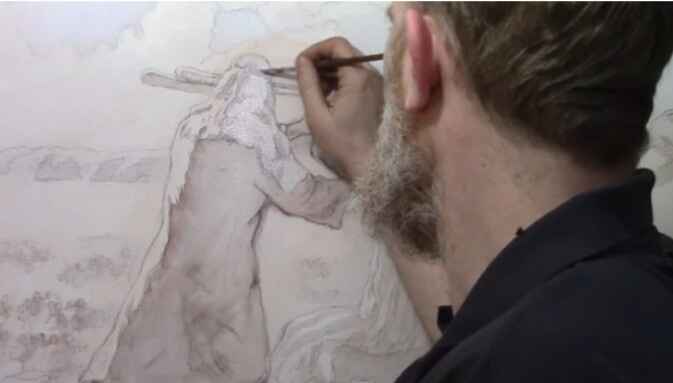
In this lesson, we will delve into a commissioned piece depicting the biblical story of Moses, Aaron, and Hur during the ancient Israeli-Amalekite battle. The symbolism of this painting reflects intercessory prayer, where Moses’ raised staff determined the outcome of the battle, supported by Aaron and Hur. Let’s walk through the process of painting the first layers while maintaining the intricate details of the sketch.
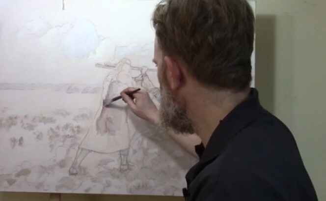
Step 1: Blocking in the Shading
The first step in building up the painting is to block in the shading. Starting with a small flat brush, begin by mixing raw umber dark with a little ultramarine blue and blending it into matte medium. This mixture allows for transparent layering, known as glazing, which will help maintain the underlying sketch without disturbing its details.
- Tip: Use small amounts of acrylic paint mixed with large amounts of matte medium for best results. This creates translucent layers that gradually build depth.
As you apply this mixture, focus on blocking in the shadows and edges of the figure. In this case, we’re focusing on the figure of Moses. The goal here is not to add too much detail but to establish the overall value structure—the lights and darks that will give the portrait its dimensionality. Keep the paint wet and blend softly to avoid harsh lines.
Step 2: Maintaining the Integrity of the Sketch
One of the advantages of the glazing technique is that it allows you to retain the integrity of your detailed sketch. Unlike opaque painting methods, where the initial sketch can get lost under thick layers of paint, glazing preserves every line. This is especially helpful when working on complex portraits that require precision and subtlety.
- Technique: Build the layers slowly. The acrylic glazing method requires patience as each layer dries before the next is applied. This results in richer shading and more nuanced transitions between light and shadow.
Step 3: Applying the Glaze to the Headdress
After blocking in the shadows, it’s time to move on to more specific areas, such as Moses’ headdress. Here, switch to ultramarine blue for a cooler tone. Apply this thin glaze using a round brush, gently working it into the edges and interior details. The goal is to subtly enhance the color while maintaining the transparency of the paint.
- Tip: Always zoom in to focus on intricate details. This ensures that the smaller elements of your painting, such as folds in fabric or facial features, receive the attention they need.
By layering the blue glaze, you start to see the headdress take on more depth, creating a subtle contrast between the cool blues and the warmer tones of Moses’ skin.
Step 4: Blocking Out Old Elements
As with many paintings, revisions are often necessary. In this instance, the figure of Aaron needed to be moved to improve the overall composition. To block out the remnants of the previous version, use titanium white mixed with raw sienna. This combination will effectively cover up old lines and prepare the canvas for new elements.
- Technique: Blocking out sections with lighter colors helps create a clean slate for adjustments. Don’t be afraid to revisit areas that need correcting, as painting is a fluid process of refinement.
Step 5: Letting the Layers Dry
After applying the first few layers, it’s essential to let the painting dry. This is one of the key aspects of acrylic glazing—patience. Each layer needs time to set before the next one is applied to avoid muddying the colors or losing the delicate balance of transparency.
- Tip: Allow ample drying time between layers. This prevents the colors from blending unintentionally and helps you achieve the sharpness needed for realistic portraits.
Once the initial layers are dry, you can return to the painting to add further nuances and build upon the foundation you’ve created.
The Benefits of Acrylic Glazing
The glazing technique offers several advantages, especially for detailed portrait painting:
- Preservation of Details: Because you are working with thin layers of transparent paint, you can retain all the intricate details of your original sketch.
- Depth and Realism: Glazing allows for gradual transitions between light and shadow, creating a more lifelike and three-dimensional appearance.
- Low Pressure: Unlike opaque techniques, where you need to get the colors and values right on the first try, glazing offers more flexibility. Each layer builds upon the previous one, so mistakes can be easily corrected with additional glazes.
- Historical Significance: This technique has been used by master painters for centuries to achieve the luminous quality seen in classical portraits.
Conclusion: Building a Strong Foundation
Mastering the first few layers of an acrylic portrait is crucial to achieving depth and realism in your painting. When using the glazing technique, you can preserve the details of your sketch while gradually building up the shading and values. Because this method requires patience but ultimately results in a more nuanced and lifelike portrait.
If you’re interested in learning more about acrylic glazing or portrait painting techniques, be sure to explore the resources available at RealisticAcrylic.com. and download my free gift for you here. With practice, you’ll be able to master this technique and bring your portraits to life with rich depth and realism.
- Adding highlights to your acrylic painting
- 5 Excellent Reasons to Use Aluminum Foil
- Paint Realistic Wrinkles in Acrylic
- Painting Clothing in an Acrylic Portrait
- Paint a Cloudy Sky Acrylic
- How to add Semi-Opaque Highlights
- How to Enhance the Contrast in Your Acrylic
- How to Add Glaze to Your Acrylic Painting
- Paint Realistic Reflections on Eyeglasses in an Acrylic Portrait
- Build Up Depth on Your Acrylic Portrait Backgrounds
- How Do You Do Layers With the Glazing Technique?
- Learn How to Paint Wrinkles in Acrylic
Read more about how to paint a portrait that you can surely be proud of!
I’d love to hear your thoughts on this video. Please share it with your friends and family. Let me know if you have any further questions. I’ll greatly help you.
If you’d like to learn more, sign up for my free email tips and video class today.
Learn How to Paint Acrylic Portraits With My Free Mini-Video Course!
Thank you so much for taking the time to read this tutorial and watch the video. That means a lot to me. I hope you find it very helpful in your portrait painting.
Yours for Better Portraits,
P.S. Did you find this post helpful or encouraging? If so, send it on ahead! Let others know with the share buttons below. I’d love to hear your comments. Thank you so much! Also, do you have a question on acrylic portrait painting you’d like answered? Let me know, and I’d be happy to help!

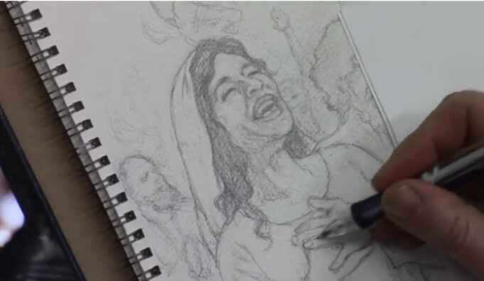
How to Sketch Book Cover Illustration
I’ll show you a sketching book cover illustration.
When creating a sketch for a book cover illustration it is a rewarding and meticulous process that blends creativity with technical skill. In this tutorial, I’ll walk through the steps of sketching a book cover illustration for a Bible commentary, focusing on capturing emotion and detail in every stroke. By the end of this guide, you’ll have actionable techniques to apply to your own projects, whether you’re a beginner or an experienced artist.
In this example, we explore the sketching process for a cover that illustrates the Pentecostal movement from the Book of Acts. This moment depicts the disciples receiving the Holy Spirit, with dramatic expressions of joy and intensity. Let’s dive into the step-by-step process of creating this compelling piece of art.
Step 1: Conceptualizing the Scene
Before starting any sketch, it’s important to have a clear understanding of the subject matter. In this case, the illustration revolves around a significant biblical event, the arrival of the Holy Spirit during Pentecost, described in the Book of Acts. To capture this effectively:
- Research the event: Familiarize yourself with the story by reading the relevant biblical passages. Because this will help you grasp the mood and energy needed for your sketch.
- Determine the key emotions: The illustration should evoke excitement, awe, and spiritual reverence. These emotions will be conveyed through the expressions of the characters and their body language.
- Find reference images: Utilize online reference photos to help with anatomy, facial expressions, and positioning.
In this sketch, the focal point is a woman’s expression of joy, symbolizing the elation felt by the disciples as they received the Holy Spirit.
Step 2: Start with a Rough Sketch
The first stage of creating any illustration is a rough sketch to establish the composition. For this book cover, the sketch began by blocking in the figures and their general positions.
- Freehand drawing: Start by sketching freehand, focusing on the placement and proportion of the characters. This allows for flexibility as you adjust the positioning of different elements.
- Keep it loose: At this stage, don’t worry too much about details. Use light lines to outline the figures and the background. This will give you a basic framework to build on.
Tips for Freehand Sketching:
- Use loose, flowing strokes to keep the composition dynamic.
- Focus on proportions but don’t stress about perfect accuracy early on.
- Keep erasing and refining the composition as needed.
Step 3: Refining the Details
Once the rough sketch is laid out, it’s time to refine the characters and bring out the key details that will make your illustration pop. Because in this project, we will focuses on capturing facial expressions and hand positioning, which are critical for conveying emotion.
Facial Expressions and Hands:
- Faces: Pay special attention to the expressions on your characters’ faces. For this sketch, one figure’s face is drawn with joy, while another figure shows intensity through a furrowed brow and a praying posture.
- Hands: Hands are often one of the hardest parts to draw accurately, but they are essential in conveying emotion. Here, the woman has her hands on her chest, adding to the sense of awe, while another figure has clasped fingers, indicating deep prayer.
Refining these elements involves carefully erasing and reworking lines to get the right anatomy and expression. For example, the wrinkles around the eyes or the positioning of the fingers can greatly impact the emotional depth of the characters.
Technique for Adding Expression:
- Use reference images: Don’t hesitate to consult images to ensure your anatomy and expressions are realistic.
- Focus on the eyes: Eyes are windows to the soul, so ensure they capture the right emotion.
- Subtle shading: Add light shading to emphasize features such as wrinkles, folds, or muscle tension in the hands.
Step 4: Working with Watercolor Paper
In this illustration, watercolor paper was used as the base for the sketch. This surface provides a bit more texture and grip than traditional drawing paper, making it ideal for illustrations that will later be painted.
Benefits of Watercolor Paper for Sketching:
- The texture holds pencil marks well, allowing for smoother shading and erasing.
- It’s sturdy enough to withstand multiple layers of detail, which is beneficial when transitioning from sketching to painting.
Step 5: Final Adjustments and Preparing for Paint
At this point in the sketch, the major elements of the illustration are in place. The characters are well-formed, and their emotions are clearly conveyed through their body language and expressions. However, there are always small adjustments that can be made to improve the sketch before painting.
Making Final Adjustments:
- Shadows and depth: Add subtle shading to the clothing and faces to create depth. For instance, a shadow under the man’s beard gives his face more structure.
- Refine small details: Pay attention to small details like the lines of the fingers or the folds in clothing. Then these small adjustments can make a big difference in the realism of the sketch.
Tips for Transitioning to Paint:
- Ensure that the sketch is as clean and detailed as possible. This will serve as the foundation for the painting stage.
- Consider how your paint medium (whether watercolor, acrylic, or oil) will interact with the pencil lines. Light sketching can easily be painted over, while heavier pencil marks might need to be minimized.
Conclusion
Sketching a book cover illustration requires both creativity and attention to detail. Because by focusing on freehand drawing, refining expressions, and making adjustments based on reference photos, you can create a compelling and emotionally charged sketch. In this project, the sketch captures the pivotal moment of Pentecost, filled with joy and intensity, and lays a solid foundation for a beautiful painted illustration.
If you found this guide helpful and would like to learn more about sketching or painting techniques, visit realisticacrylic.com for more tutorials and check out my free gift for you here
- Adding highlights to your acrylic painting
- 5 Excellent Reasons to Use Aluminum Foil
- Paint Realistic Wrinkles in Acrylic
- Painting Clothing in an Acrylic Portrait
- Paint a Cloudy Sky Acrylic
- How to add Semi-Opaque Highlights
- How to Enhance the Contrast in Your Acrylic
- How to Add Glaze to Your Acrylic Painting
- Paint Realistic Reflections on Eyeglasses in an Acrylic Portrait
- Build Up Depth on Your Acrylic Portrait Backgrounds
- How Do You Do Layers With the Glazing Technique?
- Learn How to Paint Wrinkles in Acrylic
Read more about how to paint a portrait that you can surely be proud of!
I’d love to hear your thoughts on this video. Please share it with your friends and family. Let me know if you have any further questions. I’ll greatly help you.
If you’d like to learn more, sign up for my free email tips and video class today.
Learn How to Paint Acrylic Portraits With My Free Mini-Video Course!
Thank you so much for taking the time to read this tutorial and watch the video. That means a lot to me. I hope you find it very helpful in your portrait painting.
Yours for Better Portraits,
P.S. Did you find this post helpful or encouraging? If so, send it on ahead! Let others know with the share buttons below. I’d love to hear your comments. Thank you so much! Also, do you have a question on acrylic portrait painting you’d like answered? Let me know, and I’d be happy to help!