Unlock the secrets of color and value: a step-by-step guide to acrylic portrait painting
Creating a beautiful acrylic portrait involves several steps, and one of the most crucial is blocking in colors and values. This stage establishes the foundation for your painting, allowing you to build layers of detail and depth. In this blog post, we will delve into the process of blocking in colors and values, drawing insights from me.
What is the best way to start an acrylic portrait?
Do you just begin with a white canvas, and fully paint everything from left to right, as you would in a drawing?
That’s how I used to paint, until I learned the glazing technique. I would painstakingly render every detail, and move across the surface of the canvas. But I always had a lot of white canvas staring me in the face.
After learning the glazing technique, instead, I could begin to slowly develop the portrait, like an Polaroid photograph.
Psychologically, it felt less intimidating. And it was fun to watch the process of the painting methodically taking shape.
In this video tutorial today, I’m going to show you how I begin my painting–what colors I use, where I put them and why, using this 16″ x 20″ commissioned portrait of three children…
Hopefully, this may provide you with a different approach to acrylic portrait painting, especially if you’re used to simply covering your painting opaquely across the surface of the canvas.
Let me know how this tutorial helps!
P.S. Did you find this post helpful or encouraging? If so, send it on ahead! Let others know with the share buttons below. I’d love to hear your comments. Thank you so much! Also, do you have a question on acrylic portrait painting you’d like answered? Let me know, and I’d be happy to help!
You have some time to paint over the weekend. You set up your reference photo, knock out a nice looking sketch, and then excitedly start to paint…
But something happens.
After a few layers, things start to unravel. Suddenly, it just doesn’t look like the person you’re trying to do a portrait of anymore. You paint some more in an attempt to restore what you lost in the sketch, and now you’ve only made it worse!
Frustration sets in.
Can I fix this painting? Or do I have to start over? How much time did I spend on this already?
I had exactly this question asked of me by a student…
I can get a good likeness with the sketch but I seem to lose lots of the likeness after a few layers of paint. What do you think happens? –Ron
My answer back to him will be the basis for this article today. I think it will benefit you as well, if you have lost your likeness after sketching. I know I have!
Here’s some tips to prevent the likeness in your sketch from being lost in your painting and also, how to get it back on track if you do.
1. Seal in Your Sketch
I know this sounds simple, but if you just start painting over pencil the thick paint on your brush will lift off some of the pigment on your canvas and it will smear. The end result is a muddy mix of paint and pigment and lost detail.
First of all, use colored pencil instead of graphite pencil to do your sketch. Burnt ochre or a similar color works best. Then carefully seal in the sketch with a wide synthetic bristle brush and matte medium.
Once it’s dry you will have a barrier between your sketch and your paint.
2. Paint Lightly at First
When you start your actual painting process, I recommend to use thin glazes of paint (tiny bits of paint mixed with generous portions of matte medium) and gently block in the color and value. You want to just barely see the change between the white canvas and the color you’re putting down at first.
Then, as you add more layers and depth, you can get aggressive with your paint. (At least compared to how you start out!) In the beginning, you’ll use a ratio of 90% medium to 10% paint and then later, closer to 50-50.
By going light, you will preserve the detail of your sketch beneath. Only toward the middle to the end of the painting process will the sketch get completely covered up.
3. Convert Pencil Lines to Paint
Paint over the details of your sketch intermittently with round brushes as you paint the large areas with your flat brush. It will be a constant push-and pull between blocking in large areas of value and color, and fussy detail work. Toward the end of the painting you will be favoring more of the detail aspect of your painting.
As you darken in some of these pencil lines, you’ll ensure you don’t lose that valuable detail that you laid out in the sketching stage while applying large layers.
If you’d like to learn more, sign up to receive my portrait painting tips via email. I’ll send you video lessons to show you how to paint a realistic portrait in acrylic step-by-step!
Remember that it is shading and value–those differences between light and dark with all the subtle variations–that describe a three dimensional illusion on a two-dimensional surface.
Lines can’t do that.
Only shading can.
The lines in our sketch are there to tell us where to put the shading in during the painting process. And if you do some shading during the sketching process, even better. Then you’ll be able to just enhance those areas with paint.
It is the shading (the use of value) that tells us how large someone’s chin is, or the roundness of their nose, or fullness of their cheek, or boniness of their forehead.
So, my point is this: do some shading on your sketch, and that will help your painting process along.
5. You Will Lose the Likeness to Some Degree
That’s normal. Happens to me all the time when I paint. Knowing this ahead of time will clear your mind of unrealistic expectations so that your frustration level can go down…and you can paint to the best of your ability.
The reason that the likeness inevitably does get lost is that as you’re adding these various values in different places, there will be some spots on your painting that are just less finished than others. You may have painted the eyes about as dark as they are in the reference photo, but the eyebrows haven’t “caught up” yet.
Or maybe you added some deep shadows under the chin, but you haven’t quite dialed in the shading for the cheeks. If the person’s chubby cheeks are a main part of their features, then missing this aspect can really throw off the likeness.
And this can go for parts all over the face.
I am working on a painting right now of three children as I write this blog post, and the likenesses aren’t quite there yet. In fact, they look “off” to me. But I know that if I stick with it, it will work out. I prayed that God would help me to do it well, and I believe He will.
However, as in all of life, there’s a struggle we have to go through to get to the other side. You can’t have the mountains without the valleys. So, I’ll stick with this, keep looking at my reference photo, keep praying and putting paint on the canvas.
And the end result, by God’s grace, will be a fantastic painting that the client will love.
So for you, this means that as you bring all the unfinished areas of your portrait to completion, eventually, the likeness will not only get restored to how it was during your sketch, but it will be even better.
6. Get Critiques of Your Work
When you’ve tried the other tips and you feel like your painting is way off track you may want to consider getting a critique. If you have an artist group where you meet in person, that may be a good way to go. I have a Facebook group as well if you need some quick feedback. If you haven’t already, I invite you to join the group. The folks there are very helpful.
Also, I do personal, one-to-one video critiques that you will show you precisely what you need to do to fix problem areas of your painting. Learn more here.
7. Start Over…If You Must
I don’t recommend starting over a painting, except as a last resort. I think it’s much better to stick with a painting and resolve problem areas to build confidence in your skills as an artist and to save time and money.
But if you find yourself sinking way too much time into the painting, reworking the same area over and over, and the texture is built up so much that you want to sand it off, it may be time to start over.
If the painting is in the beginning stages, and the composition or likeness was wrong from the start, then re-doing it may be the best choice. It may take less time to just start over than try to rectify your mistakes. You’ll have to look at your painting and ask yourself “how far off is it?” Sometimes we get hard on ourselves as artists (we’re perfectionists by nature) and it might be just a tiny thing that can make all the difference.
I had a painting like that. It just didn’t look like the guy. Then I added a reflection on his eye that took all of one minute to paint–and that did it. It was him!
So, get a second opinion with a good critique, and then you’ll know if it’s worth it to start over. The person critiquing your may be able to give you an idea of how far off the rails you are. You may be closer that you think!
And there you have it: 7 tips to help you how to not lose your likeness, or if you do, how to get it back. Let me know how this helps!
Blessings to you and your painting,
P.S. Did you find this post helpful or encouraging? If so, send it on ahead! Let others know with the share buttons below. I’d love to hear your comments. Thank you so much! Also, do you have a question on acrylic portrait painting you’d like answered? Let me know, and I’d be happy to help!
Using a grid or tracing can be a great way for artists just starting out in portrait painting to create a lifelike, accurate sketch. It also can help experienced painters either save time or get their proportions a bit more accurate so they can concentrate more on their painting process.
But sometimes, it’s fun to just “throw off the training wheels” and do your sketch freehand. In fact, drawing freehand will enhance your ability to see intricate spacial relationships, shapes and contours that are vital at any stage in your painting.
You’ll learn to capture those small nuances that will make a person look like them.
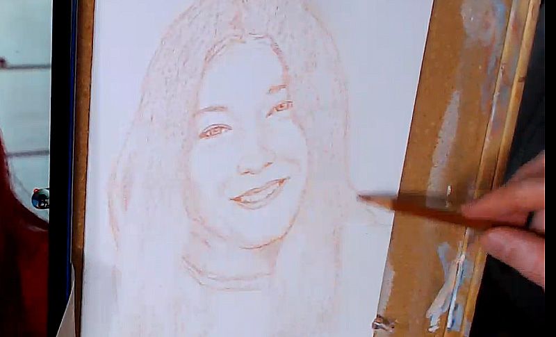
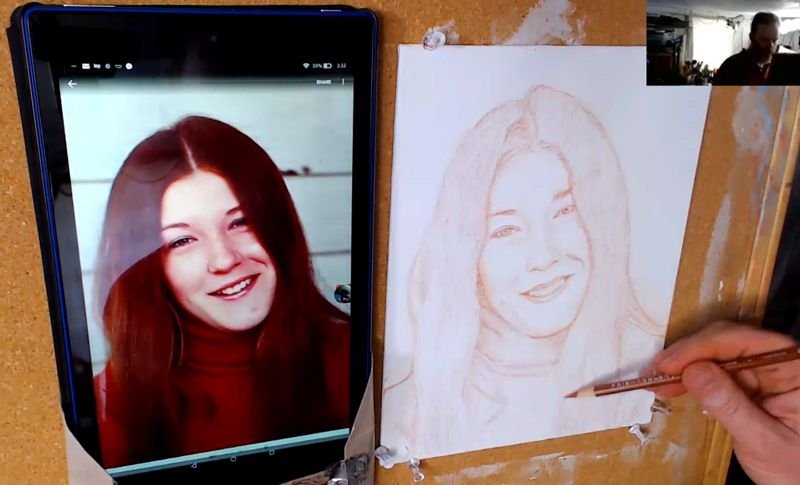
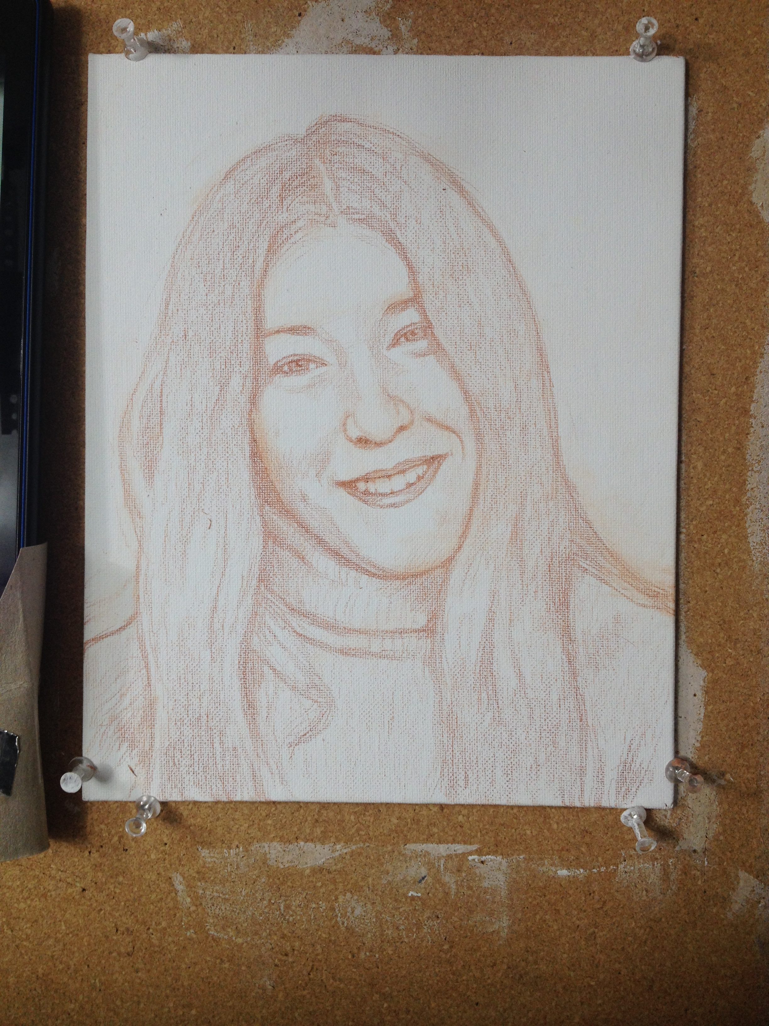
What is the best way to draw freehand?
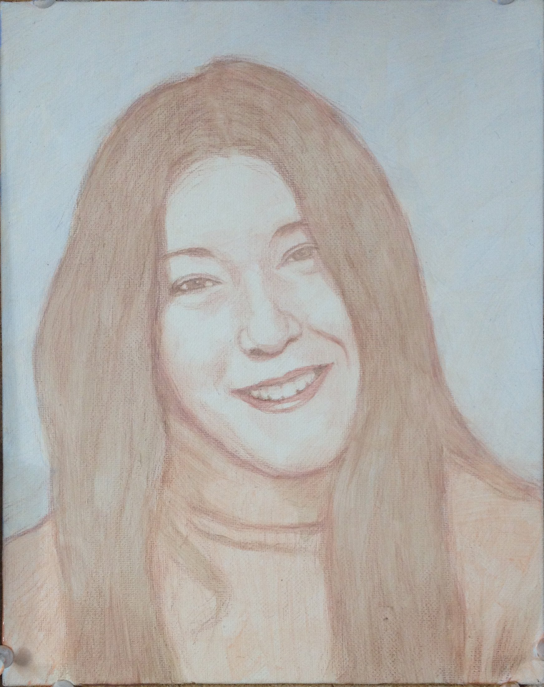
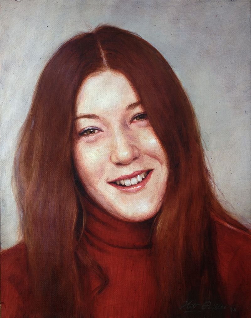
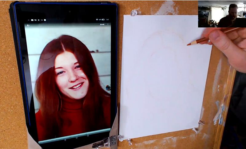
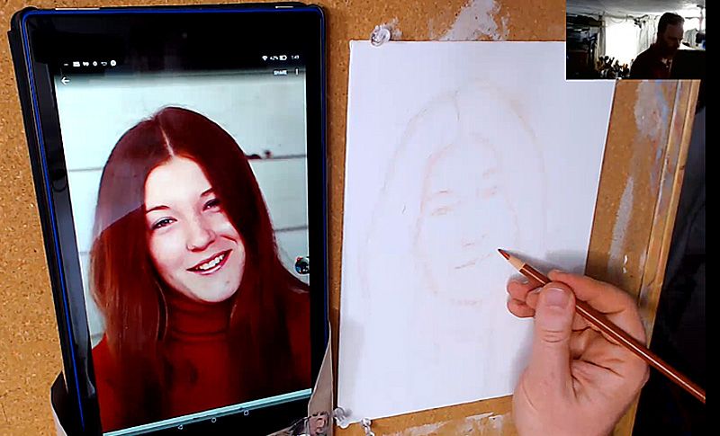
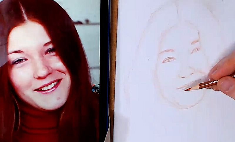
I’m not going to say I have the best method, but it has served me well in over 20 years of doing portrait art. I’d like to share that with you today, using this 8″ x 10″ commissioned portrait as an example…
Tools needed:
Canvas Burnt Ochre Prismacolor colored pencil Electric pencil sharpener White smooth eraser
Here is the 15-minute video tutorial. The drawing took almost an hour.
The rest of this tutorial–showing the entire process, from sketch to finished acrylic portrait painting (about 7 hours of video instruction)–will soon be available as an online class. You can get access to it, and several other pre-recorded painting courses by becoming a member of Realistic Acrylic Portrait School.
And now, here are the steps, based on my video, broken down…
Step 1: Locking in the Composition
In this step, you want to plot out where your drawing is going. Here’s a few rules of thumb for a good composition and accurate initial proportions…
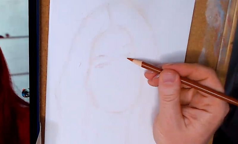
-Fill the image area as much as possible -If you were to draw an imaginary line 1/3 of the way down from the top of the canvas edge, that line should go right through the middle of the face. -Don’t let any major lines touch the edge of the “picture plane” (edges of the canvas) -Look for the overall shape of the head: Is it oval? Long? Short and wide? -Use light, short, choppy strokes to capture everything at first. It will be much easier to adjust and erase.
Step 2: Suggesting the Facial Features
After plotting out your composition, you want to start filling in the facial features. It’s good to draw lightly at first. We just want to get the basic location on the face and the overall impression of what they look like.
Start with the eyes. The eyes (and eyebrows) are THE most important feature to capture correctly on a face.
Ask yourself…
-Where are they located in relationship to the top and bottom of the head? Usually eyes are right in the middle, but that can vary from person to person. -Are they large or small? -Are they close together or far apart? Usually eyes are about one-eye-width apart from each other. -Are the eyebrows straight or curved? Angled up or down? Thin or thick? -How much of a distance is there between the eyebrows and eyes? -What’s the shape of the eyes? Narrow? Rounded? Angled? -How much of the top eyelid is showing? Some people have prominent upper eyelids. With others you can hardly see it. -Are the eyelashes thick or thin?
Now, these questions will come more into play later on as you refine the sketch, but for now at this stage, just get the general idea captured.
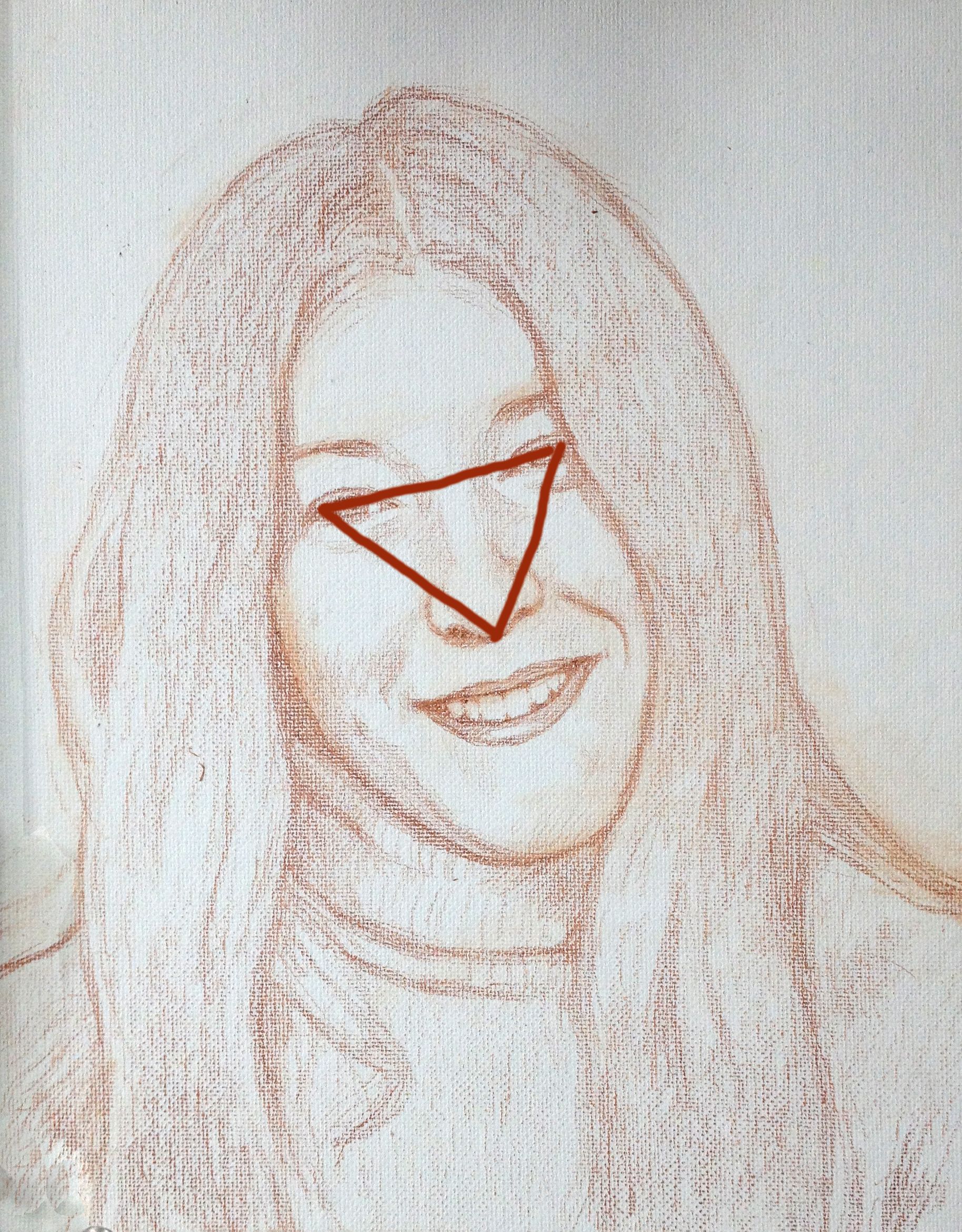
Next, you’ll move down to the nose. It’s important to see the distance between the eyes and the nose and draw that. The shape between the nose and eyes forms a triangle. If you can get a sense for that shape, it will really help you out. Is the triangle wide or long?
I am not saying to draw a triangle on your sketch. Just use the concept to see that spacial relationship between the eyes and the nose and draw it accurately.
Notice the particular shape of the nose and nostrils and draw it in. Are the nostrils prominent or obscured? Is the nose wide or skinny?
Then, move down to the mouth. You’ll want to just get the overall shape. Here’s some rules of thumb for drawing the mouth…
-The top lip is usually thinner than the bottom lip -When smiling, the edges of the mouth usually line up with the middle of the eyes
-Don’t draw the teeth in too prominently. Just suggest them. Remember that the two front teeth are larger than the rest. -The bottom teeth, if showing, are slightly more than 1/2 the width of the top.
Step 3: Redefining the Facial Features
In this step, you will want to go over everything–the eyes, nose, and mouth: making sure your shapes are accurate. The overall size and proportions should be mostly locked in by this point. So what you’ll want to do is make sure the shapes on all the features match what you see in your reference photo.
Continue to ask yourself some of the questions in the previous step as you refine. And look at your reference photo 50% of the time to make sure you’re drawing what you see, instead of what you think you see!
Step 4: Shading in
Maybe it seems redundant to shade in during a sketch, but I find it very helpful. We don’t see any resting objects in this three dimensional world as separated by line.
No.
It’s the contrast between value and color that tells us where an object begins or ends.
So, line is great for plotting composition and initial shape of features, but it is not useful for actually conveying a three-dimensional form on a two dimensional surface.
Which is why I like to shade in my sketches.
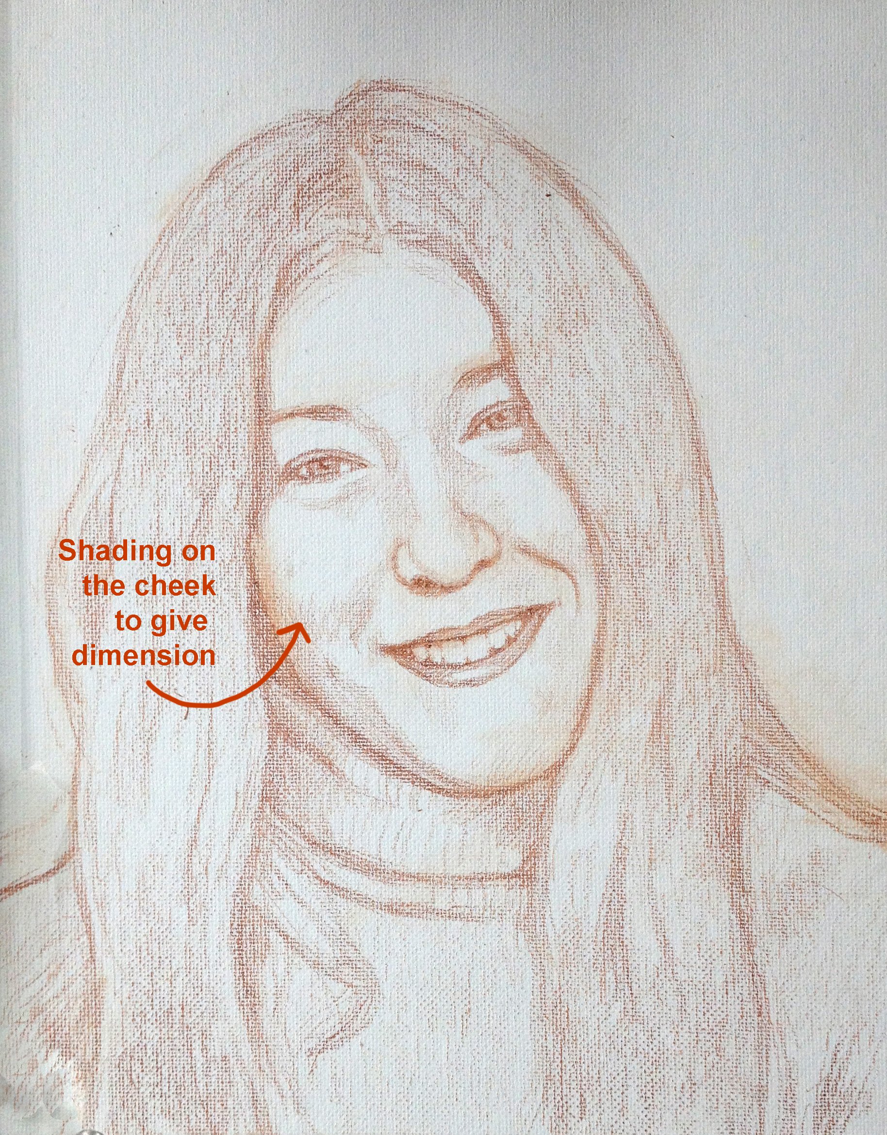
Shading will tell you how puffy a cheek is for example. Or how much a nose protrudes outward. Or how small a chin may be. And if you can capture that in the sketch stage (without too much fuss) it will really help you in the painting stage.
The heavy lifting will be done for you. All you’ll have to do in the painting stage is darken those shadows and add more nuances to tie them together. And of course, add color information!
I use the side of my pencil to block in the shadows in large areas. For smaller areas, I’ll use the tip of the pencil.
Step 5: Final Touches
The portrait sketch should be looking almost done at this point. Basically, you just want to go over everything, and make sure all minute proportions and shapes are accurate. The BIG proportions should be dialed in by now.
This step should take just a few minutes.
Keep in mind, you won’t get the sketch perfect. There may be a few areas that are getting hard to erase because you’ve drawn over the area so many times.
That’s OK.
Many small mistakes can be corrected in the painting stage. As long as you have everything close, you’ll be fine.
Once the drawing is done, you can step back and look at it from a distance just to make sure you have the likeness captured close enough. If so, you will have a good foundation to begin your portrait.
P.S. Did you find this post helpful or encouraging? If so, send it on ahead! Let others know with the share buttons below. I’d love to hear your comments. Thank you so much! Also, do you have a question on acrylic portrait painting you’d like answered? Let me know, and I’d be happy to help!
To create a realistic portrait you need a lot of different elements all working together.
The main three elements are accurate form, value, and color.
All of these elements are tied together, and even overlap a bit. Today, I want to show how form and value work together, and how you need to represent value accurately to portray correct form.
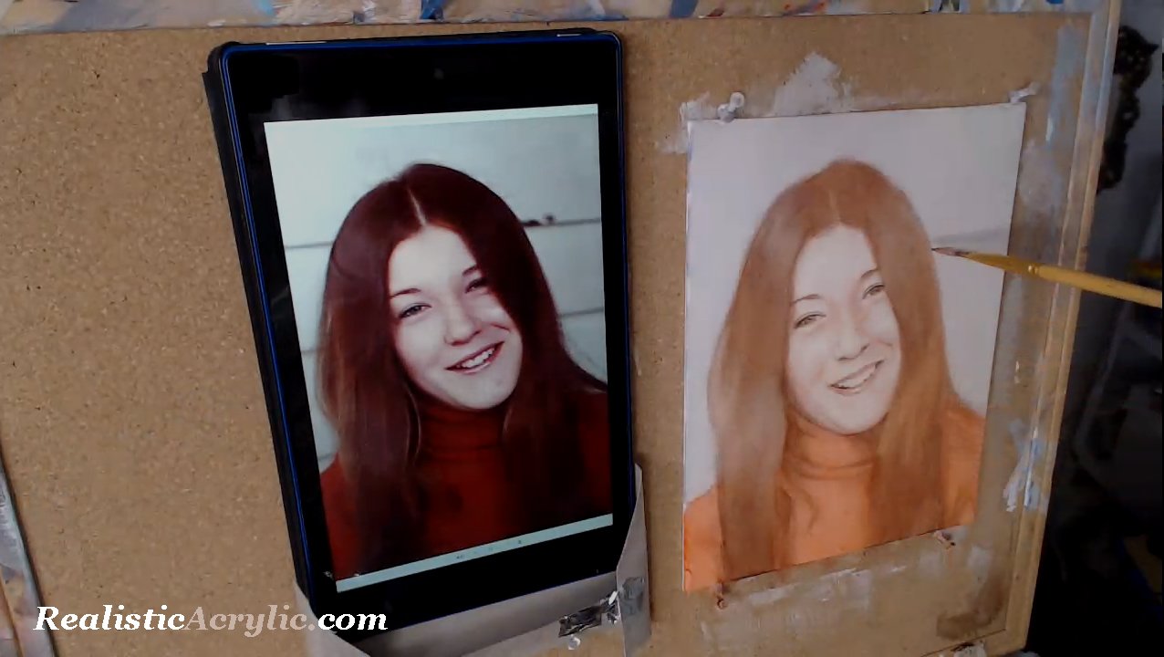
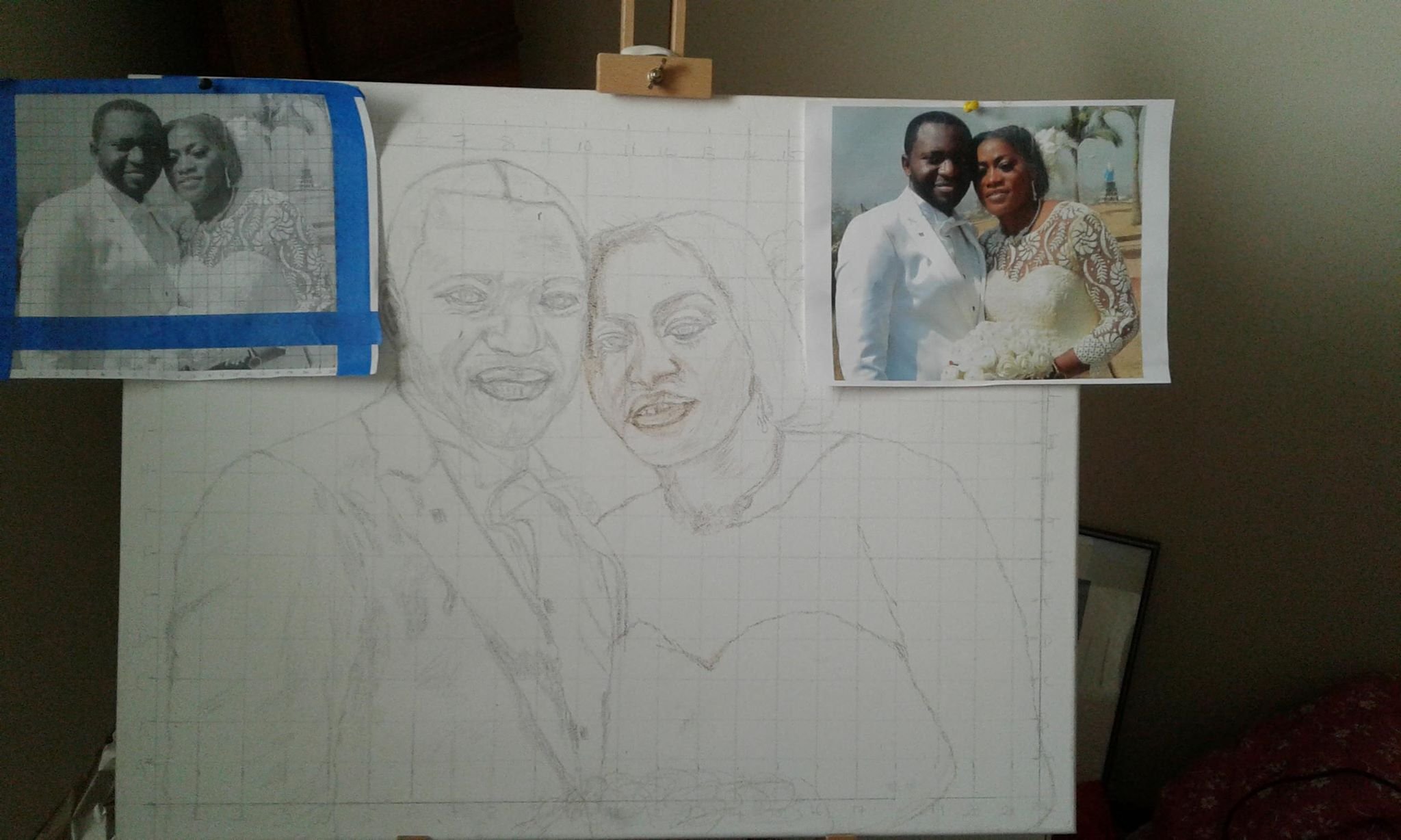
One of my students recently asked to have his portrait critiqued, while in the sketch stage. As I was recording his critique, the idea of capturing value to portray a realistic likeness came up.
In other words, if you want the person you’re painting to look like them, you have to pay close attention to the shadows. It’s just as important to capture these shadows as it is to draw the features such as the eyes, nose, mouth, etc. with correct placement, proportions, and shape. The ability to see the shadows on a face is vitally important to create the illusion of three-dimensionality on the canvas. You need to be able to see the inherent shape of a shadow from your reference photo–its hard edge and soft edge.
On a photograph that can be hard to discern.
You have an almost unlimited array of values with micro-nuances that can make it very challenging to see the “big picture” of the main shapes of the shadows. But if you can train yourself to see those main, abstract shapes you will go a long way to being able to draw and paint realistically.
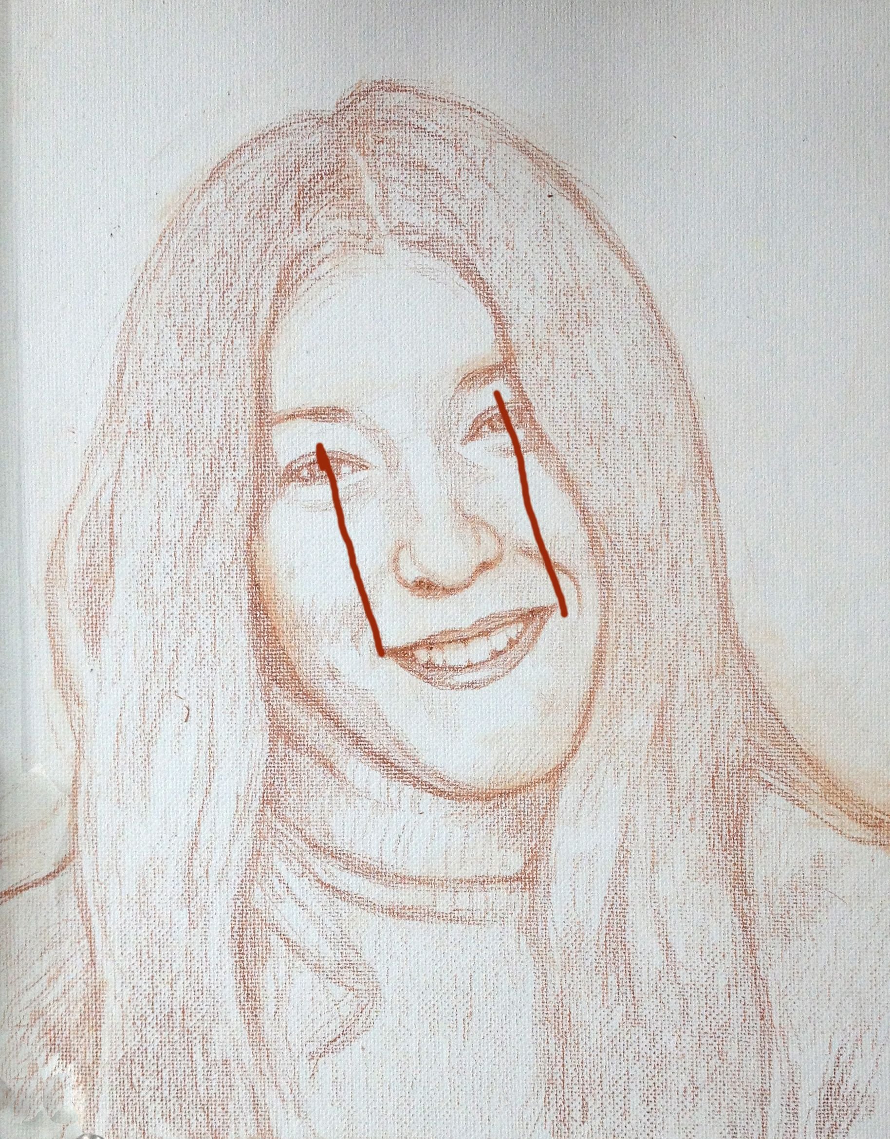
By the way, the edges are defined not only by shadows, but differences in value due to the actual value (light and dark) of the objects themselves. (For example, the contrast between the man’s flesh tone and white suit. Or, on a smaller level, the difference between his black beard on his dark brown skin.
There are borders to all the shadows and values Your job is to see the most obvious edge, pick a line, and define it.
Watch the video below and I’ll show you what I’m discussing here, using this student’s portrait sketch (supplied with his permission) as an example.
Mastering the ability to see shapes within the shadows takes practice. But it all starts with being aware of the need to do so. As you hone in this skill, you’ll see these shapes all over the place, learn how to paint what you see, and your portraits will come alive with realism!. Visit other free tutorial here.
Yours for realistic acrylic portraits,
P.S. Did you find this post helpful or encouraging? If so, send it on ahead! Let others know with the share buttons below. I’d love to hear your comments. Thank you so much! Also, do you have a question on acrylic portrait painting you’d like answered? Let me know, and I’d be happy to help!